Project Via Monserrato - Reveal
During the past year I've been working on a decorating and renovation project in the Historic Center for a client who wanted to update a few of their B&Bs.It was a great experience. At times it was also challenging, as the apartments were fully booked months in advance. The logistics were difficult.Located inside a palazzo that dates from the 1600s The Via Monserrato apartment (aka Grand Suite), is on one of the prettiest streets in Rome.The brief was to create a contemporary décor, while at the same time retaining (and respecting) the charm and history of the architecture.Vacation rentals are tricky. You don't want a design that is bland or cookie-cutter but it cannot have so much personality that it turns off most customers.Here's a photo from the living room, before.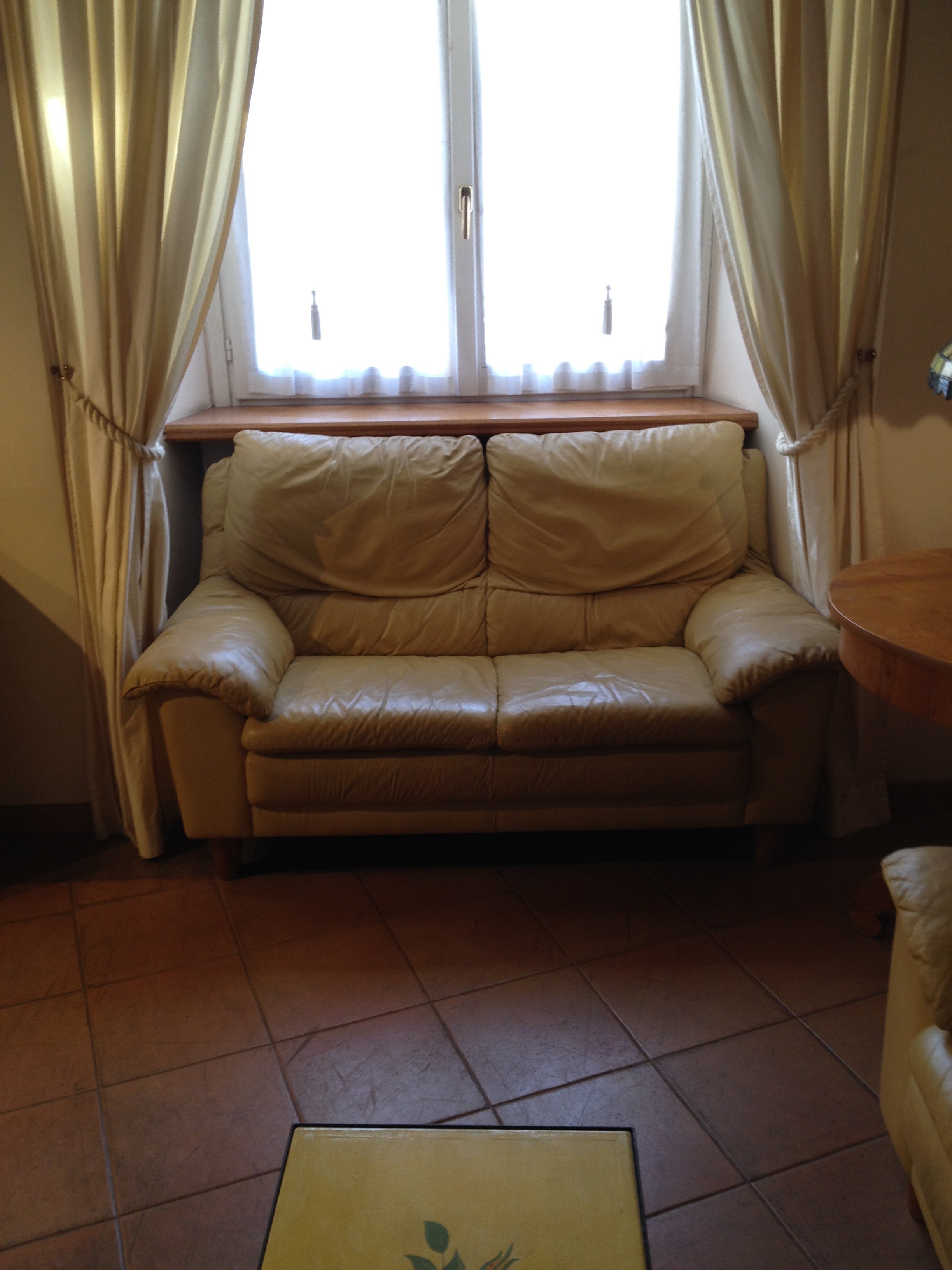 After
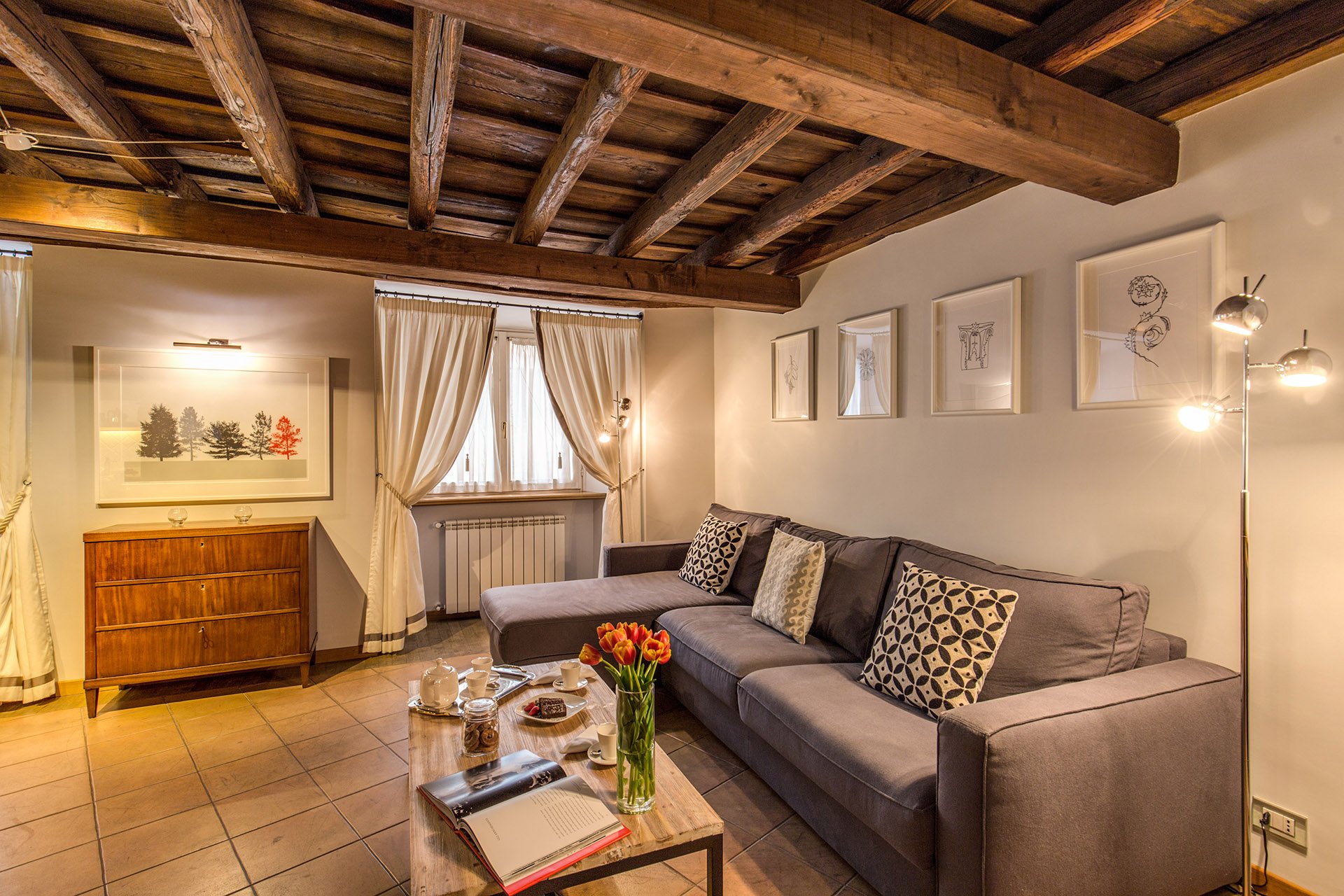
After 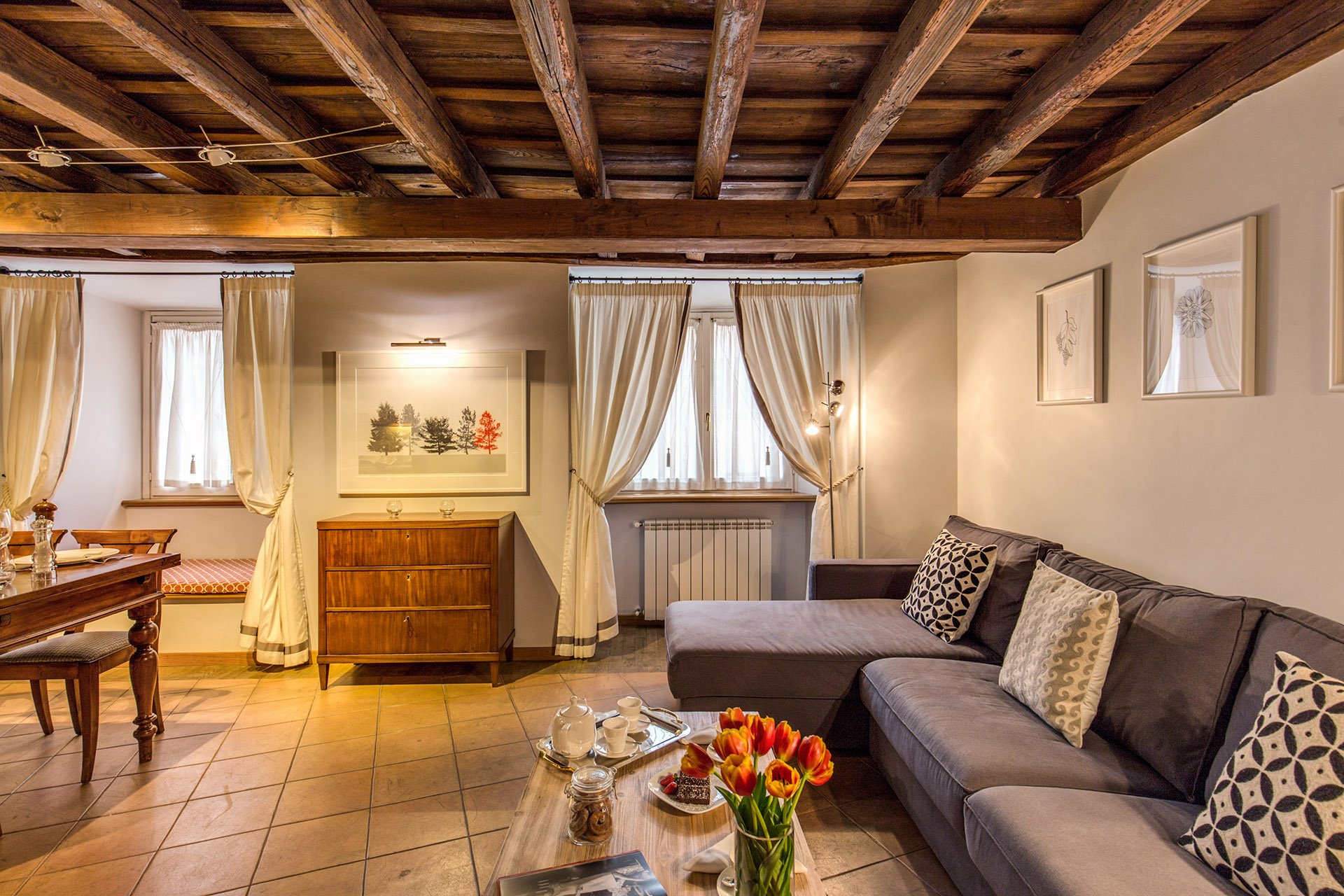 This room is a mix of high and low vendors, antiques (that belong to the client), and custom pieces.The room is light, stylish, yet comfortable. We had to use fabrics and colors that could handle a lot of wear and tear.The walls were changed to Farrow & Ball's "Blackened", a cool white that reads light grey. I know I talk a lot about this brand but there's a reason I have used it in every single project I've worked on. The quality of this paint is no joke and depth of color is incredible. This was the first time the painters had worked with Farrow & Ball and they were very impressed. When people who paint for a living rave about a brand, you know it's good. Stateside, I like Benjamin Moore as well but that brand is not sold here. Le Decorazioni is the authorized Fallow & Ball vendor in Rome.We decided to go with a one L shaped sofa instead two. This model is a sleeper sofa and we bought it from Berto Salotto.The coffee table is from Maisons du Monde, a French brand with stores all over Europe.The curtains were custom made. The trim is Dedar. All the fabric for the apartment was selected and purchased at the store Lelli.The floor lamps are from MADE.The art work over the antique buffet is by Due Alberi. Funny that I read about these two artists in Rome on Elements of Style, which is written by Boston-based American interior designer Erin Gates. We used their work in another apartment (pics soon) as well.We commissioned artist Marta Alexandra Abbott to create pieces that referenced Rome in a subtle way. Marta is American and moved to Rome several years ago. You can see more of this series, inspired by the Ara Pacis, HERE.Dining area.
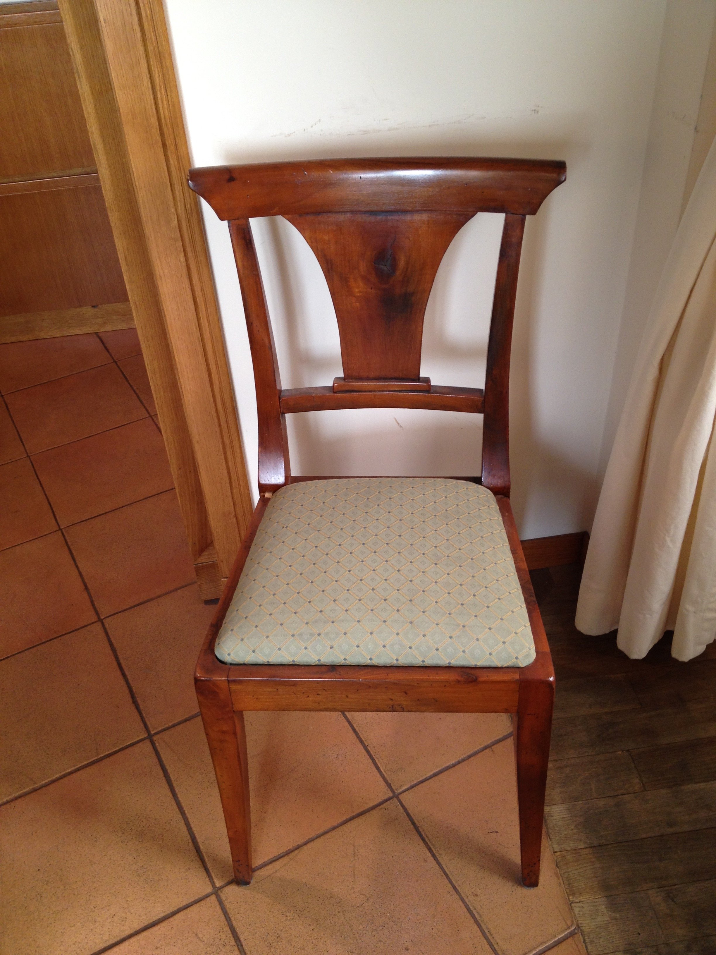
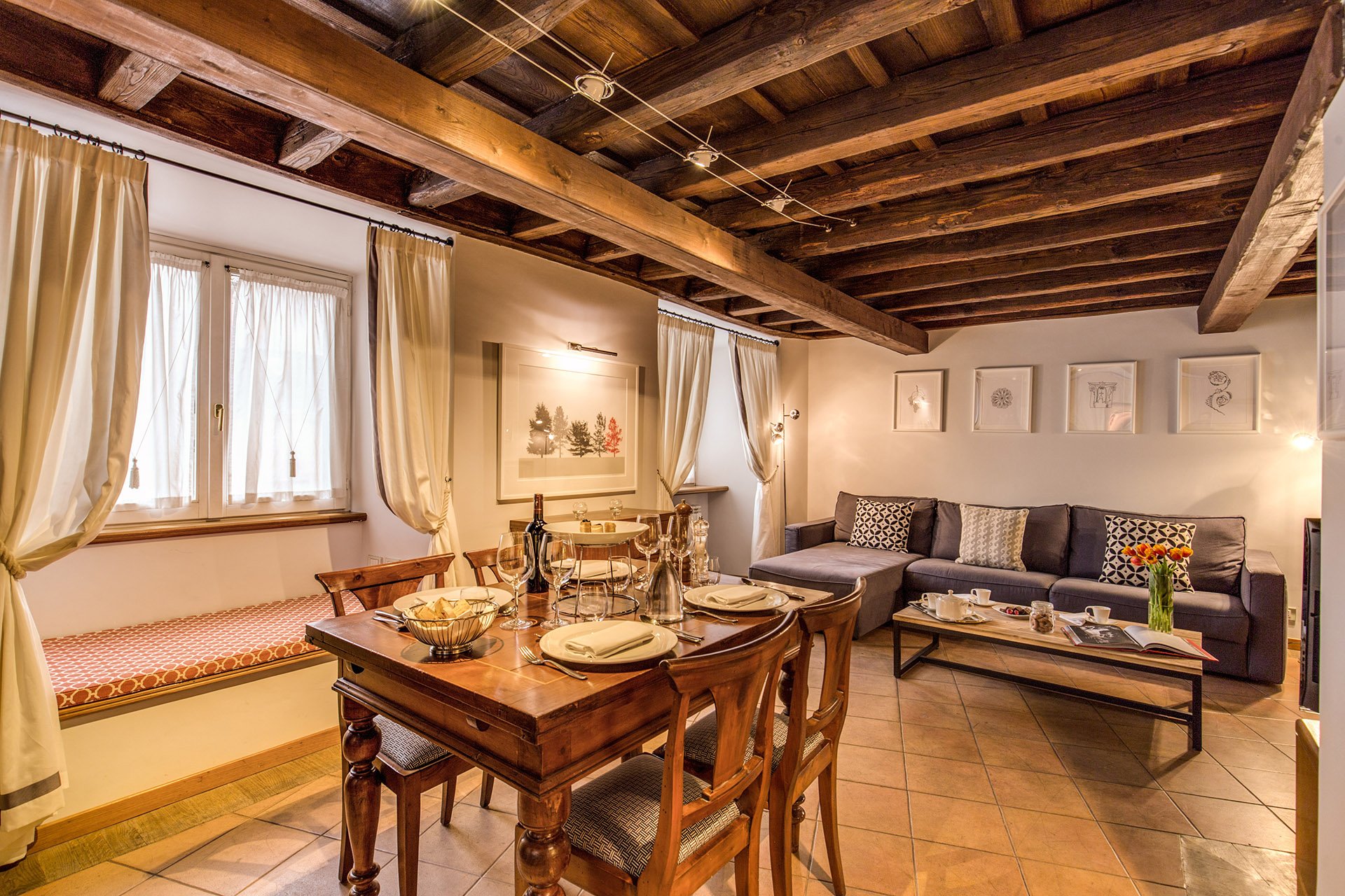 We kept the dining table and reupholstered the dining chairs.Before
 After
After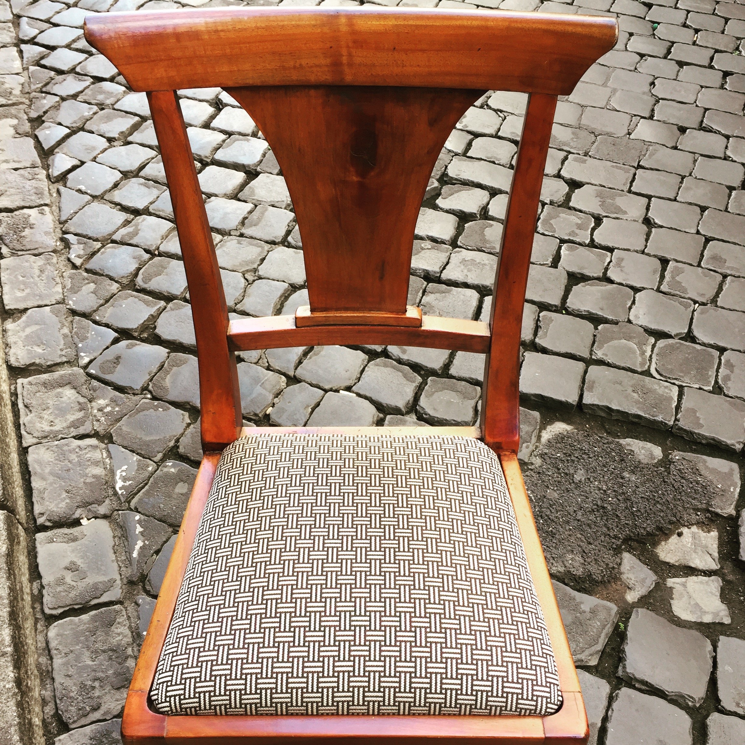 This graphic Dedar fabric is durable and makes the 1930 lines of the chair stand out. The chairs were in great shape. I thought it would be better for the budget and the design to keep them. I'm not a fan of spaces where every single item is brand new. I like to mix things up. You see that a lot in interiors in France and Italy. If you don't have any older pieces of your own, you can find them at flea markets, estates sales, in your family's attics/basements, etc.We created a window seat. I wasn't sure my client would go for the pattern or the color. The fabric is Thibaut. I think it gives this room of neutrals a nice punch of color.The pillow are from a local shop, Fabindia.The former artwork in the living room.
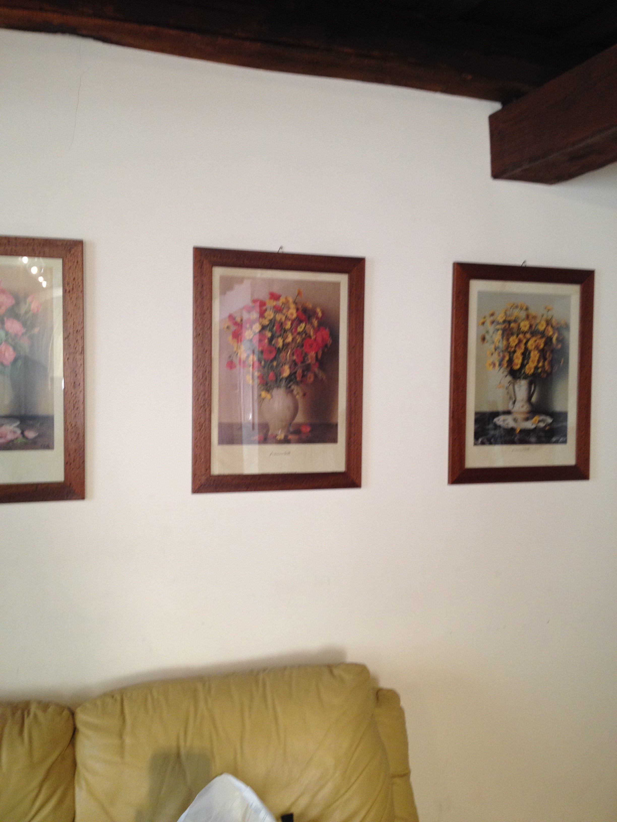 Art work, after.
 The hallway was painted white and the huge 1980s sconces were replaced with simple, modern ones. This art is by Marta as well.
 Bedroom - before
 After
After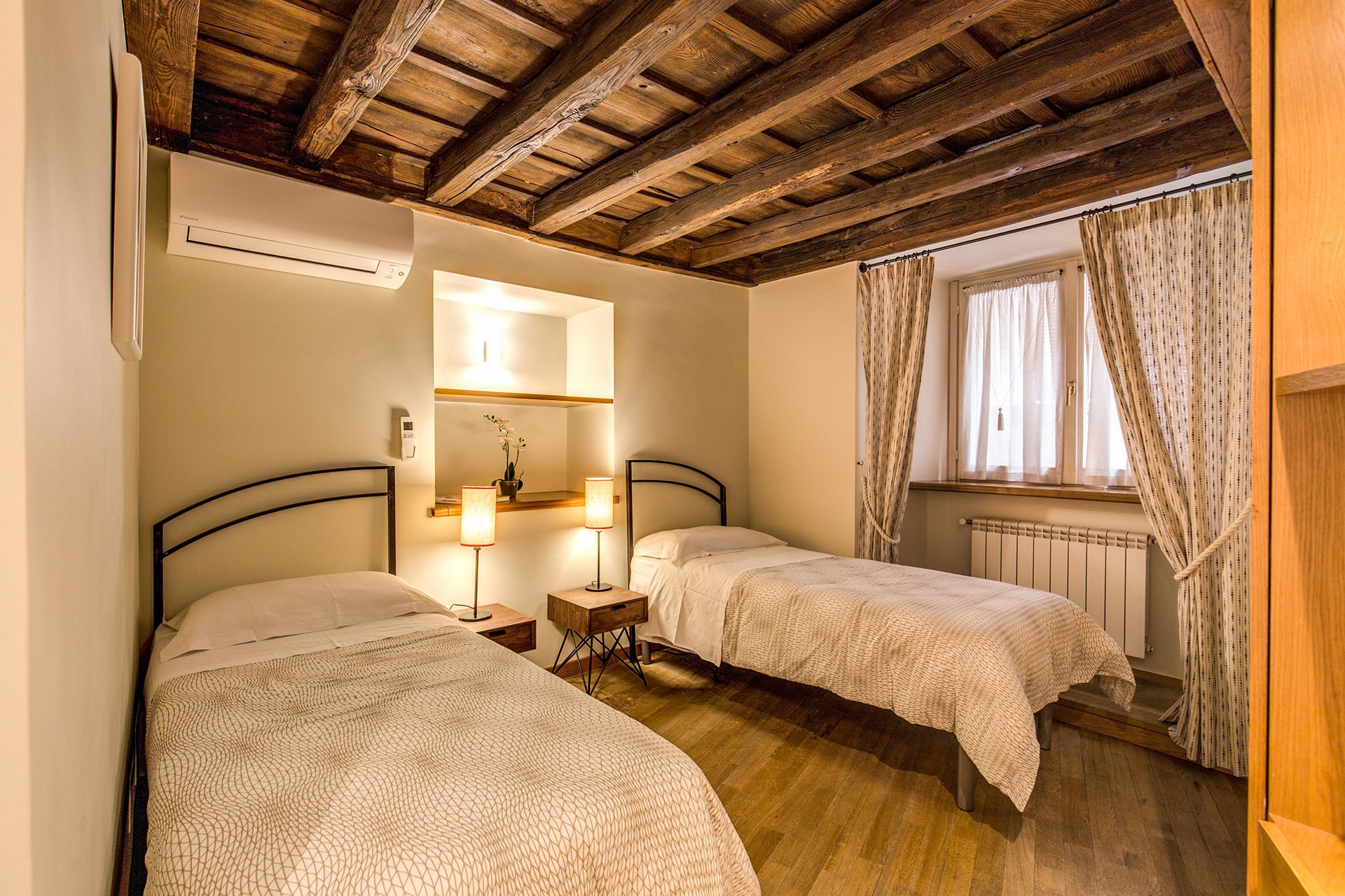 Originally, there was a queen-sized bed in this room but my client's company has had many requests for twin beds.The walls are Farrow & Ball, "James White". The curtains are custom. The fabric is Thom Filicia for Kravet.I asked my blacksmith to make the head boards. I wanted something that would look great when together and when separate. We came up with a few designs and this is the one the client picked.The night stands are from Maisons du Monde. The lamp bases are from IKEA. The shades were custom made at the store Paralume, which is right up the street.I'm not sure how a store that makes/sells lampshades manages to stay in business in this global economy we live in but I hope they stick around for a long time.The beds together.
 The master bedroom - before
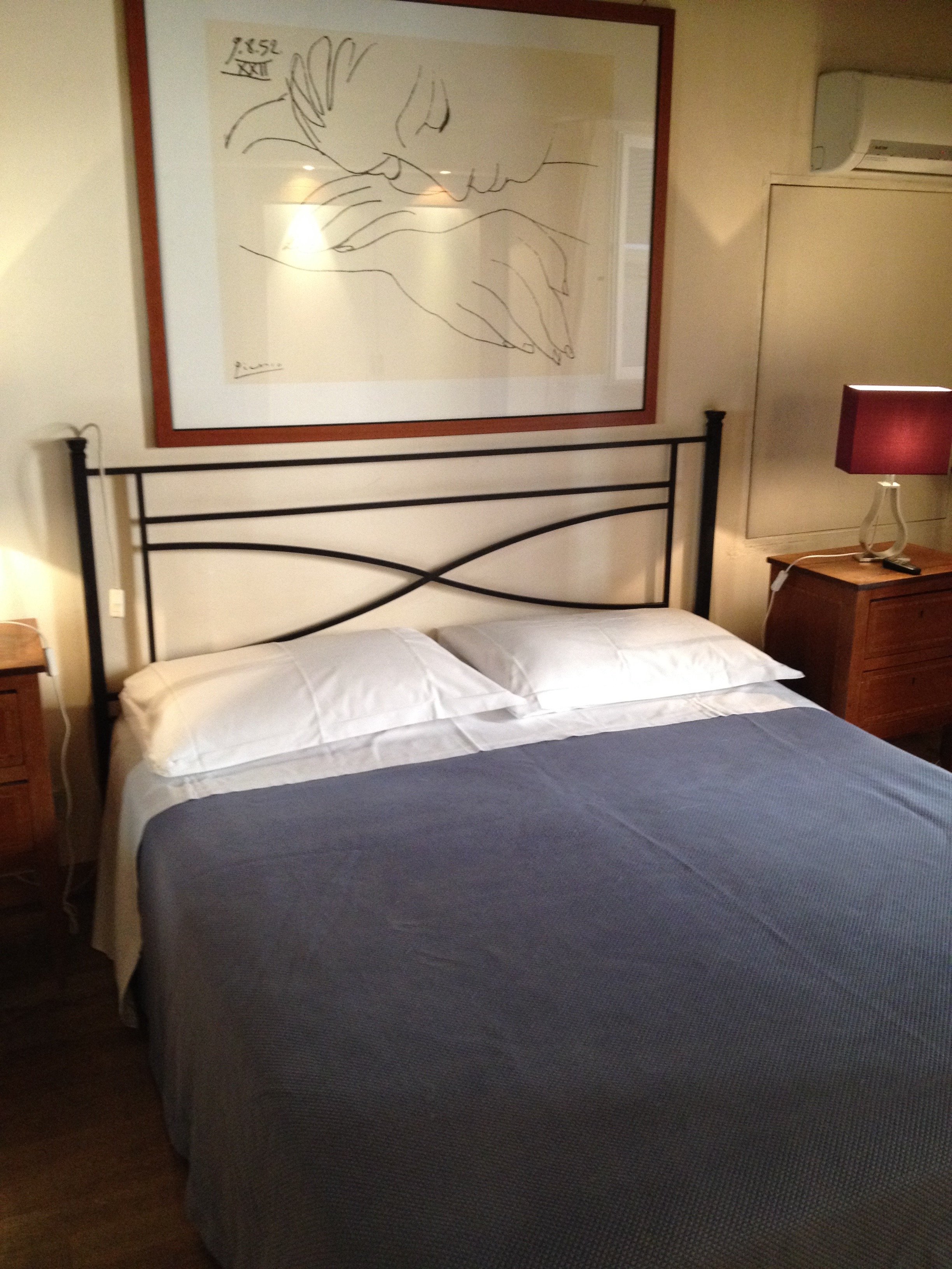 After
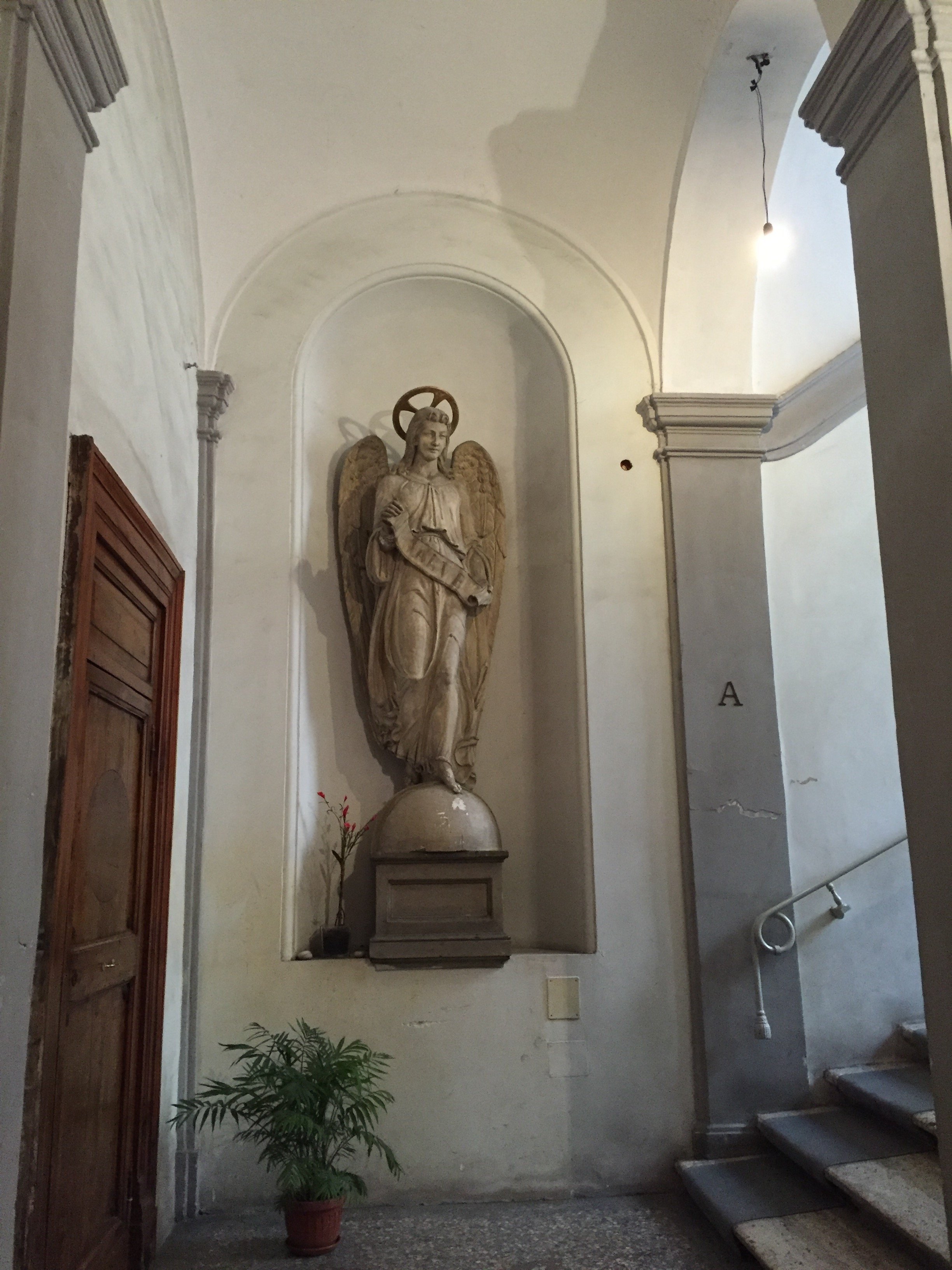
After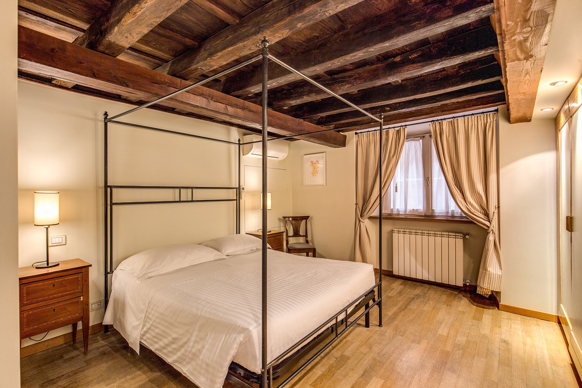 We kept the bedside tables. The walls are F&B James White. The curtain fabric is Malabar.The lamp bases are IKEA, shades custom from Paralume. It's hard to tell from the photo but these shades/trim are a different color from the other bedroom.I have a thing about four poster/canopy beds. Our blacksmith designed this simple yet, elegant frame. With these ceilings, we thought a more decorative frame would be too much. It interesting how the room actually looks bigger even though this bed is the same width as the old one.Two photos from inside the Palazzo.
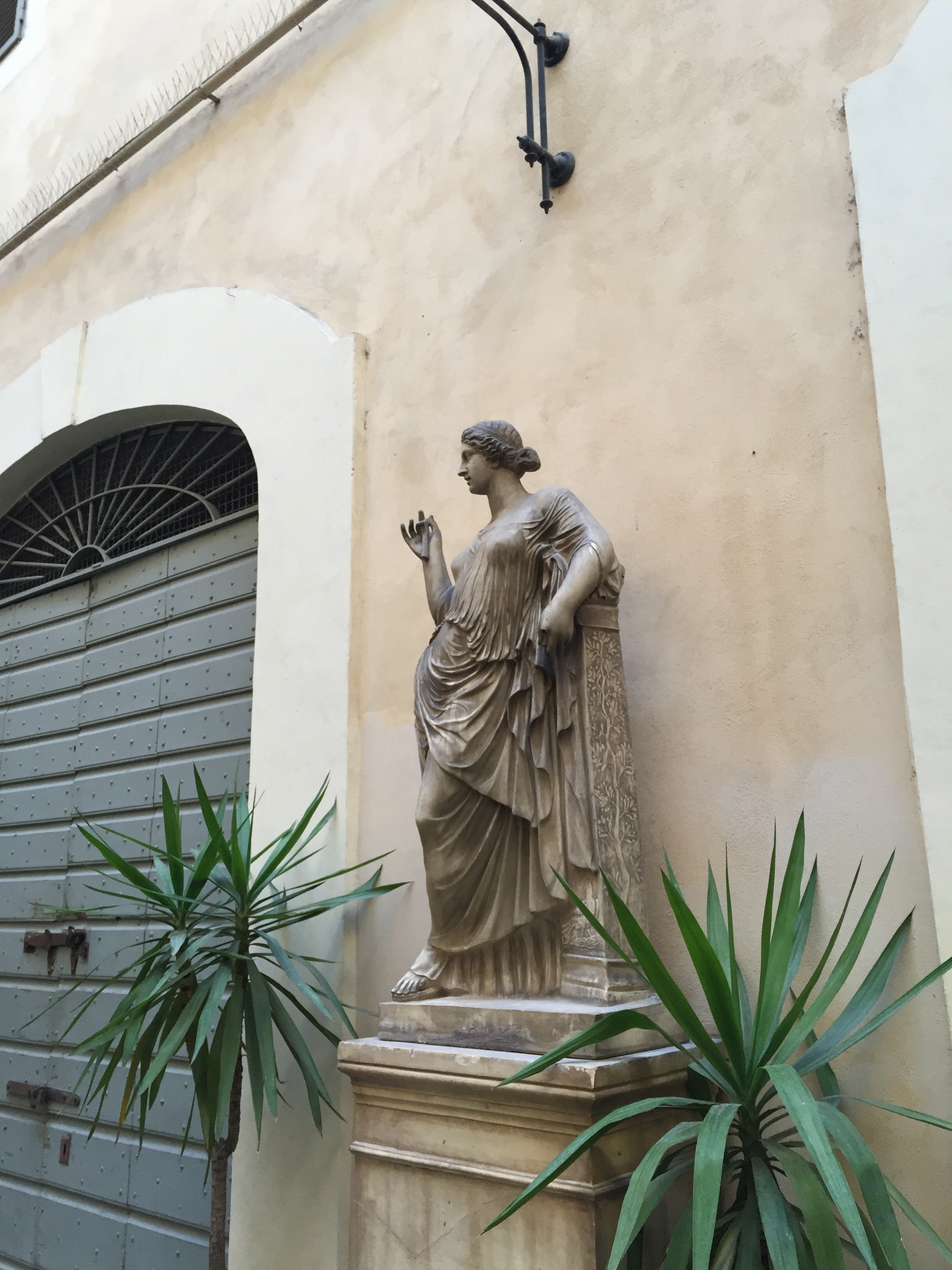 Overall, I'm very happy with how the apartment turned out. A huge, "Grazie" to my client and their team. I cannot tell you the amount of WhatsApps, SMS, emails, phone calls, job site visits, that were made. I truly appreciate their patience with my bizarre smash up of Italian and English. My client introduced me to my new Italian teacher. I got the hint. Heh.For more information about renting the Grand Suite, or other apartments from Your Suite Rome, click here.After photos and before of bedroom 1: Vincenzo TambascoOther photos: Me and my iPhone
Work in Progress - My Foyer
As I mentioned in an earlier post, I have lived with white walls for decades. The last time I had any color on the walls was when my parents let me pick the color for my bedroom back in high school.During my apartment search, I knew I wanted a place with a foyer/ingresso. Even my super tiny apartment on Via Pellegrino had one. Both of my apartments in Los Angeles, which were much larger, did not. Drove me nuts. You opened the door and walked right into the living room. Of course this is fine for a loft apartment but I didn't live in a loft.Many people neglect their foyer. It becomes a place to dump keys, magazines, mail, etc., etc. The foyer is the preview for the rest of your home. It sets the atmosphere. What does it say as you enter?Depending on the size of your foyer, it could provide much needed storage space, a place to display artwork, and in a smaller one you could splurge (creatively and/or financially) on your favorite wallpaper.Painting an entrance way a darker color than the next room makes the second room seem much larger. Interior designer Miles Redd loves going from dark to light. I decided to be bold for a change and go for it. I went to the store Le Decorazioni to look at Farrow & Ball samples.I'm so happy with how the foyer turned out. I'm relieved my landlady (who lives in the same building) loved it. I thought she might be offended since she'd just painted the apartment. Instead she asked me to send me a link to the Farrow & Ball website.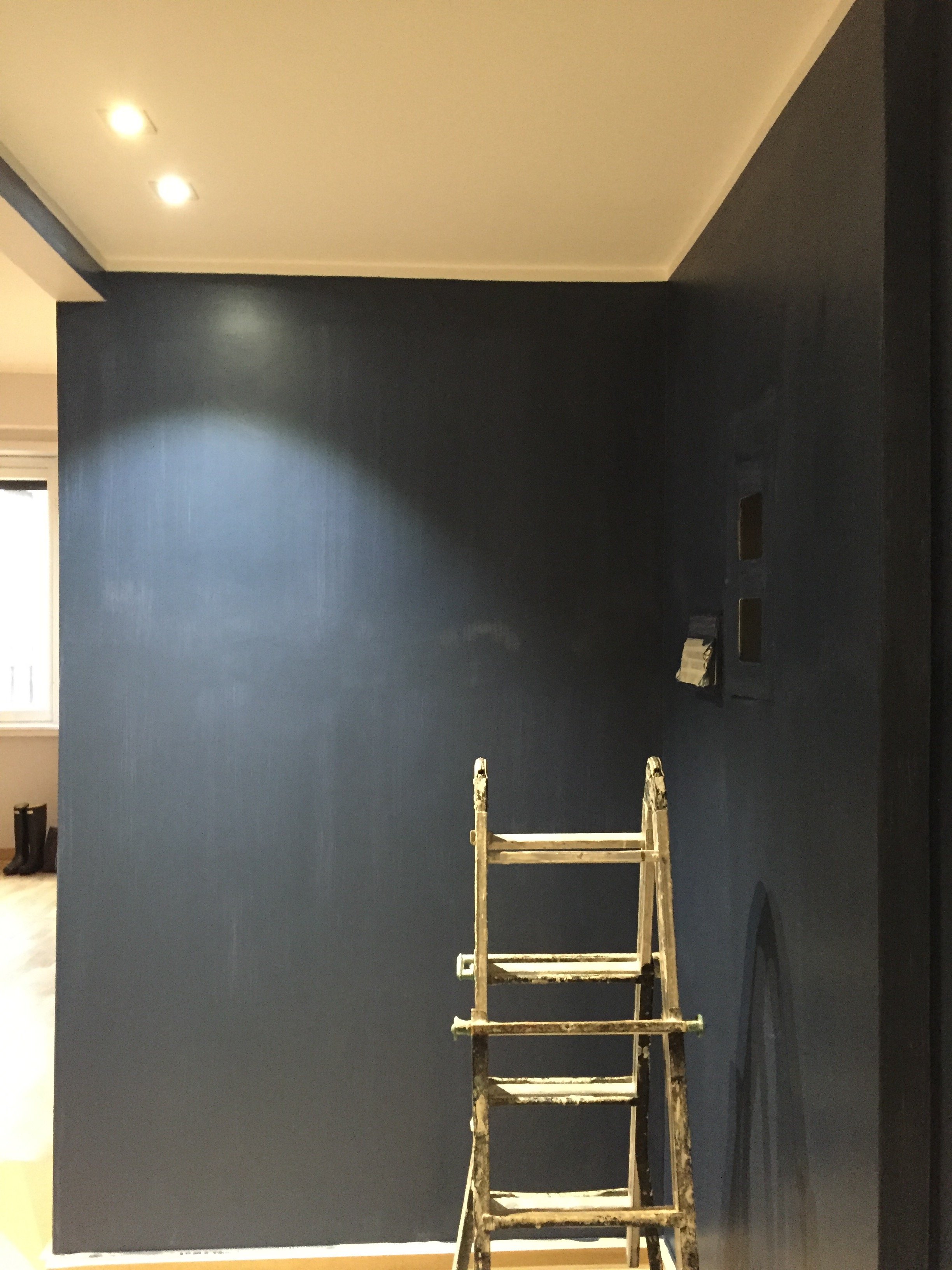 I was thinking of going with Hague Blue but in the end Stiffkey was best with the light grey in the living room. Stiffkey looks great when the lights are on and in natural light it reminds me of late summer nights in Sicily or sitting on my parents' veranda at dusk in St. Martin.When I first saw the apartment the owner told me the bookcase/cabinet in the hallway had to stay. I understood why for practical reasons. The fact that it wasn't flush with the wall bothered me aesthetically.
 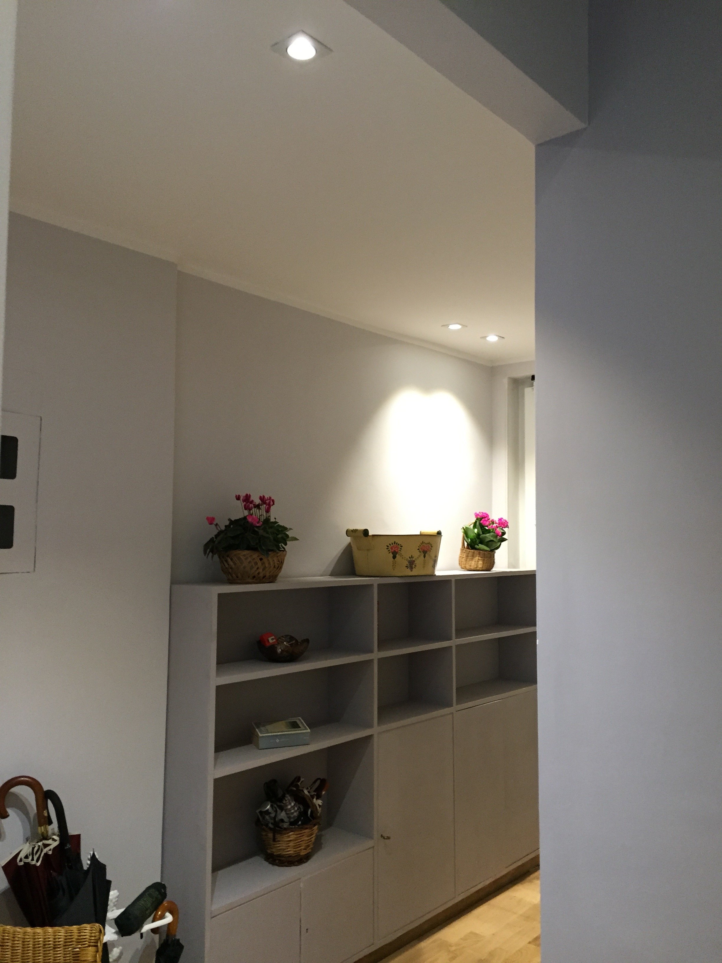 What a difference some high-quality paint makes. The painters and I couldn't believe how this big piece of furniture blends in a little more and looks more expensive than it is.
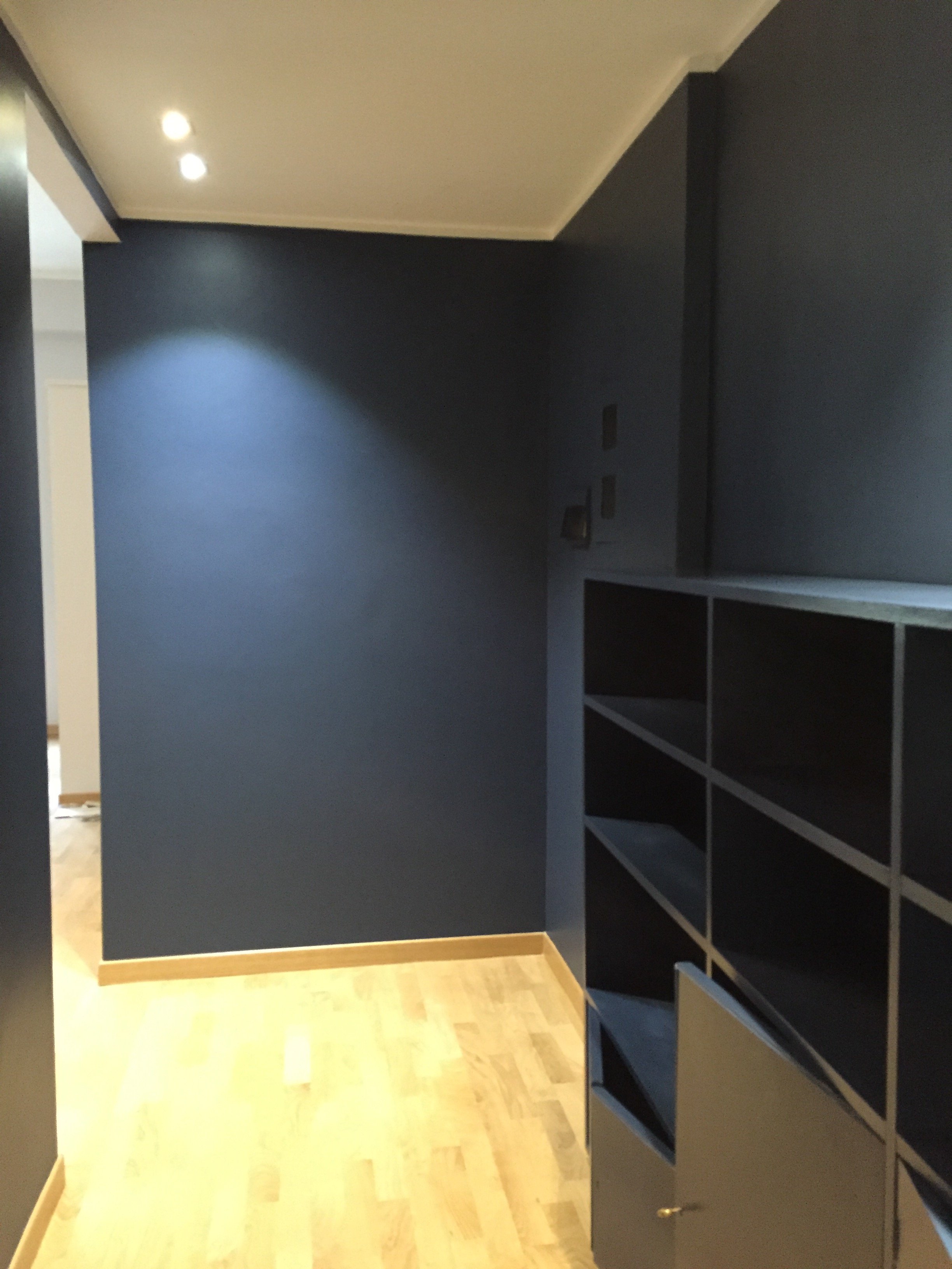 I'm going to meet with my blacksmith to design a simple bench. Above the bench I will hang some black and white photographs.I don't know when that will happen. I tell clients all the time that it's better to take our time while decorating. Perhaps I should listen to my own advice.Photos: Me and my iPhone
Reading, Writing, And Decorating.
Mamma mia, what a week. It's been non-stop since the Italian holiday season officially ended last Sunday with the Befana.There was a lot of running around picking out fabrics, butchering the Italian language when I met with the drapes/sofa maker, writing budgets, and following up on a million things that were put on hold before the holidays.My siblings and in-laws asked me what I wanted for Christmas. I have a bunch of design books on my wish list. The first batch of the books arrived last week (thanks fam!). I cannot wait to dig in. Now I just have to find the time to sit back with a ice-filled glass of Coke, some San Carlo Rustica chips and start reading.

