White Kitchens - Yes or No?
Put me firmly in the YES camp. I'm the middle of sourcing cabinets for our Anguilla Beach House Project. As I read various online design magazines and blogs, it appears that white kitchens are "out". People are sick of them. Apparently, they are boring and show no creativity.
I disagree. I strongly believe that kitchens and bathrooms are not the places to be trendy. They are the most expensive rooms to build or renovate. Twenty-four percent of Americans move to a new house every five years. In other countries people tend not to move as often. If one is worried about the resale value of their home, it would make sense to have a kitchen that is not dated.
A well-designed white kitchen is timeless. This is one reason they're so popular. One cannot tell if the kitchen was renovated five months ago or fifteen years ago. A homeowner can always swap out hardware or light fixtures to freshen things up or we can use accessories that speak to the trends of the moment. Most people cannot afford (nor want to) gut a functional kitchen just for aesthetic reasons.
White kitchens are not a trend given they've been "in" for almost two decades and were very popular in the 1920s. They are classic. Seriously, what are people smoking? I think, with the rise of social media, we're burning through trends faster. There's this need for instant gratification and always looking for something new. The thing is, most of the hot trends of today will not hold up.
To me it's more important that a workhorse room, like a kitchen, functions well. Open shelving may not be practical for some families. Maybe your kitchen isn't big enough for a massive island.
If a client wants to go with dark green cabinets, I'm all for it and we'll look for the shade that works best in the space. However, if a client wants white Shaker cabinets but worries it's too boring, we're going to get the darn Shaker cabinets. We can find other ways to add some color to the kitchen.
Content driven decorators rarely think about the architecture and/or the function of the space. Many have moved away from working with clients and instead continuously buy and flip houses. That's a very different mindset than creating a home for yourself or for a client.
As I work on this beach house kitchen, I'm mindful of the trends but we will have white Shaker cabinets as they fit the space, the location, and the architecture of the home. If the house were inland or a primary residence maybe we would chose a different color.
Here are some kitchens from talented designers and decorators. Notice that they don't look the same. I wish someone would tell them that these kitchens are boring or "so over".
This kitchen is in a 1922 Colonial that was recently renovated by interior designer, David Nastasi.
Photo: New York Magazine
Modern Farmhouse by House of Jade Interiors.
Photo. The Spruce
A villa in Tuscany designed by Ilaria Miani. The estate belonged to her grandparents and is now owned by her brother. I was one of her interns and I remember her custom Whatnot shelving well.
Photo: Elle Decor
Interior designer's Mark D. Sikes's kitchen in the Hollywood Hills.
Photo: Mark D. Sikes
A minimalist NYC kitchen. Love the terrazzo floor. Interior Design by Pierce Allen.
Photo: Elle Decor
September!
I hope everyone had a wonderful summer.Yes, I know technically it's still summer despite the fact that some retailers in the States are already selling Spiced Pumpkin Latte mixes and there are bloggers talking about Halloween.
I don't understand this rush. Let's enjoy this month and getting ready for fall. This is my favorite time of year/season. Not that I dislike the other three (well maybe winter, lack of sun and daylight is not my scene) but there's something about fall that makes me happy. I was one of those geeky kids who couldn't wait to buy back-to-school supplies. In my young mind there weren't many things more exciting that a Mead Trapper Keeper notebook.
Unfortunately, back-to-school shopping for clothes wasn't as fun as my Caribbean mom was not about that life. Every time I asked for something that EVERYONE was wearing, my mom would say that I was going to school to get an education, not for a fashion show. My dad backed her up as he didn't know (or care) about the difference between Girbaud, or Guess, jeans and a random pair from wherever.
I still look at fall as a beginning even though I graduated from college back in the Stone Age. Like spring, it's an opportunity to hit the reset button.
One of the color trends for Fall 2018 is this deep blue called Sargasso Sea.
Photo: Pantone
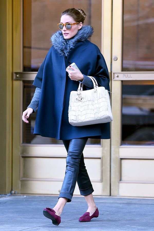
I’m feeling this cape but I might be too short for this lewk. Love the pop of color from Ms. Palermo’s shoes. Great combo.
Photo: Olivia Palermo, Refinery 29
This classic pattern from Schumacher is an excellent example of Hollywood Regency glamour.
There are so many beautiful colors to choose from but this one is in my top three, okay five.
Photo: Le Creuset
I cannot write about September without listening to this old school favorite. It dropped in 1978 and if you play it at any wedding reception, party, or cookout now people will still dance.
Here's to a great fall!
p.s. Here's a fantastic piece from NPR regarding why this song is so popular years later.
I asked Jeffrey Peretz, a professor of music theory at New York University's Clive Davis Institute, what makes that groove so powerful. He says a lot of it has to do with how the music unfolds. The song's very structure is an endless cycle that keeps us dancing and wanting more."
There's four chords in the chorus that just keep moving forward and never seem to land anywhere — much like the four seasons," he says. "It's the end of summer, it's the beginning of fall, it's that Indian summertime, it's the transition from warm to cool."
The trigger for that yearning feeling, Peretz says, is the opening line. White asks, "Do you remember?" and we supply the memories. It's a song that can bring all of the generations together, which makes it perfect for family gatherings. The true meaning is up to us — including, Allee Willis says, that strangely specific date."
We went through all the dates: 'Do you remember the first, the second, the third, the fourth ... ' and the one that just felt the best was the 21st," Willis explains. "I constantly have people coming up to me and they get so excited to know what the significance was. And there is no significance beyond it just sang better than any of the other dates. So ... sorry!"
The Design Files - A Beautiful Colonial Renovation
I published a post earlier this year regarding how traditional interiors are “in” again. I don’t think they were ever out but I’m thrilled to see color and patterns celebrated again.
I recently read about this gorgeous renovation in New York Magazine. I enjoyed The Cut Wendy Goodman’s interesting and informative interview with Interior Designer David Nastasi and his husband Michael Stone.
The couple bought the 1922 Colonial in 2014 and started the renovations a year later. It was a lot of work as the house hadn’t been touched for decades. It was important to the new owners to keep the elegant architecture of the house while updating it for the way we live today.
It’s a stunner.
Can we talk about this entrance?! I’m not the biggest Fornasetti fan. I like it in small doses BUT their Nuvolette wallpaper from Cole & Son? Cannot get enough of it. Cannot. This is a bold choice for a traditional home. I love it.
More wallpaper to love in the dining room. It’s from the Spanish brand, Gaston y Daniela.
I’m writing a separate post about white kitchens. There is nothing dated about this one. All these windows. The mix of modern and traditional. This is a kitchen I could spend hours in.
To seem more of this wonderful renovation, the article is HERE.
Photographs by Genevieve Garruppo
Design Inspiration - Palazzo Reale, Naples, Italy
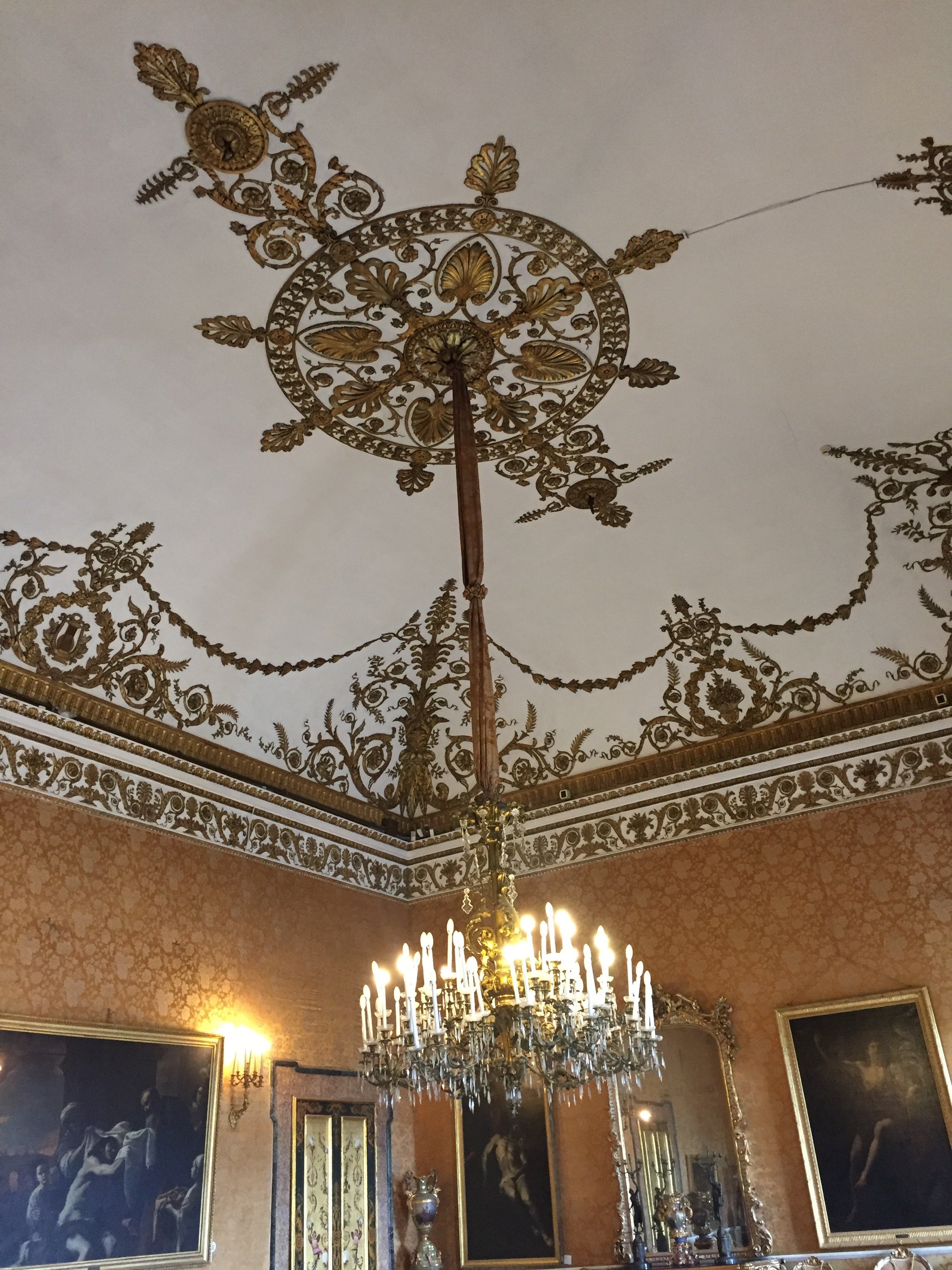
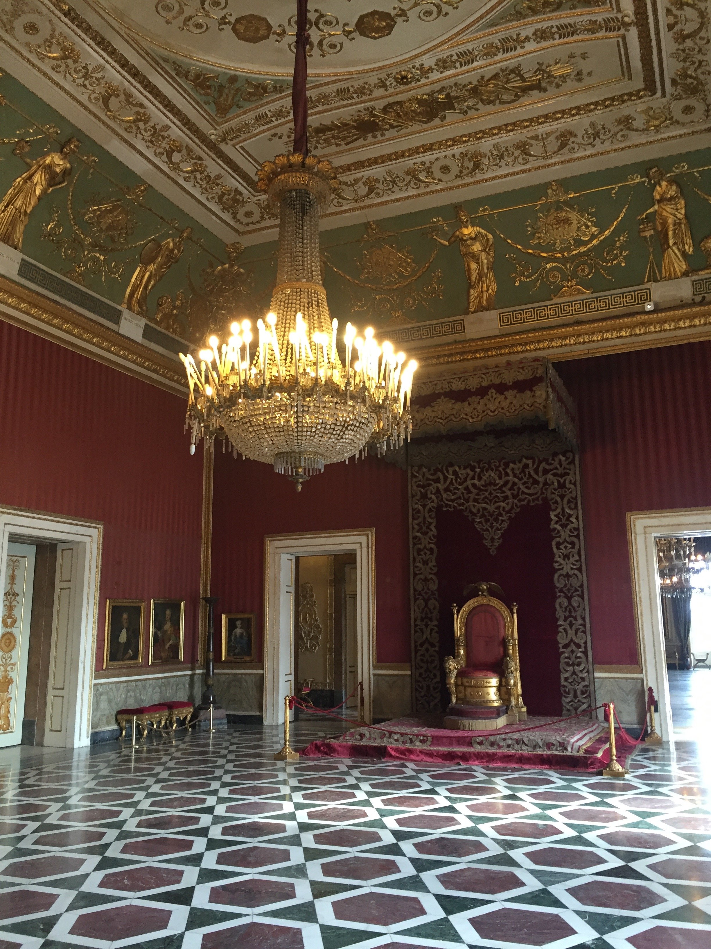
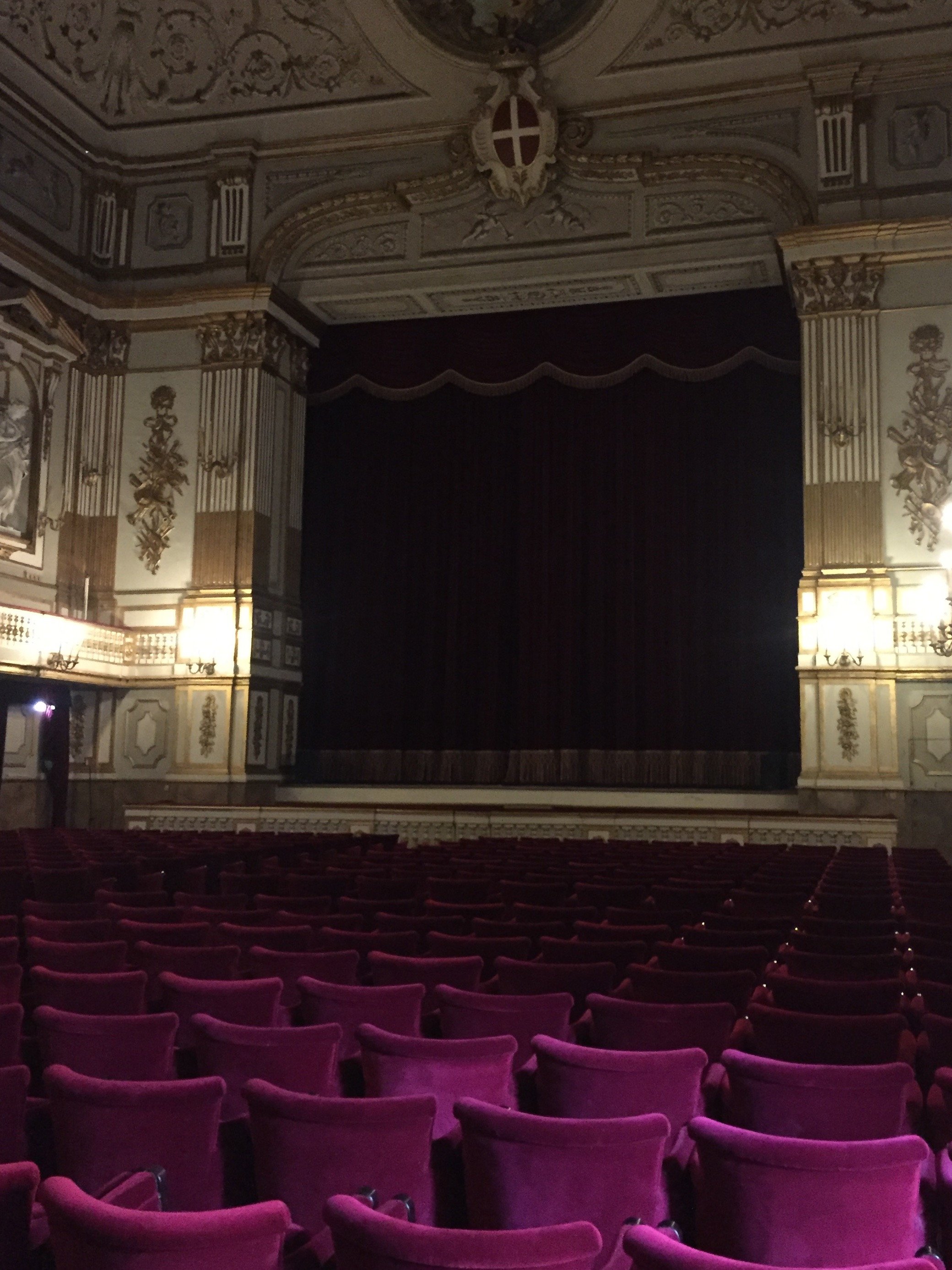
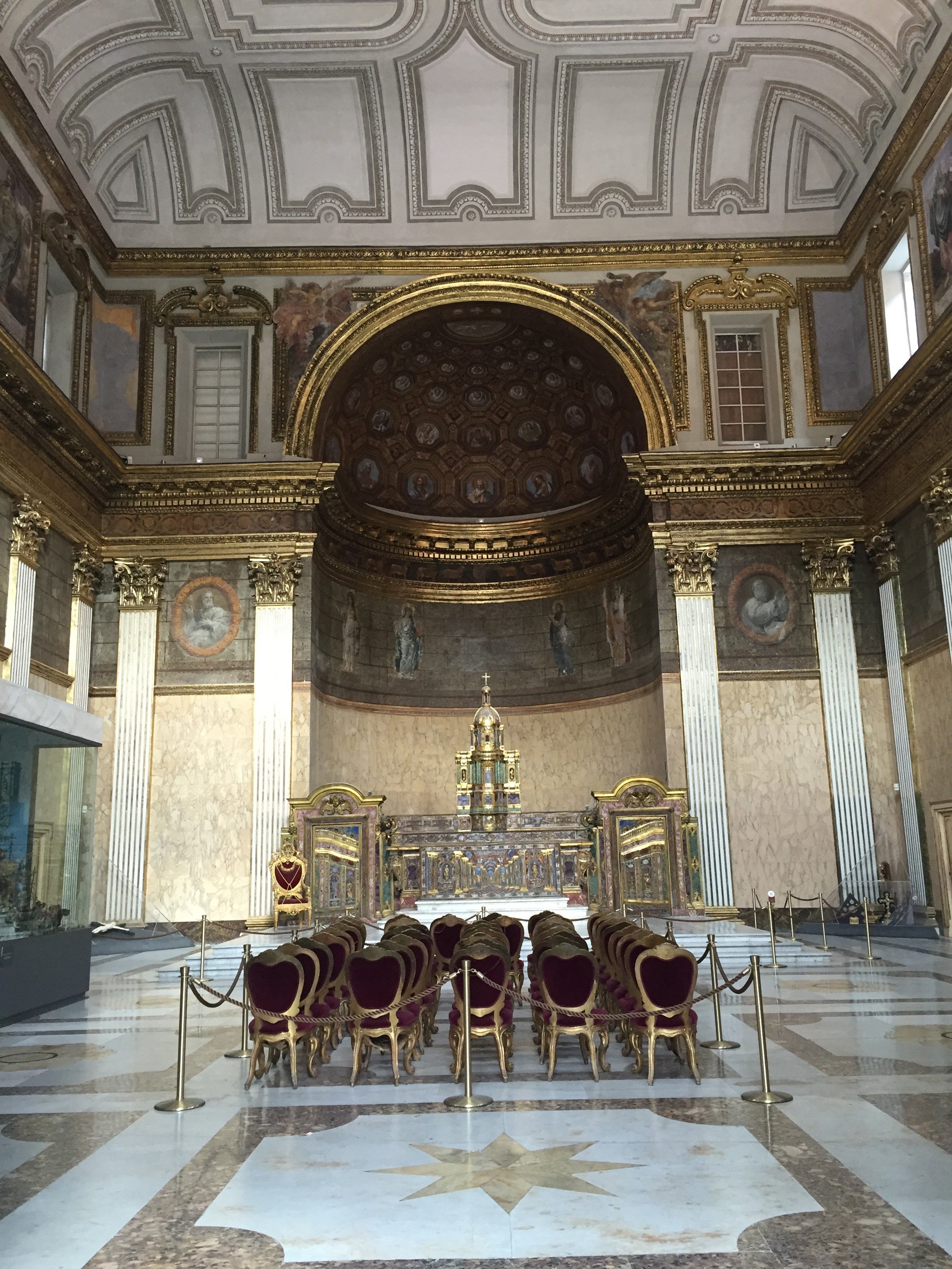
The Royal Palace of Naples is a must on my list of things to do in Naples. I wasn't able to visit until my third trip and now I want to return just so I could spend more time there.The audio tour is interesting and informative. Palazzo Reale is one of four royal palaces in and near Naples. Construction, with prominent architect Domenico Fontana, started in the 17th century by the Spanish Viceroys initially as a home to host the visiting King of Spain. He never came (so rude!) and the palace eventually became the home of various rulers, including the Bourbons and the Savoys. The Kingdom of Naples was fought over by the French and Spain for centuries. At times the Kingdom included most of southern Italy, and Sicily.The Palace was expanded over the years. Napoleon's sister, Caroline, lived in the Palace with her husband Joachim Murat (aka the Dandy King) who was the King from 1808-1815.The building suffered extensive damage from bombing during WWII but was restored.Below is the main staircase. It was very cloudy and overcast when I arrived. I still gasped when I walked in and saw this space. Pictures do not do it justice.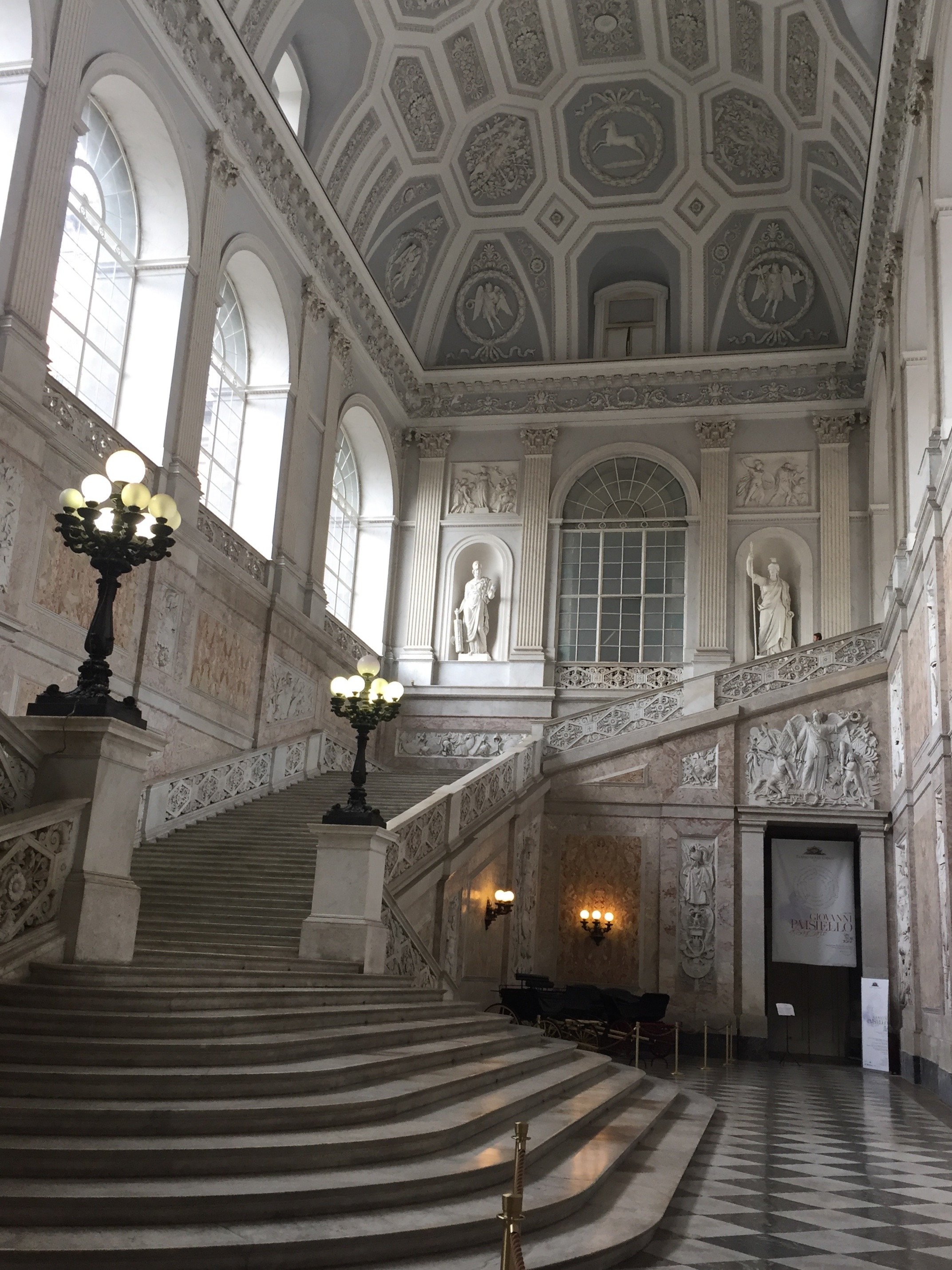 View from the top of the stairs.
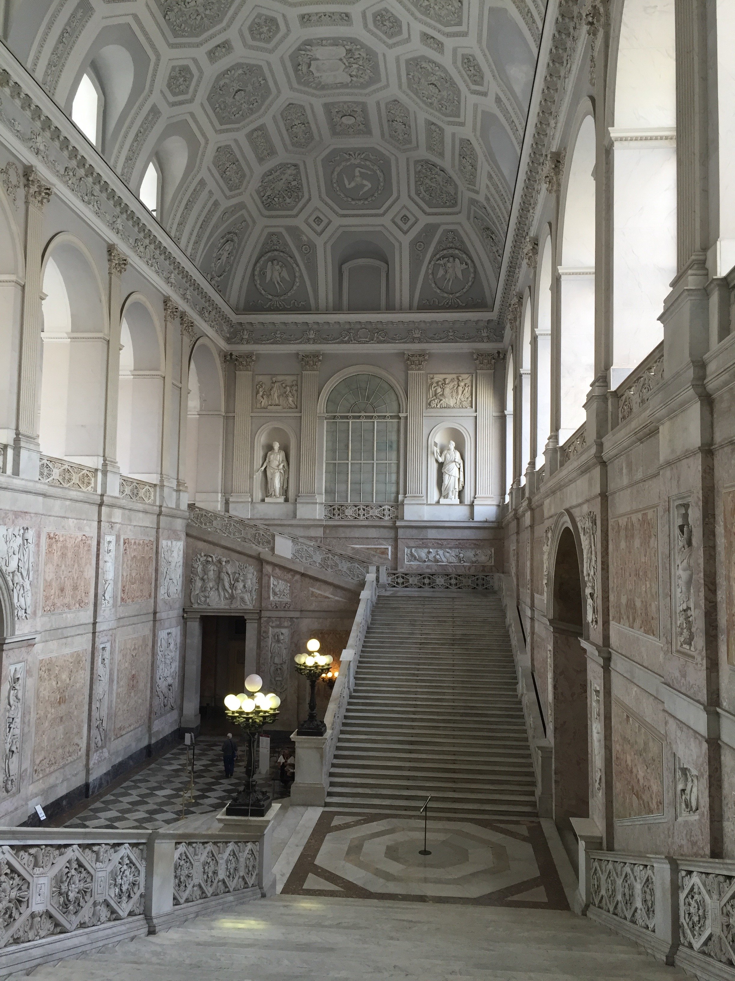 This ceiling is unreal.
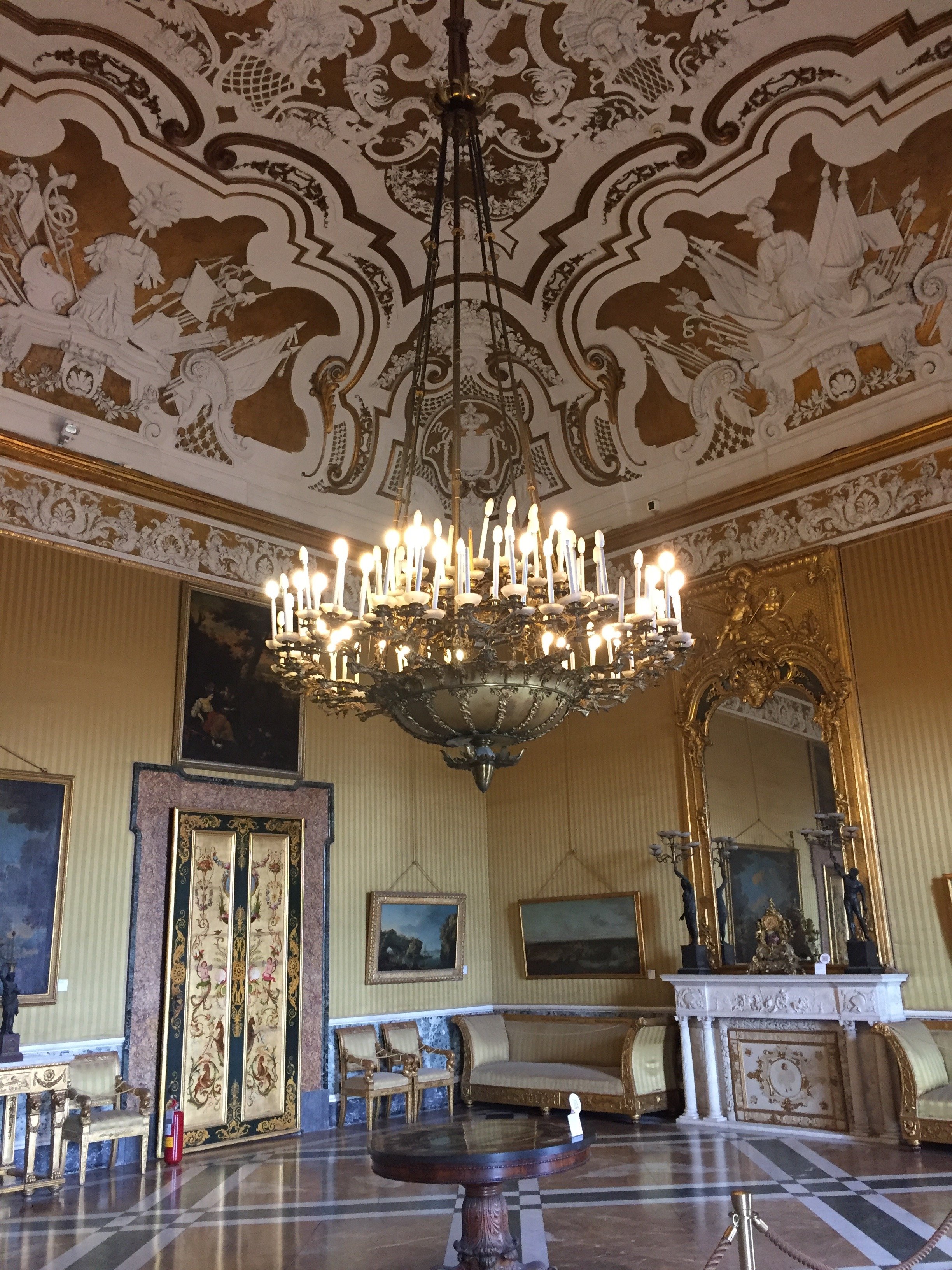 Close up of another ceiling. Gorgeous.
 This floor tho.
 How nice to have your own theatre.
 And your own chapel.
 A less ornate space. Love the simplicity of this light fixture.
 Love this ceiling too. I chuckle when I hear the color grey is too trendy so now it needs to be over. I disagree. It's a classic.
 The ballroom.
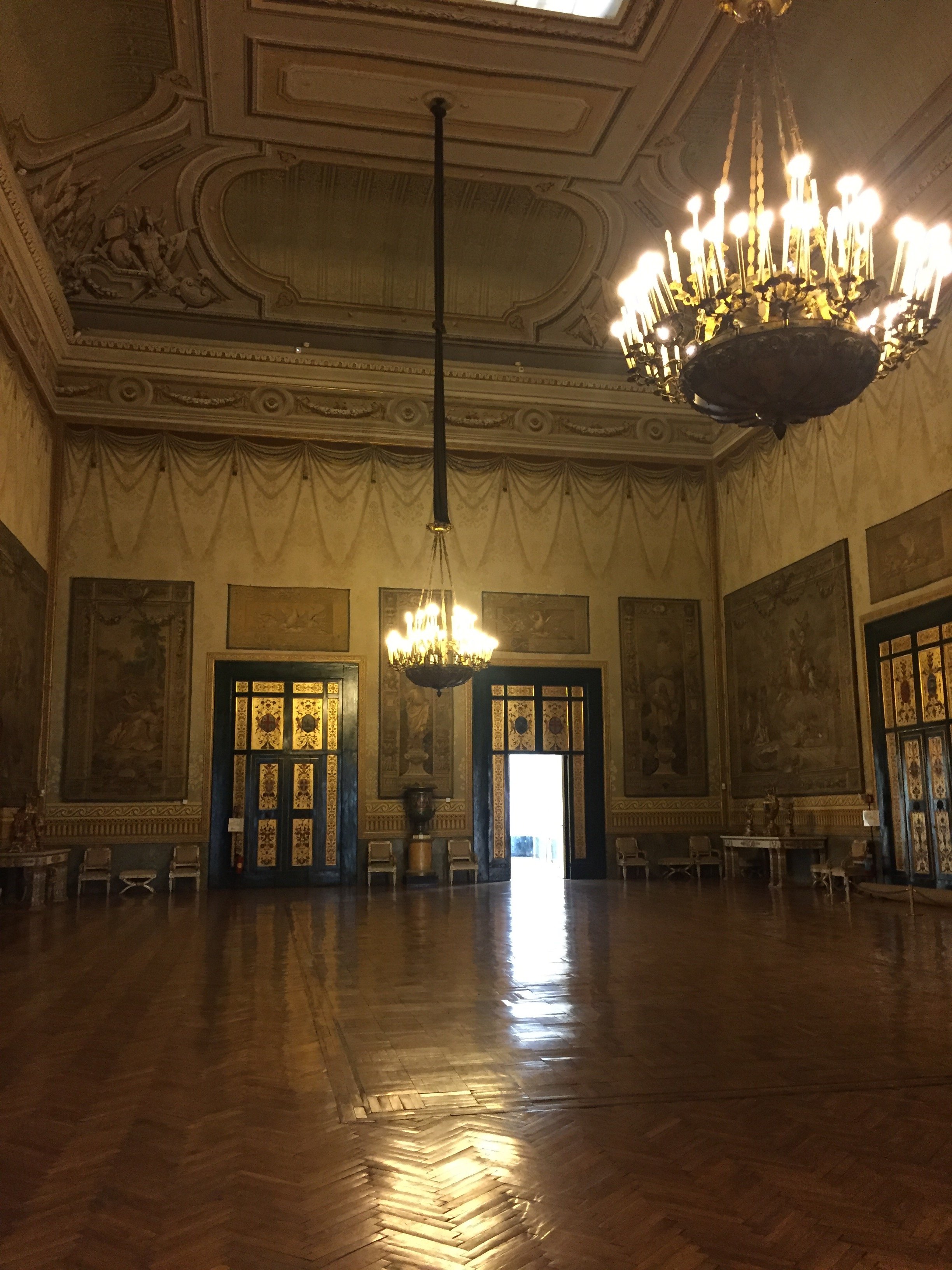 It was starting to clear up as I walked out. There's a view of the sea from several of the rooms but it was hard to get a photo without the scaffolding. The gardens are not public but there is an interior courtyard with a fountain.
 Photos: me and my iPhone
Decorating 101 for the Suddenly Single
Breakups are stressful. Moving is stressful. Moving after a breakup? We're talking stress squared.Anika Jackson, VP at Real Beauty Real Women, asked me to write a decorating post with some tips on how to make the transition a bit smoother.To read the rest of the post, click HERE.


