
My Ciao Bella interview with JJ Martin, founder of La Double J

Buongiorno a tutti!
Erica Firpo's Ciao Bella has published my interview with JJ Martin. Yes, it's true I rave about her and her brand often but I know first hand how difficult it is to be an entrepreneur in Italy. What JJ has created is incredible.
It was truly a pleasure to sit down with this very talented and dynamic woman to discuss interior design, creativity, and living in Italy.
To The Max: Designing Milan’s La Double J Store
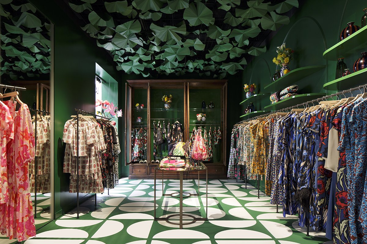
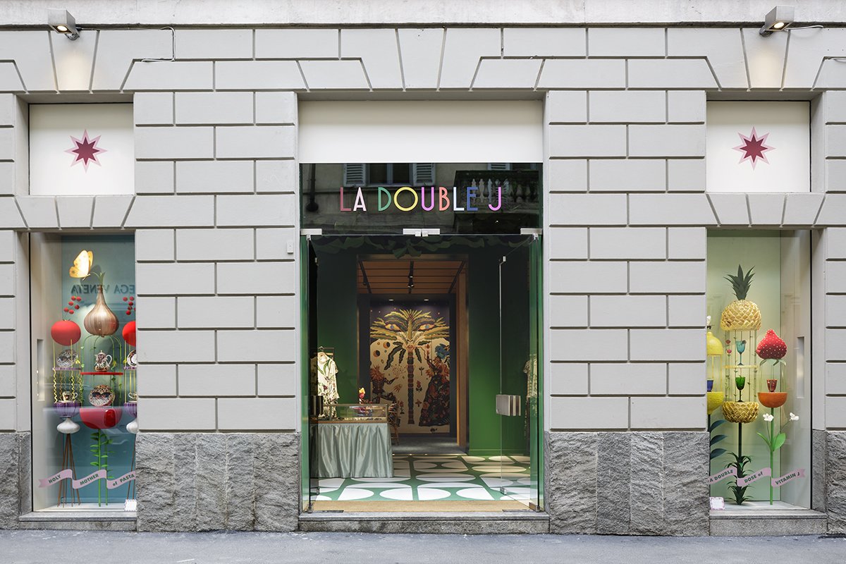
Brick and mortar maximalism
When I read LaDoubleJ (those fabulous maximalist dresses from JJ Martin, Patron Saint of Patterns) was going to open its first retail shop, I couldn’t wait to see its interiors, not just because I’m a decorator but also as a fan of JJ Martin’s colorful brand. As luck and business would have it, I had to travel to Milan to meet with a new client. And Erica, knowing that visiting the new La Double J store was a “must” on my list, asked me if I could write about the store. JJ was gracious to carve out some time in her busy schedule to sit down with Ciao Bella to discuss the design of her new store and her brand.
Arlene Gibbs: First question. What inspired you to open an actual store, brick and mortar, at this moment when all we hear is that retail is dead. It’s all about e-commerce. No one goes to stores anymore.
JJ Martin: Well, we started as a direct to consumer business and an online business so I totally agree with that. I don’t think it makes sense at all, these brands that were built on brick and mortar with three hundred shops around the world. It doesn’t feel relevant anymore, especially these cookie cutter shops that all look the same. When you scan these streets, you can’t even tell the difference. They all have white walls, really bright light, chrome or gold finishes.
AG: You could be on Rodeo Drive.
JJ: You could be anywhere. So, a huge network of stores was never my vision nor will it be. However, we stared in this little showroom in Milan that was our showroom, our atelier, our office, our workroom, everything, and we were also selling clothes at the very beginning from there. It literally did like five things. What we kept hearing from people all the time was, “don’t you have a place we could try on more clothes?”
To read the rest of the interview, click HERE.
Photos courtesy of La Double J.
Chatting with Ciao Bella!

I know I'm late to the game but I've just recorded my first podcast interview. I have mentioned my friend Erica Firpo's podcast CIAO BELLA on social media before. It's fantastic and I'm not saying that because she's a close friend.
This description of Ciao Bella sums it up perfectly.
"Italy's 21st-century creators - contemporary artists and artisans, heritage brands and innovative aesthetes, chefs, experts and more who are defining, redefining and evolving Italy.
Fashion. Food. Art. Travel. Design. Innovation. Tradition. And more. Cocktail conversations and behind-the-scenes visits that will make you want to pack your bags and go!"
I'm thrilled to be in the company of other Italy based creatives and to discuss what it is we love (and sometimes don't love so much) about this country.
In this episode we talked about working in Italy, interior design, Reno Italiano, and the beach house project I recently finished in Anguilla, BWI.
Erica and I met at Ciampini Caffe, one of our favourites places in Rome. Of course while we were there, construction started on an apartment above us.

The Most Beautiful Private Terrace in Rome *
Last week my friend Livia invited me to an intimate lunch at the lovely home of Marchesa Violante Guerrieri Gonzaga.

This view.

Livia getting her Prosecco on.
Violante is one of the most down to earth Marchese I’ve ever met. Hello, I’ve met people who are Kings and Queens of nothing and yet, as the kids would say, they had a stank attitude. Violante welcomed us into her family’s home with graciousness and warmth. She’s a very talented chef, artist, painter, and photographer. Violante founded Vio’s Cooking after attending the Accademia di Belle Arti in Rome and culinary school.
The lunch Violante prepared was delicious. The award-winning wine, San Leonardo, came from her family’s vineyard located in Northern Italy near Lake Garda. The floral arrangements by Alessandro Cambi were gorgeous. I enjoyed seeing a few of my friends and meeting people in person that I’ve previously “met” only on Instagram.

Violante did all the decorative painting in this room.

Check out Alessandro’s IG. Love his work.

Violante went to her local market in Campo dei Fiori for the ingredients.
As a decorator I completely lost it (but in a calm and kept it to myself way) over the interior design. So much inspiration. It felt like a real home, collected and personal. The anthesis of the cookie-cutter interiors that are clogging up Pinterest and Instagram.

Bullion fringe is making a big comeback in the States. This view. I cannot.
Violante’s home is located in one of the most historic palaces in Rome, Palazzo Taverna. Built in the 15th century, the palazzo is in the heart of the Centro Storico. I walked by it often when I lived on Via del Pellegrino and was curious about the 17th century fountain in the courtyard, which is visible from the street. This was the second time I’ve been to the palazzo but the first time during the day. Once you’re inside you don’t feel as if you’re in large city. It’s quiet. All you hear is the fountain.

We ate inside as it had been raining all week and that morning. We lucked out with the weather.
We stopped by Violante’s boutique after coffee.

Caffe realness.
It’s located on the ground floor of the palazzo. I have my eye on these blue and green glasses.

The shop is charming. They sell tableware designed by Violante and delicacies from her family’s estate, among other gorgeous items. The holidays are coming up and this boutique has wonderful, unique gifts.

Speaking of gifts, each of us were given a copy of Violante’s cookbook. It was presented in gift bag tied with a pretty green ribbon. The color was similar to the color of the plates that we used during the luncheon. It’s a simple thing but I appreciate that level of attention to detail.

Plate designed by Violante.

Love the mix of glassware and the floral arrangement.

Sitting on the upper terrace overwhelmed by all the beauty. Photo by Cassandra of Travel Italian Style.


BANANAS!
Violante offers small cooking classes in her home and also caters events. For more information about her cooking, or her shop, please visit her website at Vio’s Cooking.
*True, I haven’t been to every single terrace in Rome, but I feel comfortable with this terrace being in the top ten.
The Design Files - Beautiful Plates from Pastificio Gentile
Recently I was in Umbria at my friend’s Elizabeth and Domenico’s house and I posted this photo on Instagram.

This view, tho!
Quite a few people DM’d, or emailed, me to ask where the plates were from.
I remembered Elizabeth’s Instastories from when she visited Pastificio Gentile and seeing the plates. This family owned company has been making pasta since 1876. Elizabeth wrote this post using their pasta to make two zucchini recipes.
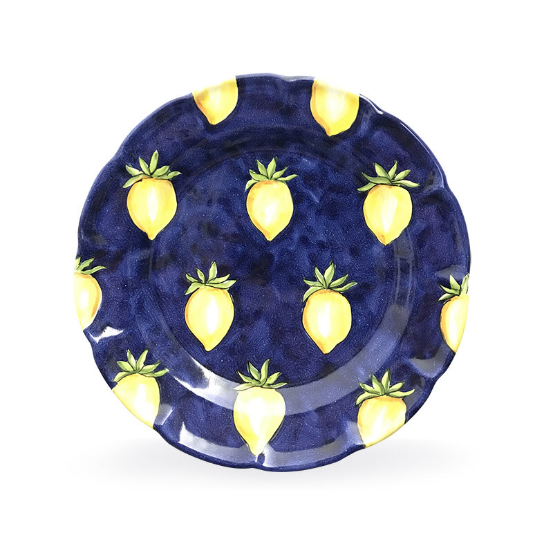
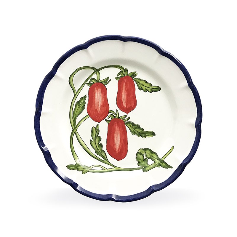
Pasitifico Gentile also sells exclusive handcrafted plates painted by artist Rosalinda Acampora. I thought the blue and yellow ones were lemons at first. They’re yellow tomatoes (and on my wish list). Wait, all of these are on my list!


I’ve read that bloggers have ruined Chevron forever but I don’t care. This plate is fantastic.

Click here to see the rest of their selection.
Elizabeth’s new book, THE ITALIAN TABLE, will be released Spring 2019. I cannot wait to read it.
This is her table setting for a simple lunch. It was beautiful and delicious. I love how Elizabeth mixed patterns. The key is the color palette.

Table photos: Me and my iPhone
Plate photos: Pastificio Gentile

The Design Files - A Beautiful Colonial Renovation
I published a post earlier this year regarding how traditional interiors are “in” again. I don’t think they were ever out but I’m thrilled to see color and patterns celebrated again.
I recently read about this gorgeous renovation in New York Magazine. I enjoyed The Cut Wendy Goodman’s interesting and informative interview with Interior Designer David Nastasi and his husband Michael Stone.
The couple bought the 1922 Colonial in 2014 and started the renovations a year later. It was a lot of work as the house hadn’t been touched for decades. It was important to the new owners to keep the elegant architecture of the house while updating it for the way we live today.
It’s a stunner.
Can we talk about this entrance?! I’m not the biggest Fornasetti fan. I like it in small doses BUT their Nuvolette wallpaper from Cole & Son? Cannot get enough of it. Cannot. This is a bold choice for a traditional home. I love it.

More wallpaper to love in the dining room. It’s from the Spanish brand, Gaston y Daniela.

I’m writing a separate post about white kitchens. There is nothing dated about this one. All these windows. The mix of modern and traditional. This is a kitchen I could spend hours in.

To seem more of this wonderful renovation, the article is HERE.
Photographs by Genevieve Garruppo
The Design Files - Ristorante Local, Venice
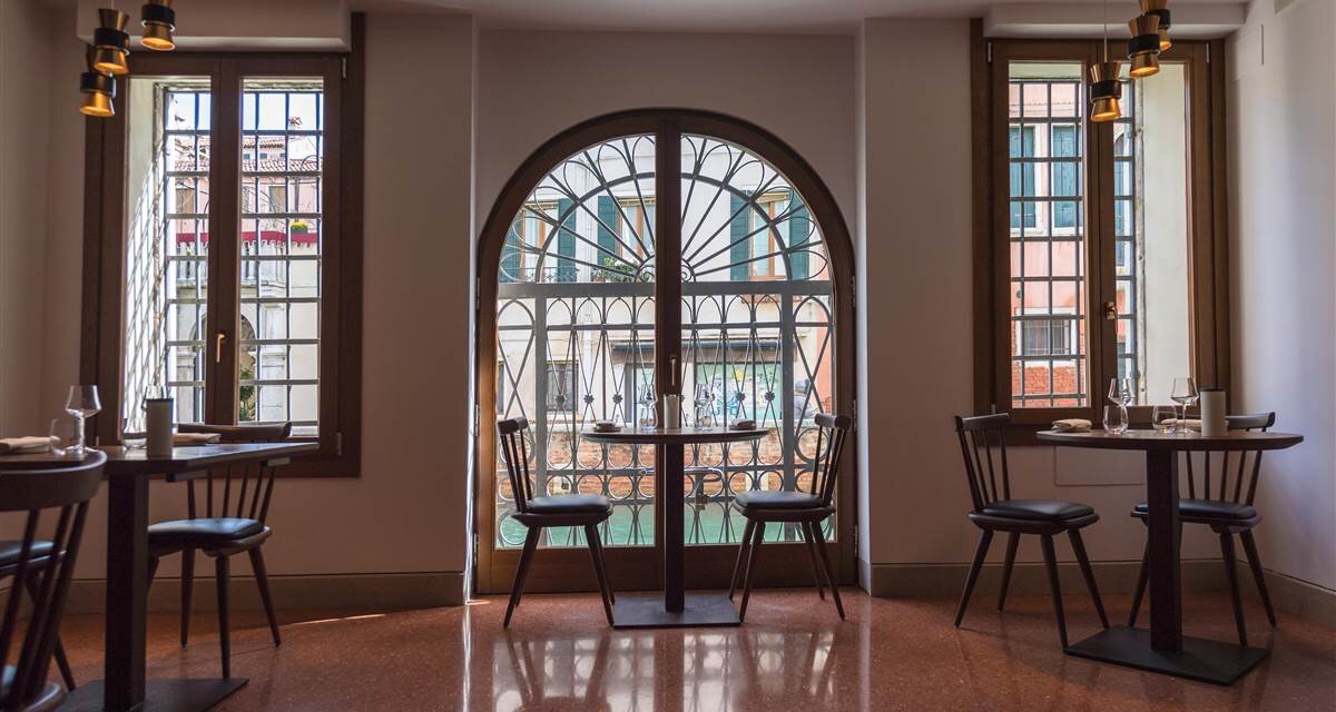
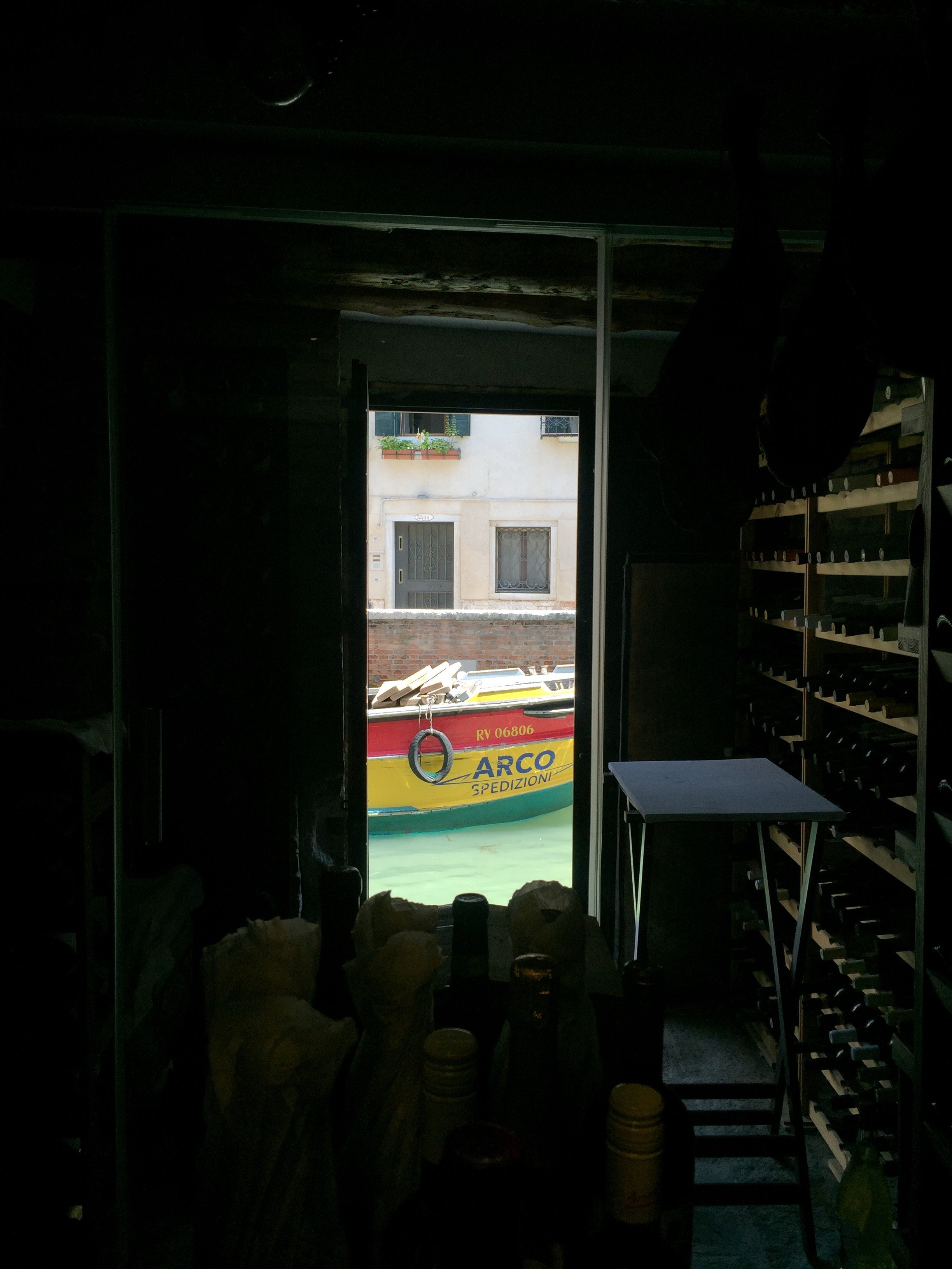
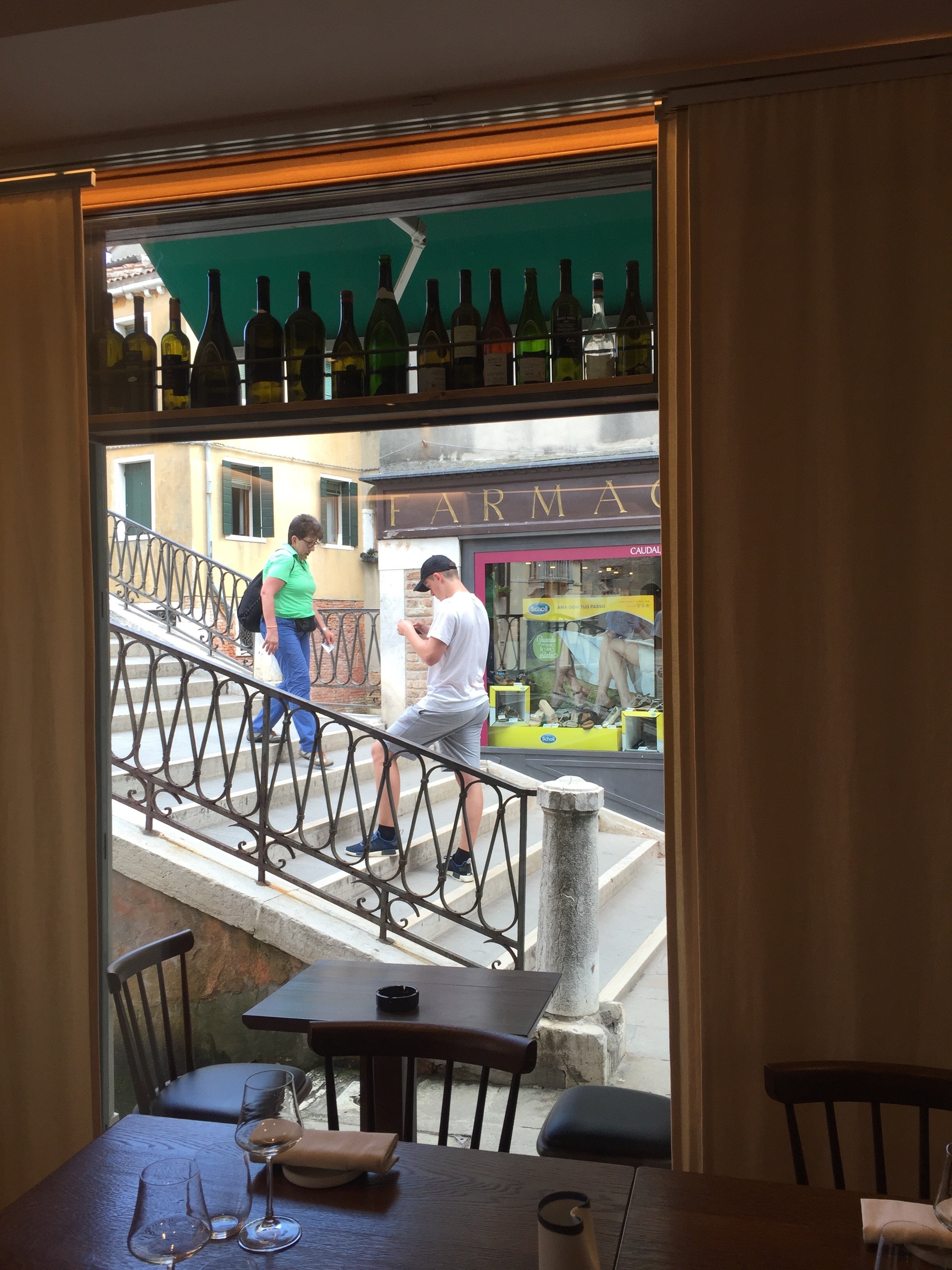
Yes, it's true that Venice has many tourist trap restaurants. Tourist traps don't care about the quality of their food (and love to over charge people) as it's a volume business, especially from the mega cruise ships. They will never see those tourists again and locals would never eat there.Do not let the bad press discourage you. There are fantastic places to eat in Venice! The restaurant Local is one of them. I'm not going to write about the food though (which was delicious) but about the interior design and overall vibe.The restaurant was opened in 2016 by brother and sister, Benedetta and Luca Fullin. The space used to be an electrical shop. It's located in the Castello neighborhood between Piazza San Marco and The Arsenale.The design like, the cuisine, is inspired by local traditional Venice but with a touch of modern international flavors.I spoke with Benedetta during our trip last month and she told they used local artisans to make, by hand, everything from the floors, to the dishes, to the lighting, etc.I absolutely love the Venetian Terrazzo floors.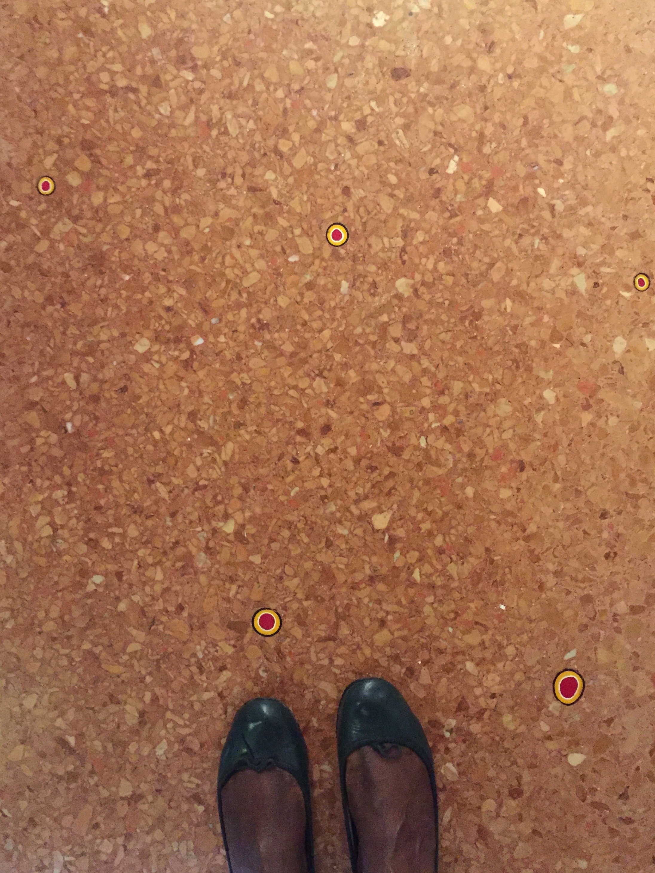 They were poured by hand and hold over five thousand murrine, which were handmade in Murano. The oak table, chairs, and wine cellar were made by Pasquini Marino.The open planned kitchen is inviting. It's not a cheap restaurant (our meals were included so checked prices online) but it's not stuffy either.
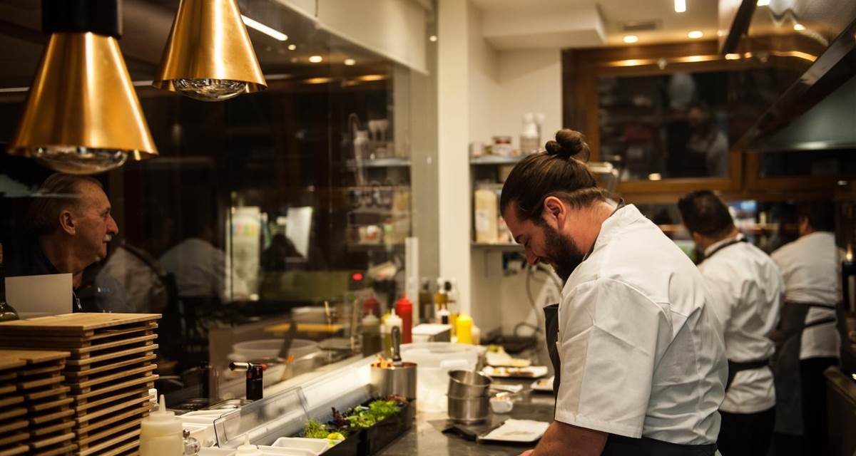 The restaurant sits on a side canal, light pours in.
 Local frequently showcases art, with a focus on emerging talent, from the Contini Art Gallery.It's not easy to find the right balance in a historic, popular tourist destination like Venice. Do you completely erase the past in order to stay current, or go in the opposite extreme? Local feels very much of its time and its location. I'm not a fan of eating in a restaurant that looks and feels generic. We eat with our eyes as well and the interior design and ambience of a restaurant shouldn't be overlooked. Living in Los Angeles, sometimes we had the reverse situation, gorgeous spaces that were very "in" but the food was indifferent to inedible.Twelve years had passed between my two trips to Venice. That's ridiculous. I'd like to return sooner rather than later. I look forward to returning to Local, grabbing a seat at the bar, and trying their cicchetti.

 First photo and the last two photos: Me and my iPhone. Other photos: Ristorante Local

The Design Files - Royal Wedding Dresses
You may have heard that there's a royal wedding this weekend in the U.K.I'm very curious about Meghan's wedding dress. Her style is classic. She wears the clothes, not the other way around. Meghan's not jumping on every random trend and clearly knows what works for her figure. The only look I didn't love was her dress for her official engagement photos. The dress was stunning but I wasn't sure why she was wearing it during a day shoot and Prince Harry's suit was too casual for the dress.Below are three royal wedding dresses that I adore. They all have beautiful silhouettes, the brides look comfortable, and the styles are not dated. I watched Princess Diana's wedding and remember even as a kid thinking her dress was (to reference one of my favorite movies of all time) too meringue. Perhaps it because she was younger than the bridges below, had a very sheltered life, and it was the early 80s. Princess Diana was drowning in her dress.Princess Grace was married in 1956 and this dress is still influencing wedding and formal dress designers. It was designed by Helen Rose who was a costume designer for MGM Studios. She designed two dresses, which were gifts from the studio to their star. Helen was the CD on four of Princess Grace's MGM movies.Gorgeous and timeless.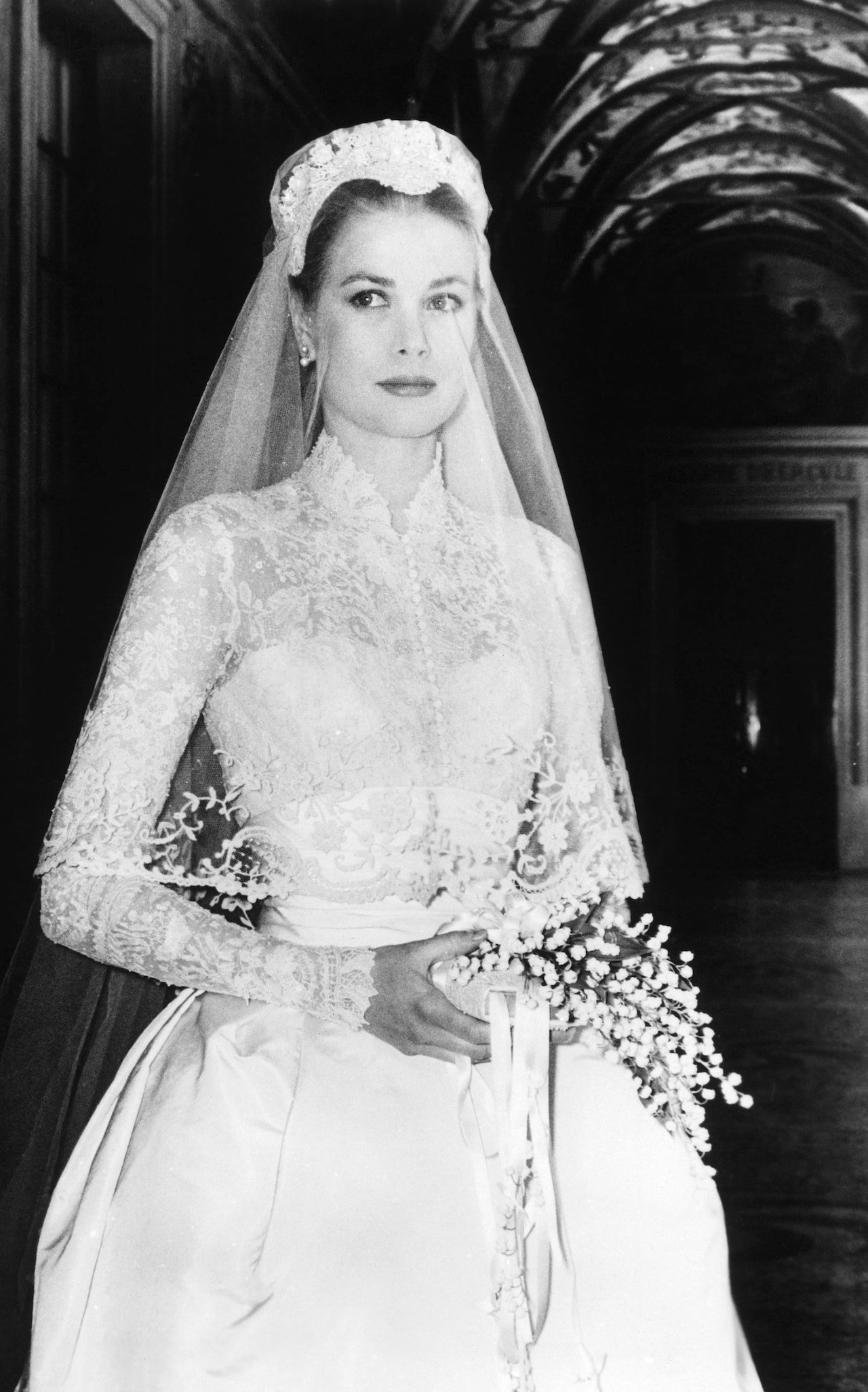 Princess Catherine 2011. Designed by Sarah Burton for Alexander McQueen. Sarah took over as Creative Director of the house in 2010 after McQueen's death. I don't know if it's rule that shoulders must covered for church wedding in the UK but this dress definitely helped bring back sleeves for wedding dresses.The sleeveless wedding dress had dominated for years. It didn't matter that the style was hard to pull off and not universally flattering. Bridal dress manufactures are happy to make this style because it's cheaper to make. Many American brides complained about the difficulty of finding wedding dresses with any kind of sleeve that wasn't dowdy and/or dated. That changed after 2011.This dress is modern and fresh.
 Princess Mabel 2004. The Princess married the late Dutch Prince Johan Frisco in a custom Viktor & Rolf dress. Instead of buttons, the fashion forward Dutch designers used bows. The cut on this dress is beyond. The bows add a bit of whimsy.The bride turned down their more conventional designs and asked for something memorable. It's unique without being a costume.
 [youtube https://www.youtube.com/watch?v=0VQMP8LYEV4&w=560&h=315]

The Design Files - Something's Gotta Give, Fifteen Years Later
I follow writer/director Nancy Meyers on Instagram. She recently published a post regarding the upcoming fifteenth anniversary of her film. I cannot believe it's been that long since the release of one of the best interior design films ever produced. Yes, I know the movie isn't about interior design but the production design was so exquisite that years later the interiors, by Production Designer, Jon Hutman and Set Decorator, Beth Rubino, look as lovely as ever.I was speaking with a Kitchen & Bath interior designer and she said that her clients are still referencing the kitchen. Creating interiors that are timeless, yet fresh, isn't easy.The interiors help us get a sense of who Erica Barry is. She's a very successful woman of a certain age (56), who has completely shut down in the romance department. This was one of Diane Keaton's best roles. Jack Nicholson was fantastic as well. These type of sharp comedic roles are not easy and Jack's Harry Sanborn character, in particular, was complicated. We were rooting for Erica from the get go. Harry, if played by a lesser actor, may have come across as a complete cad, a boring cliché of a man in his mid 60s chasing after women more than half his age. Jack and Diane had great chemistry. You can't manufacture magic.This movie had it all. I wish Hollywood would make more romantic comedies about and for adults. I keep hearing and reading this genre is dead, at least for feature films. This is unfortunate. The world needs more romance!For now, let us enjoy this beautiful home. The exterior was from a real home in Southhampton. The interiors were built on a sound stage.For more information regarding sourcing and how the interiors were created, check out Interior Designer Linda Merrill's post.


 Photos: Modern Country Style except where noted.

The Design Files - The Authentics
The Authentics: A Lush Dive into the Substance of Style by Melanie Acevedo & Dara Caponigro, is gorgeous book that takes us into the beautiful homes of dynamic people who work in a variety of creative fields.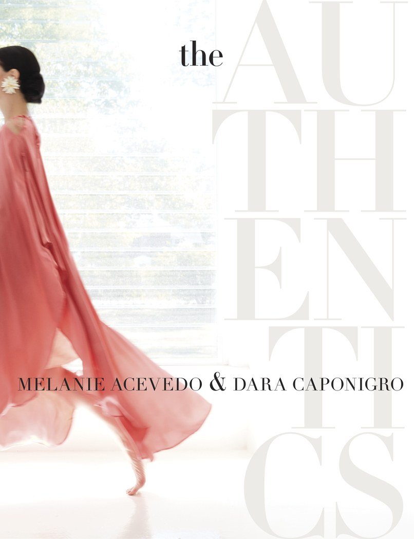 Ms. Acevedo is a well known photographer. Ms. Caponigro was one of the founders of DOMINO magazine and is currently the Creative Director of F. Schumacher & Co., the legendary fabric, wallpaper, and rug company.This is a book I will reference time and time again. Some of the names are famous in the design world, like Kelly Wearstler, Miles Redd, and Nicky Haslam, or celebrities such as actress Peggy Lipton and hair stylist Sally Hershberger. There are landscape architects, jewelry designers, chefs, etc. All have an unique point of view.Some of the rooms or gardens might be a bit "much" but I love that in a homogenized world there are people who surround themselves with things that they enjoy regardless of popularity.
 Visually, this coffee table book is a knockout. It has thick quality paper and is beautifully photographed.The interviews with these talented creative people were very inspiring. It's easy, thanks to social media, to see the same images again and again. At first everyone is excited and then the same people start to complain that the image is played or trite. The Authentics create their spaces in a way that speaks to their interests, loves, and passions. That approach will never go out of style.

Decorating 101 for the Suddenly Single

Breakups are stressful. Moving is stressful. Moving after a breakup? We're talking stress squared.Anika Jackson, VP at Real Beauty Real Women, asked me to write a decorating post with some tips on how to make the transition a bit smoother.To read the rest of the post, click HERE.
The Design Files - Interior Design Master Class

Edited by Carl Dellatore, INTERIOR DESIGN MASTER CLASS: 100 Lessons From America's Finest Designers On The Art of Decoration, is an outstanding book.Although it's geared towards students of design and professionals, this book would appeal to anyone who's curious about interiors.The book is divided into six sections: theory, structure, style, process, elements, and inspiration. Within these sections, A-list interior designers and decorators discuss everything from floor plans, lighting, comfort, color, texture, etc. etc. This insightful peek into their process, inspiration, and interiors is a real treat. The designers range from well-established legends of the industry to the new guard.MASTER CLASS is packed with useful information and it's also gorgeous. I loved it.This book will be a classic. 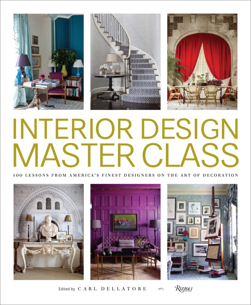

The Design Files – Traditional Interiors are Back
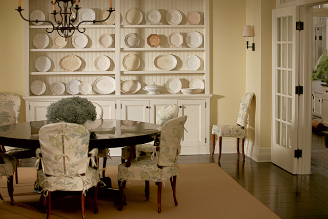
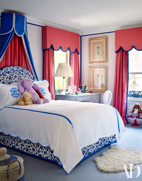
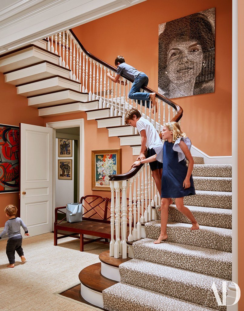
Traditional interiors will be big in 2018 according to various interior design articles. I never received the memo that they were "out". I don't think they ever went away, especially in cities like New Orleans, Charleston (SC), and Washington, DC.I don't belive in following trends. It's helpful to know what is going on in the world of design but the client's tastes and the architecture of the home are much more important than what's trending. For example, installing barn doors everywhere. I adore them. However, sometimes a room needs a regular door or a pocket door. Don't get me started on shiplap.Plus, following trends is an easy way to have your home look dated quickly. This will not help the resale value of your home (more relevant in the States where we renovate/redecorate and move often compared to other countries).I'm not surprised that people are falling back in love with traditional interiors. During a time of great uncertainty in the world, it's nice to be surrounded by something comforting and familiar. It's interesting to me that so many people thought/think of traditional interiors as very stuffy, too precious, and too old. In fact, traditional interiors are perfect for families, especially those with small children. Pieces that have been around for generations can take a beating. A little wear and tear adds character. The use of color helps hides stains and so on.Speaking of color, this is one way to make your space current and not like your great-grandmother's. Another suggestion is to mix it up. Place some modern pieces in the room. A room filled with only antiques can feel like a museum.Below are some recently decorated spaces in the traditional style. They're fun and have a lot of personality.This home in San Francisco was decorated by Miles Redd for a young family with four children. Pictures are from Architectural Digest.
 Jane Scott Hodges's home in New Orleans is a bold mix of colors and patterns. She worked on her home with friend, interior designer, Gwen Driscoll. Photos are from House Beautiful.

 Interior designer Darryl Carter wrote a book called The New Traditional. His spin on this aesthetic is more sculptural. He uses a lot of neutrals but with a variety of textures which gives his spaces movement. Photos are from One Kings Lane.


The Design Files - Nursery Tips
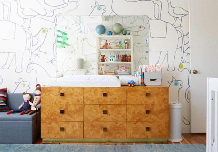
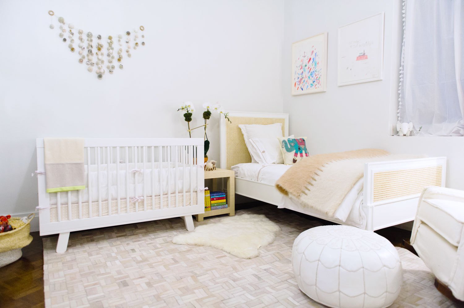
My sister and my brother-in-law had their first child last month. My brother and my sister-in-law have two boys so now I have three nephews.Nurseries are fun rooms to decorate. However, it can be a stressful time for families as they try to get this room together before the baby arrives. Below are some tips:Don't overlook the function of the room. It's easy to do when you see things like this: Make sure the space is practical. For example, is it easy to get to the changing table? Is everything you need for the changing table, wipes, diapers, etc., near the table?Window treatments.I like roman shades. Curtains are fine for babies but once they start crawling, it's better not to have anything on the floor that they can get tangled in. Keep an eye on the cords. Whatever treatment you decide on, can it block out light if needed? If the curtains are too sheer, get black out rolling shades.Babies don't care what the room look like. You will spend hours in this room. Is it comfortable and soothing for you?Not every piece of furniture needs to come from a baby store. A dresser can be turned into a changing table.To save money, re-purpose furniture and pieces that you already own.The room should reflect the rest of the house. If you're someone who loves minimalist mid-century, the nursery doesn't need to look like some cutesy, super traditional space with bright colors, and visa versa. There are ways to incorporate your taste into the room.When it comes to painting the walls, I'm a big fan of grey, and creamy whites for gender neutral colors. They're classic, and depending on the shade, work with all types of décor from traditional to contemporary. A light yellow is great too but a more difficult color to work with.Wallpaper. This is the room to add an accent wall with a bold paper:
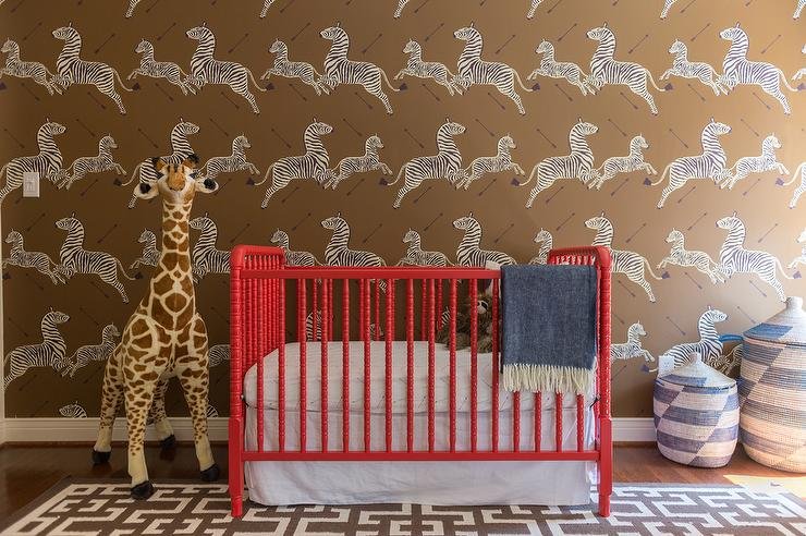 If your taste fall to the more subtle side, something like this gives you a moment without being overwhelming:
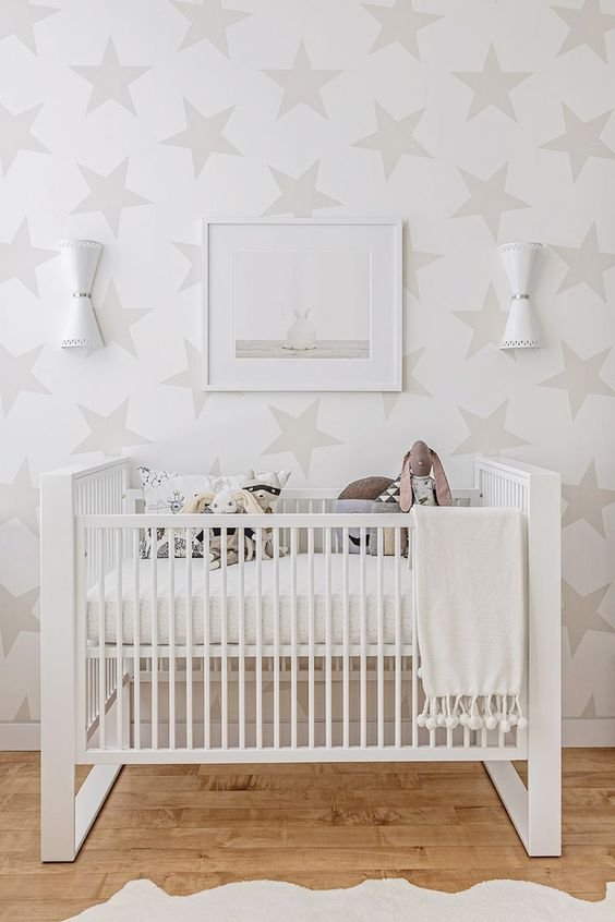 Decals are a great for renters.
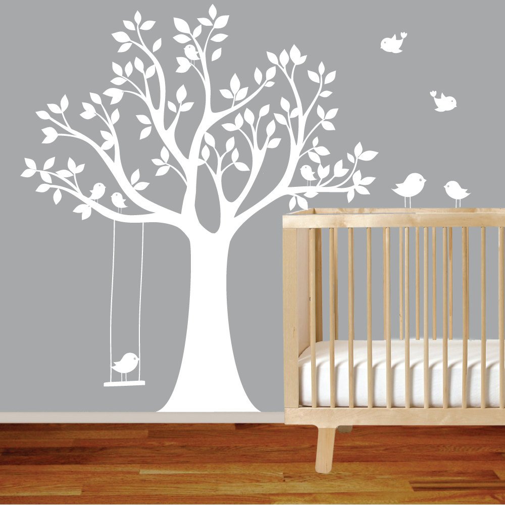 Unless you have time and money to decorate constantly, select furniture, art, and colors that will grow with your baby. Once they get older, you will redo the space for a big girl/big boy room.It's unlikely that a baby is a Frozen or Hot Wheels fan. Cutesy or trendy themes will feel dated and will become tired very quickly.Do you have enough storage? Clutter is the last thing you need in this room. You don't want trip over things during a midnight feeding when you're exhausted and not the most alert.Don't forget the books, art work, and the accessories. It's the little things that take a room from ho hum to something special.Here are some more fab nurseries:
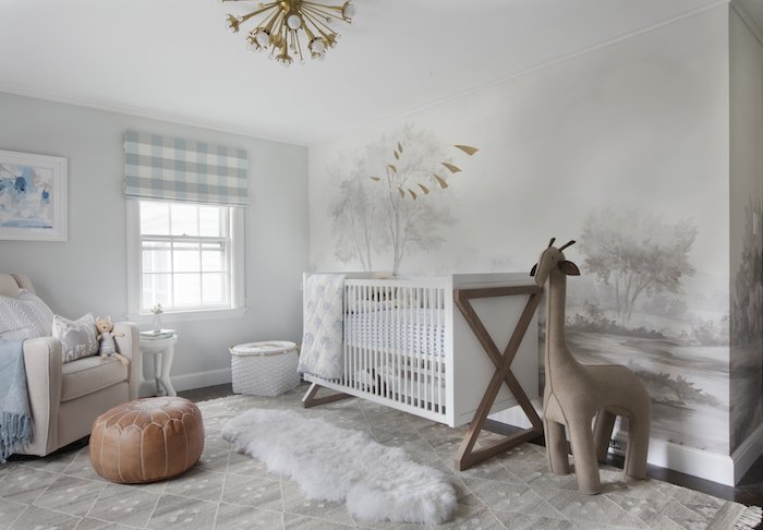


The Design Files - Yes, You Can Mix Stripes and Prints.

Ciao Bloggisti,I know matching curtains, wallpaper, and even bed covers are having a moment. I think this style can look lovely in a Manhattan Classic Six bedroom or a home in the English countryside. In general though, I'm not a fan of what interior designers/decorators refer to, in very technical terms, as matchy-matchy.So far we've used a lot of neutrals and solid colors in our projects. I'm trying to experiment more when it comes to patterns, especially mixing them. It's tricky as there's a fine line between Granny Chic and a room that looks dated.One of my clients has a beautiful striped sofa. The current decorative pillows are a solid blue that she would like to change. Surprising myself, I started to pull prints. Her home has classic lines and a few antiques mixed with modern art. The solid pillows on the couch completely disappeared.Something like this from Designer's Guild would make the pillows stand out more without overwhelming the sofas: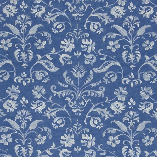 I LOVE stripes. They're a great pattern to mix with as they are simple and graphic. It may seem odd to place a stripe in a room that has floral prints, but try it. The graphic lines of the stripes will help ground the space.How to make sure the room doesn't look like a jumbled mess? Color, color, color. This bedroom by Mark D. Sikes is a perfect example.
 The stripes on the chairs go beautifully with the floral print on the duvet. Imagine a floral pattern on the chairs. I believe it would be way too much.There's a lot going on in this space but the color palette (and the scale of the furniture) makes it relaxing.Below, a bold approach from Steven Gambrel. Gorgeous.
  Chocolate brown and blue from Sheila Bridges. Notice how the print in the curtains is the same color as the stripe. Beautiful. Solid curtains with this type of sofa would've made the space too formal for a young single woman.
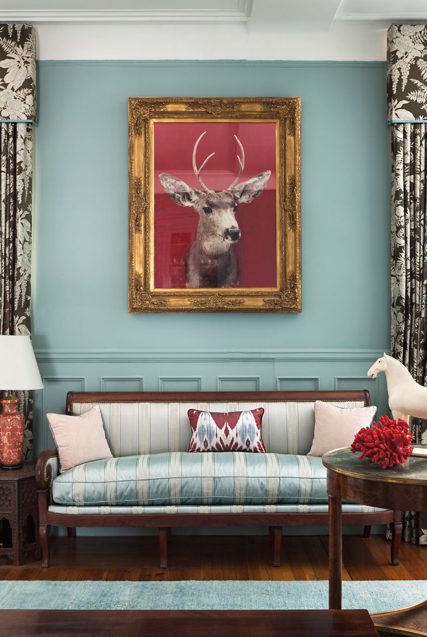 Clearly, I have the color blue on my mind.