Marcello Mastroianni Exhibit at the Museo dell'Ara Pacis
Happy New(ish) Year!
I’ve read it’s okay to say this until the end of the month. I made it just under the wire. I cannot believe February 1st is next week.
I’ve been meaning to check out the new exhibit at the Ara Pacis since the day it opened. It closes February 17th. If you live in Rome or are planning to visit, I recommend seeing it.
I loved learning more about Mastroianni’s childhood and family. I knew he was a stage actor for years before becoming a film star but had not seen many photos from that era. I didn’t know producer Dino de Laurentiis (grandfather of Giada) wanted Paul Newman for the lead in “La Dolce Vita”. Fellini said no. I’m trying to picture how different the film would’ve been.
Mastroianni was very handsome and had charisma for days but didn’t want to be seen as the cliché “Latin Lover”. In many films he upended the stereotype, playing anti-heroes who didn’t know how to deal with shifting gender roles, political/economic instability, and changing social mores.
Along with set photographs, one sheets, and short clips from several films, there were also a few costumes from his movies, including an iconic dress worn by Sophia Loren.
The exhibit is well organized, translated (English), and curated. If you love movies, the arts, Italian history, it’s a must.
Photos:Museo dell'Ara Pacis
Museo dell'Ara Pacis
Lungotevere in Augusta - 00186 Roma
Opening hours
Open daily, from 9.30 to 19.30
Last admission 1 hour before closing time
White Kitchens - Yes or No?
Put me firmly in the YES camp. I'm the middle of sourcing cabinets for our Anguilla Beach House Project. As I read various online design magazines and blogs, it appears that white kitchens are "out". People are sick of them. Apparently, they are boring and show no creativity.
I disagree. I strongly believe that kitchens and bathrooms are not the places to be trendy. They are the most expensive rooms to build or renovate. Twenty-four percent of Americans move to a new house every five years. In other countries people tend not to move as often. If one is worried about the resale value of their home, it would make sense to have a kitchen that is not dated.
A well-designed white kitchen is timeless. This is one reason they're so popular. One cannot tell if the kitchen was renovated five months ago or fifteen years ago. A homeowner can always swap out hardware or light fixtures to freshen things up or we can use accessories that speak to the trends of the moment. Most people cannot afford (nor want to) gut a functional kitchen just for aesthetic reasons.
White kitchens are not a trend given they've been "in" for almost two decades and were very popular in the 1920s. They are classic. Seriously, what are people smoking? I think, with the rise of social media, we're burning through trends faster. There's this need for instant gratification and always looking for something new. The thing is, most of the hot trends of today will not hold up.
To me it's more important that a workhorse room, like a kitchen, functions well. Open shelving may not be practical for some families. Maybe your kitchen isn't big enough for a massive island.
If a client wants to go with dark green cabinets, I'm all for it and we'll look for the shade that works best in the space. However, if a client wants white Shaker cabinets but worries it's too boring, we're going to get the darn Shaker cabinets. We can find other ways to add some color to the kitchen.
Content driven decorators rarely think about the architecture and/or the function of the space. Many have moved away from working with clients and instead continuously buy and flip houses. That's a very different mindset than creating a home for yourself or for a client.
As I work on this beach house kitchen, I'm mindful of the trends but we will have white Shaker cabinets as they fit the space, the location, and the architecture of the home. If the house were inland or a primary residence maybe we would chose a different color.
Here are some kitchens from talented designers and decorators. Notice that they don't look the same. I wish someone would tell them that these kitchens are boring or "so over".
This kitchen is in a 1922 Colonial that was recently renovated by interior designer, David Nastasi.
Photo: New York Magazine
Modern Farmhouse by House of Jade Interiors.
Photo. The Spruce
A villa in Tuscany designed by Ilaria Miani. The estate belonged to her grandparents and is now owned by her brother. I was one of her interns and I remember her custom Whatnot shelving well.
Photo: Elle Decor
Interior designer's Mark D. Sikes's kitchen in the Hollywood Hills.
Photo: Mark D. Sikes
A minimalist NYC kitchen. Love the terrazzo floor. Interior Design by Pierce Allen.
Photo: Elle Decor
La Biennale Venice - 2018
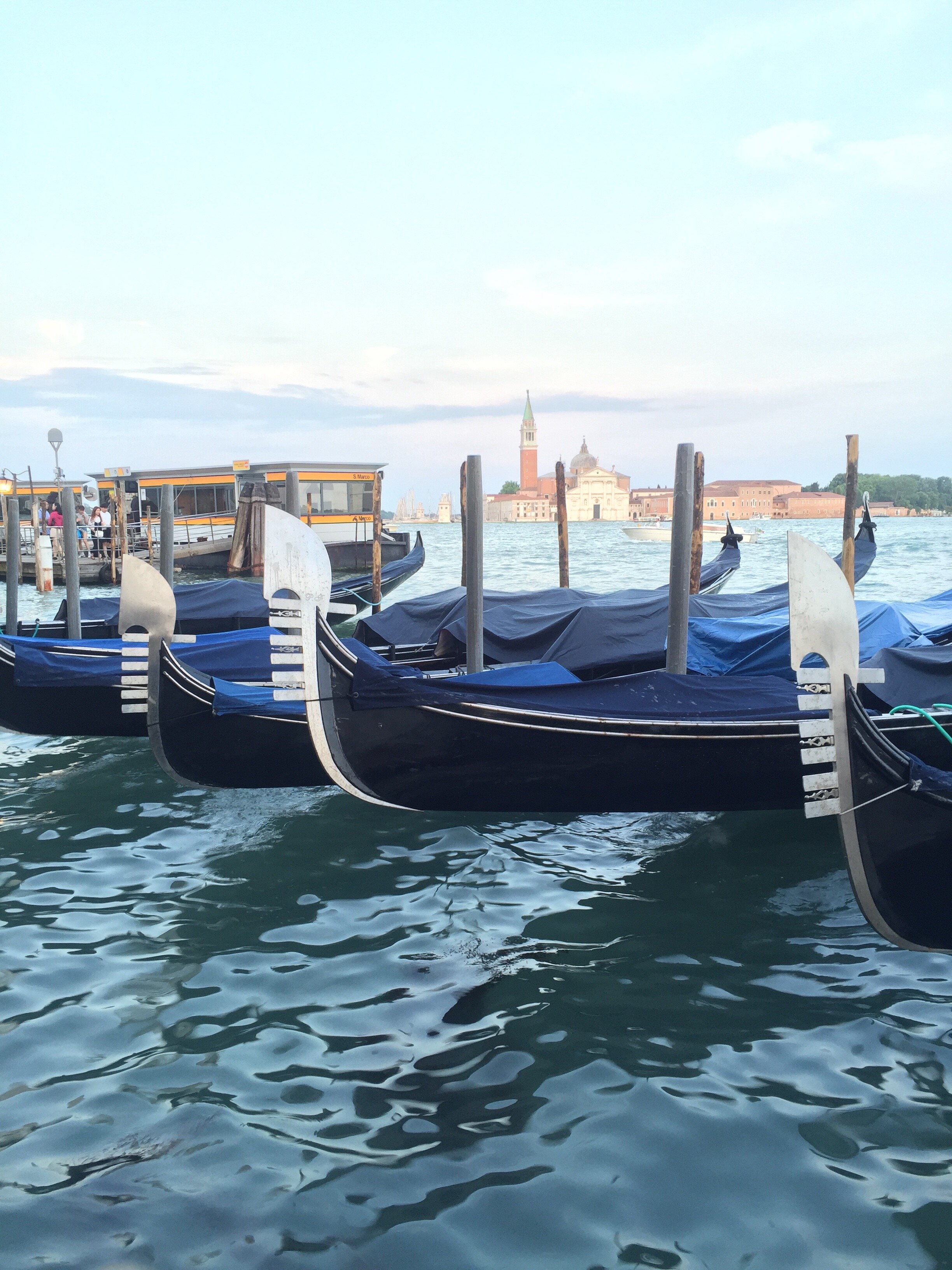
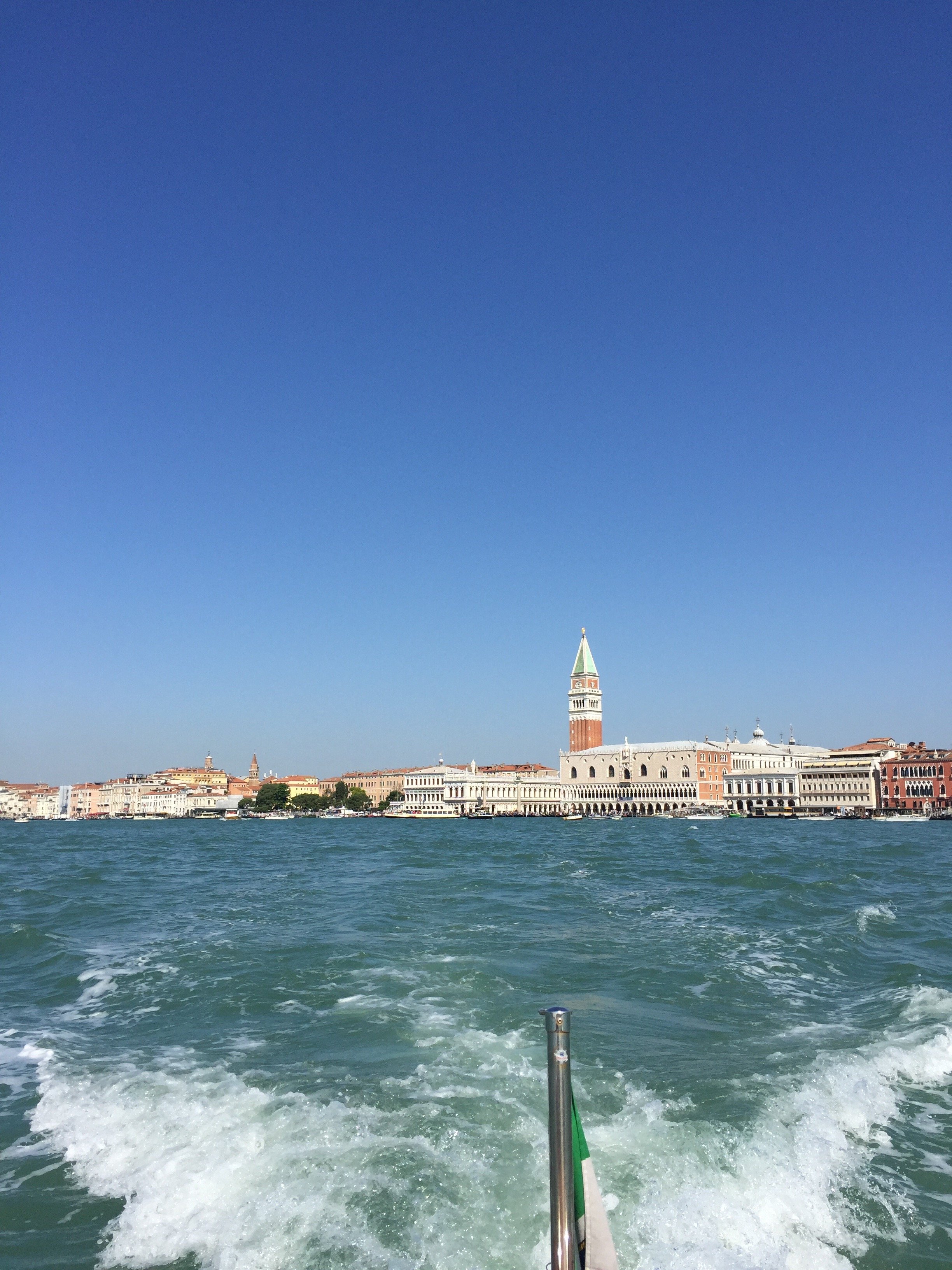
My friend Erica invited me to join her on a press trip for the preview of the 16th Architecture Biennale. I haven't been to any of the Biennale. I follow the art, cinema, and architecture ones on social media but it's not the same. My first (and last) trip to Venice was twelve years ago, late November. Even during off-season, the crowds in the Piazza San Marco area were quite large. The experience did not prepare for last week. More on that later.We were in Venice for only two days/one night. I would love to return to see the Pavilions I missed. Erica has a great write-up on her Instastories.Normally, we'd take a train from Rome but we had to get there in time for the press conference so we placed on a 7:00 am flight. A private boat picked us up. Not a bad way to enter the city. We had a few minutes before the press conference and met the other journalists/architects and their guests. It was a small group, only twelve of us, half were from Milan. Our hosts were wonderful and, my fellow Americans will feel me on this, I couldn't get over how organized everything was. One of the hosts flew from Milan to Rome to meet us on the flight to make sure things were on point.The theme this year is Freespace. The curators are architects Yvonne Farrel and Shelley McNamara of Grafton Architects.
After the press conference we walked over to Local, which was fantastic. It's owned by siblings Benedetta and Luca Fillun and used to be an electrical shop. I spoke more Italian in a day than I have in probably two months.We returned to the Arsenale for a guided tour of the Corderie. From there we were able to see a few pavilions before going to the hotel to check in. My favorite pavilions were the Kosovo, Canada, Italy, Bahrain, Italy, and Croatia Pavilions. I wish I had more time to spend in each one.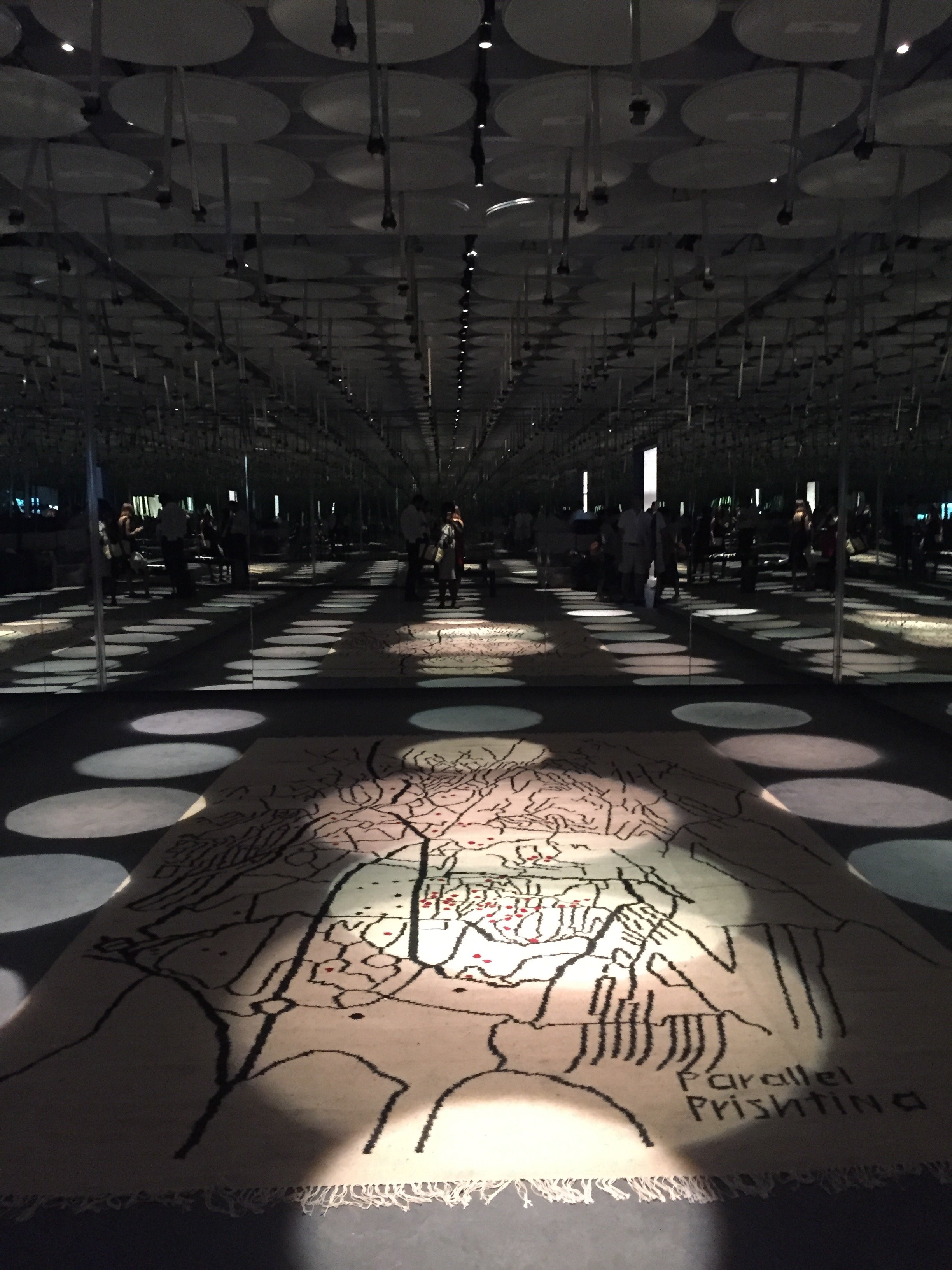 Erica and I decided to walk toward Piazza San Marco instead taking the boat. I was NOT READY. Remember, I've never been to Venice during high season. The crowds were on another level. I keep reading about the crowd situation but it's another thing to experience it. 28 million tourists visit Venice a year. Only 55,000 people live in Venice full-time, down from 175,000 post WWII, with around 2000 leaving every single year. AirBnB has pushed the rents sky high, and mass tourism from mega cruise ships turn streets into packed corridors during the day and desolate at night. I don't know what the answer is but this type of tourism is not sustainable.We stayed at the Bauer Palazzo and I was happily surprised to see that we had a terrace. The service was impeccable. It could be because we were with a group of journalists and architects.
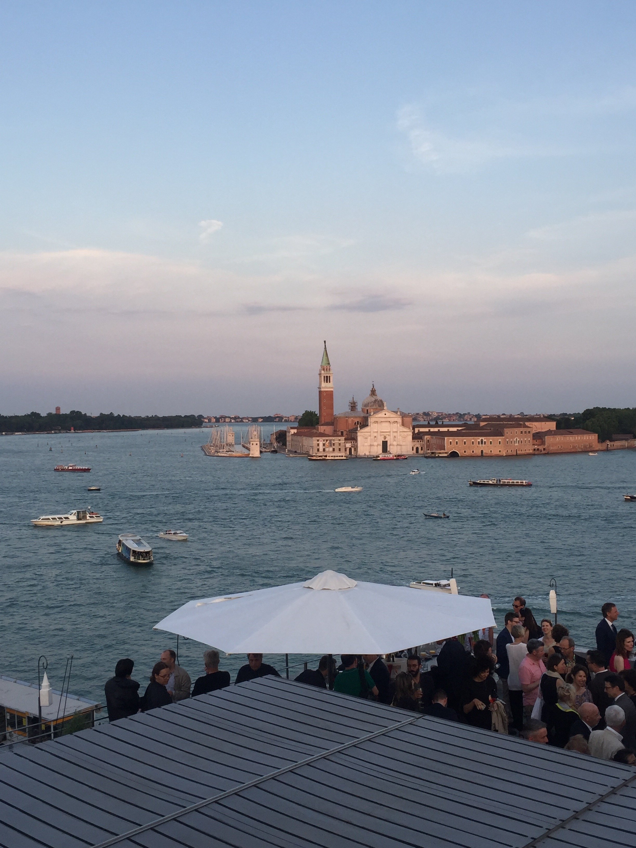
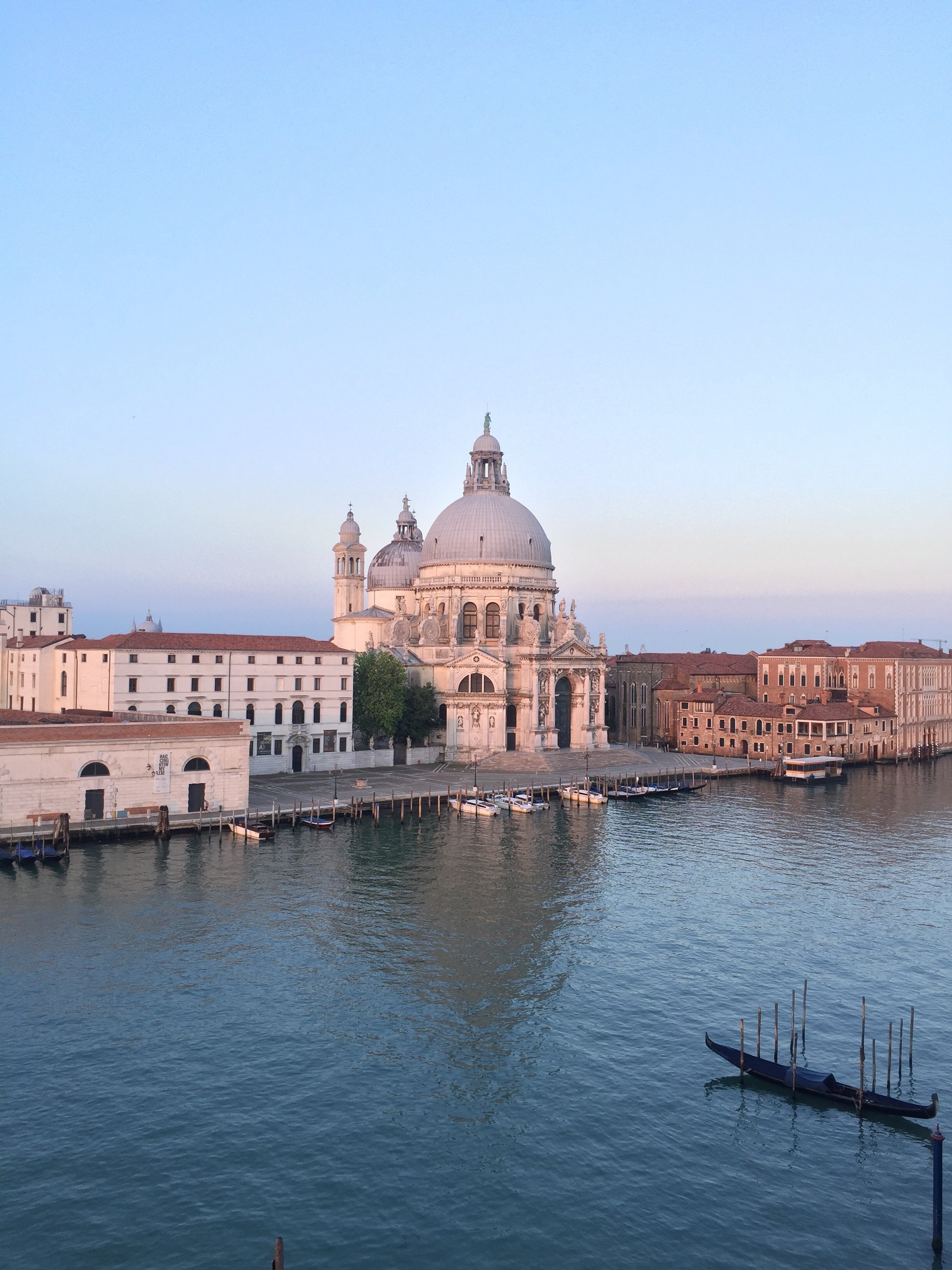 As we unpacked and got ready for aperitivi I noticed a chic terrace, a floor higher, on the building next door. I asked the bartender if it was a hotel bar. He said no they were preparing for a private party. I had no idea it was the party we were going to attended. It was a little overwhelming. There was were heavy hitters from the design/architect world and folks were not playing sartorially. The Hugos, and views, were divine.
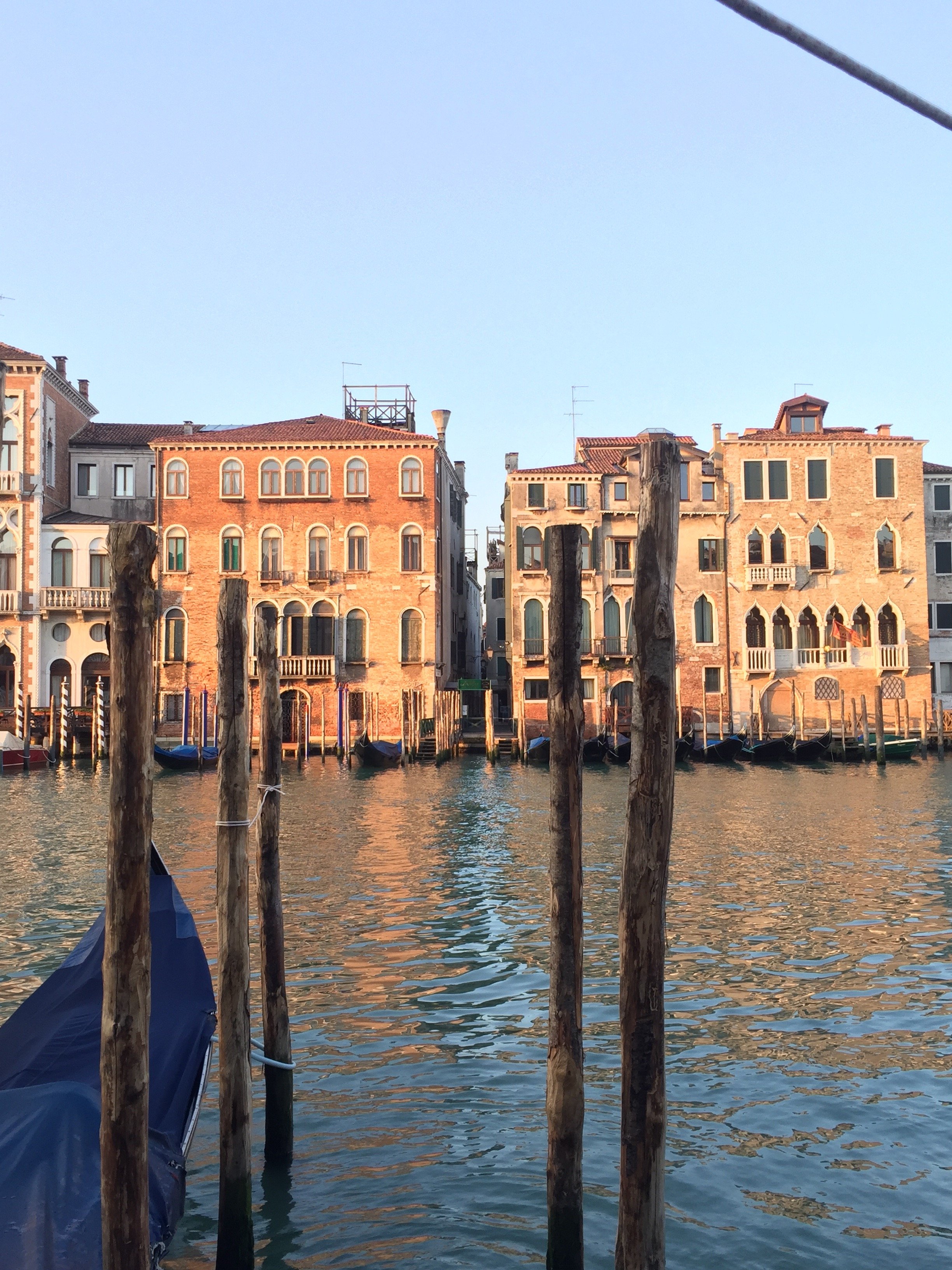
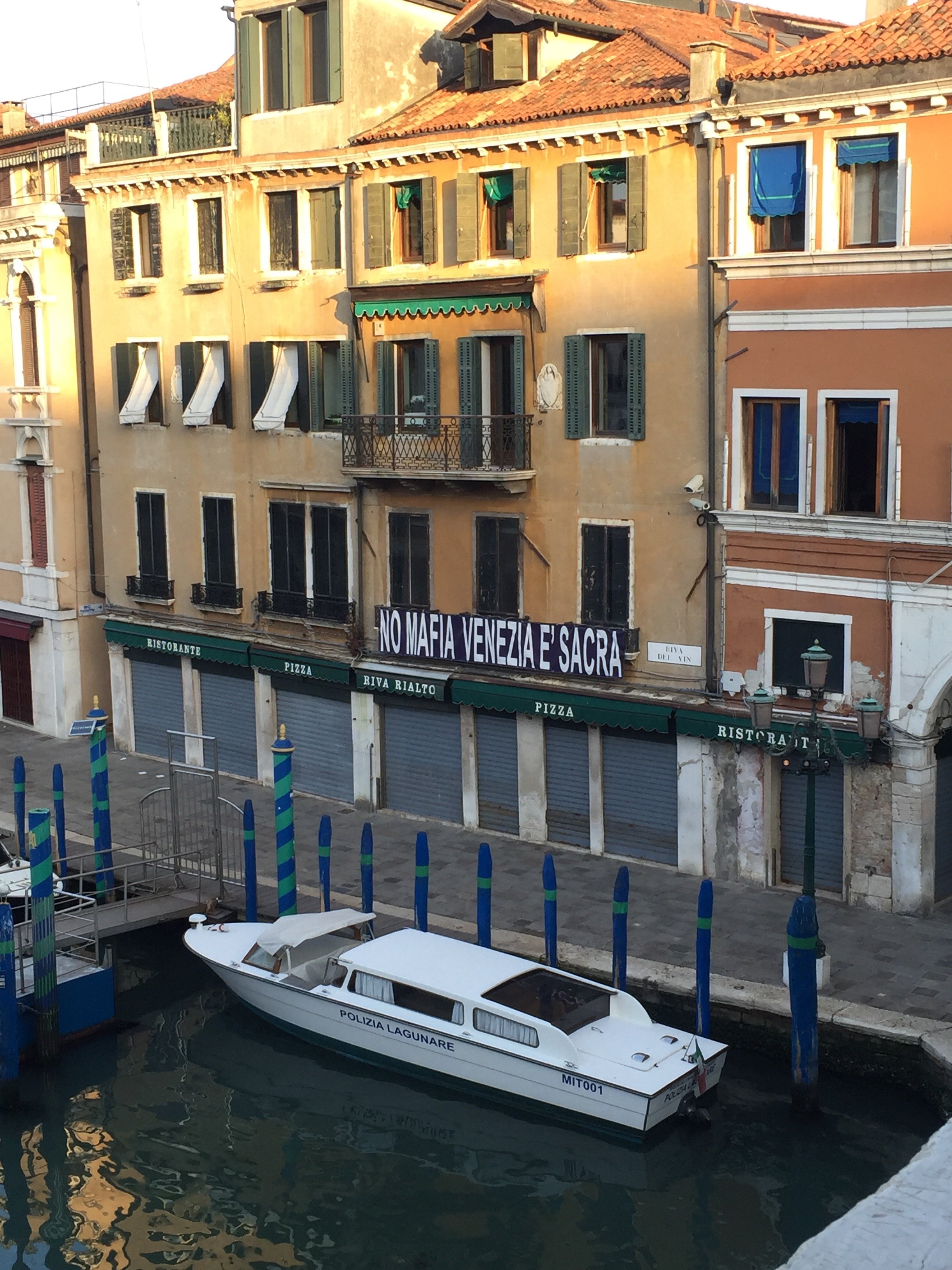
 Post- reception, we had dinner on the patio of the hotel with canal view. During dinner I hear suddenly heard loud gasps. I looked to my left and saw a mega cruise ship rolling into the canal. It dwarfed the buildings. I have no words. Perhaps I'm hyper sensitive to these ships as I've seen what they've done to the quality of life for residents of the island of St. Martin/St. Maarten. I strongly believe the cons outweigh the pros.I woke up at the crack of dawn to jog and it was glorious. The city was quiet, with Venetians going to open their shops and getting ready for the new day. There were a few other tourists out jogging and some taking photos. I got lost in the side streets running toward the Rialto bridge. I didn't mind. It's surreal to be in a city where there are no cars, buses, etc. everything is brought in, and leaves, by boat. I understand why this special city has inspired writers, artists, and artisans for generations. It's a damn shame that it's being destroyed.
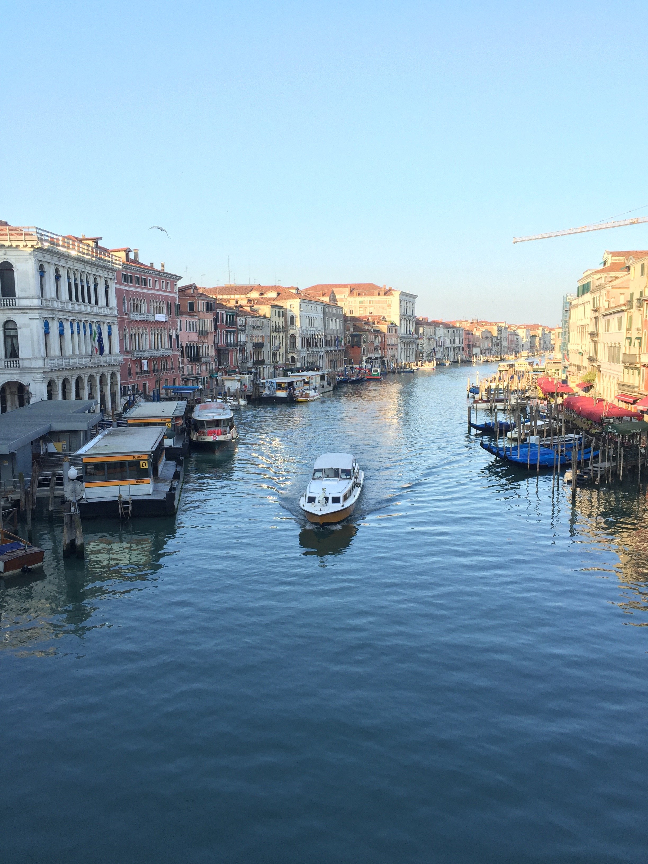 Erica and I had a delicious breakfast on the Bauer's rooftop terrace. We were picked up (on time!) and took a our boat to the Giardini (the gardens) to see more pavilions.
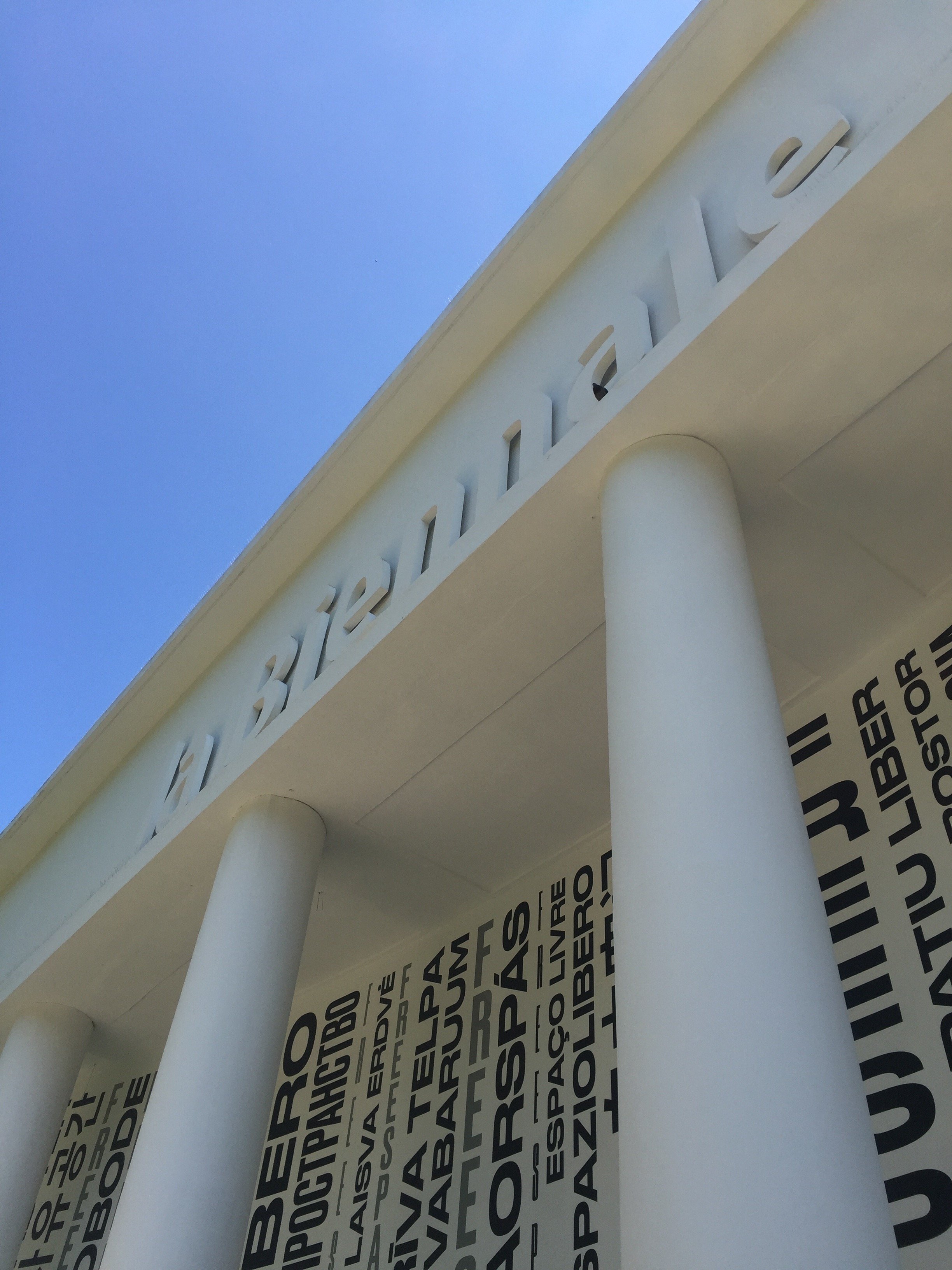
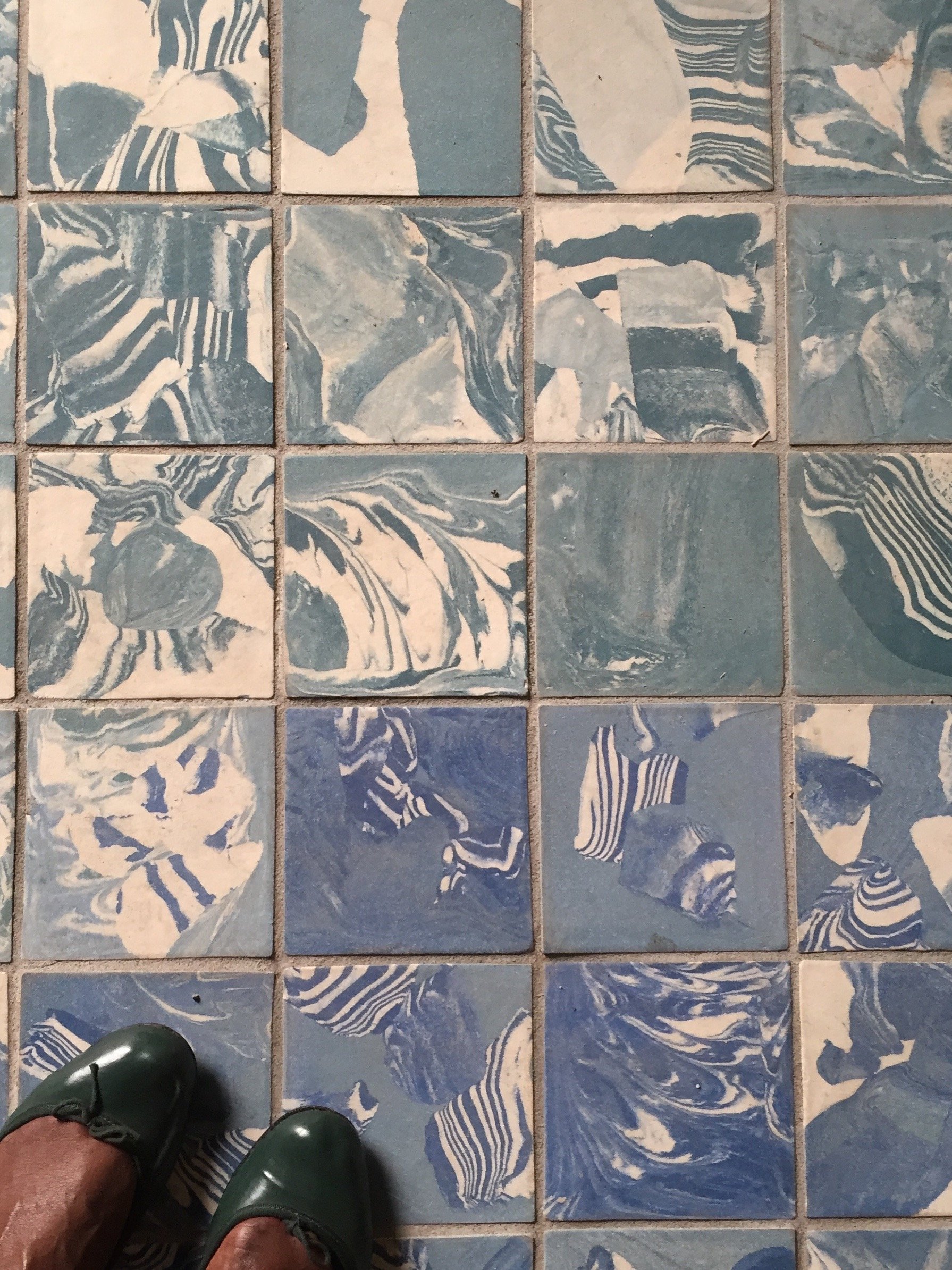 We had a guided tour of the Main Pavilion. I highly recommend checking it out. There was a very interesting scale of the NYC Project, one for a Los Angeles project, and several short films. Then we were on our own to see the rest. I have to say, I was fading fast. There was so much to take in. I missed many pavilions that I wanted to see, like Switzerland, and Antique & Barbuda. There wasn't enough time. Of the ones I made it to, America, Nordic (Finland, Norway, Sweden), Russia, France, were stand outs. I loved the roof top deck of Great Britain and France's wine set-up was very clever.
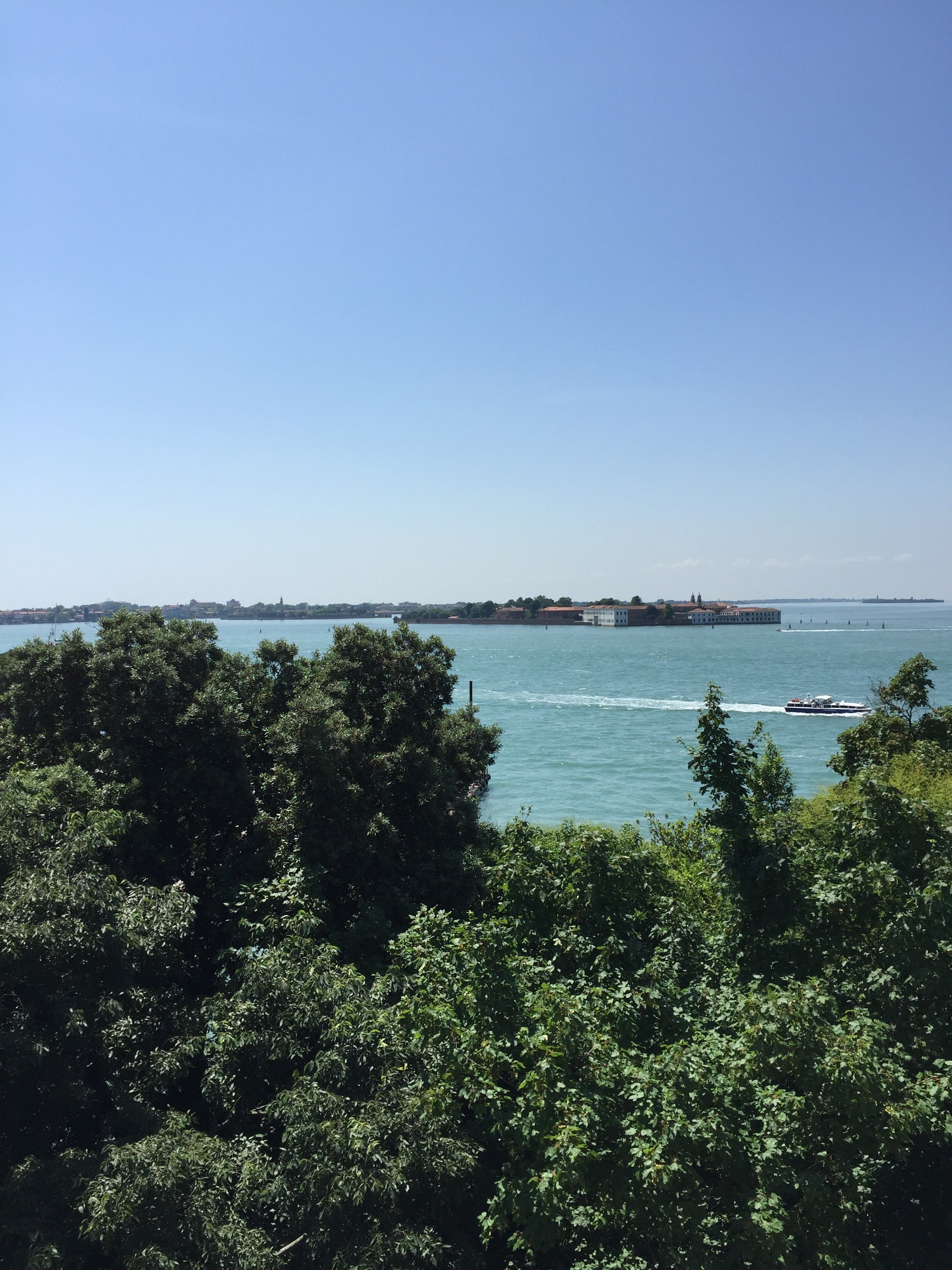
 The Russian theme was about train travel and how the largest country in the world is impacted by it. There are areas that are inaccessible by train and the country spans a few timezones, There was a short film, SEVEN DAYS IN SEVEN MINUTES, regarding a man's 9,300km/5780 miles train journey to Siberia. The Pavilion was transformed into a train station with several multimedia exhibits.The Nordic Pavilion dwelt with climate change. Visually this was one of the most interesting pavilions. The large balloons inflated and deflated depending on changing environmental conditions.The American theme was Dimensions of Citizenship, which really resonated with me. There was a fascinating short film, IN PLAIN SIGHT, that used data from global space sensors showing us how humans have organized our planet. It touched on last year's hurricane season and the difference between Houston's recovering and Puerto Rico's. I was blown away by the places that had large population but no lights, and other spots with a large electrical grid but it was used only for tourists or farming.We ended our trip with an delicious outdoor lunch at Corte Sconta. Corte Sconta means, "hidden courtyard". Our meals were included in the trip so I cannot tell you how the prices were. I get the sense that Corte Sconta was the pricier of the two but it wasn't stuffy.It was hot and walking over ten miles in one day got the best of me. By the time I had to meet our group, I was completely exhausted not really physically but it was information overload. It was a lot to process.It's an incredible experience and it was unique to have these conversations in a city like Venice. I was inspired by the architects and designers I met, the Pavilions, and of course the city itself. Grazie mille, Erica.To see more photos and videos from our short trip, I've saved them in my Instastories.The 16th International Architecture Exhibition runs until November 25th, 2018.
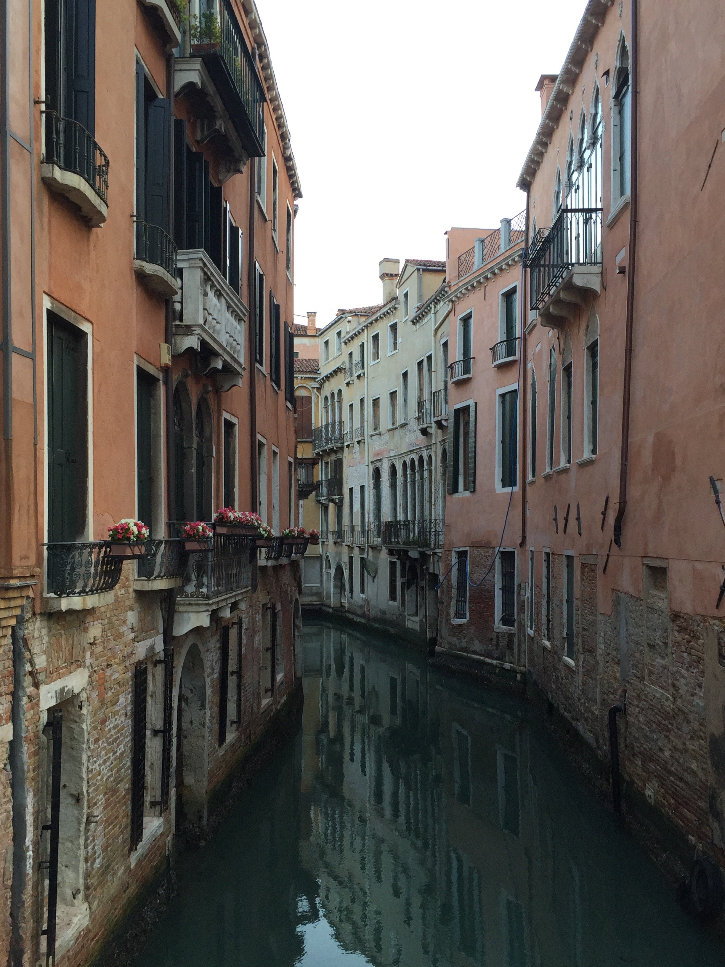
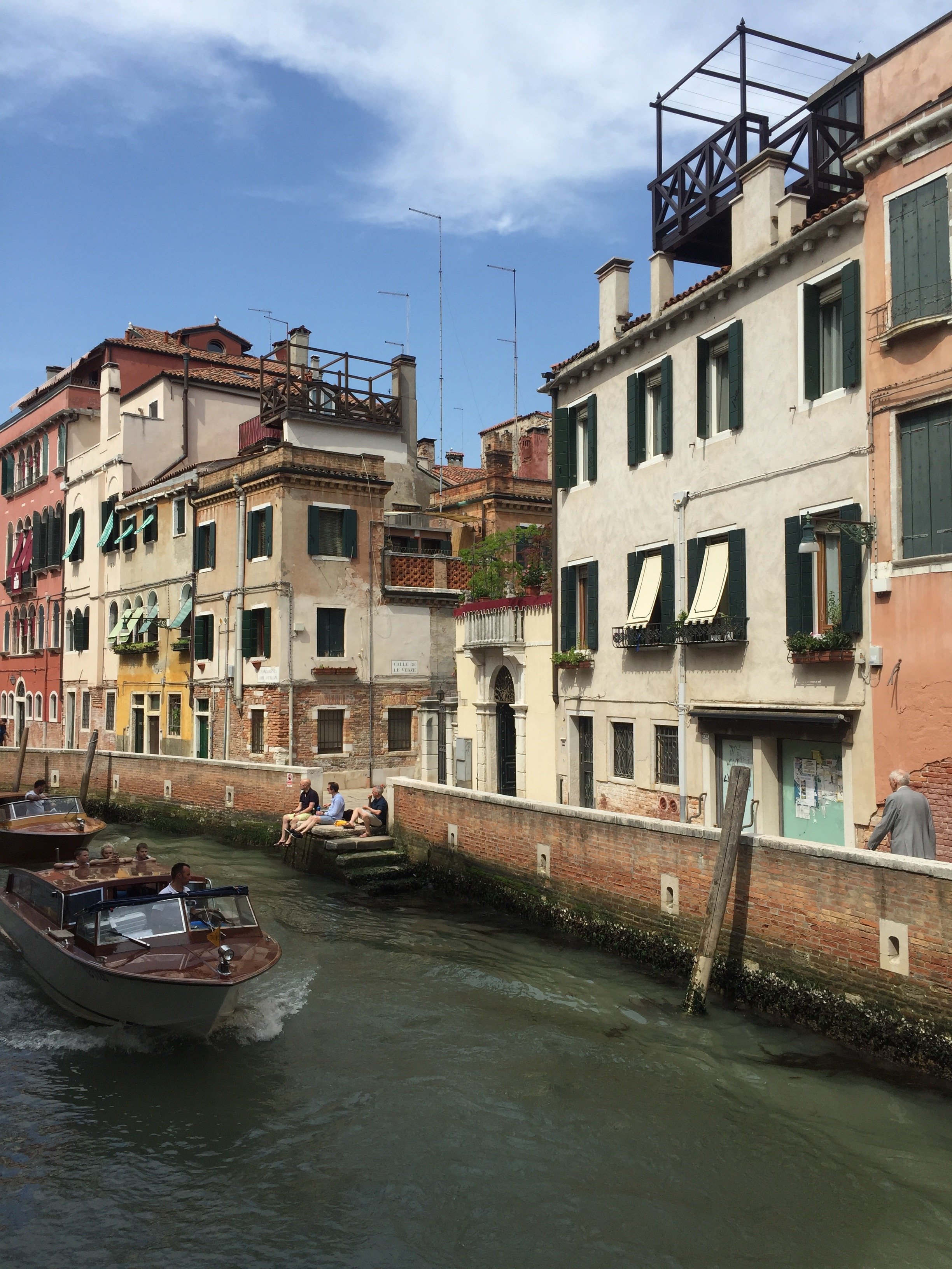

The Design Files - Royal Wedding Dresses
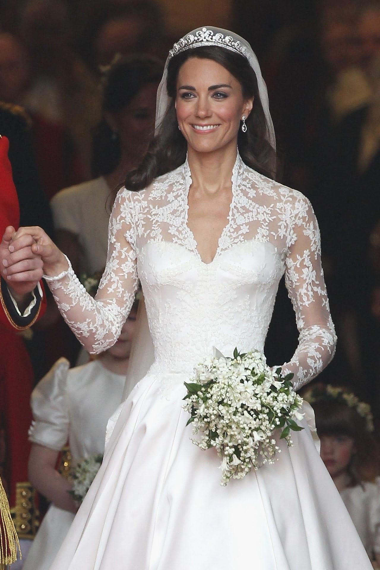
You may have heard that there's a royal wedding this weekend in the U.K.I'm very curious about Meghan's wedding dress. Her style is classic. She wears the clothes, not the other way around. Meghan's not jumping on every random trend and clearly knows what works for her figure. The only look I didn't love was her dress for her official engagement photos. The dress was stunning but I wasn't sure why she was wearing it during a day shoot and Prince Harry's suit was too casual for the dress.Below are three royal wedding dresses that I adore. They all have beautiful silhouettes, the brides look comfortable, and the styles are not dated. I watched Princess Diana's wedding and remember even as a kid thinking her dress was (to reference one of my favorite movies of all time) too meringue. Perhaps it because she was younger than the bridges below, had a very sheltered life, and it was the early 80s. Princess Diana was drowning in her dress.Princess Grace was married in 1956 and this dress is still influencing wedding and formal dress designers. It was designed by Helen Rose who was a costume designer for MGM Studios. She designed two dresses, which were gifts from the studio to their star. Helen was the CD on four of Princess Grace's MGM movies.Gorgeous and timeless.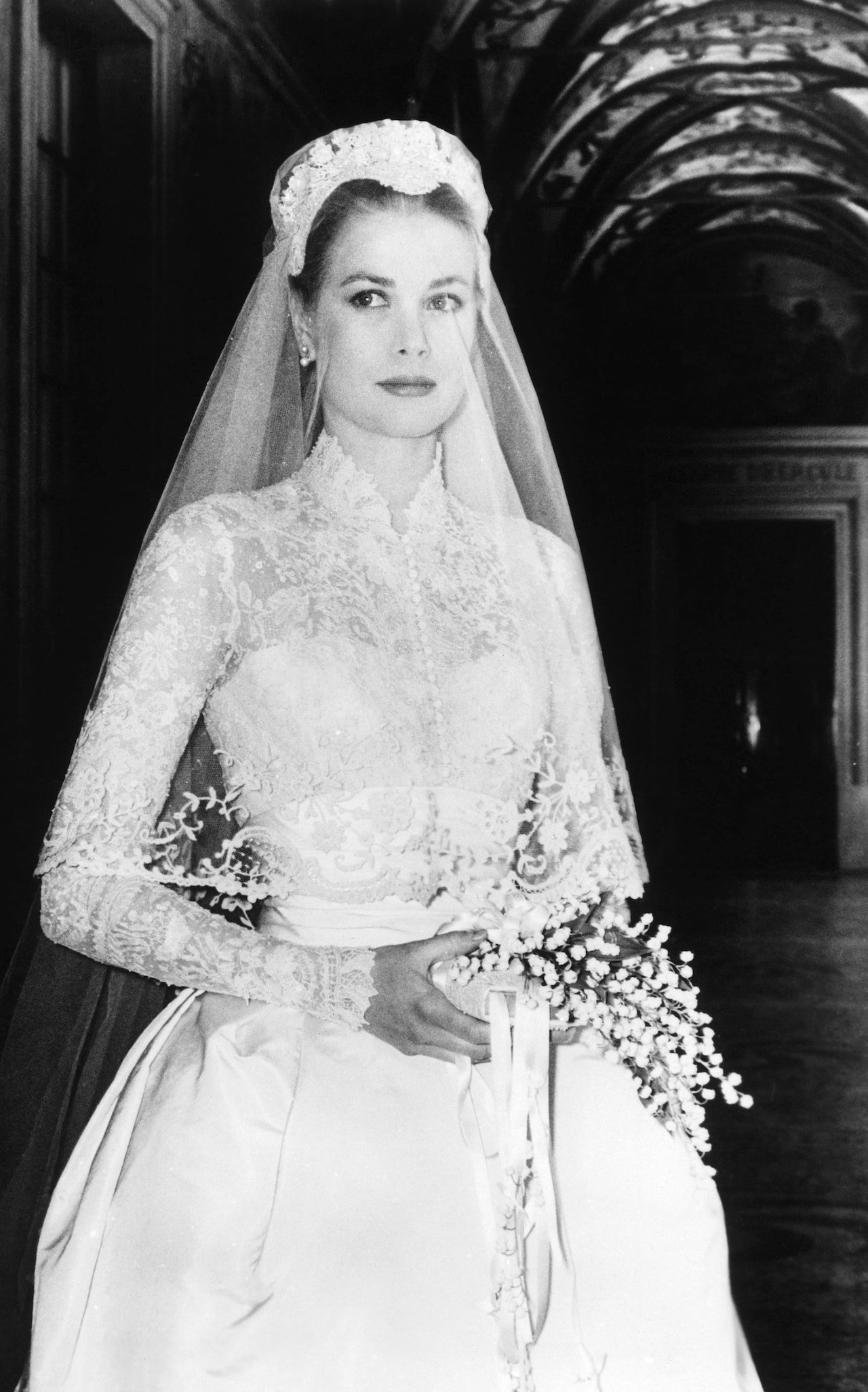 Princess Catherine 2011. Designed by Sarah Burton for Alexander McQueen. Sarah took over as Creative Director of the house in 2010 after McQueen's death. I don't know if it's rule that shoulders must covered for church wedding in the UK but this dress definitely helped bring back sleeves for wedding dresses.The sleeveless wedding dress had dominated for years. It didn't matter that the style was hard to pull off and not universally flattering. Bridal dress manufactures are happy to make this style because it's cheaper to make. Many American brides complained about the difficulty of finding wedding dresses with any kind of sleeve that wasn't dowdy and/or dated. That changed after 2011.This dress is modern and fresh.
 Princess Mabel 2004. The Princess married the late Dutch Prince Johan Frisco in a custom Viktor & Rolf dress. Instead of buttons, the fashion forward Dutch designers used bows. The cut on this dress is beyond. The bows add a bit of whimsy.The bride turned down their more conventional designs and asked for something memorable. It's unique without being a costume.
 [youtube https://www.youtube.com/watch?v=0VQMP8LYEV4&w=560&h=315]
Taking My Holiday Salutations To The Next Level With Paperless Post
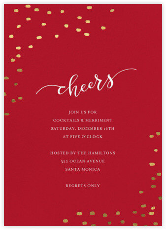
I always sent holiday cards when I lived in the States. Growing up it was a big deal as my parents had a very long list. They would also enclose handwritten letters to our family in the Caribbean. I loved sending and receiving cards. This was a tradition I hoped to continue once I moved to Italy.I was so naive back then. So naive!I heard that the Italian postal system was not the most efficient. However, I was surprised to receive Christmas cards in March, April, etc. or not at all. I mailed my cards in November just in case. It didn't matter, half my cards would show up long after the holidays were over.Then there's the cost. It's two euros/two dollars and thirty-five cents for a single stamp to the United States or to the Caribbean. It was annoying spending money on cards that did not arrive on time or were lost.A lot of my friends in Hollywood use for invitations, announcements, and cards. I've personally never used the brand but adored what I had received. I say this as a person who's a hardcore stationary fan. When Anagram Interactive asked me if I would be interested in using their client's website, I was excited to try it out for myself.Paperless Post's website is very easy to use. Hello, nobody has time to decipher websites that are more complicated than filling out a tax return. There's a wide variety of cards to choose from. Some of the cards are free and cards can be customized for a small additional cost. Paperless Post has collaborated with several designers (including some of my favorites) as well as having an in-house design team.With so many options you'd think it would be overwhelming to make a decision. Nope, there are filters to help you narrow your selection by color, designer, card shape, greetings, etc. Below are some of my picks for the cocktail party I'm not having thanks to a leak in my apartment (long story).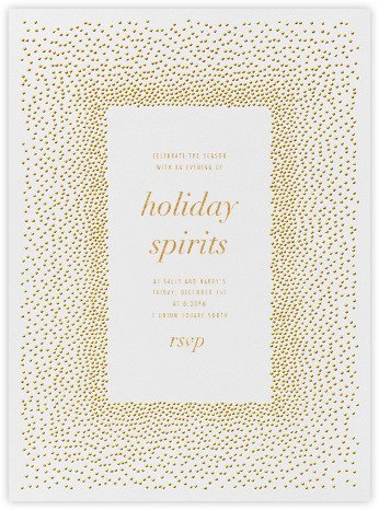
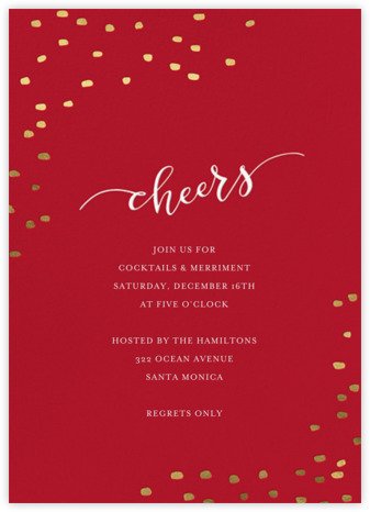

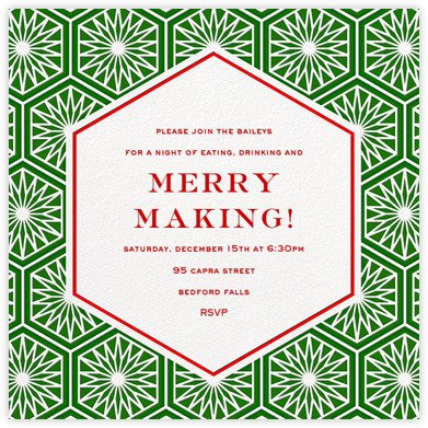





 Here are some of my picks for holiday cards:





 You also have the option of adding your own photo, or photos, to a card:
 Paperless Post started selling both digital and paper versions in 2012 after receiving many requests from their customers. Brilliant idea, especially for those customers who are sending wedding invitations. They may have relatives or family friends who prefer paper invites.It's clear that the young founders of Paperless Post have put a great deal of thought into the design of the cards and the site in general. They've combined beauty and function. Very impressed.Note: I've been given this product to review in collaboration with Anagram Interactive. All opinions remain my own and I was in no way influenced by Anagram Interactive or Paperless Post.
My Tamu's Cafe Interview
Last summer I was interviewed by the lovely Tamu McPherson owner/creator of All The Pretty Birds.Those who follow fashion know what a big deal Ms. McPherson is in the industry. She's a smart, dynamic, woman with a strong style POV. Tamu is also kind, down to earth, and hilarious.When she said she wanted to interview me, I'll be honest, I had a minor panic attack. I DO NOT like being in front of the camera. I had to do an interview for the behind the scenes extras for our film JUMPING THE BROOM's DVD. I believe I watched it once after the studio sent me a copy of the film.Also, it was an extremely hot day in Milan and my monthly friend had arrived. Grrrrrr. I felt like a Weeble. I thought we were tapping at her house which had AC. Nope, we were also going to walk around Milan.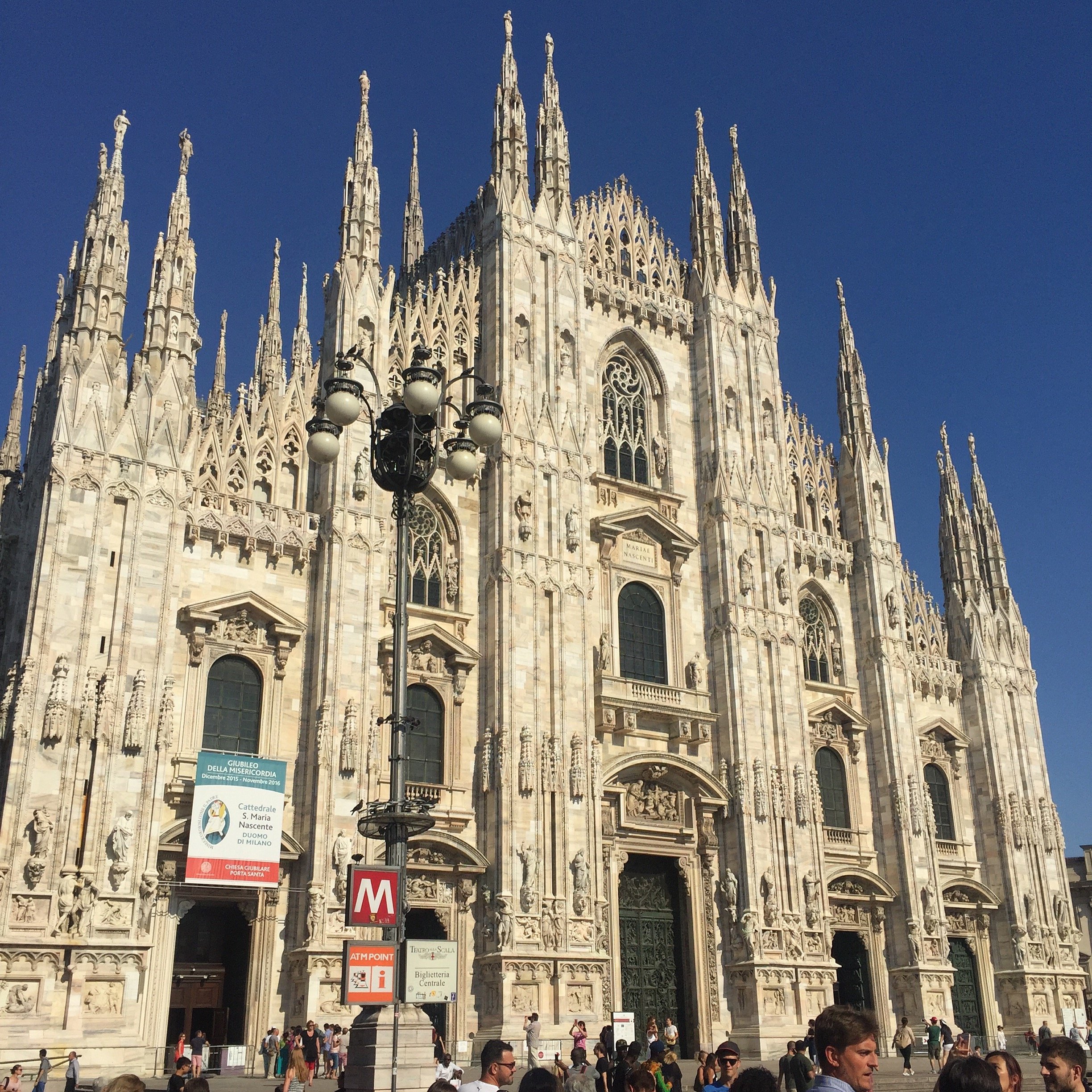 Despite the Caribbean blood that courses through my veins, I'm not a fan of hot weather. I'd say mid/high 70's (F) is my jam. It's in the mid 90s in Rome now and the sun here is on another level. Seriously.My dress had long sleeves but thanks to Tamu's expert sleeve rolling, I was cool as a cucumber. I bought the La Double J dress to celebrate a new project. Little did I know that my biggest client would be leaving Rome (thanks Trump...literally). No regrets though. Last Thursday evening I wore to the dress to events at Chez Dede and the reopening at Le Méridien. People kept asking me where I got it. It's the perfect dress for a dinner date too. Wait, I don't have any of those coming up. Never mind. Back to the subject at hand, the interview.Tamu broke it up into two parts. In Part I, it seems like I did ALL the talking. Tamu, for time, edited out her questions. In Part II we hear more from Tamu. There are Italian subtitles. We talked about working in Italy and what it's like to be a WOC living here, among other things.I move my hands around a lot. I take after my father's side of the family. They're very expressive.PART IPART III have to thank our glam squad. Just kidding. We didn't have one. Tamu and I did our own makeup.Grazie mille, Tamu!
 How pretty are these arrangements from Frida's Flowers?
Art and Architecture with Ariella - Contemporary Art in Rome
Ciao Bloggisti,Here is the latest post from Ariella:Over the past few months I have explored art in Rome from a historical point of view, as well as its current and future purpose. While Rome is known for masterpieces by some of the world's greatest artists such as Michaelangelo, Caravaggio, and many others; the city has a vibrant contemporary art culture as well.Art and architecture in Rome is always present. We travel though it everyday, sit in its' spaces, it creates views and vistas and reminds us of the past while providing the setting for the future.Rome functions like a gallery. We circulated much in the same way we travel through a space designed for art. The city has made a concerted effort to integrate contemporary art and modern life with the construction of new museums. These spaces house newer collections and also facilitate the experience of promoting the collaboration between art, architecture, and everyday life.The challenge of the newer buildings and space is not to interfere or interrupt "historic" Rome but rather to blend in. These new spaces have attracted many visitors and artists to the city. Artists come to Rome from all over the world seeking inspiration while many born and raised in Rome have also flourished as artists.Every week for the past few months, I have visited a new contemporary art museum, gallery, studio, or installation and I've been able to learn from the historical cultural wealth of the Rome as well as from the current vibrant scene.My past impressions of contemporary art were of paintings and pieces that were difficult to relate to, very conceptual. Contemporary art is always evolving and now quite a few artists have returned to figurative painting/works.The collaboration reflected in exhibits, events, and installations have shaped the contemporary art world in Rome.I asked Ariella for a list of some of her favorite contemporary art museums and galleries.Museums:MACROMAXXI  Galleries:Anna Marra ContemporaneaT293Galleria VarsiGalleria Valentina BonomoI'm adding one of my favorites to her list, Galleria Lorcan O'Neill. Ariella mentioned two other spaces. They're not galleries or museums but display contemporary art.MOMA Hostel - a hostel run by artists.MAAM - this space has living quarters for homeless families. The families live with the art. When Ariella went to visit, one of the pieces had a dent in it because the children used it as a soccer/football goal post. I went to a street art exhibit there and thought it was one of the most interesting venues for art in Rome.
Snack Chat - A Summer Treat with Nathan Turner
I saw on Instagram that Nathan Turner was shooting an online series for The Design Network.What a fun idea. Nathan is a very talented interior designer but he's also known for being quite the host.For this series, he has invited several of his design friends to cook a little something, something in the kitchen. Nathan's enthusiasm is infectious.I met him, briefly, at his shop (a must if you're in Los Angeles) during Kathryn M. Ireland's design workshop and he couldn't have been lovelier.There are six episodes (he's currently shooting the second season). I thought this Banana Berry Trifle dish he made with Mary McDonald was the perfect summer dish. I want to make this. I may need to wait until my friends return to Rome though. I can't eat this whole thing by myself.Speaking of Rome, it's Ferragosto time. No trips to Sicily or the Caribbean for me this summer, tears! However, there are some very excited things happening here and I cannot wait to share more in September.Buone Vacanze a tutti!
Metropolian Home is Back*
 *Kind of.I cannot stress how excited I am about this news! METROPOLITAN HOME was one of my favorite shelter magazines. While many of its competitors focused on big suburban houses, MH zeroed in on city living and contemporary design.During the massive financial and housing crisis of 2008, MH and several other magazines shut down (InSTYLE HOME, COTTAGE LIVING, BLUEPRINT, COUNTRY HOME, O at HOME and DOMINO). It was first published in the 1970s as APARTMENT LIFE and was renamed in 1981. It was very popular with city dwelling Baby Boomers and older Gen Xers.Now their children (the Millennials) are starting to buy and/or decorate their own homes. There's a ton of information on the internet of course, but there's something special about print. I think older Boomers who are downsizing and moving back into urban areas might spark to the relaunched MH as well.This is a test issue. It's for sale at newsstands in several cities in the States, was sent to ELLE DECOR (and other Hearst Magazine) subscribers, and is also available via the Apple store. If this issue does well, there will be a second fall/winter issue with the goal of making it a quarterly magazine.I cannot wait to read it. For more information check out their Facebook page, Pinterest page, or Instagram feed.
My Ten Year Anniversary.
I'm not sure why I started blogging ten years ago today. The blogging world has changed a great deal since my first post POST. Back then nobody was making money from blogging. It was way to communicate, connect, and create.I rarely read old posts. Some make me cringe (and not just because of all the typos), others make me thankful I got the heck out Los Angeles, and then there are the posts with the hilarious comments. The randomness of the posts is bizarre. One post would be about some serious foreign policy debate and the very next day I would write about an annoying Black Eye Peas song.At first I used a pseudonym and didn't tell anyone, outside of close friends, in Hollywood that I had a blog. Like many other long-time bloggers, I don't delete old posts...even the embarrassing ones. These posts are a snapshot of what was going on in the world and/or my life at the time.There's much debate about the future of blogs and blogging. Who knows what will happen. I do know that readers are turned off by constant shilling.I'm glad I started a blog a decade ago. Through it I found my voice again and met some great people (several who are close friends to this day). I wouldn't have moved to Italy without that blog. My life would be completely different.
Design Inspiration - Bar Luce - Prada Fondazione, Milan
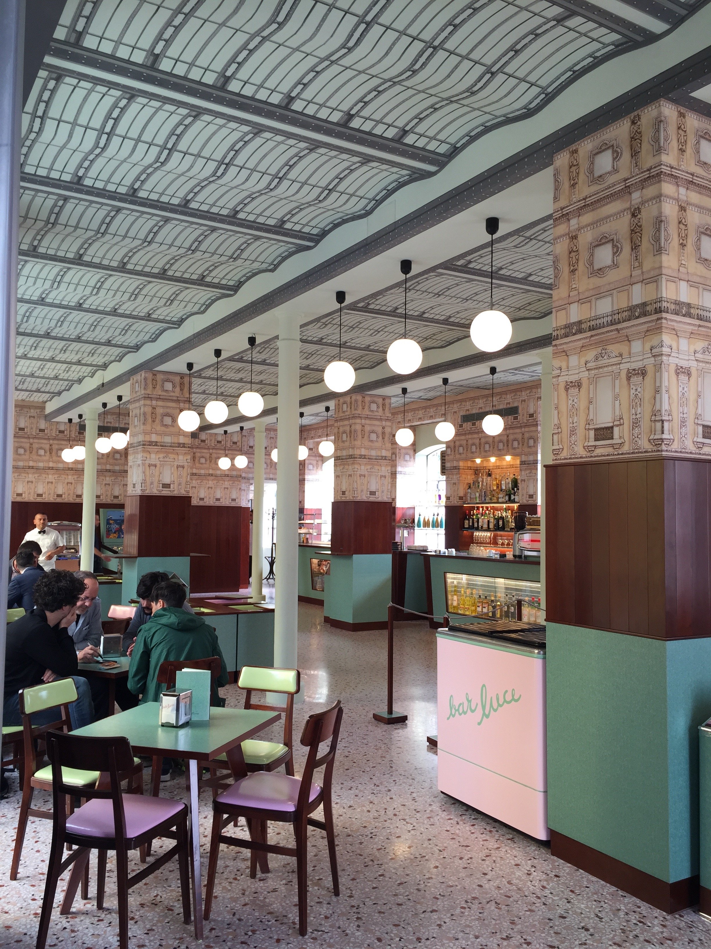
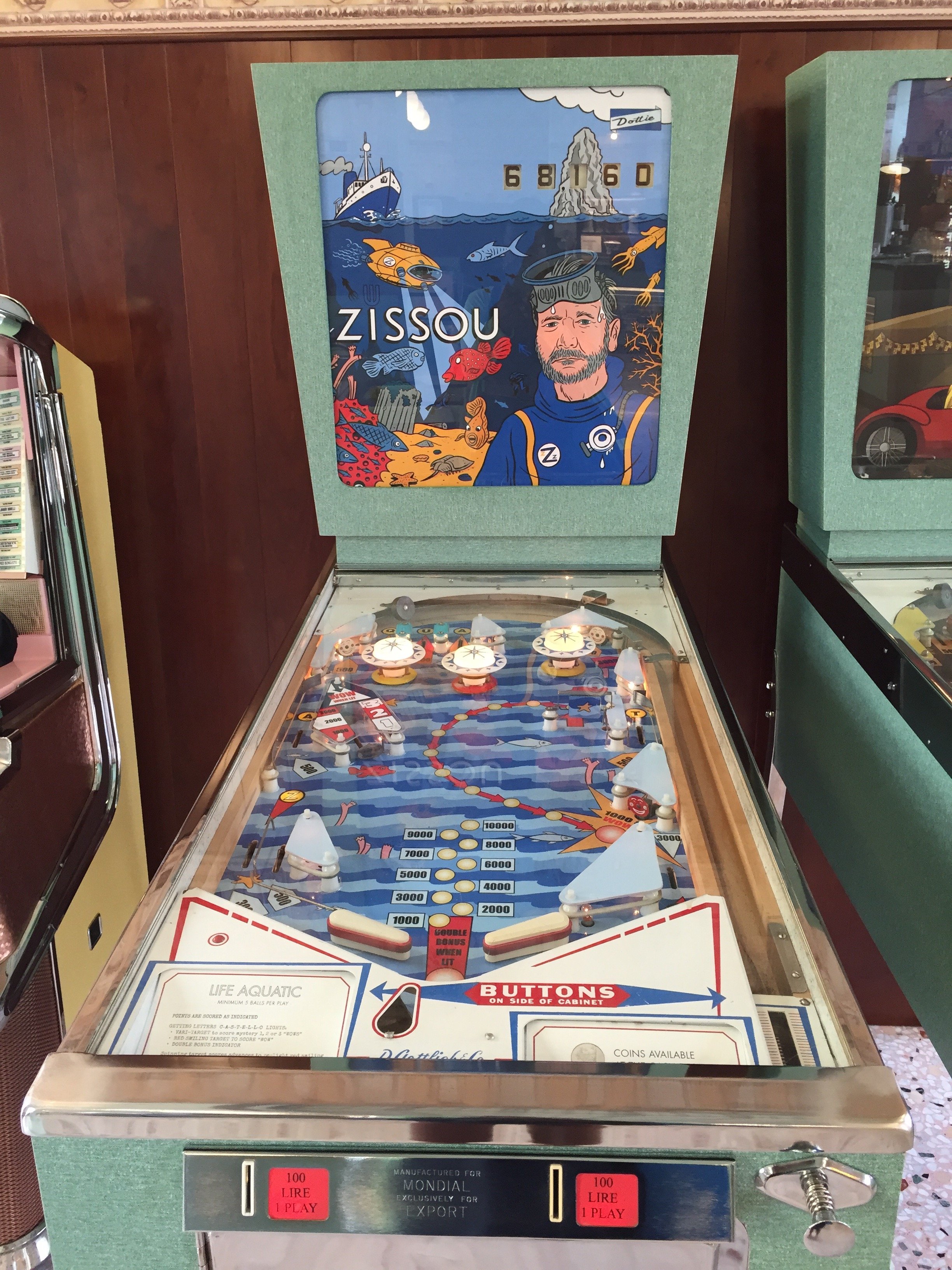
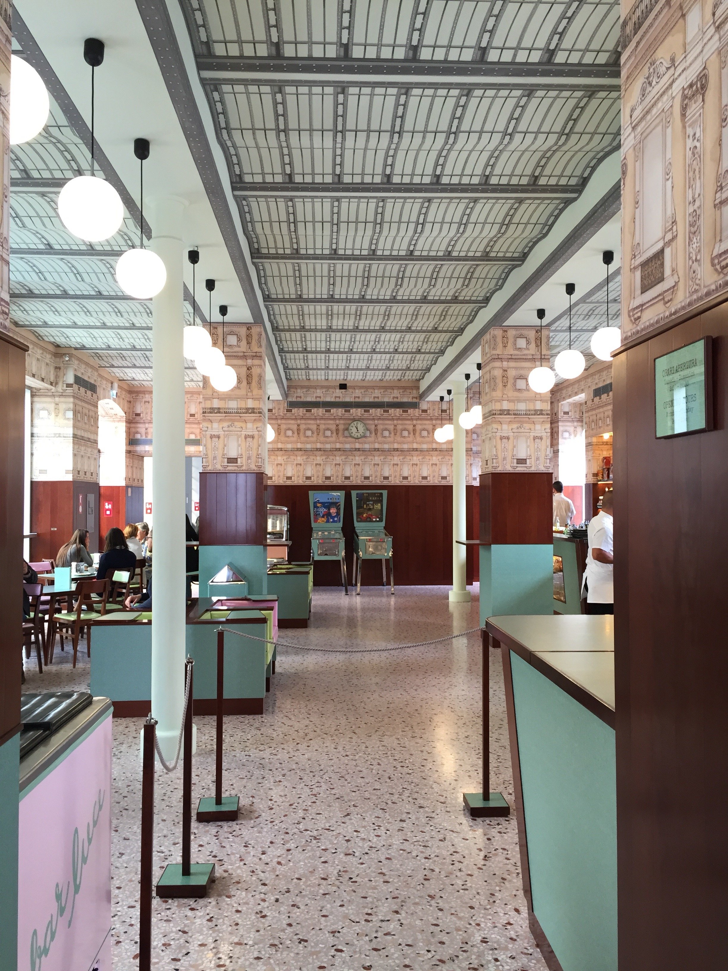
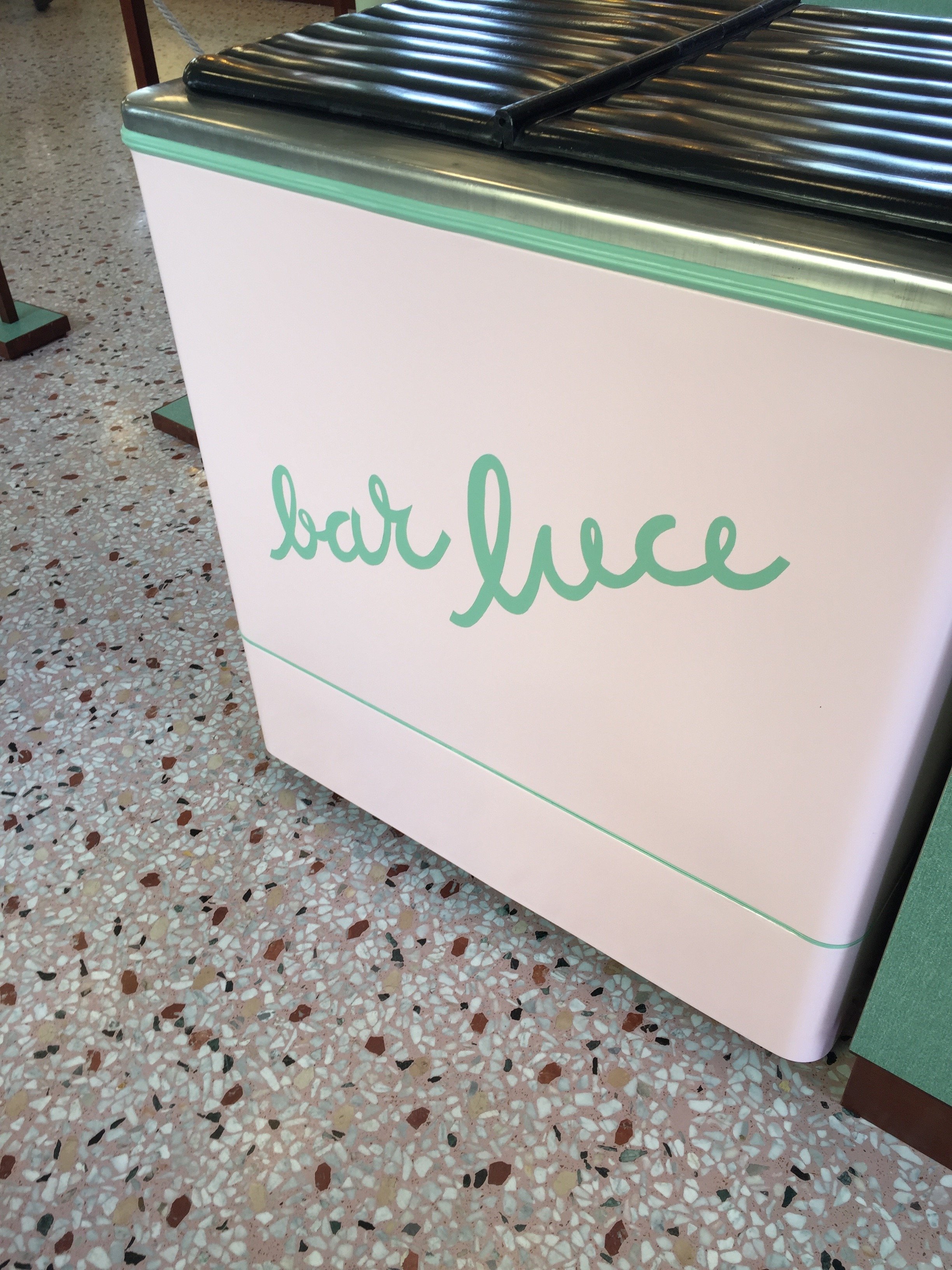
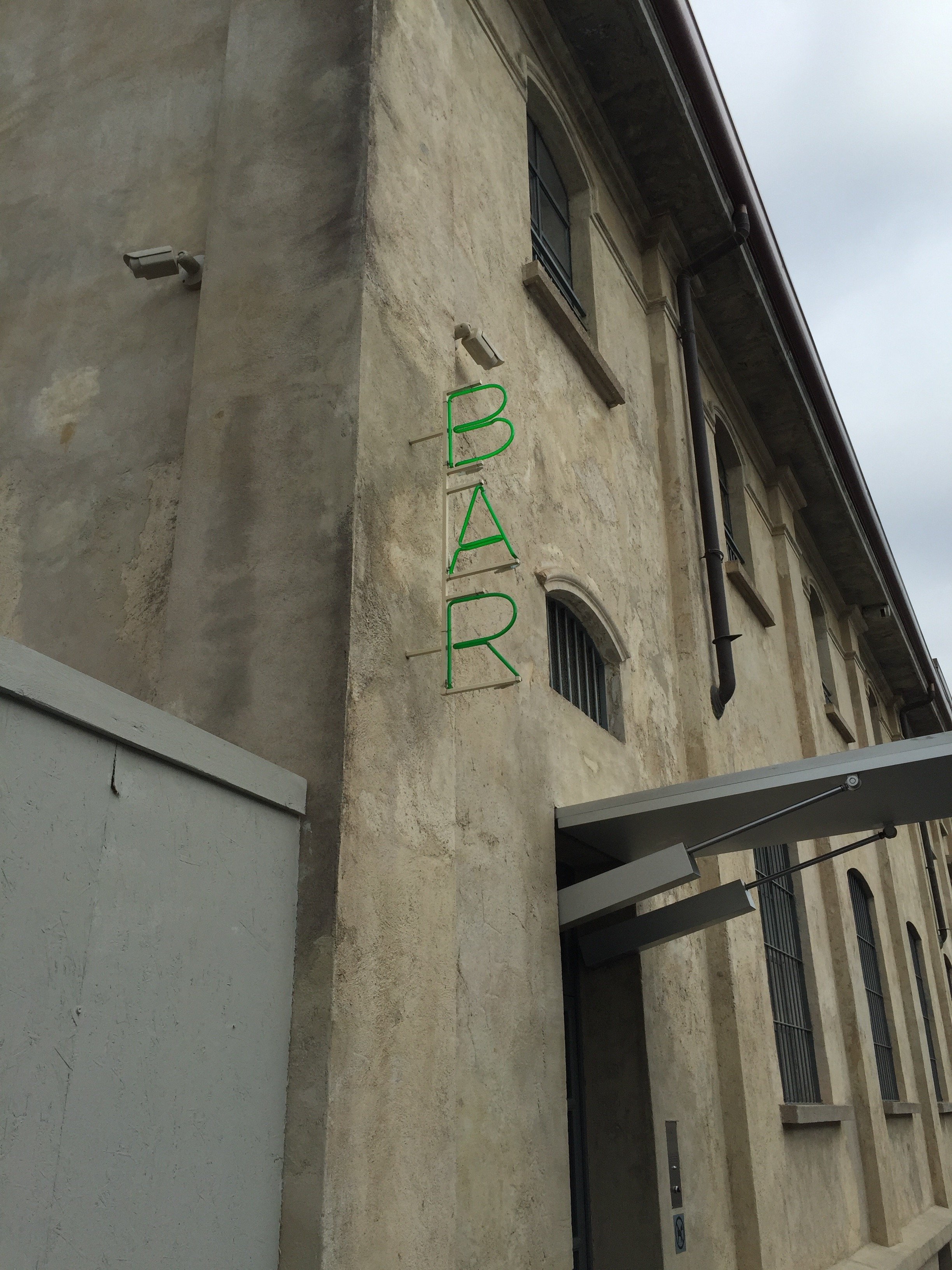
Hold up, how is it October already? One of my friends in the States was complaining about seeing Thanksgiving decorations already. I guess we should be grateful they weren't for Valentine's Day 2016.I have started my apartment search. It's, well, a trip. I don't know what some of these landlords are thinking. The bathroom situation is not good.I'm having a hard time finding smaller apartments that are unfurnished. Most of the apartments in the neighborhoods I'm focusing on were built for families. I don't need a huge apartment and as a small business owner, it wouldn't be financially smart to take on that kind of monthly expense.I hope to find something this month. We'll see.I took a quick business trip to Milan last month. I got completely lost searching for a to-the-trade vintage furniture store. Once i realized I was very close to the new Prada Fondazione, I had to check out Bar Luce.Bar Luce was designed by film director Wes Anderson. Anderson has directed several short films for the fashion house.It's 1950/1960's Milanese style with a touch of Anderson's quirkiness. Opened everyday from 9:00 a.m. - 10:00 p.m., Bar Luce is the prefect spot to have coffee or aperitivi.There are so many wonderful design details in this space. I really need to return and spend a afternoon there, reading and writing.ADORE these lights. If I find an apartment with an ingresso/foyer that has overhead lighting, I'd love a fixture like this.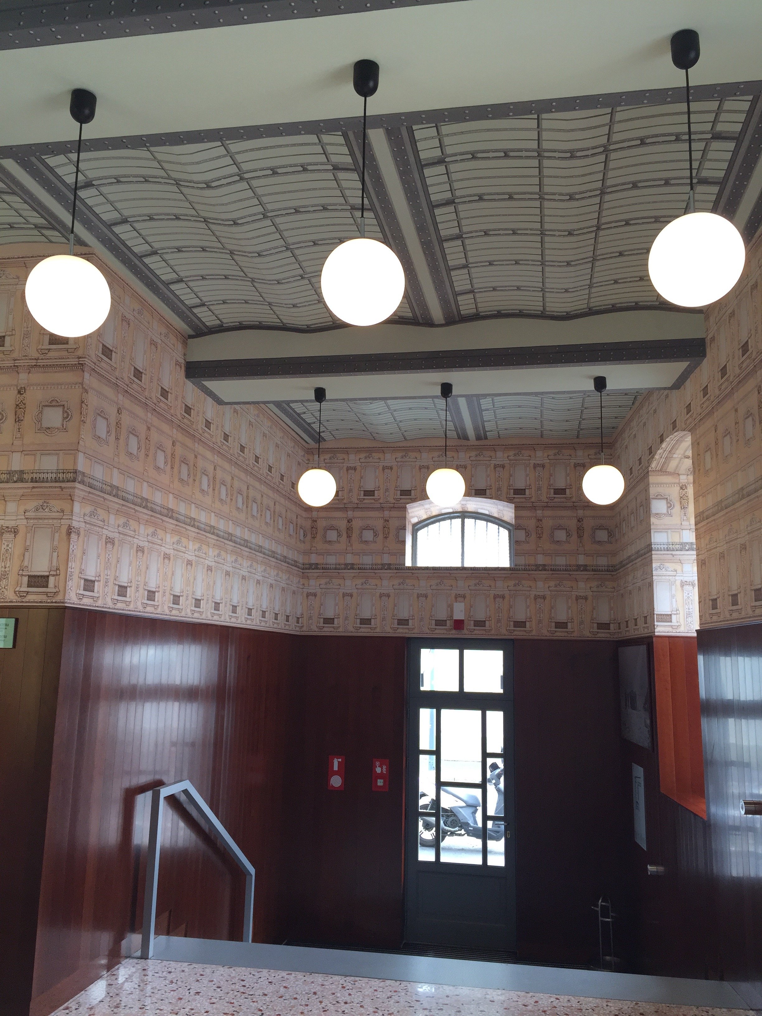 The dark wood helps anchor all the pastels. Without it, perhaps the décor would be too twee. Pink and green are fabulous together. Back in college I used to have a rugby shirt with those colors. One day while walking across the quad, an upperclassman asked me if I were an AKA. She said, "you do wear a lot of pink and green."I did. Not because I belonged to that sorority but because I wore a lot of preppy clothes in the 80s.
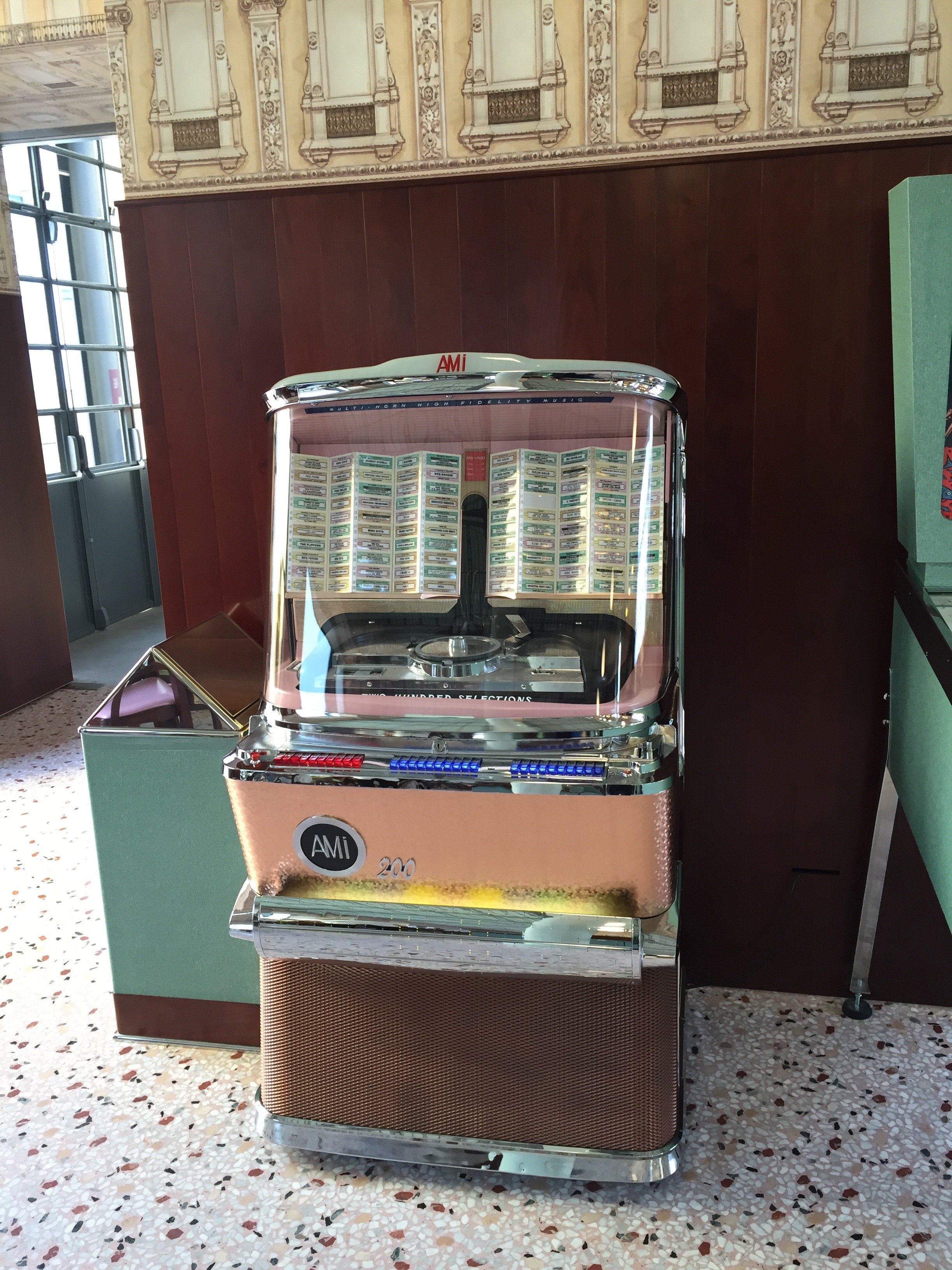
 I didn't have a chance to see what tunes were on the jukebox.
 One of my favorite Wes Anderson films. I must buy the soundtrack.
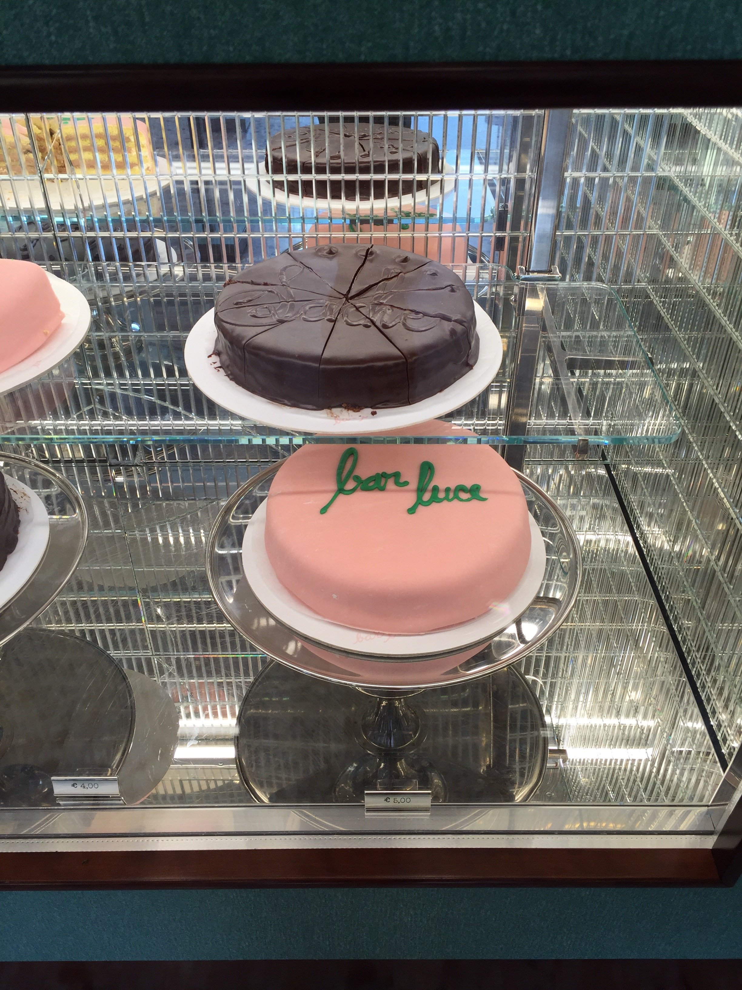
 I wonder what flavor the pink cake is. So pretty.

Life in Rome - This Time I am Ready for Ferragosto
First, I've just returned to Rome from a business trip to the States and the Caribbean. Below are some random observations:Los Angeles traffic continues to get worse. How is this possible.Target is great.J.Crew. What is happening? I've been a fan since the 80s. Something is amiss.Why is Ben and Jennifer's former nanny in the press so much? What is her end game? Reality show?Speaking of reality shows, what the heck is Hollywood Cycle?Ina Garten. Adore.Guy Fieri. Why so many shows, Food Network? Why?!My friend Erica posted this TIME magazine article that said Americans dressing like slobs equals freedom. Perhaps I have lived in Italy too long or I am turning into my Caribbean parents because I think that's absolutely ridiculous. Freedom? From what? The tyranny of Dior?The GOP debate. Fascinating. Trump was peak Trump.The flight attendants on Air France were very friendly and cheerful. It's a long flight from St. Martin to Paris (8.5 hours). Meanwhile, the American Airline attendants on the Miami to St. Martin flight (only 3 hours) not so much. Why?Portions in America are too big. I couldn't finish a single meal.The newish Restoration Hardware showroom in West Hollywood is odd. I don't get it. Is it just for the trade? Who thought it was a good idea to have a 40,000 sq ft store where you have to buy everything online or from the catalog? The scale is huge. How can any shopper, who doesn't live in a castle, envision that massive furniture in their home?It would never occur to me to combine these two things: Second, in the past I have written about my Ferragosto issues. Despite living in Italy for seven years, I was very American when it come to vacations and/or taking a break from work.I said, "was" not "am." Finally, this year I get it. I cannot wait for August 15th. Truly.My trip was intense. I recently signed a Los Angeles based client and flew to Los Angeles direct from Rome. I have NEVER in my life been so happy to sit in a freezing cold plane for a thirteen-hour flight. The six week heatwave in Rome was warping my brain. There were rumblings about Alitalia striking that weekend. Thankfully, they didn't and I got an upgrade to Business Class. Nice.That upgrade made a huge difference. I had horrible jet leg during my trip to Los Angeles back in May. This time it was much better. I think it also helped that I walked to the Century City Mall shortly after arriving and stayed up until 10.30 p.m.While I was running around Los Angeles with my client, I had deliveries and construction happening in Rome for another client. Given the nine hour time difference, things were a little hectic. I was only in Los Angeles for a few days and on my client's schedule so I didn't see many friends or "do meetings".Then I fly to Miami. It was my first trip to the city. I need to return and see more of it. I really liked the vibe. I stayed at the Viceroy which was fantastic.Unfortunately, the design district is shrinking after LVHM bought out several blocks. It was still a productive trip. I sourced some great items for my Anguilla project.From Miami I flew to St. Martin. I said hello to my parents, and the next day took the ferry to Anguilla.After all the flying, unpacking, repacking, shopping, meeting with contractors, painters, carpenters, project managers, receiving texts from clients in Rome about things we need to do ASAP, etc. etc., I hit the wall on Saturday.While packing (again) I watch Flipping Out. Can we talk about this show? I have so many questions. I wish Bravo aired in Italy.I'm not complaining but a very strange thing happened during this trip. I do not feel guilty about looking forward to August 15th. Not one bit.Of course I'm not going completely cold turkey. There are quite a few back office things I need take care of during the break and meetings I must attend.I bought a stack of shelter magazines in the States and the book The Bee Cottage Story. I'm going to cut way back from the Internet and chill. I know September is going to be off the charts busy. Everyone returns to town and I'm looking for a new apartment. The latter will be an interesting process.I may not be able to Dolce Far Niente for two weeks but can try for at least two days. To prepare I need to put together a killer playlist which will include one of my favorite summer jams from August 1990.http://www.youtube.com/watch?v=gzoEK545j64Buon Ferragosto!
Weekend Inspiration - Frame Denim - NYFW f/w 2015
I was feeling the '70s vibe during New York Fashion Week. I'm curious to what London, Paris, and Milan will bring to the runway.While there were some truly horrific get-ups in the '70s, it's one of my favorite fashion decades. Some of the silhouettes were so chic, sexy, and timeless.A few years ago I went to the Helmut Newton exhibit. One thing that stood out at me was how the dated the clothes from the '80s were but the clothes from the '70s could be worn today.I'm too short for some of these pieces but this collection from newish label Frame Demin is fantastic. Suddenly, I must listen to THE LAST DAYS OF DISCO soundtrack. Buon weekend!
Life in Rome - My Attempt to Take Ballet Classes at the "Fame" School
Recently, I wrote about how I was inspired by Garance Doré's post on the New York City Ballet.Last week I checked out IALS (Istituto Addestramento Lavoratori dello Spettacolo) aka the Fame school in Rome. It was a straight-up disaster.I had signed up for a Beginner's class. There were three other women in my class who looked like ballerinas. The teacher, an older gentleman from Eastern Europe, quickly shouted out some choreography. I was overwhelmed within sixty seconds.I thought I was doing this:http://www.youtube.com/watch?v=Rnaq1iwxOF0 But it was more like this:http://www.youtube.com/watch?v=d2K4Kusf-a4Not a good look.The teacher stated, "You've never done ballet before." No, that is why I'm taking a Beginner's class! The other women had excellent turnouts. It was obvious they had experience. There are three different levels for Beginner's and I was in the first one. What the heck was going on?During one routine, we had to put our legs on the barre. I'm short and my leg could barely reach it. The only time the teacher walked over to me was when I was struggling to reach the barre. He pushed my torso closer to it and I thought my body would split in two.When the three ladies started pirouetting across the floor, I had to pull over to the side.I felt very discouraged after the ninety minute class was over. Clearly, I was too short and too old to take ballet lessons. I walked home (of course it started to rain) in a funk.I spoke to my friend Courtney who studied ballet as a child and to this day still does the warm-up exercises she learned. She told me not to give up and to try another teacher's class.I already had a monthly pass, so why not? I did and it was a revelation.The teacher, a svelte Italian man who could probably lift three times his body weight, introduced himself and asked me if I understood Italian. There were ten of us in the class and it was co-ed. He showed us the choreography, calling out the different positions while drawing our attention to his hand movements. As we danced, he would correct our form.He had two assistants and they also demonstrated the moves. If a sequence was too difficult for some of us in the class, he told us to watch the assistants, the more advanced dancers, and to do our best, "tranquilla!"During my first lesson, I felt clumsy. In his class, I felt graceful. I appreciated how he would walk over and show us where our hands, feet, and/or head should be. When we executed a move well, or corrected mistakes on our own, he would say, "bravo/brava!"At one point, while he was changing our music, I could hear the music from the Advanced class in the studio across the hall. It was "Concerto for Two Violins and Orchestra in D Minor"by Johann Sebastian Bach.http://www.youtube.com/watch?v=DJh6i-t_I1QThis is one of my favorite pieces of music. I was so moved, I had to choke back tears.Once the class ended, we thanked Il maestro and his assistants. The ninety minutes had flown by. The next group of dancers and their teacher rushed in as we put on our street clothes in the hallway.I know my turnout will improve and it's okay that I didn't start lessons when I was four. I'm starting ballet now and I love it.
Weekend Inspiration - Garance Doré Studio at the NYC Ballet
I've always loved ballet but have never taken a class. I thought I was too short. The only dance class I've taken was modern dance in college.Lately, I've been thinking about signing up for classes. So what if I'm only 5.2"? I have several friends who are taking adult ballet classes and they rave about them.I play tennis and have played sports all my life. I need to mix things up a bit, especially as I get older. I've tried yoga and ripped a tendon in my wrist probably because I was incapable of focusing on the task at hand. It was a very painful injury. During yoga classes my mind was always racing, thinking about all the things I had to to do. I could never relax. I had the same issues when I tried Pilates.Perhaps ballet is the way to go. It combines athleticism with art, balance, agility, endurance, and mental focus. We'll see what happens.When I woke up this morning and saw Garance's latest post, I had to send it to my ballet-loving friends immediately. The Studio was invited to visit the New York City Ballet as they prepared for the opening night of their winter season.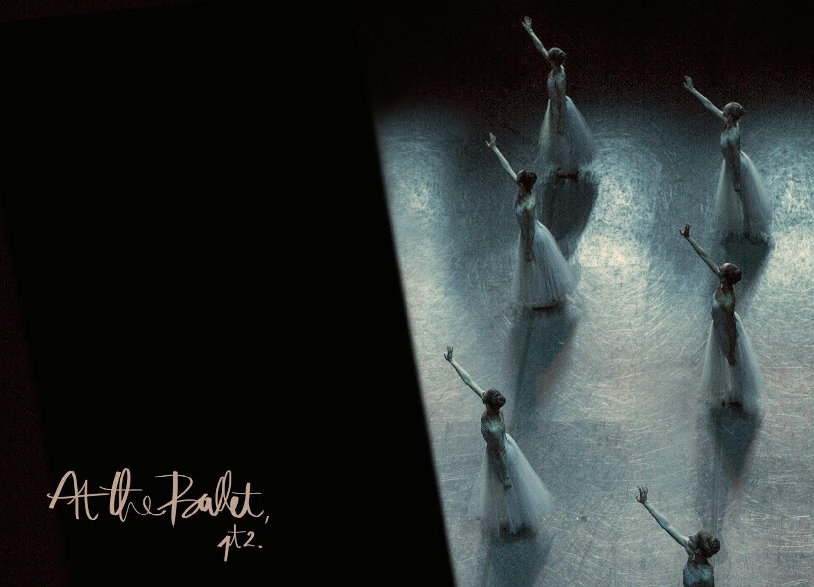
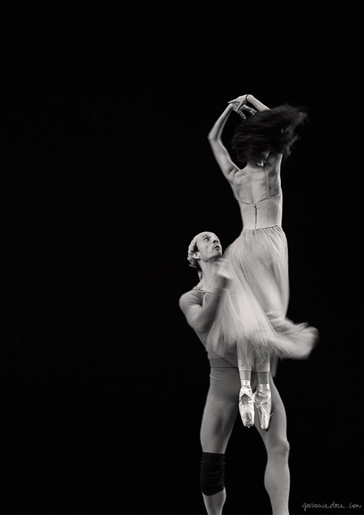
 These intimate photos are so beautiful and inspiring. To see more, click on to Garance's blog HERE.Buon weekend!
Pantone's Color For 2015 - Marsala
Design blogs blew up this week when the news hit that Patone's color for 2015 was Marsala.I enjoy cooking with Marsala wine. I really do but I must agree with majority and say, "what is this madness?!"This color reminds me of Dusty Rose from the '80s. Not a good look. Could someone please explain to me what is going on in the picture below. What is Pantone trying to say?
 The gentleman in the apron looks salty. Why? Perhaps he's not feeling the color either.I'm very curious to see how this color choice plays out in fashion and home décor trends next year. I don't think it's an easy color to wear. For the home, I love the color of Marsala wine which is a deeper burgundy than this color. That rich color would be fantastic.
Design vs. Function - American Dream Builders
Perhaps I'm naive but I believe good design incorporates a space that functions well.This is why I completely disagree with the finale (SPOILERS ahead) of the NBC show "American Dream Builders". Looking at their Facebook page, I'm not the only one.Earlier, I wrote about why I enjoyed the show.They should change the name of the show because there was nothing about Lukas's beach house that worked for the clients.The job of a decorator/interior designer is to address the needs of the client. He did not do that. All Lukas talked about was his vision. He is talented but Jay should have won.On what planet is it a good idea to paint a beach house in SOUTHERN California black? It's not edgy. A black shingled house in Maine, or Martha's Vineyard, that could be cool. Does Lukas know that that the light is different in New England compared to the Southern Californian Coast? One of the judges said the house looked like it had been in a fire.Also, Lukas did not deal with any of the design flaws of his house. That kitchen was awkward.This a beach house for a multigenerational family. Their reaction at the reveal was priceless. I adore mid-century design and would use it in a beach house but would mix it up.Nate kept saying Lukas was forward-thinking. Has Nate ever been to IKEA? I know he has traveled to Europe. This beach house would work for a single person with no kids who never entertains.Nate raved about Lukas's $30 chandelier. Again, this is in a beach house. I go to a beach house to relax. Who's going to clean it and replace the light bulbs? It's not functional.This room. Where are the young children going to hang out? Nice to look at. Wouldn't want to sit there for a long meal. What is that statue about in the corner?
 Not relaxing. These chairs would be fab in a loft apartment, not at the beach.
 if the Neighborhood Council voted for the finale winner, Jay would've won hands down. Elaine was eliminated for her red family room because it didn't fit the décor of the rest of the house, but Lukas can win the whole competition for this house? Please.If they didn't want a home builder to win, don't put them in the competition.I don't know if the series has been renewed for a second season. It's a shame that the finale was such a disappointment but I enjoyed the earlier episodes.
Progetti da Sogno (aka, American Dream Builders)
The American series AMERICAN DREAM BUILDERS started airing this week in Italy on the channel LEI.Hosted by Nate Berkus, it's a mash up between EXTREME MAKEOVERS and TOP DESIGN. I have always wondered about the reality of the former. They do a lot of structural changes. How well was the construction, plumbing, and electrical work executed when they have only a week to demolish and rebuild? Could the owners afford the increase in property taxes? So many questions.One thing I really like about this show is that two teams work on two houses from a similar era and/or style. It's compelling to see how the teams agree (or not) on an overall aesthetic for their house and then how the individual designers design their rooms.There is a mix of designers, contractors, and landscape architects. Of course, there are some strong personalities. Reality TV would be boring without them.We are three episodes in and so far it's fantastic. The show is entertaining and educational. Décor is very subjective but it's interesting to hear the judges explain why they believe a room doesn't work. Sometimes it's a design issue. For example, the team did not address the layout issues. Other times, it's about the décor. Those debates get heated.I cannot wait to see who wins. There are some very talented designers on this show.https://dailymotion.com/video/x1htfrm
Weekend Inspiration - Halloween
Halloween is a big deal in the States. Here in Italy, we are starting to see more and more decorations but it's a three day holiday weekend, All Saints Day and All Souls Day.I have carved my share of pumpkins and ate my share of Halloween candy. I don't care what anyone says, candy corn should not be classified as a candy!Perhaps I could ask one my friends who works at the American Embassy if the commissary sells Charleston Chews. All of a sudden I have a craving for one today. In the meantime, I will buy a few mini-pumpkins to decorate my table.Leave it to Ms. Martha Stewart to take it to the next level with her squash version.
Photo: Martha Stewart
Buon weekend a tutti!
Oscar de la Renta - RIP
I woke up today to the news that one of the most important fashion designers of our time had passed away.Despite his five decades in the industry, de la Renta was not one to live in the past. He made classic, yet contemporary clothes. It is rare to see a designer dress society ladies, Fortune 500 ladies, movie stars of all ages, and women who are not famous nor rich but love beautiful things.Born in the Dominican Republic, he apprenticed at Balenciaga, under Cristóbal himself (unreal), and at Lanvin under Antonio Castillo. I know a lot of people dismiss fashion as silly. Perhaps some people in fashion are over the top but to me fashion is very interesting because it's a combination of art, craft, and commerce.There are so many celebrities out here on these streets calling themselves designers. Please.De la Renta was truly a designer. He made clothes. Beautifully. Mr. de la Renta will be missed.


