The Tuscany Project
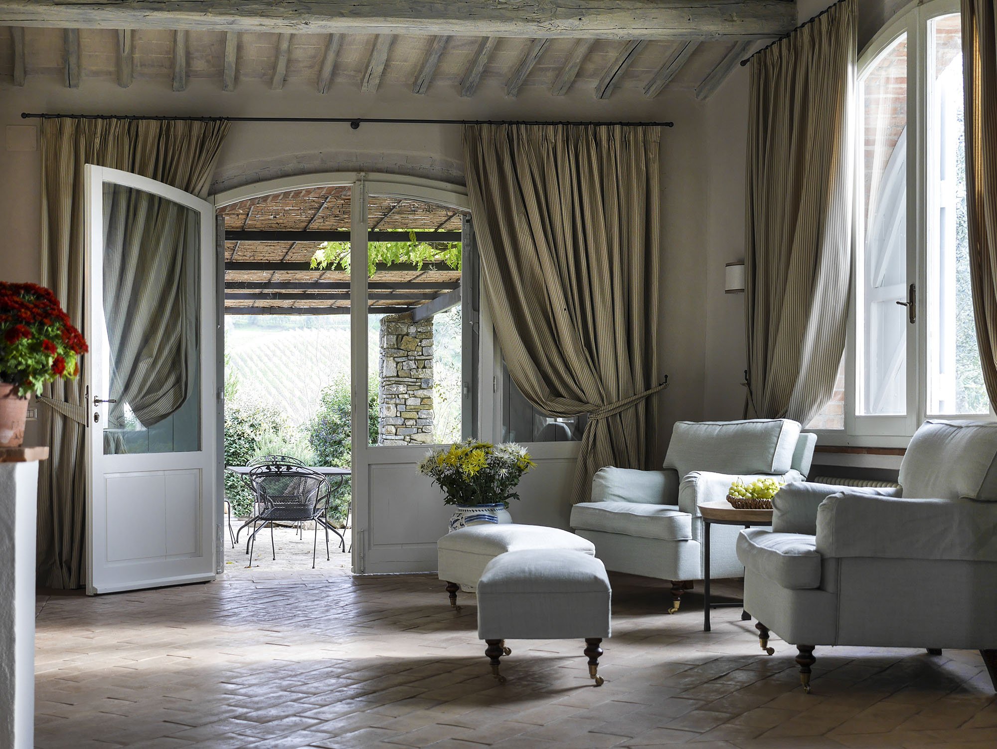
Last year I wrote about the vacation home in Tuscany I'm working on with architect Domenico Minchili.Our clients had some photos taken and below are a few of them.First, a before shot of the living room.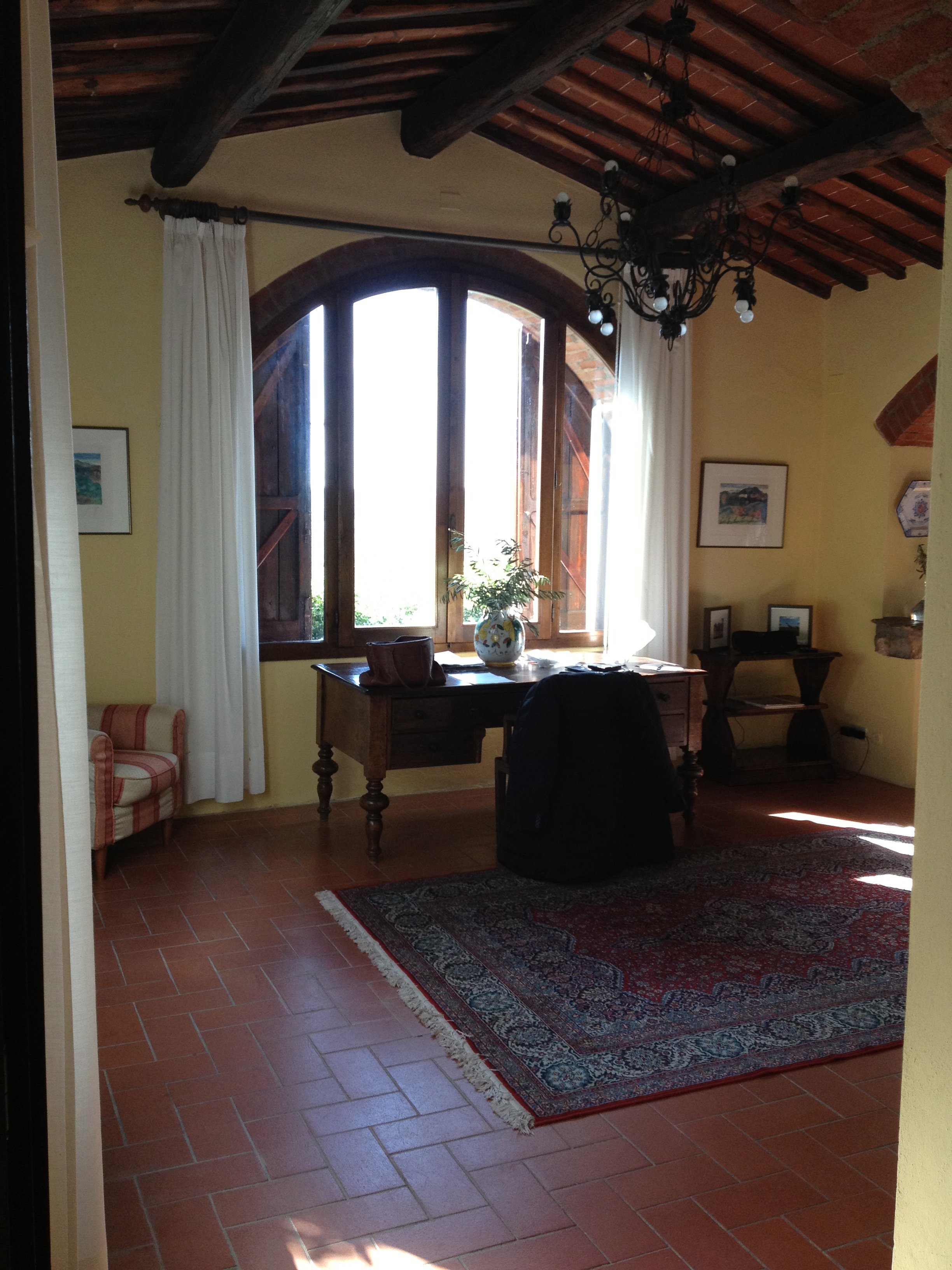 After.The room is so much lighter. The new "old" floors make a huge difference as does the paint color. I was consumed for days regarding which shade of Farrow & Ball white was the best white for the walls. We decided to use Skimming Stone.The chairs were custom made by Tondini & Radicchi. So were all the draperies in the house.
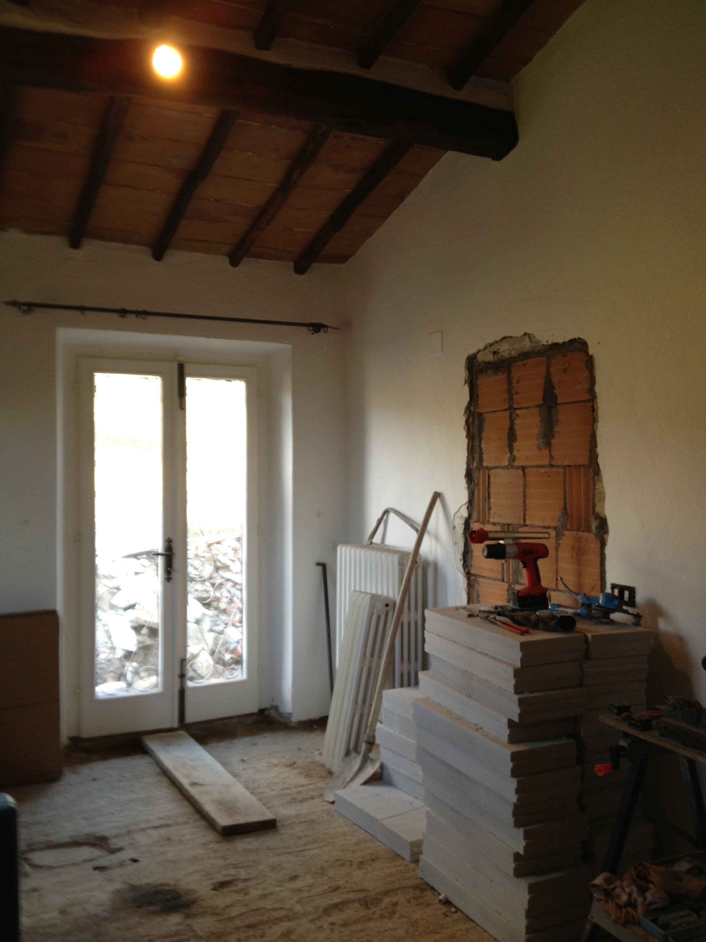
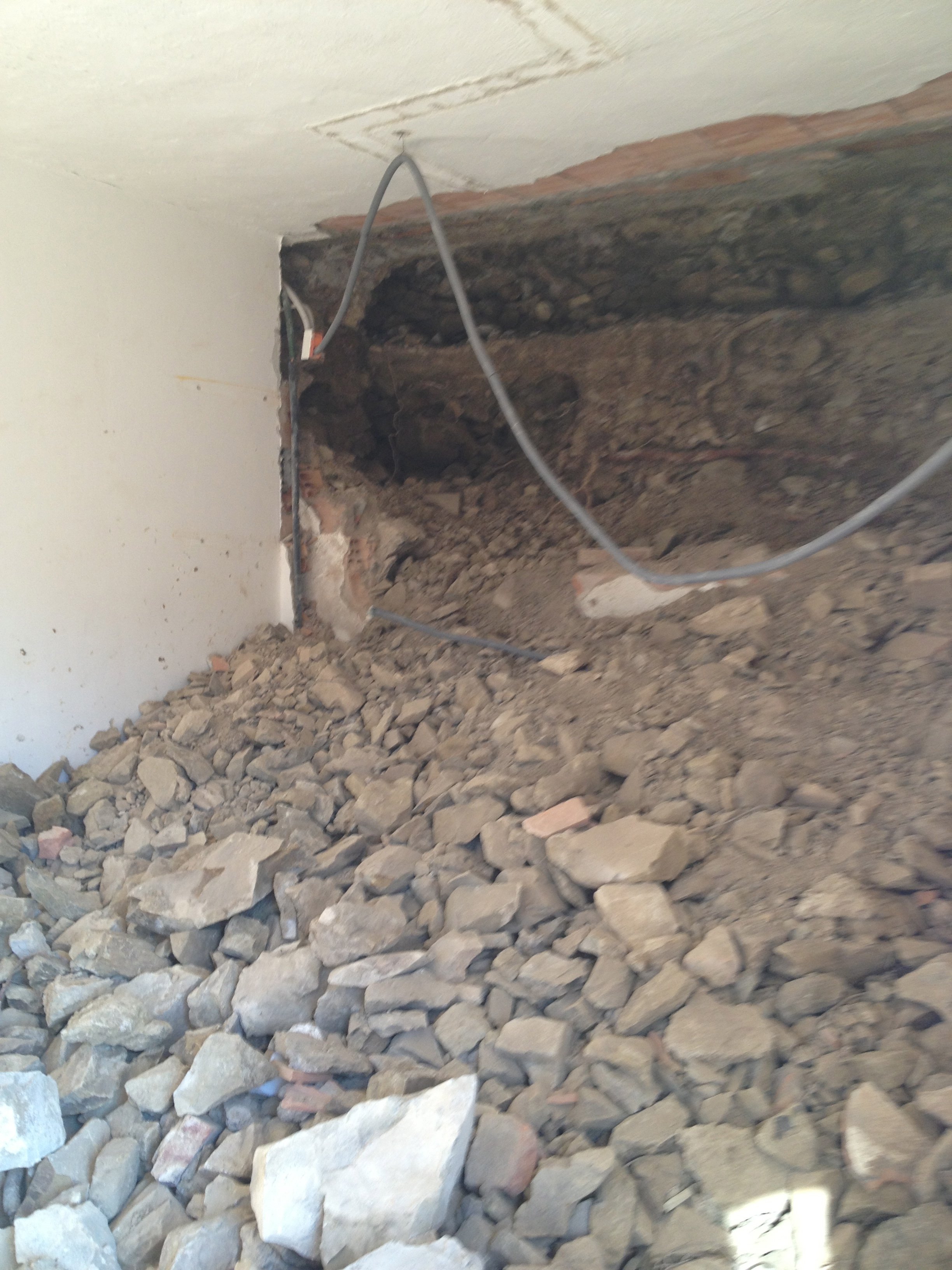
 One of the bedrooms mid-renovation.
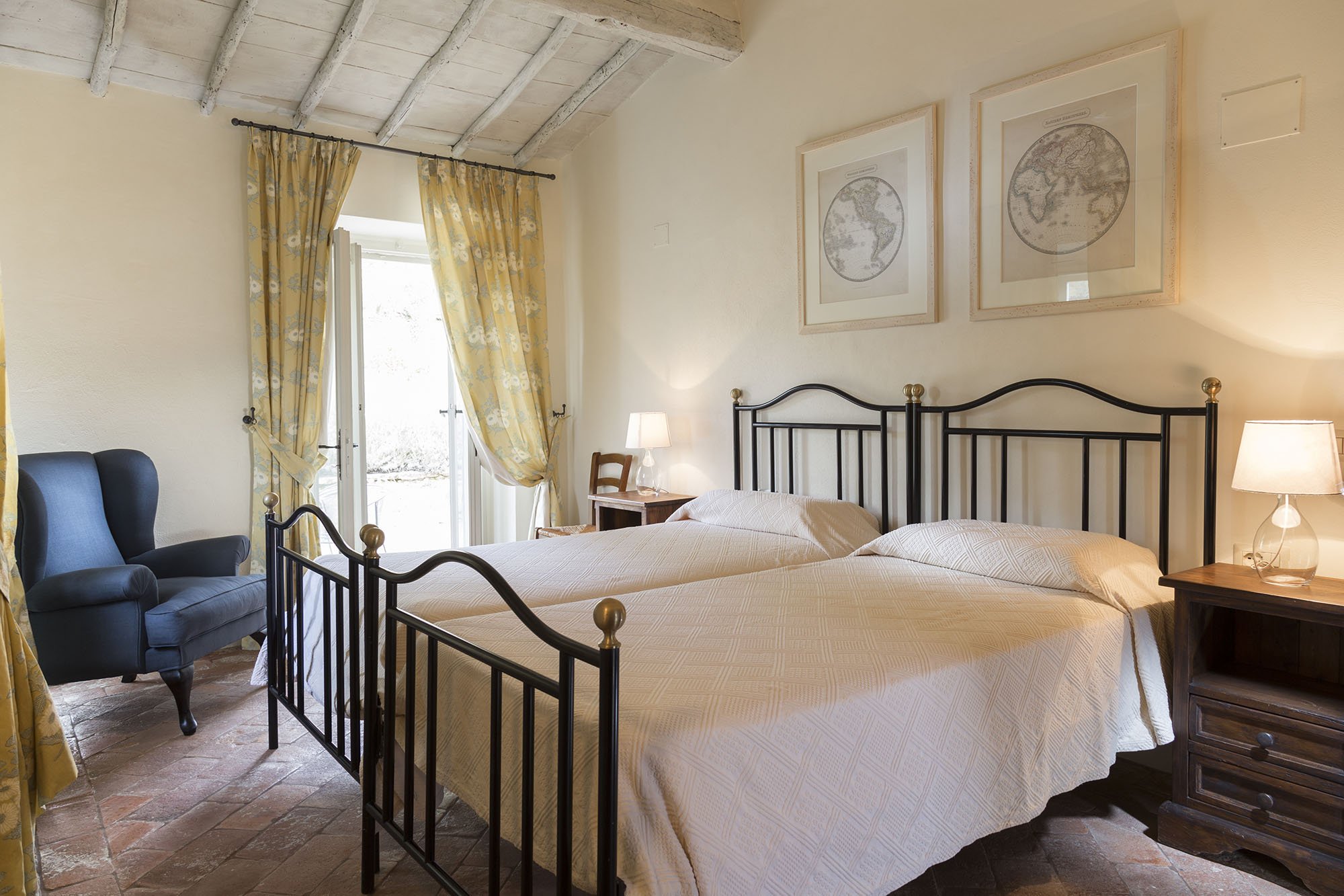
 After.
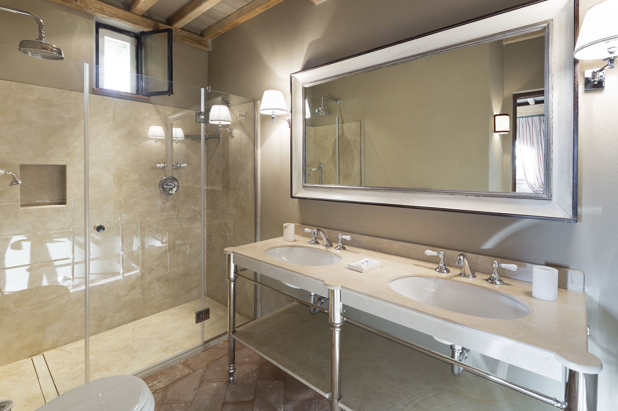
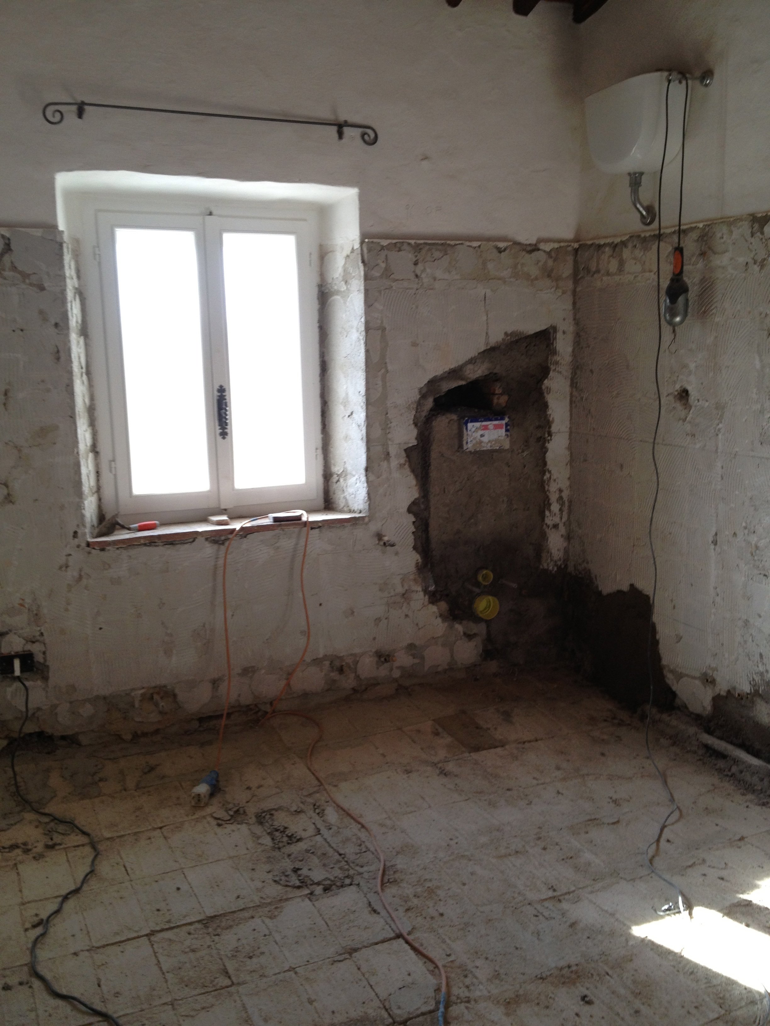
 A bathroom before.
 After.
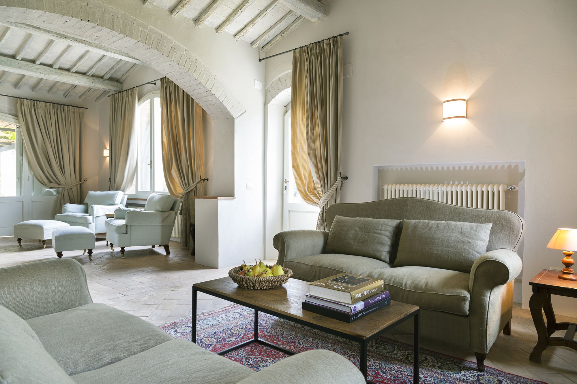
 Wider shot of the living room. The sofas, coffee table, and sconces are custom.
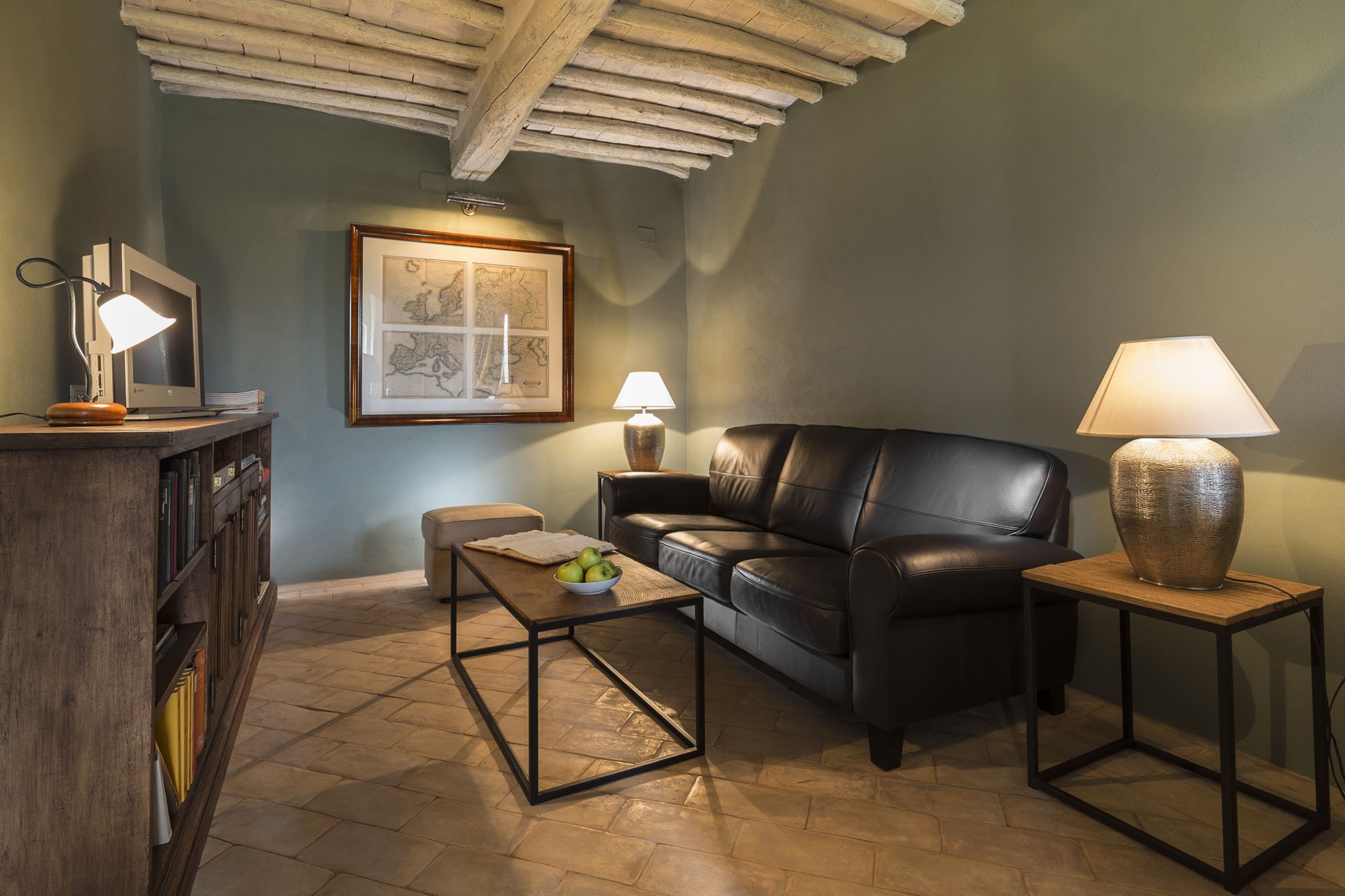
 The studio.This room receives little natural light. Many people assume that a small dark room must be painted a very light color in order to make it look bigger. Not true. It seems counter-intuitive but going darker gives a small room more depth.
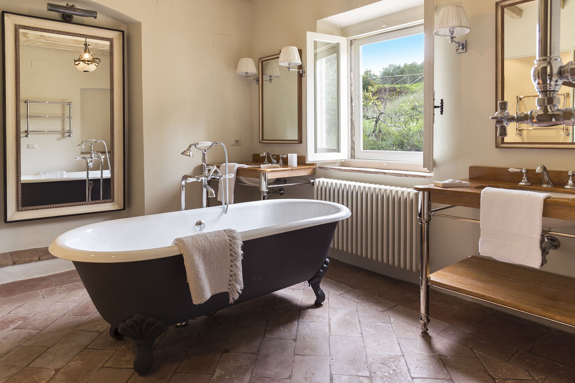
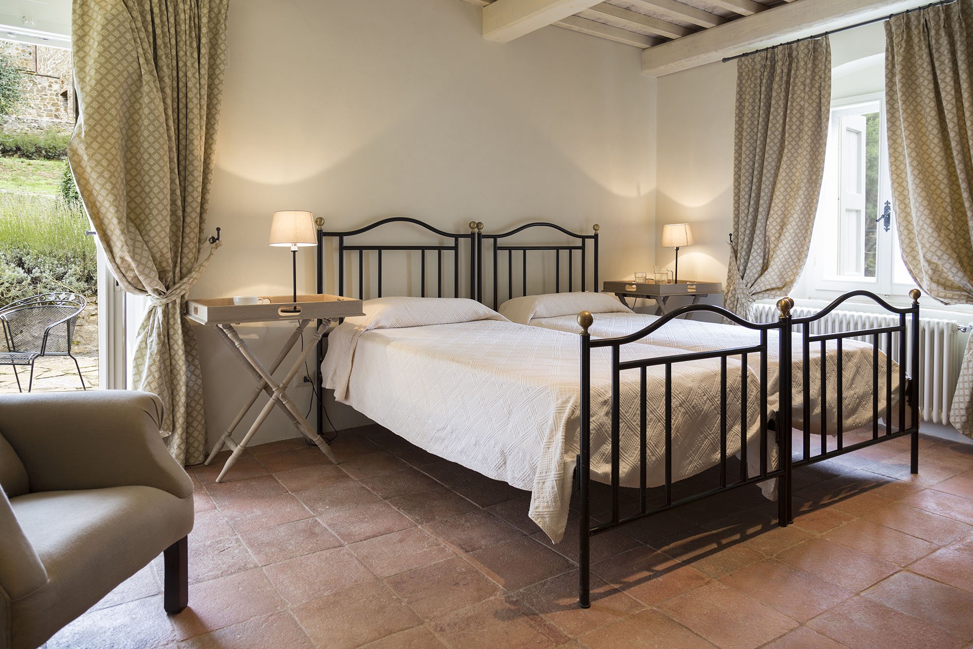
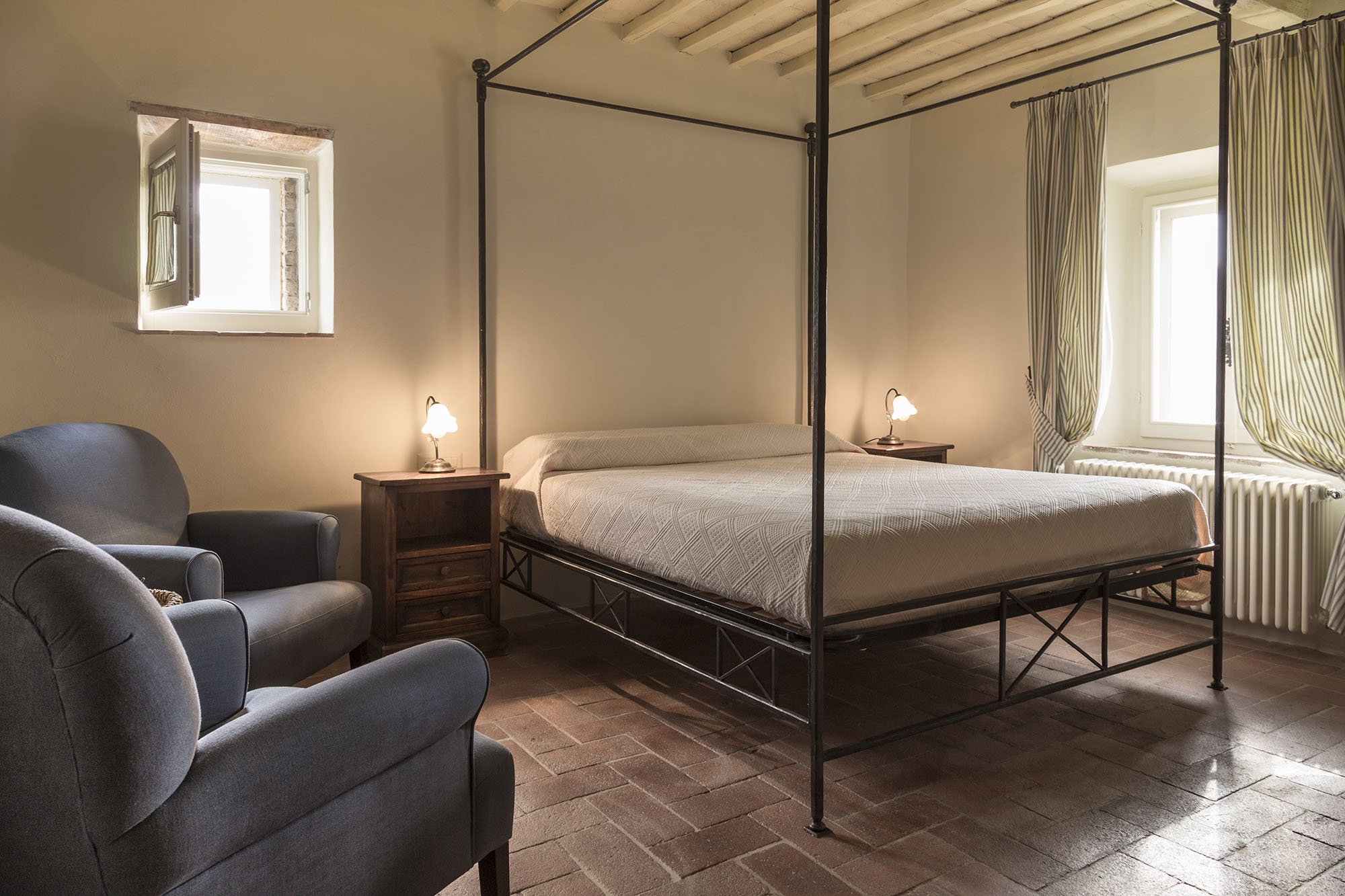
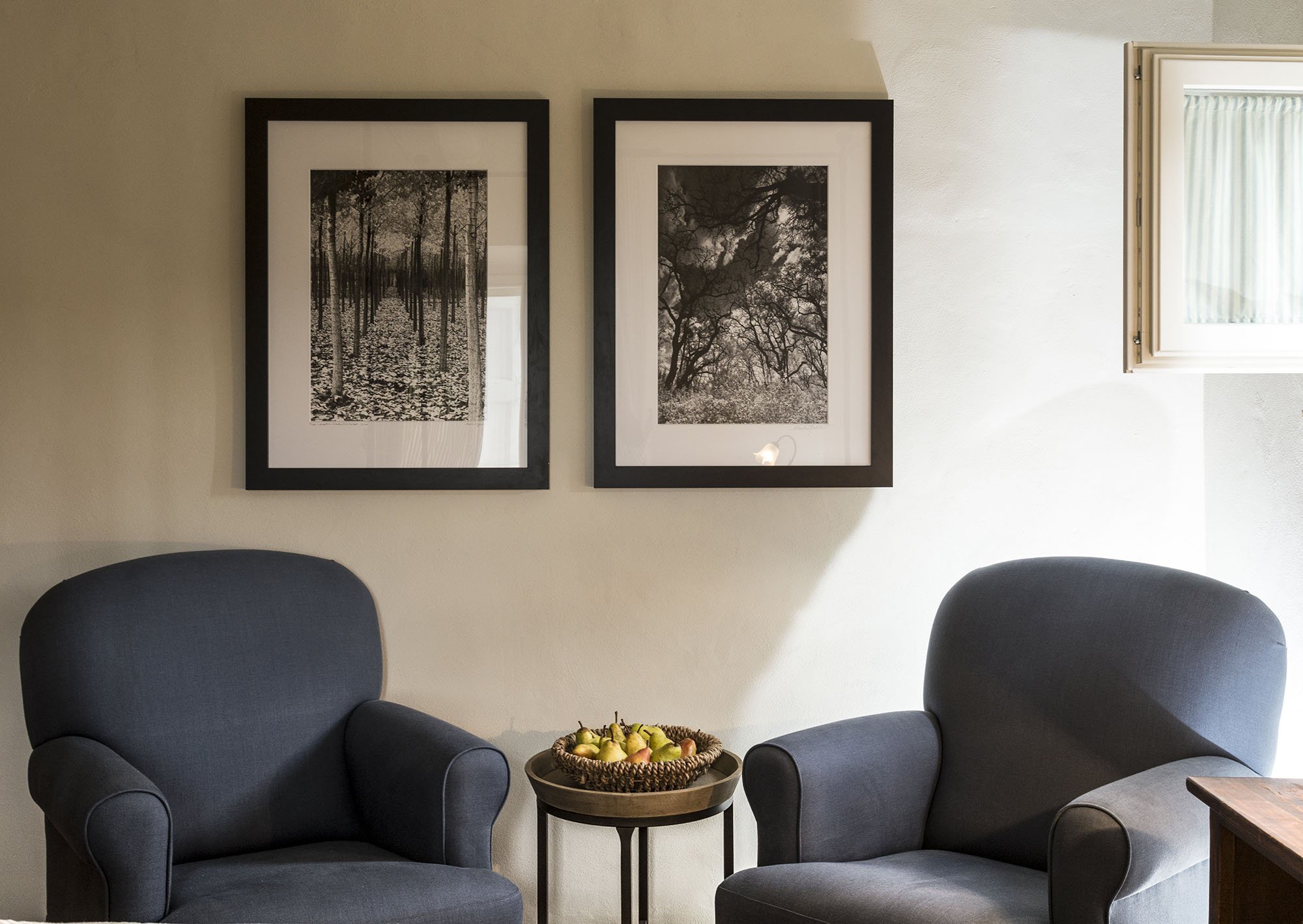
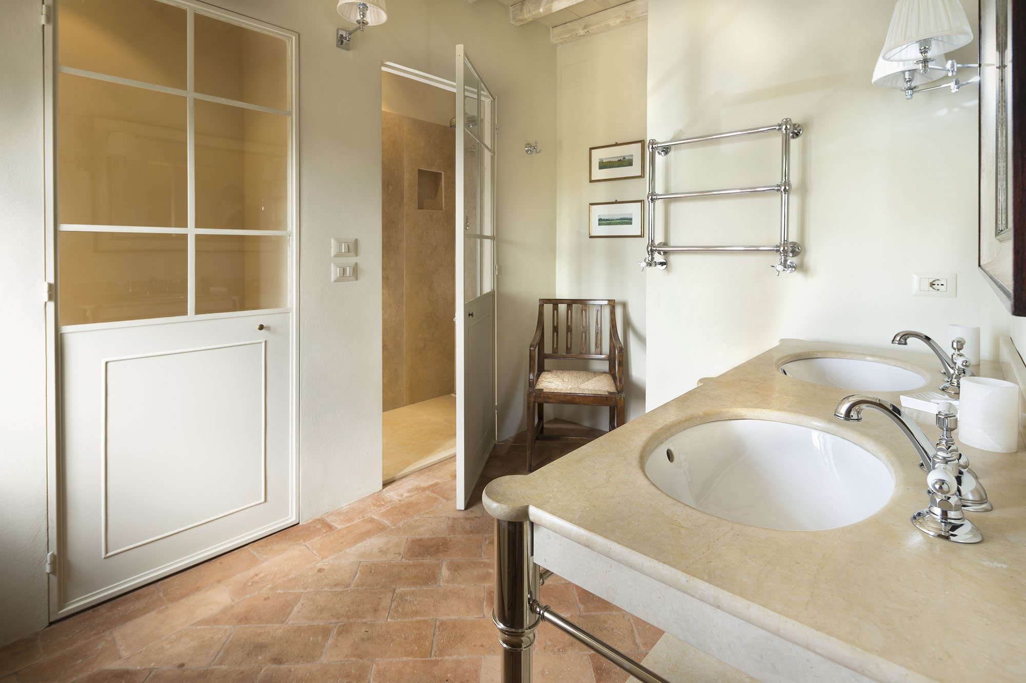

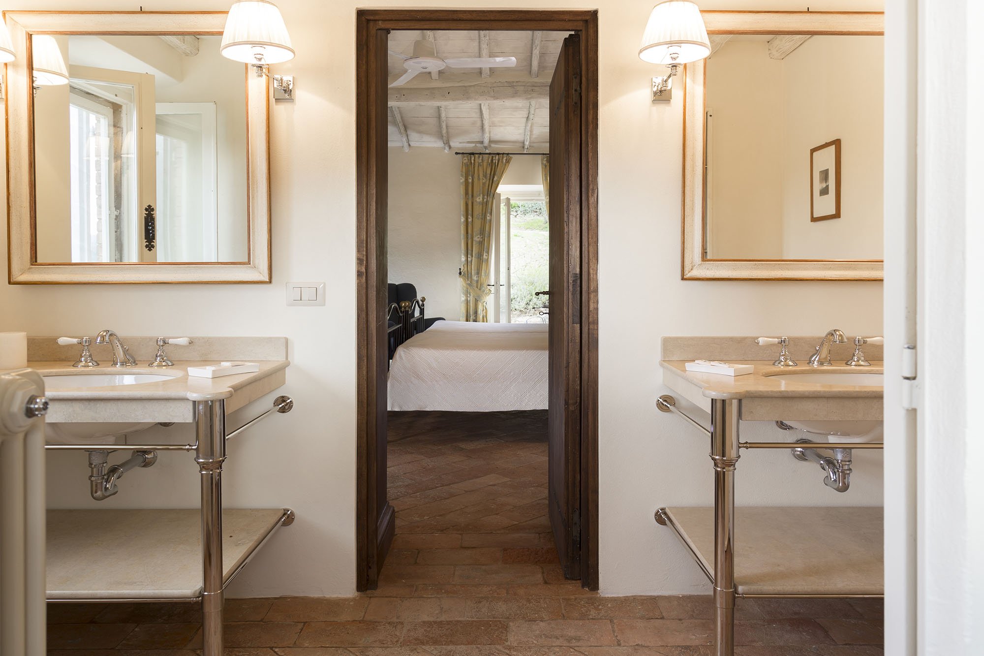
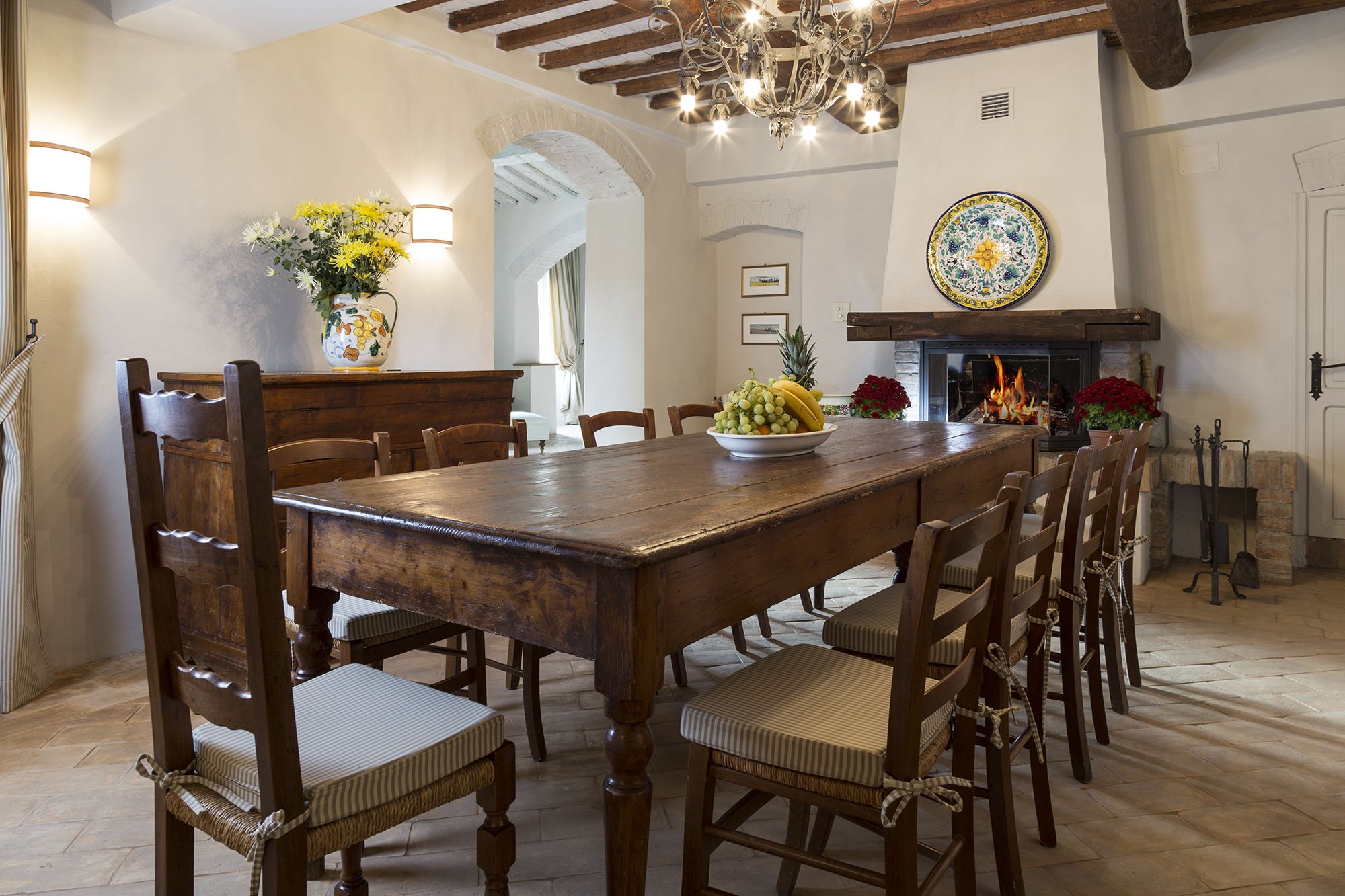
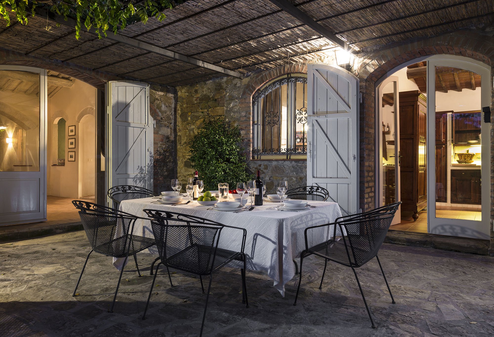
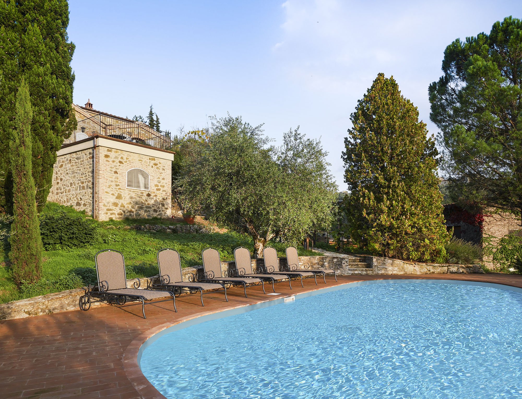 One of my Italian friends called this décor, "Relaxed Chic." Another friend said it was "Casual Luxury." Both work for me.Every bedroom, and its bathroom is unique, yet the entire home is cohesive.The paint is from Farrow & Ball.Most of the new furniture was custom made. We also sourced pieces from Flamant, Barthel, and small shops in Rome and Tuscany.Our fabric sources were, Dedar, Ralph Lauren Home, Kathryn M. Ireland, and Pierre Frey.If you would like to know the specific colors or more information about the fabric or furniture, please feel free to ask me in the comments section.This property is available for vacation rental. It's in the heart of the Chianti region surrounded by vineyards. The views are stupendous.For more information (and some exterior photos), please visit the luxury rental Abercrombie & Kent website.Photos by: Mario Flores
Weekend Inspiration - Architectural Digest Showcases A Castle In Umbria
I cannot wait to pick up a copy of the November issue of ARCHITECTURAL DIGEST (USA).One of the stand out articles is about the restoration of a castle in Umbria. The architect was Domenico Minchilli and the interiors were decorated by Martyn Lawrence Bullard. The two were brought together by the client, Evgeny Lebedev.I wrote about Domenico and the project we're working on in Tuscany HERE.Domenico showed me a few before pictures of the castle. As I looked at the photos I thought,"the word ruins doesn't convey what I'm seeing. Perhaps a pile of rocks would be a better description."I was floored by the transformation. It is truly inspiring.The November issue is on newsstands (Stateside) now.Buon weekend!
Work In Progress - Country House - Tuscany, Italy
I was recently hired by the very talented architect Domenico Minchilli to work on the interiors for a home in the Chianti region of Tuscany, Italy.Words cannot adequately express how excited I am about this project.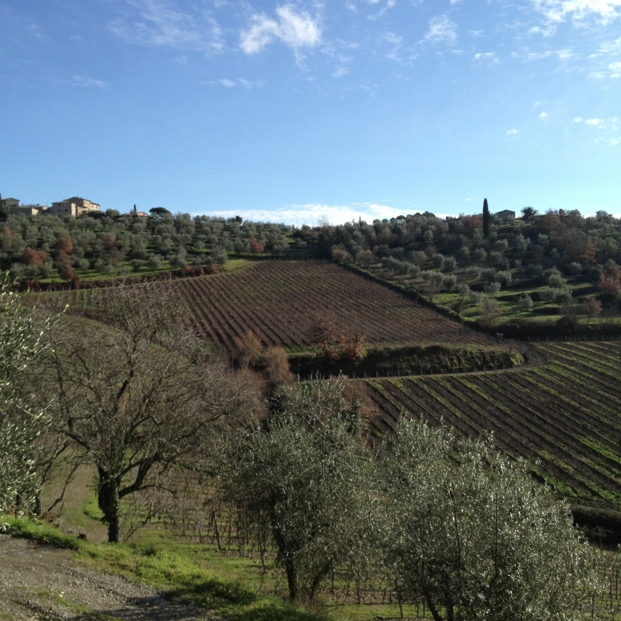 We have a mid/late Spring deadline.
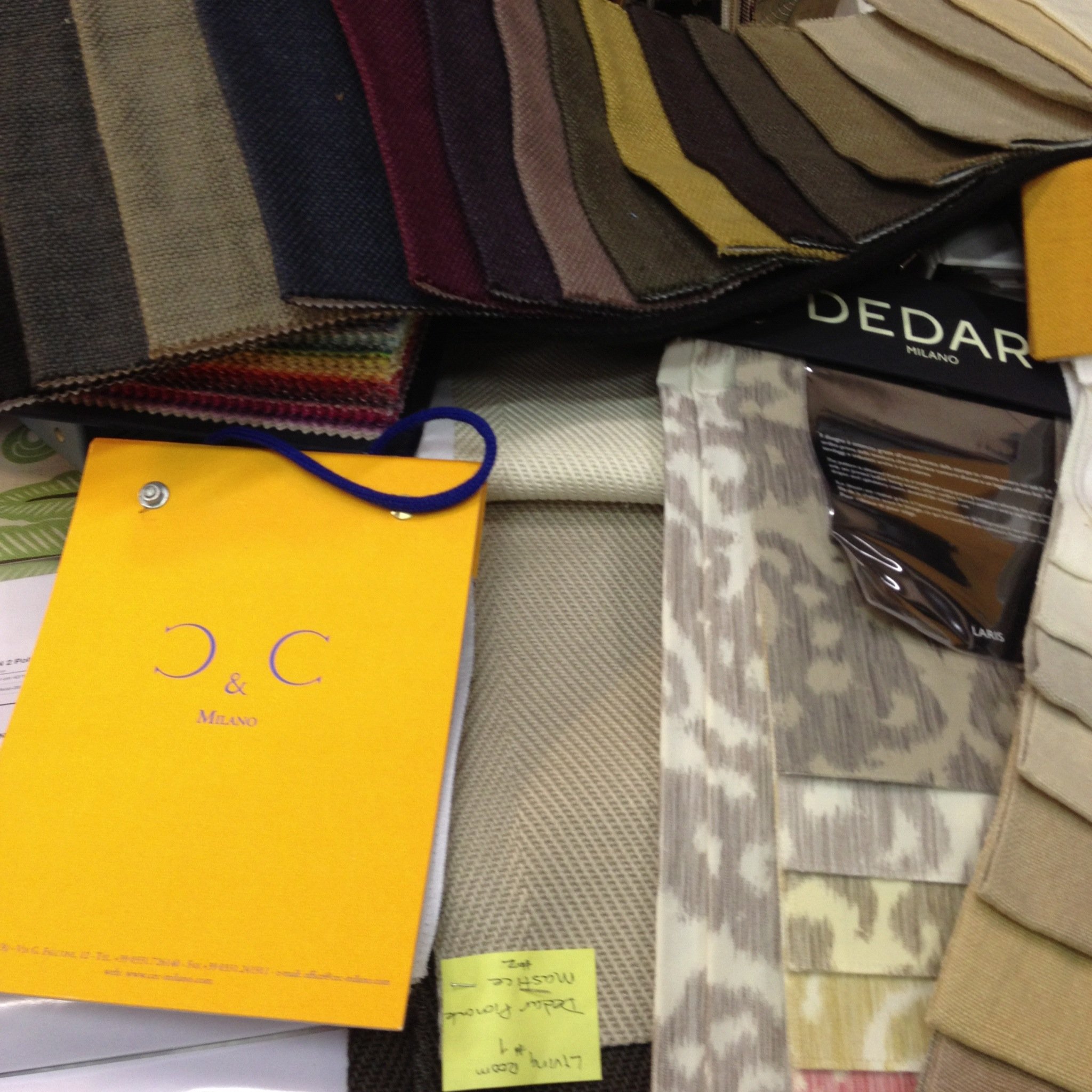
 Early on, I started to pull images for an inspiration board on Pinterest. Some of the images came from books in my library, photos from my travels, or from my favorite websites. Originally, I had over sixty-five images. It was a great visual tool and helped me see the big picture. I kept that version of the board private so I could show Domenico what I was thinking.Once I had a clearer idea of what the client wanted/needed for their home, I put together a mood board in Photoshop for each room. There has to be a separate post about Photoshop... DRAMA.
 I had written a much longer post but deleted it. It was way too sappy.However, I will say I'm thrilled to be working with such an incredible group of people and that 2013 is off to a great start.