The Tuscany Project
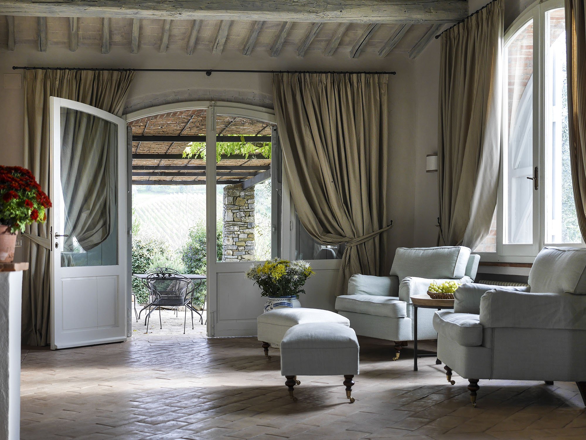
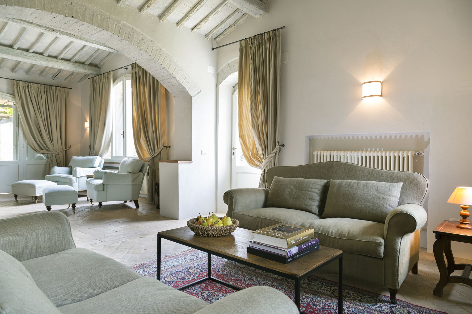
Last year I wrote about the vacation home in Tuscany I'm working on with architect Domenico Minchili.Our clients had some photos taken and below are a few of them.First, a before shot of the living room.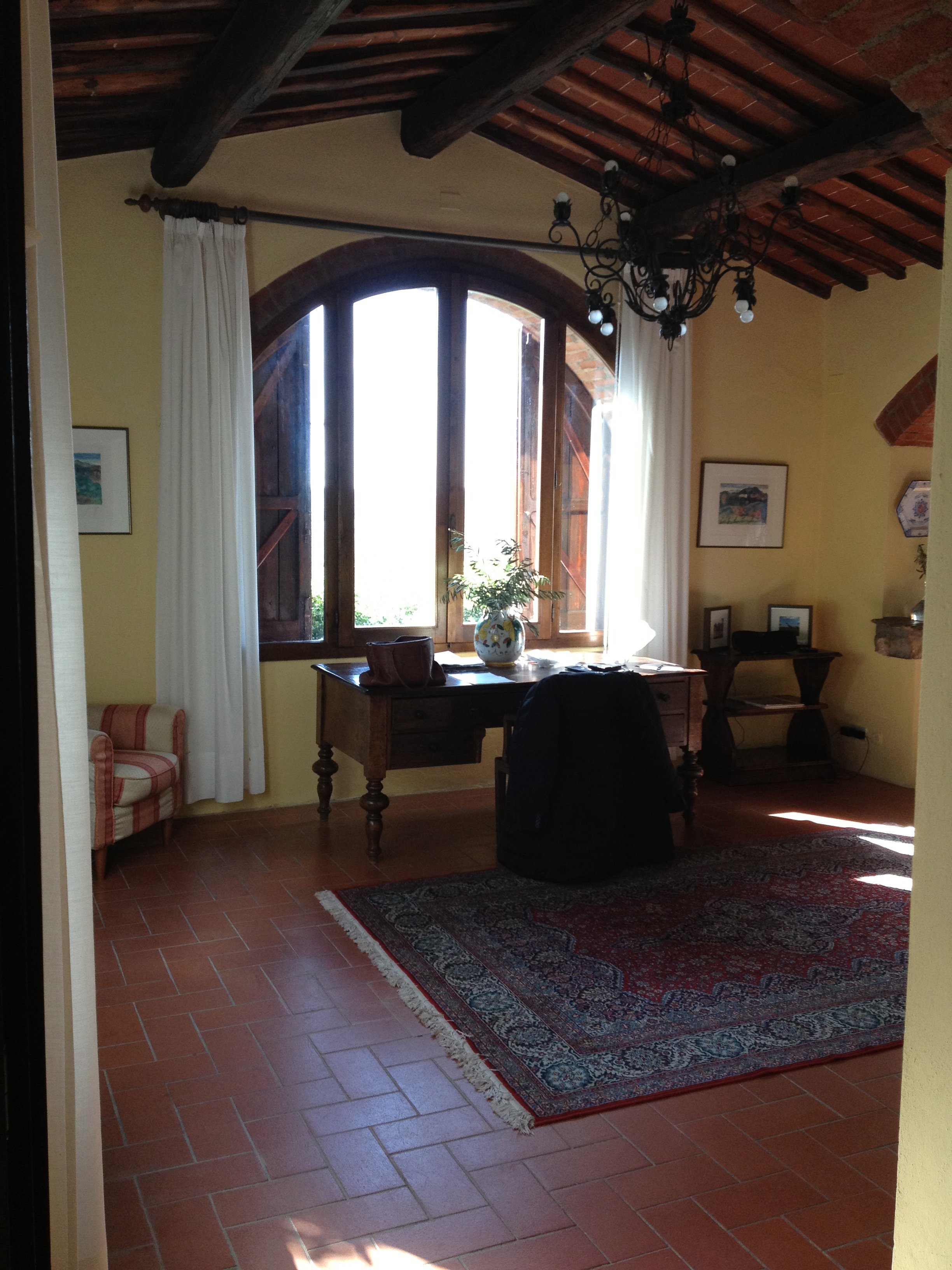 After.The room is so much lighter. The new "old" floors make a huge difference as does the paint color. I was consumed for days regarding which shade of Farrow & Ball white was the best white for the walls. We decided to use Skimming Stone.The chairs were custom made by Tondini & Radicchi. So were all the draperies in the house.
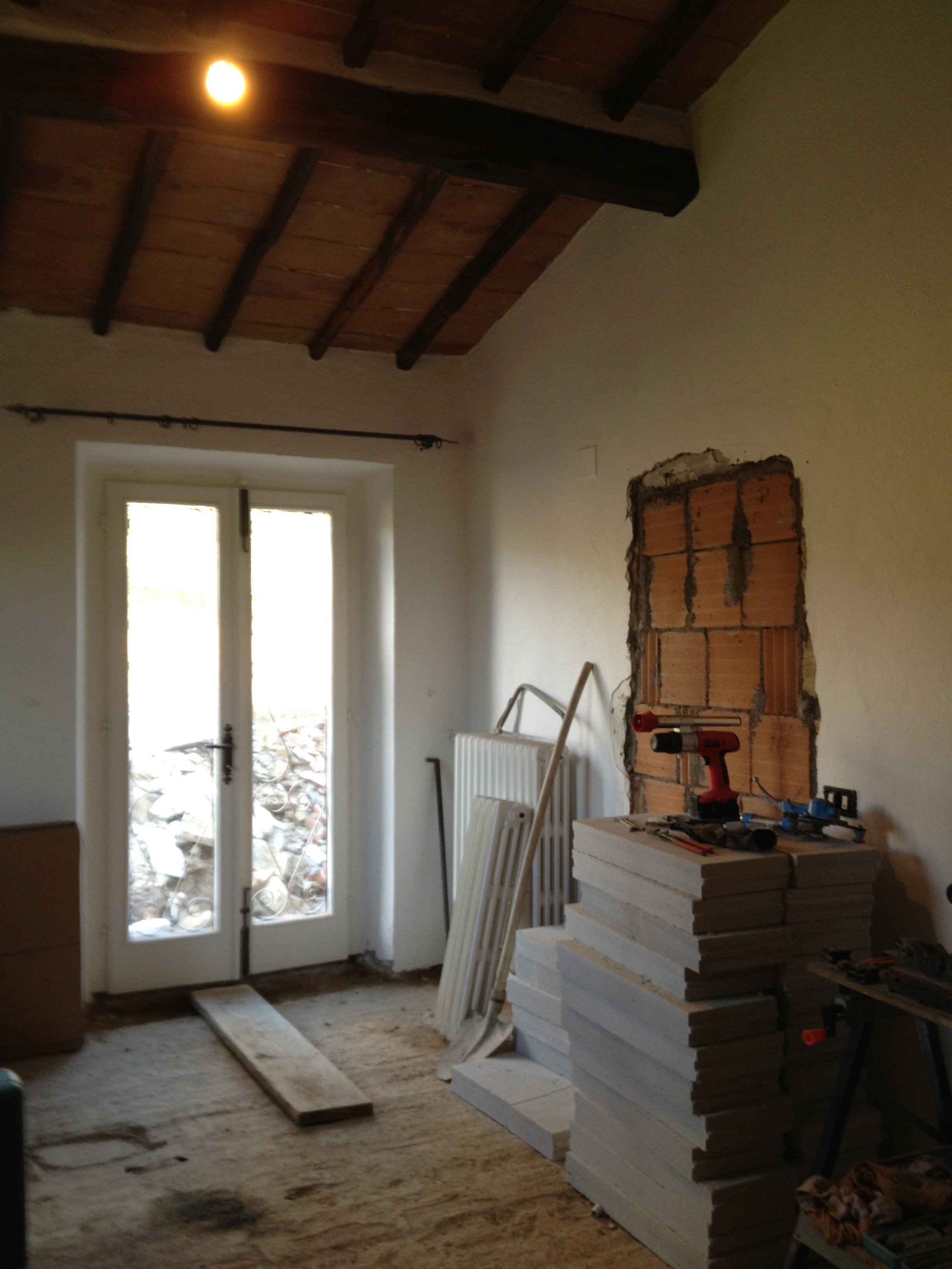
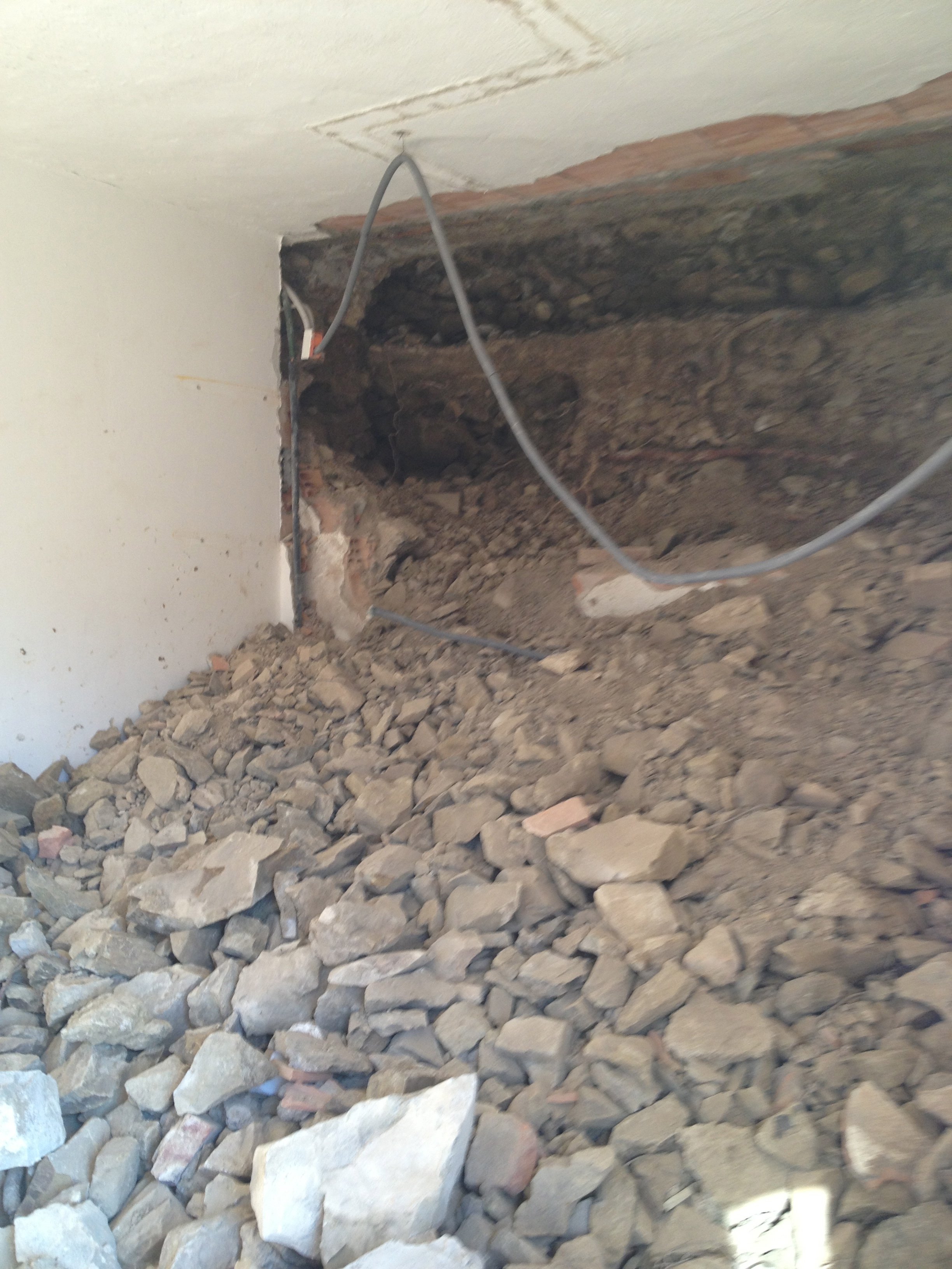
 One of the bedrooms mid-renovation.
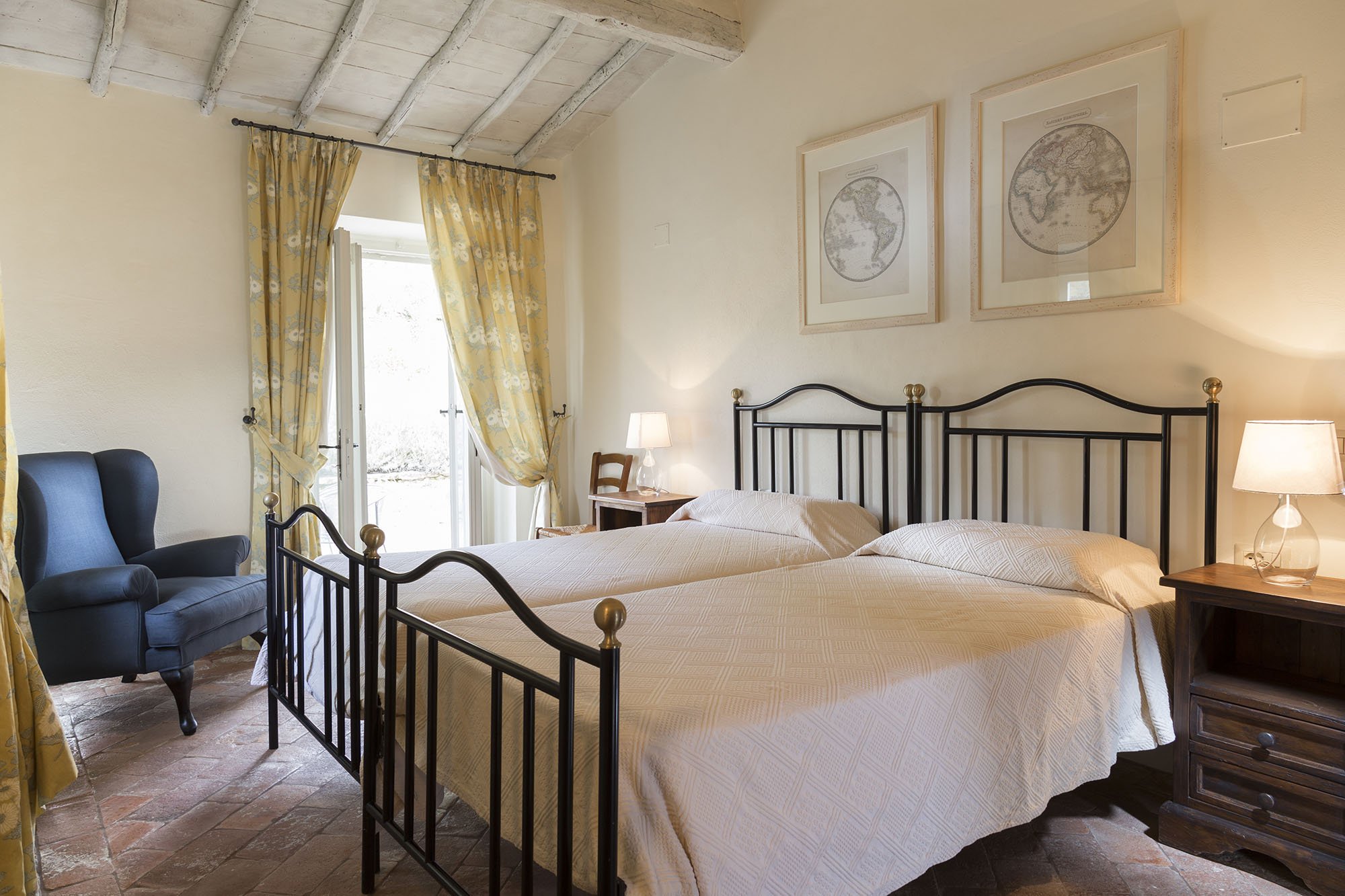
 After.
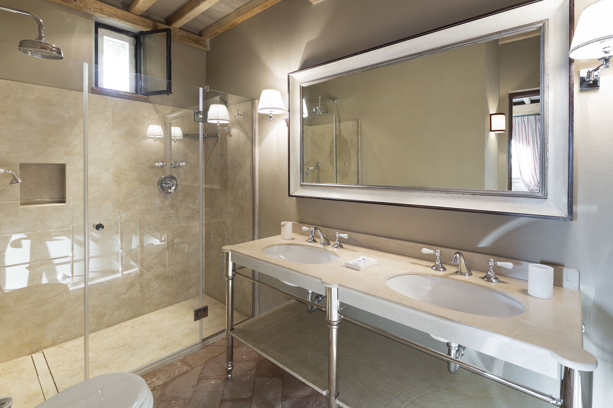
 A bathroom before.
 After.
 Wider shot of the living room. The sofas, coffee table, and sconces are custom.
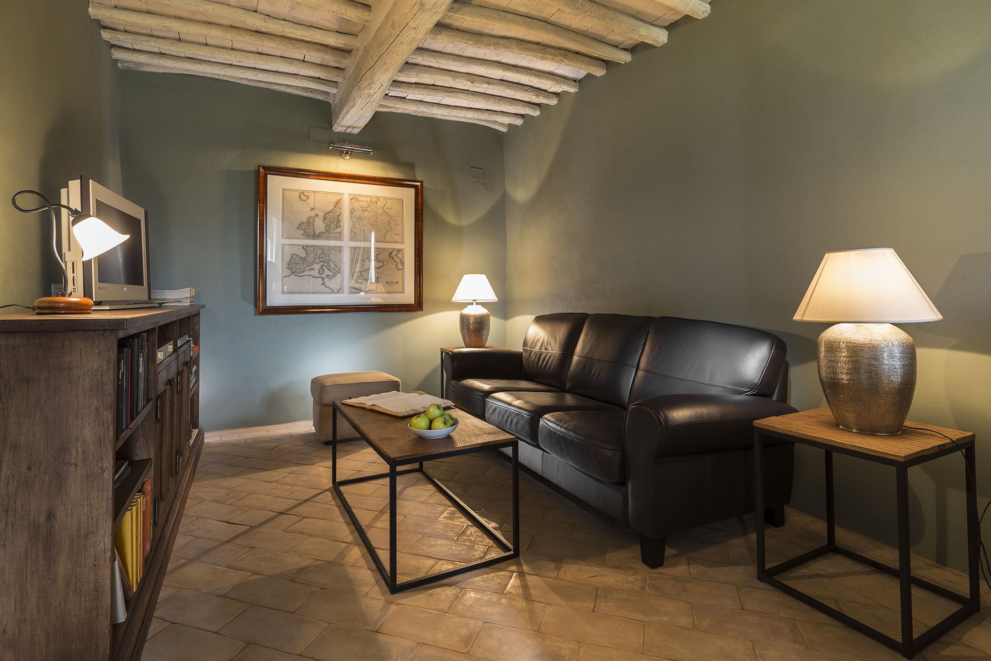
 The studio.This room receives little natural light. Many people assume that a small dark room must be painted a very light color in order to make it look bigger. Not true. It seems counter-intuitive but going darker gives a small room more depth.
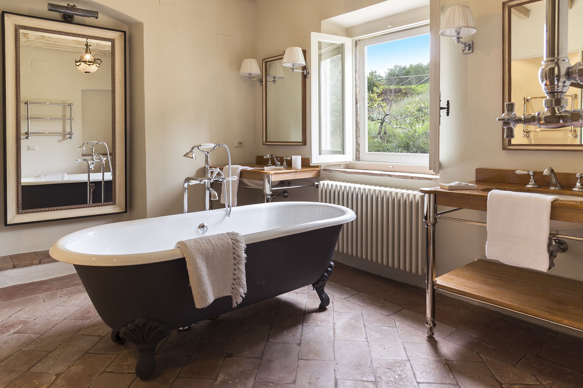
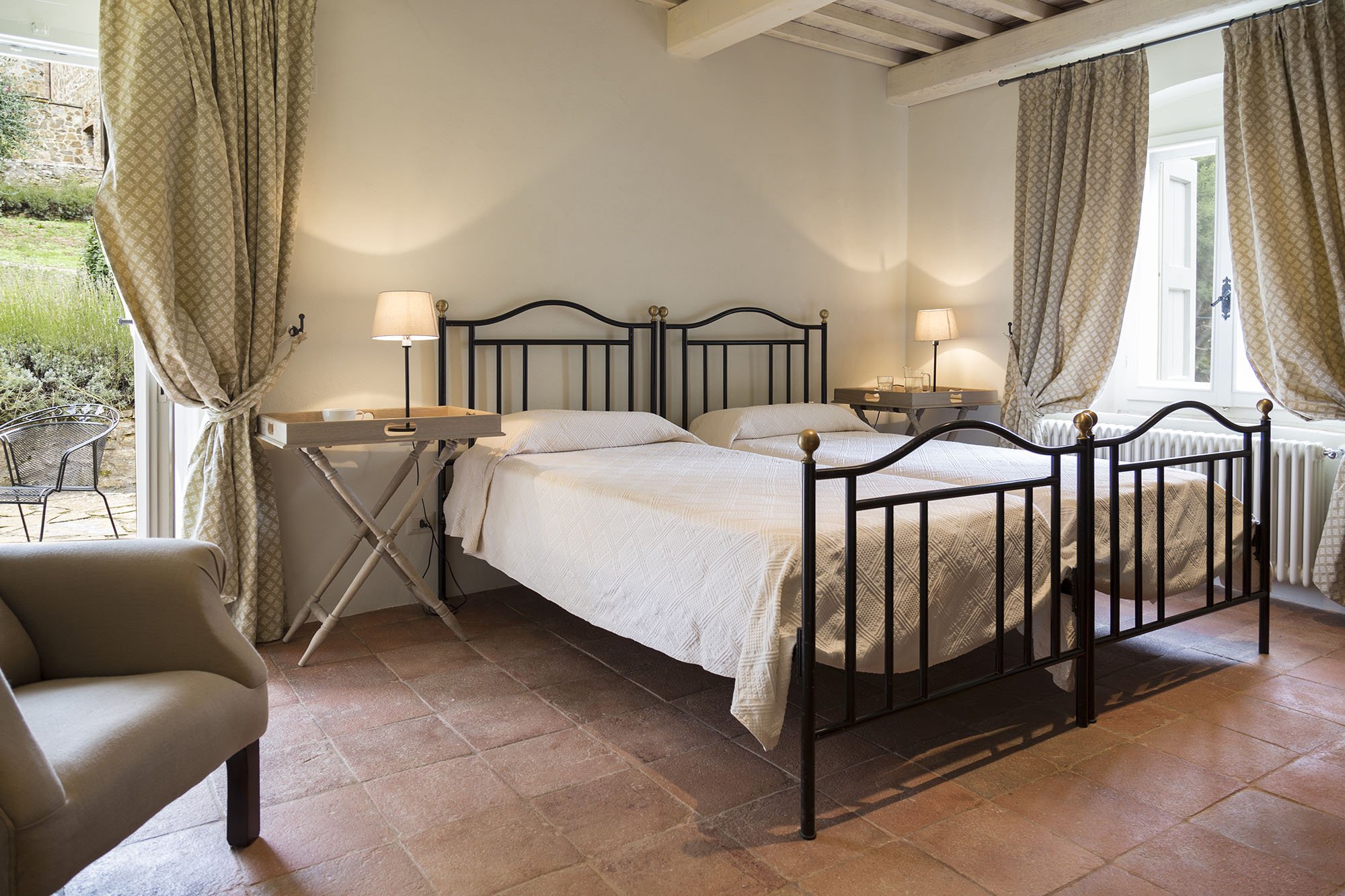
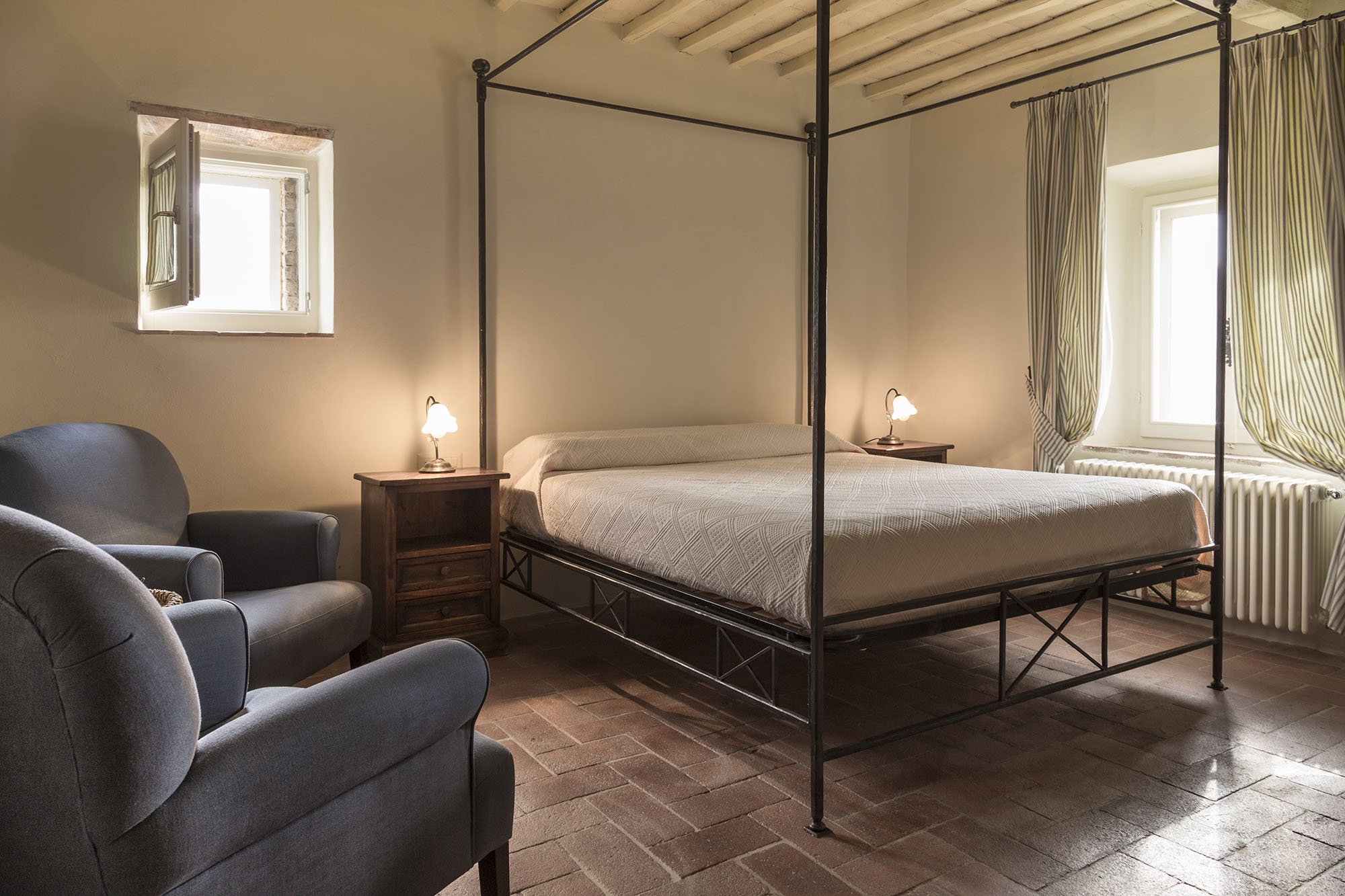
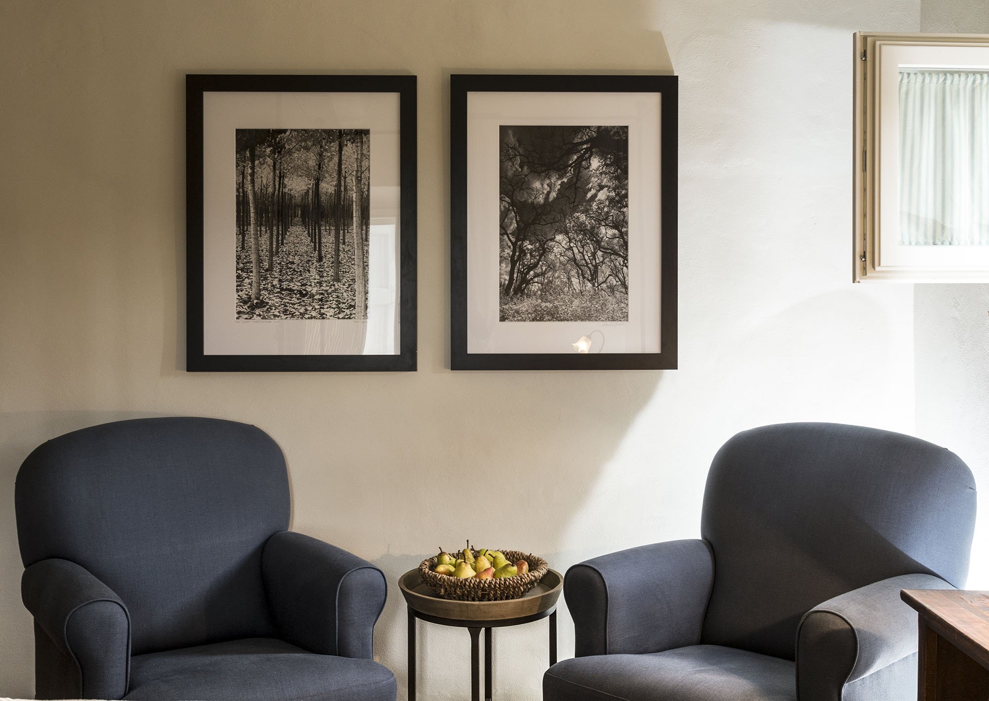
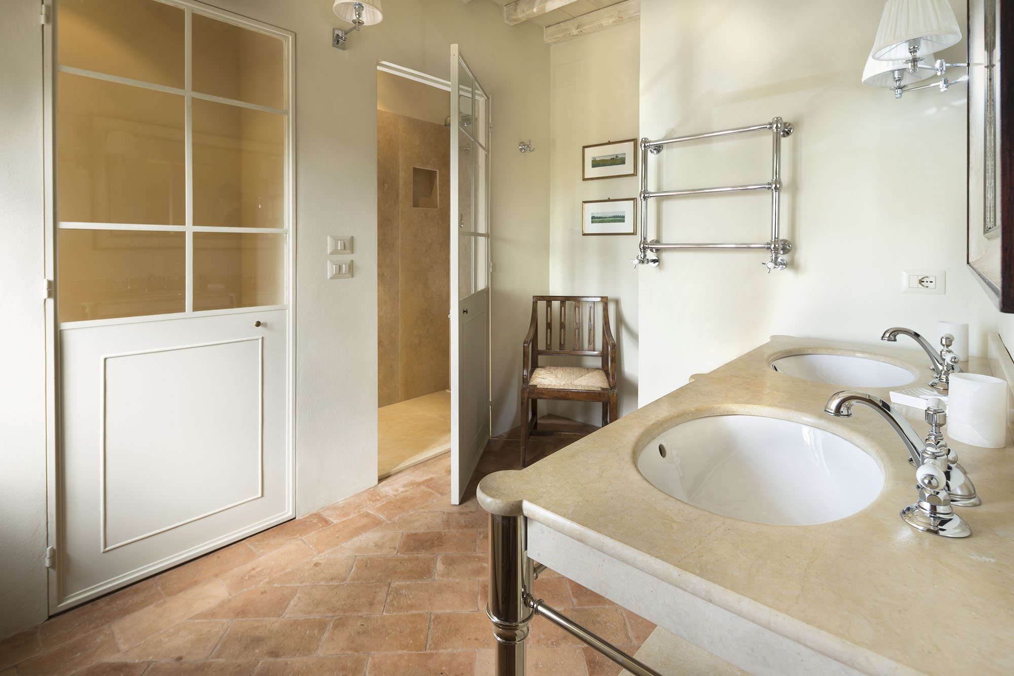

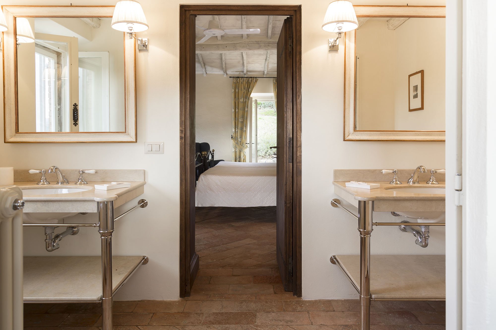
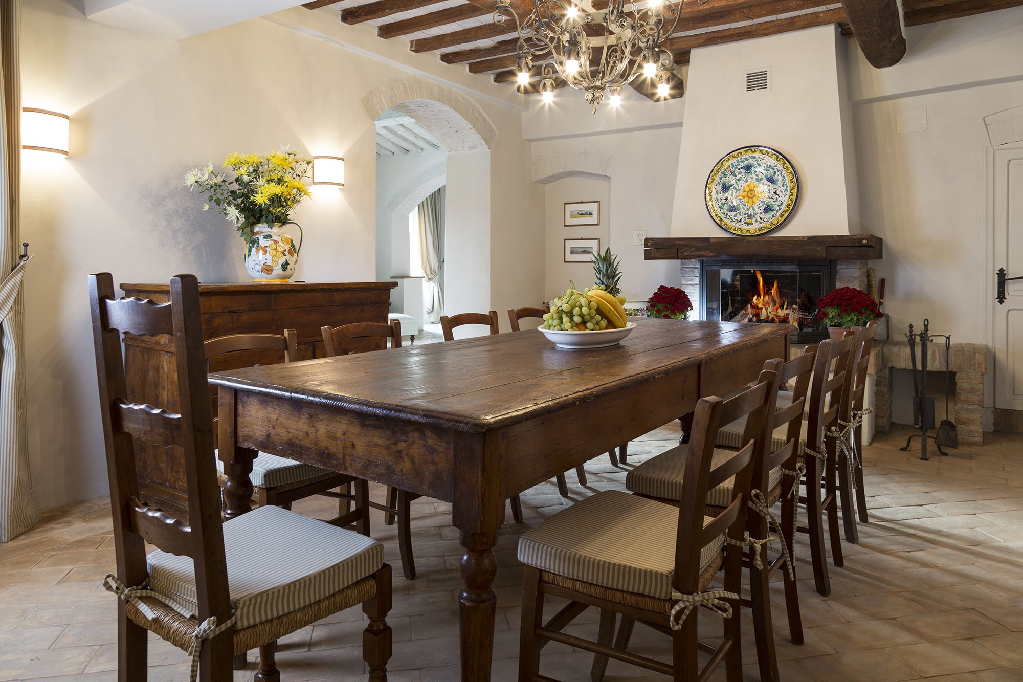
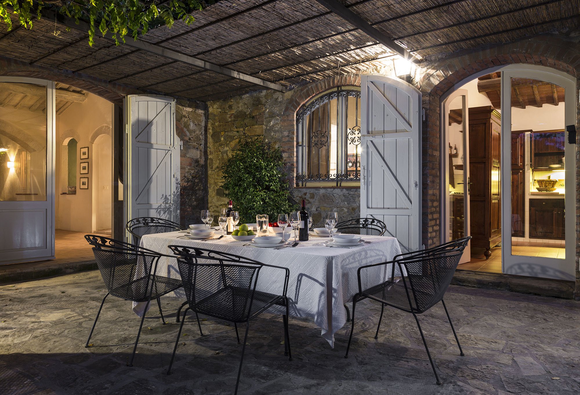
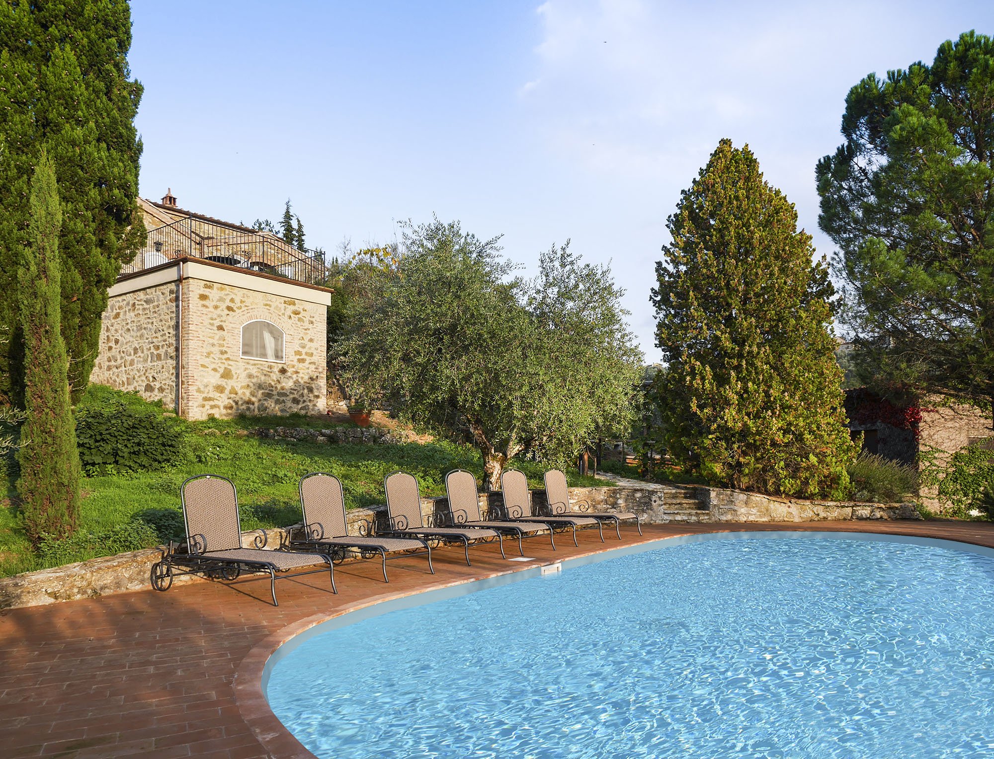 One of my Italian friends called this décor, "Relaxed Chic." Another friend said it was "Casual Luxury." Both work for me.Every bedroom, and its bathroom is unique, yet the entire home is cohesive.The paint is from Farrow & Ball.Most of the new furniture was custom made. We also sourced pieces from Flamant, Barthel, and small shops in Rome and Tuscany.Our fabric sources were, Dedar, Ralph Lauren Home, Kathryn M. Ireland, and Pierre Frey.If you would like to know the specific colors or more information about the fabric or furniture, please feel free to ask me in the comments section.This property is available for vacation rental. It's in the heart of the Chianti region surrounded by vineyards. The views are stupendous.For more information (and some exterior photos), please visit the luxury rental Abercrombie & Kent website.Photos by: Mario Flores