Rhapsody in Green - Ina Garten's Garden
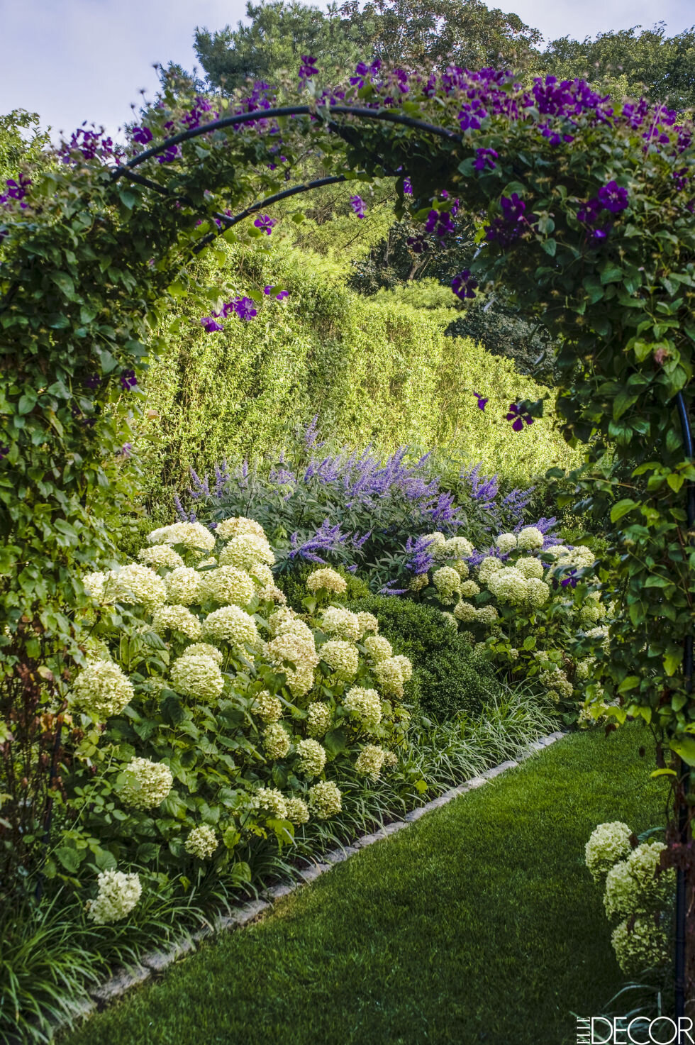
Ciao Bloggisti,I wish more American cooking shows aired in Italy. We have shows from the UK and France but not many (only the Masterchef shows) from the USA. I wonder why?I think the Barefoot Contessa would do well here. What's there not to love? Ina makes fantastic food and the settings/locations are gorgeous (that kitchen!).I was so excited when the latest issue of ELLE DECOR showed up in my mailbox. One, because it's a miracle when my magazines from the United States arrive on time, or at all, and two, because there was a beautiful spread featuring Ina's garden.It took Ina and Jeffrey ten years to convince the owners to sell the overrun pasture next to their property. Ten years. It was well worth the wait. The design of this garden, by landscape designer Edwina von Gal, is spectacular. I love the formality of the boxwoods mixed with the casualness of the roses, Russian sage, and other plants.You can read more about this gorgeous space on ELLE DECOR's website. The July/August issue is on newsstands now.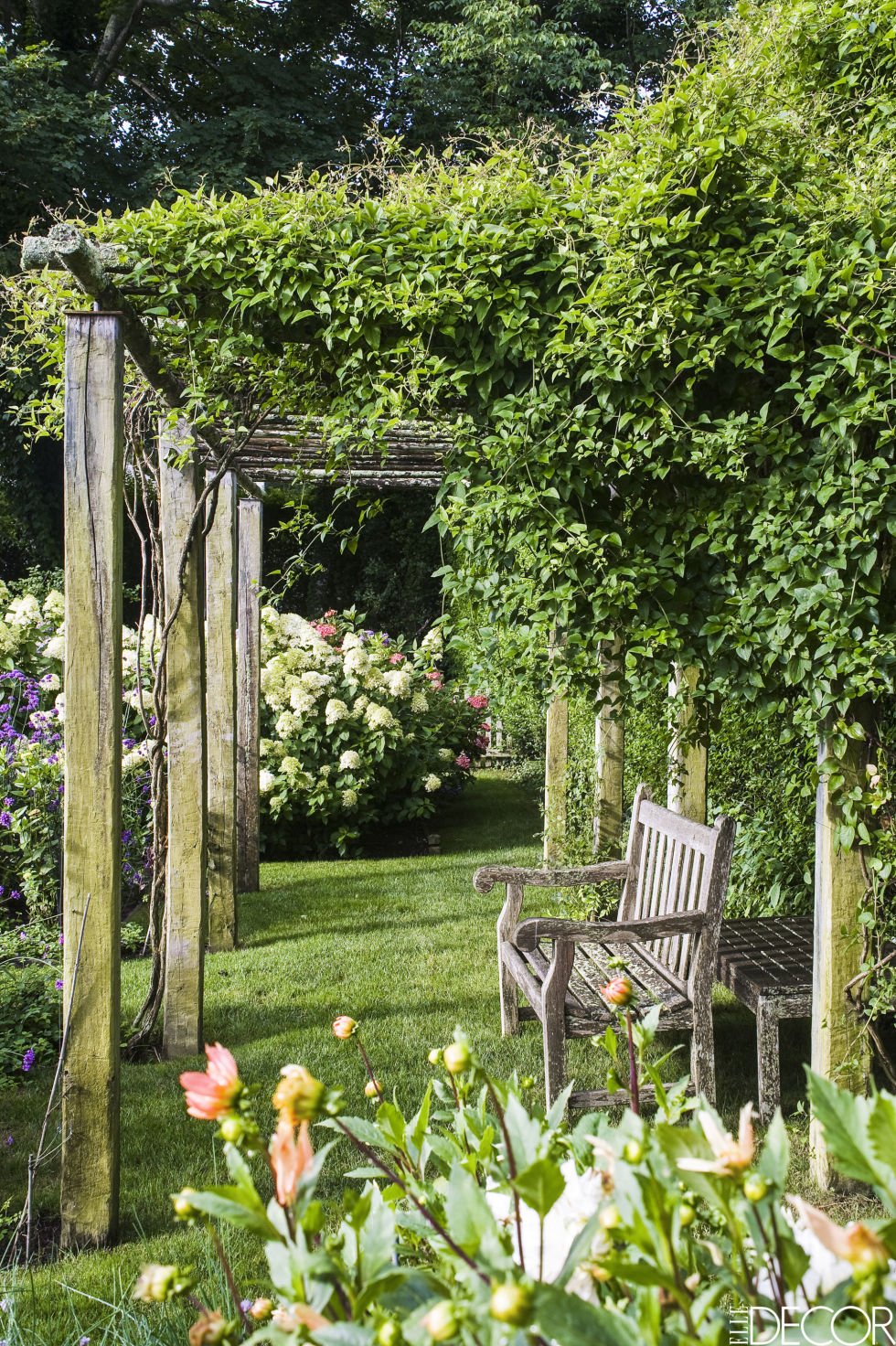
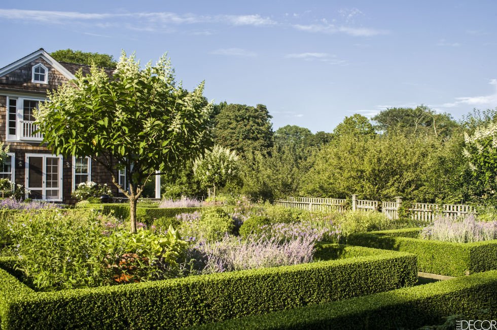
 Photos: Elle Decor
Io Adoro - E' Stile Bookstore
I'm still getting to know my neighborhood. One Sunday morning, I jogged past an interesting store window and made a mental note to check it out.Oh man, this place is going to be an issue. E' Stile is a concept bookstore focusing on art, fashion, and interior design/architecture.They have a GREAT book selection. I do order from Amazon sometimes, especially English language books but nothing beats going to an actual bookstore. Yes, it's more expensive. However, I believe it's important to support small shop owners. I like to browse and speak with the salespeople about the books. You can't duplicate that experience with online shopping.E' Stile also carries Chez Dede bags, products from brands like Kartell and Alessi, and there's a gallery space downstairs.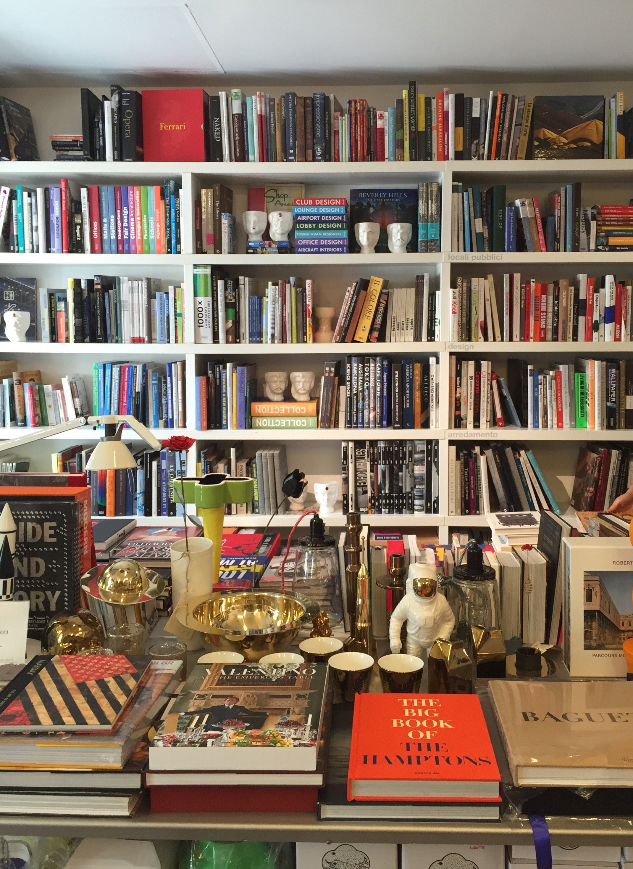
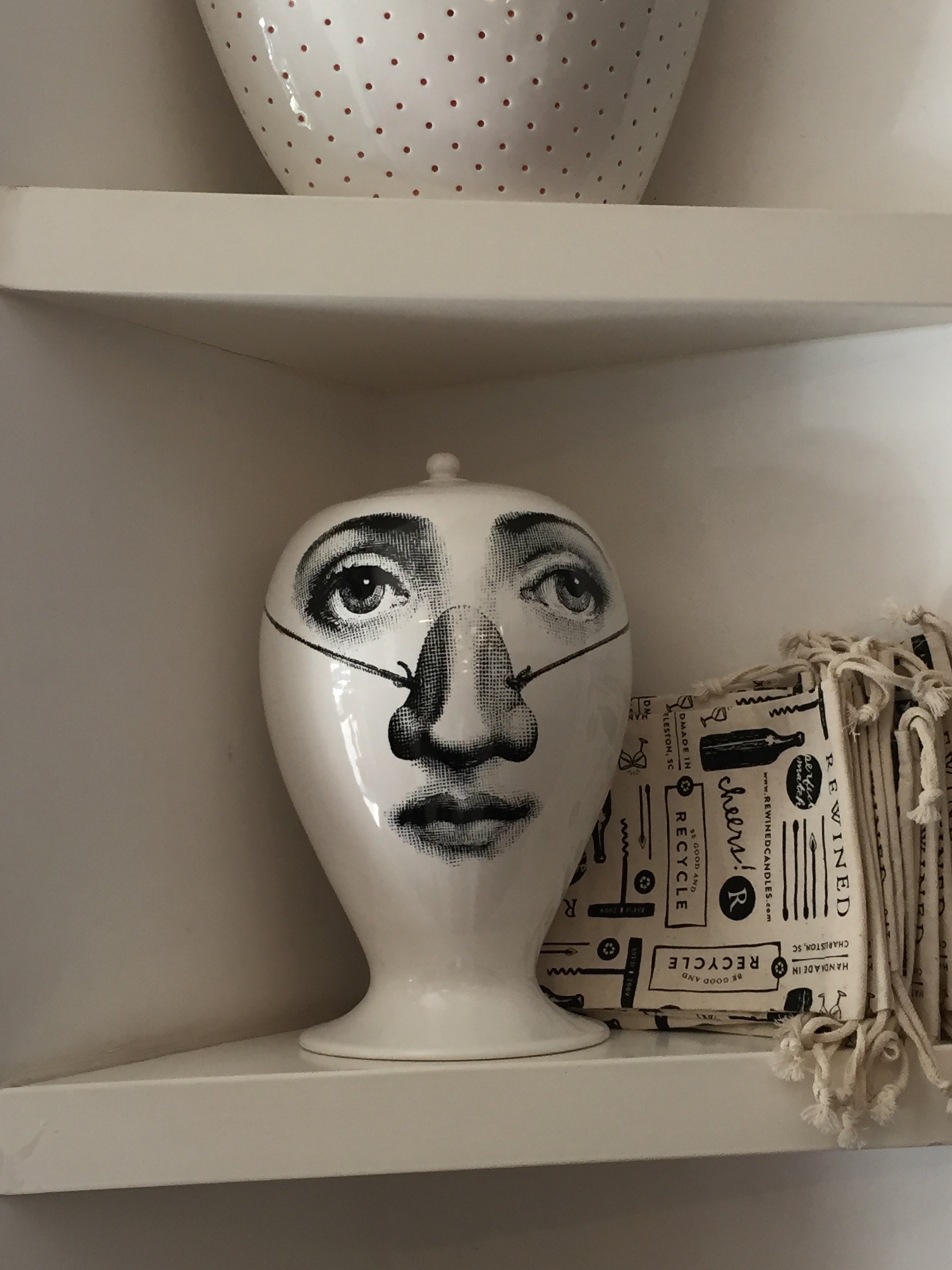
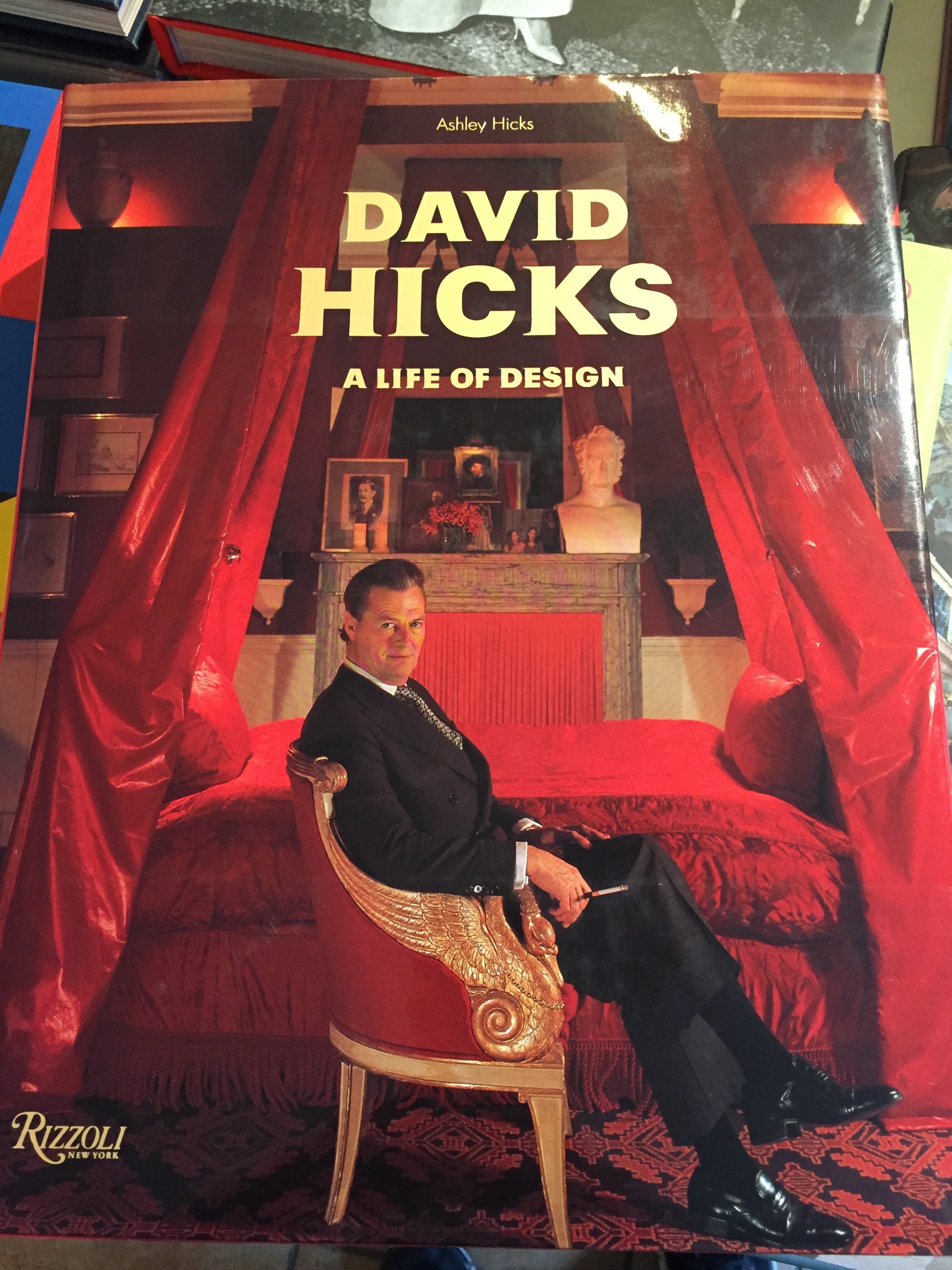


 Photos: Me and my iPhoneE' Stile BookstoreVia Chiana, 15+ 39 06 8555337
Metropolian Home is Back*
 *Kind of.I cannot stress how excited I am about this news! METROPOLITAN HOME was one of my favorite shelter magazines. While many of its competitors focused on big suburban houses, MH zeroed in on city living and contemporary design.During the massive financial and housing crisis of 2008, MH and several other magazines shut down (InSTYLE HOME, COTTAGE LIVING, BLUEPRINT, COUNTRY HOME, O at HOME and DOMINO). It was first published in the 1970s as APARTMENT LIFE and was renamed in 1981. It was very popular with city dwelling Baby Boomers and older Gen Xers.Now their children (the Millennials) are starting to buy and/or decorate their own homes. There's a ton of information on the internet of course, but there's something special about print. I think older Boomers who are downsizing and moving back into urban areas might spark to the relaunched MH as well.This is a test issue. It's for sale at newsstands in several cities in the States, was sent to ELLE DECOR (and other Hearst Magazine) subscribers, and is also available via the Apple store. If this issue does well, there will be a second fall/winter issue with the goal of making it a quarterly magazine.I cannot wait to read it. For more information check out their Facebook page, Pinterest page, or Instagram feed.
Project Via Monserrato - Reveal
During the past year I've been working on a decorating and renovation project in the Historic Center for a client who wanted to update a few of their B&Bs.It was a great experience. At times it was also challenging, as the apartments were fully booked months in advance. The logistics were difficult.Located inside a palazzo that dates from the 1600s The Via Monserrato apartment (aka Grand Suite), is on one of the prettiest streets in Rome.The brief was to create a contemporary décor, while at the same time retaining (and respecting) the charm and history of the architecture.Vacation rentals are tricky. You don't want a design that is bland or cookie-cutter but it cannot have so much personality that it turns off most customers.Here's a photo from the living room, before.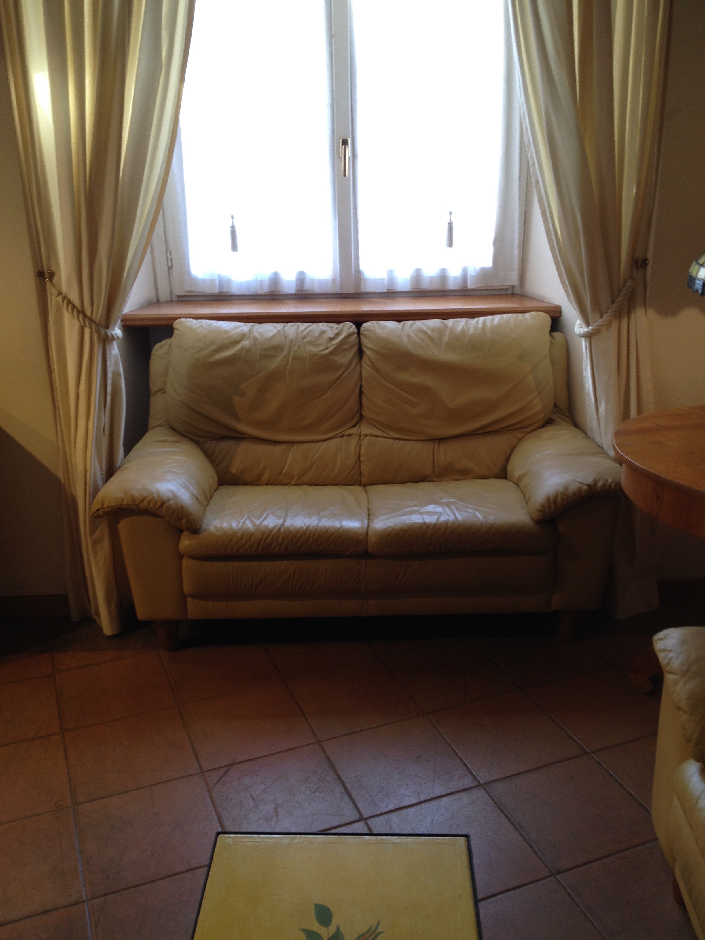 After
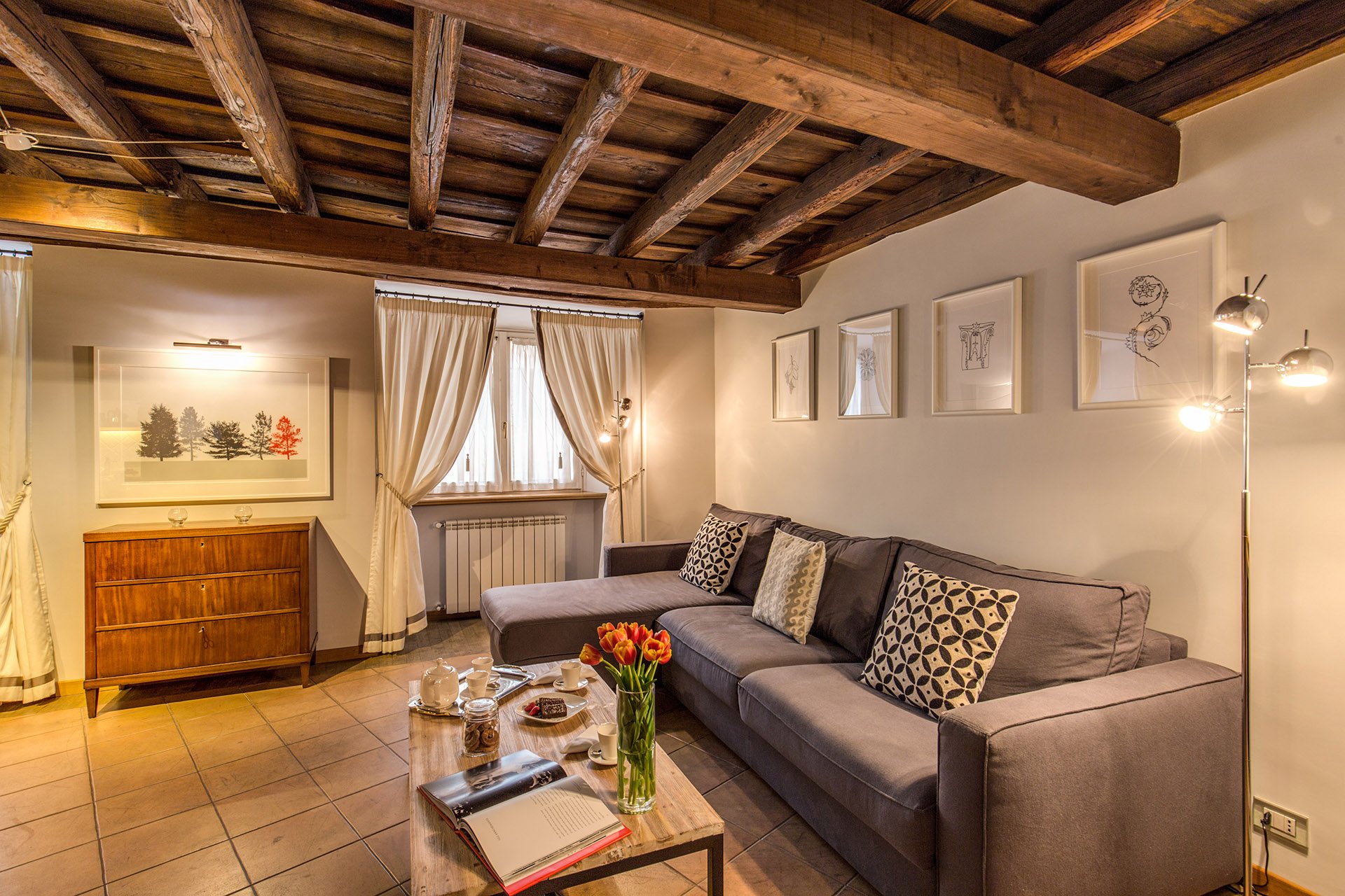
After 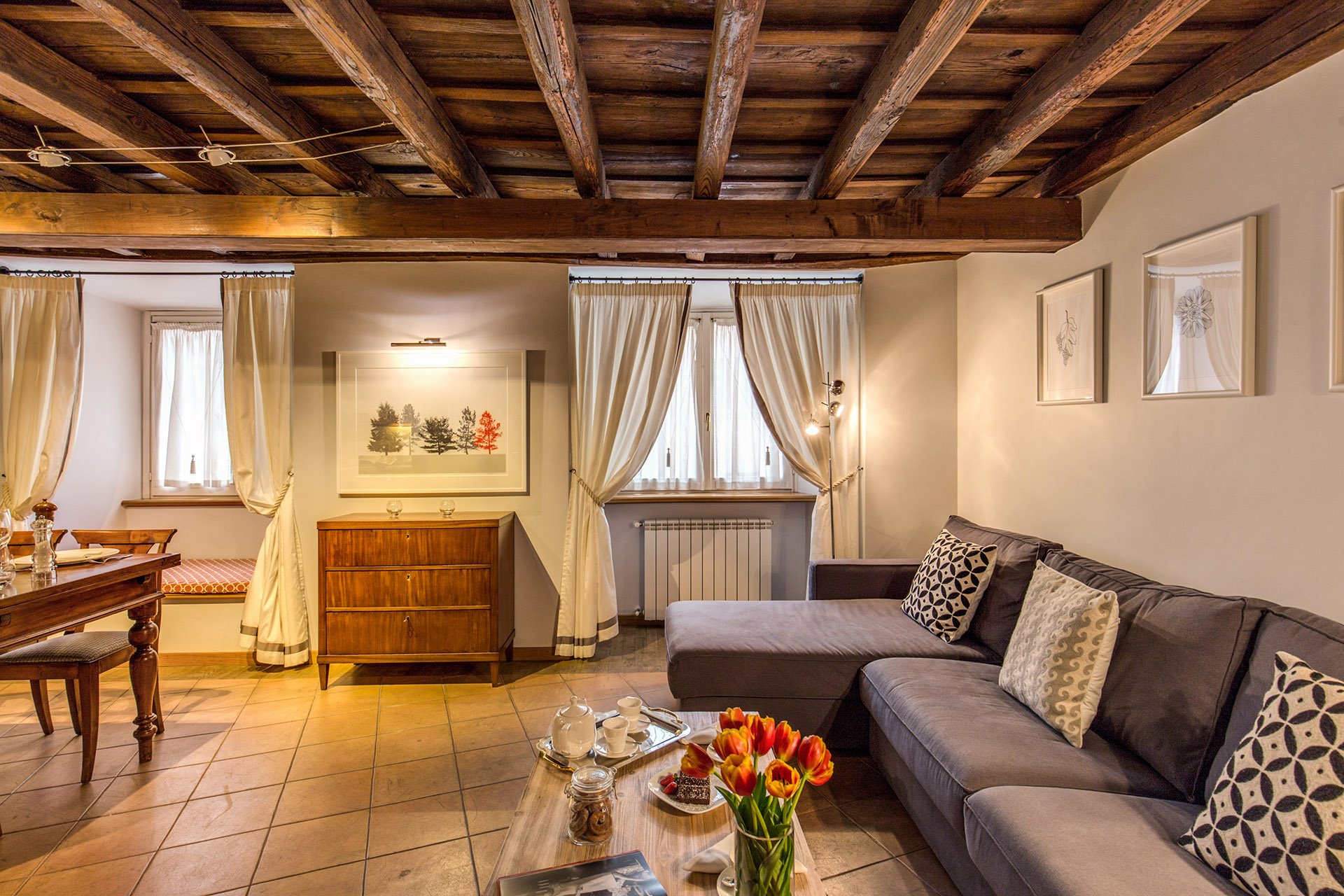 This room is a mix of high and low vendors, antiques (that belong to the client), and custom pieces.The room is light, stylish, yet comfortable. We had to use fabrics and colors that could handle a lot of wear and tear.The walls were changed to Farrow & Ball's "Blackened", a cool white that reads light grey. I know I talk a lot about this brand but there's a reason I have used it in every single project I've worked on. The quality of this paint is no joke and depth of color is incredible. This was the first time the painters had worked with Farrow & Ball and they were very impressed. When people who paint for a living rave about a brand, you know it's good. Stateside, I like Benjamin Moore as well but that brand is not sold here. Le Decorazioni is the authorized Fallow & Ball vendor in Rome.We decided to go with a one L shaped sofa instead two. This model is a sleeper sofa and we bought it from Berto Salotto.The coffee table is from Maisons du Monde, a French brand with stores all over Europe.The curtains were custom made. The trim is Dedar. All the fabric for the apartment was selected and purchased at the store Lelli.The floor lamps are from MADE.The art work over the antique buffet is by Due Alberi. Funny that I read about these two artists in Rome on Elements of Style, which is written by Boston-based American interior designer Erin Gates. We used their work in another apartment (pics soon) as well.We commissioned artist Marta Alexandra Abbott to create pieces that referenced Rome in a subtle way. Marta is American and moved to Rome several years ago. You can see more of this series, inspired by the Ara Pacis, HERE.Dining area.
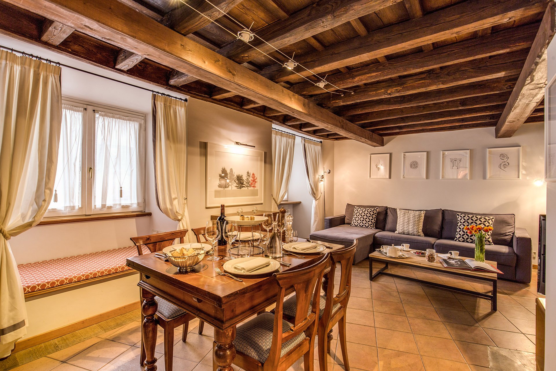 We kept the dining table and reupholstered the dining chairs.Before
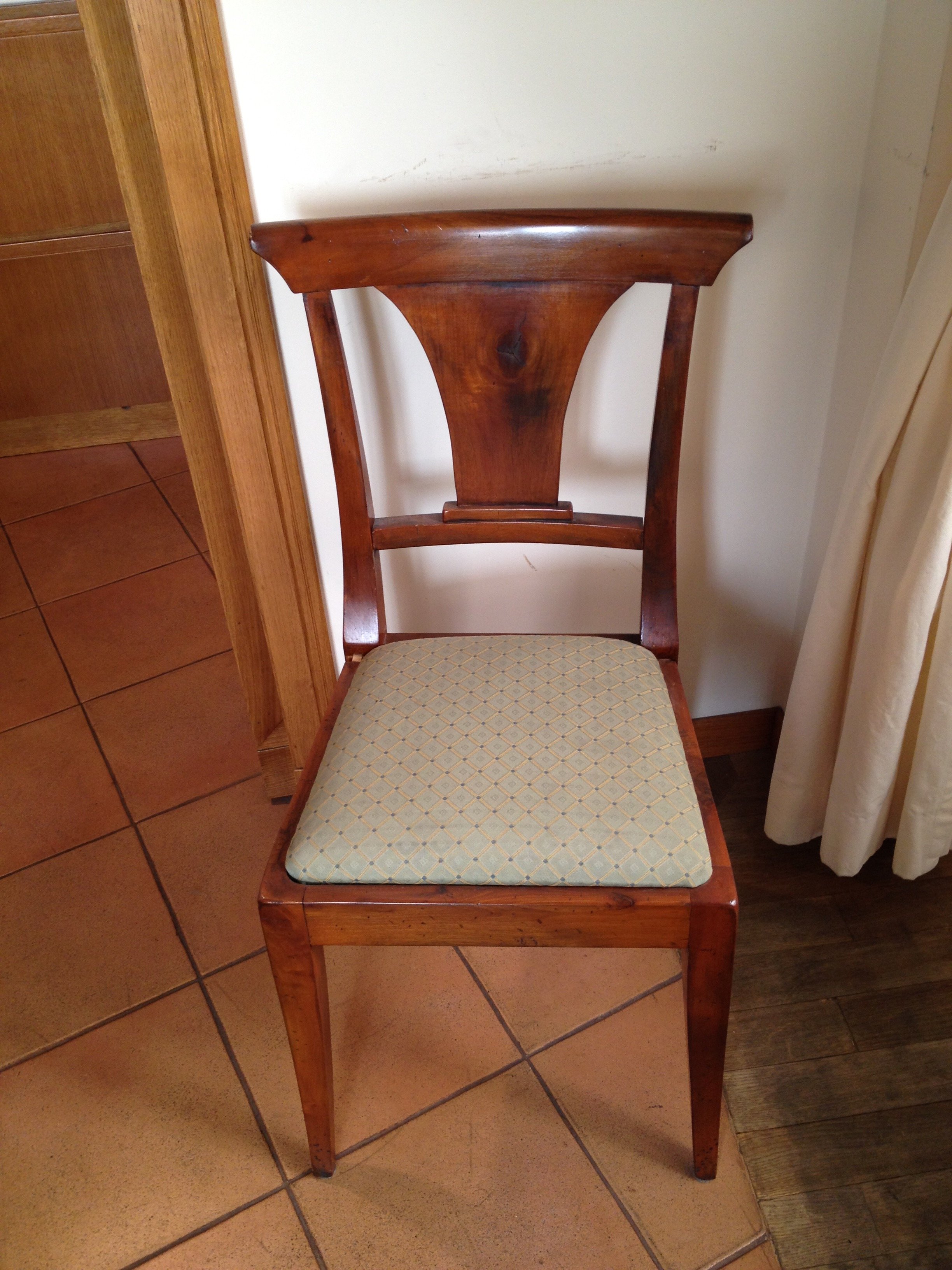 After
After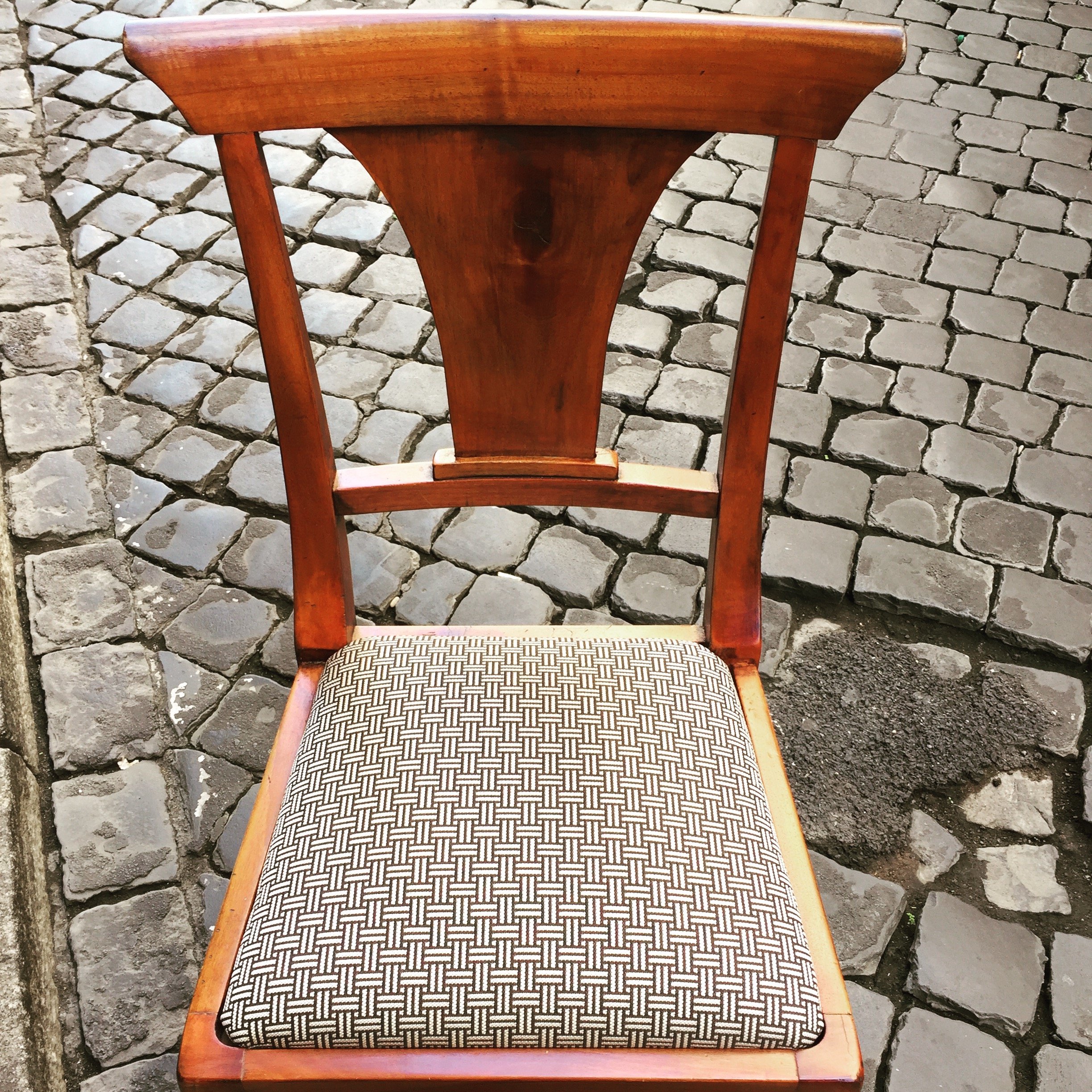 This graphic Dedar fabric is durable and makes the 1930 lines of the chair stand out. The chairs were in great shape. I thought it would be better for the budget and the design to keep them. I'm not a fan of spaces where every single item is brand new. I like to mix things up. You see that a lot in interiors in France and Italy. If you don't have any older pieces of your own, you can find them at flea markets, estates sales, in your family's attics/basements, etc.We created a window seat. I wasn't sure my client would go for the pattern or the color. The fabric is Thibaut. I think it gives this room of neutrals a nice punch of color.The pillow are from a local shop, Fabindia.The former artwork in the living room.
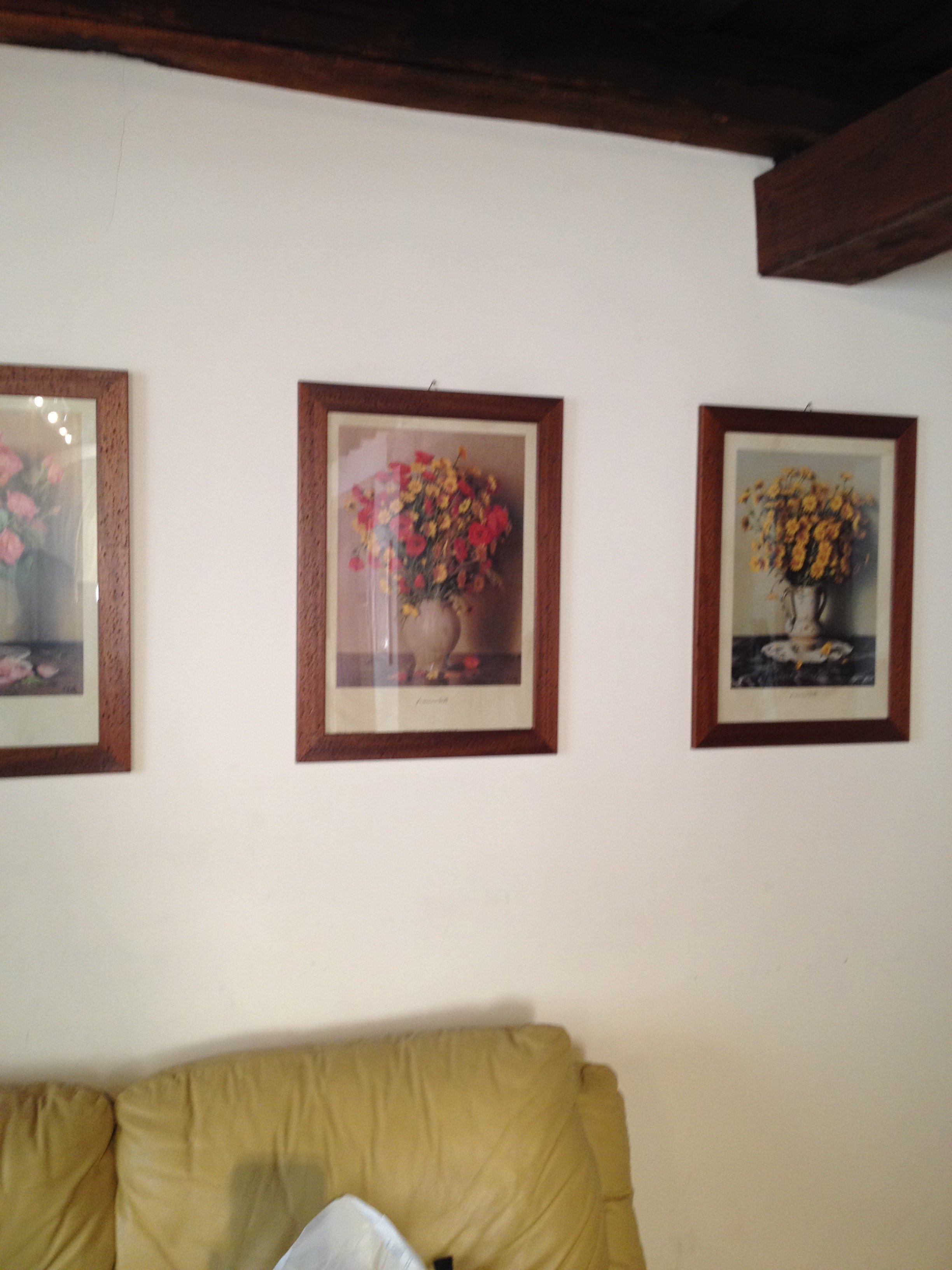 Art work, after.
 The hallway was painted white and the huge 1980s sconces were replaced with simple, modern ones. This art is by Marta as well.
 Bedroom - before
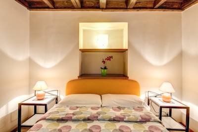 After
After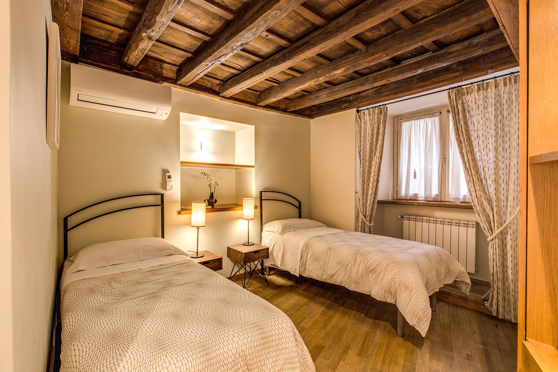 Originally, there was a queen-sized bed in this room but my client's company has had many requests for twin beds.The walls are Farrow & Ball, "James White". The curtains are custom. The fabric is Thom Filicia for Kravet.I asked my blacksmith to make the head boards. I wanted something that would look great when together and when separate. We came up with a few designs and this is the one the client picked.The night stands are from Maisons du Monde. The lamp bases are from IKEA. The shades were custom made at the store Paralume, which is right up the street.I'm not sure how a store that makes/sells lampshades manages to stay in business in this global economy we live in but I hope they stick around for a long time.The beds together.
 The master bedroom - before
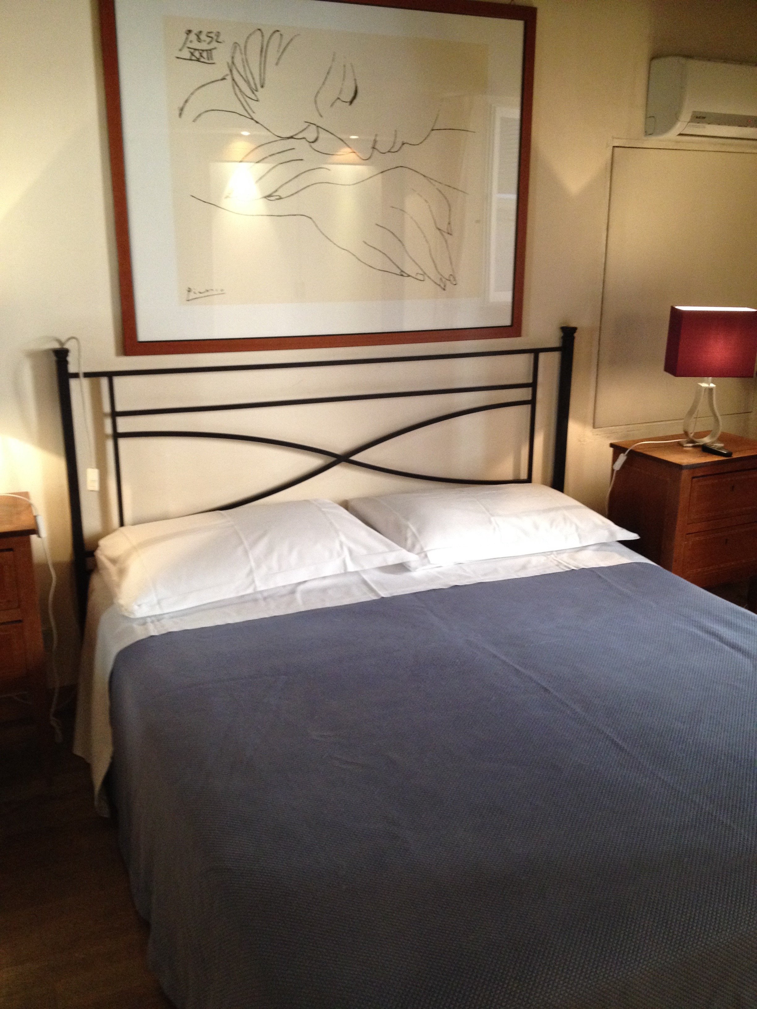 After
After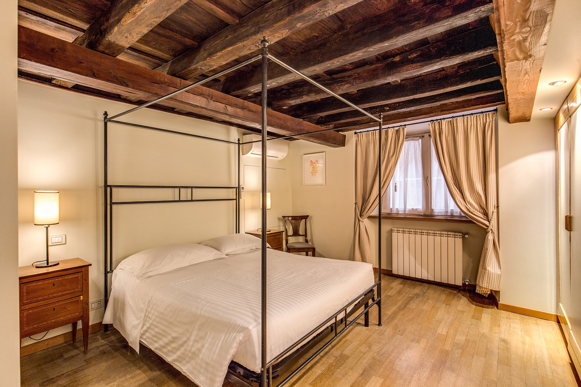 We kept the bedside tables. The walls are F&B James White. The curtain fabric is Malabar.The lamp bases are IKEA, shades custom from Paralume. It's hard to tell from the photo but these shades/trim are a different color from the other bedroom.I have a thing about four poster/canopy beds. Our blacksmith designed this simple yet, elegant frame. With these ceilings, we thought a more decorative frame would be too much. It interesting how the room actually looks bigger even though this bed is the same width as the old one.Two photos from inside the Palazzo.
 Overall, I'm very happy with how the apartment turned out. A huge, "Grazie" to my client and their team. I cannot tell you the amount of WhatsApps, SMS, emails, phone calls, job site visits, that were made. I truly appreciate their patience with my bizarre smash up of Italian and English. My client introduced me to my new Italian teacher. I got the hint. Heh.For more information about renting the Grand Suite, or other apartments from Your Suite Rome, click here.After photos and before of bedroom 1: Vincenzo TambascoOther photos: Me and my iPhone
Work in Progress - My Foyer
As I mentioned in an earlier post, I have lived with white walls for decades. The last time I had any color on the walls was when my parents let me pick the color for my bedroom back in high school.During my apartment search, I knew I wanted a place with a foyer/ingresso. Even my super tiny apartment on Via Pellegrino had one. Both of my apartments in Los Angeles, which were much larger, did not. Drove me nuts. You opened the door and walked right into the living room. Of course this is fine for a loft apartment but I didn't live in a loft.Many people neglect their foyer. It becomes a place to dump keys, magazines, mail, etc., etc. The foyer is the preview for the rest of your home. It sets the atmosphere. What does it say as you enter?Depending on the size of your foyer, it could provide much needed storage space, a place to display artwork, and in a smaller one you could splurge (creatively and/or financially) on your favorite wallpaper.Painting an entrance way a darker color than the next room makes the second room seem much larger. Interior designer Miles Redd loves going from dark to light. I decided to be bold for a change and go for it. I went to the store Le Decorazioni to look at Farrow & Ball samples.I'm so happy with how the foyer turned out. I'm relieved my landlady (who lives in the same building) loved it. I thought she might be offended since she'd just painted the apartment. Instead she asked me to send me a link to the Farrow & Ball website.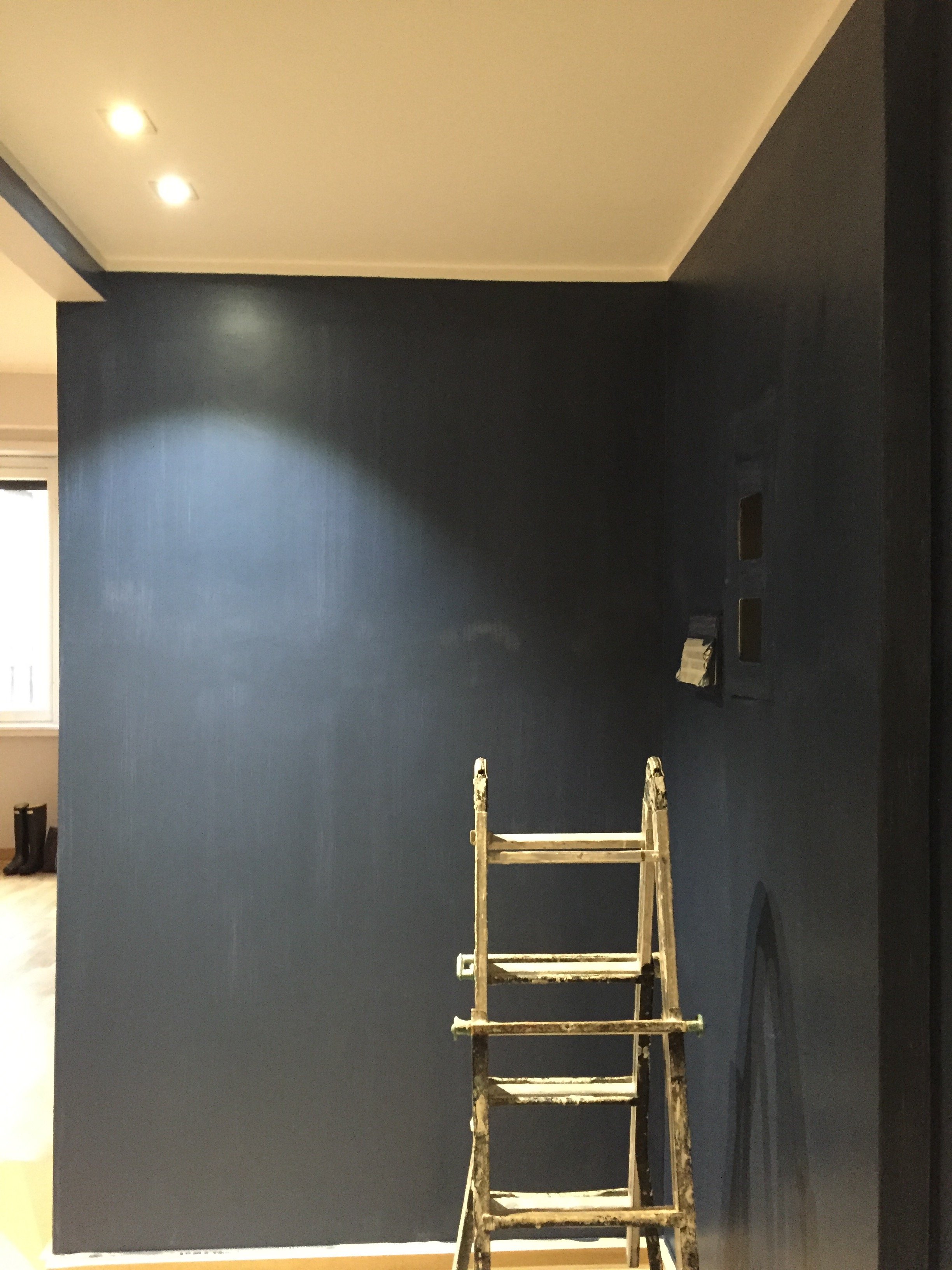 I was thinking of going with Hague Blue but in the end Stiffkey was best with the light grey in the living room. Stiffkey looks great when the lights are on and in natural light it reminds me of late summer nights in Sicily or sitting on my parents' veranda at dusk in St. Martin.When I first saw the apartment the owner told me the bookcase/cabinet in the hallway had to stay. I understood why for practical reasons. The fact that it wasn't flush with the wall bothered me aesthetically.
 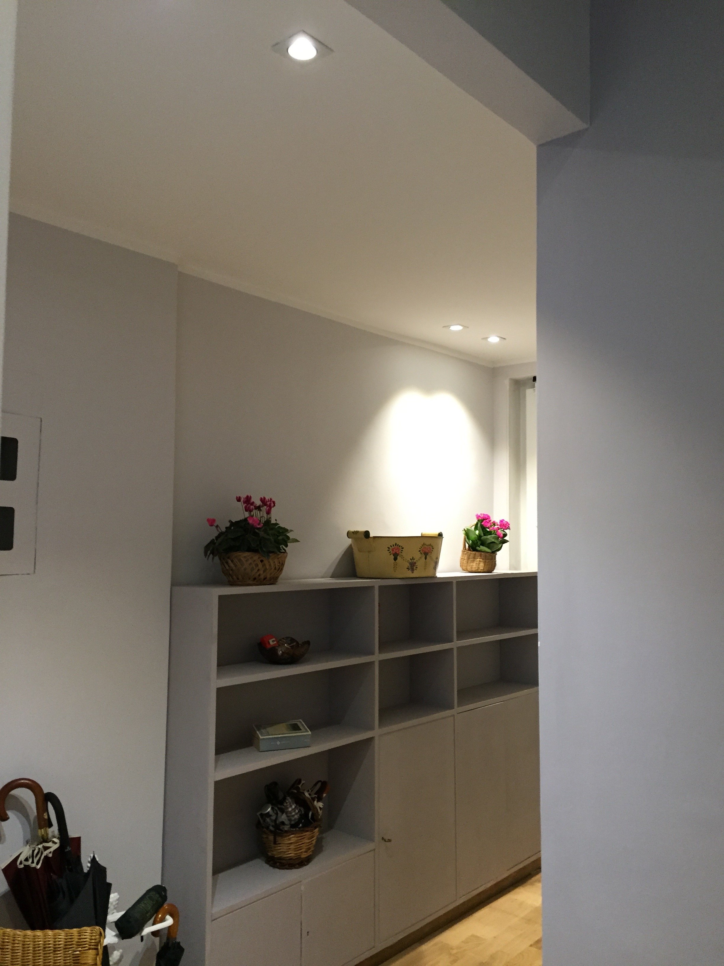 What a difference some high-quality paint makes. The painters and I couldn't believe how this big piece of furniture blends in a little more and looks more expensive than it is.
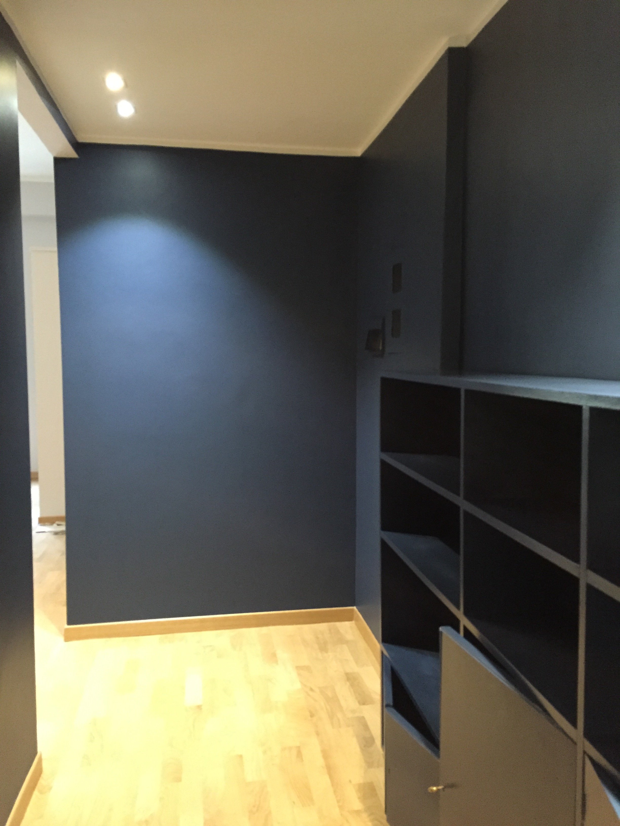 I'm going to meet with my blacksmith to design a simple bench. Above the bench I will hang some black and white photographs.I don't know when that will happen. I tell clients all the time that it's better to take our time while decorating. Perhaps I should listen to my own advice.Photos: Me and my iPhone
Life in Rome - New Year, New Address
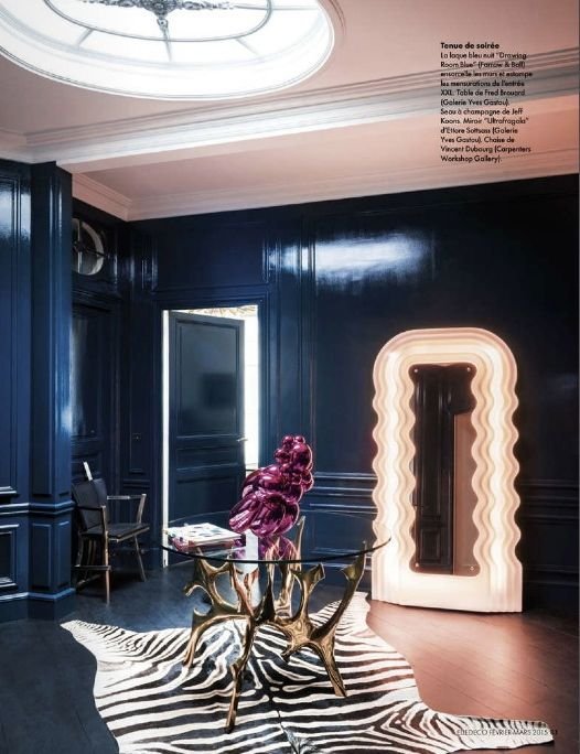
I would say Happy New Year, but it’s already January 21th.After living in the Historic Center on Via del Pellegrino for seven years, I have moved to a new neighborhood. I now live in Parioli.To say this is a big change would be an understatement.One of the biggest changes was moving from a furnished apartment to an unfurnished one. I was very fortunate that my former landlady had a great eye but I’m excited to finally have my own furniture.Finding an apartment that was unfurnished was not easy. Smaller apartments tend to be furnished and in Italy/France if your place is unfurnished it usually means you have to buy a kitchen as well. I didn’t have the time or the budget to build a kitchen.I lucked out in finding a place that was semi-furnished; meaning the kitchen was already installed.I’m still getting settled. I have no Internet. Who knows when it will be installed? Could be next week, could be next month. I’m zen about the whole thing as I realized flipping out on Vodafone would not make things move faster.For over twenty-five years, I have lived in homes with white walls. I decided to get out of my comfort zone and paint my front hallway a dark blue. Here some pictures that inspired me to get my Steven Gambrel on.A sea of blue in Mr. Gambrel's West Tenth Street townhouse.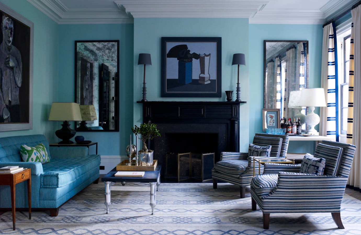 A deep blue foyer in Paris.
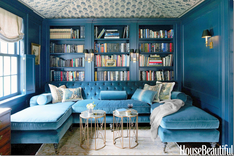
 Jeannette Whitson's library which created quite a decorating stir.
 I went with Farrow & Ball’s Stiffkey Blue.
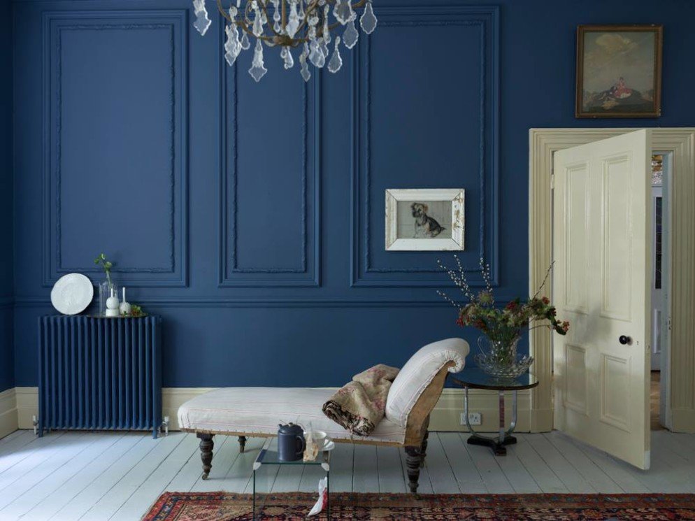 I will post some pictures as it comes together. Who knows when it will be done? Story of my life.
I Went Back to Cali - La Cienega Design Quarter - Legends 2015
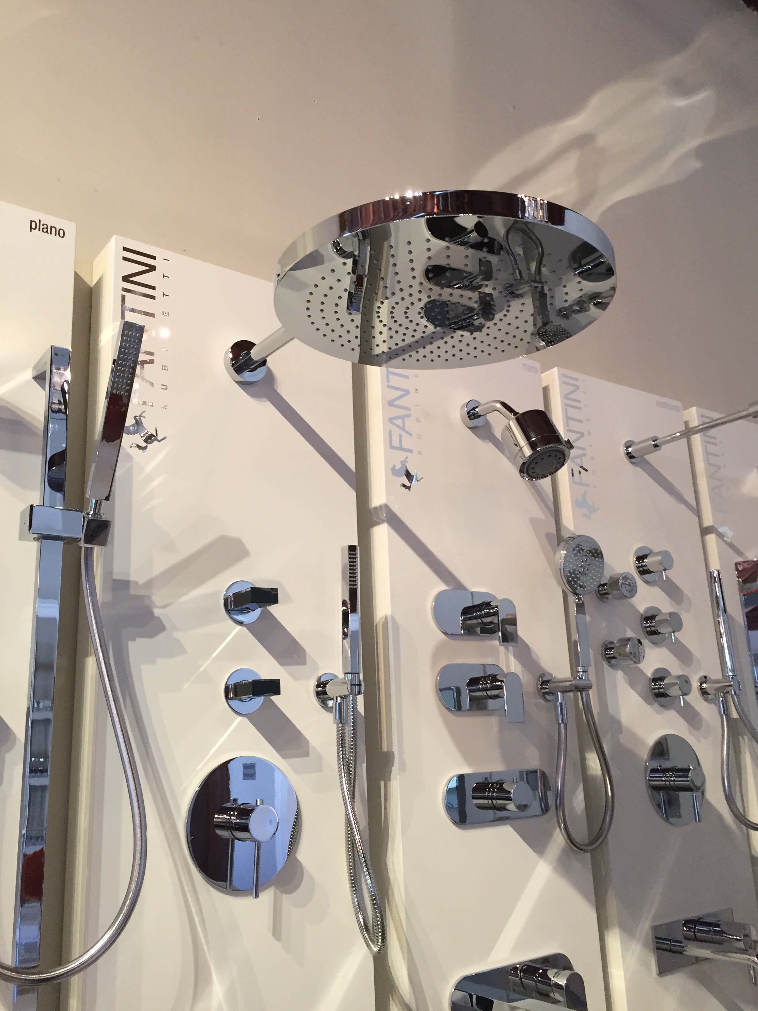
Finally, my jet lag is over. It was much worse in Los Angeles and ended shortly before my return flight to Rome. How wonderful!The LCDQ Legends interior designer conference is one of the most popular events in the industry. I've heard designers call it the Coachaella or the Oscars of interior design. There were more than ten thousand RSVPs for the three-day event, with designers from over twenty-four states, and one hundred and fifty designers traveling to Los Angeles from overseas.This was my first year attending. It was fantastic. There were Interesting and informative panel discussions, fun parties, and over sixty-seven inspiring window displays.Not only did I enjoy visiting some of my favorite (and new) showrooms, I appreciated the style of my fellow decorators. Folks were not playing. It does make sense that many interior designers/decorators have a great sense of style. I forgot how super casual Los Angeles is until I saw someone walk into Urth Cafe in Beverly Hills wearing pajamas bottoms. I'm talking about the sloppy, comfortable ones you sleep in, not the dressy ones you would wear to a party.I also had Hollywood film/TV meetings but since this is not a screenwriting blog, all I will say is that everyone is talking about EMPIRE. We'll see how this hit show changes the landscape.There were many highlights and I left feeling very energized (and determined to move to a new neighborhood).Opening night gala. My friend Corrina (an interior design junkie) came with me. It was packed. The food was delicious. I felt drunk despite not drinking at all. The jet lag struggle was real that night. The official kick off. The Bloggers Breakfast. I met Erinn Valencich from American Dream Builders. So nice. Perhaps my experience is not the norm, but I'm constantly surprised by how friendly and helpful people are in this industry. At the conference I met some serious A-listers and they couldn't be more down to earth. It's shocking!There were many famous design bloggers attending the breakfast but the room was so crowed it was impossible to move around. I found out who was at the event after seeing their Instagram feeds.Yes, I took a photo of this Italian shower head. I love that other people were also taking photos of faucets and shower heads. I could spend hours discussing such things.
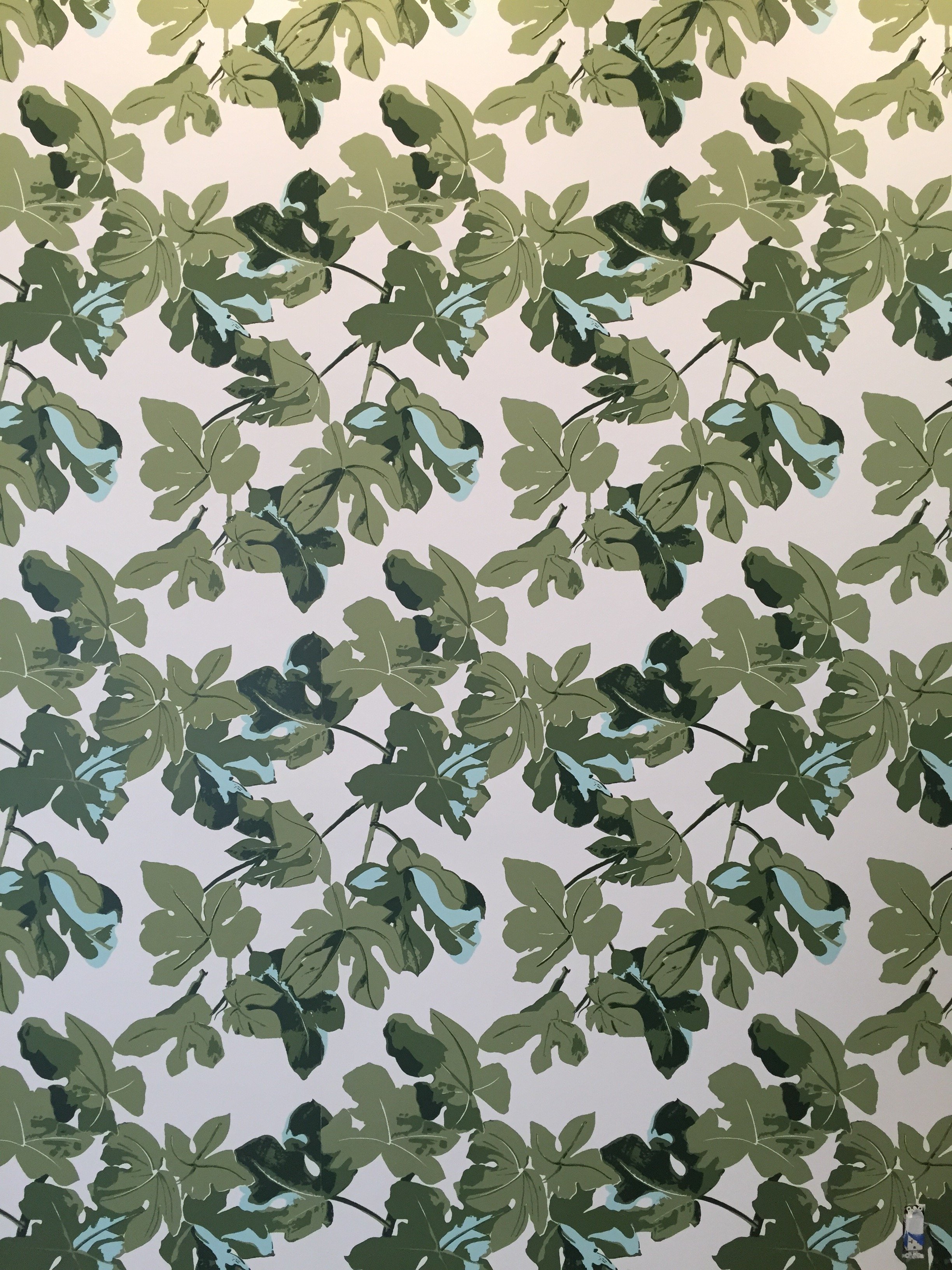
 I've written about Peter Dunham before. His showroom, Hollywood at Home, has moved to a new location. Beautiful. I ordered some fabric samples for my Anguilla beach house project.
 You know how I feel about Peonies.
 Peter's famous Fig Leaf print.
 How gorgeous is this dark blue club chair at Mecox?
 This table? Perfect for a bedroom, entryway, or a small office.
 Everyone was so cheerful. It really unnerved me. Ha!This photo was taken at the ELLE DECOR Power Luncheon. Very pretty and again, great food.
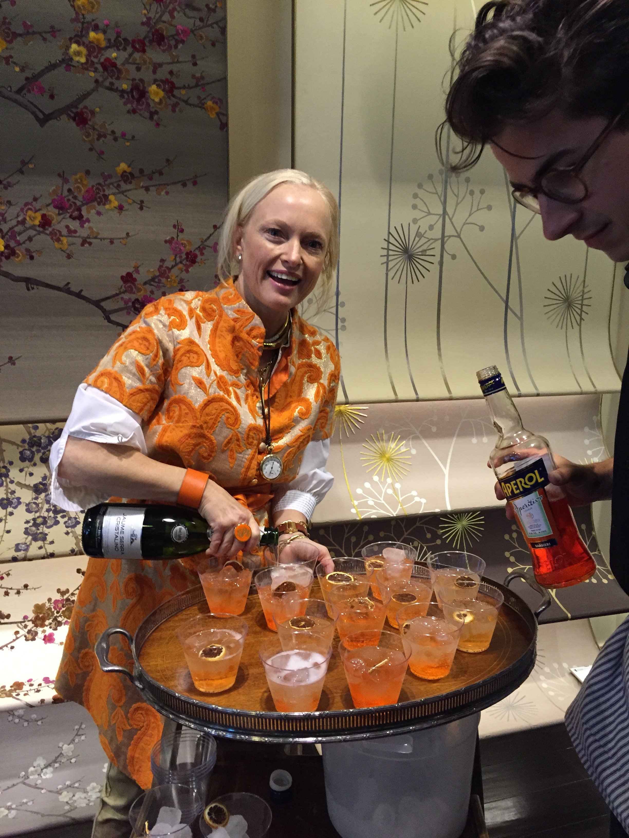
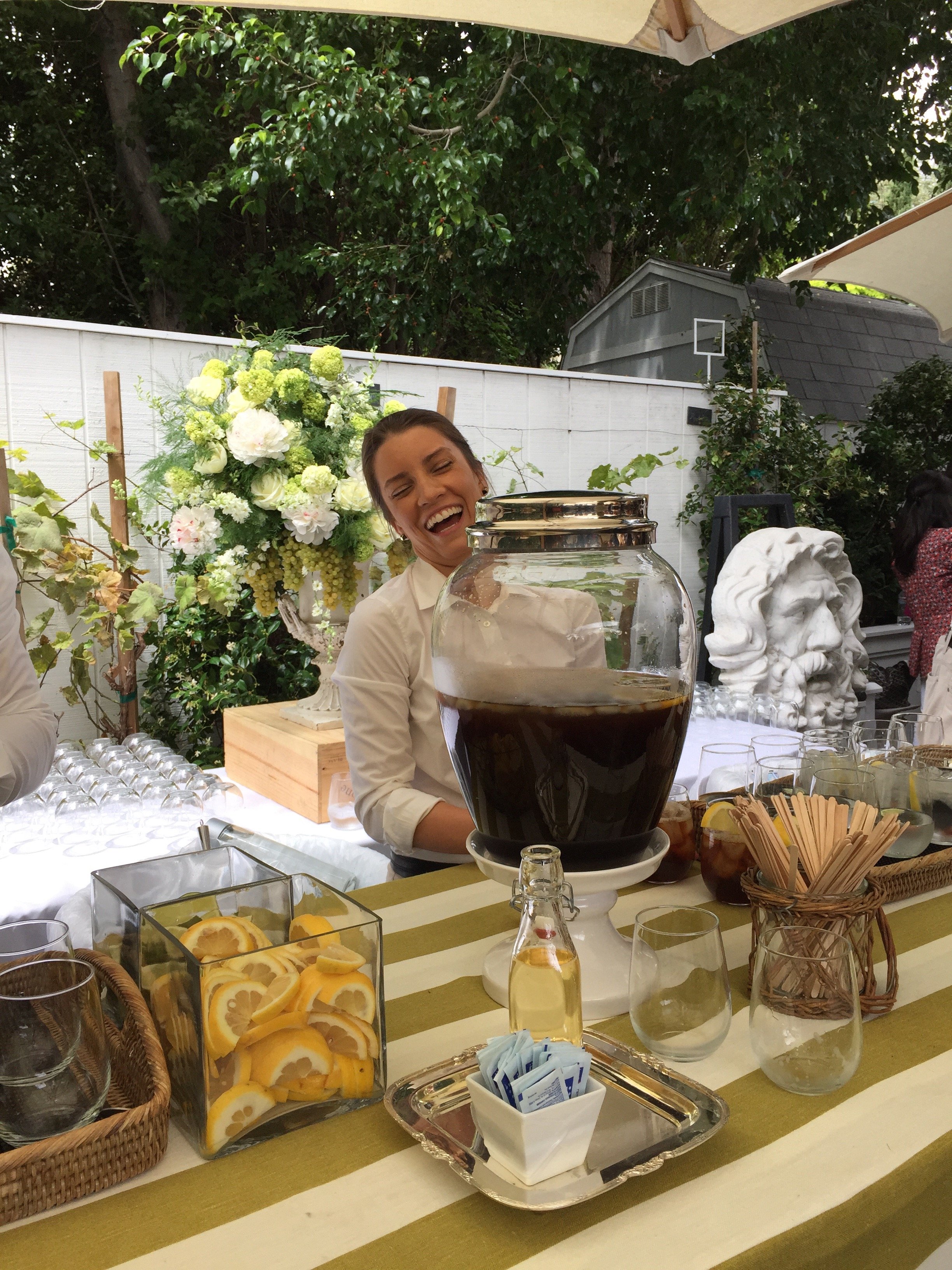 Lulu Powers making Aperol Spritz before the "Entertaining - The Home As A Social Stage" panel, with Susan McFadden, Kathryn M. Ireland, Russ Diamond, and Lulu.The take away? Dining rooms are not obsolete, despite what developers of McMansions say. They're being used differently, less formal. I agree and wish I had one.
 I read Windsor Smith's new book once I returned to Rome. I highly recommend adding it to your library. It was great to meet Windsor and to spend time in the Arteriors' showroom.
 I love that Arteriors was serving cocktails at 2:30 p.m. on a Friday afternoon. Unfortunately, I was driving non-stop in Los Angeles. Still, I enjoyed the festive atmosphere.
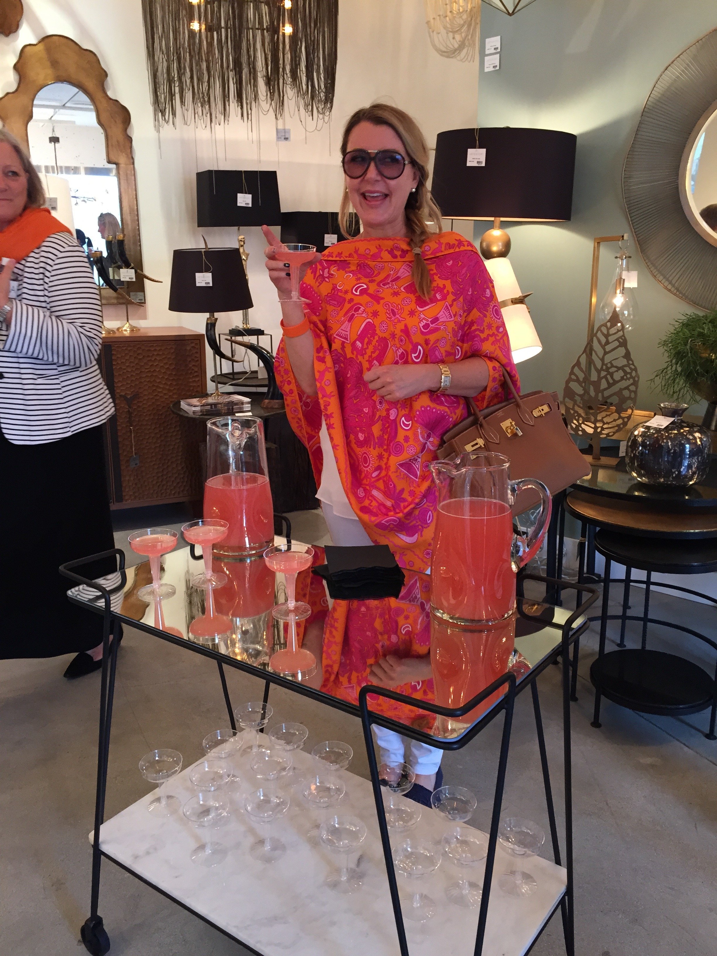 One of the most popular events is the Moore and Giles cocktail party, co-chaired by Harbinger LA and the Hearst shelter magazines (Veranda, Elle Decor, and House Beautiful) in the Harbinger backyard.More Aperol Spritz. The Italian inspired menu was catered by Lulu Powers and was delicious.
 My incredible experience ended with an intimate party at Kathryn M. Ireland's beautiful home. I forgot my phone (the HORROR!).Paloma Contreras of La Dolce Vita blog wrote a post about it.Ireland has moved her West Hollywood showroom next door to her textile printing shop on Washington street. Outside, it looks like any other nondescript industrial space. Inside, is a completely different story.I cannot believe it's been almost three years since I attended her Interior Design Boot Camp. It was one of the best investments I've made in my career. It was also a lot of fun.
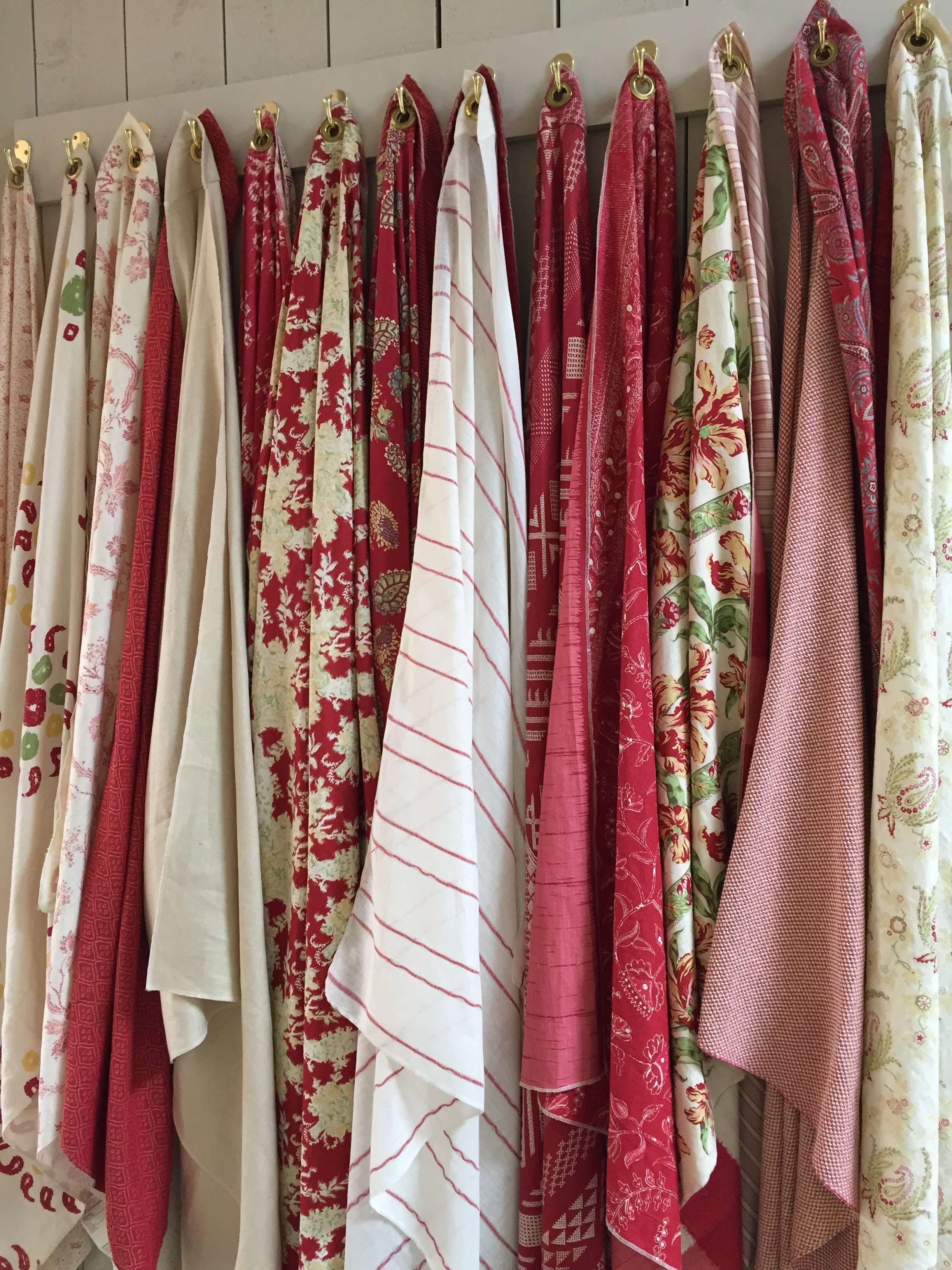 Work in progress. Hand printed textiles.
 Photos: My and my iPhone.
Small Bathrooms That Are Big On Style
The last few weeks have been incredibly busy.I'm working on a new project that will include a bathroom renovation. It has unique design challenges in that It's a vacation rental and the room is TINY.We want the space to function better and to be stylish. Below are three small spaces that caught my eye.Compact yet not claustrophobic. The shelving above the toilet is genius. Great use of space.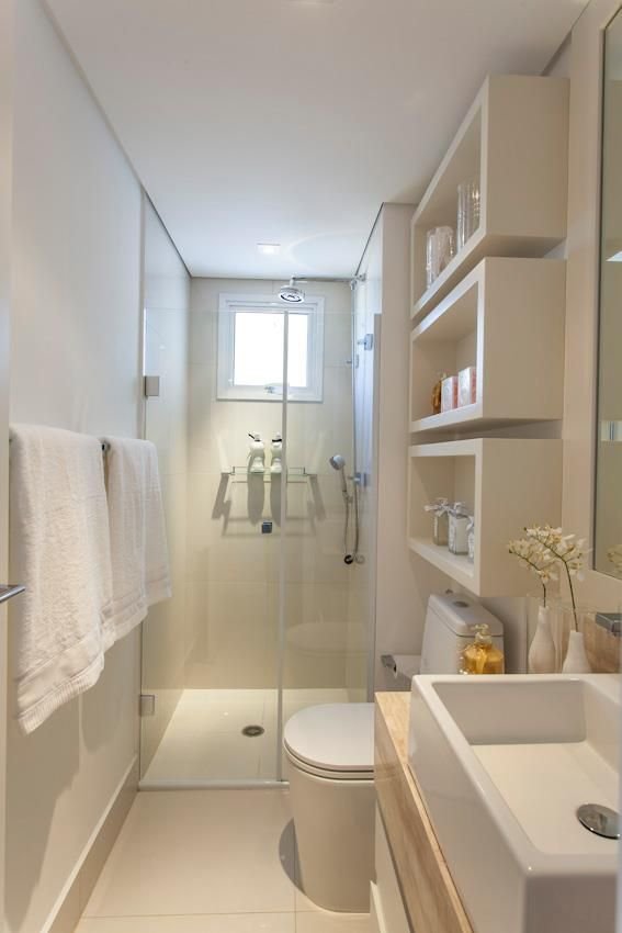 Photo: Banherio PequenoIn a small space you can use higher-end materials and finishes without blowing out your budget. Look at these floors. Stunning.
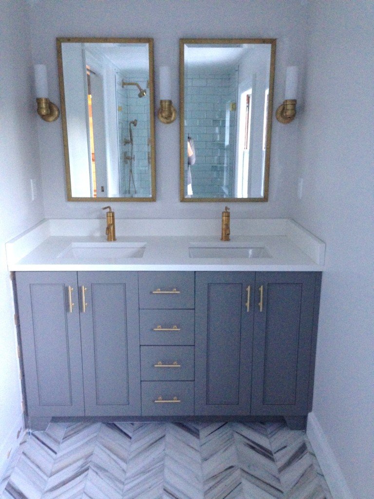
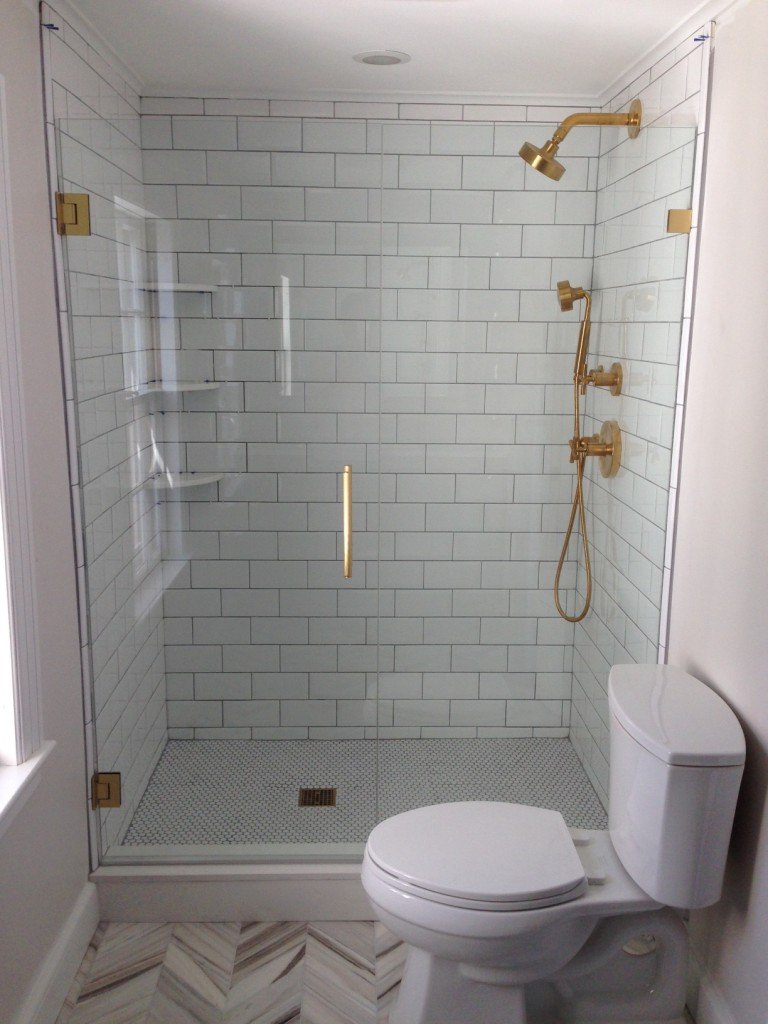 Photo: Elements of StyleLove the drama of Jenna Lyon's bathroom. These floors are spectacular as well.
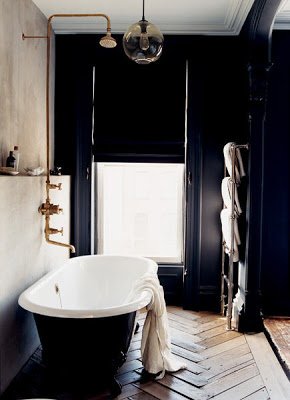 Photo: Domino
Life in Rome - My Trip to Pienza, Tuscany
Earlier I wrote about the interior design of La Bandita Townhouse. Clearly the owners, John and Ondine, have put as much thought into the service as they did into the décor.From the first email to book my room, until the day I left, the service was (as the young folks say) on fleek. This is something I do not take for granted. Unfortunately, too many people have no idea what it means to work in the hospitality business. Why they would open or work in a hotel/restaurant/spa, etc. is beyond me.Pienza is a small hilltop town with a population of approximately two thousand people. It was the birthplace of Aeneas Silvius Piccolomini, who would become Pope Pius II. Piccolomini rebuilt the entire village, starting in 1459, after he became Pope. He saw it as a lovely Renaissance retreat from the Papal capital. In 1996 Pienza was named an UNESCO World Heritage Site.It's a perfect base from which to explore this region of Tuscany (with a car). Montapluciano, Siena, and other towns are close by. If you're a Pecorino cheese fan, a visit to Pienza is a must.Since I was only staying for two nights, I didn't rent a car and spent most of my time close to the Townhouse. It was FREEZING. I'm not exaggerating. I haven't been that cold since my days at Syracuse University.I was elated to see these fire pits around town. I love how in this country even a simple and functional thing, like a fire pit, is well designed. I mean, look at the darn logs. Did the person who built the fire make sure they were "just so" or what? Also, as I said before, it was beyond freezing. Who has time to worry about aesthetics in sub-freezing weather? If the logs were janky, would the fire builder be called out?I truly appreciate this attention to details. The views were spectacular. Sunset.
 Sun rising. View as I started my epic walk three and a half-hour walk.
 Remember this road from the movie GLADIATOR? No, I was not entertained. I was a little freaked out because I didn't see a single person for kilometers. I started to think, "what if a wild boar attacked me? Nobody could hear me scream. Where the heck is the next farm house?"
 Seriously, NOBODY was around.
 The top of this well, stylish simplicity.
 Pieve dei Santi Vito e Modesto Church. It was built sometime during the 11th and 12th centuries. Notice the distinctive carvings above the door. Several of these small country churches were built above Etruscan sites and used some of the same imagery.
 I had a fantastic dinner at the hotel, after I defrosted. The restaurant is open to the pubic (you need reservations). Chef David and his sous-chef, Jacopo, knocked it out of the park.
 Martina pours some Prosecco.
 During high season, Pienza is very popular with tour groups. This charming video about La Bandita and Pienza helps explain why.http://www.youtube.com/watch?v=0rGyeJ1Z030A big Thank You to everyone at La Bandita. Sometimes it's not so easy to travel alone and they made me feel at home.Photos: Me and my iPhone.
A Tub and Shower With a View
And what a view it is. One of my friends just returned to Rome from visiting the States and she kindly picked up a copy of VERANDA magazine for me. It's not an easy magazine to find in Rome (in Milan, yes).Brooke Giannetti's Velvet & Linen blog is fantastic. She has a very large following and has posted a few photos in the past of the home she is building in Ojai, California with her architect husband Steve.It's so interesting to me that this a new build, yet their home has the warmth and vibe of a house that has been in a family for generations. You can read more about Brooke and Steve's Patina Farm journey, here.One day I would love to have a tub/shower like this. Love it. Of course it's only possible if there are no neighbors close by. A friend here has an outdoor shower on his terrace. He lives in Trastevere and the upper floors of a church and another palazzo are right across the narrow street. The man has no screens. Yeah, no.To see more photos, go to VERANDA's website.
Life in Rome - The Flaminio Flea Market
Borghetto Flaminio is not as well known as the famous Porto Portese market. The latter has more furniture but Flaminio is the market to check out for authentic vintage/used designer clothes and interesting tableware.As with any flea market there could be some fakes, but this market has a good reputation. Many of the vendors are regulars. If they were selling fake Prada, Gucci, Hermès, etc. the word would get out pretty quickly.Borghetto Flaminio is tiny. I suggest getting there early. It's packed with fantastic finds. I hadn't been there in years so when my friend, artist and florist Marta, suggested we check it out, I was ready.A cool tea set from the 40s. Lovely monogrammed vintage linen.
 A taste of Hermès. This was the most popular vendor in the market. They also had some drop dead gorgeous vintage Gucci, Valentino, Prada, and Fendi bags.
 Love this Murano glass set from the 60s.
 Marta was VERY excited about this patent leather Prada bag.
 Sundays (except holidays)Piazza della Marina, 32Sundays, 10AM – 7PM€1.60 entrance feeFrom mid-September to mid-July
Pantone's Color For 2015 - Marsala
Design blogs blew up this week when the news hit that Patone's color for 2015 was Marsala.I enjoy cooking with Marsala wine. I really do but I must agree with majority and say, "what is this madness?!"This color reminds me of Dusty Rose from the '80s. Not a good look. Could someone please explain to me what is going on in the picture below. What is Pantone trying to say?
 The gentleman in the apron looks salty. Why? Perhaps he's not feeling the color either.I'm very curious to see how this color choice plays out in fashion and home décor trends next year. I don't think it's an easy color to wear. For the home, I love the color of Marsala wine which is a deeper burgundy than this color. That rich color would be fantastic.
A Few Dinner Plates For A Thanksgiving Table
Many people back in the States have asked me what I'm doing on Thursday.I'm working. Thanksgiving is an American holiday.If I had an oven/kitchen/apartment bigger than a shoebox, I would host a Thanksgiving dinner but on Saturday (which is what the majority of expats do here).My future apartment will have more space and I will entertain more.In the meantime, I can admire these lovely plates that would be perfect for my Thanksgiving dinners.For an informal table:The Marbury Dinnerware Collection from Crate and Barrel. You can put a charger underneath with more color or a pattern. The Charlotte Street Collection from Kate Spade. I had to have at least one white plate with blue trim.
 The Eclectique Dinner plate from Williams-Sonoma. It's a pretty dish made in France.
 For a more formal table:The Renaissance Collection by Wedgewood. A classic.
 Anmut Platinum by Villeroy & Boch. One word... elegant.
 The American Dinner plate by Hermès. The blues are gorgeous.
 Hmmm, not seeing a lot of variety here.I do appreciate china with flowers but for my table I tend to keep it simple because my floral arrangements are colorful. Also, I like to mix and match my dinnerware. Having plates in a similar color palette makes the table more cohesive.For those who are celebrating, I hope you have a fantastic and Happy Thanksgiving.
Design vs. Function - American Dream Builders
Perhaps I'm naive but I believe good design incorporates a space that functions well.This is why I completely disagree with the finale (SPOILERS ahead) of the NBC show "American Dream Builders". Looking at their Facebook page, I'm not the only one.Earlier, I wrote about why I enjoyed the show.They should change the name of the show because there was nothing about Lukas's beach house that worked for the clients.The job of a decorator/interior designer is to address the needs of the client. He did not do that. All Lukas talked about was his vision. He is talented but Jay should have won.On what planet is it a good idea to paint a beach house in SOUTHERN California black? It's not edgy. A black shingled house in Maine, or Martha's Vineyard, that could be cool. Does Lukas know that that the light is different in New England compared to the Southern Californian Coast? One of the judges said the house looked like it had been in a fire.Also, Lukas did not deal with any of the design flaws of his house. That kitchen was awkward.This a beach house for a multigenerational family. Their reaction at the reveal was priceless. I adore mid-century design and would use it in a beach house but would mix it up.Nate kept saying Lukas was forward-thinking. Has Nate ever been to IKEA? I know he has traveled to Europe. This beach house would work for a single person with no kids who never entertains.Nate raved about Lukas's $30 chandelier. Again, this is in a beach house. I go to a beach house to relax. Who's going to clean it and replace the light bulbs? It's not functional.This room. Where are the young children going to hang out? Nice to look at. Wouldn't want to sit there for a long meal. What is that statue about in the corner?
 Not relaxing. These chairs would be fab in a loft apartment, not at the beach.
 if the Neighborhood Council voted for the finale winner, Jay would've won hands down. Elaine was eliminated for her red family room because it didn't fit the décor of the rest of the house, but Lukas can win the whole competition for this house? Please.If they didn't want a home builder to win, don't put them in the competition.I don't know if the series has been renewed for a second season. It's a shame that the finale was such a disappointment but I enjoyed the earlier episodes.
Progetti da Sogno (aka, American Dream Builders)
The American series AMERICAN DREAM BUILDERS started airing this week in Italy on the channel LEI.Hosted by Nate Berkus, it's a mash up between EXTREME MAKEOVERS and TOP DESIGN. I have always wondered about the reality of the former. They do a lot of structural changes. How well was the construction, plumbing, and electrical work executed when they have only a week to demolish and rebuild? Could the owners afford the increase in property taxes? So many questions.One thing I really like about this show is that two teams work on two houses from a similar era and/or style. It's compelling to see how the teams agree (or not) on an overall aesthetic for their house and then how the individual designers design their rooms.There is a mix of designers, contractors, and landscape architects. Of course, there are some strong personalities. Reality TV would be boring without them.We are three episodes in and so far it's fantastic. The show is entertaining and educational. Décor is very subjective but it's interesting to hear the judges explain why they believe a room doesn't work. Sometimes it's a design issue. For example, the team did not address the layout issues. Other times, it's about the décor. Those debates get heated.I cannot wait to see who wins. There are some very talented designers on this show.https://dailymotion.com/video/x1htfrm
Bigger Is Not Always Better - Peter Dunham's West Hollywood Home
Meeting Peter Dunham was one of the highlights of Kathryn M. Ireland's Design Workshop. I have adored his textiles and design for ages and was excited to see his showroom. He was lovely.I think it's very interesting that he downsized. When I lived in Los Angeles, most of my peers in entertainment were all about getting to the next level. You had to have the right address, the right car, and even if your house was perfect, the minute you could afford to (or not) you would upgrade to a bigger, better, house.In this month's issue of HOUSE BEAUTIFUL, there is a great interview (and slideshow) with Peter. He talks about why he moved from a house that was 3,500 square-feet to an apartment that is only 550 square-feet.Living in a tiny space forces you to edit. You cannot surround yourself with just "stuff."There is some fantastic design advice for small spaces in the article. You can read it HERE and check out more photos of his charming home.


Stylish Simplicity - Como Glasses - Paola Navone for Crate & Barrel
I've written before regarding how much I adore the collection Italian architect/furniture and interior designer Paola Navone has created exclusively for the American store Crate & Barrel.Her new collection is out. My siblings were kind enough to give me a gift certificate to Crate & Barrel and I had to get these glasses. Now they are sitting at my sister's house. One day they'll make it to Rome.I love the color of the rim and the lines of the glass. Very simple and very stylish.
Work In Progress - Caribbean Beach House - Bathroom Inspiration
A few weeks ago I went to Anguilla to check in on one of my projects. The build is going very well.When I think of the mood for a beach house, the first thing that comes to mind is relaxation.I've been looking at books in my library and pulling images from the internet for inspiration. The bathrooms don't have to be from a Caribbean beach house but must have some elements that would work in that environment.There are many decisions that have to be made. What kind of finishes? What color? If we use tile, what size?While this is a house in Anguilla, the style will not be British Colonial. It's too formal for a beach house. There will be touches (like a mahogany four-poster bed) of course but mixed with a contemporary spin on Caribbean design.Below are few spaces that caught my eye:This bathroom is from a home on the tiny Island of Mustique. I love the natural feel of it. We're already using poured cement for the kitchen counter tops. To use it again in the bathrooms might be too much.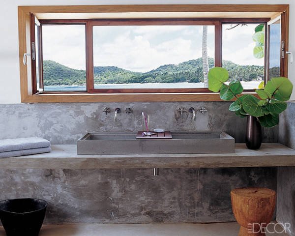
Photo: Elle Decor
This large en-suite bathroom in a Sicilian villa has a stone sink. Love the simplicity of the shower stall and the use of wooden stools. This is a newish boutique hotel. I must see Rocca delle Tra Contrade in person. The photos are stunning.
Photo: Rocca delle Tre Contrade
I'm not a fan of shower caddies.
Our clients for the Tuscany project were very clear that they wanted built-in spaces for shampoo, soap, etc. If it's early enough in the build/renovation, I recommend going in this direction. Just make sure there's a slight slope, so water doesn't pool in the space.
A partial wall works for this project. It never gets cold.
Photo: Elements Of Style
Getting away from the neutrals for a minute, this bathroom from the La Banane hotel on St. Barths is very bright and colorful.
A fun design like this might be a great idea for one of the smaller bathrooms. Or the powder room. In a large space this color and pattern would be not be relaxing to me.
Photo: Villa La Banane
Brass fixtures are having a moment. I like them in this bathroom. I look at all this tile and worry about cleaning the grout.
Photo: Habitually Chic
I LOVE outdoor showers. The ones at Cap Juluca in Anguilla are fantastic.
Photo: Cap Juluca
A more traditional style at Oscar de la Renta's former home in the Dominican Republic.
A shower in Marrakesh. Fantastic built-in bench.
Photos: Mark D Sikes
I don't know where this house is but I like the contrast of the stone-tiled floor with the black contemporary trim on the windows and with the lines of the tub.
Photo: Pinterest
The Tuscany Project
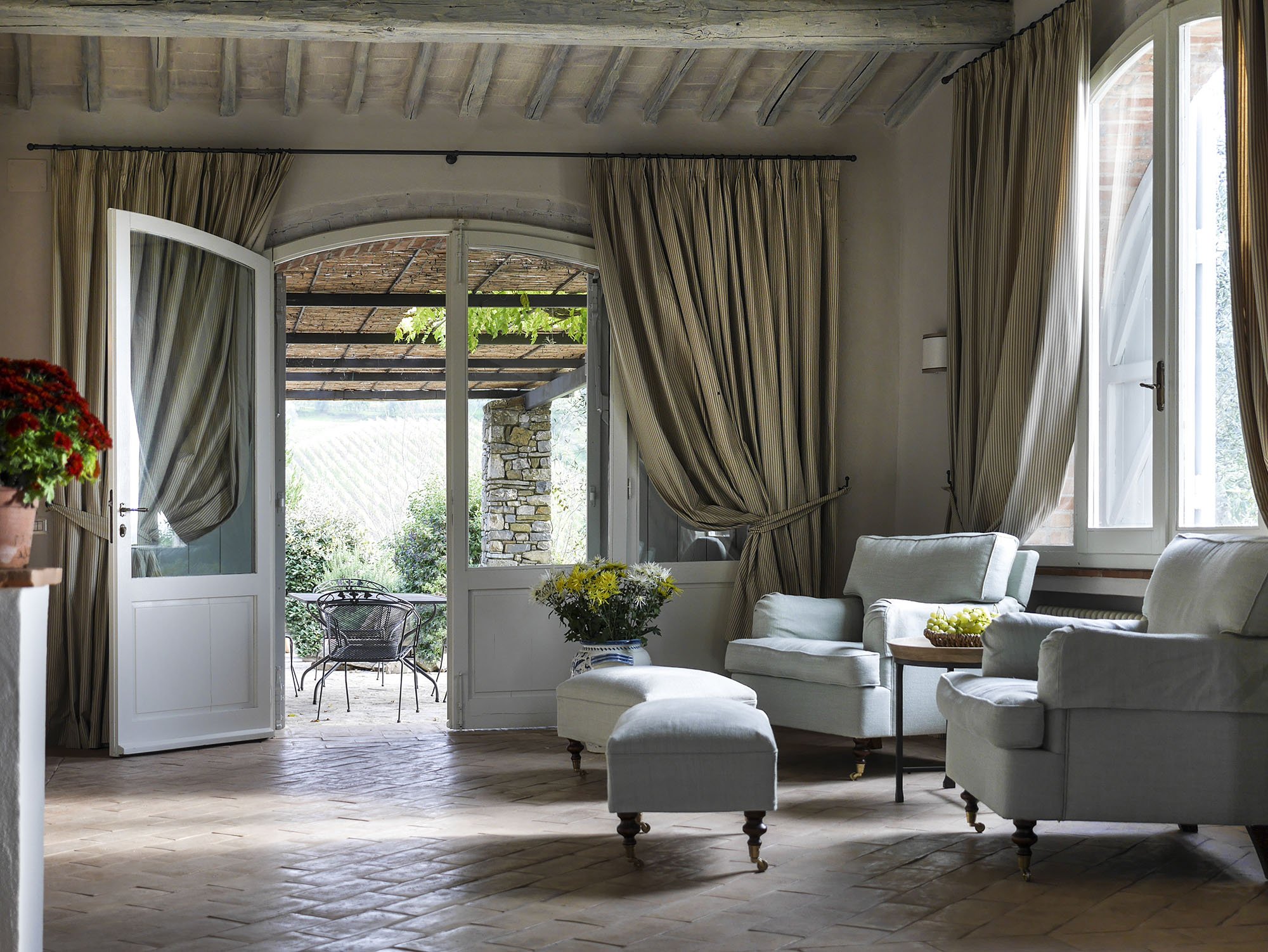
Last year I wrote about the vacation home in Tuscany I'm working on with architect Domenico Minchili.Our clients had some photos taken and below are a few of them.First, a before shot of the living room.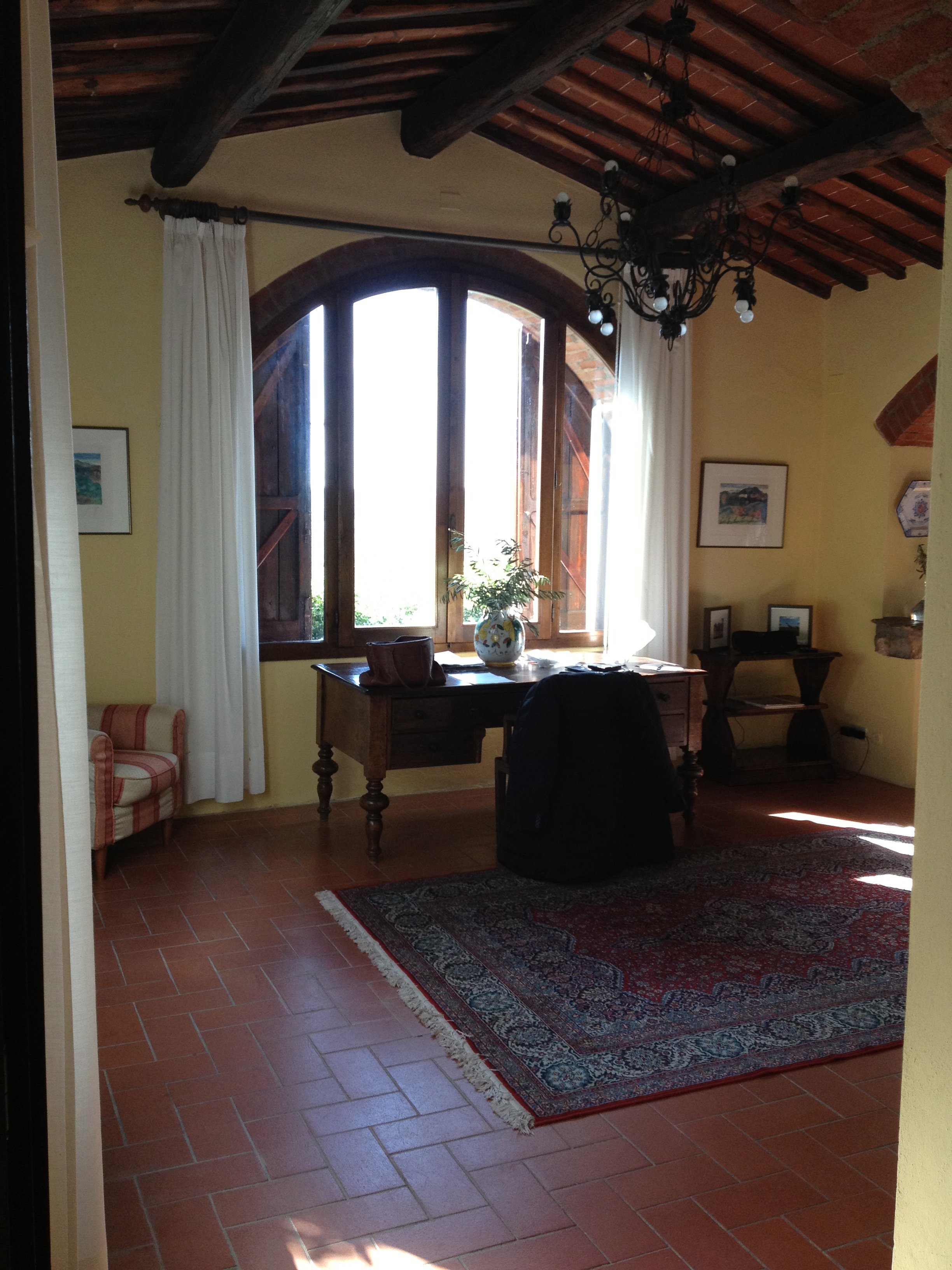 After.The room is so much lighter. The new "old" floors make a huge difference as does the paint color. I was consumed for days regarding which shade of Farrow & Ball white was the best white for the walls. We decided to use Skimming Stone.The chairs were custom made by Tondini & Radicchi. So were all the draperies in the house.
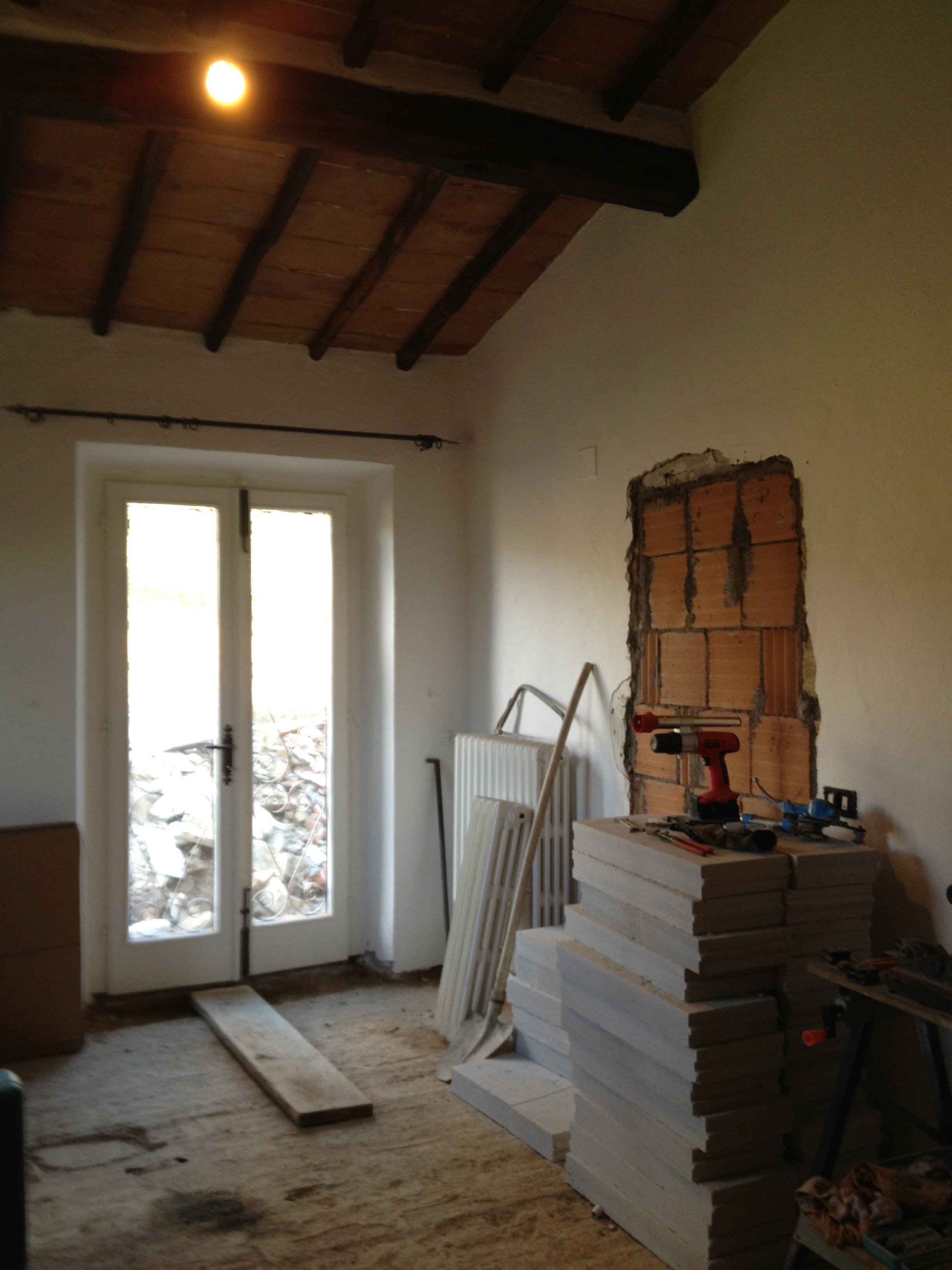
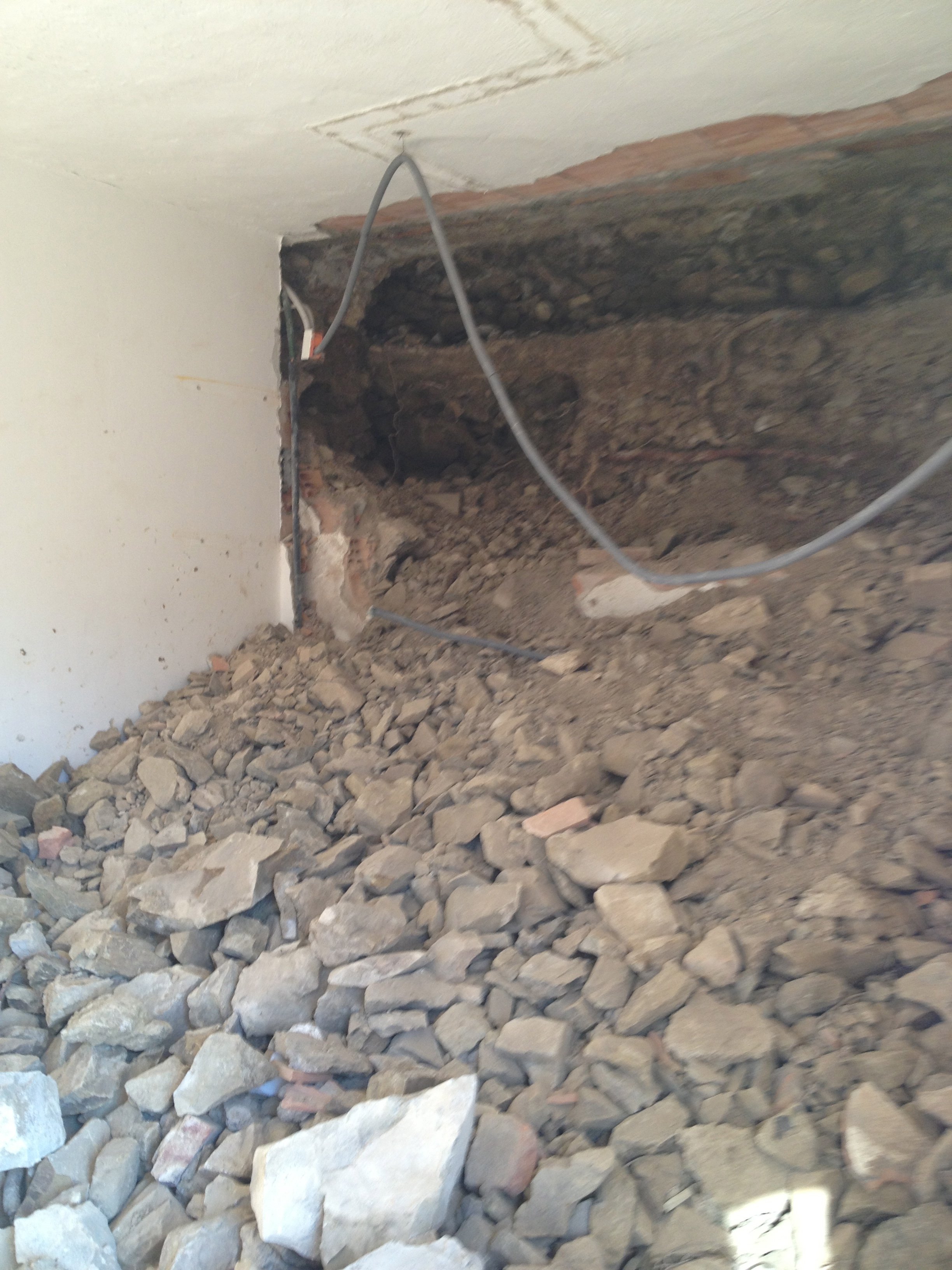
 One of the bedrooms mid-renovation.
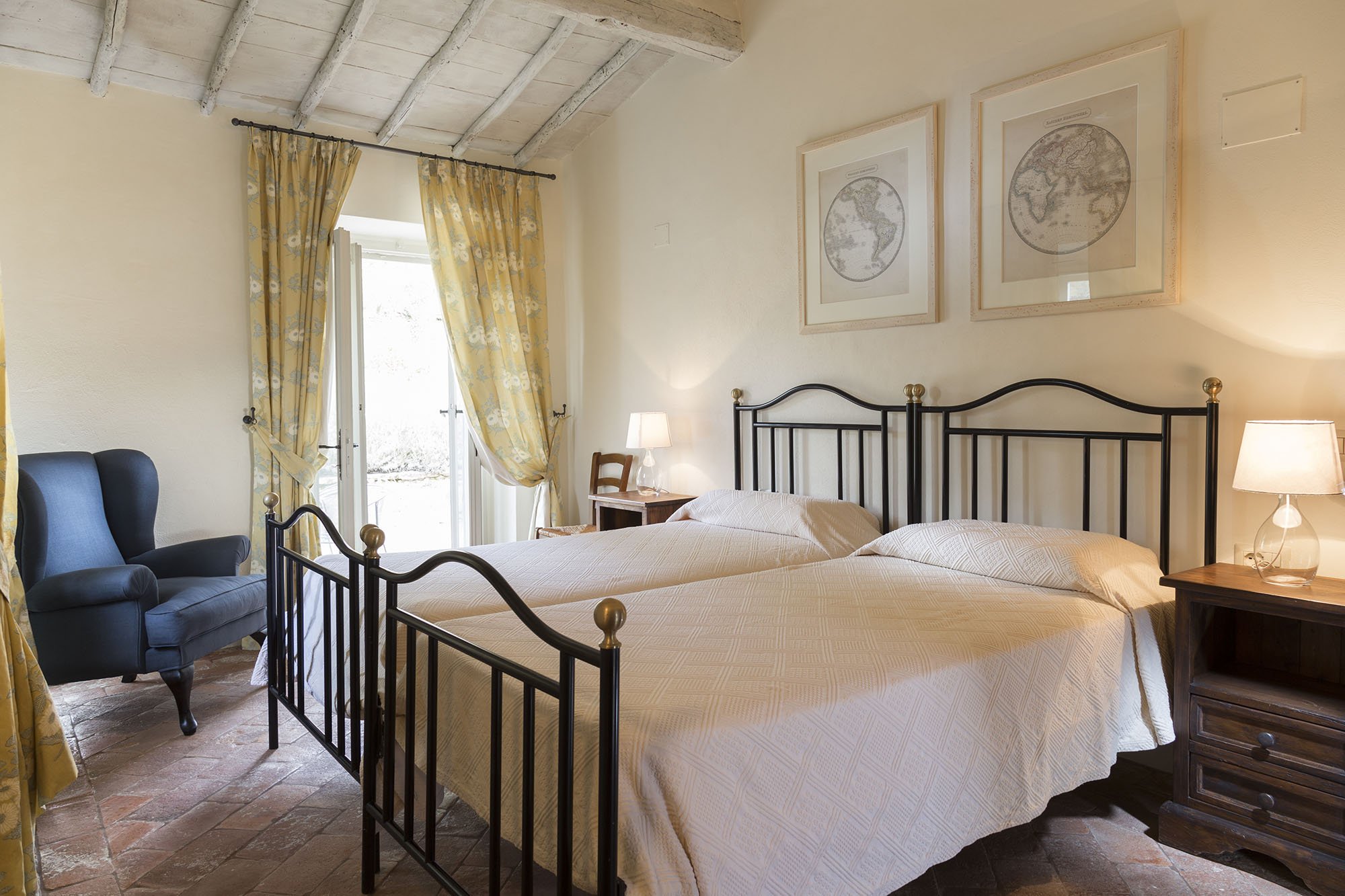
 After.
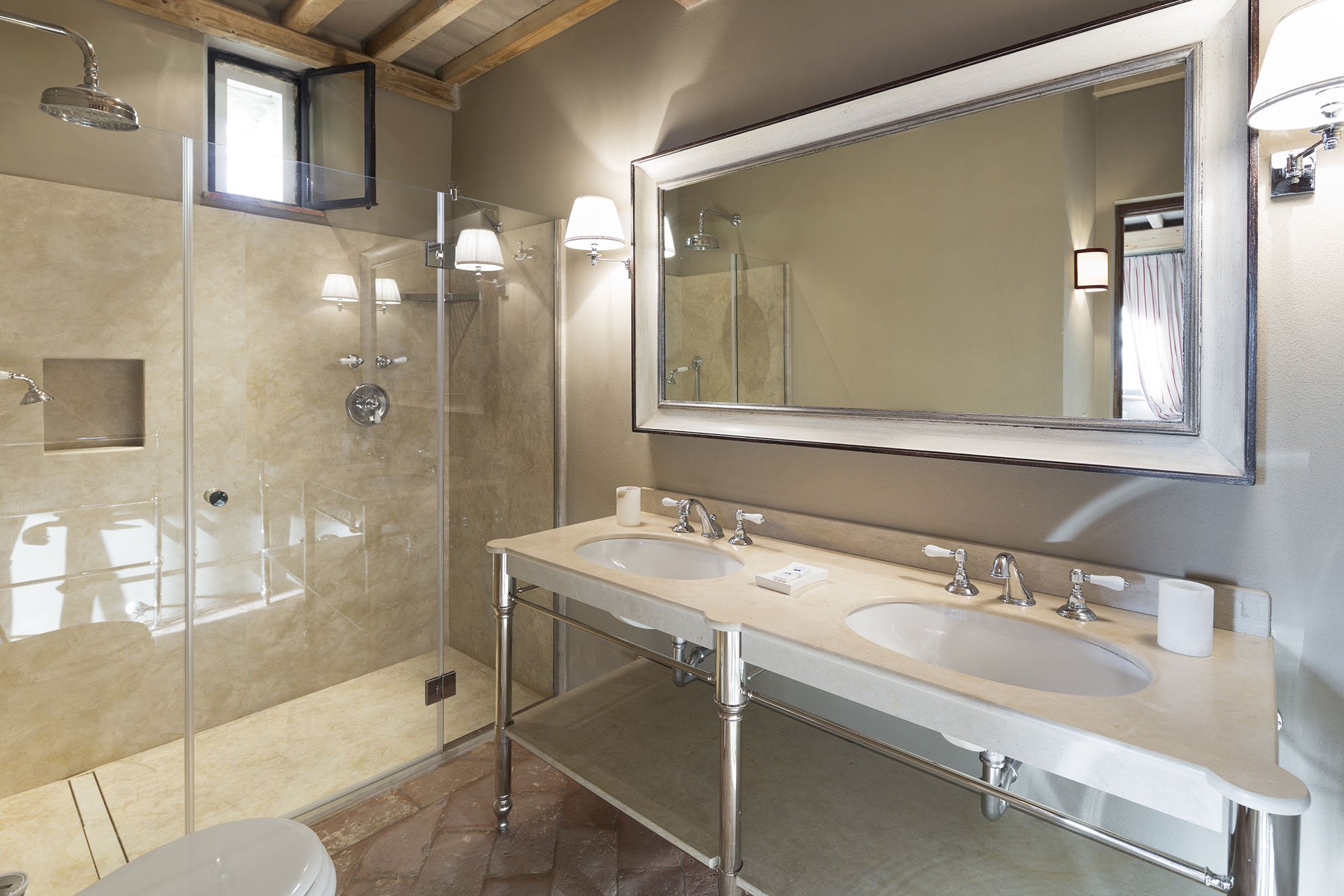
 A bathroom before.
 After.
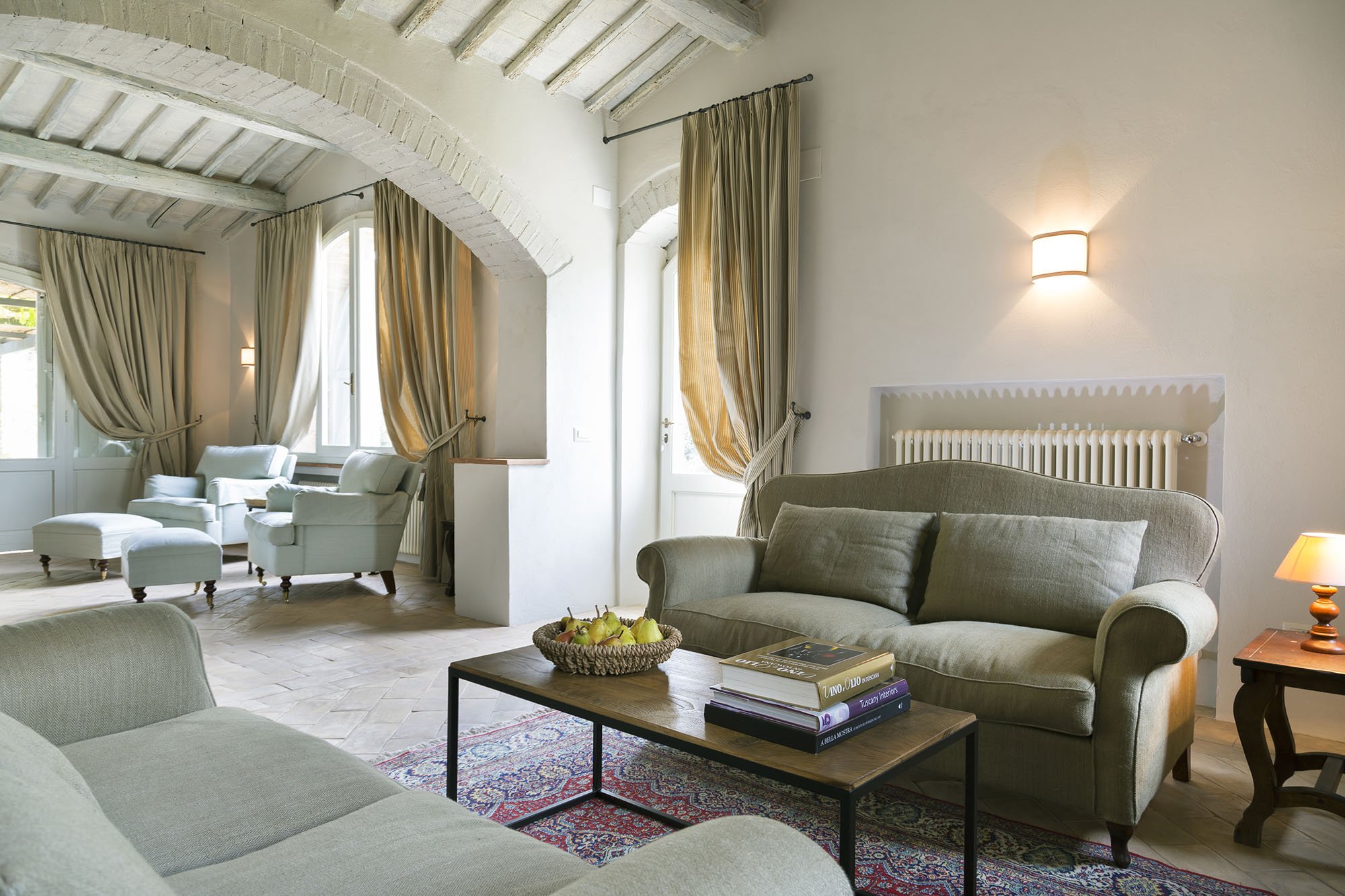
 Wider shot of the living room. The sofas, coffee table, and sconces are custom.
 The studio.This room receives little natural light. Many people assume that a small dark room must be painted a very light color in order to make it look bigger. Not true. It seems counter-intuitive but going darker gives a small room more depth.
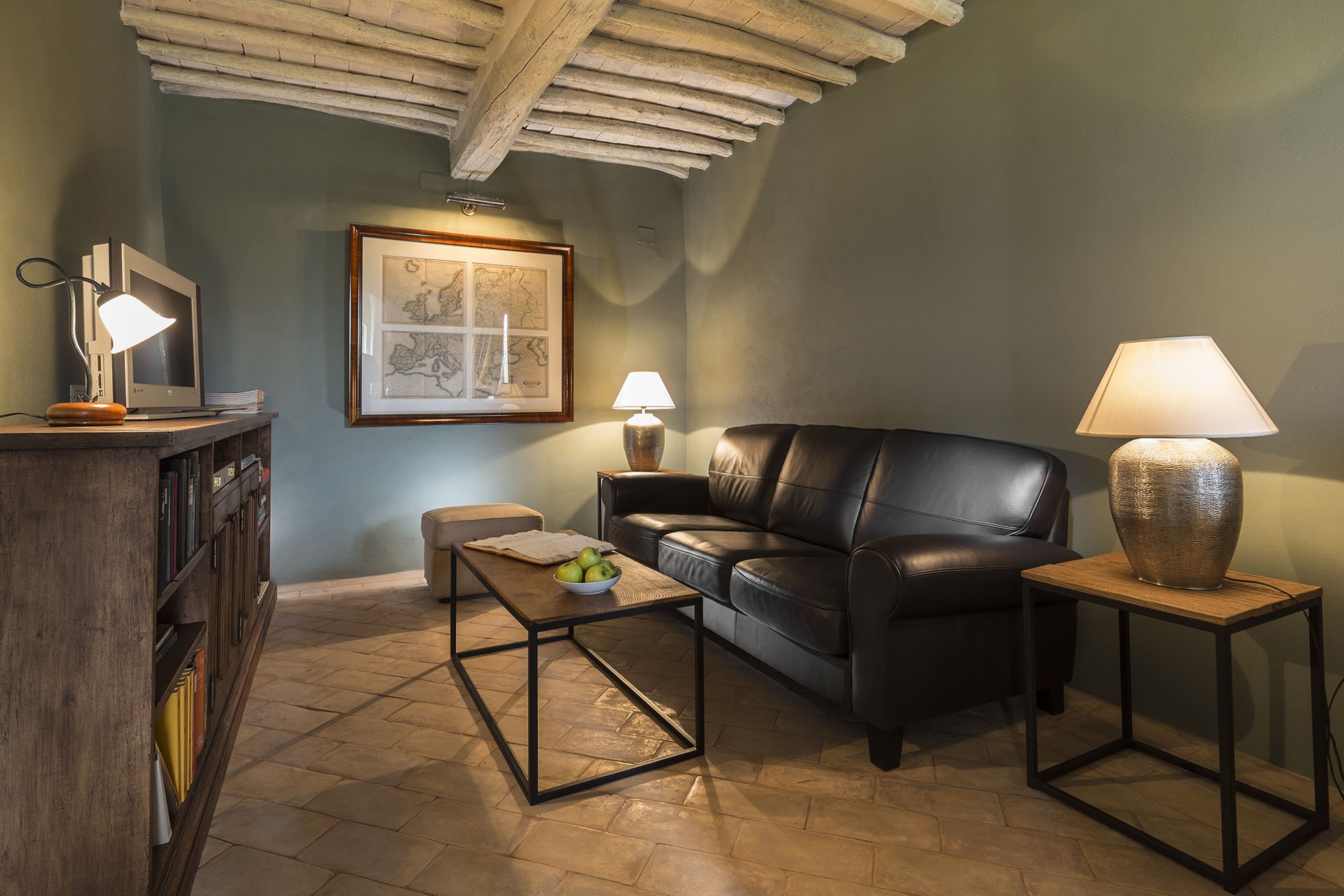
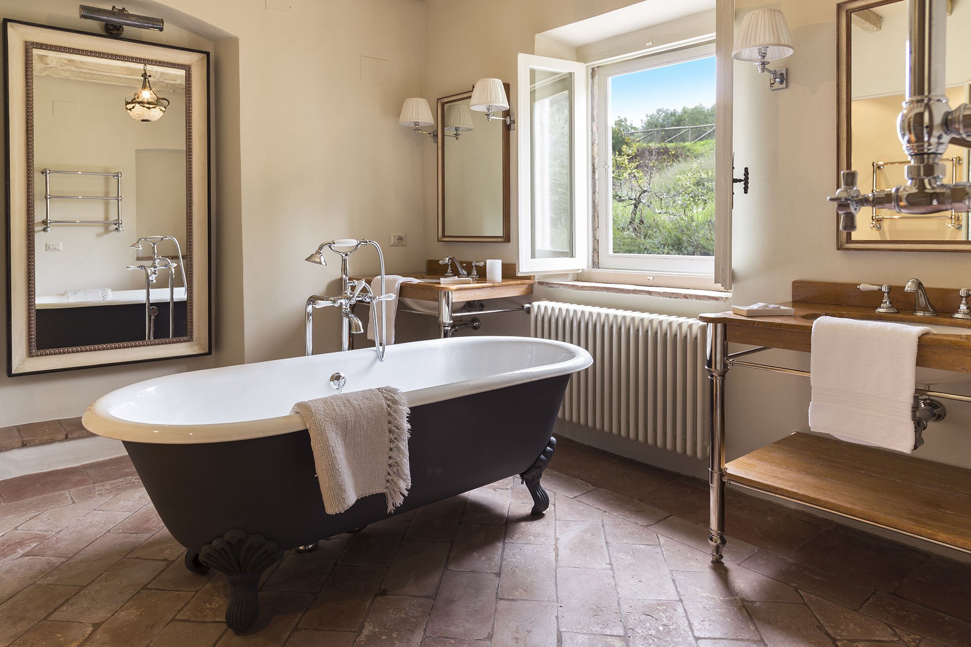
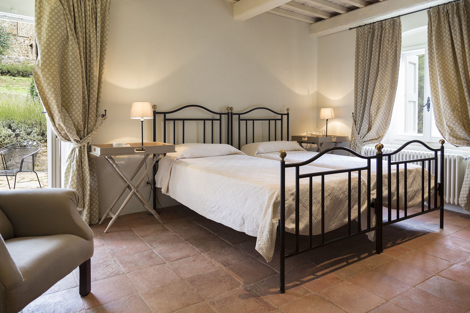
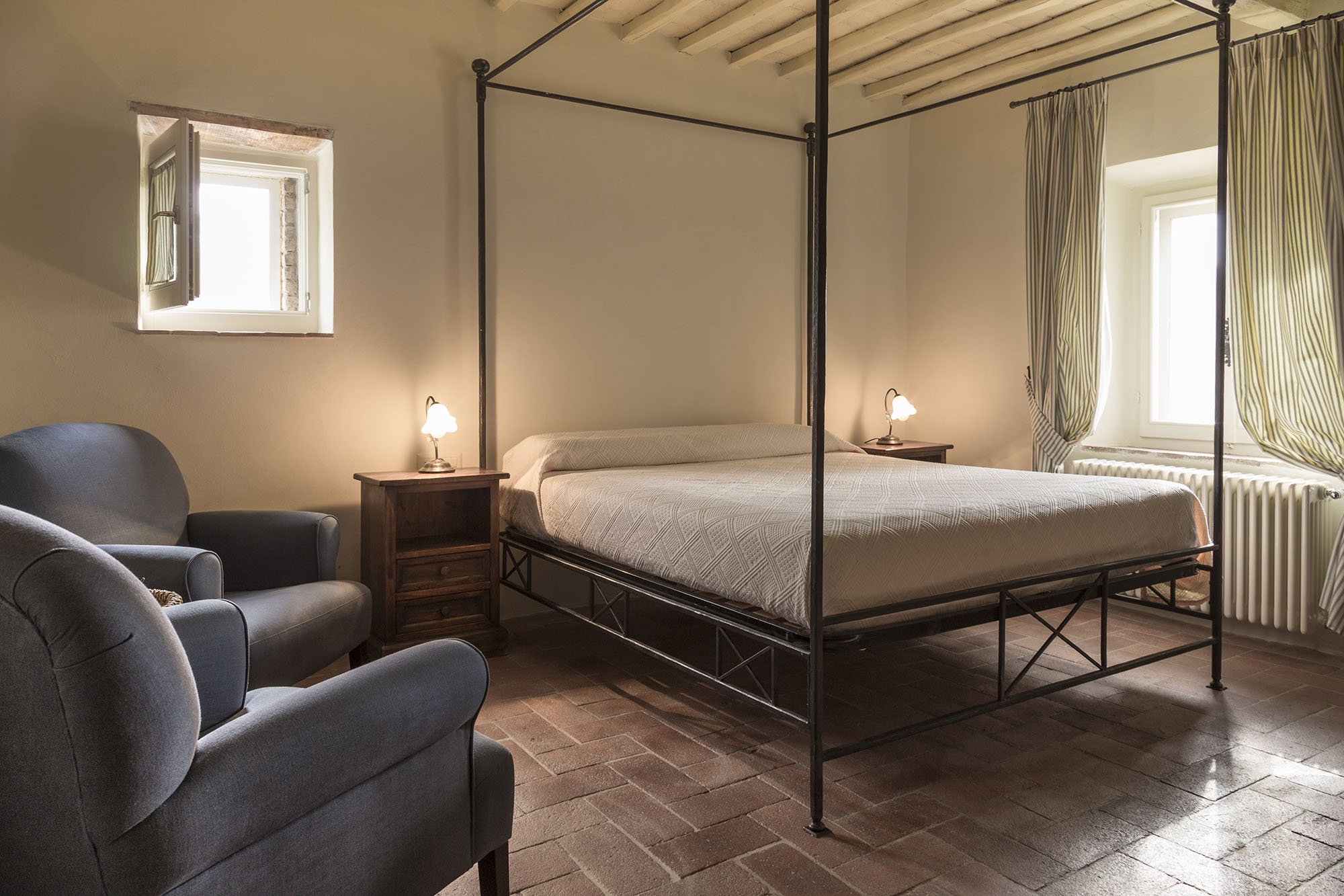
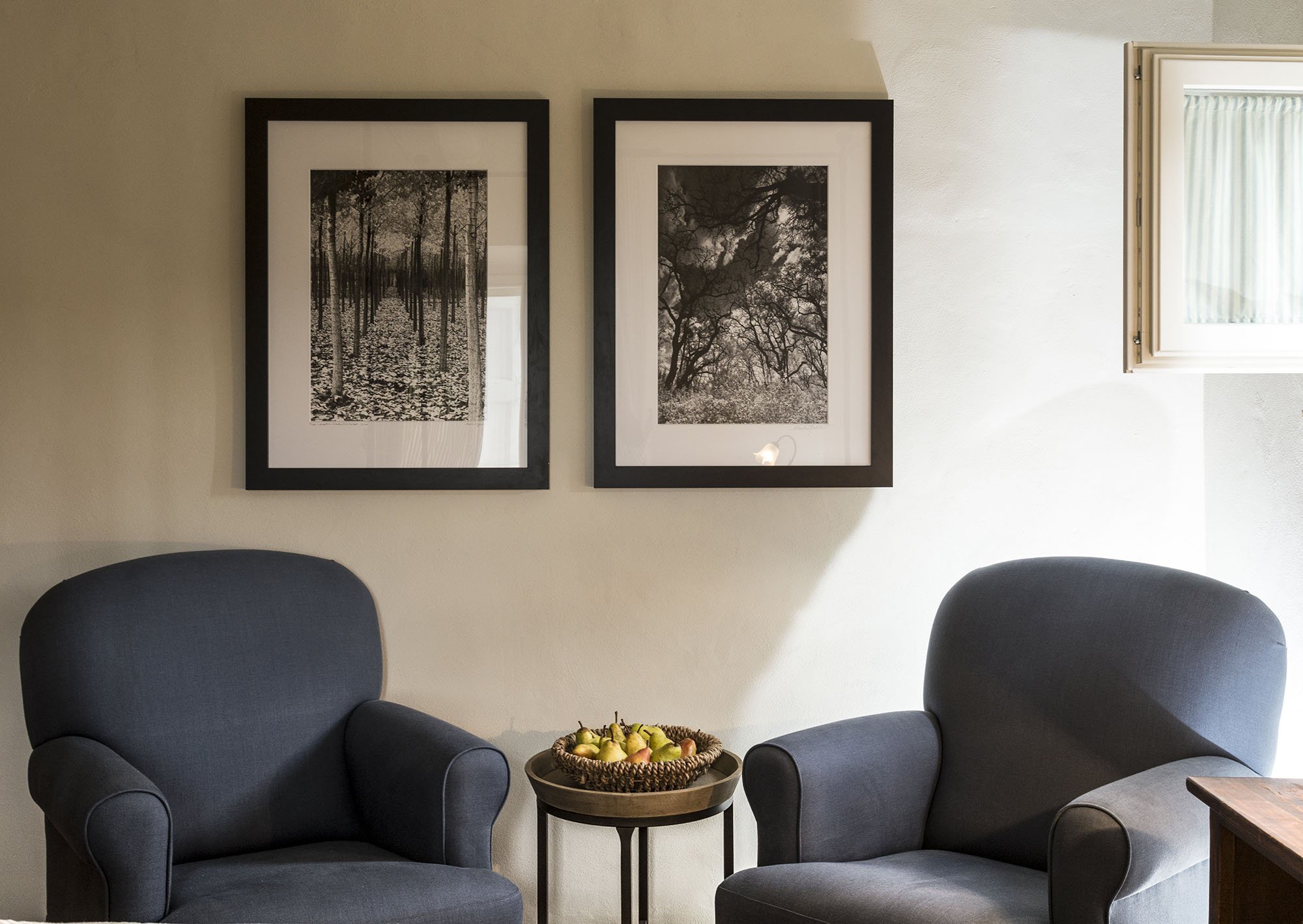
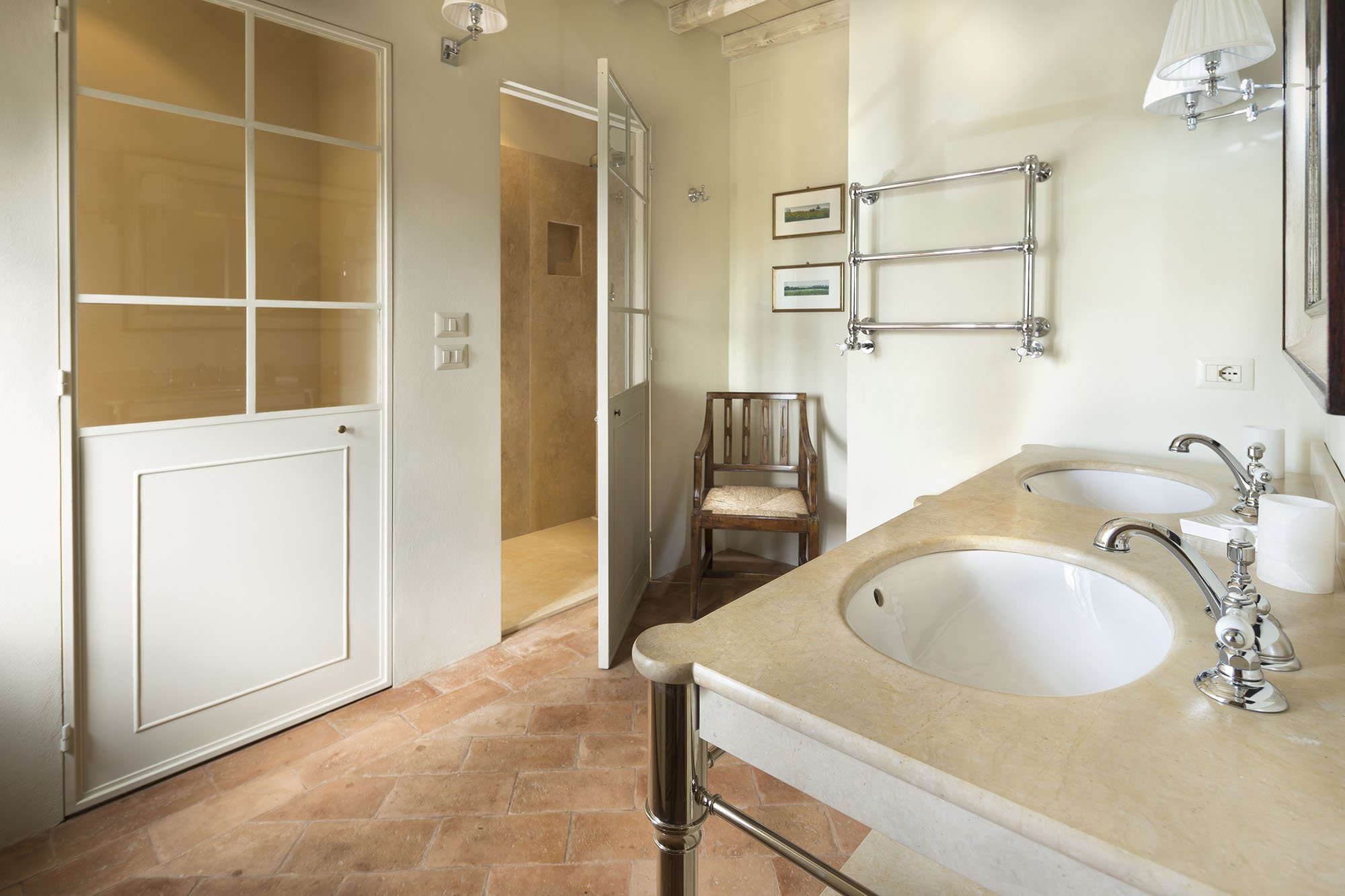

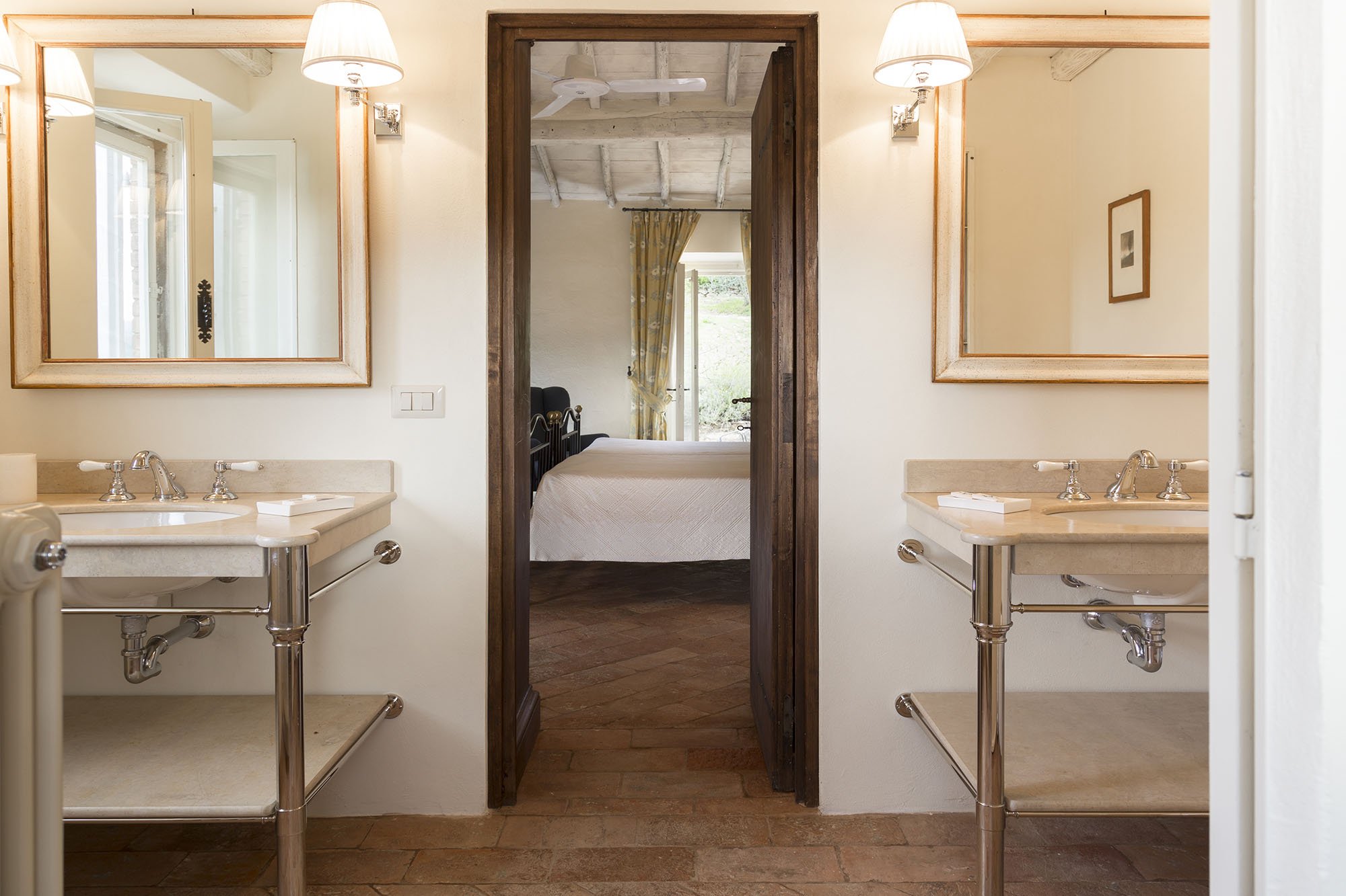
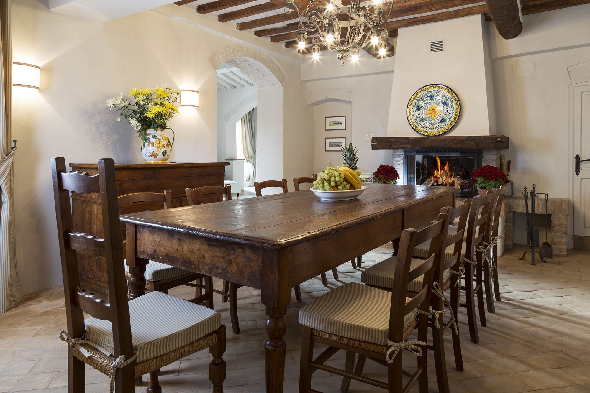
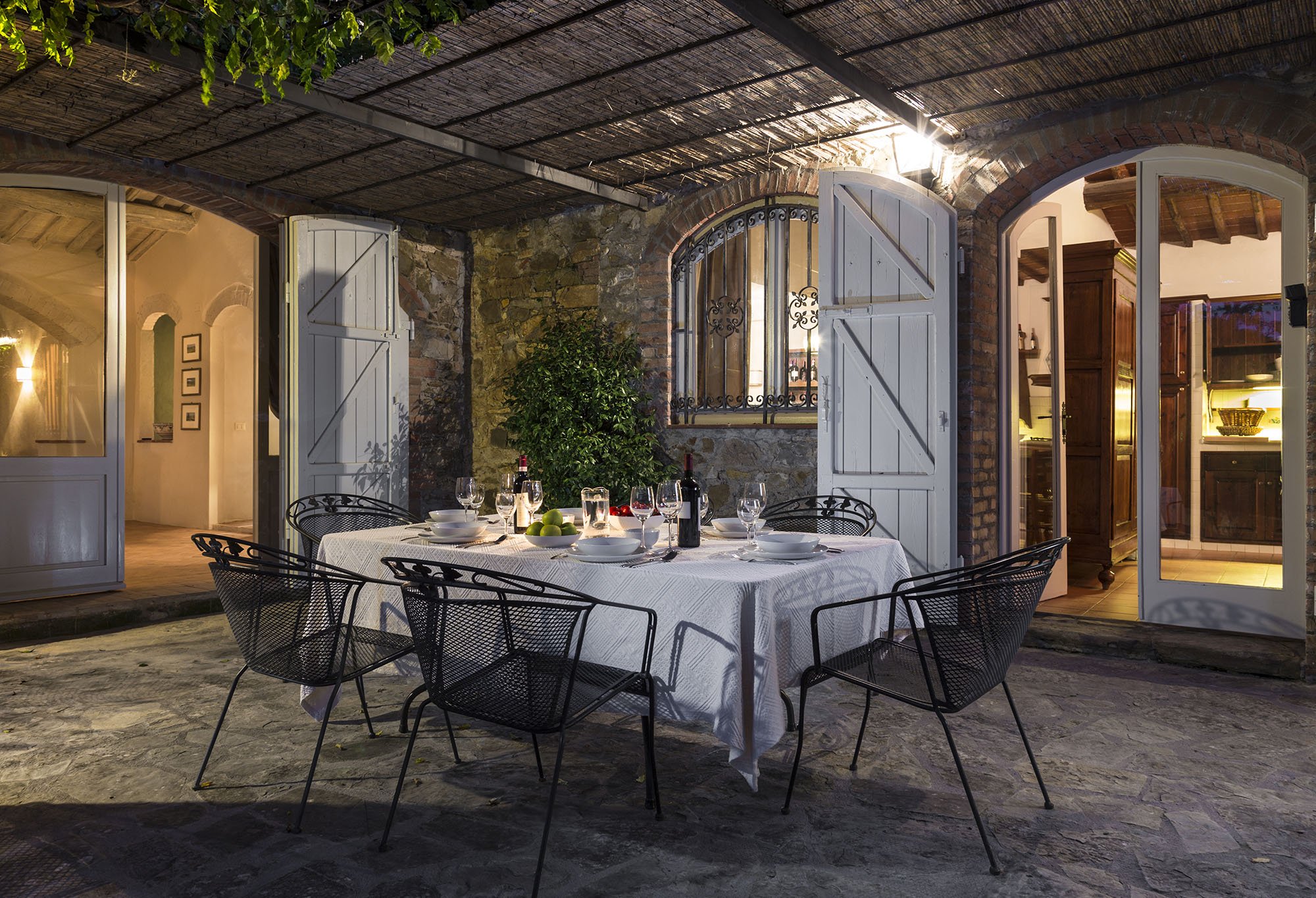
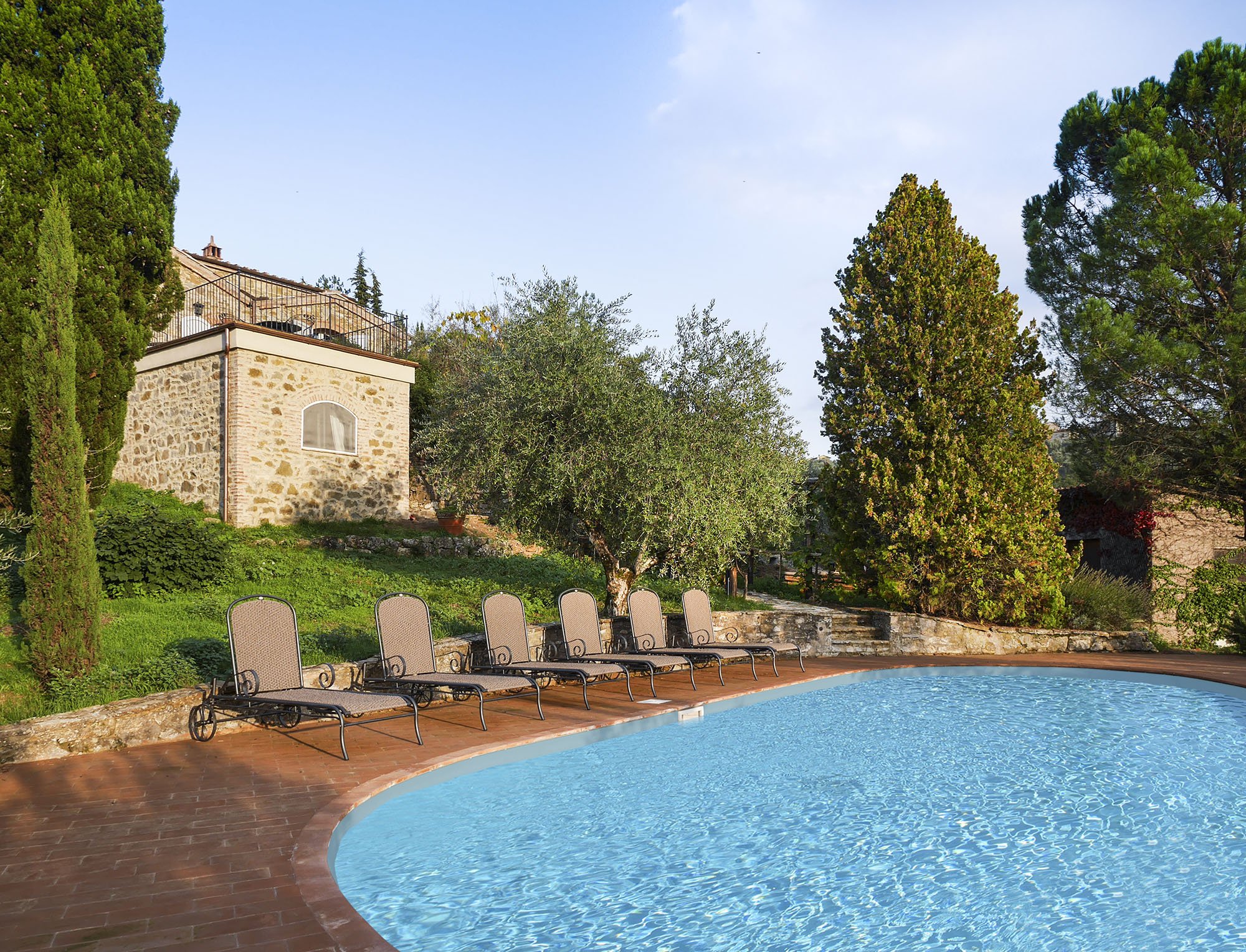 One of my Italian friends called this décor, "Relaxed Chic." Another friend said it was "Casual Luxury." Both work for me.Every bedroom, and its bathroom is unique, yet the entire home is cohesive.The paint is from Farrow & Ball.Most of the new furniture was custom made. We also sourced pieces from Flamant, Barthel, and small shops in Rome and Tuscany.Our fabric sources were, Dedar, Ralph Lauren Home, Kathryn M. Ireland, and Pierre Frey.If you would like to know the specific colors or more information about the fabric or furniture, please feel free to ask me in the comments section.This property is available for vacation rental. It's in the heart of the Chianti region surrounded by vineyards. The views are stupendous.For more information (and some exterior photos), please visit the luxury rental Abercrombie & Kent website.Photos by: Mario Flores
Stylish Simplicity - Palazzo Mirror by Julian Chichester
I love decorating with mirrors. That said, I'm a little over the sunburst ones. They are everywhere.I was looking for a mirror for a client, when I saw this beauty from one of my favorite furniture designers, Julian Chichester. This London-based designer has so many pieces I would love to have in my home. I don't own a palazzo but I think this mirror would work in a variety of décors.The eglomis frame is stunning and not ornate. This is truly stylish simplicity.
