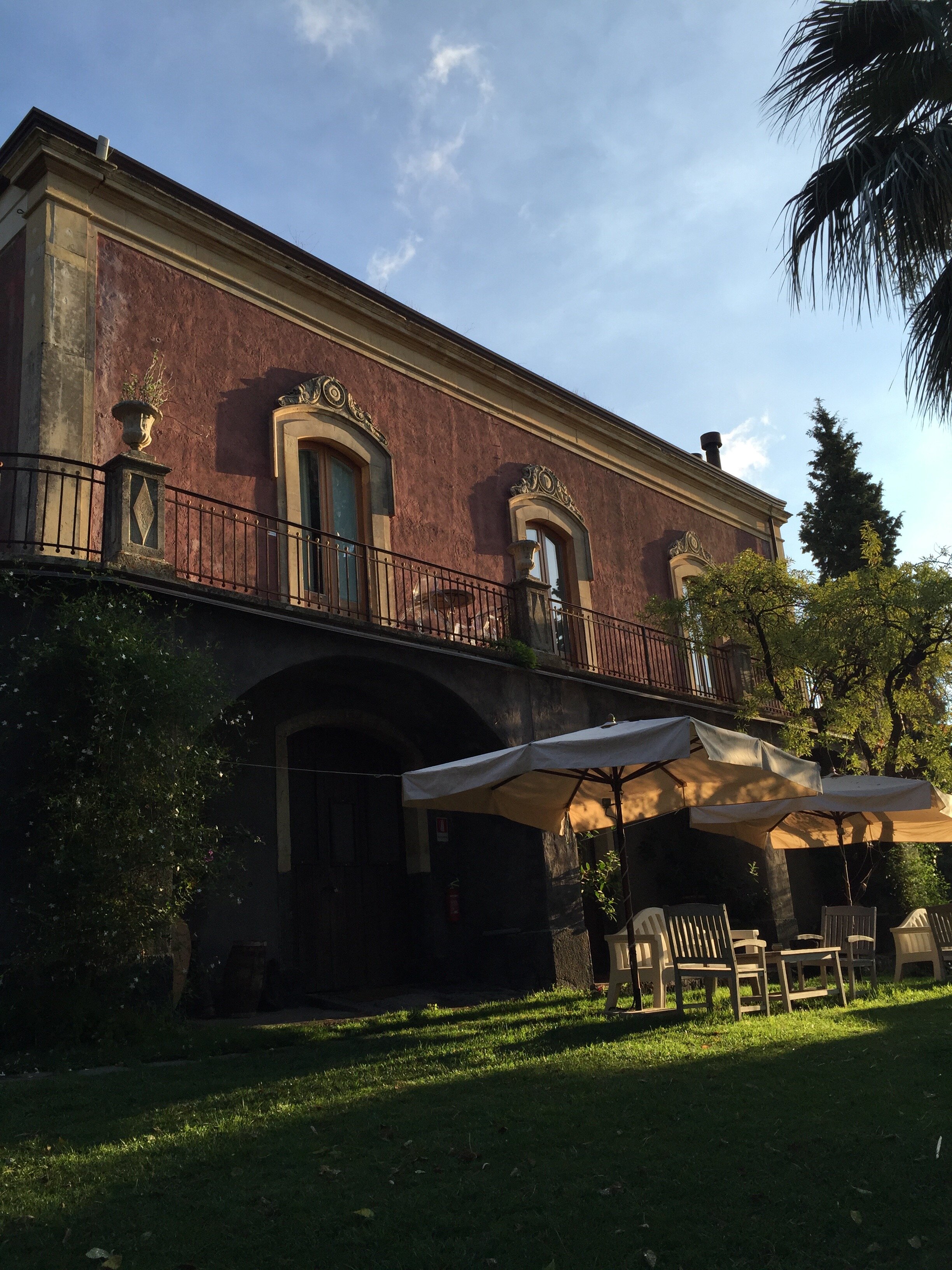
Villa Necchi, A Must See/Do in Milan
Ciao from a rainy morning in Rome.
I know I said I was going to write on this here blog more often but work this year has been very hectic. Perhaps things will slow down during Spring '22! I'm not complaining as these are good problems to have, especially during these strange pandemic times.
I went to Milan last week, just overnight, for the Salone. The energy in Milan was incredible. I felt safe going to showrooms and events as there were Covid protocols in place. Milan and the surrounding area were hit hard last year and no one wants to return to a lockdown.
I'm writing this while still on a Design Week high. I went to Milan in July for work and I was finally able to visit this palazzo. It has been on my list for ages and seeing the movie IO SONO AMORE/I AM LOVE only added fuel to my desire. The full name is Villa Necchi Campiglio but most know it as Villa Necchi.
Villa Necchi was designed and built by architect Piero Portaluppi from 1932 -1935 for the owner of the Necchi company, Angelo Campiglio, his wife Gigina and his sister-in-law, Nedda. There were some modifications and additions added by Architect Tomaso Buzzi after WWII. His style was a bit more traditional and you can see the difference as you walk through the villa. The villa was occupied by the fascists during the war and the family called Architect Buzzi once they were able to finally return to their home.
It took my breath away and pictures do not do it justice. It's amazing to see how modern these rooms from the early 20th century look and feel! It takes serious talent to design spaces that are classic yet contemporary. Portaluppi and his clients were truly ahead of their time. The Necchis entertained often and the house's public areas layout reflect this. This house was THE place to be back in the day.
The family had no children and instead donated their home to the non-profit FAI, the Italian National Trust.
The home has a large private garden with a swimming pool and tennis courts. Remember this is in the center of a large city! The villa is also filled with art, mostly 18th century, including artists Canaletto, Marieschi, and Tiepolo.
Look at the ceiling in the library! That design is a Portaluppi signature and you see it employed discreetly through out the villa.
I won't say anything to spoil the film for those who haven't seen it yet but one of the most important scenes in the movie takes place in this location.
The bathrooms were to die for. Again, I couldn't believe there were built in the 1930s. The veranda was another favorite room. The furniture was original and I could see those pieces being sold today. Even the utility rooms were design heaven. The Necchi family had custom Richard Ginori dinner service. I love the design of the "C" logo.
Style/fashion lovers will get a kick out of the sisters' built-in closets. The custom pieces from Gucci, Ferragamo, and Hermès are gorgeous. Quality and design like that never goes out of style.
The guides were very helpful, bilingual and there were two or three on each floor. I cannot recommend visiting this gem enough. My pictures and videos from this fantastic tour are in my Instagram highlights.
Buon weekend!
All villa photos: Giorgio Majno, © FAI — Fondo Ambiente Italiano
The Design Files - Royal Wedding Dresses
You may have heard that there's a royal wedding this weekend in the U.K.I'm very curious about Meghan's wedding dress. Her style is classic. She wears the clothes, not the other way around. Meghan's not jumping on every random trend and clearly knows what works for her figure. The only look I didn't love was her dress for her official engagement photos. The dress was stunning but I wasn't sure why she was wearing it during a day shoot and Prince Harry's suit was too casual for the dress.Below are three royal wedding dresses that I adore. They all have beautiful silhouettes, the brides look comfortable, and the styles are not dated. I watched Princess Diana's wedding and remember even as a kid thinking her dress was (to reference one of my favorite movies of all time) too meringue. Perhaps it because she was younger than the bridges below, had a very sheltered life, and it was the early 80s. Princess Diana was drowning in her dress.Princess Grace was married in 1956 and this dress is still influencing wedding and formal dress designers. It was designed by Helen Rose who was a costume designer for MGM Studios. She designed two dresses, which were gifts from the studio to their star. Helen was the CD on four of Princess Grace's MGM movies.Gorgeous and timeless.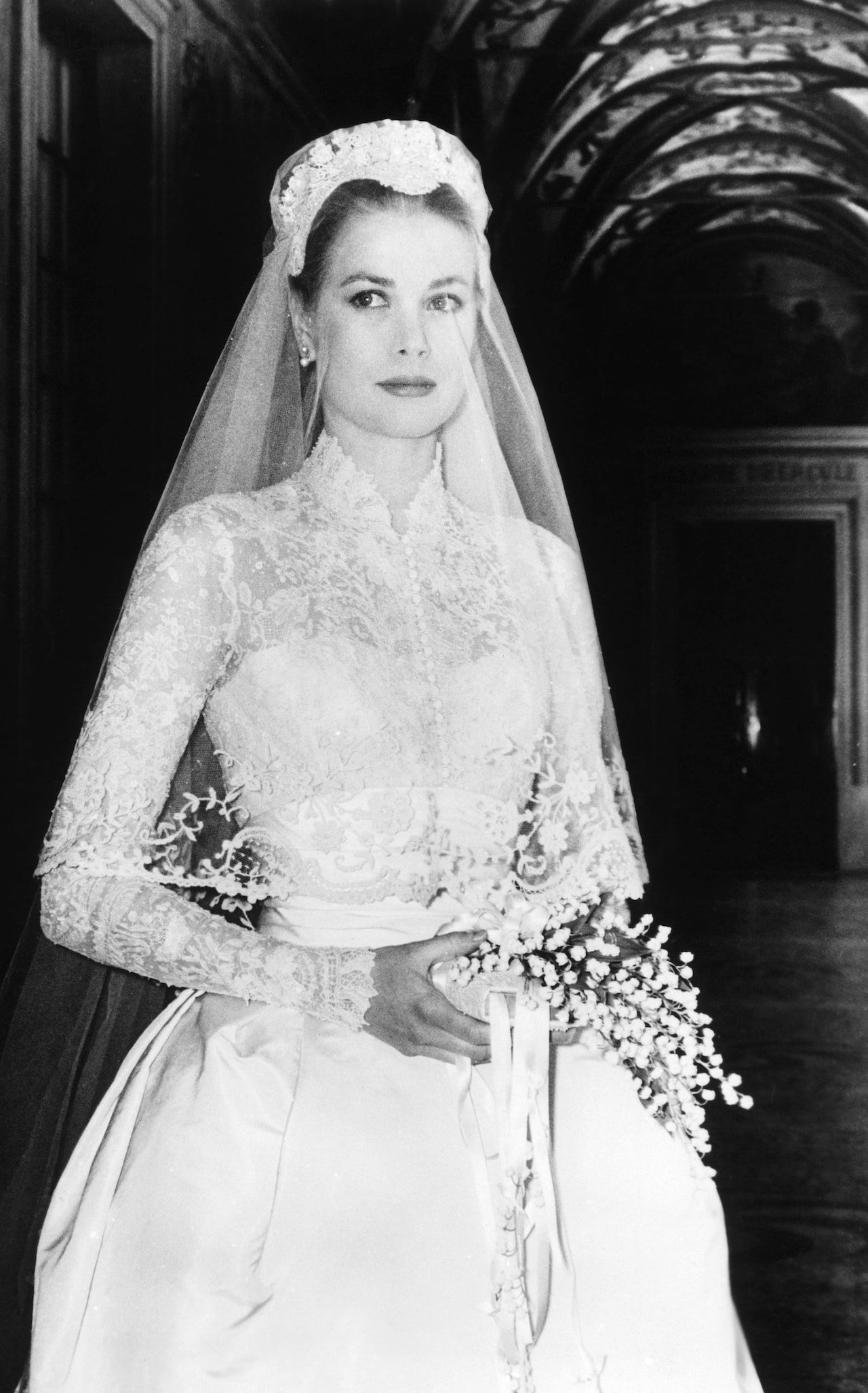 Princess Catherine 2011. Designed by Sarah Burton for Alexander McQueen. Sarah took over as Creative Director of the house in 2010 after McQueen's death. I don't know if it's rule that shoulders must covered for church wedding in the UK but this dress definitely helped bring back sleeves for wedding dresses.The sleeveless wedding dress had dominated for years. It didn't matter that the style was hard to pull off and not universally flattering. Bridal dress manufactures are happy to make this style because it's cheaper to make. Many American brides complained about the difficulty of finding wedding dresses with any kind of sleeve that wasn't dowdy and/or dated. That changed after 2011.This dress is modern and fresh.
 Princess Mabel 2004. The Princess married the late Dutch Prince Johan Frisco in a custom Viktor & Rolf dress. Instead of buttons, the fashion forward Dutch designers used bows. The cut on this dress is beyond. The bows add a bit of whimsy.The bride turned down their more conventional designs and asked for something memorable. It's unique without being a costume.
 [youtube https://www.youtube.com/watch?v=0VQMP8LYEV4&w=560&h=315]
Life in Rome - A Day Trip to Ischia
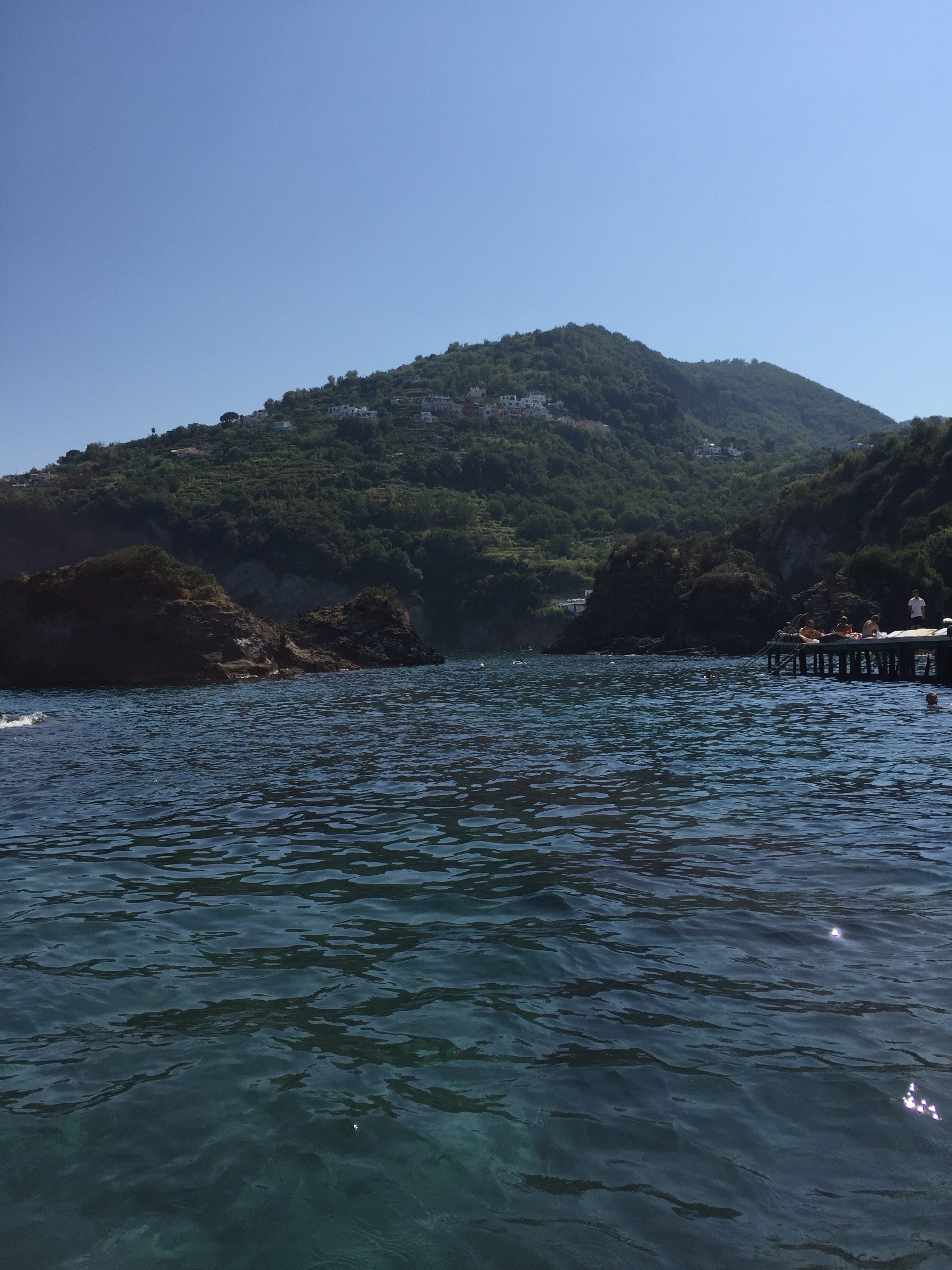
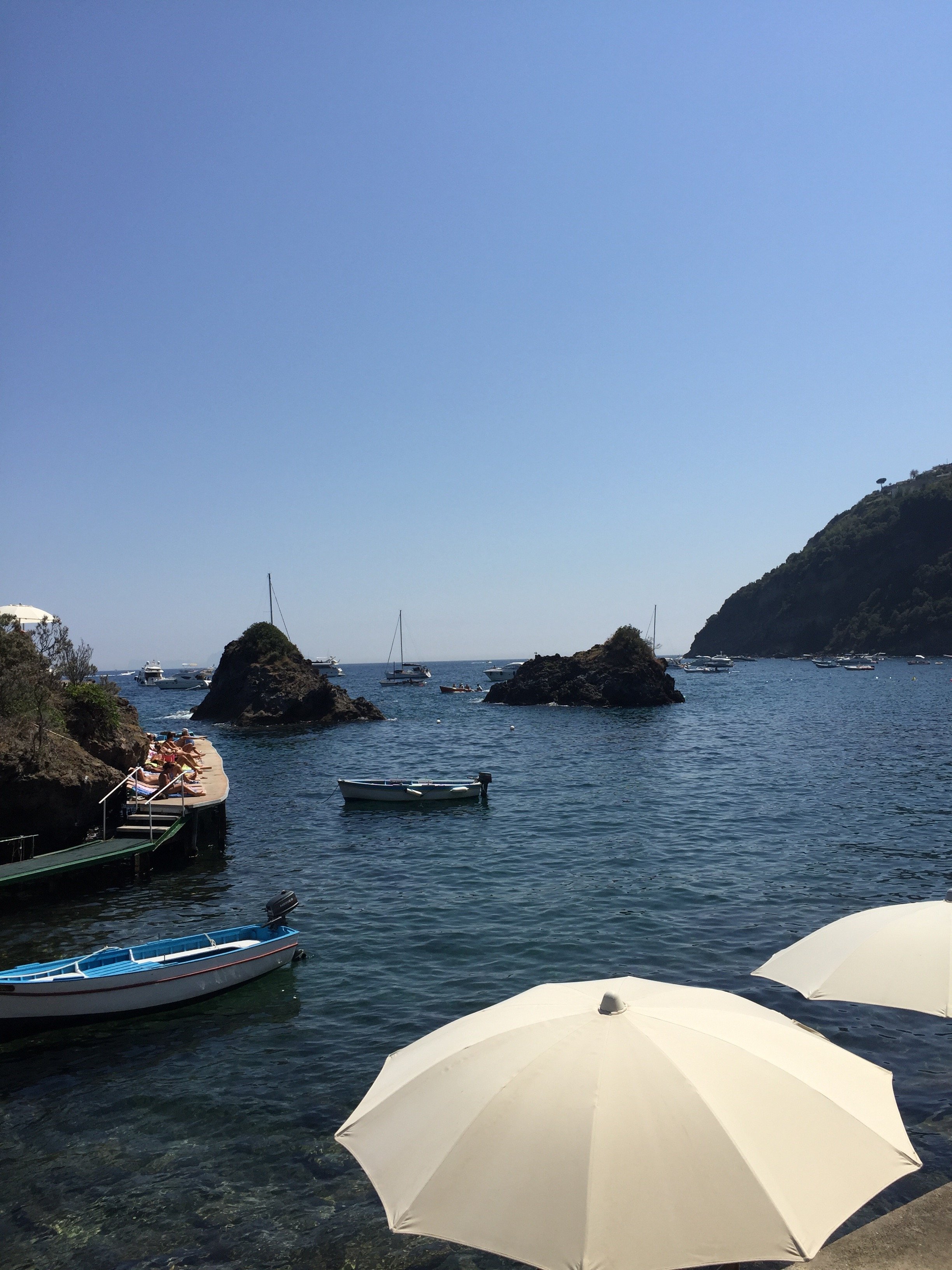
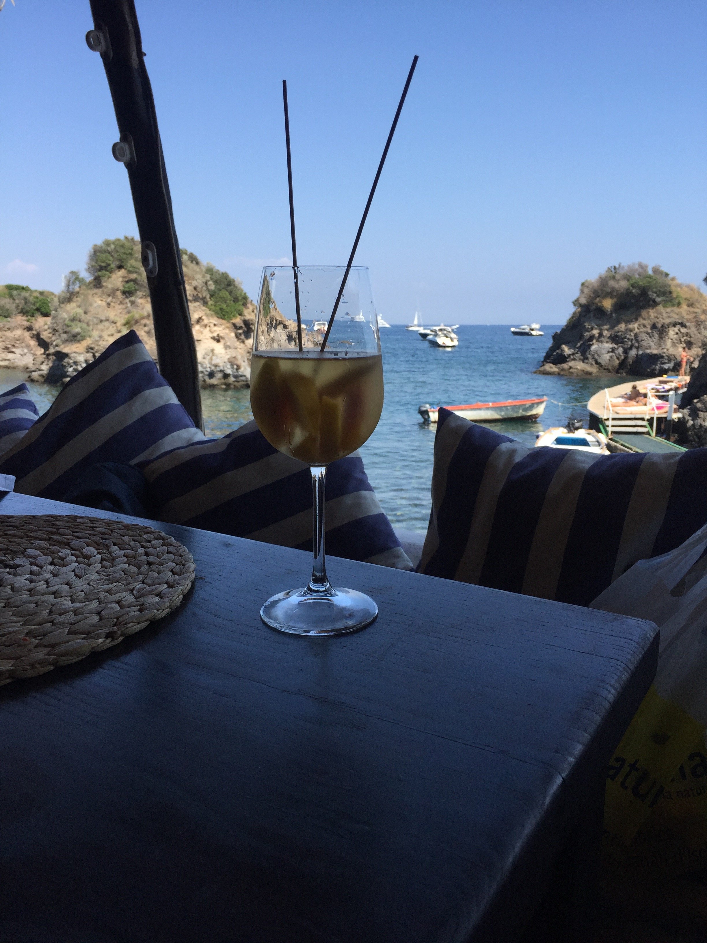
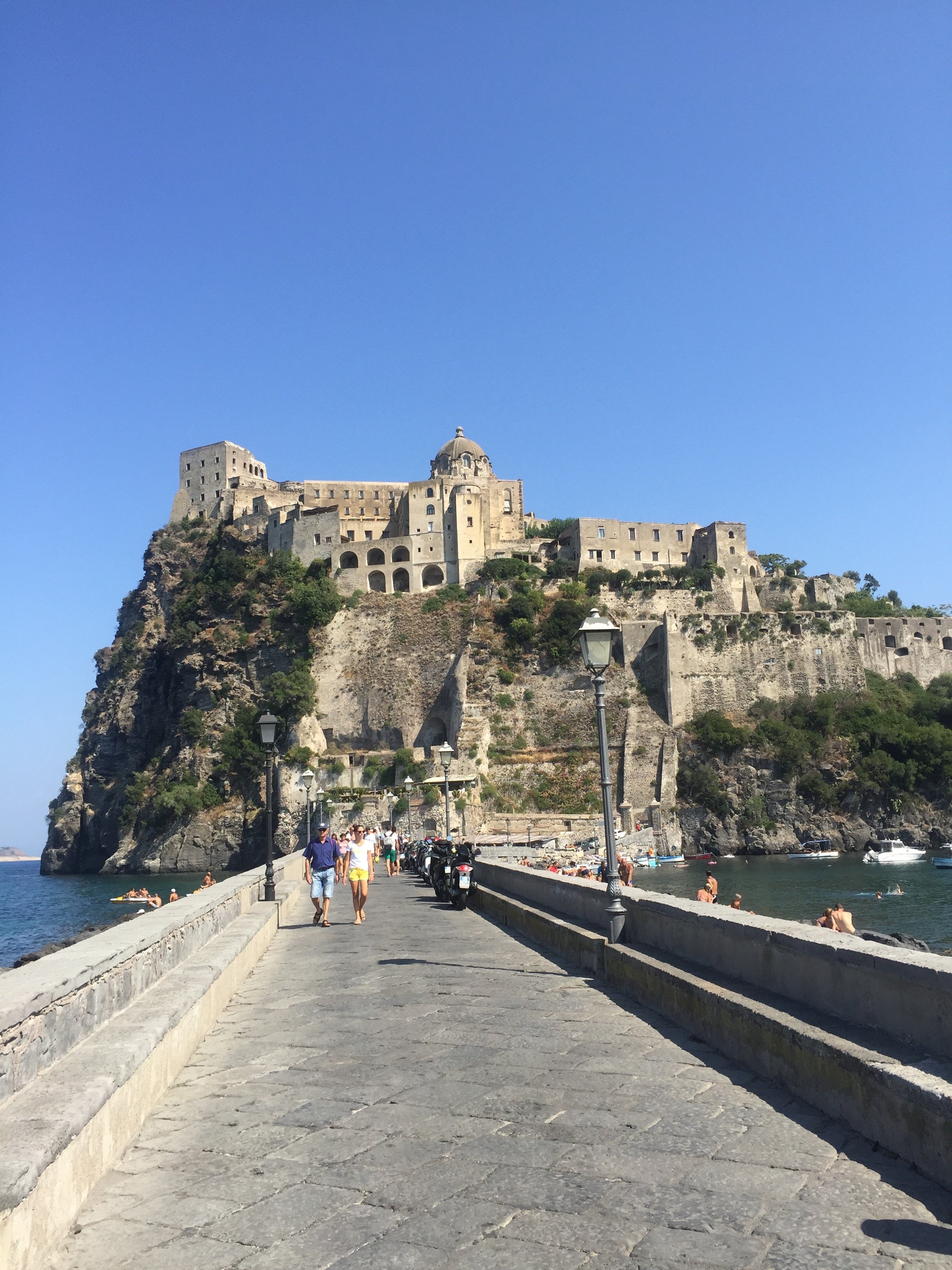
Ciao Bloggisti,How was the rest of your summer?The rientro was/is intense but I'm loving this back-to-school vibe. Folks are rested and ready.My summer was pretty uneventful, except for a visit from my younger sister. Daniella was speaking at conference in Hamburg, Germany and decided to return to the States from Rome.It was her first trip to Italy and she loved it. She rented a fabulous place in Monti. Daniella happened to be in town during my birthday and we decided to take a day trip to the island of Ischia.Ischia is somewhat of a schlep for one day but it had been on my "must visit" list for ages. We took the fast train to Naples. It was worth the extra money to save time. We also paid a little more to book our ferry tickets in advance online.A friend who used to live in Ischia and other another friend who holds yoga retreats there, recommended Il Giardino Eden as a great place for lunch. All I wanted was a view of the water and decent food. Our lunch was delicious and the views were ridiculous.To get the restaurant you can walk up a short steep hill or, for ten euros or so round trip, have a little boat take you to the restaurant. We went with the boat.I'm big fan of the film The Talented Mr. Ripley (the set and costume designs were incredible). It was a treat to see several of the locations, like Castello Aragonese, in person.I would love to return during the off season and stay for awhile. It's a beautiful island.


Project Via Monserrato - Reveal
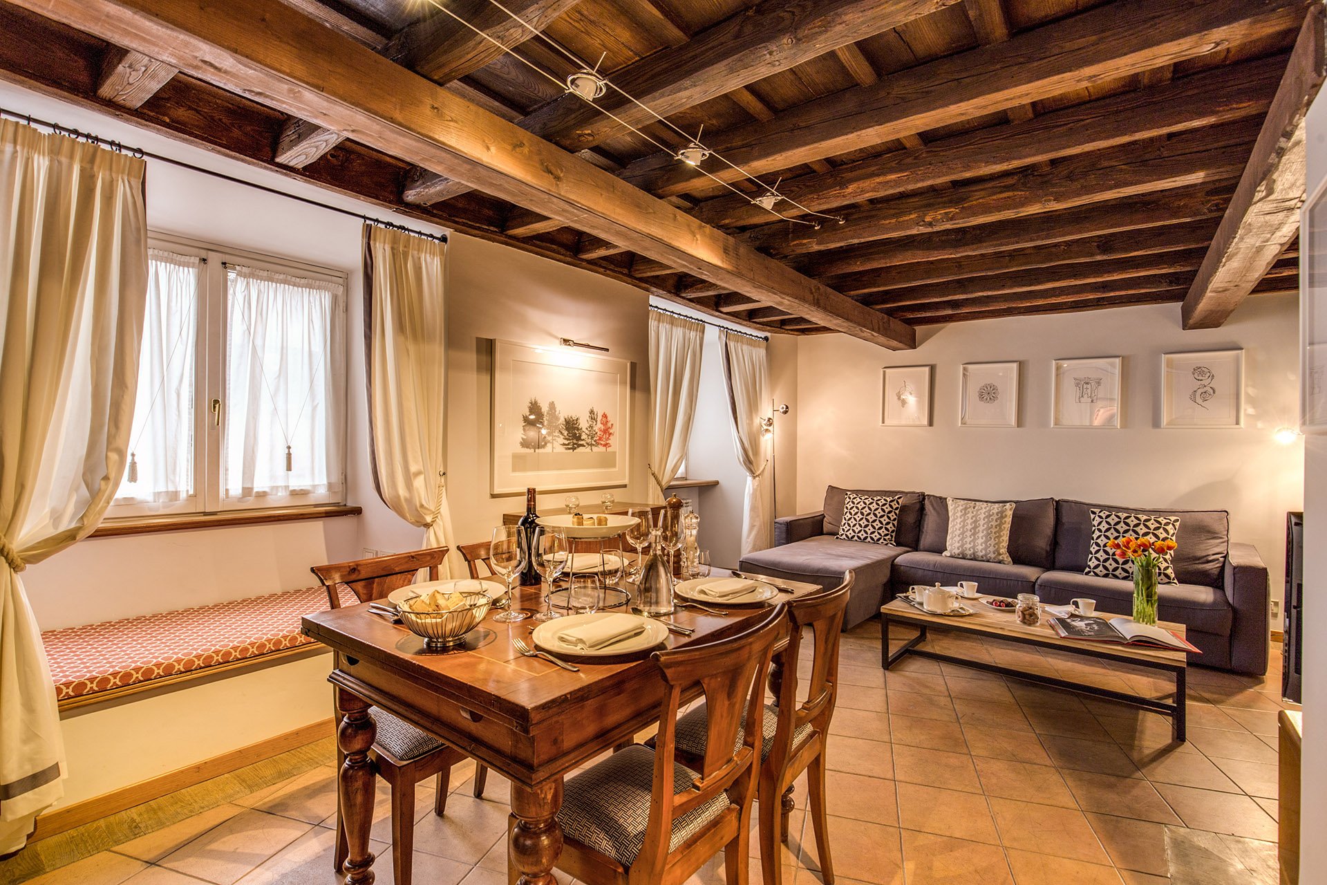
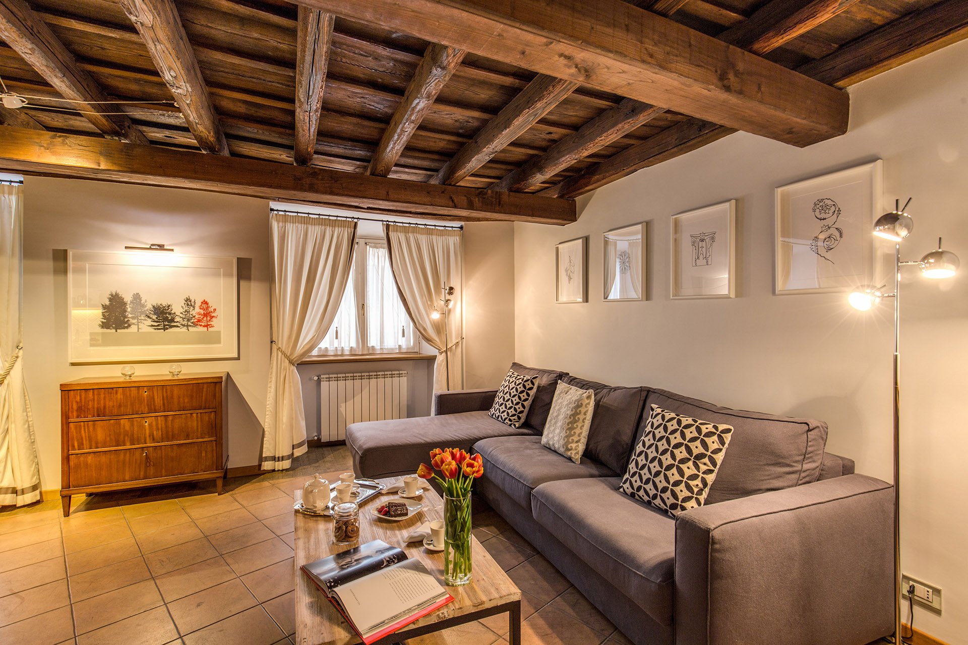
During the past year I've been working on a decorating and renovation project in the Historic Center for a client who wanted to update a few of their B&Bs.It was a great experience. At times it was also challenging, as the apartments were fully booked months in advance. The logistics were difficult.Located inside a palazzo that dates from the 1600s The Via Monserrato apartment (aka Grand Suite), is on one of the prettiest streets in Rome.The brief was to create a contemporary décor, while at the same time retaining (and respecting) the charm and history of the architecture.Vacation rentals are tricky. You don't want a design that is bland or cookie-cutter but it cannot have so much personality that it turns off most customers.Here's a photo from the living room, before.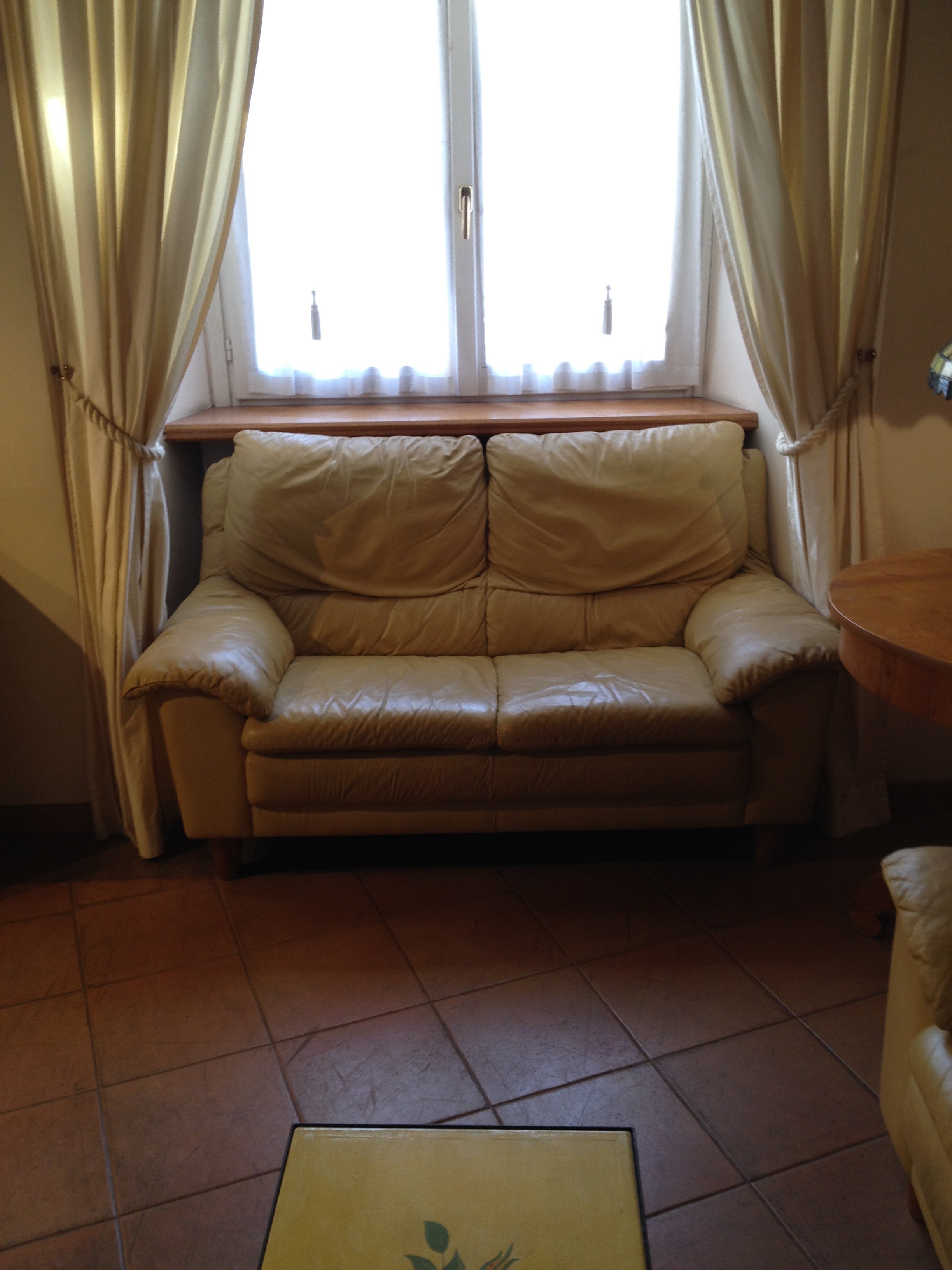 After
After 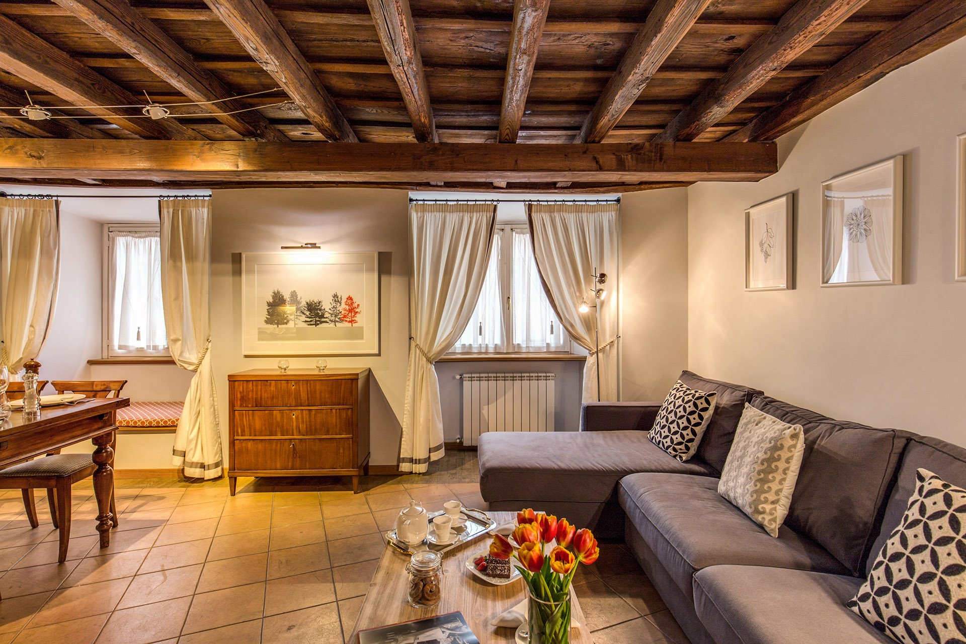 This room is a mix of high and low vendors, antiques (that belong to the client), and custom pieces.The room is light, stylish, yet comfortable. We had to use fabrics and colors that could handle a lot of wear and tear.The walls were changed to Farrow & Ball's "Blackened", a cool white that reads light grey. I know I talk a lot about this brand but there's a reason I have used it in every single project I've worked on. The quality of this paint is no joke and depth of color is incredible. This was the first time the painters had worked with Farrow & Ball and they were very impressed. When people who paint for a living rave about a brand, you know it's good. Stateside, I like Benjamin Moore as well but that brand is not sold here. Le Decorazioni is the authorized Fallow & Ball vendor in Rome.We decided to go with a one L shaped sofa instead two. This model is a sleeper sofa and we bought it from Berto Salotto.The coffee table is from Maisons du Monde, a French brand with stores all over Europe.The curtains were custom made. The trim is Dedar. All the fabric for the apartment was selected and purchased at the store Lelli.The floor lamps are from MADE.The art work over the antique buffet is by Due Alberi. Funny that I read about these two artists in Rome on Elements of Style, which is written by Boston-based American interior designer Erin Gates. We used their work in another apartment (pics soon) as well.We commissioned artist Marta Alexandra Abbott to create pieces that referenced Rome in a subtle way. Marta is American and moved to Rome several years ago. You can see more of this series, inspired by the Ara Pacis, HERE.Dining area.
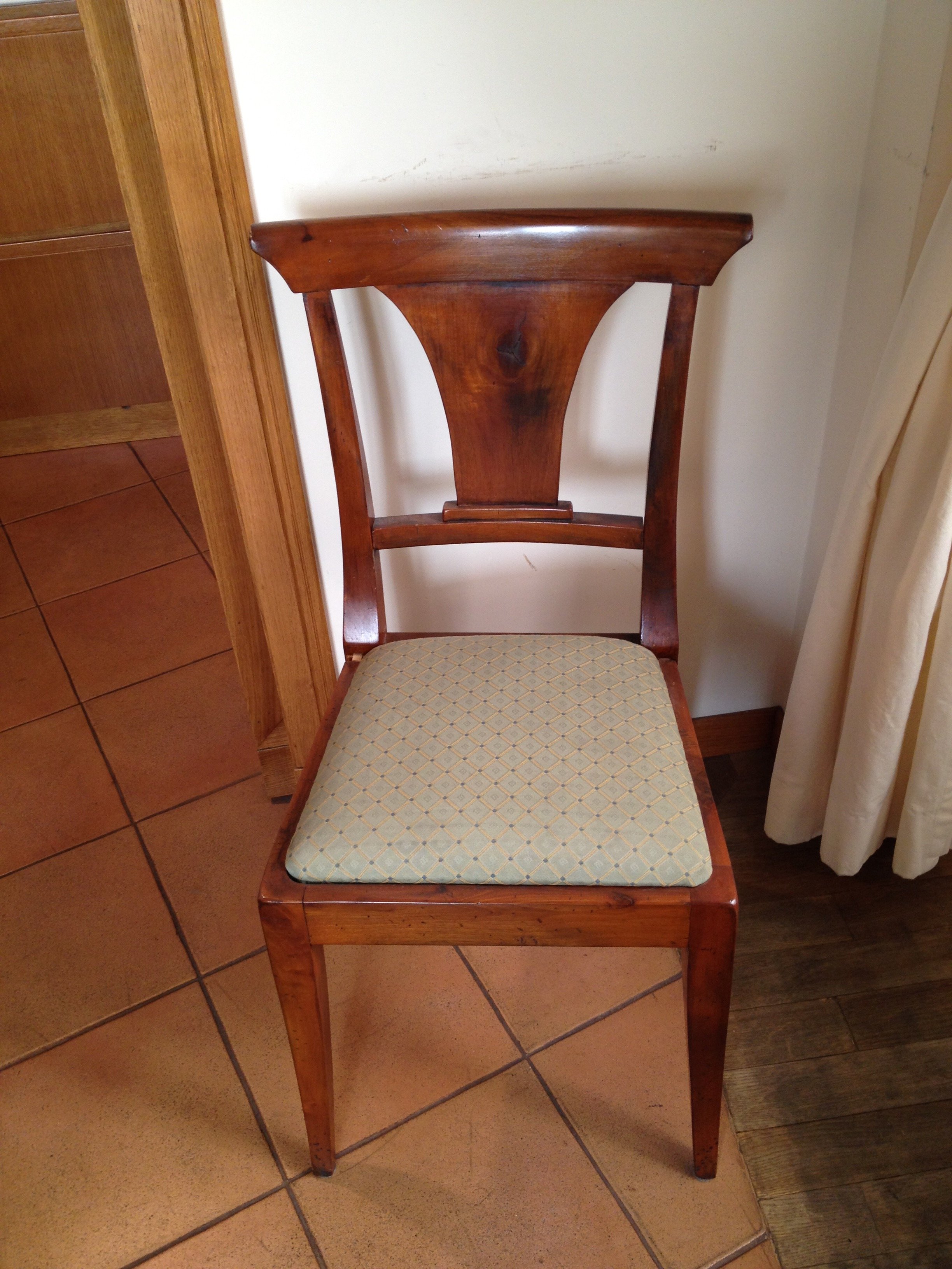
 We kept the dining table and reupholstered the dining chairs.Before
 After
After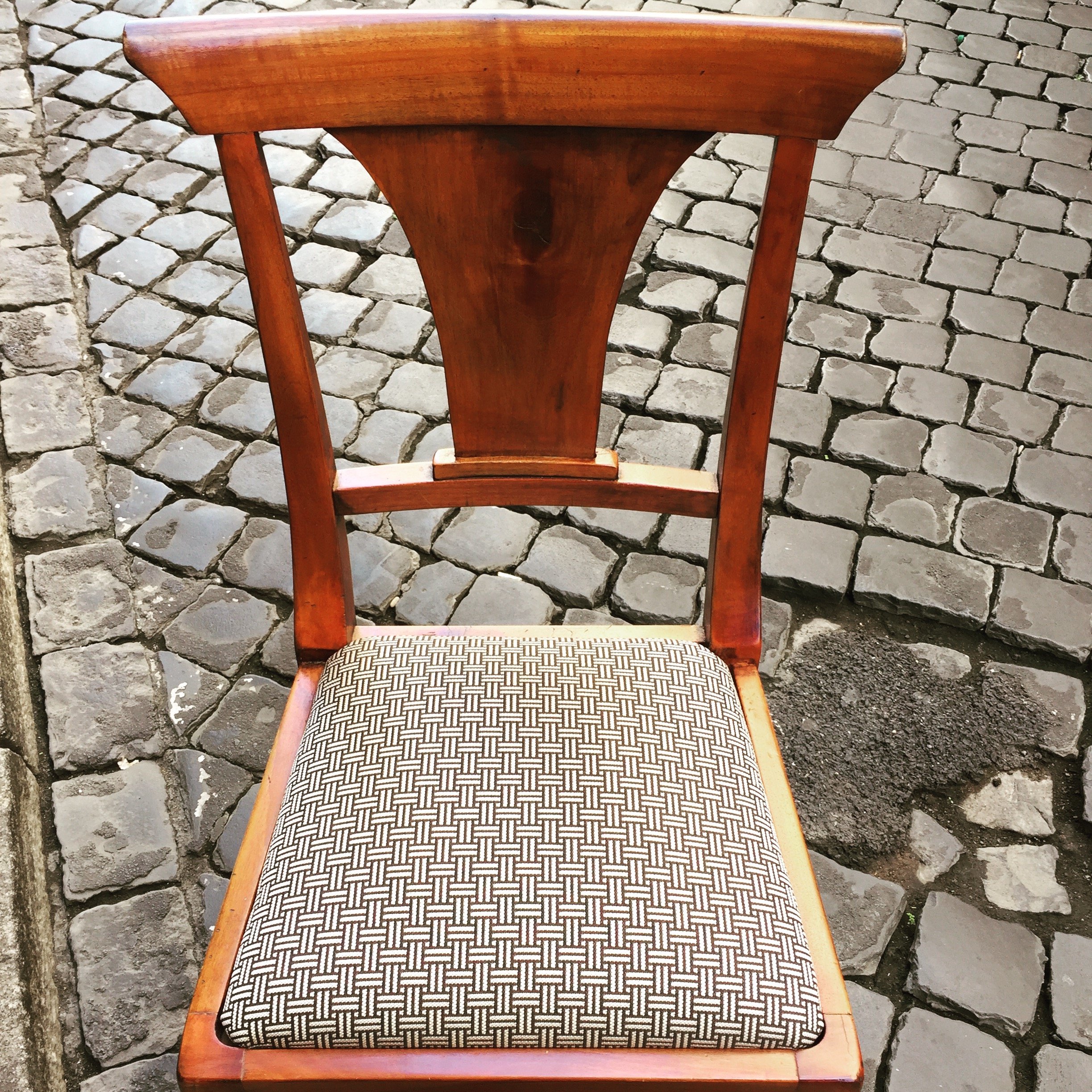 This graphic Dedar fabric is durable and makes the 1930 lines of the chair stand out. The chairs were in great shape. I thought it would be better for the budget and the design to keep them. I'm not a fan of spaces where every single item is brand new. I like to mix things up. You see that a lot in interiors in France and Italy. If you don't have any older pieces of your own, you can find them at flea markets, estates sales, in your family's attics/basements, etc.We created a window seat. I wasn't sure my client would go for the pattern or the color. The fabric is Thibaut. I think it gives this room of neutrals a nice punch of color.The pillow are from a local shop, Fabindia.The former artwork in the living room.
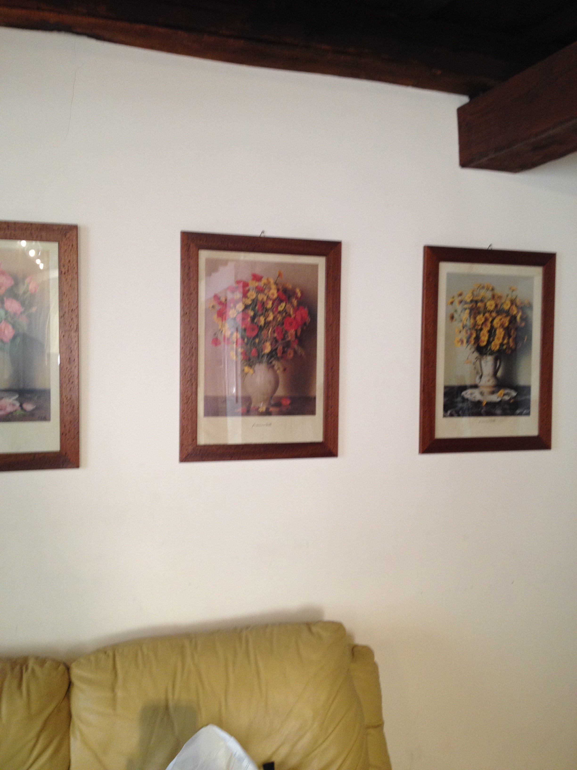 Art work, after.
 The hallway was painted white and the huge 1980s sconces were replaced with simple, modern ones. This art is by Marta as well.
 Bedroom - before
 After
After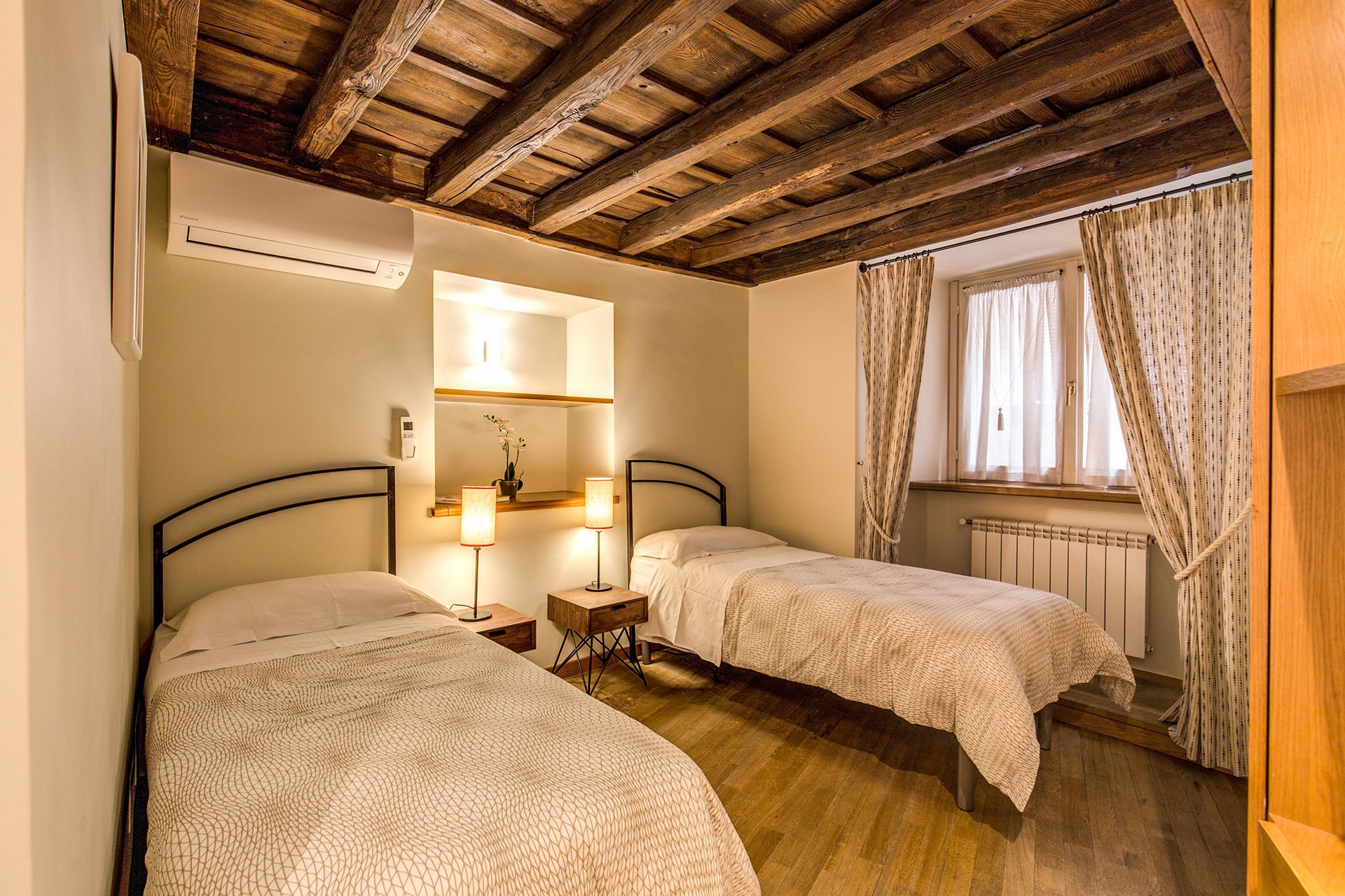 Originally, there was a queen-sized bed in this room but my client's company has had many requests for twin beds.The walls are Farrow & Ball, "James White". The curtains are custom. The fabric is Thom Filicia for Kravet.I asked my blacksmith to make the head boards. I wanted something that would look great when together and when separate. We came up with a few designs and this is the one the client picked.The night stands are from Maisons du Monde. The lamp bases are from IKEA. The shades were custom made at the store Paralume, which is right up the street.I'm not sure how a store that makes/sells lampshades manages to stay in business in this global economy we live in but I hope they stick around for a long time.The beds together.
 The master bedroom - before
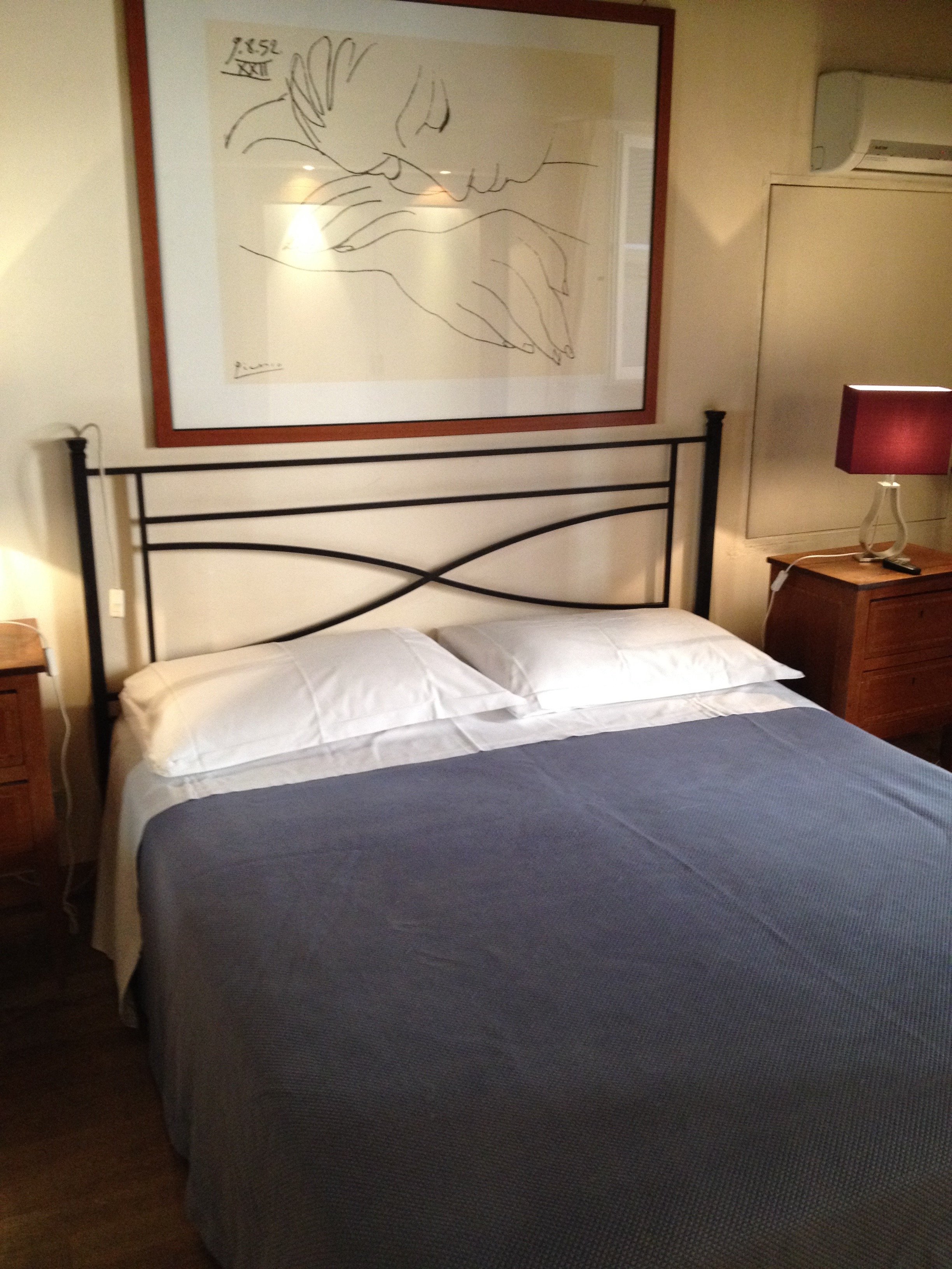 After
After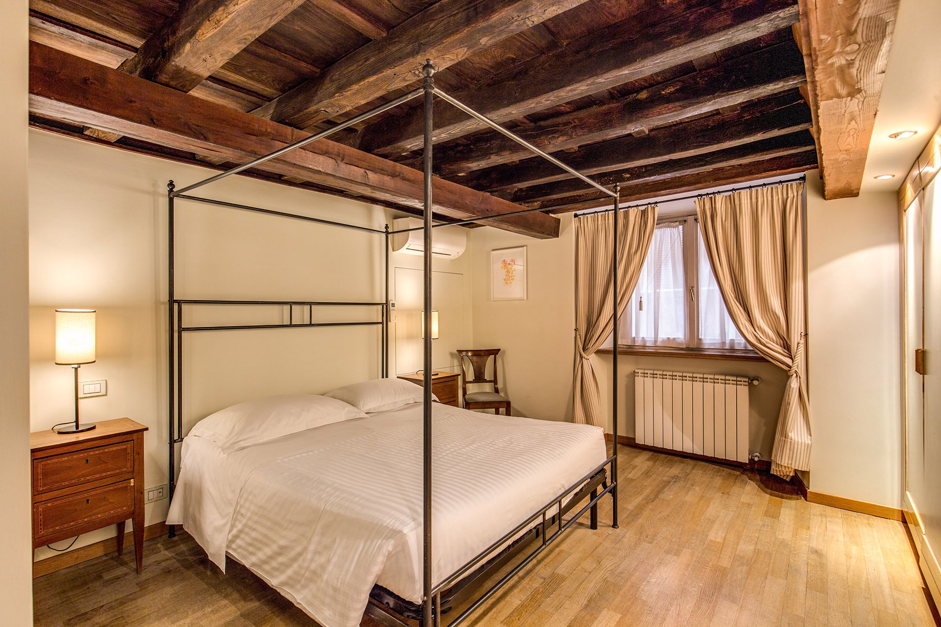 We kept the bedside tables. The walls are F&B James White. The curtain fabric is Malabar.The lamp bases are IKEA, shades custom from Paralume. It's hard to tell from the photo but these shades/trim are a different color from the other bedroom.I have a thing about four poster/canopy beds. Our blacksmith designed this simple yet, elegant frame. With these ceilings, we thought a more decorative frame would be too much. It interesting how the room actually looks bigger even though this bed is the same width as the old one.Two photos from inside the Palazzo.
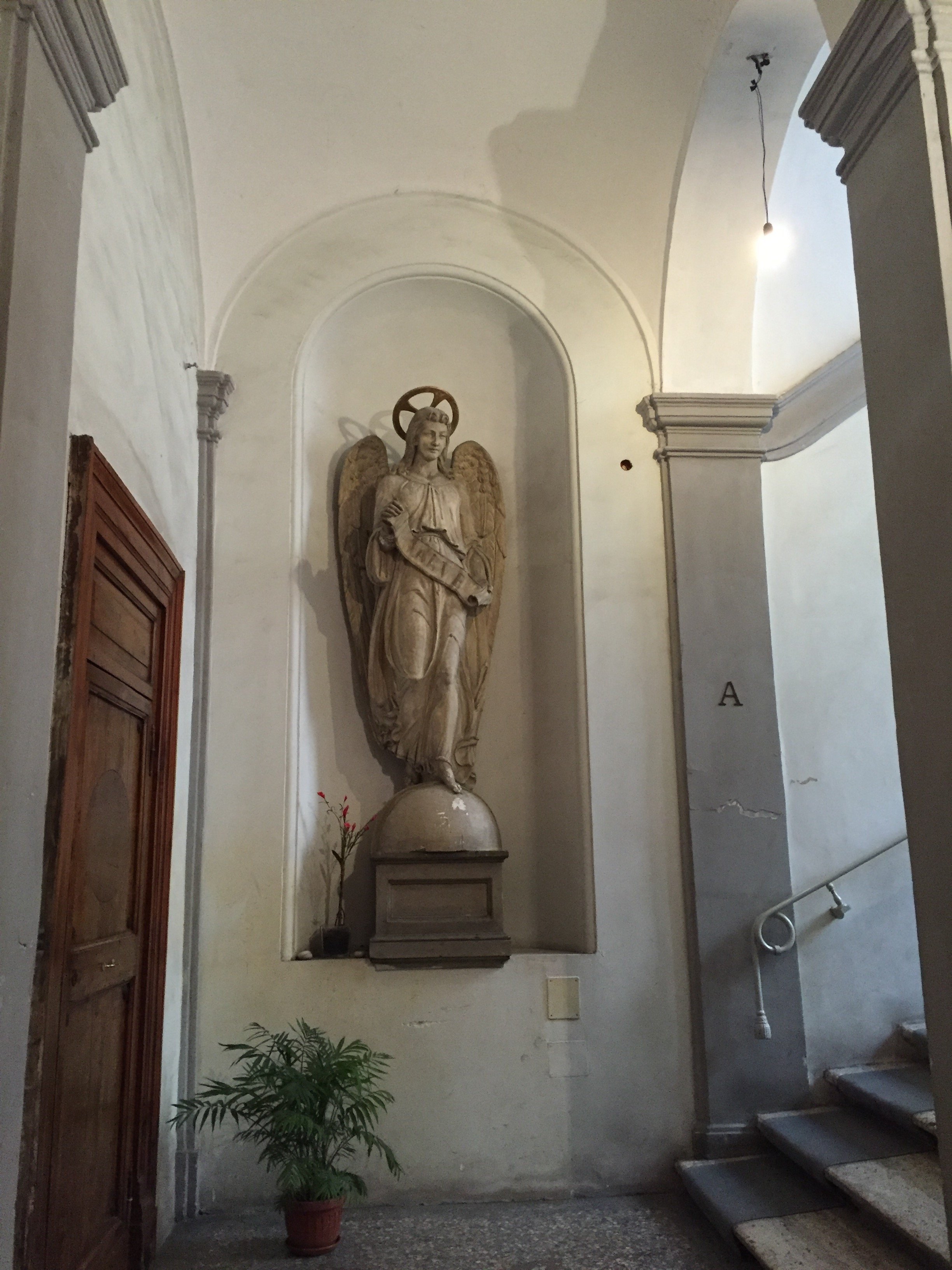
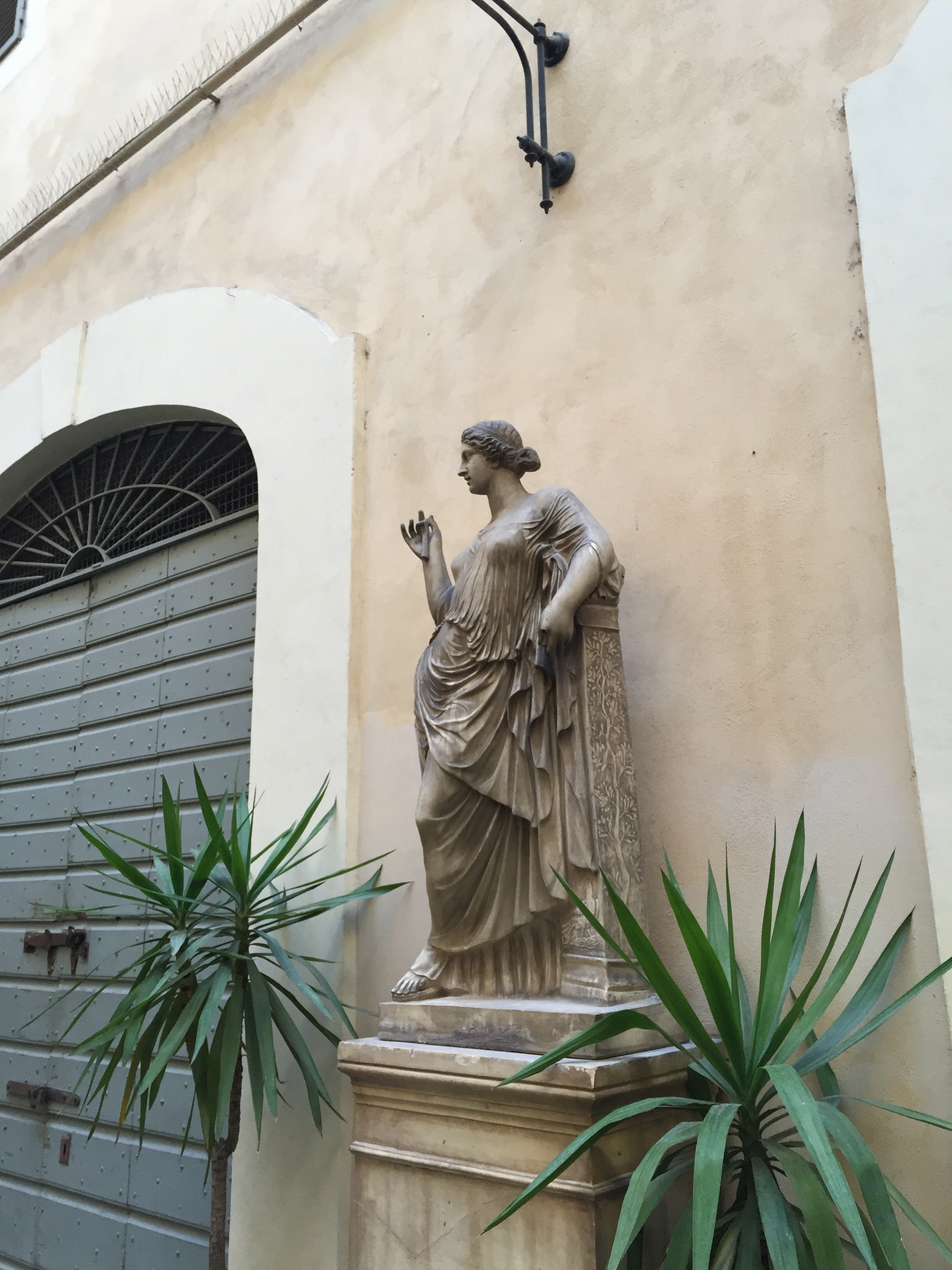 Overall, I'm very happy with how the apartment turned out. A huge, "Grazie" to my client and their team. I cannot tell you the amount of WhatsApps, SMS, emails, phone calls, job site visits, that were made. I truly appreciate their patience with my bizarre smash up of Italian and English. My client introduced me to my new Italian teacher. I got the hint. Heh.For more information about renting the Grand Suite, or other apartments from Your Suite Rome, click here.After photos and before of bedroom 1: Vincenzo TambascoOther photos: Me and my iPhone
Design Inspiration - Sugar Paper, Los Angeles
I'm a big fan of Sugar Paper's letter-press stationary. I must visit their store whenever I'm in Los Angeles.Before I said "arrivederci" to my Hollywood screenwriting career, my Los Angeles trips were a blur of pitches, general meetings, and being stuck in horrendous traffic.During my last trip, I was able to slow down a bit and really see Los Angeles. My feelings about Los Angeles have completely changed. I lived there for ten years and was so happy to get out. Now? I'm excited to spend time there. Not that excited about the thirteen-hour direct flight though.Sugar Paper is located in the Brentwood Country Mart. The market is worth checking out as well. In the past I've bought my stationary and rushed out the door to my next meeting.This time I had a lunch meeting at Farmshop in the Mart and the traffic gods had smiled upon me. I was very early. To be honest, my wallet was displeased with the turn of events.How lovely is this space?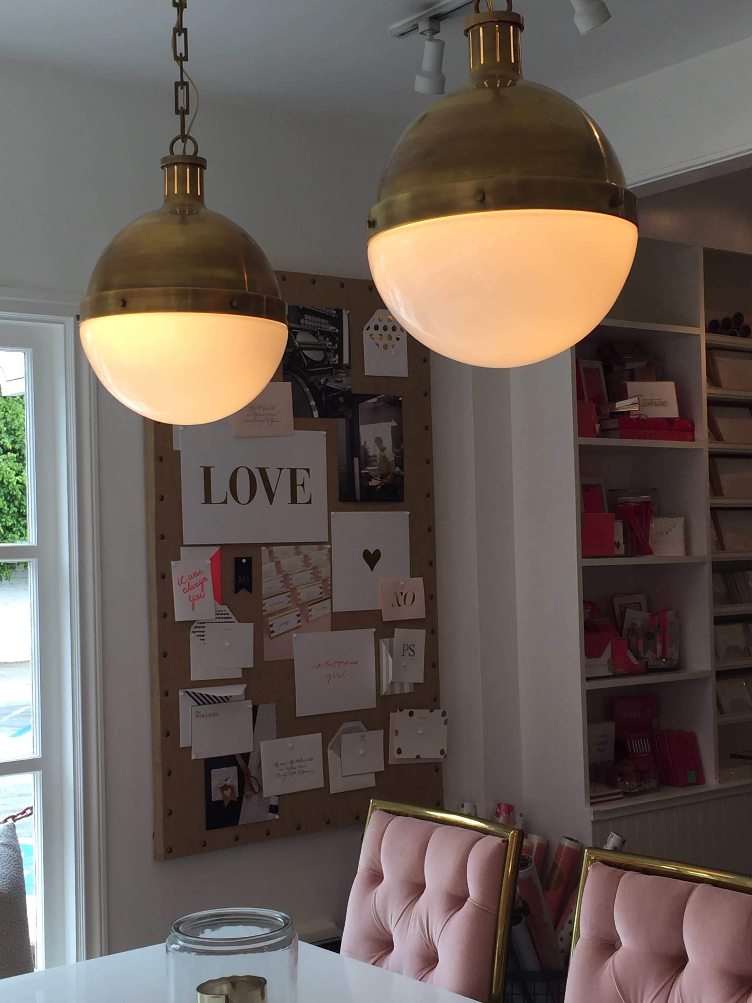 Renovated last year by the firm Life.Style., this update of the ten-year old shop is perfection. The stationary is the star of the show.
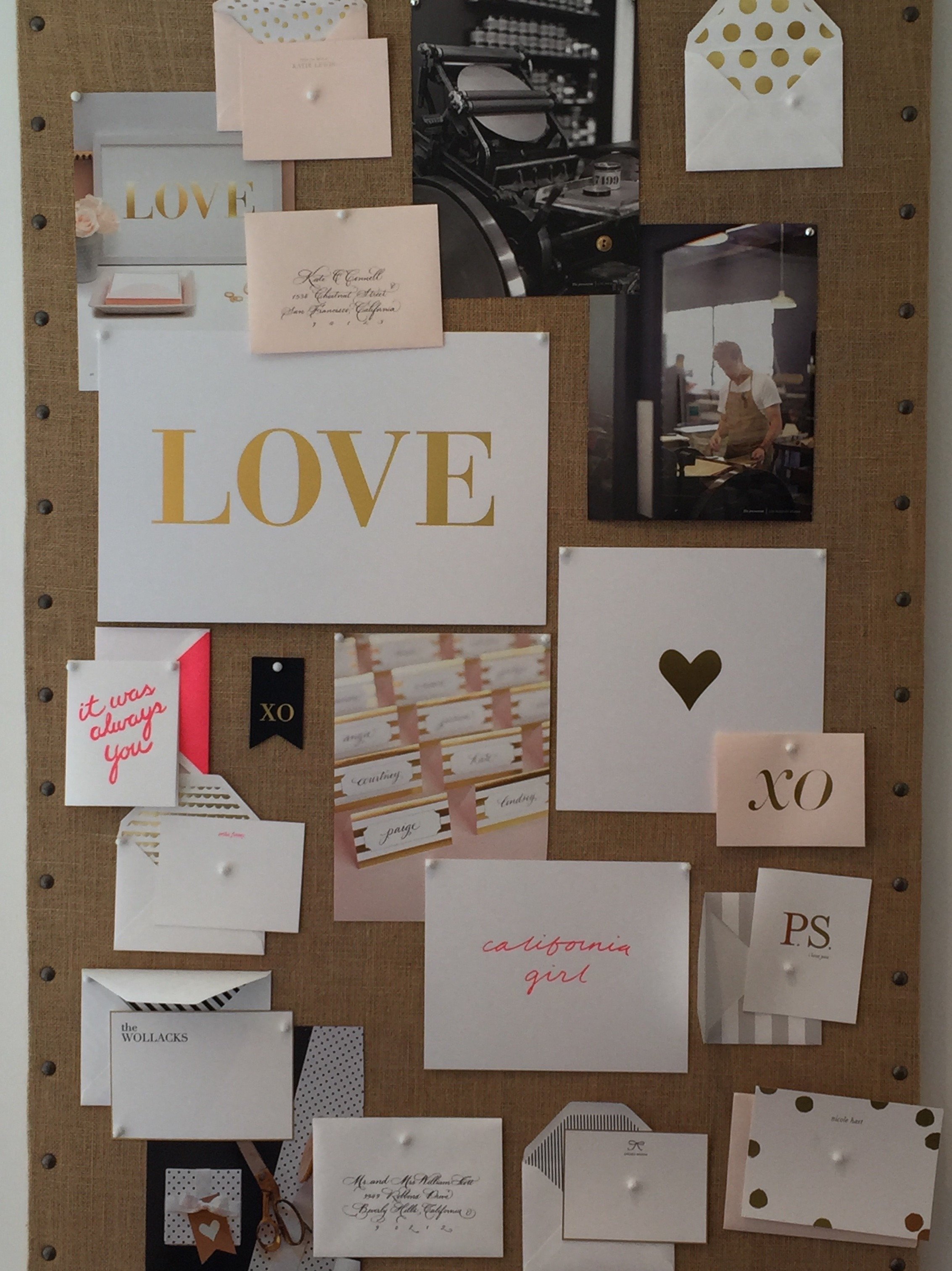
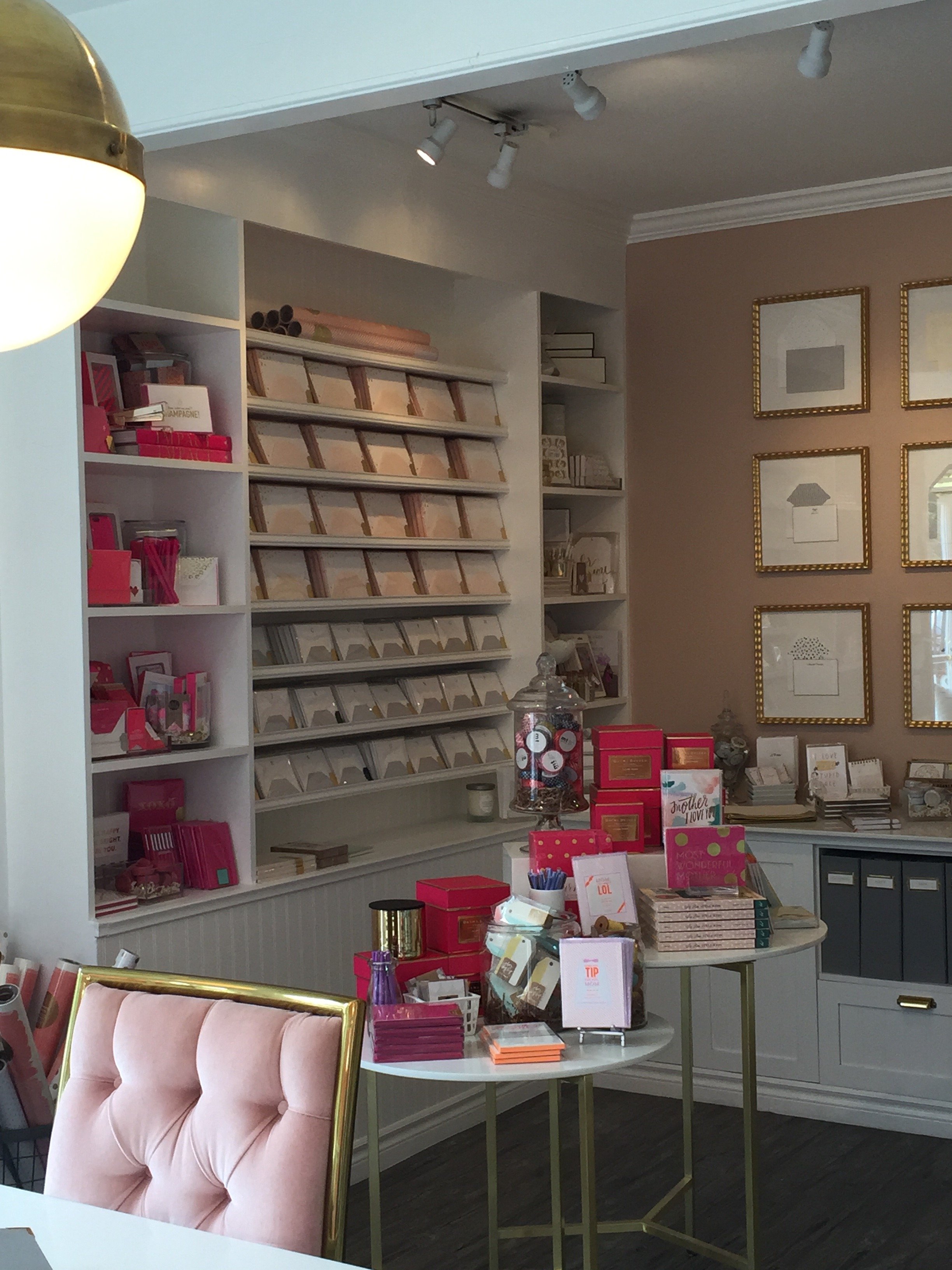
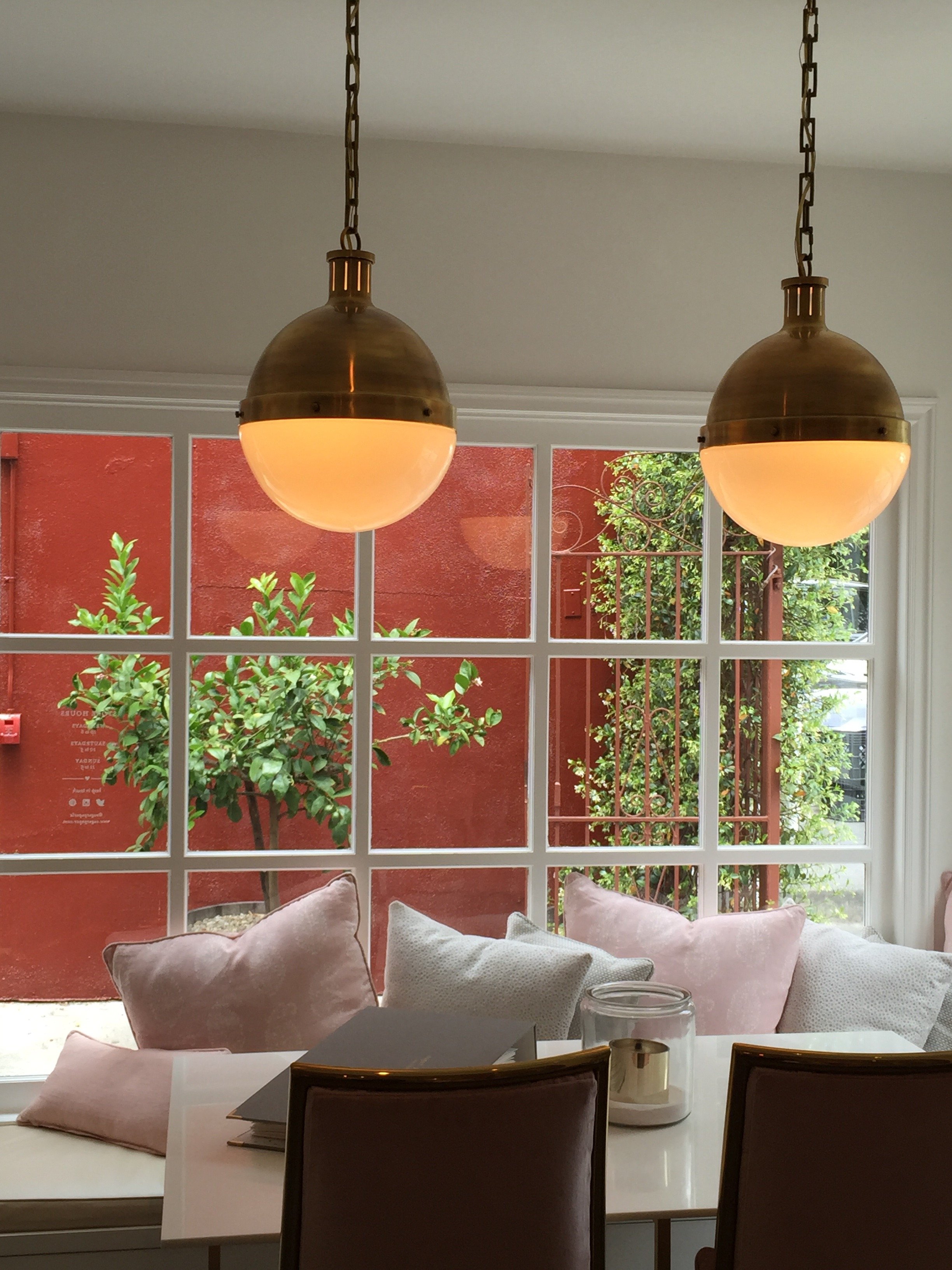
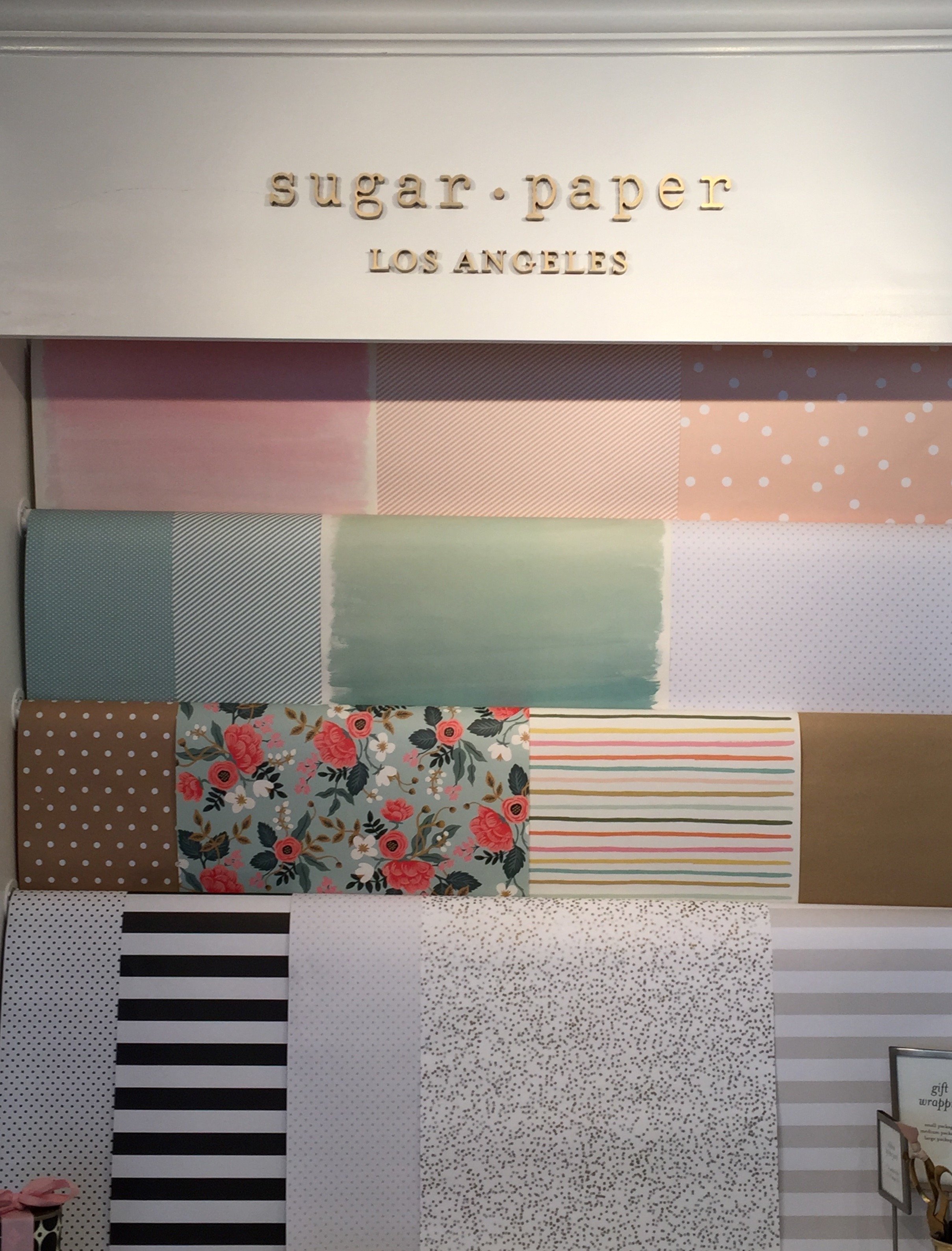 The brass light fixtures are Thomas O'Brien and the fabric is from Peter Dunham. For more (and professional!) pictures of the project, the Life.Style. portfolio is here.Photos: Me and my iPhone
Work in Progress - My Foyer
As I mentioned in an earlier post, I have lived with white walls for decades. The last time I had any color on the walls was when my parents let me pick the color for my bedroom back in high school.During my apartment search, I knew I wanted a place with a foyer/ingresso. Even my super tiny apartment on Via Pellegrino had one. Both of my apartments in Los Angeles, which were much larger, did not. Drove me nuts. You opened the door and walked right into the living room. Of course this is fine for a loft apartment but I didn't live in a loft.Many people neglect their foyer. It becomes a place to dump keys, magazines, mail, etc., etc. The foyer is the preview for the rest of your home. It sets the atmosphere. What does it say as you enter?Depending on the size of your foyer, it could provide much needed storage space, a place to display artwork, and in a smaller one you could splurge (creatively and/or financially) on your favorite wallpaper.Painting an entrance way a darker color than the next room makes the second room seem much larger. Interior designer Miles Redd loves going from dark to light. I decided to be bold for a change and go for it. I went to the store Le Decorazioni to look at Farrow & Ball samples.I'm so happy with how the foyer turned out. I'm relieved my landlady (who lives in the same building) loved it. I thought she might be offended since she'd just painted the apartment. Instead she asked me to send me a link to the Farrow & Ball website.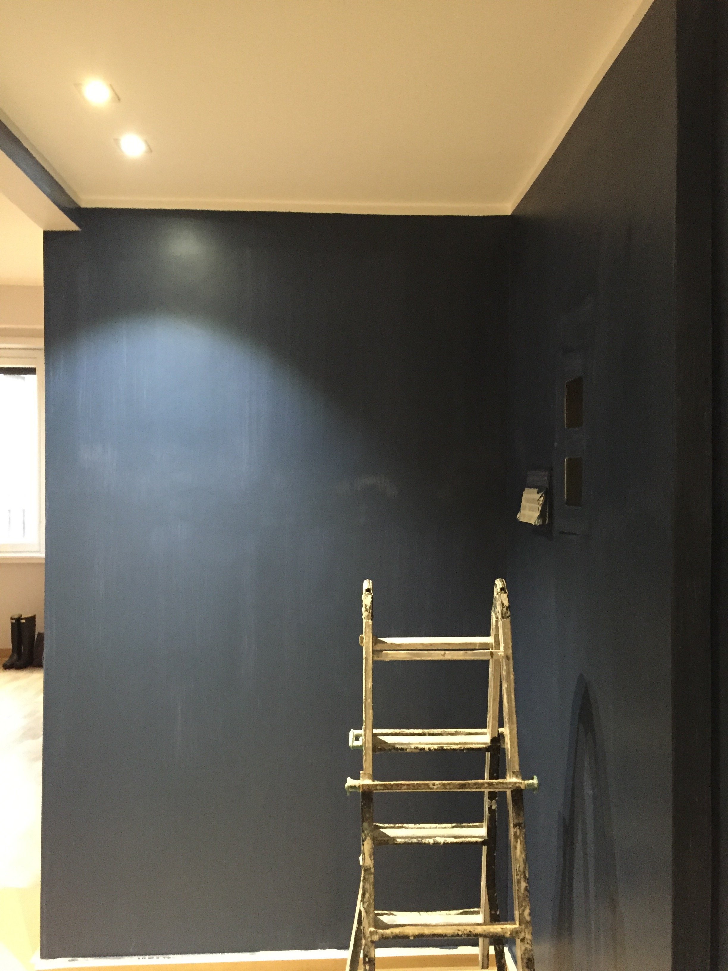 I was thinking of going with Hague Blue but in the end Stiffkey was best with the light grey in the living room. Stiffkey looks great when the lights are on and in natural light it reminds me of late summer nights in Sicily or sitting on my parents' veranda at dusk in St. Martin.When I first saw the apartment the owner told me the bookcase/cabinet in the hallway had to stay. I understood why for practical reasons. The fact that it wasn't flush with the wall bothered me aesthetically.
 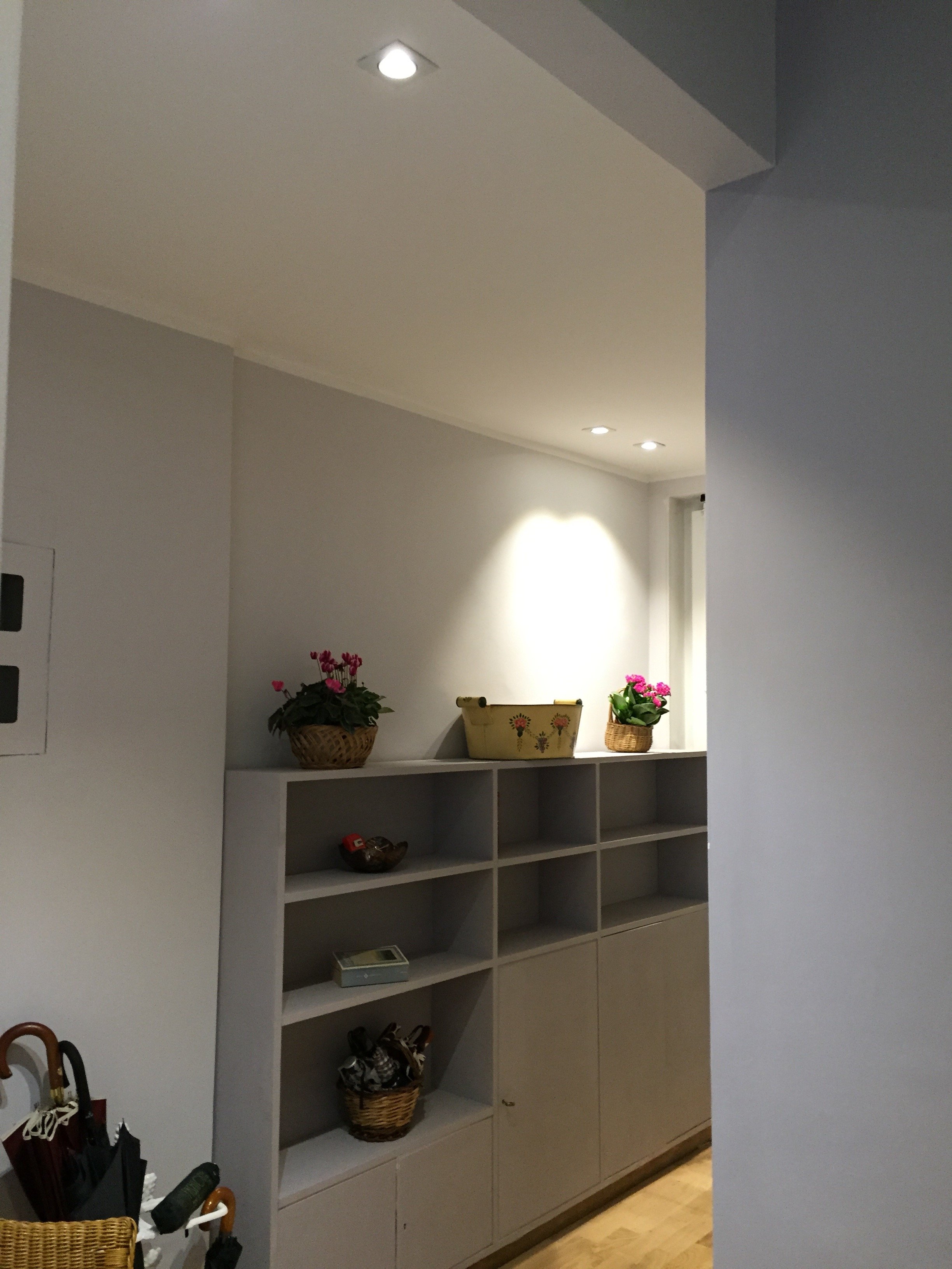 What a difference some high-quality paint makes. The painters and I couldn't believe how this big piece of furniture blends in a little more and looks more expensive than it is.
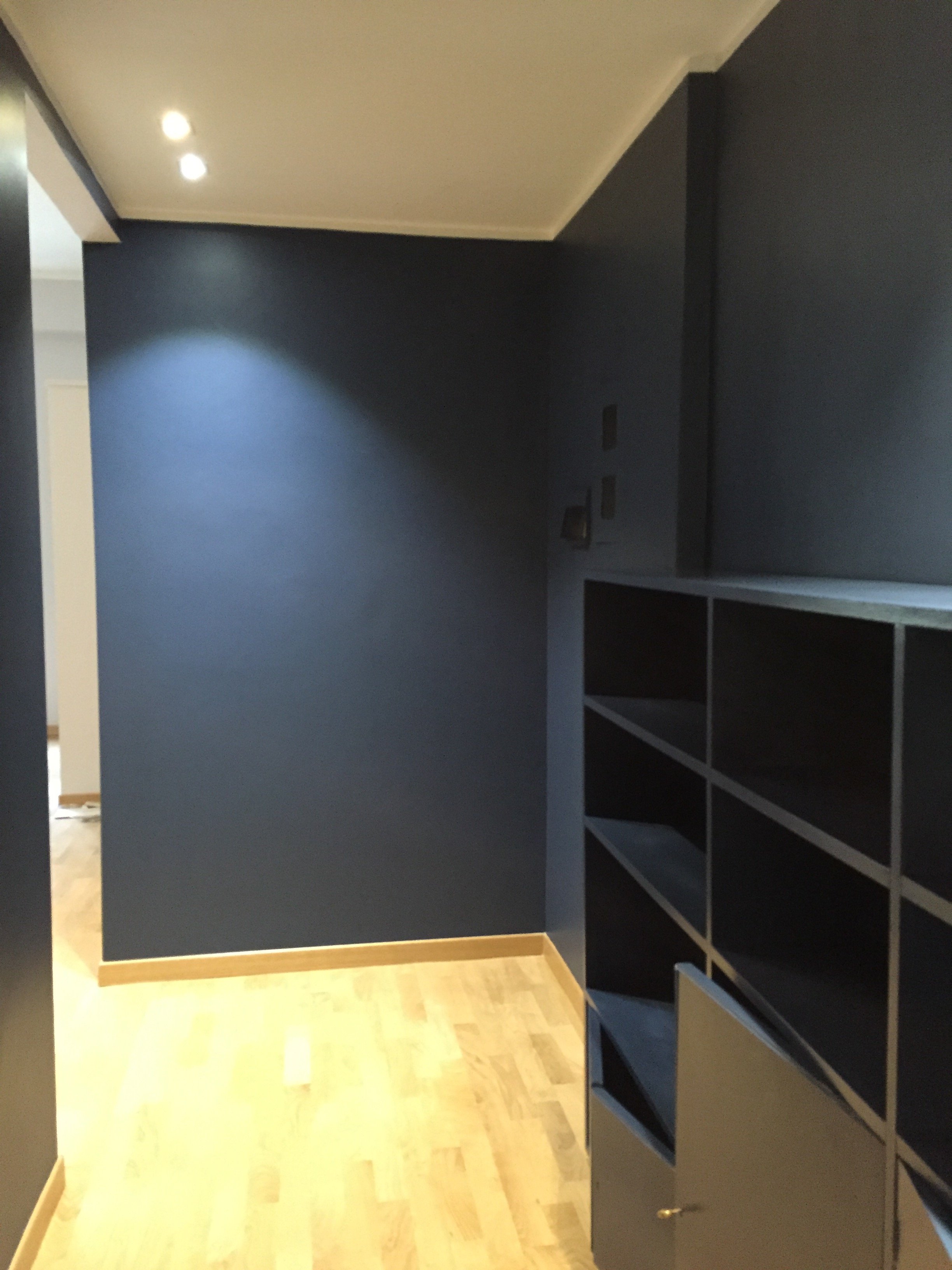 I'm going to meet with my blacksmith to design a simple bench. Above the bench I will hang some black and white photographs.I don't know when that will happen. I tell clients all the time that it's better to take our time while decorating. Perhaps I should listen to my own advice.Photos: Me and my iPhone
Life in Rome – Rome Luxury Suites, Via Babuino
Buon giorno!Life has been nuts these past few weeks between signing new clients and moving. I still have twenty-five boxes of books and magazines to unpack.I hope to publish a post on this blog the first and third Wednesday of the month, at least. I need get it on a schedule or else it will end up like Jeb!’s presidential campaign. Seriously, what’s happening there? He must be very annoyed. This is one of most unusual American presidential races I've ever seen, but I digress.While Rome is one of the most popular tourist destinations in the world, finding a hotel here can be tricky especially once you get out of the five-star range.I tend to prefer smaller boutique hotels, so I was excited to check out Rome Luxury Suites on Via Babuino. I was invited, along with a few other guests, to tour the hotel followed by an aperitivi on the new rooftop. You know how I feel about terraces, more on that later.The location couldn’t be better. Via Babuino is in the Trident area, close to the Spanish Steps and Piazza del Popolo. The sidewalks were recently widened. During the day there's a lot of pedestrian traffic as this street is a popular high-end shopping destination. At night, it’s quiet. There are no bars, or clubs.The hotel has twenty-four rooms. They are stylishly decorated without being too “done”. On some floors it’s possible to connect rooms, creating a private suite. Perfect for a family.This is a great place for someone who likes the idea of renting an apartment but would like the services of a hotel (concierge).One of my favorite rooms was the Babuino Suite which has its own balcony.

 Now back to the roof terrace. It’s available for guests only. This was my favorite part of the hotel. I know that’s not logical but what can I say? I love a good roof terrace.For more about the hotel (they have two other locations in the neighborhood) you can check out their website HERE.
My Return to Sicily
Hello, my name is Arlene Antoinette Gibbs and I have a Sicily problem.It's bad. Every time I go, i wish I could stay longer. There's so much of the island I haven't seen yet, for example the entire West Coast, the interior, and other islands like Stromboli, Lampedusa, etc. etc.This time I was on the island for a week, Mt. Etna then Ortigia, for vacation (and to celebrate my birthday)."It's good to back," I said to Rosa, the newish manager, when I walked into the reception room at Monaci delle Terre Nere. Last year I wrote about Monaci and my first trip to the Sicilian mainland for FATHOM.This time I stayed in the Floreale room. The bathroom!
 Photos: Monaci The view from my balcony.
 Lunch was served by the pool.The first time I went to Monaci, it was raining and winter so I had no idea how spectacular the views were. The grounds are gorgeous.
 The main villa at sunset. I would like to decorate a Sicilian villa one day.
 One morning I jogged around the forty acre property. Most of the food served at Monaci comes from their organic gardens. There is a huge chicken coop. I hesitate to call it a coop. It's more like a palace as it's bigger than my apartment. Lucky chickens.The breakfast spread was serious. On the other side were eggs, cheeses, salumi, cakes, breads, cereals, and many other things I didn't have a chance to try.
 I had to buy a jar of their honey. Fifteen percent of the honey made in Italy comes from this small town.
 I had some great Sicilian wines. I love their aperitivi. Although there were more guests during this trip (the hotel was at full occupancy) fewer people went to the aperitivi. Perhaps they thought it wasn't child appropriate?
 Several rooms, located a few meters from the main house, have been renovated now. The atmosphere during high season was completely different from off-season. There were lots of families and half the tourists were American.I had a moment with a fellow American guest who was so rude, it took my breath away. I believe I had a strong reaction to her snub because it was completely out of context. The vibe at Monaci is very friendly and chill. The owners, Guido and Ada, are lovely and as are the other people who work there. For this basic lady to not understand that said a lot about her.As soon as I sat down with my book by the pool, I got over it. I was in a beautiful place and no one was going to put a damper on that.A slight scent of Sicilian jasmine, and lavender filled the air. There were roosters in the background and sometimes the volcano "groaned", loudly. It was very relaxing despite the sounds coming from Mt. Etna.A grazie mille to Rosa, Sara, Federico, Nujuan, Salvatore, and of course Guido and Ada for helping make this the best birthday ever.Note: My room was in the main villa and on the same floor as the kitchen. I'm an early riser, so I never heard a peep from the kitchen or from the downstairs reception area.From Monaci, I went to Oritigia. This time I rented an apartment on the other side of the village. I couldn't understand why it was cheaper than my place from last year. It had a terrace with a partial sea view.It's because that side of the town wasn't completely regentrified, yet.As you can see in the photos below, some of the buildings are derelict and the empty former prison is on the left. I liked being only two blocks away from the farmers market but can see how that might not be appealing.I had to work a bit during my vacation but at least I had a view.
 Love the old faded tiles on the right.
 Before unpacking, I ran out to get pick up some yogurt, wine, and other important things. All of a sudden I heard my name and it was X, Erica's daughter. Once again, without planning it, our apartments were only blocks away from each other.The tiny piazza in front of my building at night.
 The architecture here is incredible. Remember to look up.
 My friends at Casa Mia wrote about Tabaré (Sicilian dialect for tray) and I had to check it out. It's a must.
 On my birthday we went to Arenella beach. We got there early and scored great beach chairs, second row. It was my first trip to a Sicilian beach and I had a great time. I love how people of all shapes and sizes rock bikinis and Speedos.
 Later that night we went to dinner. In Italy when it's your birthday and you invite people to celebrate with you, you pay. It makes sense to me. You're the host. I have some American friends who really have an issue with this custom but it's not just an Italian thing. In the Caribbean if you invite people out for your birthday, you pay. I get it if you're in your early 20s and you meet at a bar or something. However, by your 40s/50s and up, the whole invite people to celebrate you and then expect them to pay is a little odd to me.
 After dinner Erica insisted on treating me to a post dinner drink in the main piazza. This is probably one of my favorite churches and piazzas in Italy. It is ridiculously beautiful.
 I was worked up about this birthday but in the end, it turned out to be a perfect day. Thank you, Ms. Firpo and Ms. Arya.I've been back for less than two weeks and I'm already trying to figure out when I can return. I'm tempted to join one of my friends in Rome who has to go to there for work in October. Seriously.Photos (except for the first two): me and my iPhone
Life in Rome - Chez Dédé Opening Party
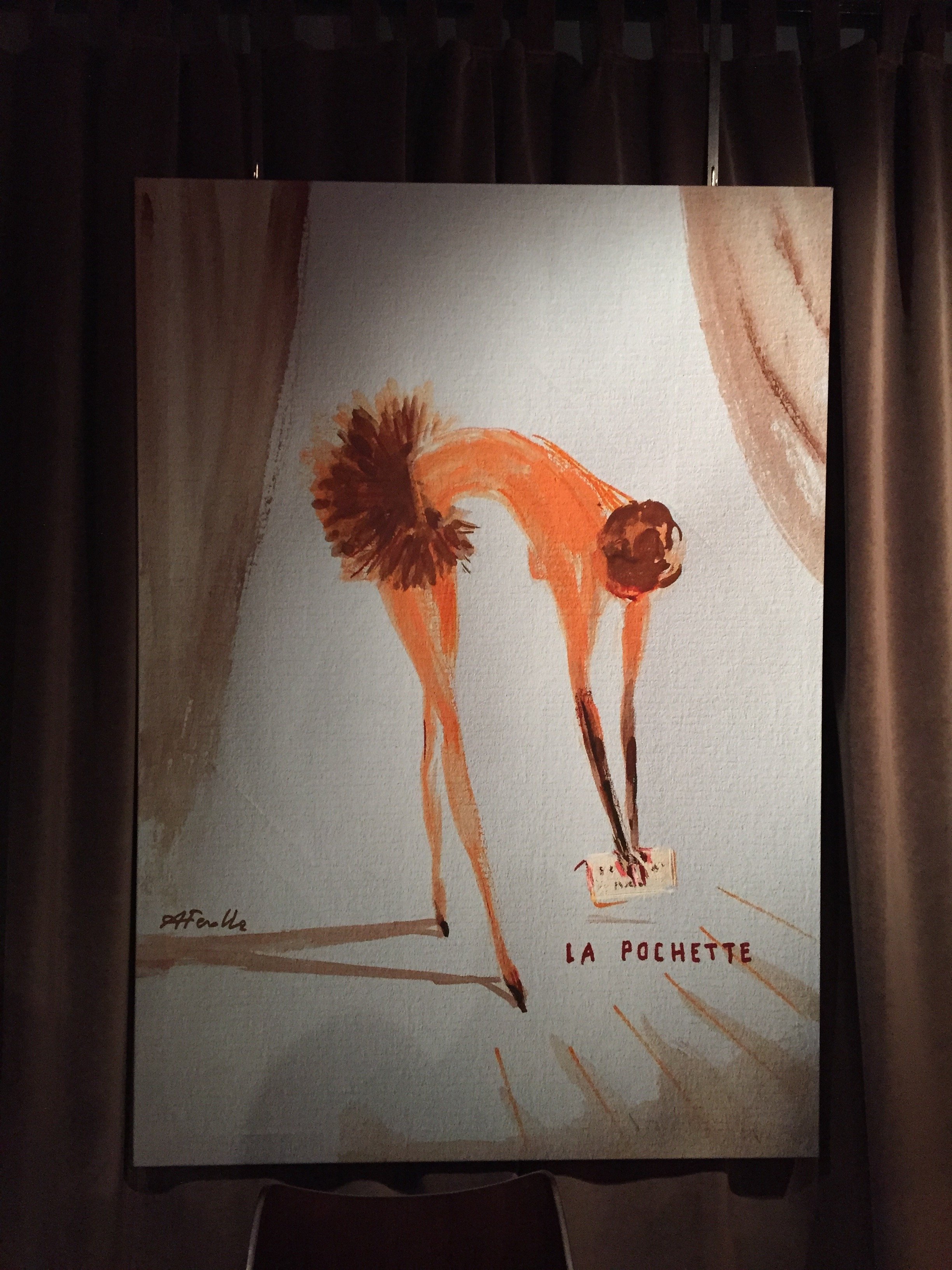
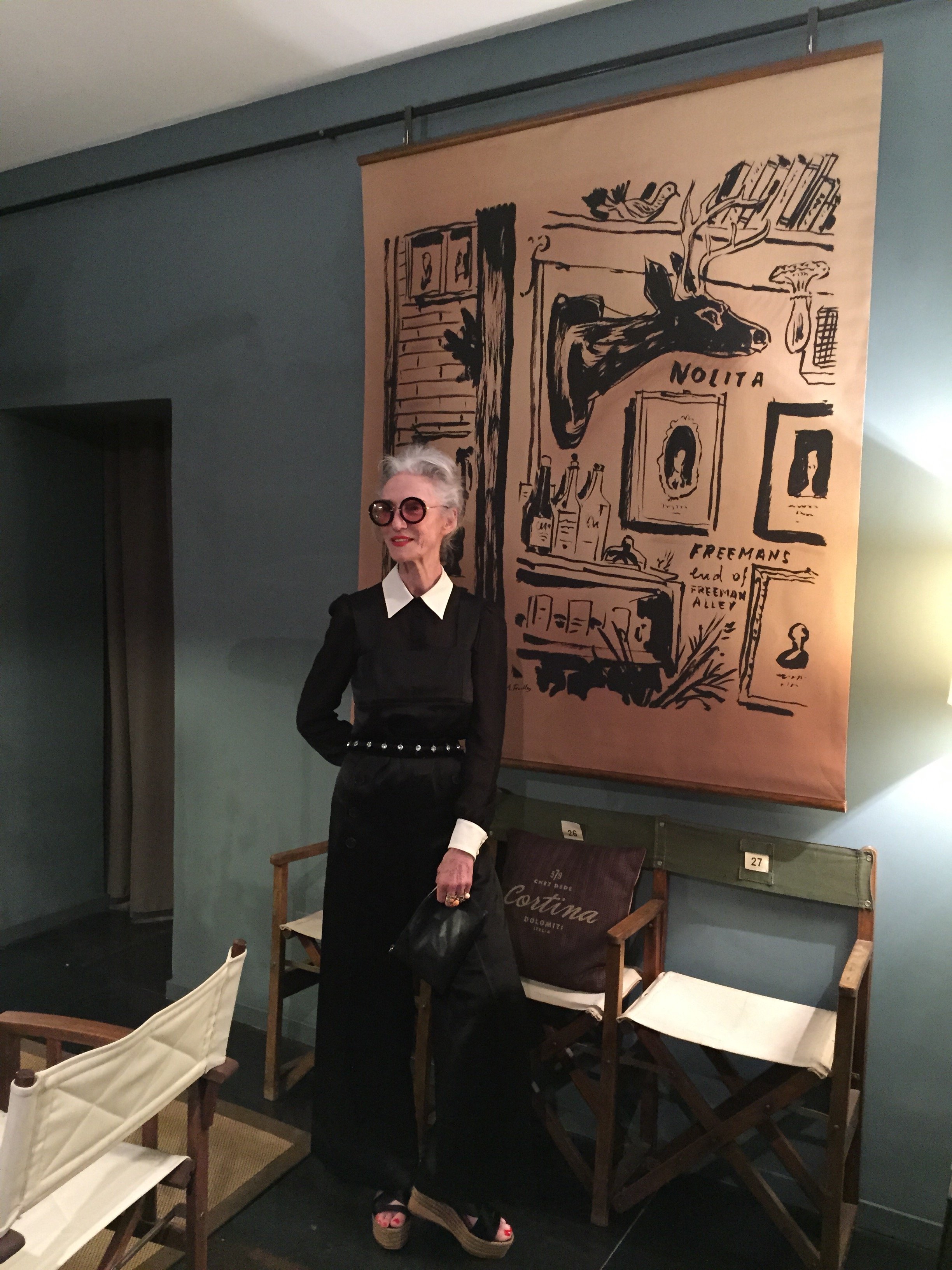
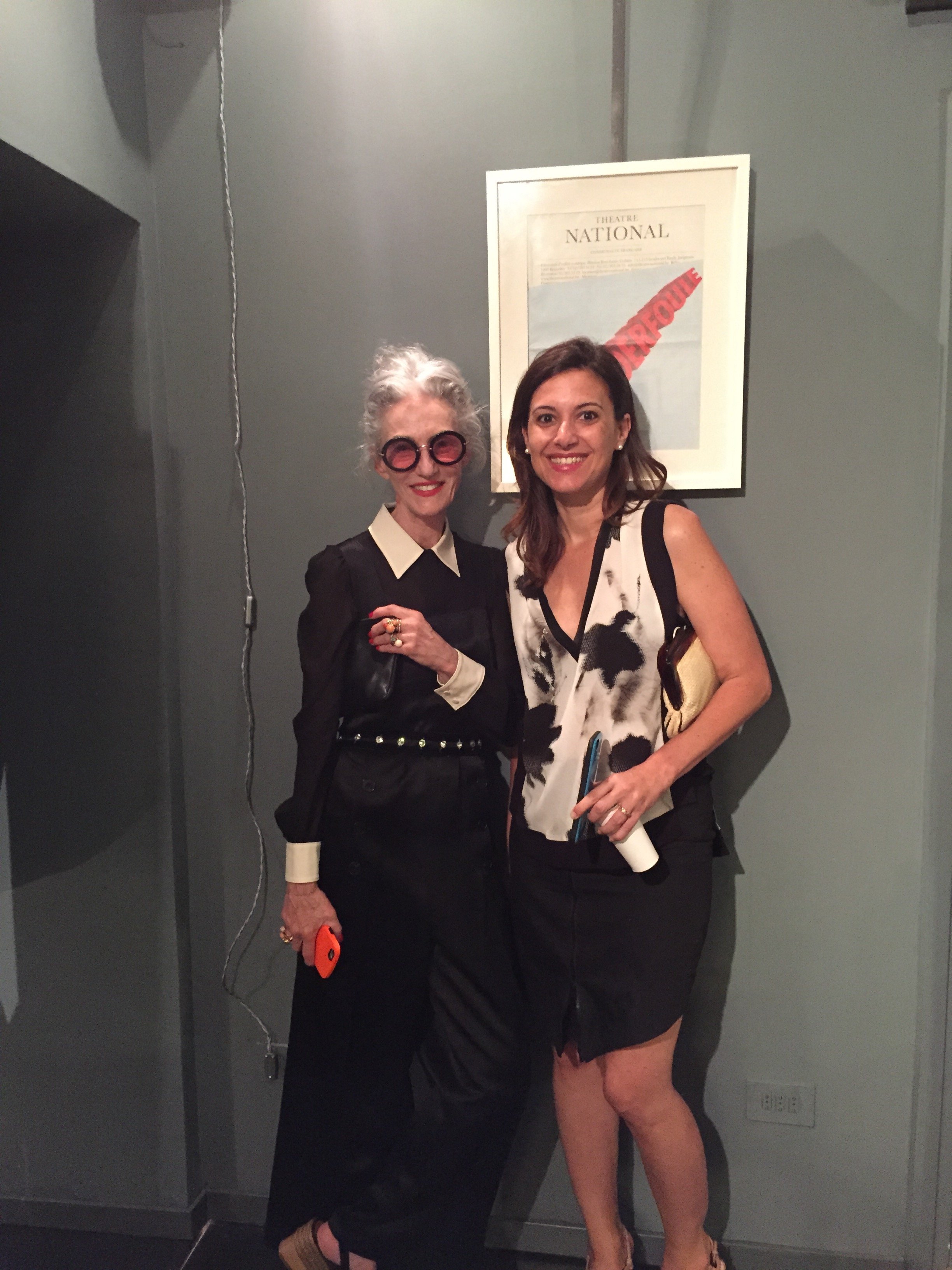
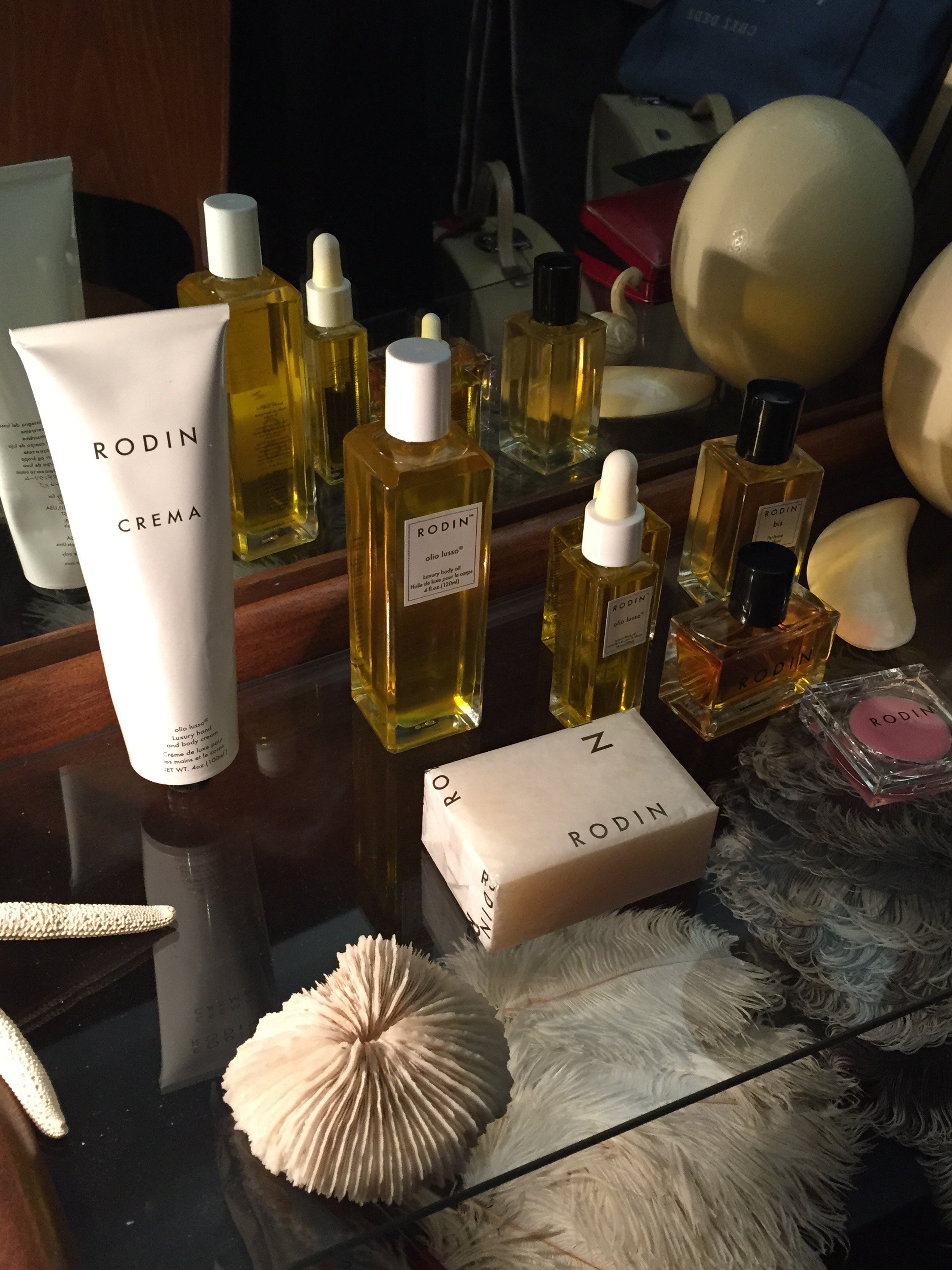
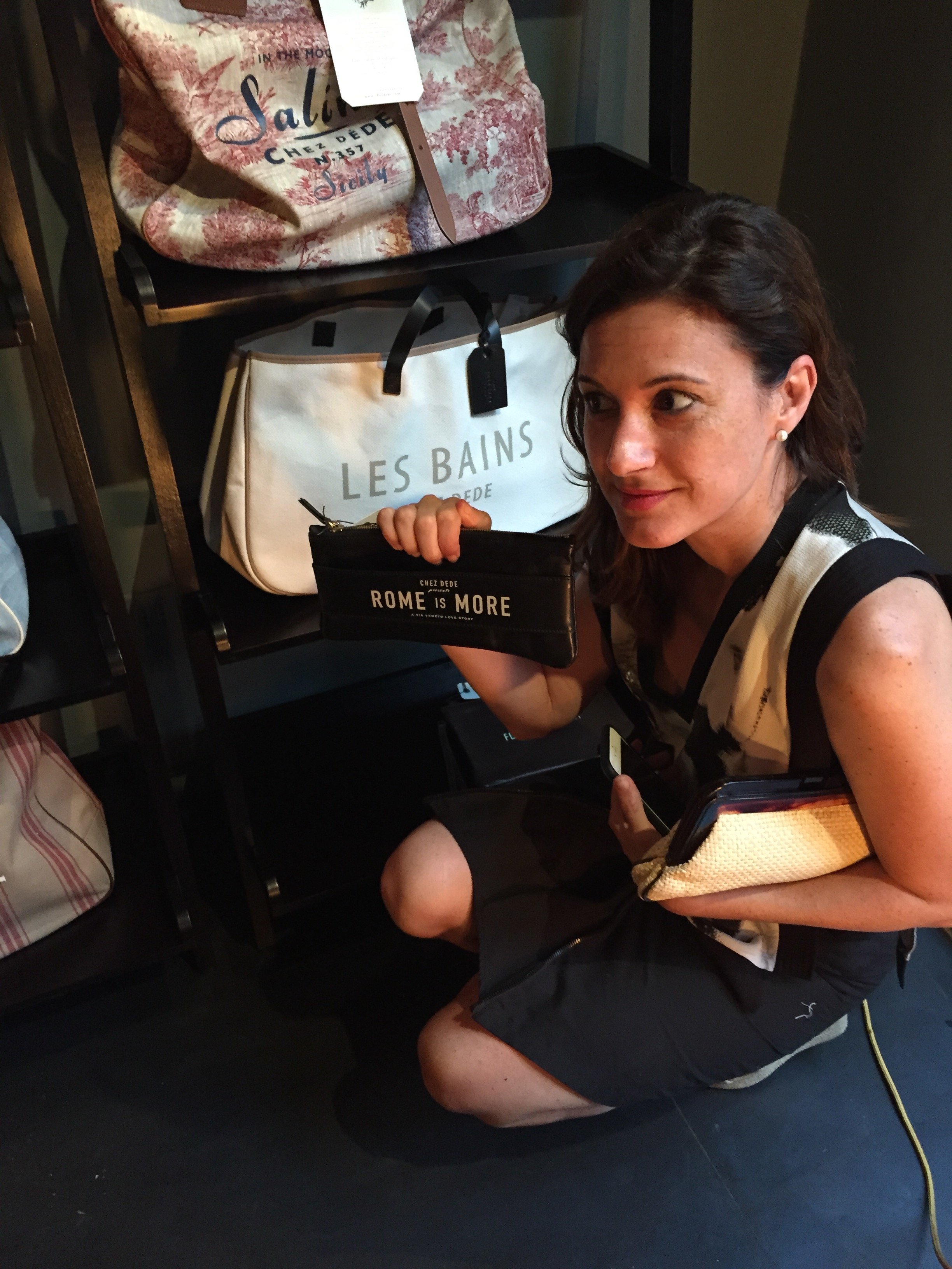
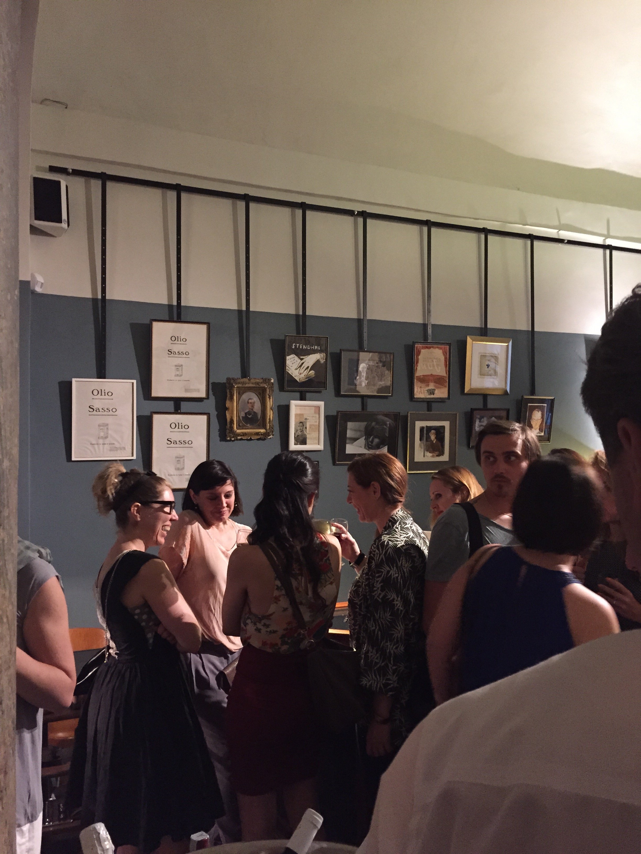
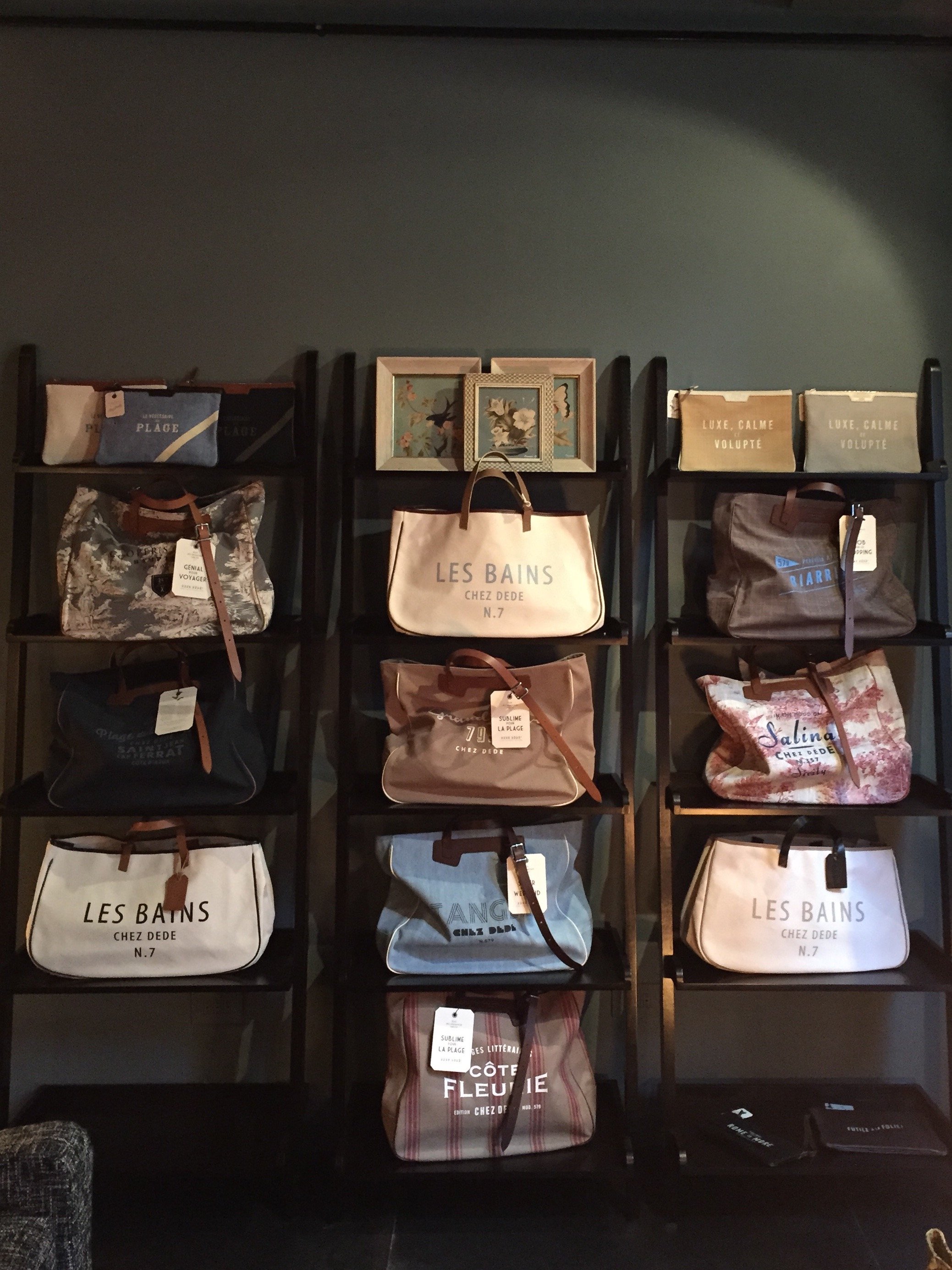
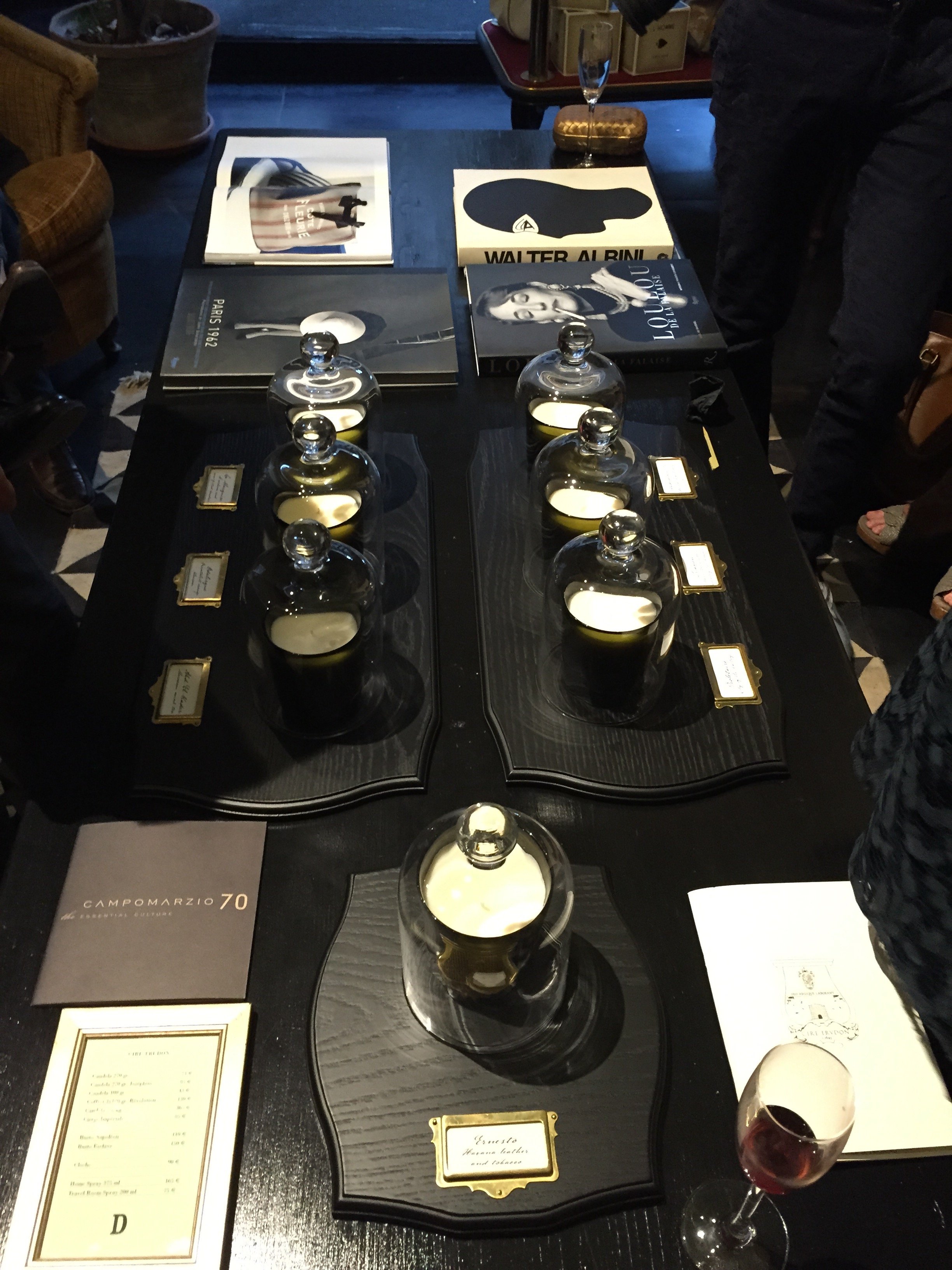
A few years ago I wrote about how much I adore the boutique accessories label founded by Andrea Ferolla and Daria Rein, Chez Dédé.There has been a lot of retail space turnover in our neighborhood. Antique stores, artisans, etc., are shutting down and Subway fast food restaurants, and other weird sandwich shops are taking over. There have been some great additions, like the Suppli spot but for every one of those there are four or five places that leave locals scratching their heads.Via Monserrato is one of the prettiest streets in Rome. When I saw the large for rent sign where Ilaria MIani's showroom used to be, I became very nervous. What kind of janky business would set up shop on this street?Then I saw this: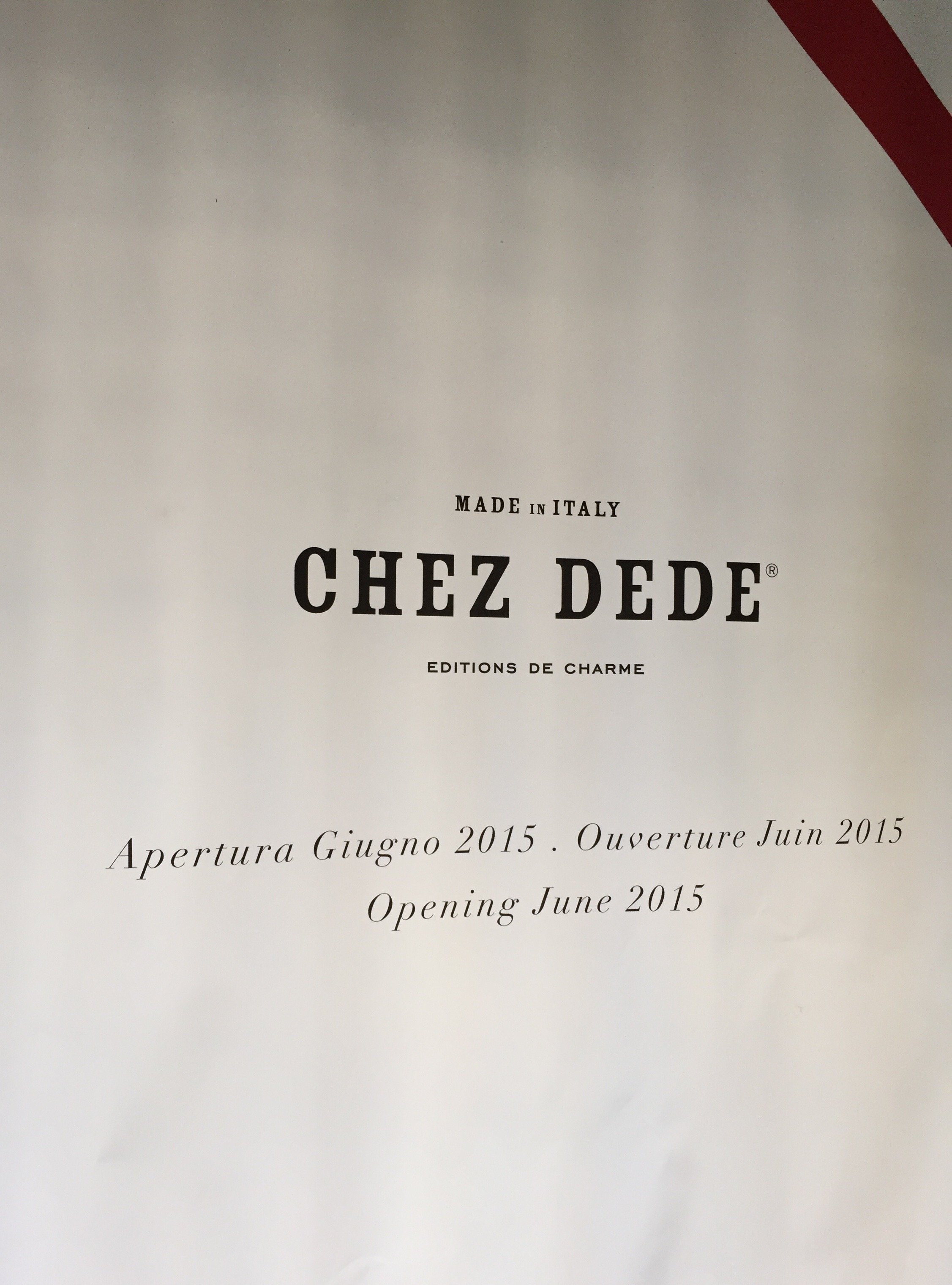 YAS!The store had its opening last week. Erica and I walked over and bumped into a bunch of our neighbors. One of our favorite bartenders, Fabrizio from Pierluigi, made the Kir Royales.Unfortunately, for me, the store is stunning. I should just leave my wallet there and let them take my money. All of it.Erica completely fan-girled LInda Rodin. I don't blame her. Ms. Rodin is a style icon for a reason. She was so gracious and didn't give us the side-eye for geeking out.I think I need to treat myself to a nice Grand Sac bag for my birthday. It's a big one (no, I'm not going to say which birthday it is as I still work in Hollywood). I haven't decided which bag yet. The island of Salina is one of my favorite places in the world but I also love the colors/style of the Portofino, Kenya, and Dubai bags. I haven't been to any of those places, so I think I should go with the Salina bag.Below are photos from the opening. Grazie mille, Daria for the invite!EDIT:Okay, I wrote this yesterday with the plan to publish today. I like to proof read before publishing yet, some typos still make it through. Grrrr.On Saturday my friend Courtney called me and said she had to speak with me urgently on Sunday. I asked what was wrong. Why couldn't she tell me over the phone? I was working all day on Sunday but said I would meet her in the afternoon. Erica wanted me to stop by her daughter's lemonade stand. I said I was on my way to meet Courtney but would stop by. I was worried about Courtney. Erica said she was too and hoped that everything was okay.I show up at Etablli. Courtney sends a SMS saying she's on her way and she asks me to order her a glass of wine. What the heck was going on? Was her news so heavy she needed to have a drink in hand?She walks in and Erica (!) is right behind her. They say, "Happy Birthday" and then this happened:
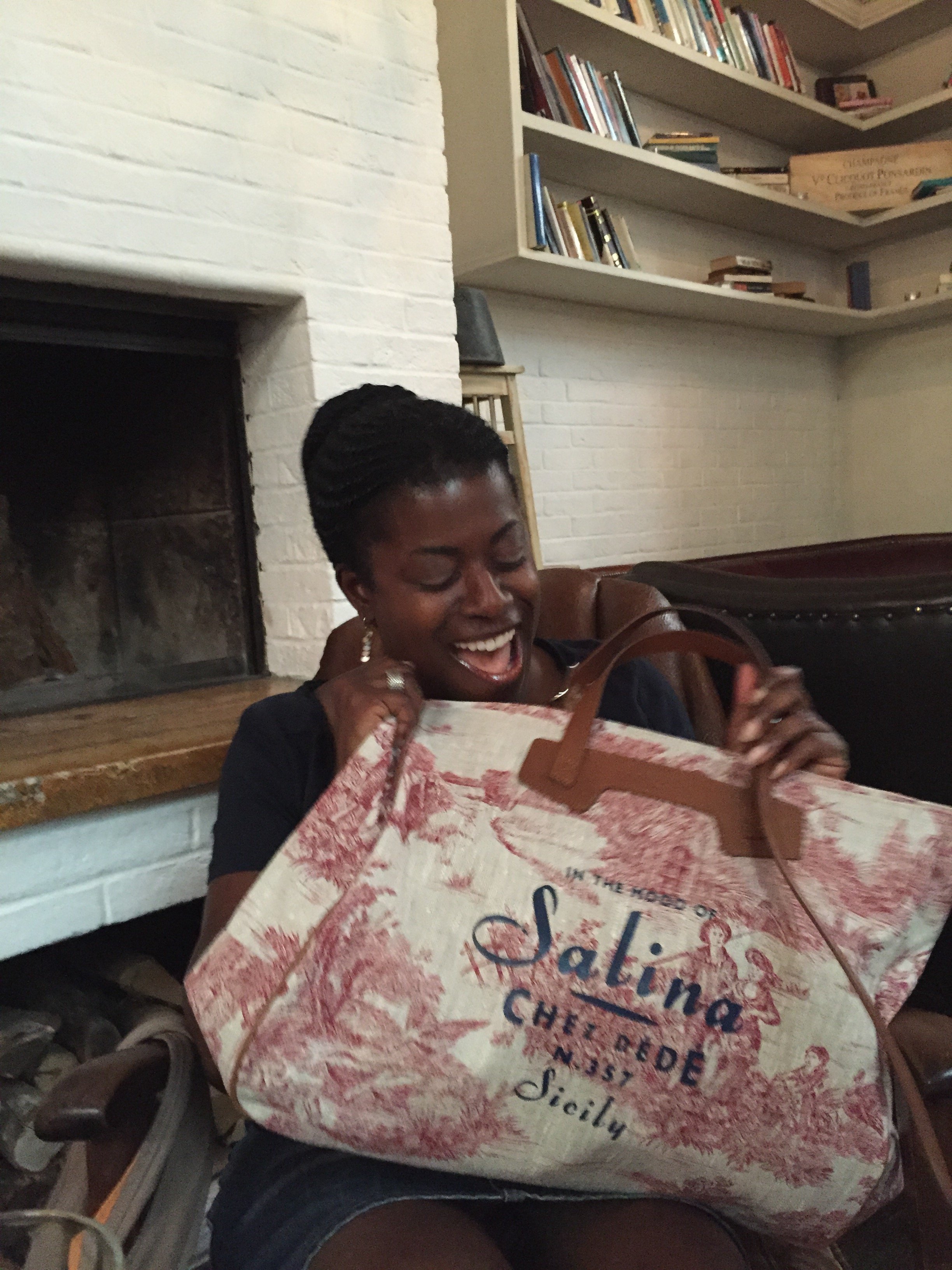 I had no idea they were planning this! Erica thought I was going to buy the bag before my birthday so she and Courtney went into action over the weekend. My birthday isn't until August 26th.I was/am floored. I am not an easy person to surprise and they totally got me. Well played ladies, well played. I love my bag.
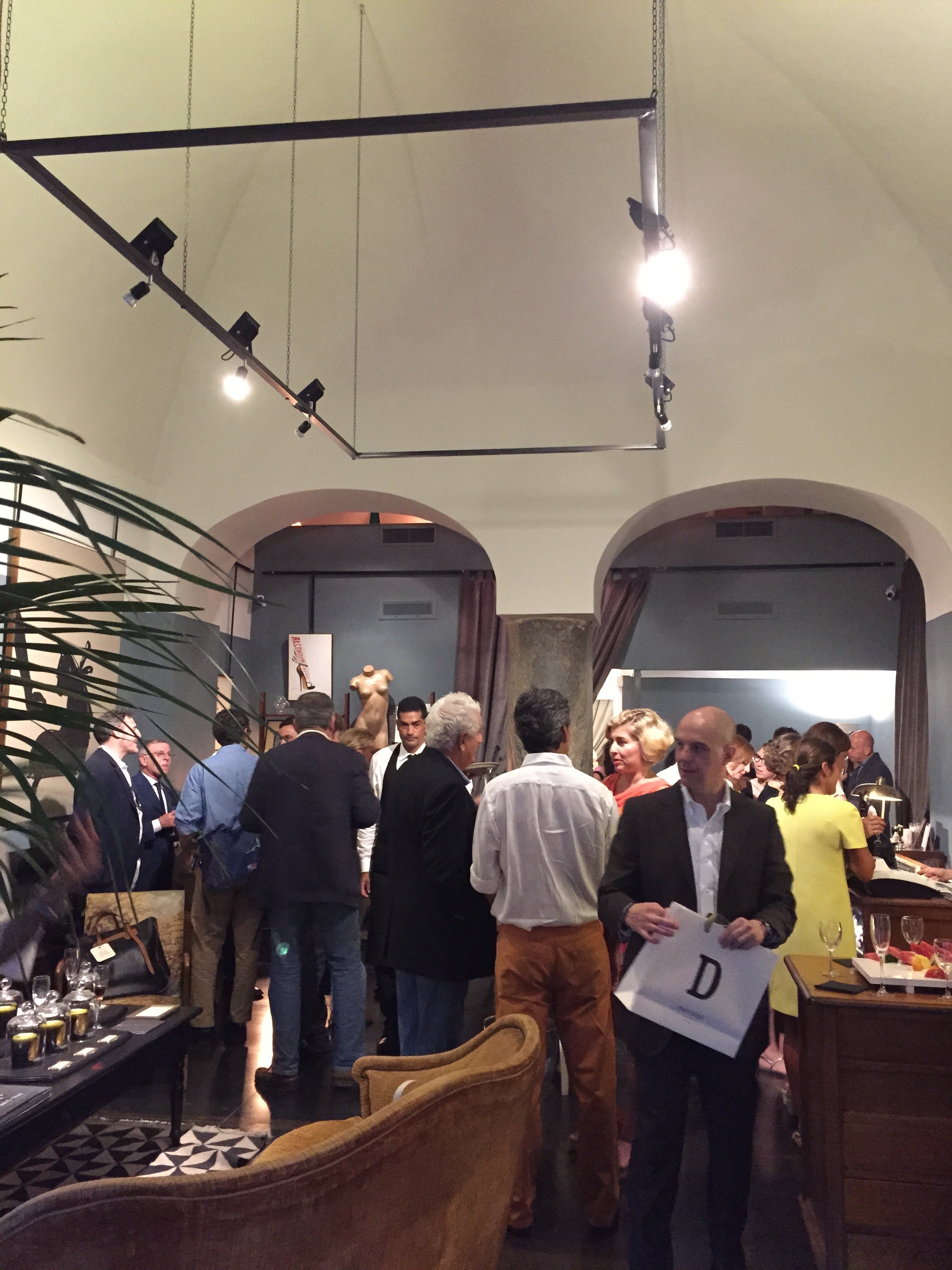
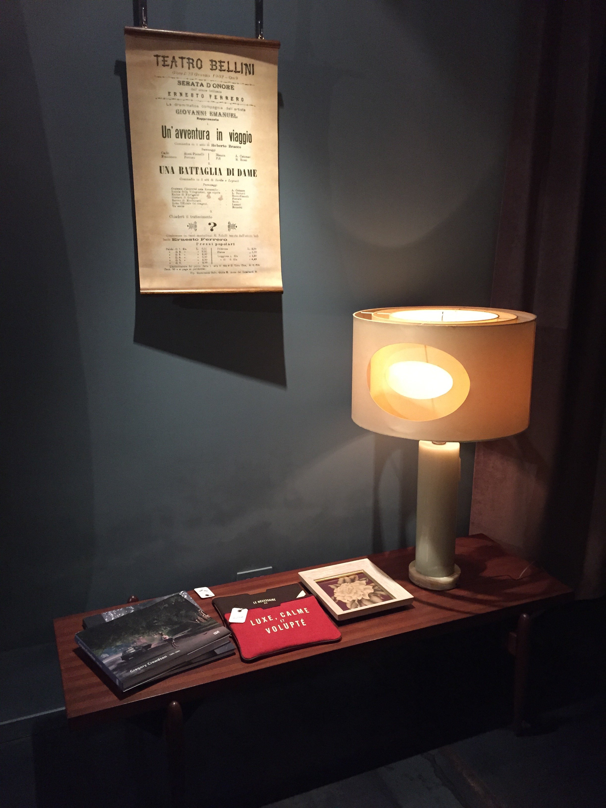 Andrea is a very talented illustrator.
 Linda Rodin. Fabulous.
 Erica and Linda.
 So true.
 Photos: Me and my iPhone
Small Bathrooms That Are Big On Style
The last few weeks have been incredibly busy.I'm working on a new project that will include a bathroom renovation. It has unique design challenges in that It's a vacation rental and the room is TINY.We want the space to function better and to be stylish. Below are three small spaces that caught my eye.Compact yet not claustrophobic. The shelving above the toilet is genius. Great use of space.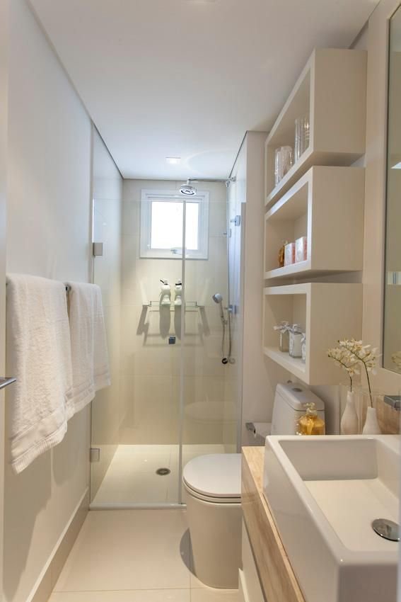 Photo: Banherio PequenoIn a small space you can use higher-end materials and finishes without blowing out your budget. Look at these floors. Stunning.
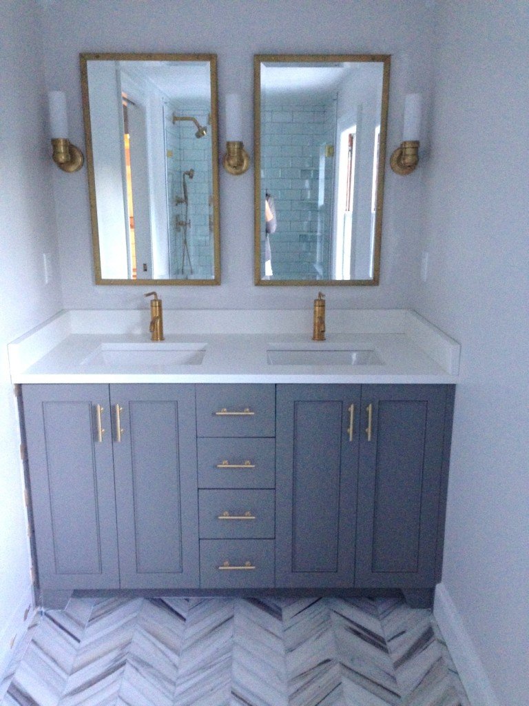
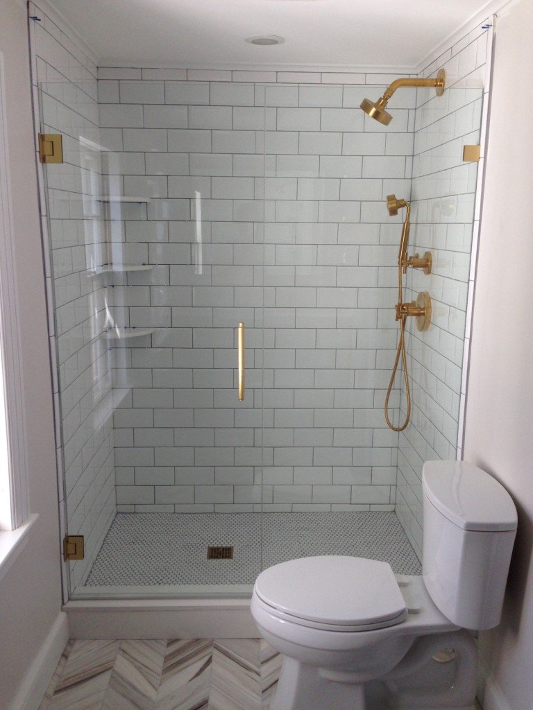 Photo: Elements of StyleLove the drama of Jenna Lyon's bathroom. These floors are spectacular as well.
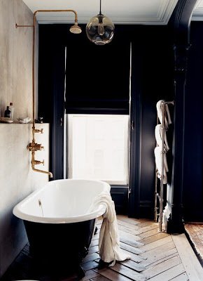 Photo: Domino
Life in Rome - My Trip to Pienza, Tuscany
Earlier I wrote about the interior design of La Bandita Townhouse. Clearly the owners, John and Ondine, have put as much thought into the service as they did into the décor.From the first email to book my room, until the day I left, the service was (as the young folks say) on fleek. This is something I do not take for granted. Unfortunately, too many people have no idea what it means to work in the hospitality business. Why they would open or work in a hotel/restaurant/spa, etc. is beyond me.Pienza is a small hilltop town with a population of approximately two thousand people. It was the birthplace of Aeneas Silvius Piccolomini, who would become Pope Pius II. Piccolomini rebuilt the entire village, starting in 1459, after he became Pope. He saw it as a lovely Renaissance retreat from the Papal capital. In 1996 Pienza was named an UNESCO World Heritage Site.It's a perfect base from which to explore this region of Tuscany (with a car). Montapluciano, Siena, and other towns are close by. If you're a Pecorino cheese fan, a visit to Pienza is a must.Since I was only staying for two nights, I didn't rent a car and spent most of my time close to the Townhouse. It was FREEZING. I'm not exaggerating. I haven't been that cold since my days at Syracuse University.I was elated to see these fire pits around town. I love how in this country even a simple and functional thing, like a fire pit, is well designed. I mean, look at the darn logs. Did the person who built the fire make sure they were "just so" or what? Also, as I said before, it was beyond freezing. Who has time to worry about aesthetics in sub-freezing weather? If the logs were janky, would the fire builder be called out?I truly appreciate this attention to details. The views were spectacular. Sunset.
 Sun rising. View as I started my epic walk three and a half-hour walk.
 Remember this road from the movie GLADIATOR? No, I was not entertained. I was a little freaked out because I didn't see a single person for kilometers. I started to think, "what if a wild boar attacked me? Nobody could hear me scream. Where the heck is the next farm house?"
 Seriously, NOBODY was around.
 The top of this well, stylish simplicity.
 Pieve dei Santi Vito e Modesto Church. It was built sometime during the 11th and 12th centuries. Notice the distinctive carvings above the door. Several of these small country churches were built above Etruscan sites and used some of the same imagery.
 I had a fantastic dinner at the hotel, after I defrosted. The restaurant is open to the pubic (you need reservations). Chef David and his sous-chef, Jacopo, knocked it out of the park.
 Martina pours some Prosecco.
 During high season, Pienza is very popular with tour groups. This charming video about La Bandita and Pienza helps explain why.http://www.youtube.com/watch?v=0rGyeJ1Z030A big Thank You to everyone at La Bandita. Sometimes it's not so easy to travel alone and they made me feel at home.Photos: Me and my iPhone.
Design Inspiration - La Bandita Townhouse - Pienza, Tuscany
I've read about La Bandita, a country house near Pienza and have seen photos of it in various shelter magazines/design articles.A little over a year ago, John Voigtmann and his wife Ondine Cohane opened La Bandita Townhouse converting a former convent in center of Pienza into a 12-room boutique hotel.My friend Gillian and husband stayed there recently. She told me I had to see it in person. Gillian knows my taste and said I would love it.She was correct. I know people are sick and tired of decorators using words like swoon! obsessed! and dying! when describing interiors. However, let me say, I swooned when I saw my room. I was obsessed with the design of the kitchen and was dying over the views.I've written before about the mix. It's something you see frequently in French and Italian interiors. It's not easy to pull off. Sometimes the space is too modern for the architecture and it feels cold. Or the design is so faithful to the past, it's dated.Working with Florence based architects, Arianna Pieri and Ernesto Bartolini of DA.Studio, John and Ondine have created a lovely space. In a hotel, all the beauty in the world doesn't mean a thing if the service is awful. It was fantastic and I will write about a post about that and Pienza soon.I absolutely adore this type of décor. The same architects worked on Monteverdi with interiors by Ilaria Miani.i found out that one of the main resources for La Bandita Townhouse was the store Barthel. No wonder it spoke to me as we sourced most of the items for the bathrooms in our Tuscany project from Barthel.This was my room, number 12. I arrived late afternoon. The amount of light during the day is unreal. I love that they retained the stone wall. The view from the tub was sick. The Ortigia products were a nice touch, as were the free water and soda in the mini-bar.In my next apartment I would like a canopy bed. The colors, the lighting, the bed linens, I really didn't want to leave this room after two days.I have to ask if they have a room with a desk, because La Bandita is a perfect spot for writers. Tears of happiness when i saw this huge shower stall. I really need to move.
 Gorgeous. The main hallway is the first thing you see when you walk thru the door. The convent dates from the 1400s.
 Again, stone walls. A lot of natural materials with pops of orange throughout.
 This kitchen is everything. In the States open-plan kitchens are preferred but not in Italy (or the Caribbean). Notice the overhead window over the bar? It drops down. Once you close the door on the left of the bar, you have a closed kitchen that lets in light. A friend of mine, who lives in a loft in Rome, did something very similar. It's a brilliant idea.
 An old map of Italy in the library/lounge.
 I was very excited to see so many classic LPs in different genres. I could've stayed up all night listening to music. I still have some vinyl and for my next apartment (I know, I know) I will buy a turntable.
 You know how I feel about books and magazines. It was freezing outside. It was nice to curl up on the sofa and just chill.
 John is former music industry executive. Some of his gold records sit on top of the bookcase.
 Aperitivi time!
 John has said he and Ondine wanted to create a beautiful, comfortable hotel where people could come to relax and enjoy Tuscany. They have. La Bandita is a special place. I cannot wait to return during warmer weather so I can eat outside on their fantastic terrace.Photos: (except for the one of the kitchen and of the bookcase) me and my iPhone.Click HERE to see more from La Bandita's great photo gallery.
La Bandita Townhouse
A Tub and Shower With a View
And what a view it is. One of my friends just returned to Rome from visiting the States and she kindly picked up a copy of VERANDA magazine for me. It's not an easy magazine to find in Rome (in Milan, yes).Brooke Giannetti's Velvet & Linen blog is fantastic. She has a very large following and has posted a few photos in the past of the home she is building in Ojai, California with her architect husband Steve.It's so interesting to me that this a new build, yet their home has the warmth and vibe of a house that has been in a family for generations. You can read more about Brooke and Steve's Patina Farm journey, here.One day I would love to have a tub/shower like this. Love it. Of course it's only possible if there are no neighbors close by. A friend here has an outdoor shower on his terrace. He lives in Trastevere and the upper floors of a church and another palazzo are right across the narrow street. The man has no screens. Yeah, no.To see more photos, go to VERANDA's website.
Have Yourself A Merry Little Christmas
I cannot believe it's Christmas 2014 already. Where did this year go?In a sea filled with awful news (I really need to ease up on how much I watch and read everyday), it's good to be reminded of joyous things.Last Friday my friend, Gina, invited me to meet her, Rachel, and Elizabeth at their friend Alice's holiday pop-up bakery. Alice Is a food stylist and cook. Her gingerbread cookies were delicious. I wonder if it's possible to order some during the off season. I must investigate.I loved the simple decorations, the Prosecco, and most importantly, sharing them with friends old and new.

 It's not easy to be far away from my family during the holidays, but I feel very fortunate to be surrounded by an incredible group of friends.Merry Christmas!!
Weekend Inspiration - All of the Lights - Campo de' Fiori
For me the day after Thanksgiving has nothing to do with shopping. It means I can start playing Christmas carols.This probably comes as a shock to people who don't know me well, as I appear to be a person who loves to shop. It's even part of my job.However, the whole Black Friday thing always left a bad taste in my mouth. While Short Hills Mall is one of my favorite places in America, I'd rather listen to Izzy Azalea on a continuous loop than go there on the day after Thanksgiving.We don't have such a thing in Italy and I don't see it happening anytime soon. The concept of standing/waiting in line is completely foreign, even in places (like the post office) where we're supposed to.One thing that is also popular here, are street lights. This week crews were putting them up all over town.In my neighborhood, Campo de Fiori, we have these: I adore the simplicity of them.Now, I'm off to play some of my favorite holiday jams.Buon weekend!
A Few Dinner Plates For A Thanksgiving Table
Many people back in the States have asked me what I'm doing on Thursday.I'm working. Thanksgiving is an American holiday.If I had an oven/kitchen/apartment bigger than a shoebox, I would host a Thanksgiving dinner but on Saturday (which is what the majority of expats do here).My future apartment will have more space and I will entertain more.In the meantime, I can admire these lovely plates that would be perfect for my Thanksgiving dinners.For an informal table:The Marbury Dinnerware Collection from Crate and Barrel. You can put a charger underneath with more color or a pattern. The Charlotte Street Collection from Kate Spade. I had to have at least one white plate with blue trim.
 The Eclectique Dinner plate from Williams-Sonoma. It's a pretty dish made in France.
 For a more formal table:The Renaissance Collection by Wedgewood. A classic.
 Anmut Platinum by Villeroy & Boch. One word... elegant.
 The American Dinner plate by Hermès. The blues are gorgeous.
 Hmmm, not seeing a lot of variety here.I do appreciate china with flowers but for my table I tend to keep it simple because my floral arrangements are colorful. Also, I like to mix and match my dinnerware. Having plates in a similar color palette makes the table more cohesive.For those who are celebrating, I hope you have a fantastic and Happy Thanksgiving.
Stylish Simplicity - The Tiffany T Bracelet
There has been great deal of press about the new Design Director of Tiffany & Co., Francesca Amfitheatrof. She is the first woman to have this position at the storied American jewelry company. The job had been vacant for five years. Ms. Amfitheatrof had some big shoes to fill.Ms. Amfitheatrof, who trained with a master silversmith in Padua after college, has created pieces for Chanel, Alessi, and Fendi. She was born in Japan to an Italian mother and a Russian-American father, who was a TIME bureau chief, and grew up in New York, Rome, London, and Moscow.I love her new collection for Tiffany. This bracelet is so simple and so chic.
18 karat rose gold bracelet
Narrow Wire 18 karat white gold bracelet
18 Karat gold braclet
I have read some comments claiming that this collection is not all that. It's TOO simple, "Hello it's just a T. My kid could do that." I cringe when I hear people make those kind of statements about any kind of creative endeavor.The simpler something is, the easier it is to mess it up. Look at Cacio e Pepe, not many ingredients but a difficult dish to execute well. There are no bells and whistles to hide imperfections. Every single ingredient has to be of excellent quality.It's is the same thing with these bracelets (yes, I just compared high-end jewelry to a simple Roman pasta dish).You can wear these bracelet with many different styles of clothing. I think they are destined to become classics like some of Elsa Peretti's pieces. The Tiffany T bracelet is the very definition of Stylish Simplicity.Photos: Tiffany
Seven Days of Sicily - Day 7 - Art + Design
Why do I miss Sicily? There are Sicilian restaurants in Rome.Perhaps this is only an infatuation. My first trip to Sicily was just last year, which I wrote about in FATHOM. Maybe the island will lose its hold on me after a few more trips, or years. We'll see.Like the cuisine, the art and architecture of Sicily has been influenced by the diverse cultures of its various rulers.Every day I stopped by to see the Burial of Santa Lucia, painted by Caravaggio in 1608, located in the Santa Lucia alla Badia church. There is something very special about seeing art in the context that it was created for.In the early 2000's many architects and interior designers started to buy and renovate houses in the area. I kept getting lost in little courtyards and side streets. There was inspiration all around me and design elements that gave me some ideas for my Caribbean beach house project.Below are a few of my favorite things:How pretty is this packaging? I received a gift from this store on my birthday. Erica's daughter picked it out. That five year-old has excellent taste.
Photo: ortigiasicily.com
As someone who was raised Methodist, I'm still thrown by some of the more intense art in Catholic churches. My childhood church had stained glass with images of things like Jesus chilling with some shepherds.
Here is the patron saint of Siracusa, Santa Lucia.
Clever use of a satellite dish.
Spiderman on the side of the Municipal Building representing the heroic spirit of the people. I'm trying to find out who the artist is and when the work was installed.
Cool planter outside a house that faces the sea.
Rome-based artist UNO and his latest installation.
Also from Rome, Alice Pasquini. Erica and I went to see her and UNO work on their murals. This is a school in Siracusa.
The new and the old.
I saw these fishing baskets all over my neighborhood.
Love the door.
And this gate.
This alley showing a sliver of the sea was up the street.
I'm thinking about my next trip. Maybe I should go to Palermo or Cefalù, or both.
Photos, unless noted otherwise, are by me and my iPhone.
Stylish Simplicity - Como Glasses - Paola Navone for Crate & Barrel
I've written before regarding how much I adore the collection Italian architect/furniture and interior designer Paola Navone has created exclusively for the American store Crate & Barrel.Her new collection is out. My siblings were kind enough to give me a gift certificate to Crate & Barrel and I had to get these glasses. Now they are sitting at my sister's house. One day they'll make it to Rome.I love the color of the rim and the lines of the glass. Very simple and very stylish.
Stylish Simplicity - Eres Bikini (and a short rant)
Today's edition of Stylish Simplicity highlights the ERES bikini.
Work it J.Lo
Photo. Vogue June 2012
This French brand has some of the most beautiful bathing suits on the planet... classic and well made.
I never wore a bikini until I moved to Italy. NEVER. I grew up seeing magazine covers constantly saying, "Get A Beach Ready Body!" or tabloid headlines that screamed, "Worst Beach Bodies!" In Los Angeles many of my colleagues gleefully ripped celebrities to shreds, calling them fat and what not. Celebrities who were no larger than a size 4.
What's the point of starving oneself for the season? What happens once the summer is over, back to bad eating habits? I blame the Puritans for this madness.
The first time I went to the beach here I was stunned by the variety of shapes, sizes, and ages wearing bikinis and Speedos. Italians were chilling, just doing their thing. I stood out with my very sensible one-piece for a woman of a "certain age."
How do my friends in Italy get ready for beach season? They put on a bathing suit and go to the beach.
I'm not sure what made me decide to take the plunge and finally buy my first bikini. In the fitting room, I told the saleslady there wasn't enough coverage on top. She looked at me like I had two heads. She said that's the way a bikini was supposed to fit. I was skeptical.
The day came when my Eres bikini and I went out in public. The world didn't stop spinning. The Italians couldn't care less. The only reason I stood out is because I was one of the few people of color on the beach not selling a trinket.
Now my sensible one-pieces (which actually made me look heavier) are sitting at the back of my closet. To me function is just as important as style. A two-piece is more practical than a one-piece.
I wish I could go back and talk to my critical younger self. I'd tell her to get a grip, just go to the darn beach, and enjoy herself.


