The Cottage, Meads Bay Beach, Anguilla BWI - Reveal
Building and designing a new beach house on a tiny island is not the easiest of jobs.
This was a personal project and I was working with several people who all have different tastes. I wanted to incorporate everyone's ideas yet make sure the space was cohesive.
This is a cottage so nothing too fancy or formal. A cottage is more traditional. That's why we have spindles and rails on the veranda and not glass. I wanted it to be comfortable. It's Relaxed Chic. It's the vacation home of your favorite aunt and uncle who like to have a cocktail, or two, as they watch the sun set from their veranda.
The logistics! The one two punch of the strongest hurricane to ever hit the Atlantic and then two years later the first global pandemic in one hundred years didn't help. However, thanks to a very dedicated and hard working team, we did it! The Cottage is finished.
Here are two before photos:
Standing in front of what was going to be the kitchen island looking out at the sea view.
After: The sea view from behind said island. The house was designed to take advantage of the spectacular views. There was a big debate about the ceilings. Yes they are very high (over 19 ft) and the wood was beautiful but I thought staining them a dark color would be a mistake. The only natural light is coming from the bi-fold veranda doors and way on the other end, the windows in the kitchen.
We painted the walls and ceiling a softer white than the external color The color running through the house is blue with touches of yellow, and a coral red.
The countertops are poured concrete. The counter stools are from Serena and Lily. The handmade made bowl is Schoolhouse and the pomegranates came from our contractor's mom's backyard.
Almost everything has to be imported due to the island's size. I had a local carpenter make quite a few pieces. I was asked why not buy the bedside tables, in the Main Bedroom, in the States as it would be easier and probably cheaper. I did it because we already had a full container coming from America and it's important no matter where you build/renovate to support local businesses and artisans when possible.
I cannot stand it when you're unable to get a sense of place in a house. I'm a huge fan of the big American stores I sourced from but it's a good thing, especially for a new build, to mix it up. I don't like spaces that feel like a showroom. I also sourced from smaller vendors and to the trade.
The Caribbean is mix of cultures and that's reflexed in The Cottage. I side-eye the fact that one culture is usually missing despite the majority of the people who live in the Caribbean being from that culture.
The dining table was sourced at the French store La Maison in St Martin. The chairs, Amazon USA. A local upholster made the seat cushions. The fabric is from Ghana and was bought at the African Market store in St. Maarten (Dutch side). The vase is Crate & Barrel.
The view looking in from the veranda. Ceiling fans are Minka Aire. Sofa is from La Péninusle in St. Martin. Coffee table is Serena and Lily. Arm chairs IKEA. Custom seat cushions outdoor/indoor fabric Sunbrella from Showroom Tapissier in St. Martin. Side table from Home Kara in St. Martin.
I designed the custom bookcase/desk with our carpenter.
This is the view looking out from the veranda.
The kitchen. The cabinet doors were custom made by our carpenter. The pendants lights had to be a special order from Schoolhouse because of the height. Sconces and hardware are Schoolhouse as well. I decided not to do upper cabinets. This may not be practical for a primary residence but for a vacation house it makes sense. It's easier to find everything. I feel upper cabinets would look odd with these type of ceilings. They would cut the space in half.
Glassware, tableware, and small appliances are from Crate & Barrel. The larger appliances including the wine refrigerator (it's in the island), integrated dishwasher, and mircowave are GE and were bought through Sheila Haskins who is the authorised GE vendor on island.
When it came to the countertops, I knew from the very beginning they would be concrete. I like that they were made by hand and the material is perfect for this beach house style. The floors are coral stone tile from the Dominican Republic. Backsplash is Granada Tile also handcrafted.
I wanted this to be a comfortable house where people could relax and enjoy themselves. The tray is from Serena and Lily. The art work was commissioned from a young Anguillian artist, Carmel Gumbs. It's a black and white oil of Shoal Bay. B&W was a risk but with the incredible views why compete? It's different. The clients love it. Vase is Crate & Barrel. The morning of the shoot I cut some branches from our sea grape tree.
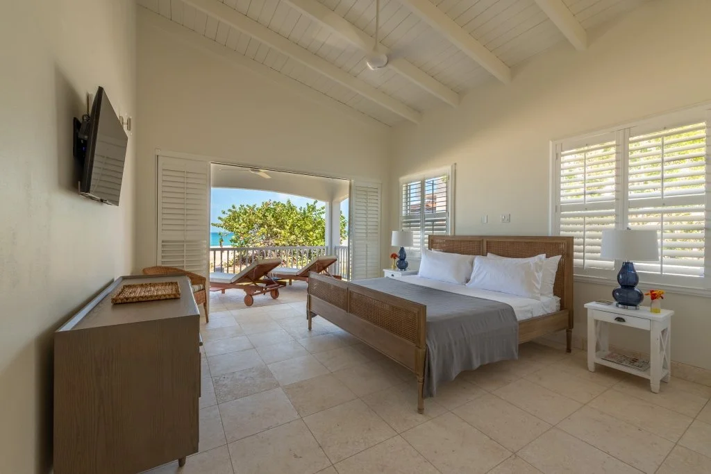
The main bedroom as the sun starts to set. The bed is Crate and Barrel. The basket is Vendredi in St. Martin. The lamps are from One Kings Lane, and the bed side tables are custom. The sheets in all the bedrooms are Boll & Branch.
Another angle of the bedroom. That view! So glad we went with these type of doors. Great for indoor/outdoor living.
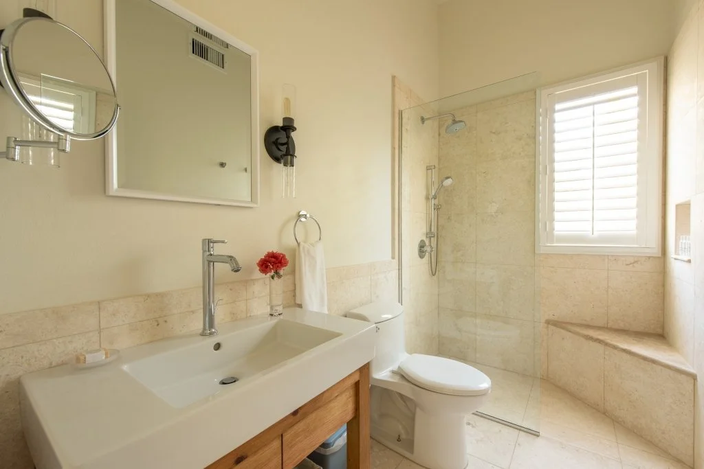
The en-suite bathroom. Sconces are from Shades of Light.
I designed the custom vanities with our carpenter and contractor. We stained the wood instead of painted it. I like having some wood in the bathrooms. Warms things up a bit.
In the original plans there was another closet where the tub currently is. Where the shower is now was supposed to be the tub AND the shower. I did a walk through once the internal walls were up. I suggested we get rid of the closet and place the tub there. It's a vacation house. It's not necessary to have two large closets. I think most people would rather have a roomy shower.
Sigh. That shower.
This bedroom also has a sea views and a king size bed. Bed is from Serena and Lily. Lamps One Kings Lane. Bedside tables from La Péninsule in St. Martin. Dresser is from Crate & Barrel.
That sea grape tree has been there for ages. I would like to relax on this veranda. Chaise lounges from One Kings Lane.
The en-suite bathroom. The next bedroom (yellow room) has the same bathroom.
The yellow room. Garden View. Twin beds and dresser are Crate & Barrel. Bedside tables from La Péninsule, St. Martin.
This color was quite controversial. This room gets a LOT of sun and the color changes during the day with the light. It's called Bermuda Sun. Appropriate.
I've just read an article in Architectural Digest regarding how yellow is one of the toughest colors to work with but it's making a comeback. I stand by my choice! Plus, it's very pretty at night.
The closets were built by our carpenter.
In the hallway looking into the half-bedroom and the powder room.
The day bed is from Crate & Barrel. Floor lamp Serena and Lily.
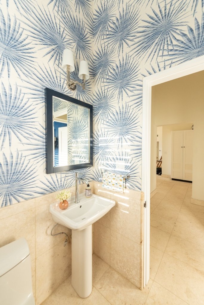
The customs/installation drama with this wallpaper was worth every grey hair.
This is a small room. Powder rooms are the perfect space to go all out. Wallpaper is Thibault (to the trade). Sconce is Circa Lighting.
This is technically the front of the house. You walk in and your eye goes immediately to the view.
The cabinets are custom. Bench is Serena and Lily. Black sconces, hooks, and door knobs from Schoolhouse. Chrome sconce is Circa Lighting and these are in all the bedrooms as well. Art work is a print from St. Martin based artist Antoine Chapon.
Bag is from Ghana sourced at the African Market store, St. Maarten.
The very large Dutch Door. I changed it from a regular door so it's possible to keep the top open for a breeze without worrying about young children, out of eyesight, going outside .
Custom shade is from The Shade Store.
Meads Bay Beach is also famous for its sunsets. Not a bad place to enjoy them. Table, love seat, coffee table, from Le Péninsule and the yellow chairs are from La Maison, both in St. Martin. Tableware and teak candle holders (on the floor) from Crate & Barrel. Table top candle holders from Paloma & Co.
I would love to walk out of the bedroom and sit here with some rosé or rum punch.
No words regarding this view.
Sconces on the veranda are Circa Lighting. Sconces outside the veranda are Shades of Light.
Meads Bay.
Buona notte/Good night!
The logistics of this project were on the Italian bureaucracy level. One thing I would highly recommend is hiring a local project manager from the very beginning, even if you're on island. We started working with Gifford Connor mid-way through this project. Once the pandemic hit, and the borders were closed, I wasn't able to visit the job site even when I was in St. Martin just a 20 minute ferry ride away. It was great to have someone on the ground to keep everything moving forward.
Anguilla is truly a special place. She has managed to retain her soul (so far) despite the increase in tourism. The government looked at what St. Maarten did and decided not to go that route. There are no casinos and no big cruise ships. I didn't appreciate this island when I was a teenager. I thought it was too small and so boring. All my relatives were super strict and nosy. I wished I were back in Jersey at the Willowbrook or Short Hill Malls with my friends. Ha. That all changed once my parents moved back to St. Martin after retiring. I started to spend more time in the Caribbean and realized that all the things that I resented when I was younger, I needed/wanted in my life.
This property belonged to my great-grandmother Priscilla Connor. I don't know much about her and next time I'm in Anguilla I will try to look up when she was born. Her daughter Martha was born in 1898 (and lived to be almost 101 years old). The high-end luxury tourism boom took off in the '80s. Now the Four Seasons (formerly the Viceroy) is on one end of the beach and Malliouhana Hotel is on the other end. My grandmother was a widow and yet she refused to sell her land. She turned down every offer. She said it would go to her children. It did and my uncles and aunt agreed with my mom to let "the kids" build The Cottage. Everyone contributed. We're one of only two or three local families to still own property on this beach. I think of Priscilla often. I wonder what her life was like and what she would think of Anguilla today. This is more than just a beach house to us.
Doors, windows, wood, and indoor shutters sourced from Arawak Hardwoods a local company that also has an office in Florida.
All bathroom fixtures and fittings are from Quality Bath.
Builders: Ernest Fleming and Shawn Romney
Architect: Anderson Home Planners
Project Manager: Gifford Connor, APA - Anguilla Property Services
Photography: KSharp Media
Click HERE for more information regarding vacation rentals.
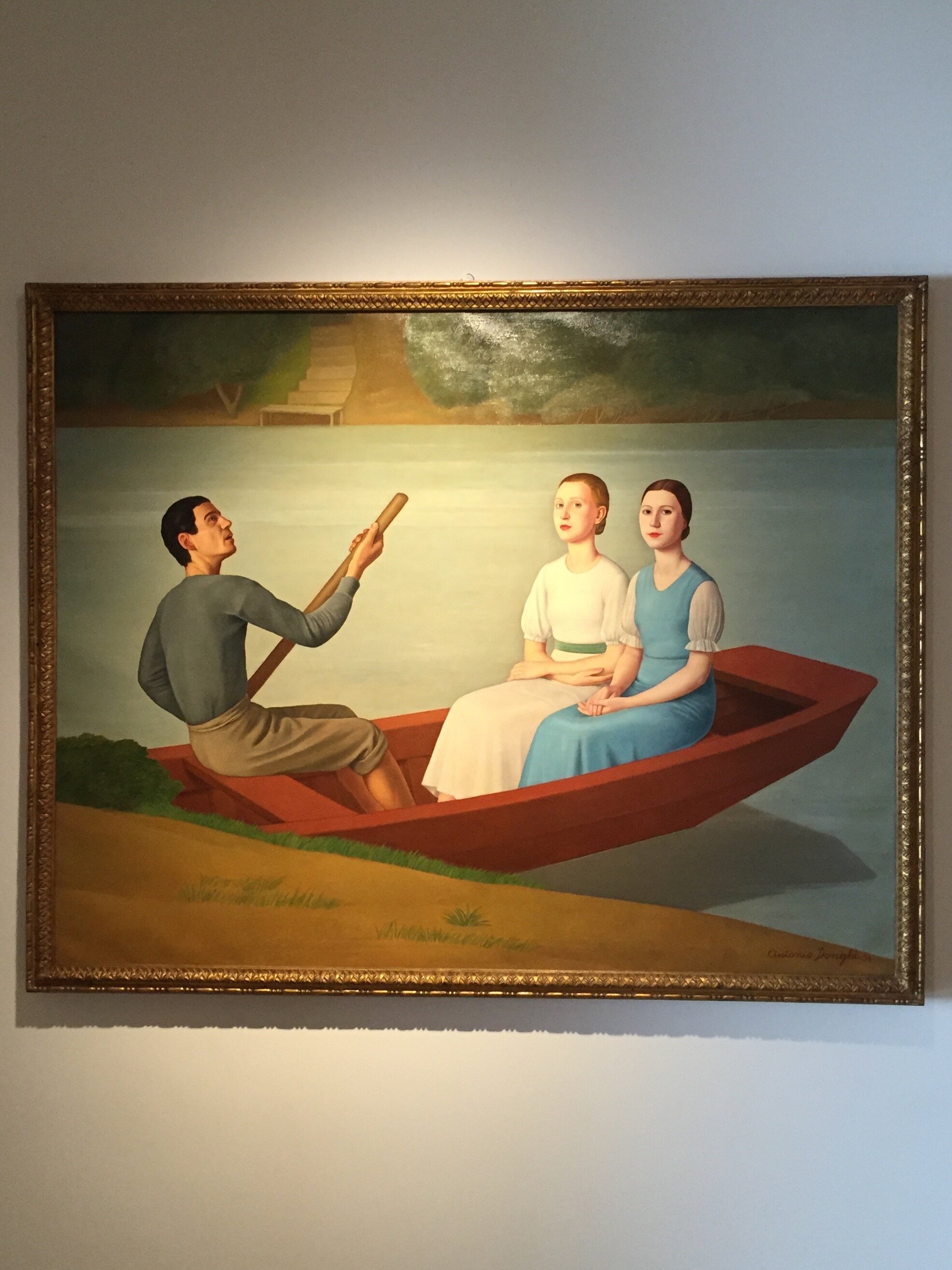
Palazzo Merulana, Rome
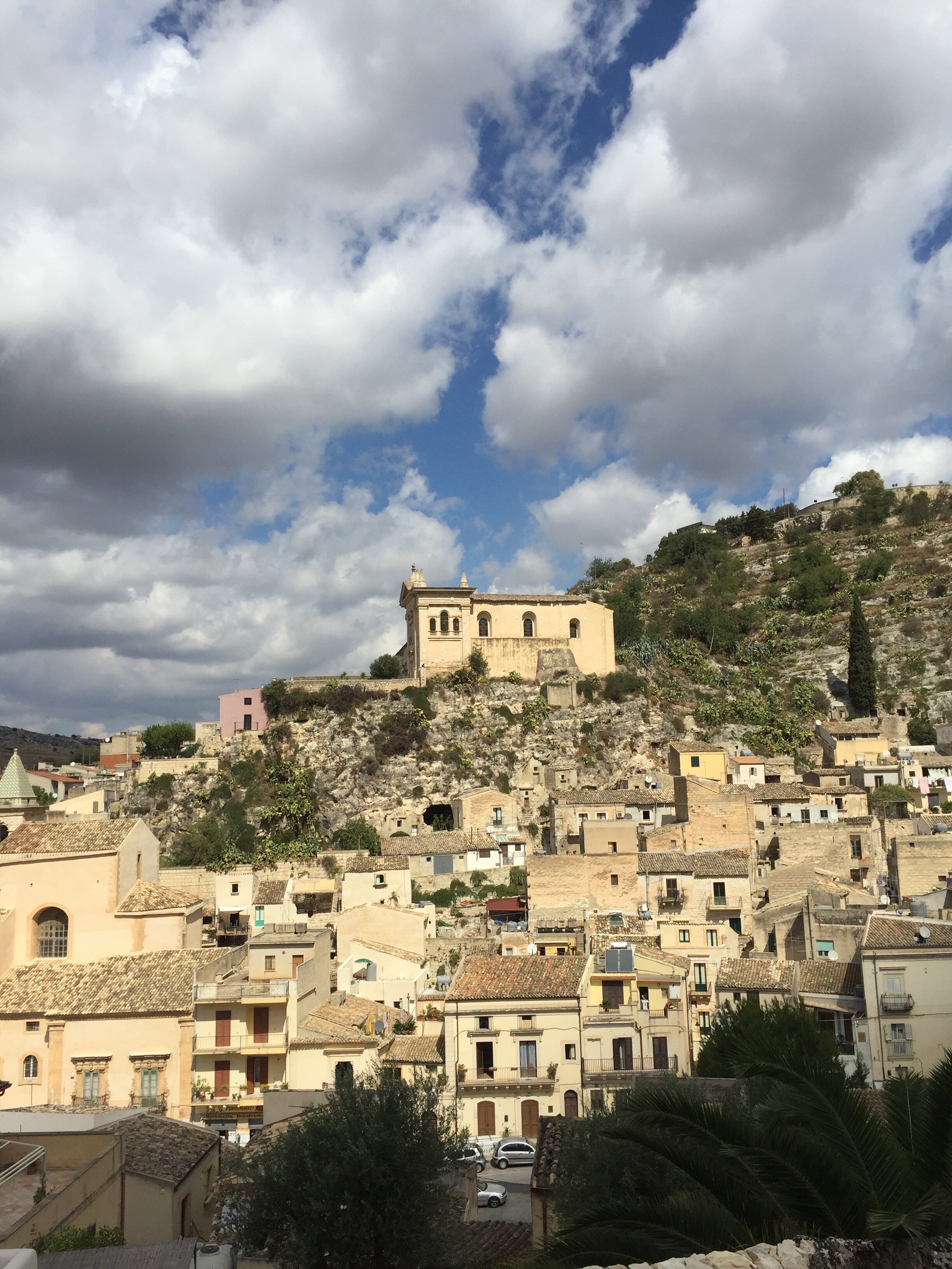
I noticed this large abandoned palazzo when I first moved to Rome. I wondered what the history of the building was and why it was falling apart.I found out that it was a city owned property built in 1929. It used to be the headquarters for the Health Administration. Once those offices moved, the building fell into disrepair with some sections abandoned for over sixty years.Palazzo Merulana reopened last month and it's a beauty. Stunning.The renovations took only three years and was a private-public partnership. The space now holds the important collection of Claudio and Elena Cerasi. The couple focused on works created in the early 20th century, with the majority between WW 1 and WW 2. The Cerasi family owns a prominent construction company that has worked on projects such as the MAXXI Museum and other public and private works.The Cerasi Foundation would like to see the Palazzo become an important space for visual art, cinema, music, and theatre. They're working closely with several local cultural orgnaizaions. This is quite a gift to the city.A ticket to see the exhibit is four euros. There's a small, charming cafe on the ground and outdoor seating on the patio. The terrace is schedule to open in mid-July and the top floor is reserved for cultural events. 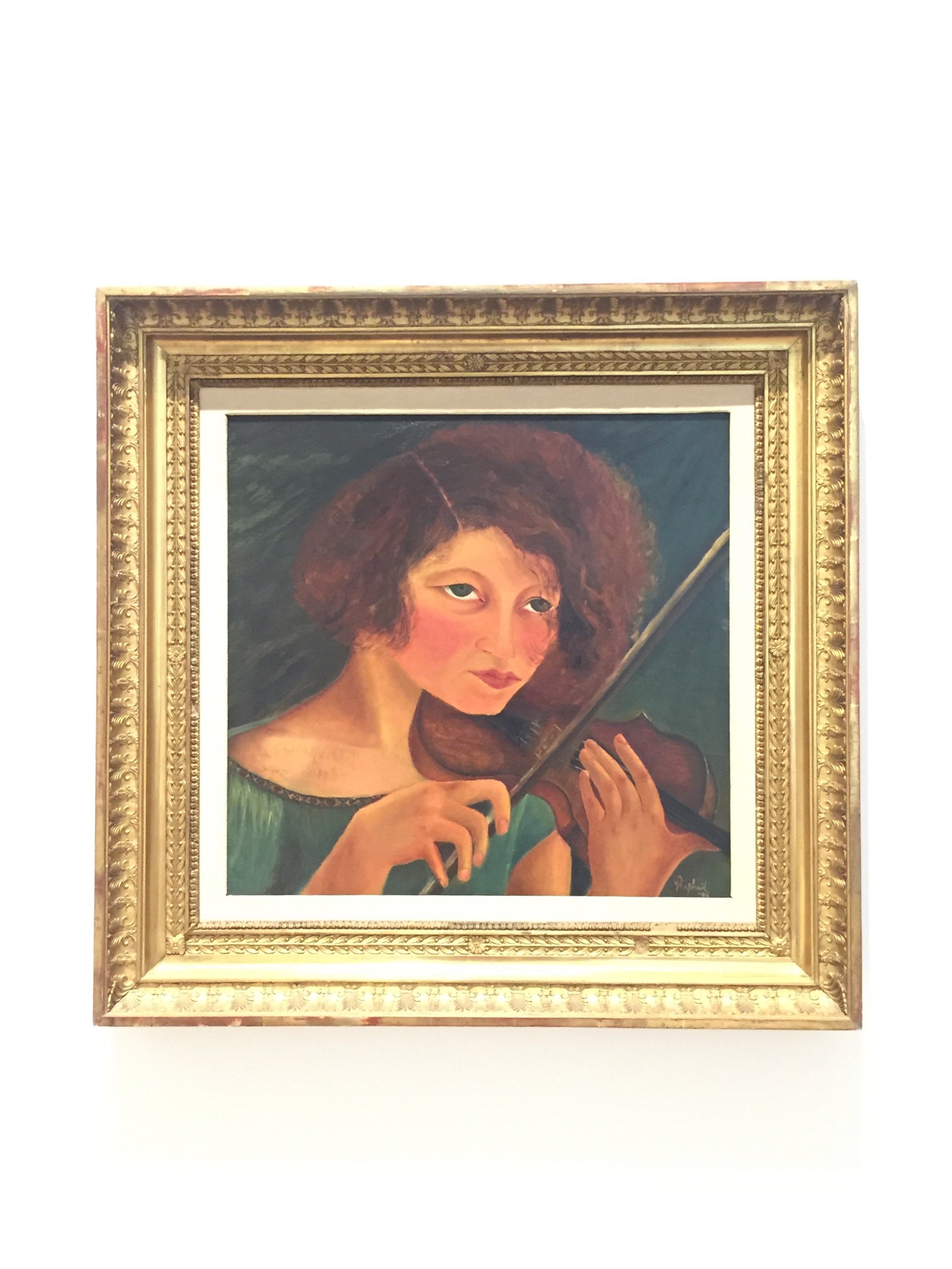
 Here is a short clip about the museum.https://youtu.be/SHw3vc-5fq0 The museum's in a very accessible location. It's about a ten minute walk from the Colosseum with easy access to the Metro and the Tram.121 Via Merulana, 00185, Rome
The Design Files - Ristorante Local, Venice
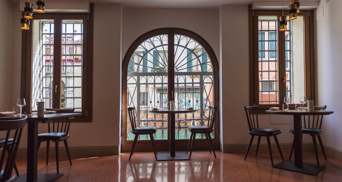
Yes, it's true that Venice has many tourist trap restaurants. Tourist traps don't care about the quality of their food (and love to over charge people) as it's a volume business, especially from the mega cruise ships. They will never see those tourists again and locals would never eat there.Do not let the bad press discourage you. There are fantastic places to eat in Venice! The restaurant Local is one of them. I'm not going to write about the food though (which was delicious) but about the interior design and overall vibe.The restaurant was opened in 2016 by brother and sister, Benedetta and Luca Fullin. The space used to be an electrical shop. It's located in the Castello neighborhood between Piazza San Marco and The Arsenale.The design like, the cuisine, is inspired by local traditional Venice but with a touch of modern international flavors.I spoke with Benedetta during our trip last month and she told they used local artisans to make, by hand, everything from the floors, to the dishes, to the lighting, etc.I absolutely love the Venetian Terrazzo floors.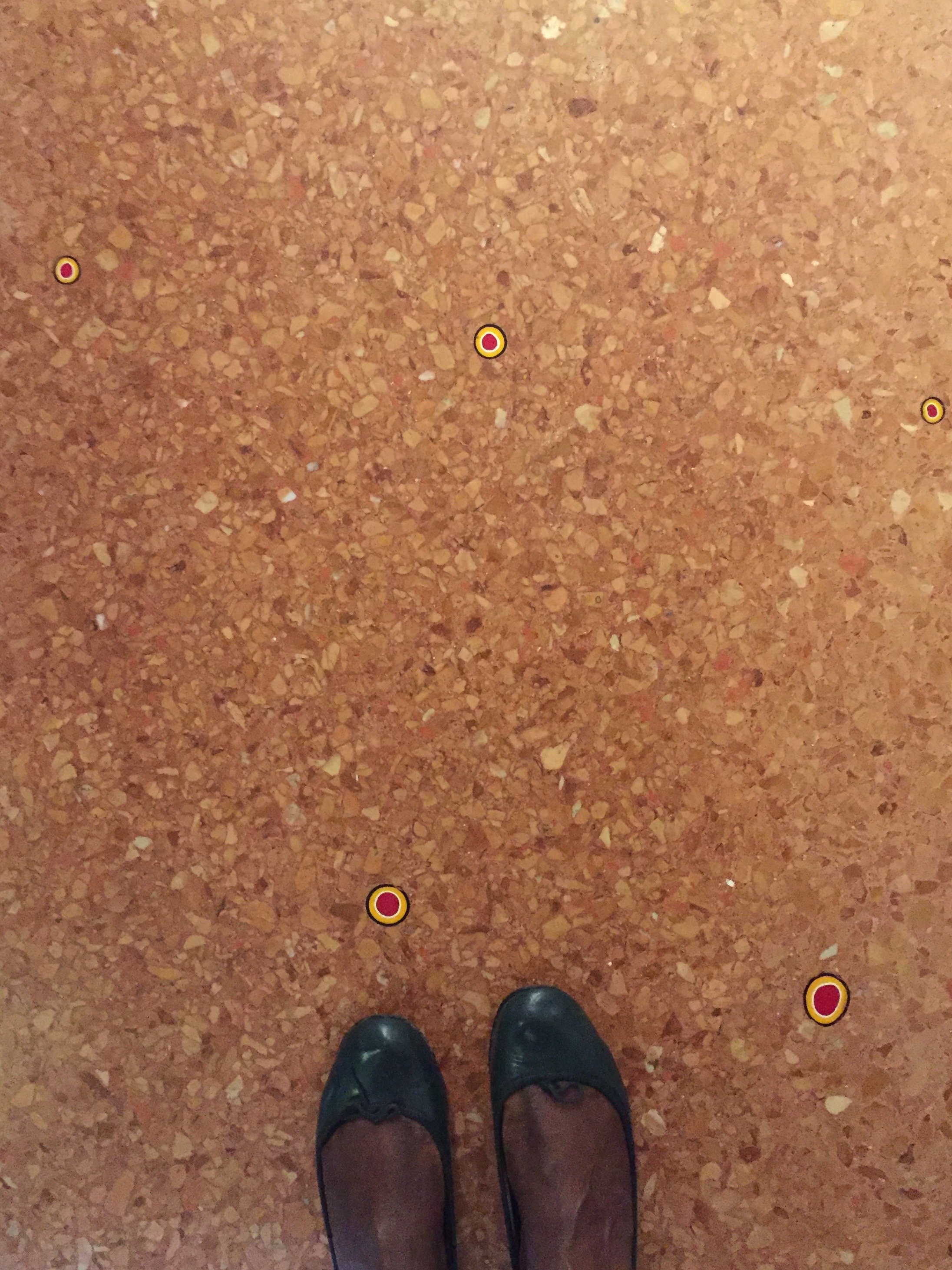 They were poured by hand and hold over five thousand murrine, which were handmade in Murano. The oak table, chairs, and wine cellar were made by Pasquini Marino.The open planned kitchen is inviting. It's not a cheap restaurant (our meals were included so checked prices online) but it's not stuffy either.
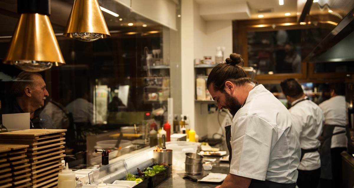 The restaurant sits on a side canal, light pours in.
 Local frequently showcases art, with a focus on emerging talent, from the Contini Art Gallery.It's not easy to find the right balance in a historic, popular tourist destination like Venice. Do you completely erase the past in order to stay current, or go in the opposite extreme? Local feels very much of its time and its location. I'm not a fan of eating in a restaurant that looks and feels generic. We eat with our eyes as well and the interior design and ambience of a restaurant shouldn't be overlooked. Living in Los Angeles, sometimes we had the reverse situation, gorgeous spaces that were very "in" but the food was indifferent to inedible.Twelve years had passed between my two trips to Venice. That's ridiculous. I'd like to return sooner rather than later. I look forward to returning to Local, grabbing a seat at the bar, and trying their cicchetti.

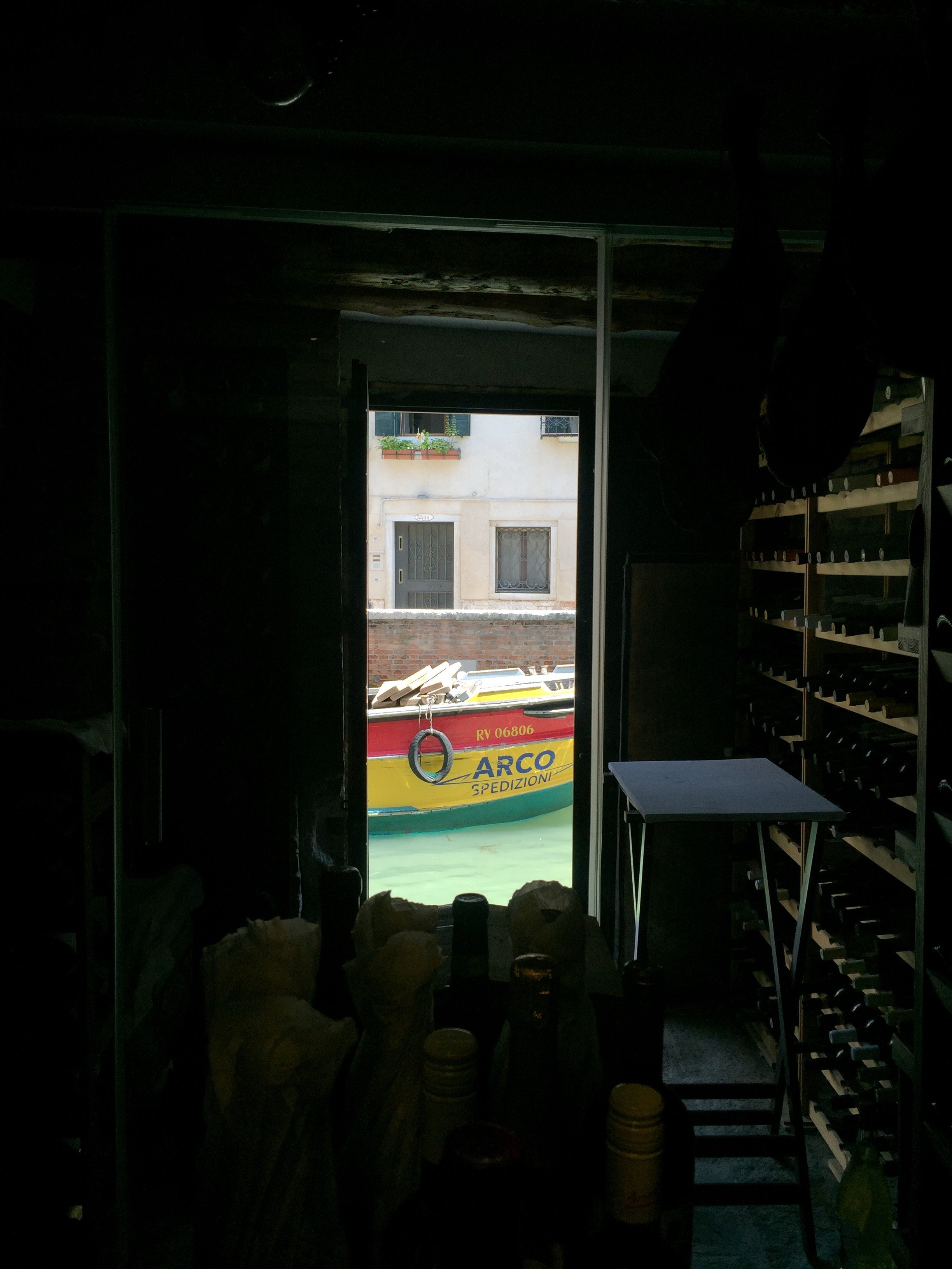
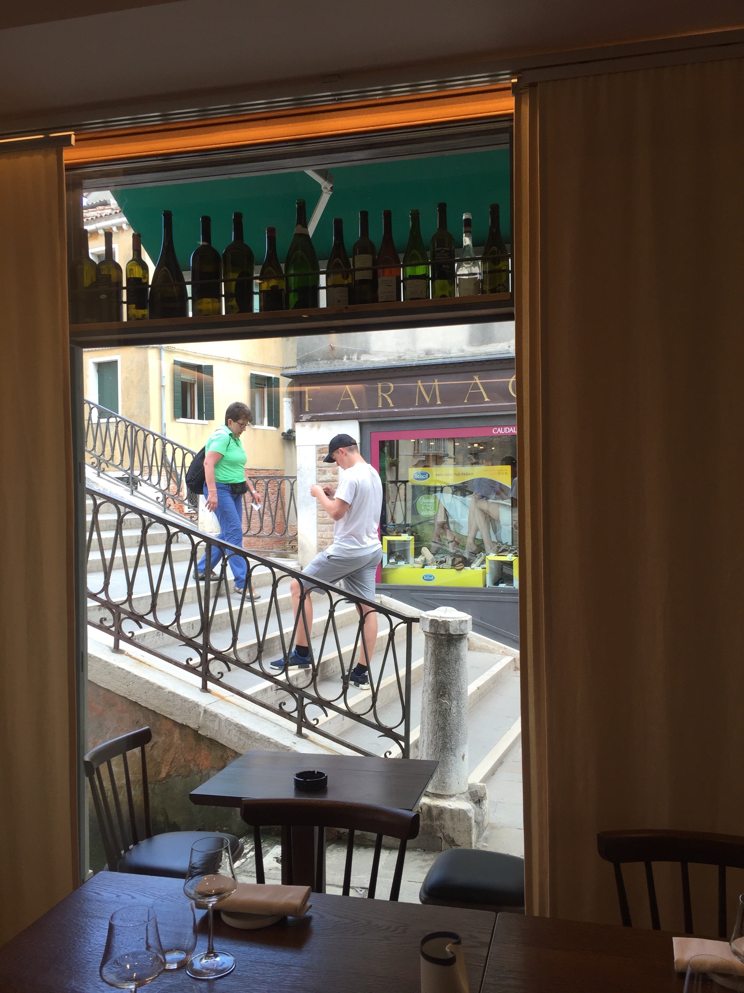 First photo and the last two photos: Me and my iPhone. Other photos: Ristorante Local
La Biennale Venice - 2018
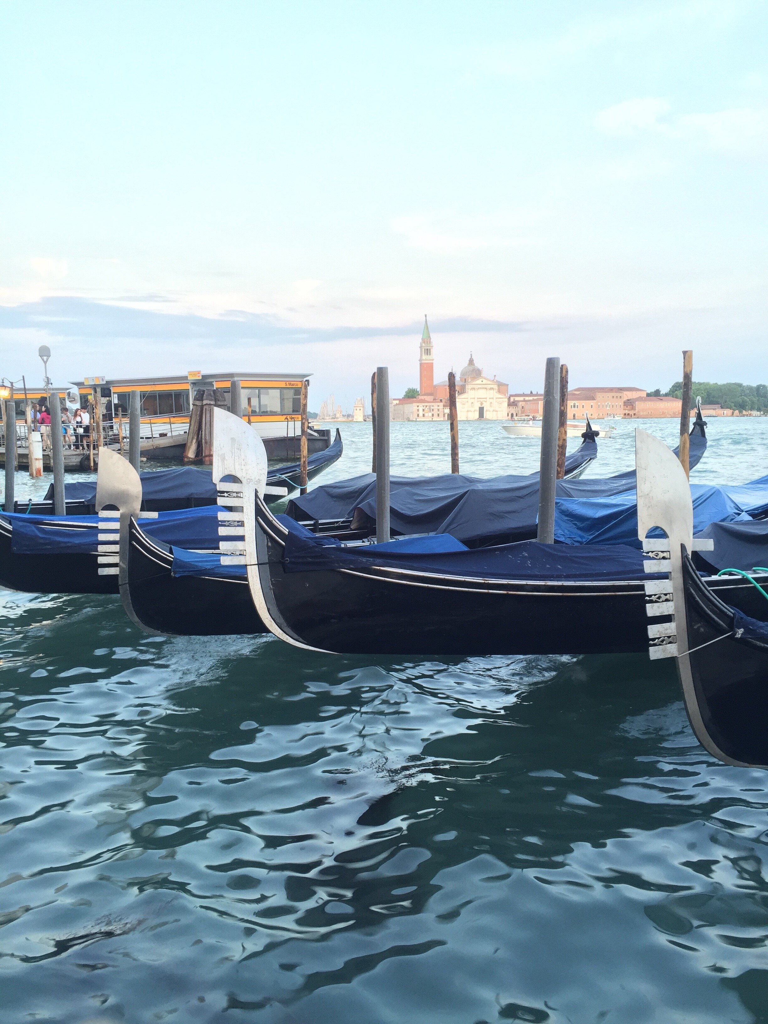
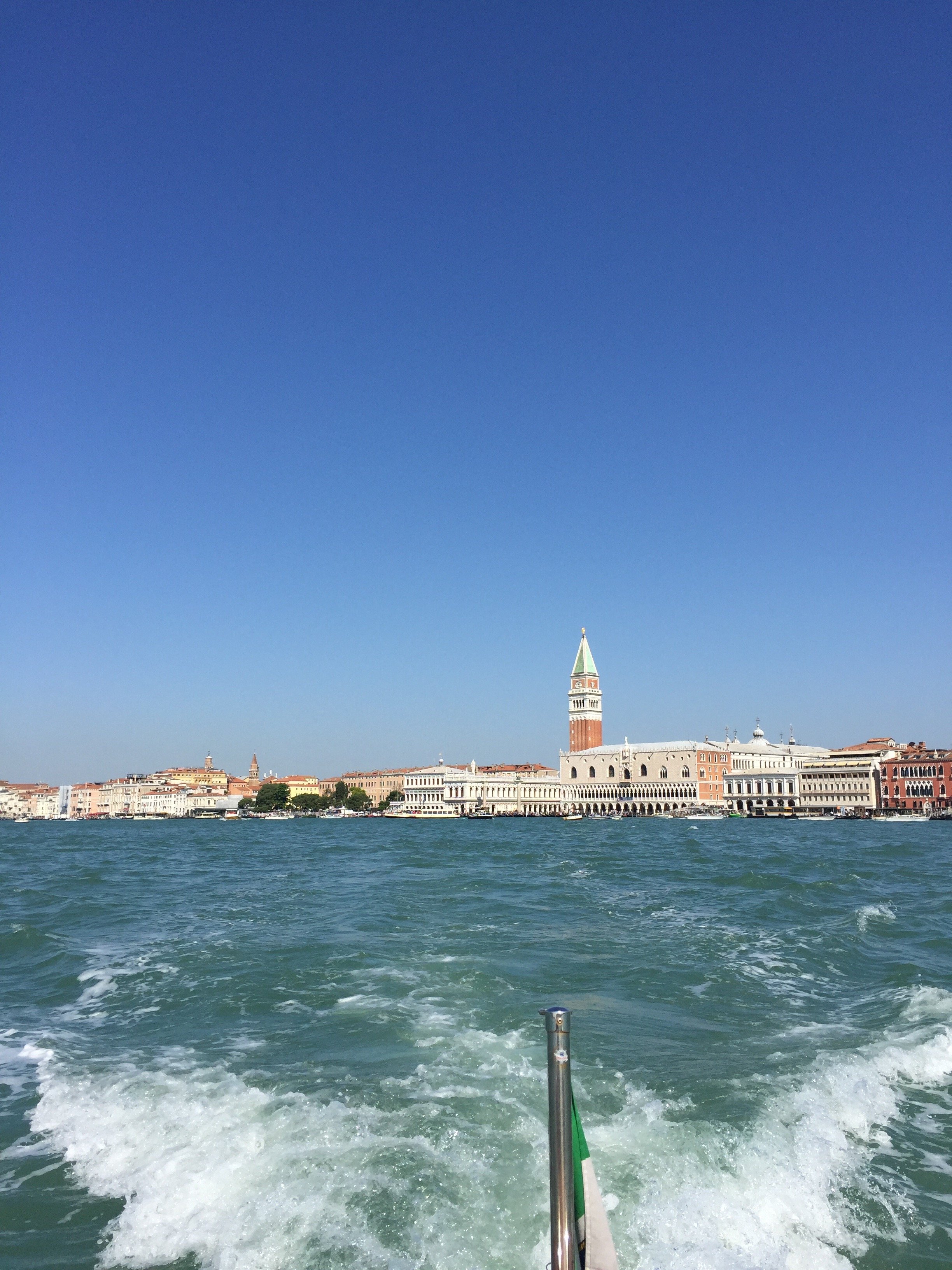
My friend Erica invited me to join her on a press trip for the preview of the 16th Architecture Biennale. I haven't been to any of the Biennale. I follow the art, cinema, and architecture ones on social media but it's not the same. My first (and last) trip to Venice was twelve years ago, late November. Even during off-season, the crowds in the Piazza San Marco area were quite large. The experience did not prepare for last week. More on that later.We were in Venice for only two days/one night. I would love to return to see the Pavilions I missed. Erica has a great write-up on her Instastories.Normally, we'd take a train from Rome but we had to get there in time for the press conference so we placed on a 7:00 am flight. A private boat picked us up. Not a bad way to enter the city. We had a few minutes before the press conference and met the other journalists/architects and their guests. It was a small group, only twelve of us, half were from Milan. Our hosts were wonderful and, my fellow Americans will feel me on this, I couldn't get over how organized everything was. One of the hosts flew from Milan to Rome to meet us on the flight to make sure things were on point.The theme this year is Freespace. The curators are architects Yvonne Farrel and Shelley McNamara of Grafton Architects.
After the press conference we walked over to Local, which was fantastic. It's owned by siblings Benedetta and Luca Fillun and used to be an electrical shop. I spoke more Italian in a day than I have in probably two months.We returned to the Arsenale for a guided tour of the Corderie. From there we were able to see a few pavilions before going to the hotel to check in. My favorite pavilions were the Kosovo, Canada, Italy, Bahrain, Italy, and Croatia Pavilions. I wish I had more time to spend in each one.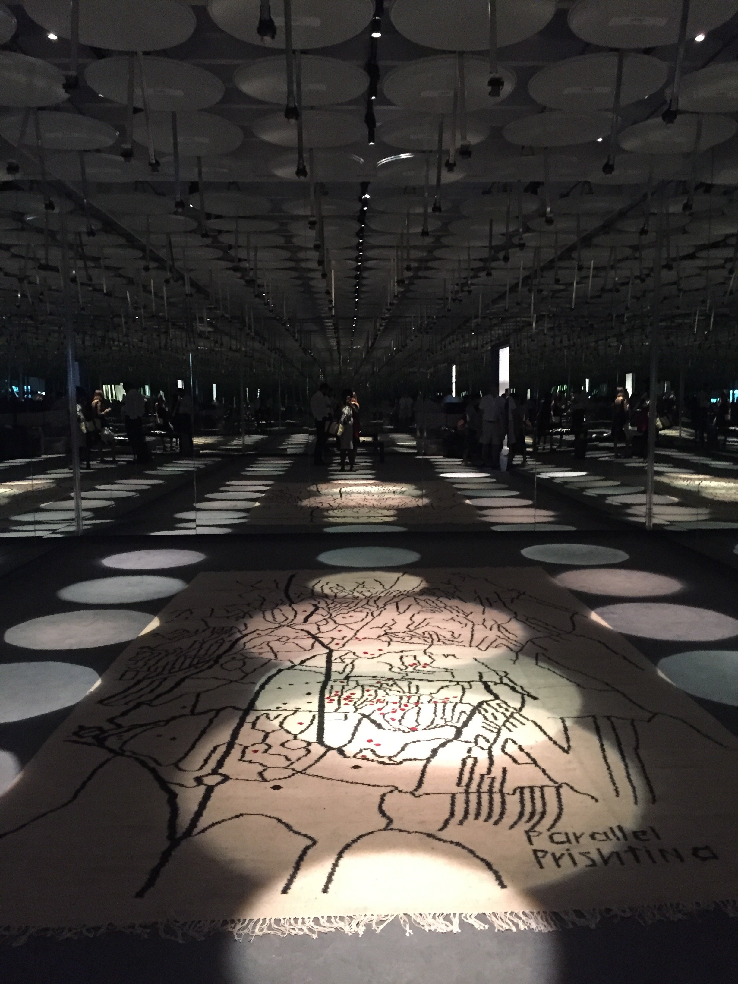 Erica and I decided to walk toward Piazza San Marco instead taking the boat. I was NOT READY. Remember, I've never been to Venice during high season. The crowds were on another level. I keep reading about the crowd situation but it's another thing to experience it. 28 million tourists visit Venice a year. Only 55,000 people live in Venice full-time, down from 175,000 post WWII, with around 2000 leaving every single year. AirBnB has pushed the rents sky high, and mass tourism from mega cruise ships turn streets into packed corridors during the day and desolate at night. I don't know what the answer is but this type of tourism is not sustainable.We stayed at the Bauer Palazzo and I was happily surprised to see that we had a terrace. The service was impeccable. It could be because we were with a group of journalists and architects.
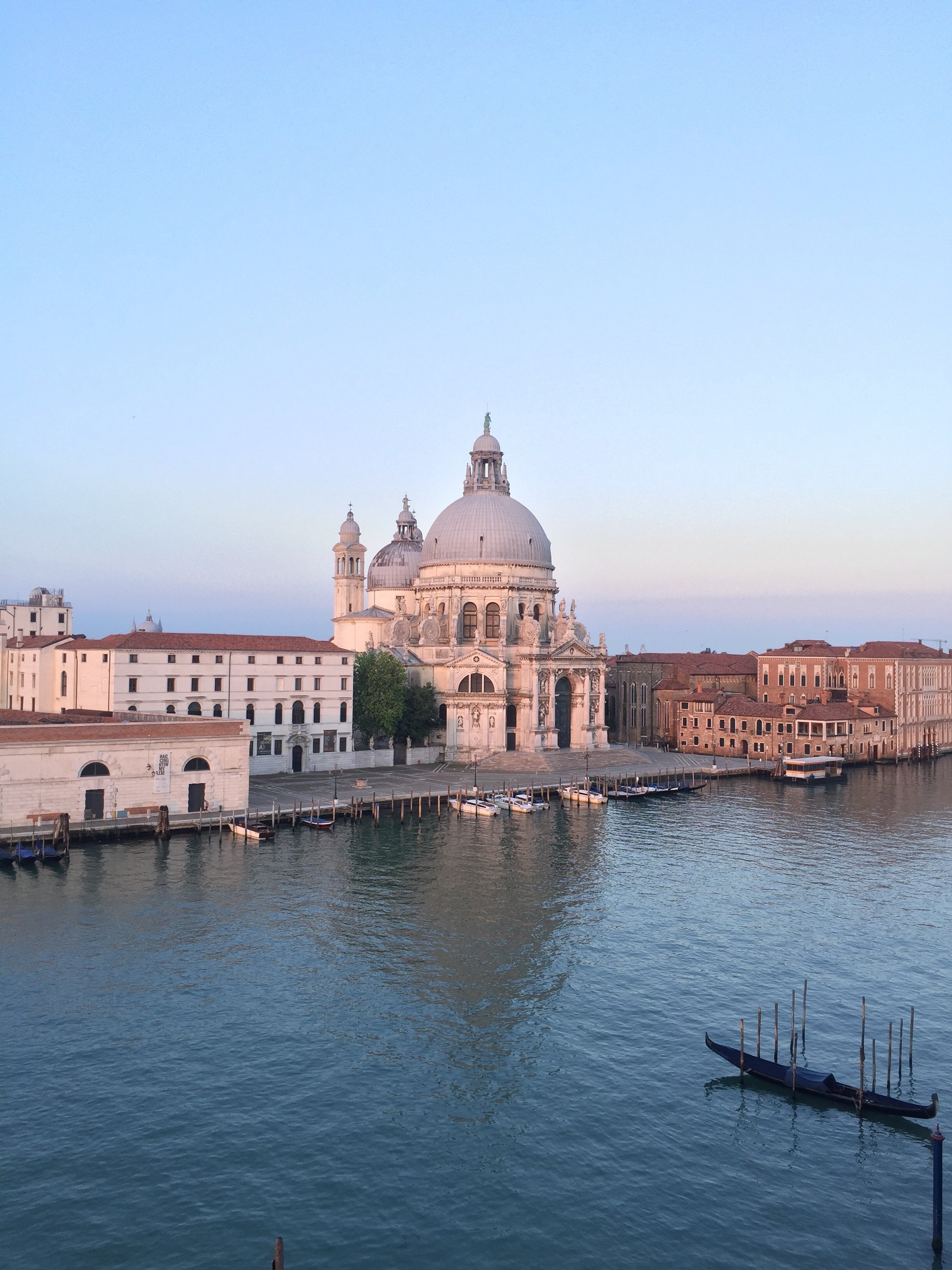 As we unpacked and got ready for aperitivi I noticed a chic terrace, a floor higher, on the building next door. I asked the bartender if it was a hotel bar. He said no they were preparing for a private party. I had no idea it was the party we were going to attended. It was a little overwhelming. There was were heavy hitters from the design/architect world and folks were not playing sartorially. The Hugos, and views, were divine.
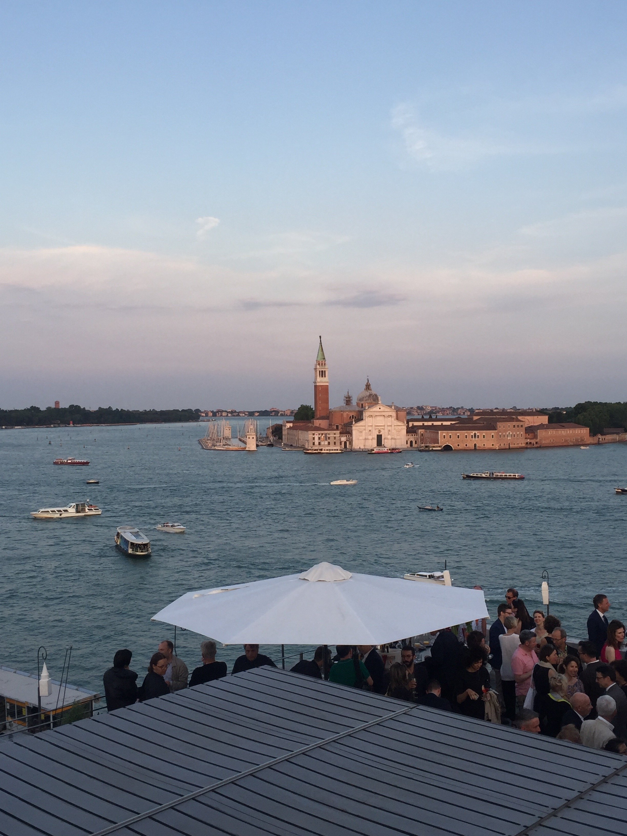 Post- reception, we had dinner on the patio of the hotel with canal view. During dinner I hear suddenly heard loud gasps. I looked to my left and saw a mega cruise ship rolling into the canal. It dwarfed the buildings. I have no words. Perhaps I'm hyper sensitive to these ships as I've seen what they've done to the quality of life for residents of the island of St. Martin/St. Maarten. I strongly believe the cons outweigh the pros.I woke up at the crack of dawn to jog and it was glorious. The city was quiet, with Venetians going to open their shops and getting ready for the new day. There were a few other tourists out jogging and some taking photos. I got lost in the side streets running toward the Rialto bridge. I didn't mind. It's surreal to be in a city where there are no cars, buses, etc. everything is brought in, and leaves, by boat. I understand why this special city has inspired writers, artists, and artisans for generations. It's a damn shame that it's being destroyed.
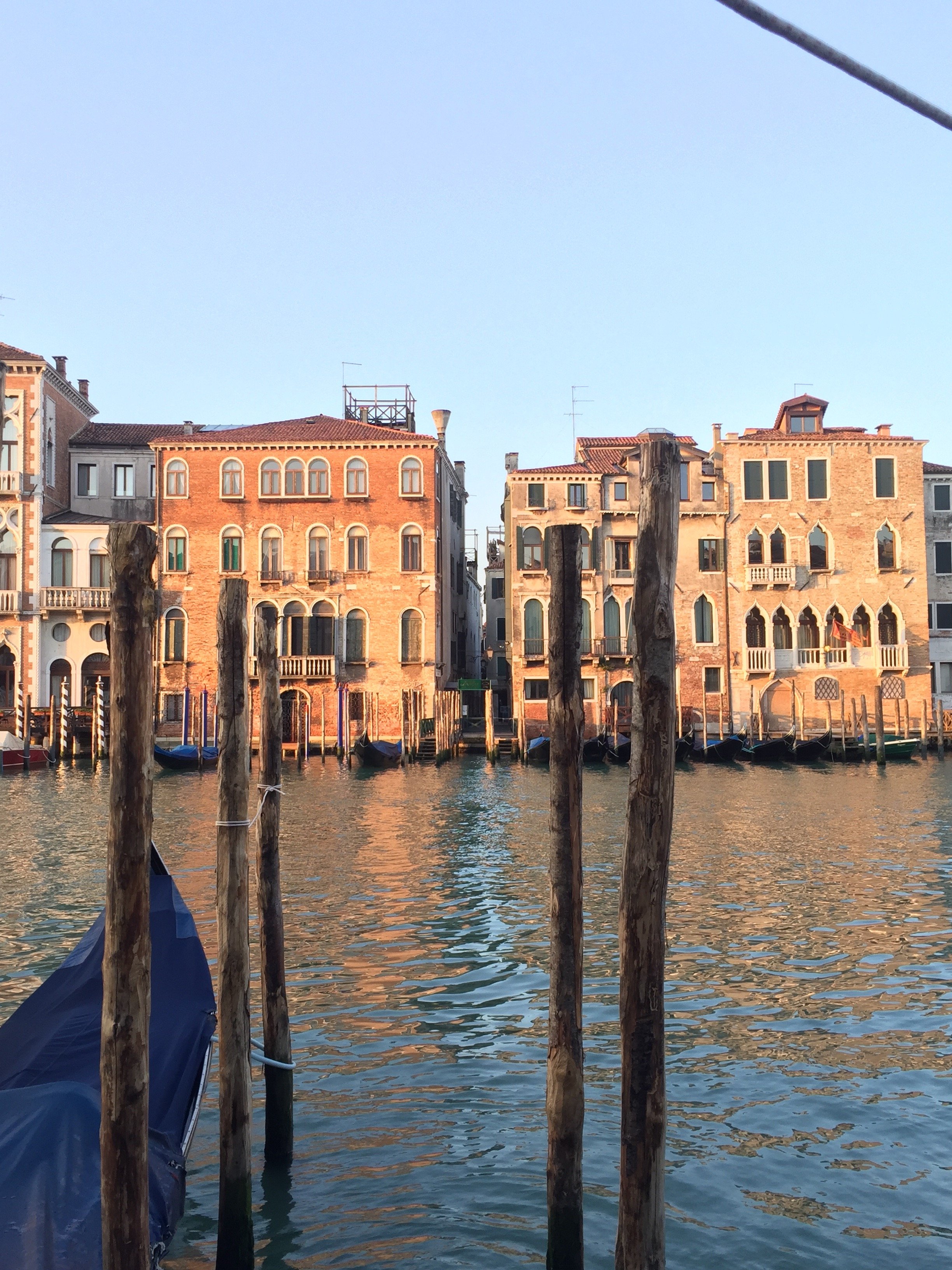
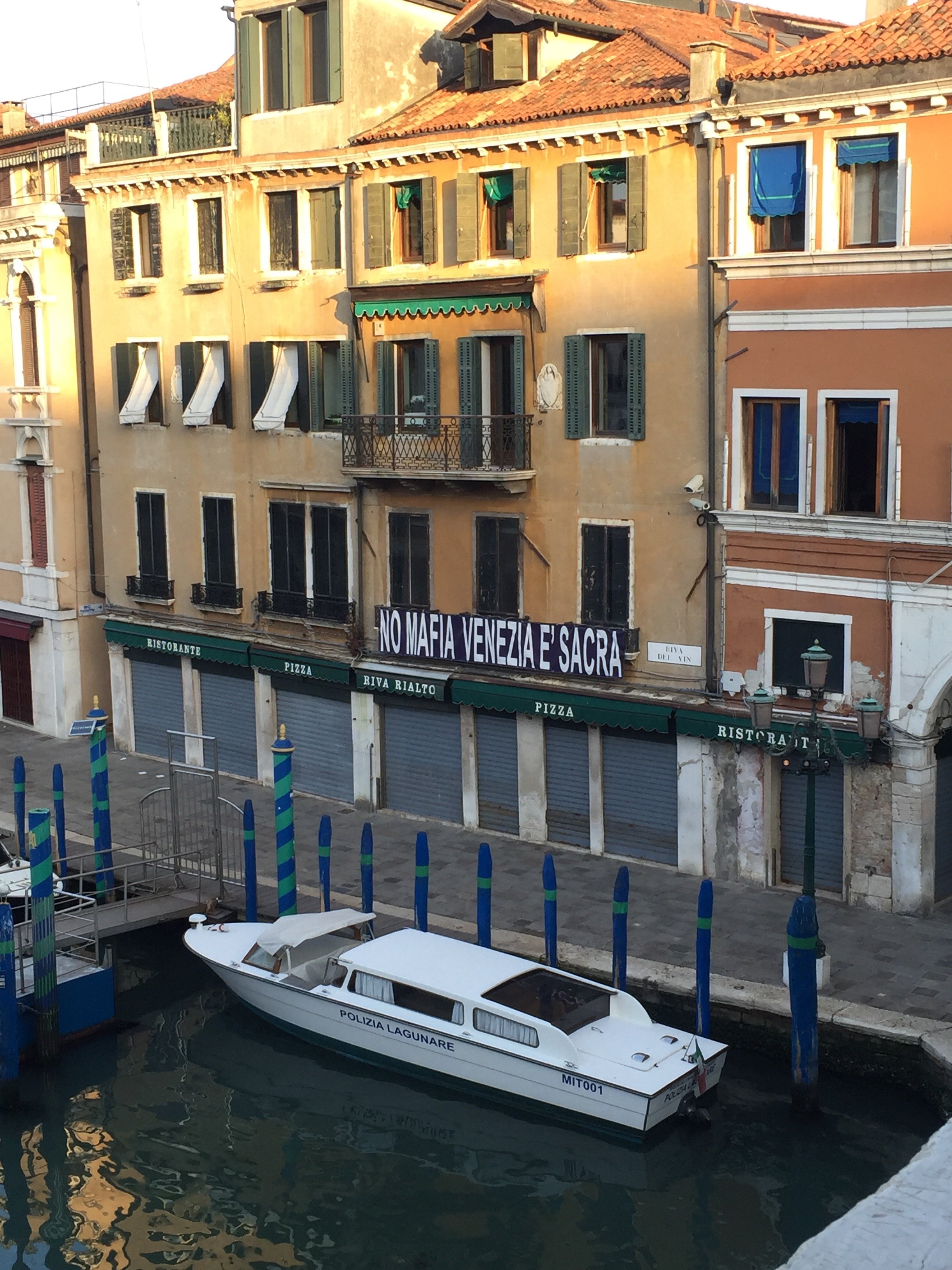
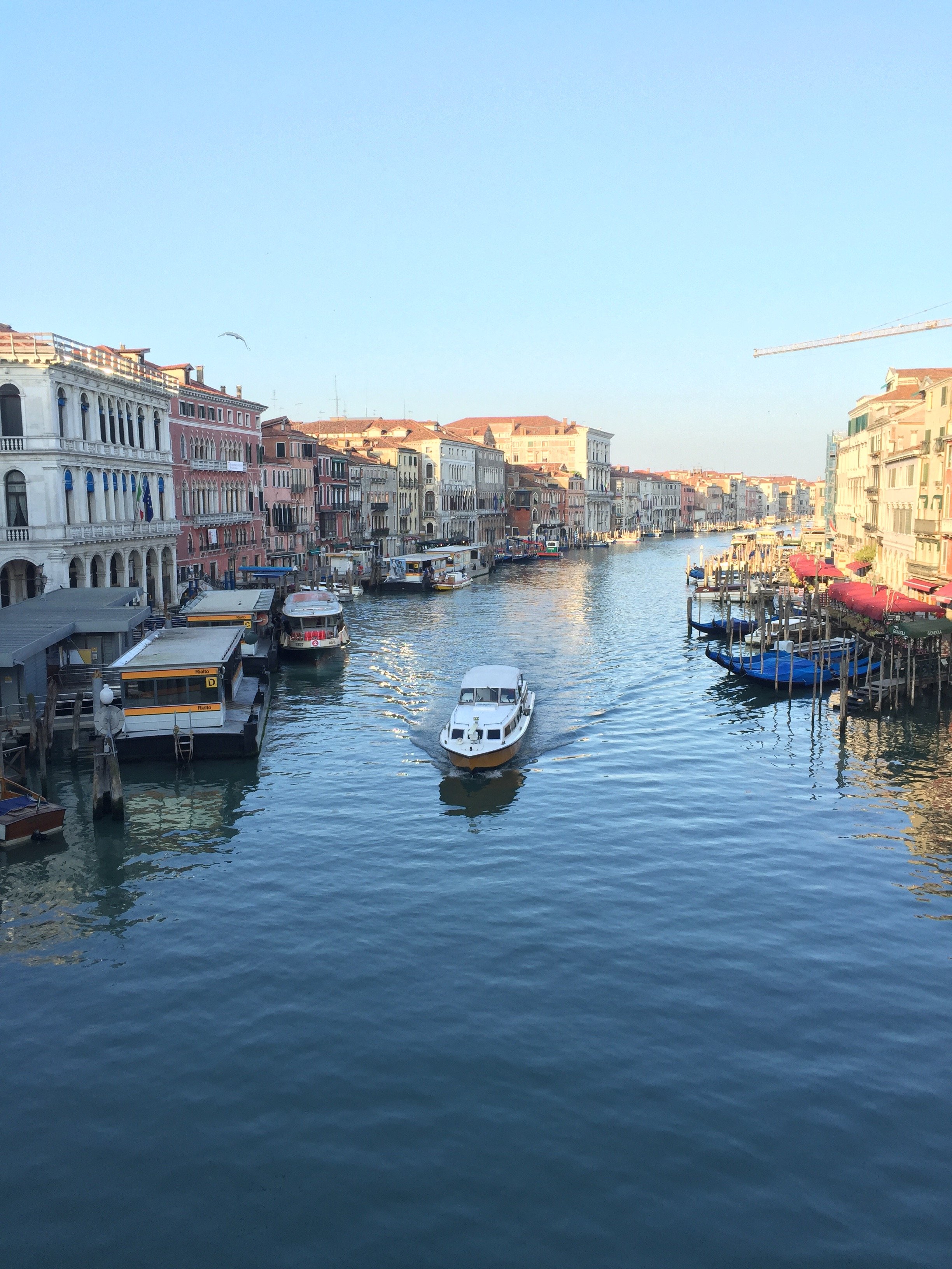 Erica and I had a delicious breakfast on the Bauer's rooftop terrace. We were picked up (on time!) and took a our boat to the Giardini (the gardens) to see more pavilions.
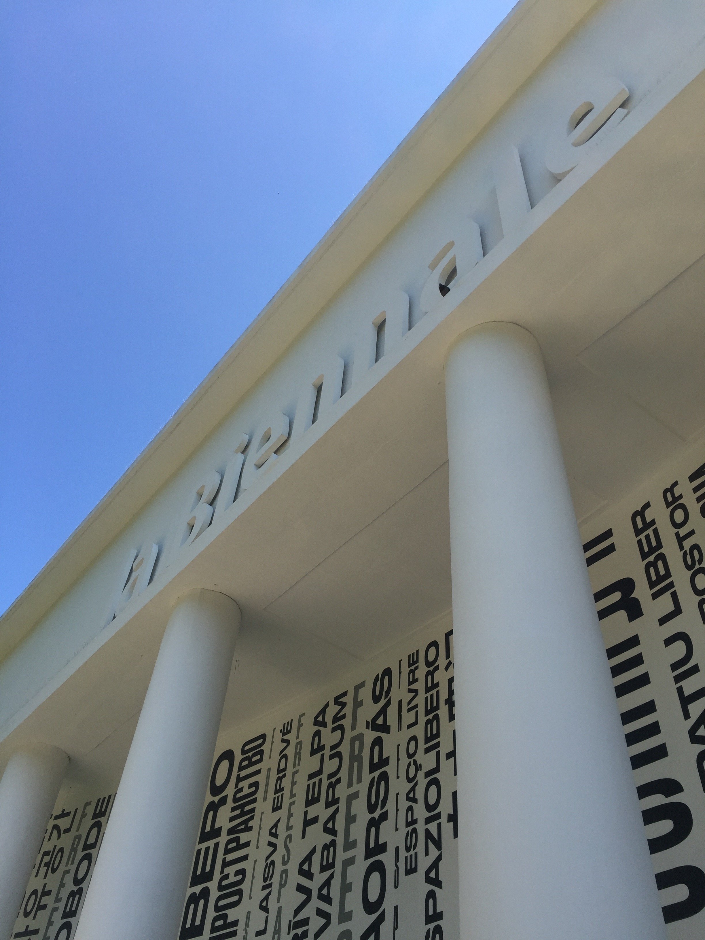
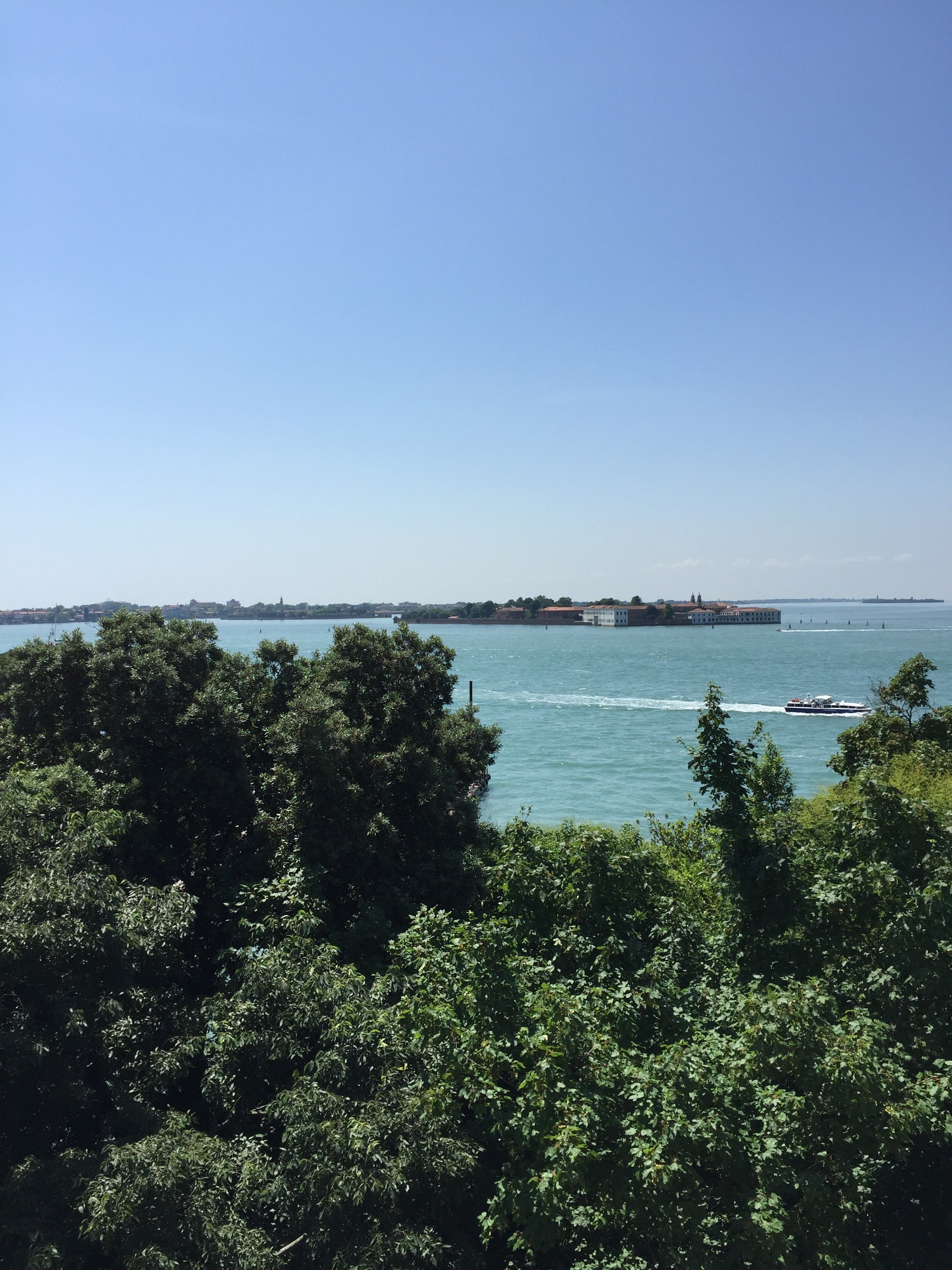
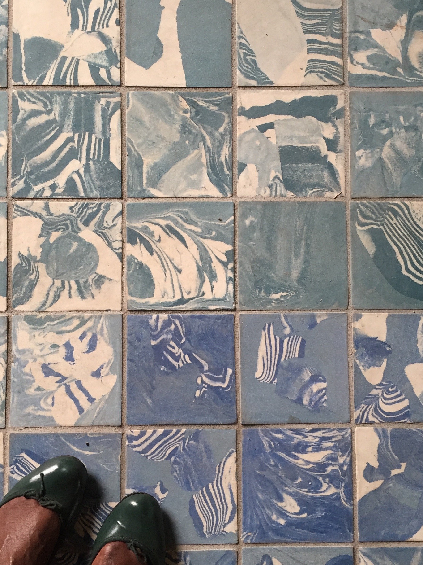 We had a guided tour of the Main Pavilion. I highly recommend checking it out. There was a very interesting scale of the NYC Project, one for a Los Angeles project, and several short films. Then we were on our own to see the rest. I have to say, I was fading fast. There was so much to take in. I missed many pavilions that I wanted to see, like Switzerland, and Antique & Barbuda. There wasn't enough time. Of the ones I made it to, America, Nordic (Finland, Norway, Sweden), Russia, France, were stand outs. I loved the roof top deck of Great Britain and France's wine set-up was very clever.
 The Russian theme was about train travel and how the largest country in the world is impacted by it. There are areas that are inaccessible by train and the country spans a few timezones, There was a short film, SEVEN DAYS IN SEVEN MINUTES, regarding a man's 9,300km/5780 miles train journey to Siberia. The Pavilion was transformed into a train station with several multimedia exhibits.The Nordic Pavilion dwelt with climate change. Visually this was one of the most interesting pavilions. The large balloons inflated and deflated depending on changing environmental conditions.The American theme was Dimensions of Citizenship, which really resonated with me. There was a fascinating short film, IN PLAIN SIGHT, that used data from global space sensors showing us how humans have organized our planet. It touched on last year's hurricane season and the difference between Houston's recovering and Puerto Rico's. I was blown away by the places that had large population but no lights, and other spots with a large electrical grid but it was used only for tourists or farming.We ended our trip with an delicious outdoor lunch at Corte Sconta. Corte Sconta means, "hidden courtyard". Our meals were included in the trip so I cannot tell you how the prices were. I get the sense that Corte Sconta was the pricier of the two but it wasn't stuffy.It was hot and walking over ten miles in one day got the best of me. By the time I had to meet our group, I was completely exhausted not really physically but it was information overload. It was a lot to process.It's an incredible experience and it was unique to have these conversations in a city like Venice. I was inspired by the architects and designers I met, the Pavilions, and of course the city itself. Grazie mille, Erica.To see more photos and videos from our short trip, I've saved them in my Instastories.The 16th International Architecture Exhibition runs until November 25th, 2018.
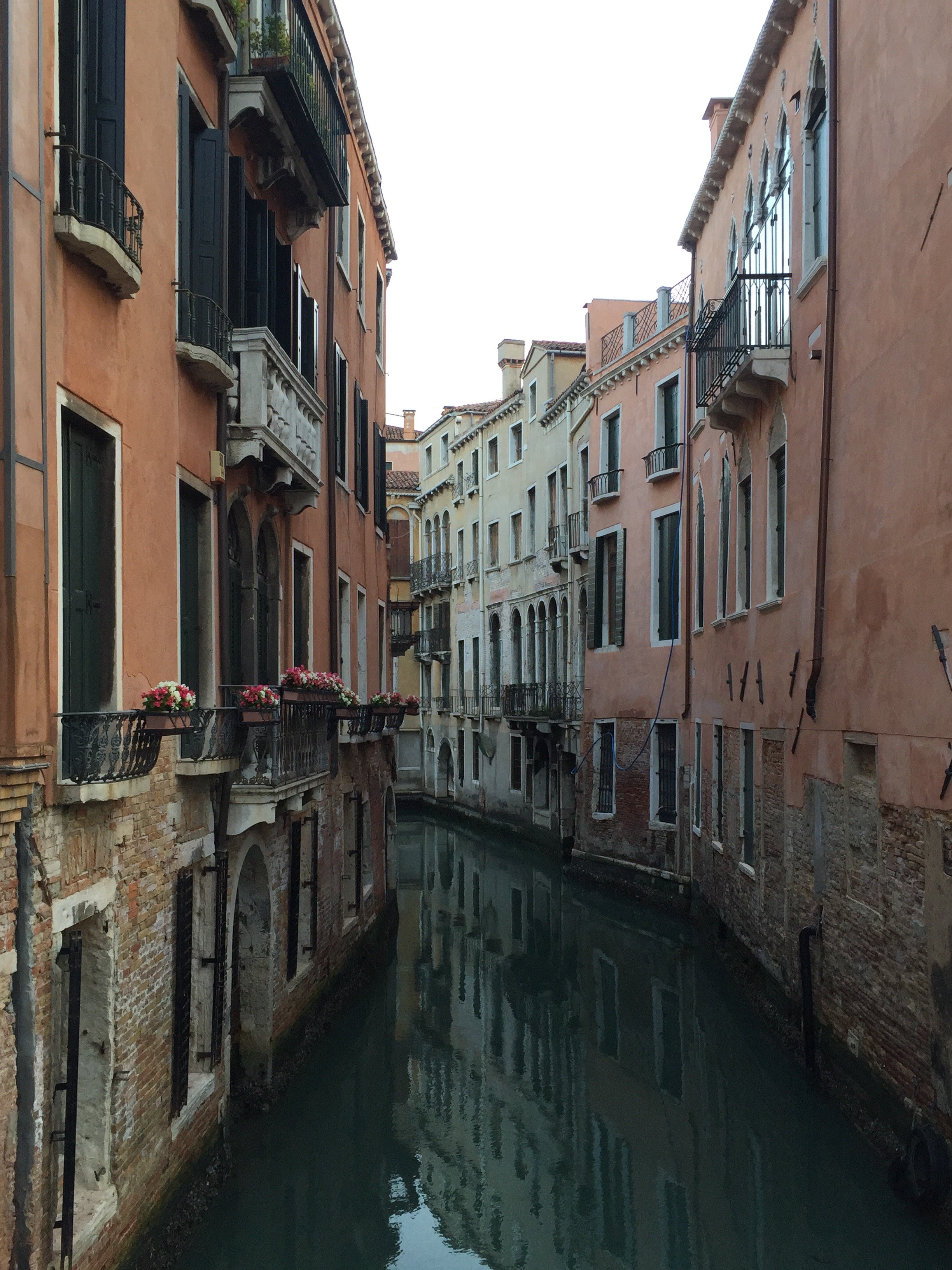
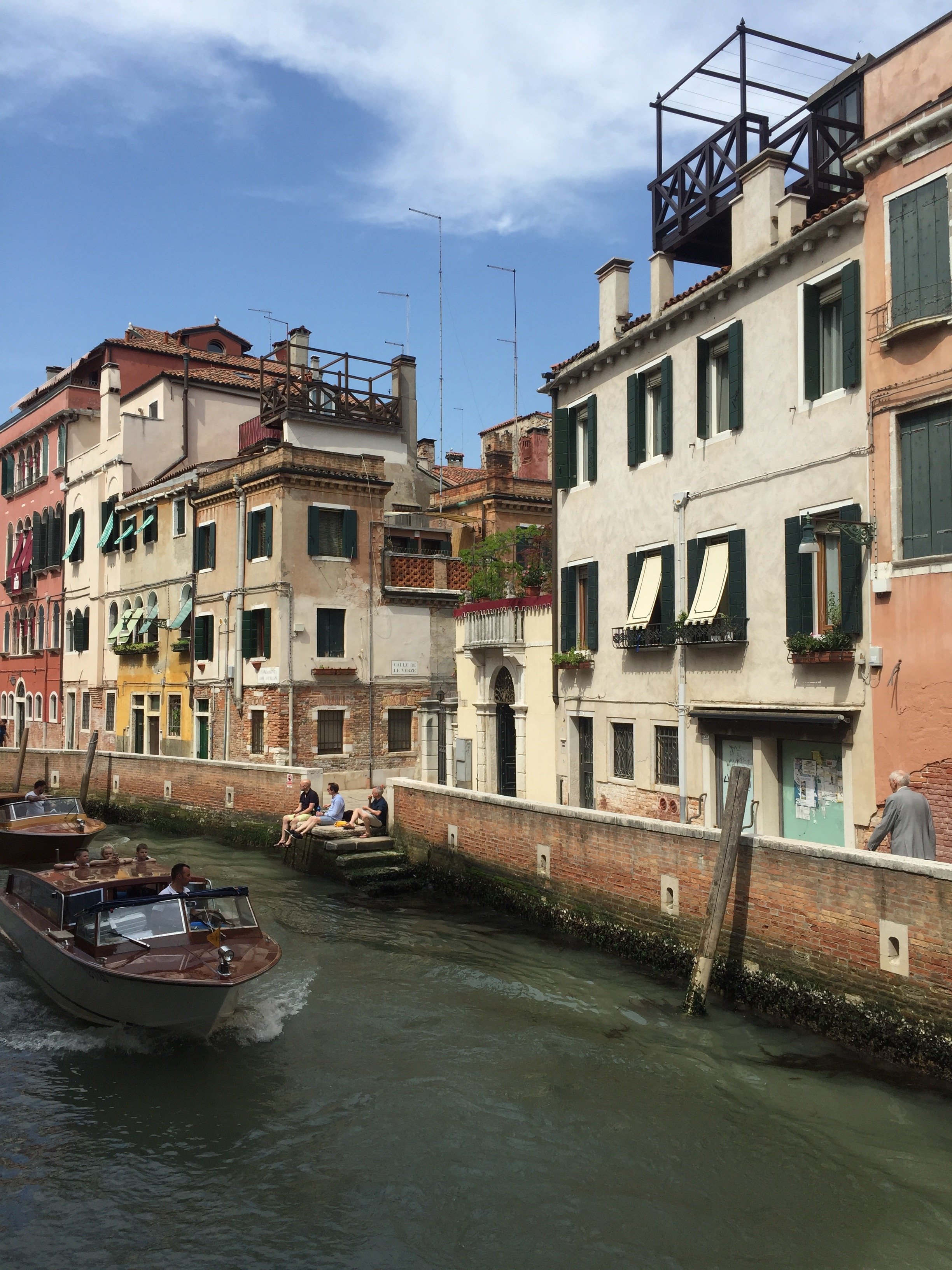

Montepulciano - Under A Tuscan Sun
The other week, my friend Michelle and I decided to meet in Chiusi for lunch and then take the train to Montepulciano, a hill town in southern Tuscany near Siena.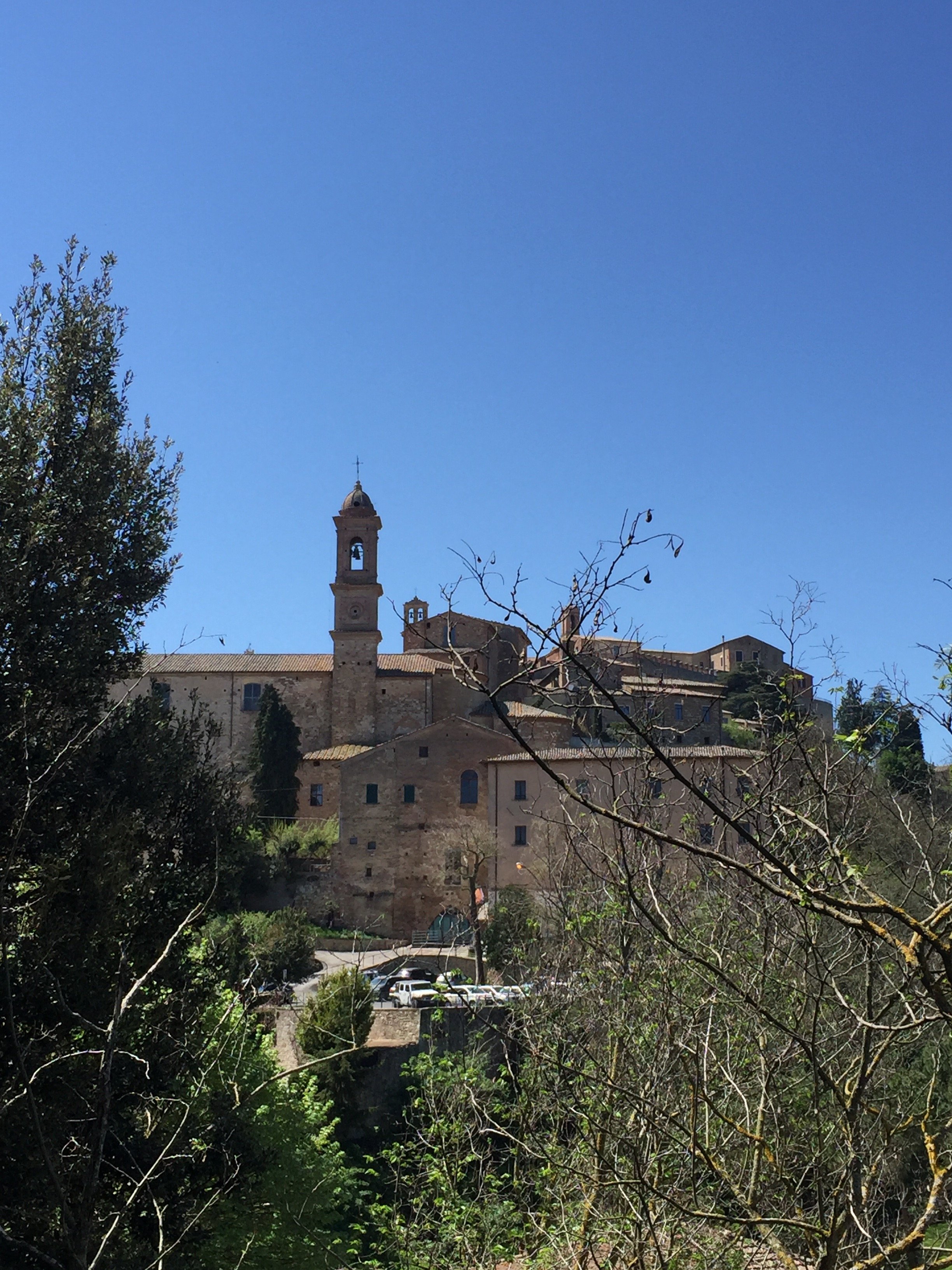 Michelle lives in Florence and Chiusi was the prefect half-way point. However, once we were in Chiusi we saw the sporadic train schedule and noticed that there was a bus leaving in thirty minutes. We took it.It was great move as we later found out that the train station is quite a distance from the hill town. The bus dropped us off right at the bottom of the hill.I've been to Montepulciano once before on a New Year's Day. It was freezing, packed with tourists, and quite a few places were closed for the holiday. Our day trip was the perfect time to go. It's wasn't too crowded and the weather was glorious.
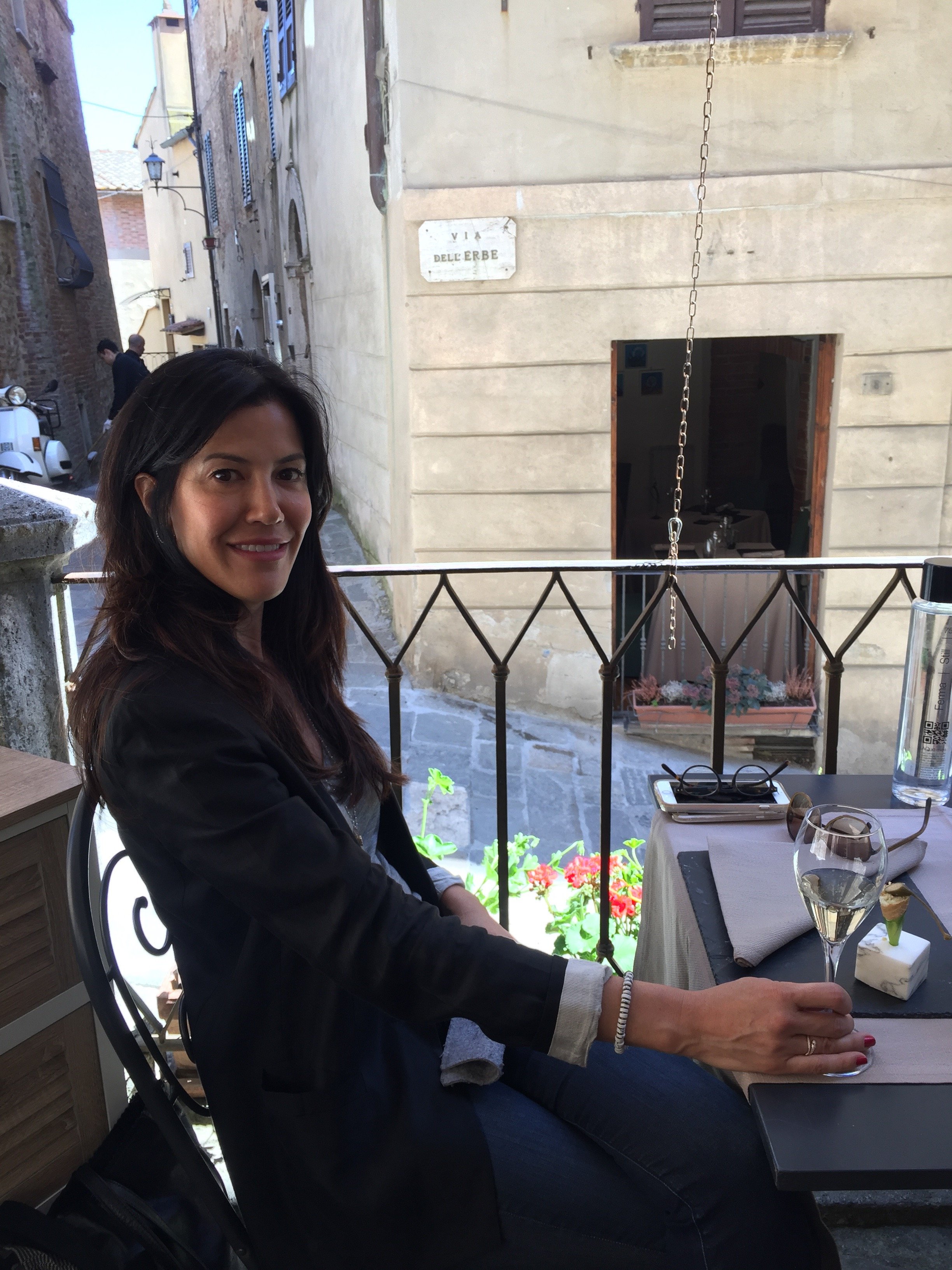
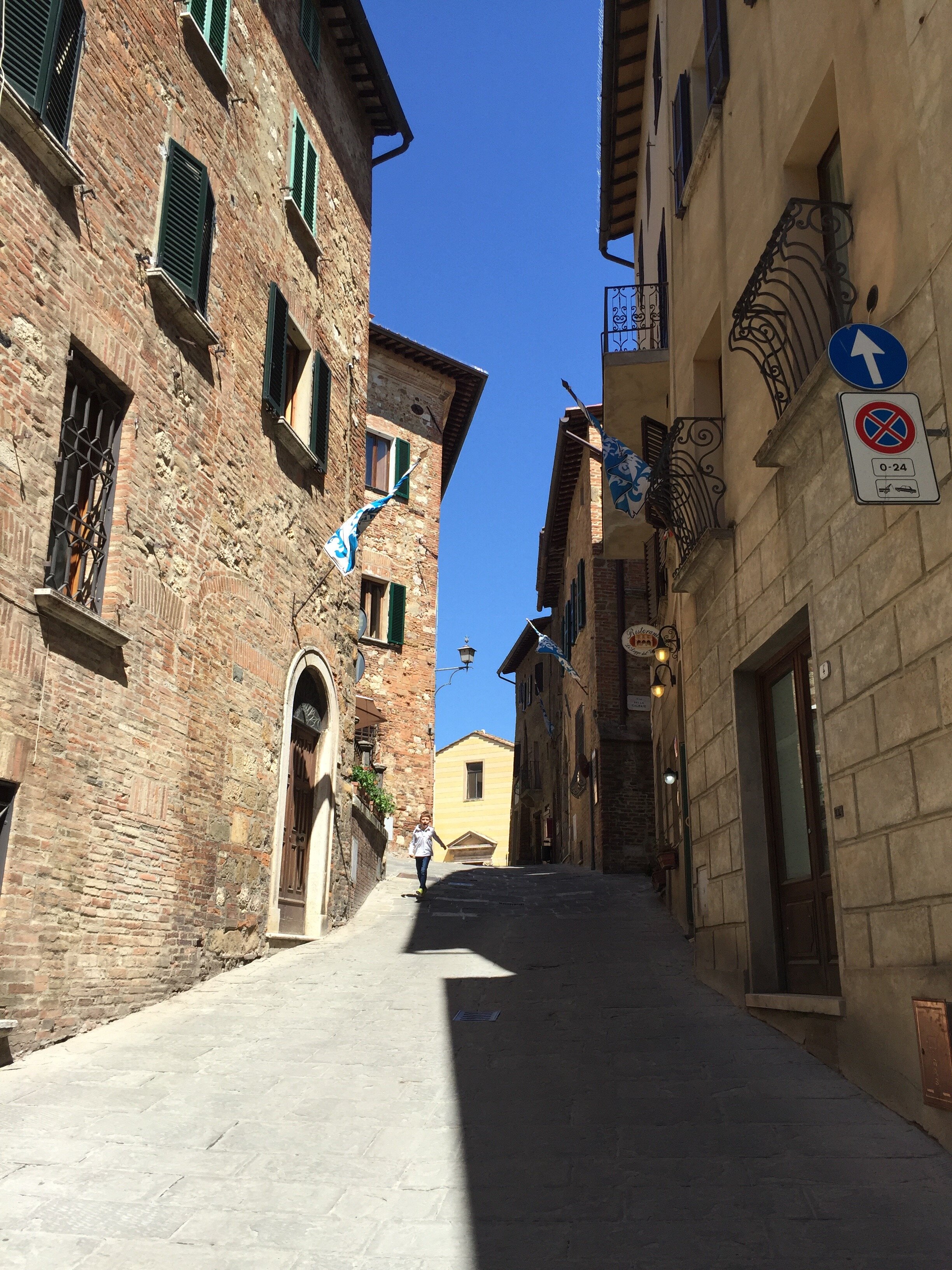
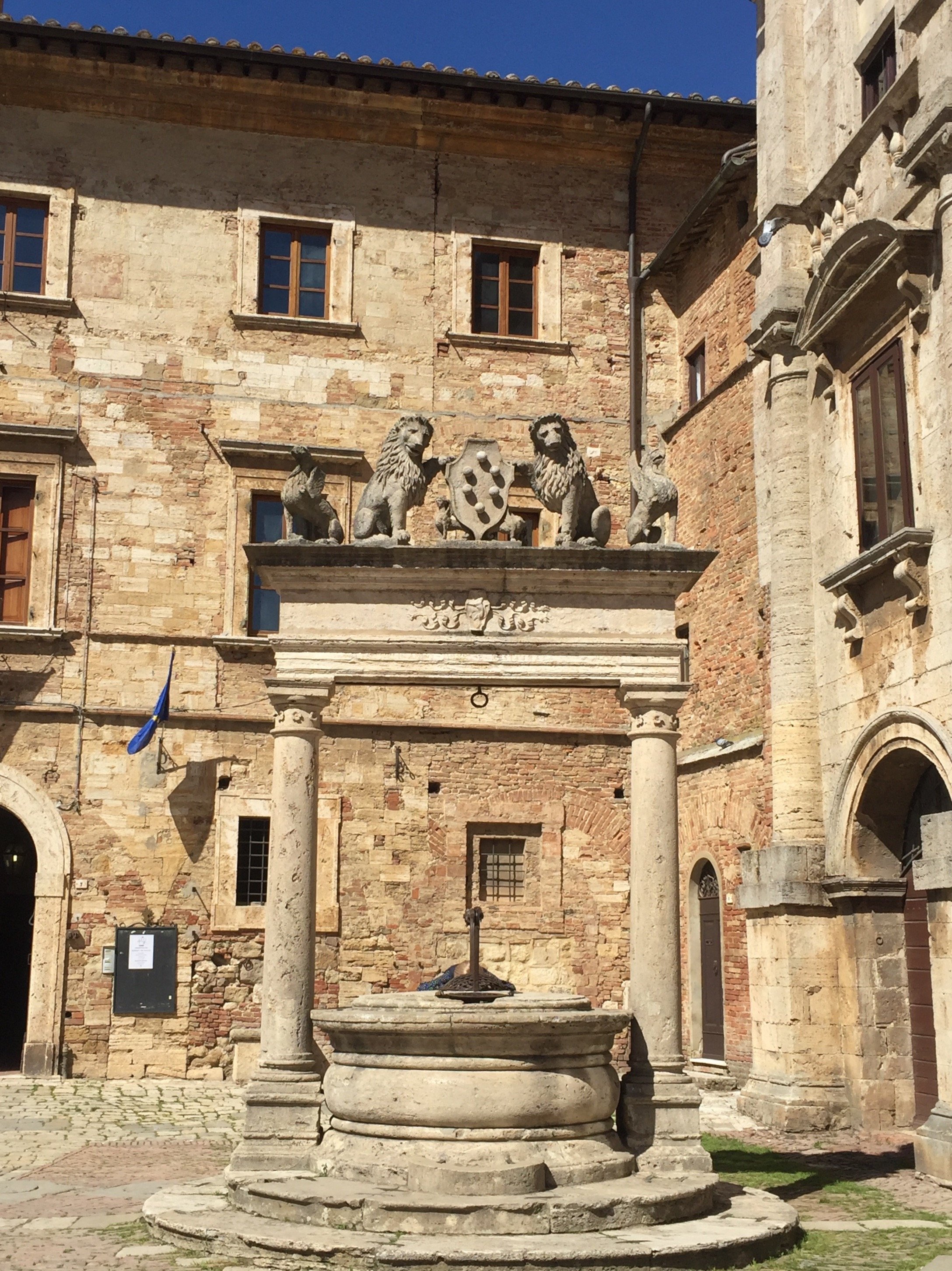
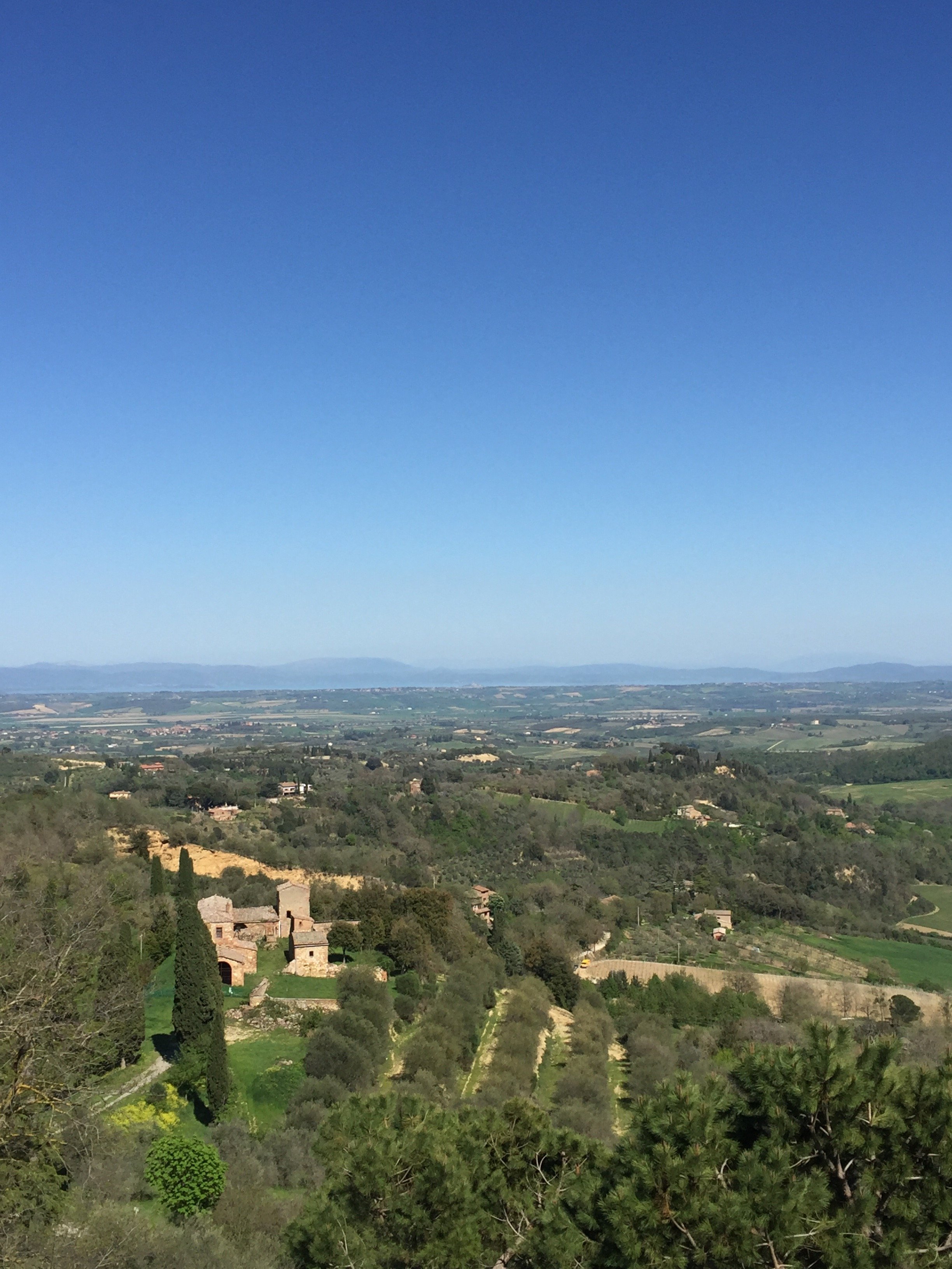
 Montepuclciano has a population of about 14,000. It's known for its Vino Nobile red wine (it's surrounded by vineyards), its architecture (no major new buildings since the 16th century) and the views.
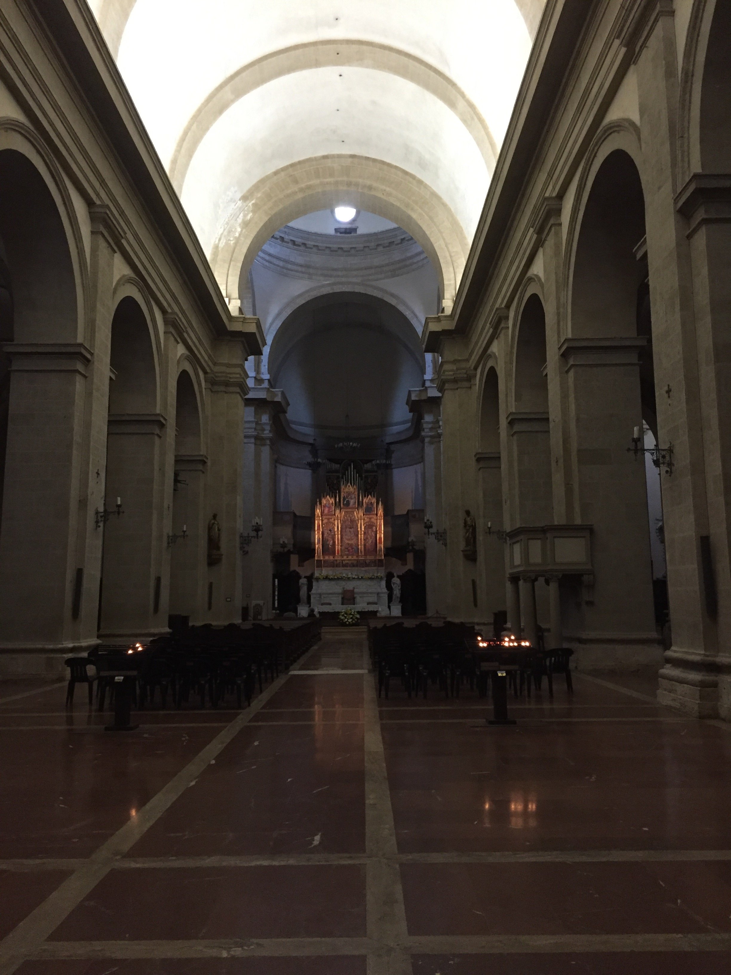
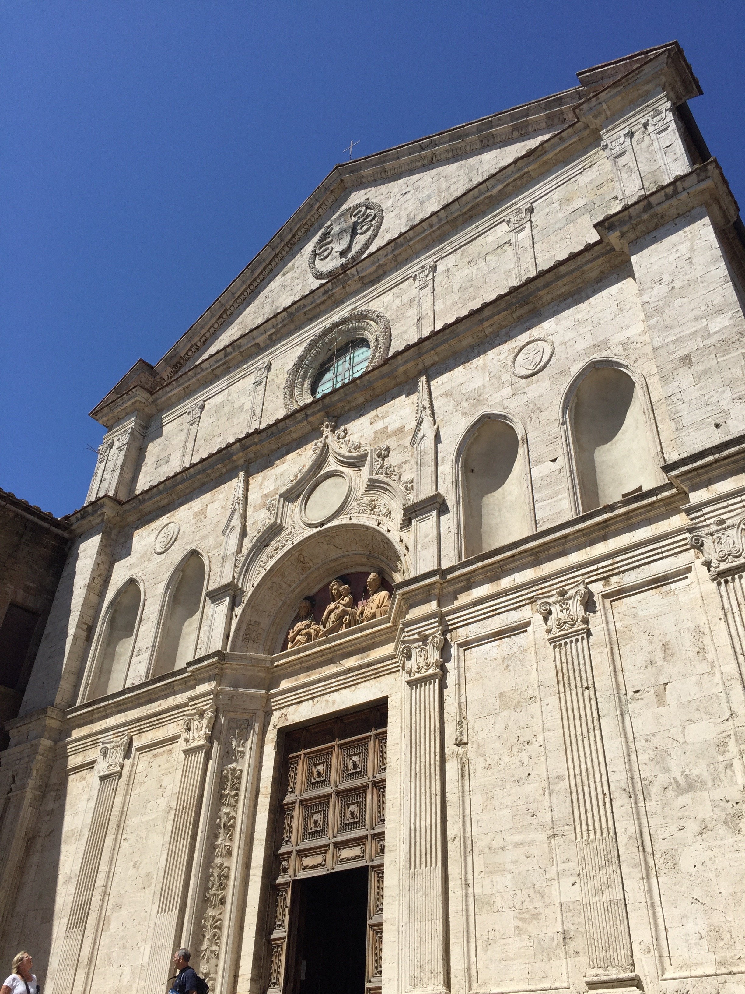
 As you enter the main door/gate, you arrive at The Corso which is the commercial hub of the town. Take this winding street up, and up, until you reach Piazza Grande the beautiful main square. The unfinished brick facade of the Duomo is very striking.Montepulciano formed an alliance with Florence in 1511. The Medici's asked two of the most successful architects in Italy, Vignola and Antonio da Sangallo the Elder, to renovate many of the noble families's palazzi and to make the public spaces grander.
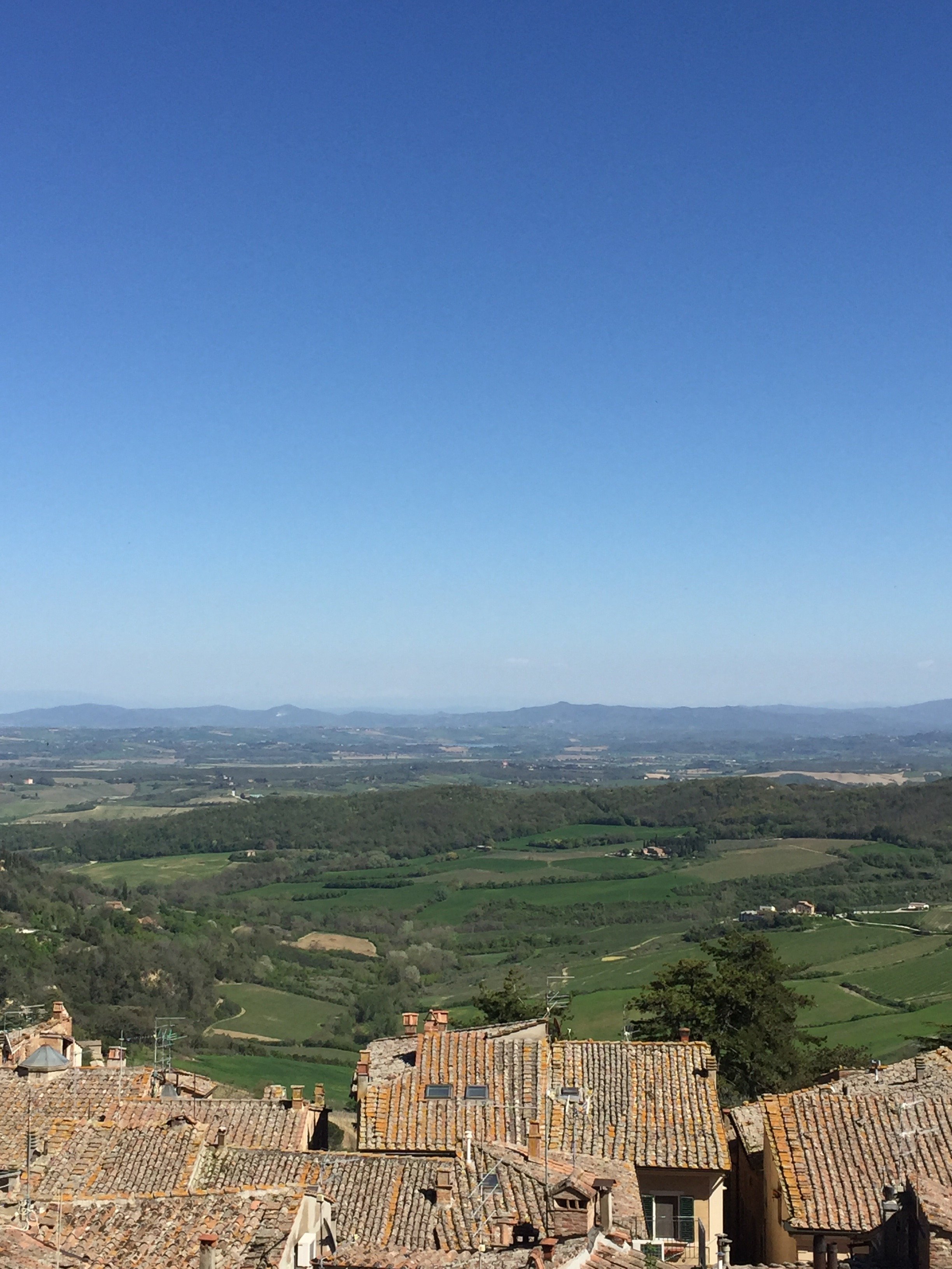
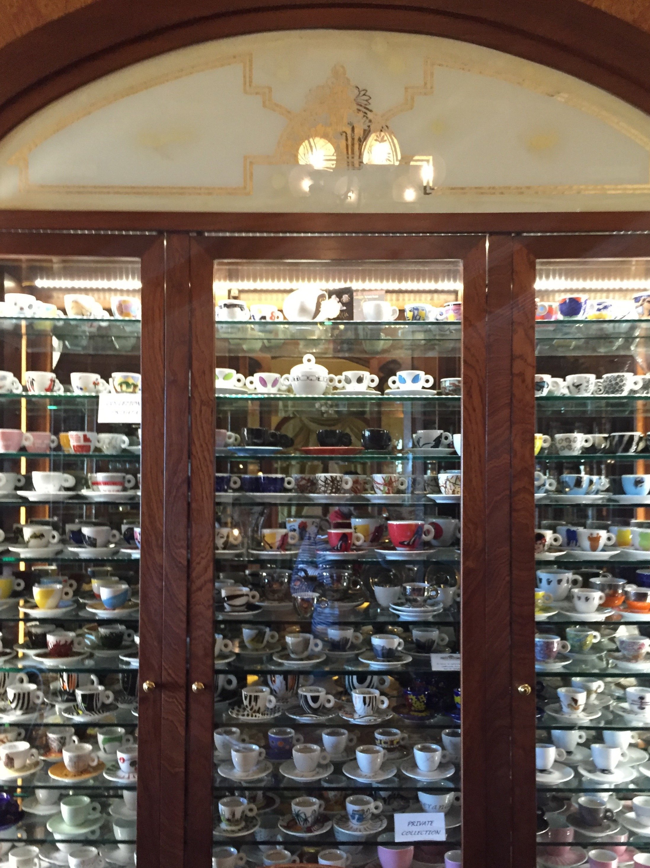
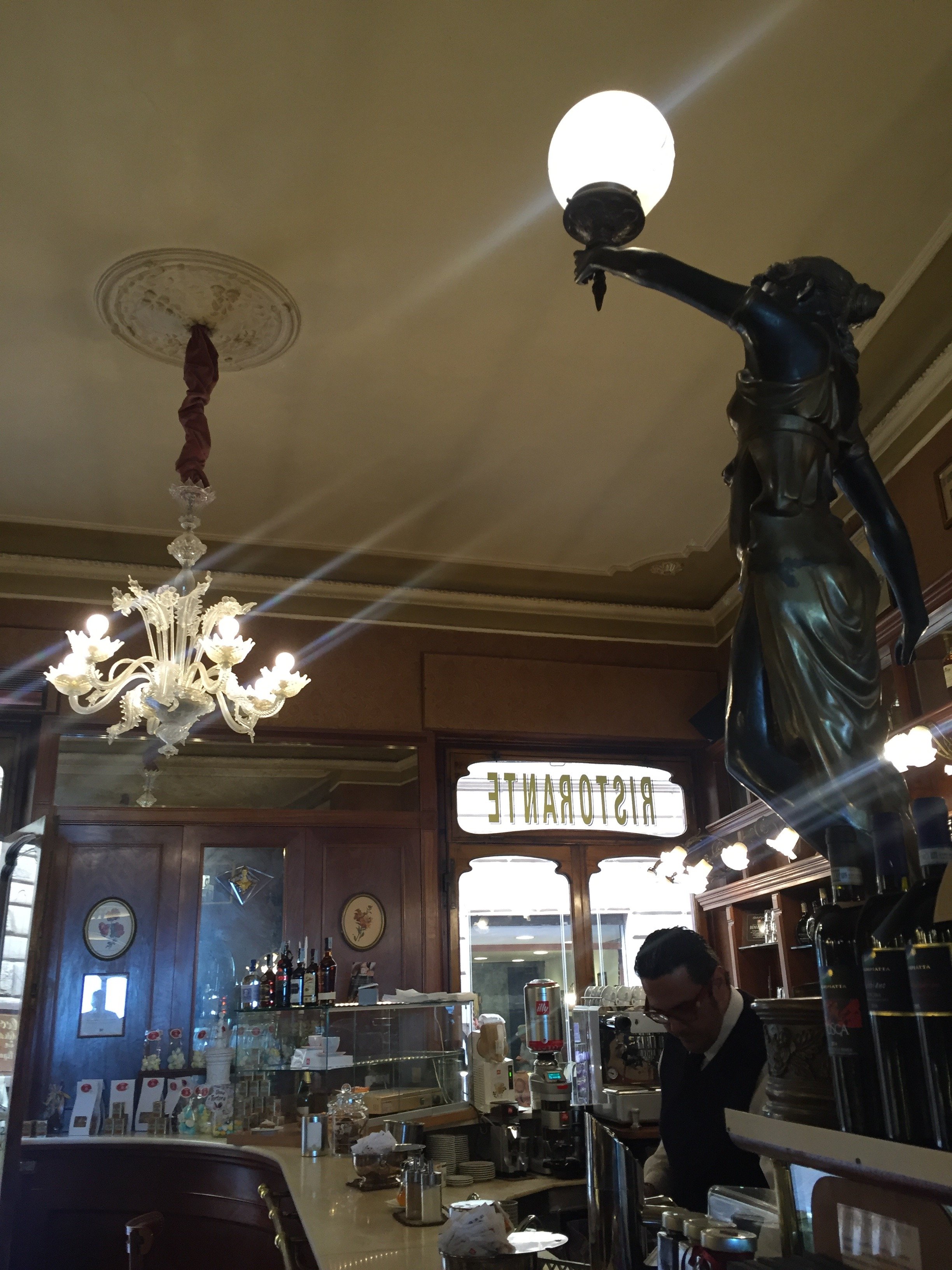
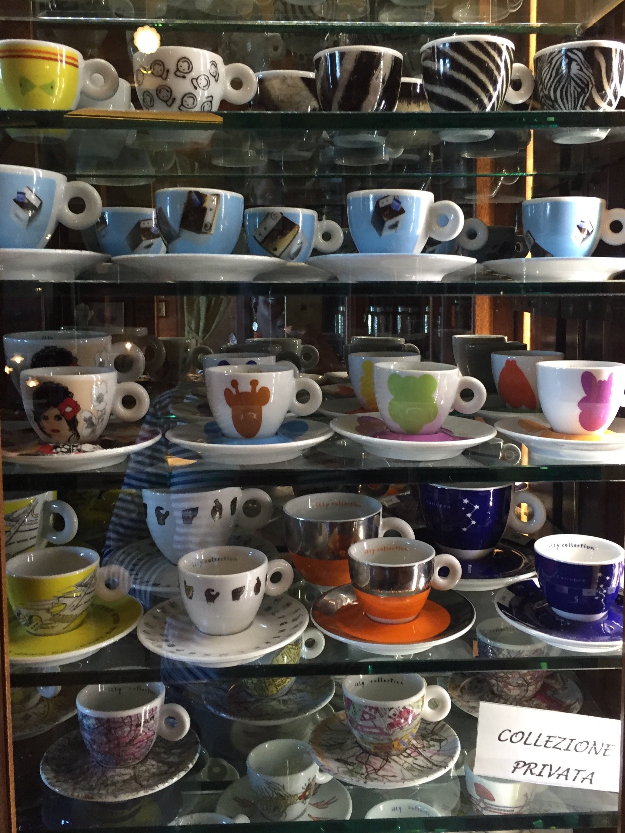
 We ended our day in Montepulciano with aperitivi at the historic Caffè Poliziano. We met up with two of Michelle's friends who were on their way to Umbria. The Caffè was opened in 1886 and is a favorite with the locals for coffee. Of course prices are lower if you stand at the bar. If you can get one of the tiny tables on the small back terrace, do. These views are worth the price

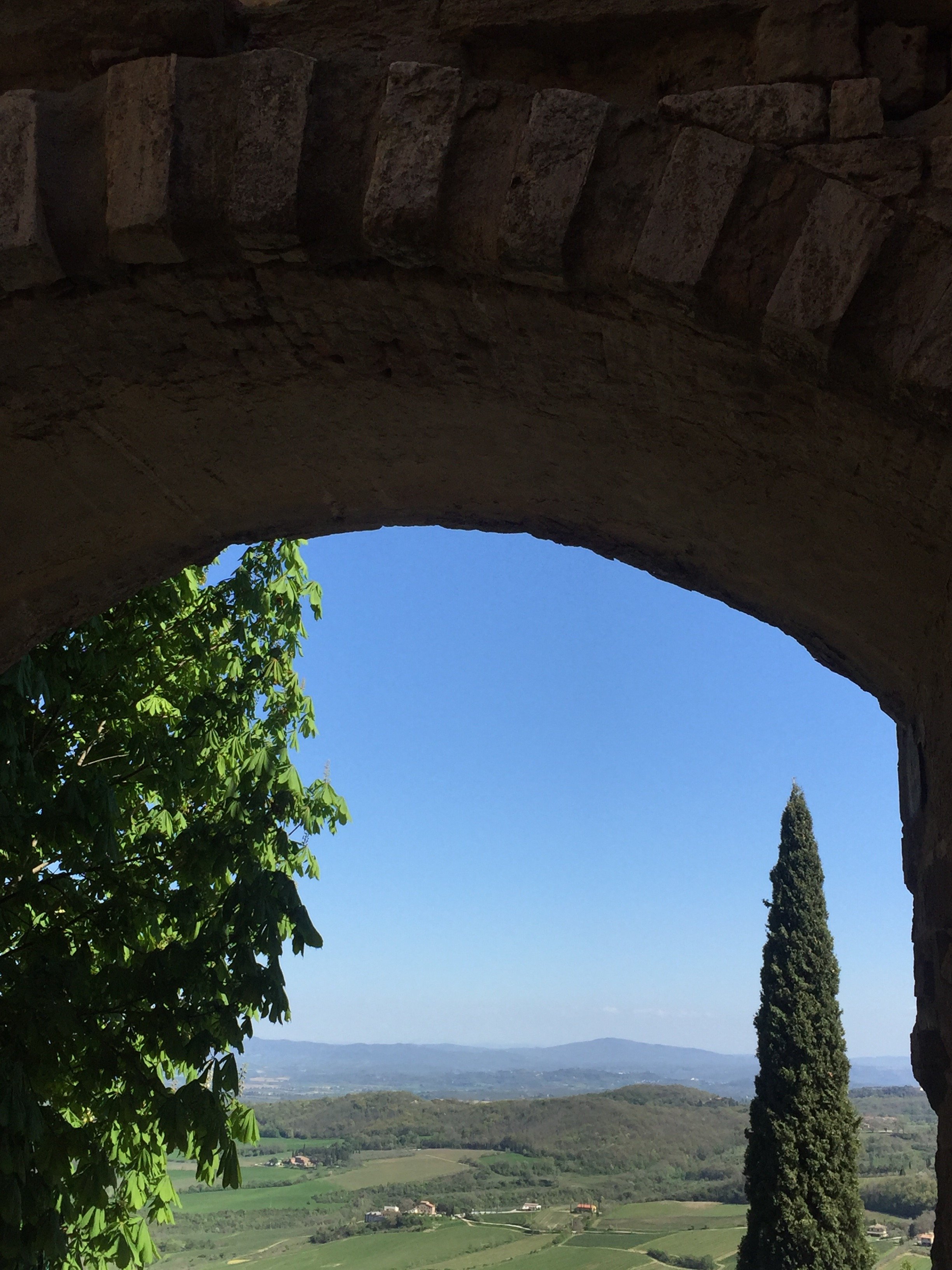 I must to return to Montepulciano and hope to visit Sangallo's masterpiece, San Biagio. The church is located a few meters from the hilltop's walls and inspired St. Peter's Basilica and other churches.
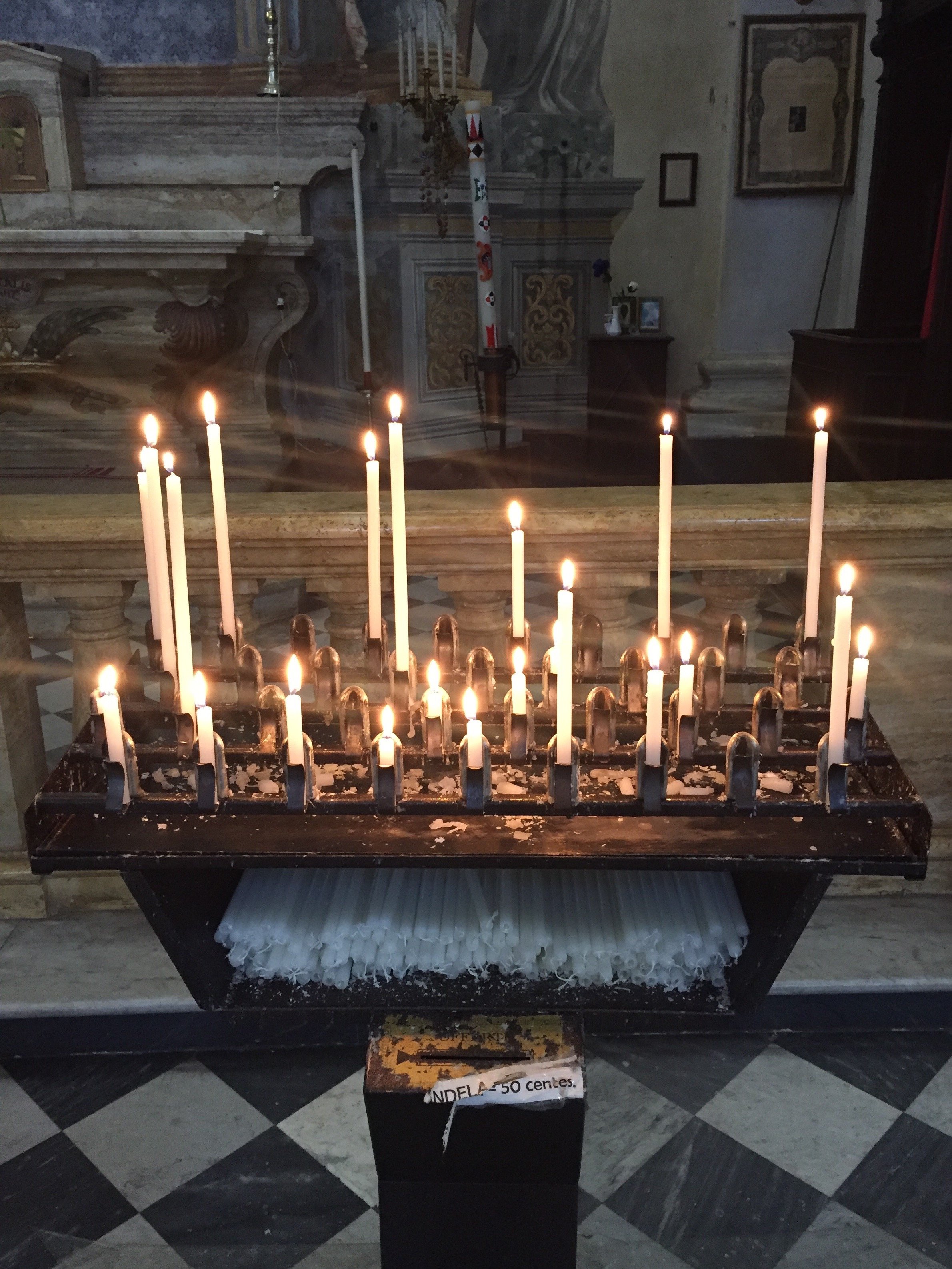
 Photos: Me and my iPhone
Design Inspiration - Palazzo Reale, Naples, Italy
The Royal Palace of Naples is a must on my list of things to do in Naples. I wasn't able to visit until my third trip and now I want to return just so I could spend more time there.The audio tour is interesting and informative. Palazzo Reale is one of four royal palaces in and near Naples. Construction, with prominent architect Domenico Fontana, started in the 17th century by the Spanish Viceroys initially as a home to host the visiting King of Spain. He never came (so rude!) and the palace eventually became the home of various rulers, including the Bourbons and the Savoys. The Kingdom of Naples was fought over by the French and Spain for centuries. At times the Kingdom included most of southern Italy, and Sicily.The Palace was expanded over the years. Napoleon's sister, Caroline, lived in the Palace with her husband Joachim Murat (aka the Dandy King) who was the King from 1808-1815.The building suffered extensive damage from bombing during WWII but was restored.Below is the main staircase. It was very cloudy and overcast when I arrived. I still gasped when I walked in and saw this space. Pictures do not do it justice.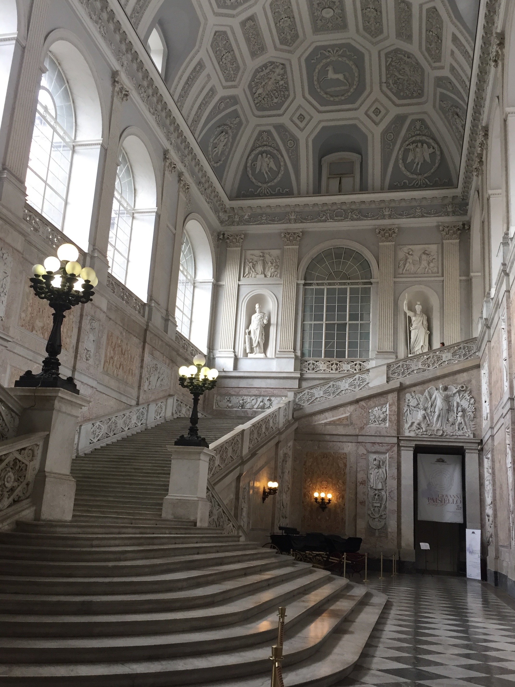 View from the top of the stairs.
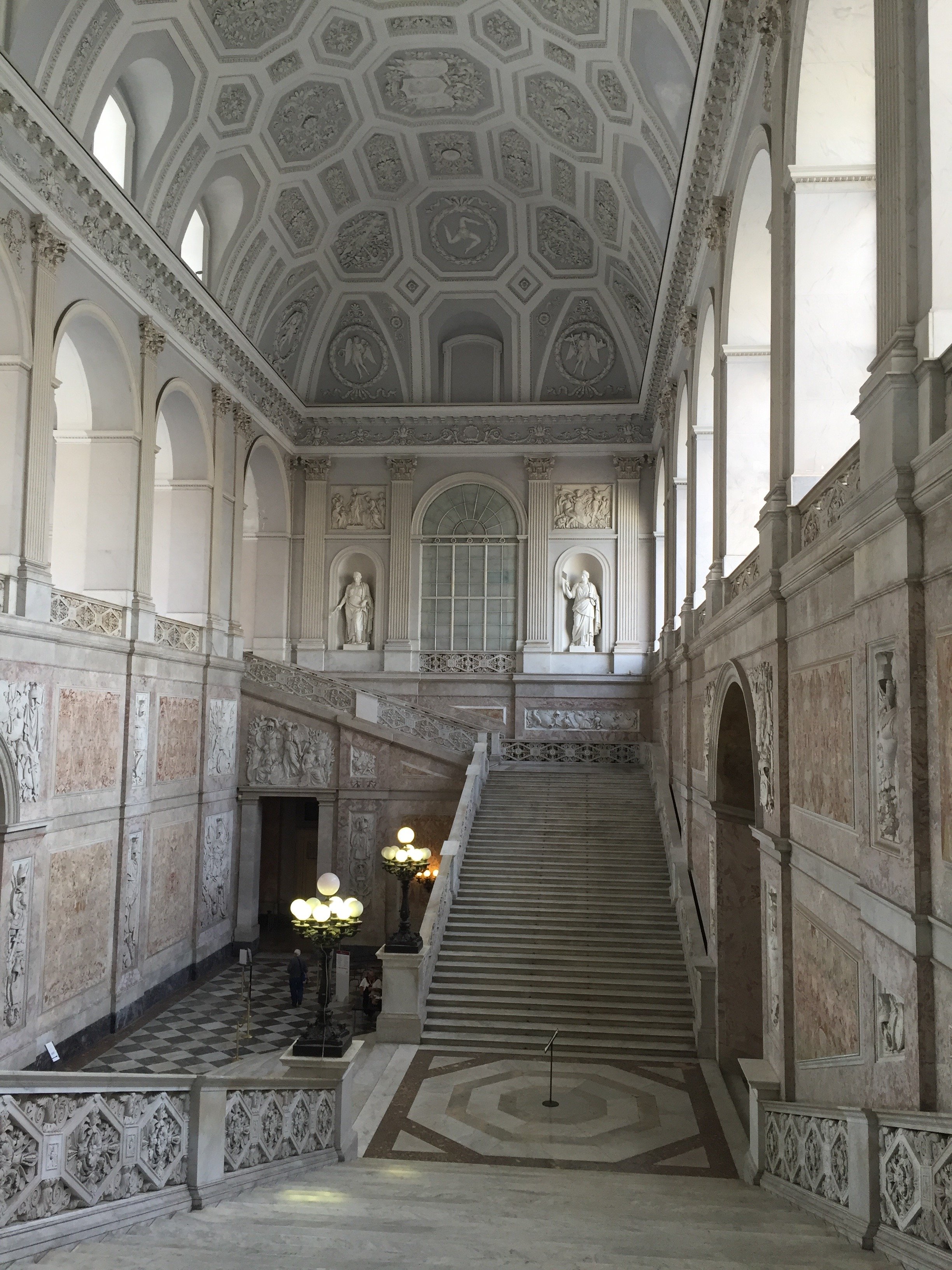 This ceiling is unreal.
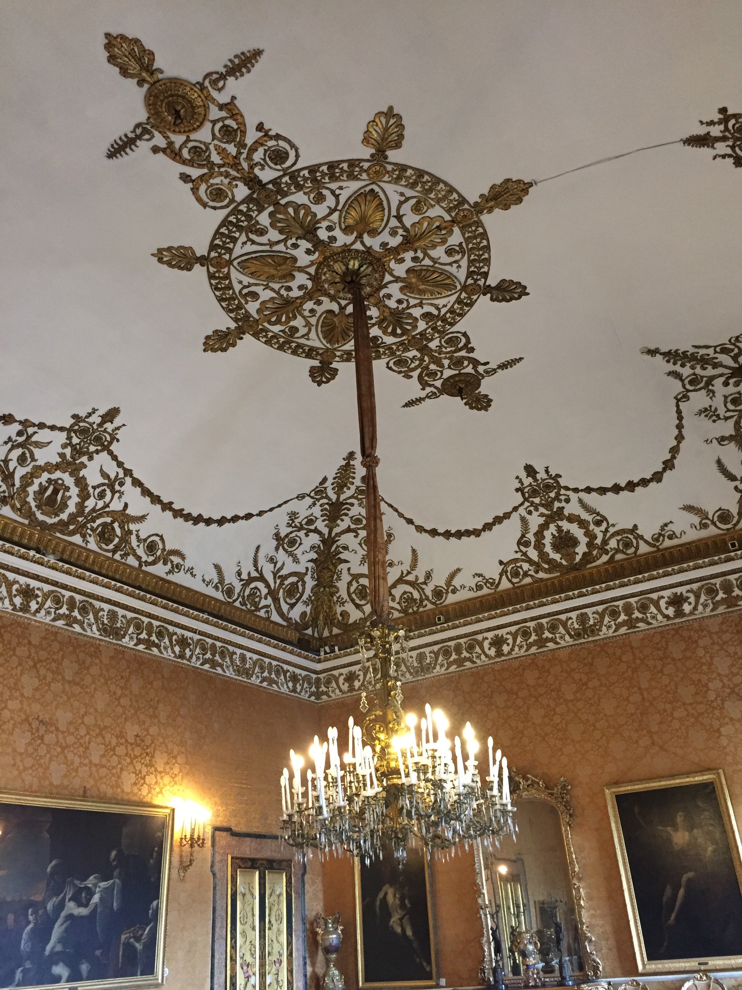
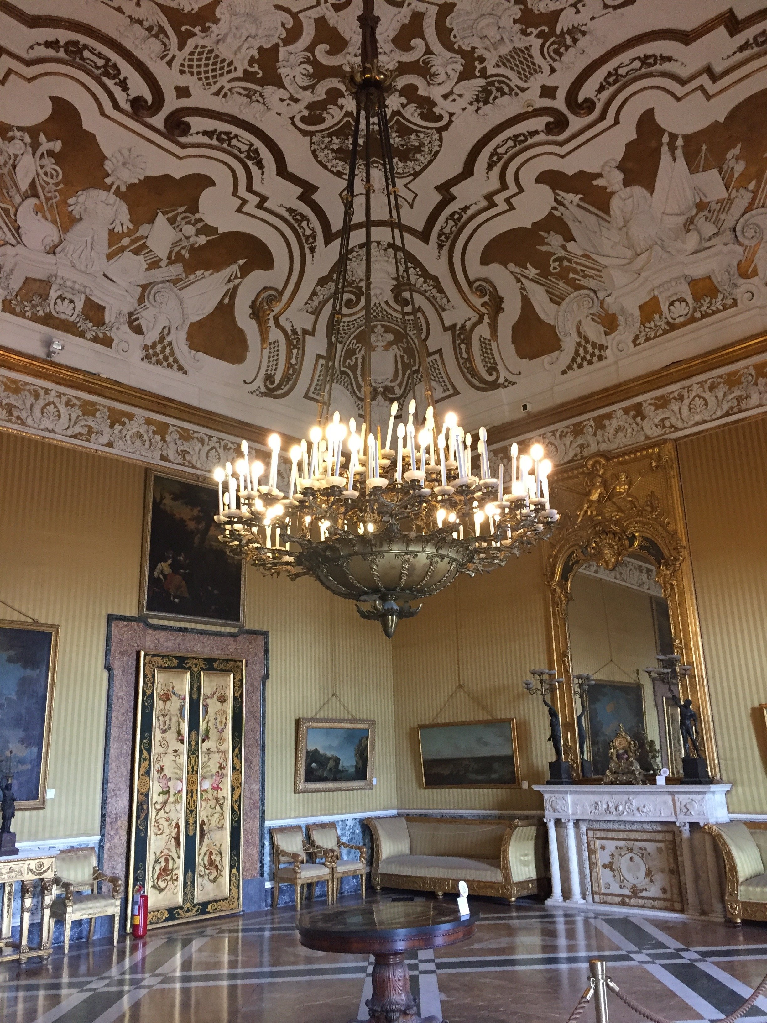 Close up of another ceiling. Gorgeous.
 This floor tho.
 How nice to have your own theatre.
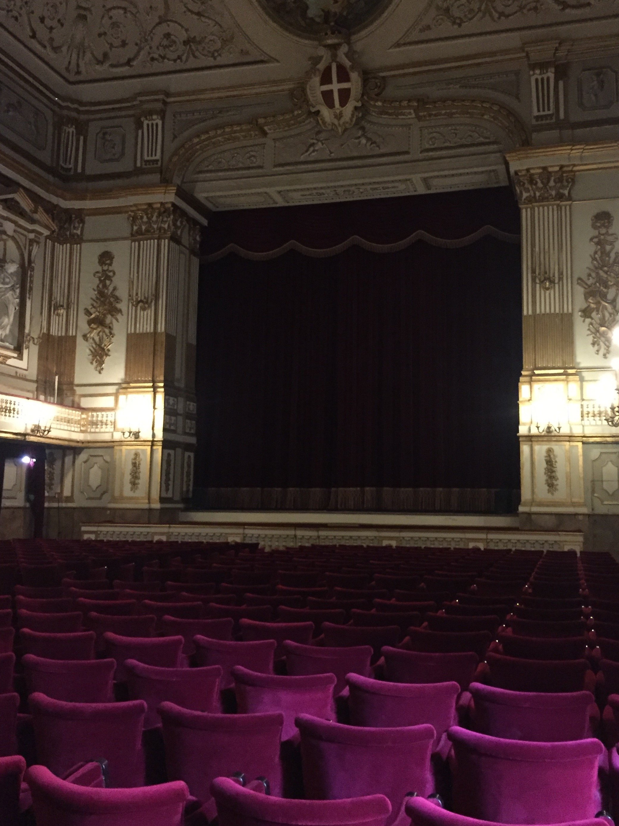 And your own chapel.
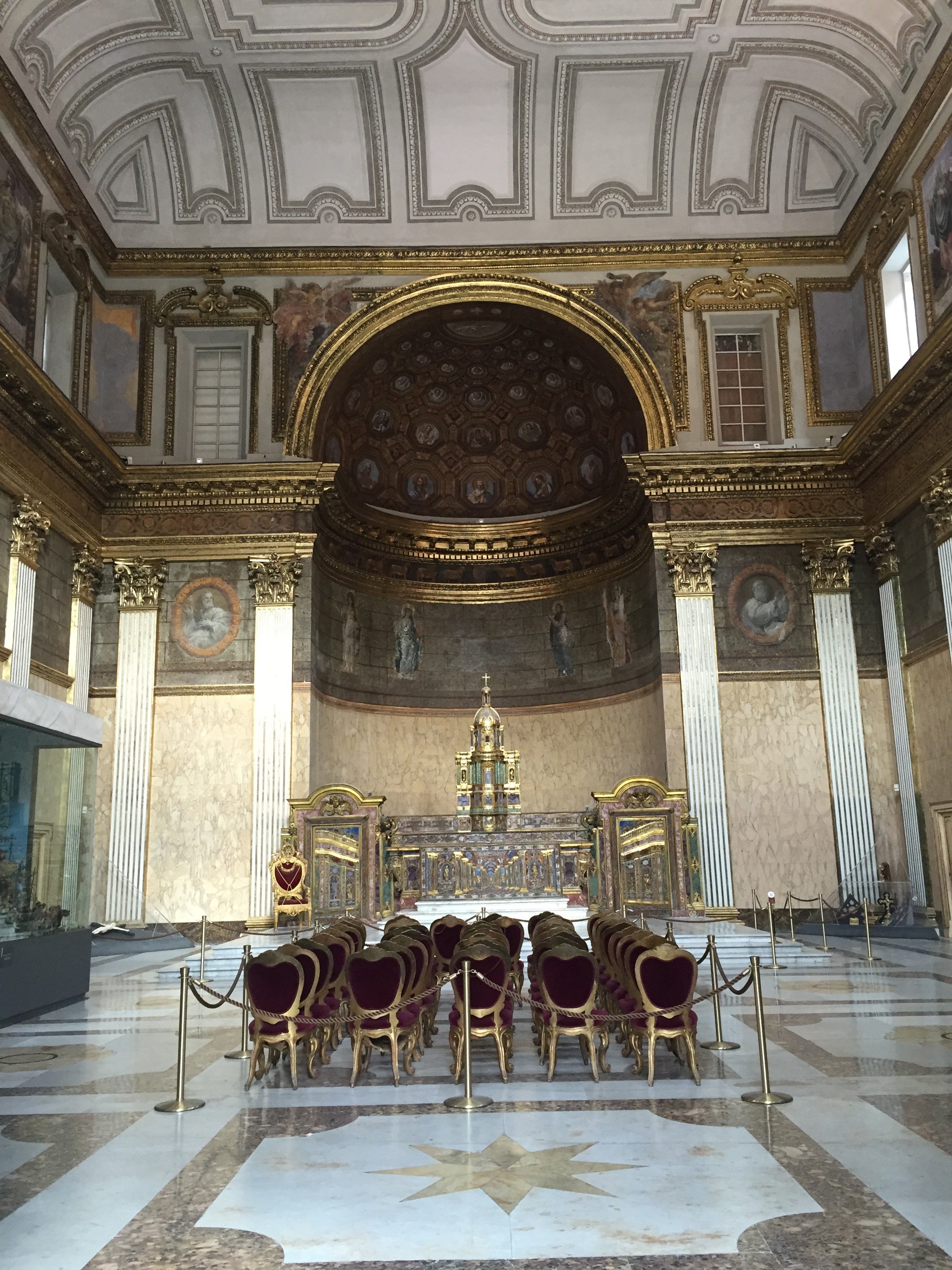 A less ornate space. Love the simplicity of this light fixture.
 Love this ceiling too. I chuckle when I hear the color grey is too trendy so now it needs to be over. I disagree. It's a classic.
 The ballroom.
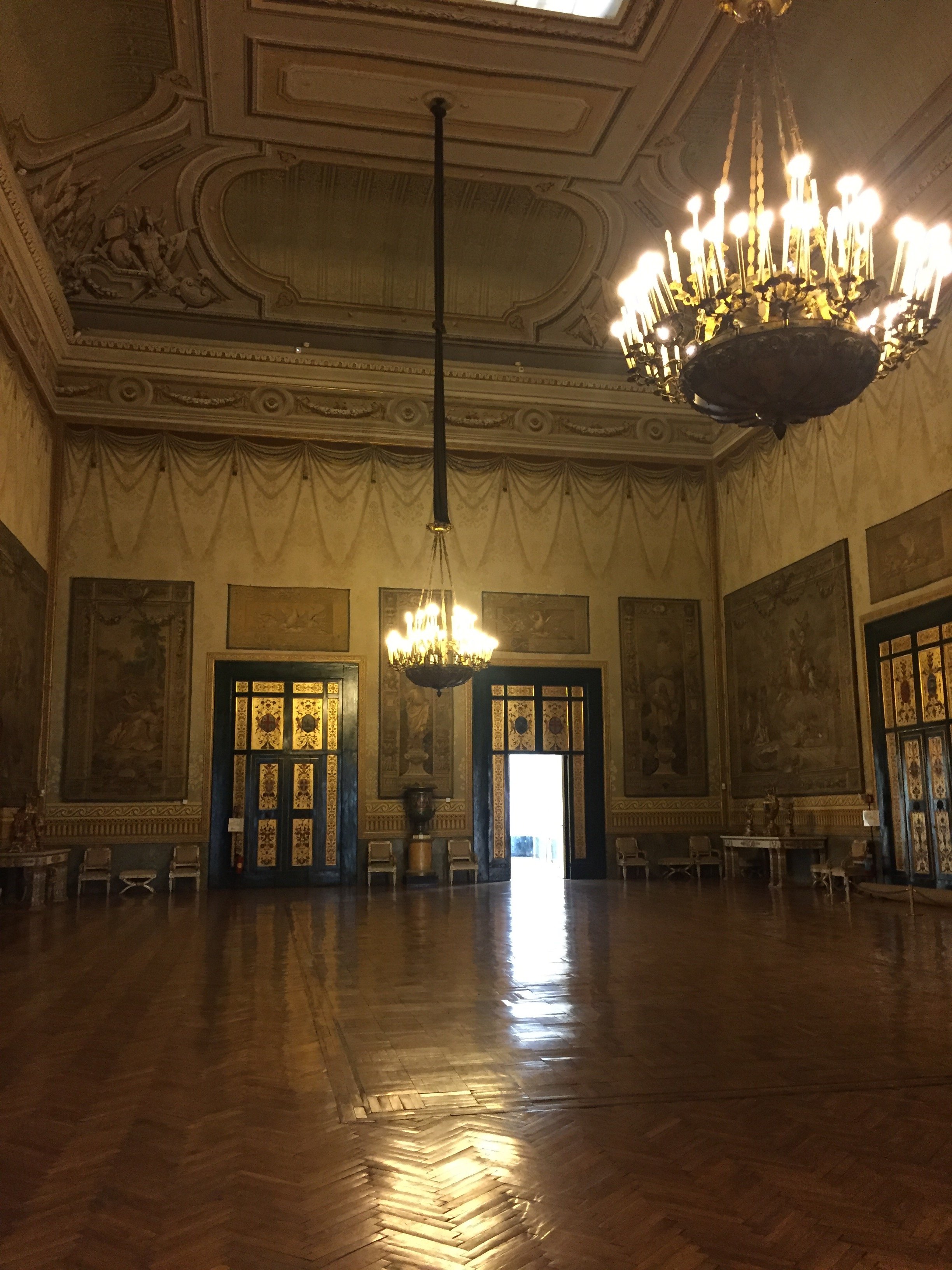 It was starting to clear up as I walked out. There's a view of the sea from several of the rooms but it was hard to get a photo without the scaffolding. The gardens are not public but there is an interior courtyard with a fountain.
 Photos: me and my iPhone
"See Naples and Die."
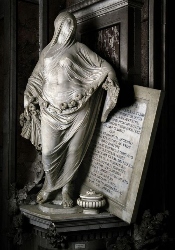
This is a phrase coined in the mid-1800s during the reign of the Bourbons. At the time Naples was the third most populous city in Europe after London and Paris. It was also one of the wealthiest.I prefer to agree with the original meaning of the phrase and not the "if you go to Naples you will die because it's so dangerous" image the city had for years.I first went to Naples in 2007 on a day trip during my second trip to Italy. I met the lovely Tracie P, then know as Tracie B. I don't believe that was almost eleven years ago! My last trip to Naples was with Erica in 2009. I thought it was four years ago at most.I cannot tell you how many people back then worried for my safety when I told them I was going to Naples. One friend said he hated the place as he was mugged literally five minutes after he walked out of the main train station. Naples was mentioned in the international press mostly for its pizza, the mafia, and a major garbage problem. During both trips I could count the number of American tourists on one hand. One famous guidebook said if Rome was overwhelming, don't go further south. Naples is Rome squared.I loved the energy of Naples during those early trips, even with the garbage situation. There's no place like it. It reminded me a little of pre-Disneyfied New York City.Not sure what the heck took me so long to return but I was shocked at the change. The city is cleaner than Rome. There are more American tourists. Fuelled in part by the popoluarity of the Ferrante book series, the international press is writing about the great things happening in Naples. Naples is "in". Are there still problems, yes. I recommend using the same precautions you would in any major, densely populated city. Leave the fancy watches, rings, etc at home or in your hotel safe.I wasn't as overwhelmed during this trip. It could be because I live in a walking city again whereas during my the first trip i was coming from Los Angeles where your car is a cocoon. I'd visited the archeological museum and Castel Nuovo on those trips. I wanted to see a few places I missed.My first stop was the Museo Capella Sansevero. You buy your ticket (€7) at the small nearby center/office . There was a long line to enter but it moved quickly. You cannot take any photos inside. It's not the easiest to find. It's on a small side street but my Google maps was on point.This is a church I would return to again, maybe in the dead of winter/off season so I could have more time to take it all in. I now understand why the Veiled Christ by Giuseppe Sanmartino is considered one of the most incredible sculptures in the world.I know this is all marble yet I have a hard time believing it. Prince Raimondo di Sangro commissioned the young Sanmartino to create this work for his family's chapel. The Prince was a well-known alchemist and bold experimentalist. There are several other incredible works in the chapel inculding a poignant Pudicizia by Antonio Corradini, whose veiled female figure next to a cracked plaque, honors Raimondo's mother, Cecilia Gaetani d’Aquila d’Aragona. He was only 11 months old when she died.
 There's a little room downstairs. Folks, once I descended down the narrow iron staircase I was shook. There are two skeletins, a man and a woman. They are encased in what looks like perfectly preserved human arterial systems. Over two centuries ago, Dr. Giuseppe Salerno from Palermo, along with the Prince, created theses anatomical works. There were/are all kinds of rumors as to how these bodies came to be. Word was that the Prince killed members of his staff, injecting them with liquid while they were still alive. Others said the arterial systems are reproductions. They are fascinating and creepy. No Google search for photos. Nope. Cannot.
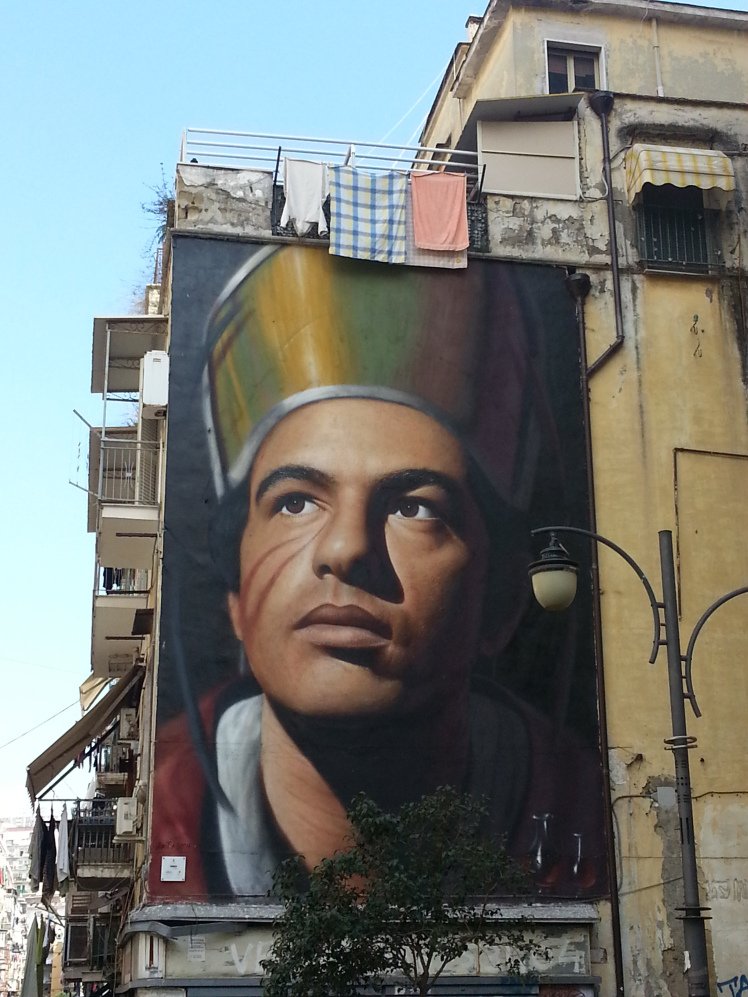
  I got lost and went into many churches as I made my way to the restaurant Antica Osteria Pisano. Thanks for the suggestion, Gina. The restaurant is in the Historic Center on the cusp of the Forcella neightbhood. If you've watched the third season of GOMORRA you're familiar with this mural of San Gennaro, the patron saint of Naples.
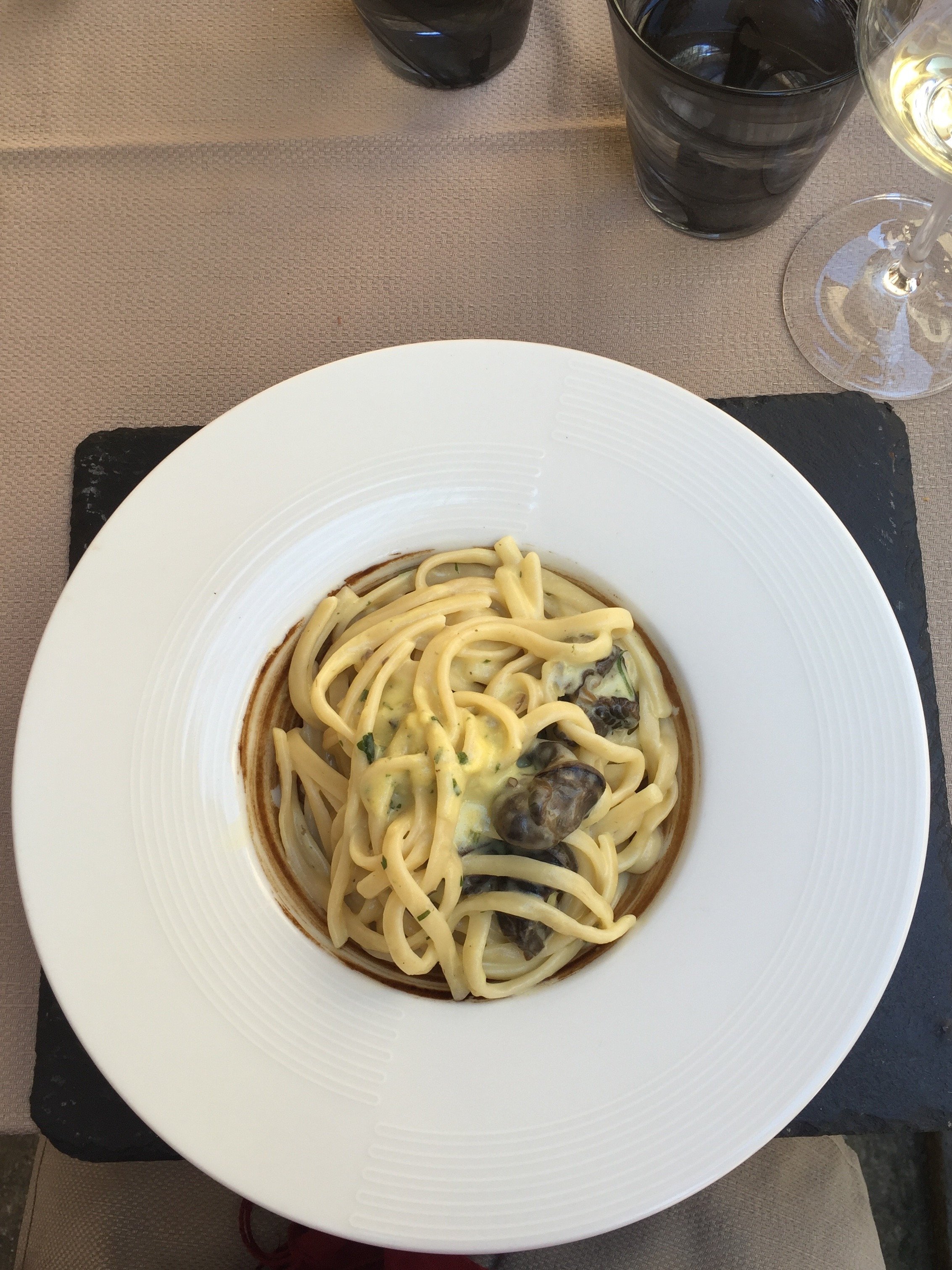
 I asked about the pasta of the day. It was Rigatoni alla Bolognese. I was skeptical about ordering this dish outside of Bologna but Gennaro (one of the owners) told me it was delicious. He was correct.I walked off my pasta getting lost on the way to Palazzo Reale. I had the palace on my list but never made it during my last two trips.I listened to the audioguide. I highly recommend it as the history of this palace is fascinating. The palace suffered some major damage during WWII but you can still get a sense of the wealth and presitage of the era.Located in Piazza del Plebiscito, the outside is understated. I was not prepared for this.
 Or this.
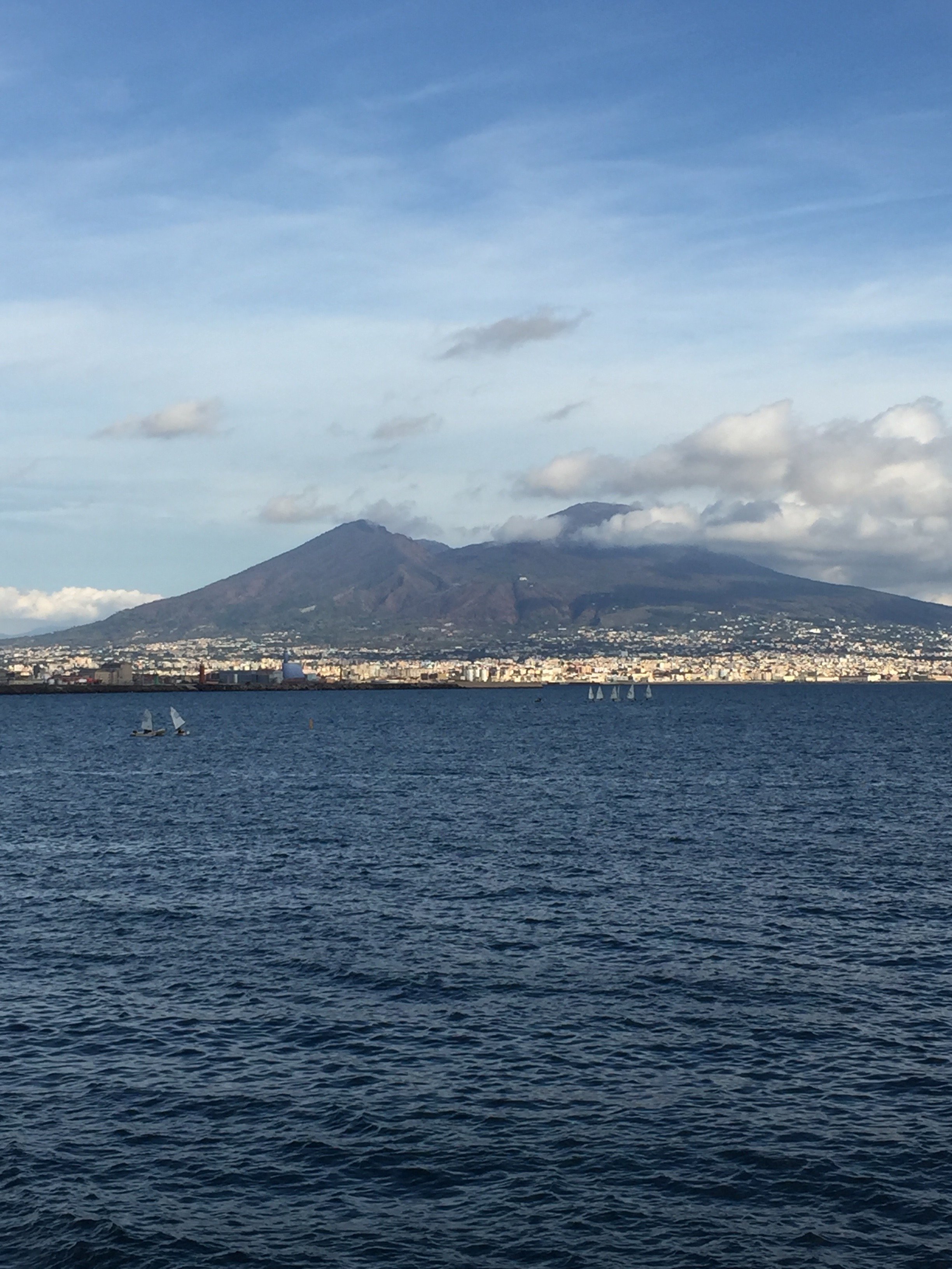
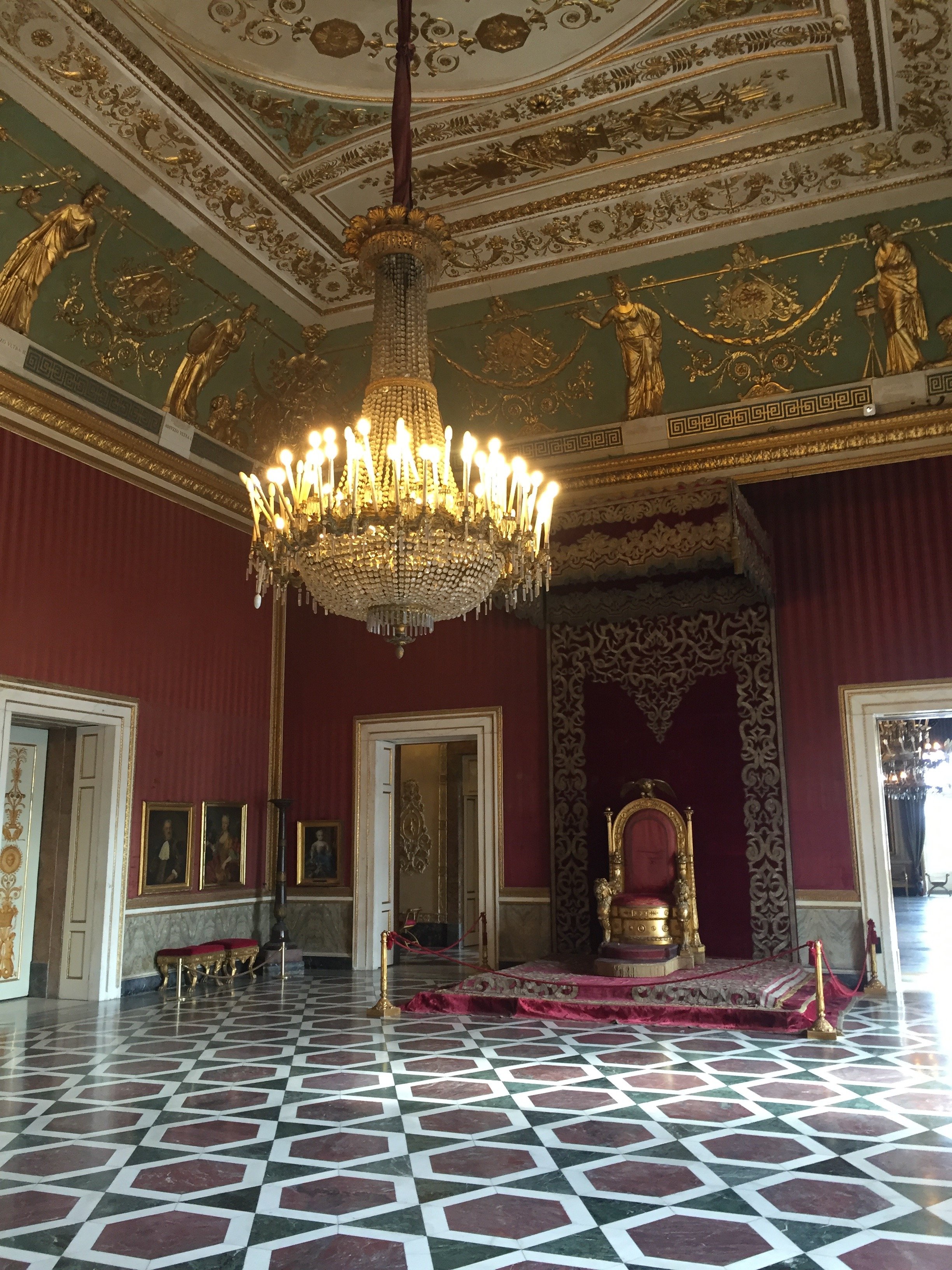 I was overwhelmed by the beauty and will have to write a seperate post about the interiors and history of this palace.The seafront is very close to this piazza, just down the hill. I decided to walk along the sea on my way to the Chiaia neighborhood. A large section of the Lungamare is a car-free zone. This was started in 2012 and what a great idea. People, mostly locals, were out and about enjoying the sunny weather. There are plenty of caffes and restaurants
 I didn't get to spend much time in the Chiaia area because I had to catch my return train. Chiaia is an upscale neighborhood where you find your luxury local shops and some of the international brands like Prada. I popped into a small enoteca, Belledonne, for a glass of wine. It was excellent and €6.I made my way to the closet Metro stop. I found the signage a little confusing but asked for directions.I took the fast Italo train. It's only an hour and usually there are great deals during the week for same day travel. I really need to spend more time in Naples.Photos: Me and my iPhone unless noted
Life in Rome - Centrale Montemartini Museum, an Ancient and Modern Mix
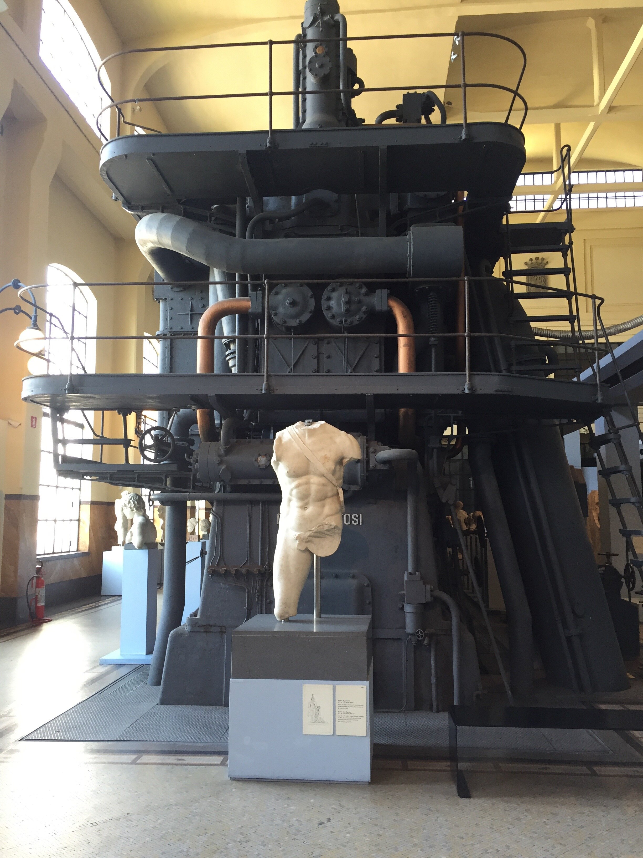
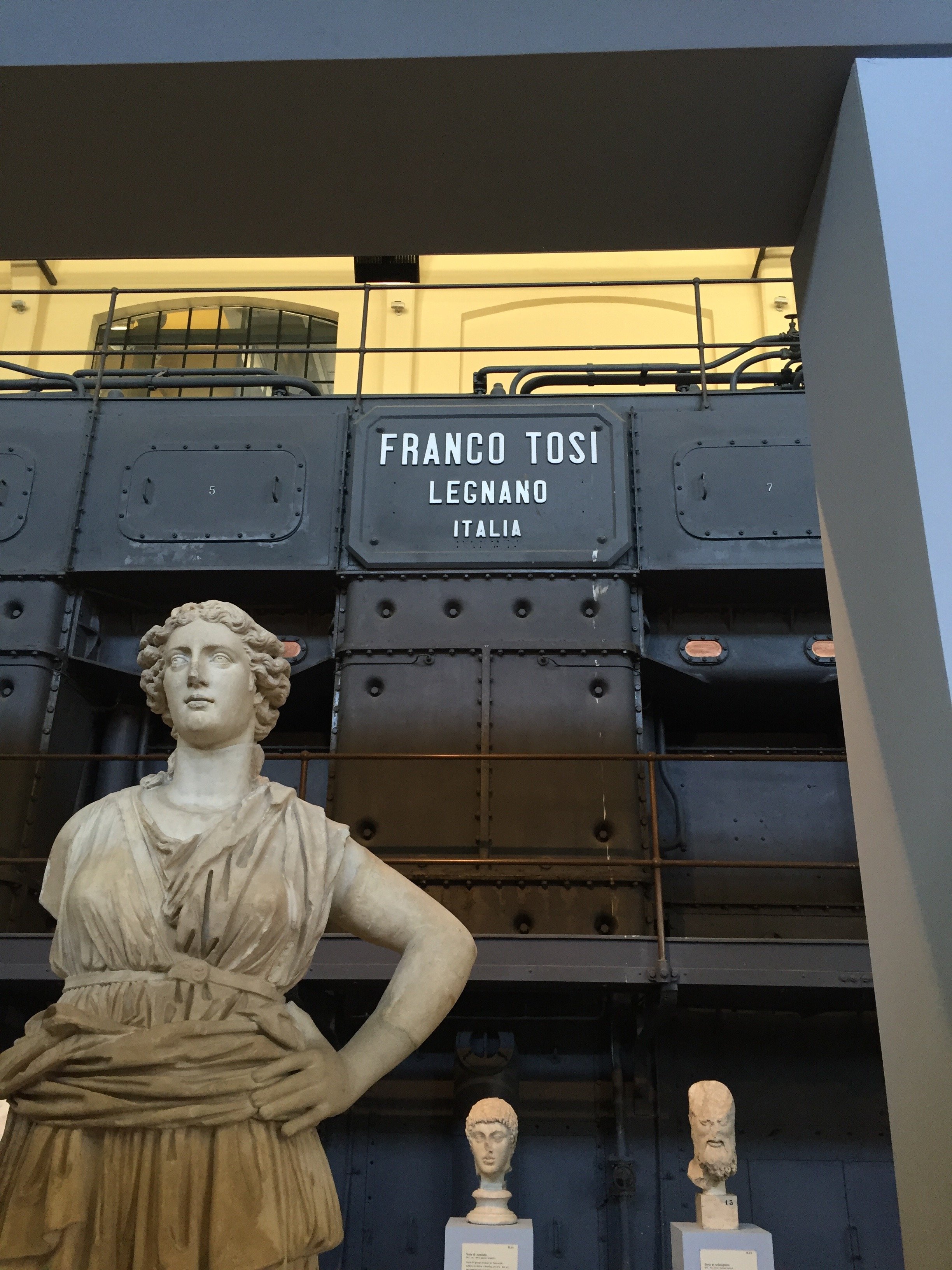
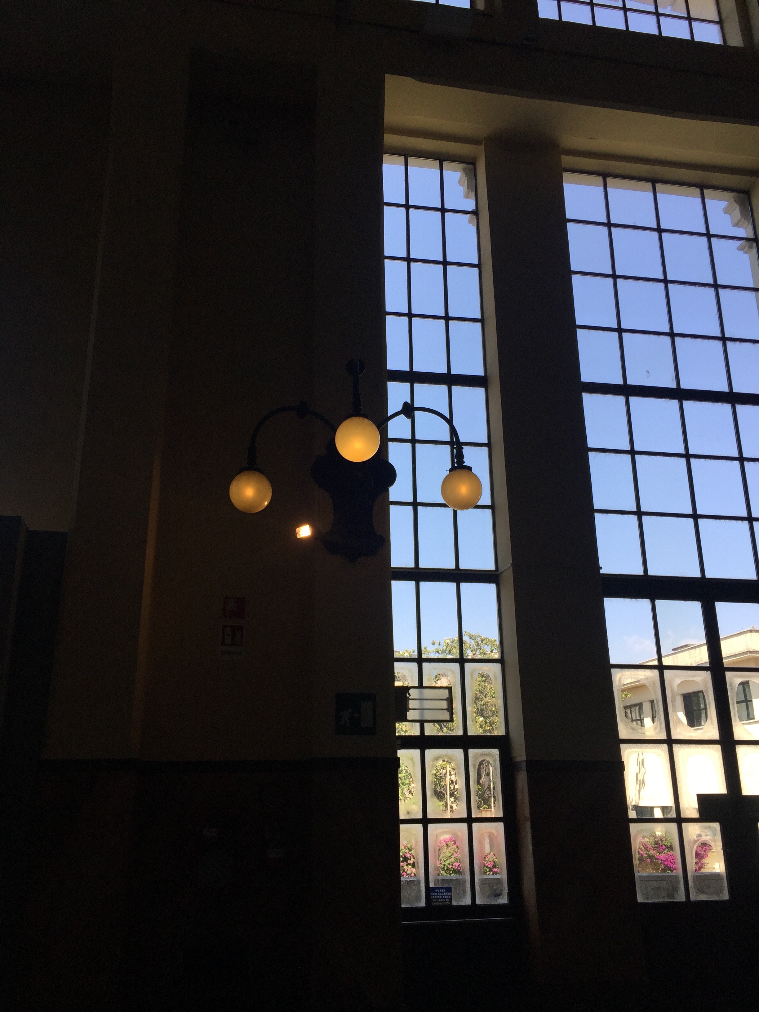
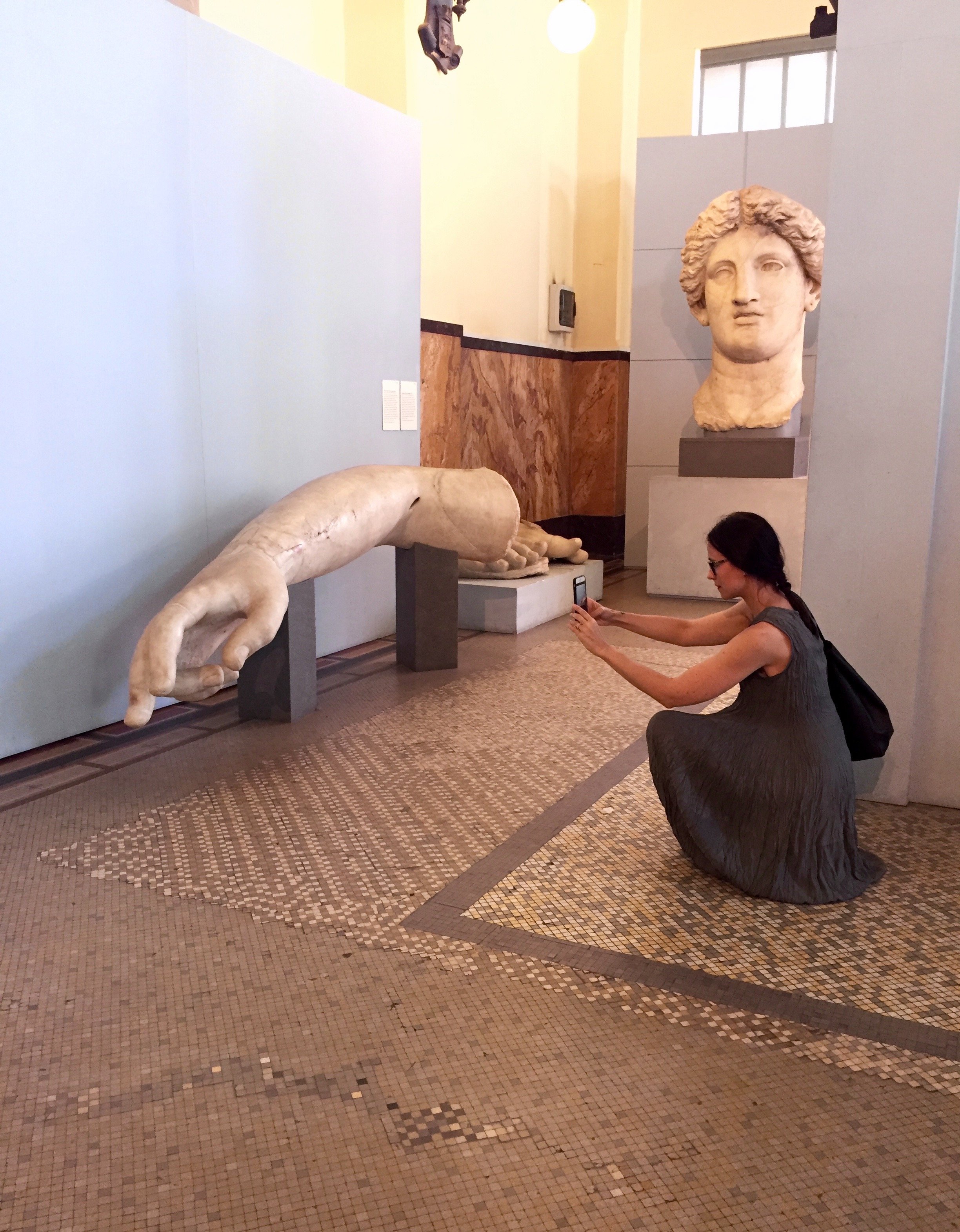
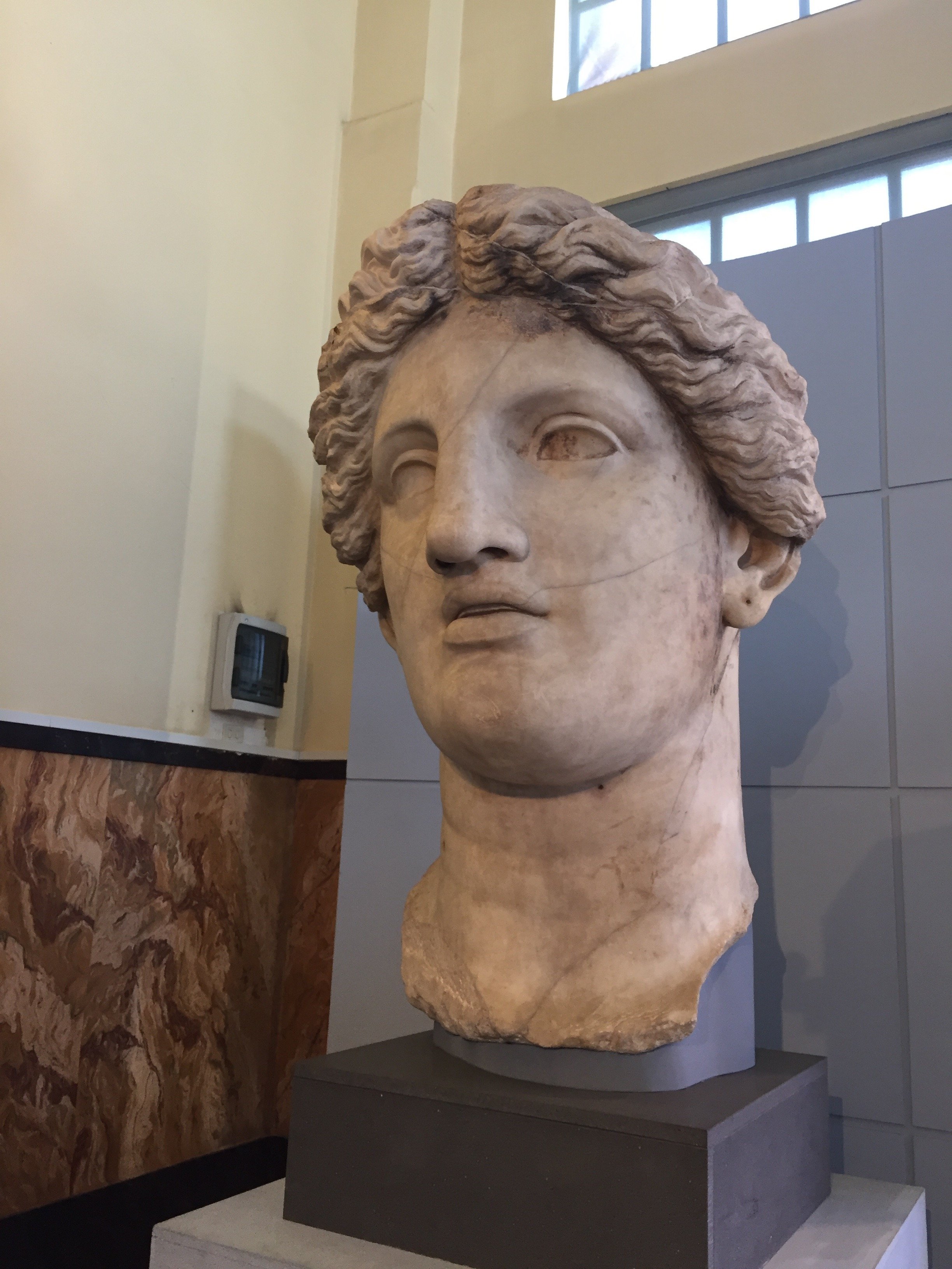
This museum is not in the Historic Center but located in the dynamic and funky Ostiense neighborhood. It has been on my list for years and I finally visited it recently with my friend, Marta. We loved it.I saw a spread in American Vogue that had used the museum as a backdrop, so I thought I had an idea of what to expect.I was wrong. The museum is located inside a former power plant that was built in 1912. The plant closed during the early '60s. In 1997 the city used the abandoned space to temporarily house works from the Capitoline Museums, which were under renovation. Thankfully, the Cultural Minister had the idea to permanently convert the structure into a museum. Many of the pieces in the museum were excavated during the late 1900's and the 1930's.I found out after we left that I have personal connected to the museum. The Vignacce Marsyas piece was excavated during a 2009 dig in Villa delle Vignacce directed by my friend, Dr. Darius Arya. It's believed to have been the work of artisans from the early 2nd century. Thanks for the scoop, Erica!The space alone is worth a trip and the artwork inside is very interesting as well. I think this museum would appeal to young children too, especially if they’re into big machines.The museum was practically empty the afternoon we were there. We saw two artists sketching the mosaic floors and there was a small film crew setting up a shoot as we left. That’s it. Rome residents get a discounted ticket, so bring your I.D.It’s close to the one of the best pasty shops in Rome, Andreotti, and not far from a large EATALY. There’s excellent street art in the area. If you’re looking for something off the beaten path, this is museum is perfect. I've read some reviews from tourists who say the area is "sketchy." Perhaps this is the reason the museum is underrated? It's a shame as I think it's a good idea to get away from the crowds sometimes.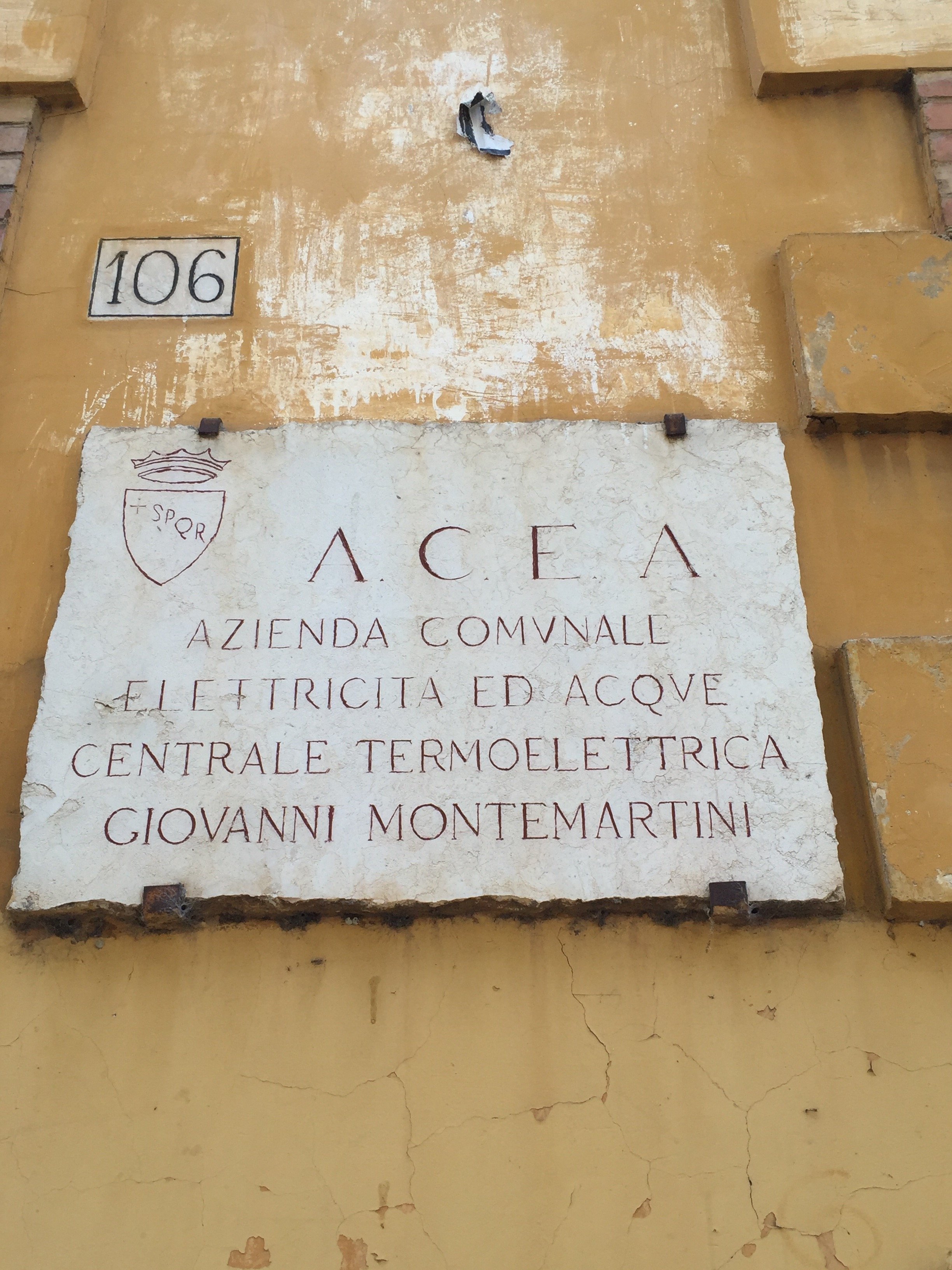
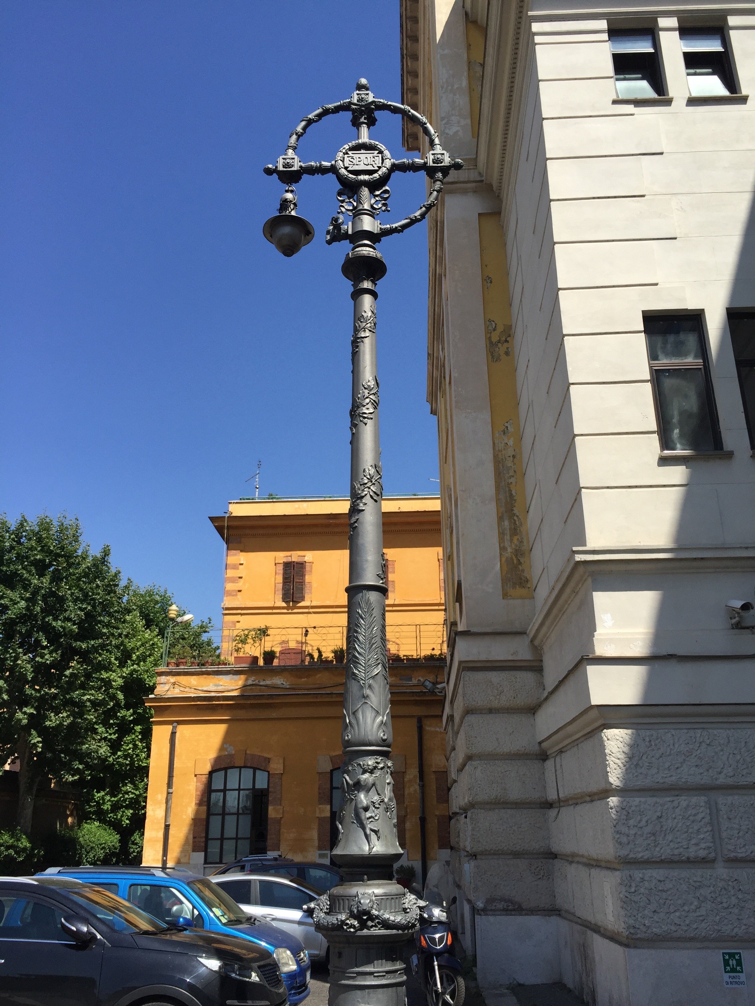
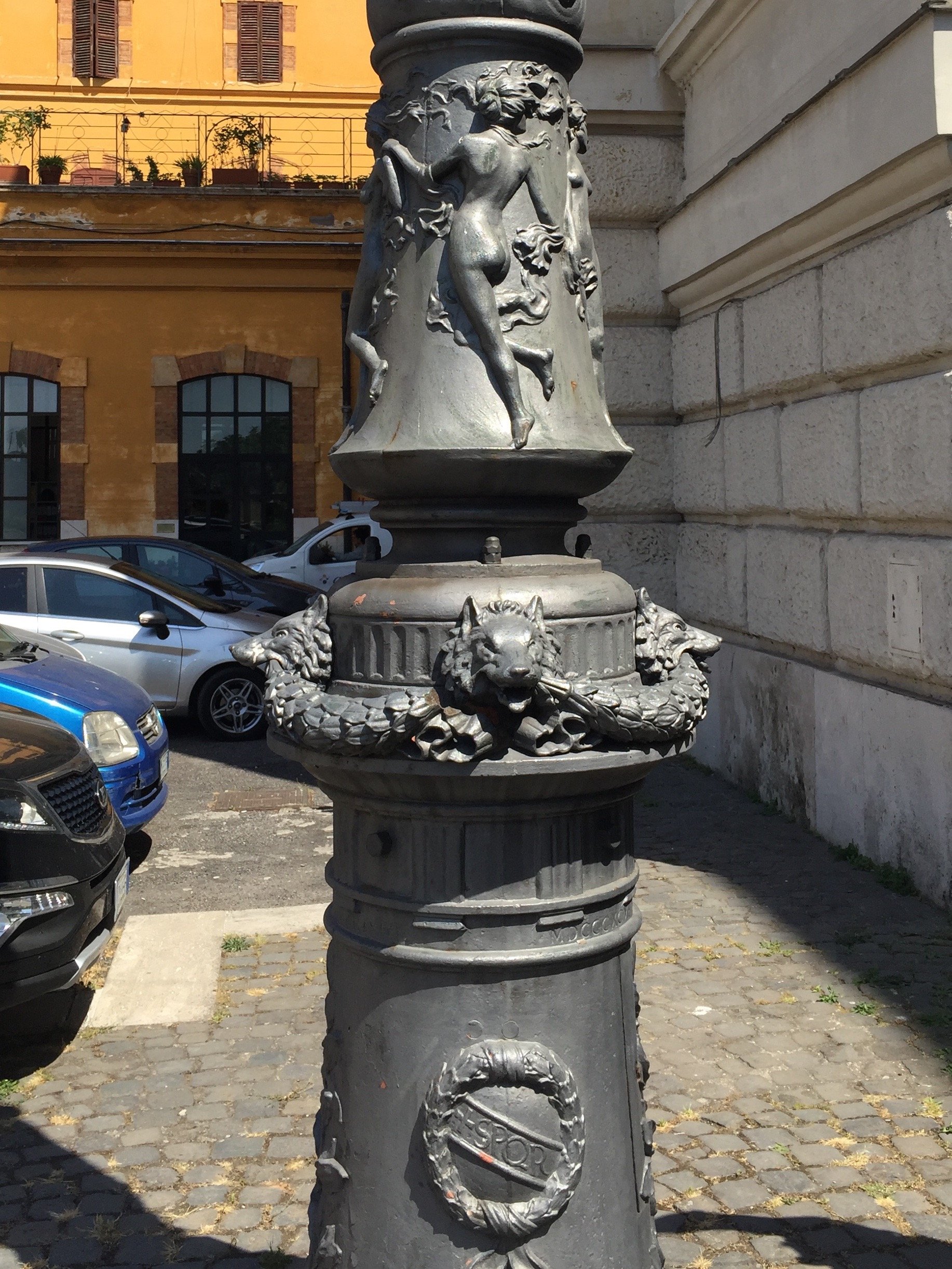

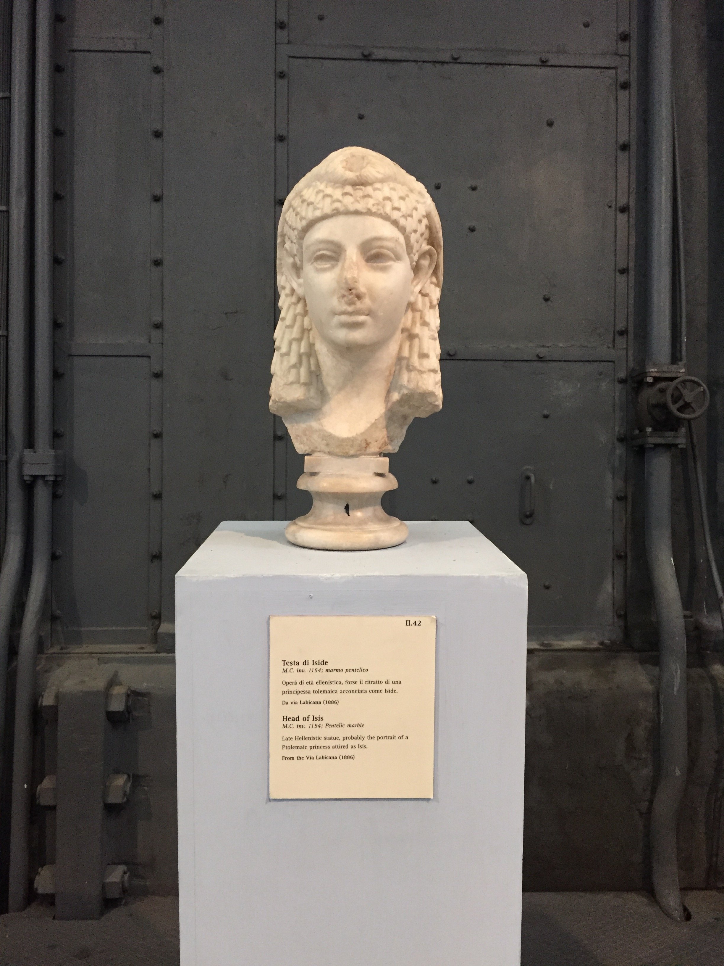
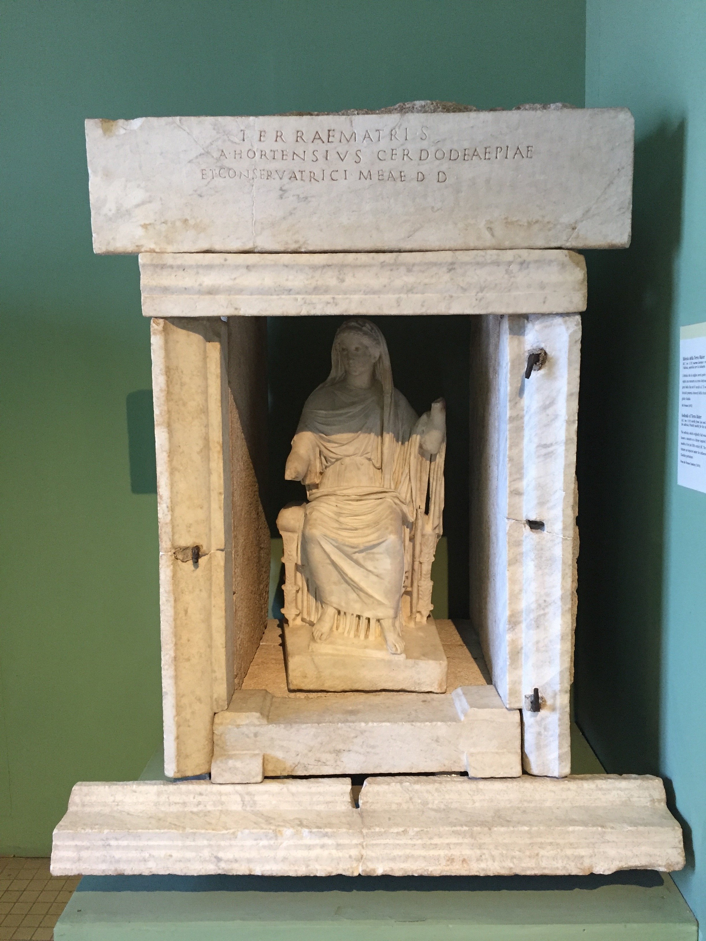
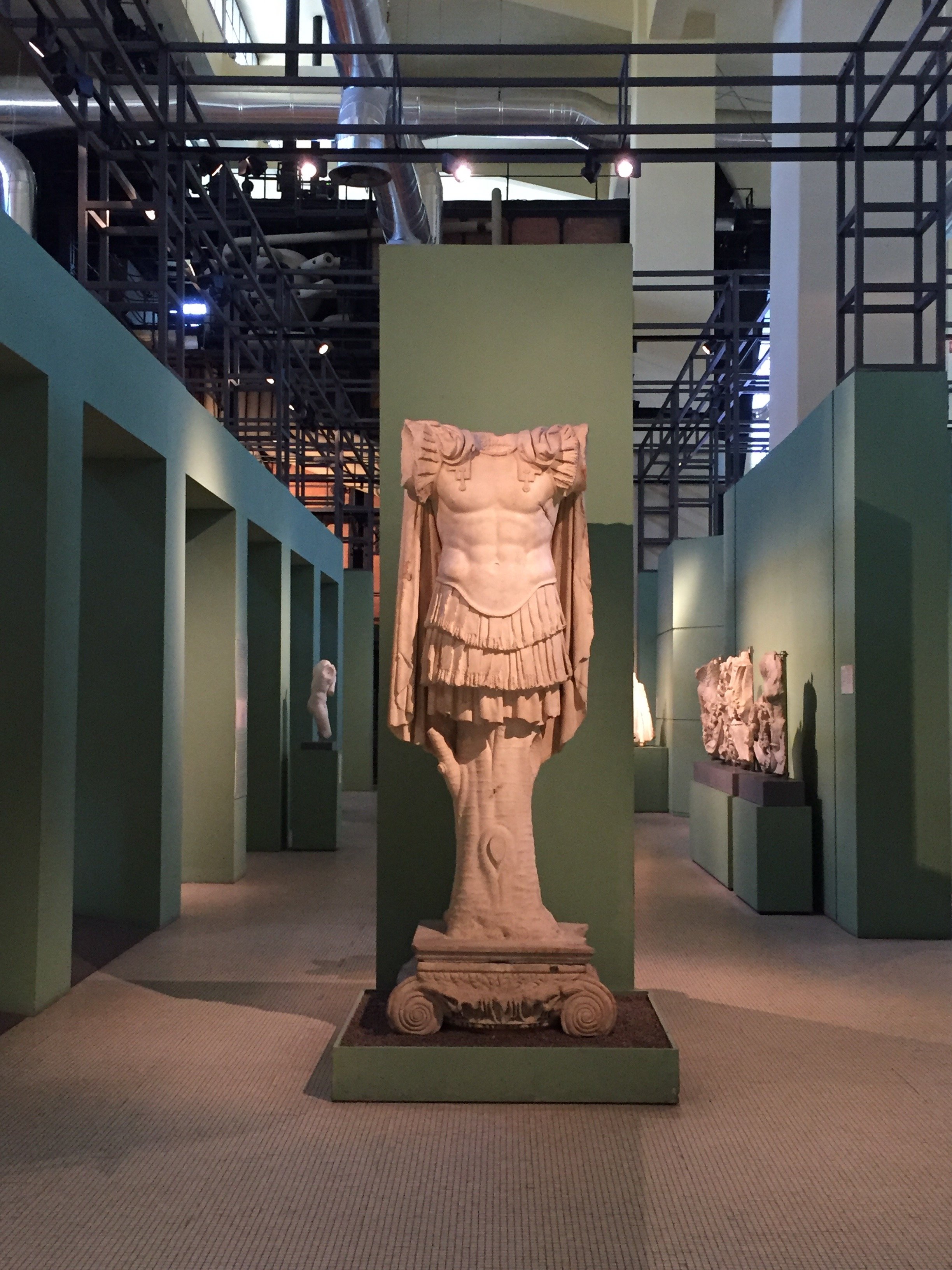
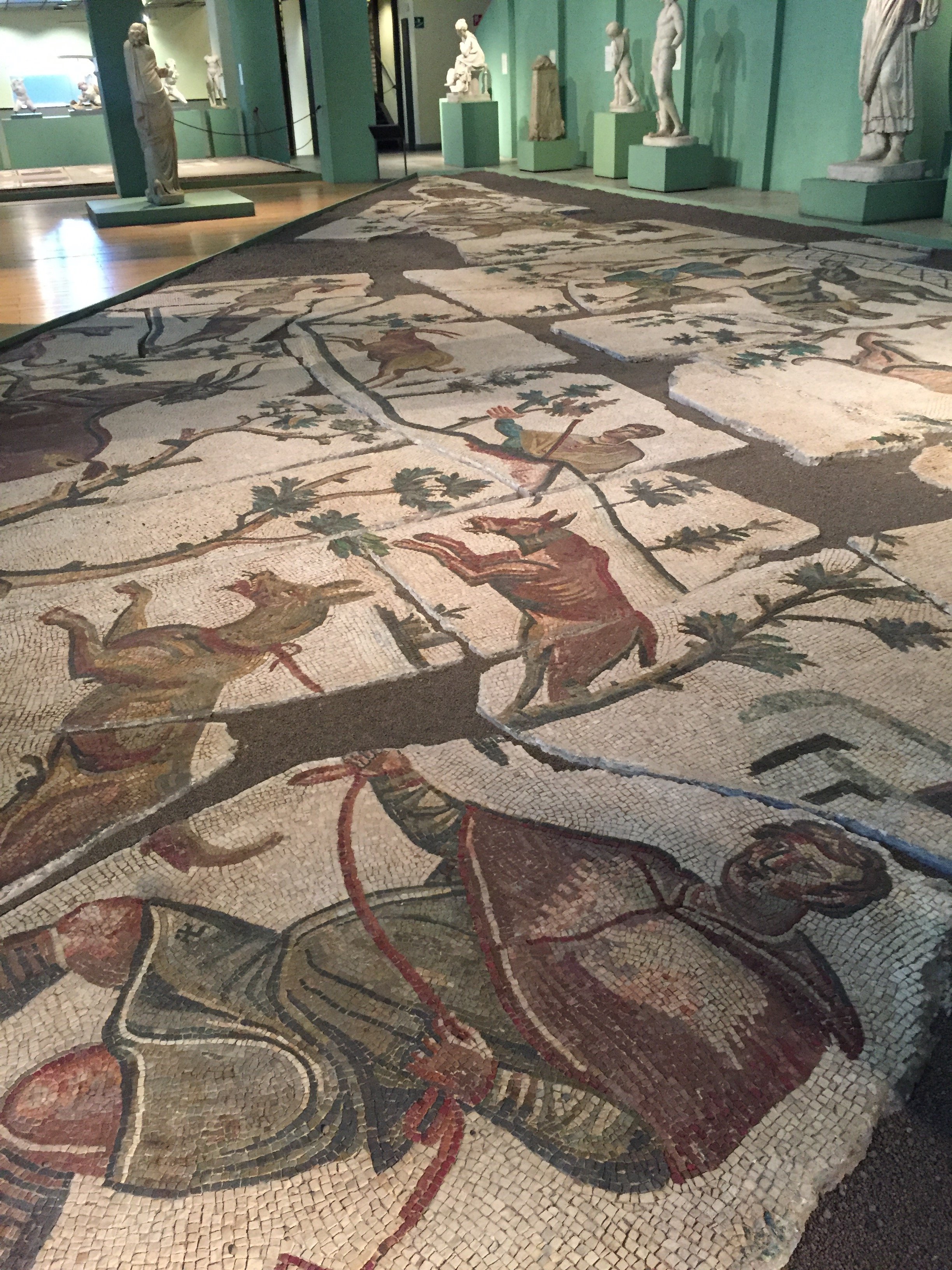
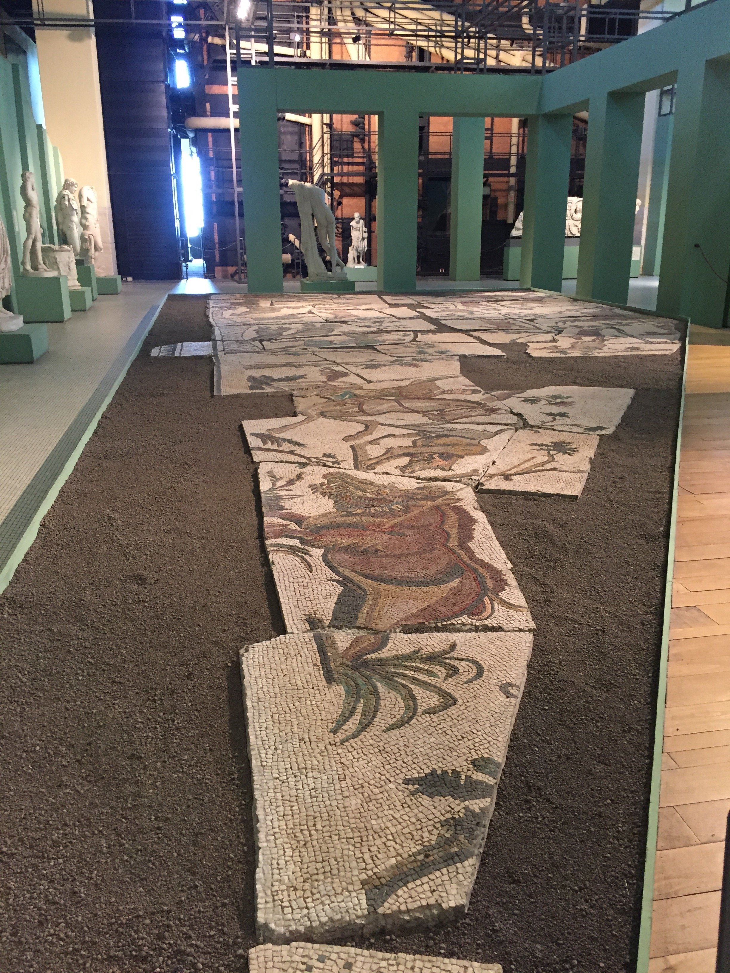
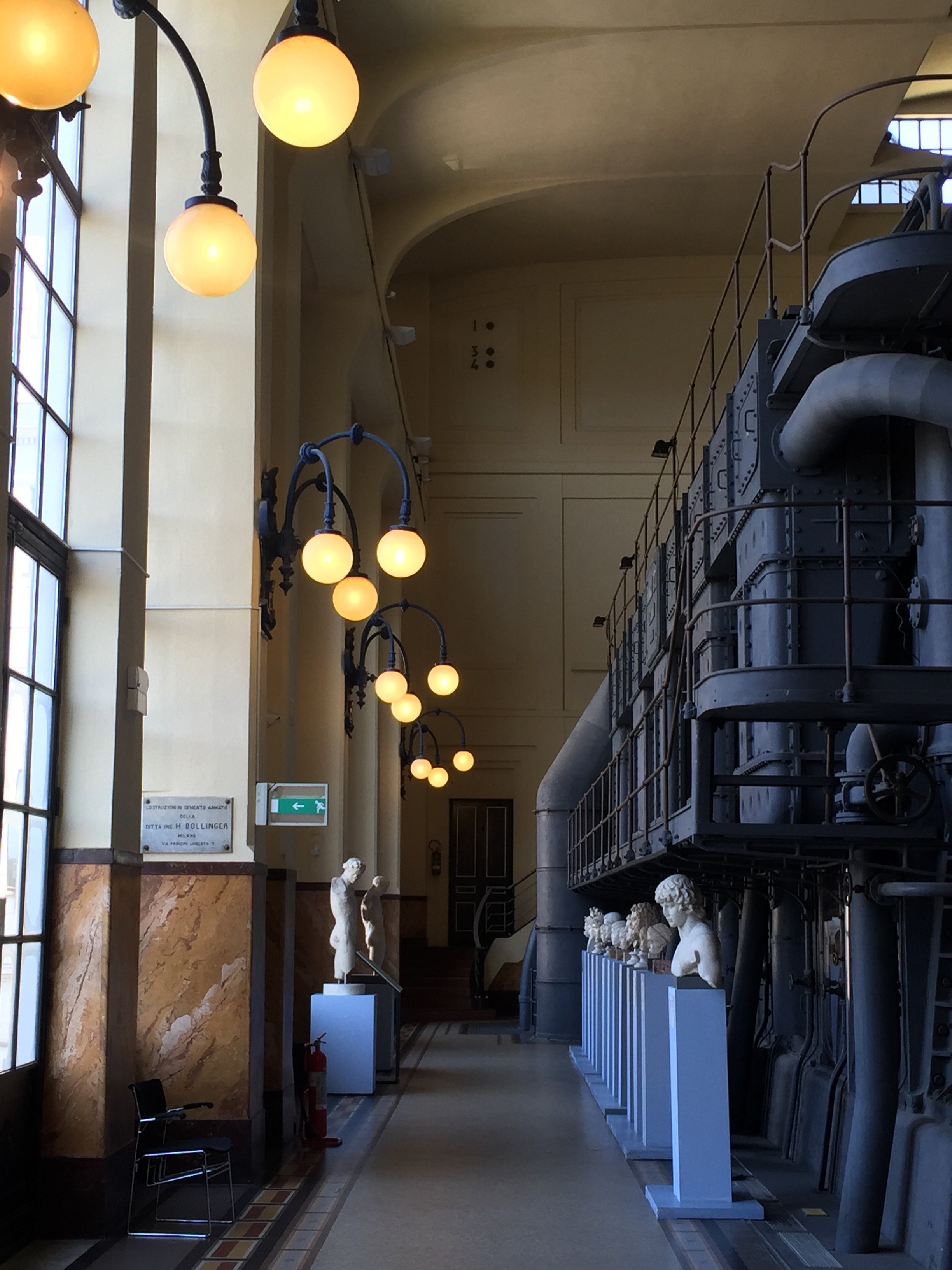
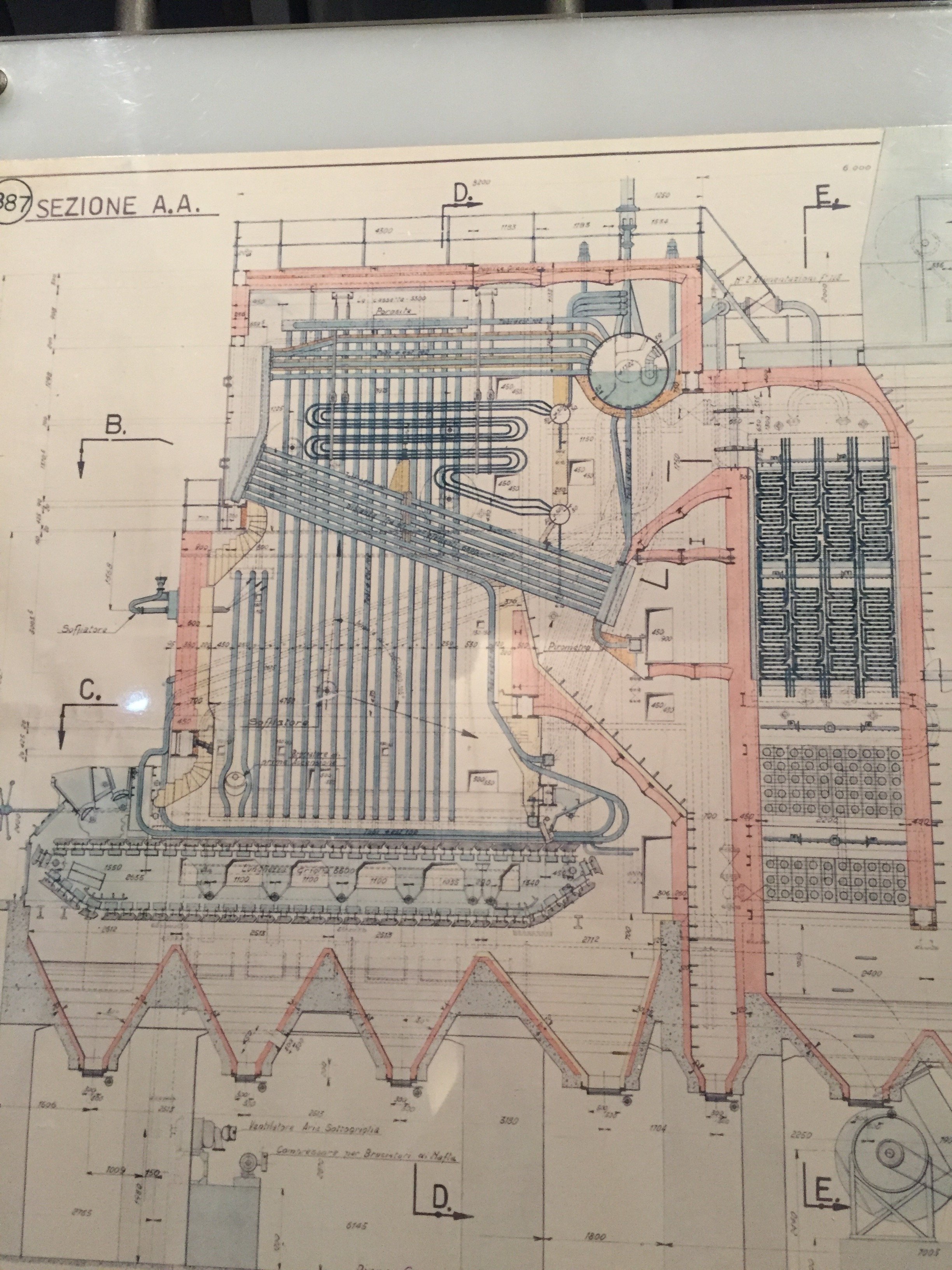 Via Ostiense 106Tel. +39 06 39967800Website www.centralemontemartini.orgOpen Tuesday to Sunday 9:00-19:00. Closed Mondays and some public holidays.Cash only.
Design Inspiration - La Bandita Countryhouse
My apologies for the radio silence. Work has been bonkers. One of my clients moved back to the States. She was a high-ranking diplomat and her term was up. We needed to organize a major international move for someone who had lived in Rome for quite some time.My trip to La Bandita was the weekend after her move was finished. The timing was perfect. I was completely wiped out.I've been to the Townhouse and was curious about the Countryhouse after reading about it in design magazines. When Annalee invited me to join her, she didn't have to ask twice.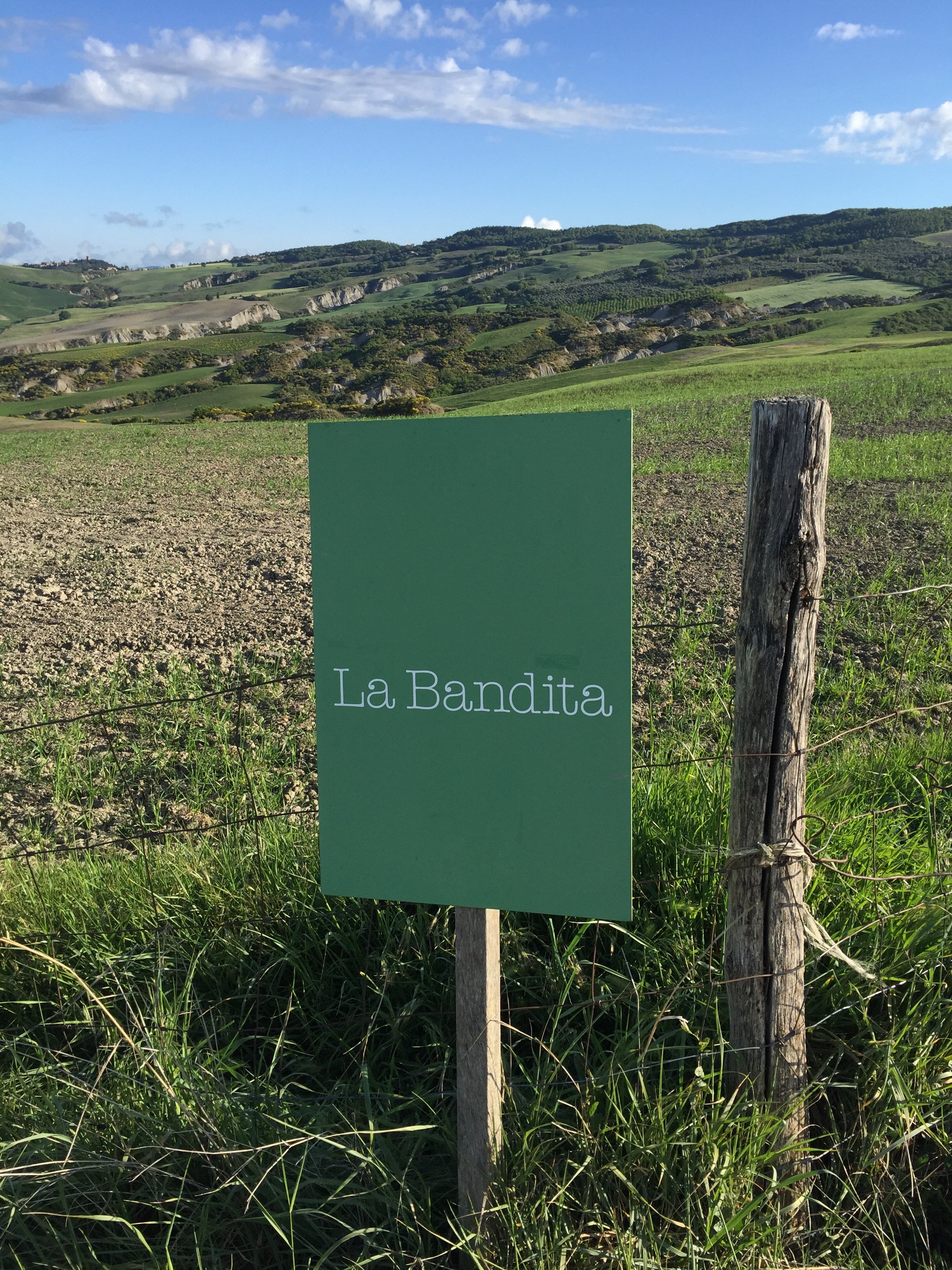 We met at the Chiusi train station and rented a car. Thankfully, Annalee did most of the driving as the two times I've rented a car in Italy I've received a speeding ticket. I lived in Los Angeles for ten years and drove pretty much every single day. I never received a speeding ticket (or any ticket for that matter). NEVER. I really don't understand why I got tickets in Sicily and Tuscany given I was trying to keep up with the flow of traffic. Sorry, I digress.I keep hearing Tuscany is over. Those people are on drugs. Are there some areas that are packed with tourists? Yes, but Tuscany is a large region. There's no reason to write off the entire area.The Val d'Orcia is truly one of the most beautiful places I've been to in Italy. My next post will be about what we did and where we went.Today, I'm focusing on the interior design. I've seen my share of "Tuscan" interiors. Too often there are extremes, either super modern, stripping all the character out of these older homes or too traditional, creating a space that reminds you of the Addams Family's house.Owners Ondine Cohane and John Voightmann, with their architects Ernesto Bartolini and Arianna Pieri of DA Studio in Florence, have a created a contemporary space that is warm, airy, and feels Tuscan. That last quality is so difficult to get right especially in an era of cookie cutter interior design (in part because every city has the same chain stores). Are there elements of the design that would feel at home in say, Miami or the Caribbean? Absolutely. The La Bandita team worked closely with local artisans and used natural materials found in the area. All these pieces came together to create a space that could only be in Tuscany.This article, written by Ondine, is about the how and why John and Ondine opened the Country House.
 Annalee and I stayed in The Pigsty Suite. Yes, this independent apartment (just a few meters from the main house) used to be the pigsty.
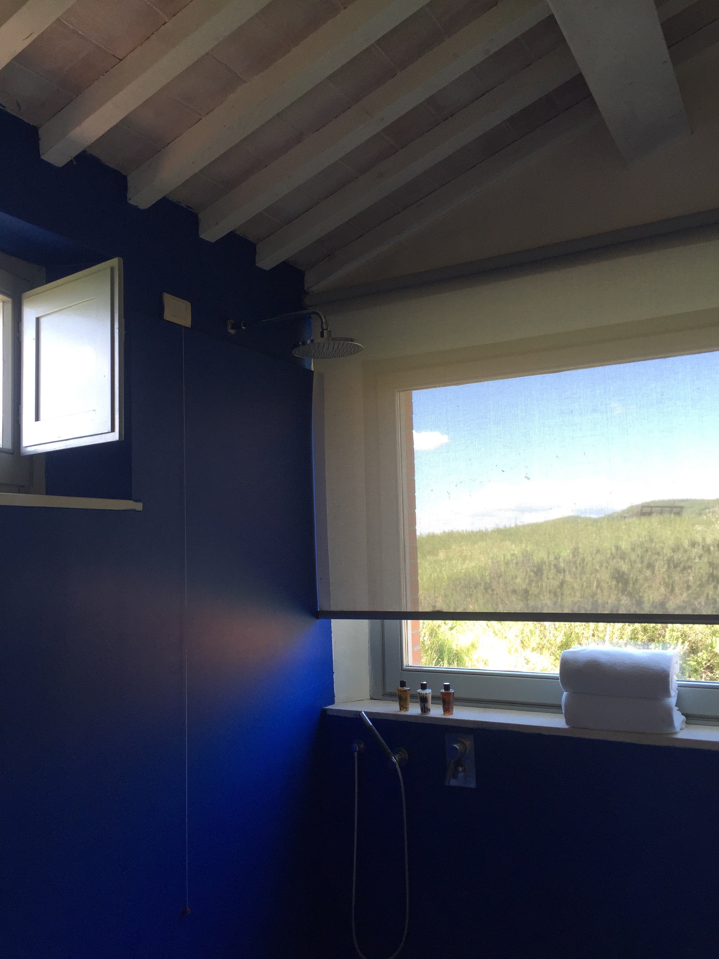
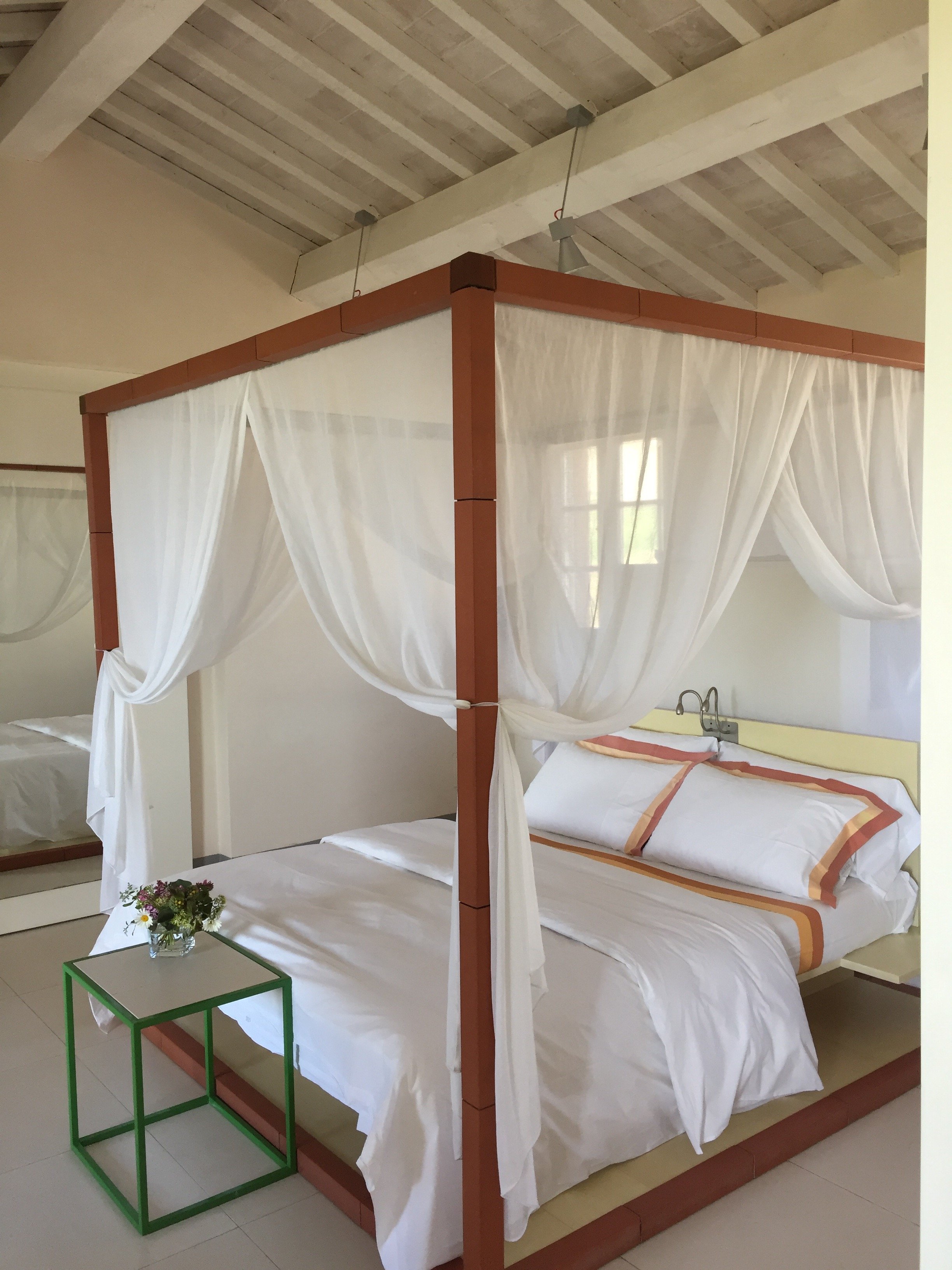 My pictures don't do it justice. It was perfection. We had our own little patio. The views from our "backward" were breathtaking. The bathroom was immaculate. I have a thing about cleanliness in general and it's taken to another level regarding kitchens and bathrooms.The bathroom was huge and I loved having a shower next to the big picture window. I felt like I was taking a shower outdoors but without the risk of being attacked by wild boars. Seriously, these darn boars are no joke. Annalee and I went jogging before dinner and other guests told us they saw a family of boars right after they passed us on the road. No grazie.
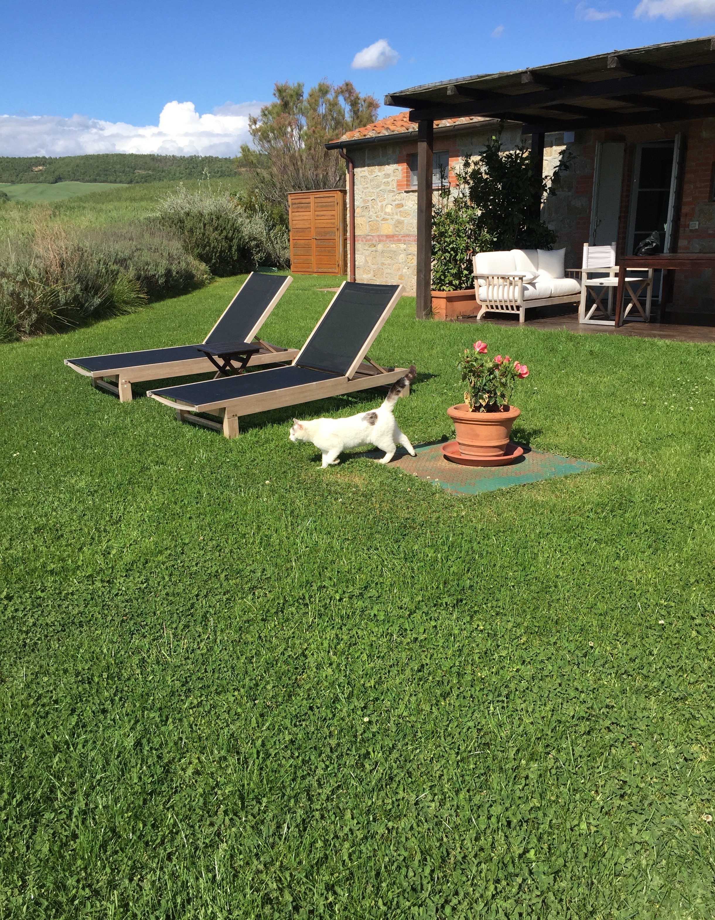 The check in desk/reception is in the main quasi-open planned room with the kitchen and dining areas. There is a lounge/library area with a great selection of books.
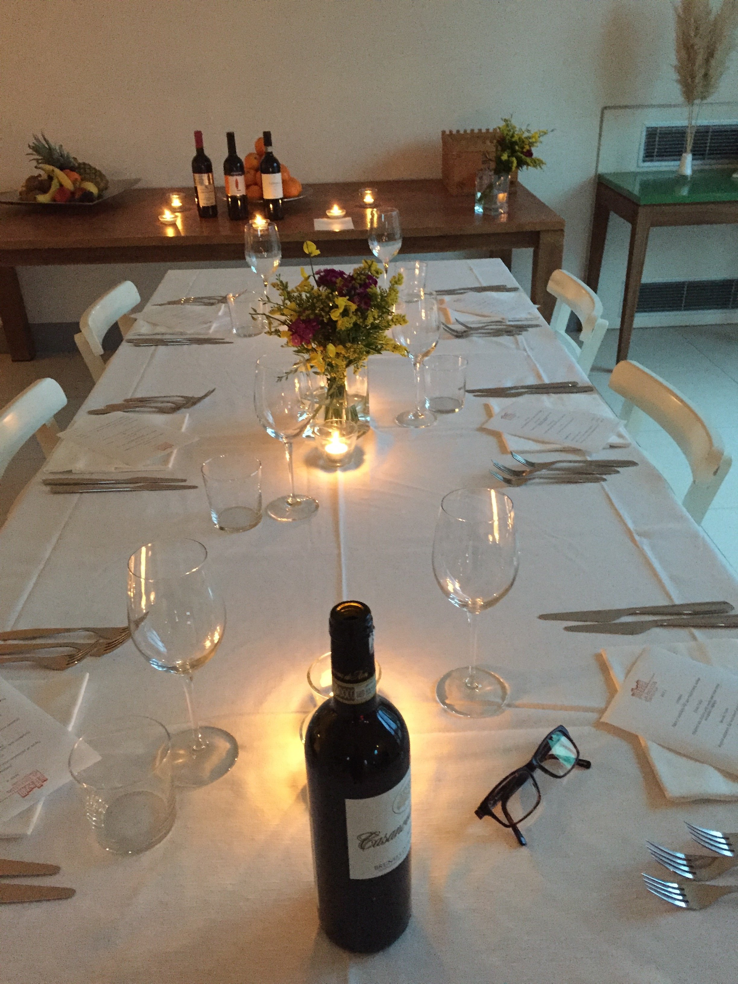
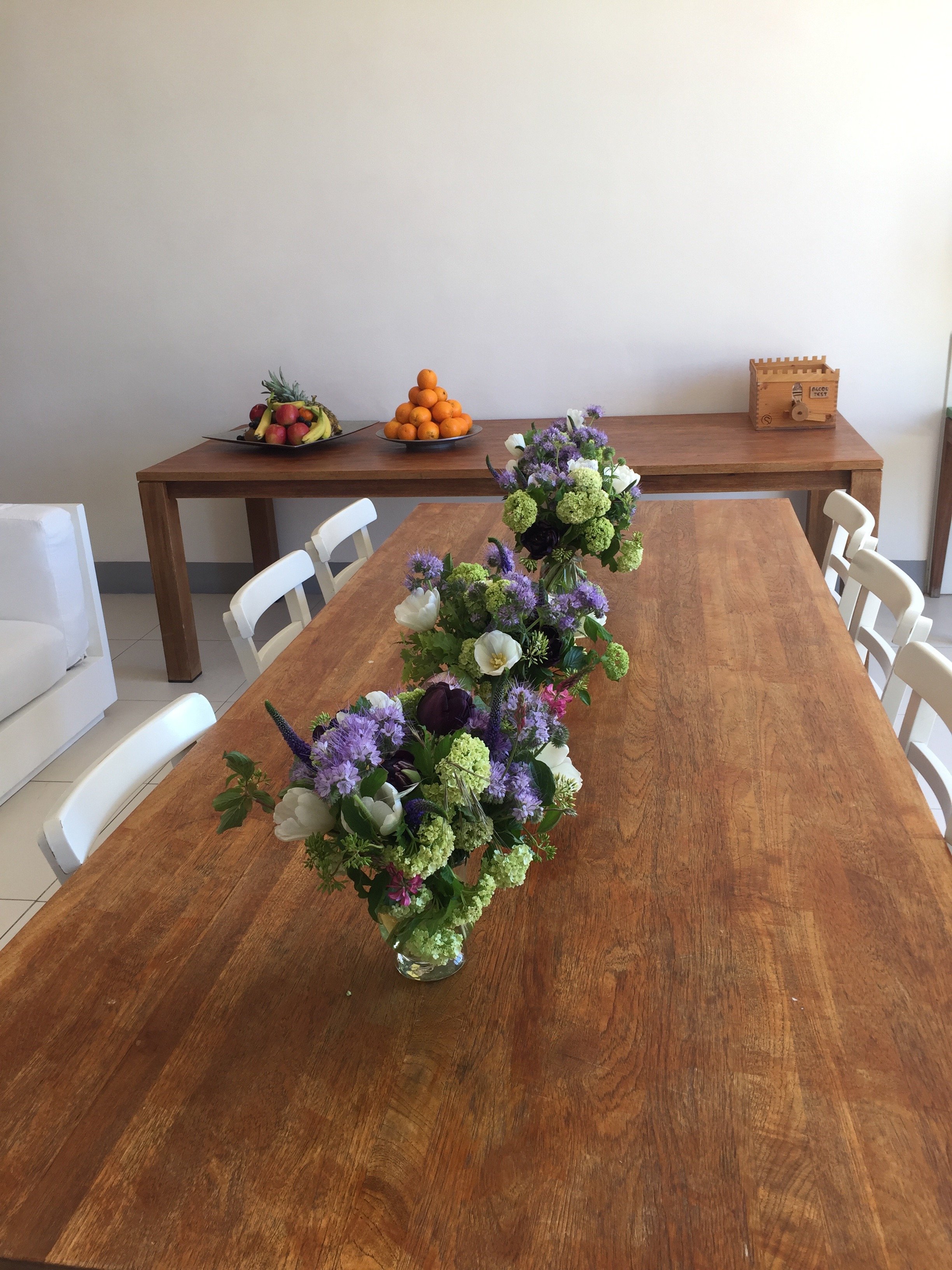
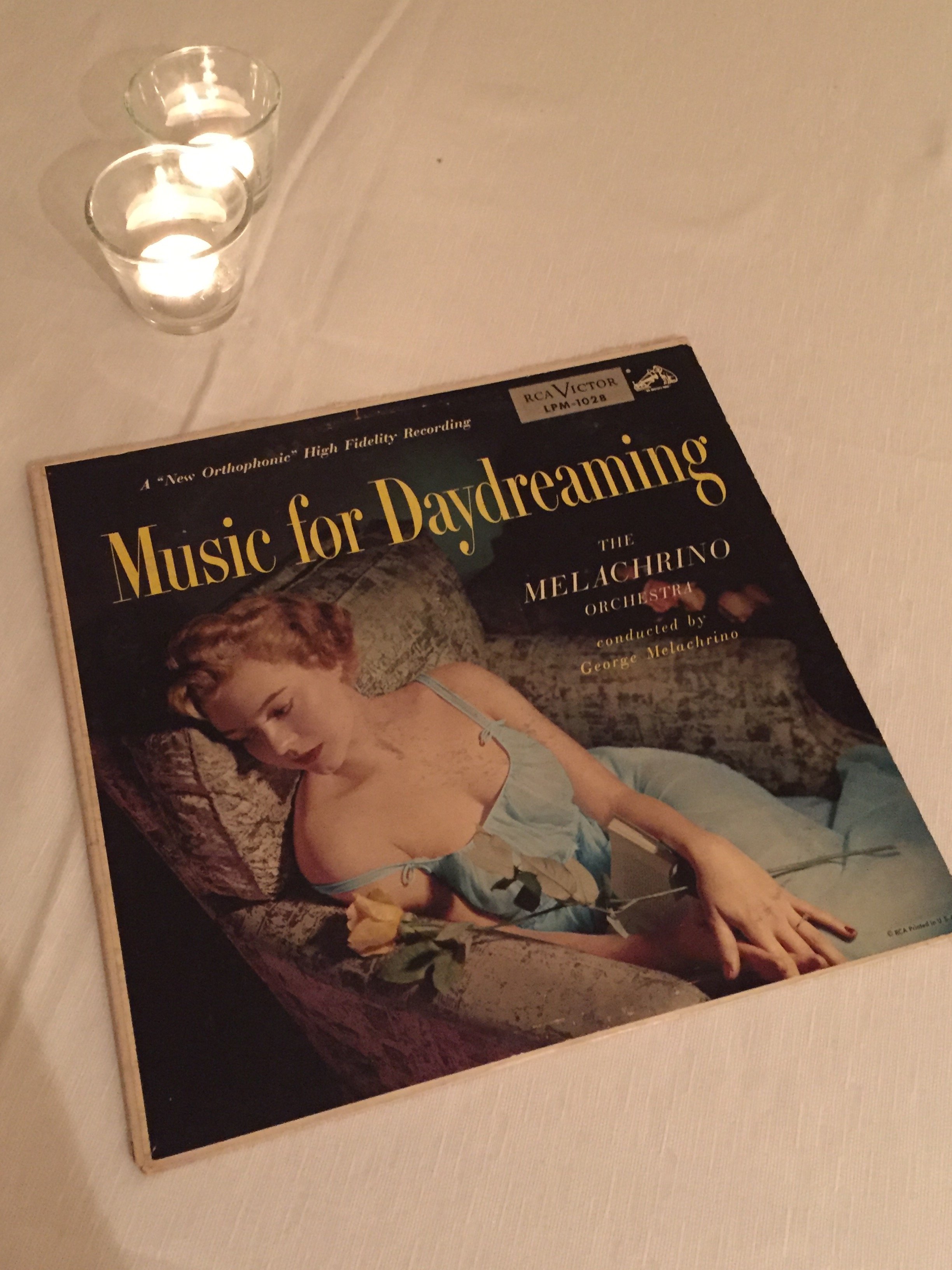 My personal hotel tastes lean toward simple but sophisticated interiors. Some might find the bedrooms too minimalist but for me they let the architecture and views shine. The rooms are relaxing and calm which is what I want in a hotel room.
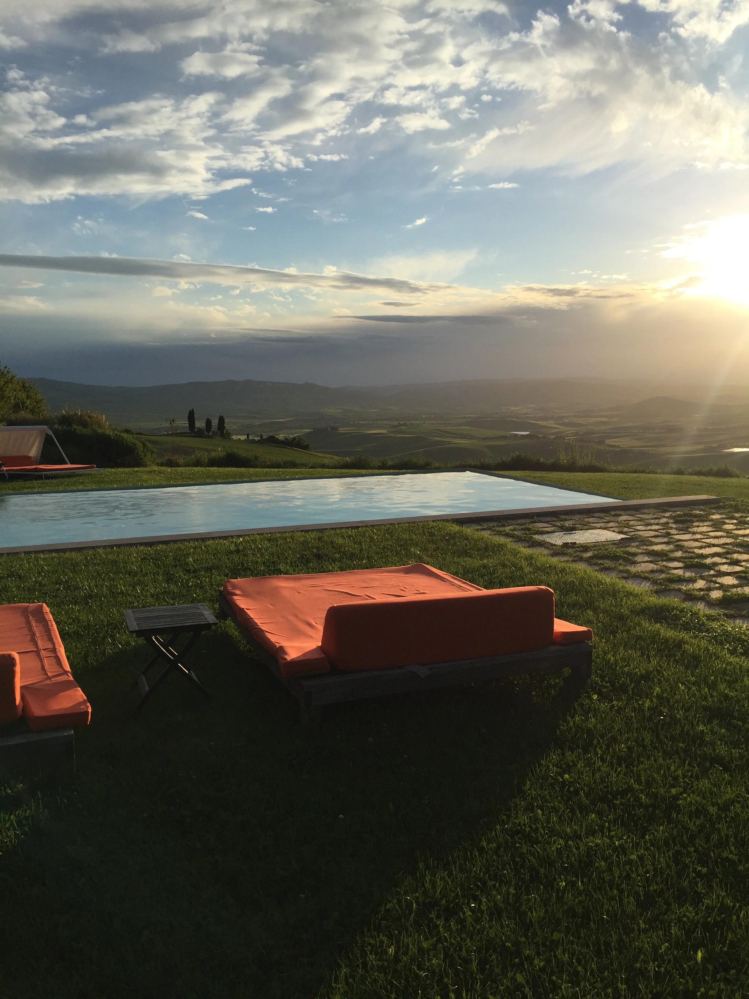
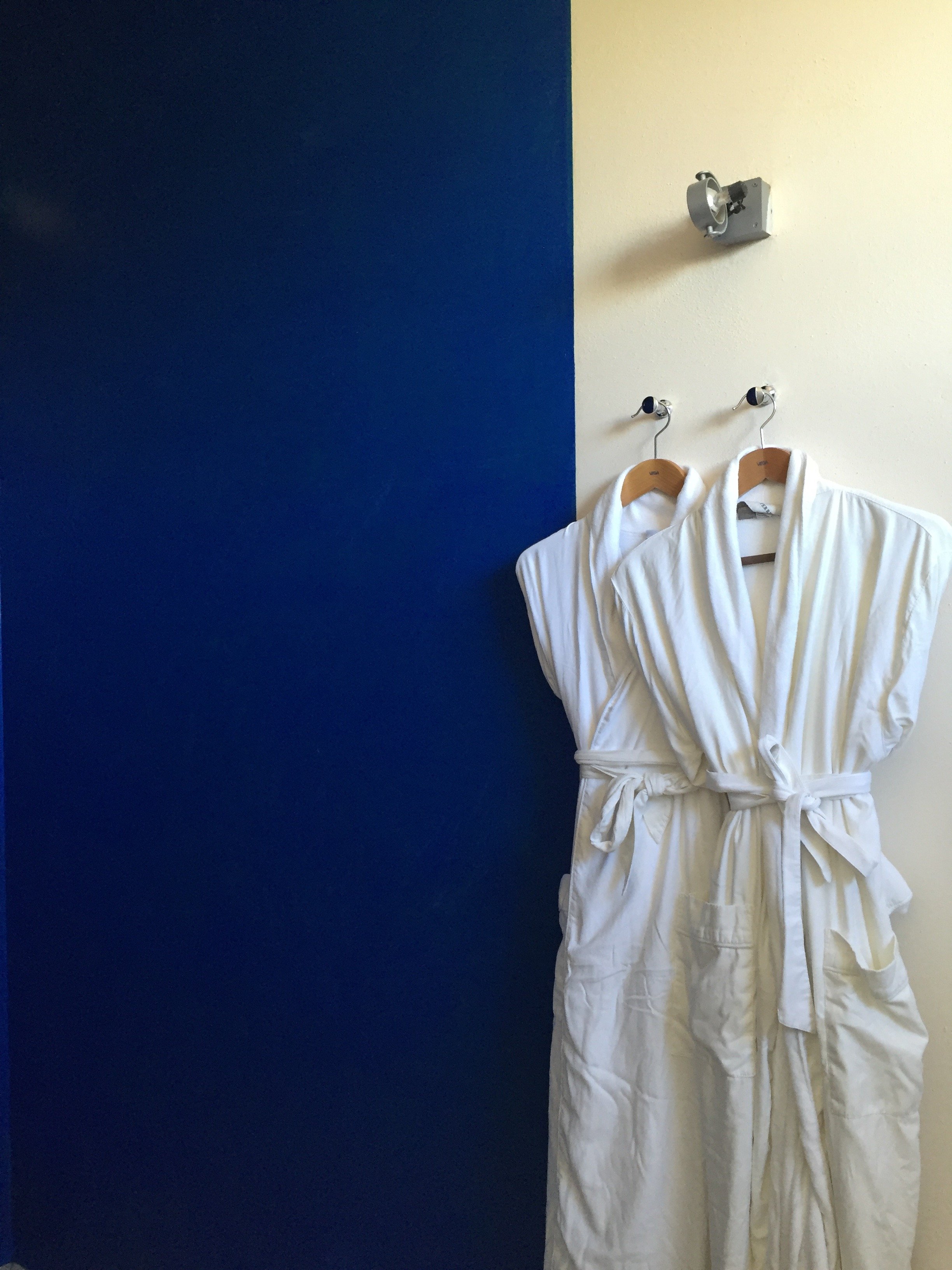 I can see how this hotel may not work for a solo traveler or anti-social couples as the dining space is communal. Bandita Countryhouse would be perfect for a group to rent the entire space.It's truly off the beaten path so I'm glad we arrived during the day. The unpaved road leading to the property is steep but worth it for the 360 views.
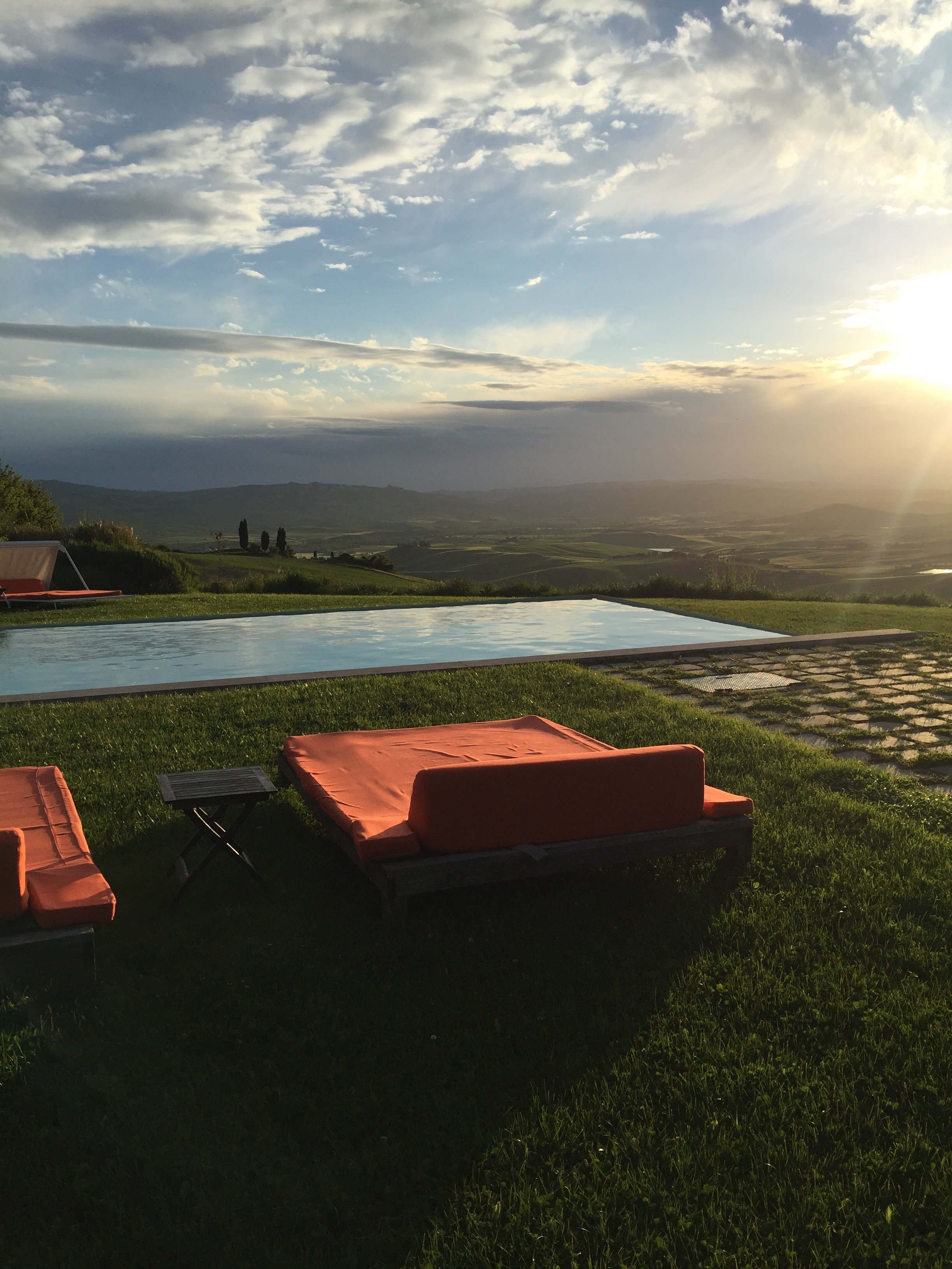
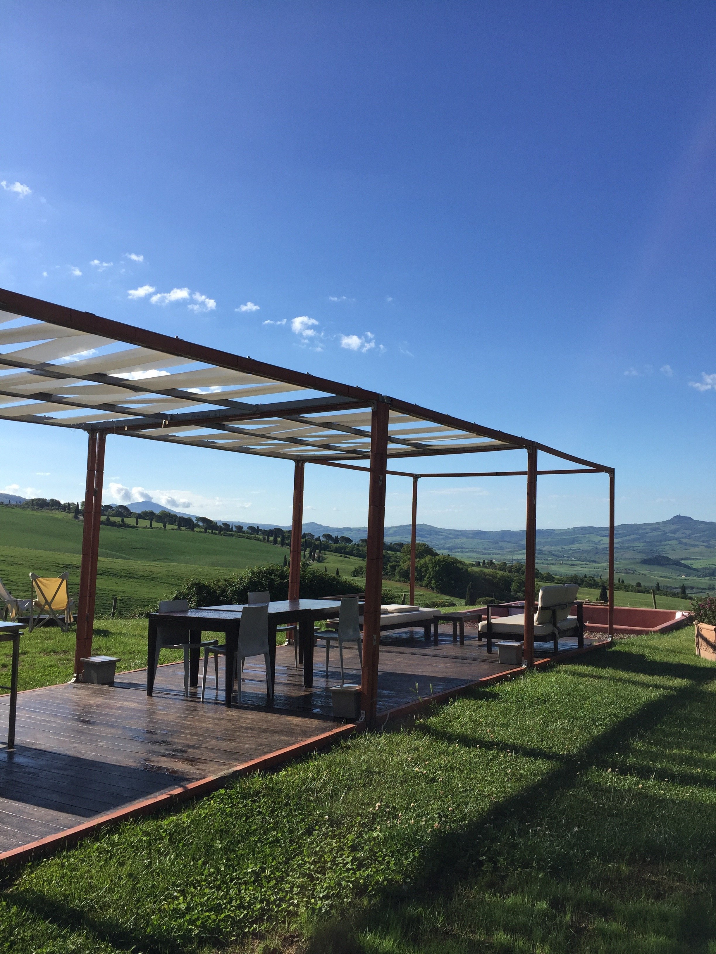 While technically it is a boutique hotel, the vibe at La Bandita Countyhouse is more your friend's very chic country house in Tuscany. I am here for it. The hospitality and food were wonderful. John, Ondine, Dario, Elena, Paola, Marco, and the cat (I didn't catch its name) made us feel at home.I had a great time. So much so that I'm willing to deal with the drama of driving a car in Italy again.
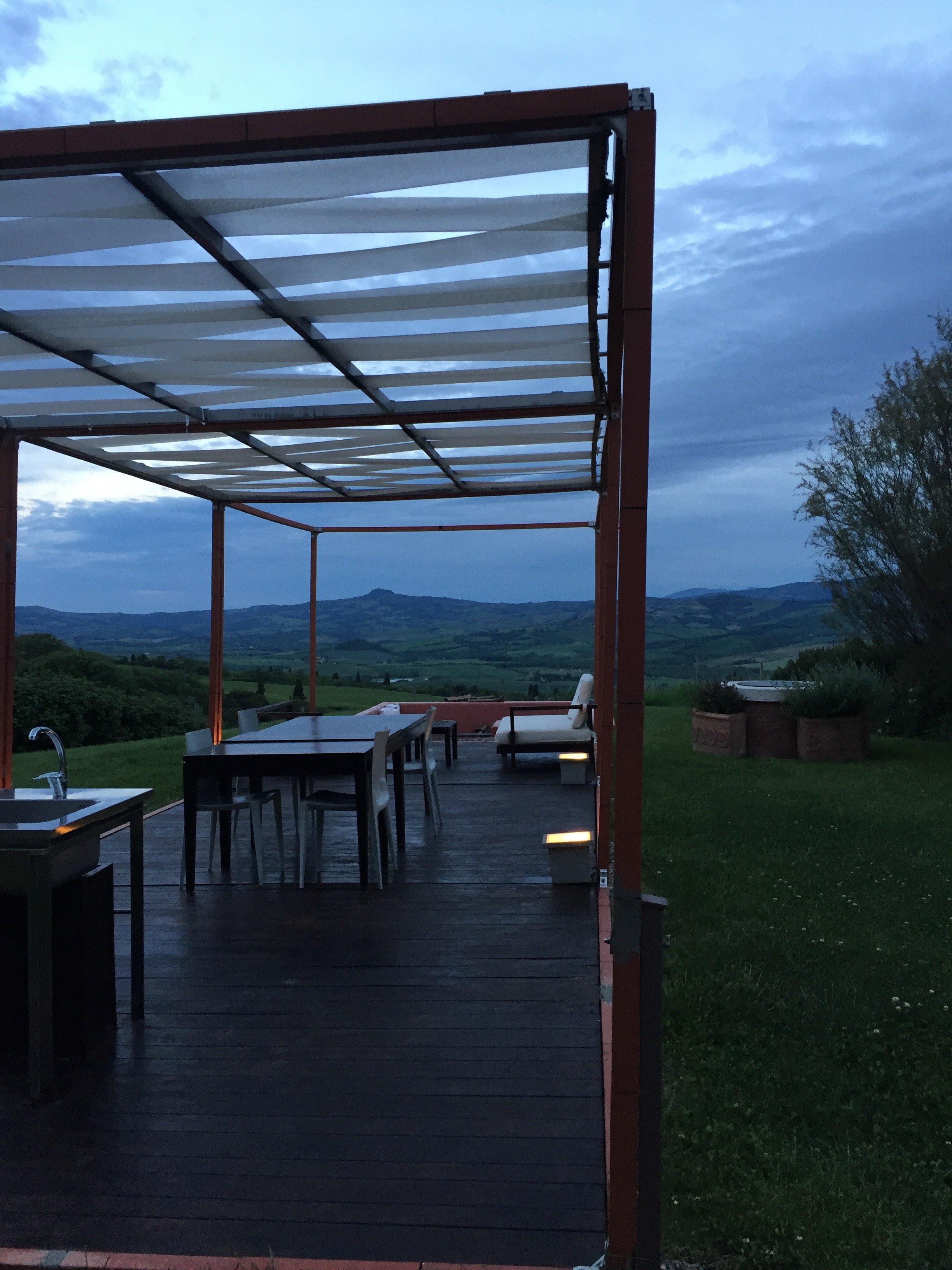 Photos: Me and my iPhone.La Bandita CountryhousePodere La BanditaPienza (SI) 53026Toscana, ItaliaTel +39–333–404–6704Fax +1–212–202–6222website
Life in Rome - Ercoli 1928 Parioli
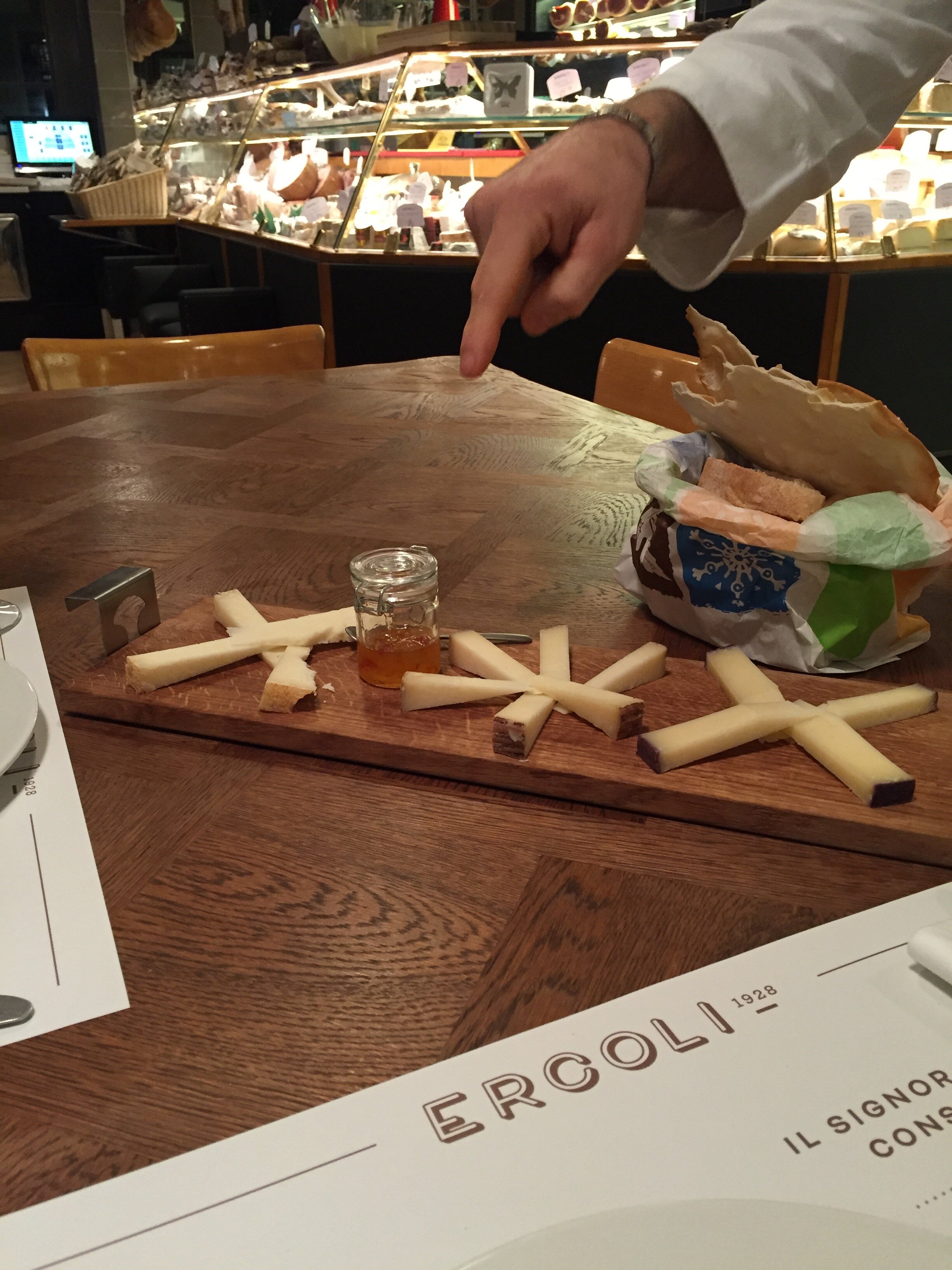
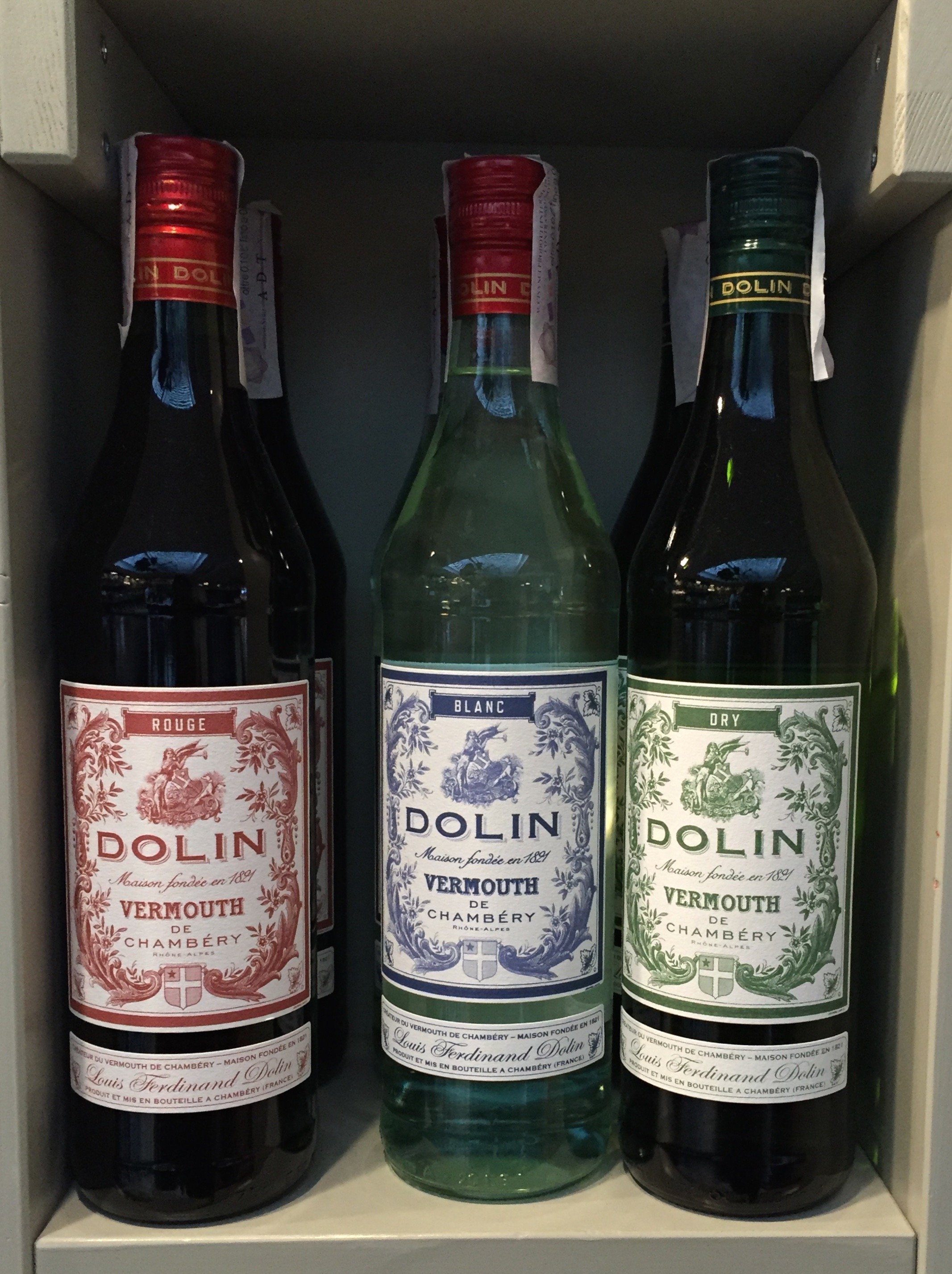
I have lived in Parioli for a year now and love it. When I told people I was moving from the Historic Center to Parioli, everyone had an opinion (mostly negative)."It's so boring," was one of the main criticisms I heard regarding Parioli. Granted, it's not as exciting as living around the corner from the Drunken Ship but that's okay.There are plenty of great places in this neighborhood to get your aperitivi on and the prices are much lower than the Center. That said, it is a more residential area. There are rarely any tourists and while there are quite a few American and British expats living in Parioli, I seem to bump into them only at the DOC or Carrefour supermarkets.The latest addition to the 'hood is Ercoli 1928 Parioli and I am here for it. I met a friend for an aperitivo during the holidays. The first person I saw when we walked in was Federico Tomasselli, the bar manager and one of the best bartenders in Rome. What a very pleasant surprise! He used to be at Barnum on Via del Pellegrino. I lived on Pellegrino and spent a lot of time at Barnum because of Federico and Patrick (Patrick is now at Caffe Propaganda).My friend and I sat at the bar and loved it. The bar's specialty is Vermouth. My friend said their drink was outstanding. If you don't drink Vermouth, no worries. Ercoli's wine list is deep and they have a solid cocktails list too.I returned with another friend the other week and this time we sat in the front because the bar was still setting up.We ordered glasses of wine and the Italian cheese plate. Outstanding.The service was great and everyone was friendly. Trust me, this is not the norm in Rome where service can range from indifference to outright hostility. Ha.My friend picked up some takeout for her husband. I need to ask her how the meatballs were. The cheese selection is fantastic and will be problematic. I haven't eaten lunch or dinner here yet but have heard very positive reviews about chef Andrea di Raimo's dishes.
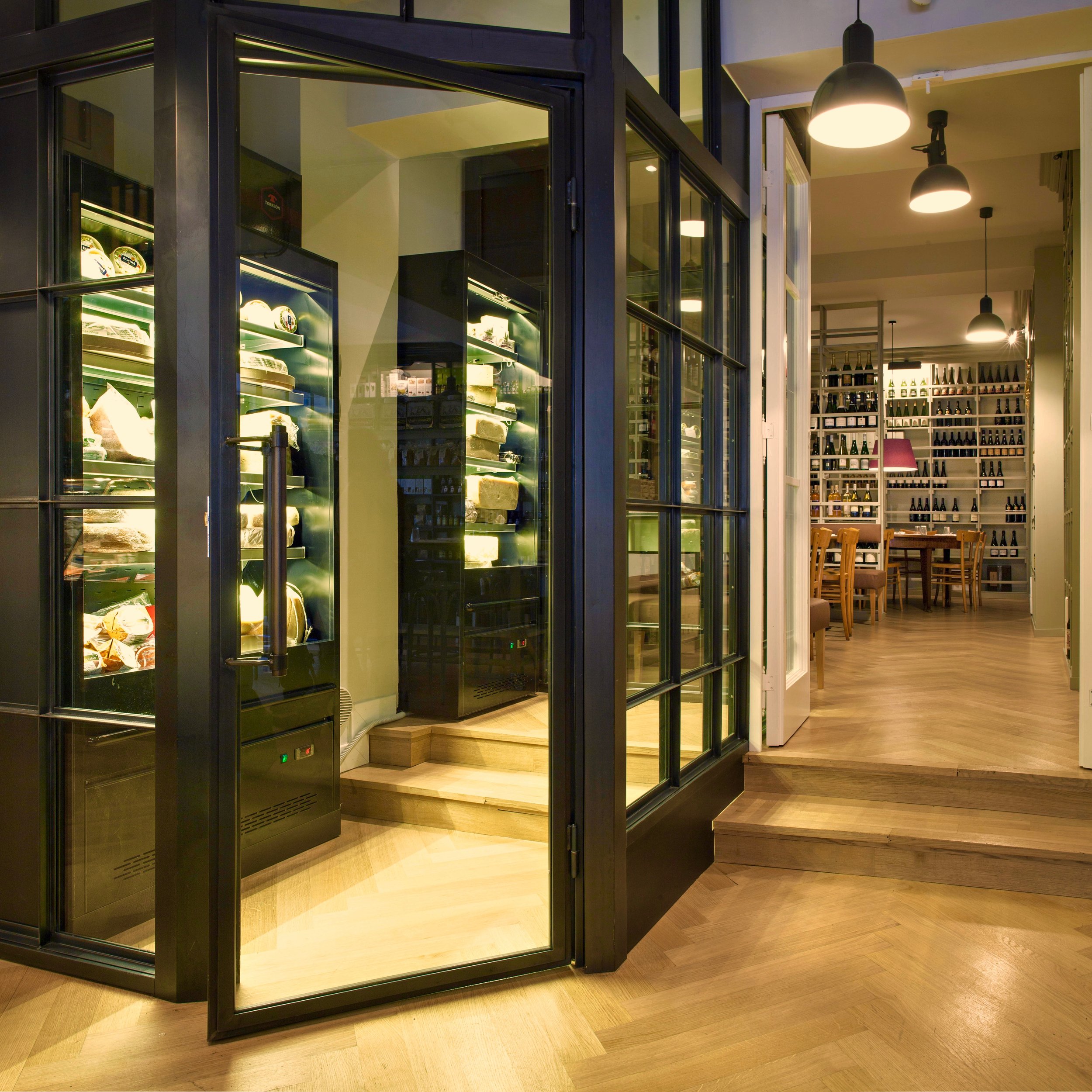
 There are people don't care how a place looks as long as the drinks are great. I'm not one of those people. For food, it's a different story. There are wonderful restaurants that don't have much of a décor but it's okay because the food is on point. However, when it come to aperitivi/cocktails, atmosphere is also very important to me.
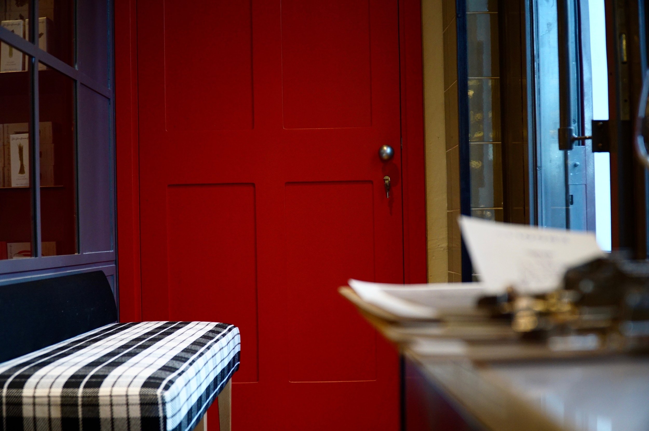
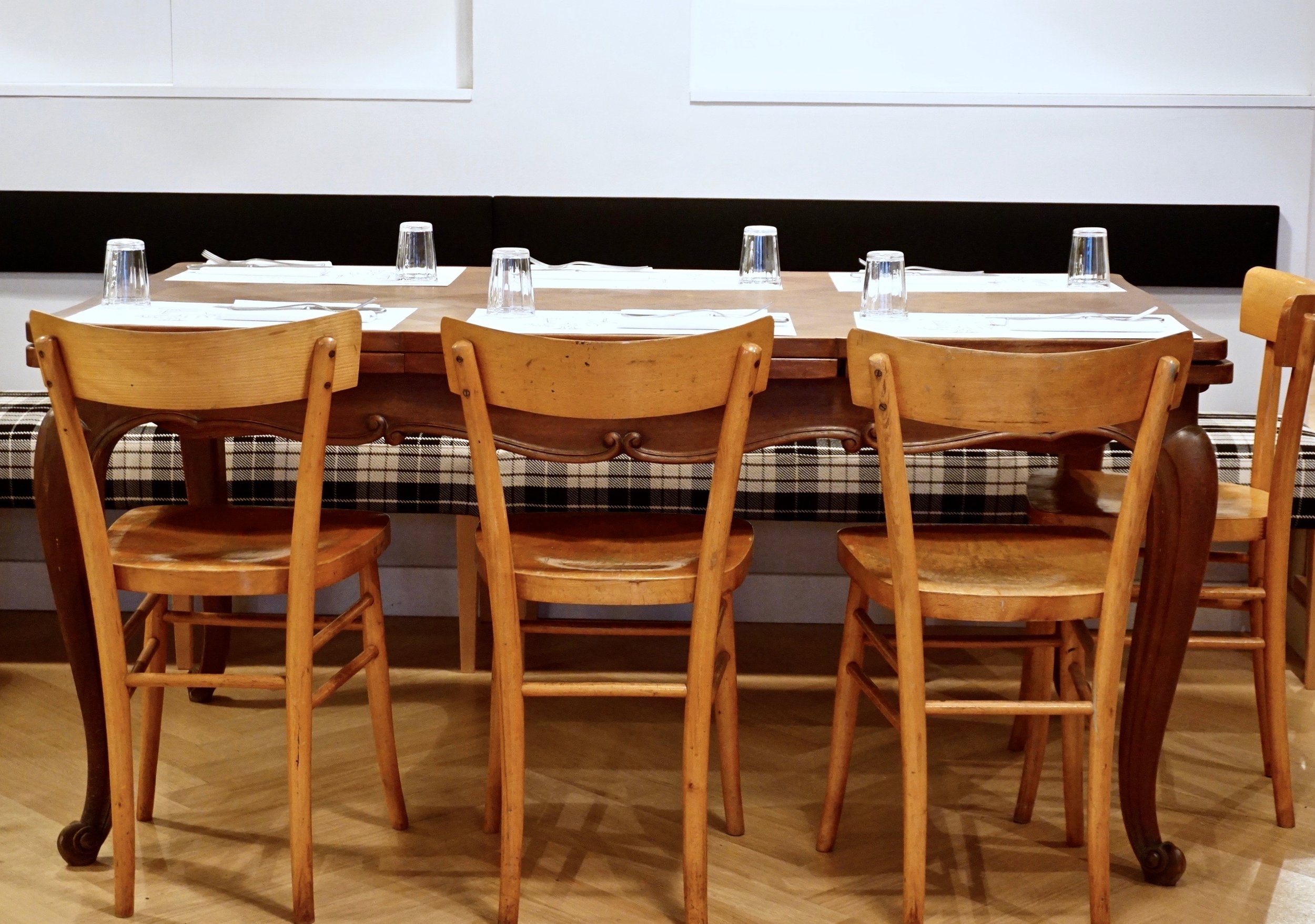
 Ercoli Parioli knocks it out of the park. The space is divided into three areas. There's a restaurant, a deli, and the bar/cantina.The architect is Roberto Liorni, who's responsible for several of my favorite restaurant spaces including, Pastificio San Lorenzo a Roma, Rosti, and 'Gusto. The latter opened in 1998 and other restaurants are still "referencing" it. Liorni was also the architect for the film company Cattleya's headquarters. All these places have their own vibe but with his unmistakable DNA, contemporary, chic, yet comfortable.I adore the interior design at Ercoli. It's not trying to be the Roman version of a space in Soho or on Abbot Kinney. It fits the neighborhood and doesn't look like every single restaurant that has opened recently. I love the plaid...an unexpected touch.
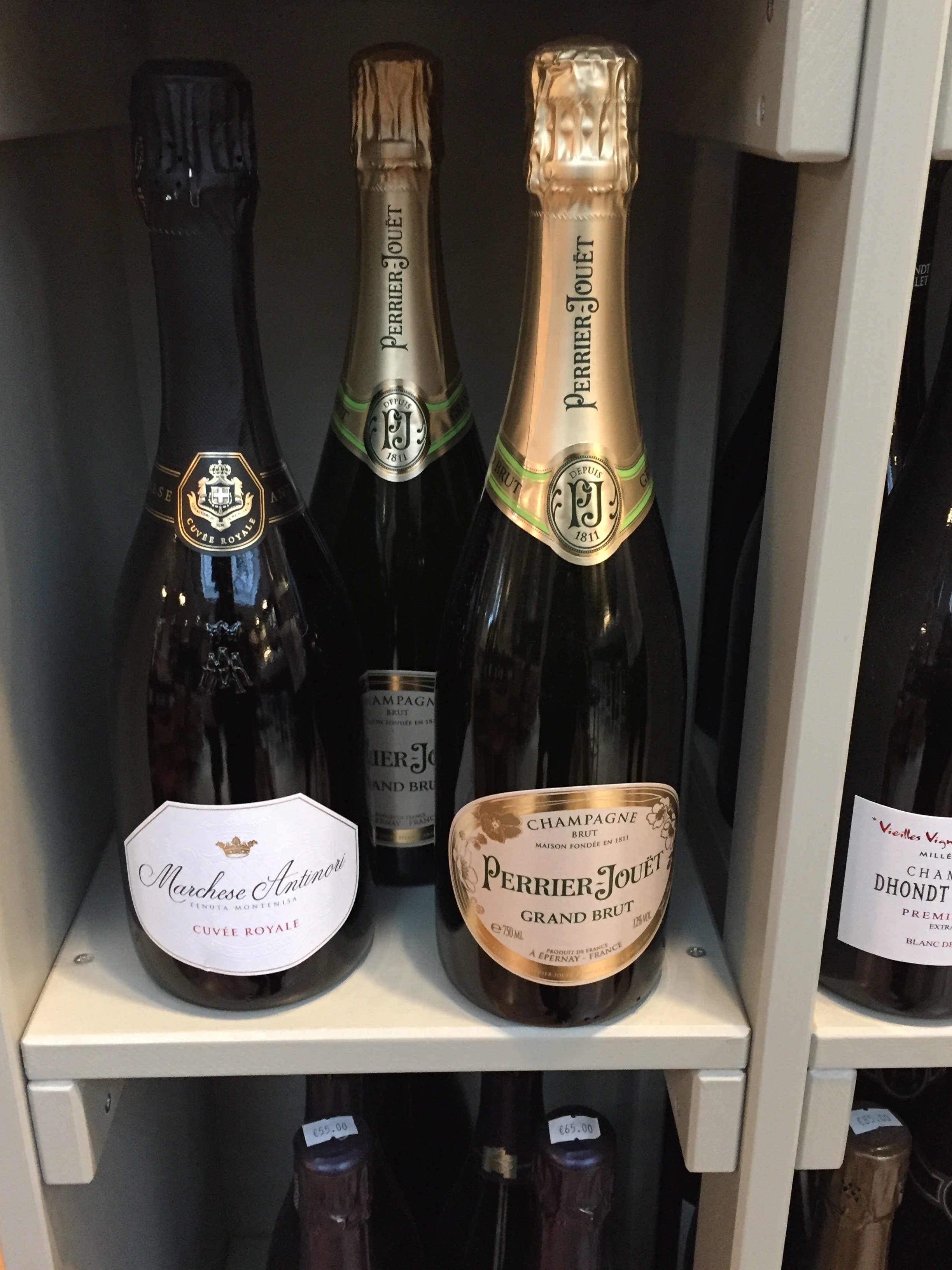
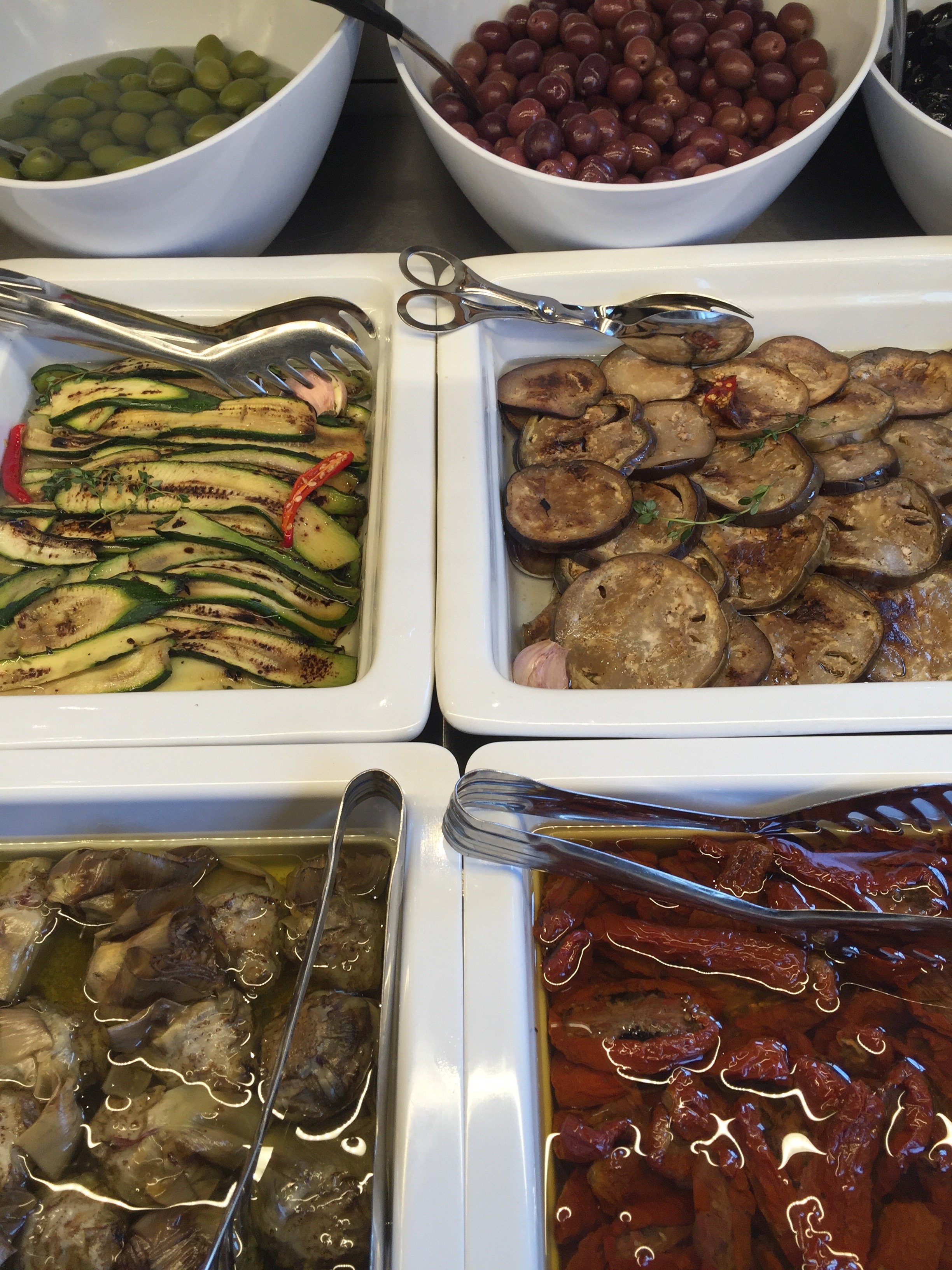
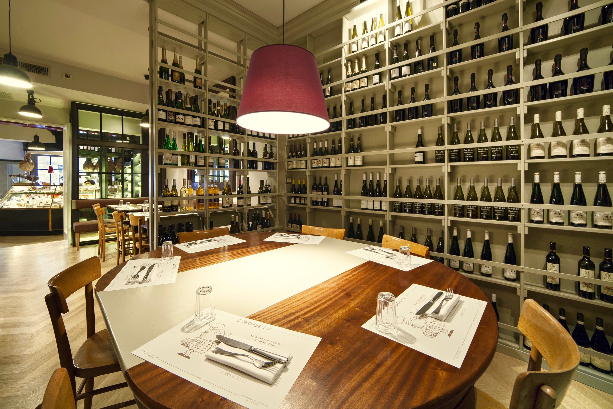


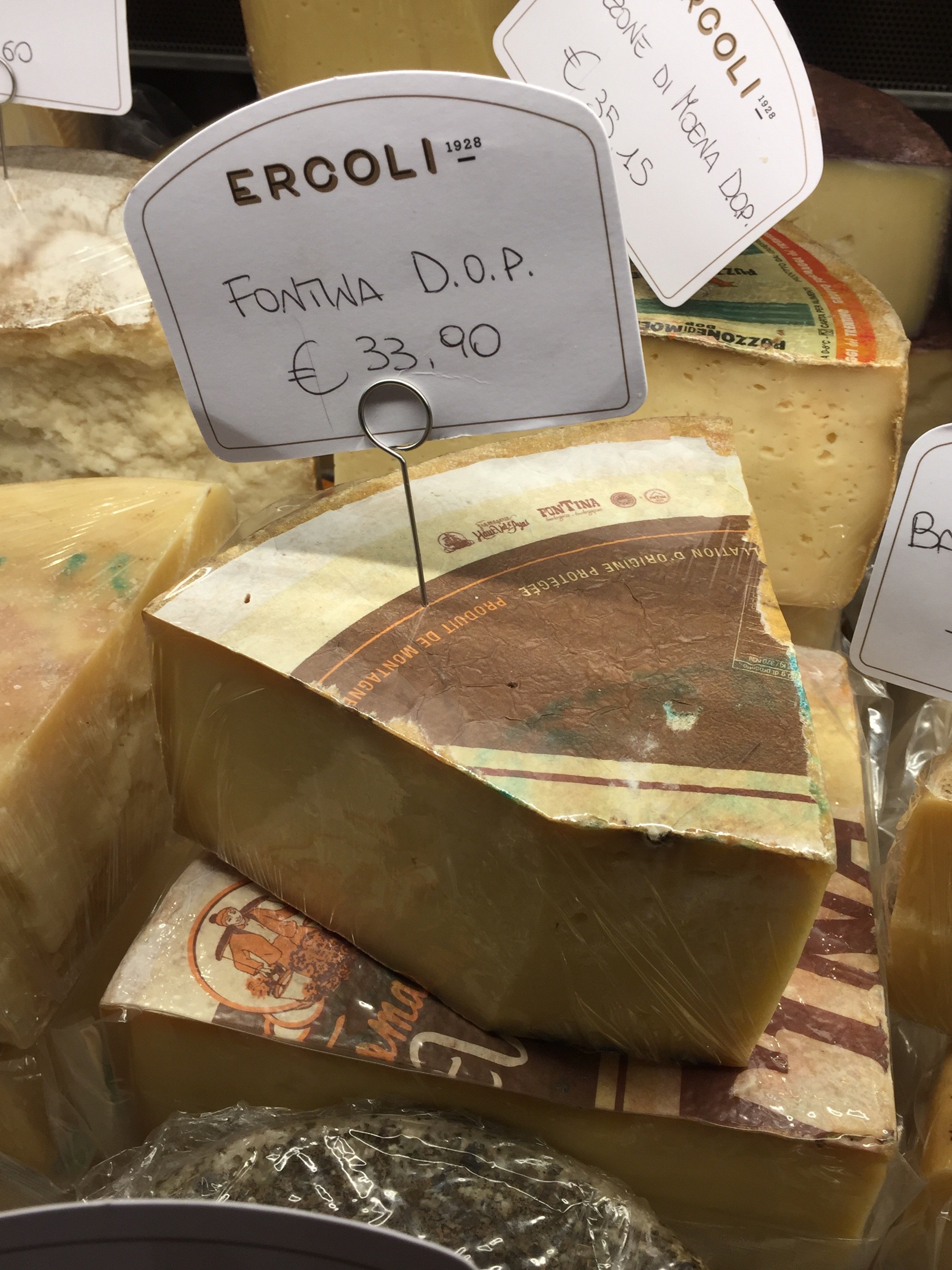
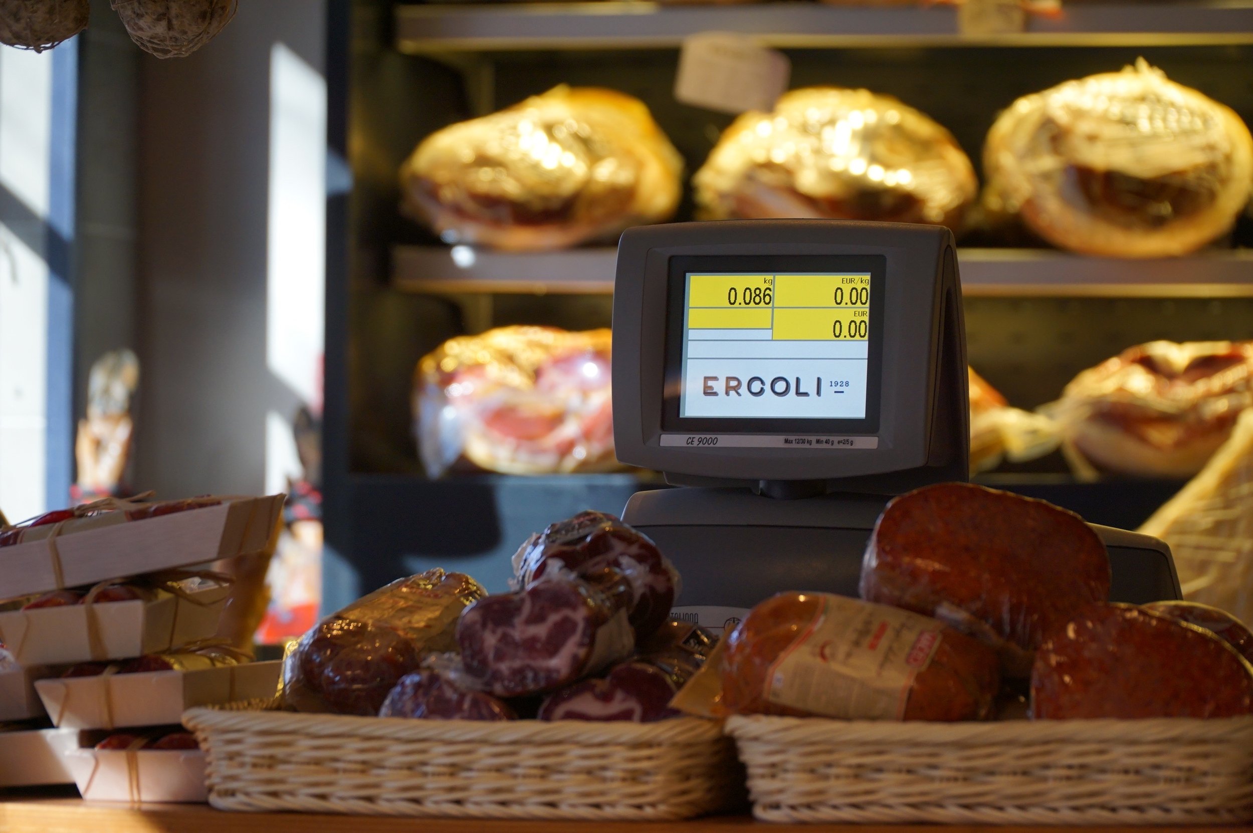 I finished the cheese I bought. I'm trying to avoid Ercoli this week. I don't think I will be successful.
Before & After - Via Banchi Vecchi Project
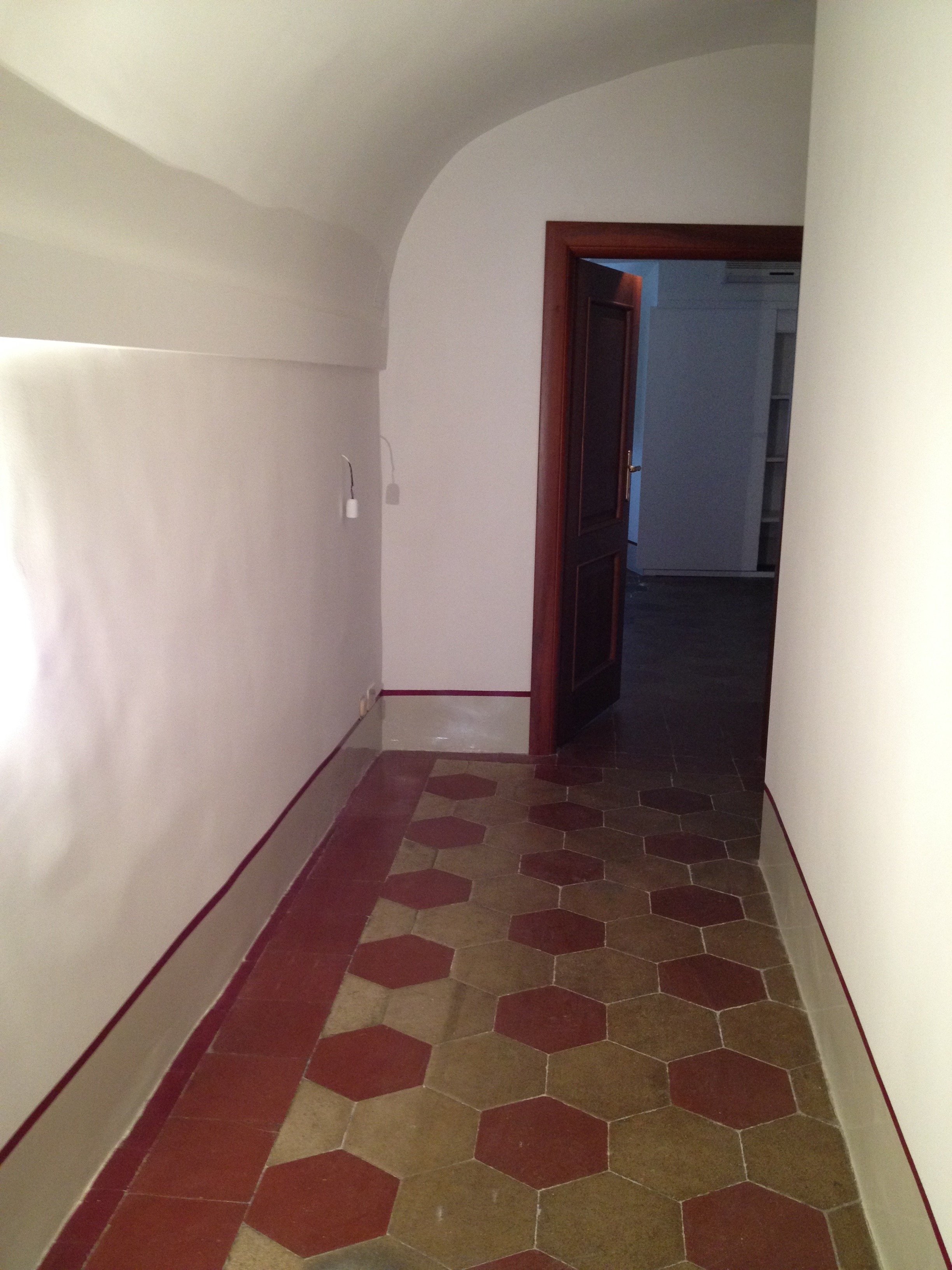
Ciao Bloggisti,Earlier I wrote about the Via Monserrato project. One of the other apartments we worked on was located two blocks away on Via Banchi Vecchi. It was a new apartment for our client.The apartment was empty so we didn't have the same logistical issues but two bathrooms, and the kitchen had to be renovated. Any time you start opening walls you will have some surprises, especially in a building that's over three hundred years old.The brief from the client stated that the unique original flooring and the red tiles in the kitchen could not be replaced. The floors weren't in great shape but I like to think of them as adding character. The client wanted to improve the layout, add a closet in the bedroom, lighten up the very dark kitchen, and make the second bathroom more functional.The bulk of the budget went to the renovation. Some of the furniture came from the other apartments. We bought a mix of high-end hardware/fixtures along with budget friendly pieces.The minute the client stated that they had to change the layout, we called an architect. Fortunately, Domenico Minchilli and his studio took on the project. Square footage wise it was a lot smaller than their usual projects but it was complicated. We had worked together before which made the renovation process, never easy, smoother.BEFORE - The Kitchen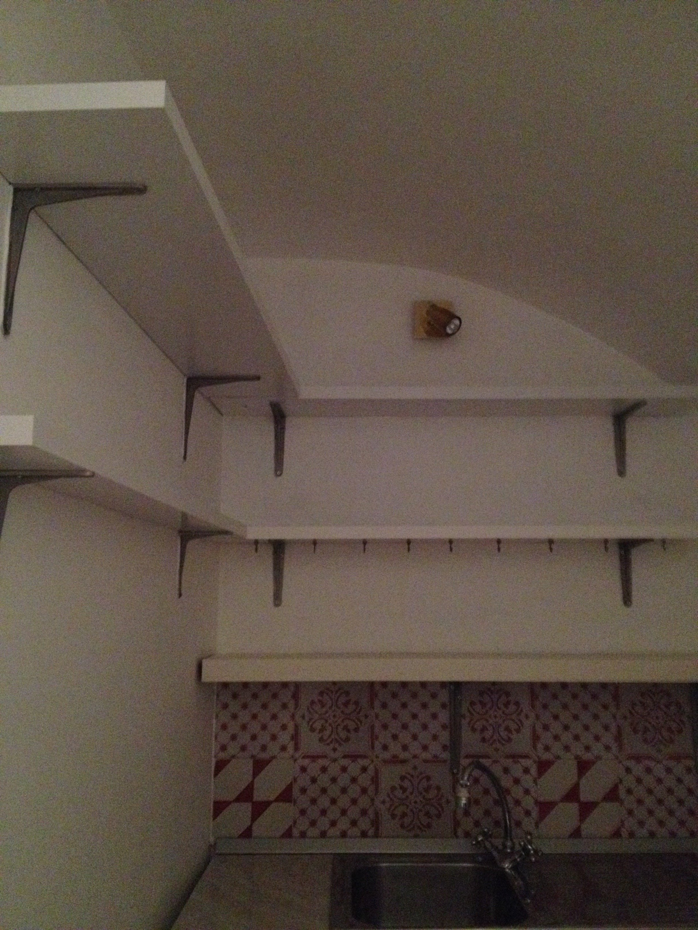 True, this is not a primary residence but I don't think any guest would want to spend a lot of time in here. It was impossible to get a decent shot of this dark, cramped space. The hallway before. The kitchen is behind the wall on the right.
 There were structural issues that had to be addressed (electrical, ventilation) so a upgrade/renovation had to happen.
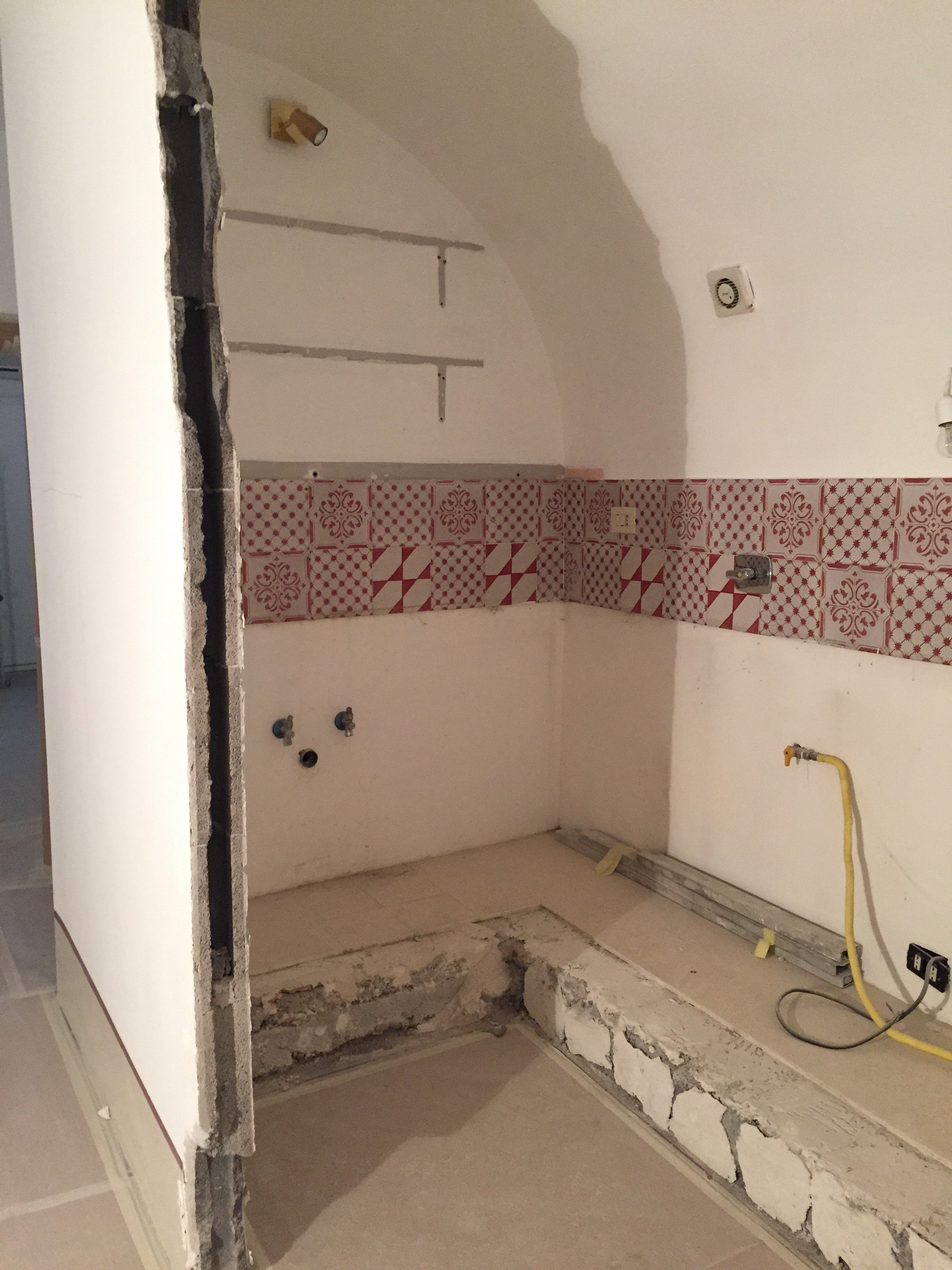 Originally, we discussed opening just one of the walls. Studio Minchilli suggested removing all them so you could see the entire arch as you walked into the apartment.AFTER
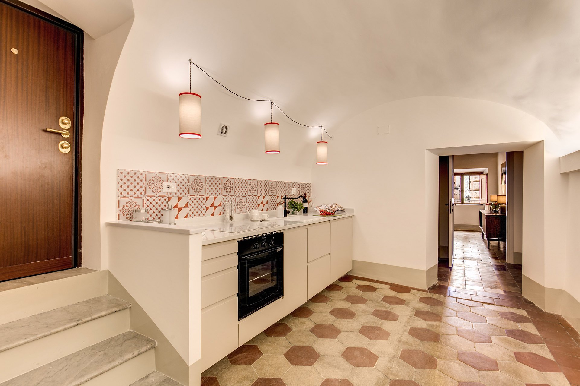
 What a difference. It's light and there's plenty of space to move around. The cabinets are from IKEA but the counter top is quartz from Stone Italiana. We decided to spend more for a higher quality counter top given the open plan design. It elevates the entire space, making the IKEA cabinets look more expensive.My anxiety level was not good the morning of this installation. A heavy slab, cut to order. Three men had to carry it.
  The light fixture is custom. Il Paralume.
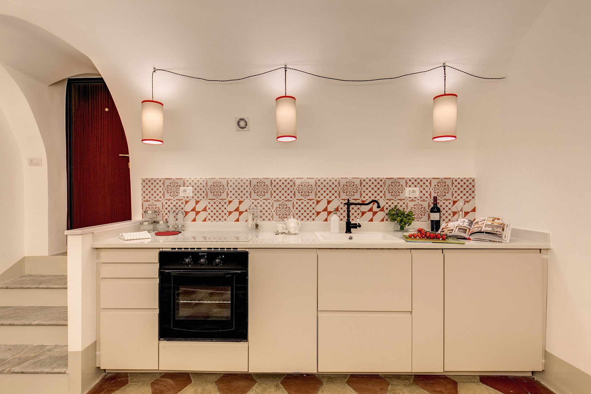 We also installed LED lights on the right.
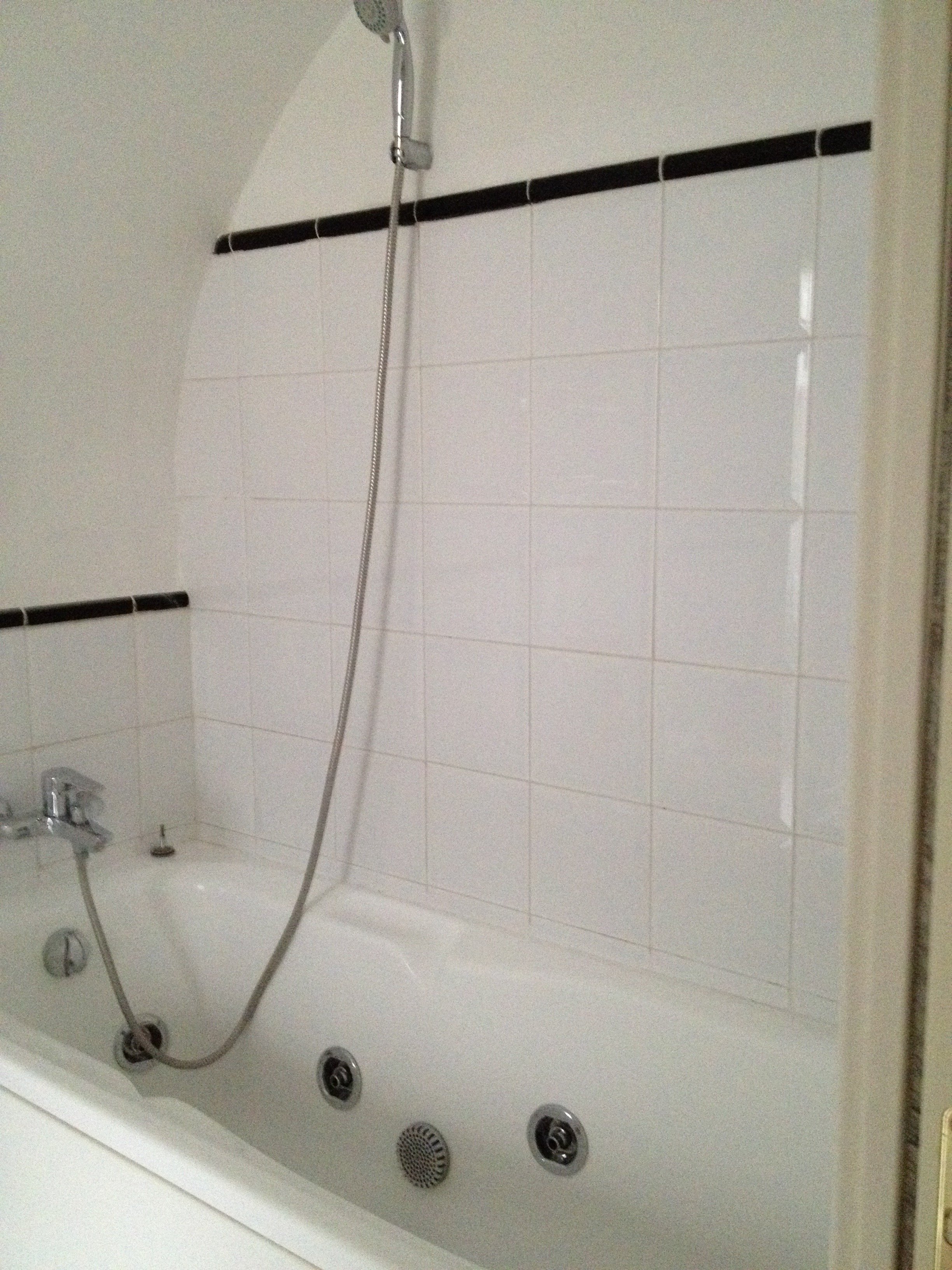
 BEFORE - Master Bathroom
 There were dated, inexpensive white tiles on the floor. AFTER
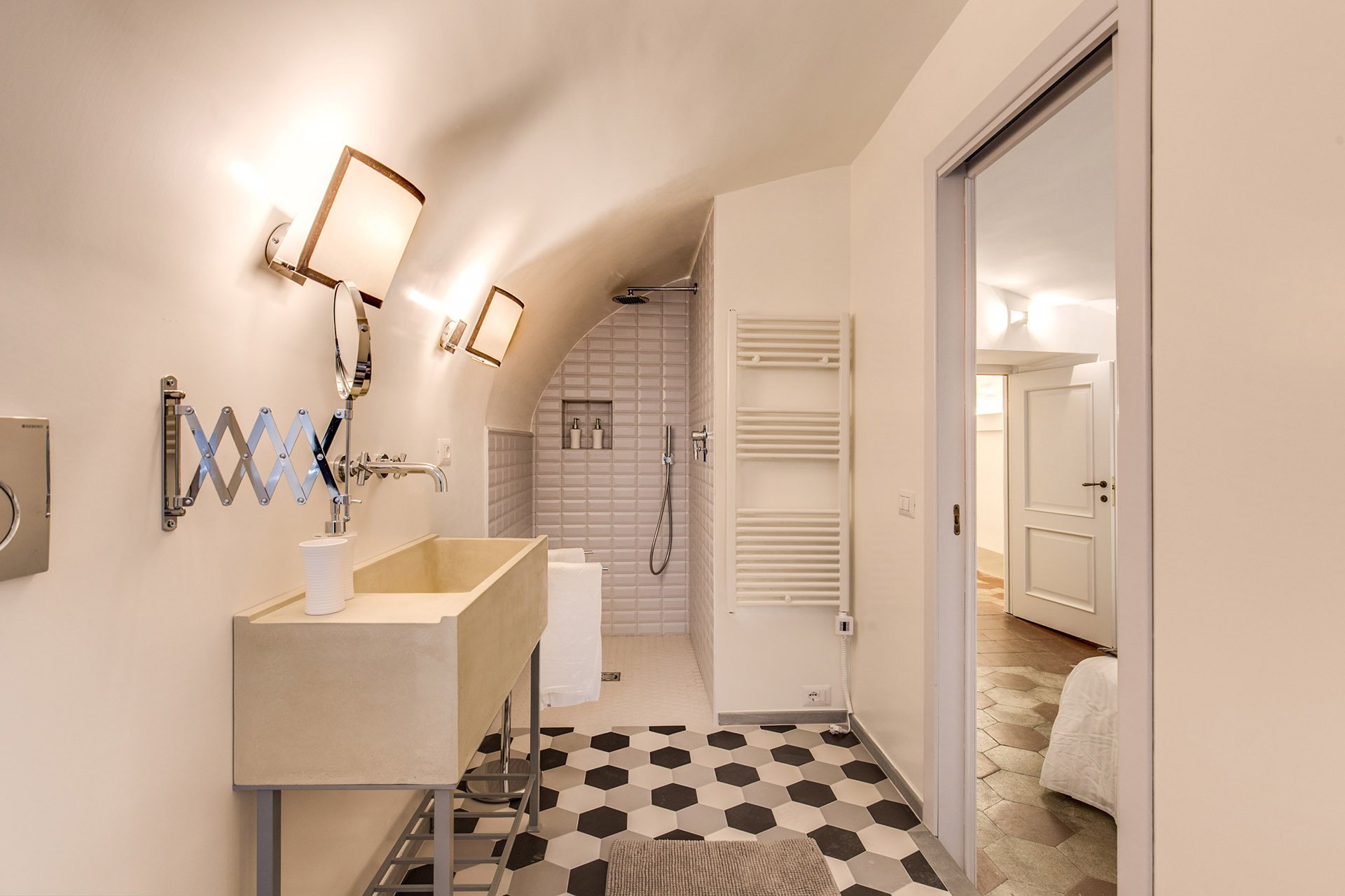 The tub was replaced with a shower.
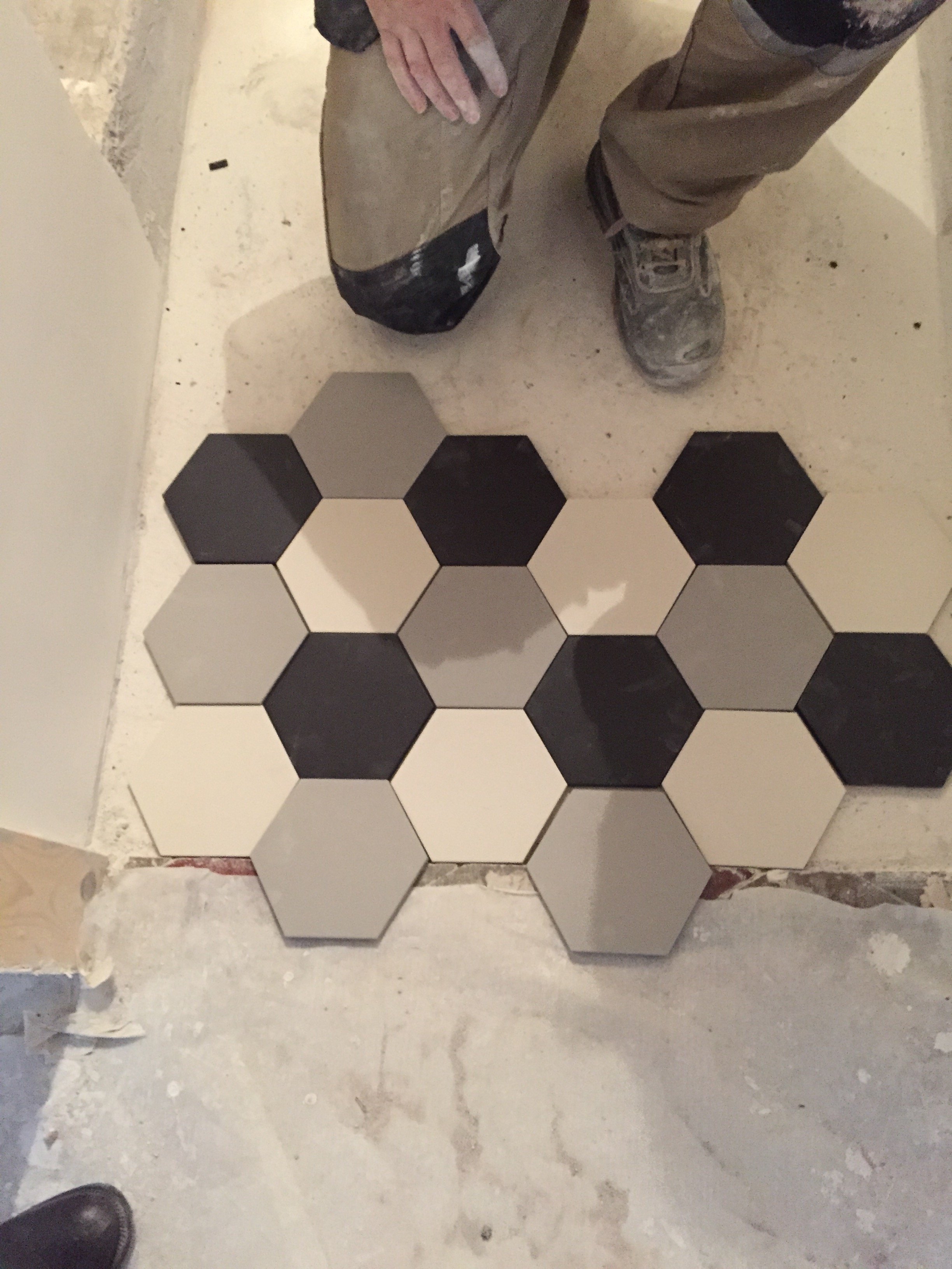
 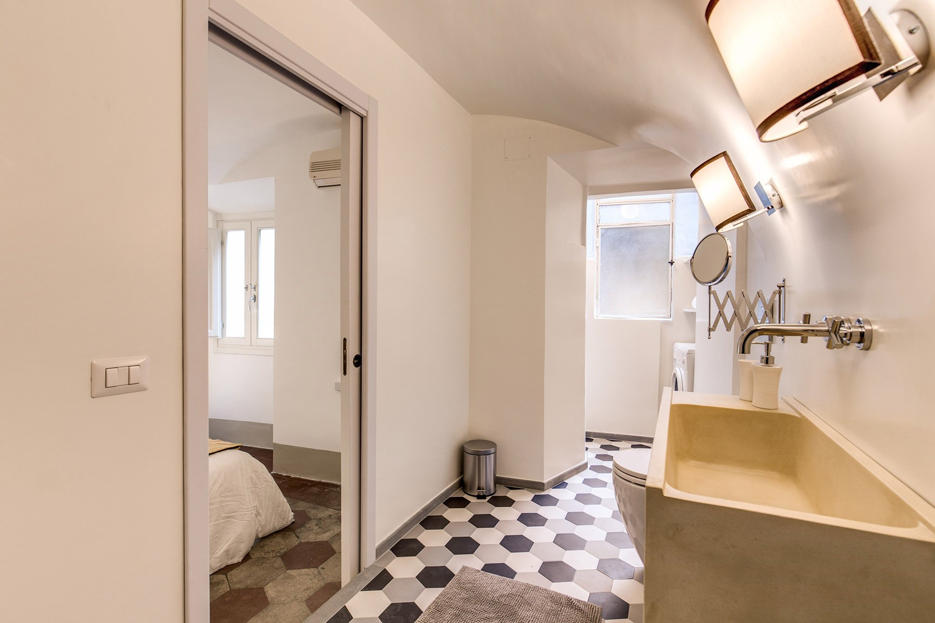 We decided to go with a combination bidet and toilet, which is great for small spaces. The client wanted a unique sink. We ordered these (which were quite heavy, our poor contractor) and asked our blacksmith to build the bases.Notice, we didn't put tiles on the walls. Similar to the Tuscany Project, we wanted the bathrooms to feel more like a room and less clinical. For a busy family bathroom this option could be impractical but I really like how these rooms feel without tiled walls.The design of the new tiles mimics the original tiled floors in the rest of the apartment. While these colors look great together, installing three colors is a different story. Complicated.
 The tiles, sink, and all hardware were purchased at LOZZI.The sconces are custom. Il Paralume.Paint is a custom color from Crown.In the bedroom we added a pocket door, a built-in closet, and the lampshades are custom from Il Paralume.
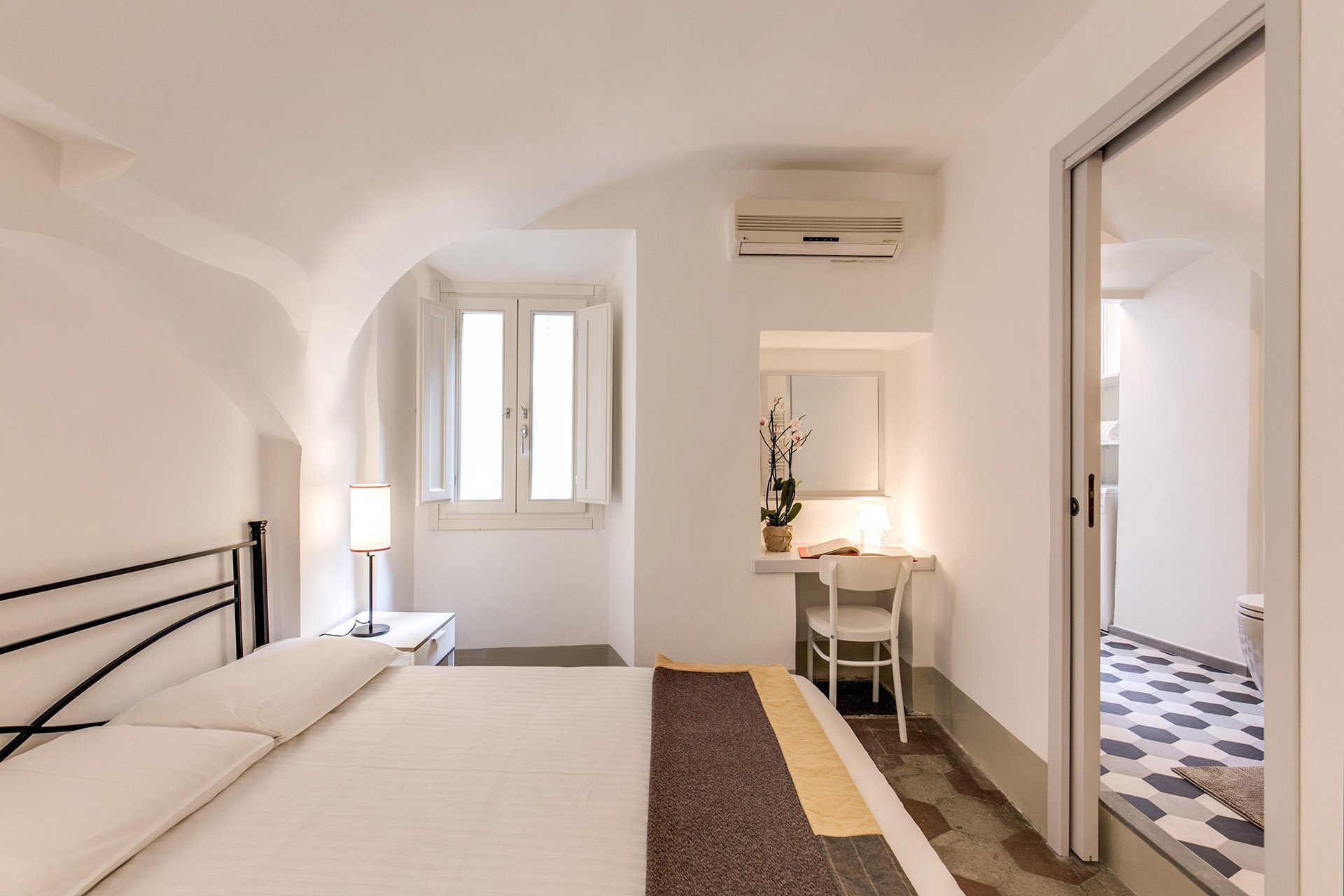 Our carpenter also created a desk in the corner.
 BEFORE - Second bathroom.Extremely tight space, dated tiles. The layout was terrible and the room very dark.
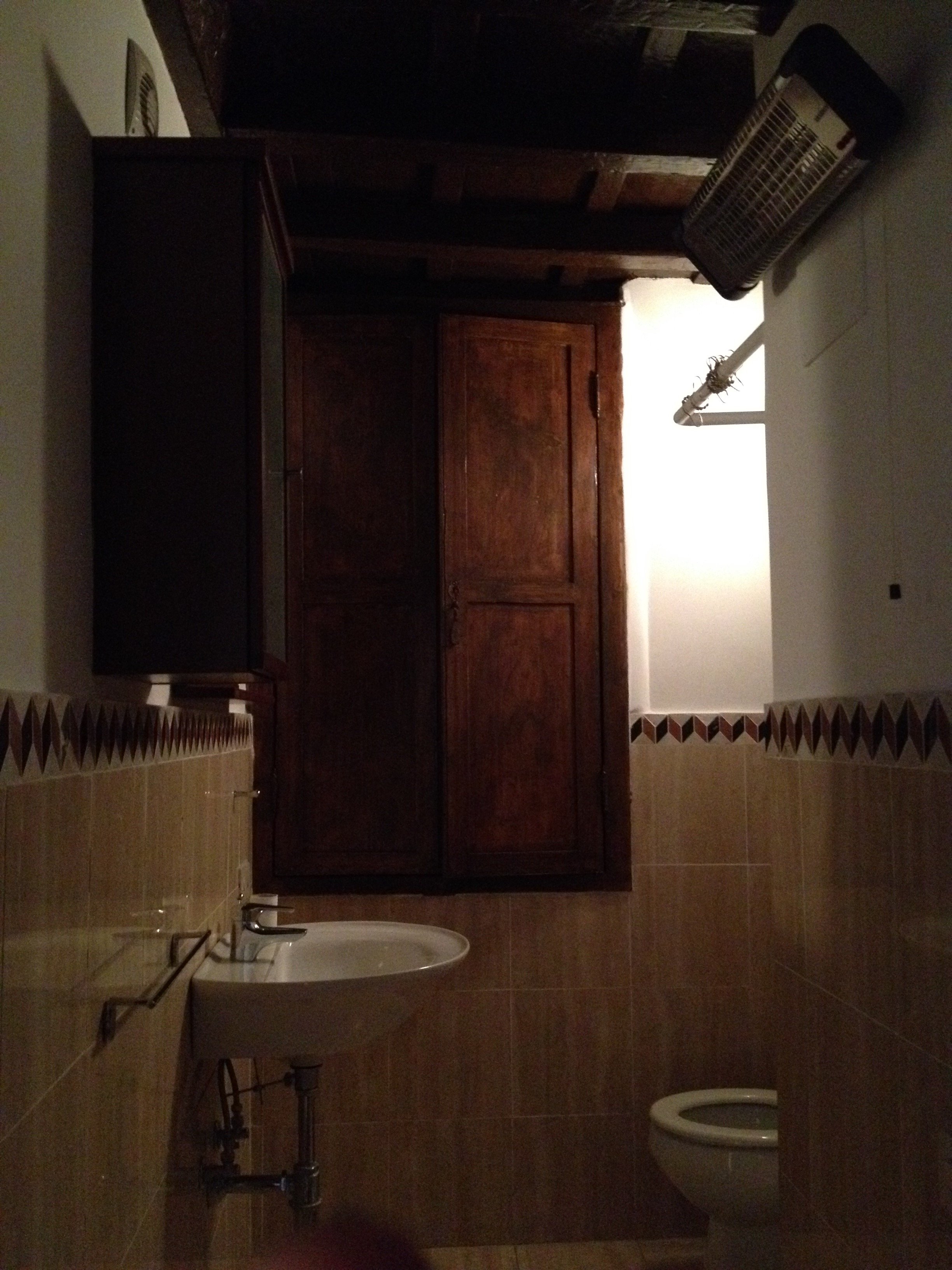 AFTERWe completely changed the layout. We moved the entrance which enabled us to add space for a proper shower.The door is custom made by our carpenter. Door fixtures are from Handles.
 Here's a better shot of the sink with the custom iron base. As with the other bathroom, we bought a combination bidet and toilet.
 BEFORE - Living Room
 AFTER - Living Room
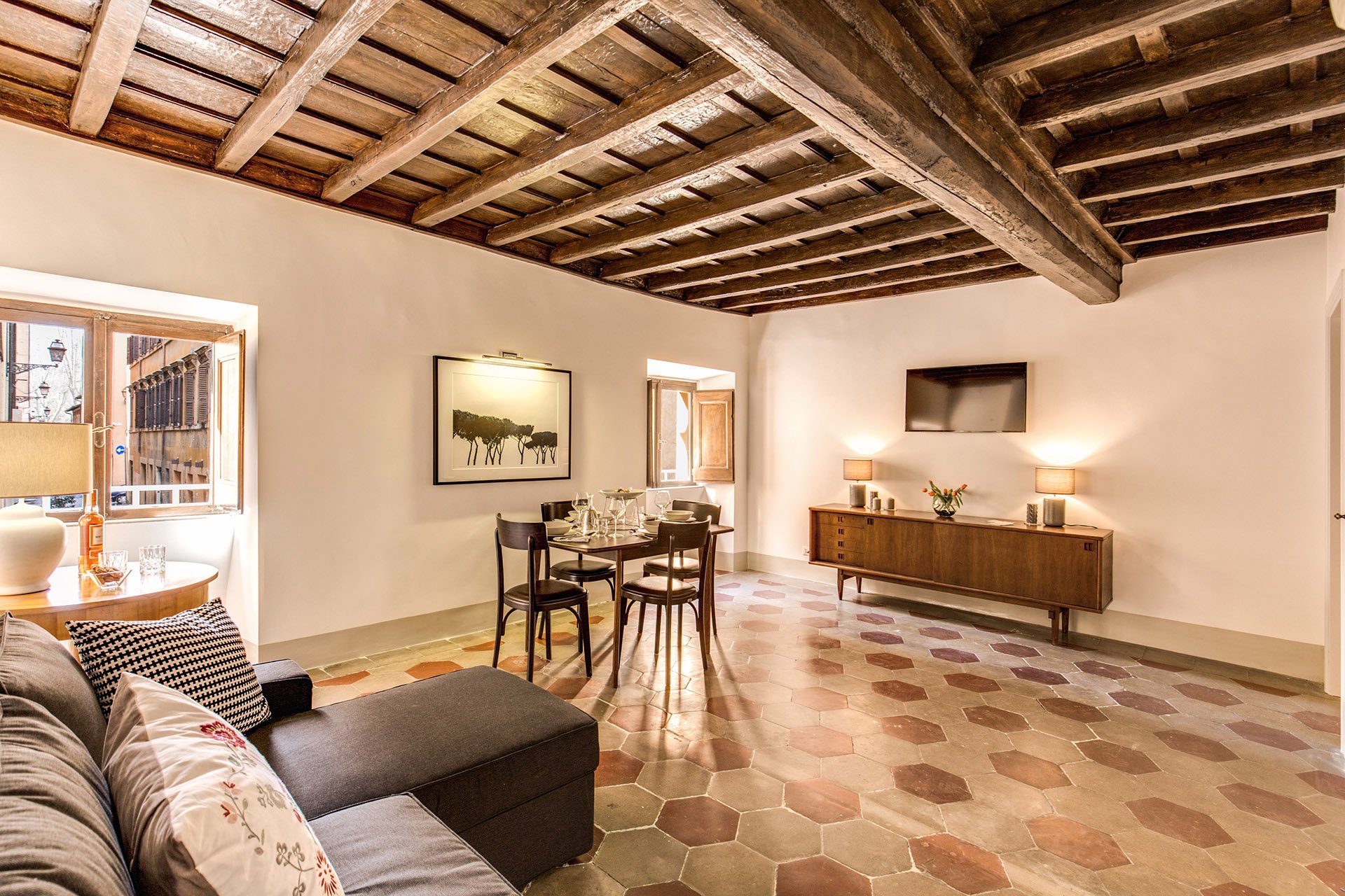 The fantastic artwork is from Due Alberi. They're based in Rome but ship internationally.Our carpenter added new closets.The dining table is from MADE and the chairs belong to the client.
 The side table came from the Via Monserrato apartment. We found the lamp at Leroy Merlin (the French version of Home Depot).
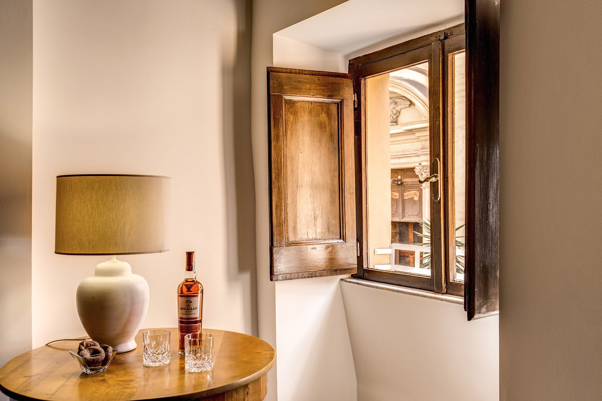 The client found the credenza online. The lamps were a great find at Leroy Merlin. We were so tired and hungry. My client was worried about my mental health as we had just spent hours at the IKEA next door. I perked up when I saw the lamps on a bottom shelf. I was so excited. It was like meeting Idris Elba.
 Overall, the apartment feels lighter despite the lack of light (the windows are tiny). The renovated kitchen and bathrooms compliment the style and architecture of the apartment. We updated them but without losing the charm.We kept the palette very simple, creamy whites, grey, black, with a touch of red. The ceiling seems higher and apartment looks/feels bigger.For more information about this vacation rental, please check out Your Suite Rome on Booking.com.Architect: Domenico MinchilliAfter Photos: Vincenzo Tambasco
Art and Architecture with Ariella - Amsterdam
Ciao Bloggisti,Here is the latest post from our intern, Ariella:Last week my classmates and I went to Amsterdam. My impression of the city upon arriving was very different to my expectations. The architecture reflects its history and age, serving as a unique backdrop for modern, urban life.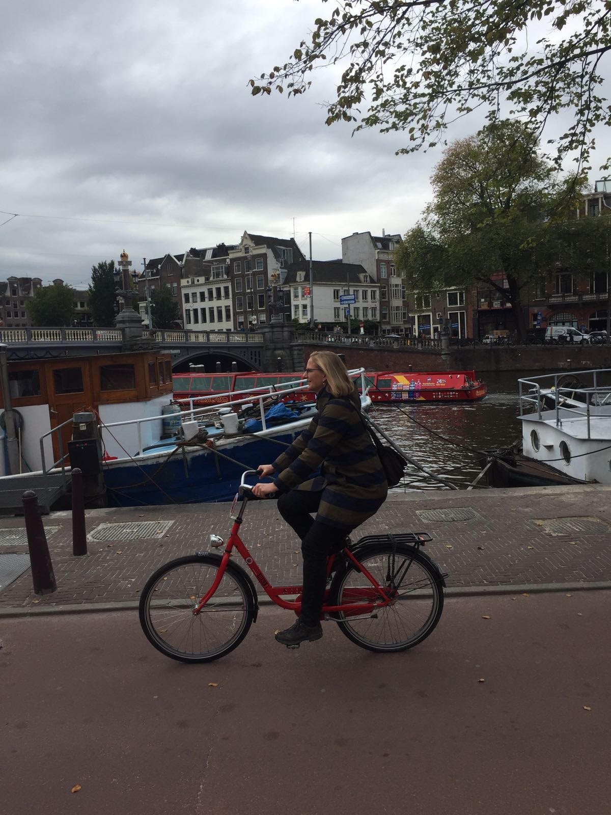 I had preconceived notions of what the relatively “young” culture/community of Amsterdam was like. While Amsterdam really is a young and vibrant city, we soon found out how the existing architectural exteriors are not allowed to change. There’s a strict limit on the height of buildings in order to preserve the density and aesthetic “look” of Amsterdam. This also gives the city the character of feeling small, manageable, and almost village like, easy to get around. We saw many bikers traveling through its beautiful streets, even during peak rush hour time. Amsterdam is very livable and feels “alive” with its diverse multicultural population whose art and ideas you see splashed all about town; on the walls, in the alleyways, in fairs and in performances.
 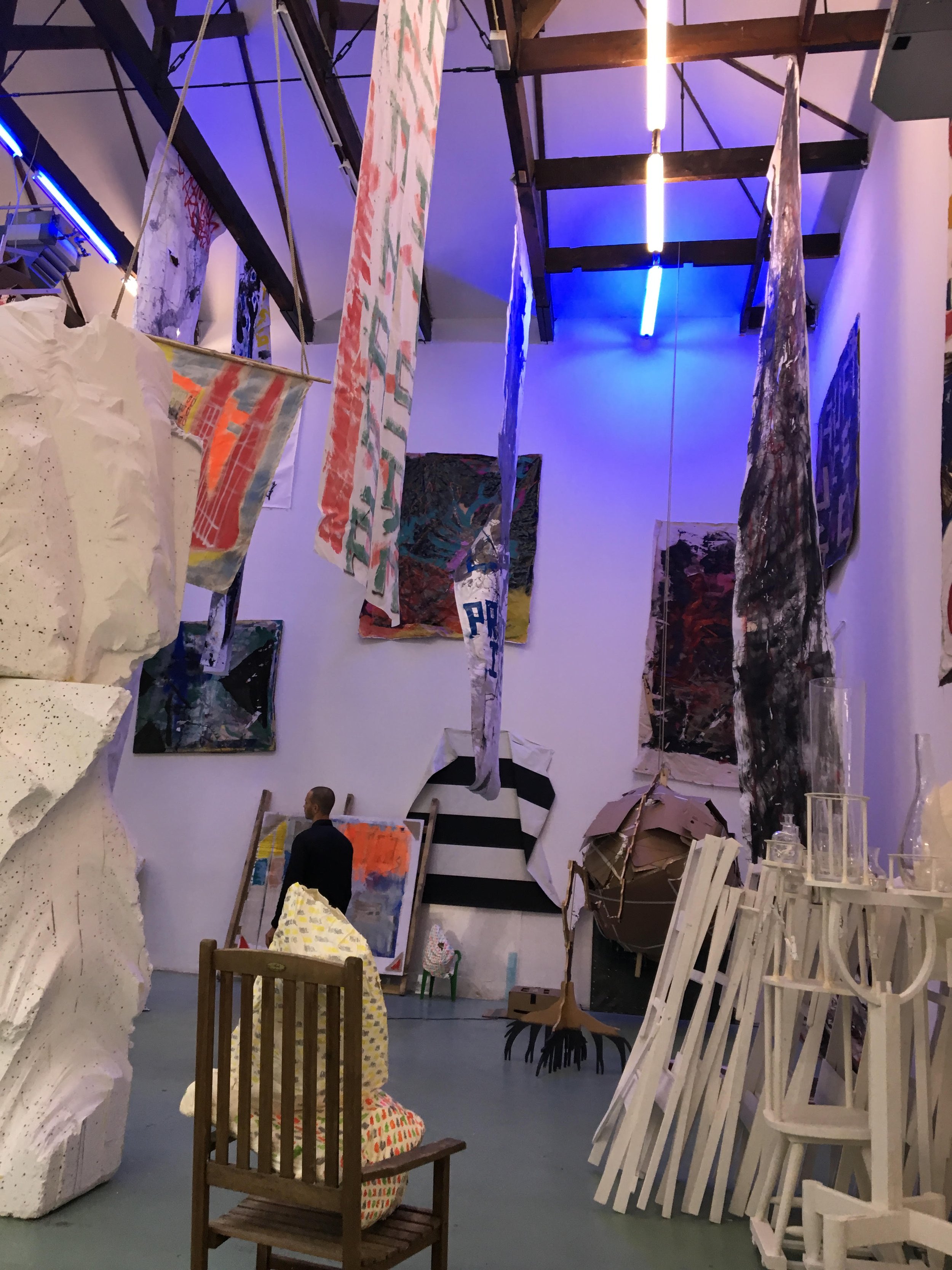 Amsterdam has become a city where all the people and their original works have connected the old character of the city to the new young ideas.
Life in Rome - Villa Farnesina
Ciao Bloggisti,Villa Farnesina has been on my "need to visit" list for quite some time. One rainy afternoon, I decided to schlep across town. It was worth the trip.This villa is one of the finest examples of Renaissance architecture. In 1509, the wealthy banker Sienese Agostino Chigi commissioned architect Baldassarre Peruzzi (who was known mostly for his paintings) to build a villa for him in the country. The villa is located just across the river in Trastevere. Back in the day, Trastevere was considered the country as it was outside the city walls. Chigi was well connected and ran in some very rarefied circles. The location was perfect for him. He was close enough to the city for business and far enough away to build a grand space to entertain his friends, which included the Pope, with lavish banquets. Chigi, while a great host, was also a huge patron of the arts.Rumor has it that Villa Farnesina was built over the ruins of the villa where Cleopatra met her lover Mark Antony for sexy times. When construction began, Chigi was in love with the infamous courtesan Imperia (supposedly she was the first woman to be called as such) but his second mistress, and later wife, Andreosia lived in the home. It's not a surprise that the theme running through the villa is love.Imperia was close to, and perhaps the lover of, the great artist Raphael. She was the model for several of the frescoes in the villa. Other painters along with Raphael and Peruzzi were, Sebastiano del Piombo, Giovanni da Udine, Giovanni Bazzi, Giulio Romano, and Giovan Francesco Penni.In 1577 the Farnese family bought Villa Farnesina. It was given this name to set it apart from the villa they owned across the river in Piazza Farnese.I hope return to Villa Farnesina during a sunny day and soak it all in. It's beautiful.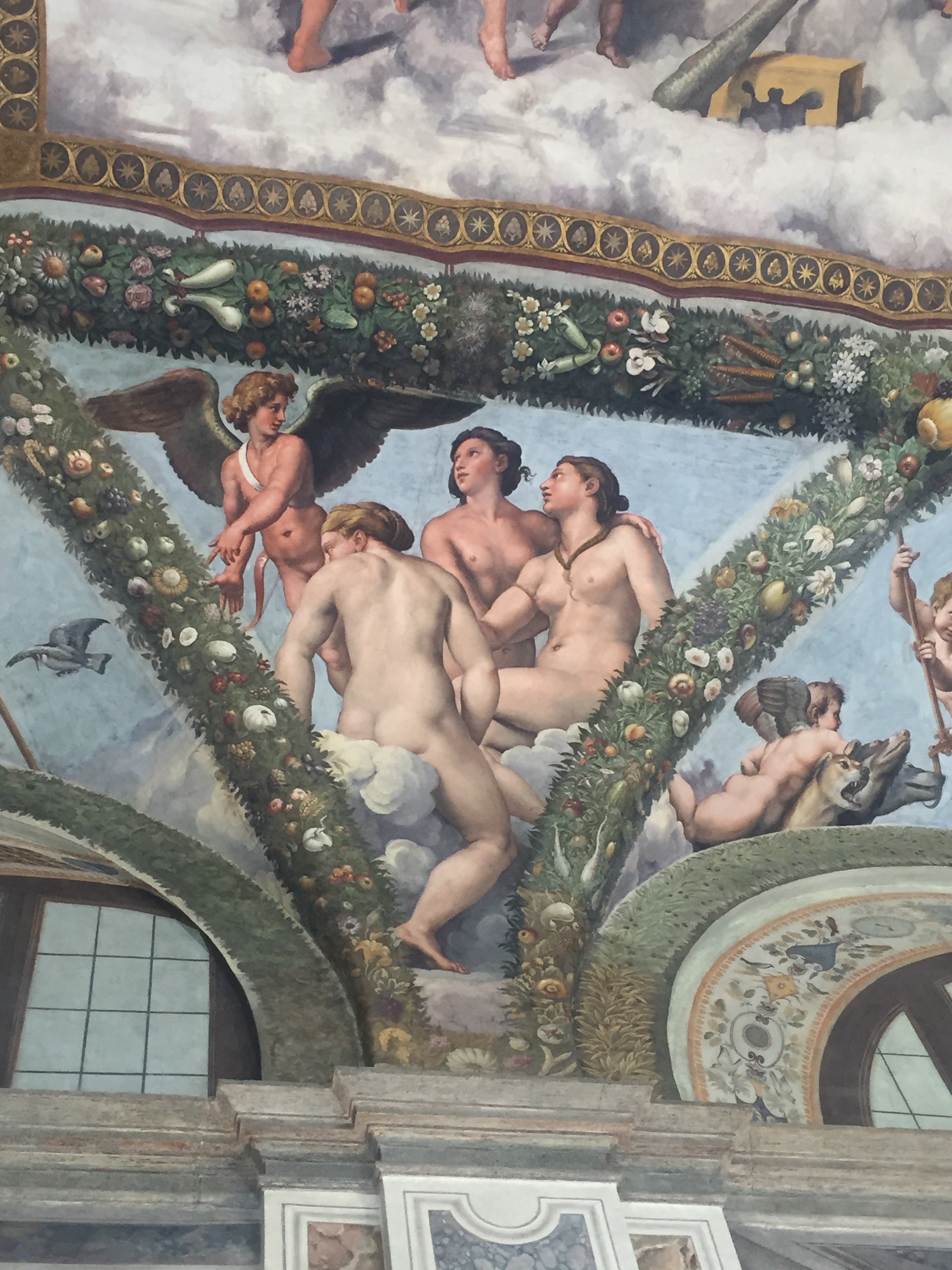
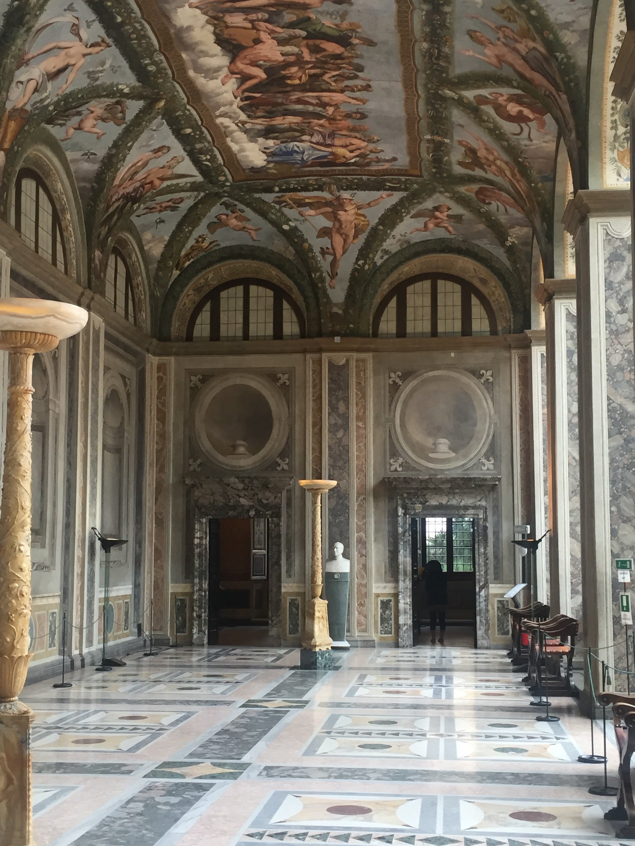
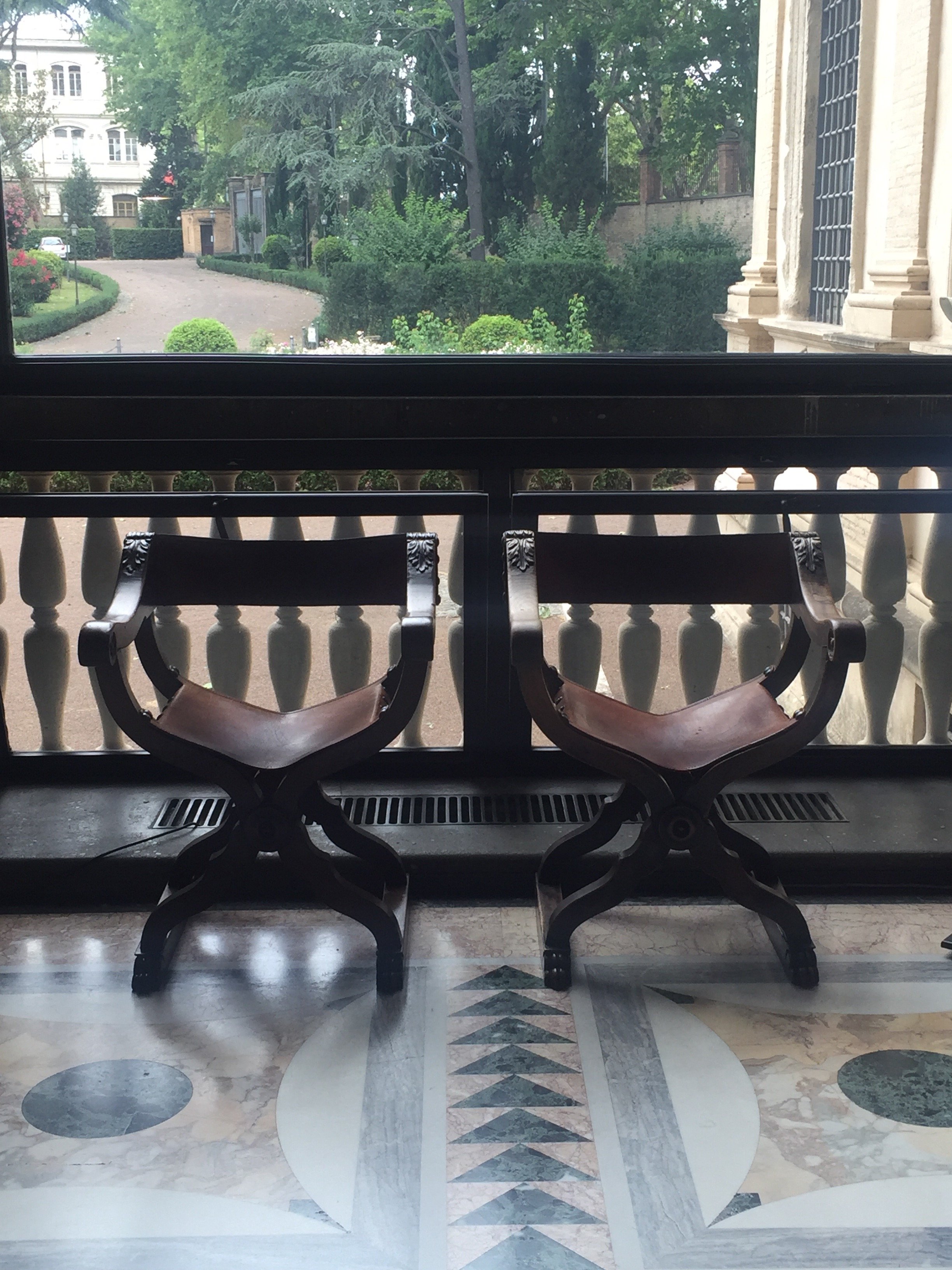
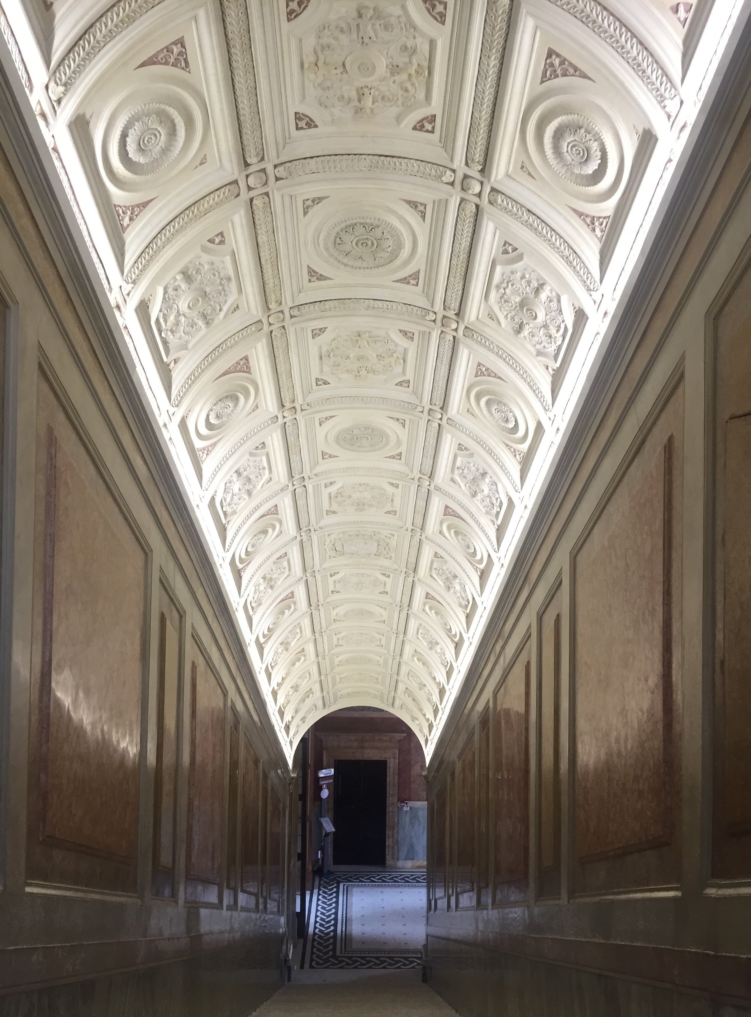
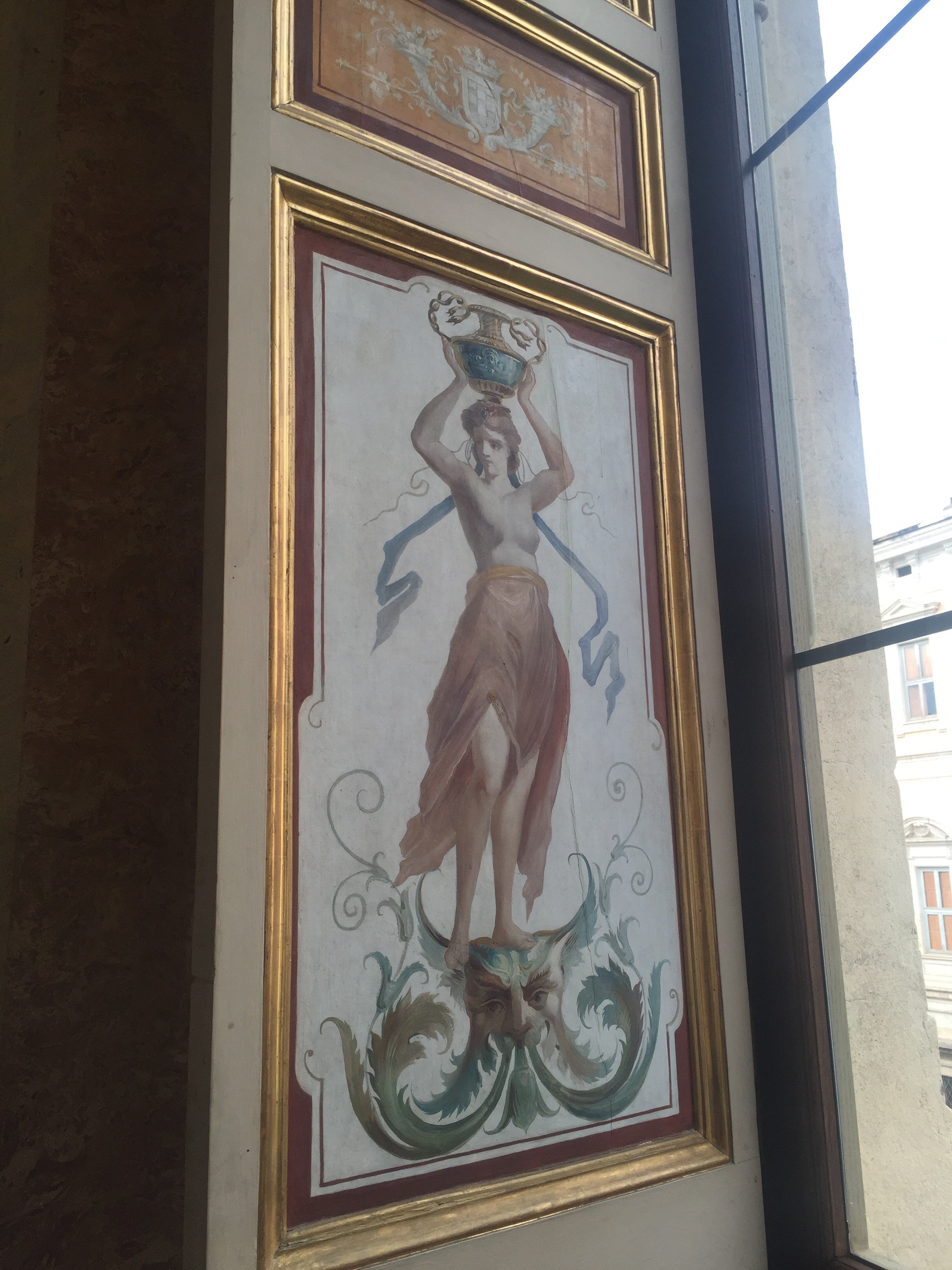
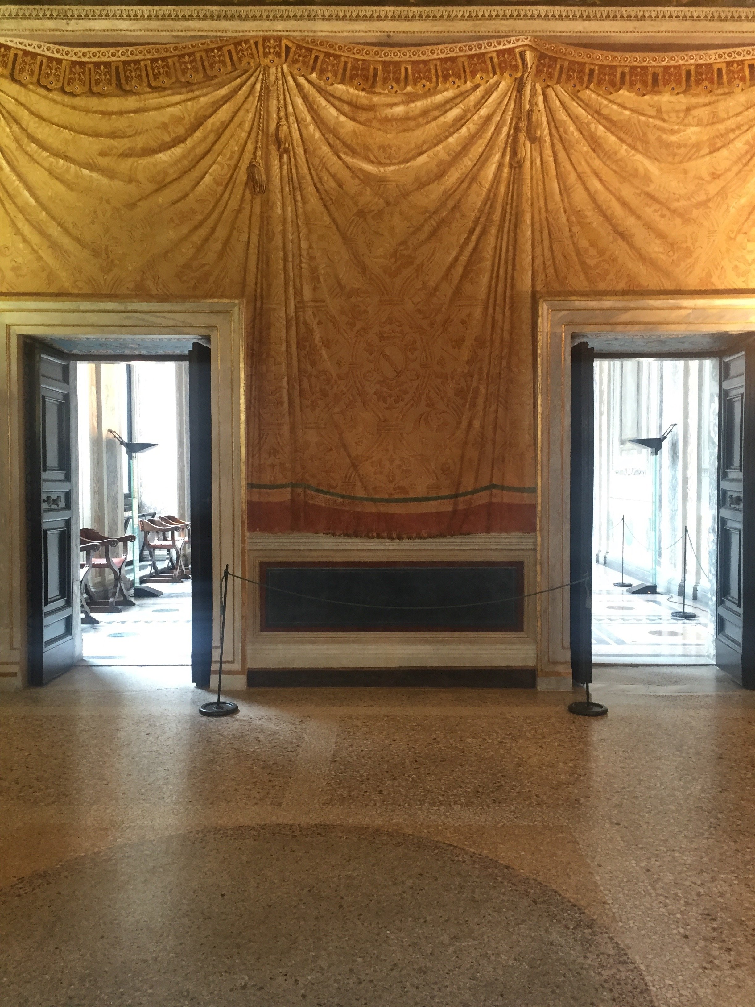
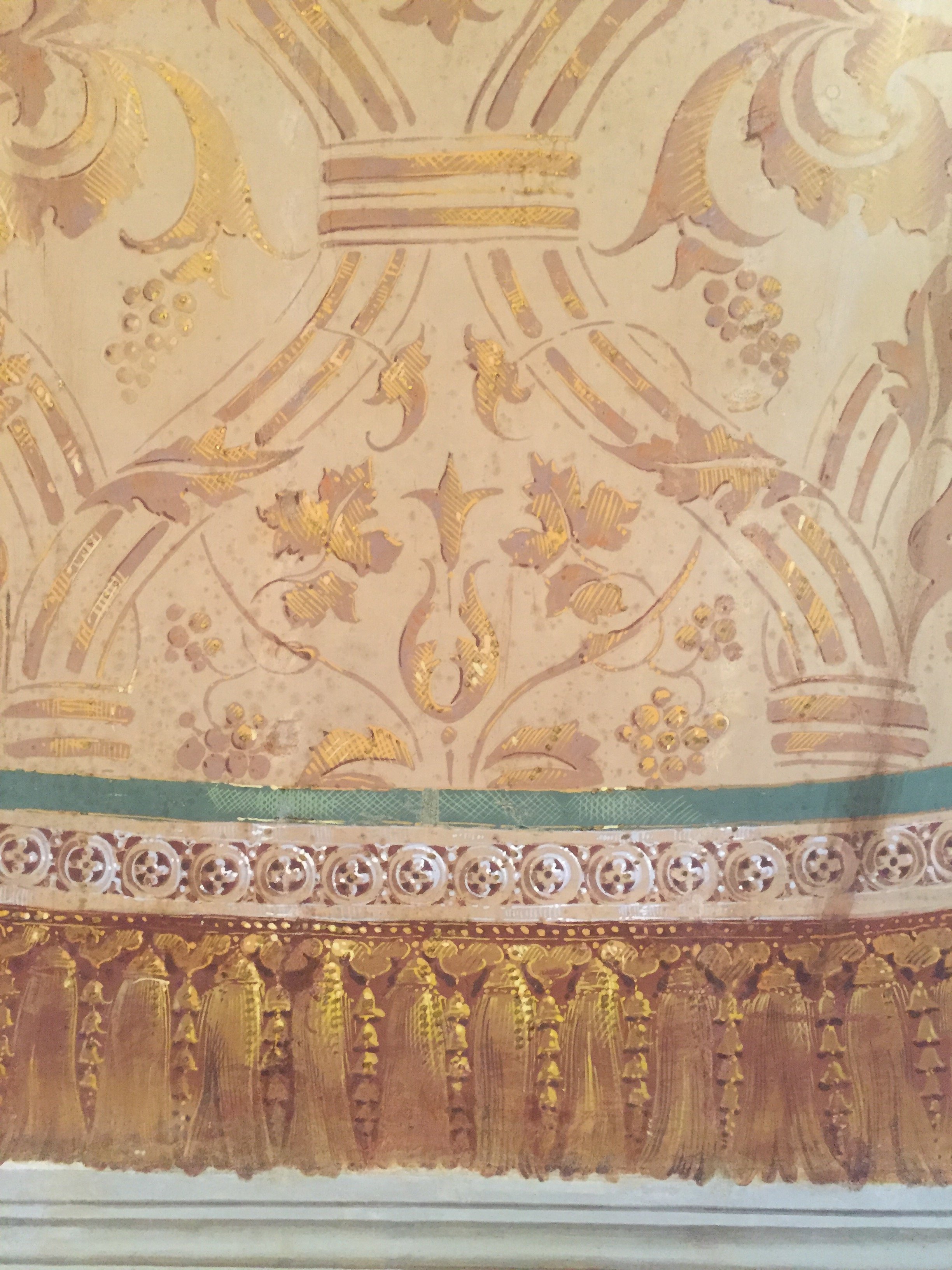
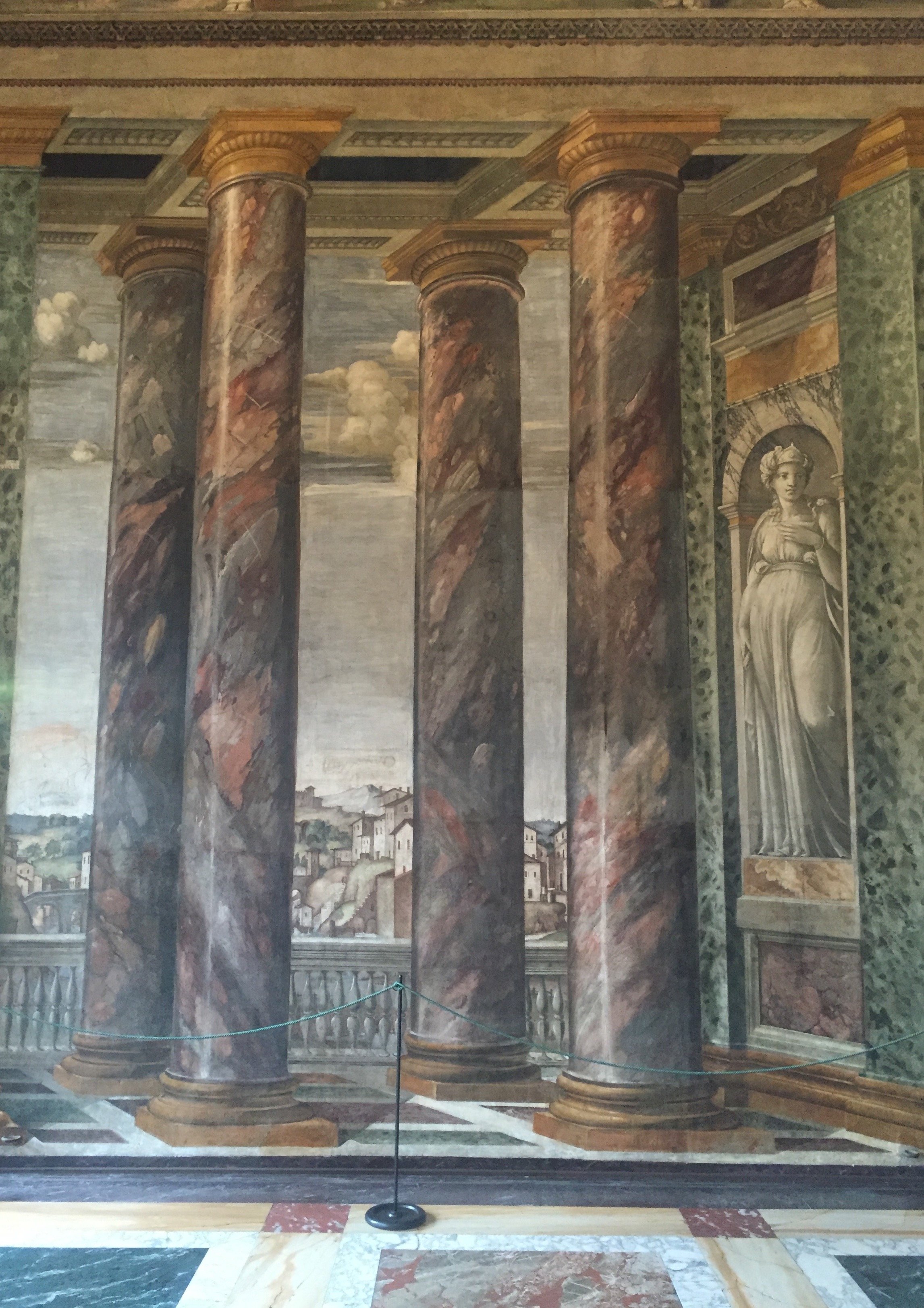
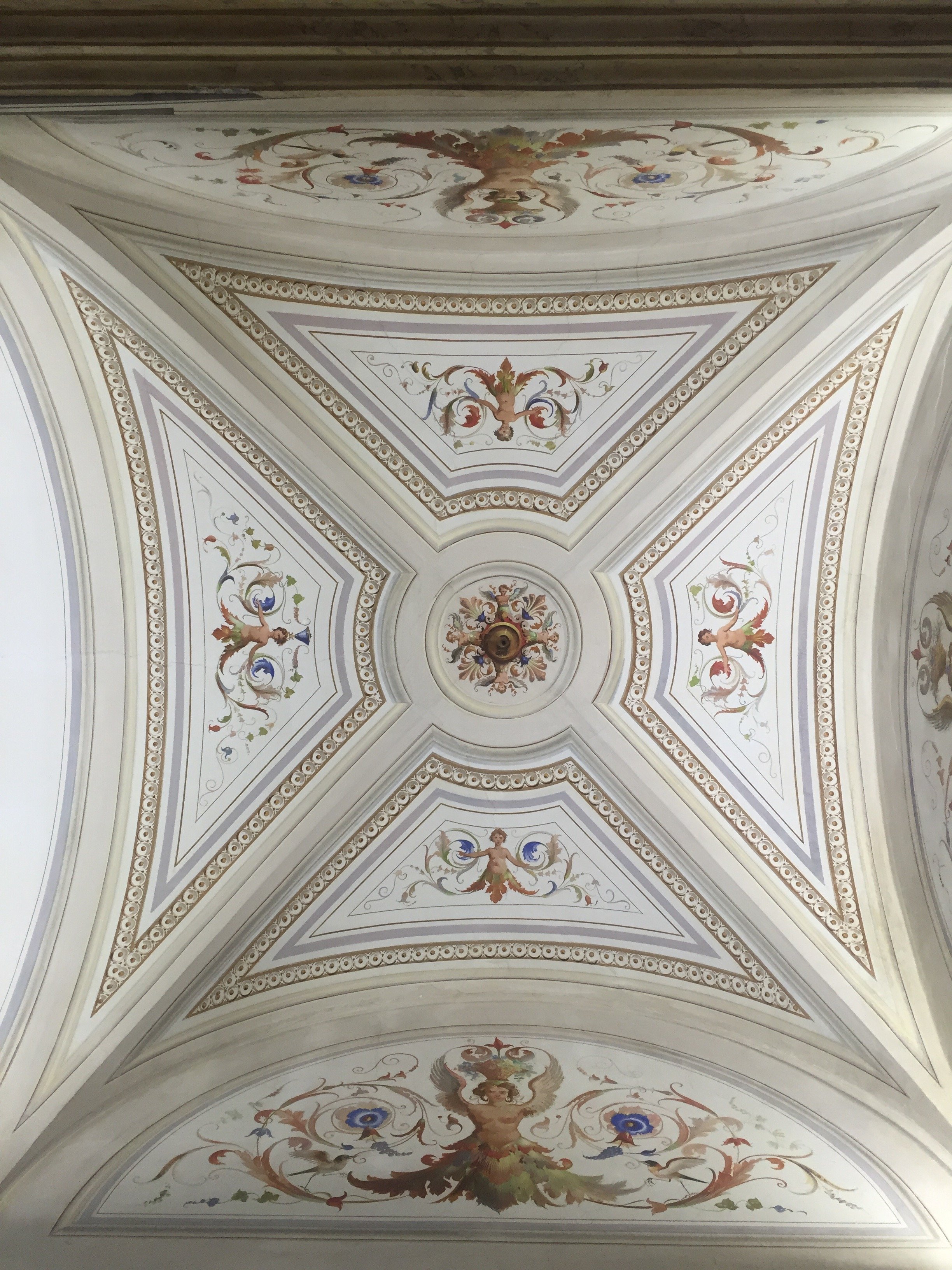
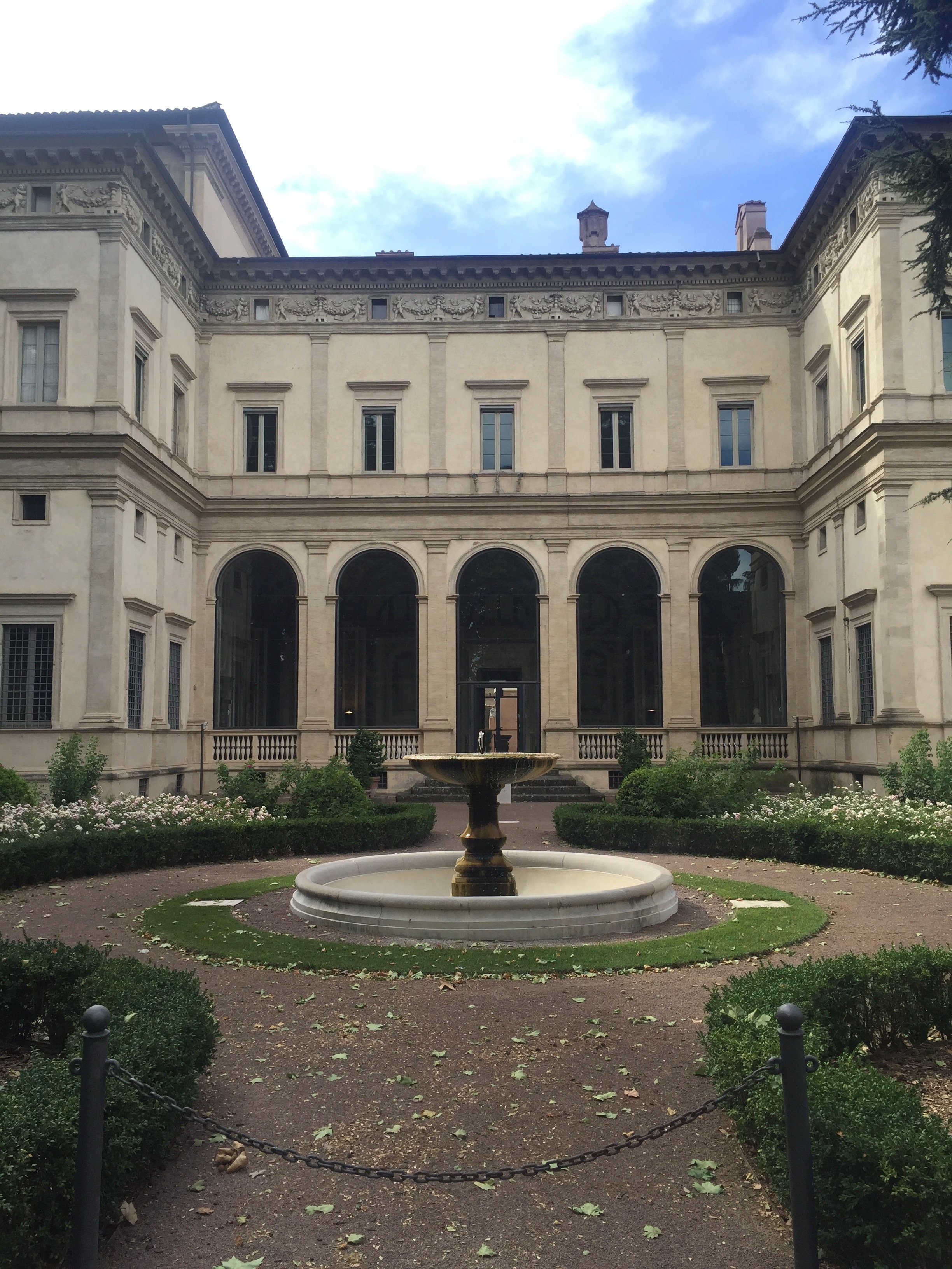 Photos: Me and my iPhone.
Art and Architecture with Ariella - Torino

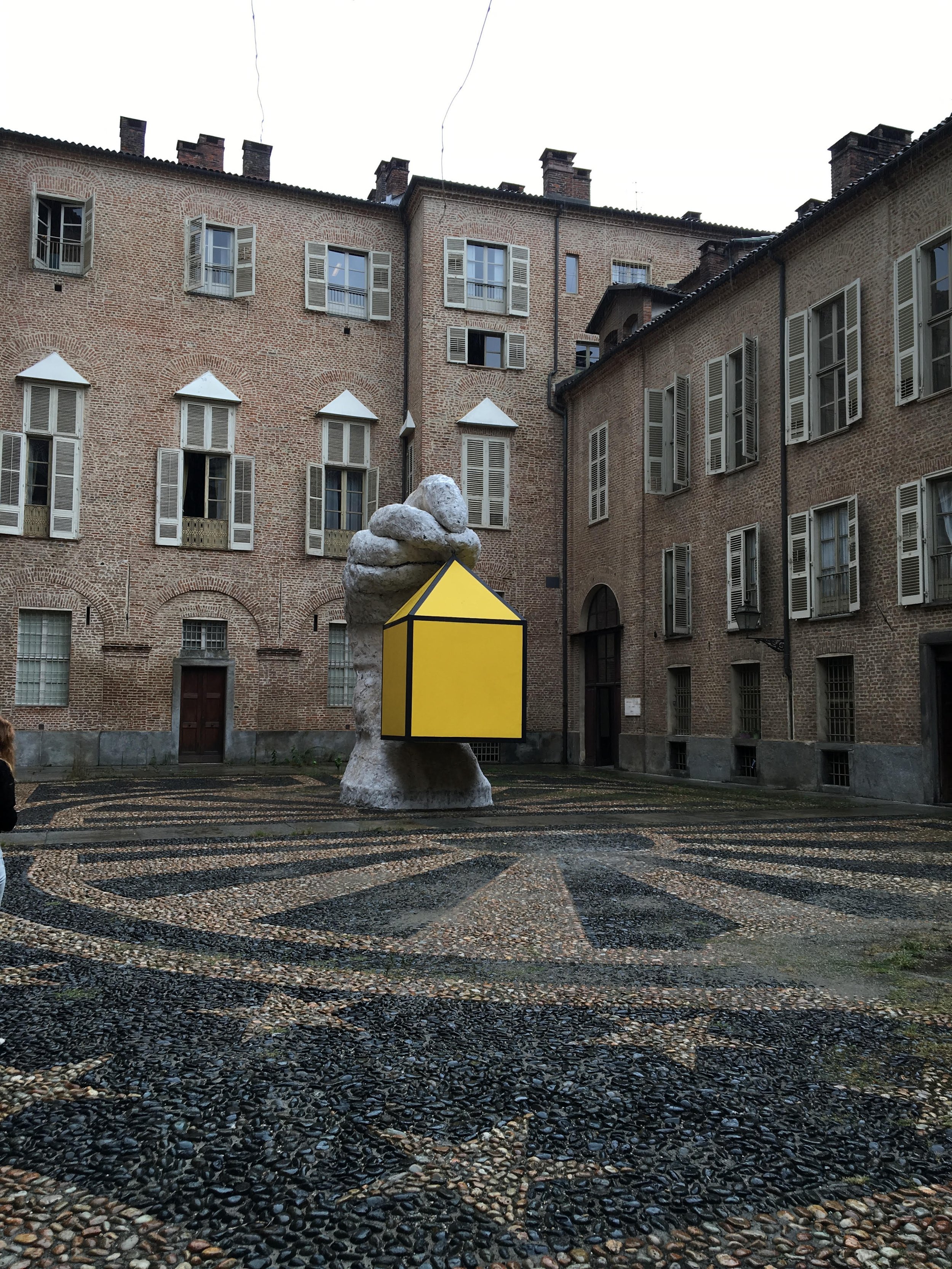
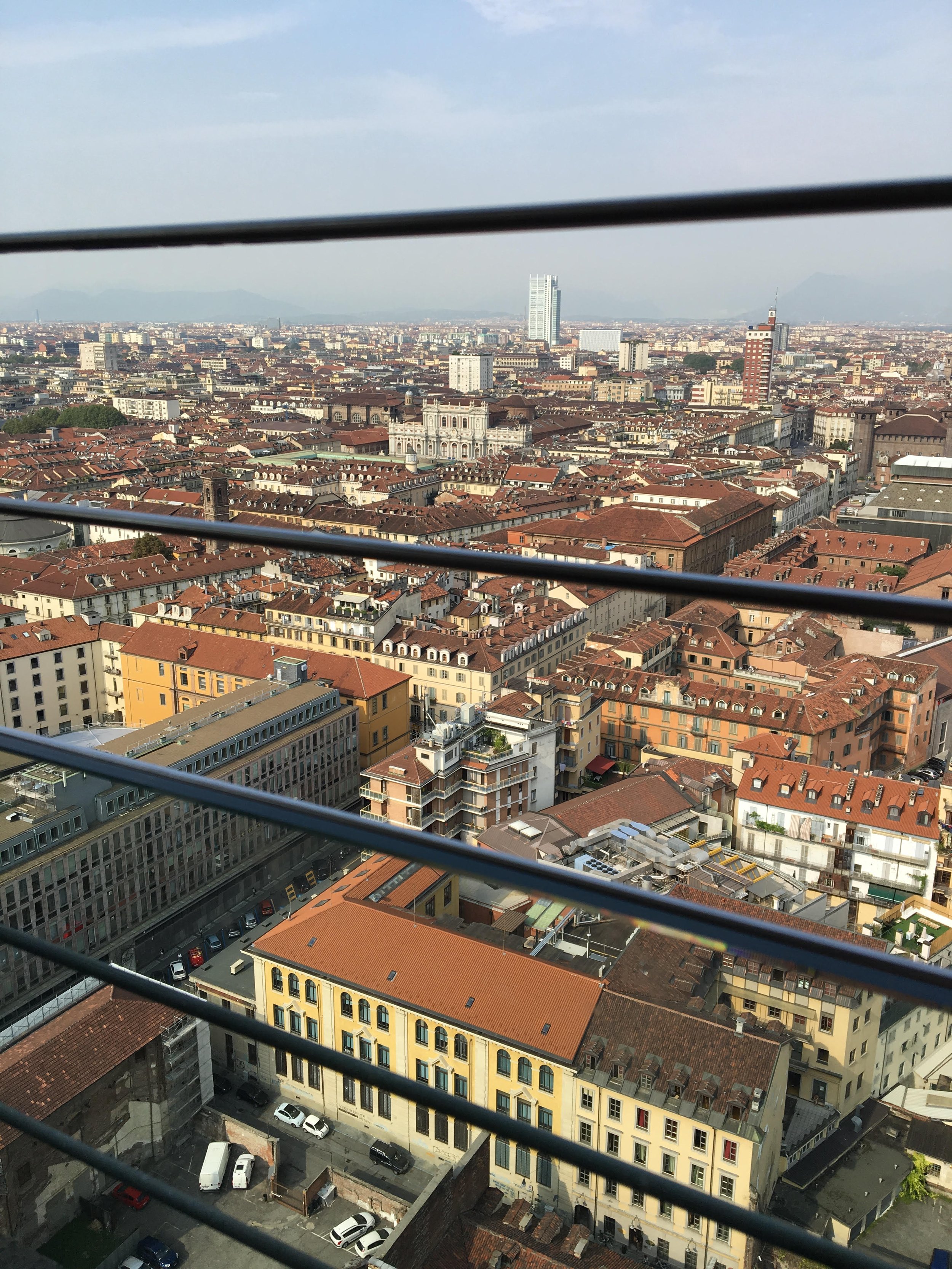 The floor of the elevator was made of glass and had striking views of the entire building. However, the ride up was not the best experience for those of us with a fear of heights.Looking back, I feel I did not spend enough time in the museum as it's something that could possibly take an entire day. The next day we walked around the city admiring the architecture, walking in and out of churches and buildings. At one point we realized there was a kind of 'exhibition' in the city. Contemporary artists had pieces displayed throughout the city and there was a map of all of the pieces. We grabbed a map and started the trail. This trail took us to some beautiful piazzas and courtyards. One of the pieces was a large cube with a triangular pyramid on top which matched the design of the window almost exactly except it was enlarged. The cafes in Torino were also incredibly beautiful. It was obvious that they were built and designed long ago. The way the aesthetics have been maintained make them unique to Torino, similar to much of the architecture we saw.
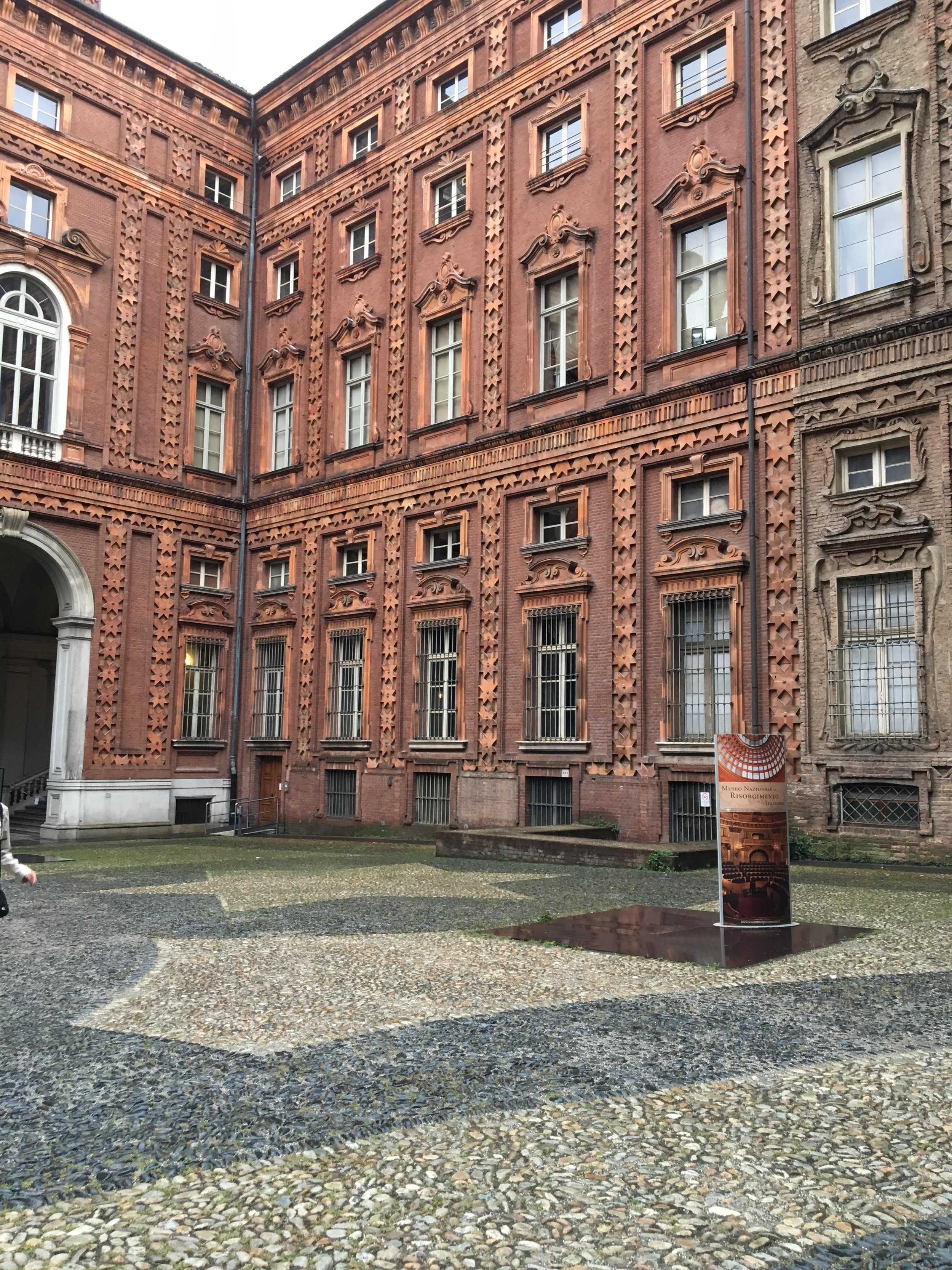
 Photos by Ariella.
A Belated Birthday Trip to Sicily
Ciao Bloggisti,I'm suffering from a bit of Sicily withdrawal. Please bear with me.Thanks to a birthday present from my parents (thank Mom and Dad!), I returned to Sicily for a long weekend. There was an airline strike and my flight departed over two hours late. The weather was horrible. I rented a car and had an accident. I got lost constantly. It didn't matter.The minute I drove up to the reception area and saw the views, smelled the Sicilian jasmine, and had a glass of wine, I forgot all about the hassles to get there. Like my friend Gina, I'm already plotting my next Sicilian trip.One major reason for my withdrawal is Monaci delle Terre Nere. This was my third trip and hopefully there will be a forth. I think I need to go during the Spring as that's the only season I haven't been there. While checking out, I told Sara that the next time I return I want to be there with my man. Hello, I'm single.I stayed in the Fragante room. It has a fireplace, terrace, a Jacuzzi, and sea/vineyards views. It's a short walk, through lime trees, to the main villa. I loved the little details, like this floral arrangement.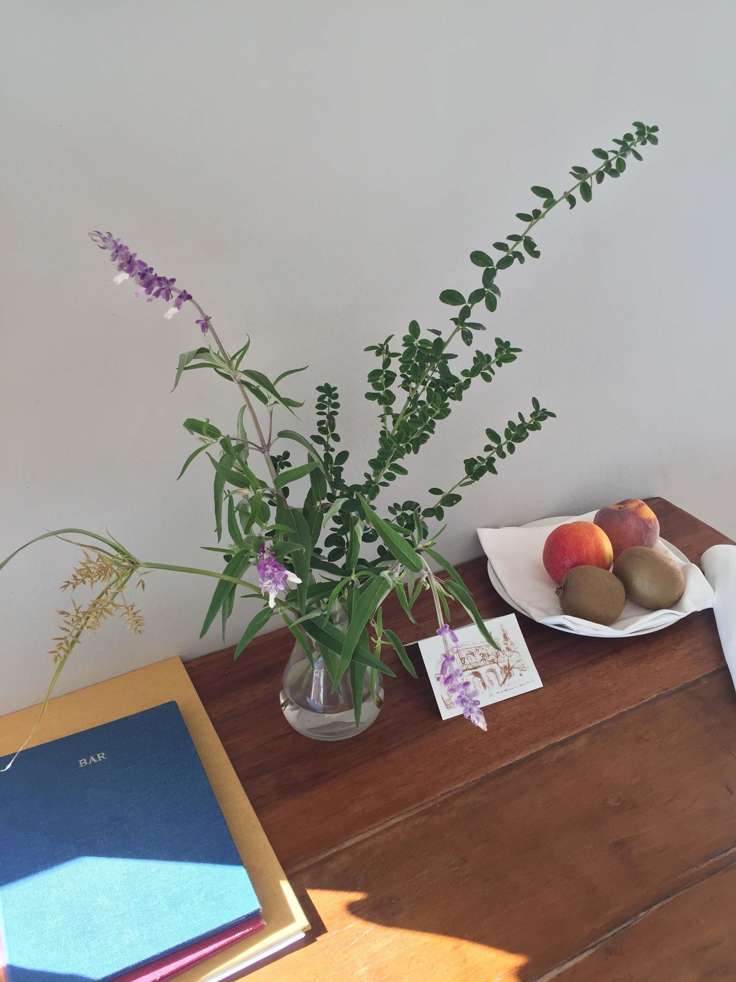 I woke up to sunrises with the sounds of roosters, the sheep next door, and Mt. Etna.
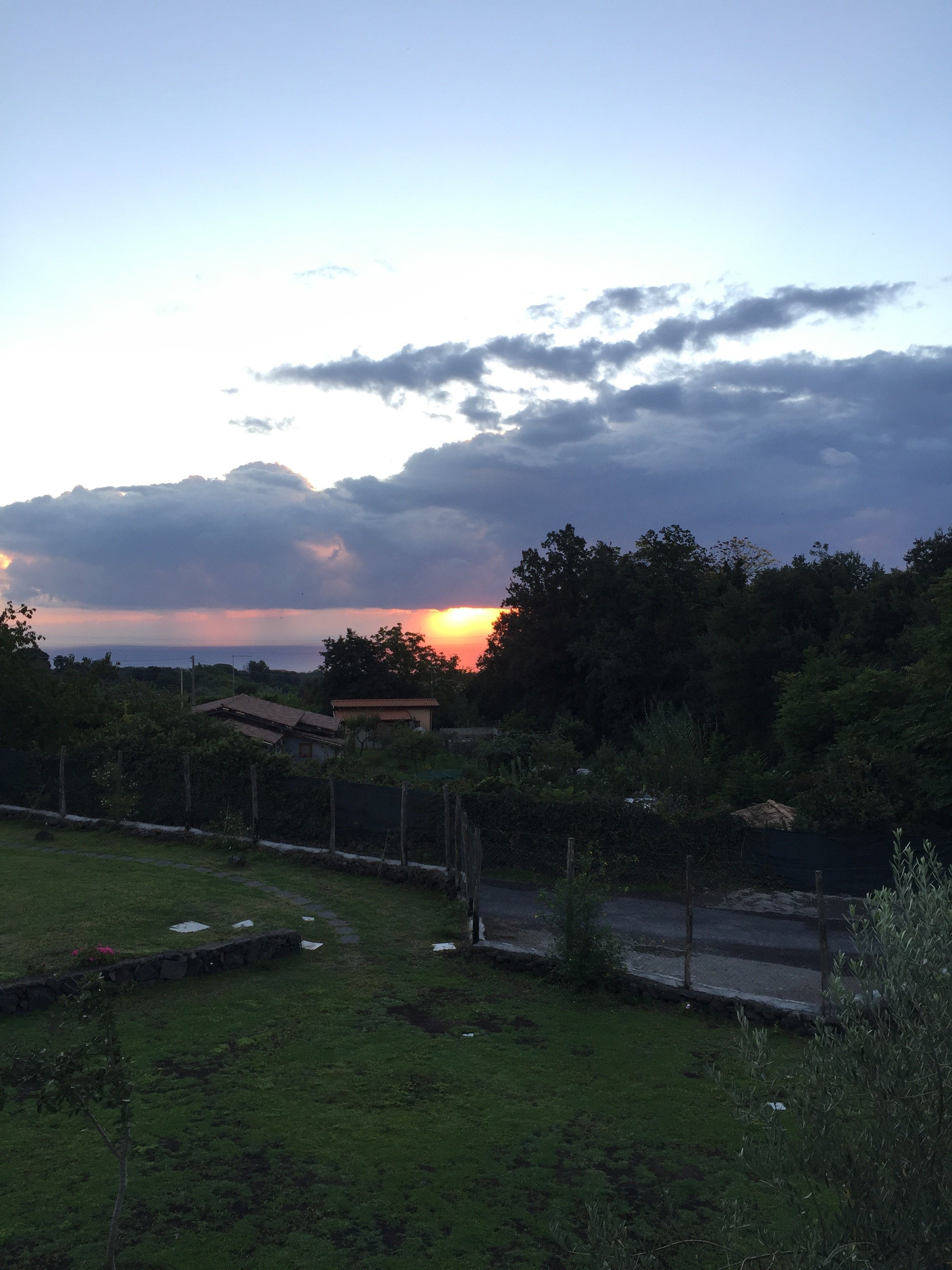
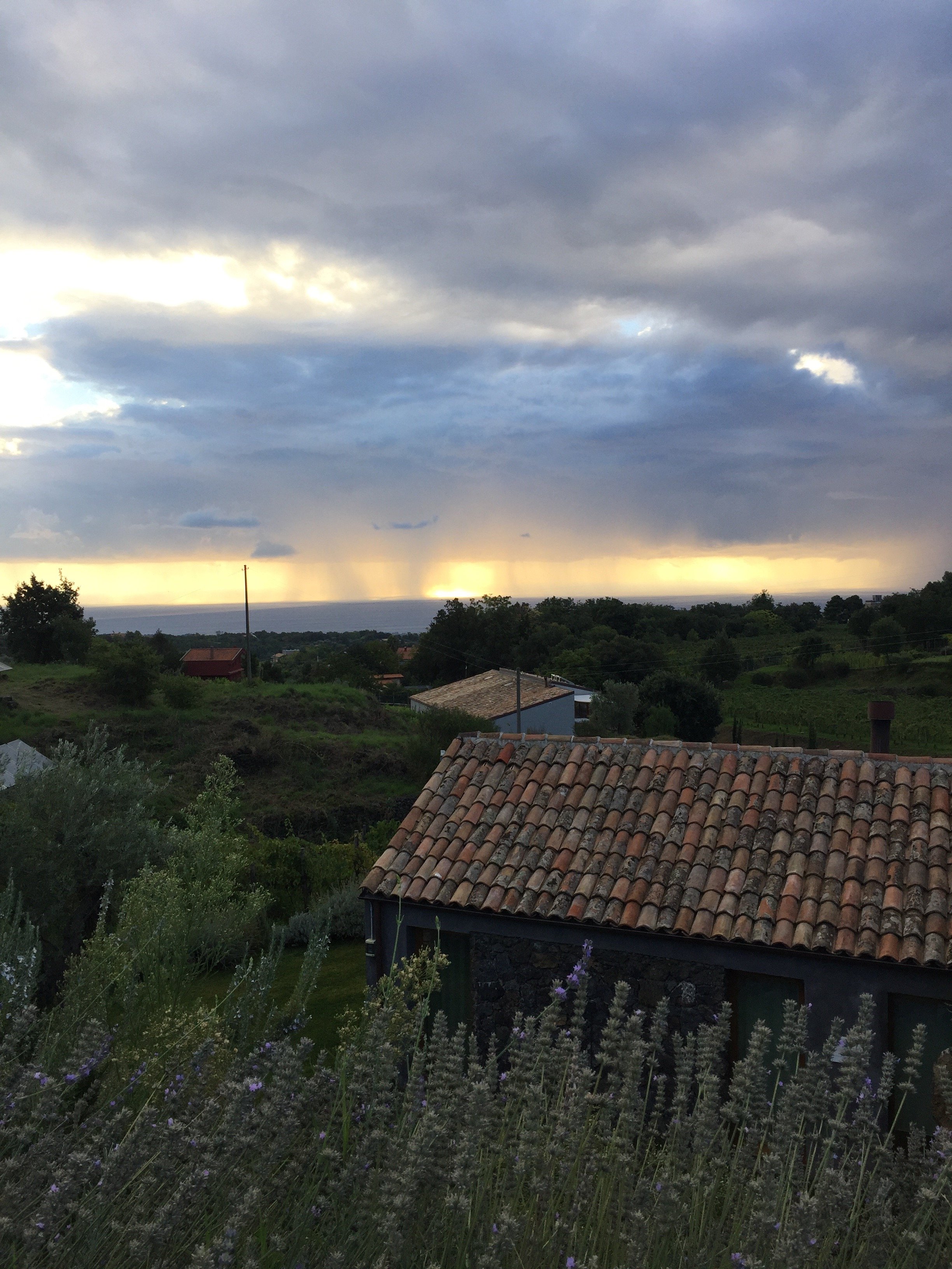
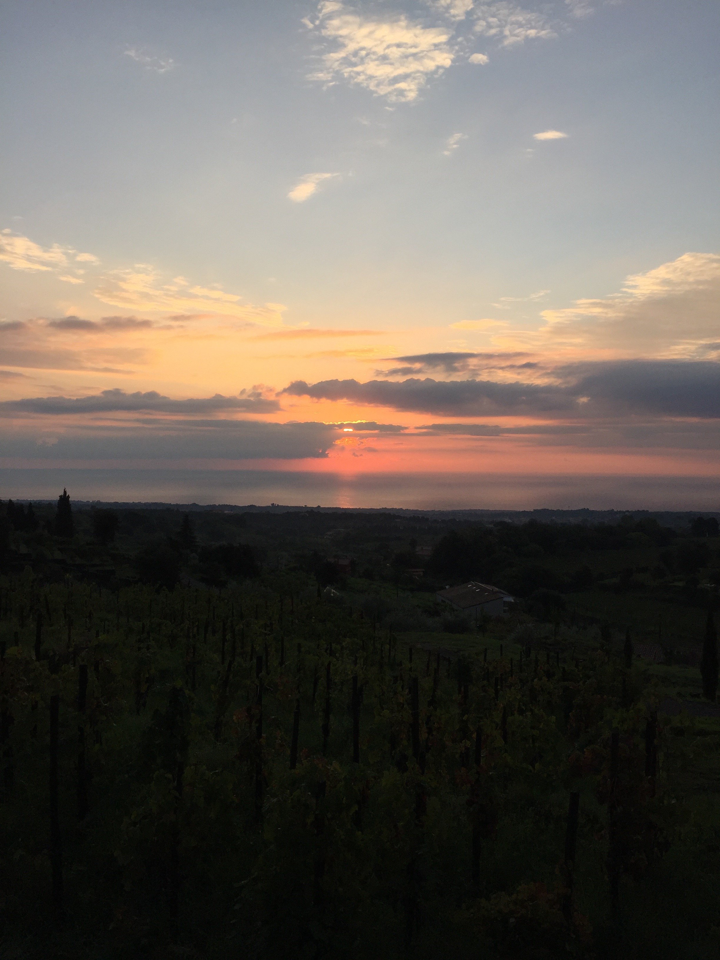 It got a little chilly at night, so I really appreciated the fireplace.They have a newish chef and the food (lunch and dinner) is a little less rustic than before. It is very good but it's a high-end take on Sicilian cuisine. The wine list is extensive and excellent. The breakfast spread was on point.It rained most of the time I was there, so no lounging by the pool (or the pool bar) this time. I'm glad it did clear up a little bit the day I drove down the coast.
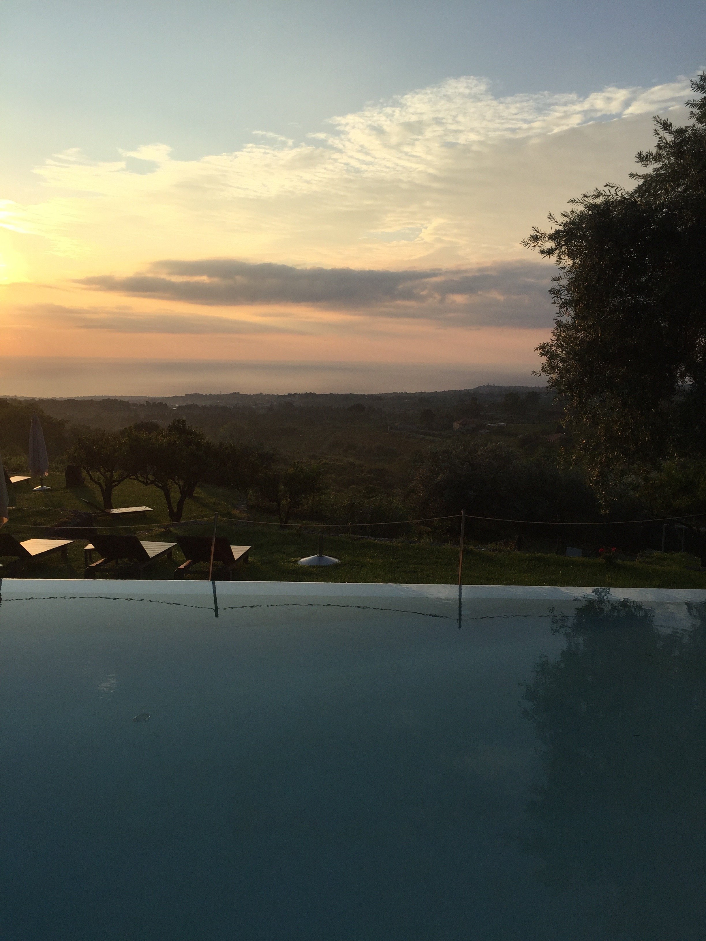 Of course it was a stunning day the morning I checked out.



 Grazie mille Guido, Ada, Nujuan, and Sara for everything.I have a solid sense of direction. Therefore, I was perplexed by my Sicilian driving situation. None of the rentals cars came with GPS but I had maps, directions printed out, and Google Maps on my phone and still I got lost. What the heck?My plan was to go to Ragusa, Modica, and then meet Gina in Ortigia for dinner. Some how I took the wrong exit for Ragusa. It was a happy accident because I ended up in Scicli which was incredible.I gasped when I saw this view. Pictures do not do it justice. Stunning.

 Next, Modica.Had a slight fender bender. It wasn't my fault and after my nerves were frazzled. At least I wasn't driving a stick shift. I thought Modica was beautiful as well.
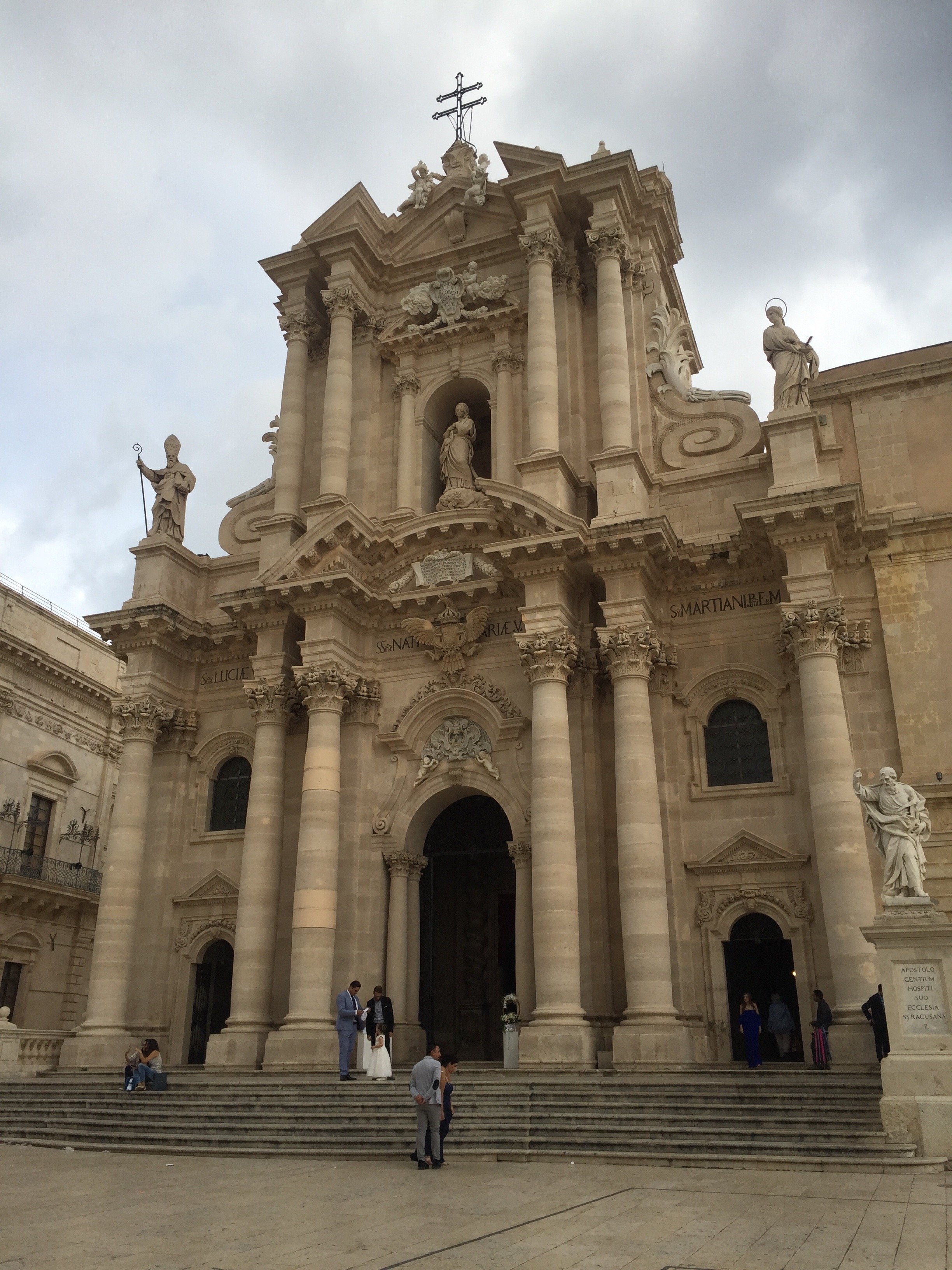
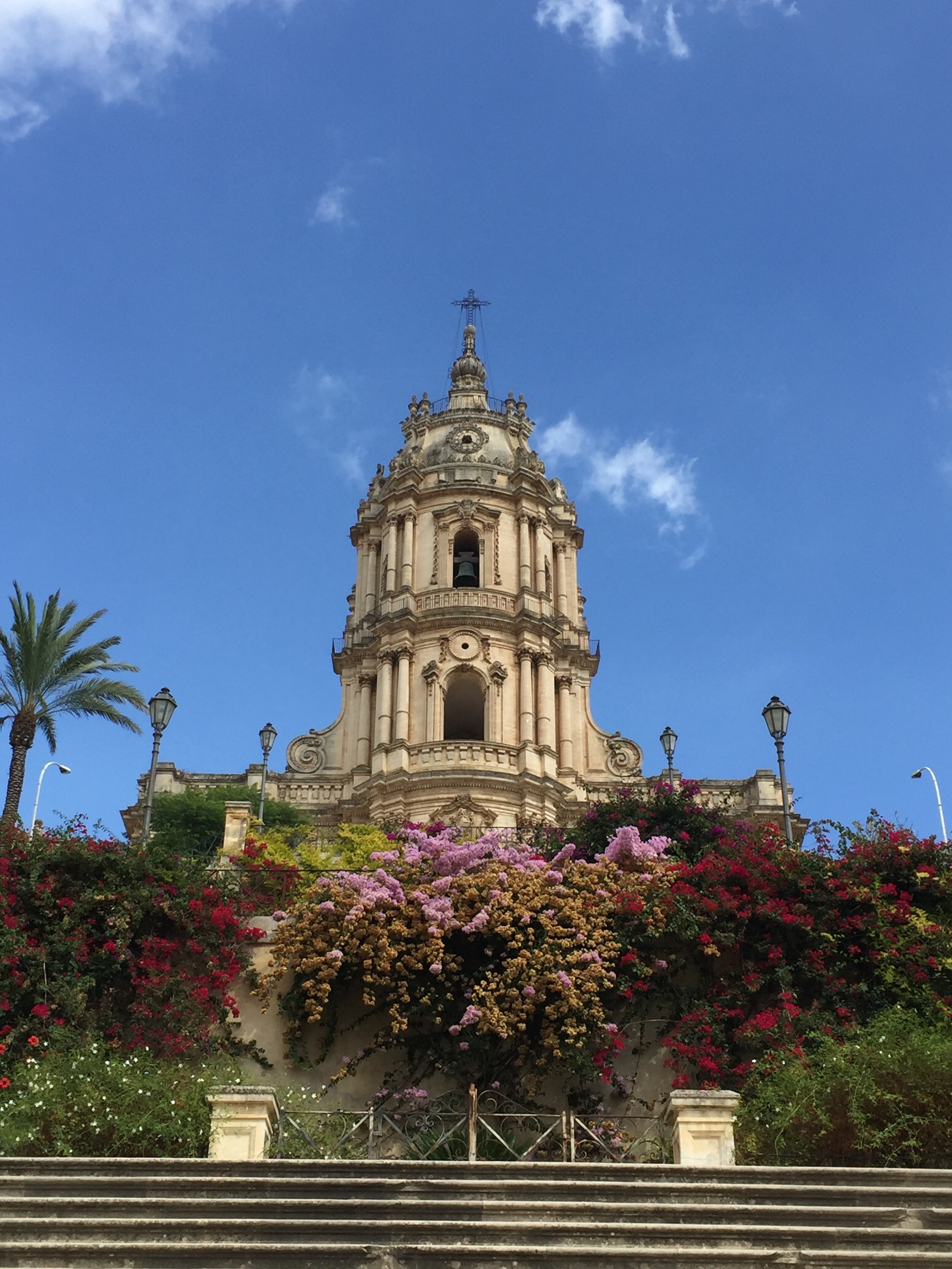 Three years ago when I was trying to decide between staying in Modica or Ortigia, I picked Ortigia. I liked Modica but I would've missed being by the sea and it's a lot more touristy than Scicli. If I had to pick a small hill town to stay in it would be the latter.Ortigia.It started to pour again. Gina and I went to a small caffe for aperitivi to wait it out. The rain never stopped.One thing I noticed right away, is how much Ortigia has changed in one year! The word is out. There were small tour buses. The caffe I always went to in Piazza Archimede was packed with tourists. There are several new shops selling souvenirs (at least most of them are food related). I hope this is great for the local economy.Even in the rain, The Duomo and its piazza moved me.
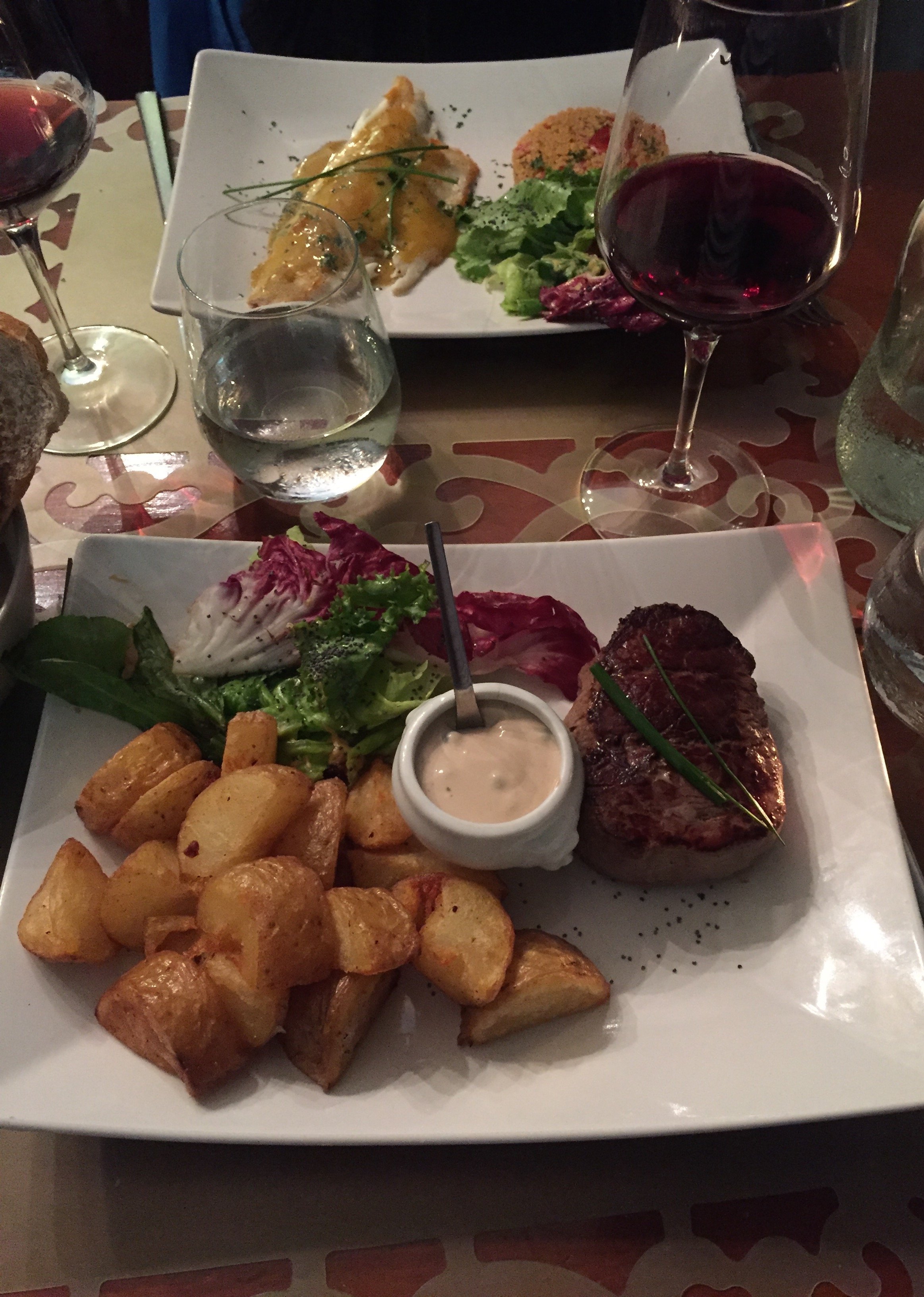
 Dinner at Le Vin de L'assassin was delicious.
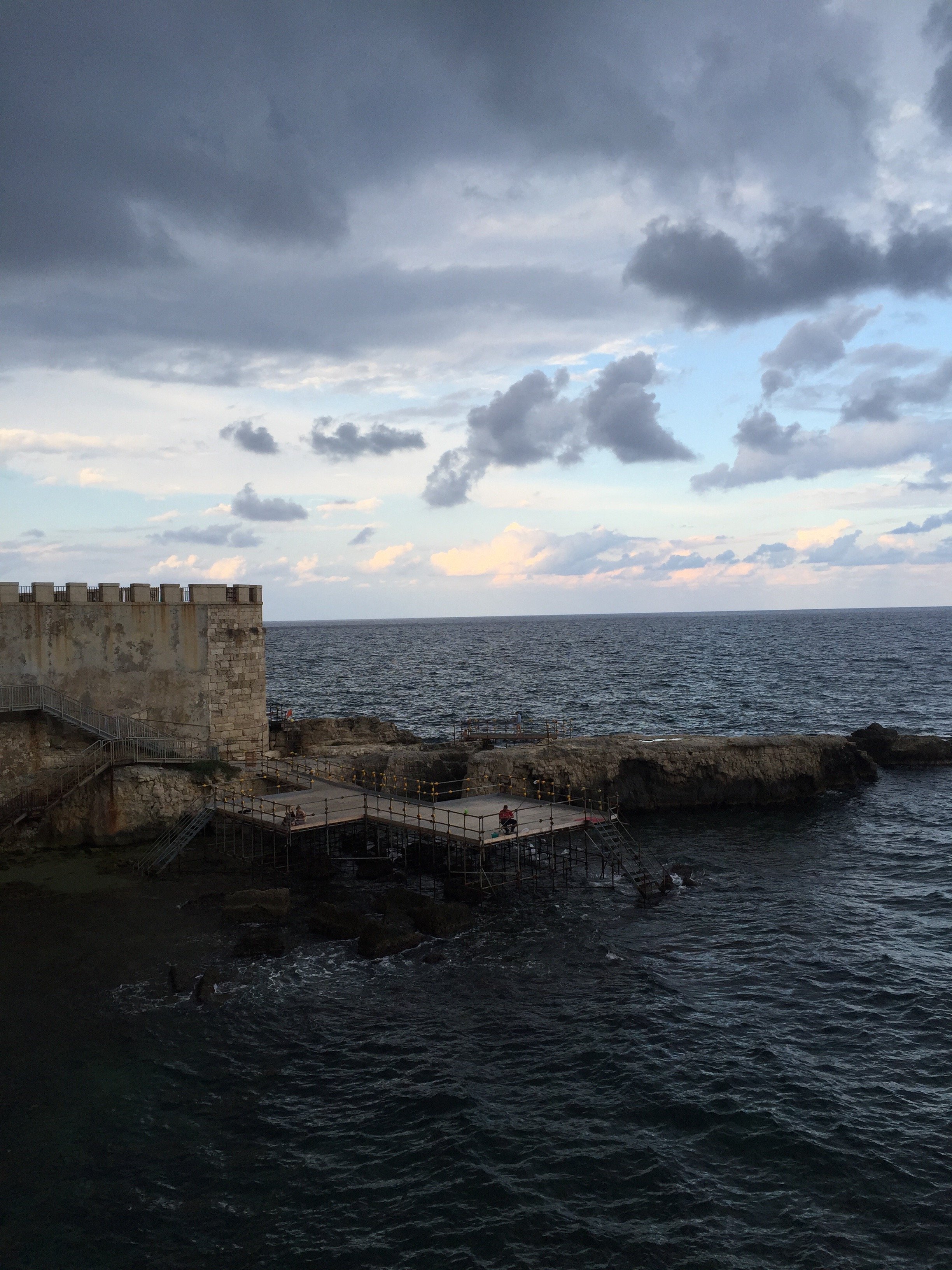
 By time we finished dinner, the rain had tampered off. Then I got lost while driving through flooded streets. Fun.I finally made it to the Autostrada. It stopped raining and there wasn't any traffic at midnight. Life was lovely. I was singing along with the radio, loudly, when all of a sudden the skies open up. BUCKETS of rain. I was near Catania and the heavy rain did not stop until I reached the exit for Acireale. More flooding as I drove on hairpin curves up the mountain. Thankfully, this time I found Monaci no problem.I really need to see Palermo and so many other places not just in Sicily but also Italy in general. I haven't been to Puglia or much of the North. However, Sicily keeps calling me. I find the architecture beautiful and inspiring. The food and wine are incredible. The people I've met made me feel at home.
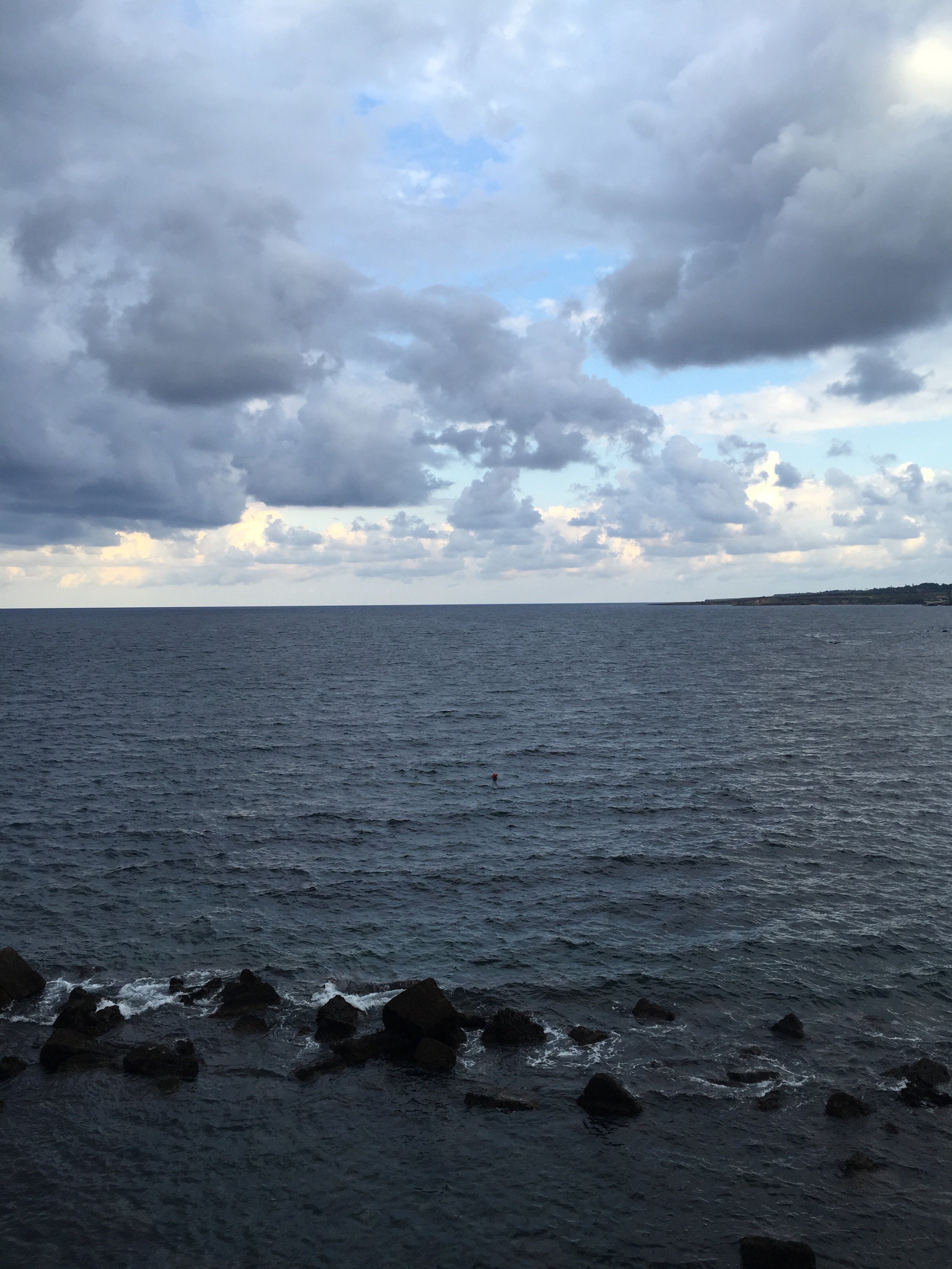 Sicily has my heart and my head.Photos: Me and my iPhone.
Io Adoro - E' Stile Bookstore
I'm still getting to know my neighborhood. One Sunday morning, I jogged past an interesting store window and made a mental note to check it out.Oh man, this place is going to be an issue. E' Stile is a concept bookstore focusing on art, fashion, and interior design/architecture.They have a GREAT book selection. I do order from Amazon sometimes, especially English language books but nothing beats going to an actual bookstore. Yes, it's more expensive. However, I believe it's important to support small shop owners. I like to browse and speak with the salespeople about the books. You can't duplicate that experience with online shopping.E' Stile also carries Chez Dede bags, products from brands like Kartell and Alessi, and there's a gallery space downstairs.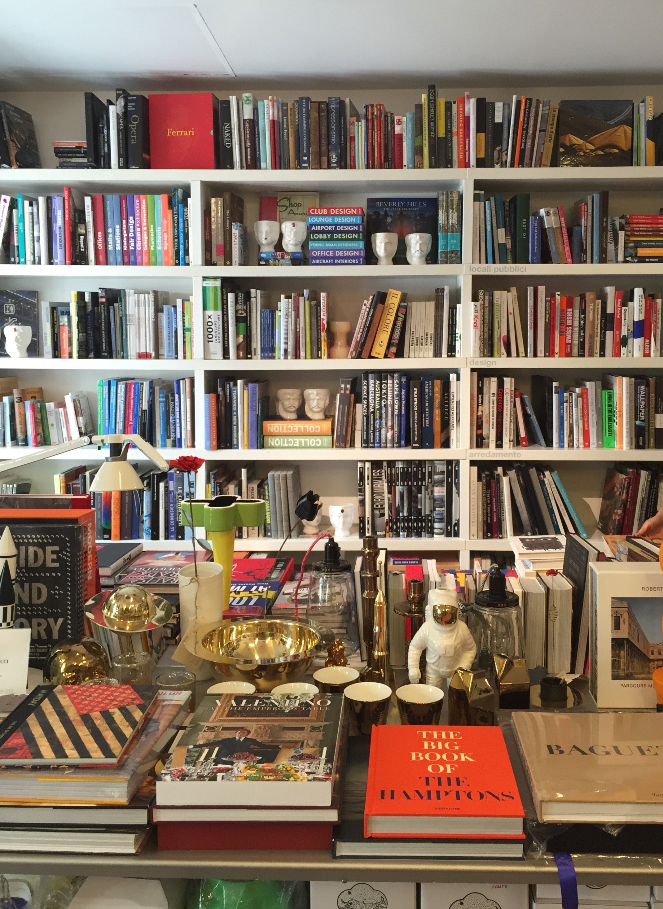
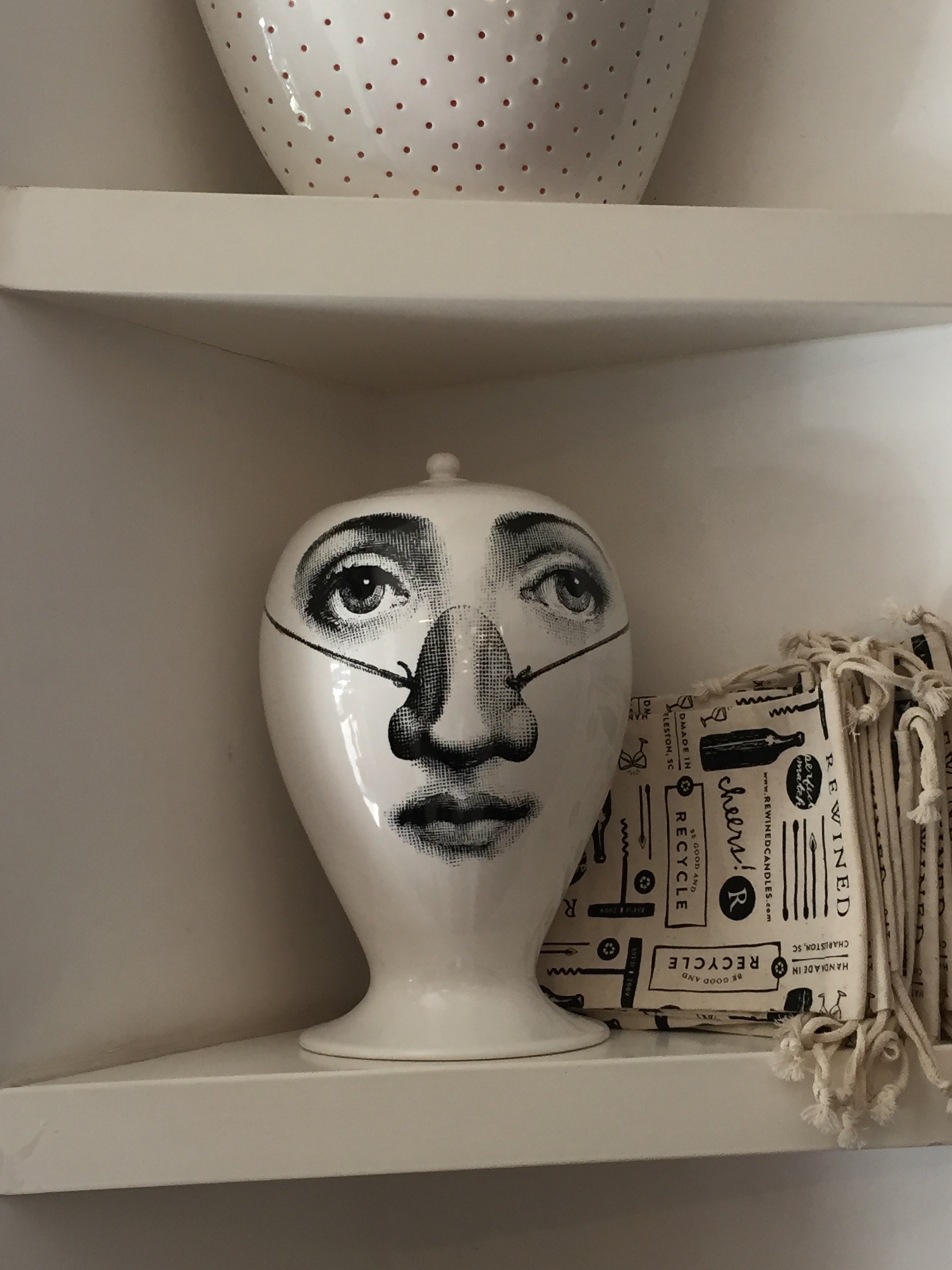
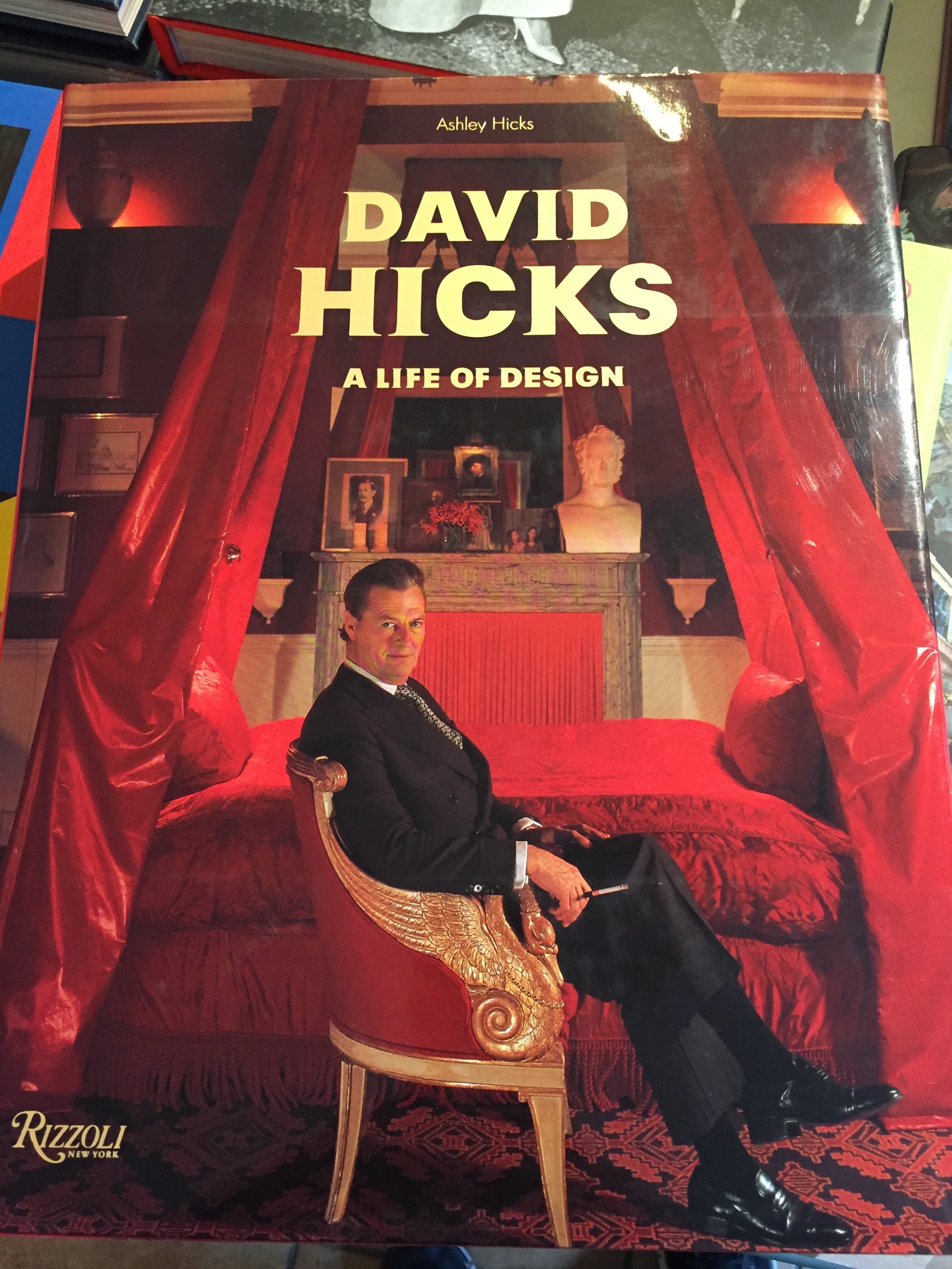


 Photos: Me and my iPhoneE' Stile BookstoreVia Chiana, 15+ 39 06 8555337
Life in Rome - My Post Milan Funk
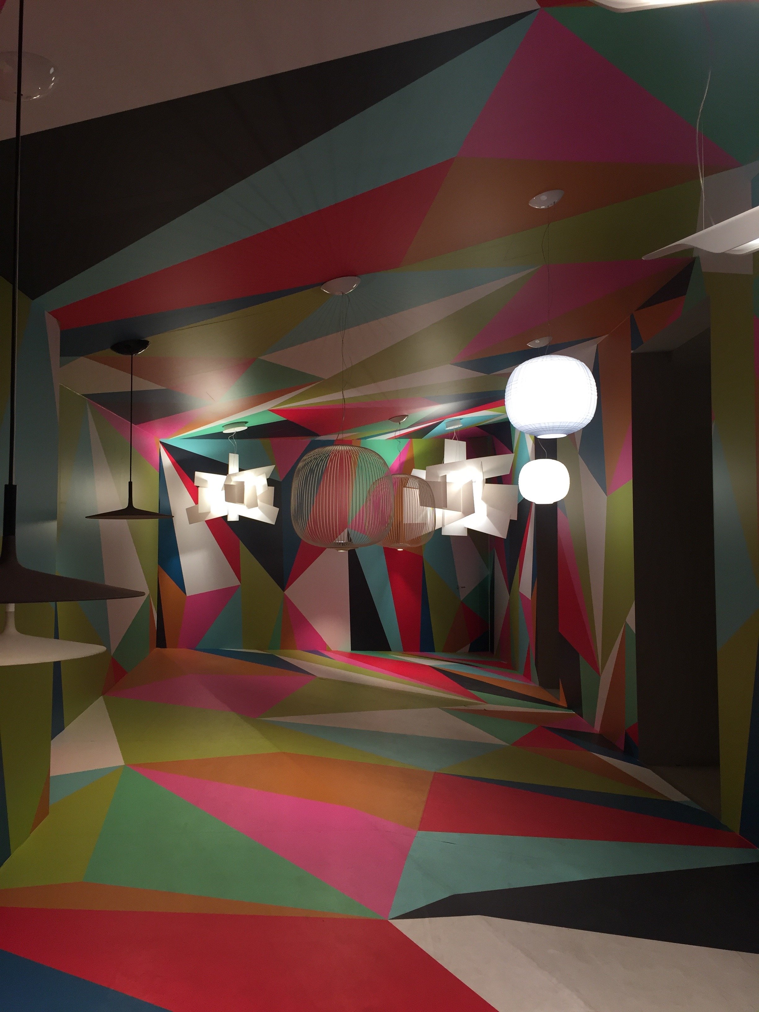
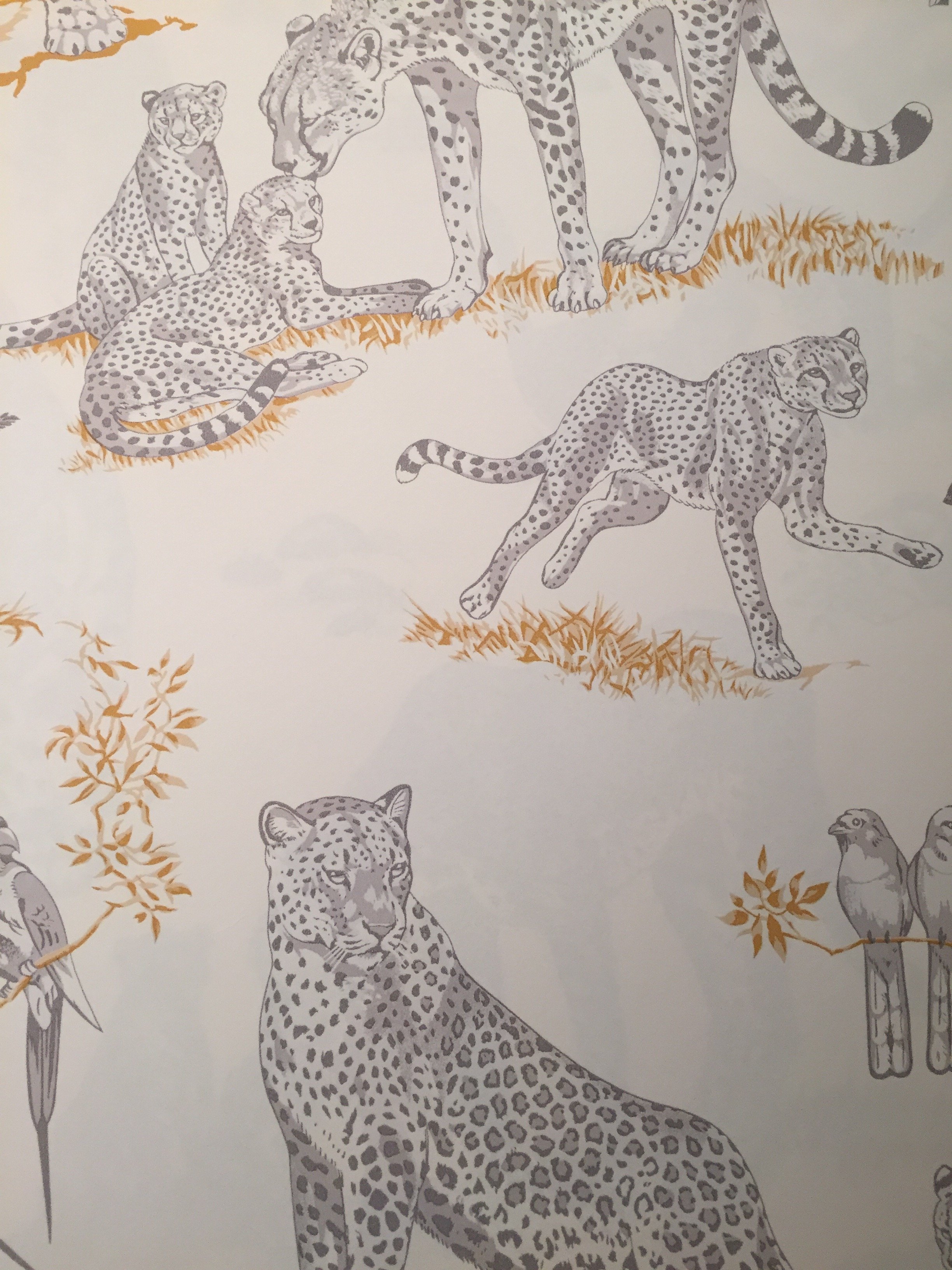
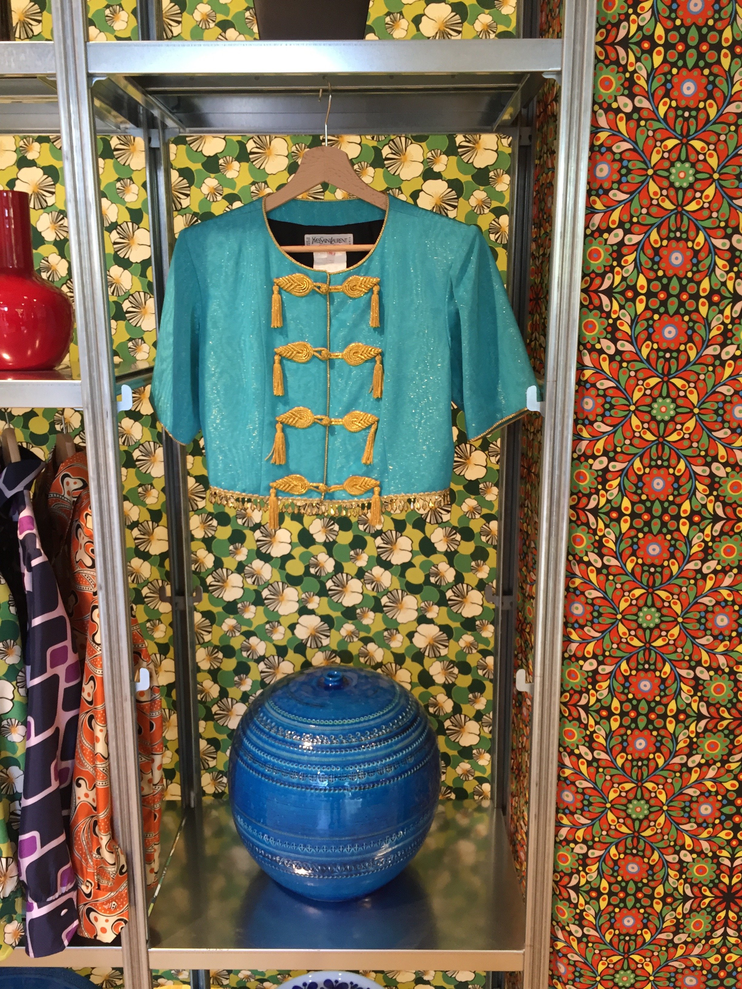
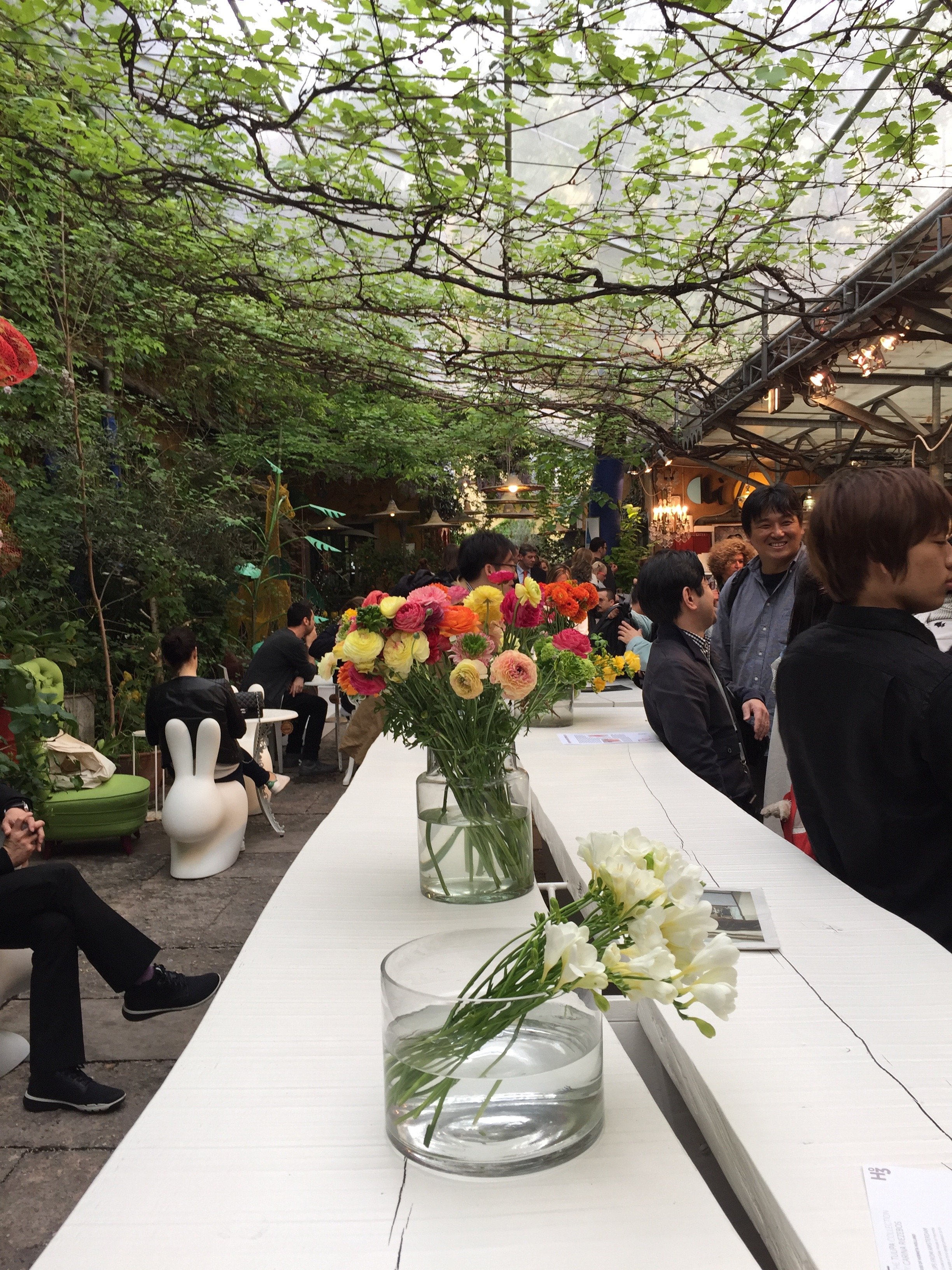
I've been in a weird mood since returning from Milan the other week.I'm crashing from the Salone del Mobile high, Prince is dead, and I have a cold. I rarely get sick but when I do it seems as if my colds have a need to make up for lost time or something.When I went to the Salone two years ago this didn't happen. Something has changed in Rome and it's not for the better. I'm not the only one who feels this way. These articles, yesterday's New York Times and a piece my friend Michelle wrote for US and News Report in February, sum things up pretty well. Maybe I have cabin fever. Hopefully, tomorrow I will feel better and can leave my house!I have been to the Salone three times. The first time I stayed in a hotel near the Convention Center. The second time I rented an apartment in the city near the canals. Third time's a charm.Hotel prices are insane during the Salone (if you can find one). The Salone is larger than Fashion week and seventy percent of the people attending are visiting from other countries. The entire city takes part. If you're planning to attend, make reservations early. Many companies and vendors have blocked out rooms years in advance.I returned to the Principe after my great experience there in September. I still don't understand how the hotel was filled to capacity, yet I rarely saw any other guests on my floor. So quiet. The service at this hotel is impeccable despite its size. Plus, they have American bacon during breakfast.Renting an apartment while traveling on vacation is an excellent option but I've learned my lesson. When I'm working, a hotel is a better choice for me. Much better.I was running around Milan like a chicken with my head cut off and it was wonderful to return to a clean room, to have concierge service, a gym, a convenient place to have meetings, etc. Of course the cost was higher than the apartment I rented two years ago but my trip was more productive.And what a great trip...four intense days of meetings and visiting showrooms. I wish I had more time.I posted a few photos on Instagram and below are additional pictures from some of the highlights. I can't upload all the highlights as I forgot to take photos at the Ethimo party, and quite a few showrooms.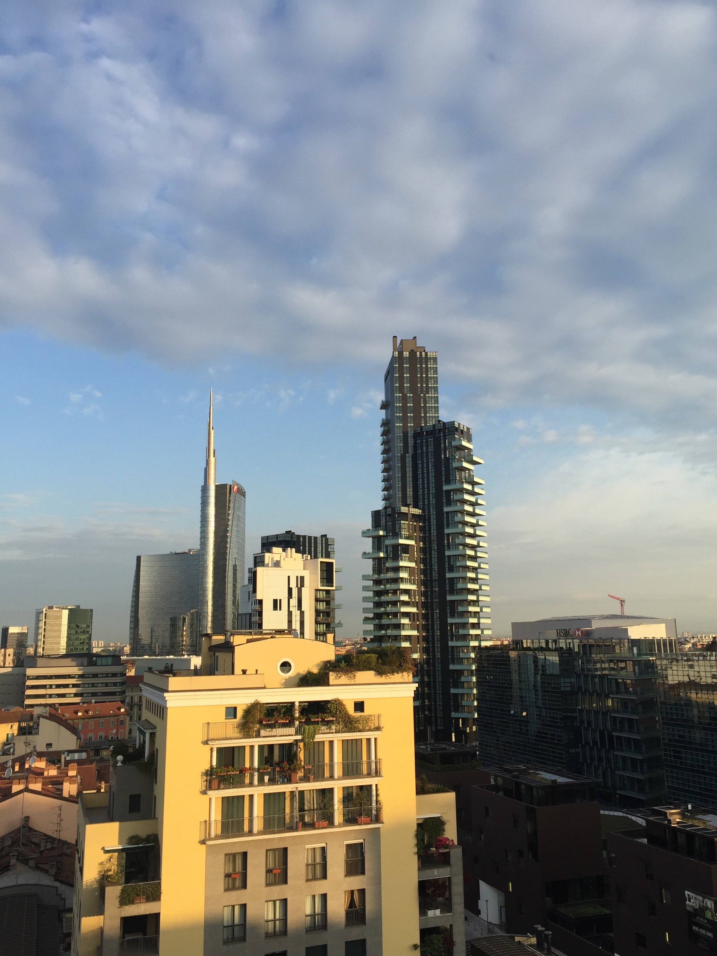


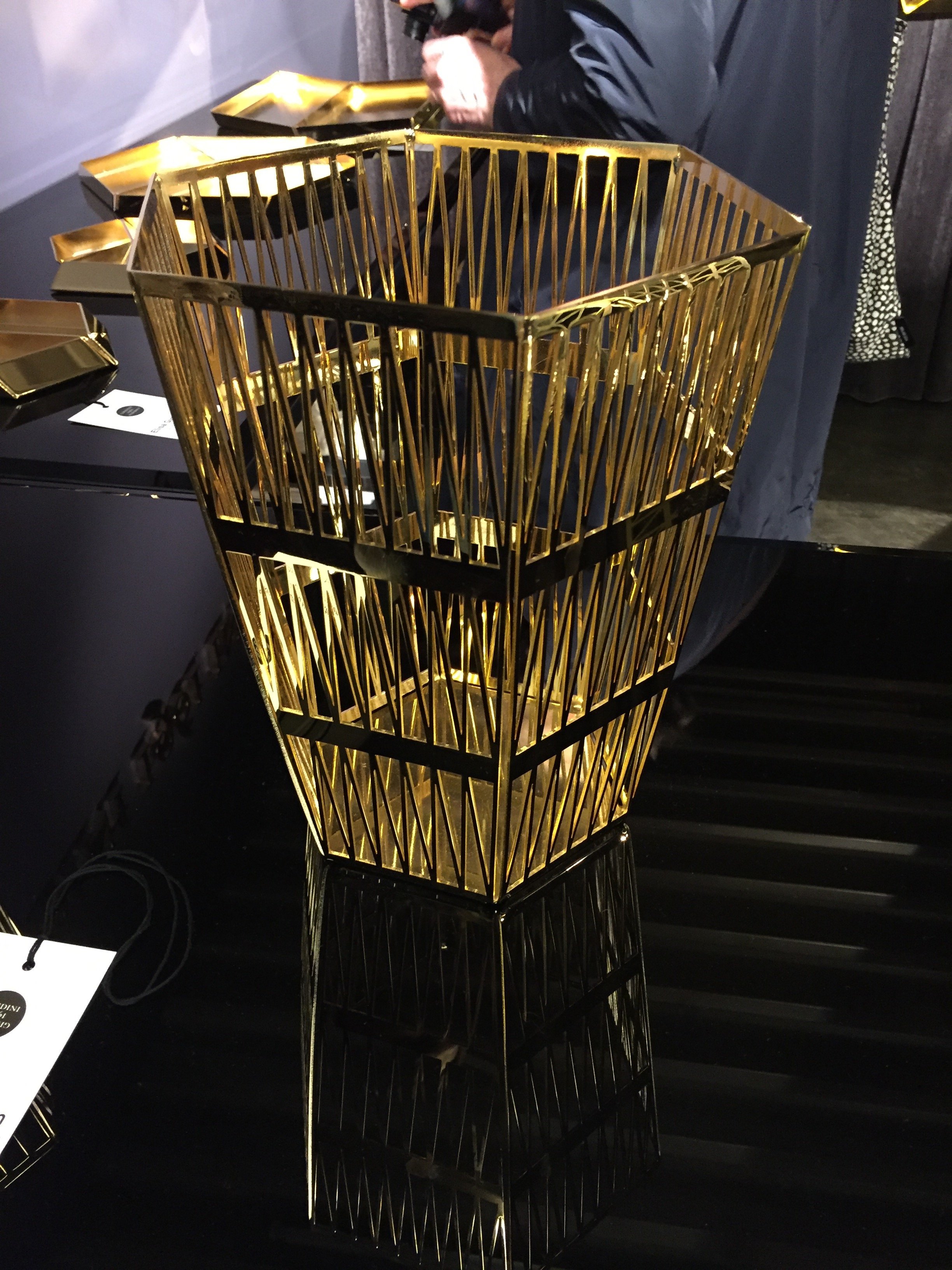
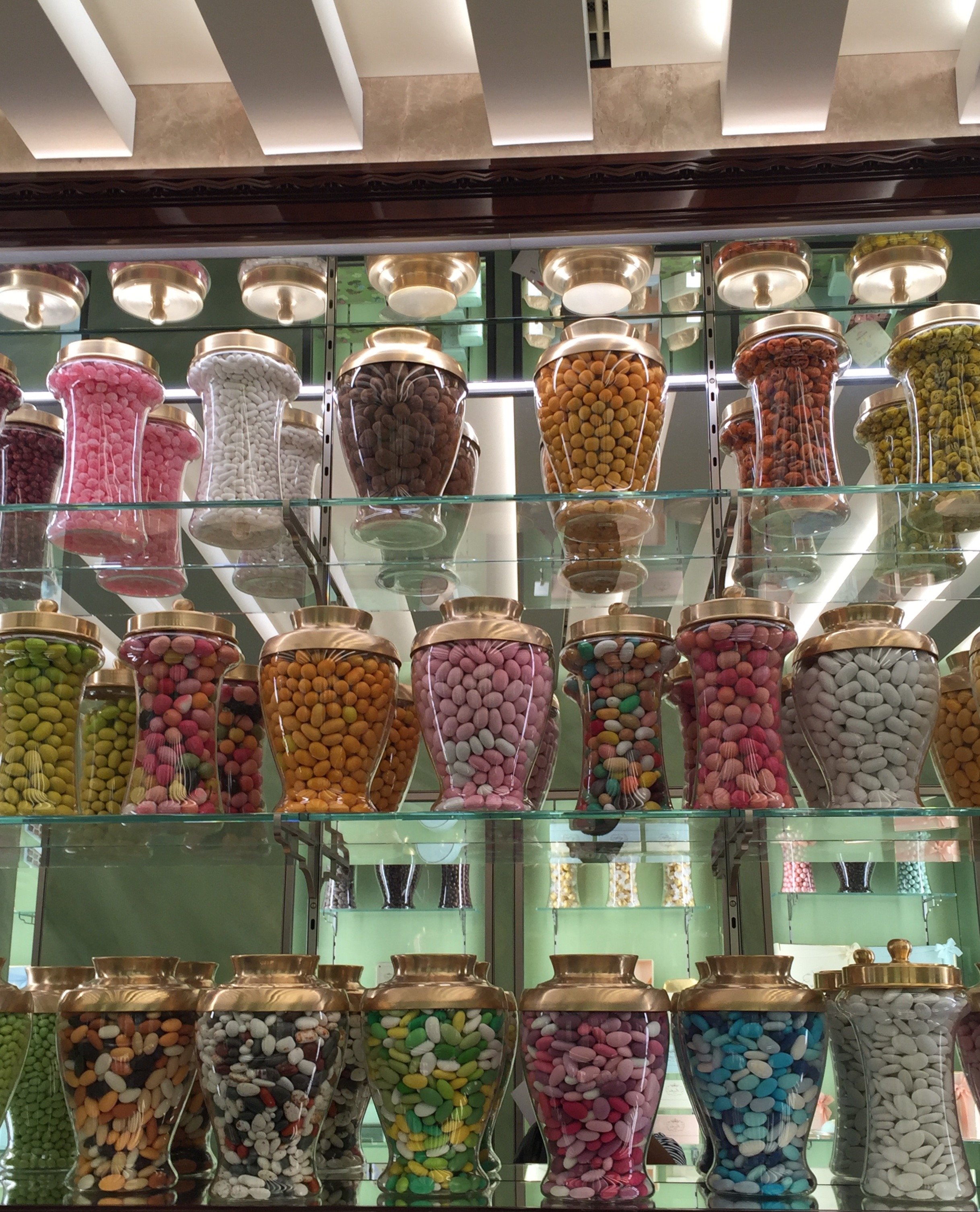
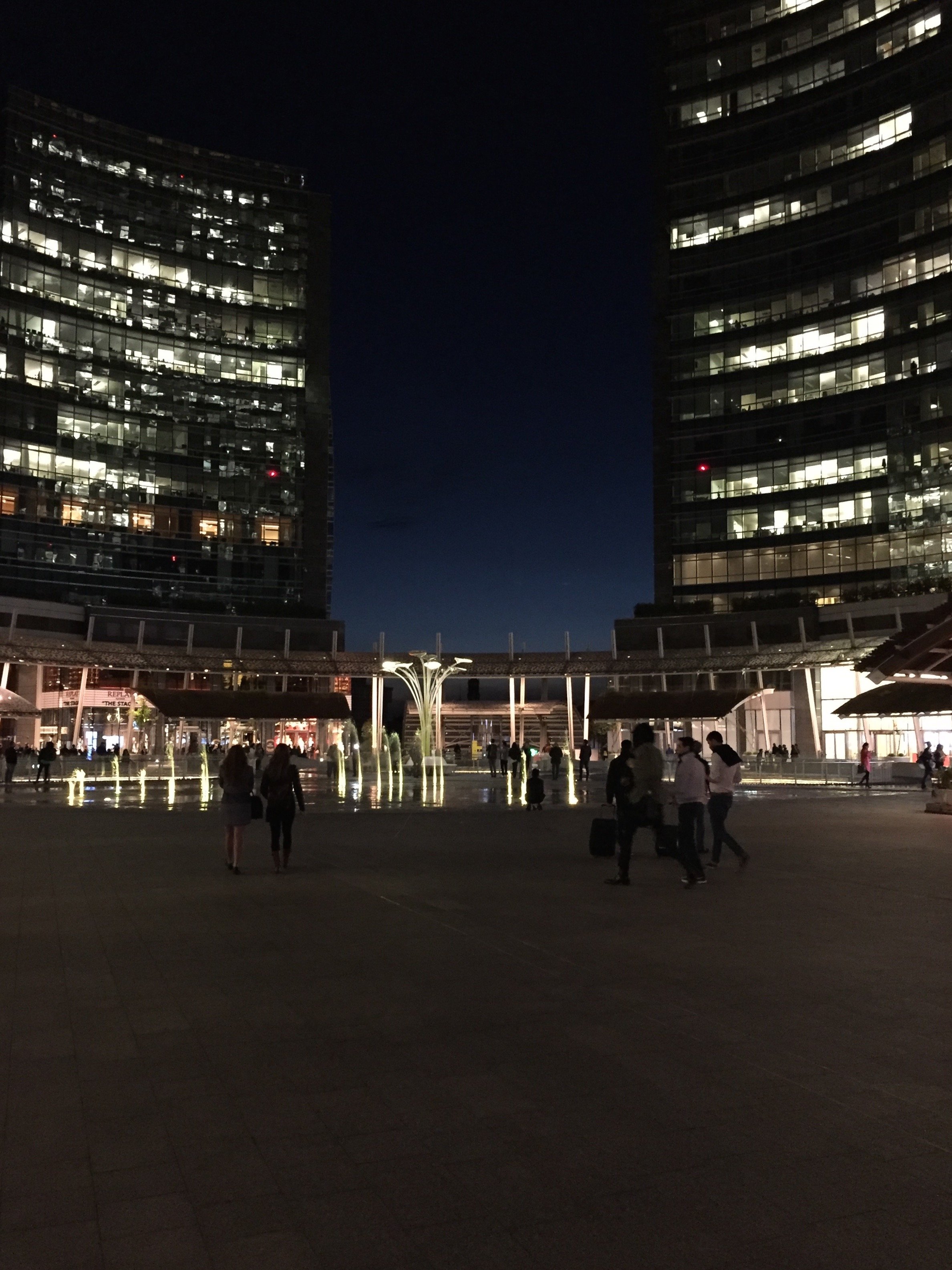
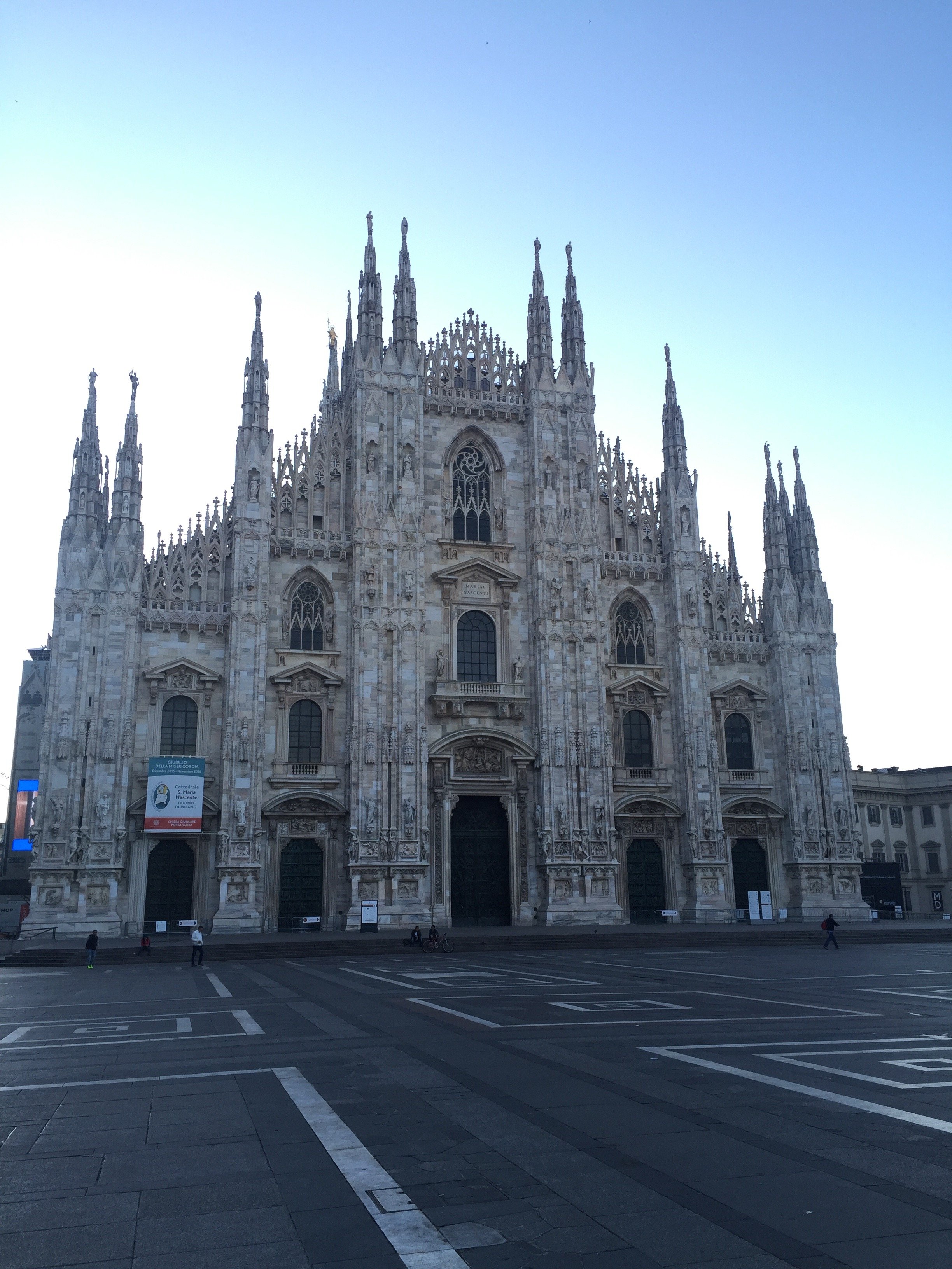
Project Via Monserrato - Reveal
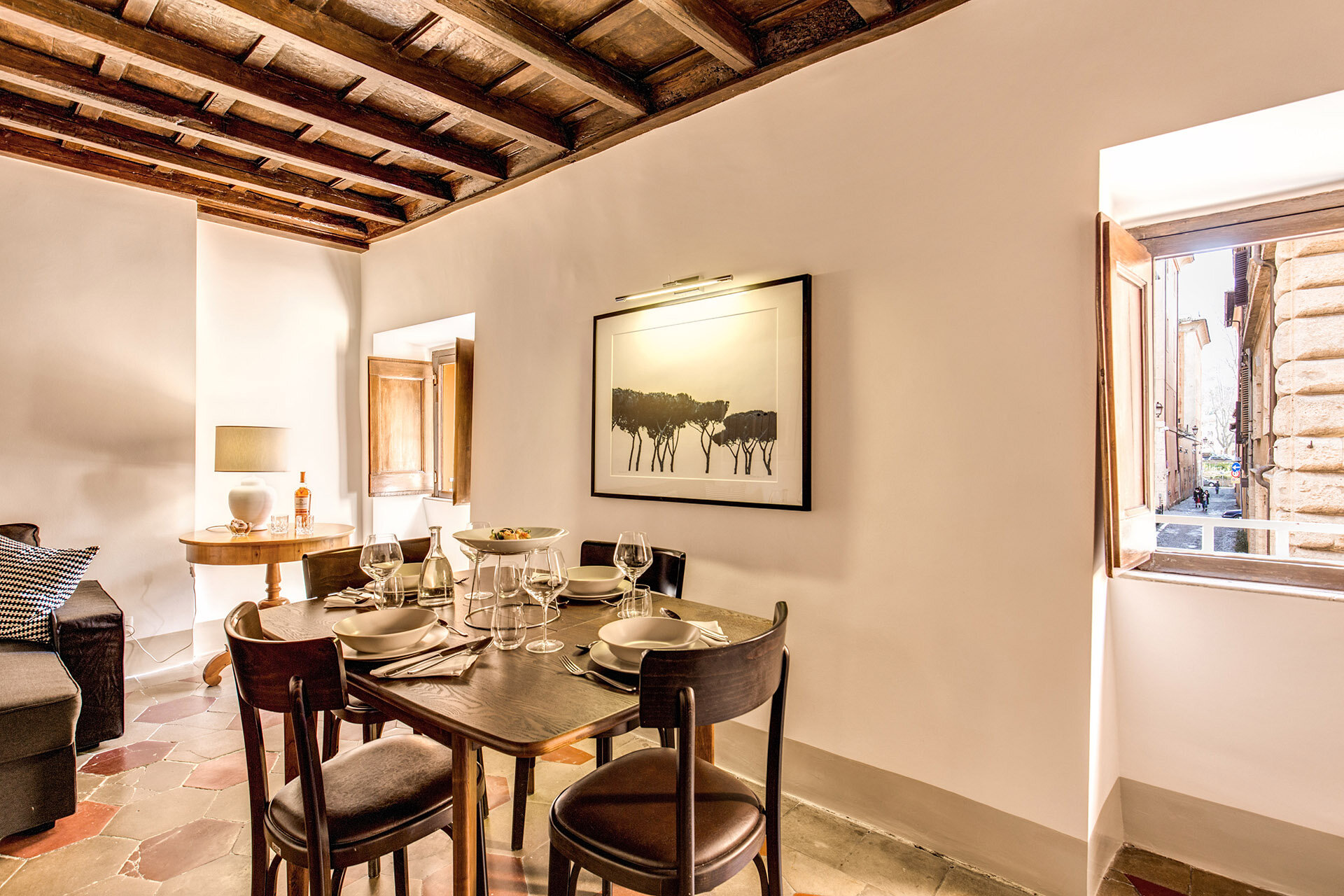
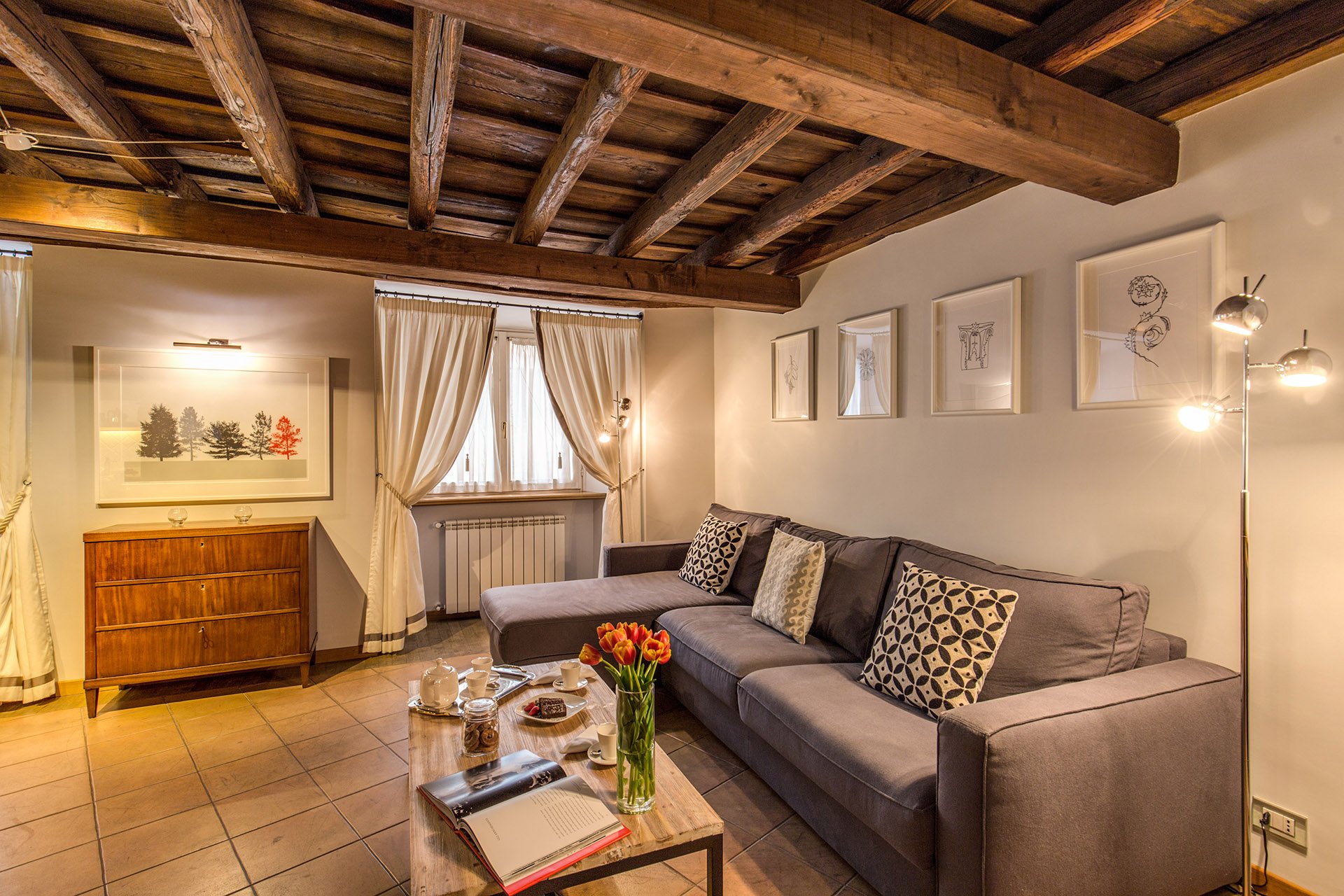
During the past year I've been working on a decorating and renovation project in the Historic Center for a client who wanted to update a few of their B&Bs.It was a great experience. At times it was also challenging, as the apartments were fully booked months in advance. The logistics were difficult.Located inside a palazzo that dates from the 1600s The Via Monserrato apartment (aka Grand Suite), is on one of the prettiest streets in Rome.The brief was to create a contemporary décor, while at the same time retaining (and respecting) the charm and history of the architecture.Vacation rentals are tricky. You don't want a design that is bland or cookie-cutter but it cannot have so much personality that it turns off most customers.Here's a photo from the living room, before.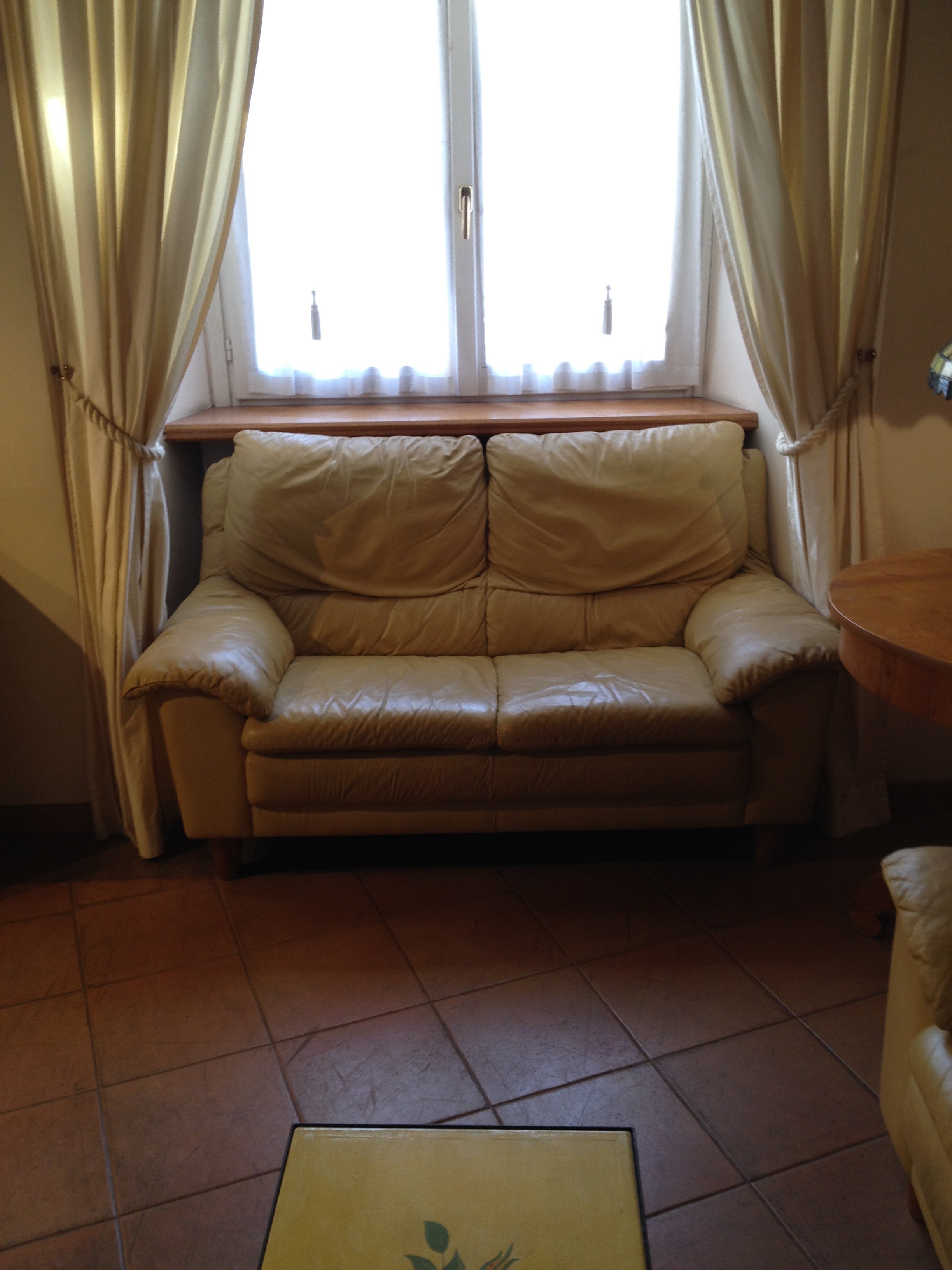 After
After 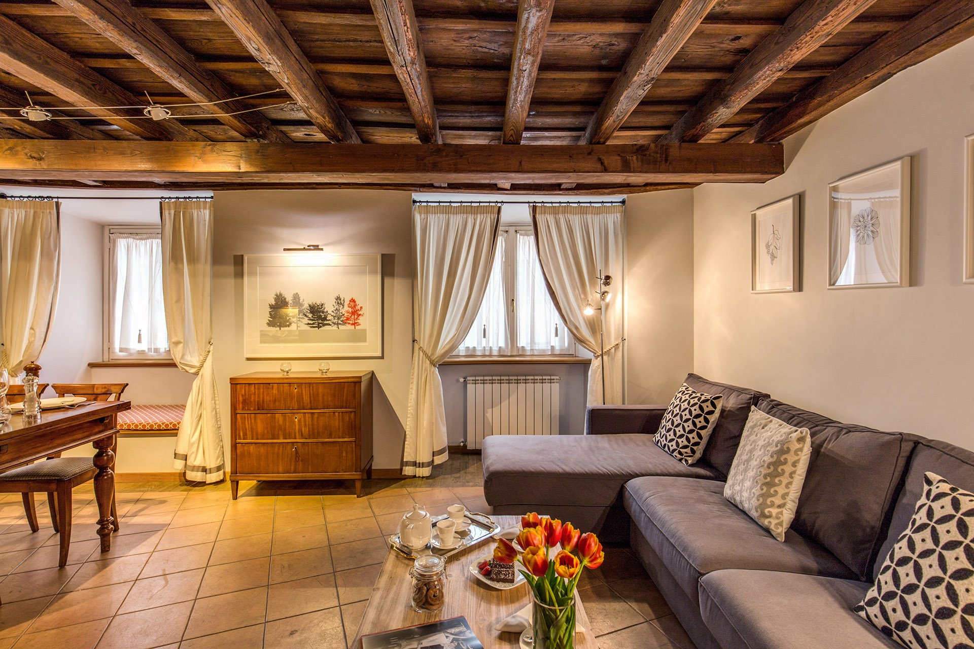 This room is a mix of high and low vendors, antiques (that belong to the client), and custom pieces.The room is light, stylish, yet comfortable. We had to use fabrics and colors that could handle a lot of wear and tear.The walls were changed to Farrow & Ball's "Blackened", a cool white that reads light grey. I know I talk a lot about this brand but there's a reason I have used it in every single project I've worked on. The quality of this paint is no joke and depth of color is incredible. This was the first time the painters had worked with Farrow & Ball and they were very impressed. When people who paint for a living rave about a brand, you know it's good. Stateside, I like Benjamin Moore as well but that brand is not sold here. Le Decorazioni is the authorized Fallow & Ball vendor in Rome.We decided to go with a one L shaped sofa instead two. This model is a sleeper sofa and we bought it from Berto Salotto.The coffee table is from Maisons du Monde, a French brand with stores all over Europe.The curtains were custom made. The trim is Dedar. All the fabric for the apartment was selected and purchased at the store Lelli.The floor lamps are from MADE.The art work over the antique buffet is by Due Alberi. Funny that I read about these two artists in Rome on Elements of Style, which is written by Boston-based American interior designer Erin Gates. We used their work in another apartment (pics soon) as well.We commissioned artist Marta Alexandra Abbott to create pieces that referenced Rome in a subtle way. Marta is American and moved to Rome several years ago. You can see more of this series, inspired by the Ara Pacis, HERE.Dining area.
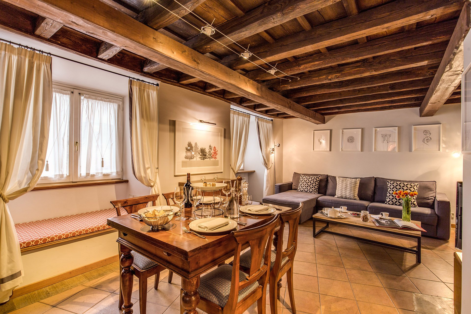 We kept the dining table and reupholstered the dining chairs.Before
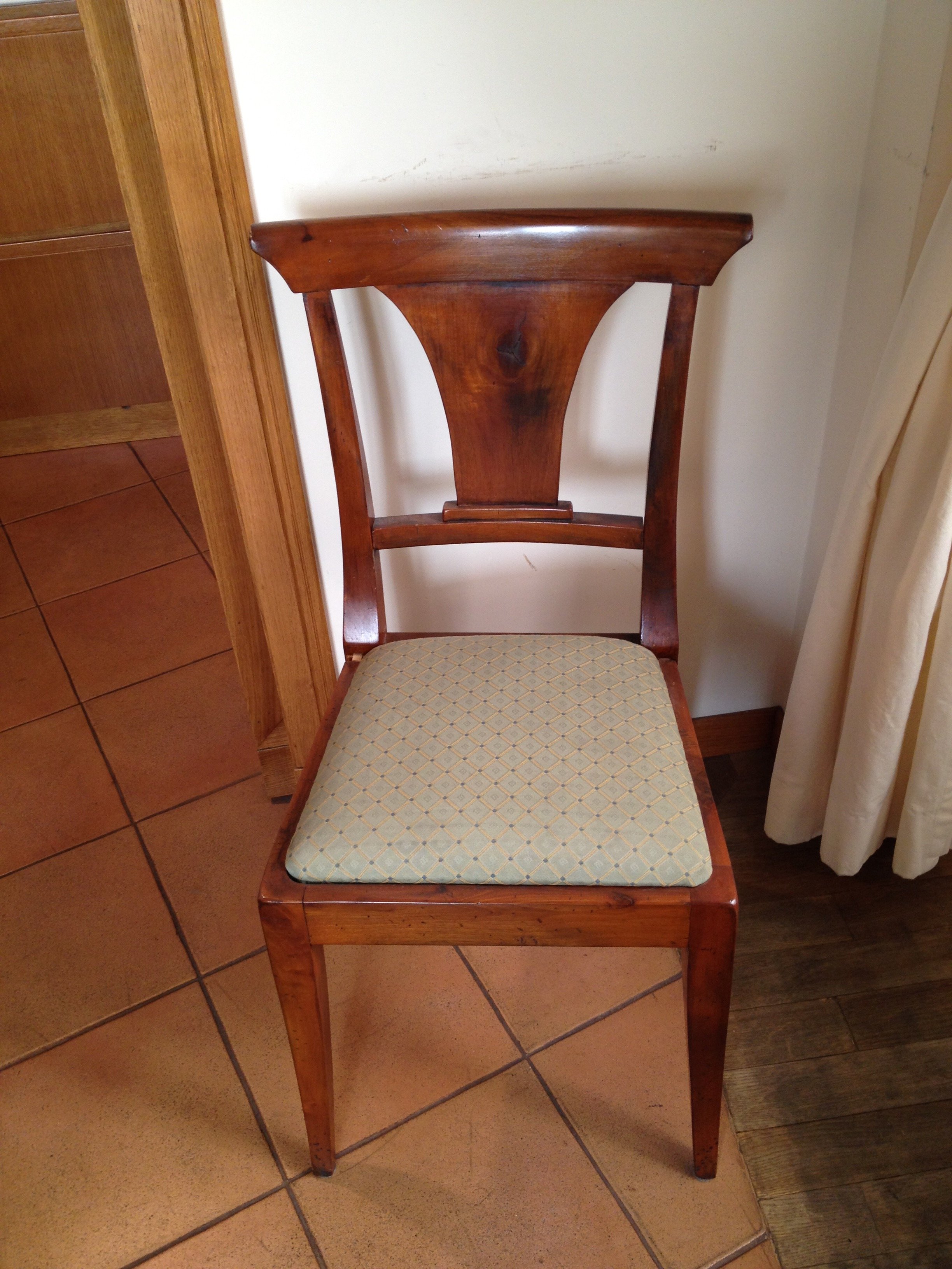 After
After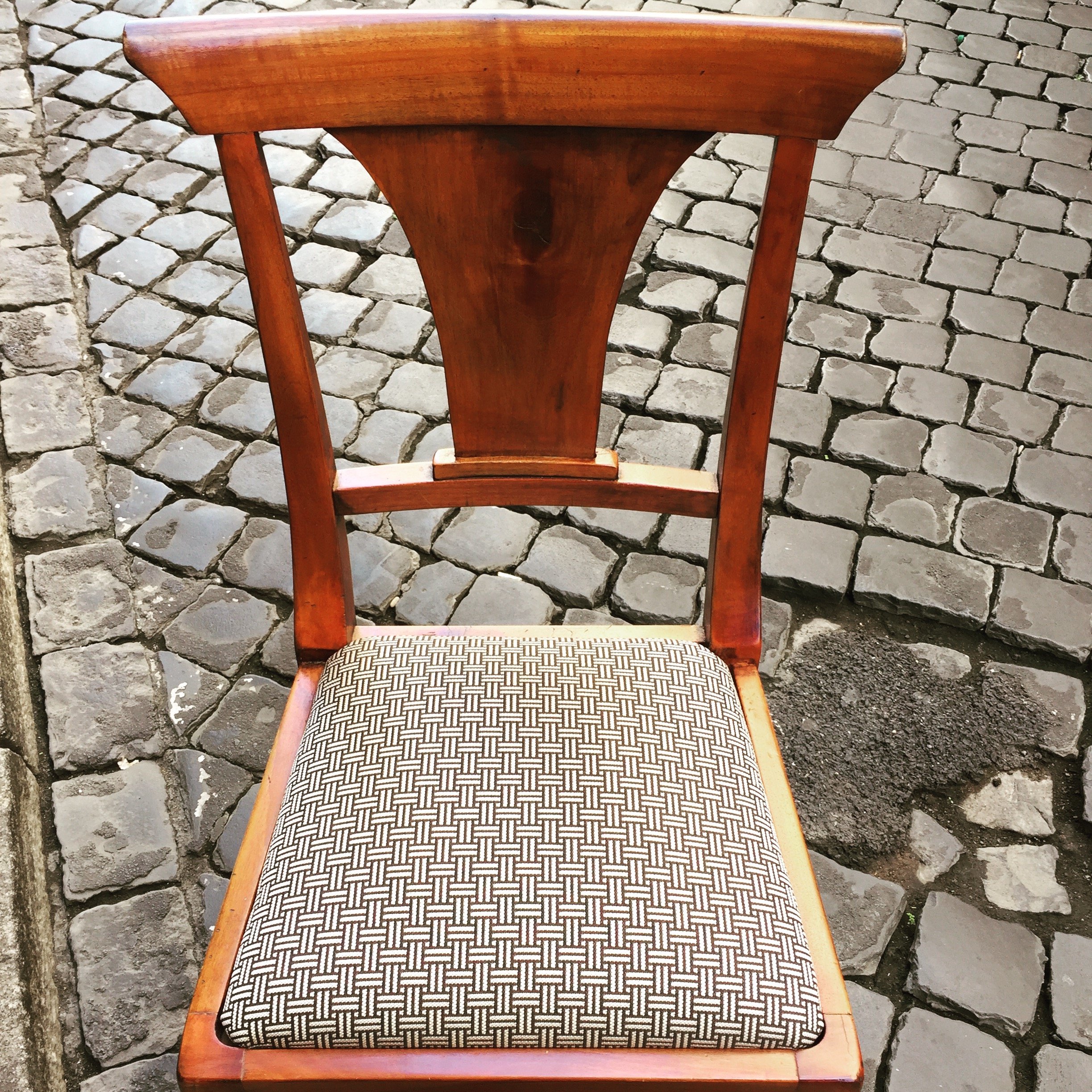 This graphic Dedar fabric is durable and makes the 1930 lines of the chair stand out. The chairs were in great shape. I thought it would be better for the budget and the design to keep them. I'm not a fan of spaces where every single item is brand new. I like to mix things up. You see that a lot in interiors in France and Italy. If you don't have any older pieces of your own, you can find them at flea markets, estates sales, in your family's attics/basements, etc.We created a window seat. I wasn't sure my client would go for the pattern or the color. The fabric is Thibaut. I think it gives this room of neutrals a nice punch of color.The pillow are from a local shop, Fabindia.The former artwork in the living room.
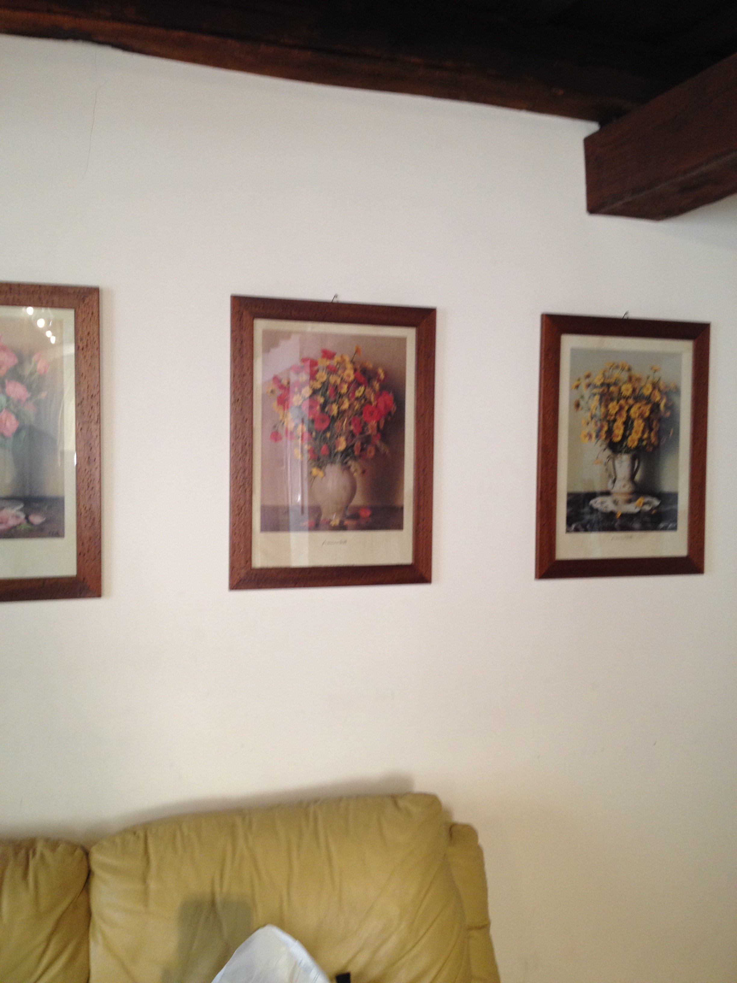 Art work, after.
 The hallway was painted white and the huge 1980s sconces were replaced with simple, modern ones. This art is by Marta as well.
 Bedroom - before
 After
After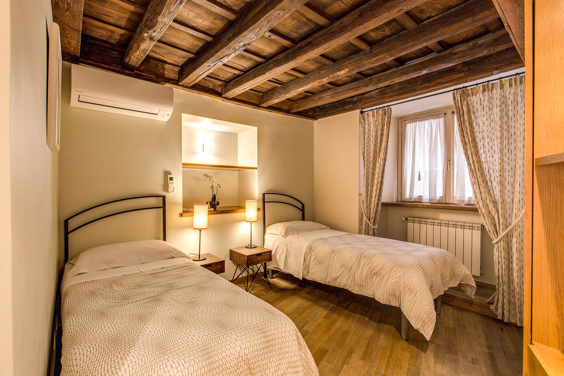 Originally, there was a queen-sized bed in this room but my client's company has had many requests for twin beds.The walls are Farrow & Ball, "James White". The curtains are custom. The fabric is Thom Filicia for Kravet.I asked my blacksmith to make the head boards. I wanted something that would look great when together and when separate. We came up with a few designs and this is the one the client picked.The night stands are from Maisons du Monde. The lamp bases are from IKEA. The shades were custom made at the store Paralume, which is right up the street.I'm not sure how a store that makes/sells lampshades manages to stay in business in this global economy we live in but I hope they stick around for a long time.The beds together.
 The master bedroom - before
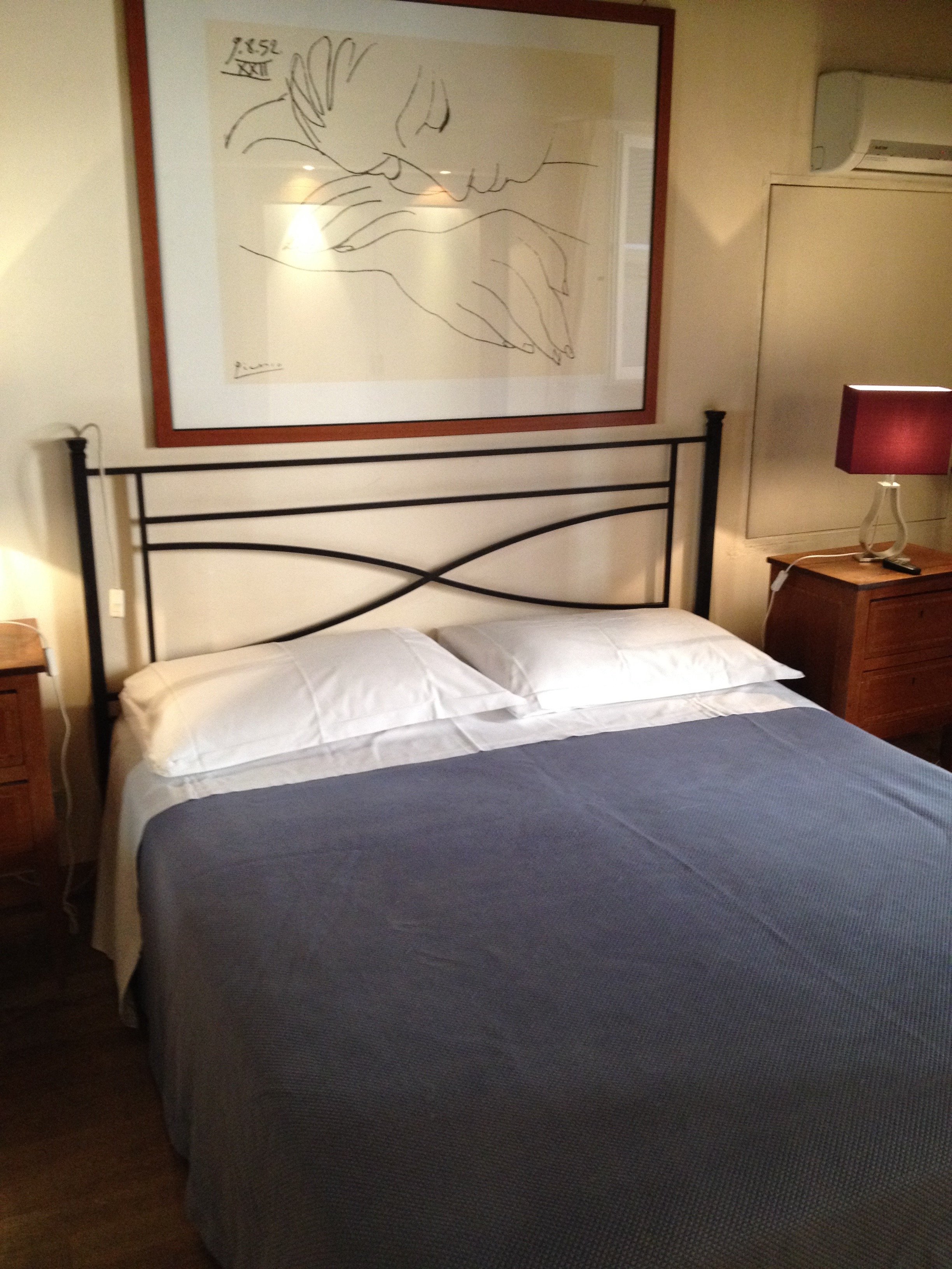 After
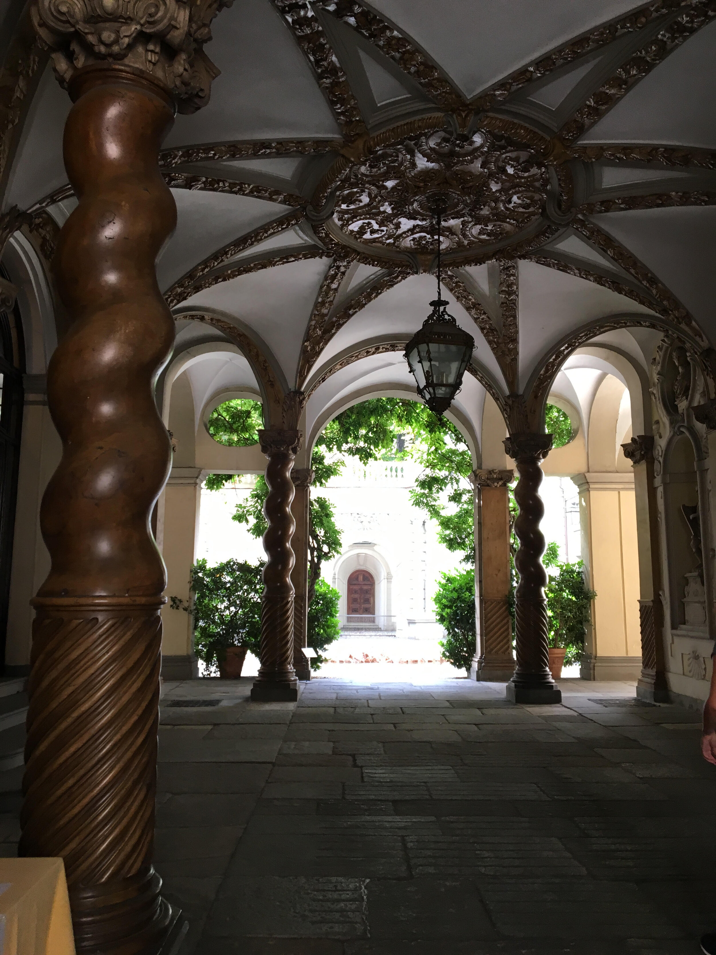
After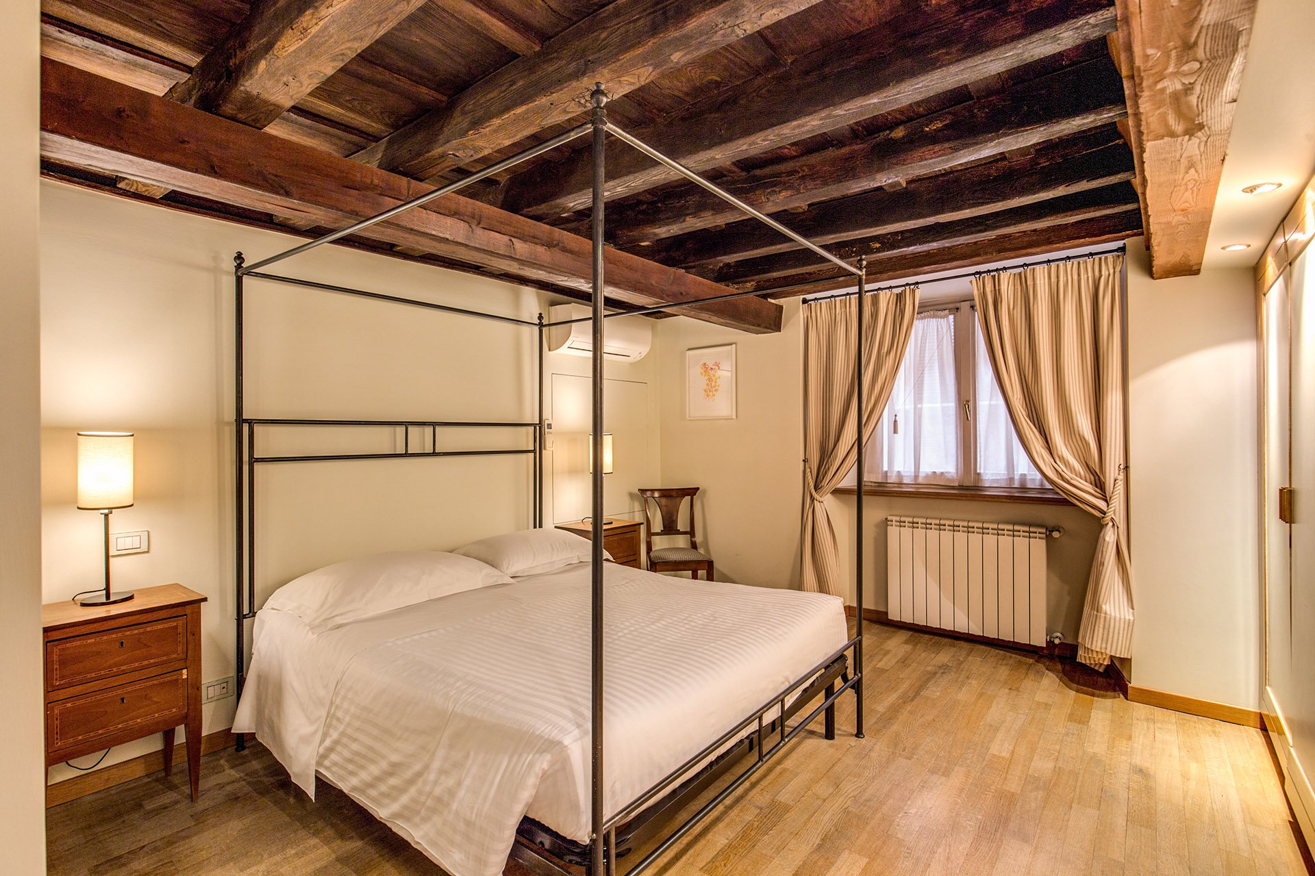 We kept the bedside tables. The walls are F&B James White. The curtain fabric is Malabar.The lamp bases are IKEA, shades custom from Paralume. It's hard to tell from the photo but these shades/trim are a different color from the other bedroom.I have a thing about four poster/canopy beds. Our blacksmith designed this simple yet, elegant frame. With these ceilings, we thought a more decorative frame would be too much. It interesting how the room actually looks bigger even though this bed is the same width as the old one.Two photos from inside the Palazzo.
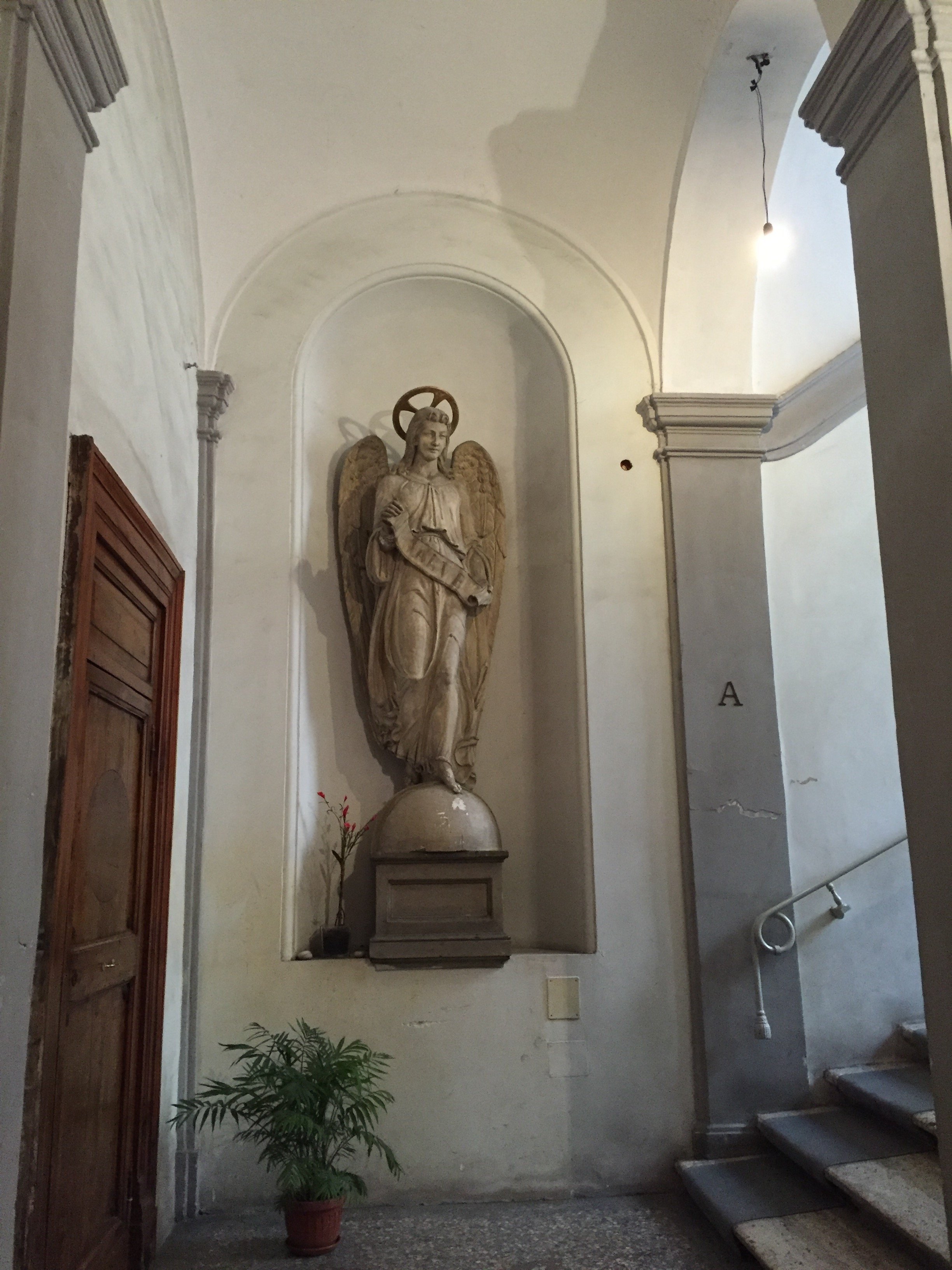
 Overall, I'm very happy with how the apartment turned out. A huge, "Grazie" to my client and their team. I cannot tell you the amount of WhatsApps, SMS, emails, phone calls, job site visits, that were made. I truly appreciate their patience with my bizarre smash up of Italian and English. My client introduced me to my new Italian teacher. I got the hint. Heh.For more information about renting the Grand Suite, or other apartments from Your Suite Rome, click here.After photos and before of bedroom 1: Vincenzo TambascoOther photos: Me and my iPhone
Life in Rome - Museo Nazionale Romano, Palazzo Altemps
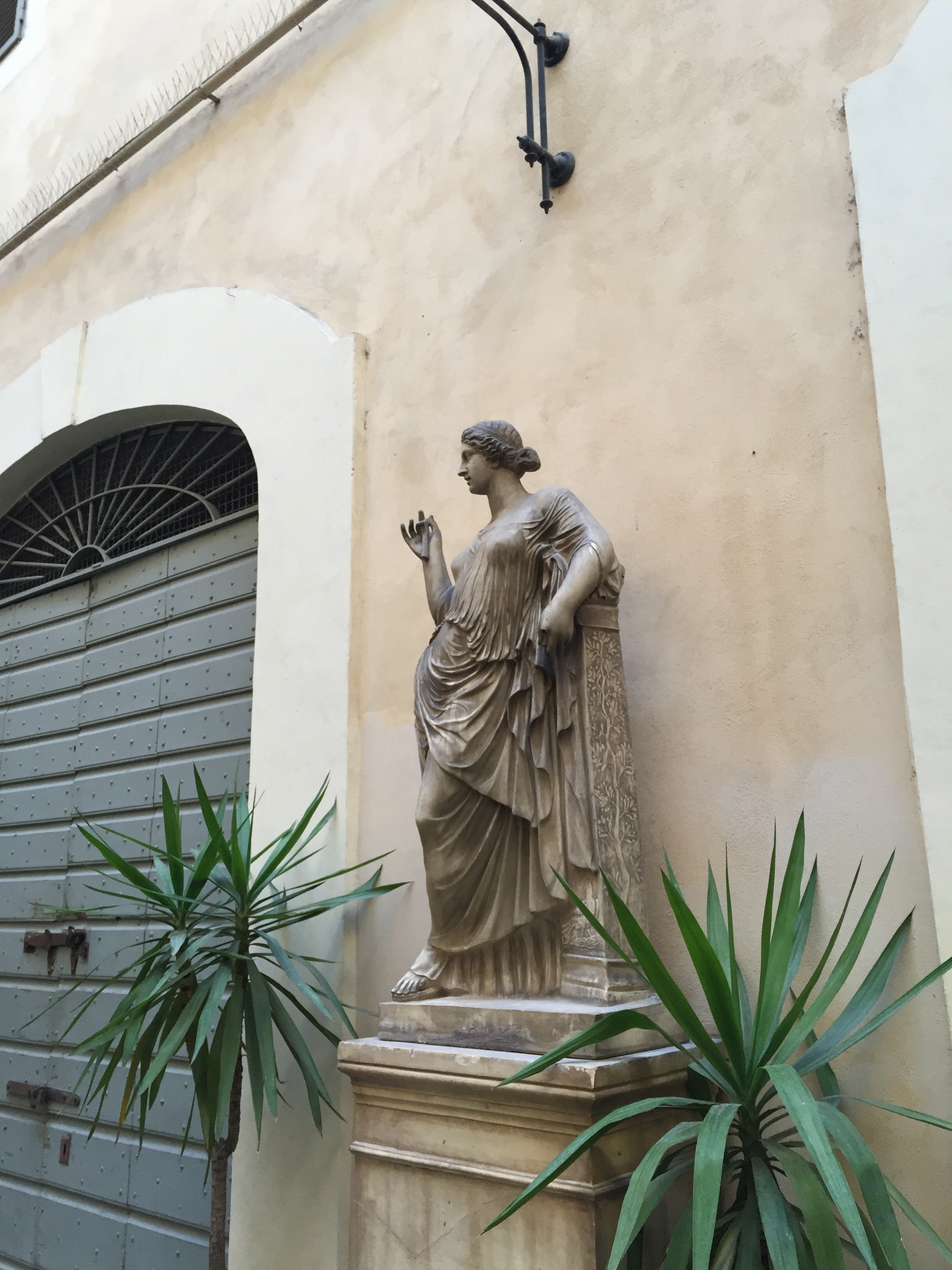
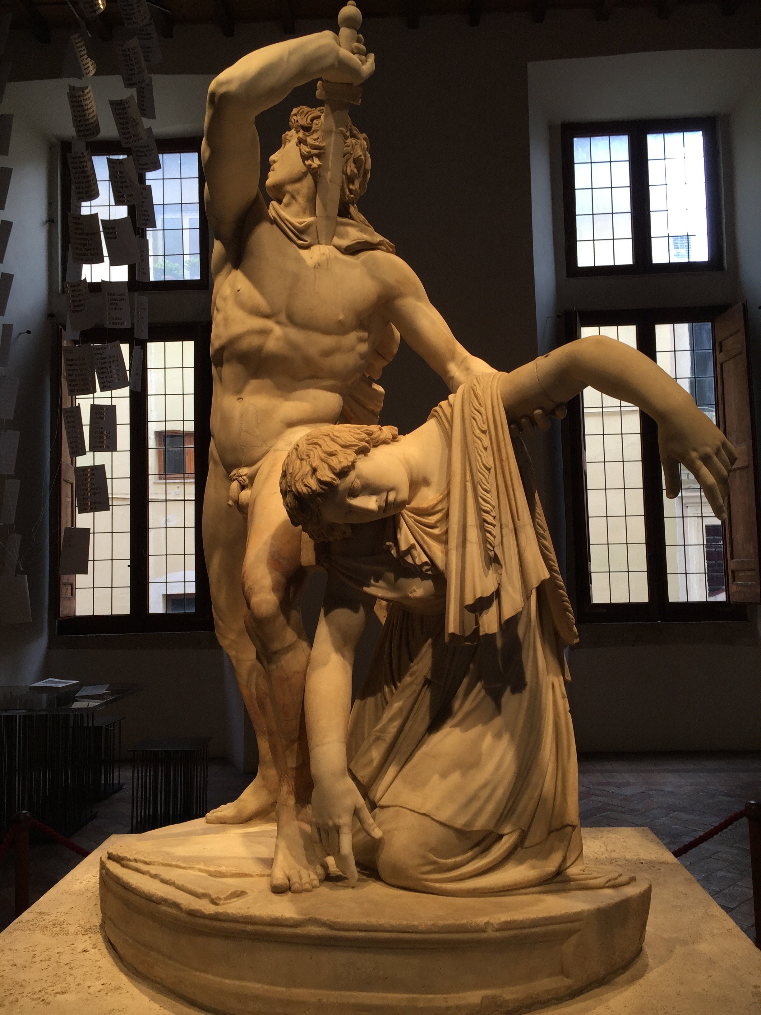
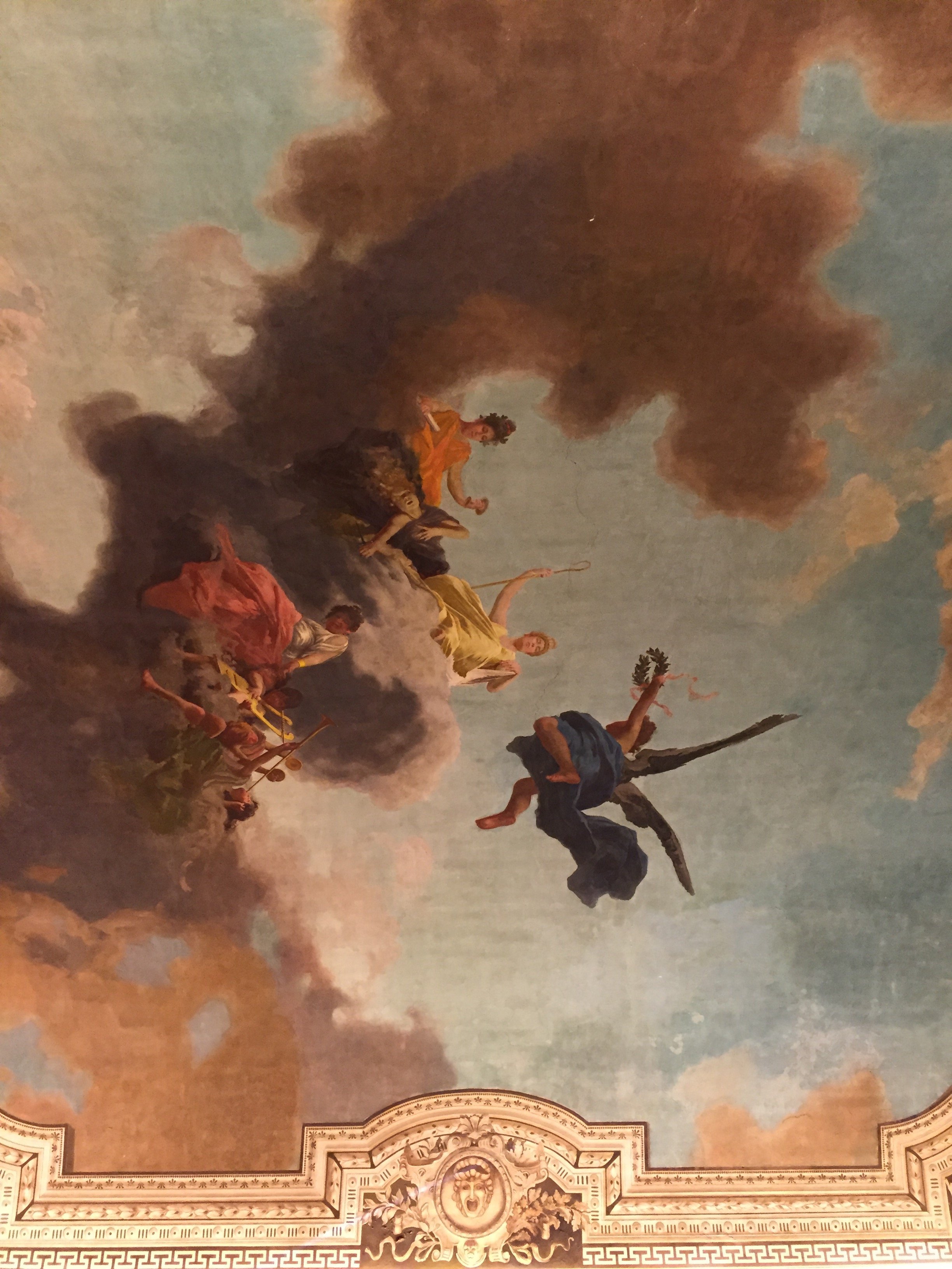
For almost eight years I walked past Palazzo Altemps at least five times a week. I'm not sure why I waited so long to finally check it out.One Friday, during lunch time, I basically had the place to myself. True, it was the dead of winter but I was surprised.The Palazzo is very close to Piazza Navona and was built during the 1500s. Archaeologists have uncovered ancient Roman structures and artifacts from the 1st century AD, which are displayed on the first floor.Cardinal Marcus Sitticus Altemps acquired the palazzo from the Riario family in 1568. He greatly extended the palazzo to showcase the family's impressive art and and book collections. There are also many standout pieces from the Boncompagni Ludovisi, Mattei, del Drago Albani, and Brancaccio collectionsThis museum is part of the Museo Nazionale Romano which also includes the Crypta Balbi, Palazzo Massimo, and Terme di Diocleziano.There is free admission to the museums on the first Sunday of the month.Below are a few pictures I snapped during my tour: 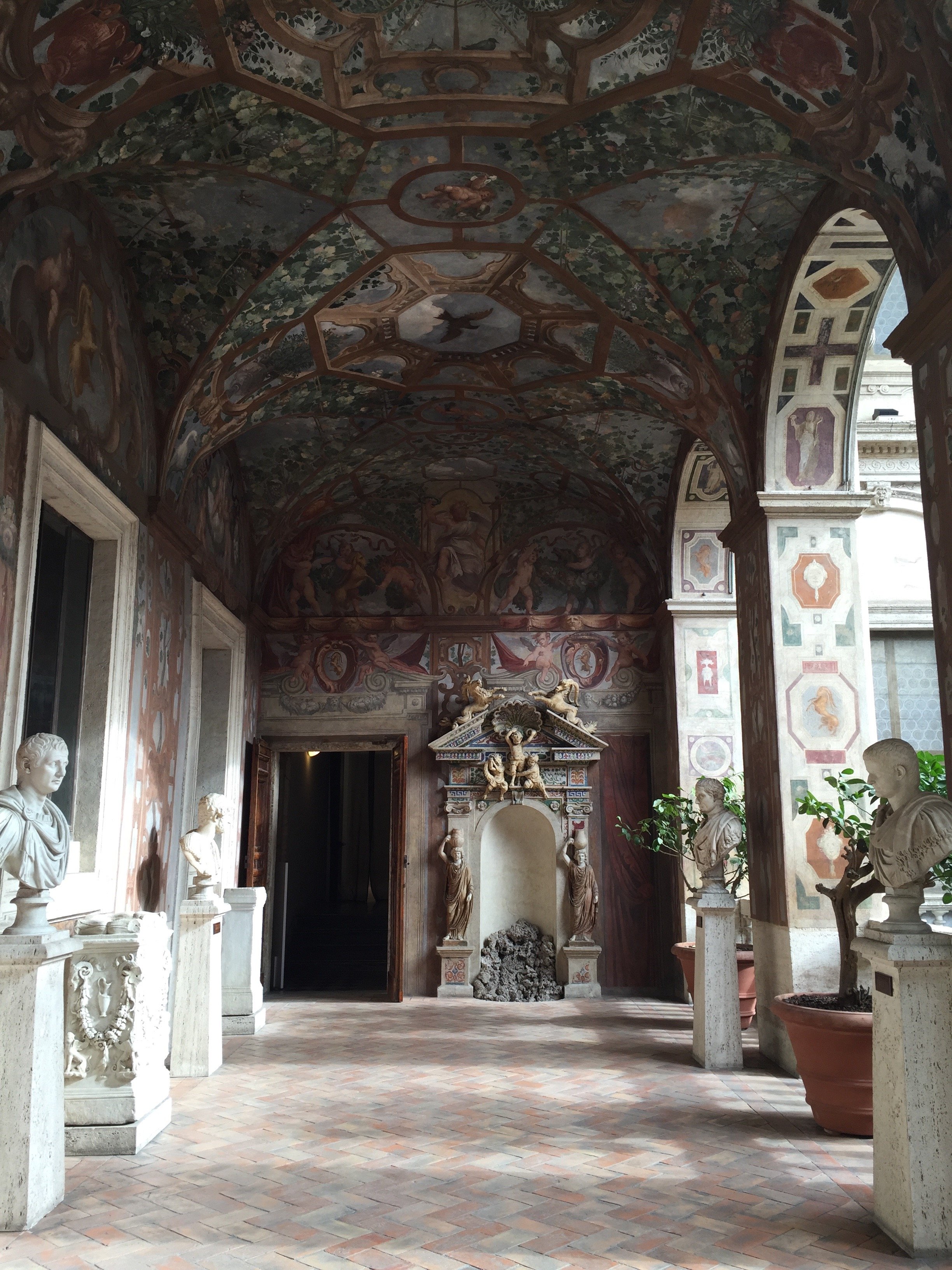


 Palazzo Altemps is opened Tuesday - Sunday from 9.00 to 19.45.Closed Mondays (except Easter Monday and during the "Culture Week"), 1 January, 25 December.The Ticket Office closes one hour before closing time.Photos: Me and my iPhone
Design Inspiration - Bar Luce - Prada Fondazione, Milan
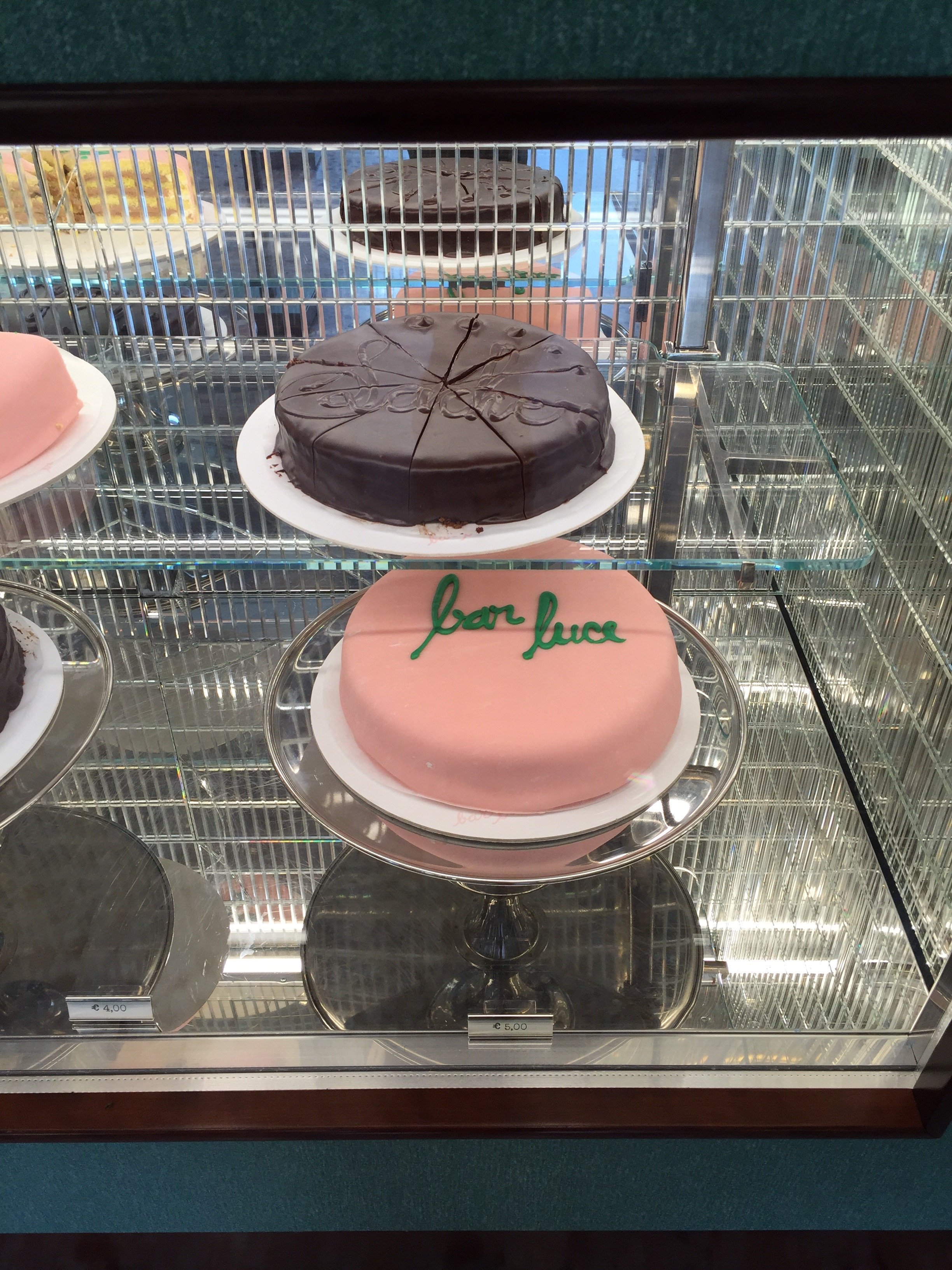
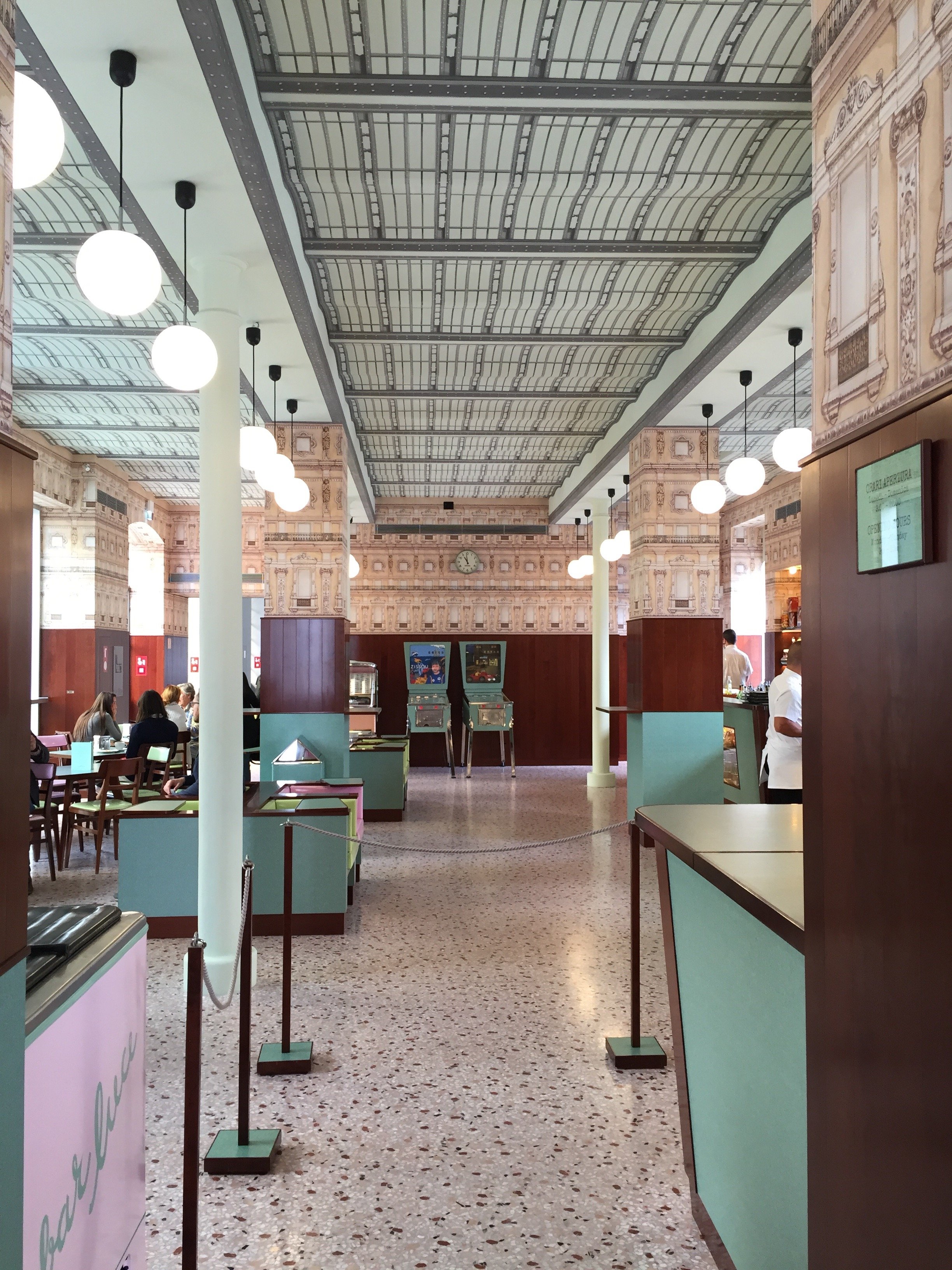
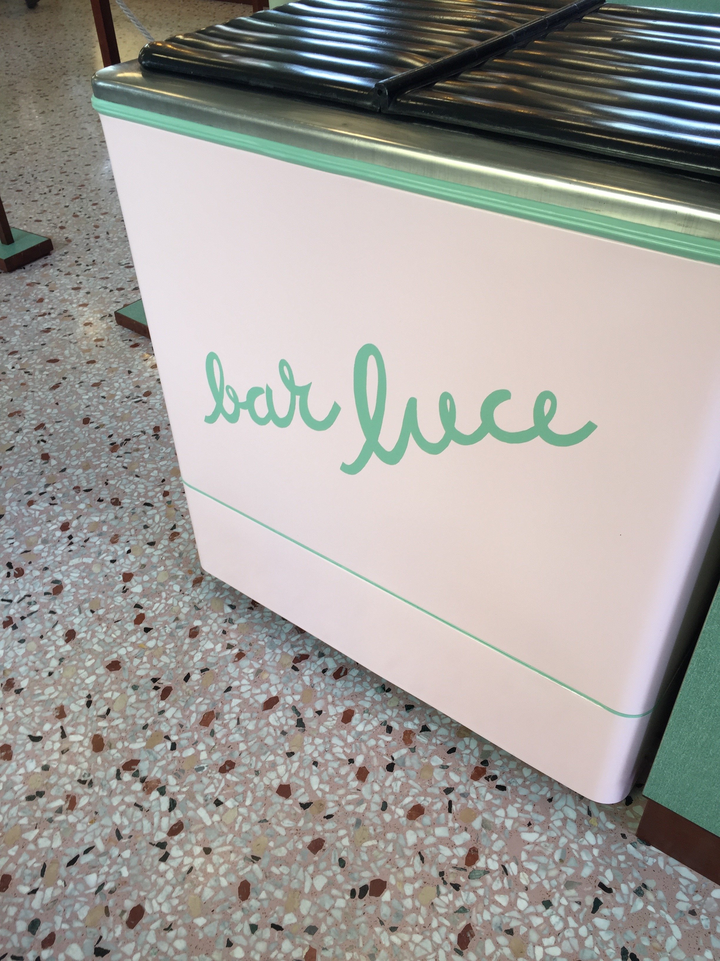
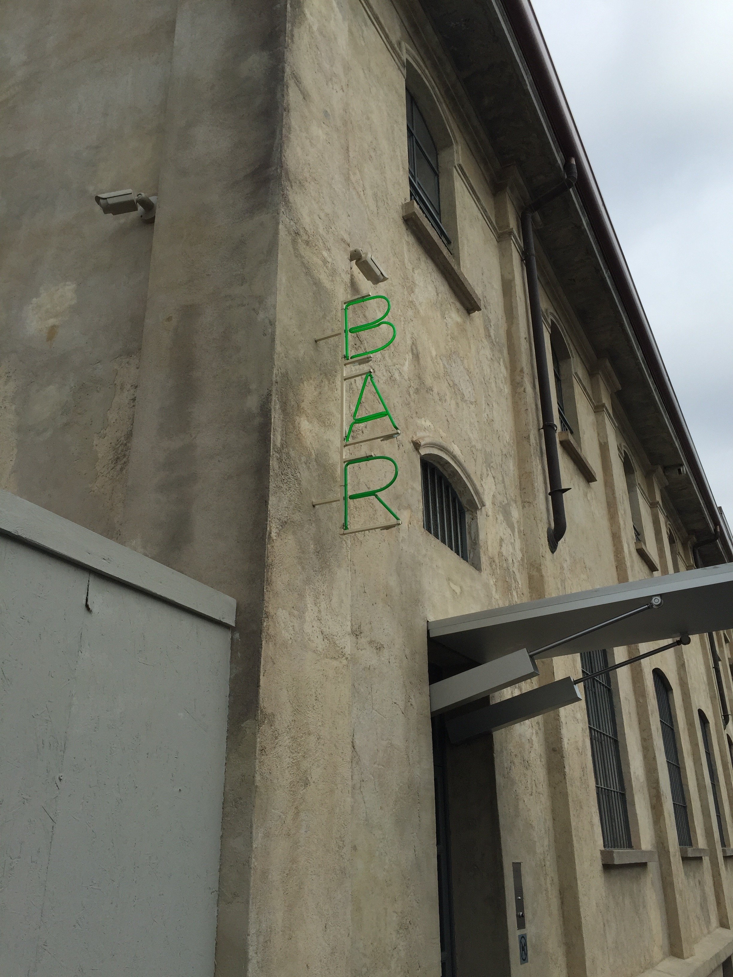
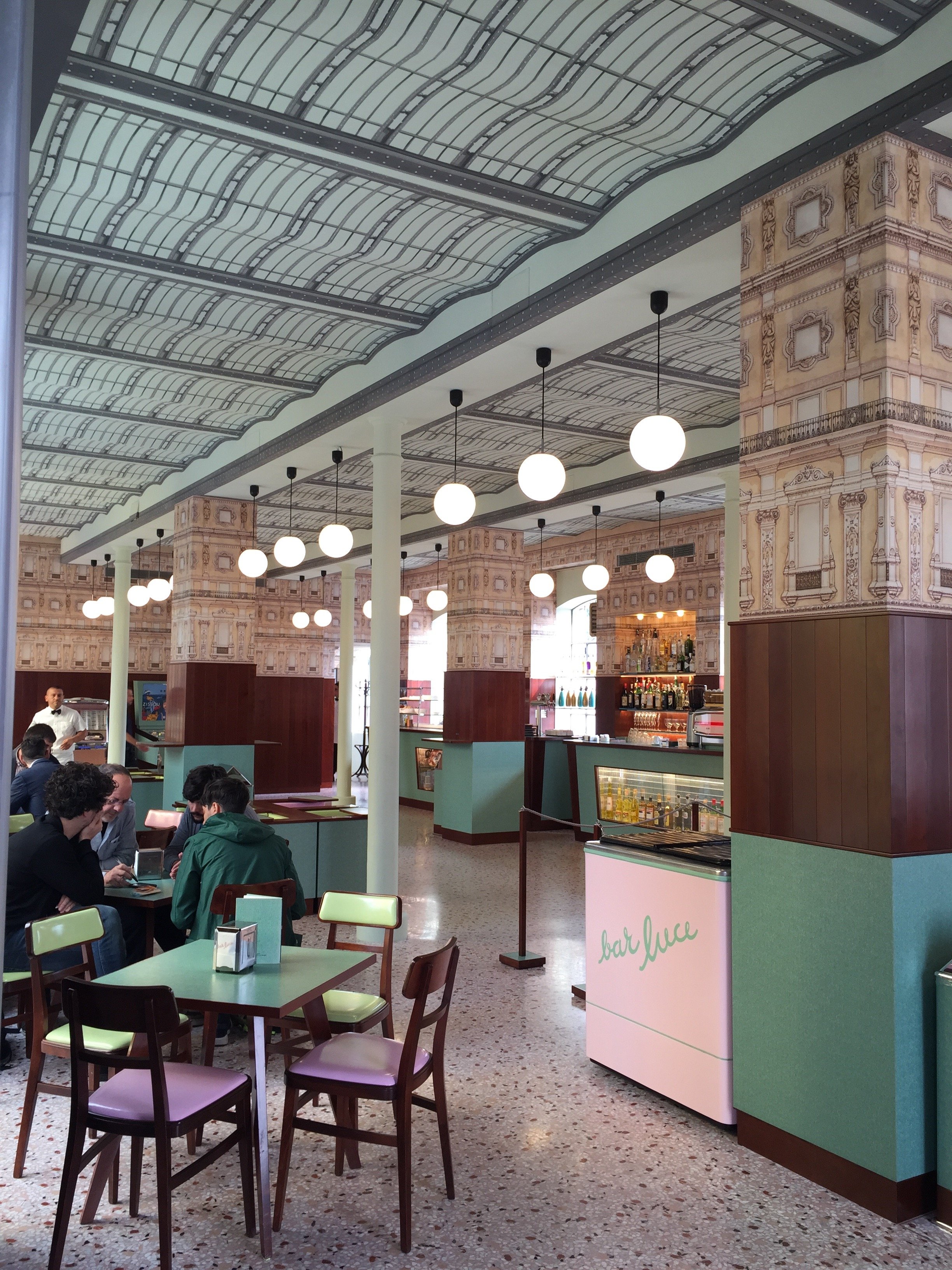
Hold up, how is it October already? One of my friends in the States was complaining about seeing Thanksgiving decorations already. I guess we should be grateful they weren't for Valentine's Day 2016.I have started my apartment search. It's, well, a trip. I don't know what some of these landlords are thinking. The bathroom situation is not good.I'm having a hard time finding smaller apartments that are unfurnished. Most of the apartments in the neighborhoods I'm focusing on were built for families. I don't need a huge apartment and as a small business owner, it wouldn't be financially smart to take on that kind of monthly expense.I hope to find something this month. We'll see.I took a quick business trip to Milan last month. I got completely lost searching for a to-the-trade vintage furniture store. Once i realized I was very close to the new Prada Fondazione, I had to check out Bar Luce.Bar Luce was designed by film director Wes Anderson. Anderson has directed several short films for the fashion house.It's 1950/1960's Milanese style with a touch of Anderson's quirkiness. Opened everyday from 9:00 a.m. - 10:00 p.m., Bar Luce is the prefect spot to have coffee or aperitivi.There are so many wonderful design details in this space. I really need to return and spend a afternoon there, reading and writing.ADORE these lights. If I find an apartment with an ingresso/foyer that has overhead lighting, I'd love a fixture like this.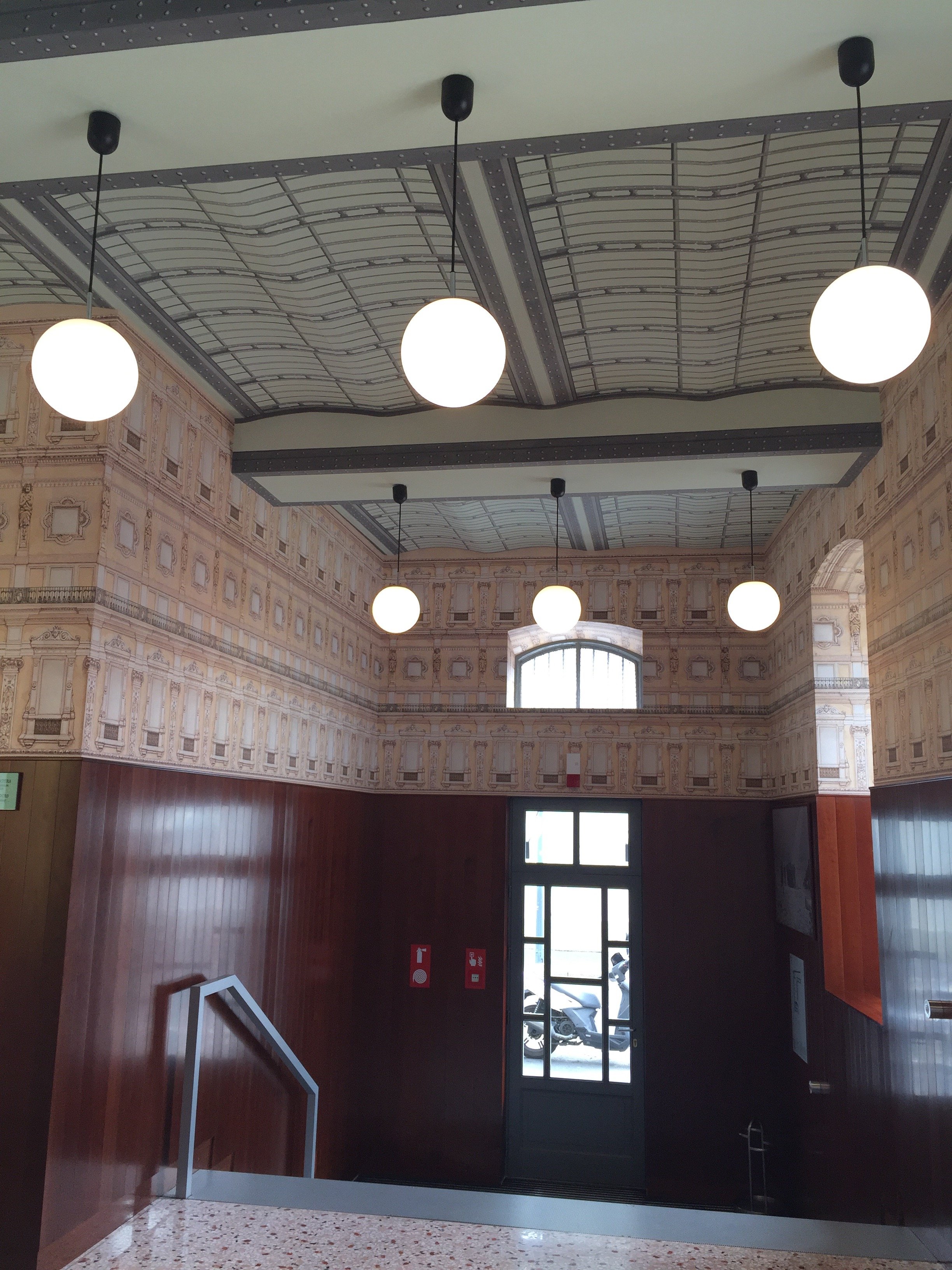 The dark wood helps anchor all the pastels. Without it, perhaps the décor would be too twee. Pink and green are fabulous together. Back in college I used to have a rugby shirt with those colors. One day while walking across the quad, an upperclassman asked me if I were an AKA. She said, "you do wear a lot of pink and green."I did. Not because I belonged to that sorority but because I wore a lot of preppy clothes in the 80s.
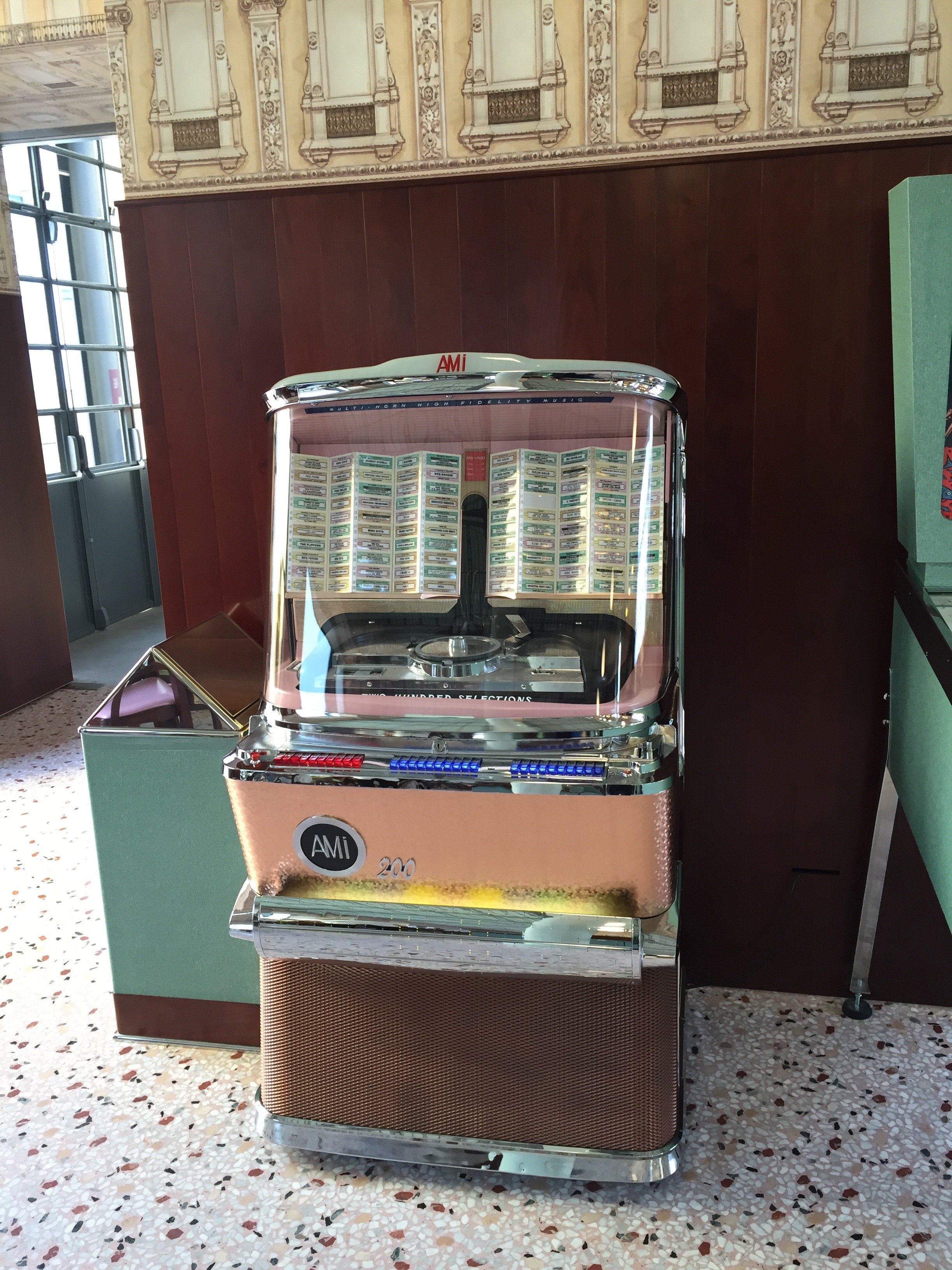
 I didn't have a chance to see what tunes were on the jukebox.
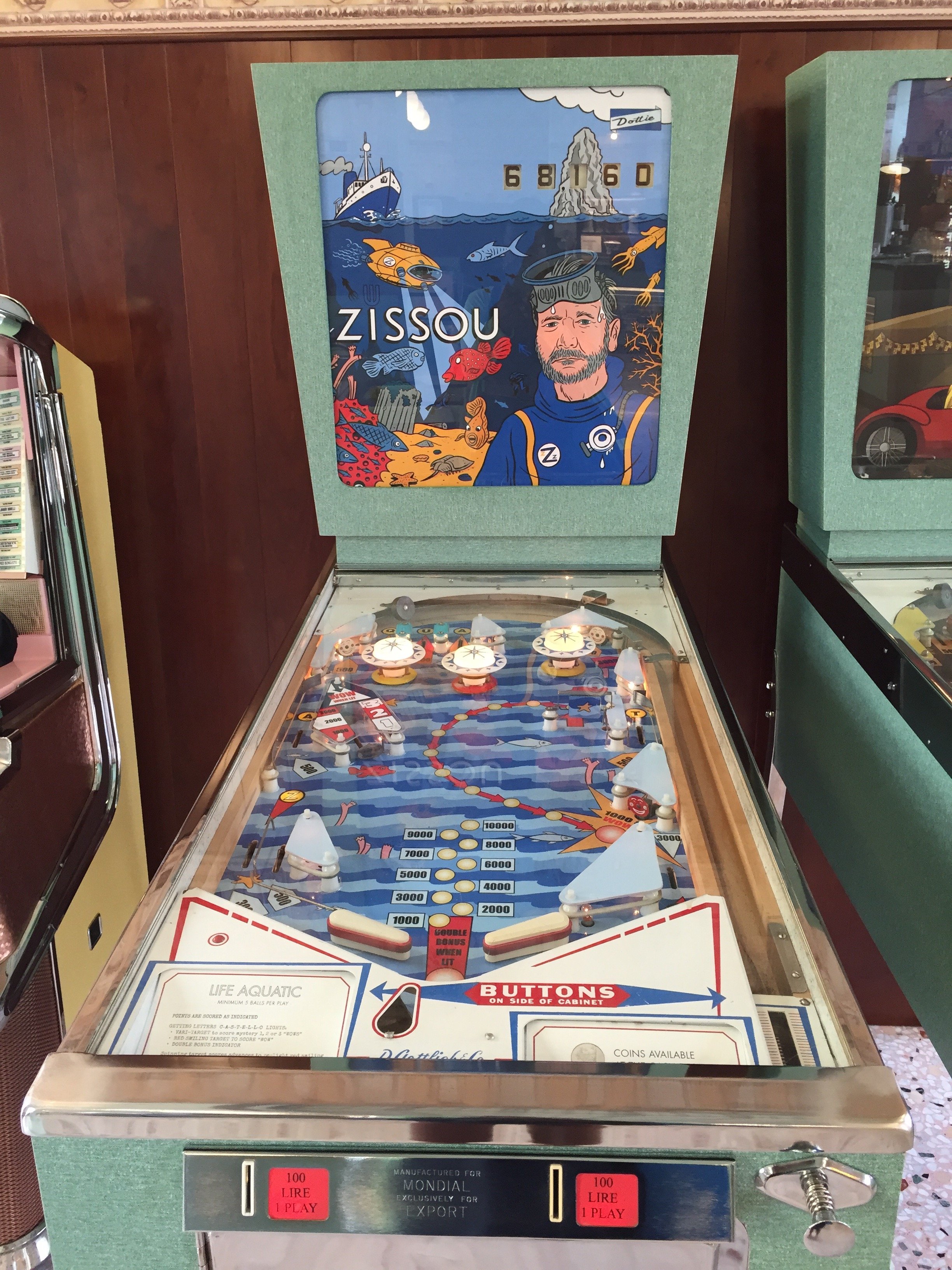
 One of my favorite Wes Anderson films. I must buy the soundtrack.
 I wonder what flavor the pink cake is. So pretty.