Weekend Insipiration - Have A Seat - Viceroy Hotel - Anguilla, British West Indies
How funky are these chairs?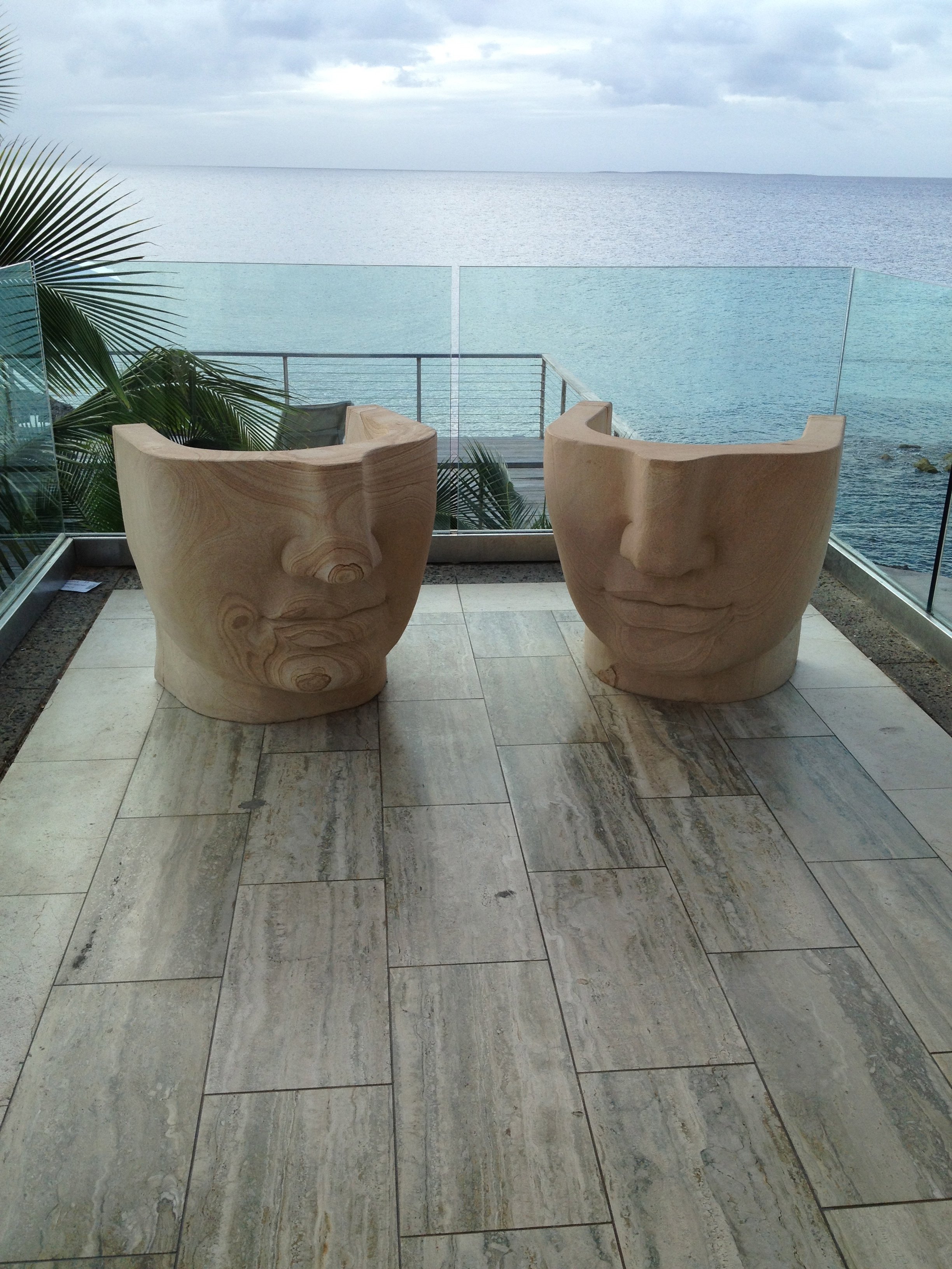 I am a big fan of Kelly Wearstler's commercial work, yet the Viceroy in Anguilla took me by surprise.A few years ago I met clients for a drink at the bar. At first, when I walked in, the décor seemed so "uncaribbean" to me.Then I walked around. It IS very Caribbean. Wearstler's use of natural materials, her color palette, and the subtle nod to more tradition Caribbean design makes the Viceroy one my favorite hotel spaces.This hotel is huge and could easily feel very corporate (thinking of a certain hotel on the Dutch side of St. Maarten that ruined one of the best beaches on the island).Instead it's unique and jaw dropping gorgeous.Not a bad place to meet for drinks, especially with a locals' discount.I have more meetings this weekend about my Caribbean project.Feeling very inspiredBuon weekend!
Io Adoro - Portrait Firenze - A New Hotel in Florence, Italy
Before my first trip to Italy, nine years ago, I had to cut my vacation short. The production company I worked for decided to shut down, permanently, two weeks before Christmas. Happy Holidays everyone!I was going to scrap the entire trip but my family was very worried about my mental state and insisted I go.I decided to travel to only one city for just one week. I narrowed down my choices to Rome or Florence. One of my good friends in L.A. is a hardcore Italophile. She proclaimed that I was a Rome person and should save Florence for another trip.I've been to Florence twice. The art is stupendous and the city is beautiful. Yet each time I felt anxious and couldn't wait to return to Rome. It's not as if Rome is a laid back place. However, Florence is a much smaller city and cannot handle the hordes of tourists and study aboard students.Well, I need to get over it because I must see the new Portrait Firenze. The architect/interior designer is Michele Bonan. I've written about how much I LOVE his work, especially, the newish J.K. Place in Rome.The hotel is owned by the Ferragamo family (the Lungarno Collection) and is located in the heart of the Historic Center. It has only thirty-six rooms and killer views of the Ponte Vecchio. It's scheduled to open this spring.Look at that view. Love the soft relaxing colors. Those green lamps? Must track down.
 Sigh. No words.
 I need to be here with my man, enjoying the Franciacorta.
 Pocket doors. Dark wood. Look at that ceiling.
Photos: Lungarno Collection
Stylish Simplicity - Palazzo Mirror by Julian Chichester
I love decorating with mirrors. That said, I'm a little over the sunburst ones. They are everywhere.I was looking for a mirror for a client, when I saw this beauty from one of my favorite furniture designers, Julian Chichester. This London-based designer has so many pieces I would love to have in my home. I don't own a palazzo but I think this mirror would work in a variety of décors.The eglomis frame is stunning and not ornate. This is truly stylish simplicity.
Io Adoro - Michelle Dockery and Lupita Nyong'o
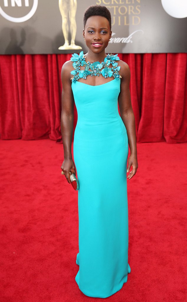
We are smack in the middle of the Hollywood awards season. For fans of film, and/or fashion, these are glorious times.Every season, a few people really stand out. Some, unfortunately, stand out for all the wrong reasons and then there are stars like Michelle Dockery and Lupita Nyong'o.These two actresses have been killing it on the red carpet.I wasn't surprised to find out that they share a stylist, Micaela Erlanger. This has been a break out season for her as well.I love that both woman wear clothes that fit their personalities. Sometimes on the red carpet it looks like the clothes are wearing the star.While it's true most of the clothes are borrowed, there's still no excuse for ill fitting garments. One thing I've noticed with both Michelle and Lupita is the fit of their clothes. Perfection.How beautiful is this Oscar de la Renta dress? On someone else it could've seemed too old fashioned but Michelle's make-up and accessories keep it fresh.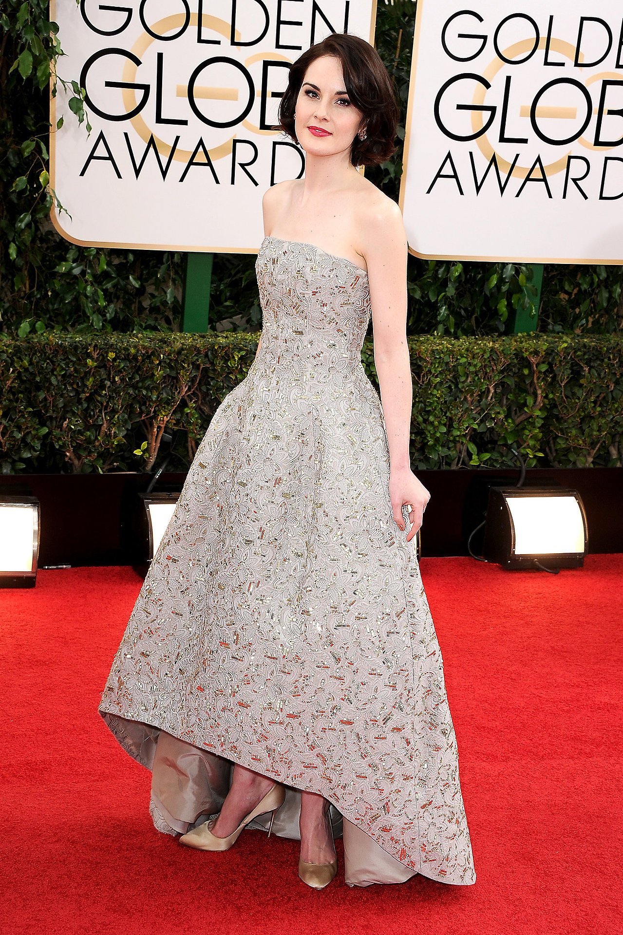
Photo: OscarPRGirl
The detailing at the neckline and the color of this Gucci dress is stunning. It's a great color for Lupita's complexion.
Photo: E! online
I'm very curious to see what they will wear for the Oscars.
Weekend Inspiration - Cate Blanchett in Blue Jasmine
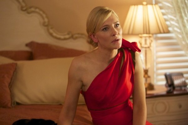
I recently saw Blue Jasmine. Cate Blanchett is so outstanding, you forget the plot holes in the movie.I haven't seen all the other Best Actress nominees' performances yet but if Cate wins the Oscar I wouldn't be surprised.The wardrobe was amazing as well. I read that the costume designer, Suzy Benzinger, had a budget of only $35,000. Most of the clothes were borrowed and every time Cate dropped the Birkin (which belonged to Benzinger and cost more than the entire budget) on the ground, people on set gasped.Beautiful Chanel jacket. Poor Jasmine. She was bananas.
Photo: Collider.com
How stunning is this red Carolina Herrera dress? Love, love, love, it!
Photo: indiewire.com
Stylish simplicity in a linen dress by Façonnable.
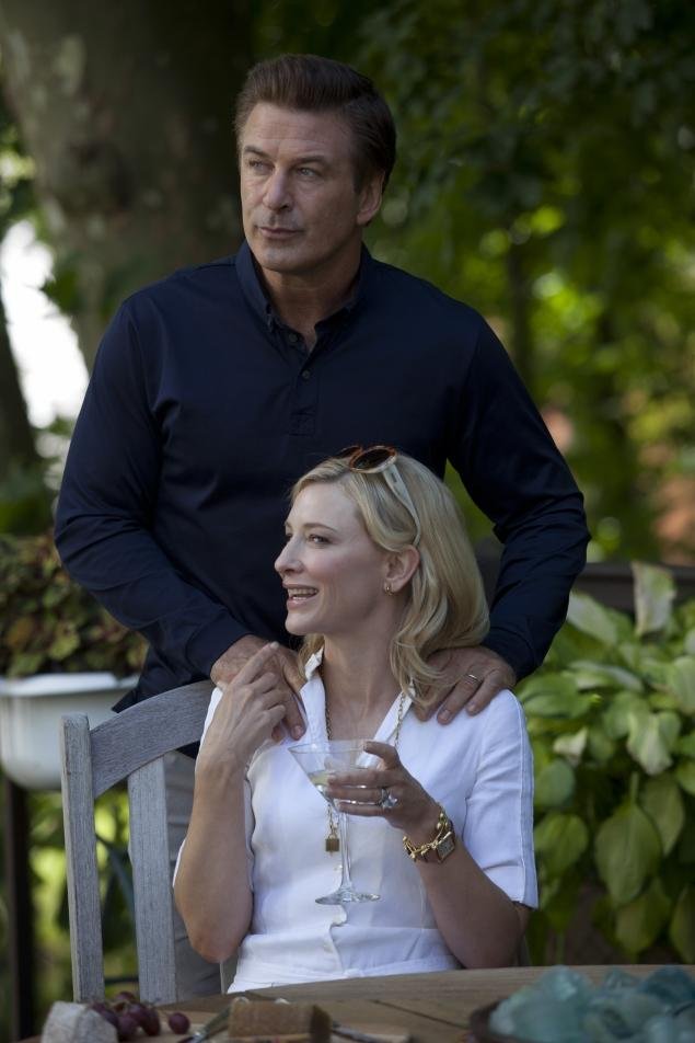
Photo: NY Daily News
I have a completely different build from Ms. Blanchett. I'm not sure how any of these clothes would look on my short self, but I can dream about the accessories.
Buon weekend!
My Word For 2014 - Crescere
Happy New Year!Last year my word was, "si."I took some risks (professionally and personally). I learned a lot and I'd like to keep this momentum going. The Italian word for "to grow" is perfect.Other words I considered:Chevron - I don't care what anyone says. This print is a classic and will never be out of style. Idris Elba - Okay, that's two words.[youtube=http://www.youtube.com/watch?v=WLFwuCs8IwY&w=420&h=315] Jon Hamm - Two more words. The interview starts at 3:41[youtube=http://www.youtube.com/watch?v=rOP9OMmAiRU&w=560&h=315] Do you have a word for 2014?
Weekend Inspiration - J.K. Place Hotel - Rome
This week, LONNY wrote about the new J.K. Place Hotel. Believe the hype. It's gorgeous.Months ago, one of my vendors told me I had to see the chartreuse DEDAR fabric architect/interior designer Michele Bonan used in the cafe. I finally had a chance to see it when my friend Erica and I went to meet a colleague of hers and his wife who were staying at the hotel.I told Erica we must add J.K. to our list. We are very hard on places when it comes to cocktails. It's not enough to have an excellent bartender, the décor must be on point.Erica's colleague showed us their room. I almost cried when I saw the bathroom. This one is a little larger. Look at that shower. The floors. The marble. Sigh.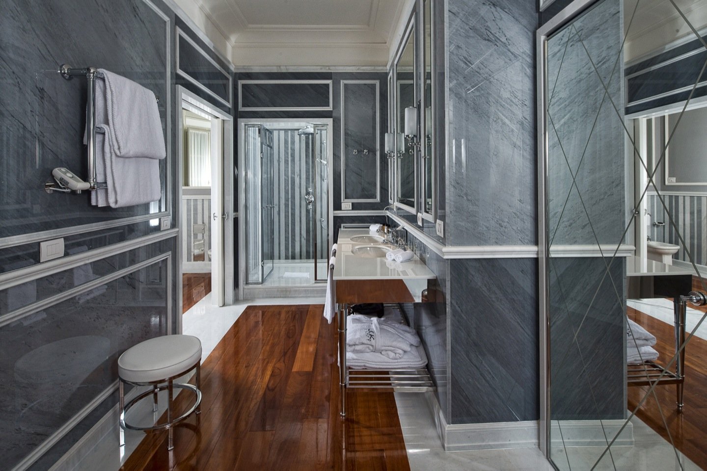 Bonan is one of my favorite designers and what he did with the space is stunning. The building used to be the architecture school for La Sapienza (the largest university in Rome).
 Inspired by Tom Ford's film, A SINGLE MAN, the atmosphere is what folks back in the States call "grown and sexy."It's a very unique space in Rome and I think the bar/lobby will appeal to people who are, well, grown and sexy. I don't see Flip-Flop Girls™ hanging out here. Grazie dio!I could spend hours in the library.
 For more pictures of J.K. Place Roma, you can click on their gallery HERE.Photos: J.K. Place Roma
Weekend Inspiration - Architectural Digest Showcases A Castle In Umbria
I cannot wait to pick up a copy of the November issue of ARCHITECTURAL DIGEST (USA).One of the stand out articles is about the restoration of a castle in Umbria. The architect was Domenico Minchilli and the interiors were decorated by Martyn Lawrence Bullard. The two were brought together by the client, Evgeny Lebedev.I wrote about Domenico and the project we're working on in Tuscany HERE.Domenico showed me a few before pictures of the castle. As I looked at the photos I thought,"the word ruins doesn't convey what I'm seeing. Perhaps a pile of rocks would be a better description."I was floored by the transformation. It is truly inspiring.The November issue is on newsstands (Stateside) now.Buon weekend!
My Fall/Winter 2013 Wish List
I know there is a huge difference between want and need. Many times I catch myself making statements such as, "that skirt needs to be in my closet."Hello, no it doesn't. I would like it to be there. That is a want.I have written before about my lack of clothes for cold weather. Now that I no longer spend the majority of my working hours in my house writing scripts, I really need to step up my fall/winter wardrobe. I cannot meet with clients or vendors looking bananas.Thank god I live in a city that is not as casual as Los Angeles. If I wear a dress or a skirt to a meeting in Rome, nobody asks me why am I so dressed up. Sometimes, wait for it, I even wear thigh-high stockings!There are many things I would like to purchase this year but have narrowed down the list to five.Long leather gloves. I'm thinking black or chocolate brown. Why does Olivia Pope look so sad here?
Ankle boots with heels that can handle cobblestone streets.
I have a pair of ankle boots with a narrow heel. They have been destroyed. RIP.
A LBD.
Love the cut of this dress from J. Crew.
A camel hair coat.
i do need a new winter cloth coat but I think I can get another season out of my current one. This will go in the want column. Max Mara's coats are classic.
 Photo: People
Last but not least, I do need a short winter sports jacket. I look like the Michelin Tire Man in puffy jackets. I like the lines of this one.
What's on your list?
Stylish Simplicity - Stone Candle Holders by Tom Dixon
I was looking through Tom Dixon's website when I saw his Stone Candle holders.These candles would work well with a traditional decor or a modern one. I think it's because of the material, marble. The lines are very minimal but the marble gives the holders warmth.They are fantastic. Stylish and simple.
 Photo: tomdixon.net
Weekend Inspiration - Dolce & Gabbana - S/S 2014
Dolce & Gabbana had one of the outstanding collections during Milan Fashion Week. Folks are still talking about the last look.It's funny, Dolce & Gabbana is a house I've appreciated for it's tailoring, marketing, and red carpet looks, yet for some reason I never paid much attention to their RTW.Unlike most houses that are expanding like crazy, especially into the cash-cow lower priced lines, Dolce & Gabbana closed down their very profitable D&G line in 2011. They said one reason was the desire to get back to basics.In getting back to basics, they've also returned to Sicily. The island has had a strong influence on the designer's work (Dolce is Sicilian and the two have a house in Stromboli).When I finally made it to Sicily, I understood how and why the island drives their creativity. I cannot wait to explore more of it.This collection has convinced me to at least think about adding some florals to my spring/summer wardrobe.I never wear florals. I like to keep things simple and clean. I'm short and don't want to look like Great Auntie Gertrude's sofa.This dress is so not my style. I cannot stop looking at it. Is it the color, the cut? I don't know but I'm loving this Sicilian almond blossoms dress.
 Photo: Style.com
Buon weekend!
Stylish Simplicity - Paola Navone for Crate & Barrel
One of my favorite American stores has recently announced their collaboration with the incredible, Milan-based architect/interior designer, Paola Navone. To say I'm a fan of her work is a huge understatement.I would like to buy so many things in this collection. The darker blues remind me of Rome at dusk or the color of the sky above the mountains in St. Martin.I wonder how much it would cost to ship a few items to Rome. Okay, I need to stop. I once had to pay €40 to get a pack of Girl Scout cookies out of customs that my sister had sent to me. I love Samoas but come on, that's bananas.I will have to appreciate this collection from afar. It's the very definition of Stylish Simplicity.

 [youtube=http://www.youtube.com/watch?v=TXCQo62VWXs&w=420&h=315]For more information about Paola and to see the entire collection, HERE is the website.
Weekend Inspiration - Carolina Herrera - S/S 2014
One of my favorite collections from this year's NYFW Spring/Summer 2014 was Carolina Herrera's.Her clothes are sophisticated, modern, and stylish. I'm loving the grown-up understated glamour of this collection.I wish I could afford one of her dresses but until then, I'll just appreciate the design of these lovely pieces.Buon weekend!


 Photos: Carolina Herrera
Rhapsody In Blue - Using Wallpaper To Open Up A Small Kitchen
The latest issue of HOUSE BEAUTIFUL features designer Sheila Bridges' New York City kitchen.
This is a very striking and unusual blue for a kitchen. Bridges' Torino Damask wallpaper is gorgeous and does make the space seem larger.
I love how the silver in the wallpaper works with the stainless steel appliances.
It's funny to me how this is described as a small kitchen. True, it is much smaller than the kitchen in Bridges' Hudson River Valley home, but by NYC standard, this kitchen is pretty decent size.
To see more of the kitchen, the HB slide show is HERE.
Buon Viaggio - Bologna, Italy
I've been to Bologna once before for a very quick day trip with friends. This time I went for work.Bologna is consistently rated as one the most liveable cities on the planet. The cuisine is amazing, there are many companies based in the area in a variety of sectors, and a well educated population (the oldest university in the Western world was founded in Bologna).I knew this before I started researching my trip. I didn't know, however, that there were so many fantastic stores for interiors. I was in décor heaven and I could not get over how friendly everyone was.My sister's former colleague, John, is in Bologna writing his dissertation and we had lunch at Drogheria della Rosa. It was just as delicious as I remembered and it's one of John's favorite restaurants in Bologna.John was kind enough to bring me a bunch of shelter and cooking magazines from the States. Later I met up with the lovely Tina for an aperitivo before catching the Italo train back to Rome. It was a nice way to end a long but productive day.I hope I will be able to return to Bologna soon.Here are three of the showrooms I adored:
BORGO DELLA TOVAGLIE
 Housed in a former furrier's workshop, this store blends design, art, and fashion.Borgo delle Tovaglie began as a tablecloth manufacturer in the early '90s. In 2005 Valentina Muggia and her husband Giuliano Di Paolo bought the company. Today the brand is internationally known for it's quality and style. This is their first store and it's a beauty. They carry a variety of brands in addition to their own. There was so much to see (and buy). I loved their plates in a bucket. Very clever and useful.Borgo delle TovaglieVia Farini, 10+39 051-330938www.borgodelletovaglie.com
CAMERA CON VISTA
 This store is located in the very pretty Piazza Santo Stefano. Owned by Matteo and Rebecca, here you find one of kind objects from Italy, France, Spain, Sweden, and other countries.They carry jaw-dropping antiques and stunning modern pieces that have been refurbished into furniture.There are always new pieces coming in. You never know what you might discover during your visit.Camera Con VistaVia Santa Stefano 14/2a+39 051-22468www.cameraconvista.biz
FABRIZIO COCCHI
Interior designer Fabrizio Cocchi's showroom has an elegant, glamorous vibe. It's bold and full of color. The photo below is of the neutral section. When I first walked in, there was a lot of orange and red.Cocchi also had quite the collection of design books. I would have gladly sat on one of his custom sofas and read for the afternoon.Okay, that would've been weird and rude as it's a store not a library.
Photo: Fabriziococchi.com
Fabrizio CocchiVia Castiglione, 17d+39 051-264358www.fabriziococchi.com
Stylish Simplicity - Dolce & Gabbana Striped A-Line Skirt
I was recently in the lovely city of Bologna for work. I saw this skirt in the window of Dolce & Gabbana and it stopped me in my tracks.
 Photo: Closet Candies
Stripes are huge this summer. I adore them but must be careful with horizontal stripes unless I want to look like a Weeble. I don't.
I love the black edging and think this skirt is very versatile. I could wear it to work, to an outdoor summer dinner party, or on a date to aperitivi with friends.
It's stylish simplicity.
The Hallway/Il Ingresso
Recently I re-read "Rose Cumming: Design Inspirations."This book, about one of the pioneers of a "new" field called interior design, was a gift from my friend Erica for my birthday last year.The following quote from Ms. Cumming jumped out at me: "I feel that upon entering a house one should at once be made conscious of the dominate note pervading its scheme of decoration."I was just speaking with a friend regarding how sometimes hallways are neglected spaces.I agree with Ms. Cumming. A hallway shouldn't be a dumping ground for keys, shoes, etc.If you live in a small space you could create a hallway that's functional and stylish.Here are three fab hallways:
Photo: Veranda
How gorgeous is this staircase? I love the contrast of the very dark wood with the white paint.
Photo: The Kitchn
Designer Rita Konig's kitchen is a perfect example of a hallway serving more than one purpose.
Photo: Remodelista
A hallway is a great space to showcase art.
Weekend Inspiration - Relais Monaci Delle Terre Nere - Sicily
No words are needed explain why this new hotel in Sicily is inspiring. For more pictures of this stunning place, please click on their website HERE:Buon weekend!(I'm going to dream about the bedrooms. I know it.)
Stylish Simplicity - Alessi E-LI-LI Espresso Cups By Fuksas
I don't even drink coffee or have an espresso maker, yet I would love to own these cups. Stylish, simple, elegant... I adore them
Photo: Amazon.uk
Speaking of Fuksas, the world renowned architects recently renovated the flagship Benetton store in Rome. I haven't stepped into a Benetton since college but I'm very curious about this building.
Weekend Inspiration - Flowers By Brittany Asch
I was reading LONNY magazine last weekend when I came across the gorgeous work of Brittany Asch.Asch has a great eye and her use of color is inspiring. Looking at these arrangements makes me swoon. Truly beautiful work.Buon (and bello) Weekend!

 Photos: Brrch.com
