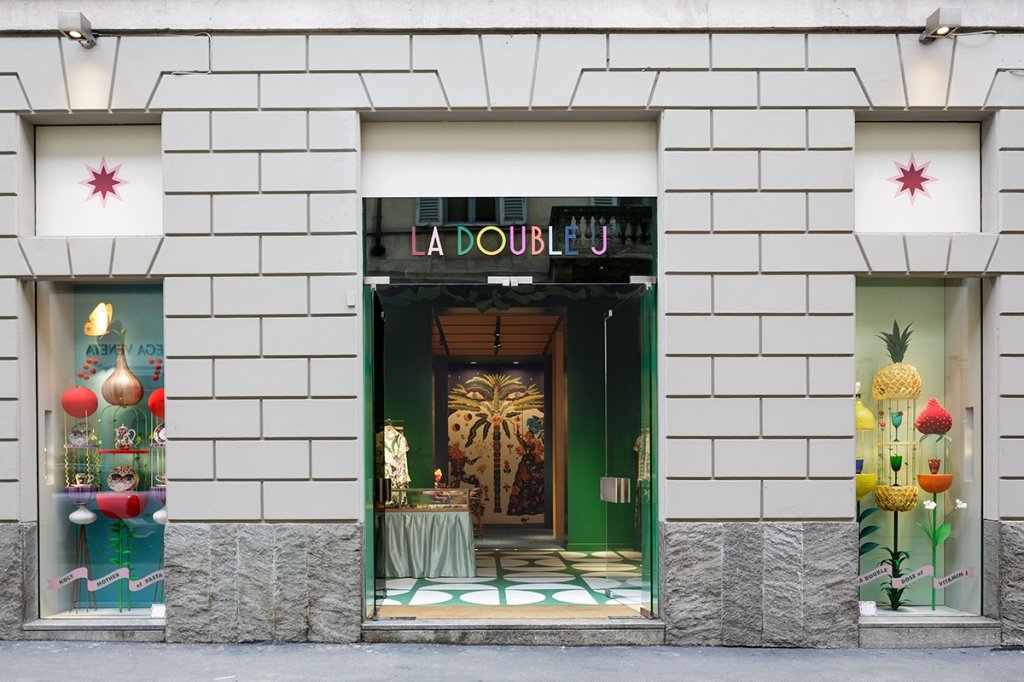
My Ciao Bella interview with JJ Martin, founder of La Double J
Buongiorno a tutti!
Erica Firpo's Ciao Bella has published my interview with JJ Martin. Yes, it's true I rave about her and her brand often but I know first hand how difficult it is to be an entrepreneur in Italy. What JJ has created is incredible.
It was truly a pleasure to sit down with this very talented and dynamic woman to discuss interior design, creativity, and living in Italy.
To The Max: Designing Milan’s La Double J Store
Brick and mortar maximalism
When I read LaDoubleJ (those fabulous maximalist dresses from JJ Martin, Patron Saint of Patterns) was going to open its first retail shop, I couldn’t wait to see its interiors, not just because I’m a decorator but also as a fan of JJ Martin’s colorful brand. As luck and business would have it, I had to travel to Milan to meet with a new client. And Erica, knowing that visiting the new La Double J store was a “must” on my list, asked me if I could write about the store. JJ was gracious to carve out some time in her busy schedule to sit down with Ciao Bella to discuss the design of her new store and her brand.
Arlene Gibbs: First question. What inspired you to open an actual store, brick and mortar, at this moment when all we hear is that retail is dead. It’s all about e-commerce. No one goes to stores anymore.
JJ Martin: Well, we started as a direct to consumer business and an online business so I totally agree with that. I don’t think it makes sense at all, these brands that were built on brick and mortar with three hundred shops around the world. It doesn’t feel relevant anymore, especially these cookie cutter shops that all look the same. When you scan these streets, you can’t even tell the difference. They all have white walls, really bright light, chrome or gold finishes.
AG: You could be on Rodeo Drive.
JJ: You could be anywhere. So, a huge network of stores was never my vision nor will it be. However, we stared in this little showroom in Milan that was our showroom, our atelier, our office, our workroom, everything, and we were also selling clothes at the very beginning from there. It literally did like five things. What we kept hearing from people all the time was, “don’t you have a place we could try on more clothes?”
To read the rest of the interview, click HERE.
Photos courtesy of La Double J.
Villa Necchi, A Must See/Do in Milan
Ciao from a rainy morning in Rome.
I know I said I was going to write on this here blog more often but work this year has been very hectic. Perhaps things will slow down during Spring '22! I'm not complaining as these are good problems to have, especially during these strange pandemic times.
I went to Milan last week, just overnight, for the Salone. The energy in Milan was incredible. I felt safe going to showrooms and events as there were Covid protocols in place. Milan and the surrounding area were hit hard last year and no one wants to return to a lockdown.
I'm writing this while still on a Design Week high. I went to Milan in July for work and I was finally able to visit this palazzo. It has been on my list for ages and seeing the movie IO SONO AMORE/I AM LOVE only added fuel to my desire. The full name is Villa Necchi Campiglio but most know it as Villa Necchi.
Villa Necchi was designed and built by architect Piero Portaluppi from 1932 -1935 for the owner of the Necchi company, Angelo Campiglio, his wife Gigina and his sister-in-law, Nedda. There were some modifications and additions added by Architect Tomaso Buzzi after WWII. His style was a bit more traditional and you can see the difference as you walk through the villa. The villa was occupied by the fascists during the war and the family called Architect Buzzi once they were able to finally return to their home.
It took my breath away and pictures do not do it justice. It's amazing to see how modern these rooms from the early 20th century look and feel! It takes serious talent to design spaces that are classic yet contemporary. Portaluppi and his clients were truly ahead of their time. The Necchis entertained often and the house's public areas layout reflect this. This house was THE place to be back in the day.
The family had no children and instead donated their home to the non-profit FAI, the Italian National Trust.
The home has a large private garden with a swimming pool and tennis courts. Remember this is in the center of a large city! The villa is also filled with art, mostly 18th century, including artists Canaletto, Marieschi, and Tiepolo.
Look at the ceiling in the library! That design is a Portaluppi signature and you see it employed discreetly through out the villa.
I won't say anything to spoil the film for those who haven't seen it yet but one of the most important scenes in the movie takes place in this location.
The bathrooms were to die for. Again, I couldn't believe there were built in the 1930s. The veranda was another favorite room. The furniture was original and I could see those pieces being sold today. Even the utility rooms were design heaven. The Necchi family had custom Richard Ginori dinner service. I love the design of the "C" logo.
Style/fashion lovers will get a kick out of the sisters' built-in closets. The custom pieces from Gucci, Ferragamo, and Hermès are gorgeous. Quality and design like that never goes out of style.
The guides were very helpful, bilingual and there were two or three on each floor. I cannot recommend visiting this gem enough. My pictures and videos from this fantastic tour are in my Instagram highlights.
Buon weekend!
All villa photos: Giorgio Majno, © FAI — Fondo Ambiente Italiano
September!
I hope everyone had a wonderful summer.Yes, I know technically it's still summer despite the fact that some retailers in the States are already selling Spiced Pumpkin Latte mixes and there are bloggers talking about Halloween.
I don't understand this rush. Let's enjoy this month and getting ready for fall. This is my favorite time of year/season. Not that I dislike the other three (well maybe winter, lack of sun and daylight is not my scene) but there's something about fall that makes me happy. I was one of those geeky kids who couldn't wait to buy back-to-school supplies. In my young mind there weren't many things more exciting that a Mead Trapper Keeper notebook.
Unfortunately, back-to-school shopping for clothes wasn't as fun as my Caribbean mom was not about that life. Every time I asked for something that EVERYONE was wearing, my mom would say that I was going to school to get an education, not for a fashion show. My dad backed her up as he didn't know (or care) about the difference between Girbaud, or Guess, jeans and a random pair from wherever.
I still look at fall as a beginning even though I graduated from college back in the Stone Age. Like spring, it's an opportunity to hit the reset button.
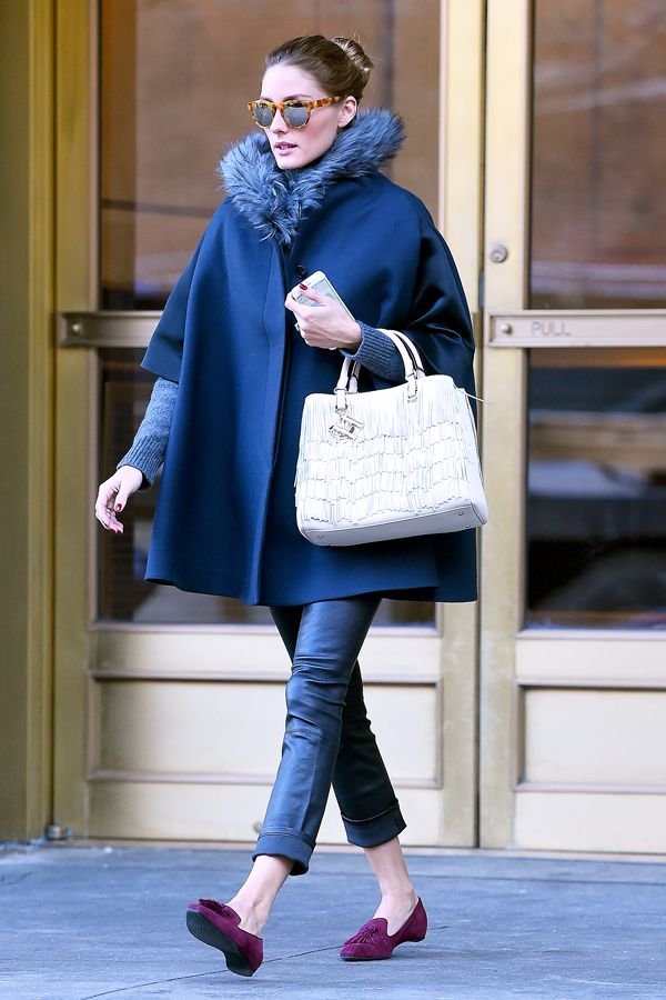
One of the color trends for Fall 2018 is this deep blue called Sargasso Sea.
Photo: Pantone
I’m feeling this cape but I might be too short for this lewk. Love the pop of color from Ms. Palermo’s shoes. Great combo.
Photo: Olivia Palermo, Refinery 29
This classic pattern from Schumacher is an excellent example of Hollywood Regency glamour.
There are so many beautiful colors to choose from but this one is in my top three, okay five.
Photo: Le Creuset
I cannot write about September without listening to this old school favorite. It dropped in 1978 and if you play it at any wedding reception, party, or cookout now people will still dance.
Here's to a great fall!
p.s. Here's a fantastic piece from NPR regarding why this song is so popular years later.
I asked Jeffrey Peretz, a professor of music theory at New York University's Clive Davis Institute, what makes that groove so powerful. He says a lot of it has to do with how the music unfolds. The song's very structure is an endless cycle that keeps us dancing and wanting more."
There's four chords in the chorus that just keep moving forward and never seem to land anywhere — much like the four seasons," he says. "It's the end of summer, it's the beginning of fall, it's that Indian summertime, it's the transition from warm to cool."
The trigger for that yearning feeling, Peretz says, is the opening line. White asks, "Do you remember?" and we supply the memories. It's a song that can bring all of the generations together, which makes it perfect for family gatherings. The true meaning is up to us — including, Allee Willis says, that strangely specific date."
We went through all the dates: 'Do you remember the first, the second, the third, the fourth ... ' and the one that just felt the best was the 21st," Willis explains. "I constantly have people coming up to me and they get so excited to know what the significance was. And there is no significance beyond it just sang better than any of the other dates. So ... sorry!"
The Design Files - Royal Wedding Dresses
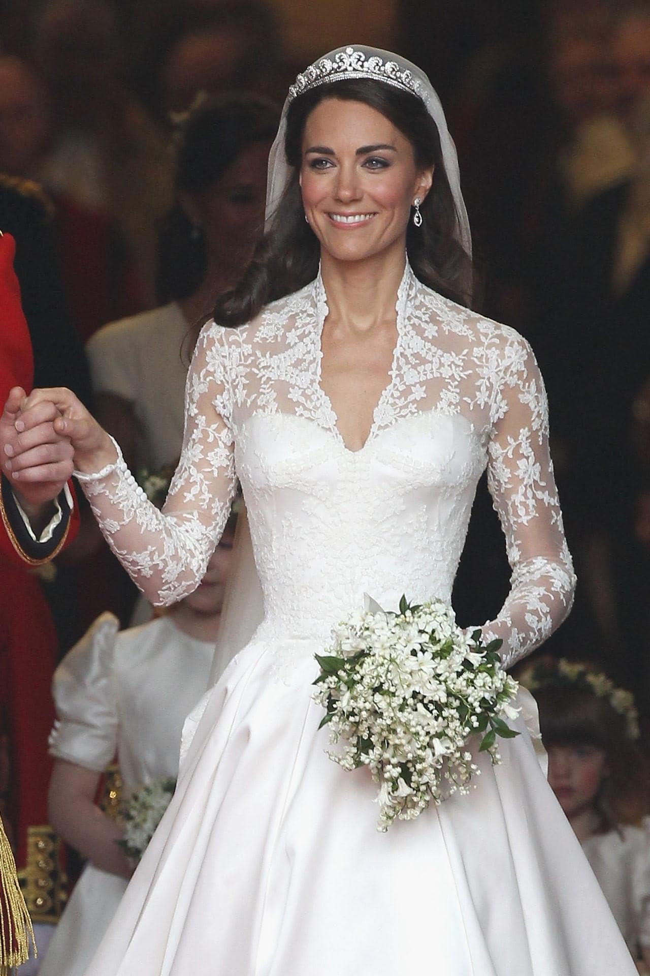
You may have heard that there's a royal wedding this weekend in the U.K.I'm very curious about Meghan's wedding dress. Her style is classic. She wears the clothes, not the other way around. Meghan's not jumping on every random trend and clearly knows what works for her figure. The only look I didn't love was her dress for her official engagement photos. The dress was stunning but I wasn't sure why she was wearing it during a day shoot and Prince Harry's suit was too casual for the dress.Below are three royal wedding dresses that I adore. They all have beautiful silhouettes, the brides look comfortable, and the styles are not dated. I watched Princess Diana's wedding and remember even as a kid thinking her dress was (to reference one of my favorite movies of all time) too meringue. Perhaps it because she was younger than the bridges below, had a very sheltered life, and it was the early 80s. Princess Diana was drowning in her dress.Princess Grace was married in 1956 and this dress is still influencing wedding and formal dress designers. It was designed by Helen Rose who was a costume designer for MGM Studios. She designed two dresses, which were gifts from the studio to their star. Helen was the CD on four of Princess Grace's MGM movies.Gorgeous and timeless.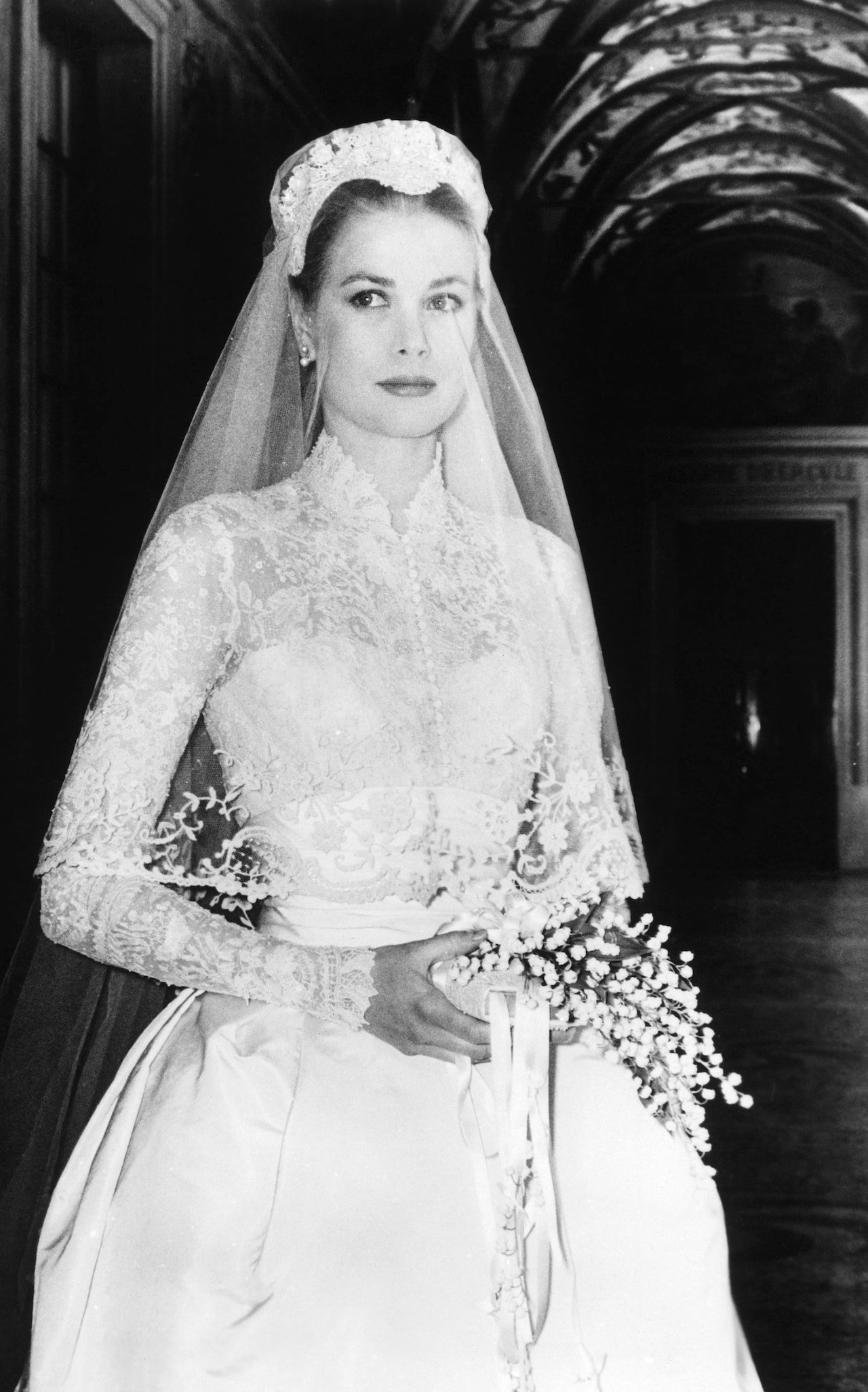 Princess Catherine 2011. Designed by Sarah Burton for Alexander McQueen. Sarah took over as Creative Director of the house in 2010 after McQueen's death. I don't know if it's rule that shoulders must covered for church wedding in the UK but this dress definitely helped bring back sleeves for wedding dresses.The sleeveless wedding dress had dominated for years. It didn't matter that the style was hard to pull off and not universally flattering. Bridal dress manufactures are happy to make this style because it's cheaper to make. Many American brides complained about the difficulty of finding wedding dresses with any kind of sleeve that wasn't dowdy and/or dated. That changed after 2011.This dress is modern and fresh.
 Princess Mabel 2004. The Princess married the late Dutch Prince Johan Frisco in a custom Viktor & Rolf dress. Instead of buttons, the fashion forward Dutch designers used bows. The cut on this dress is beyond. The bows add a bit of whimsy.The bride turned down their more conventional designs and asked for something memorable. It's unique without being a costume.
 [youtube https://www.youtube.com/watch?v=0VQMP8LYEV4&w=560&h=315]
My Tamu's Cafe Interview
Last summer I was interviewed by the lovely Tamu McPherson owner/creator of All The Pretty Birds.Those who follow fashion know what a big deal Ms. McPherson is in the industry. She's a smart, dynamic, woman with a strong style POV. Tamu is also kind, down to earth, and hilarious.When she said she wanted to interview me, I'll be honest, I had a minor panic attack. I DO NOT like being in front of the camera. I had to do an interview for the behind the scenes extras for our film JUMPING THE BROOM's DVD. I believe I watched it once after the studio sent me a copy of the film.Also, it was an extremely hot day in Milan and my monthly friend had arrived. Grrrrrr. I felt like a Weeble. I thought we were tapping at her house which had AC. Nope, we were also going to walk around Milan.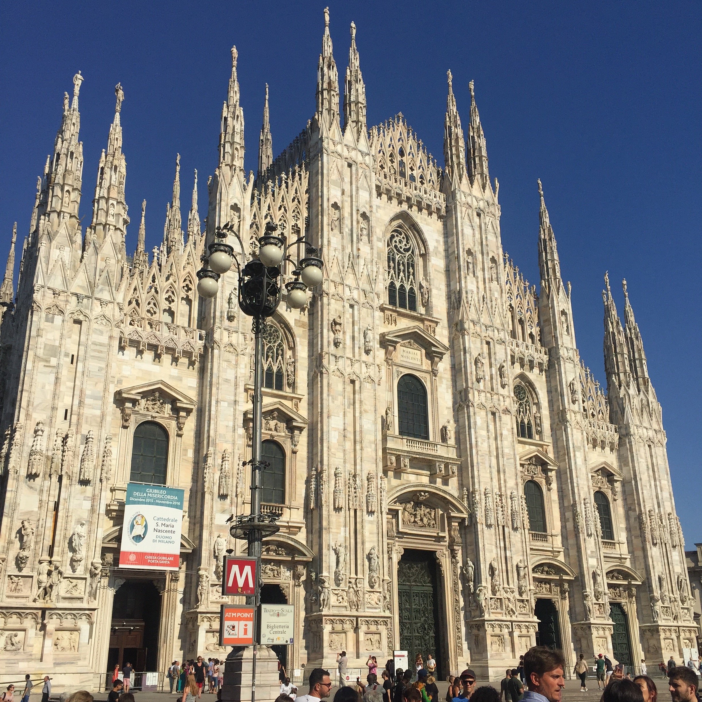 Despite the Caribbean blood that courses through my veins, I'm not a fan of hot weather. I'd say mid/high 70's (F) is my jam. It's in the mid 90s in Rome now and the sun here is on another level. Seriously.My dress had long sleeves but thanks to Tamu's expert sleeve rolling, I was cool as a cucumber. I bought the La Double J dress to celebrate a new project. Little did I know that my biggest client would be leaving Rome (thanks Trump...literally). No regrets though. Last Thursday evening I wore to the dress to events at Chez Dede and the reopening at Le Méridien. People kept asking me where I got it. It's the perfect dress for a dinner date too. Wait, I don't have any of those coming up. Never mind. Back to the subject at hand, the interview.Tamu broke it up into two parts. In Part I, it seems like I did ALL the talking. Tamu, for time, edited out her questions. In Part II we hear more from Tamu. There are Italian subtitles. We talked about working in Italy and what it's like to be a WOC living here, among other things.I move my hands around a lot. I take after my father's side of the family. They're very expressive.PART IPART III have to thank our glam squad. Just kidding. We didn't have one. Tamu and I did our own makeup.Grazie mille, Tamu!
 How pretty are these arrangements from Frida's Flowers?
The Design Files - Yes, You Can Mix Stripes and Prints.
Ciao Bloggisti,I know matching curtains, wallpaper, and even bed covers are having a moment. I think this style can look lovely in a Manhattan Classic Six bedroom or a home in the English countryside. In general though, I'm not a fan of what interior designers/decorators refer to, in very technical terms, as matchy-matchy.So far we've used a lot of neutrals and solid colors in our projects. I'm trying to experiment more when it comes to patterns, especially mixing them. It's tricky as there's a fine line between Granny Chic and a room that looks dated.One of my clients has a beautiful striped sofa. The current decorative pillows are a solid blue that she would like to change. Surprising myself, I started to pull prints. Her home has classic lines and a few antiques mixed with modern art. The solid pillows on the couch completely disappeared.Something like this from Designer's Guild would make the pillows stand out more without overwhelming the sofas: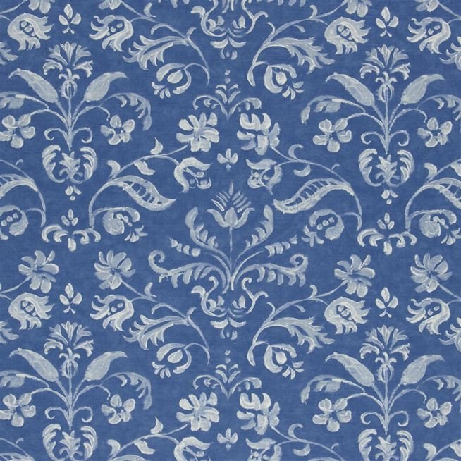 I LOVE stripes. They're a great pattern to mix with as they are simple and graphic. It may seem odd to place a stripe in a room that has floral prints, but try it. The graphic lines of the stripes will help ground the space.How to make sure the room doesn't look like a jumbled mess? Color, color, color. This bedroom by Mark D. Sikes is a perfect example.
 The stripes on the chairs go beautifully with the floral print on the duvet. Imagine a floral pattern on the chairs. I believe it would be way too much.There's a lot going on in this space but the color palette (and the scale of the furniture) makes it relaxing.Below, a bold approach from Steven Gambrel. Gorgeous.
  Chocolate brown and blue from Sheila Bridges. Notice how the print in the curtains is the same color as the stripe. Beautiful. Solid curtains with this type of sofa would've made the space too formal for a young single woman.
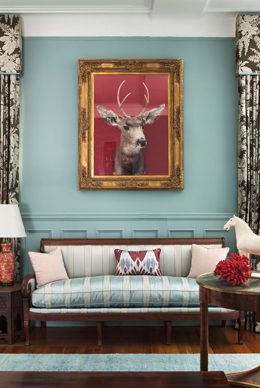 Clearly, I have the color blue on my mind.


