White Kitchens - Yes or No?
Put me firmly in the YES camp. I'm the middle of sourcing cabinets for our Anguilla Beach House Project. As I read various online design magazines and blogs, it appears that white kitchens are "out". People are sick of them. Apparently, they are boring and show no creativity.
I disagree. I strongly believe that kitchens and bathrooms are not the places to be trendy. They are the most expensive rooms to build or renovate. Twenty-four percent of Americans move to a new house every five years. In other countries people tend not to move as often. If one is worried about the resale value of their home, it would make sense to have a kitchen that is not dated.
A well-designed white kitchen is timeless. This is one reason they're so popular. One cannot tell if the kitchen was renovated five months ago or fifteen years ago. A homeowner can always swap out hardware or light fixtures to freshen things up or we can use accessories that speak to the trends of the moment. Most people cannot afford (nor want to) gut a functional kitchen just for aesthetic reasons.
White kitchens are not a trend given they've been "in" for almost two decades and were very popular in the 1920s. They are classic. Seriously, what are people smoking? I think, with the rise of social media, we're burning through trends faster. There's this need for instant gratification and always looking for something new. The thing is, most of the hot trends of today will not hold up.
To me it's more important that a workhorse room, like a kitchen, functions well. Open shelving may not be practical for some families. Maybe your kitchen isn't big enough for a massive island.
If a client wants to go with dark green cabinets, I'm all for it and we'll look for the shade that works best in the space. However, if a client wants white Shaker cabinets but worries it's too boring, we're going to get the darn Shaker cabinets. We can find other ways to add some color to the kitchen.
Content driven decorators rarely think about the architecture and/or the function of the space. Many have moved away from working with clients and instead continuously buy and flip houses. That's a very different mindset than creating a home for yourself or for a client.
As I work on this beach house kitchen, I'm mindful of the trends but we will have white Shaker cabinets as they fit the space, the location, and the architecture of the home. If the house were inland or a primary residence maybe we would chose a different color.
Here are some kitchens from talented designers and decorators. Notice that they don't look the same. I wish someone would tell them that these kitchens are boring or "so over".
This kitchen is in a 1922 Colonial that was recently renovated by interior designer, David Nastasi.
Photo: New York Magazine
Modern Farmhouse by House of Jade Interiors.
Photo. The Spruce
A villa in Tuscany designed by Ilaria Miani. The estate belonged to her grandparents and is now owned by her brother. I was one of her interns and I remember her custom Whatnot shelving well.
Photo: Elle Decor
Interior designer's Mark D. Sikes's kitchen in the Hollywood Hills.
Photo: Mark D. Sikes
A minimalist NYC kitchen. Love the terrazzo floor. Interior Design by Pierce Allen.
Photo: Elle Decor
September!
I hope everyone had a wonderful summer.Yes, I know technically it's still summer despite the fact that some retailers in the States are already selling Spiced Pumpkin Latte mixes and there are bloggers talking about Halloween.
I don't understand this rush. Let's enjoy this month and getting ready for fall. This is my favorite time of year/season. Not that I dislike the other three (well maybe winter, lack of sun and daylight is not my scene) but there's something about fall that makes me happy. I was one of those geeky kids who couldn't wait to buy back-to-school supplies. In my young mind there weren't many things more exciting that a Mead Trapper Keeper notebook.
Unfortunately, back-to-school shopping for clothes wasn't as fun as my Caribbean mom was not about that life. Every time I asked for something that EVERYONE was wearing, my mom would say that I was going to school to get an education, not for a fashion show. My dad backed her up as he didn't know (or care) about the difference between Girbaud, or Guess, jeans and a random pair from wherever.
I still look at fall as a beginning even though I graduated from college back in the Stone Age. Like spring, it's an opportunity to hit the reset button.
One of the color trends for Fall 2018 is this deep blue called Sargasso Sea.
Photo: Pantone
I’m feeling this cape but I might be too short for this lewk. Love the pop of color from Ms. Palermo’s shoes. Great combo.
Photo: Olivia Palermo, Refinery 29
This classic pattern from Schumacher is an excellent example of Hollywood Regency glamour.
There are so many beautiful colors to choose from but this one is in my top three, okay five.
Photo: Le Creuset
I cannot write about September without listening to this old school favorite. It dropped in 1978 and if you play it at any wedding reception, party, or cookout now people will still dance.
Here's to a great fall!
p.s. Here's a fantastic piece from NPR regarding why this song is so popular years later.
I asked Jeffrey Peretz, a professor of music theory at New York University's Clive Davis Institute, what makes that groove so powerful. He says a lot of it has to do with how the music unfolds. The song's very structure is an endless cycle that keeps us dancing and wanting more."
There's four chords in the chorus that just keep moving forward and never seem to land anywhere — much like the four seasons," he says. "It's the end of summer, it's the beginning of fall, it's that Indian summertime, it's the transition from warm to cool."
The trigger for that yearning feeling, Peretz says, is the opening line. White asks, "Do you remember?" and we supply the memories. It's a song that can bring all of the generations together, which makes it perfect for family gatherings. The true meaning is up to us — including, Allee Willis says, that strangely specific date."
We went through all the dates: 'Do you remember the first, the second, the third, the fourth ... ' and the one that just felt the best was the 21st," Willis explains. "I constantly have people coming up to me and they get so excited to know what the significance was. And there is no significance beyond it just sang better than any of the other dates. So ... sorry!"
The Design Files - Interior Design Master Class
Edited by Carl Dellatore, INTERIOR DESIGN MASTER CLASS: 100 Lessons From America's Finest Designers On The Art of Decoration, is an outstanding book.Although it's geared towards students of design and professionals, this book would appeal to anyone who's curious about interiors.The book is divided into six sections: theory, structure, style, process, elements, and inspiration. Within these sections, A-list interior designers and decorators discuss everything from floor plans, lighting, comfort, color, texture, etc. etc. This insightful peek into their process, inspiration, and interiors is a real treat. The designers range from well-established legends of the industry to the new guard.MASTER CLASS is packed with useful information and it's also gorgeous. I loved it.This book will be a classic. 
Before & After - Via Banchi Vecchi Project
Ciao Bloggisti,Earlier I wrote about the Via Monserrato project. One of the other apartments we worked on was located two blocks away on Via Banchi Vecchi. It was a new apartment for our client.The apartment was empty so we didn't have the same logistical issues but two bathrooms, and the kitchen had to be renovated. Any time you start opening walls you will have some surprises, especially in a building that's over three hundred years old.The brief from the client stated that the unique original flooring and the red tiles in the kitchen could not be replaced. The floors weren't in great shape but I like to think of them as adding character. The client wanted to improve the layout, add a closet in the bedroom, lighten up the very dark kitchen, and make the second bathroom more functional.The bulk of the budget went to the renovation. Some of the furniture came from the other apartments. We bought a mix of high-end hardware/fixtures along with budget friendly pieces.The minute the client stated that they had to change the layout, we called an architect. Fortunately, Domenico Minchilli and his studio took on the project. Square footage wise it was a lot smaller than their usual projects but it was complicated. We had worked together before which made the renovation process, never easy, smoother.BEFORE - The Kitchen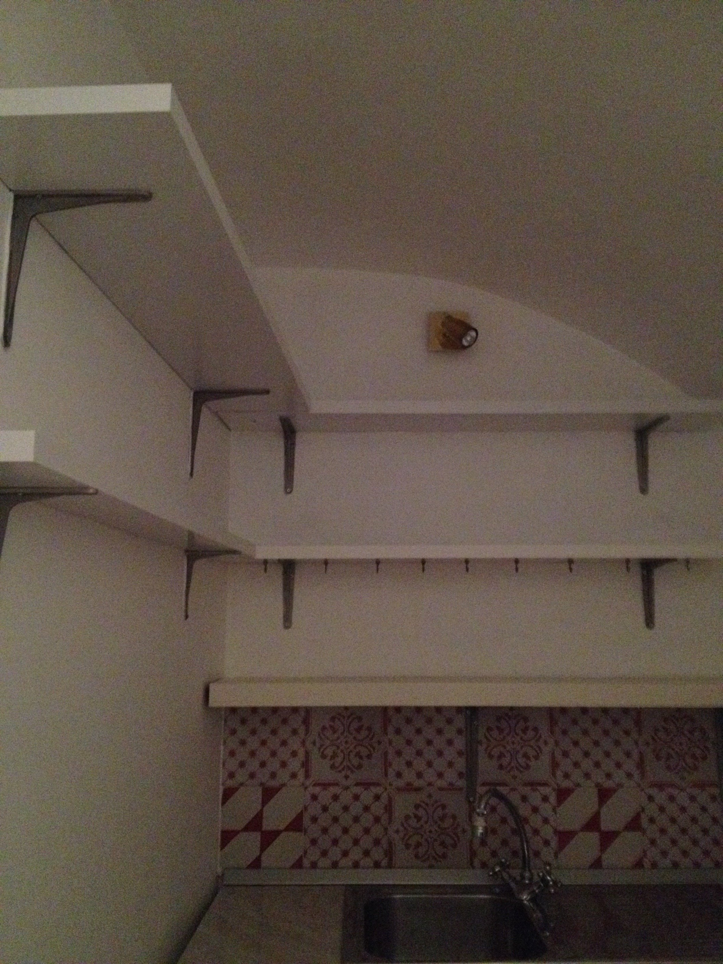 True, this is not a primary residence but I don't think any guest would want to spend a lot of time in here. It was impossible to get a decent shot of this dark, cramped space. The hallway before. The kitchen is behind the wall on the right.
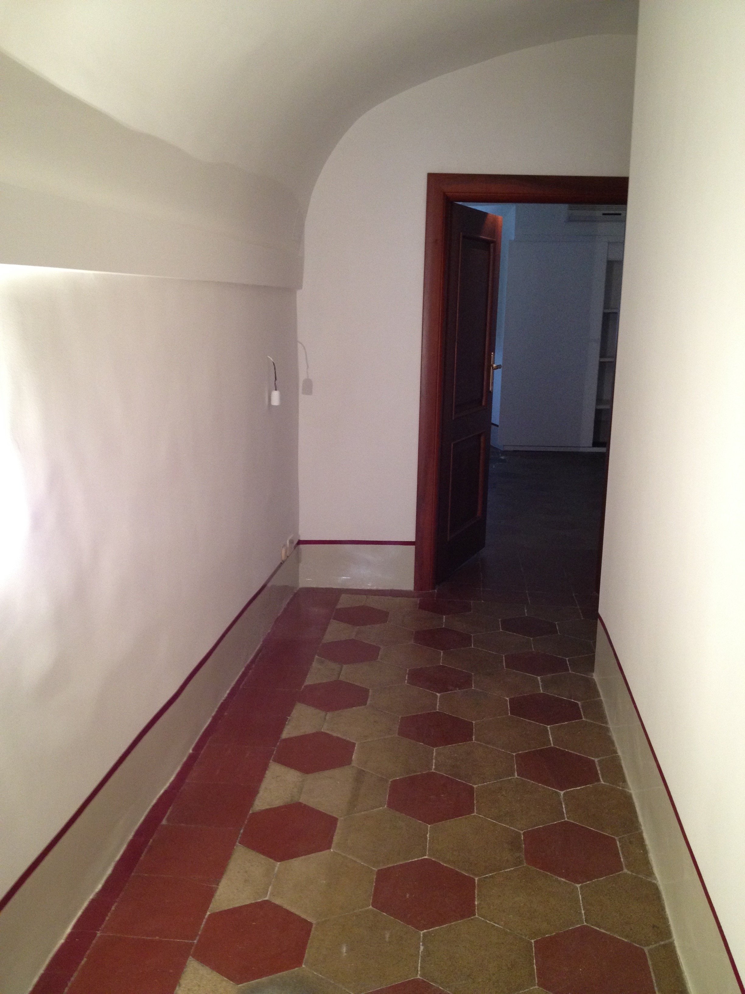 There were structural issues that had to be addressed (electrical, ventilation) so a upgrade/renovation had to happen.
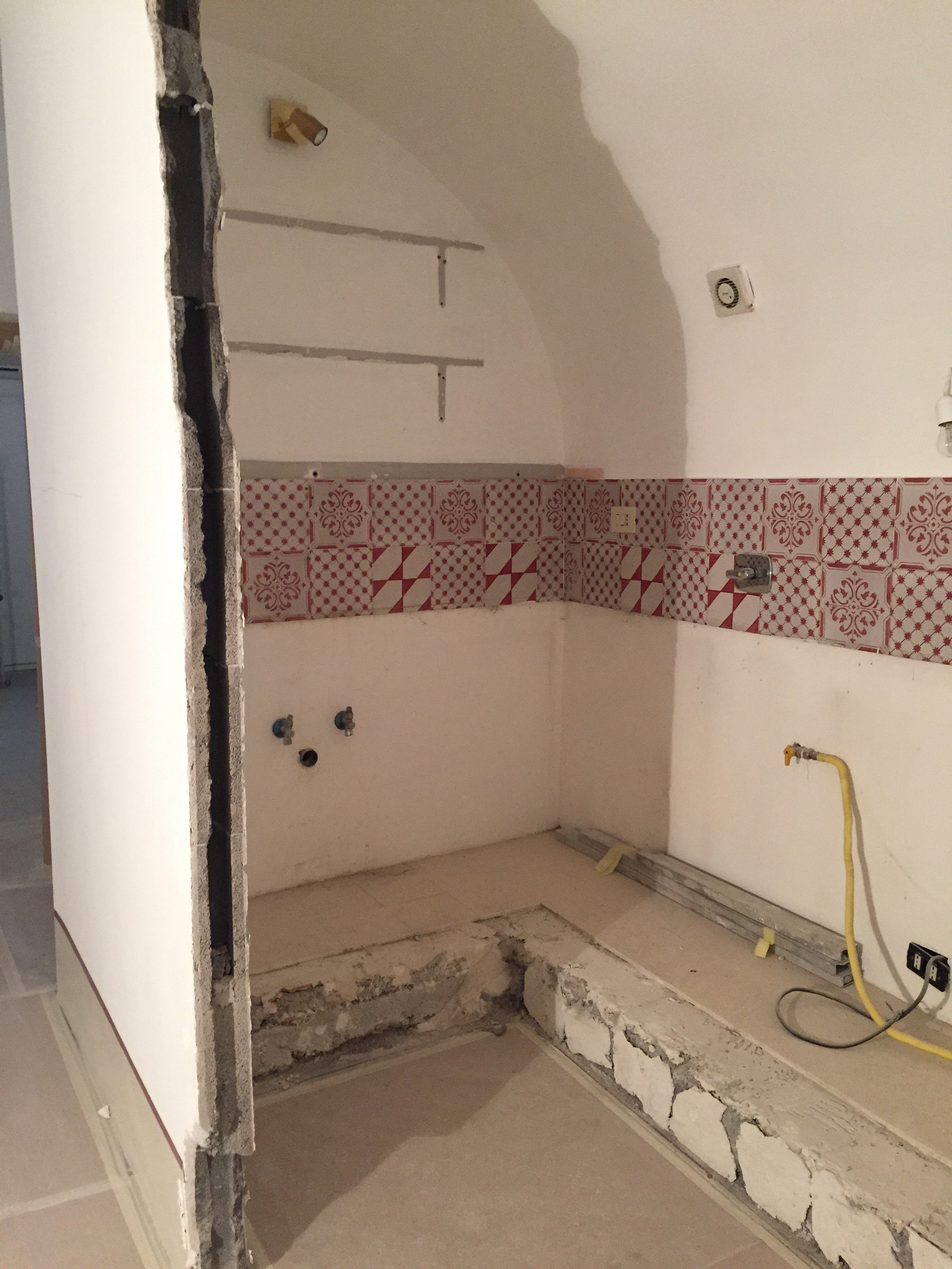 Originally, we discussed opening just one of the walls. Studio Minchilli suggested removing all them so you could see the entire arch as you walked into the apartment.AFTER
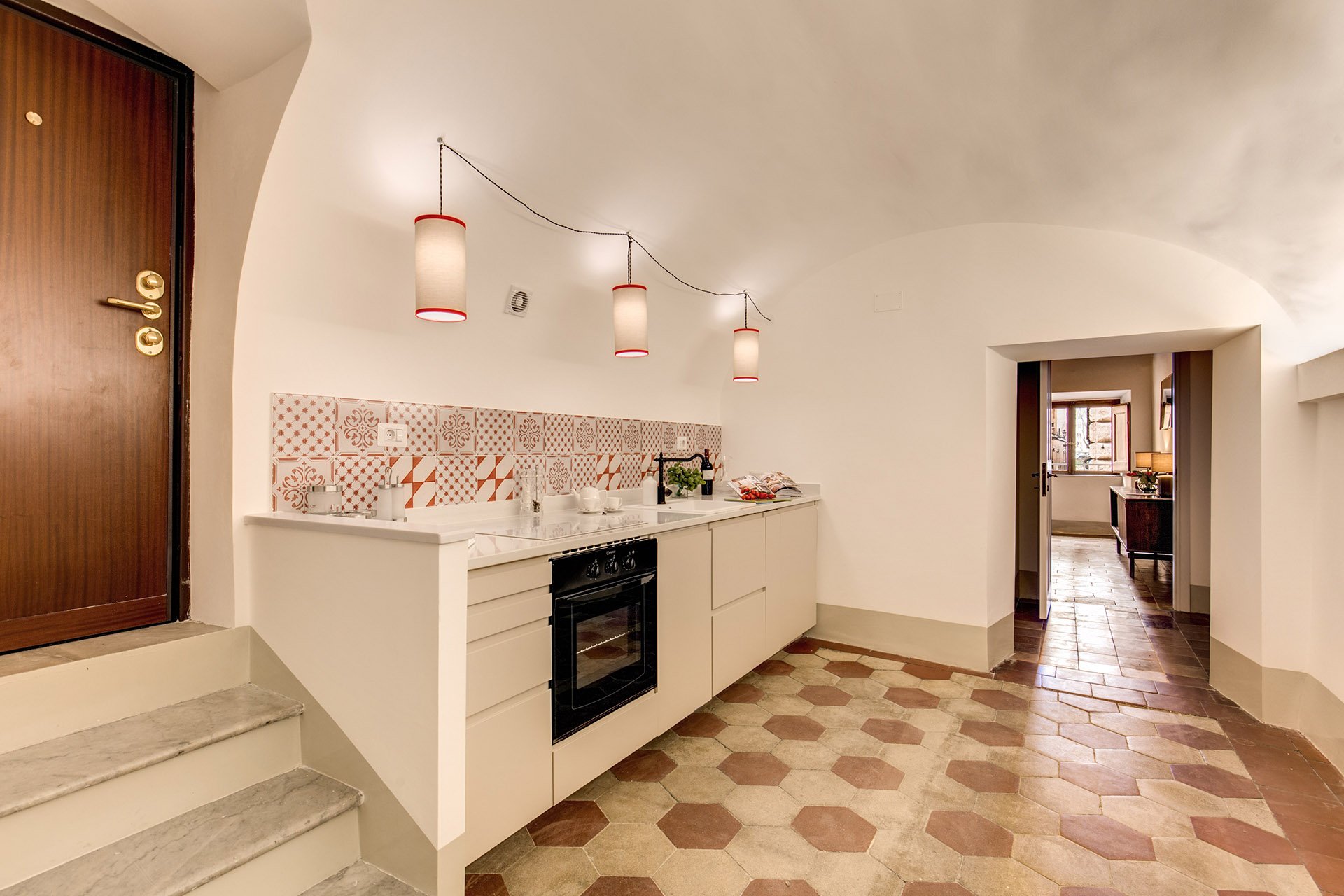
 What a difference. It's light and there's plenty of space to move around. The cabinets are from IKEA but the counter top is quartz from Stone Italiana. We decided to spend more for a higher quality counter top given the open plan design. It elevates the entire space, making the IKEA cabinets look more expensive.My anxiety level was not good the morning of this installation. A heavy slab, cut to order. Three men had to carry it.
  The light fixture is custom. Il Paralume.
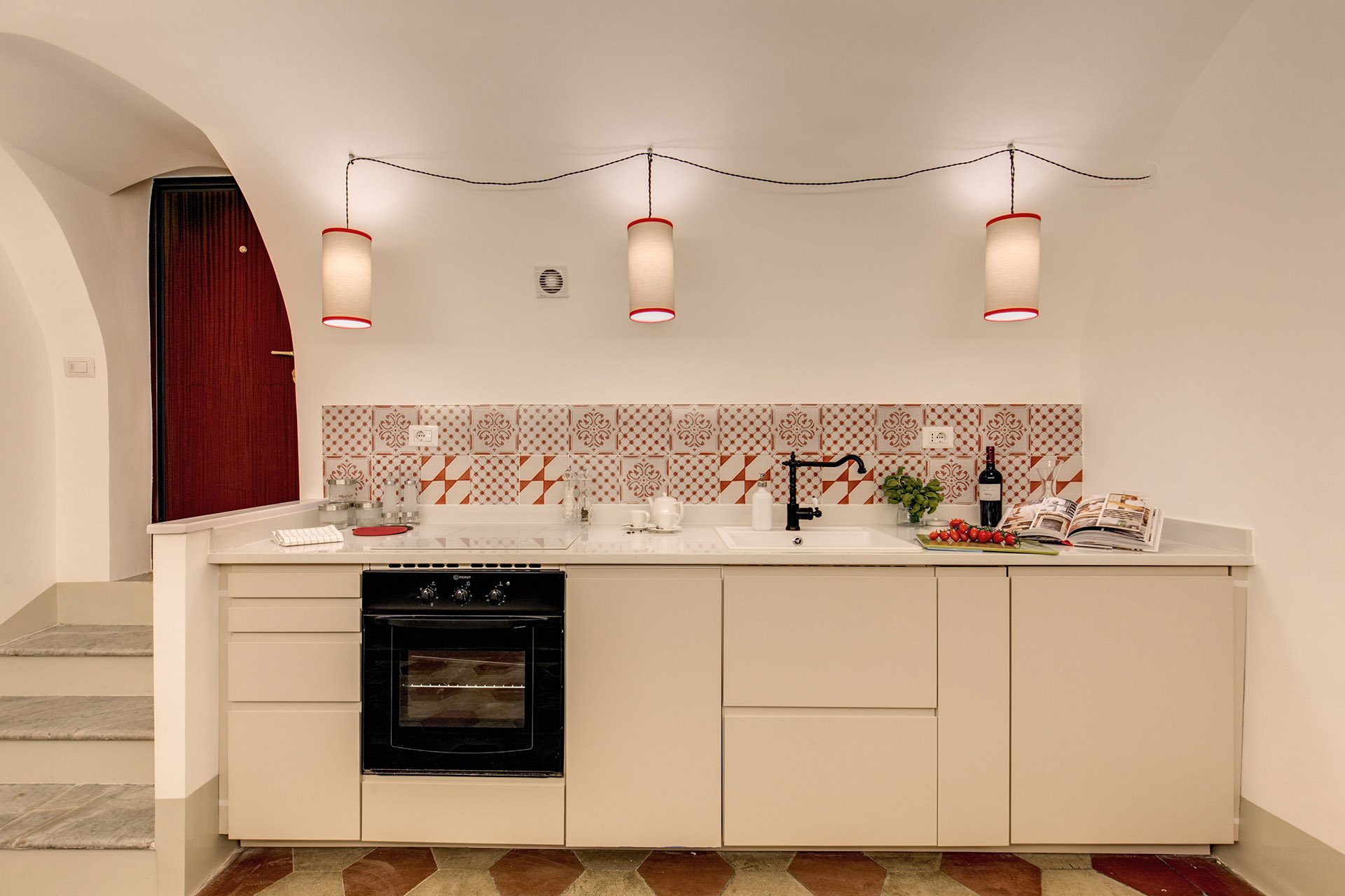 We also installed LED lights on the right.
 BEFORE - Master Bathroom
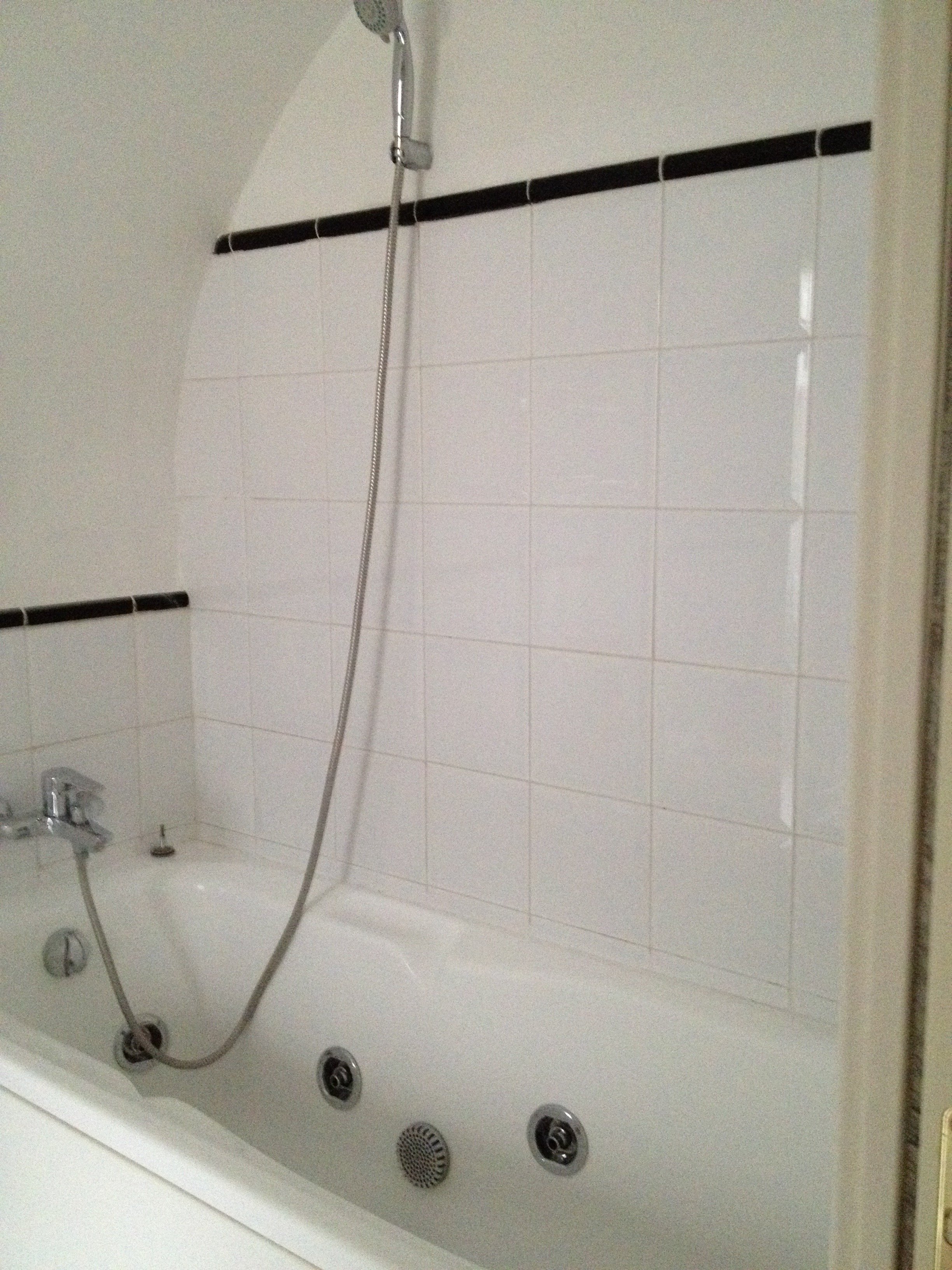 There were dated, inexpensive white tiles on the floor. AFTER
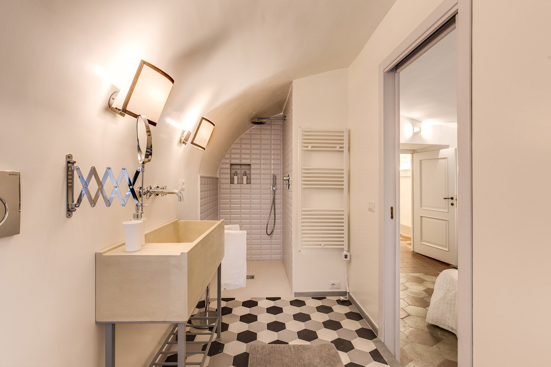 The tub was replaced with a shower.
 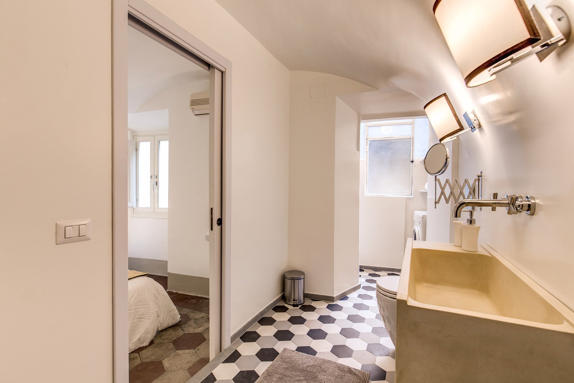 We decided to go with a combination bidet and toilet, which is great for small spaces. The client wanted a unique sink. We ordered these (which were quite heavy, our poor contractor) and asked our blacksmith to build the bases.Notice, we didn't put tiles on the walls. Similar to the Tuscany Project, we wanted the bathrooms to feel more like a room and less clinical. For a busy family bathroom this option could be impractical but I really like how these rooms feel without tiled walls.The design of the new tiles mimics the original tiled floors in the rest of the apartment. While these colors look great together, installing three colors is a different story. Complicated.
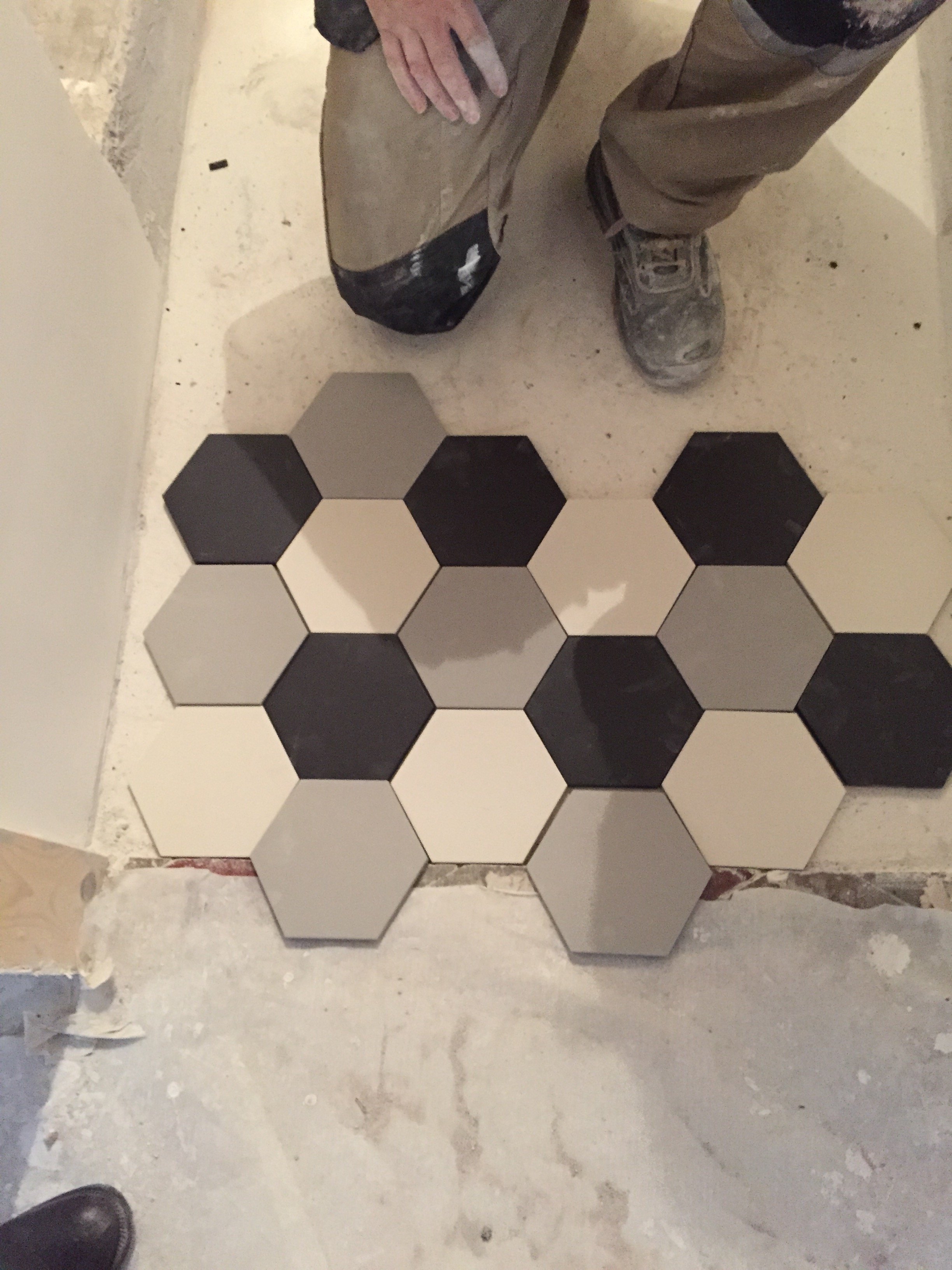 The tiles, sink, and all hardware were purchased at LOZZI.The sconces are custom. Il Paralume.Paint is a custom color from Crown.In the bedroom we added a pocket door, a built-in closet, and the lampshades are custom from Il Paralume.
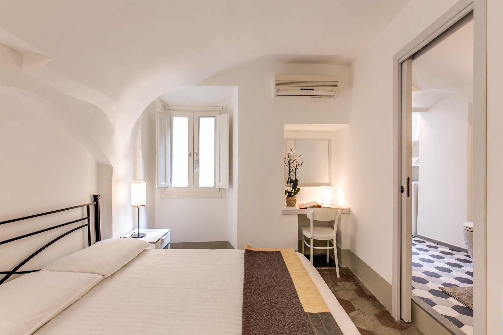 Our carpenter also created a desk in the corner.
 BEFORE - Second bathroom.Extremely tight space, dated tiles. The layout was terrible and the room very dark.
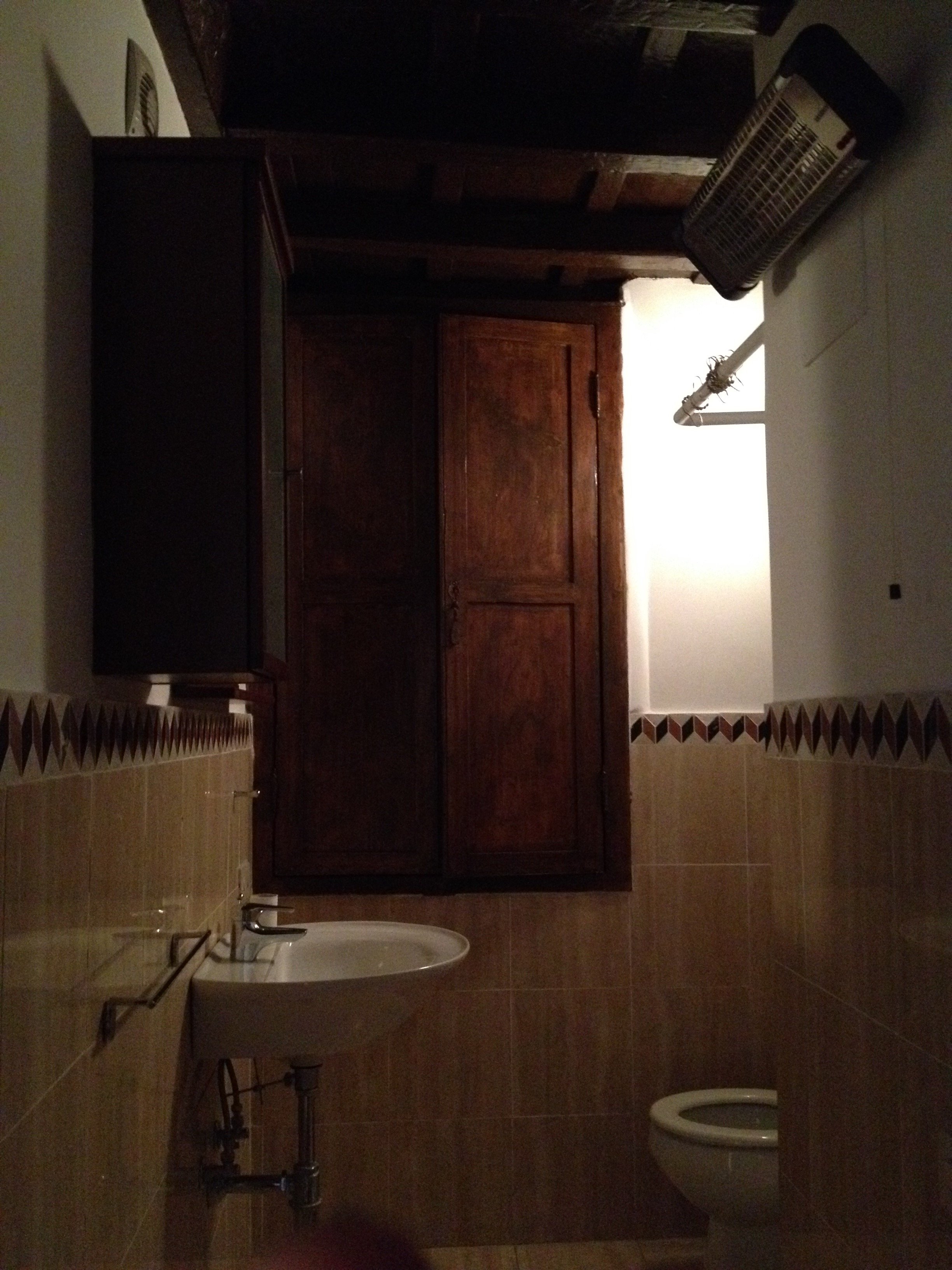 AFTERWe completely changed the layout. We moved the entrance which enabled us to add space for a proper shower.The door is custom made by our carpenter. Door fixtures are from Handles.
 Here's a better shot of the sink with the custom iron base. As with the other bathroom, we bought a combination bidet and toilet.
 BEFORE - Living Room
 AFTER - Living Room
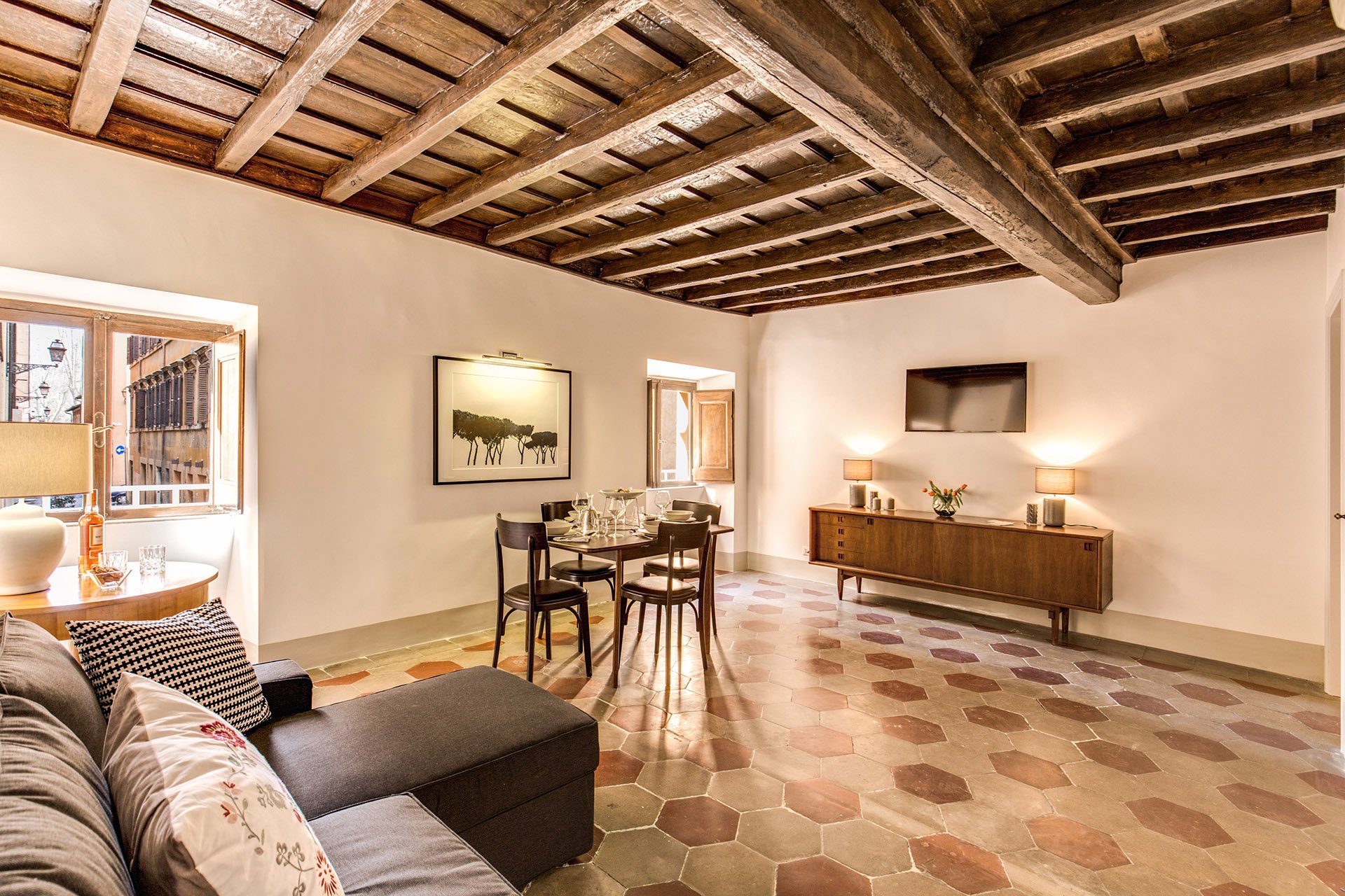 The fantastic artwork is from Due Alberi. They're based in Rome but ship internationally.Our carpenter added new closets.The dining table is from MADE and the chairs belong to the client.
 The side table came from the Via Monserrato apartment. We found the lamp at Leroy Merlin (the French version of Home Depot).
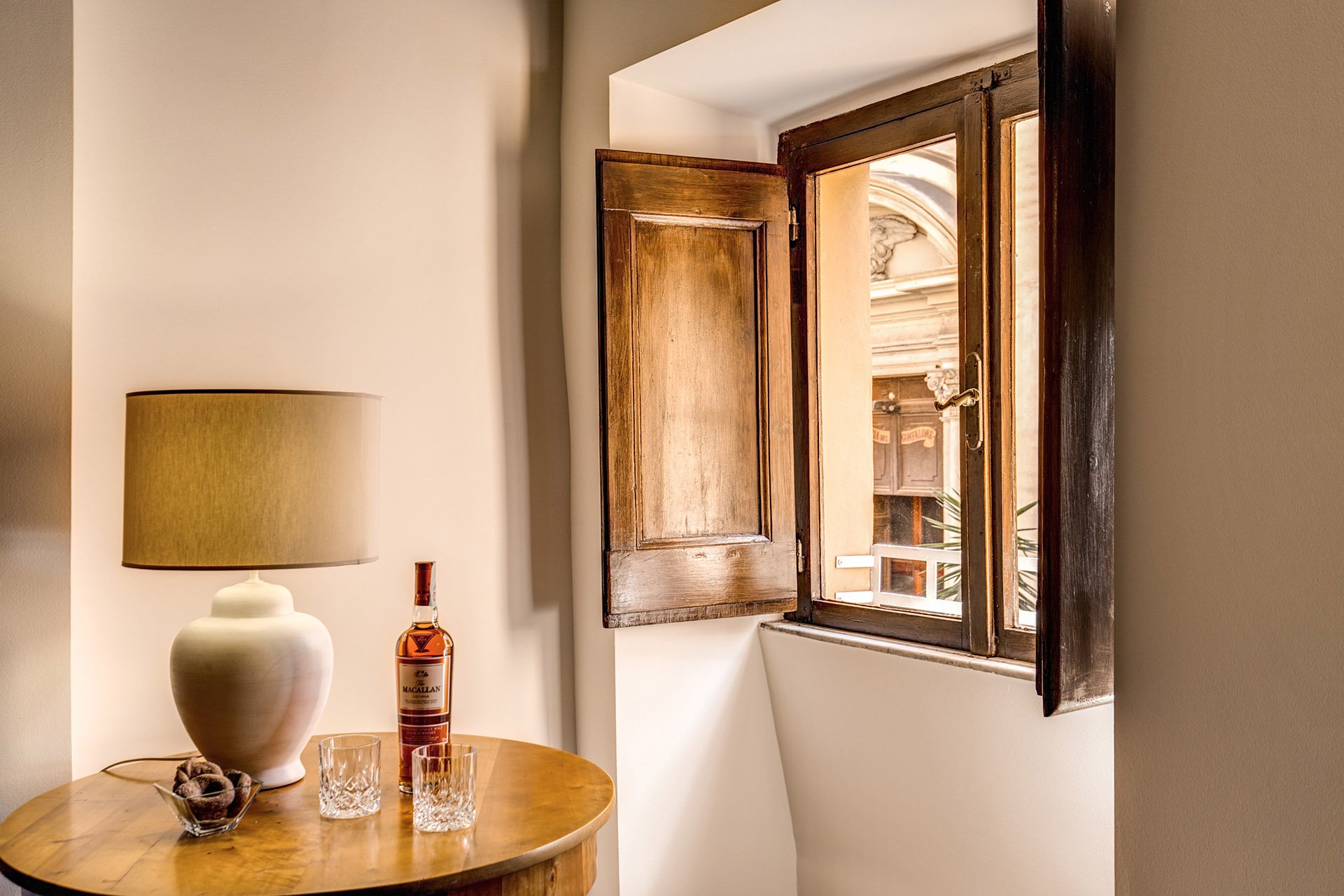 The client found the credenza online. The lamps were a great find at Leroy Merlin. We were so tired and hungry. My client was worried about my mental health as we had just spent hours at the IKEA next door. I perked up when I saw the lamps on a bottom shelf. I was so excited. It was like meeting Idris Elba.
 Overall, the apartment feels lighter despite the lack of light (the windows are tiny). The renovated kitchen and bathrooms compliment the style and architecture of the apartment. We updated them but without losing the charm.We kept the palette very simple, creamy whites, grey, black, with a touch of red. The ceiling seems higher and apartment looks/feels bigger.For more information about this vacation rental, please check out Your Suite Rome on Booking.com.Architect: Domenico MinchilliAfter Photos: Vincenzo Tambasco
The Design Files - Yes, You Can Mix Stripes and Prints.
Ciao Bloggisti,I know matching curtains, wallpaper, and even bed covers are having a moment. I think this style can look lovely in a Manhattan Classic Six bedroom or a home in the English countryside. In general though, I'm not a fan of what interior designers/decorators refer to, in very technical terms, as matchy-matchy.So far we've used a lot of neutrals and solid colors in our projects. I'm trying to experiment more when it comes to patterns, especially mixing them. It's tricky as there's a fine line between Granny Chic and a room that looks dated.One of my clients has a beautiful striped sofa. The current decorative pillows are a solid blue that she would like to change. Surprising myself, I started to pull prints. Her home has classic lines and a few antiques mixed with modern art. The solid pillows on the couch completely disappeared.Something like this from Designer's Guild would make the pillows stand out more without overwhelming the sofas: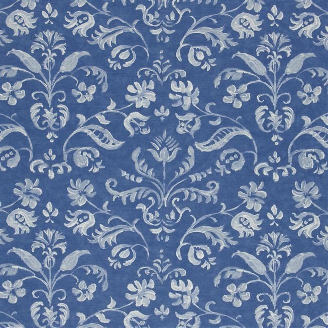 I LOVE stripes. They're a great pattern to mix with as they are simple and graphic. It may seem odd to place a stripe in a room that has floral prints, but try it. The graphic lines of the stripes will help ground the space.How to make sure the room doesn't look like a jumbled mess? Color, color, color. This bedroom by Mark D. Sikes is a perfect example.
 The stripes on the chairs go beautifully with the floral print on the duvet. Imagine a floral pattern on the chairs. I believe it would be way too much.There's a lot going on in this space but the color palette (and the scale of the furniture) makes it relaxing.Below, a bold approach from Steven Gambrel. Gorgeous.
  Chocolate brown and blue from Sheila Bridges. Notice how the print in the curtains is the same color as the stripe. Beautiful. Solid curtains with this type of sofa would've made the space too formal for a young single woman.
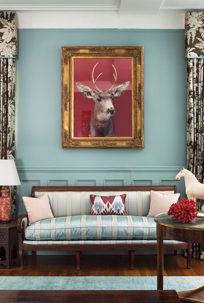 Clearly, I have the color blue on my mind.
I'm Going to Check Myself Before I Wreck Myself - Summer 2016
Ciao Blogglisti,How are you doing?I wrote a post few months ago about being in a major funk after my trip to Milan. While Rome and I never got into fisticuffs, the situation was critical.Late last week, I stopped by a vendor I haven't seen since moving out of the Center. She told me that my Italian had really improved. I thought about her comment. I was constantly beating myself up for not being fluent, instead of remembering that I'm getting better. I seem to be focusing on the negative a lot lately.Yesterday was the first day of summer. I am determined not to spend yet another season salty with city I live in. I'm not the biggest kumbaya person. You will not find me on the top of Gianicolo Hill doing this:[youtube https://www.youtube.com/watch?v=4R462Ro5fqU?rel=0&w=420&h=315]I do know that walking around, as the youngins would say, with a stank attitude is not going to make things better. I will try to see this city with fresh eyes, be more social, and maybe cut back on political news.


