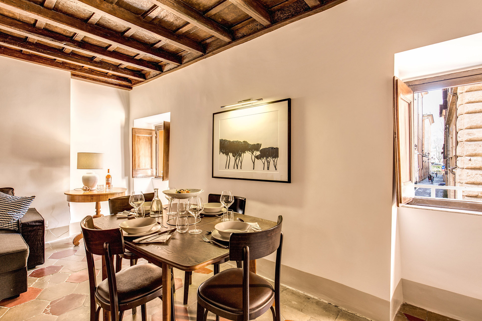
White Kitchens - Yes or No?
Put me firmly in the YES camp. I'm the middle of sourcing cabinets for our Anguilla Beach House Project. As I read various online design magazines and blogs, it appears that white kitchens are "out". People are sick of them. Apparently, they are boring and show no creativity.
I disagree. I strongly believe that kitchens and bathrooms are not the places to be trendy. They are the most expensive rooms to build or renovate. Twenty-four percent of Americans move to a new house every five years. In other countries people tend not to move as often. If one is worried about the resale value of their home, it would make sense to have a kitchen that is not dated.
A well-designed white kitchen is timeless. This is one reason they're so popular. One cannot tell if the kitchen was renovated five months ago or fifteen years ago. A homeowner can always swap out hardware or light fixtures to freshen things up or we can use accessories that speak to the trends of the moment. Most people cannot afford (nor want to) gut a functional kitchen just for aesthetic reasons.
White kitchens are not a trend given they've been "in" for almost two decades and were very popular in the 1920s. They are classic. Seriously, what are people smoking? I think, with the rise of social media, we're burning through trends faster. There's this need for instant gratification and always looking for something new. The thing is, most of the hot trends of today will not hold up.
To me it's more important that a workhorse room, like a kitchen, functions well. Open shelving may not be practical for some families. Maybe your kitchen isn't big enough for a massive island.
If a client wants to go with dark green cabinets, I'm all for it and we'll look for the shade that works best in the space. However, if a client wants white Shaker cabinets but worries it's too boring, we're going to get the darn Shaker cabinets. We can find other ways to add some color to the kitchen.
Content driven decorators rarely think about the architecture and/or the function of the space. Many have moved away from working with clients and instead continuously buy and flip houses. That's a very different mindset than creating a home for yourself or for a client.
As I work on this beach house kitchen, I'm mindful of the trends but we will have white Shaker cabinets as they fit the space, the location, and the architecture of the home. If the house were inland or a primary residence maybe we would chose a different color.
Here are some kitchens from talented designers and decorators. Notice that they don't look the same. I wish someone would tell them that these kitchens are boring or "so over".
This kitchen is in a 1922 Colonial that was recently renovated by interior designer, David Nastasi.
Photo: New York Magazine
Modern Farmhouse by House of Jade Interiors.
Photo. The Spruce
A villa in Tuscany designed by Ilaria Miani. The estate belonged to her grandparents and is now owned by her brother. I was one of her interns and I remember her custom Whatnot shelving well.
Photo: Elle Decor
Interior designer's Mark D. Sikes's kitchen in the Hollywood Hills.
Photo: Mark D. Sikes
A minimalist NYC kitchen. Love the terrazzo floor. Interior Design by Pierce Allen.
Photo: Elle Decor
September!
I hope everyone had a wonderful summer.Yes, I know technically it's still summer despite the fact that some retailers in the States are already selling Spiced Pumpkin Latte mixes and there are bloggers talking about Halloween.
I don't understand this rush. Let's enjoy this month and getting ready for fall. This is my favorite time of year/season. Not that I dislike the other three (well maybe winter, lack of sun and daylight is not my scene) but there's something about fall that makes me happy. I was one of those geeky kids who couldn't wait to buy back-to-school supplies. In my young mind there weren't many things more exciting that a Mead Trapper Keeper notebook.
Unfortunately, back-to-school shopping for clothes wasn't as fun as my Caribbean mom was not about that life. Every time I asked for something that EVERYONE was wearing, my mom would say that I was going to school to get an education, not for a fashion show. My dad backed her up as he didn't know (or care) about the difference between Girbaud, or Guess, jeans and a random pair from wherever.
I still look at fall as a beginning even though I graduated from college back in the Stone Age. Like spring, it's an opportunity to hit the reset button.
One of the color trends for Fall 2018 is this deep blue called Sargasso Sea.
Photo: Pantone
I’m feeling this cape but I might be too short for this lewk. Love the pop of color from Ms. Palermo’s shoes. Great combo.
Photo: Olivia Palermo, Refinery 29
This classic pattern from Schumacher is an excellent example of Hollywood Regency glamour.
There are so many beautiful colors to choose from but this one is in my top three, okay five.
Photo: Le Creuset
I cannot write about September without listening to this old school favorite. It dropped in 1978 and if you play it at any wedding reception, party, or cookout now people will still dance.
Here's to a great fall!
p.s. Here's a fantastic piece from NPR regarding why this song is so popular years later.
I asked Jeffrey Peretz, a professor of music theory at New York University's Clive Davis Institute, what makes that groove so powerful. He says a lot of it has to do with how the music unfolds. The song's very structure is an endless cycle that keeps us dancing and wanting more."
There's four chords in the chorus that just keep moving forward and never seem to land anywhere — much like the four seasons," he says. "It's the end of summer, it's the beginning of fall, it's that Indian summertime, it's the transition from warm to cool."
The trigger for that yearning feeling, Peretz says, is the opening line. White asks, "Do you remember?" and we supply the memories. It's a song that can bring all of the generations together, which makes it perfect for family gatherings. The true meaning is up to us — including, Allee Willis says, that strangely specific date."
We went through all the dates: 'Do you remember the first, the second, the third, the fourth ... ' and the one that just felt the best was the 21st," Willis explains. "I constantly have people coming up to me and they get so excited to know what the significance was. And there is no significance beyond it just sang better than any of the other dates. So ... sorry!"
The Design Files - A Beautiful Colonial Renovation
I published a post earlier this year regarding how traditional interiors are “in” again. I don’t think they were ever out but I’m thrilled to see color and patterns celebrated again.
I recently read about this gorgeous renovation in New York Magazine. I enjoyed The Cut Wendy Goodman’s interesting and informative interview with Interior Designer David Nastasi and his husband Michael Stone.
The couple bought the 1922 Colonial in 2014 and started the renovations a year later. It was a lot of work as the house hadn’t been touched for decades. It was important to the new owners to keep the elegant architecture of the house while updating it for the way we live today.
It’s a stunner.
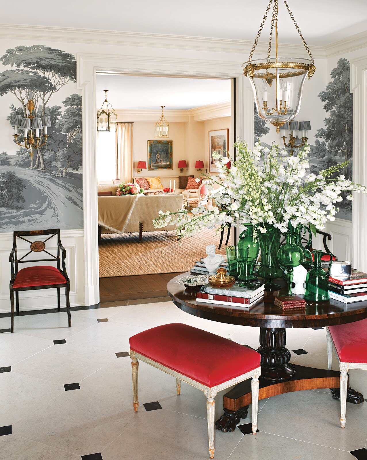
Can we talk about this entrance?! I’m not the biggest Fornasetti fan. I like it in small doses BUT their Nuvolette wallpaper from Cole & Son? Cannot get enough of it. Cannot. This is a bold choice for a traditional home. I love it.
More wallpaper to love in the dining room. It’s from the Spanish brand, Gaston y Daniela.
I’m writing a separate post about white kitchens. There is nothing dated about this one. All these windows. The mix of modern and traditional. This is a kitchen I could spend hours in.
To seem more of this wonderful renovation, the article is HERE.
Photographs by Genevieve Garruppo
The Design Files - The Authentics
The Authentics: A Lush Dive into the Substance of Style by Melanie Acevedo & Dara Caponigro, is gorgeous book that takes us into the beautiful homes of dynamic people who work in a variety of creative fields.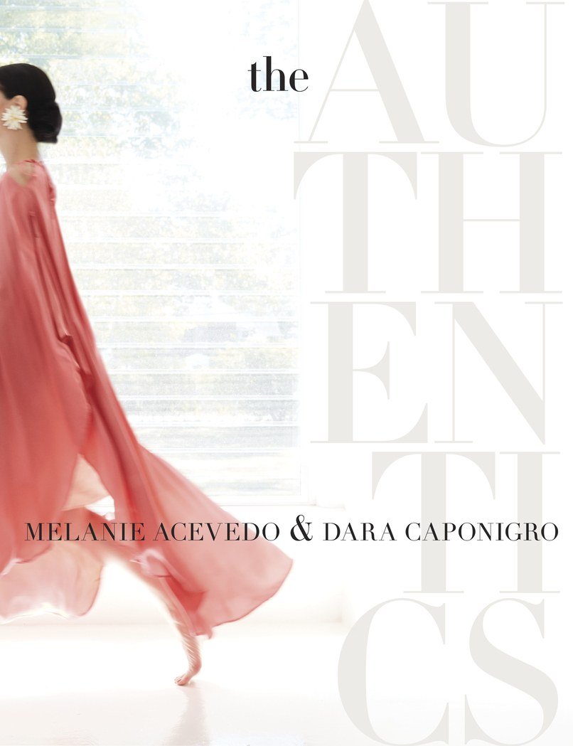 Ms. Acevedo is a well known photographer. Ms. Caponigro was one of the founders of DOMINO magazine and is currently the Creative Director of F. Schumacher & Co., the legendary fabric, wallpaper, and rug company.This is a book I will reference time and time again. Some of the names are famous in the design world, like Kelly Wearstler, Miles Redd, and Nicky Haslam, or celebrities such as actress Peggy Lipton and hair stylist Sally Hershberger. There are landscape architects, jewelry designers, chefs, etc. All have an unique point of view.Some of the rooms or gardens might be a bit "much" but I love that in a homogenized world there are people who surround themselves with things that they enjoy regardless of popularity.
 Visually, this coffee table book is a knockout. It has thick quality paper and is beautifully photographed.The interviews with these talented creative people were very inspiring. It's easy, thanks to social media, to see the same images again and again. At first everyone is excited and then the same people start to complain that the image is played or trite. The Authentics create their spaces in a way that speaks to their interests, loves, and passions. That approach will never go out of style.
Decorating 101 for the Suddenly Single
Breakups are stressful. Moving is stressful. Moving after a breakup? We're talking stress squared.Anika Jackson, VP at Real Beauty Real Women, asked me to write a decorating post with some tips on how to make the transition a bit smoother.To read the rest of the post, click HERE.
The Design Files - Interior Design Master Class
Edited by Carl Dellatore, INTERIOR DESIGN MASTER CLASS: 100 Lessons From America's Finest Designers On The Art of Decoration, is an outstanding book.Although it's geared towards students of design and professionals, this book would appeal to anyone who's curious about interiors.The book is divided into six sections: theory, structure, style, process, elements, and inspiration. Within these sections, A-list interior designers and decorators discuss everything from floor plans, lighting, comfort, color, texture, etc. etc. This insightful peek into their process, inspiration, and interiors is a real treat. The designers range from well-established legends of the industry to the new guard.MASTER CLASS is packed with useful information and it's also gorgeous. I loved it.This book will be a classic. 
The Design Files – Traditional Interiors are Back
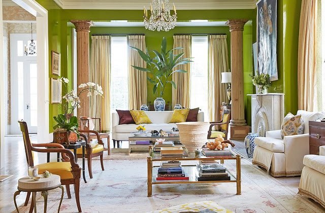
Traditional interiors will be big in 2018 according to various interior design articles. I never received the memo that they were "out". I don't think they ever went away, especially in cities like New Orleans, Charleston (SC), and Washington, DC.I don't belive in following trends. It's helpful to know what is going on in the world of design but the client's tastes and the architecture of the home are much more important than what's trending. For example, installing barn doors everywhere. I adore them. However, sometimes a room needs a regular door or a pocket door. Don't get me started on shiplap.Plus, following trends is an easy way to have your home look dated quickly. This will not help the resale value of your home (more relevant in the States where we renovate/redecorate and move often compared to other countries).I'm not surprised that people are falling back in love with traditional interiors. During a time of great uncertainty in the world, it's nice to be surrounded by something comforting and familiar. It's interesting to me that so many people thought/think of traditional interiors as very stuffy, too precious, and too old. In fact, traditional interiors are perfect for families, especially those with small children. Pieces that have been around for generations can take a beating. A little wear and tear adds character. The use of color helps hides stains and so on.Speaking of color, this is one way to make your space current and not like your great-grandmother's. Another suggestion is to mix it up. Place some modern pieces in the room. A room filled with only antiques can feel like a museum.Below are some recently decorated spaces in the traditional style. They're fun and have a lot of personality.This home in San Francisco was decorated by Miles Redd for a young family with four children. Pictures are from Architectural Digest.
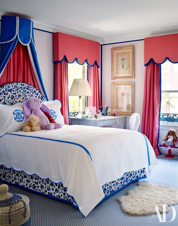
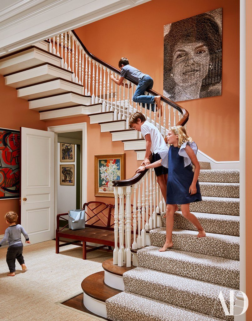
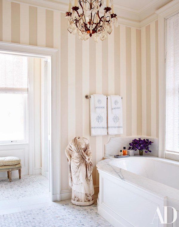 Jane Scott Hodges's home in New Orleans is a bold mix of colors and patterns. She worked on her home with friend, interior designer, Gwen Driscoll. Photos are from House Beautiful.
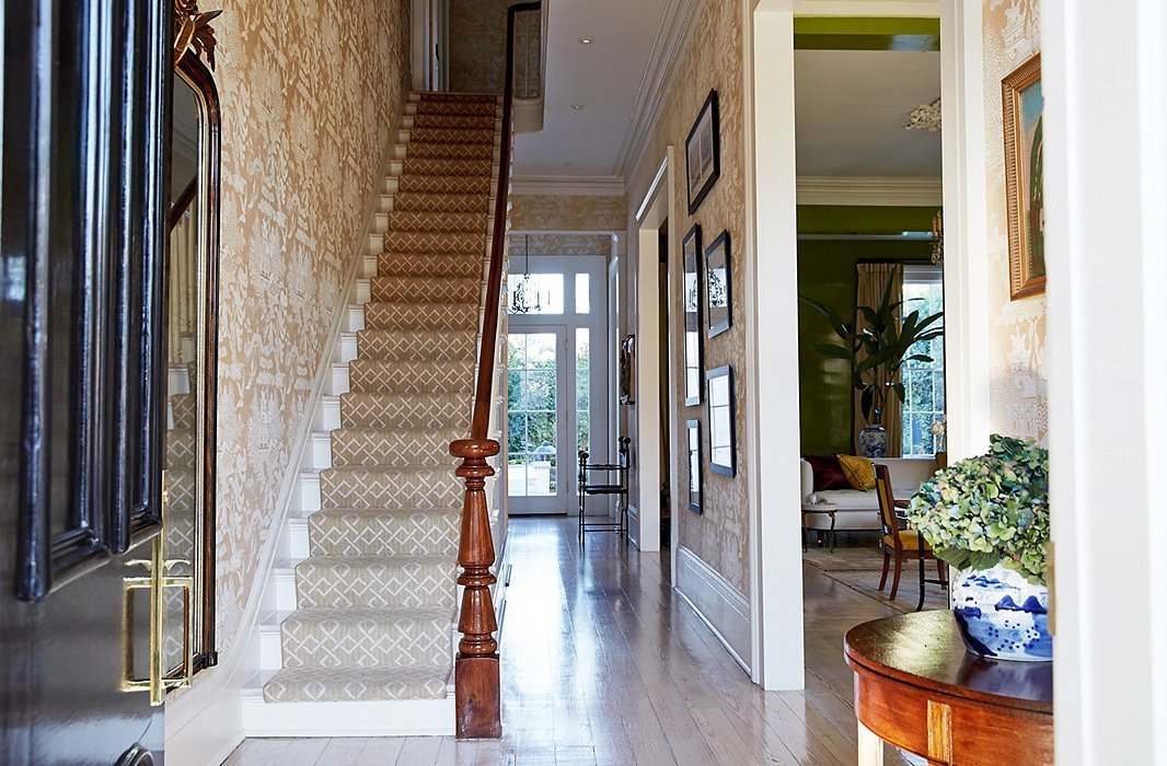

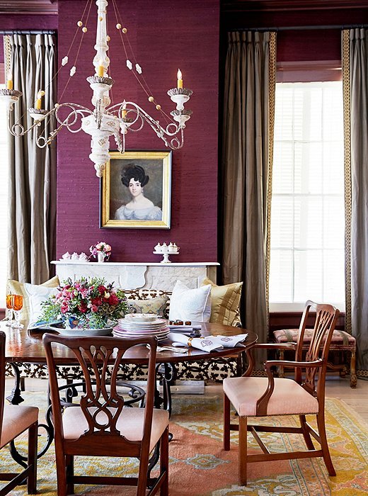 Interior designer Darryl Carter wrote a book called The New Traditional. His spin on this aesthetic is more sculptural. He uses a lot of neutrals but with a variety of textures which gives his spaces movement. Photos are from One Kings Lane.


I Used to Hate on Florence, Italy.
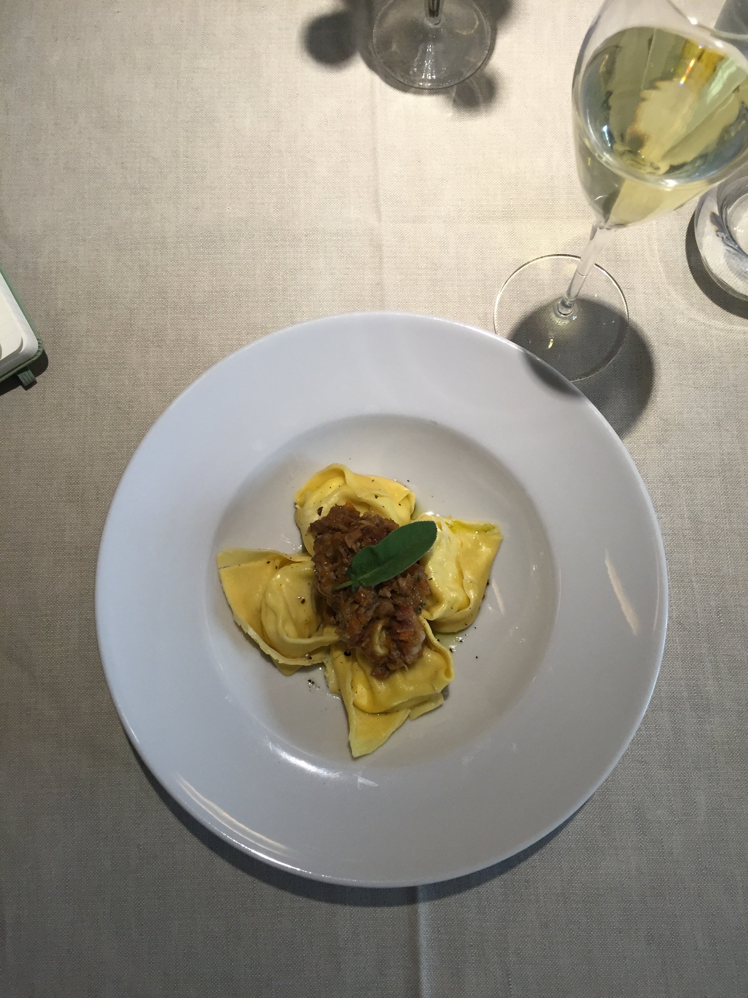
I went to Florence for the first time during my second vacation in Italy. I stayed for a couple of days.My second trip was a few years later during the first month I lived in Italy. I couldn't wait to leave both times. The second trip was over nine years ago and I believed if I never visited again, it was okay with me. Never mind that at some point I would need to return for work. My plan was to get in and get out.I loved the art and thought the city was beautiful, so what was my damage? I couldn't get a read on the city, no sense of place. I had visited during the months of May and April respectively and couldn't walk down the streets. It was that crowded with tourists. Florence felt like a Renaissance amusement park.A friend in Los Angeles was dating a chef in Florence and she suggested I go to his restaurant for lunch. He couldn't have cared less. Our mutual friend, had the same experience. She has spent a lot of time in Italy (from top to bottom) and shrugged at his rudeness saying, "Florence."Earlier this year, I was having drinks with a friend and his dear friend who grew up in Florence. She told me I needed to return to the city. That the energy in the city is completely different from my last trip. My friends who live in Florence said the same thing. I was skeptical.I decided to go on my birthday to see what my Florentine friends were raving about. August is blazing hot and still high season, but I found an excellent same day fare on Italo.This is how I felt after my day in Florence. No, it's not because Rome is a trainwreck right now (please get it together Mayor Raggi). It's because I completely misread Florence.Man, I used to talk so much smack about Florence. In my defense, I wasn't the only one. A friend from NYC, who comes to Italy every year, emailed me during her first trip to Florence and said she was in the seventh circle of hell. She was there during the height of the high season.Yes, Florence is very popular with tourists and American exchange students. Since my two earlier trips, friends have moved to Florence and their version of the city is not what I experienced back then. How could it be? I was there for four days max. They live there. They know Florence. Their version is the side I was able to see during my trip last month.I had been to all the museums before and I didn't have a crazy itinerary this time. I wanted to see the Boboli Gardens and friends who were in town but otherwise left my schedule open to just walk around.I speak Italian now. When I walked into a store and the salesperson automatically spoke English to me, I responded in Italian. Their mood changed. Except for one dude at a handmade paper shop. I was looking for a birthday gift for a friend. I walked in and gave my best, "buon giorno". He looked at me and then proceeded to ignore me. Hello, even in Rome they will at least give you a salty, "buon giorno", or "salve" in return. I'm sorry that he had to work during Ferragosto while the vast majority of his peers were at the sea or in the mountains. Perhaps he should've closed his store during August?I had lunch at Osteria dell'Enoteca. I didn't know what restaurants would be opened during Ferragosto. Thankfully, Georgette (aka Girl in Florence) had a post for that.Georgette and I finally met in person when she was in Rome earlier this year. I think Florence's tourism board should give her a medal and a lot of money. I always forward her blog to friends, and friends of friends, who are visiting Florence.I find Tuscan cuisine a bit heavy. These ravioli were light and delicious. The waiters were lovely. It was the perfect birthday lunch.
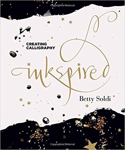
 I met Veronica in Rome through friends at my favorite store Chez Dede. She saw my Instagram post about the Boboli Gardens and suggested I stop by their store And Company. I'm thrilled that they were open during Ferragosto. It's my kind of place. I was so busy talking and looking at everything, I didn't take any photos. I did post a few videos on Instastories.Betty Soldi, is one of the owners and a very talented calligrapher. I want all her cards. Her new book dropped this month and I cannot wait to read it.
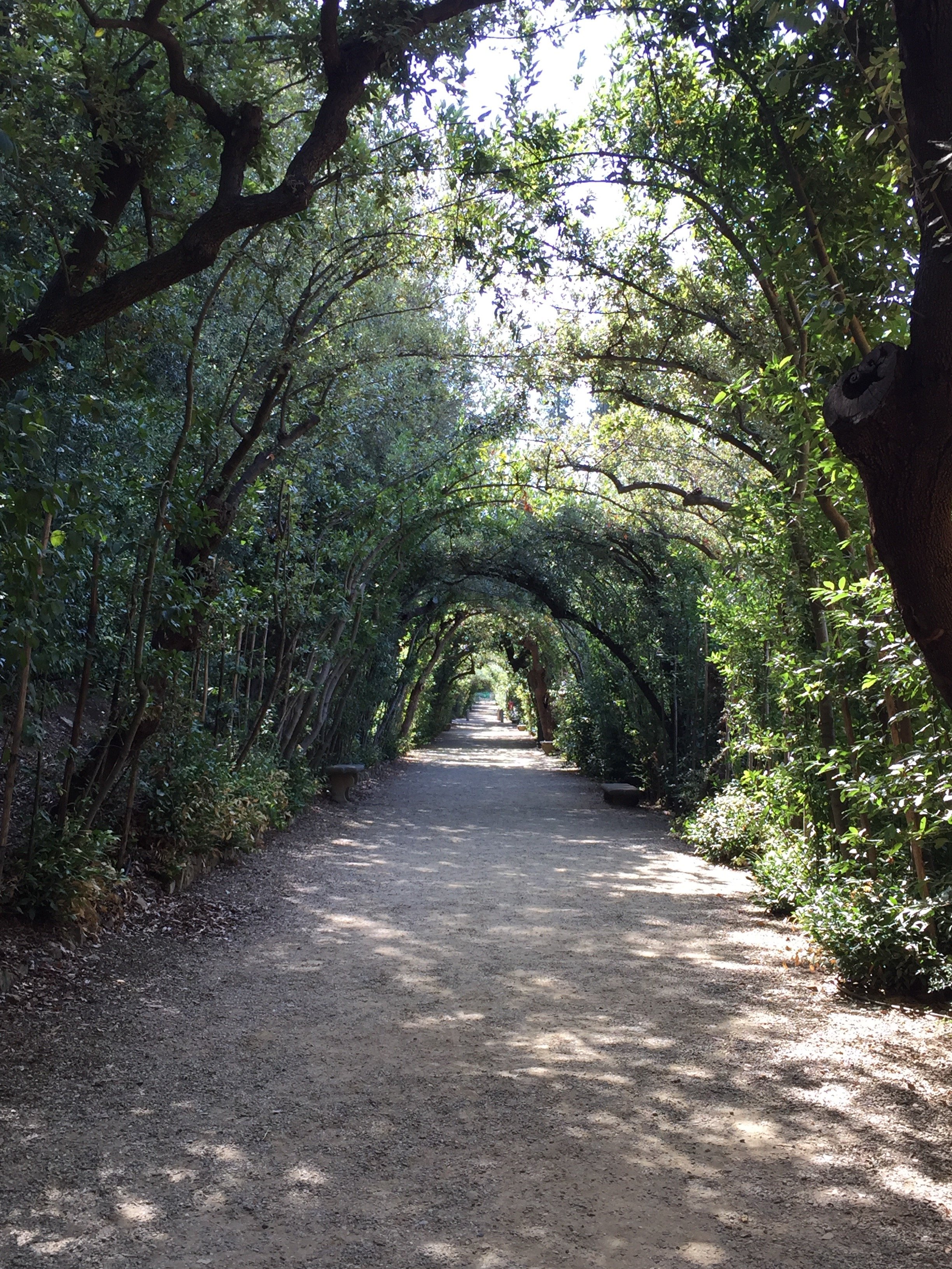
 I met Melinda at Ditta Artigianale for some iced tea and air conditioning. Melinda, an American, used to commute between Paris and Florence. Currently, she lives in Florence full-time. The last time we saw each other was in Rome years ago. We had a lot of catching up to do.The Boboli Gardens were one of the many highlights of the day. It was extremely hot. I wasn't able to take it all in. I must return in fall so I can spend more time exploring.
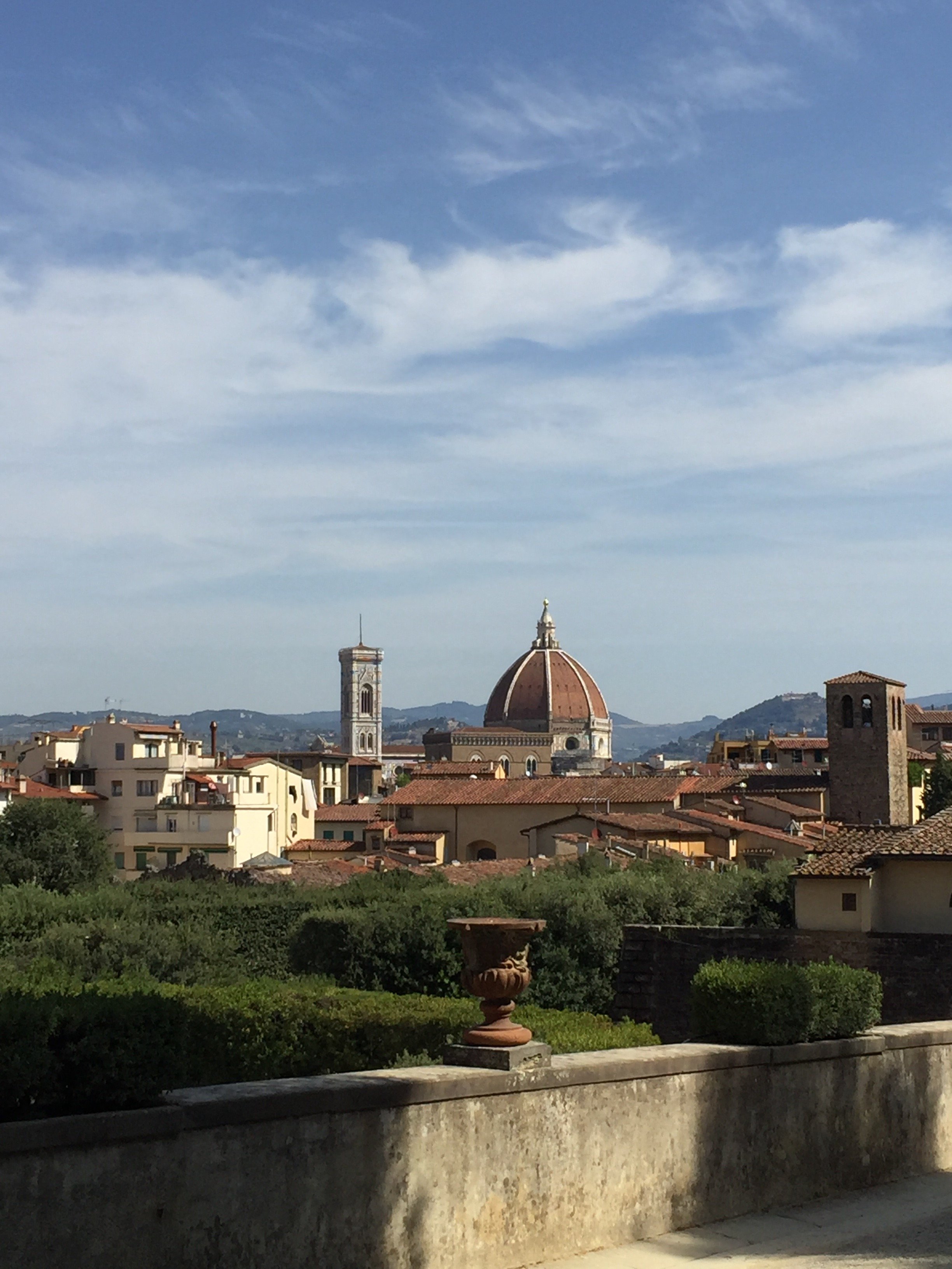
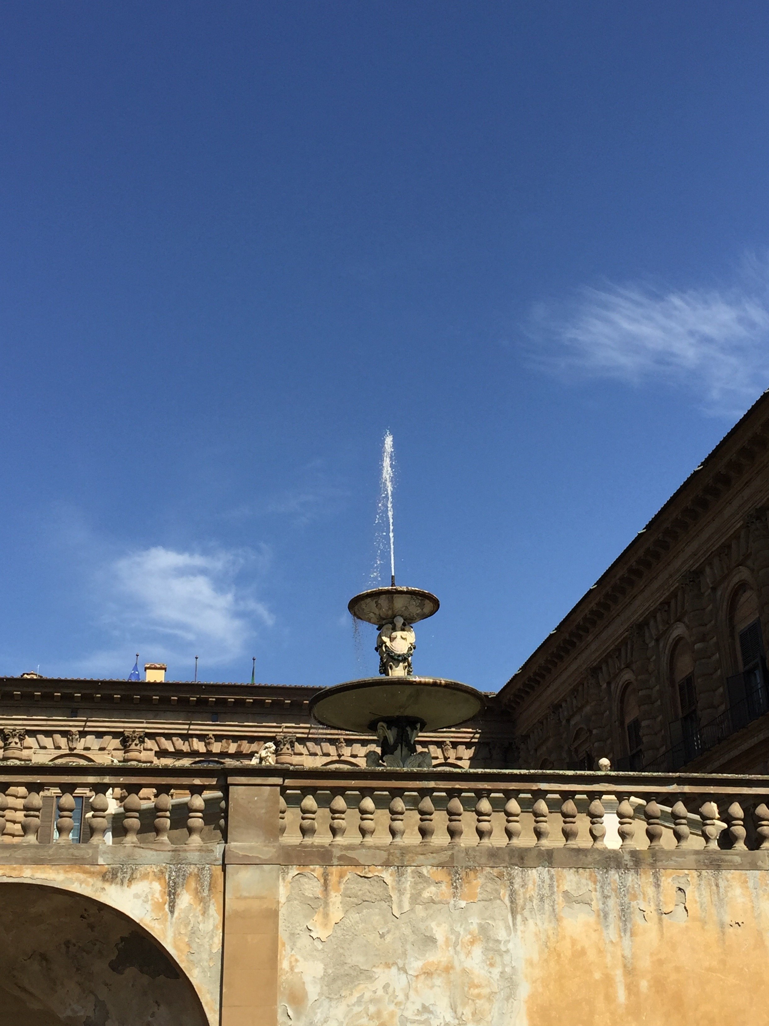

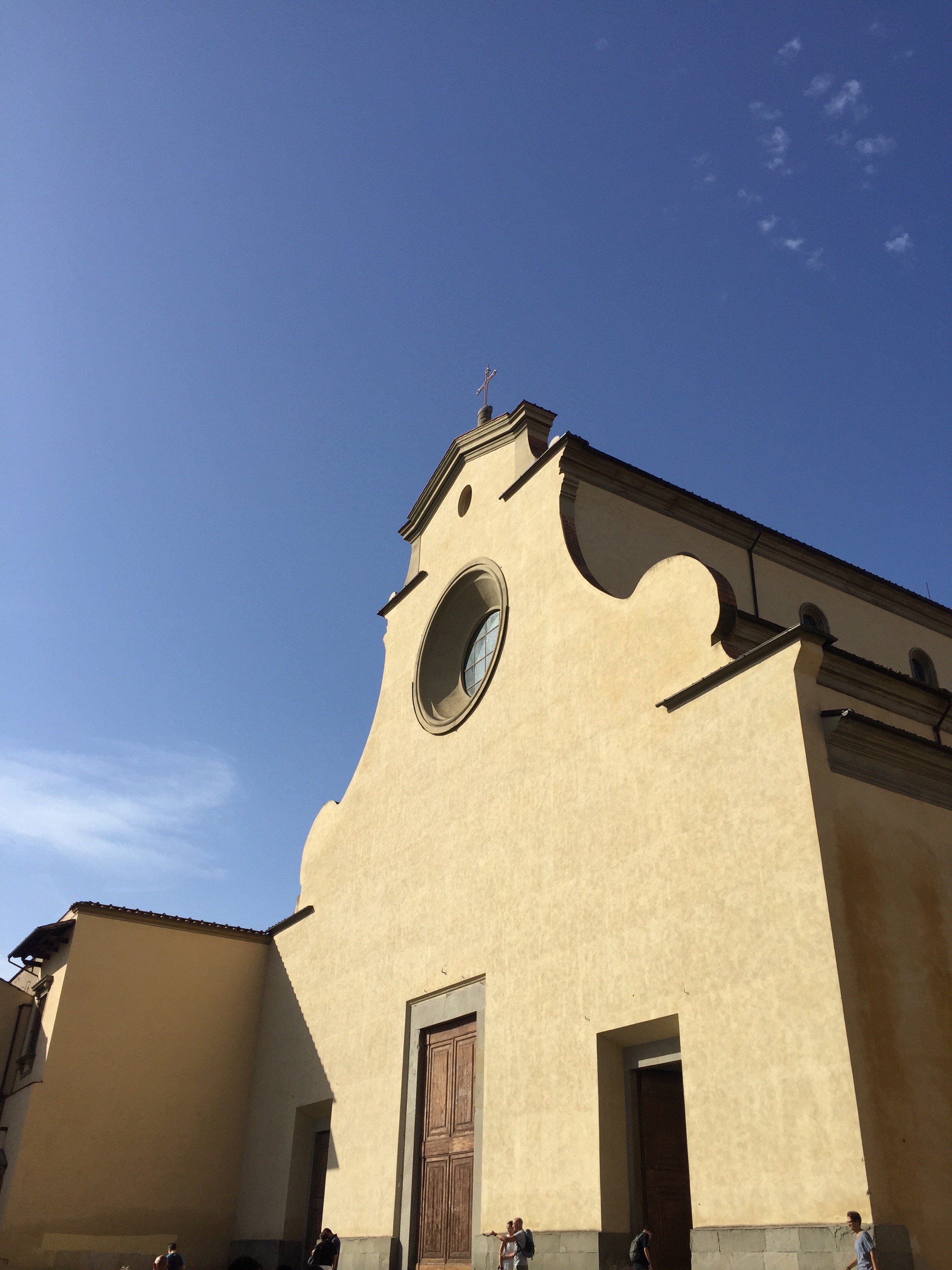
 This was my first time visiting the church San Spirito. No pictures are allowed inside. Trust me when I say it's worth a visit.
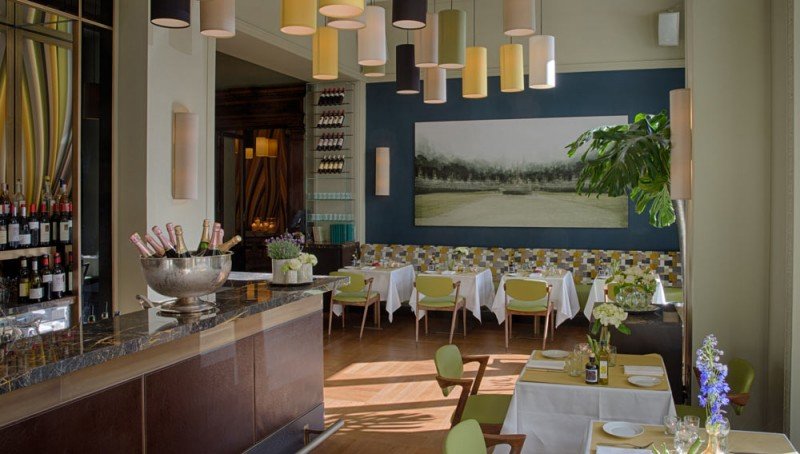
 Georgette has posted a few cocktails from Irene on Instagram and she said the next time I came to Florence we had to meet there. We did. The cocktails were on point and the food was great too.
 I went to the bar super early because I was basically melting in the heat. The bartenders couldn't be more friendly despite the fact that I only ordered water to drink, while watching Instastories, as I waited for Georgette and her friend.Irene is the hotel bar/bistrot for the Hotel Savoy. I loved the vibe with its fantastic interiors and the crowd was a mix of locals and guests of the hotel. It's located right on Piazza della Repubblica in the heart of the Historic Center. The space is named for Rocco Forte's (the owner) mother.
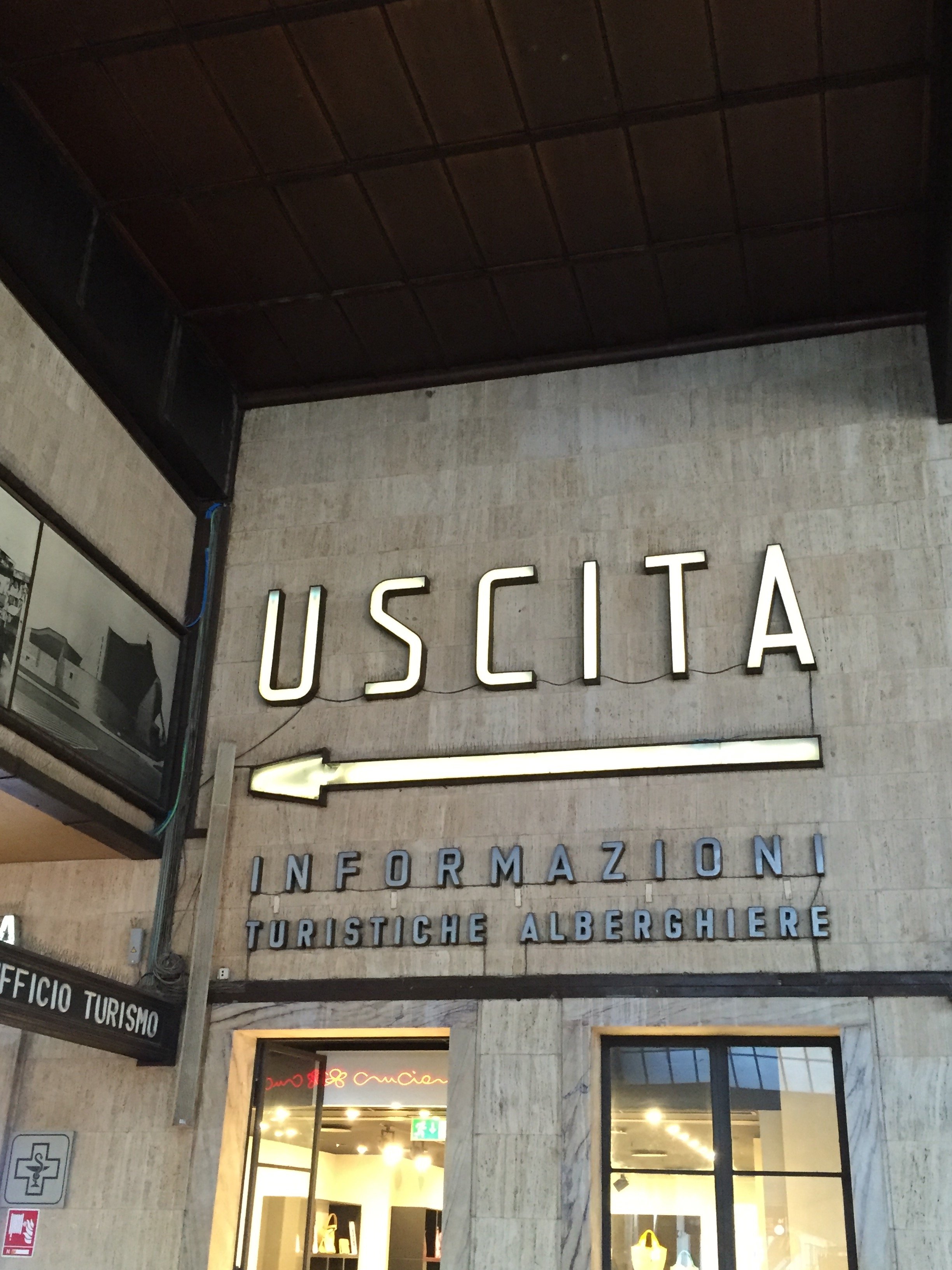
 I took the fast train home. Florence is only an hour and a half train ride away.
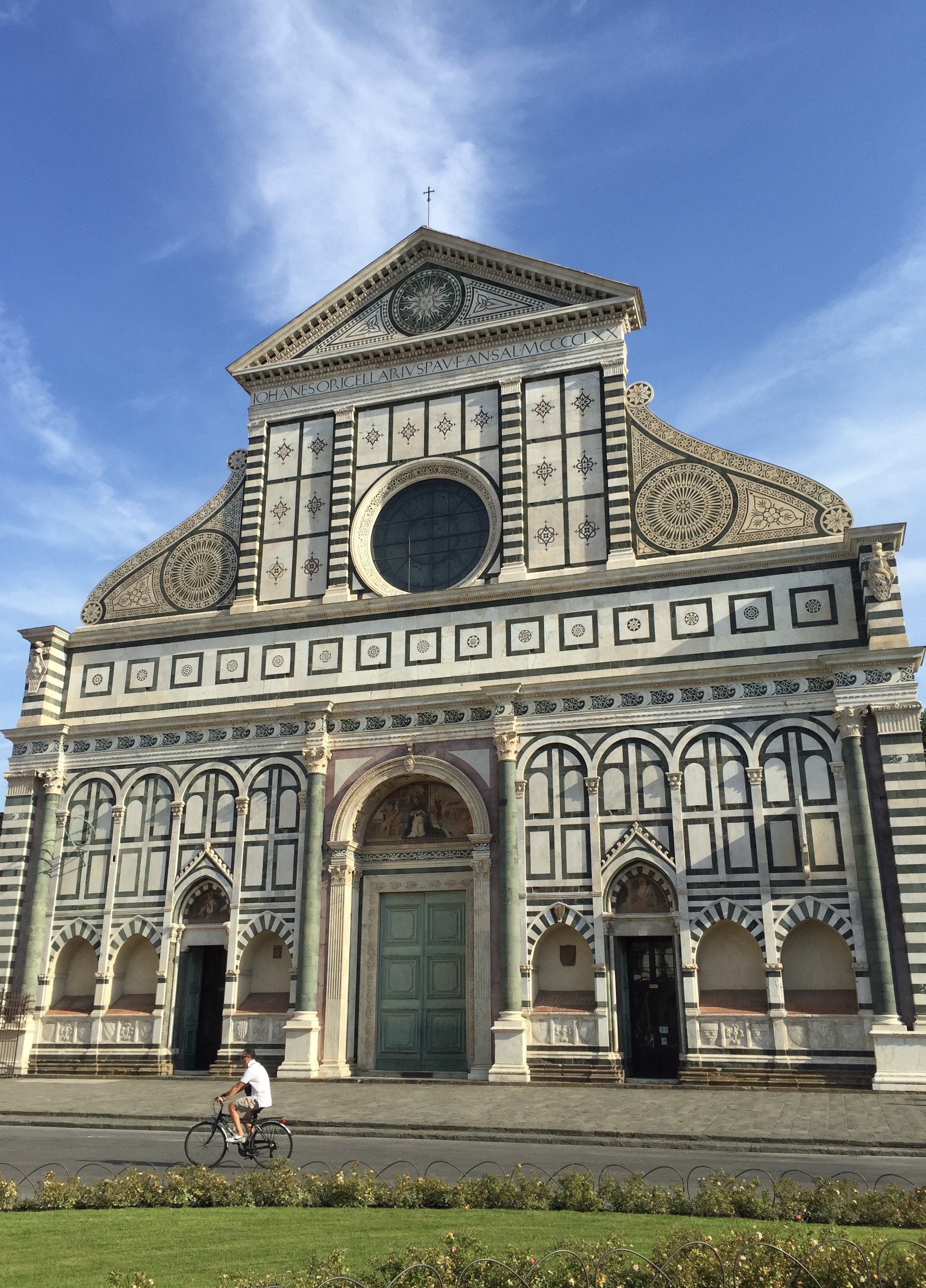
 There are a lot of day trippers, via cruise ships, in Florence. Once the sun goes down the city does empty out a bit. If you can stay longer than a day, I highly recommend it.I definitely felt a different energy during this trip. A buzz, a sense that exciting things are happening on the creative front.I left Florence feeling inspired by all the creative and talented people I met. I cannot wait to return.
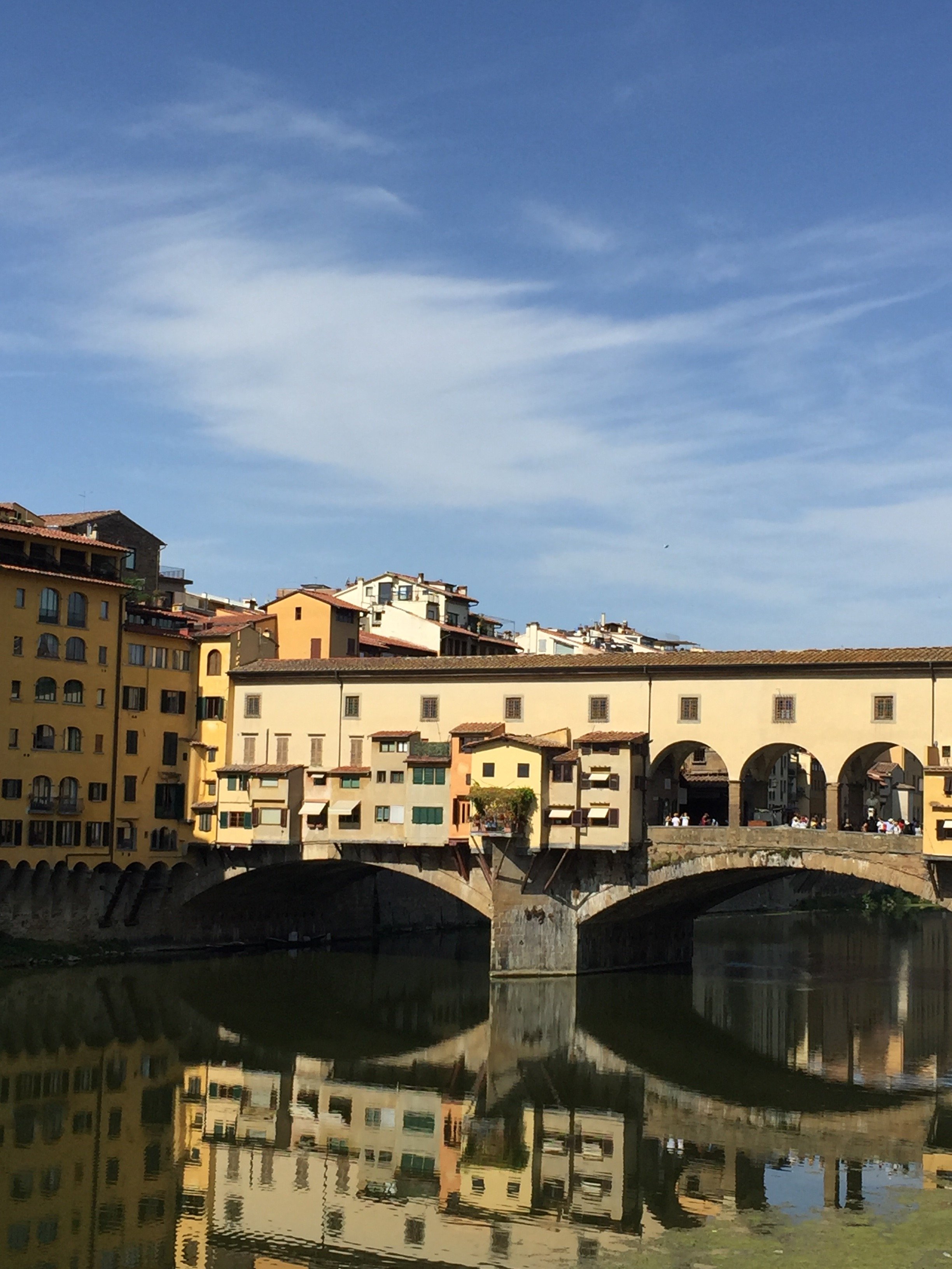 Photos: Me and my iPhone unless otherwise noted.
Life in Rome - Mini-break at Le Méridien Visconti Hotel
One of my friends, who owns a boutique travel agency in Italy, told me that finding four star hotels in Rome is difficult. She said there are great options at the five-star high-end level and at the economical end but there are too many four-stars that are really a three- star at best.Enter Le Méridien. The Starwood Group recently added the Visconti Hotel to its portfolio. The hotel officially reopened this June after a twenty million dollar renovation.I had the opportunity to stay at the hotel for two nights. Before my stay I read reviews online because I'm anal. The reviews were very good except for two things, the air conditioning and the WiFi.Given my stay was happening during one of the worst heatwaves in history and I had several work deadlines, I was concerned.They must have fixed these issues as I'm happy to report I had no problems. In fact the A/C was so strong I had to turn it off. My fellow Americans, you know that NEVER happens in Italy.The hotel is located in Prati. It's a few minutes walk from Piazza Cavour and in the other direction (a slightly longer walk), Piazza del Popolo. I think it's a perfect location. You're near the Historic Center but not smack in the middle of it and the prices reflect this. The area is centrally located as Piazza Cavour is a major bus hub. For those who like to walk, you can cross the river and be in the heart of the Historic Center in ten minutes.The roof terrace is fantastic. Sometimes there are annoying loud seagulls who like to wait for people to leave and then dive in for the food. The waiters are on top of it though. Seagulls 0.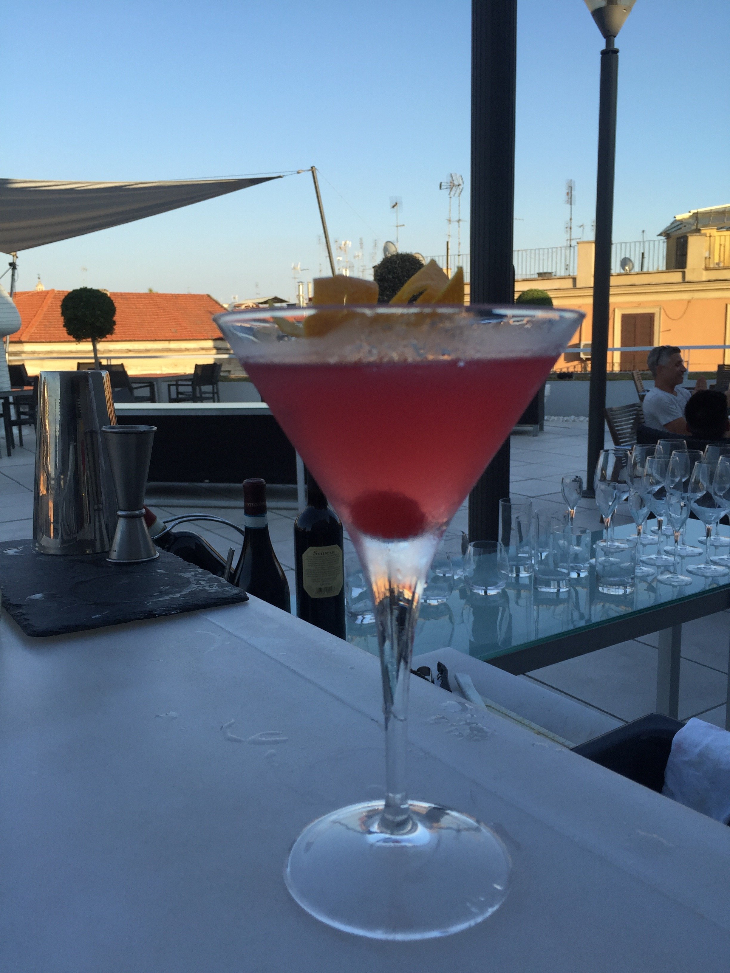

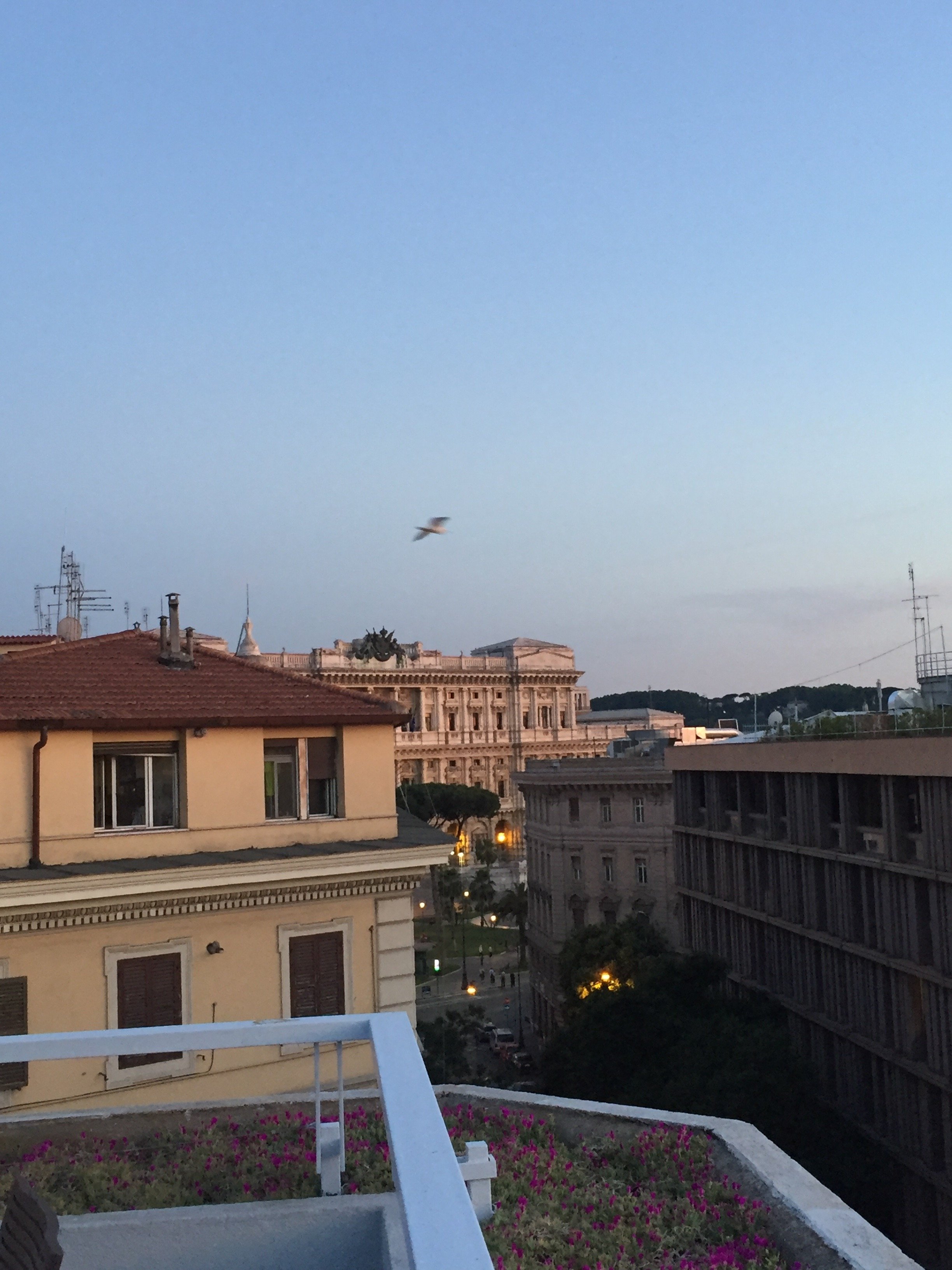 Service was great. Granted some of the employees at the hotel have seen me a few times but that wasn't the case with the check-in. I thought they were friendly. There was a small line when I arrived but it moved quickly.Location, price, design, of course all these things matter but when I stay in a hotel there are two things that are extremely important to me. Cleanliness. I cannot stand clutter and dirty bathrooms or kitchens freak me out. I don't want to step into a hotel bathroom and see hair in the drain. Just typing that made me feel queasy. The other thing is the bed. It must be comfortable.My room was spotless and the bed was excellent. The toiletries are Malin & Goetz. I was so geeked out to see them because no retailer in Rome sells these products. I checked the website and there is a store in Milan that carries them. I muust remember this important information for my next trip.
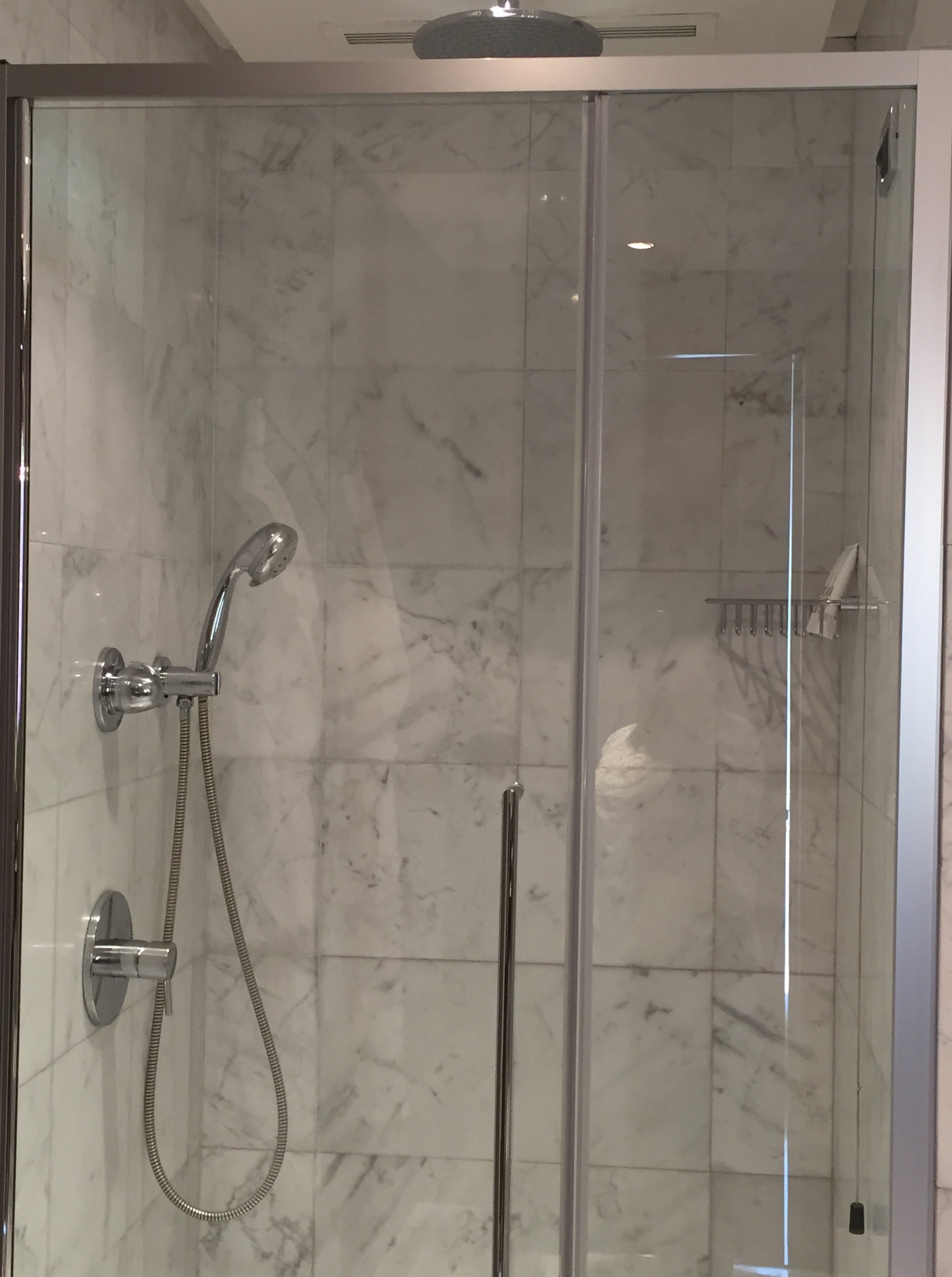
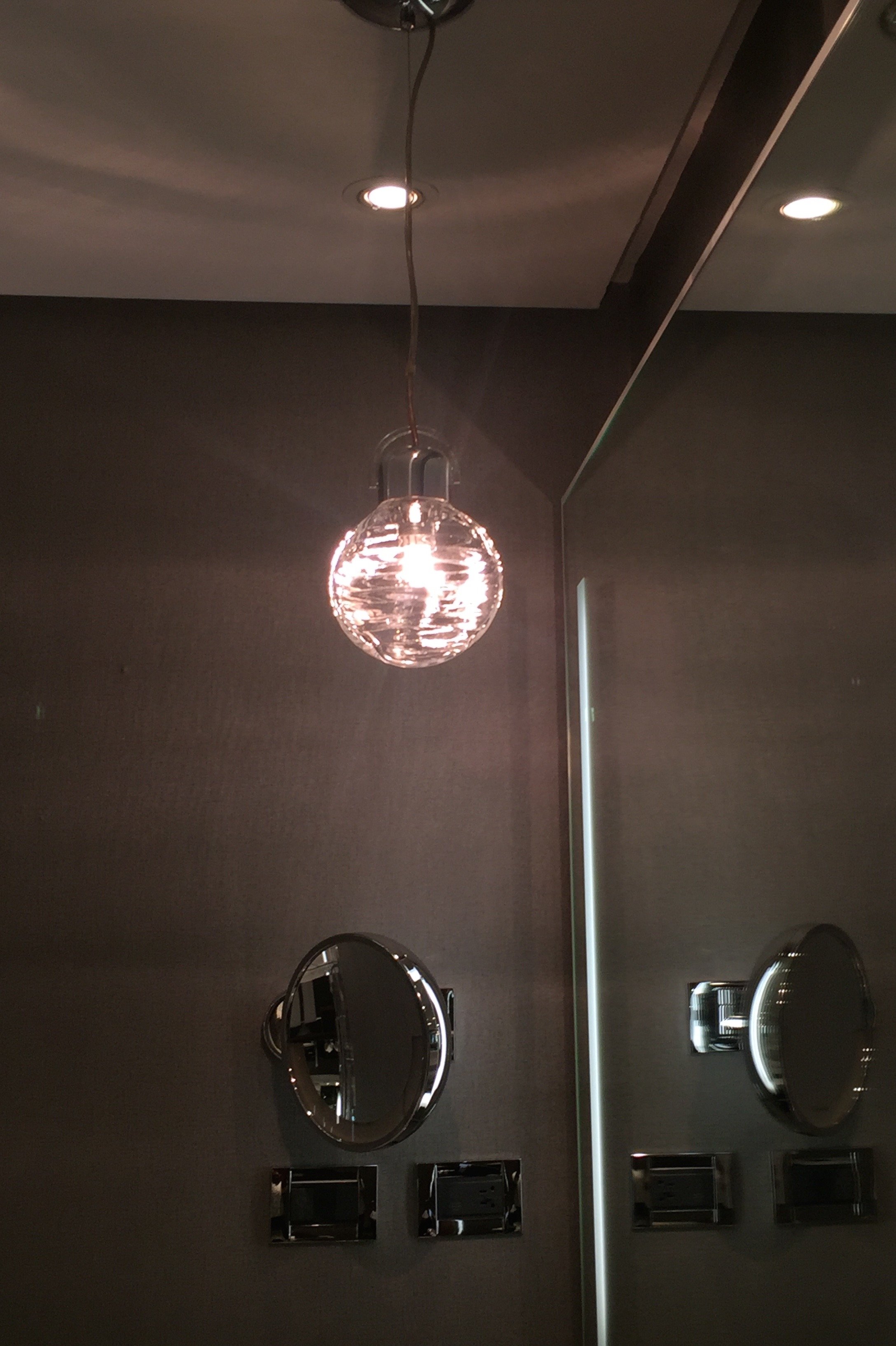
 The interior design has mid-century touches that also speak to the hotel's location in the Eternal City. The head designer was Harry Gregory of the firm, ara Design International. They wanted to create something timeless.I adore the pared down use of marble, a material synonymous with Italy and Rome. I think too much marble can make an interior feel cold. At the Le Méridien it's warm and dramatic.The neutrals of grey, black, and white, with splashes of color, are relaxing and chic. The Longitude 12 Bar and Bistrot is a great place for a coffee during the day and for cocktails at night. The Bistrot also has a delicious lunch and dinner menu and starts serving wine around noon.In the Bistrot there's a communal table that has outlets for your laptop and phone adapters.


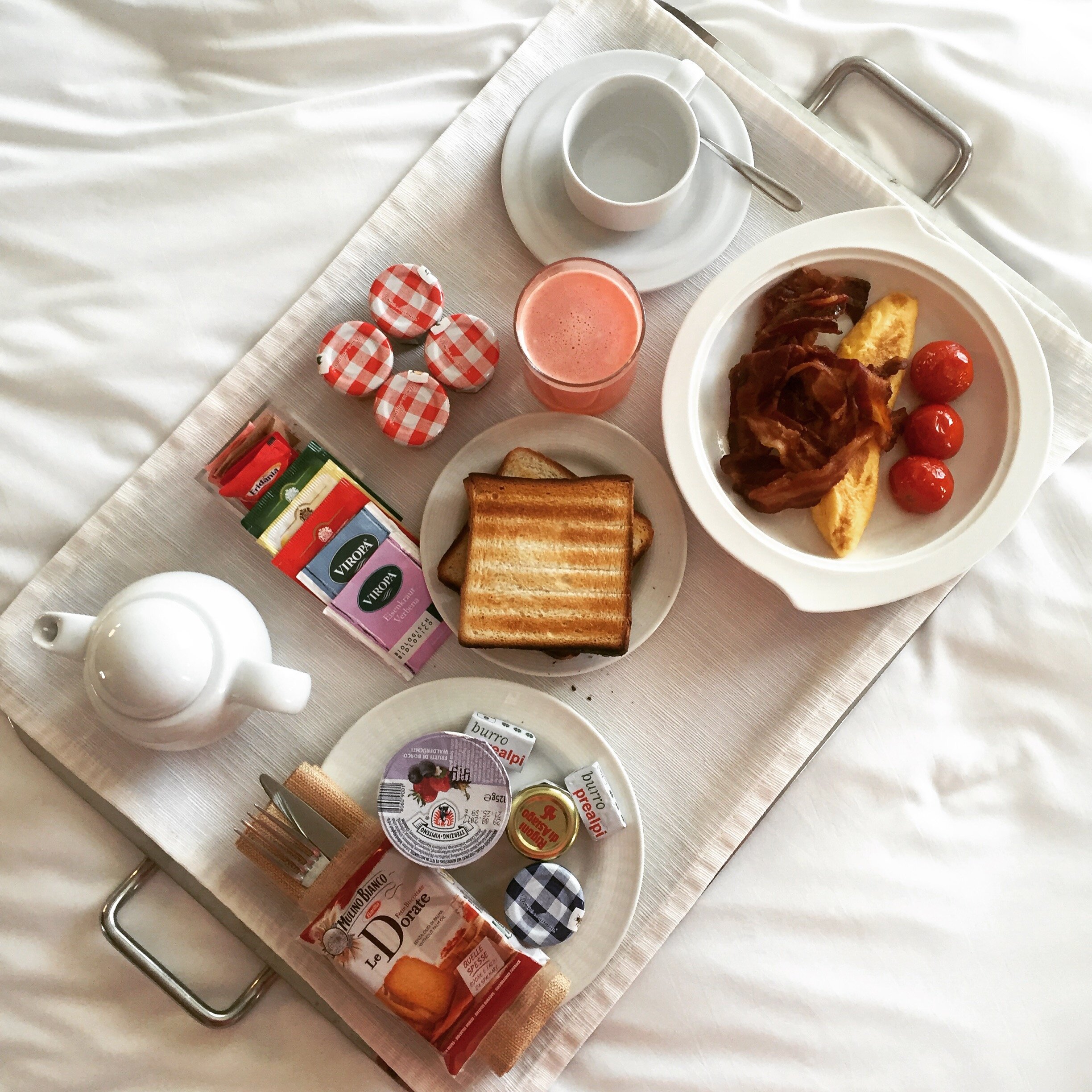
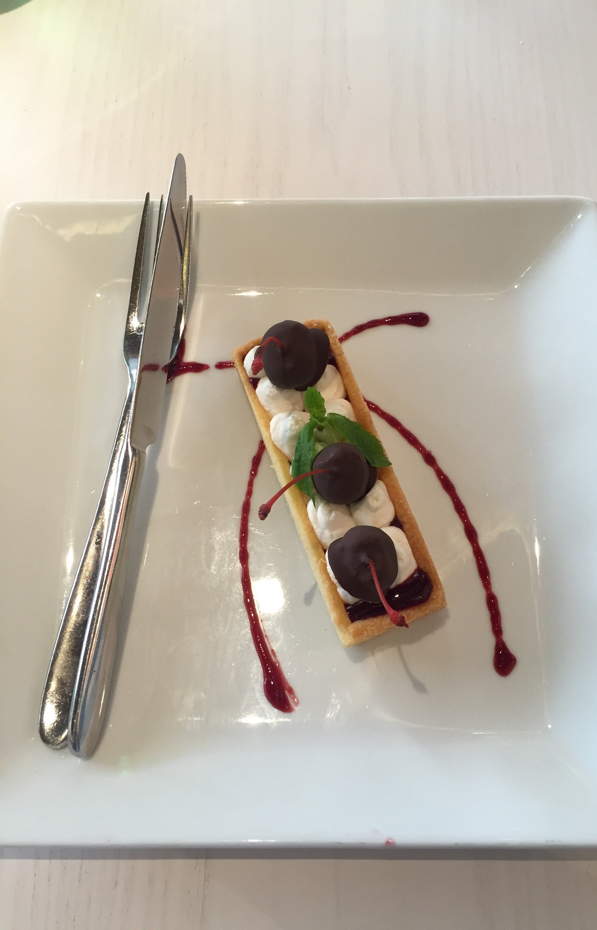 Downstairs, there was a wide selection for breakfast, including American bacon. I repeat, there was American bacon.
 The hotel has an eclectic art collection, from abstract to figurative pieces, created with different materials. These artworks are from the private collection of the Toti family. Their collection focuses on Italian artists from the 1980s. When people think of Rome they often focus on classical art. It's wonderful to see some contemporaries pieces as well.
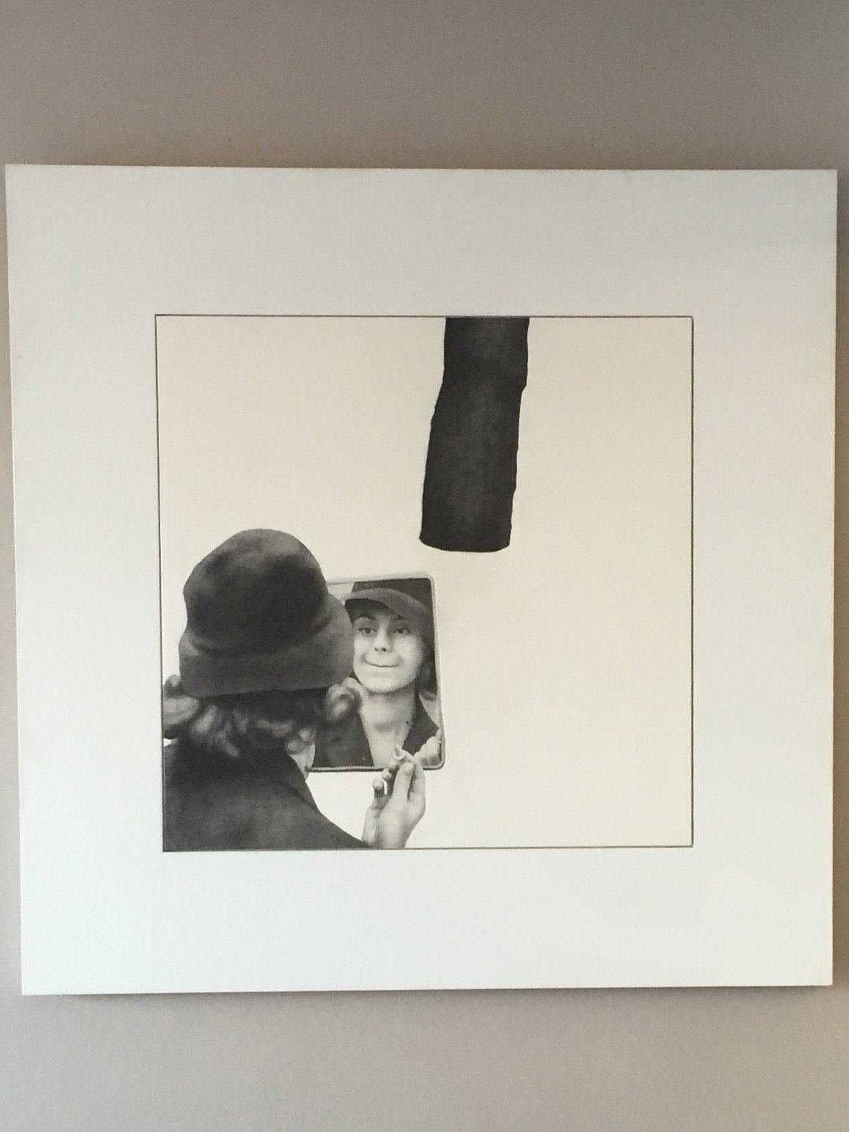
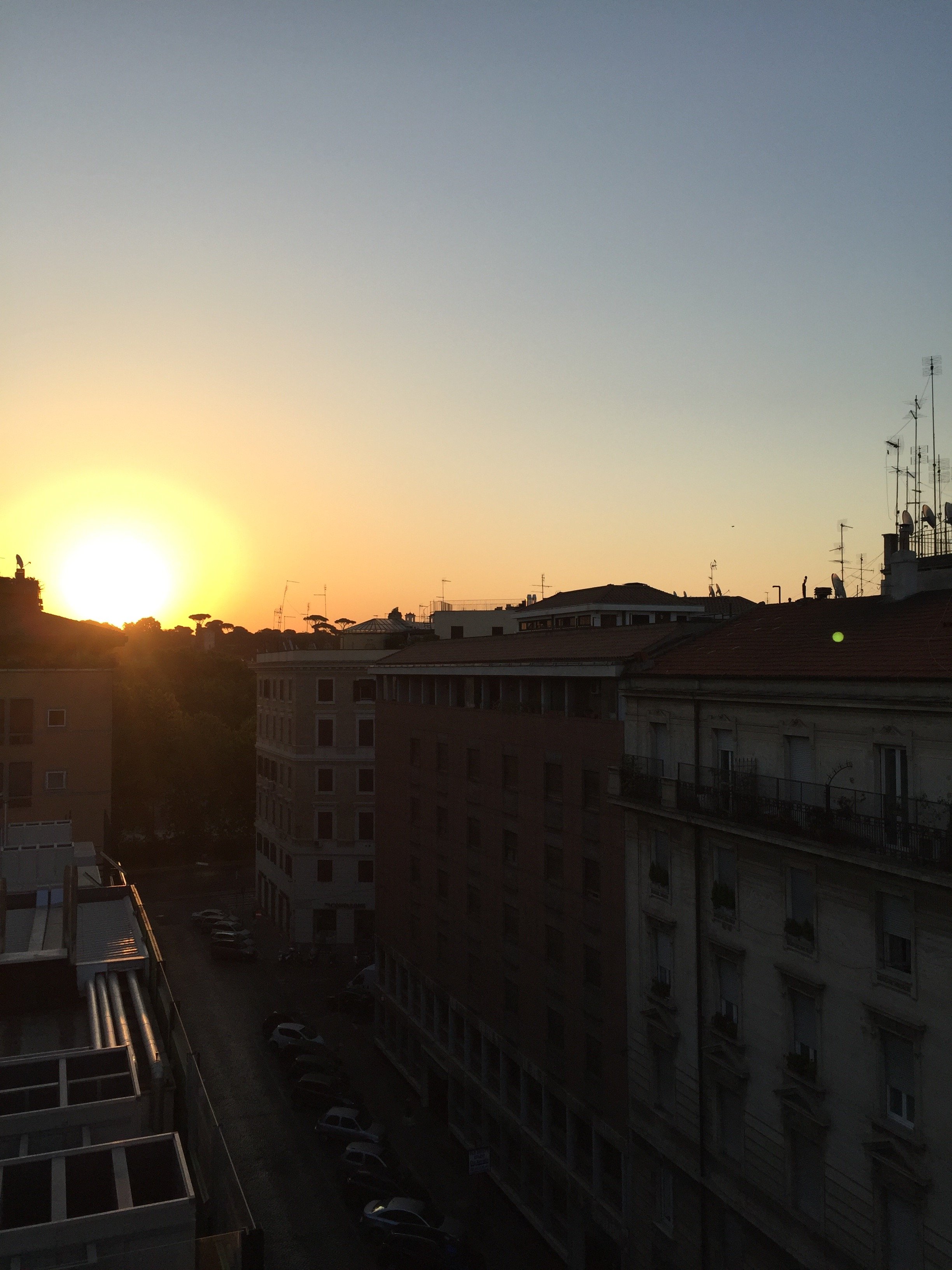 The gym is small but well-equipped with Technogym equipment. Did you know Technogym was an Italian company? I saw this brand in high-end gyms in New York City and Los Angeles and had no idea until I moved to Italy. Mind blown.I stayed at the hotel in early August but have been stopping by since April. This is not official market research but it seems to me that the hotel is very popular with couples, families, business travelers, and friends traveling together. I didn't see too many solo vacation travelers but I've always felt welcomed thanks to the friendly service.Photos: Me and my iPhone. Disclaimer: I was a guest of the hotel. However, opinions and thoughts are my own.
A Weekend in Tuscany's Val d'Orcia Region
The Val d'Orcia region of Tuscany is a protected UNESCO World Heritage site. Located south of Siena, it's home to some of the most gorgeous vistas in Italy. I cannot wait to return.The first night we stayed at La Bandita.
 We arrived just in time to drive back down the steep hill to have lunch at Dopolavoro. Originally built by the Origo family in 1939, it was the meeting place for the workers on the La Foce estate. Dopo lavoro, translated to English, means after work. During the war locals came to watch news reels. The Origo family still owns the La Foce estate and opened the restaurant (after a lengthy restoration) in 2012.
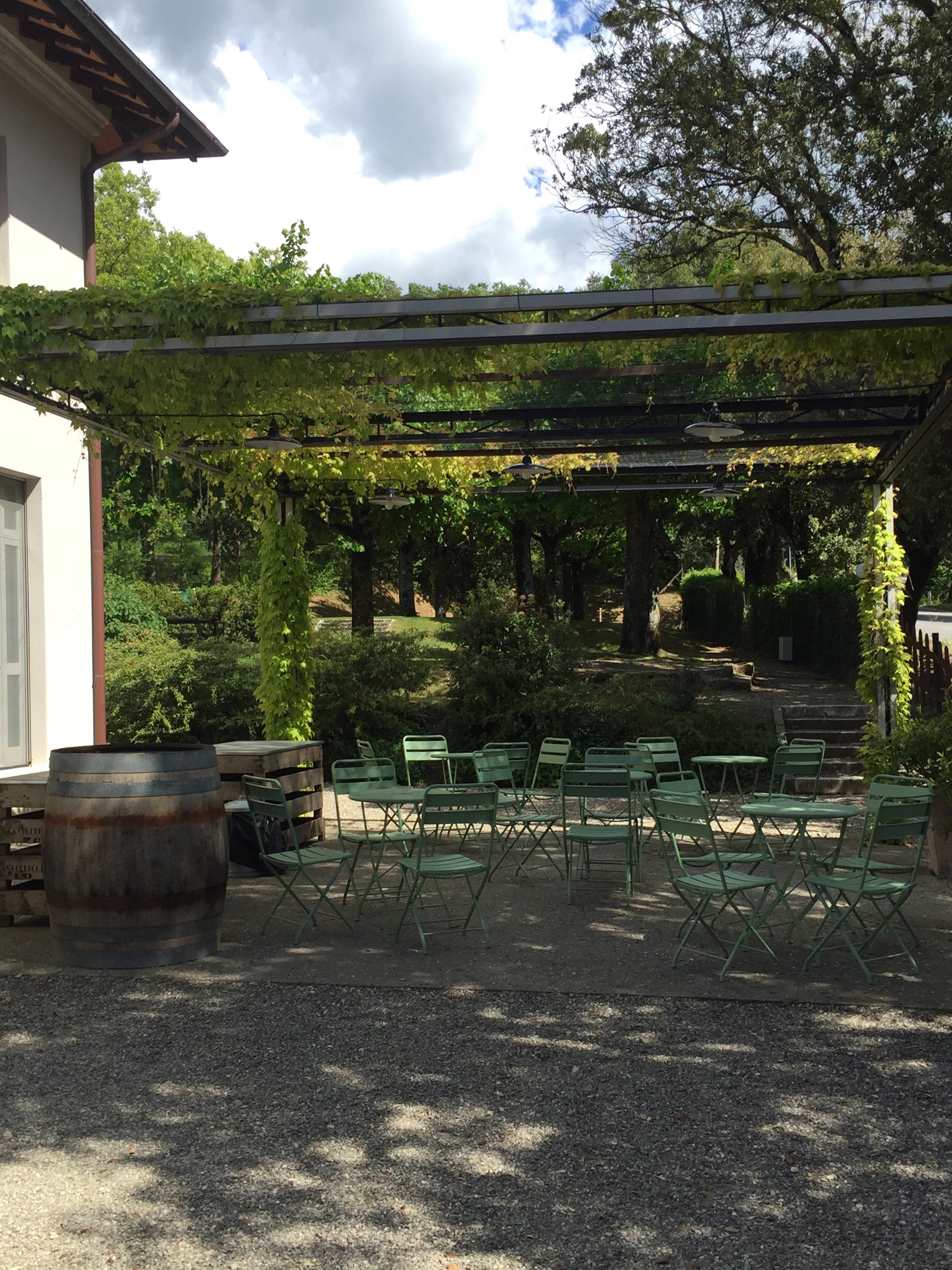 Our lunch was excellent. Annalee doesn't eat meat and found plenty of dishes to choose from (not so easy in Tuscany). The restaurant has a large vegetable garden and uses olive oil from the estate. On a design note, it was perfection. Great service too.
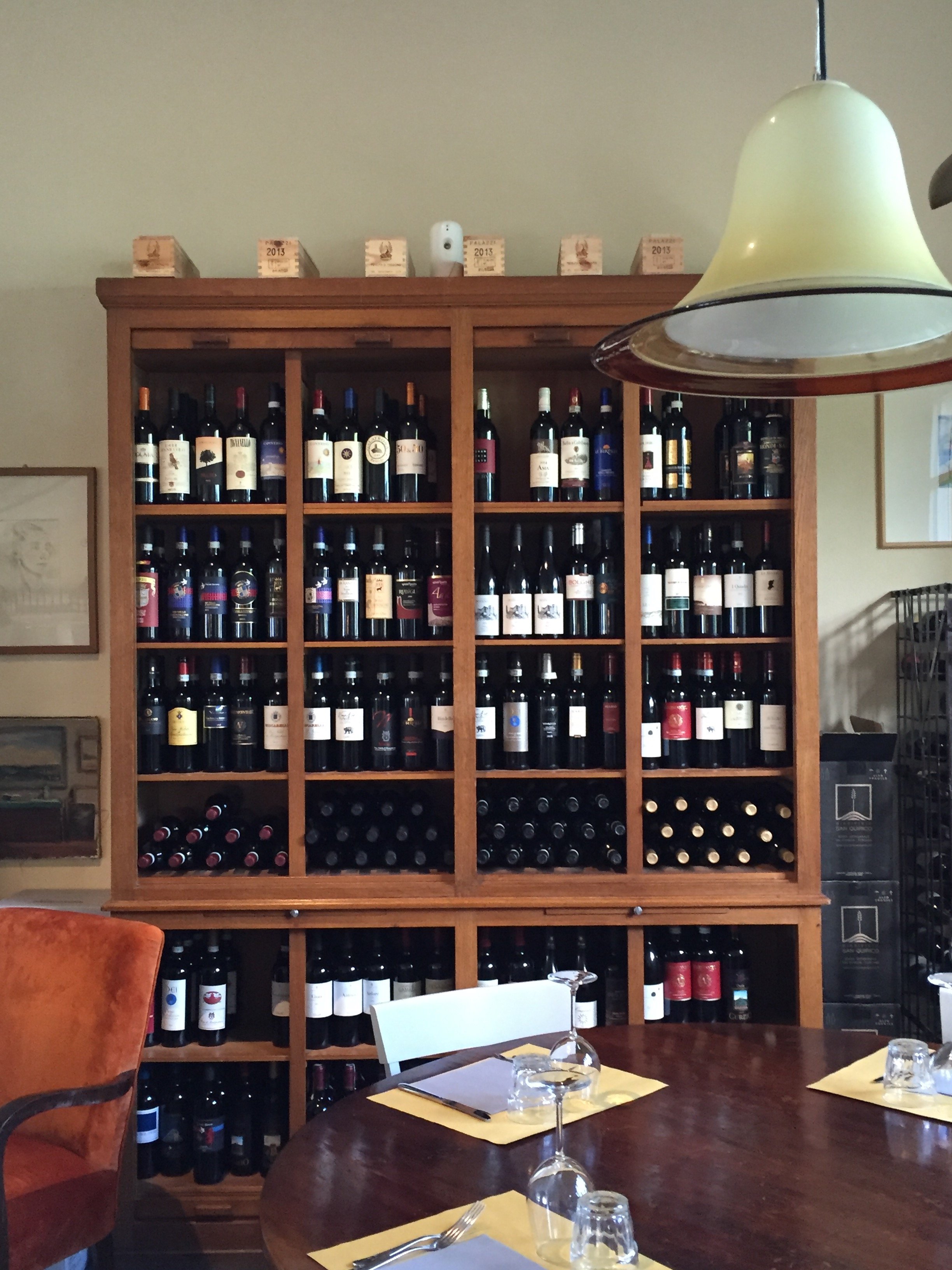
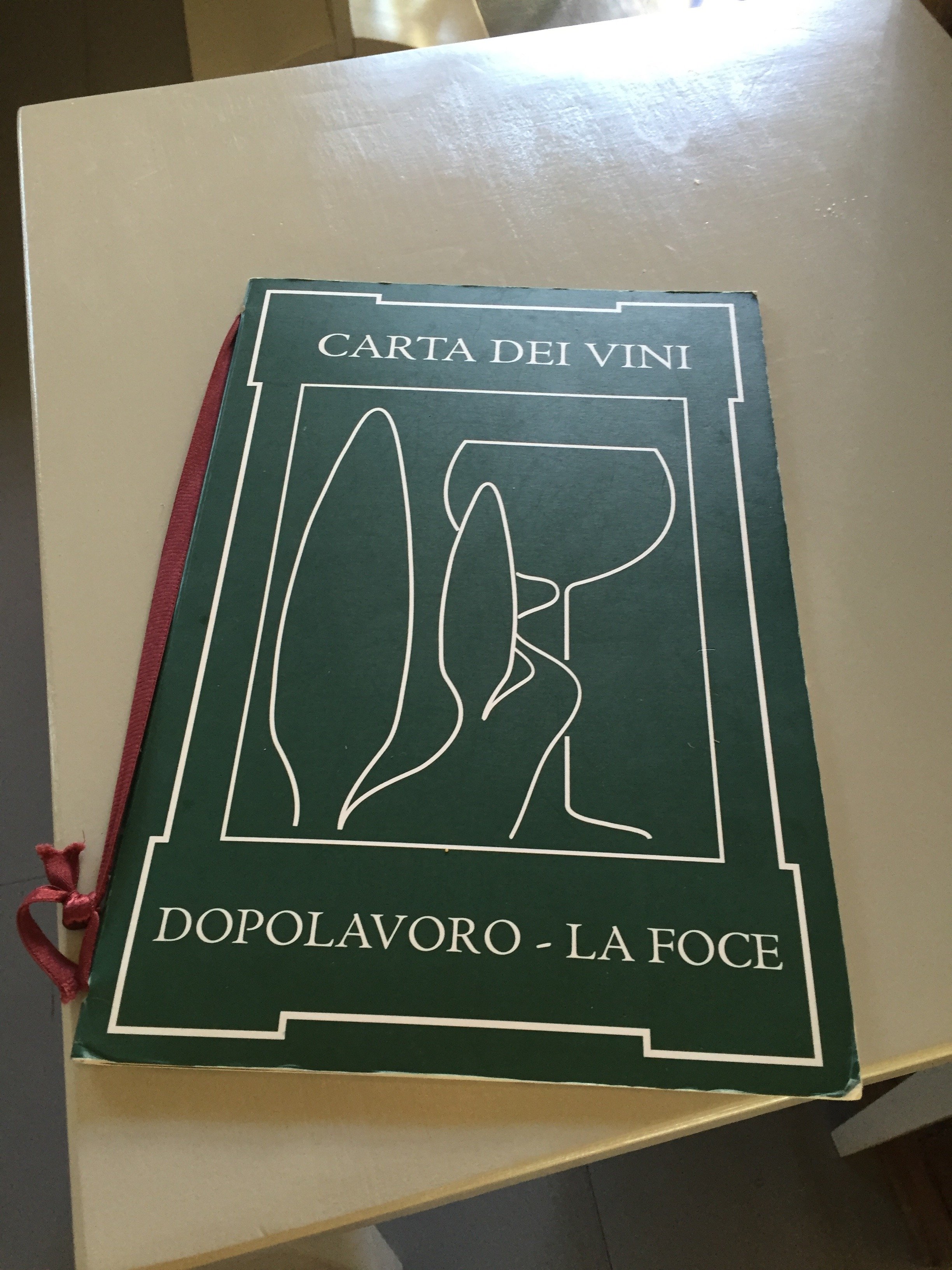
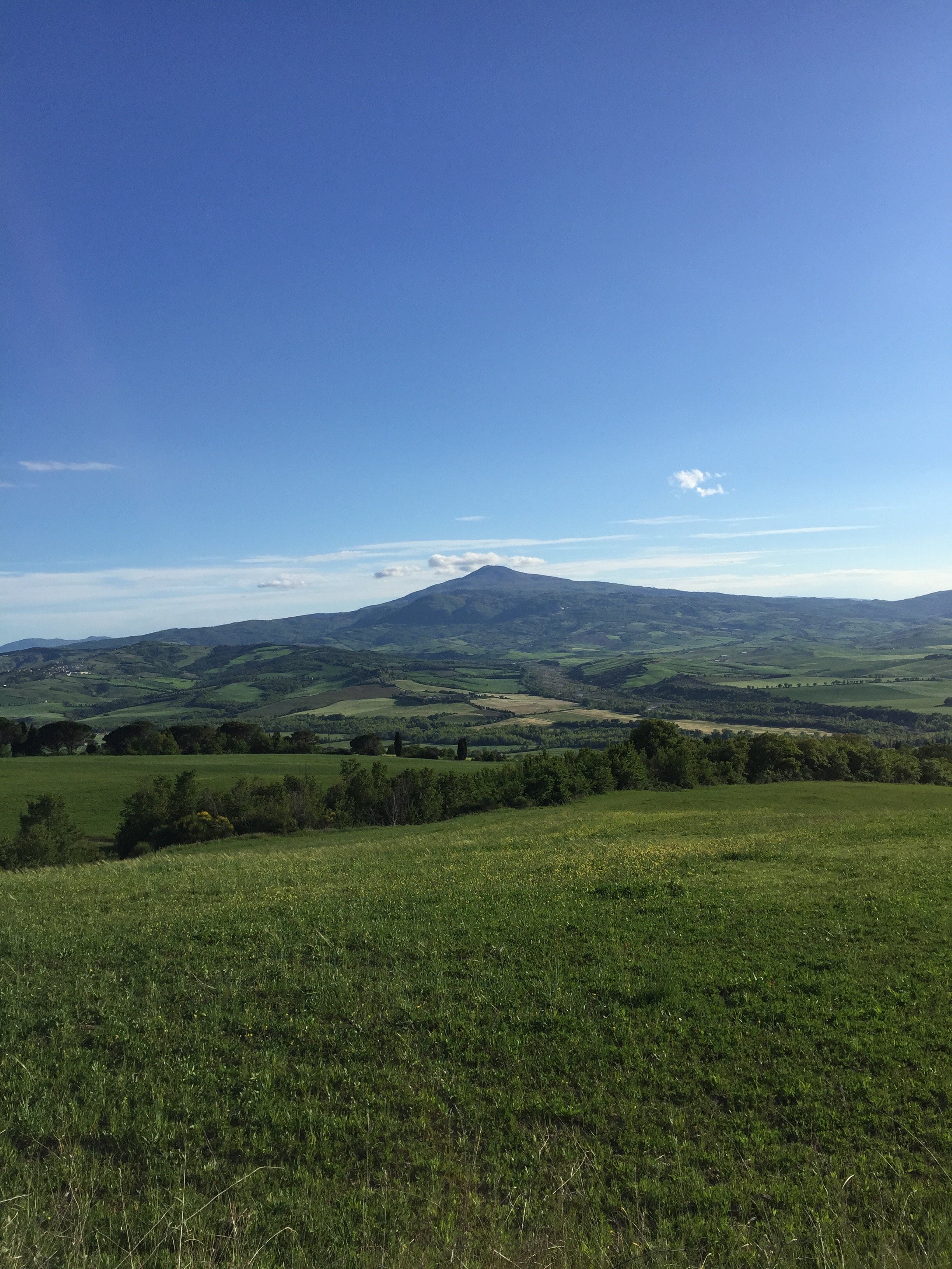
 We decide to take a power walk before dinner. I'm relieved we missed the family of boars spotted by the other guests. I don't know why boars freak me out. Maybe because they're wild animals and the adults are massive? I love being out in country but not really a fan of bugs, snakes, and such. I know this is not logical.
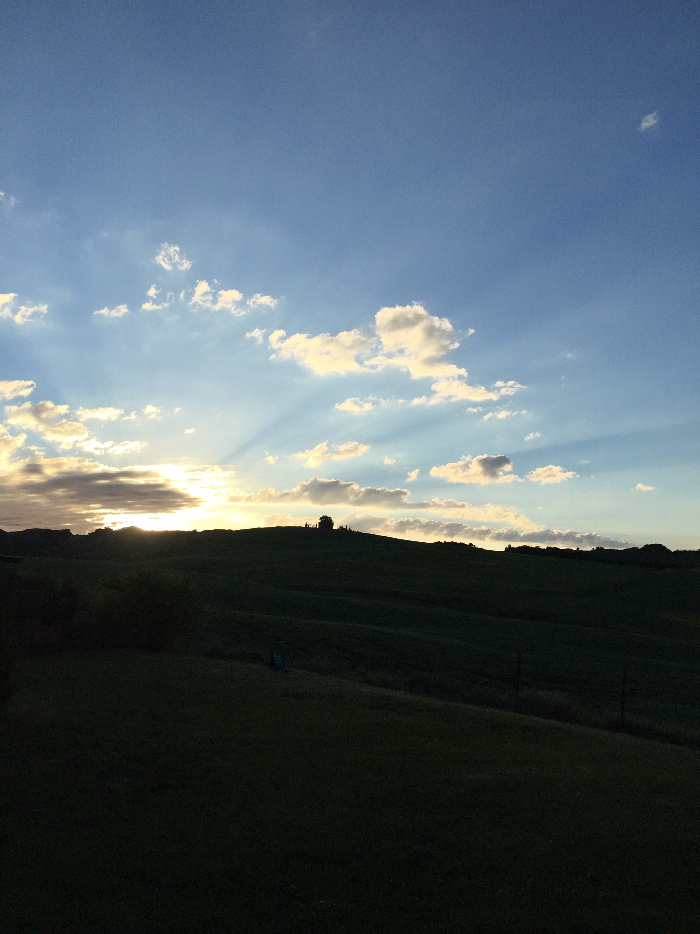
 During dinner we met an American couple and a young couple from Poland who had recently become engaged. We had a wonderful time. The conversation flowed and the food prepared by Chef Dario was delicious. You never know with communal dining. I got a little nervous once politics came up but it was fine. Most of our discussion centered around, food/wine, travel, and the places we've visited so far in Italy.It began to rain so we couldn't light the large fire pit. Tears. Instead we went old school and played records. John, the co-owner of La Bandita, is a former music industry executive and has quite the eclectic collection of vinyl. I found an Earth, Wind, and Fire LP and it was a wrap. EW&F is one of my favorite bands. I side-eye people who tell me they dislike them as their catalogue is pretty deep. Perhaps they do not like music, period. Or maybe they don't like R&B or soul/funk? I met a person who told me they couldn't stand EW&F. This person was also a black American Gen-Xer. I was so shook, I didn't even know to say.I cracked up when Annalee started line dancing with Chef Dario and his colleague Paolo. It was the perfect way to end a spectacular day.The next morning, I woke up at my usual time and watched the sun rise. All I could hear were sheep and roosters in the distance. Paradise.
 During my run before breakfast, I was trying to figure out when I could return La Bandita.
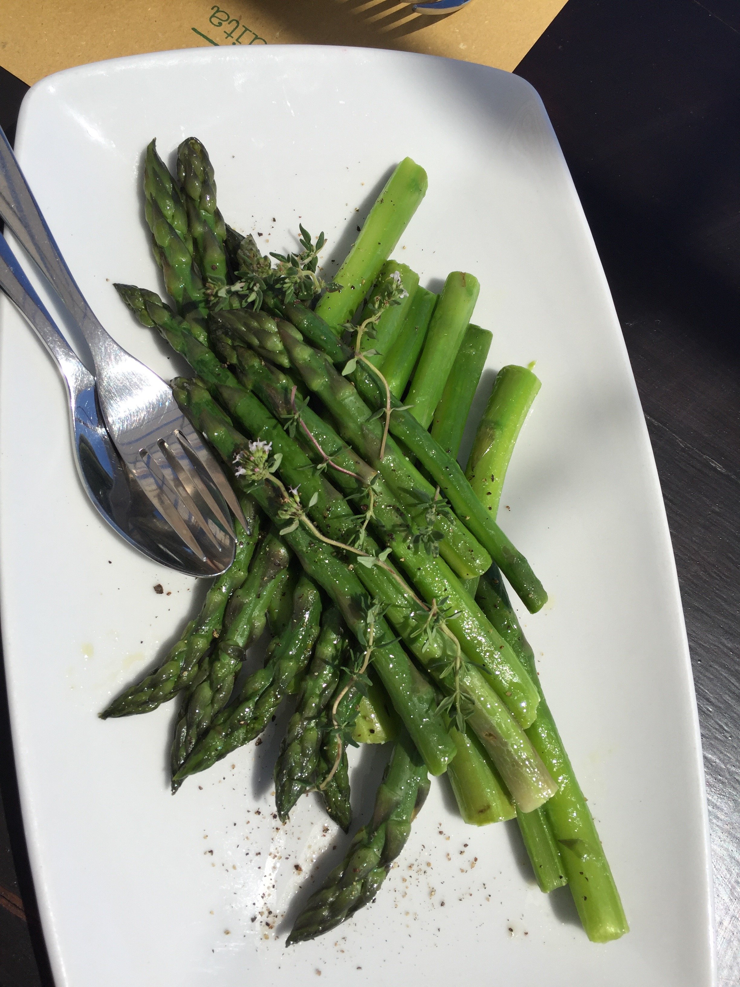
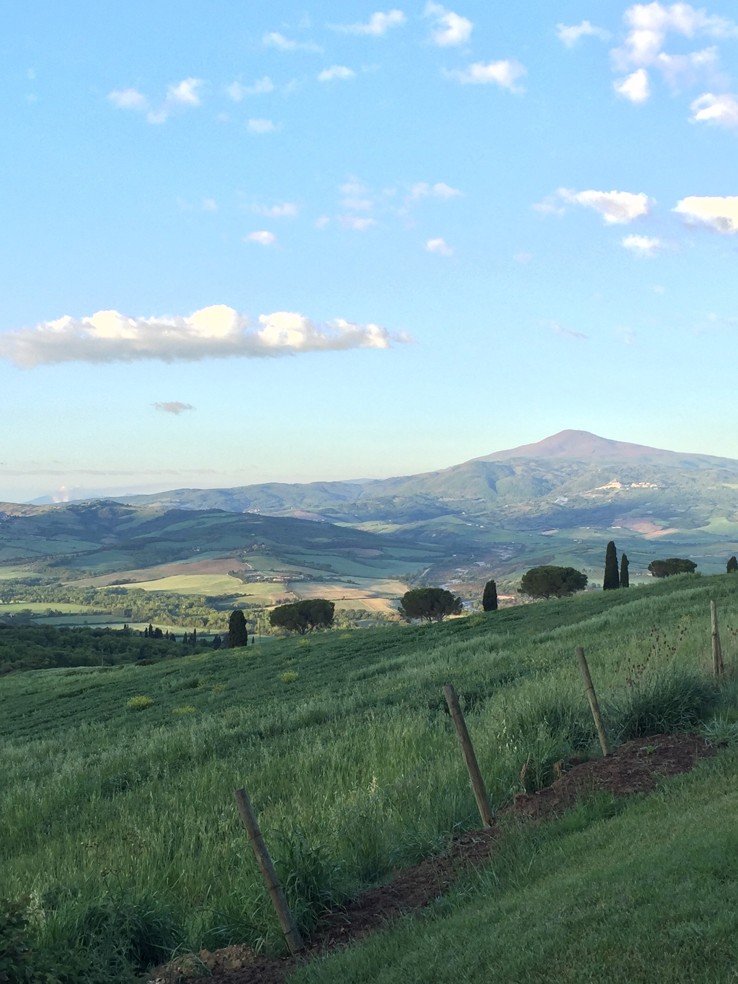 We decided to have lunch at the Countryhouse before driving to the Townhouse in Pienza as it was the nicest day of the weekend. It was delicious, and very pretty.
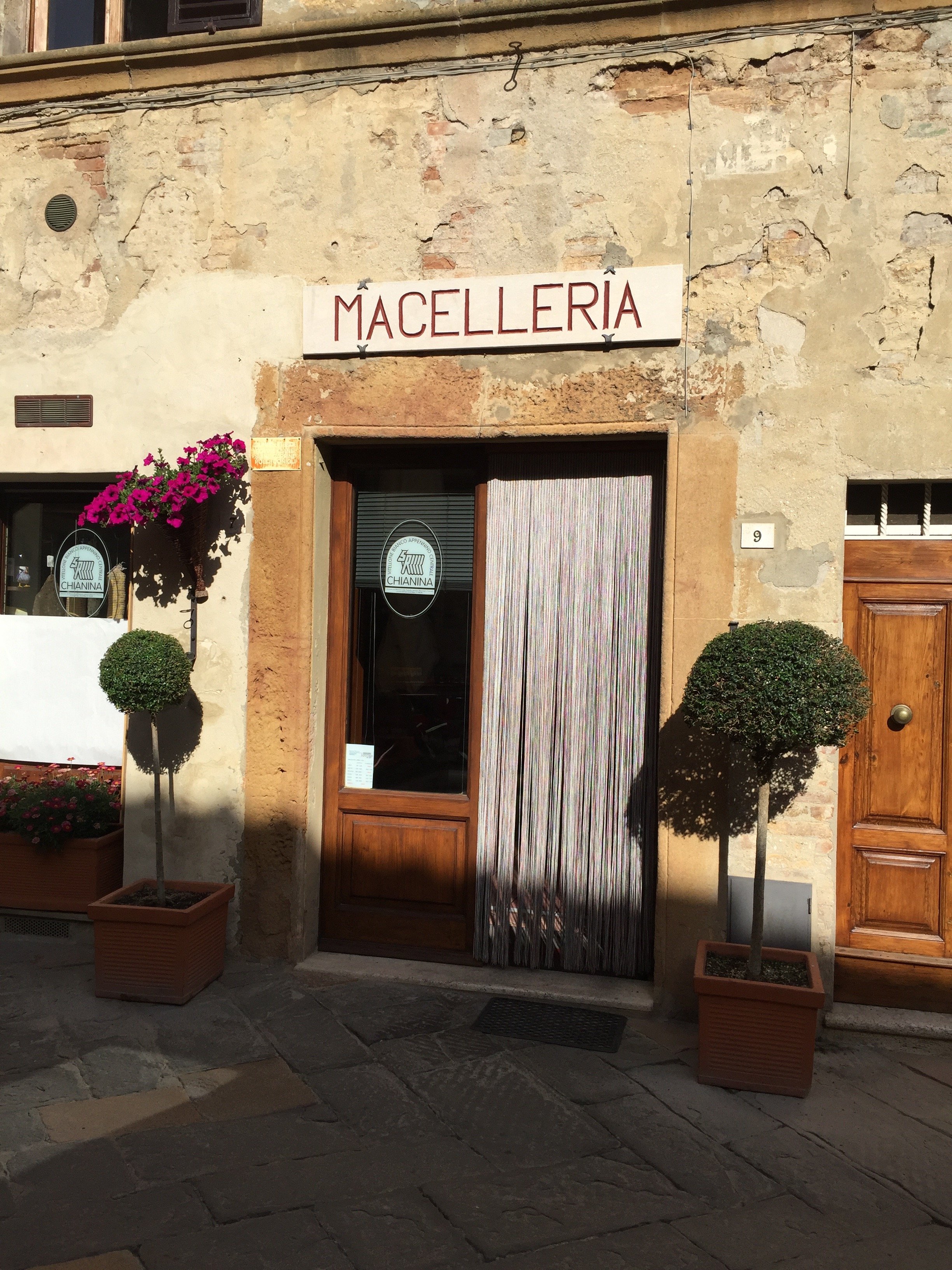
 I've been to Pienza before but it was Annalee's first time. I adore this small hill town.


 The first time I was there was during the dead of winter. This time around Pienza was crowded with large tour buses dropping people off. However, once aperitivi hour arrived, it cleared out a bit. We met Ondine (co-owner with John of La Bandita) for an aperitivo at a new place in town. The views were just ridiculous. Hello, is this real life?
 The next morning I did a quick workout before the rain arrived.

 Annalee and I got completely lost, in the pouring rain, looking for Monteverdi. It was worth it because we ended up driving through a stunning nature reserve.I was excited to finally see Monteverdi. Ilaria Miani was the interior designer and I had interned in her showroom. I couldn't want to see the spaces, that were floor plans during my internship, in person.American Michael L. Cioffi started buying and renovating villas in the village of Castiglioncello del Trinoro in 2003. He and Ilaria have created a special place that respects the history, culture, and beauty of the borgo while restoring it, a difficult feat.


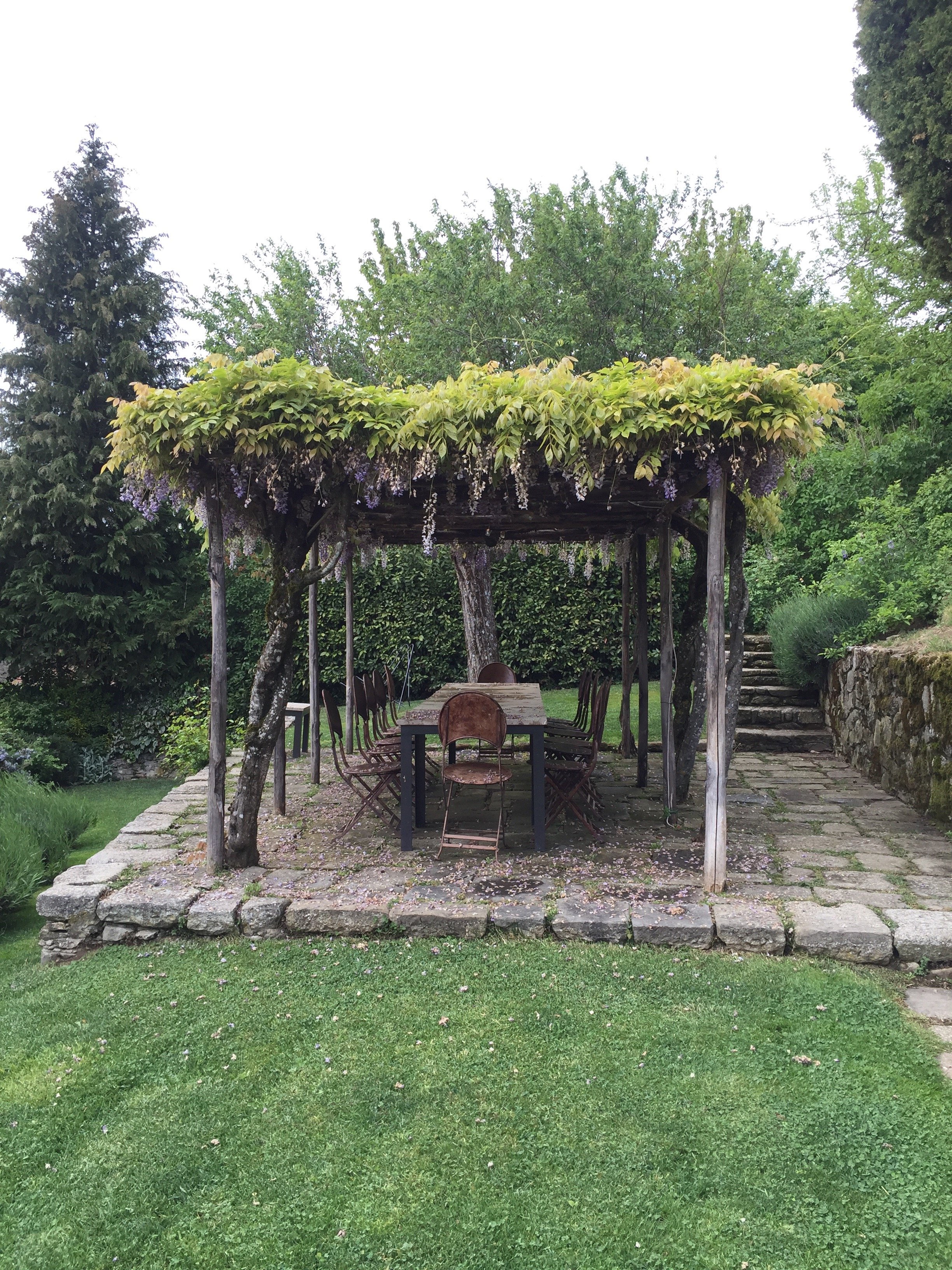
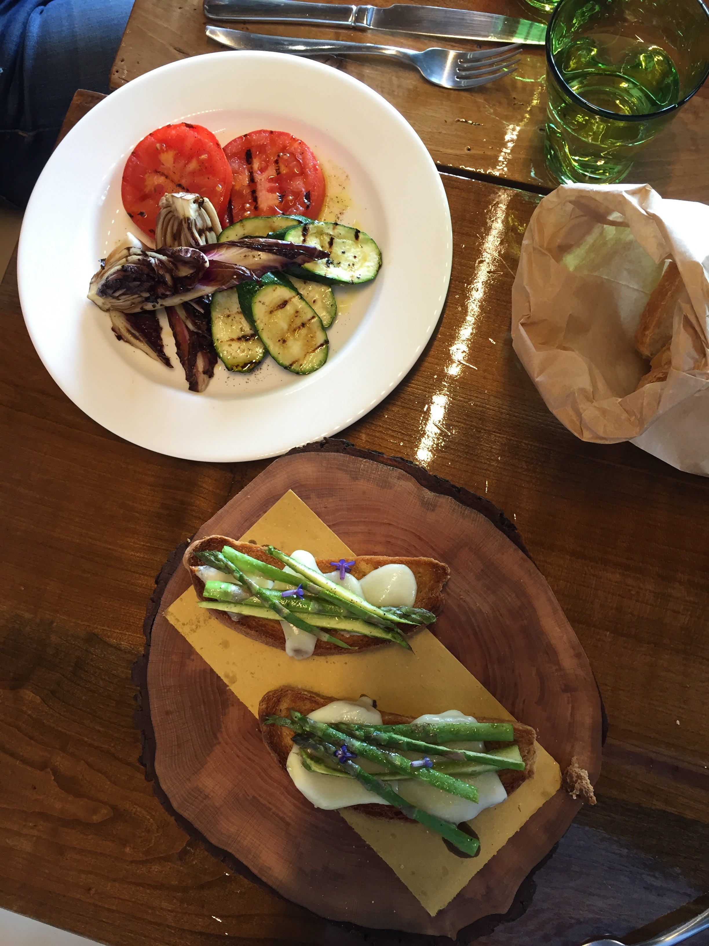
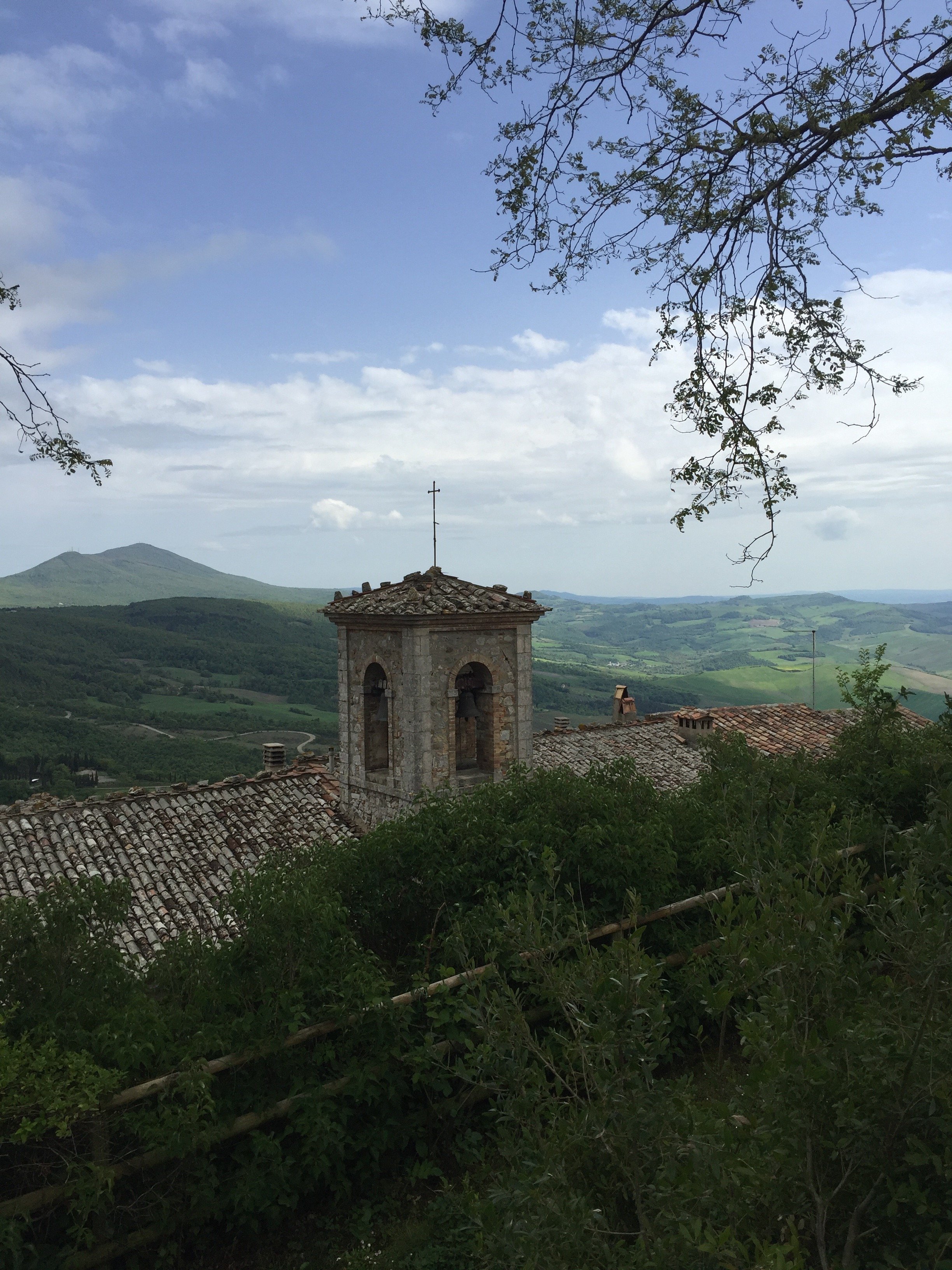 We ate lunch in the entoeca. Outstanding. The service was incredible. As I mentioned earlier Annalee, doesn't eat meat. The chef went to the other restaurant on the property to order some fish for her.
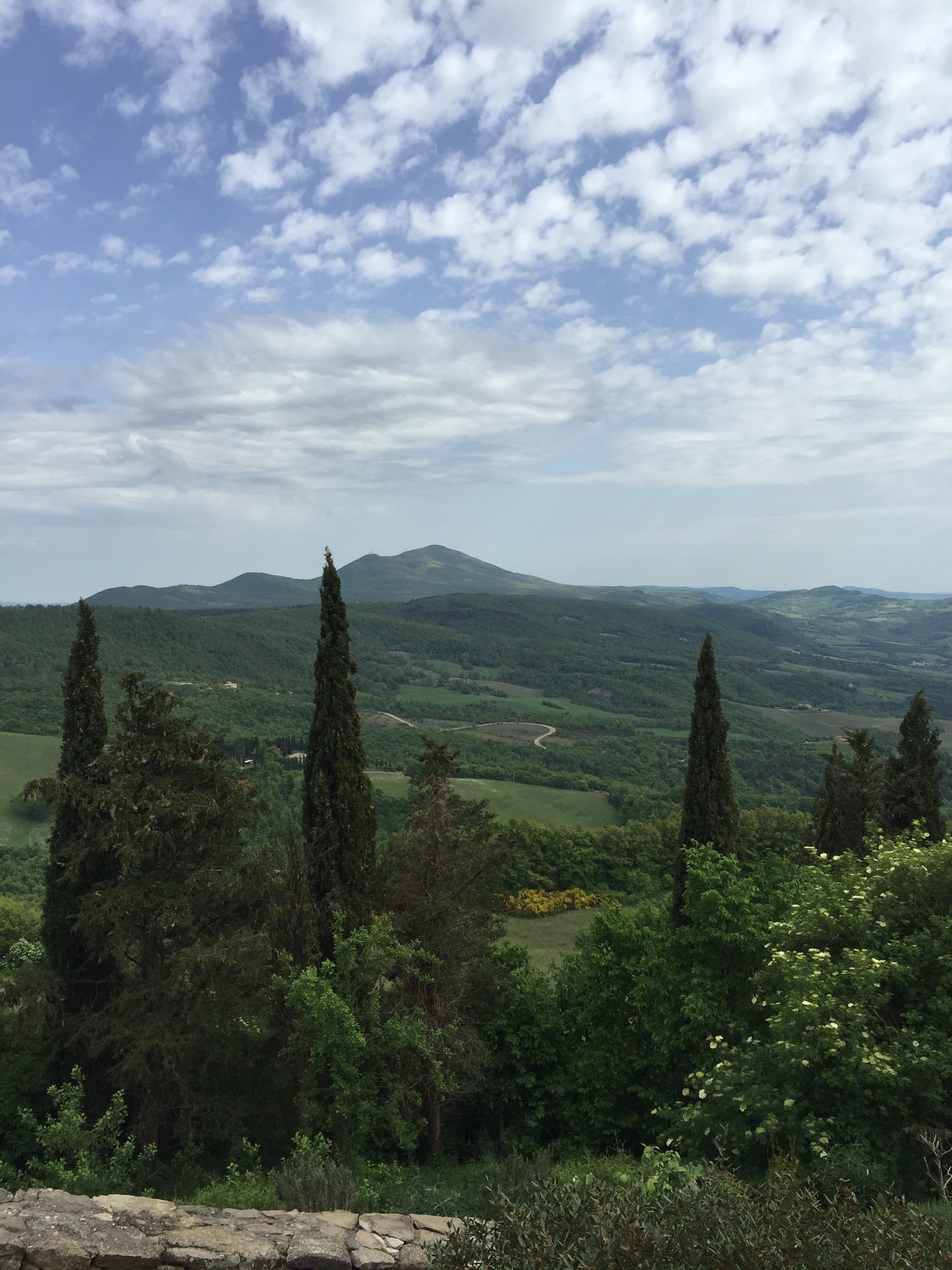
 The sun was trying to make an appearance.
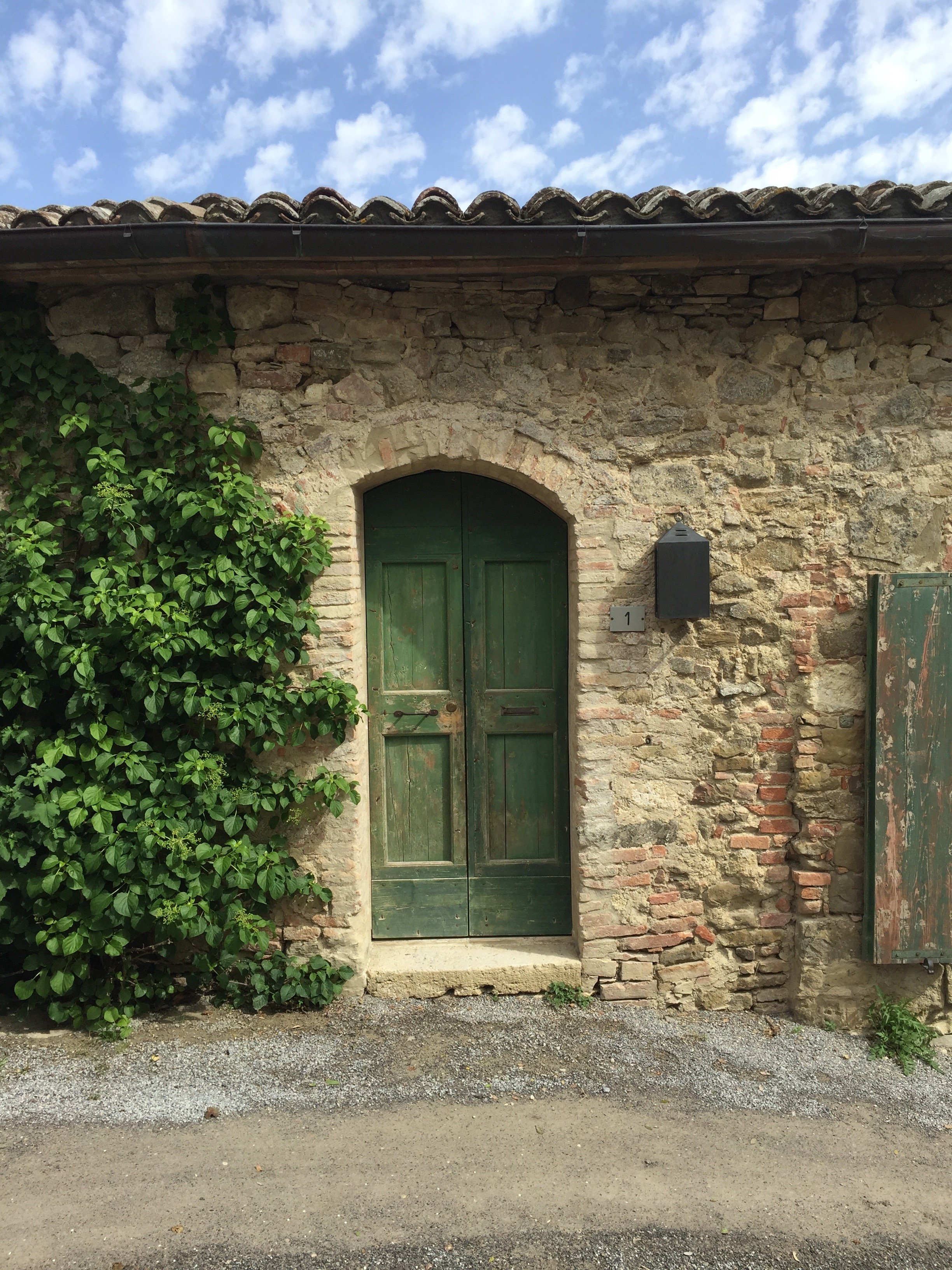
 Monteverdi is an unique experience. There are full time residents who have lived in the borgo for decades. However, this isn't a Disney version of a borgo. Locals and visitors attend the concerts, art shows, and other events held in the village's 14th century church, Sant' Andrea.
 Unfortunately, our weekend was coming to an end and the forecast called for rain all day. When I woke up, I saw that the sun was shinning. I flew out of my room to take advantage of the change in weather.
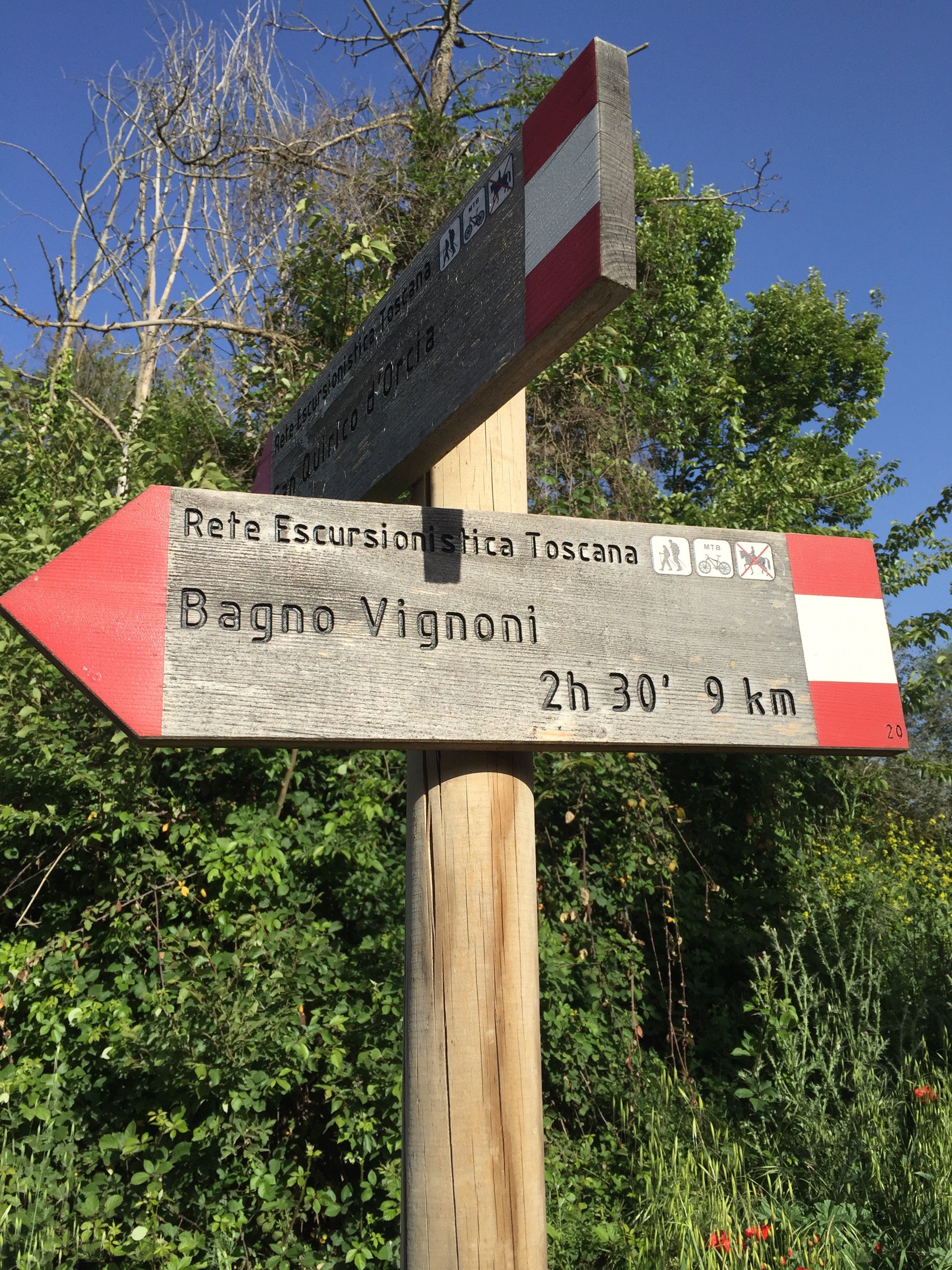

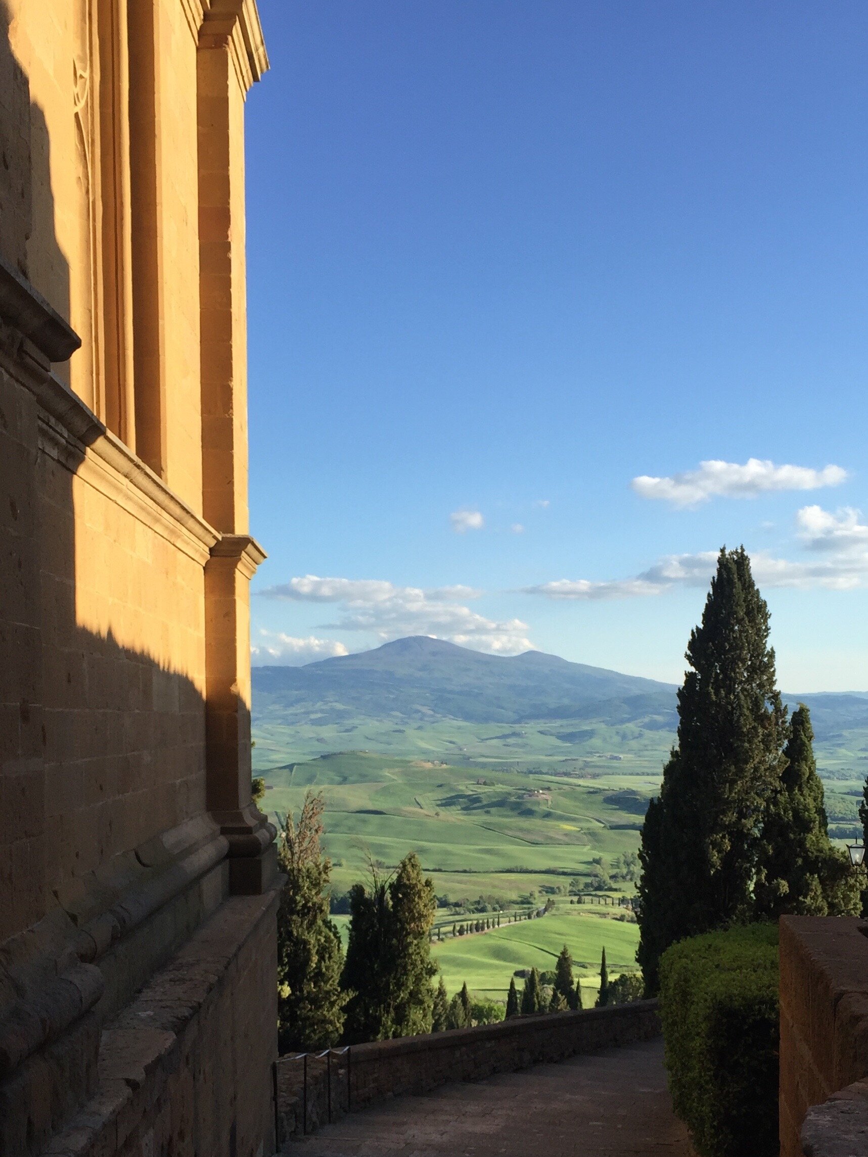
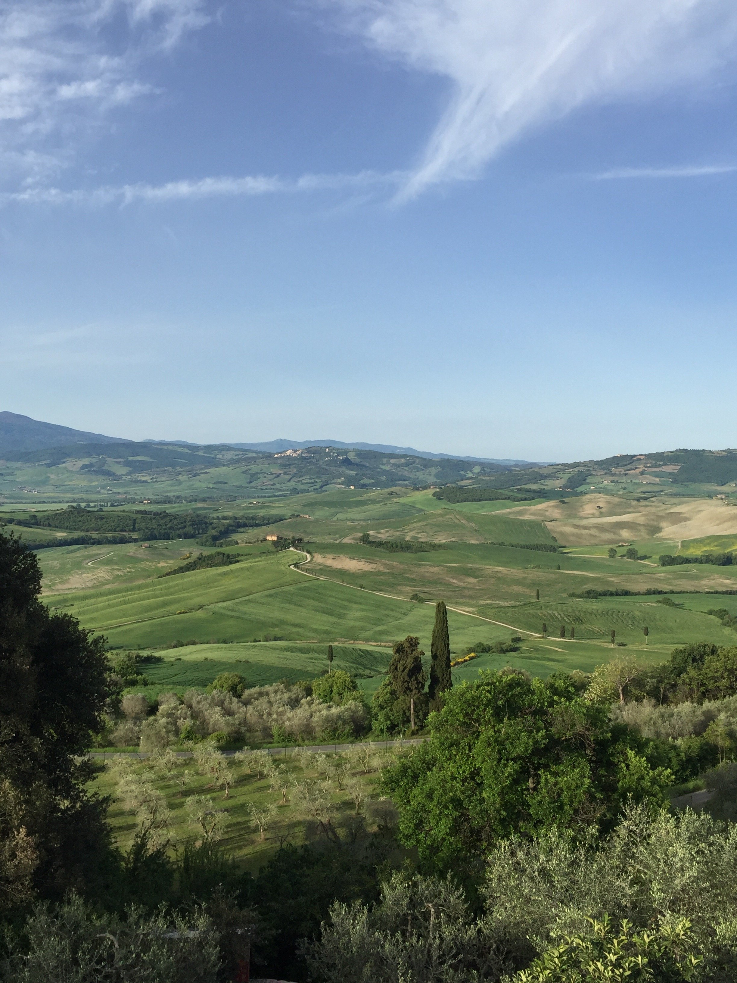 If some of these vistas seem familiar it's because many films were shot on location in this area. The verdant hills of the Val di'Orcia have been inspiring artists for centuries. I highly recommend a visit.Photos: Me and my iPhone
Design Inspiration - Darryl Carter's Boutique, Washington, DC
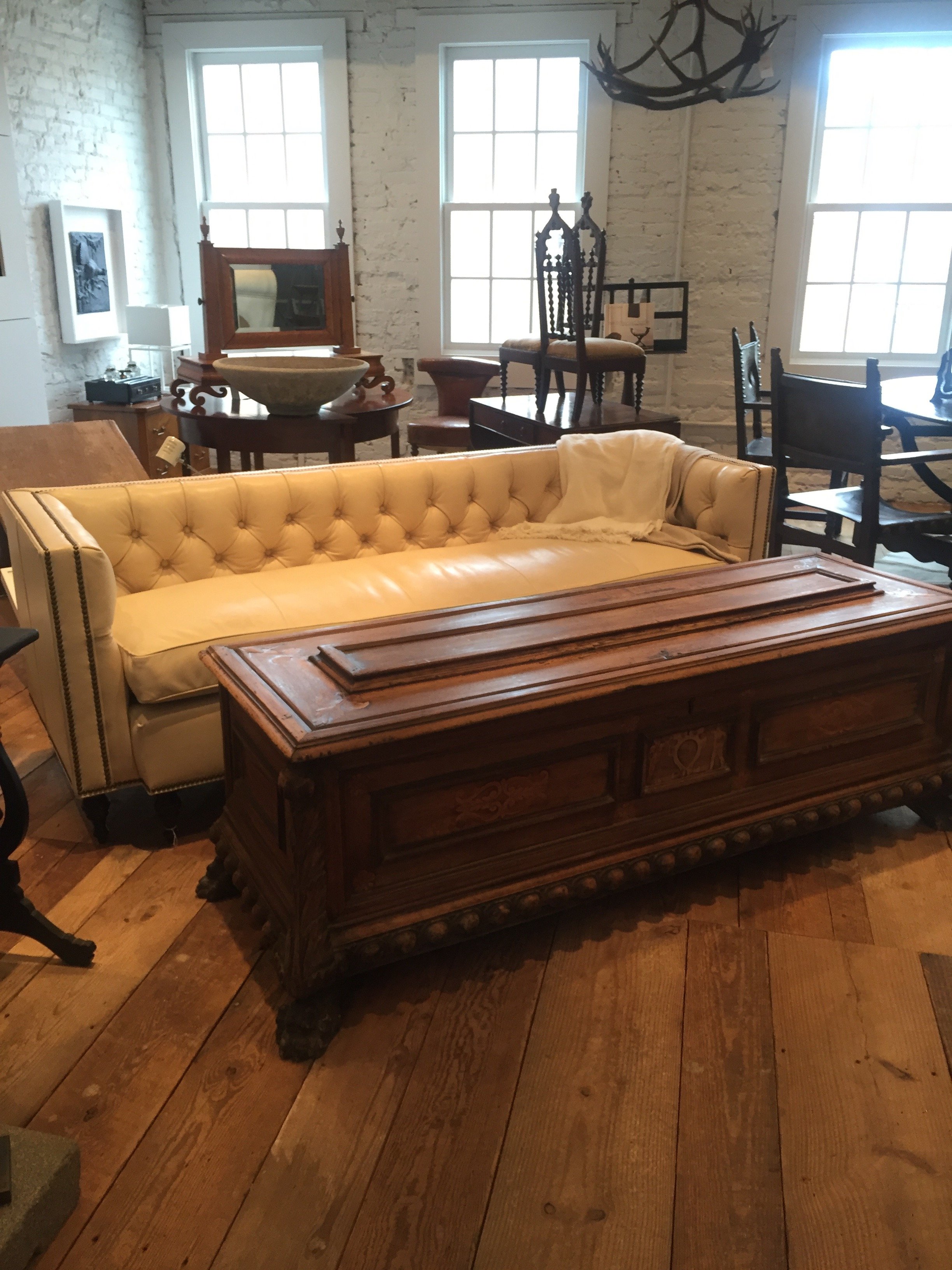
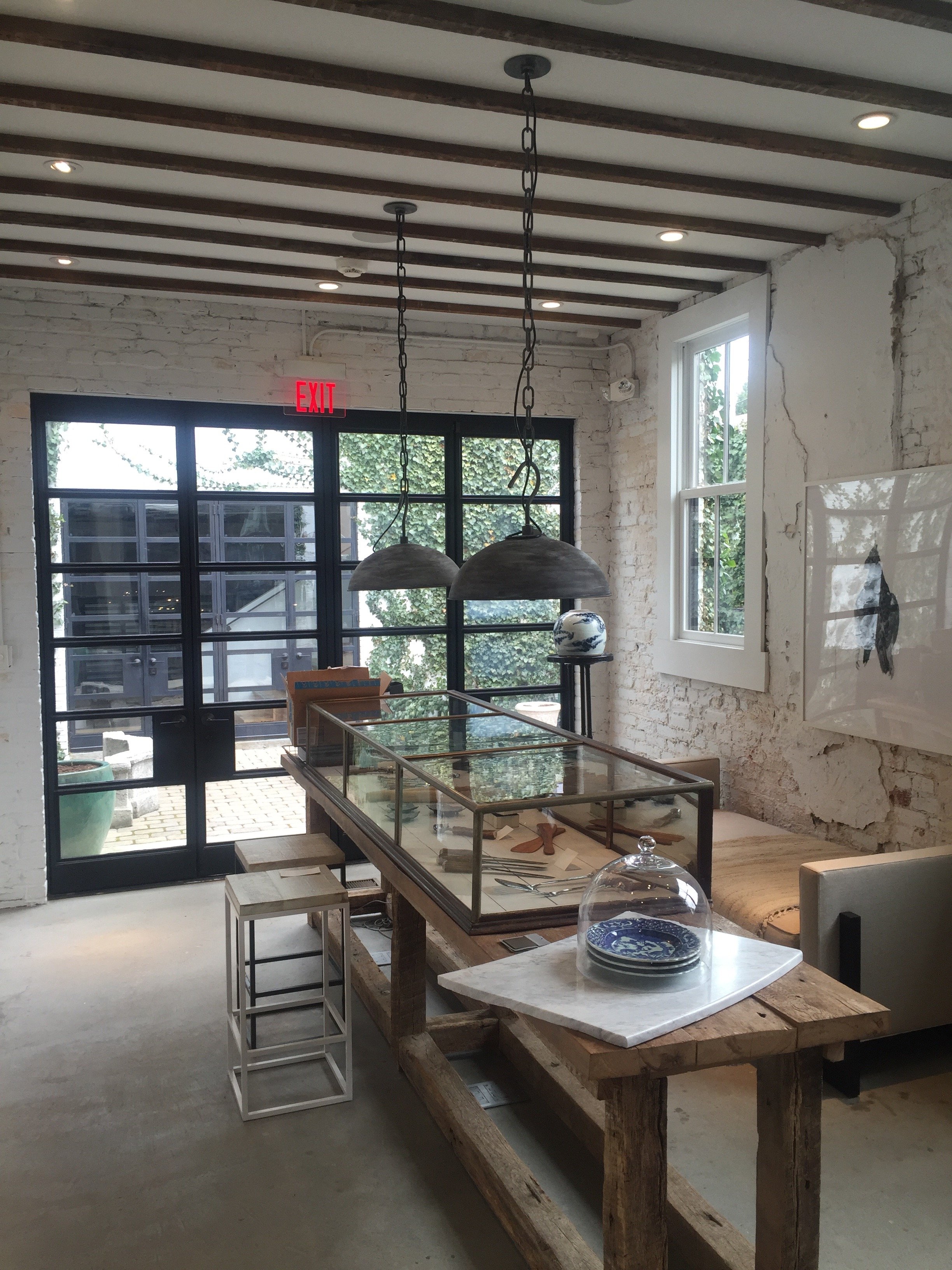
Darryl Carter's boutique was on my list of must sees during my trip to Washington, DC last month.I've read about it and seen many photos of it. Yet, I was not ready!Mr. Carter is one of my favorite interior designers. He usually works with neutral palettes and I love his modern take on traditional, classic style.He didn't study interior design. Carter was expected to attend law school and he did.His transition from a very successful lawyer to one of the most acclaimed designers in America is inspiring.His boutique, a pre-Civil War carriage house, is located in the Shaw neighborhood. The space was in complete disrepair when Carter bought it in 2008. The extensive renovation was thoughtful and bold, retaining many of the building's unique features. The exterior work was approved by the Historic Preservation Review Board.Carter sells antiques and new items that are handmade by artisans. Like his interior design work, the boutique is beautifully edited. It feels more like a home, rather than a store.Megan was kind enough to show me around during my visit.Much of the wood on the first floor was salvaged from the South African Embassy which was built around the same time as the original structure.This incredible limestone arch came from an old Virginia manor. The cupboards were salvaged from the butler's panty of the Dumbarton estate.
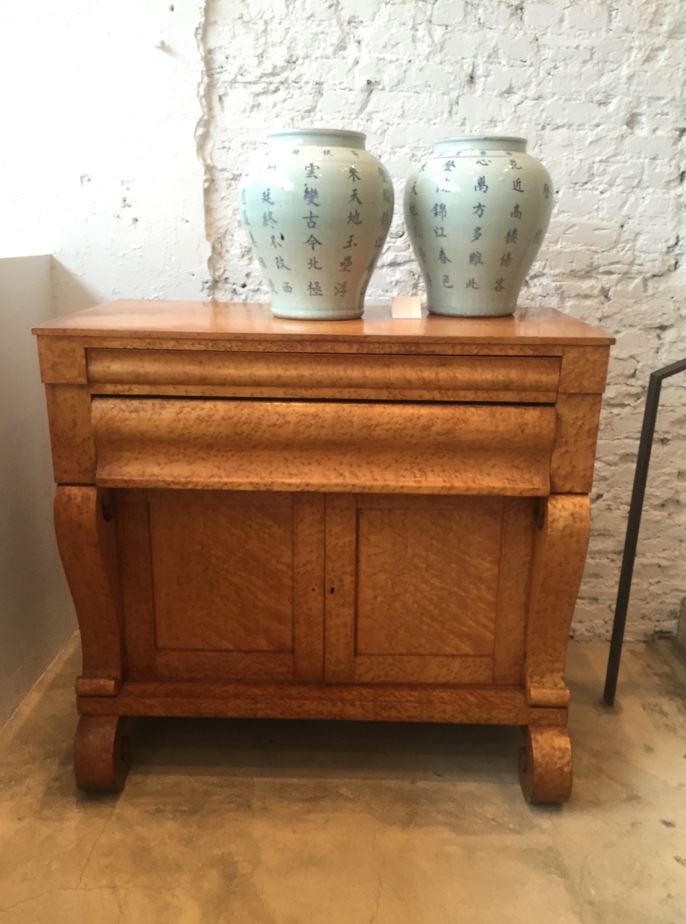
 This Birdseye maple dresser is an American antique from 1835.
 Chairs from the late 1900s found in Philadelphia.
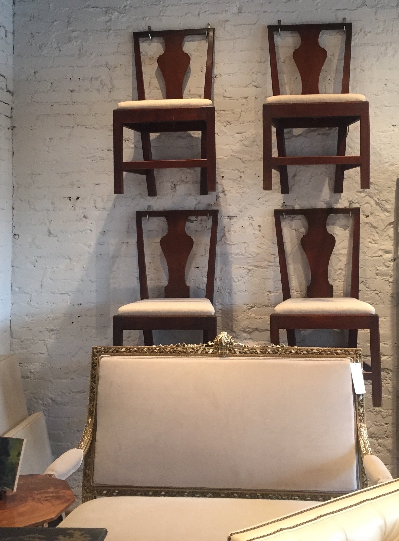 This sofa? Like butter.
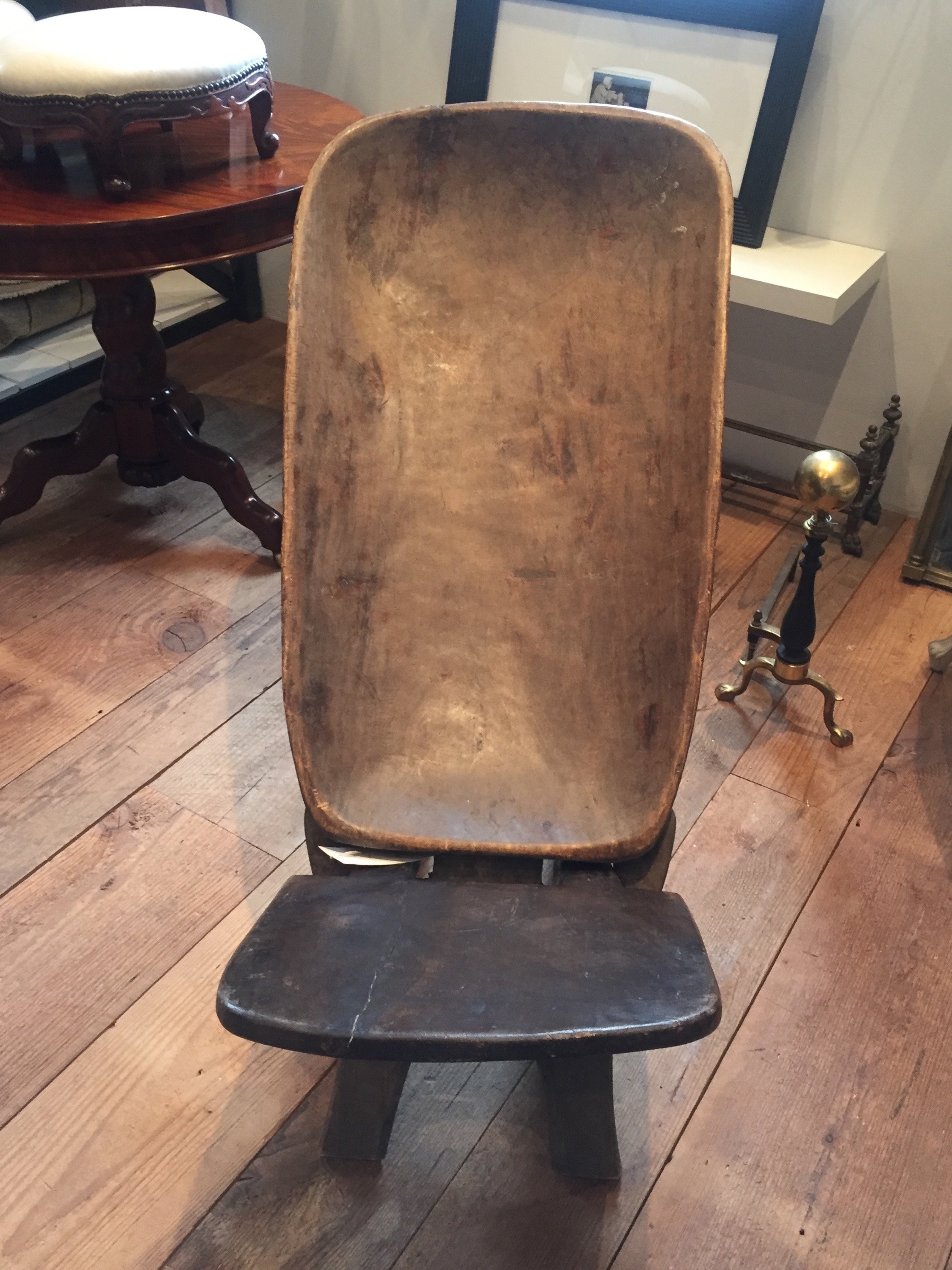
 African birthing chair.
 I wish I took a better photos of the kitchen. My fingers were still defrosting. I cannot handle cold weather anymore.I love every single thing about this space, especially the doors that lead out to the courtyard.
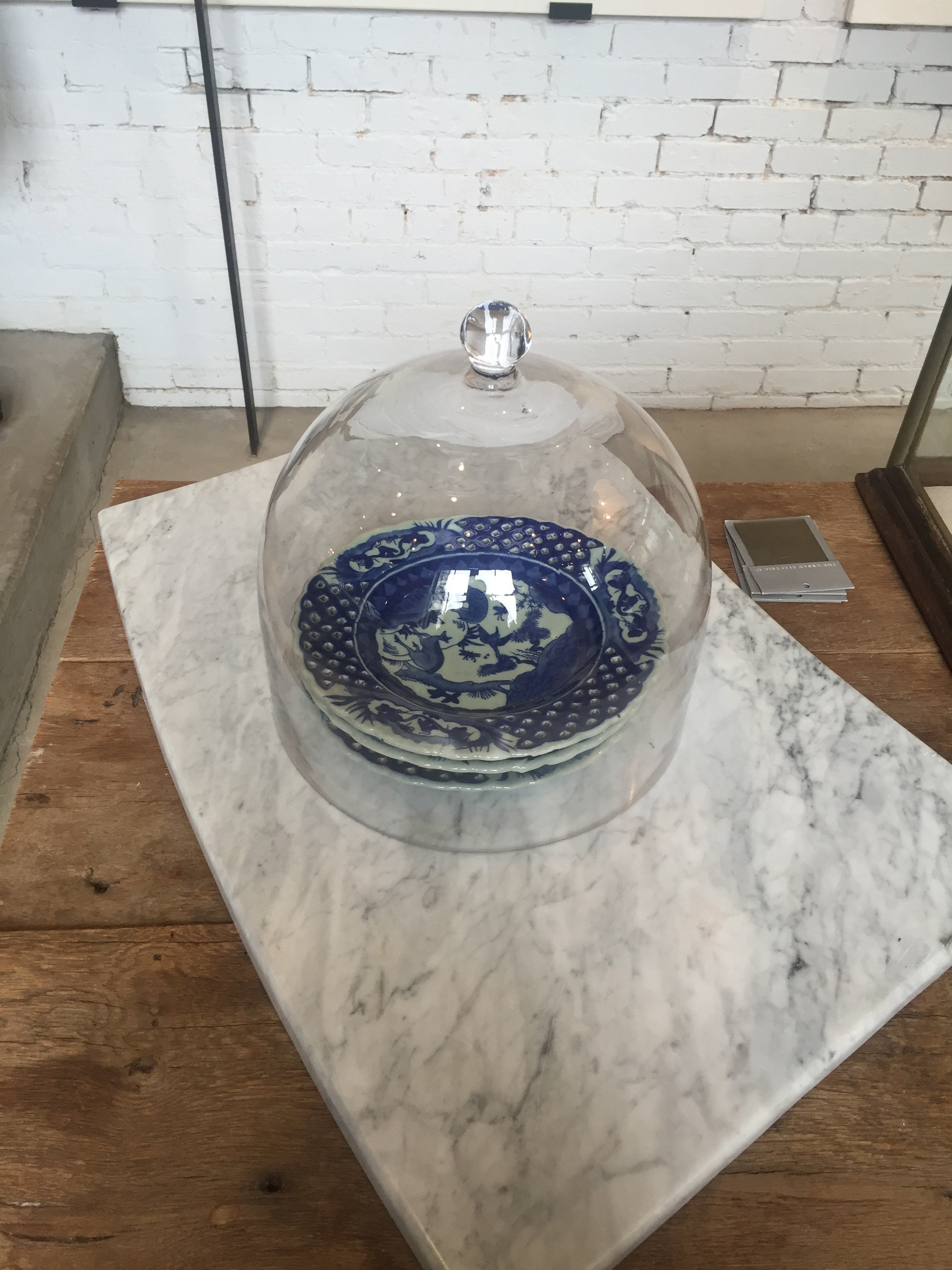
 This bench, designed by Carter, is perfection.

The Design Files - Nursery Tips
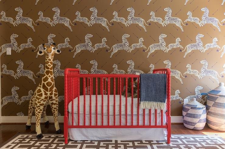
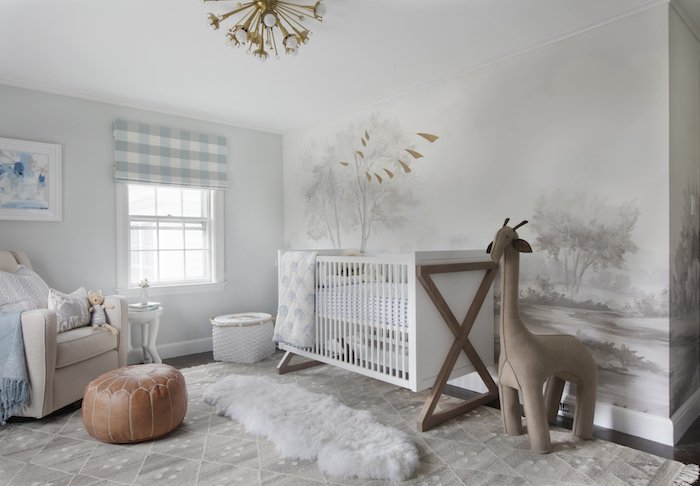
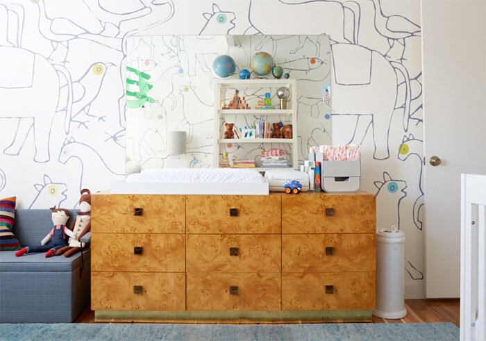
My sister and my brother-in-law had their first child last month. My brother and my sister-in-law have two boys so now I have three nephews.Nurseries are fun rooms to decorate. However, it can be a stressful time for families as they try to get this room together before the baby arrives. Below are some tips:Don't overlook the function of the room. It's easy to do when you see things like this: Make sure the space is practical. For example, is it easy to get to the changing table? Is everything you need for the changing table, wipes, diapers, etc., near the table?Window treatments.I like roman shades. Curtains are fine for babies but once they start crawling, it's better not to have anything on the floor that they can get tangled in. Keep an eye on the cords. Whatever treatment you decide on, can it block out light if needed? If the curtains are too sheer, get black out rolling shades.Babies don't care what the room look like. You will spend hours in this room. Is it comfortable and soothing for you?Not every piece of furniture needs to come from a baby store. A dresser can be turned into a changing table.To save money, re-purpose furniture and pieces that you already own.The room should reflect the rest of the house. If you're someone who loves minimalist mid-century, the nursery doesn't need to look like some cutesy, super traditional space with bright colors, and visa versa. There are ways to incorporate your taste into the room.When it comes to painting the walls, I'm a big fan of grey, and creamy whites for gender neutral colors. They're classic, and depending on the shade, work with all types of décor from traditional to contemporary. A light yellow is great too but a more difficult color to work with.Wallpaper. This is the room to add an accent wall with a bold paper:
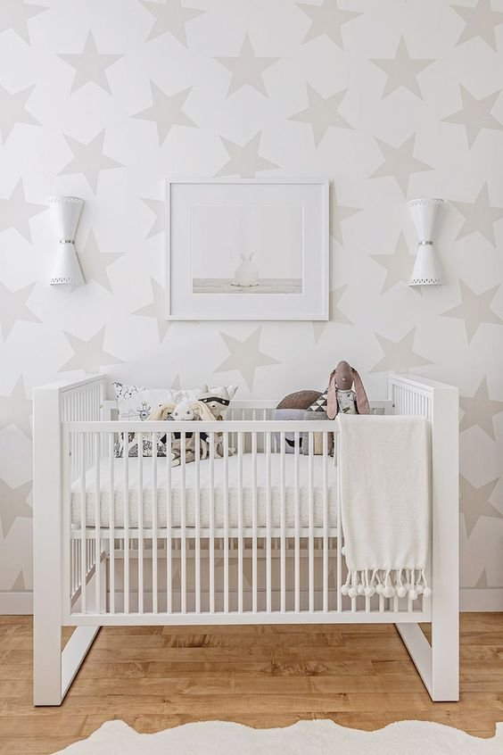
 If your taste fall to the more subtle side, something like this gives you a moment without being overwhelming:
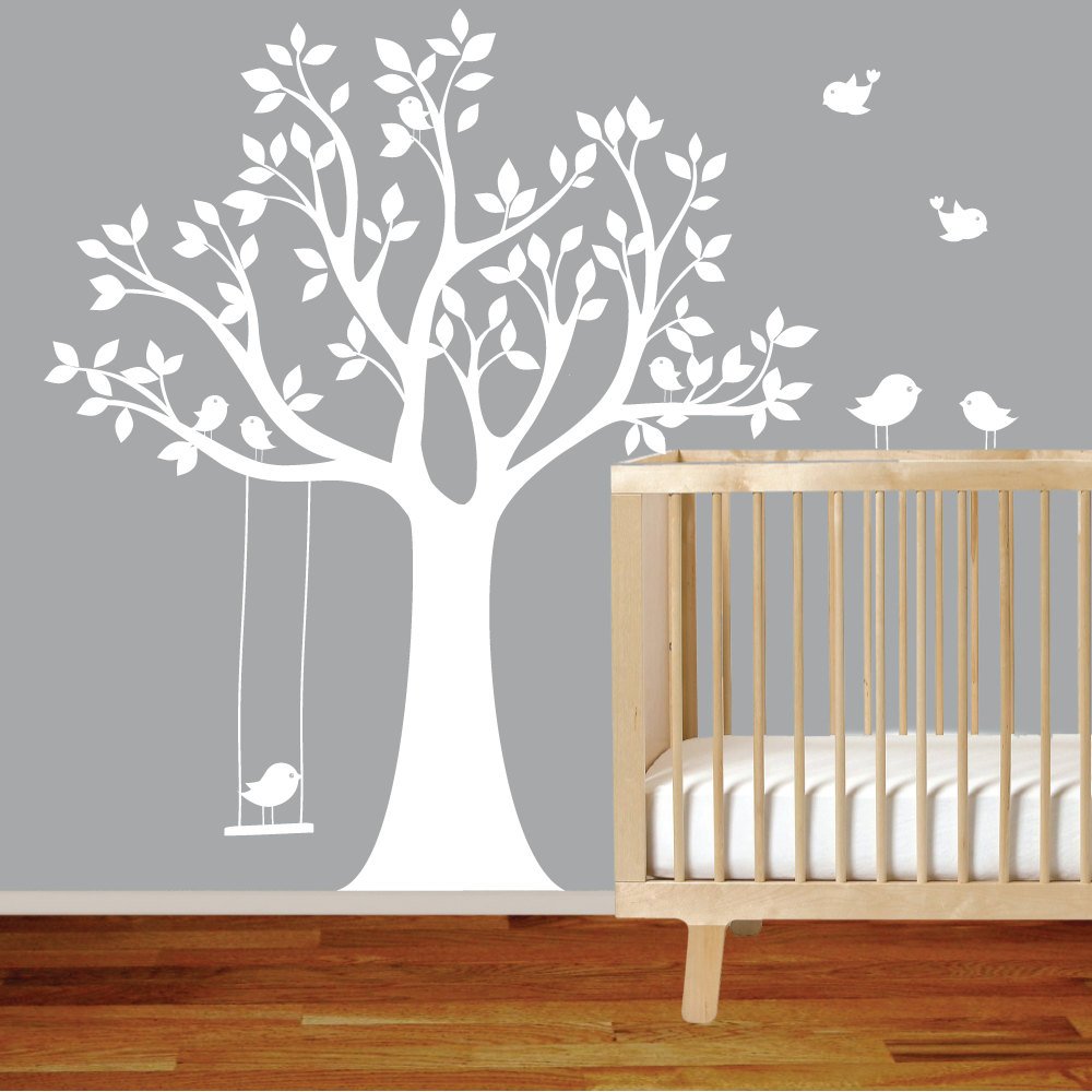
 Decals are a great for renters.
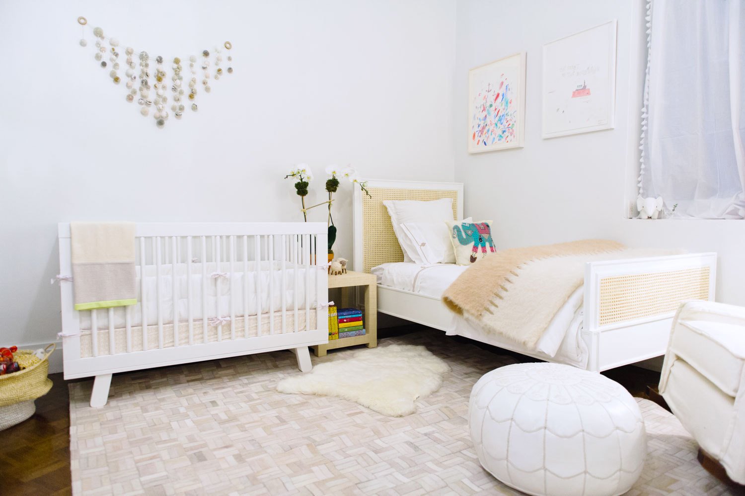
 Unless you have time and money to decorate constantly, select furniture, art, and colors that will grow with your baby. Once they get older, you will redo the space for a big girl/big boy room.It's unlikely that a baby is a Frozen or Hot Wheels fan. Cutesy or trendy themes will feel dated and will become tired very quickly.Do you have enough storage? Clutter is the last thing you need in this room. You don't want trip over things during a midnight feeding when you're exhausted and not the most alert.Don't forget the books, art work, and the accessories. It's the little things that take a room from ho hum to something special.Here are some more fab nurseries:

Life in Rome - Ercoli 1928 Parioli
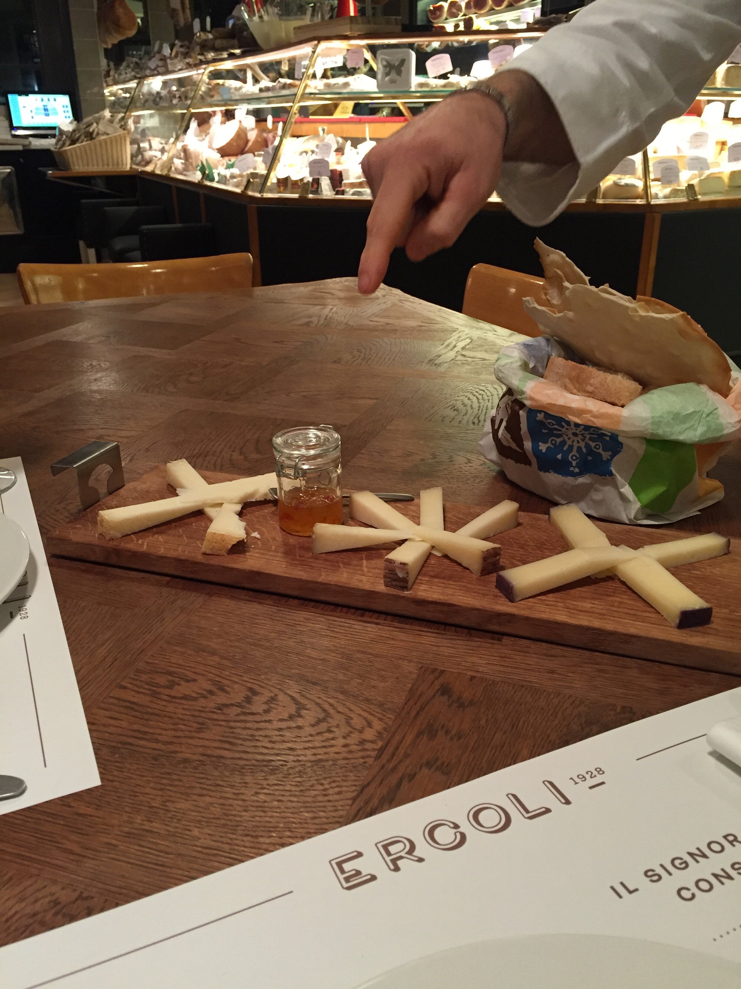
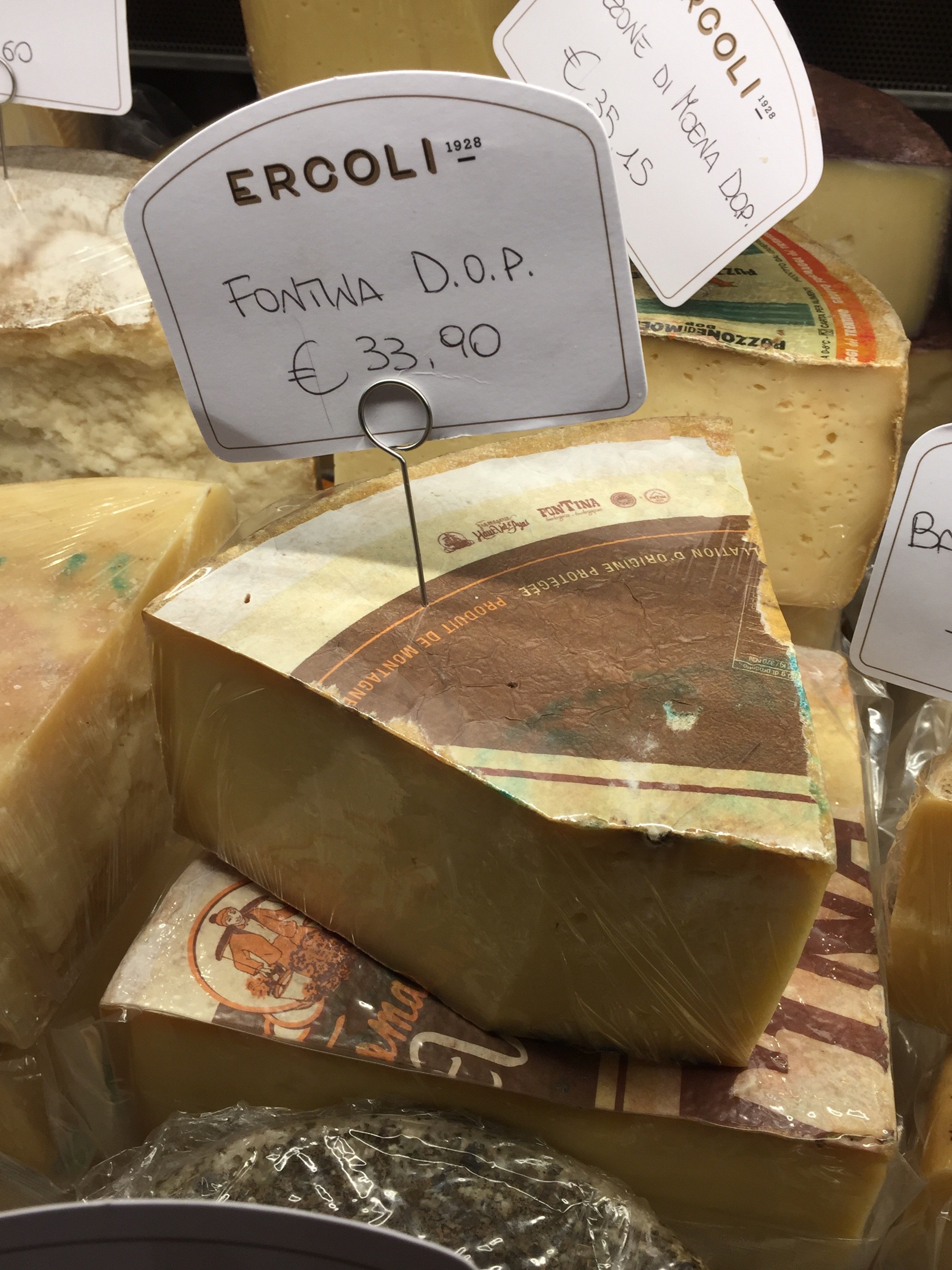
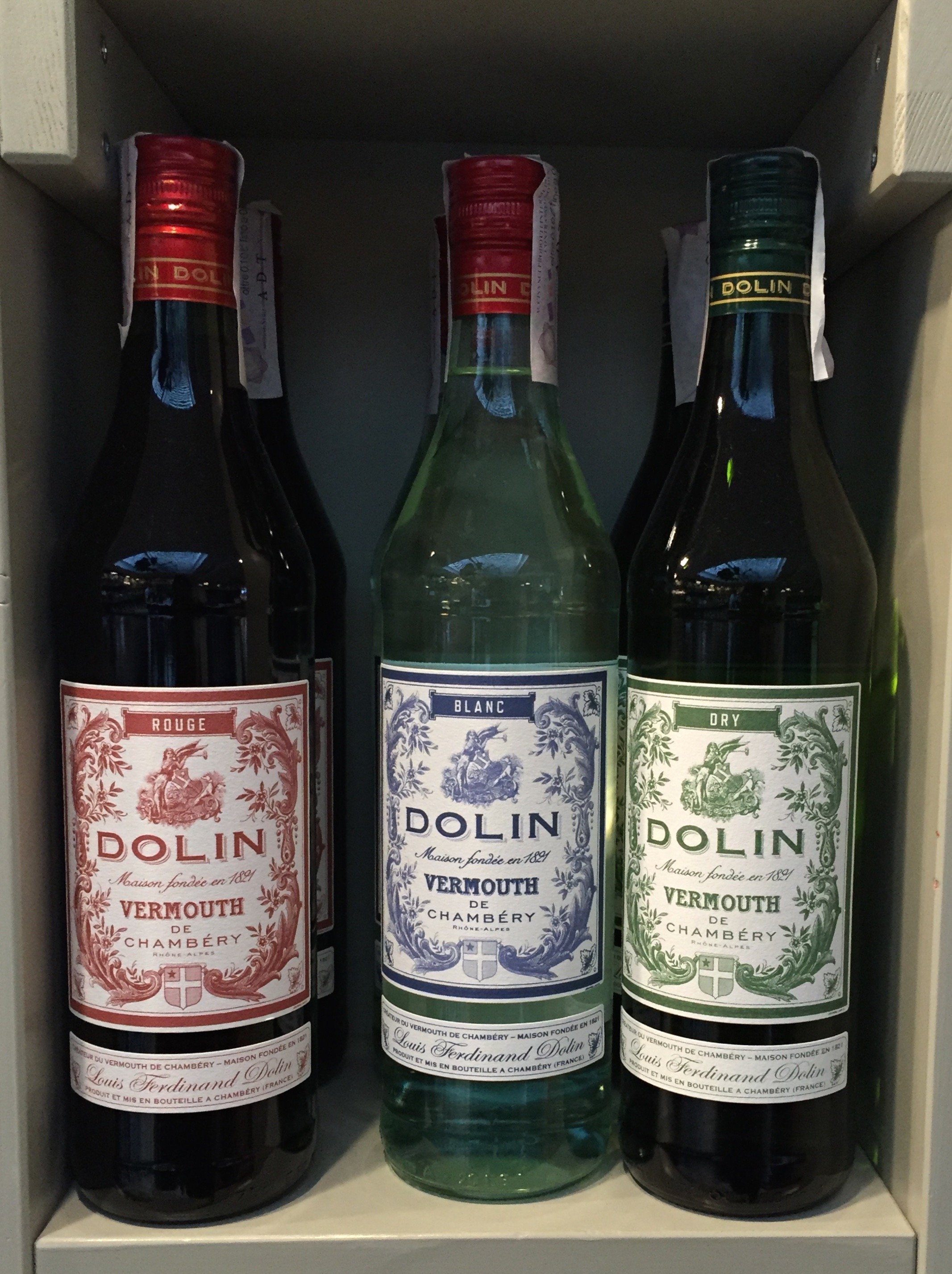
I have lived in Parioli for a year now and love it. When I told people I was moving from the Historic Center to Parioli, everyone had an opinion (mostly negative)."It's so boring," was one of the main criticisms I heard regarding Parioli. Granted, it's not as exciting as living around the corner from the Drunken Ship but that's okay.There are plenty of great places in this neighborhood to get your aperitivi on and the prices are much lower than the Center. That said, it is a more residential area. There are rarely any tourists and while there are quite a few American and British expats living in Parioli, I seem to bump into them only at the DOC or Carrefour supermarkets.The latest addition to the 'hood is Ercoli 1928 Parioli and I am here for it. I met a friend for an aperitivo during the holidays. The first person I saw when we walked in was Federico Tomasselli, the bar manager and one of the best bartenders in Rome. What a very pleasant surprise! He used to be at Barnum on Via del Pellegrino. I lived on Pellegrino and spent a lot of time at Barnum because of Federico and Patrick (Patrick is now at Caffe Propaganda).My friend and I sat at the bar and loved it. The bar's specialty is Vermouth. My friend said their drink was outstanding. If you don't drink Vermouth, no worries. Ercoli's wine list is deep and they have a solid cocktails list too.I returned with another friend the other week and this time we sat in the front because the bar was still setting up.We ordered glasses of wine and the Italian cheese plate. Outstanding.The service was great and everyone was friendly. Trust me, this is not the norm in Rome where service can range from indifference to outright hostility. Ha.My friend picked up some takeout for her husband. I need to ask her how the meatballs were. The cheese selection is fantastic and will be problematic. I haven't eaten lunch or dinner here yet but have heard very positive reviews about chef Andrea di Raimo's dishes.
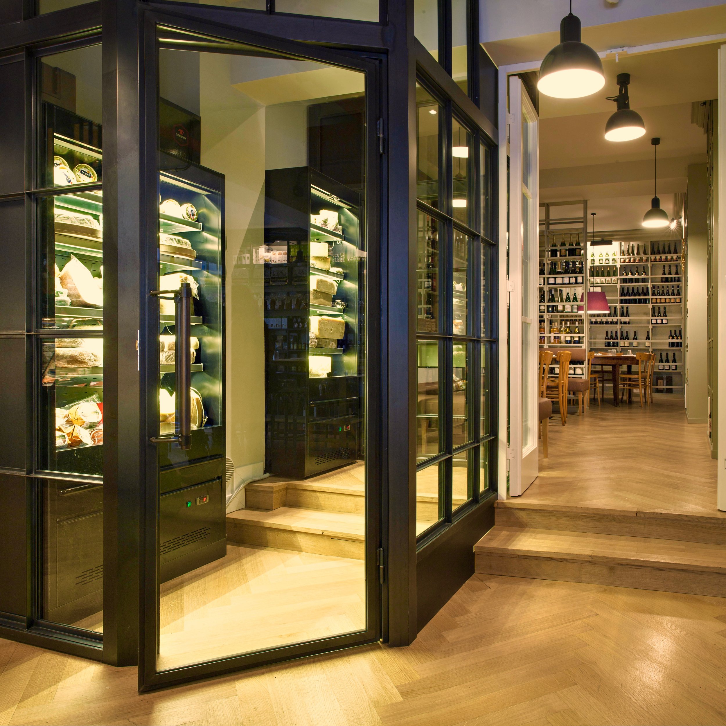
 There are people don't care how a place looks as long as the drinks are great. I'm not one of those people. For food, it's a different story. There are wonderful restaurants that don't have much of a décor but it's okay because the food is on point. However, when it come to aperitivi/cocktails, atmosphere is also very important to me.
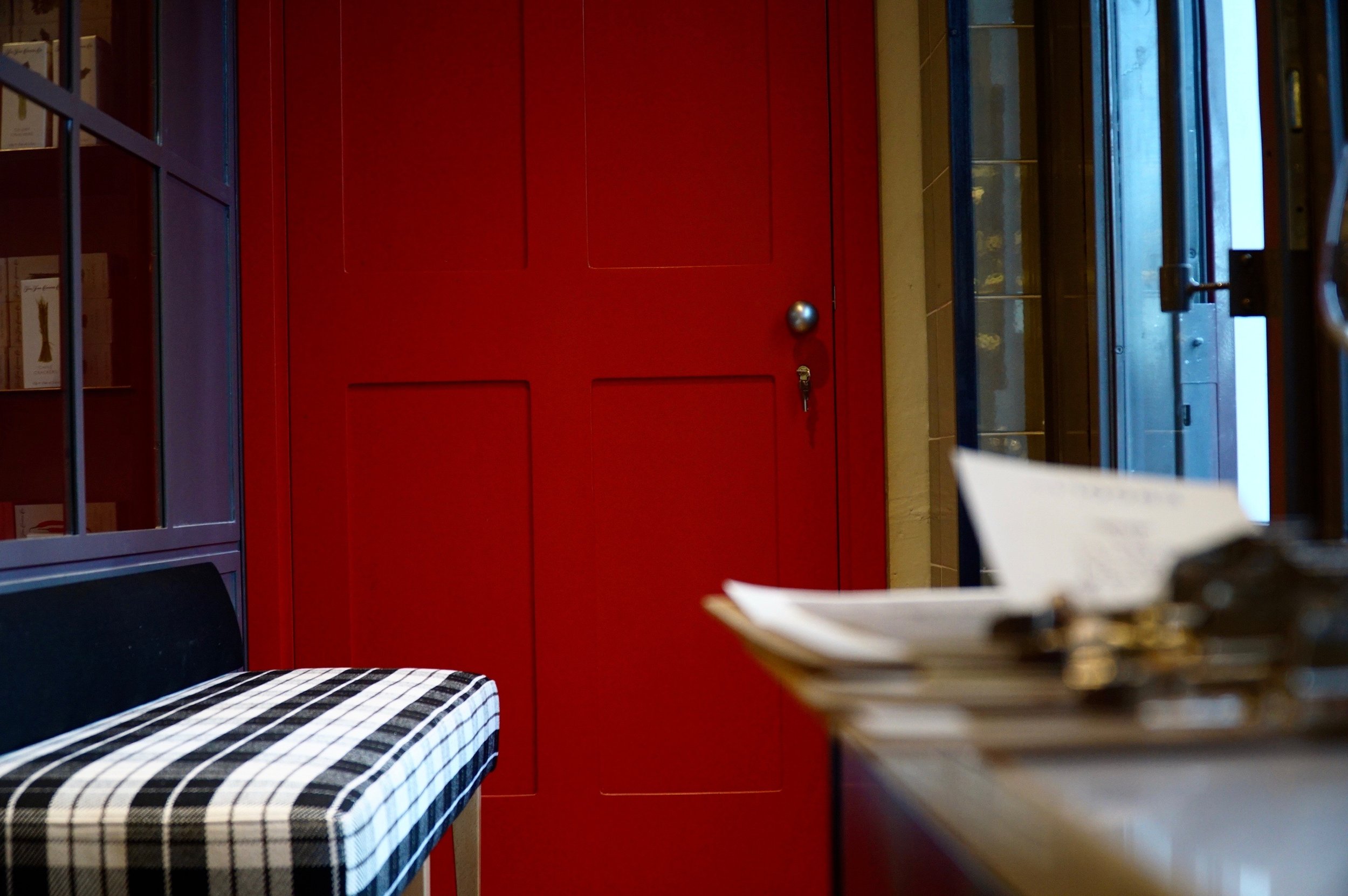
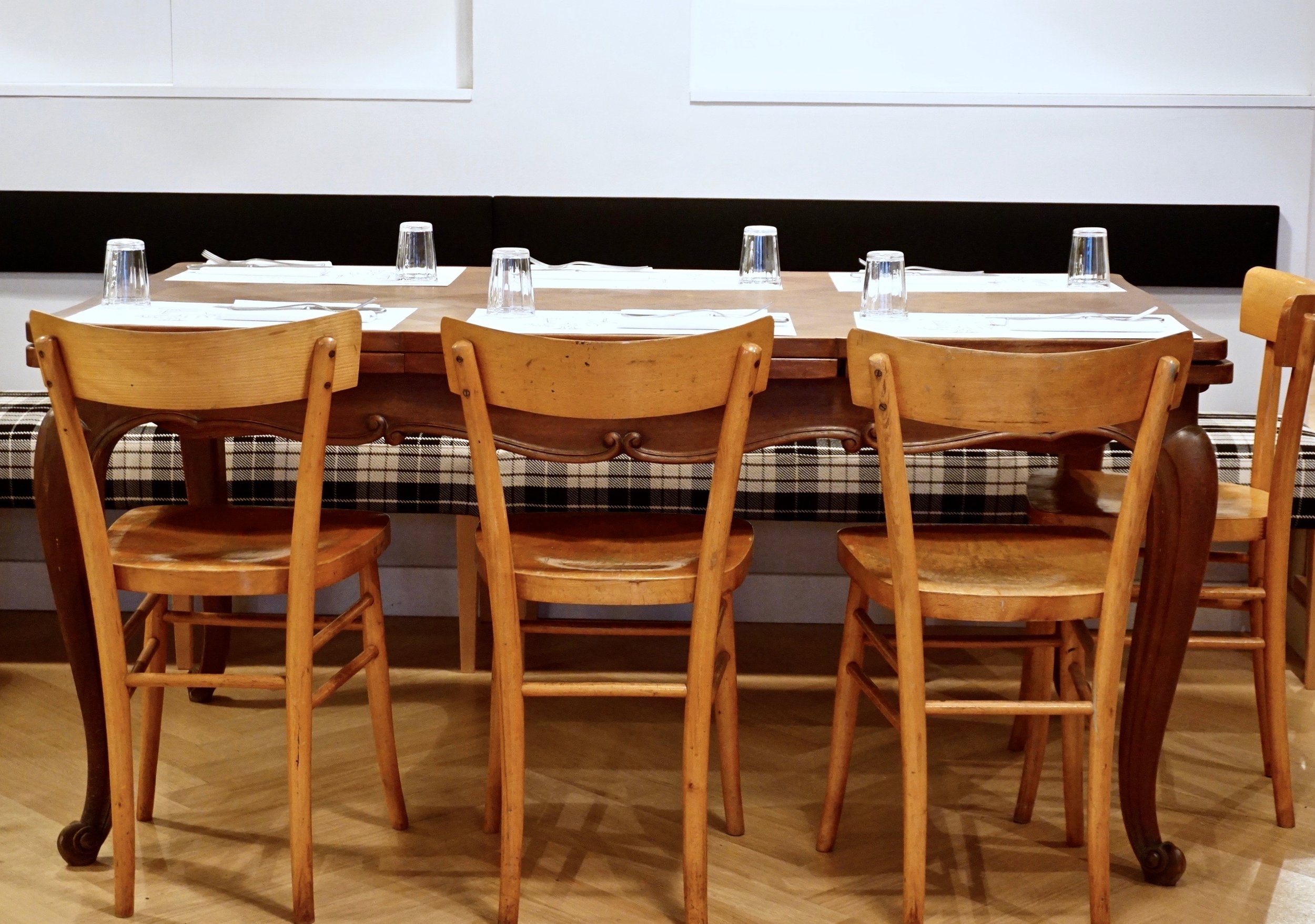
 Ercoli Parioli knocks it out of the park. The space is divided into three areas. There's a restaurant, a deli, and the bar/cantina.The architect is Roberto Liorni, who's responsible for several of my favorite restaurant spaces including, Pastificio San Lorenzo a Roma, Rosti, and 'Gusto. The latter opened in 1998 and other restaurants are still "referencing" it. Liorni was also the architect for the film company Cattleya's headquarters. All these places have their own vibe but with his unmistakable DNA, contemporary, chic, yet comfortable.I adore the interior design at Ercoli. It's not trying to be the Roman version of a space in Soho or on Abbot Kinney. It fits the neighborhood and doesn't look like every single restaurant that has opened recently. I love the plaid...an unexpected touch.
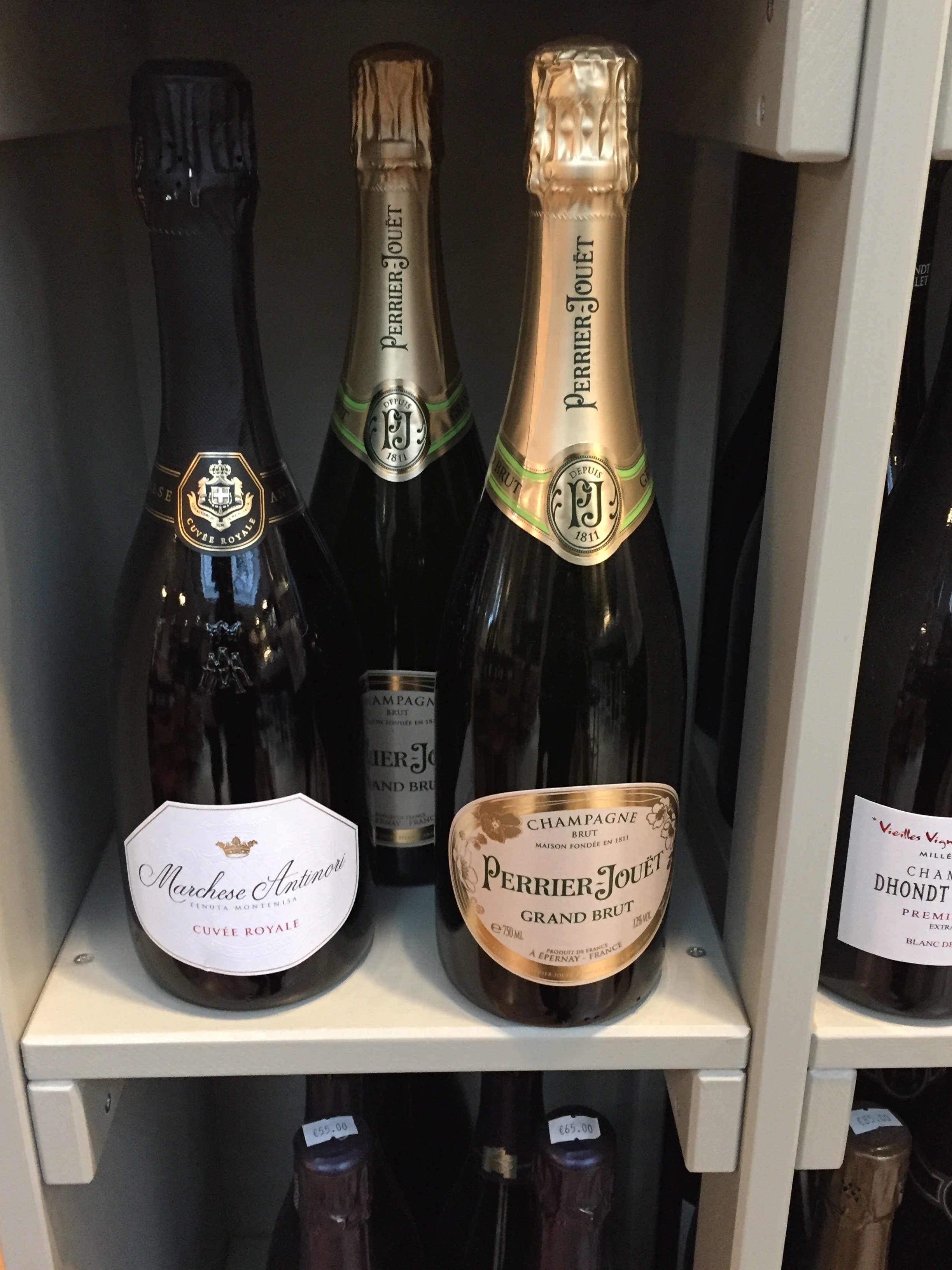
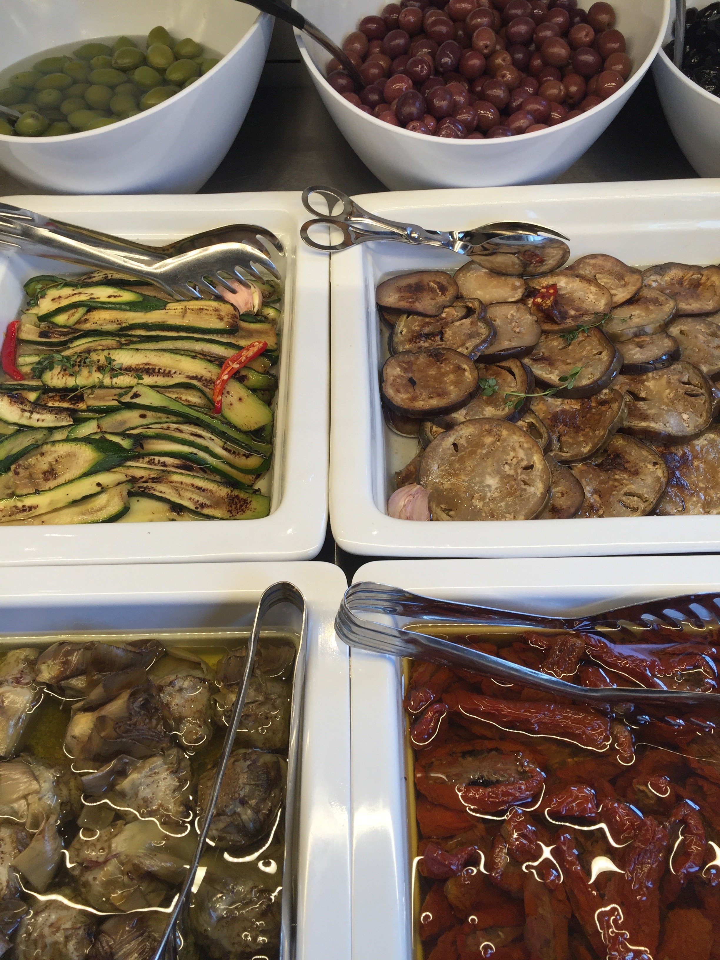
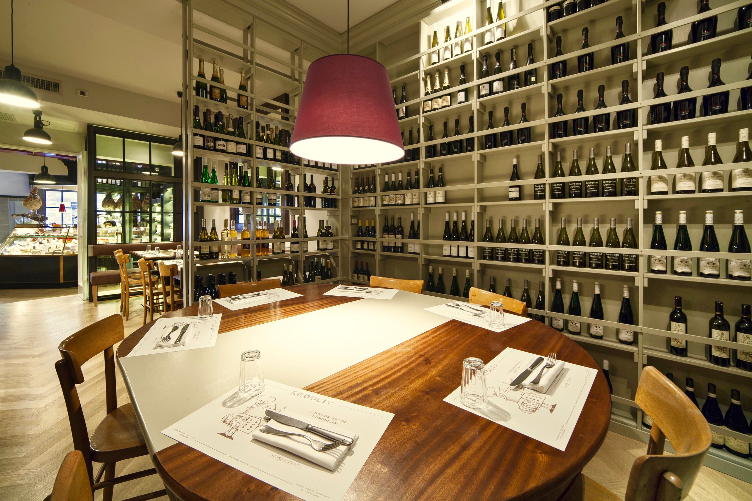


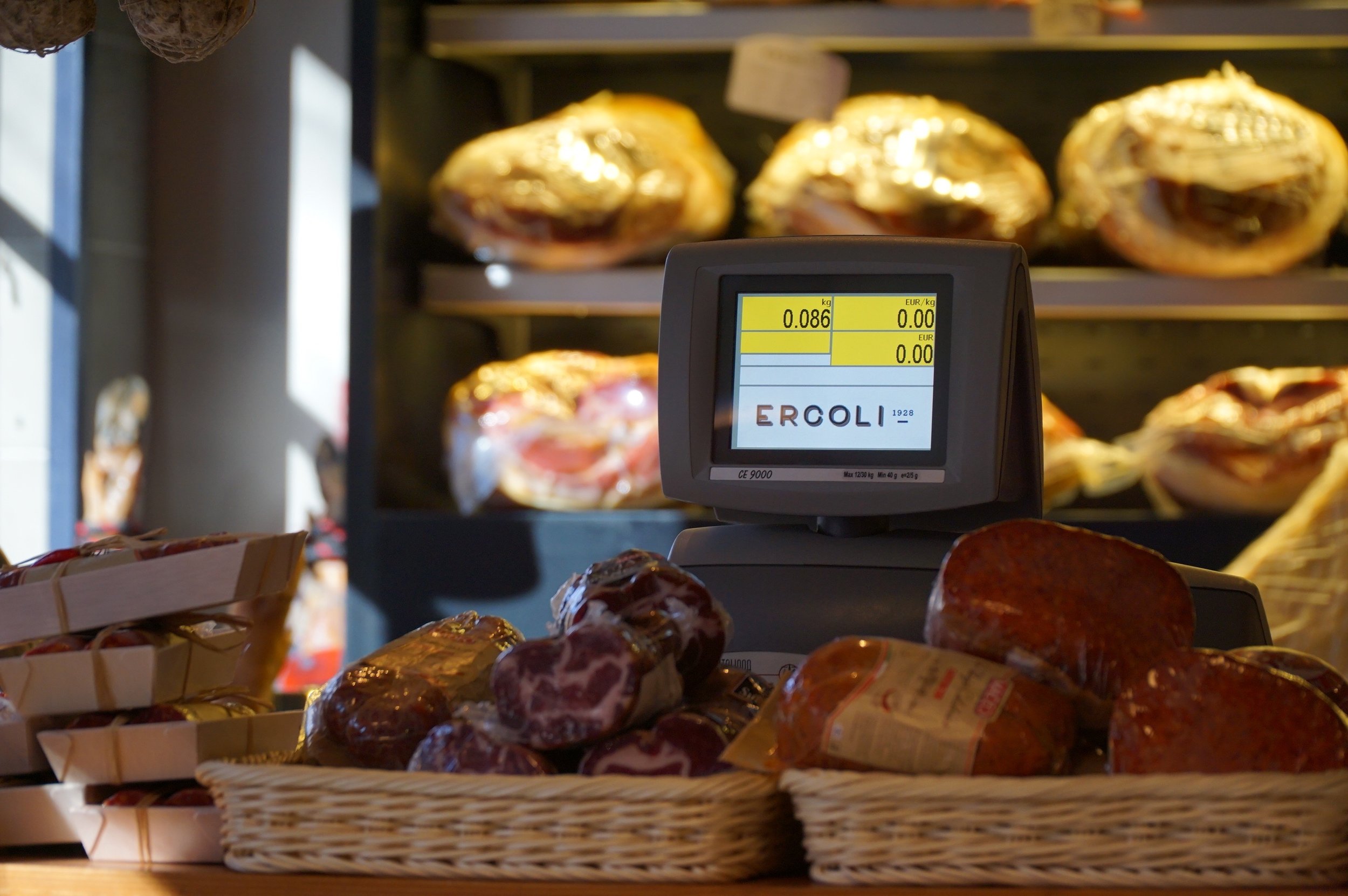 I finished the cheese I bought. I'm trying to avoid Ercoli this week. I don't think I will be successful.
Before & After - Via Banchi Vecchi Project
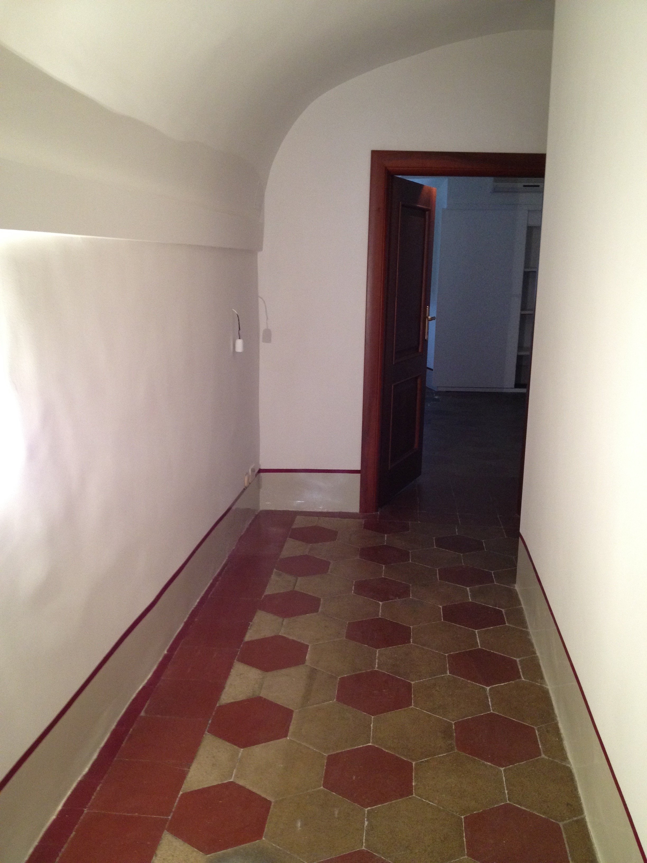
Ciao Bloggisti,Earlier I wrote about the Via Monserrato project. One of the other apartments we worked on was located two blocks away on Via Banchi Vecchi. It was a new apartment for our client.The apartment was empty so we didn't have the same logistical issues but two bathrooms, and the kitchen had to be renovated. Any time you start opening walls you will have some surprises, especially in a building that's over three hundred years old.The brief from the client stated that the unique original flooring and the red tiles in the kitchen could not be replaced. The floors weren't in great shape but I like to think of them as adding character. The client wanted to improve the layout, add a closet in the bedroom, lighten up the very dark kitchen, and make the second bathroom more functional.The bulk of the budget went to the renovation. Some of the furniture came from the other apartments. We bought a mix of high-end hardware/fixtures along with budget friendly pieces.The minute the client stated that they had to change the layout, we called an architect. Fortunately, Domenico Minchilli and his studio took on the project. Square footage wise it was a lot smaller than their usual projects but it was complicated. We had worked together before which made the renovation process, never easy, smoother.BEFORE - The Kitchen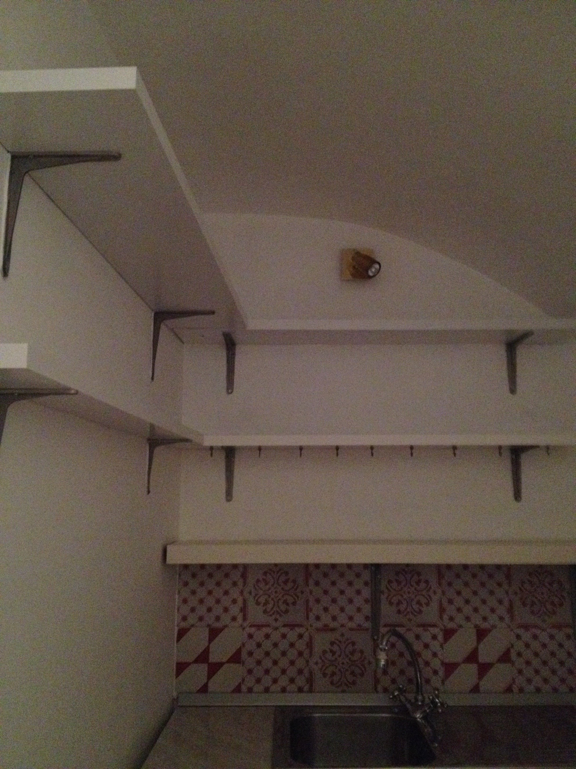 True, this is not a primary residence but I don't think any guest would want to spend a lot of time in here. It was impossible to get a decent shot of this dark, cramped space. The hallway before. The kitchen is behind the wall on the right.
 There were structural issues that had to be addressed (electrical, ventilation) so a upgrade/renovation had to happen.
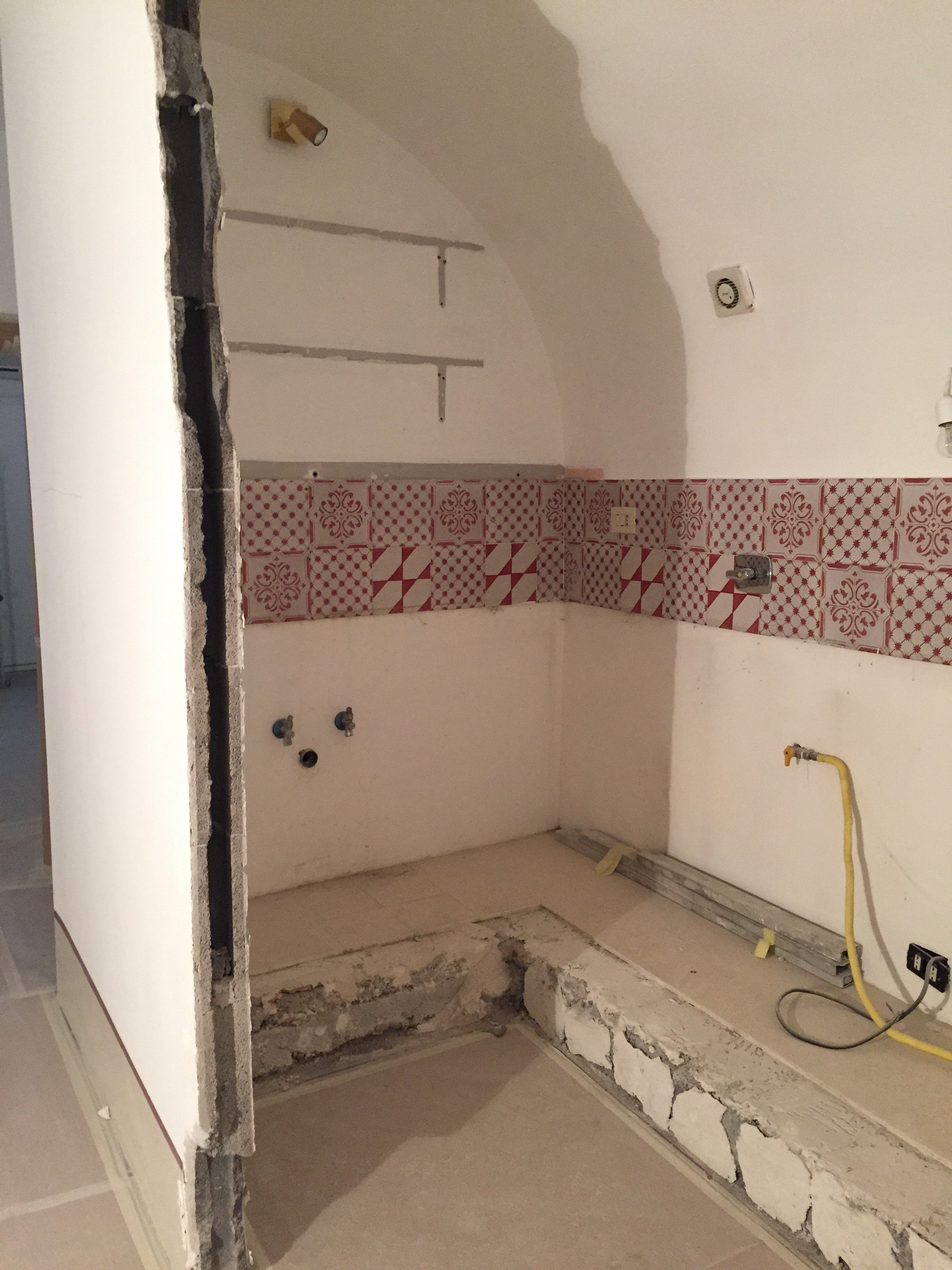 Originally, we discussed opening just one of the walls. Studio Minchilli suggested removing all them so you could see the entire arch as you walked into the apartment.AFTER
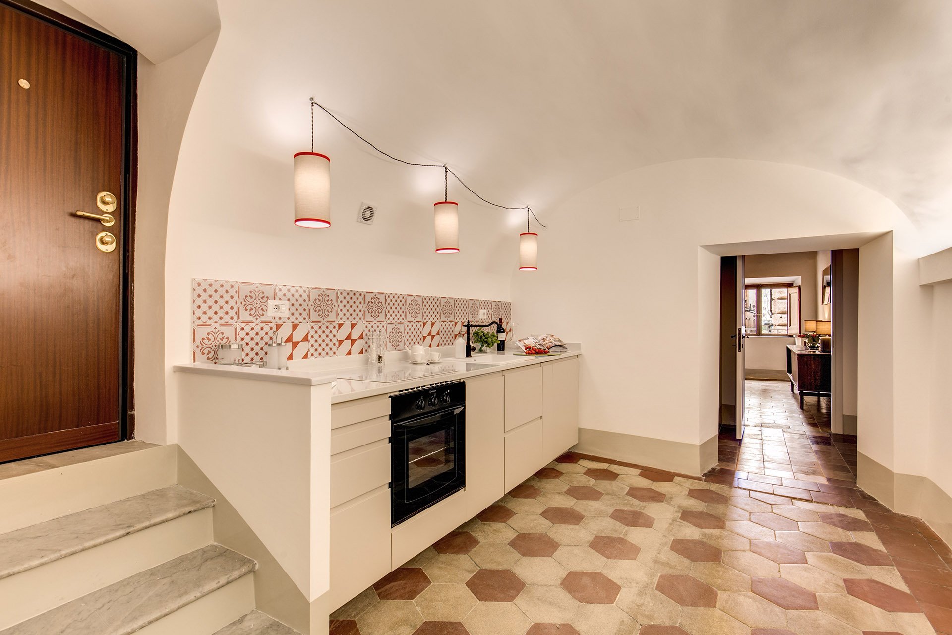
 What a difference. It's light and there's plenty of space to move around. The cabinets are from IKEA but the counter top is quartz from Stone Italiana. We decided to spend more for a higher quality counter top given the open plan design. It elevates the entire space, making the IKEA cabinets look more expensive.My anxiety level was not good the morning of this installation. A heavy slab, cut to order. Three men had to carry it.
  The light fixture is custom. Il Paralume.
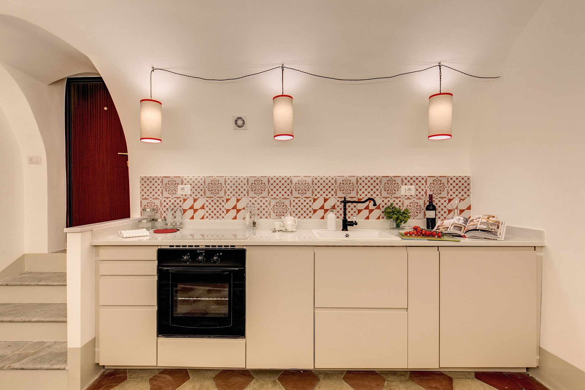 We also installed LED lights on the right.
 BEFORE - Master Bathroom
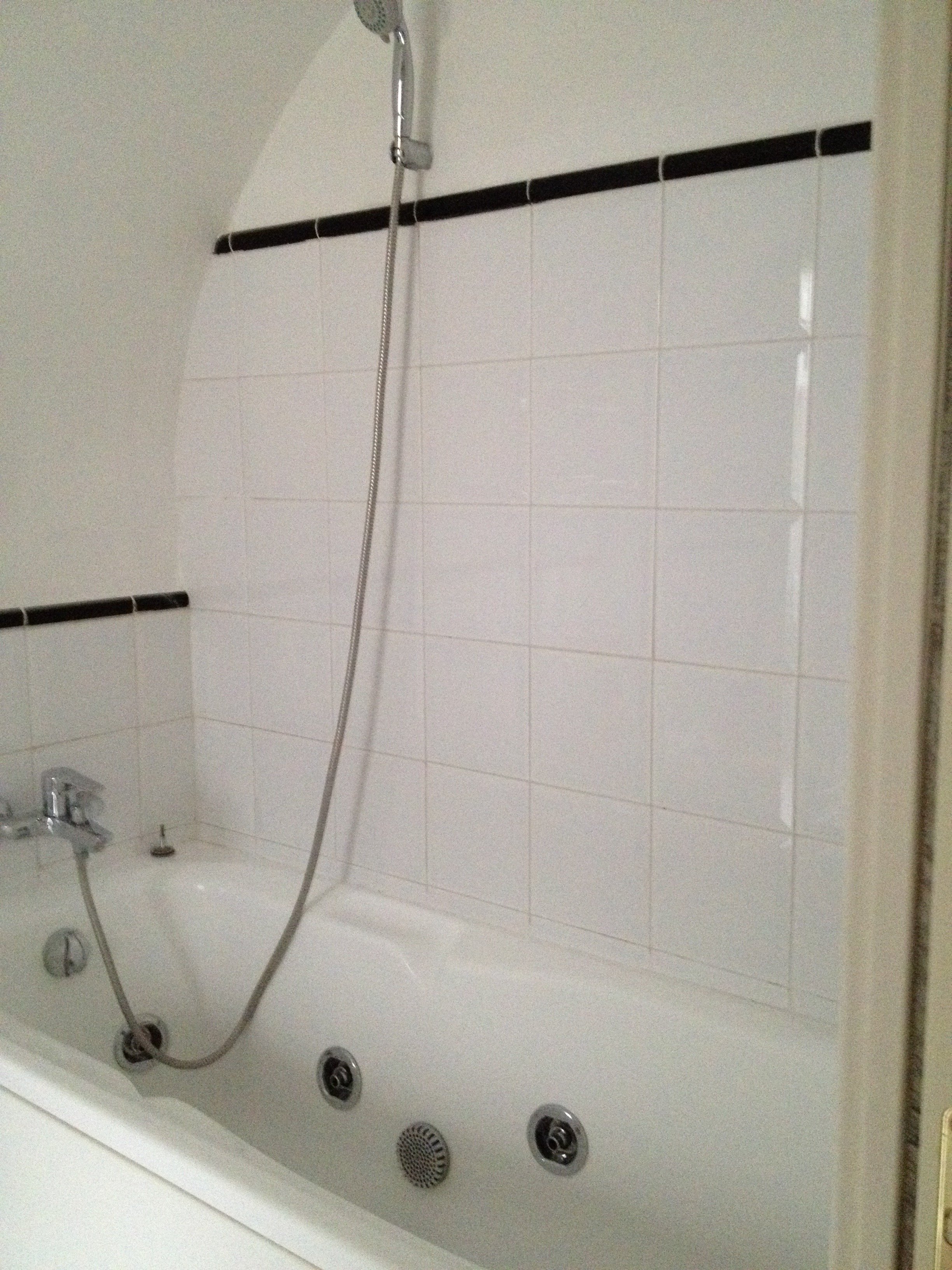 There were dated, inexpensive white tiles on the floor. AFTER
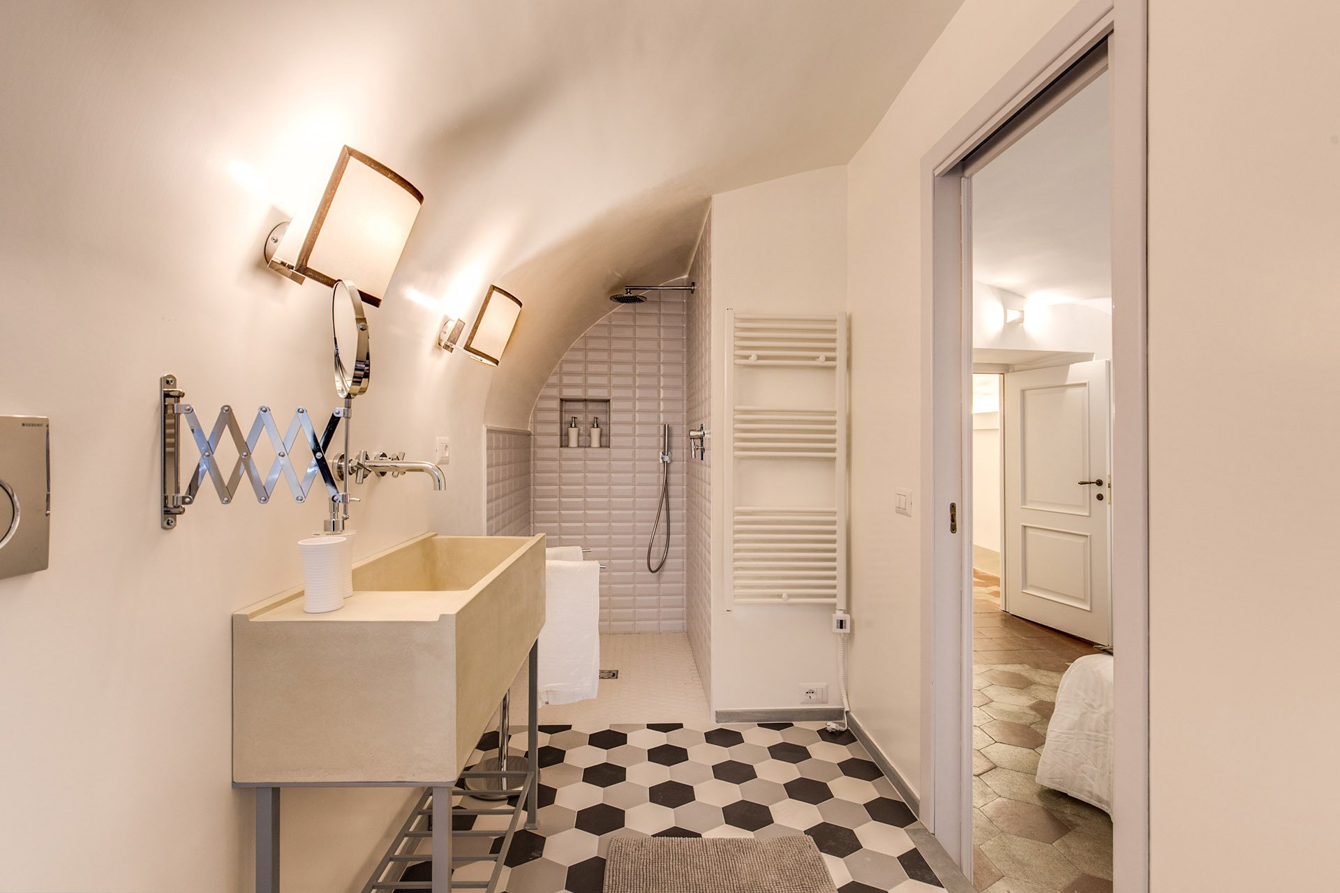 The tub was replaced with a shower.
 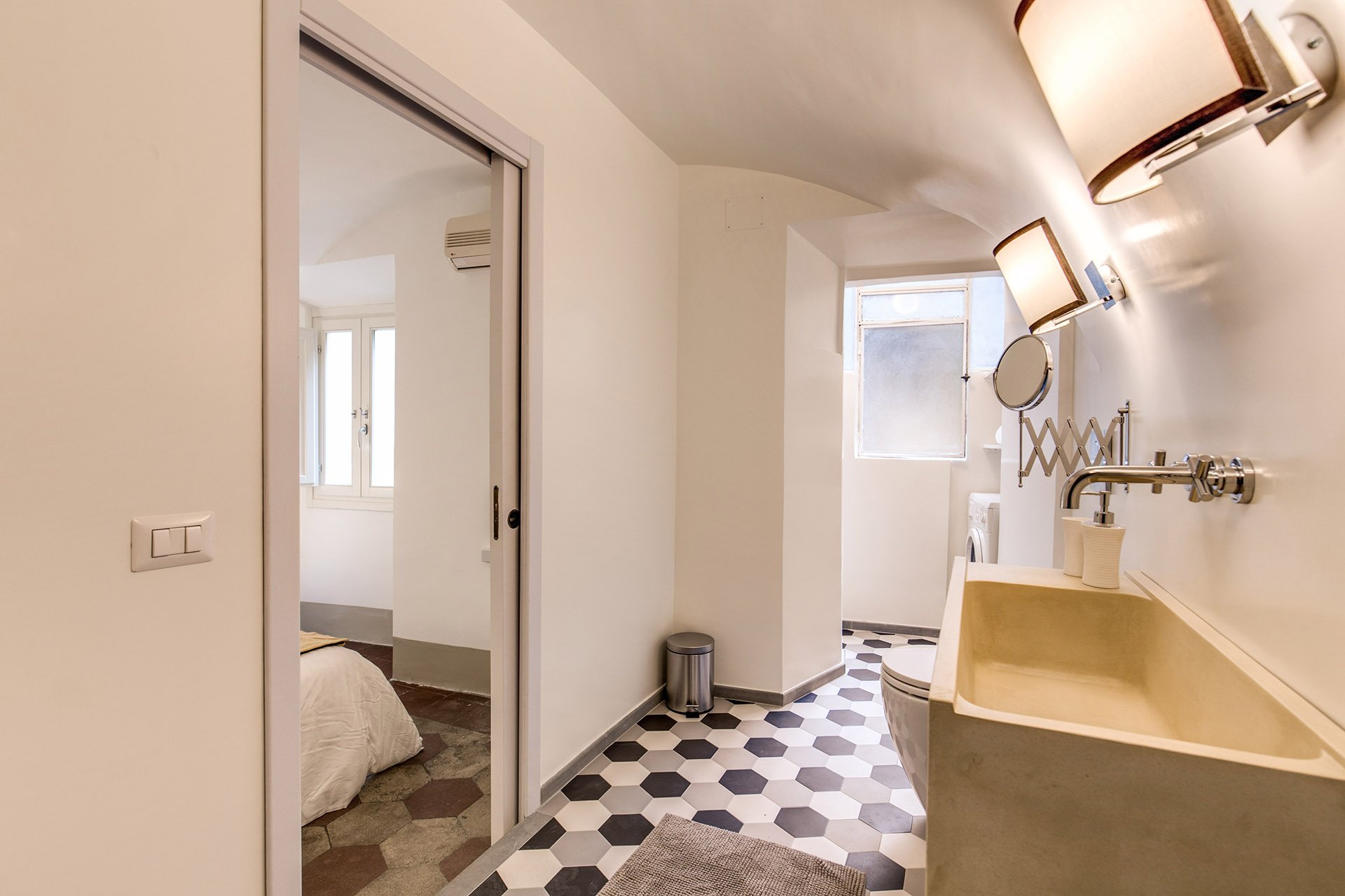 We decided to go with a combination bidet and toilet, which is great for small spaces. The client wanted a unique sink. We ordered these (which were quite heavy, our poor contractor) and asked our blacksmith to build the bases.Notice, we didn't put tiles on the walls. Similar to the Tuscany Project, we wanted the bathrooms to feel more like a room and less clinical. For a busy family bathroom this option could be impractical but I really like how these rooms feel without tiled walls.The design of the new tiles mimics the original tiled floors in the rest of the apartment. While these colors look great together, installing three colors is a different story. Complicated.
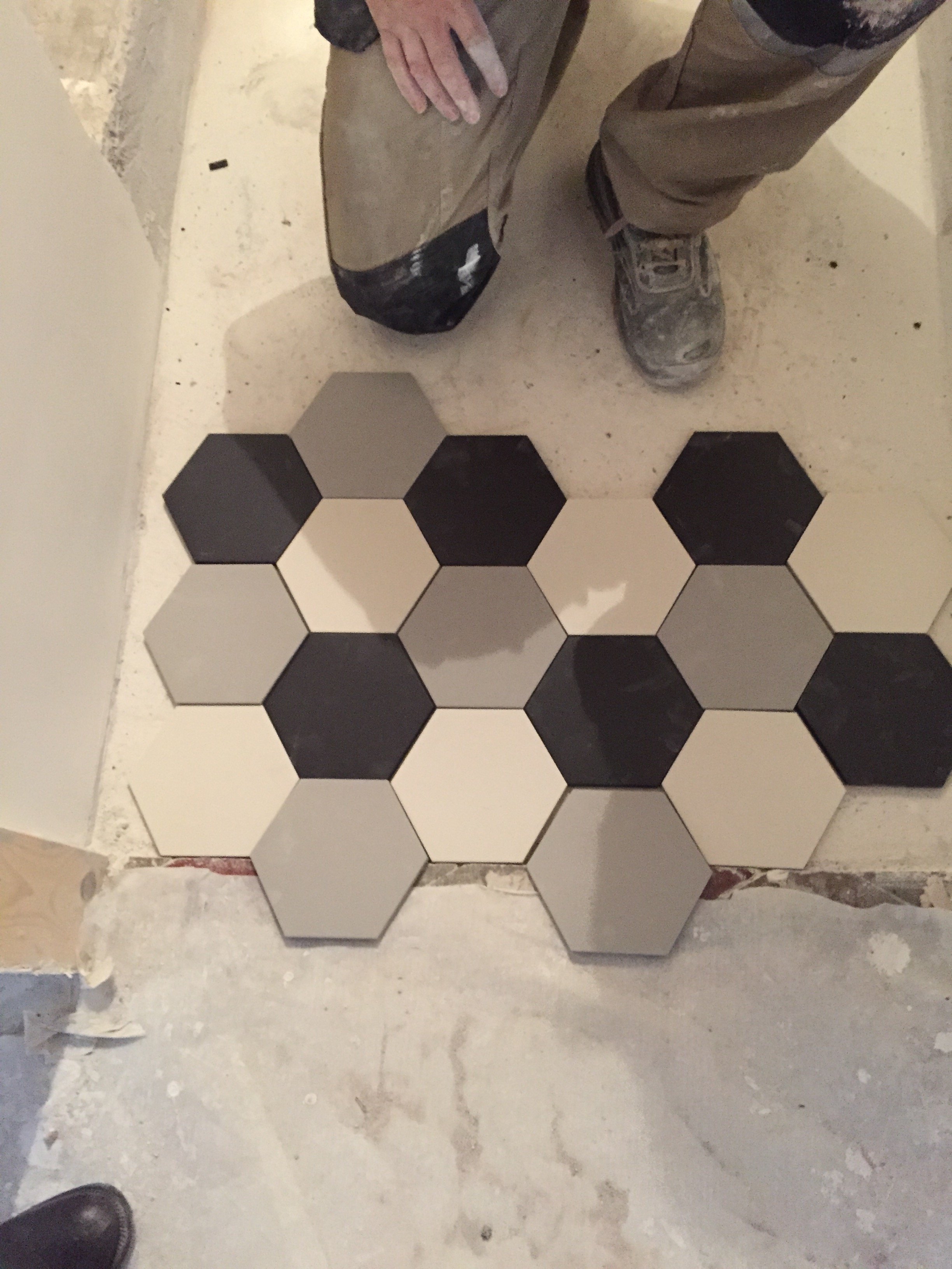 The tiles, sink, and all hardware were purchased at LOZZI.The sconces are custom. Il Paralume.Paint is a custom color from Crown.In the bedroom we added a pocket door, a built-in closet, and the lampshades are custom from Il Paralume.
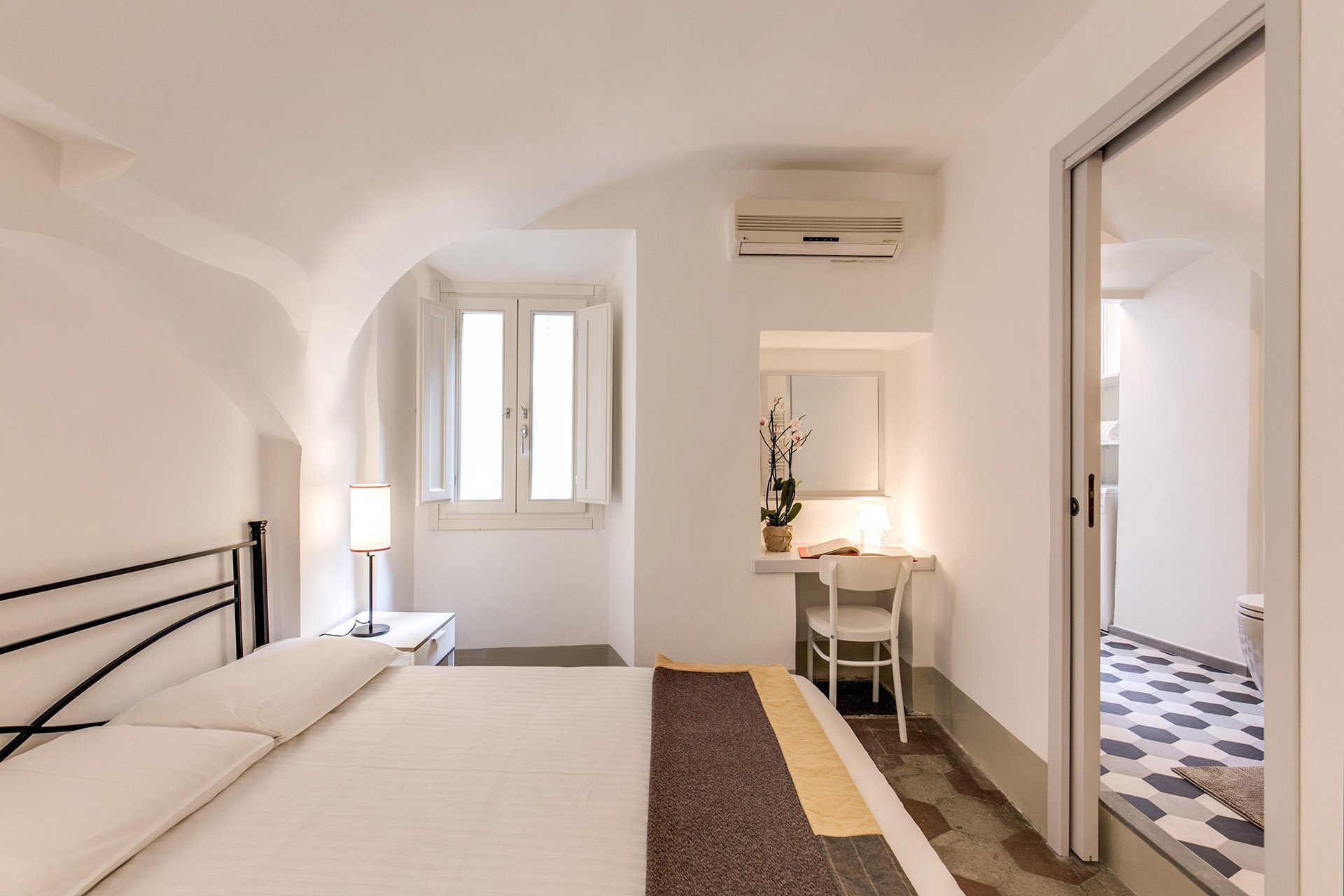 Our carpenter also created a desk in the corner.
 BEFORE - Second bathroom.Extremely tight space, dated tiles. The layout was terrible and the room very dark.
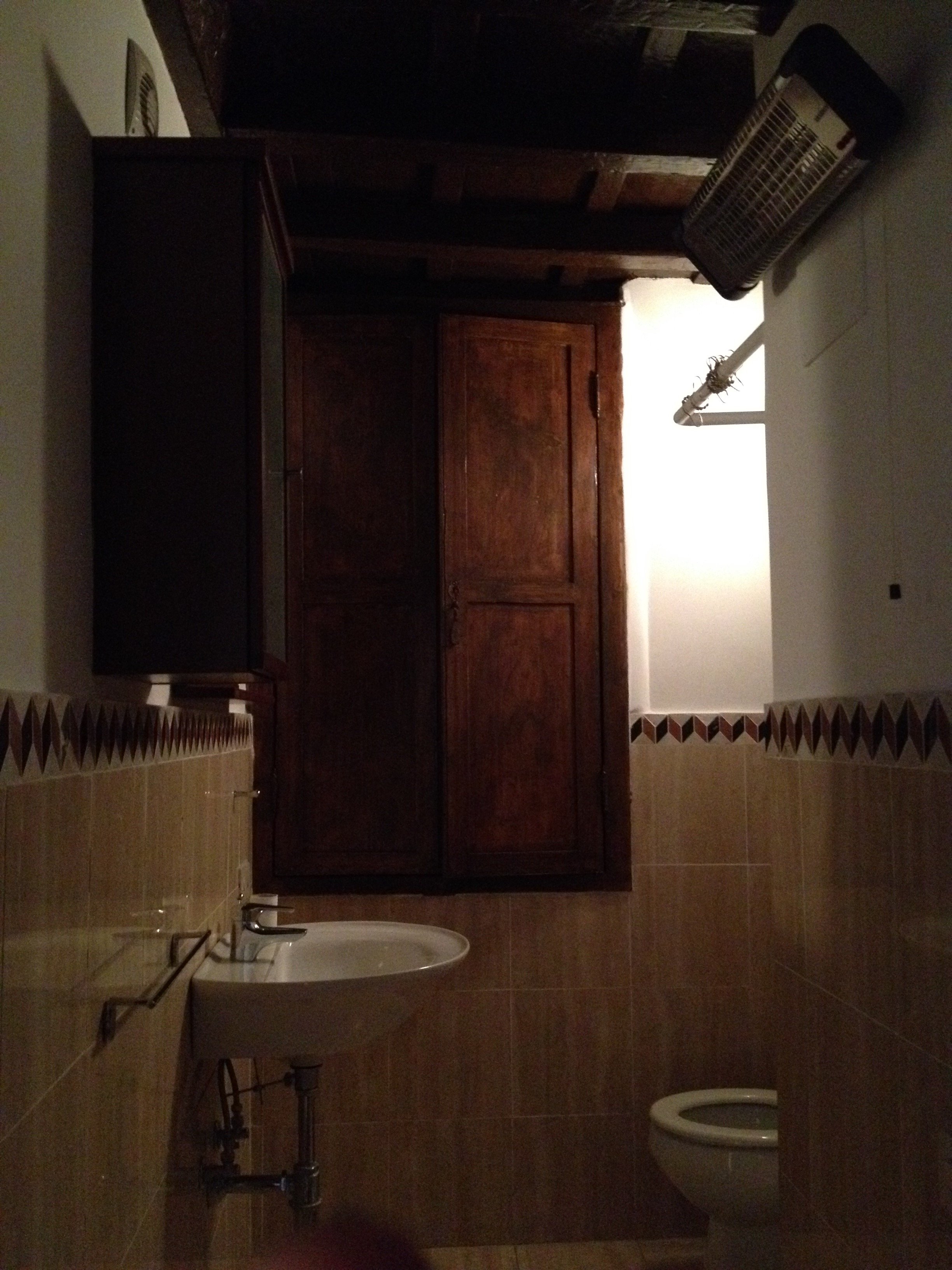 AFTERWe completely changed the layout. We moved the entrance which enabled us to add space for a proper shower.The door is custom made by our carpenter. Door fixtures are from Handles.
 Here's a better shot of the sink with the custom iron base. As with the other bathroom, we bought a combination bidet and toilet.
 BEFORE - Living Room
 AFTER - Living Room
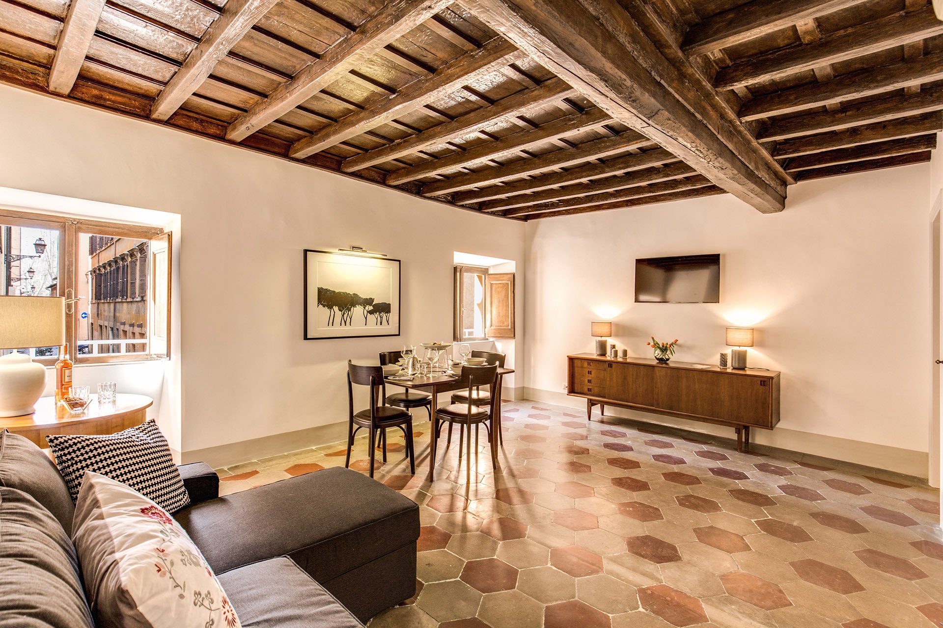 The fantastic artwork is from Due Alberi. They're based in Rome but ship internationally.Our carpenter added new closets.The dining table is from MADE and the chairs belong to the client.
 The side table came from the Via Monserrato apartment. We found the lamp at Leroy Merlin (the French version of Home Depot).
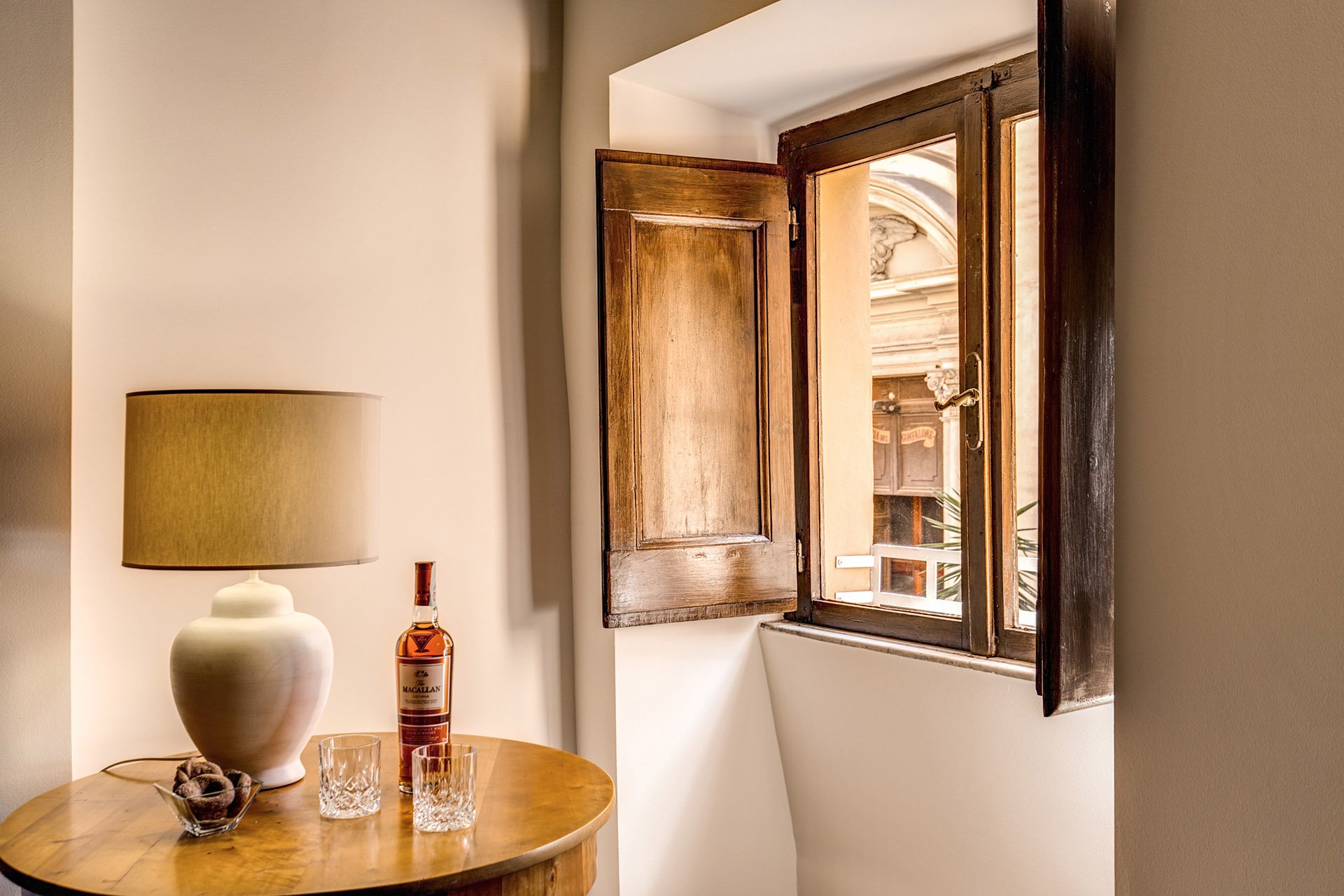 The client found the credenza online. The lamps were a great find at Leroy Merlin. We were so tired and hungry. My client was worried about my mental health as we had just spent hours at the IKEA next door. I perked up when I saw the lamps on a bottom shelf. I was so excited. It was like meeting Idris Elba.
 Overall, the apartment feels lighter despite the lack of light (the windows are tiny). The renovated kitchen and bathrooms compliment the style and architecture of the apartment. We updated them but without losing the charm.We kept the palette very simple, creamy whites, grey, black, with a touch of red. The ceiling seems higher and apartment looks/feels bigger.For more information about this vacation rental, please check out Your Suite Rome on Booking.com.Architect: Domenico MinchilliAfter Photos: Vincenzo Tambasco
Work in Progress - My Foyer
As I mentioned in an earlier post, I have lived with white walls for decades. The last time I had any color on the walls was when my parents let me pick the color for my bedroom back in high school.During my apartment search, I knew I wanted a place with a foyer/ingresso. Even my super tiny apartment on Via Pellegrino had one. Both of my apartments in Los Angeles, which were much larger, did not. Drove me nuts. You opened the door and walked right into the living room. Of course this is fine for a loft apartment but I didn't live in a loft.Many people neglect their foyer. It becomes a place to dump keys, magazines, mail, etc., etc. The foyer is the preview for the rest of your home. It sets the atmosphere. What does it say as you enter?Depending on the size of your foyer, it could provide much needed storage space, a place to display artwork, and in a smaller one you could splurge (creatively and/or financially) on your favorite wallpaper.Painting an entrance way a darker color than the next room makes the second room seem much larger. Interior designer Miles Redd loves going from dark to light. I decided to be bold for a change and go for it. I went to the store Le Decorazioni to look at Farrow & Ball samples.I'm so happy with how the foyer turned out. I'm relieved my landlady (who lives in the same building) loved it. I thought she might be offended since she'd just painted the apartment. Instead she asked me to send me a link to the Farrow & Ball website.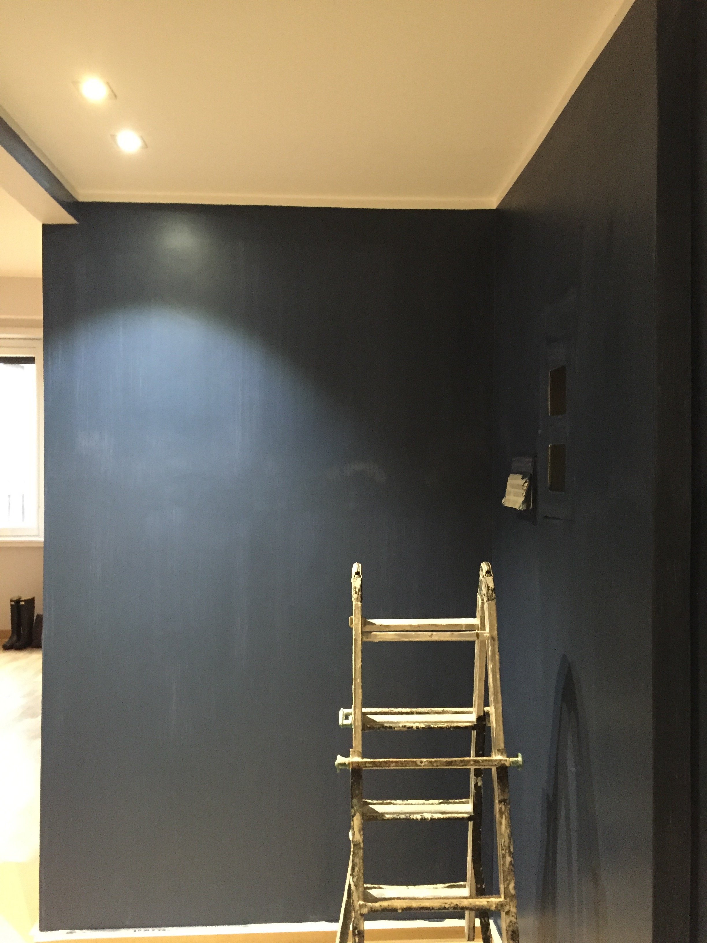 I was thinking of going with Hague Blue but in the end Stiffkey was best with the light grey in the living room. Stiffkey looks great when the lights are on and in natural light it reminds me of late summer nights in Sicily or sitting on my parents' veranda at dusk in St. Martin.When I first saw the apartment the owner told me the bookcase/cabinet in the hallway had to stay. I understood why for practical reasons. The fact that it wasn't flush with the wall bothered me aesthetically.
 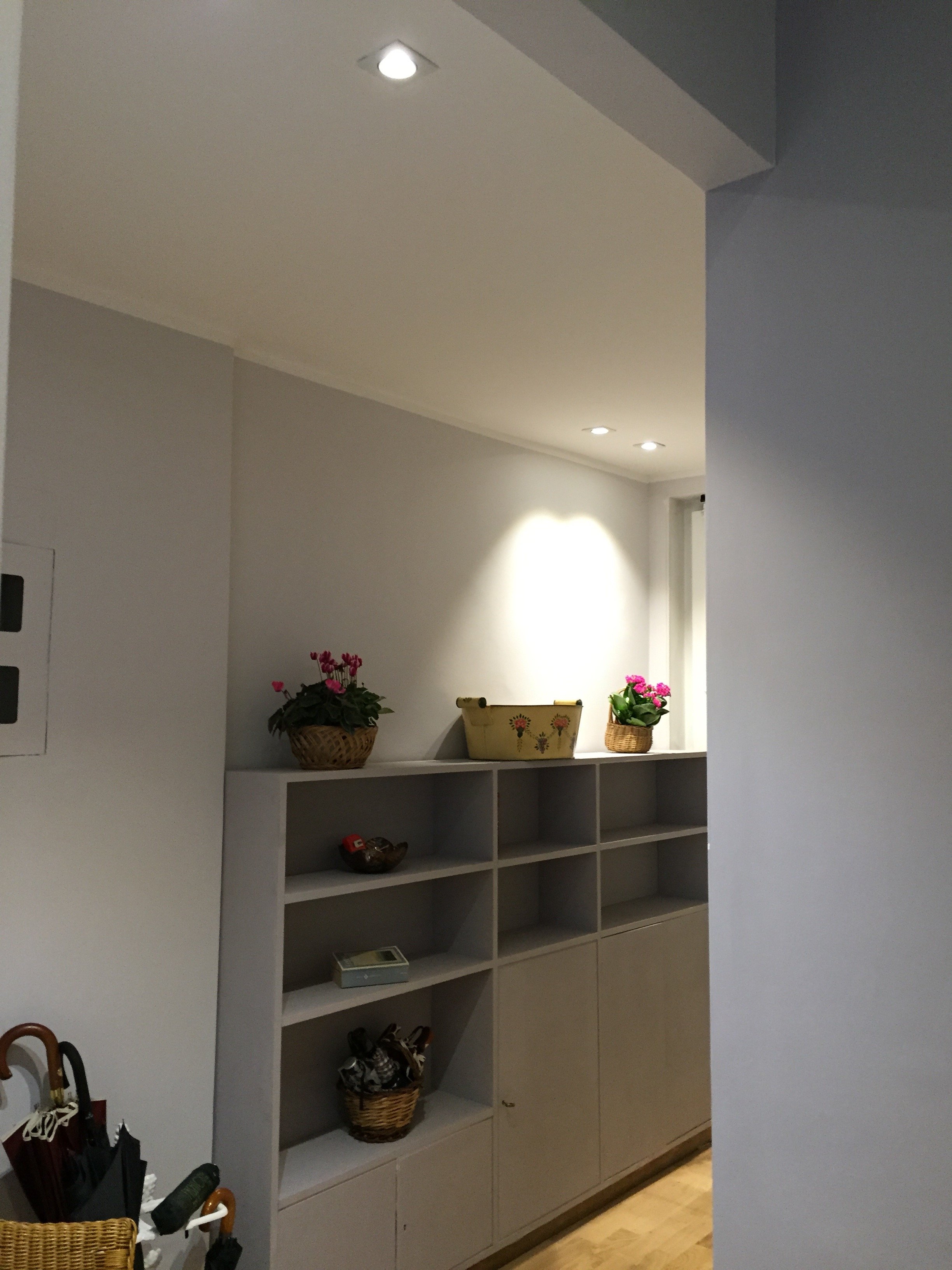 What a difference some high-quality paint makes. The painters and I couldn't believe how this big piece of furniture blends in a little more and looks more expensive than it is.
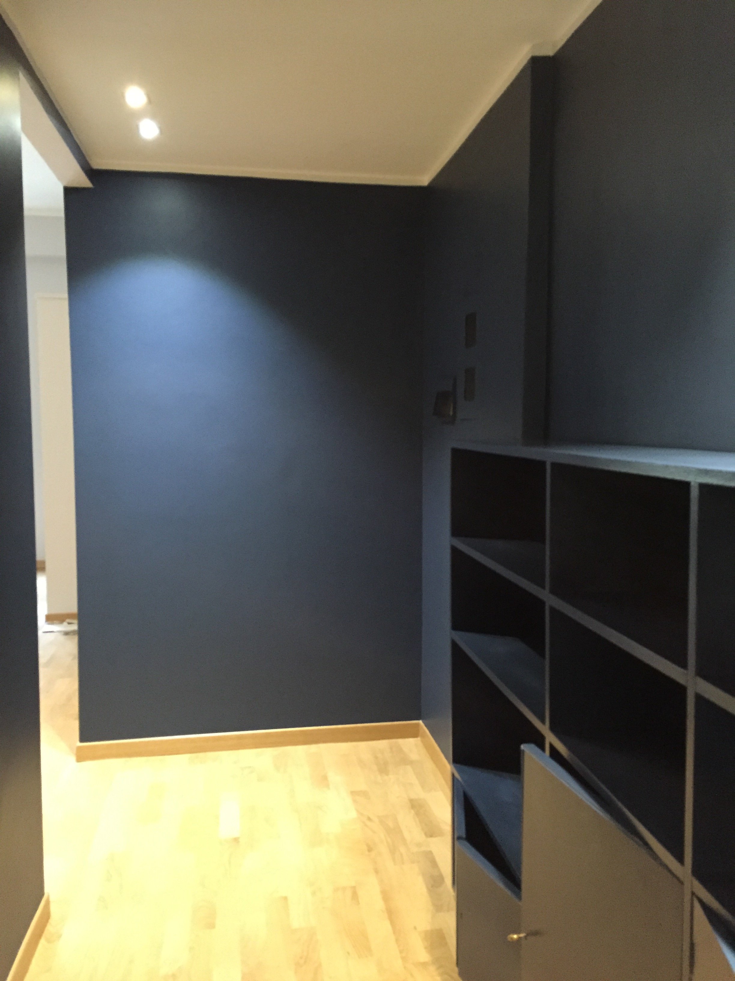 I'm going to meet with my blacksmith to design a simple bench. Above the bench I will hang some black and white photographs.I don't know when that will happen. I tell clients all the time that it's better to take our time while decorating. Perhaps I should listen to my own advice.Photos: Me and my iPhone
Life in Rome - Where to go for Cocktails
The wonderful women at Italy Casa Mia asked me to write a guest post about where to have delicious cocktails in Rome. It was hard work, very difficult research.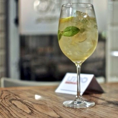 Photo: Gina Tringali However, somehow I was able to complete this assignment.Quite a bit of ink has been spilled recenty regarding how the cocktail scene has improved in Rome. I don’t know what it was like before but I agree that yes, it is possible to have a cocktail in Rome. Anyone who tells you that the only thing to drink is wine or an Aperol Spritz (not that there’s anything wrong with either of them) is incorrect.While a great bartender (or mixologist as they’re called today) is key, the atmosphere is just as important. There are some spots where the drinks are good but I cannot get into the vibe and/or décor.Of course this list is very subjective. Below are the places my friends and I tend to go to time and time again. Not on the list are a few bars some of my younger friends love. To paraphrase Lethal Weapon, “I’m too old for that foolishness.” This is a grown folks list.First up, in alphabetical order, the hotel bars. I’ve heard that back in the day (perhaps 2003?) the best chance for a decent cocktail was at a hotel bar but the prices tend to be higher.
DOM
This hotel opened two years ago on the gorgeous Via Giulia. A former convent, the tiny downstairs bar is seriously sexy with its dark greys. They make a great French 75. In warmer months, head upstairs to the lovely rooftop terrace. Note: On weekend nights, the bar gets very crowded. There’s usually a line (and a list) to get in.To read the rest of my list, click HERE. Buon drinking!


