The Cottage, Meads Bay Beach, Anguilla BWI - Reveal
Building and designing a new beach house on a tiny island is not the easiest of jobs.
This was a personal project and I was working with several people who all have different tastes. I wanted to incorporate everyone's ideas yet make sure the space was cohesive.
This is a cottage so nothing too fancy or formal. A cottage is more traditional. That's why we have spindles and rails on the veranda and not glass. I wanted it to be comfortable. It's Relaxed Chic. It's the vacation home of your favorite aunt and uncle who like to have a cocktail, or two, as they watch the sun set from their veranda.
The logistics! The one two punch of the strongest hurricane to ever hit the Atlantic and then two years later the first global pandemic in one hundred years didn't help. However, thanks to a very dedicated and hard working team, we did it! The Cottage is finished.
Here are two before photos:
Standing in front of what was going to be the kitchen island looking out at the sea view.
After: The sea view from behind said island. The house was designed to take advantage of the spectacular views. There was a big debate about the ceilings. Yes they are very high (over 19 ft) and the wood was beautiful but I thought staining them a dark color would be a mistake. The only natural light is coming from the bi-fold veranda doors and way on the other end, the windows in the kitchen.
We painted the walls and ceiling a softer white than the external color The color running through the house is blue with touches of yellow, and a coral red.
The countertops are poured concrete. The counter stools are from Serena and Lily. The handmade made bowl is Schoolhouse and the pomegranates came from our contractor's mom's backyard.
Almost everything has to be imported due to the island's size. I had a local carpenter make quite a few pieces. I was asked why not buy the bedside tables, in the Main Bedroom, in the States as it would be easier and probably cheaper. I did it because we already had a full container coming from America and it's important no matter where you build/renovate to support local businesses and artisans when possible.
I cannot stand it when you're unable to get a sense of place in a house. I'm a huge fan of the big American stores I sourced from but it's a good thing, especially for a new build, to mix it up. I don't like spaces that feel like a showroom. I also sourced from smaller vendors and to the trade.
The Caribbean is mix of cultures and that's reflexed in The Cottage. I side-eye the fact that one culture is usually missing despite the majority of the people who live in the Caribbean being from that culture.
The dining table was sourced at the French store La Maison in St Martin. The chairs, Amazon USA. A local upholster made the seat cushions. The fabric is from Ghana and was bought at the African Market store in St. Maarten (Dutch side). The vase is Crate & Barrel.
The view looking in from the veranda. Ceiling fans are Minka Aire. Sofa is from La Péninusle in St. Martin. Coffee table is Serena and Lily. Arm chairs IKEA. Custom seat cushions outdoor/indoor fabric Sunbrella from Showroom Tapissier in St. Martin. Side table from Home Kara in St. Martin.
I designed the custom bookcase/desk with our carpenter.
This is the view looking out from the veranda.
The kitchen. The cabinet doors were custom made by our carpenter. The pendants lights had to be a special order from Schoolhouse because of the height. Sconces and hardware are Schoolhouse as well. I decided not to do upper cabinets. This may not be practical for a primary residence but for a vacation house it makes sense. It's easier to find everything. I feel upper cabinets would look odd with these type of ceilings. They would cut the space in half.
Glassware, tableware, and small appliances are from Crate & Barrel. The larger appliances including the wine refrigerator (it's in the island), integrated dishwasher, and mircowave are GE and were bought through Sheila Haskins who is the authorised GE vendor on island.
When it came to the countertops, I knew from the very beginning they would be concrete. I like that they were made by hand and the material is perfect for this beach house style. The floors are coral stone tile from the Dominican Republic. Backsplash is Granada Tile also handcrafted.
I wanted this to be a comfortable house where people could relax and enjoy themselves. The tray is from Serena and Lily. The art work was commissioned from a young Anguillian artist, Carmel Gumbs. It's a black and white oil of Shoal Bay. B&W was a risk but with the incredible views why compete? It's different. The clients love it. Vase is Crate & Barrel. The morning of the shoot I cut some branches from our sea grape tree.
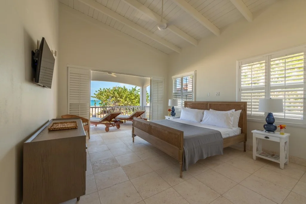
The main bedroom as the sun starts to set. The bed is Crate and Barrel. The basket is Vendredi in St. Martin. The lamps are from One Kings Lane, and the bed side tables are custom. The sheets in all the bedrooms are Boll & Branch.
Another angle of the bedroom. That view! So glad we went with these type of doors. Great for indoor/outdoor living.
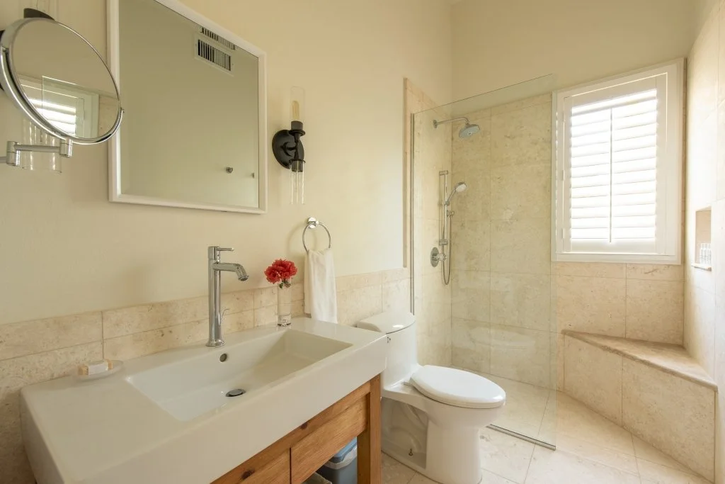
The en-suite bathroom. Sconces are from Shades of Light.
I designed the custom vanities with our carpenter and contractor. We stained the wood instead of painted it. I like having some wood in the bathrooms. Warms things up a bit.
In the original plans there was another closet where the tub currently is. Where the shower is now was supposed to be the tub AND the shower. I did a walk through once the internal walls were up. I suggested we get rid of the closet and place the tub there. It's a vacation house. It's not necessary to have two large closets. I think most people would rather have a roomy shower.
Sigh. That shower.
This bedroom also has a sea views and a king size bed. Bed is from Serena and Lily. Lamps One Kings Lane. Bedside tables from La Péninsule in St. Martin. Dresser is from Crate & Barrel.
That sea grape tree has been there for ages. I would like to relax on this veranda. Chaise lounges from One Kings Lane.
The en-suite bathroom. The next bedroom (yellow room) has the same bathroom.
The yellow room. Garden View. Twin beds and dresser are Crate & Barrel. Bedside tables from La Péninsule, St. Martin.
This color was quite controversial. This room gets a LOT of sun and the color changes during the day with the light. It's called Bermuda Sun. Appropriate.
I've just read an article in Architectural Digest regarding how yellow is one of the toughest colors to work with but it's making a comeback. I stand by my choice! Plus, it's very pretty at night.
The closets were built by our carpenter.
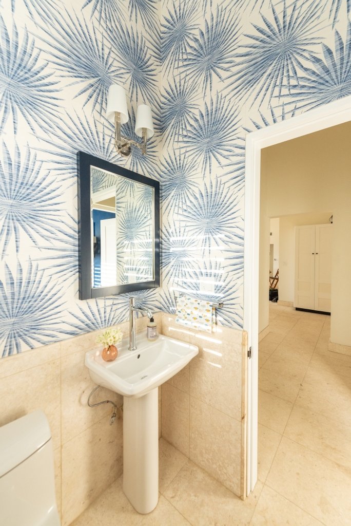
In the hallway looking into the half-bedroom and the powder room.
The day bed is from Crate & Barrel. Floor lamp Serena and Lily.
The customs/installation drama with this wallpaper was worth every grey hair.
This is a small room. Powder rooms are the perfect space to go all out. Wallpaper is Thibault (to the trade). Sconce is Circa Lighting.
This is technically the front of the house. You walk in and your eye goes immediately to the view.
The cabinets are custom. Bench is Serena and Lily. Black sconces, hooks, and door knobs from Schoolhouse. Chrome sconce is Circa Lighting and these are in all the bedrooms as well. Art work is a print from St. Martin based artist Antoine Chapon.
Bag is from Ghana sourced at the African Market store, St. Maarten.
The very large Dutch Door. I changed it from a regular door so it's possible to keep the top open for a breeze without worrying about young children, out of eyesight, going outside .
Custom shade is from The Shade Store.
Meads Bay Beach is also famous for its sunsets. Not a bad place to enjoy them. Table, love seat, coffee table, from Le Péninsule and the yellow chairs are from La Maison, both in St. Martin. Tableware and teak candle holders (on the floor) from Crate & Barrel. Table top candle holders from Paloma & Co.
I would love to walk out of the bedroom and sit here with some rosé or rum punch.
No words regarding this view.
Sconces on the veranda are Circa Lighting. Sconces outside the veranda are Shades of Light.
Meads Bay.
Buona notte/Good night!
The logistics of this project were on the Italian bureaucracy level. One thing I would highly recommend is hiring a local project manager from the very beginning, even if you're on island. We started working with Gifford Connor mid-way through this project. Once the pandemic hit, and the borders were closed, I wasn't able to visit the job site even when I was in St. Martin just a 20 minute ferry ride away. It was great to have someone on the ground to keep everything moving forward.
Anguilla is truly a special place. She has managed to retain her soul (so far) despite the increase in tourism. The government looked at what St. Maarten did and decided not to go that route. There are no casinos and no big cruise ships. I didn't appreciate this island when I was a teenager. I thought it was too small and so boring. All my relatives were super strict and nosy. I wished I were back in Jersey at the Willowbrook or Short Hill Malls with my friends. Ha. That all changed once my parents moved back to St. Martin after retiring. I started to spend more time in the Caribbean and realized that all the things that I resented when I was younger, I needed/wanted in my life.
This property belonged to my great-grandmother Priscilla Connor. I don't know much about her and next time I'm in Anguilla I will try to look up when she was born. Her daughter Martha was born in 1898 (and lived to be almost 101 years old). The high-end luxury tourism boom took off in the '80s. Now the Four Seasons (formerly the Viceroy) is on one end of the beach and Malliouhana Hotel is on the other end. My grandmother was a widow and yet she refused to sell her land. She turned down every offer. She said it would go to her children. It did and my uncles and aunt agreed with my mom to let "the kids" build The Cottage. Everyone contributed. We're one of only two or three local families to still own property on this beach. I think of Priscilla often. I wonder what her life was like and what she would think of Anguilla today. This is more than just a beach house to us.
Doors, windows, wood, and indoor shutters sourced from Arawak Hardwoods a local company that also has an office in Florida.
All bathroom fixtures and fittings are from Quality Bath.
Builders: Ernest Fleming and Shawn Romney
Architect: Anderson Home Planners
Project Manager: Gifford Connor, APA - Anguilla Property Services
Photography: KSharp Media
Click HERE for more information regarding vacation rentals.
Chatting with Ciao Bella!
I know I'm late to the game but I've just recorded my first podcast interview. I have mentioned my friend Erica Firpo's podcast CIAO BELLA on social media before. It's fantastic and I'm not saying that because she's a close friend.
This description of Ciao Bella sums it up perfectly.
"Italy's 21st-century creators - contemporary artists and artisans, heritage brands and innovative aesthetes, chefs, experts and more who are defining, redefining and evolving Italy.
Fashion. Food. Art. Travel. Design. Innovation. Tradition. And more. Cocktail conversations and behind-the-scenes visits that will make you want to pack your bags and go!"
I'm thrilled to be in the company of other Italy based creatives and to discuss what it is we love (and sometimes don't love so much) about this country.
In this episode we talked about working in Italy, interior design, Reno Italiano, and the beach house project I recently finished in Anguilla, BWI.
Erica and I met at Ciampini Caffe, one of our favourites places in Rome. Of course while we were there, construction started on an apartment above us.
Grazie, Thank You, Merci!
Greetings from a construction site.
I'm finally out of my fourteen day quarantine here in Anguilla. The contractor and his crew have returned to the job site. I spent the first week of quarantine at the boutique hotel Frangipani. I was supposed to be there only two nights but there was no way my sister-in-law and I could start our quarantine at The Cottage while the crew was finishing up the bathrooms.
I watched the premiere of RENO ITALIANO in my hotel room. To say it was a surreal experience would be an understatement. The first week after RENO aired was bananas, so many emails and messages. Speaking of bananas, that's the situation here as we finish this house. So this is just a quick note to say thank you to everyone who watched, helped spread the word, left comments, emailed, Tweeted, Instagrammed, etc. etc. I've read every single note and I'm very grateful for the wonderful feedback.
I've received a ton of questions asking me if HGTV will rerun the pilot, will it be On Demand, or on Discovery Plus, and if RENO ITALIANO will become a series. I don't have any information at the moment. If that changes in the future, I will post about it on social media.
Returning to my long punch list.
Buon weekend!
Introducing RENO ITALIANO, our HGTV pilot!
I can finally talk about it and I’m trying to be zen. As if it’s just another day at the office.
However, I have zero chill and I’m completely geeking out. The renovation TV show pilot I’ve been working on will air this Friday on HGTV. Yes, that channel. Seriously, what is my life right now?
Our show is called Reno Italiano and it’s on at 11:30 a.m. EST (USA) between Flip or Flop and Love It or List It. Check local time for listings.
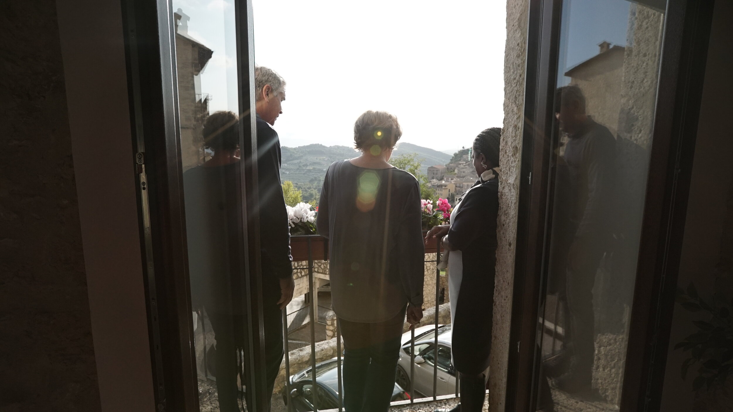
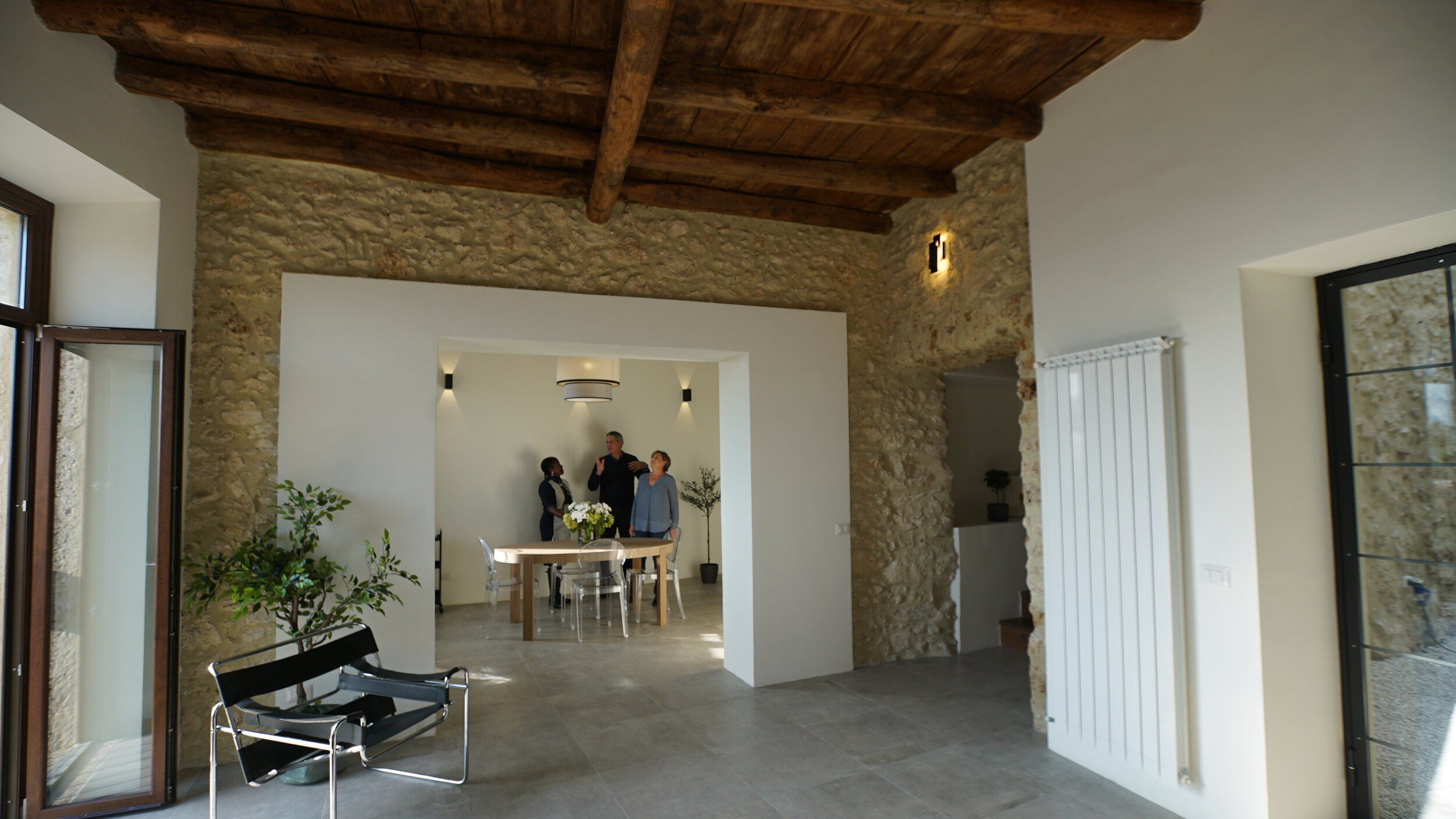
The house is located in Arpino, a small hilltop town between Rome and Naples, and the views are gorgeous. It’s over two hundred years old and had been abandoned for sixty years. This was not an easy renovation and we were doing it in Italy on a very narrow street. However, we had a great team and you’ll get to meet them during the show.
My clients, Tracy and Matt, are American and couldn’t see their house (once the renovation started) until it was finished! Can you imagine? I’m grateful for the trust they placed in us and that we were able to make their Italian dream home a reality. I’m also grateful for our excellent project managers Kylie and Antonio, phenomenal contractor Bruno, and last but not least our on point geometra, Michele.
Regarding the non-renovation part of this process, I learned a lot. It’s one thing to be an assistant or a producer on set. Being in front of the camera? Weird. I was in good hands though with my producers Kip and Rich and our showrunner Katie. This unscripted world is new to me and fascinating.
We can’t share any BEFORE or AFTER pics before the show airs. I can tell you that it’s a stunning transformation so set your DVRs.
Follow along on Twitter and Instagram with the hashtags #renoitaliano and #hgtv.
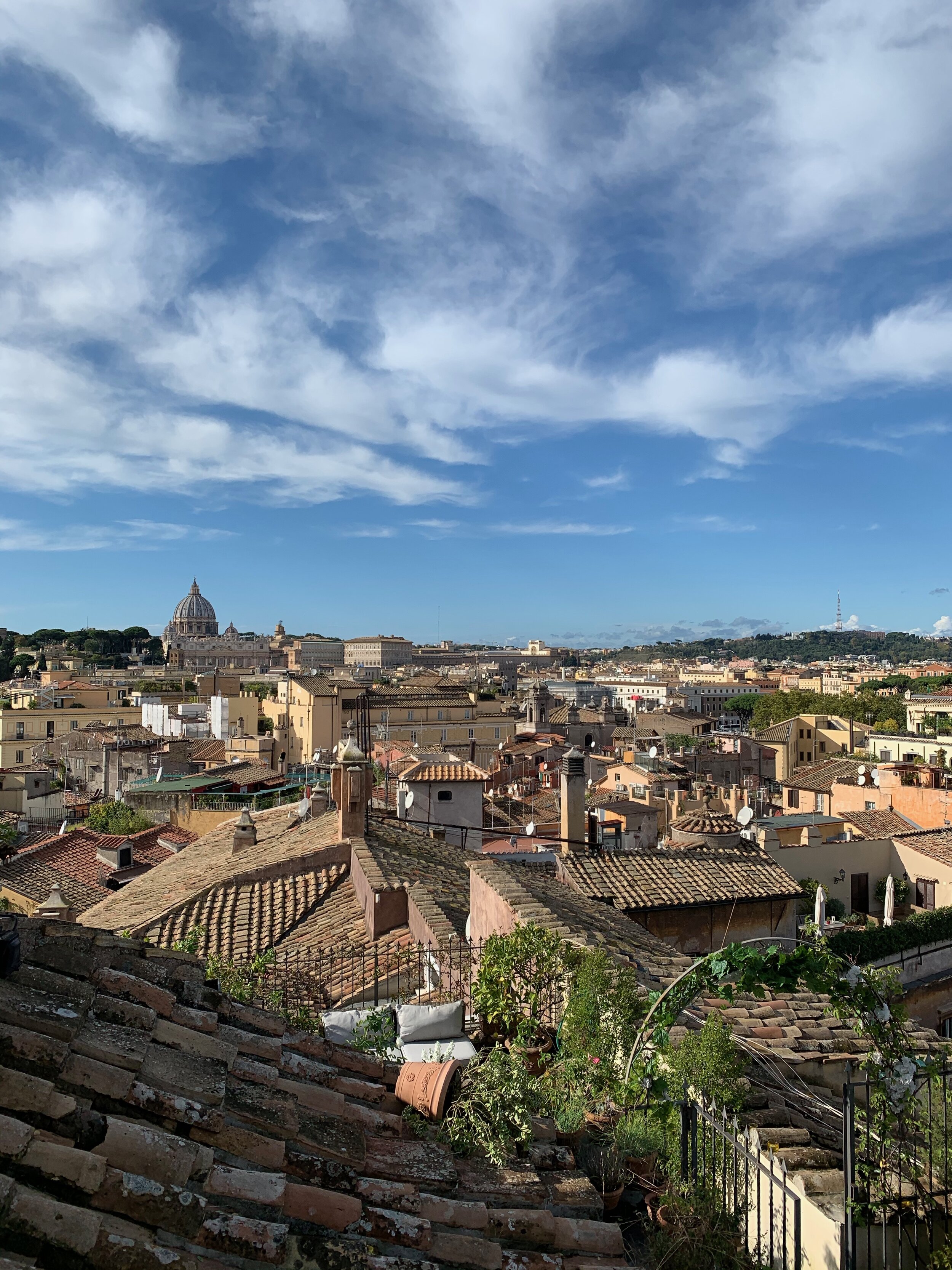
The Most Beautiful Private Terrace in Rome *
Last week my friend Livia invited me to an intimate lunch at the lovely home of Marchesa Violante Guerrieri Gonzaga.
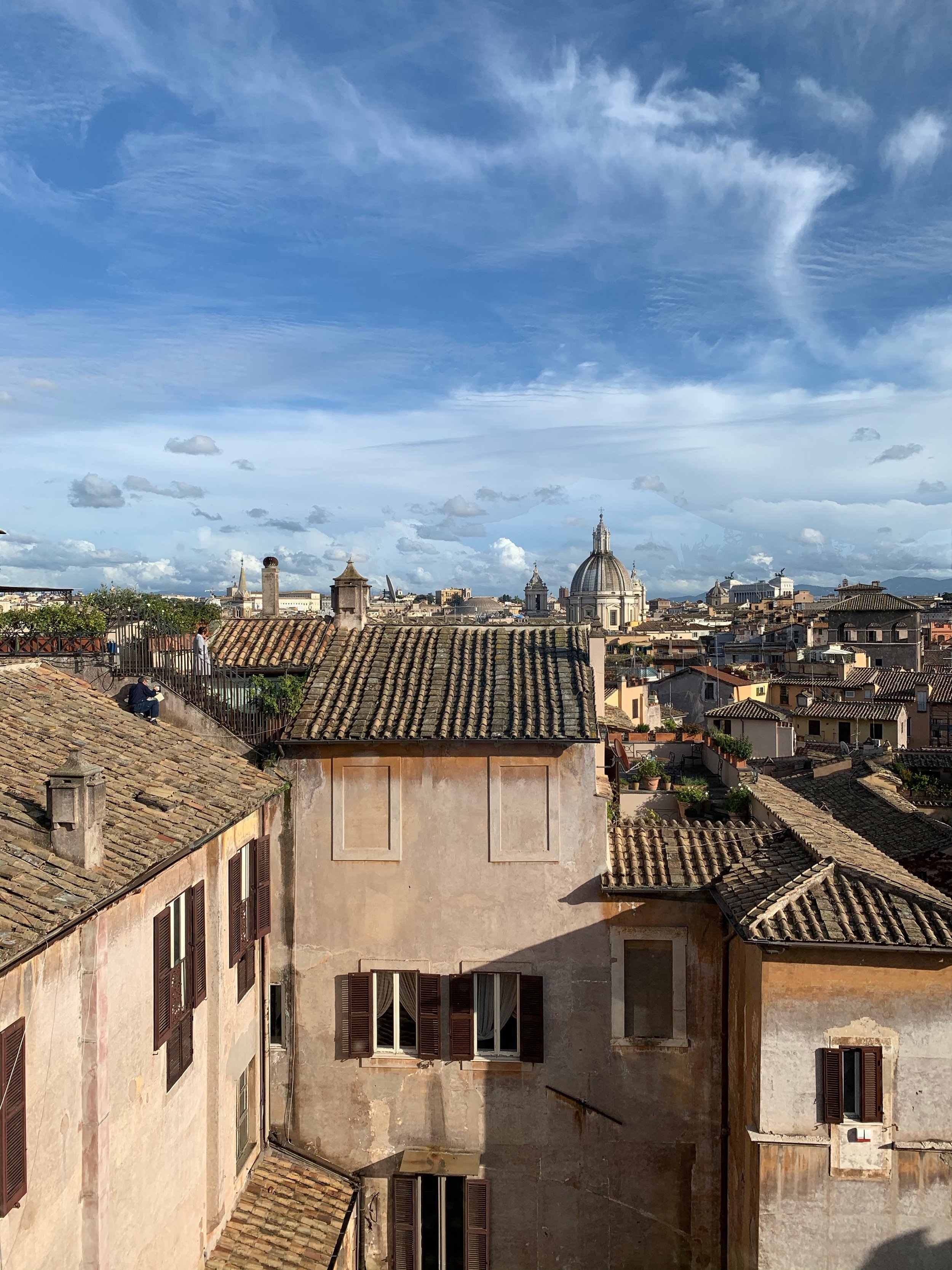
This view.
Livia getting her Prosecco on.
Violante is one of the most down to earth Marchese I’ve ever met. Hello, I’ve met people who are Kings and Queens of nothing and yet, as the kids would say, they had a stank attitude. Violante welcomed us into her family’s home with graciousness and warmth. She’s a very talented chef, artist, painter, and photographer. Violante founded Vio’s Cooking after attending the Accademia di Belle Arti in Rome and culinary school.
The lunch Violante prepared was delicious. The award-winning wine, San Leonardo, came from her family’s vineyard located in Northern Italy near Lake Garda. The floral arrangements by Alessandro Cambi were gorgeous. I enjoyed seeing a few of my friends and meeting people in person that I’ve previously “met” only on Instagram.
Violante did all the decorative painting in this room.
Check out Alessandro’s IG. Love his work.
Violante went to her local market in Campo dei Fiori for the ingredients.
As a decorator I completely lost it (but in a calm and kept it to myself way) over the interior design. So much inspiration. It felt like a real home, collected and personal. The anthesis of the cookie-cutter interiors that are clogging up Pinterest and Instagram.
Bullion fringe is making a big comeback in the States. This view. I cannot.
Violante’s home is located in one of the most historic palaces in Rome, Palazzo Taverna. Built in the 15th century, the palazzo is in the heart of the Centro Storico. I walked by it often when I lived on Via del Pellegrino and was curious about the 17th century fountain in the courtyard, which is visible from the street. This was the second time I’ve been to the palazzo but the first time during the day. Once you’re inside you don’t feel as if you’re in large city. It’s quiet. All you hear is the fountain.
We ate inside as it had been raining all week and that morning. We lucked out with the weather.
We stopped by Violante’s boutique after coffee.
Caffe realness.
It’s located on the ground floor of the palazzo. I have my eye on these blue and green glasses.
The shop is charming. They sell tableware designed by Violante and delicacies from her family’s estate, among other gorgeous items. The holidays are coming up and this boutique has wonderful, unique gifts.
Speaking of gifts, each of us were given a copy of Violante’s cookbook. It was presented in gift bag tied with a pretty green ribbon. The color was similar to the color of the plates that we used during the luncheon. It’s a simple thing but I appreciate that level of attention to detail.
Plate designed by Violante.
Love the mix of glassware and the floral arrangement.
Sitting on the upper terrace overwhelmed by all the beauty. Photo by Cassandra of Travel Italian Style.
BANANAS!
Violante offers small cooking classes in her home and also caters events. For more information about her cooking, or her shop, please visit her website at Vio’s Cooking.
*True, I haven’t been to every single terrace in Rome, but I feel comfortable with this terrace being in the top ten.
Marigold - A Delicious Newish Restaurant/Bakery in Rome.
I’ve bought baker Sofie Wochner’s cinnamon rolls during the Latteria Studio‘s holiday pop-ups. Big fan. I’ve also heard about the pop-up dinners she and her husband, chef Domenico Cortese, used to hold in various locations through out Rome.
Sofie and Domenico have dreamed about opening a restaurant and micro bakery in Rome for years and recently they made that dream come true. They’ve opened Marigold in the dynamic and artsy Ostiense neighborhood.
It’s on the other side of town and quite the hike for me. However, after my meal on Saturday, I’m more than happy to walk to the tram, take the tram to the Metro, and then walk from the Metro to the restaruant.
My friend Marta and I met for brunch. Well, more like breakfast as we arrived pretty early, around 10. It’s a good thing we did. The restaurant filled up quickly and I read there’s usually a line out the door after 1:00 p.m. The space is lovely. It’s minimalist/modern yet warm. The music is chill and enhances the vibe. The handmade ceramics are beautiful. The service was great, attentive without being intrusive.
We both had the waffles as we never make them at home. Neither one of us has a waffle pan. They were excellent. I also ordered some carrot cake because it was Saturday. It was delicious. I’m very picky about cakes, especially in Italian where American style ones can be too dry. The carrot cake was perfection. Not too sweet and the icing was great too.
I haven’t had the bread but my friends rave about it. Sofie walked out with a tray of chocolate chip cookies as we were leaving. I had already ate my weight in sugar and bought some cinnamon rolls to go. While I was tempted to buy some cookies, I decided to hold off and return another day. I will probably buy some cinnamon rolls too and the carrot cake again, and maybe a brownie. Perhaps it’s a good thing that Marigold is on the other side of town.
IMG_1823.jpeg
Closed on Mondays.
Via Giovanni da Empoli, 37
Rome, 00154 +39 06 8772 5679
White Kitchens - Yes or No?
Put me firmly in the YES camp. I'm the middle of sourcing cabinets for our Anguilla Beach House Project. As I read various online design magazines and blogs, it appears that white kitchens are "out". People are sick of them. Apparently, they are boring and show no creativity.
I disagree. I strongly believe that kitchens and bathrooms are not the places to be trendy. They are the most expensive rooms to build or renovate. Twenty-four percent of Americans move to a new house every five years. In other countries people tend not to move as often. If one is worried about the resale value of their home, it would make sense to have a kitchen that is not dated.
A well-designed white kitchen is timeless. This is one reason they're so popular. One cannot tell if the kitchen was renovated five months ago or fifteen years ago. A homeowner can always swap out hardware or light fixtures to freshen things up or we can use accessories that speak to the trends of the moment. Most people cannot afford (nor want to) gut a functional kitchen just for aesthetic reasons.
White kitchens are not a trend given they've been "in" for almost two decades and were very popular in the 1920s. They are classic. Seriously, what are people smoking? I think, with the rise of social media, we're burning through trends faster. There's this need for instant gratification and always looking for something new. The thing is, most of the hot trends of today will not hold up.
To me it's more important that a workhorse room, like a kitchen, functions well. Open shelving may not be practical for some families. Maybe your kitchen isn't big enough for a massive island.
If a client wants to go with dark green cabinets, I'm all for it and we'll look for the shade that works best in the space. However, if a client wants white Shaker cabinets but worries it's too boring, we're going to get the darn Shaker cabinets. We can find other ways to add some color to the kitchen.
Content driven decorators rarely think about the architecture and/or the function of the space. Many have moved away from working with clients and instead continuously buy and flip houses. That's a very different mindset than creating a home for yourself or for a client.
As I work on this beach house kitchen, I'm mindful of the trends but we will have white Shaker cabinets as they fit the space, the location, and the architecture of the home. If the house were inland or a primary residence maybe we would chose a different color.
Here are some kitchens from talented designers and decorators. Notice that they don't look the same. I wish someone would tell them that these kitchens are boring or "so over".
This kitchen is in a 1922 Colonial that was recently renovated by interior designer, David Nastasi.
Photo: New York Magazine
Modern Farmhouse by House of Jade Interiors.
Photo. The Spruce
A villa in Tuscany designed by Ilaria Miani. The estate belonged to her grandparents and is now owned by her brother. I was one of her interns and I remember her custom Whatnot shelving well.
Photo: Elle Decor
Interior designer's Mark D. Sikes's kitchen in the Hollywood Hills.
Photo: Mark D. Sikes
A minimalist NYC kitchen. Love the terrazzo floor. Interior Design by Pierce Allen.
Photo: Elle Decor
The Design Files - Beautiful Plates from Pastificio Gentile
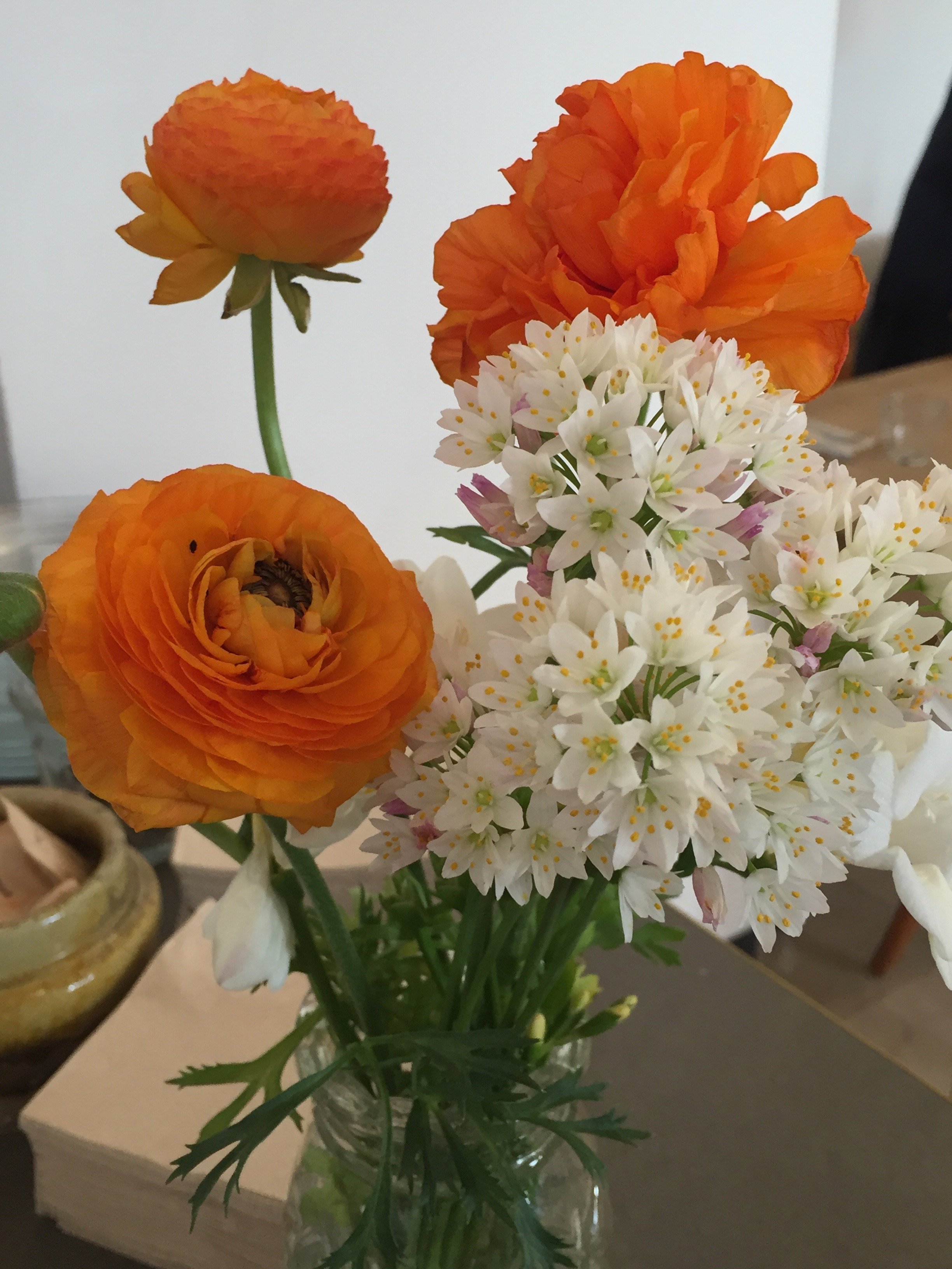
Recently I was in Umbria at my friend’s Elizabeth and Domenico’s house and I posted this photo on Instagram.
This view, tho!
Quite a few people DM’d, or emailed, me to ask where the plates were from.
I remembered Elizabeth’s Instastories from when she visited Pastificio Gentile and seeing the plates. This family owned company has been making pasta since 1876. Elizabeth wrote this post using their pasta to make two zucchini recipes.
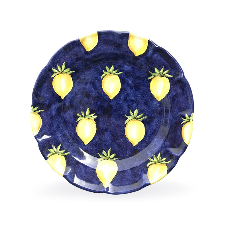
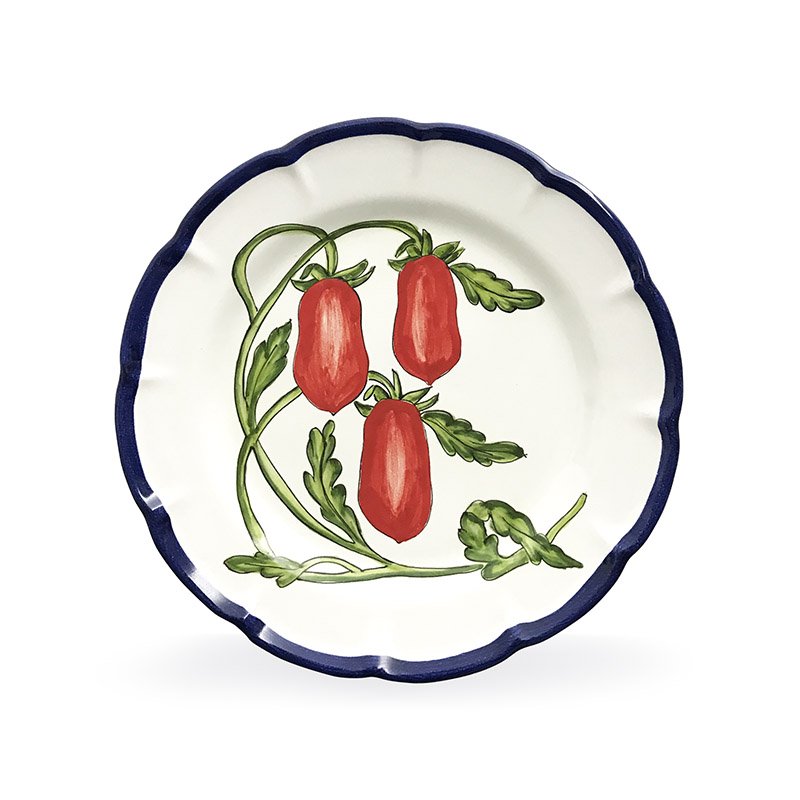
Pasitifico Gentile also sells exclusive handcrafted plates painted by artist Rosalinda Acampora. I thought the blue and yellow ones were lemons at first. They’re yellow tomatoes (and on my wish list). Wait, all of these are on my list!
I’ve read that bloggers have ruined Chevron forever but I don’t care. This plate is fantastic.
Click here to see the rest of their selection.
Elizabeth’s new book, THE ITALIAN TABLE, will be released Spring 2019. I cannot wait to read it.
This is her table setting for a simple lunch. It was beautiful and delicious. I love how Elizabeth mixed patterns. The key is the color palette.
Table photos: Me and my iPhone
Plate photos: Pastificio Gentile
The Design Files - A Beautiful Colonial Renovation
I published a post earlier this year regarding how traditional interiors are “in” again. I don’t think they were ever out but I’m thrilled to see color and patterns celebrated again.
I recently read about this gorgeous renovation in New York Magazine. I enjoyed The Cut Wendy Goodman’s interesting and informative interview with Interior Designer David Nastasi and his husband Michael Stone.
The couple bought the 1922 Colonial in 2014 and started the renovations a year later. It was a lot of work as the house hadn’t been touched for decades. It was important to the new owners to keep the elegant architecture of the house while updating it for the way we live today.
It’s a stunner.
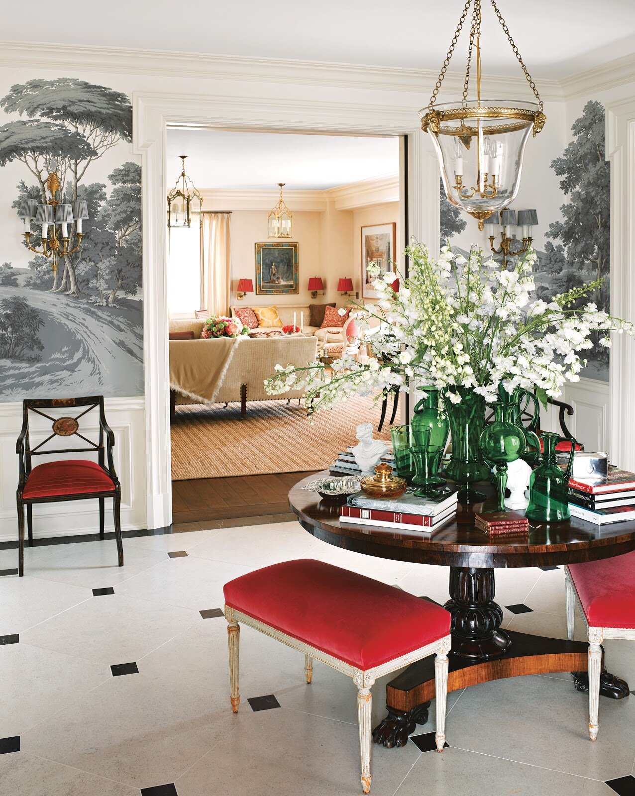
Can we talk about this entrance?! I’m not the biggest Fornasetti fan. I like it in small doses BUT their Nuvolette wallpaper from Cole & Son? Cannot get enough of it. Cannot. This is a bold choice for a traditional home. I love it.
More wallpaper to love in the dining room. It’s from the Spanish brand, Gaston y Daniela.
I’m writing a separate post about white kitchens. There is nothing dated about this one. All these windows. The mix of modern and traditional. This is a kitchen I could spend hours in.
To seem more of this wonderful renovation, the article is HERE.
Photographs by Genevieve Garruppo
The Design Files - Ristorante Local, Venice
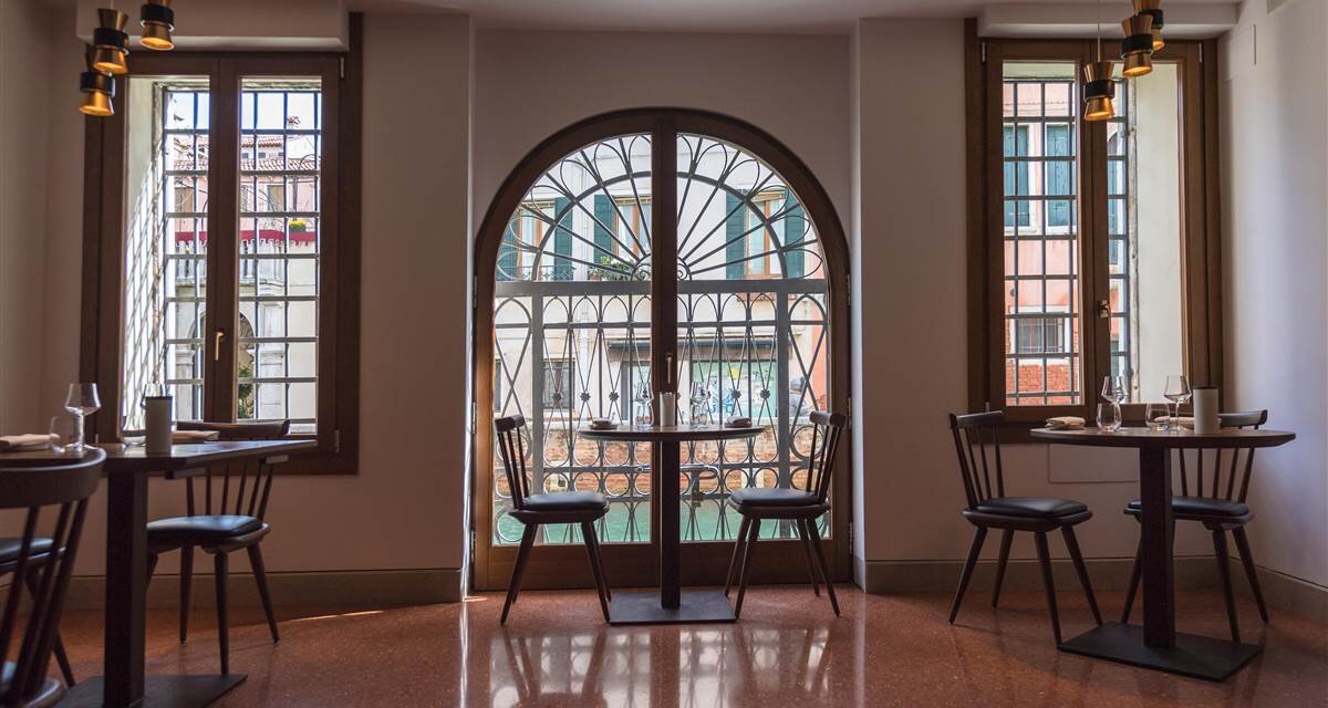
Yes, it's true that Venice has many tourist trap restaurants. Tourist traps don't care about the quality of their food (and love to over charge people) as it's a volume business, especially from the mega cruise ships. They will never see those tourists again and locals would never eat there.Do not let the bad press discourage you. There are fantastic places to eat in Venice! The restaurant Local is one of them. I'm not going to write about the food though (which was delicious) but about the interior design and overall vibe.The restaurant was opened in 2016 by brother and sister, Benedetta and Luca Fullin. The space used to be an electrical shop. It's located in the Castello neighborhood between Piazza San Marco and The Arsenale.The design like, the cuisine, is inspired by local traditional Venice but with a touch of modern international flavors.I spoke with Benedetta during our trip last month and she told they used local artisans to make, by hand, everything from the floors, to the dishes, to the lighting, etc.I absolutely love the Venetian Terrazzo floors.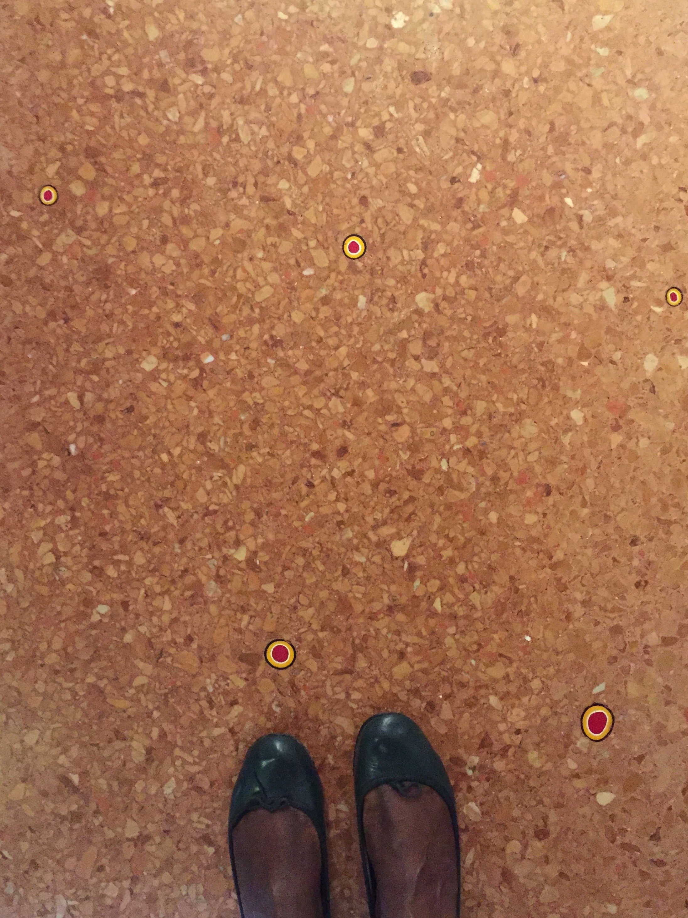 They were poured by hand and hold over five thousand murrine, which were handmade in Murano. The oak table, chairs, and wine cellar were made by Pasquini Marino.The open planned kitchen is inviting. It's not a cheap restaurant (our meals were included so checked prices online) but it's not stuffy either.
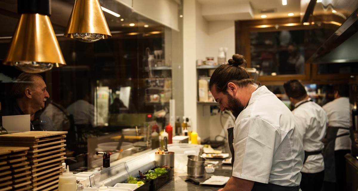 The restaurant sits on a side canal, light pours in.
 Local frequently showcases art, with a focus on emerging talent, from the Contini Art Gallery.It's not easy to find the right balance in a historic, popular tourist destination like Venice. Do you completely erase the past in order to stay current, or go in the opposite extreme? Local feels very much of its time and its location. I'm not a fan of eating in a restaurant that looks and feels generic. We eat with our eyes as well and the interior design and ambience of a restaurant shouldn't be overlooked. Living in Los Angeles, sometimes we had the reverse situation, gorgeous spaces that were very "in" but the food was indifferent to inedible.Twelve years had passed between my two trips to Venice. That's ridiculous. I'd like to return sooner rather than later. I look forward to returning to Local, grabbing a seat at the bar, and trying their cicchetti.

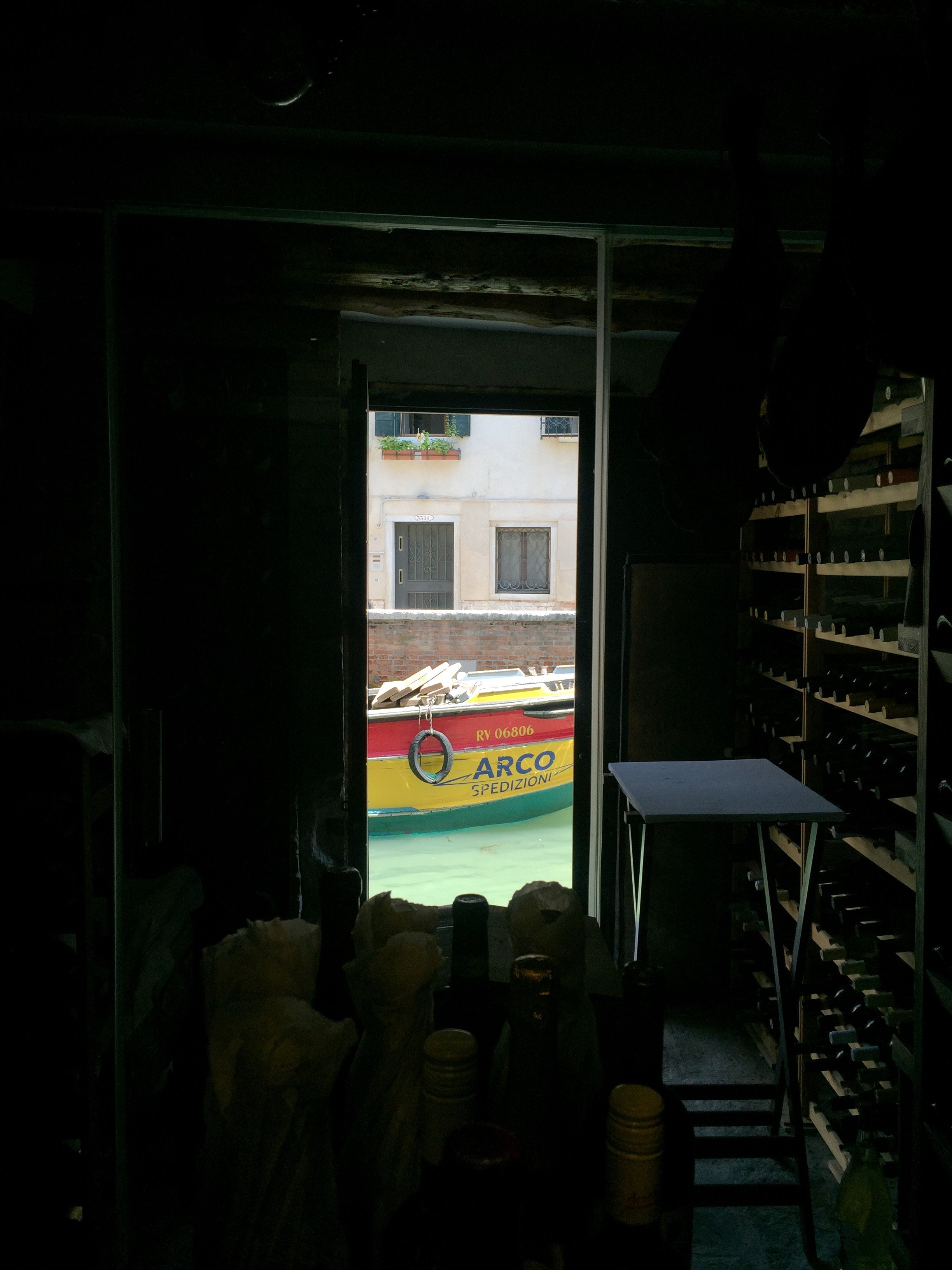
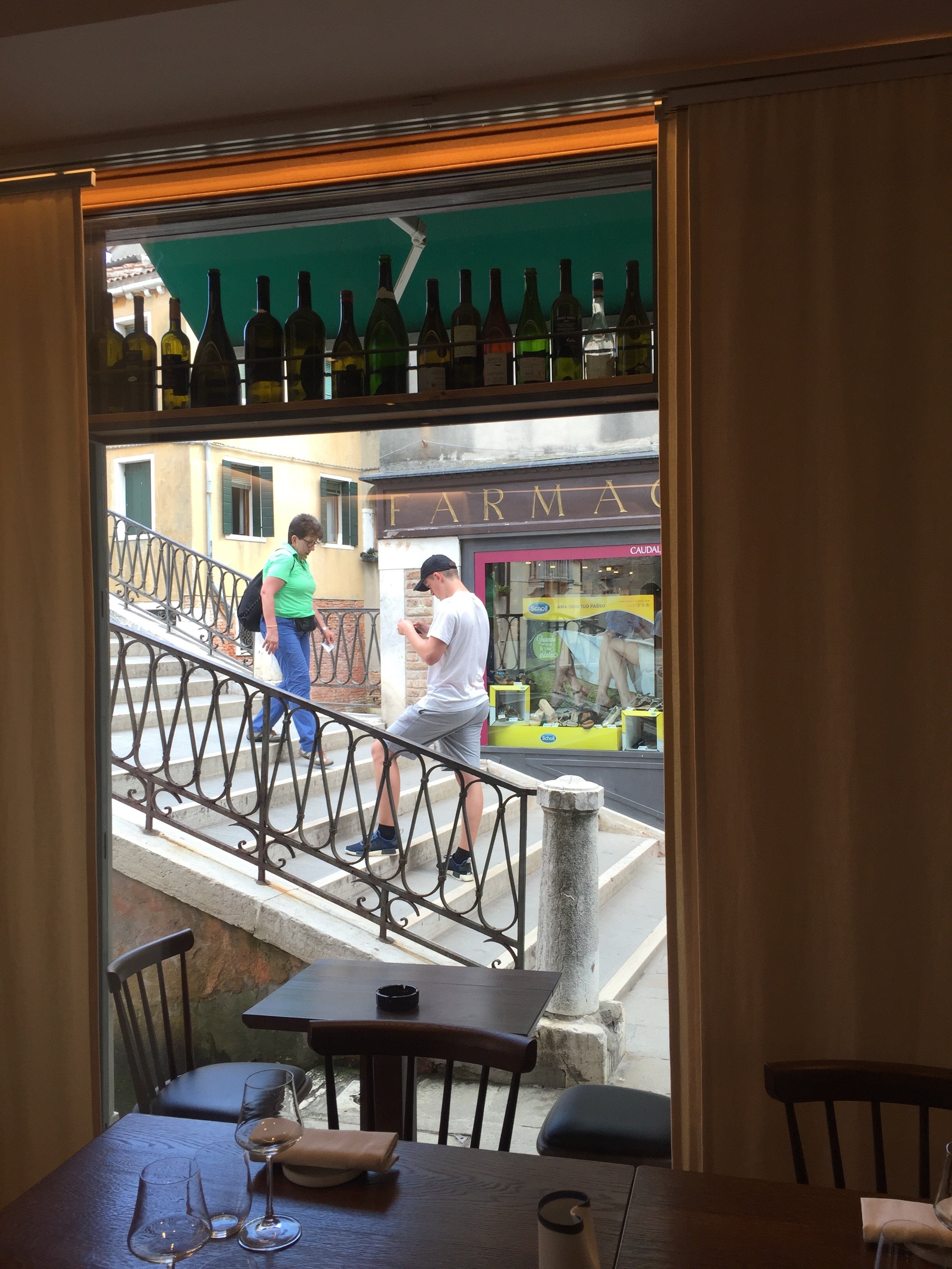 First photo and the last two photos: Me and my iPhone. Other photos: Ristorante Local
The Design Files - Something's Gotta Give, Fifteen Years Later
I follow writer/director Nancy Meyers on Instagram. She recently published a post regarding the upcoming fifteenth anniversary of her film. I cannot believe it's been that long since the release of one of the best interior design films ever produced. Yes, I know the movie isn't about interior design but the production design was so exquisite that years later the interiors, by Production Designer, Jon Hutman and Set Decorator, Beth Rubino, look as lovely as ever.I was speaking with a Kitchen & Bath interior designer and she said that her clients are still referencing the kitchen. Creating interiors that are timeless, yet fresh, isn't easy.The interiors help us get a sense of who Erica Barry is. She's a very successful woman of a certain age (56), who has completely shut down in the romance department. This was one of Diane Keaton's best roles. Jack Nicholson was fantastic as well. These type of sharp comedic roles are not easy and Jack's Harry Sanborn character, in particular, was complicated. We were rooting for Erica from the get go. Harry, if played by a lesser actor, may have come across as a complete cad, a boring cliché of a man in his mid 60s chasing after women more than half his age. Jack and Diane had great chemistry. You can't manufacture magic.This movie had it all. I wish Hollywood would make more romantic comedies about and for adults. I keep hearing and reading this genre is dead, at least for feature films. This is unfortunate. The world needs more romance!For now, let us enjoy this beautiful home. The exterior was from a real home in Southhampton. The interiors were built on a sound stage.For more information regarding sourcing and how the interiors were created, check out Interior Designer Linda Merrill's post.
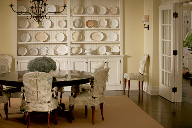


 Photos: Modern Country Style except where noted.
The Design Files - The Authentics
The Authentics: A Lush Dive into the Substance of Style by Melanie Acevedo & Dara Caponigro, is gorgeous book that takes us into the beautiful homes of dynamic people who work in a variety of creative fields.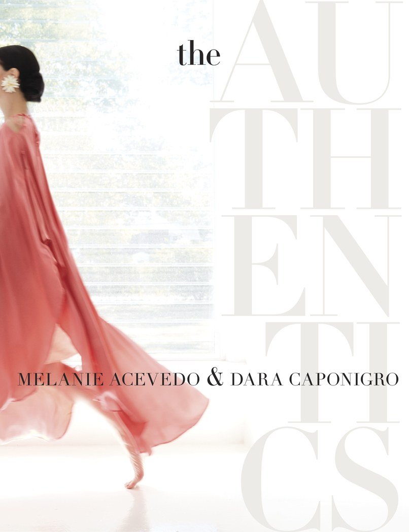 Ms. Acevedo is a well known photographer. Ms. Caponigro was one of the founders of DOMINO magazine and is currently the Creative Director of F. Schumacher & Co., the legendary fabric, wallpaper, and rug company.This is a book I will reference time and time again. Some of the names are famous in the design world, like Kelly Wearstler, Miles Redd, and Nicky Haslam, or celebrities such as actress Peggy Lipton and hair stylist Sally Hershberger. There are landscape architects, jewelry designers, chefs, etc. All have an unique point of view.Some of the rooms or gardens might be a bit "much" but I love that in a homogenized world there are people who surround themselves with things that they enjoy regardless of popularity.
 Visually, this coffee table book is a knockout. It has thick quality paper and is beautifully photographed.The interviews with these talented creative people were very inspiring. It's easy, thanks to social media, to see the same images again and again. At first everyone is excited and then the same people start to complain that the image is played or trite. The Authentics create their spaces in a way that speaks to their interests, loves, and passions. That approach will never go out of style.
Design Inspiration - Palazzo Reale, Naples, Italy
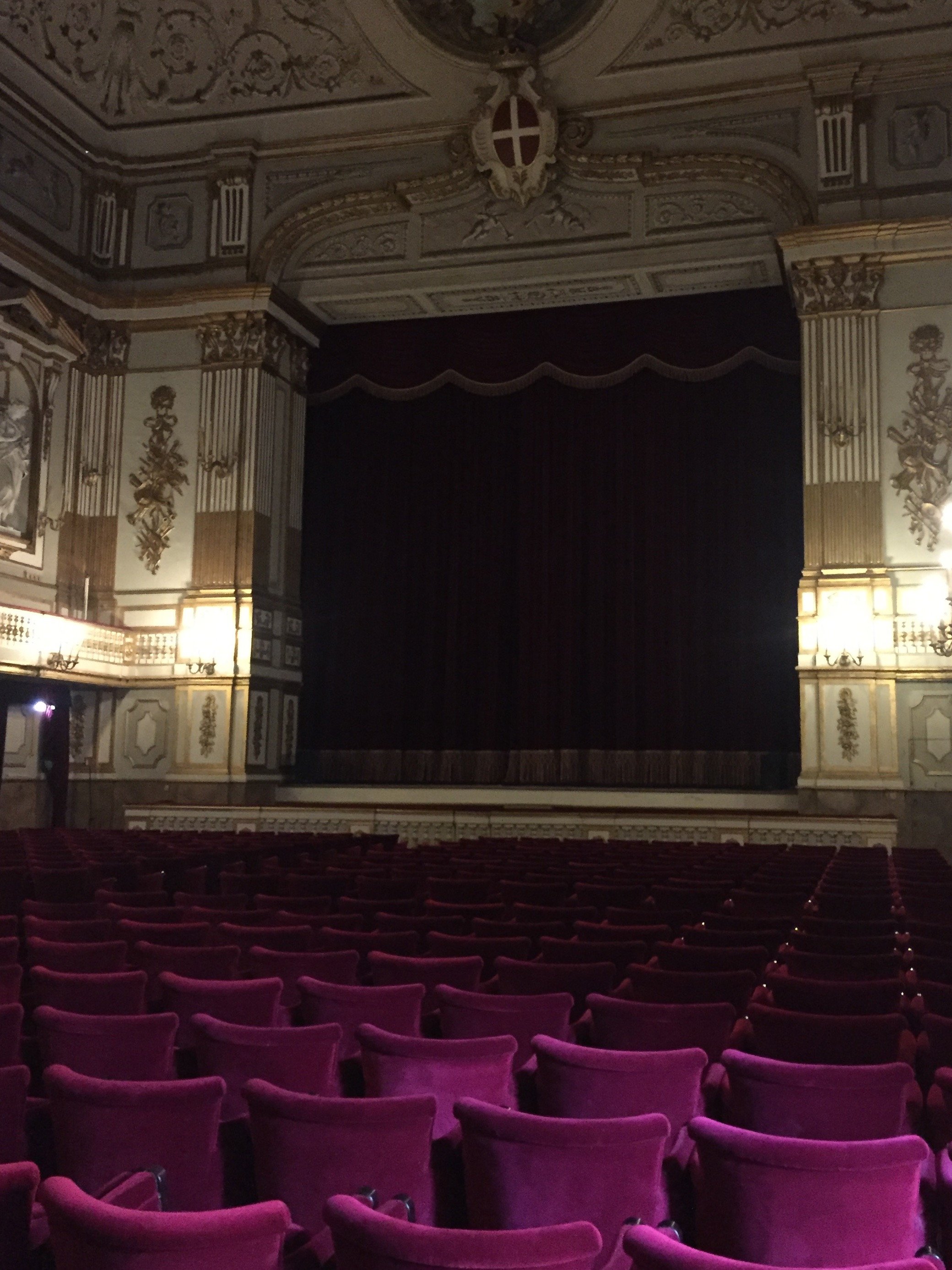
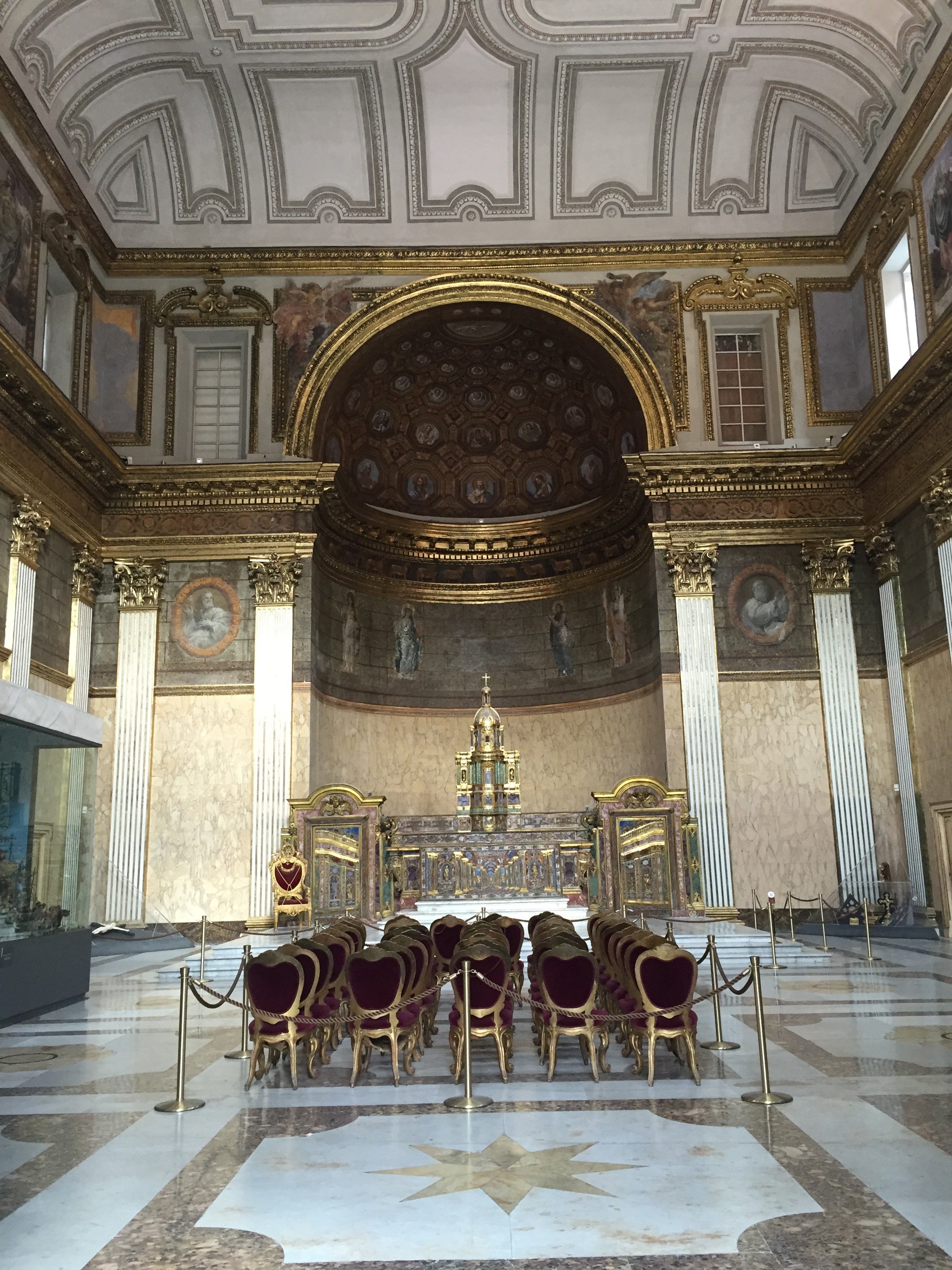
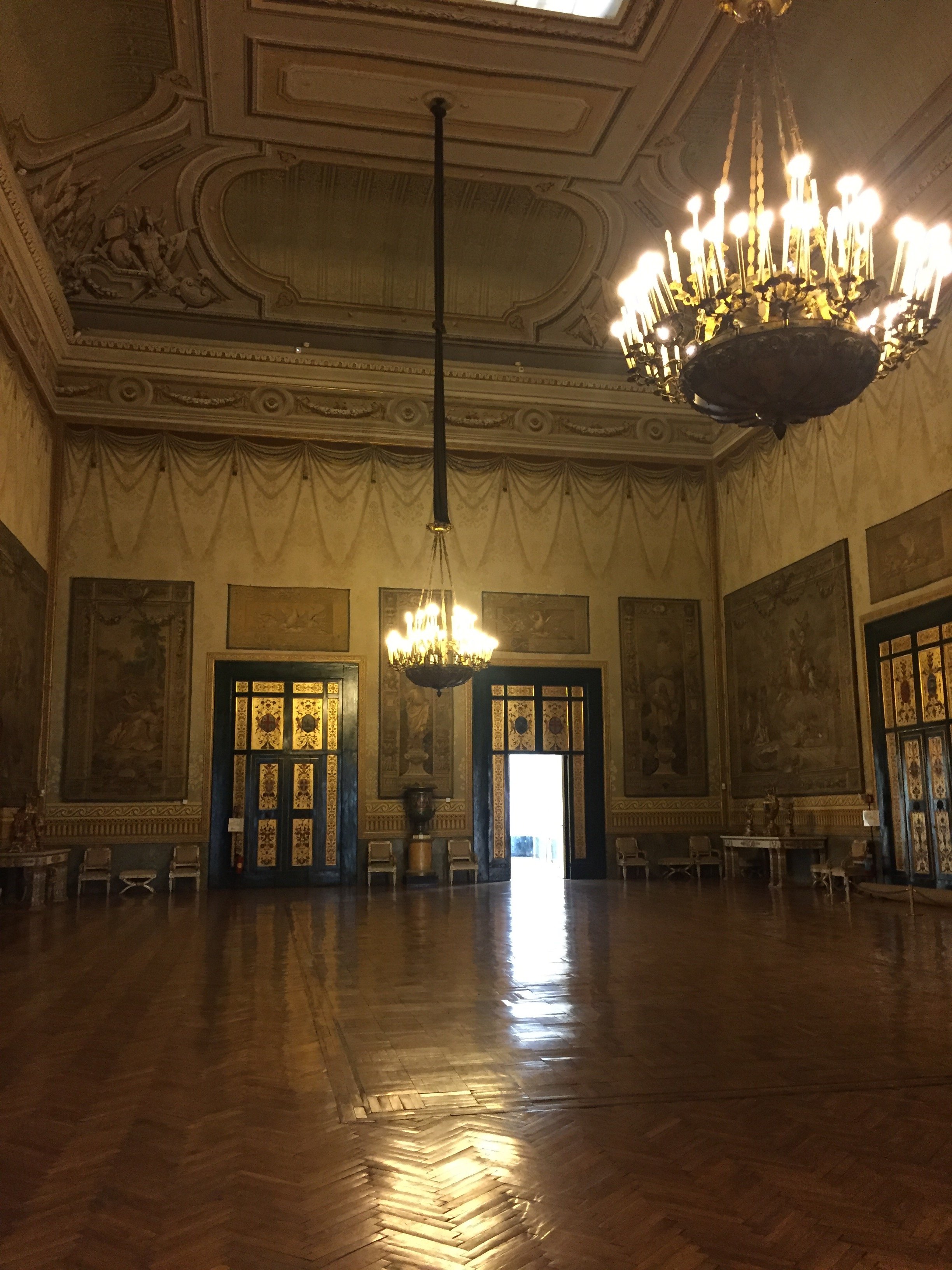
The Royal Palace of Naples is a must on my list of things to do in Naples. I wasn't able to visit until my third trip and now I want to return just so I could spend more time there.The audio tour is interesting and informative. Palazzo Reale is one of four royal palaces in and near Naples. Construction, with prominent architect Domenico Fontana, started in the 17th century by the Spanish Viceroys initially as a home to host the visiting King of Spain. He never came (so rude!) and the palace eventually became the home of various rulers, including the Bourbons and the Savoys. The Kingdom of Naples was fought over by the French and Spain for centuries. At times the Kingdom included most of southern Italy, and Sicily.The Palace was expanded over the years. Napoleon's sister, Caroline, lived in the Palace with her husband Joachim Murat (aka the Dandy King) who was the King from 1808-1815.The building suffered extensive damage from bombing during WWII but was restored.Below is the main staircase. It was very cloudy and overcast when I arrived. I still gasped when I walked in and saw this space. Pictures do not do it justice.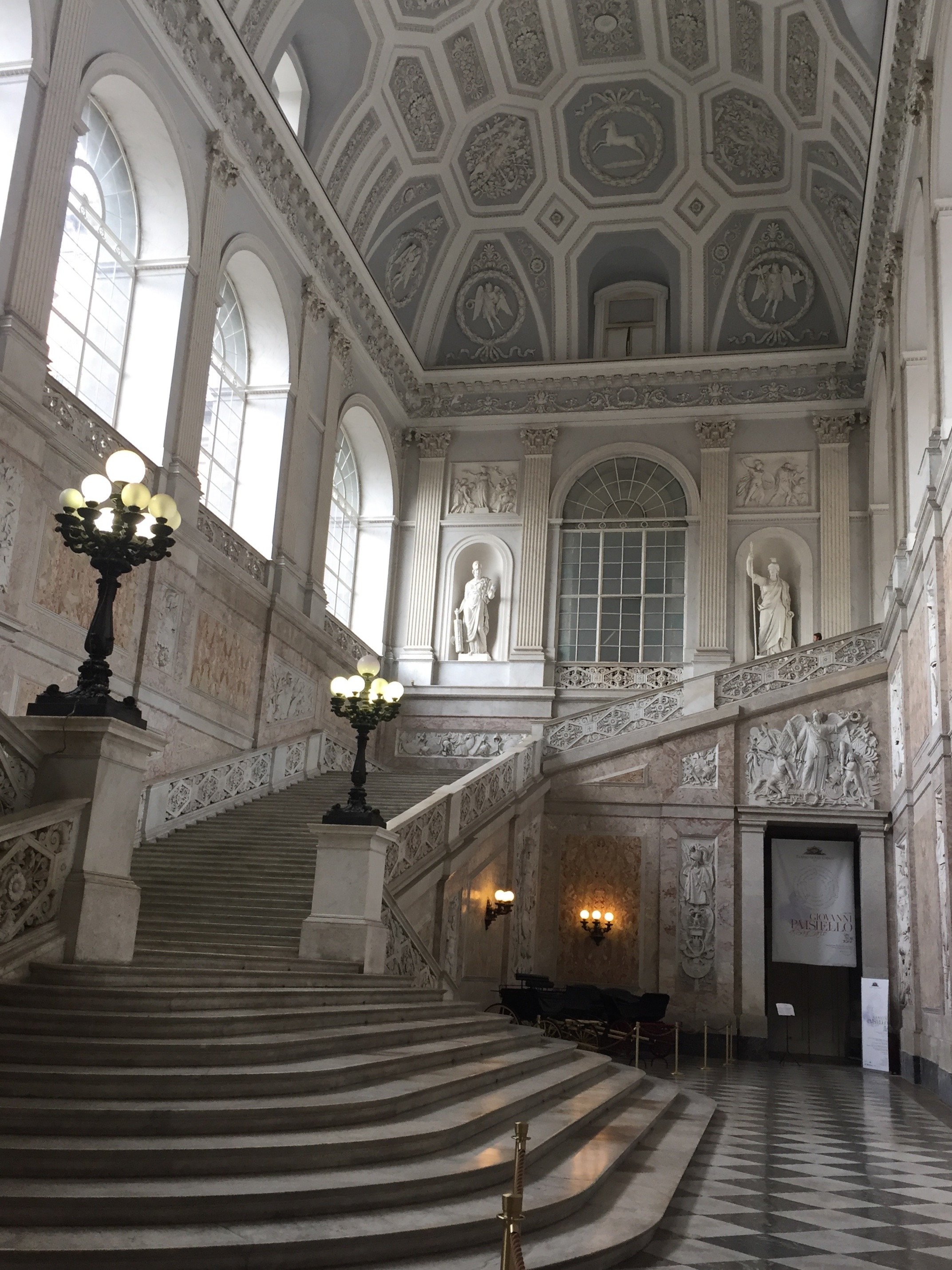 View from the top of the stairs.
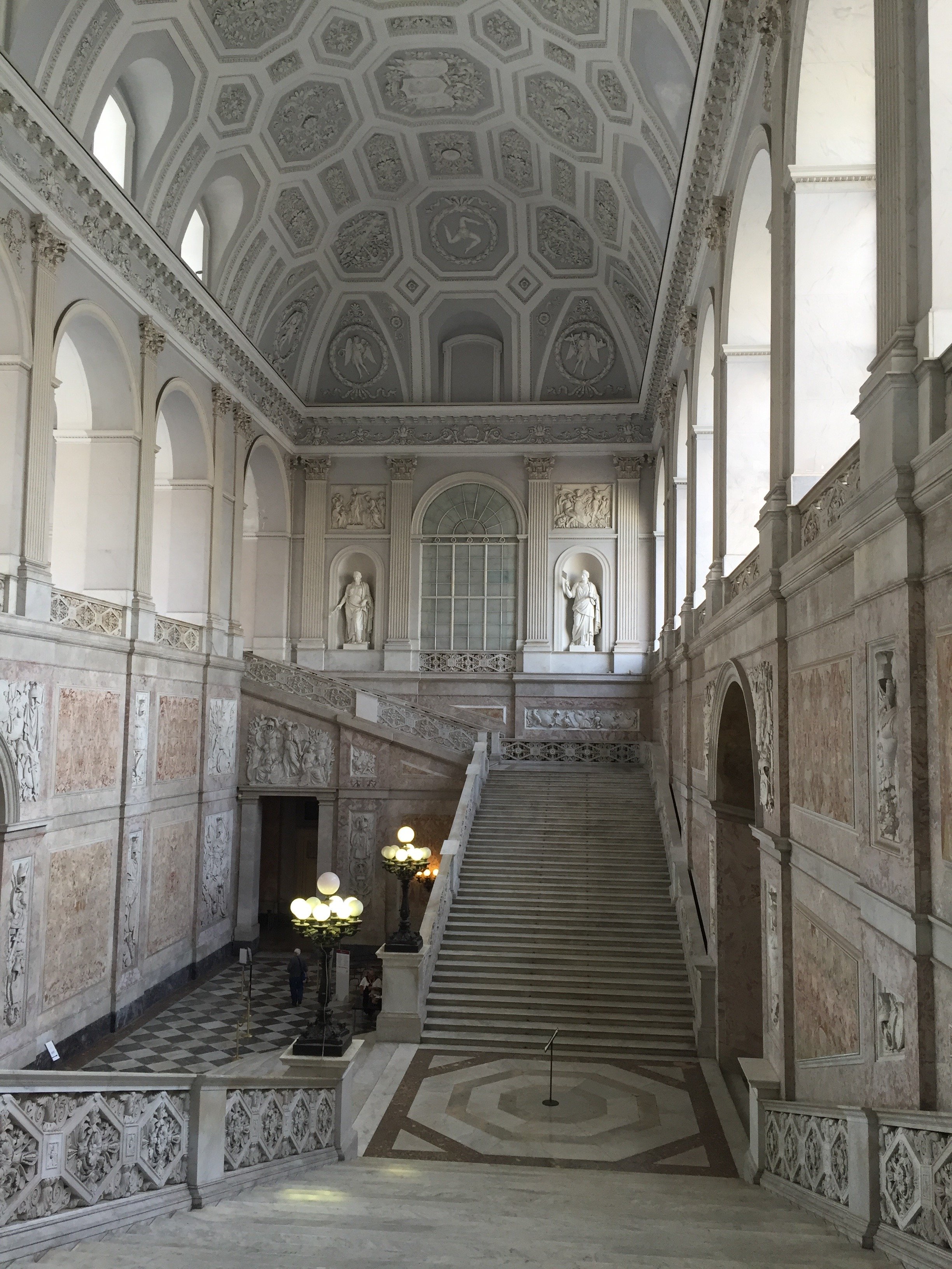 This ceiling is unreal.
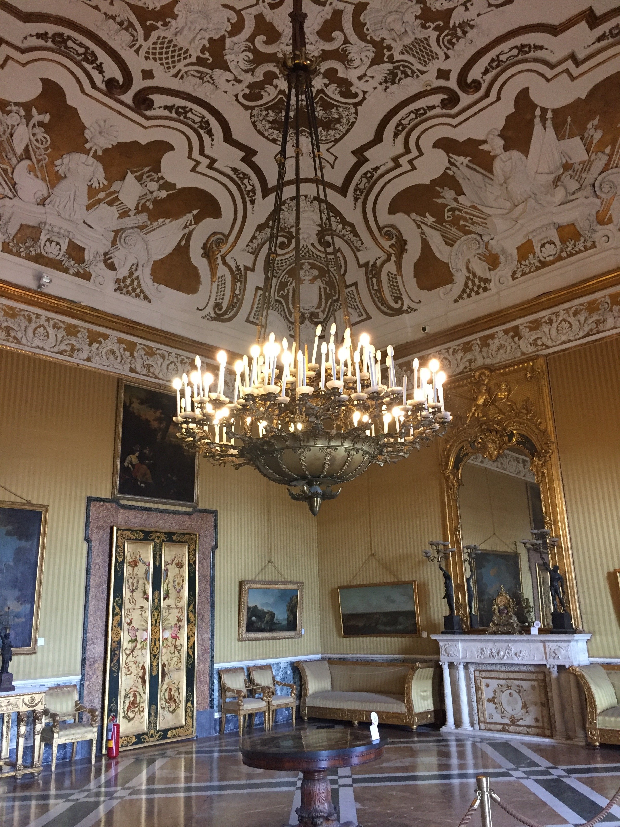 Close up of another ceiling. Gorgeous.
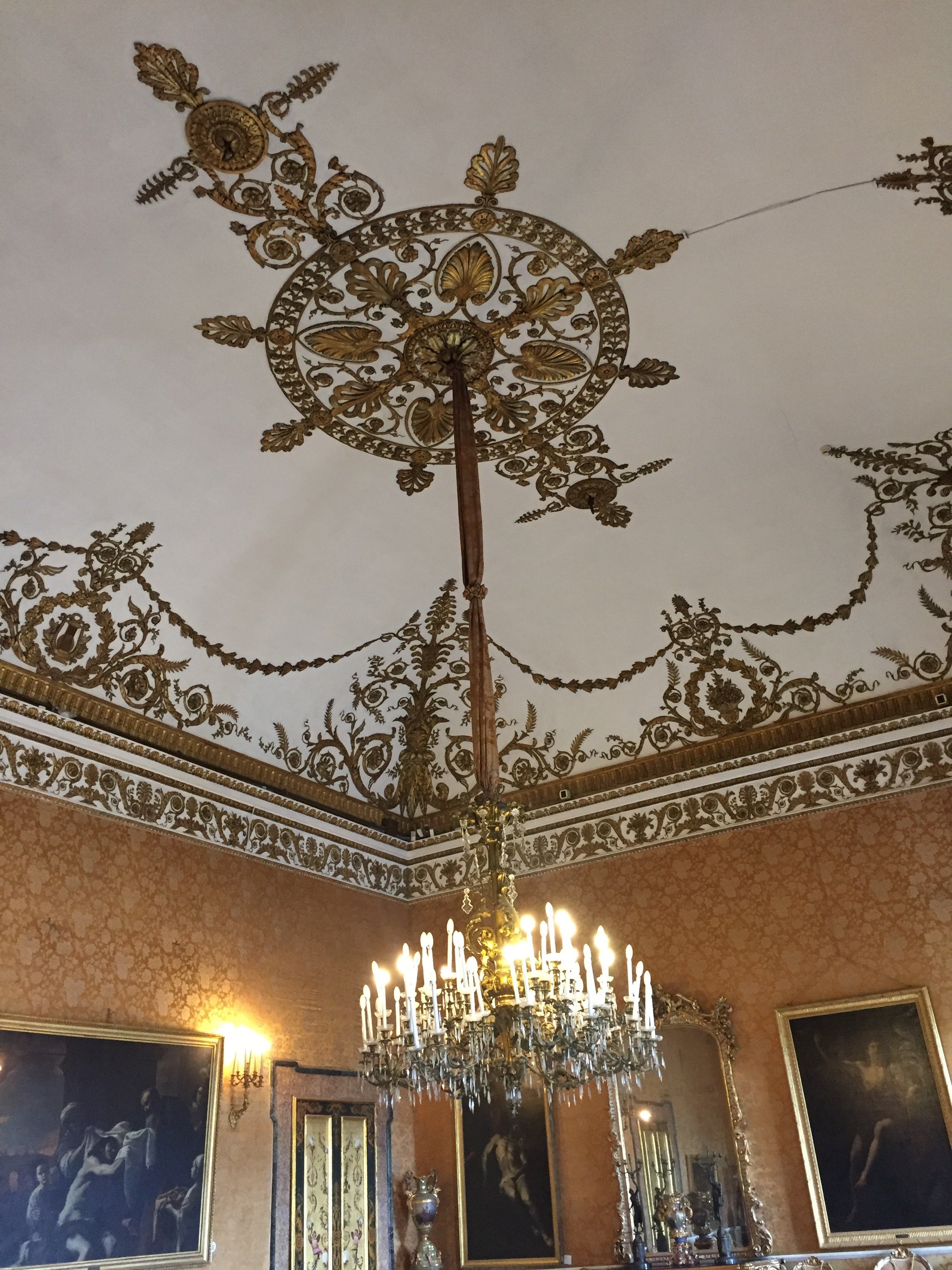 This floor tho.
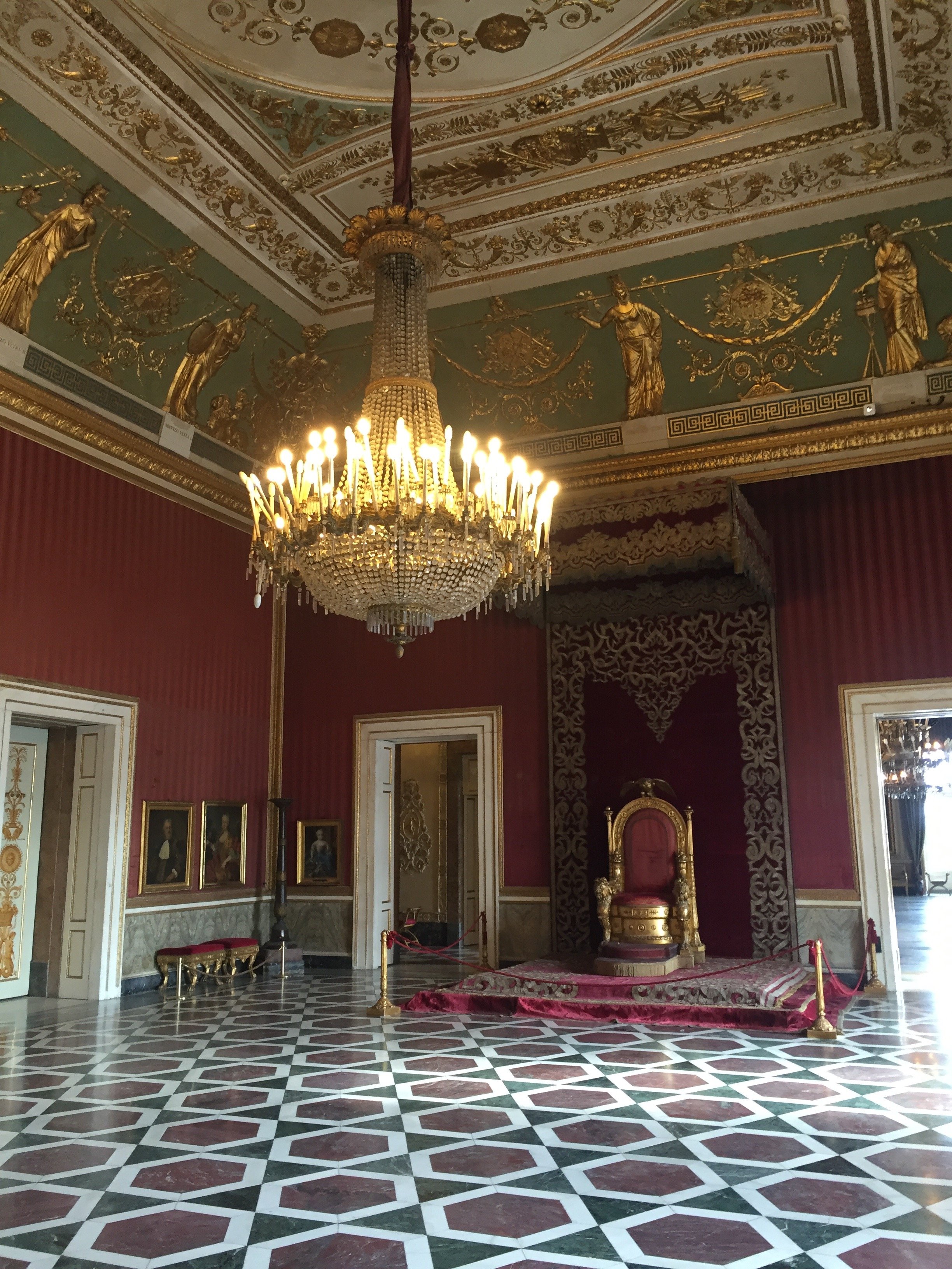
 How nice to have your own theatre.
 And your own chapel.
 A less ornate space. Love the simplicity of this light fixture.
 Love this ceiling too. I chuckle when I hear the color grey is too trendy so now it needs to be over. I disagree. It's a classic.
 The ballroom.
 It was starting to clear up as I walked out. There's a view of the sea from several of the rooms but it was hard to get a photo without the scaffolding. The gardens are not public but there is an interior courtyard with a fountain.
 Photos: me and my iPhone
Decorating 101 for the Suddenly Single
Breakups are stressful. Moving is stressful. Moving after a breakup? We're talking stress squared.Anika Jackson, VP at Real Beauty Real Women, asked me to write a decorating post with some tips on how to make the transition a bit smoother.To read the rest of the post, click HERE.
The Design Files - Interior Design Master Class
Edited by Carl Dellatore, INTERIOR DESIGN MASTER CLASS: 100 Lessons From America's Finest Designers On The Art of Decoration, is an outstanding book.Although it's geared towards students of design and professionals, this book would appeal to anyone who's curious about interiors.The book is divided into six sections: theory, structure, style, process, elements, and inspiration. Within these sections, A-list interior designers and decorators discuss everything from floor plans, lighting, comfort, color, texture, etc. etc. This insightful peek into their process, inspiration, and interiors is a real treat. The designers range from well-established legends of the industry to the new guard.MASTER CLASS is packed with useful information and it's also gorgeous. I loved it.This book will be a classic. 
The Design Files – Traditional Interiors are Back
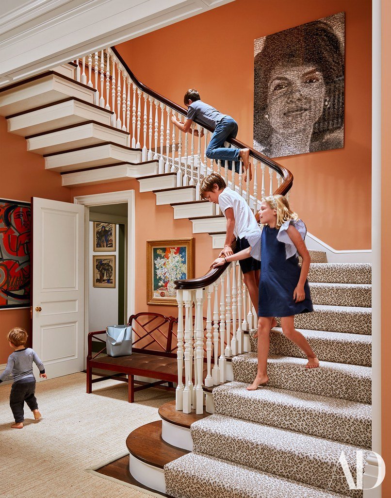
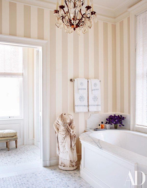
Traditional interiors will be big in 2018 according to various interior design articles. I never received the memo that they were "out". I don't think they ever went away, especially in cities like New Orleans, Charleston (SC), and Washington, DC.I don't belive in following trends. It's helpful to know what is going on in the world of design but the client's tastes and the architecture of the home are much more important than what's trending. For example, installing barn doors everywhere. I adore them. However, sometimes a room needs a regular door or a pocket door. Don't get me started on shiplap.Plus, following trends is an easy way to have your home look dated quickly. This will not help the resale value of your home (more relevant in the States where we renovate/redecorate and move often compared to other countries).I'm not surprised that people are falling back in love with traditional interiors. During a time of great uncertainty in the world, it's nice to be surrounded by something comforting and familiar. It's interesting to me that so many people thought/think of traditional interiors as very stuffy, too precious, and too old. In fact, traditional interiors are perfect for families, especially those with small children. Pieces that have been around for generations can take a beating. A little wear and tear adds character. The use of color helps hides stains and so on.Speaking of color, this is one way to make your space current and not like your great-grandmother's. Another suggestion is to mix it up. Place some modern pieces in the room. A room filled with only antiques can feel like a museum.Below are some recently decorated spaces in the traditional style. They're fun and have a lot of personality.This home in San Francisco was decorated by Miles Redd for a young family with four children. Pictures are from Architectural Digest.
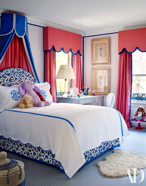
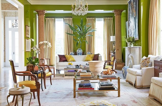
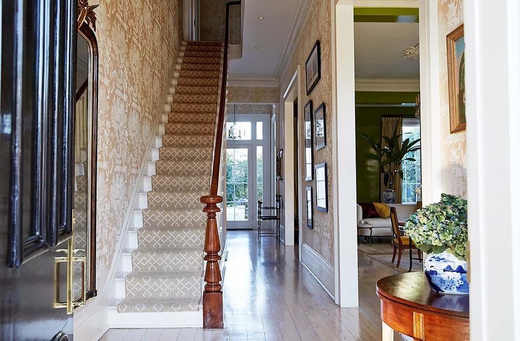
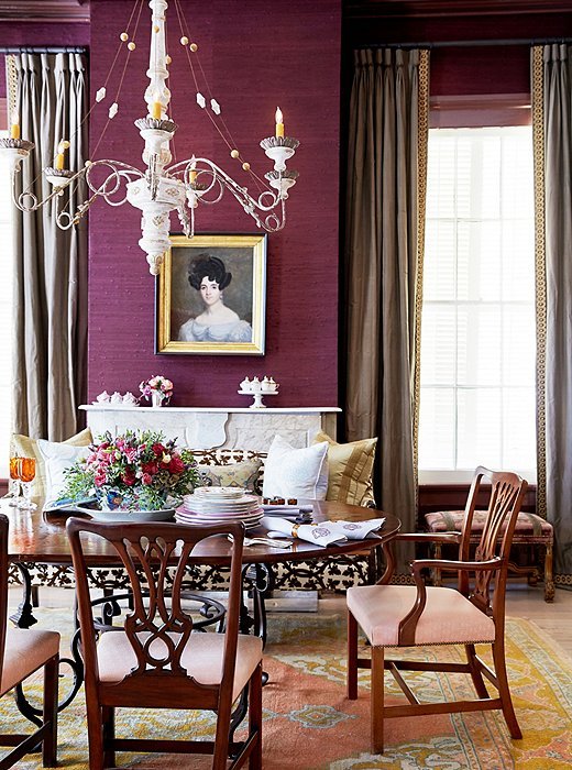
 Jane Scott Hodges's home in New Orleans is a bold mix of colors and patterns. She worked on her home with friend, interior designer, Gwen Driscoll. Photos are from House Beautiful.

 Interior designer Darryl Carter wrote a book called The New Traditional. His spin on this aesthetic is more sculptural. He uses a lot of neutrals but with a variety of textures which gives his spaces movement. Photos are from One Kings Lane.


Eating, Praying, and Moving in Puglia
I made it to Puglia, finally!I've wanted to visit this region of Italy for years. I was excited to learn that Eat, Pray, Move had a yoga retreat in Puglia and signed up.I wrote about my first yoga retreat which was in Tuscany. That retreat had an art component. This retreat had a Move + Manifest one.We went on days trips to Alberobello, Polignano al Mare, Martina Franca, Matera, and Ostuni. We covered a lot so instead of writing the longest blog post on earth, this is more of an overview and I will write about some of the individual towns we visited later. There was free time built into the schedule so you never felt rushed. All classes and activities were optional.We were a group of twelve women with most of us being from the States and one from Australia. It was a great group and fun to get to know everyone. Small world alert...I was speaking with one of the women and she made a passing reference to the university she graduated from. I told her that I was an alum too. We talked about our previous jobs and she mentioned a best friend, a Hollywood screenwriter, who also graduated from Syracuse University. Her friend was one of my former assistants and it was his first job in the industry. Random!Michelle's workshops were excellent and helpful. I'm slightly biased as I've worked with Michelle earlier this year. It's one thing to open up one-on-one but in a group, not so easy. On the first day I was a little skeptical about the whole thing. By the end of the week, this was me: I went to Puglia in late September. While we had some rainy days, I've heard from my Pugliese friends that it's a great time to visit. The weather is still warm and it's less crowded. Puglia gets packed in the summer with Italians coming home from other regions, and Italian tourists. It seems that for at least the last five years, there's been a ton of press about Puglia being the "next" Tuscany. Alberobello and Matera had a lot of tourists but overall Puglia is still off the beaten path for most American tourists. It's a shame as Puglia is a beautiful region and the food is off the chain. Seriously, I cannot stress how fresh and delicious the food was. Puglia's in my top four along with Piemonte, Emilia-Romagna, and Sicily as my favorite Italian food regions.Our base was the Masseria Fumarola. It's an hour or so drive from the Brindisi airport. Thankfully, Alitalia wasn't on strike and was still solvent at the time.
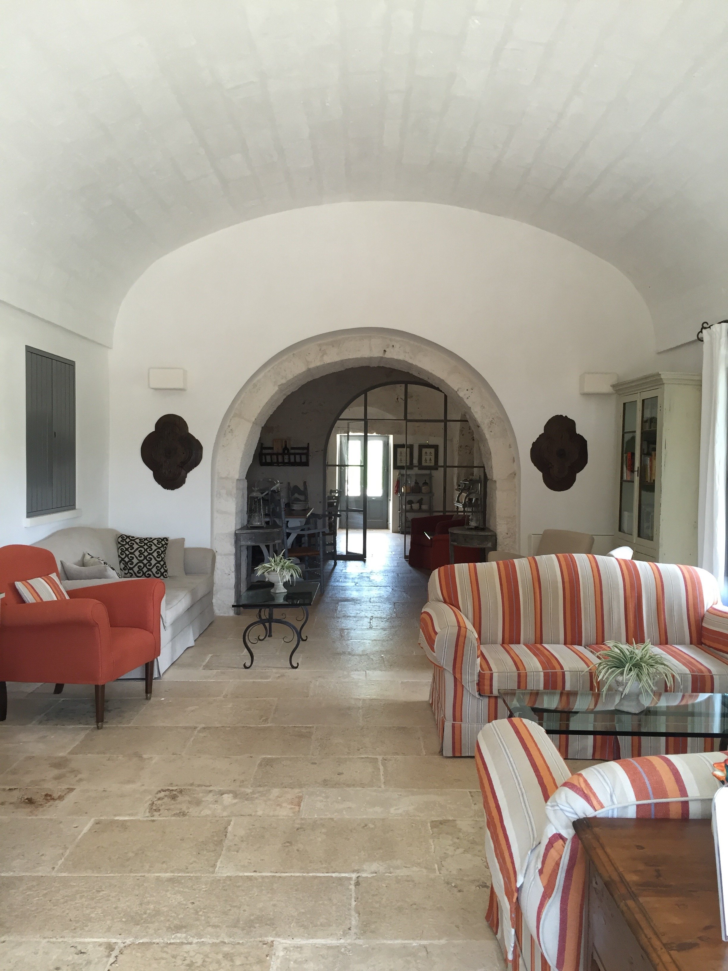
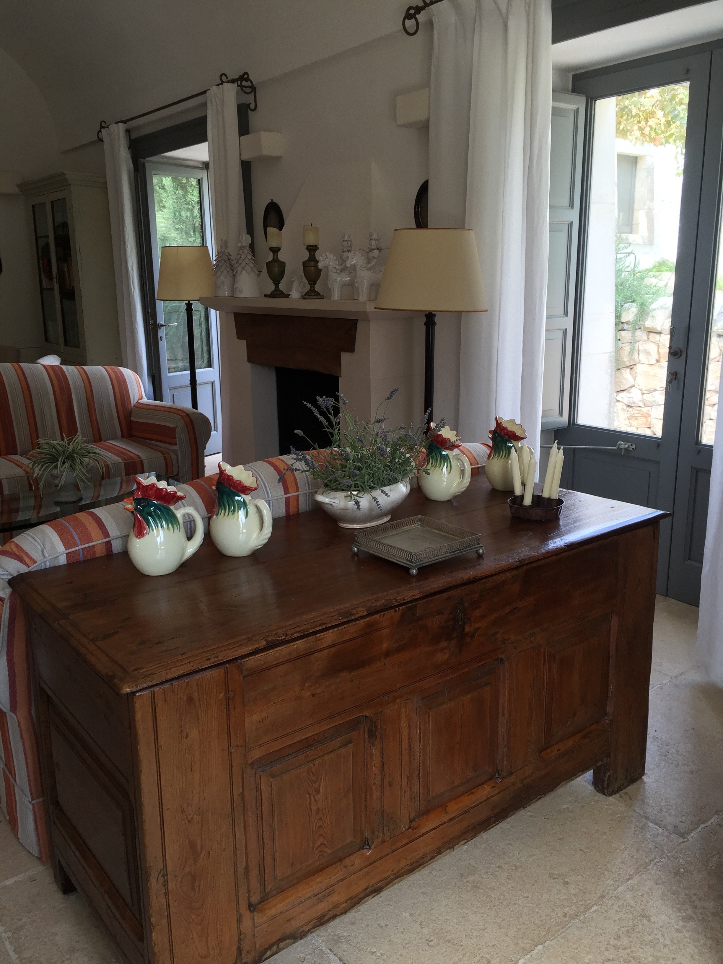
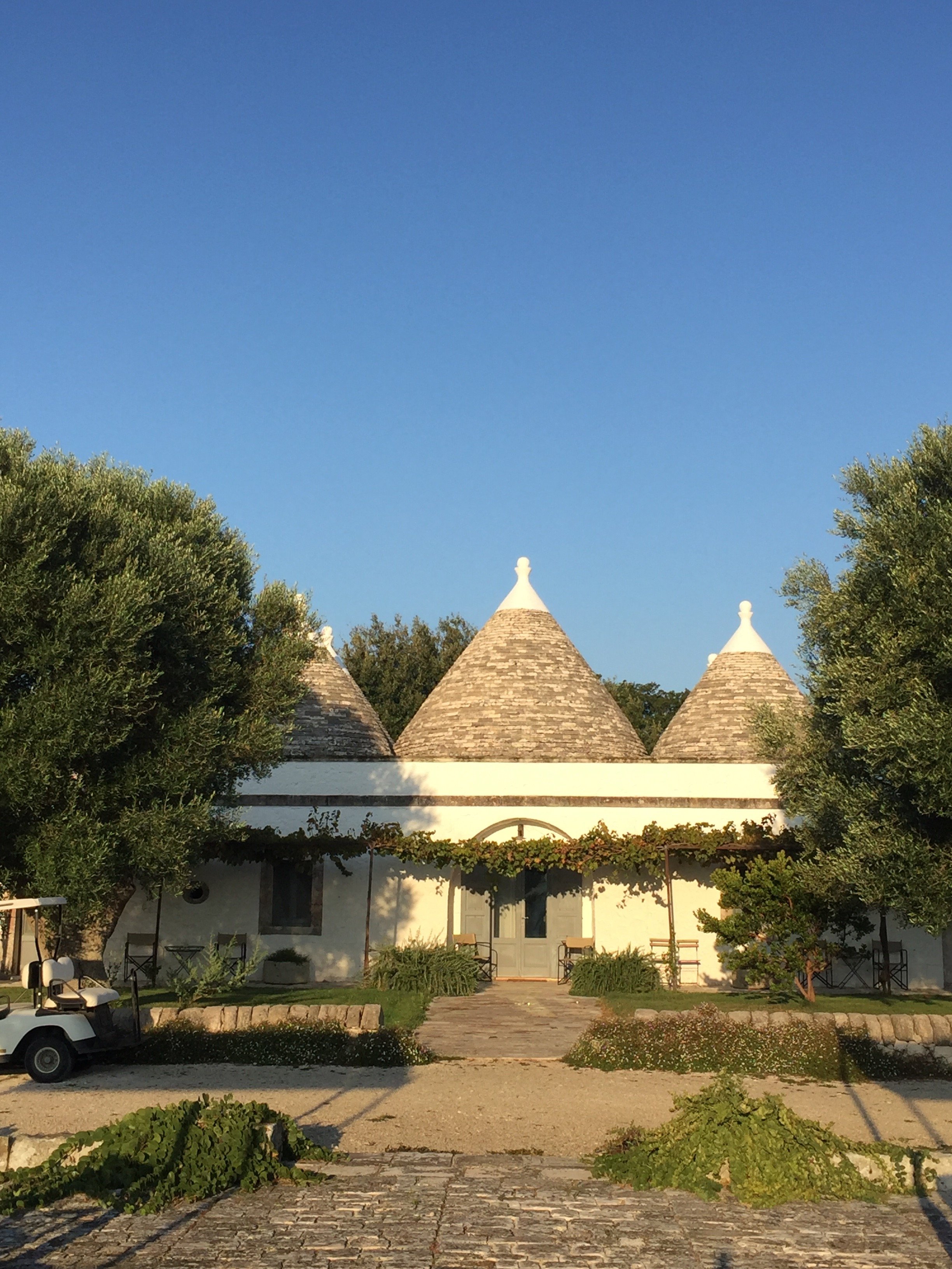 The Masseria (which is what country estate houses are called in Puglia) was perfection. It's located in the heart of the Valle d'Itria area. The main farmhouse dates back to the early 1800s. Once a working farm run by the grandmother of the current owner, Masseria Fumarola was renovated by the owner's architect father. He turned it into a beautiful boutique hotel without stripping the buildings of their original charm.Love the stone floors. I was so busy enjoying the conversations and the food, I forgot to take photos of the dining room.
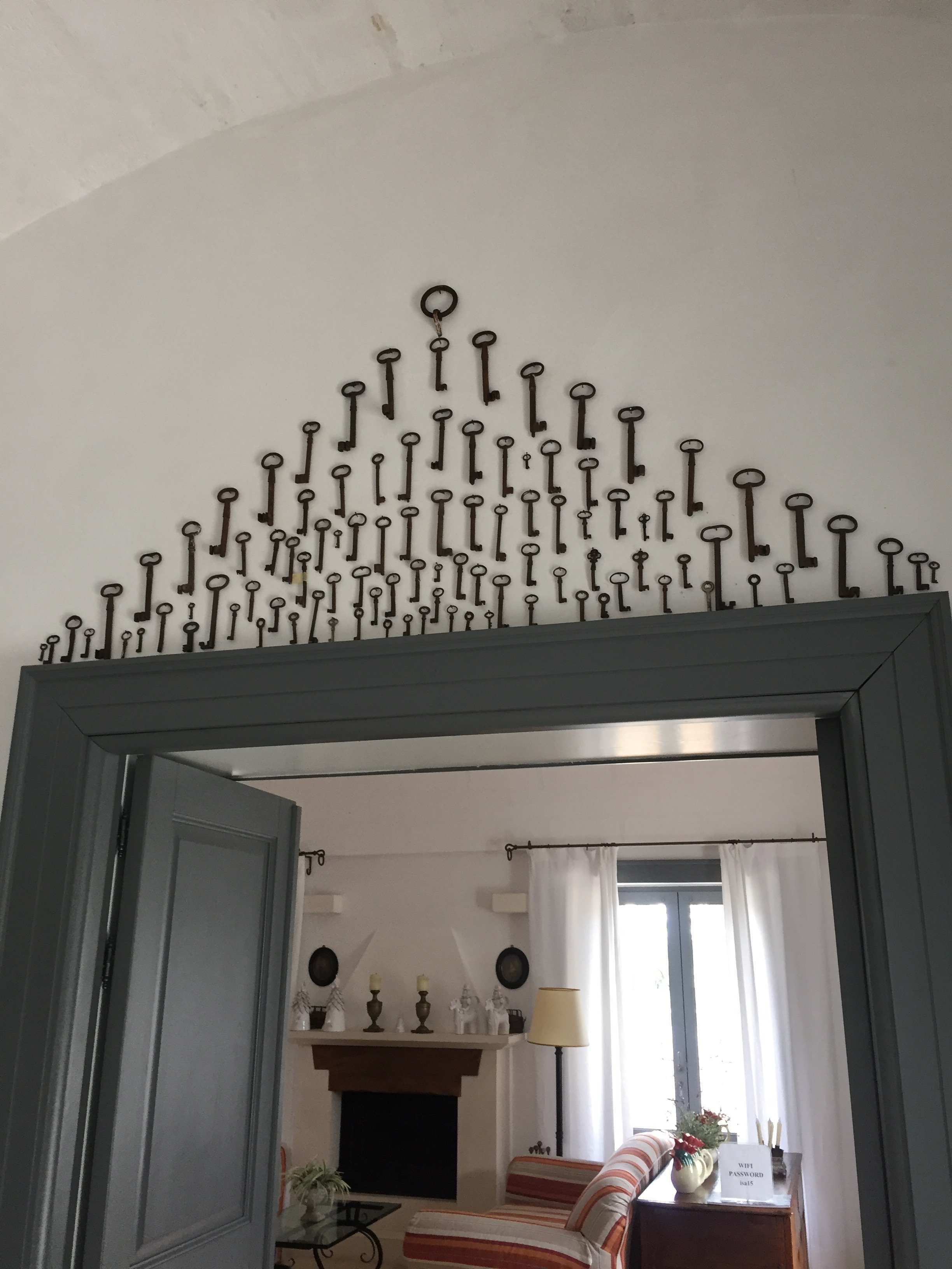
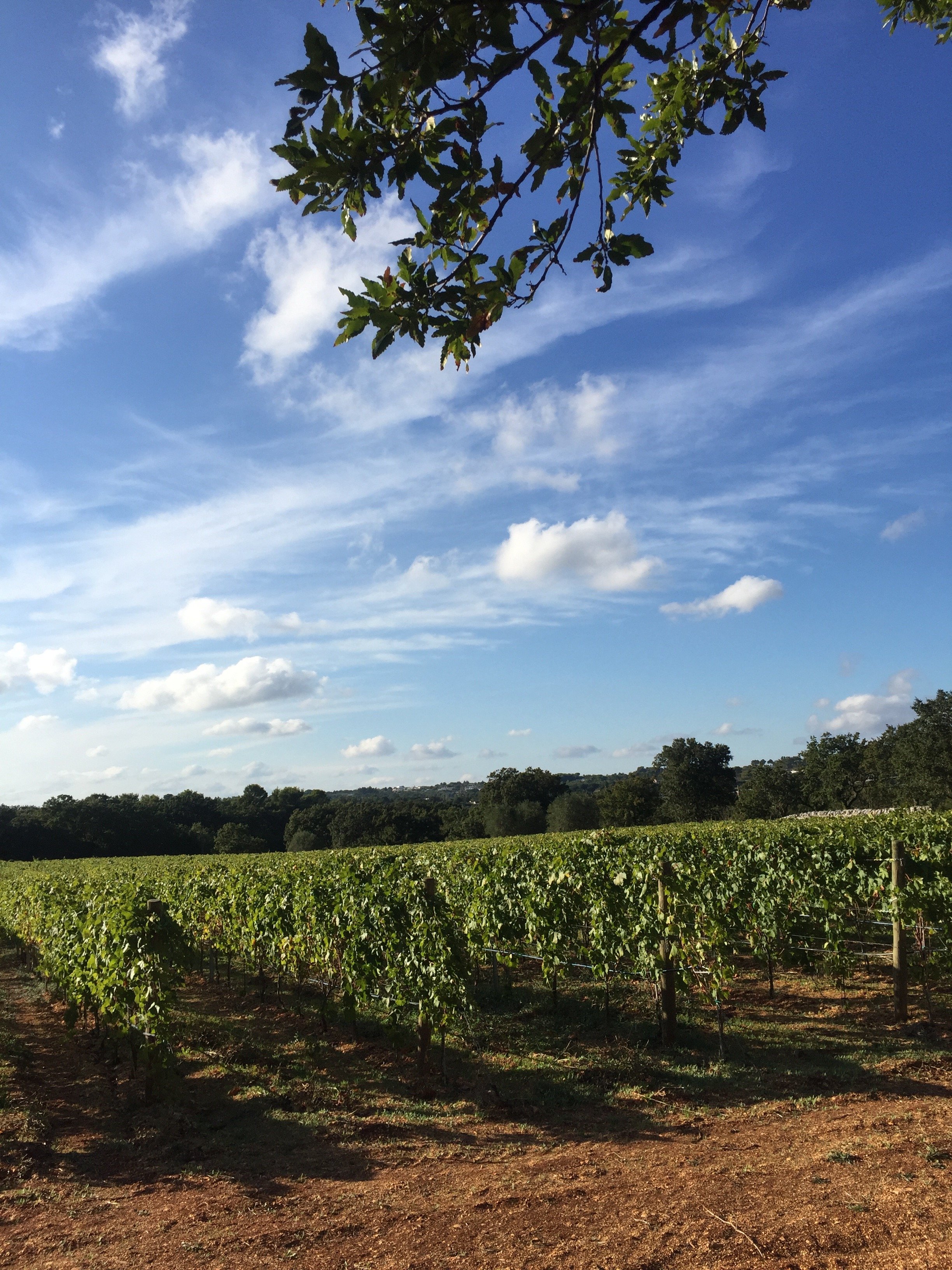
 The Masseria is surround by six acres of woodlands that includes, olive groves, vineyards, several vegetable gardens, and orchards.
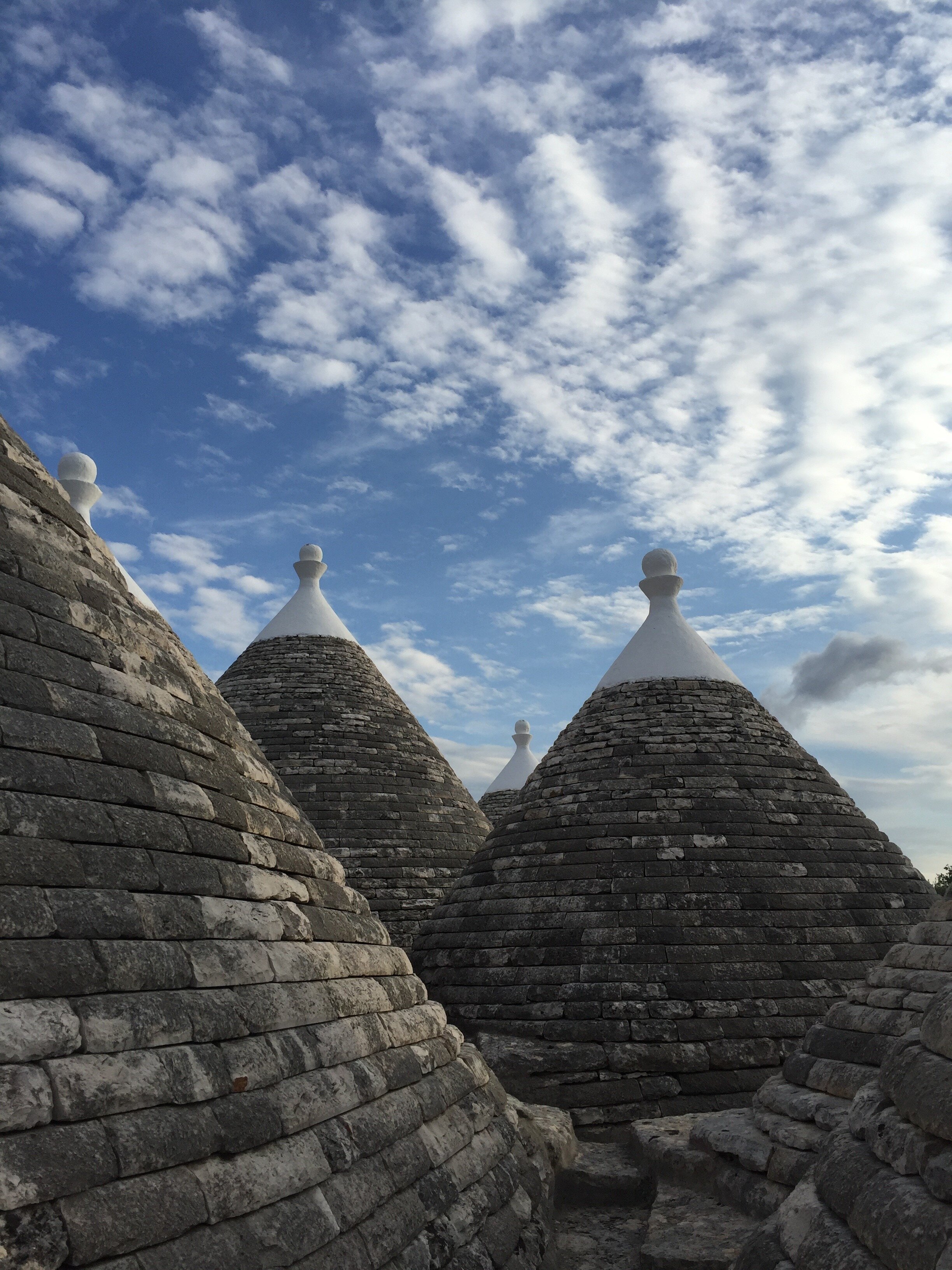
 Each room/bungalow is unique. I loved how the trulli were incorporated.
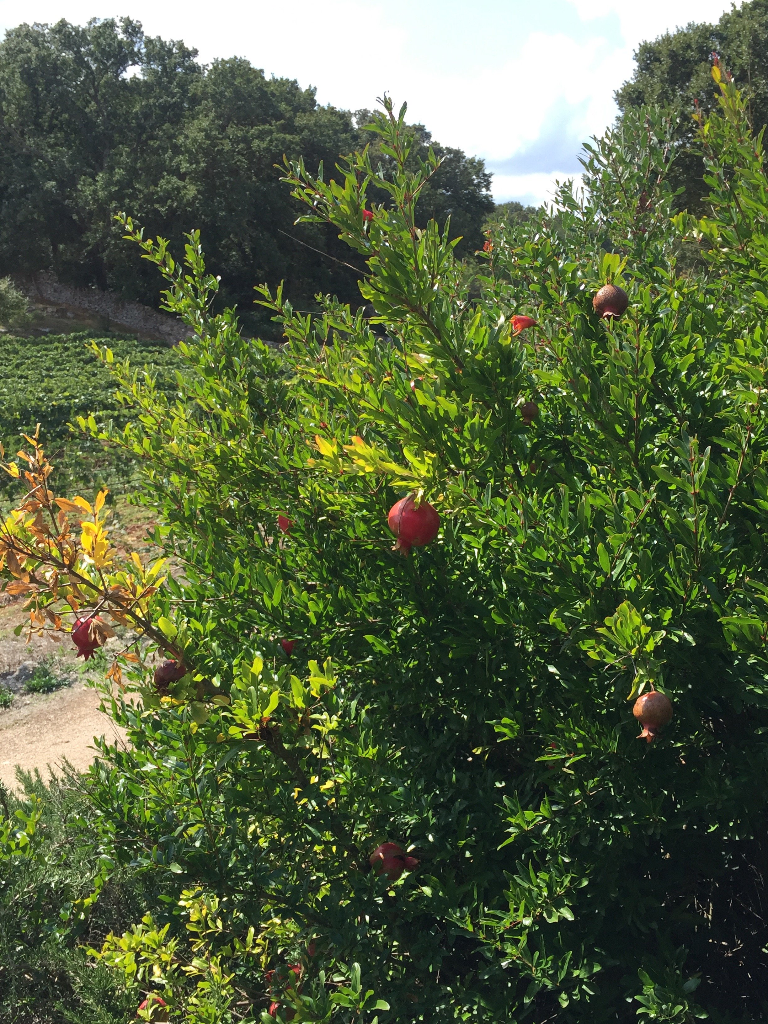
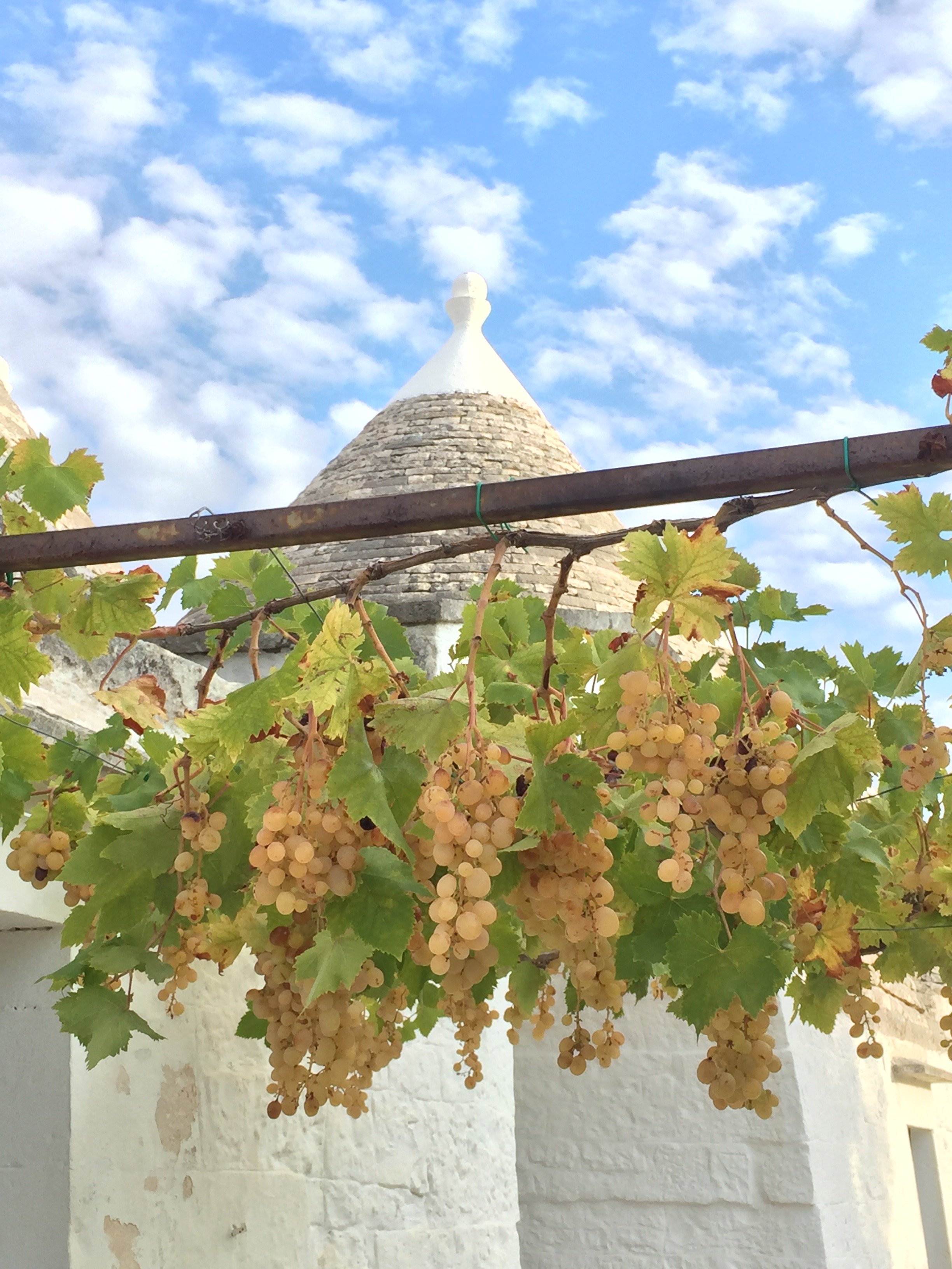 The pomengranate tree outside our bunalow.
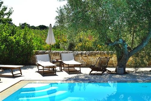
 The meals we had were simple, outstanding, and very local. Most of the vegetables came from the gardens.The one day it was warm enough to go swimming in their pool, we went to the sea. We appreciated the huge fireplace in the main building during the cool evenings. We would meet there for workshops, or a glass of wine (or both) and in the morning, there were fruits, tea/coffee available for us before our 8:00 a.m. yoga class.
 I was a tightly wound ball of stress when I stepped onto the plane in Rome. I'm still processing everything I learned during the workshops but physically I feel much better.I walked around the property at sunrise. I was greatful for the stillness, the scents, the freshness of the air, and the beauty of it all. My yoga has improved by leaps and bounds since the summer. This time my mind didn't wander. While Erin's classes sometimes kicked my butt (my abs were on fire the next day) I looked forward to that hour and fifteen minutes.Rome can be a very difficult city and this year has really tested my perseverance. During my trip to Puglia, I was able to reconnect a bit with the main reasons why I moved to Italy in the first place.I cannot wait to return to Puglia. Bari and Lecce are on my list.
 Photos: Me and my iPhone, except for the pool photo from Masseria Fumarola.
Life in Rome - Mini-break at Le Méridien Visconti Hotel
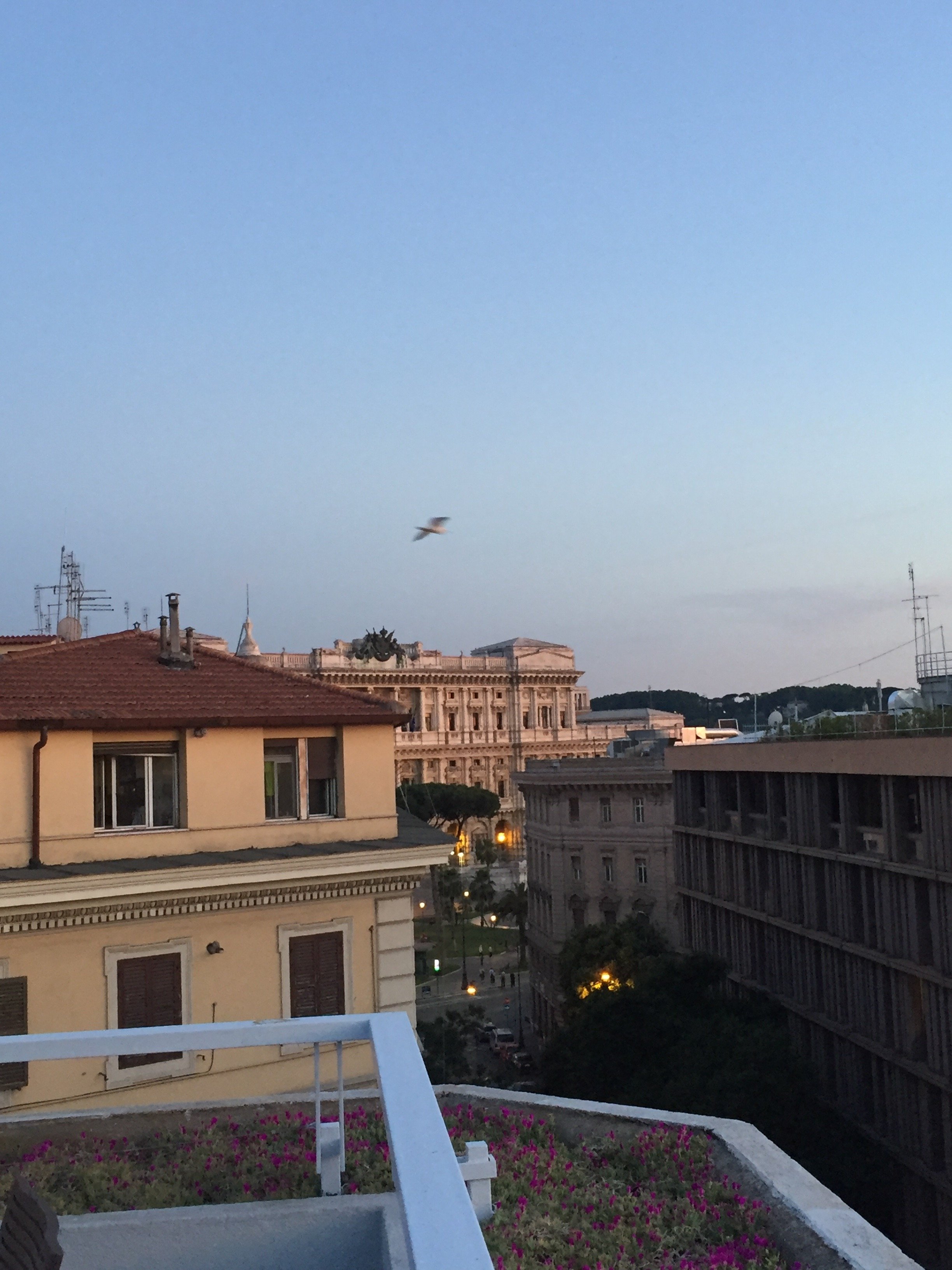
One of my friends, who owns a boutique travel agency in Italy, told me that finding four star hotels in Rome is difficult. She said there are great options at the five-star high-end level and at the economical end but there are too many four-stars that are really a three- star at best.Enter Le Méridien. The Starwood Group recently added the Visconti Hotel to its portfolio. The hotel officially reopened this June after a twenty million dollar renovation.I had the opportunity to stay at the hotel for two nights. Before my stay I read reviews online because I'm anal. The reviews were very good except for two things, the air conditioning and the WiFi.Given my stay was happening during one of the worst heatwaves in history and I had several work deadlines, I was concerned.They must have fixed these issues as I'm happy to report I had no problems. In fact the A/C was so strong I had to turn it off. My fellow Americans, you know that NEVER happens in Italy.The hotel is located in Prati. It's a few minutes walk from Piazza Cavour and in the other direction (a slightly longer walk), Piazza del Popolo. I think it's a perfect location. You're near the Historic Center but not smack in the middle of it and the prices reflect this. The area is centrally located as Piazza Cavour is a major bus hub. For those who like to walk, you can cross the river and be in the heart of the Historic Center in ten minutes.The roof terrace is fantastic. Sometimes there are annoying loud seagulls who like to wait for people to leave and then dive in for the food. The waiters are on top of it though. Seagulls 0.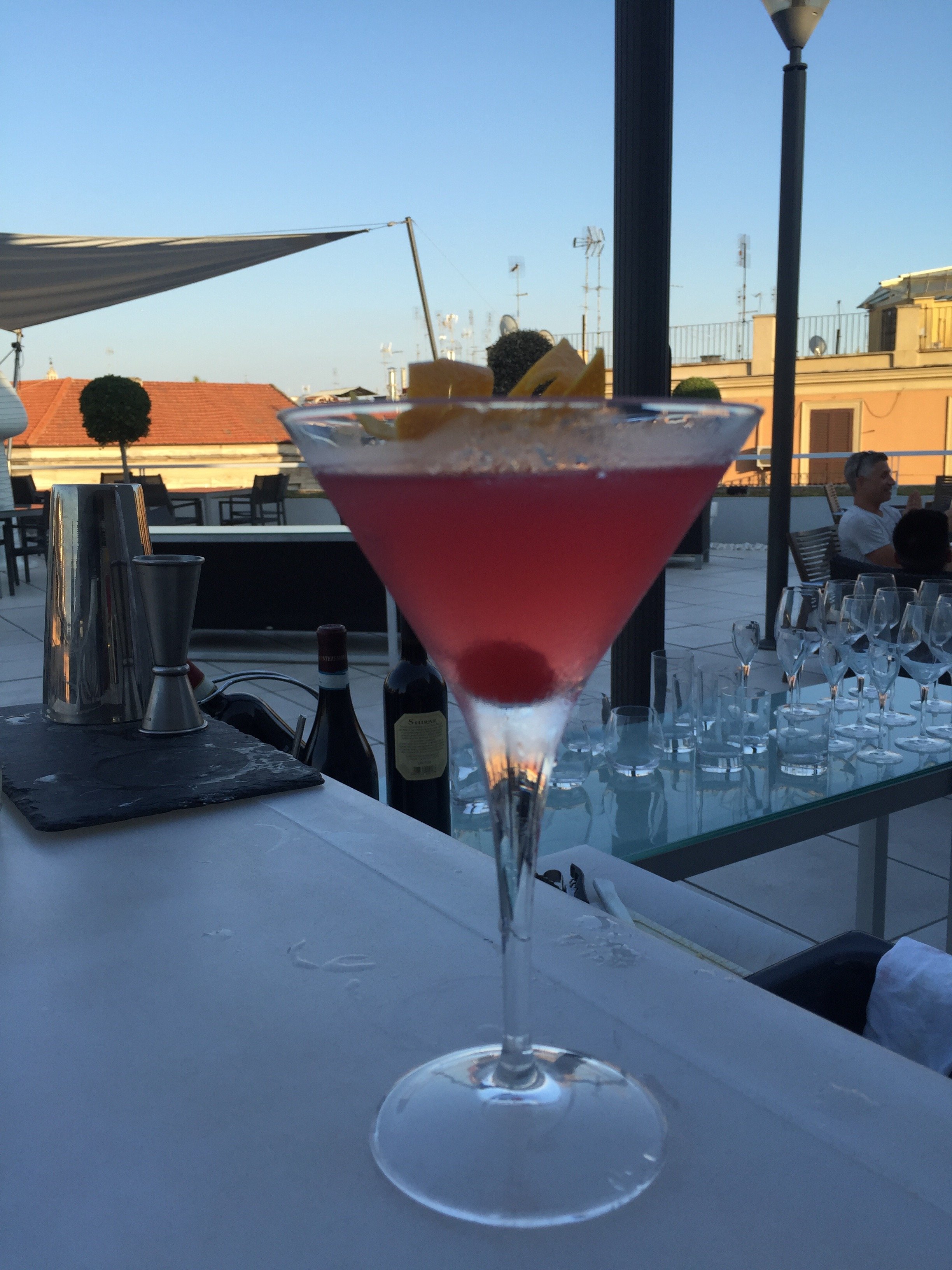

 Service was great. Granted some of the employees at the hotel have seen me a few times but that wasn't the case with the check-in. I thought they were friendly. There was a small line when I arrived but it moved quickly.Location, price, design, of course all these things matter but when I stay in a hotel there are two things that are extremely important to me. Cleanliness. I cannot stand clutter and dirty bathrooms or kitchens freak me out. I don't want to step into a hotel bathroom and see hair in the drain. Just typing that made me feel queasy. The other thing is the bed. It must be comfortable.My room was spotless and the bed was excellent. The toiletries are Malin & Goetz. I was so geeked out to see them because no retailer in Rome sells these products. I checked the website and there is a store in Milan that carries them. I muust remember this important information for my next trip.
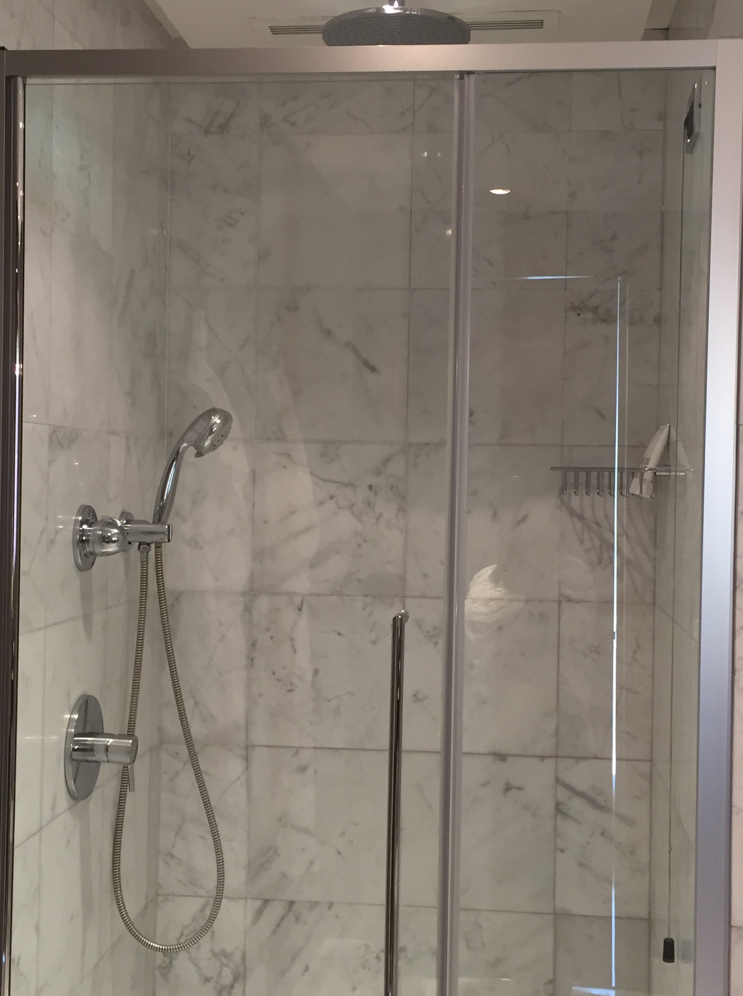
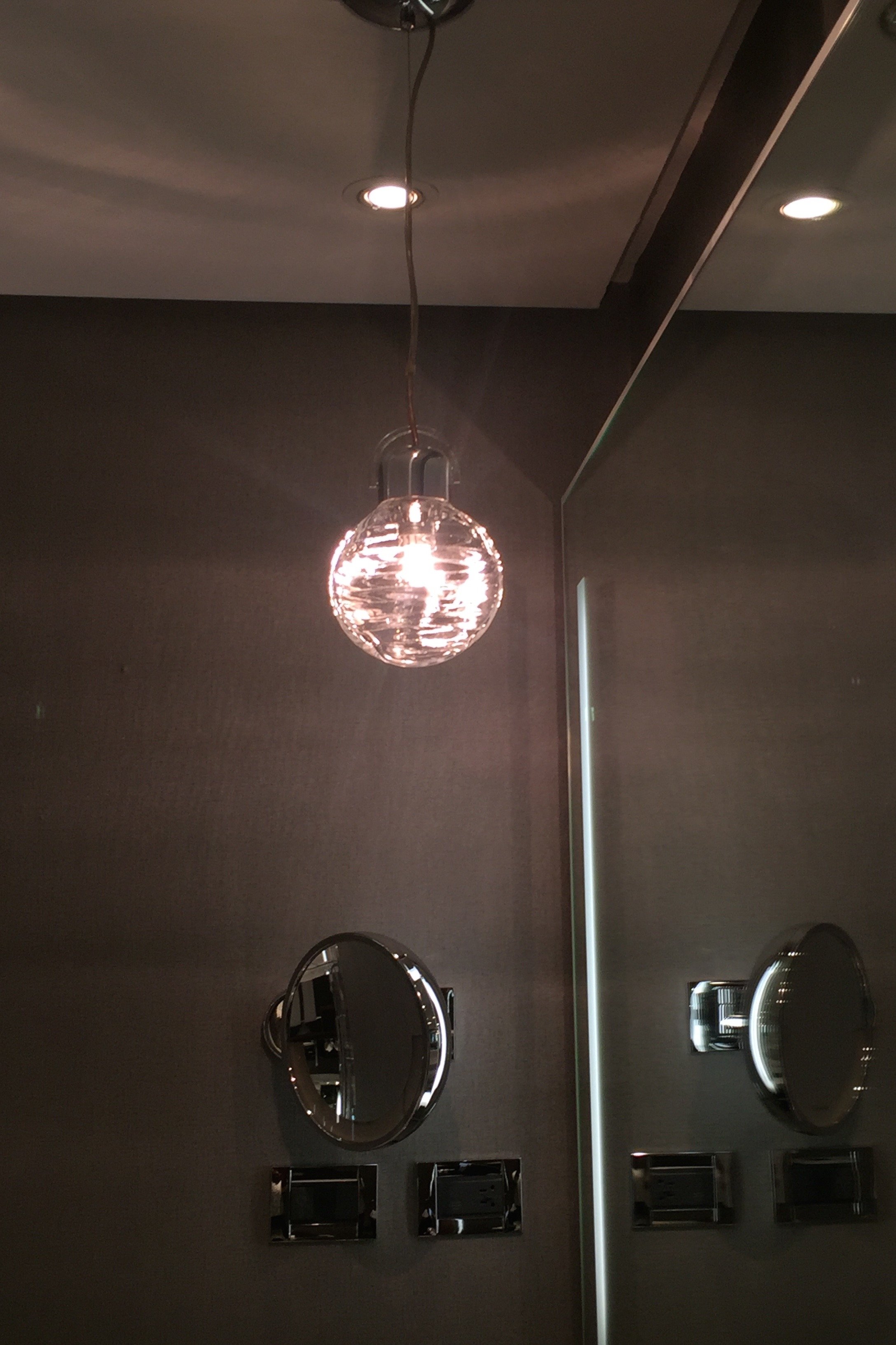
 The interior design has mid-century touches that also speak to the hotel's location in the Eternal City. The head designer was Harry Gregory of the firm, ara Design International. They wanted to create something timeless.I adore the pared down use of marble, a material synonymous with Italy and Rome. I think too much marble can make an interior feel cold. At the Le Méridien it's warm and dramatic.The neutrals of grey, black, and white, with splashes of color, are relaxing and chic. The Longitude 12 Bar and Bistrot is a great place for a coffee during the day and for cocktails at night. The Bistrot also has a delicious lunch and dinner menu and starts serving wine around noon.In the Bistrot there's a communal table that has outlets for your laptop and phone adapters.


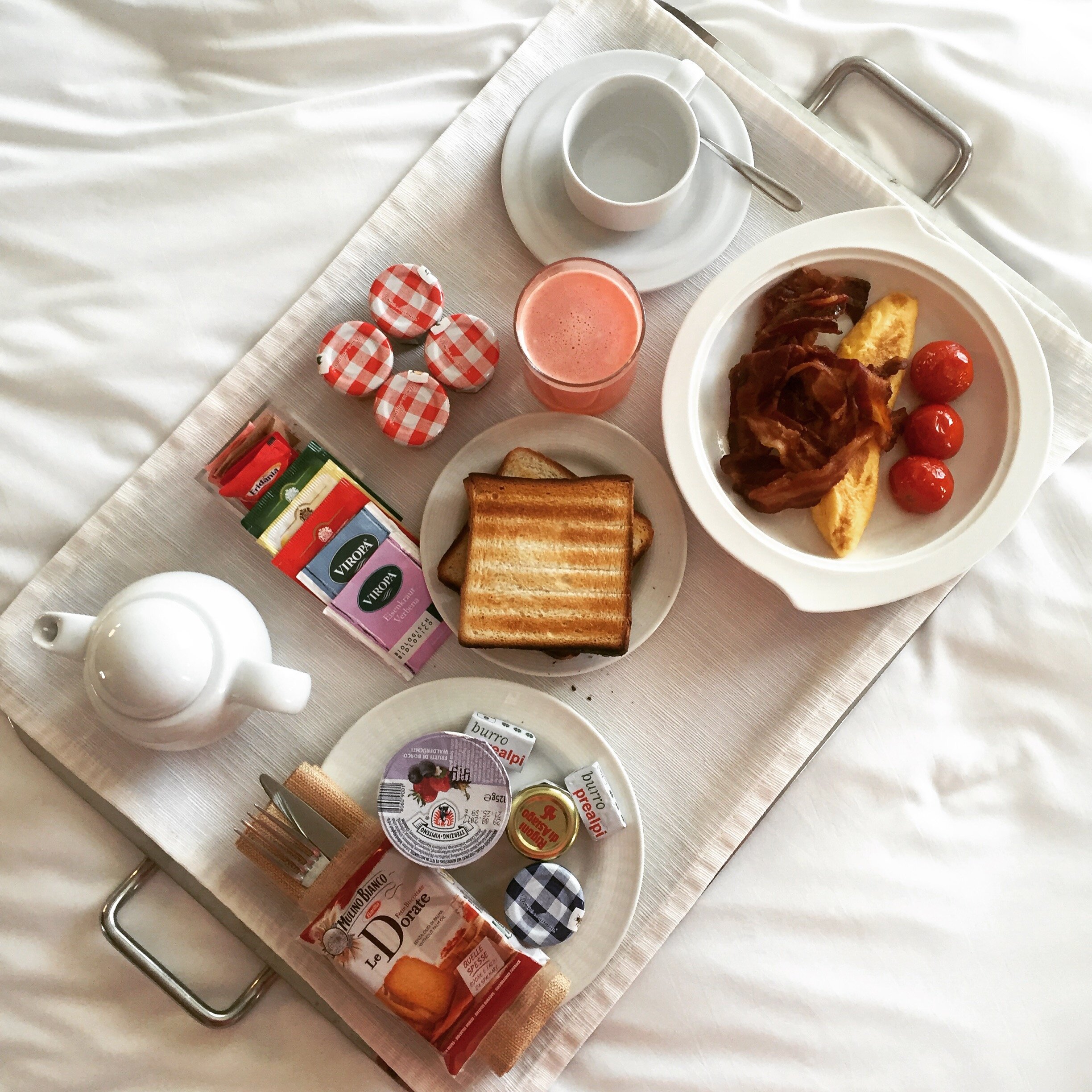
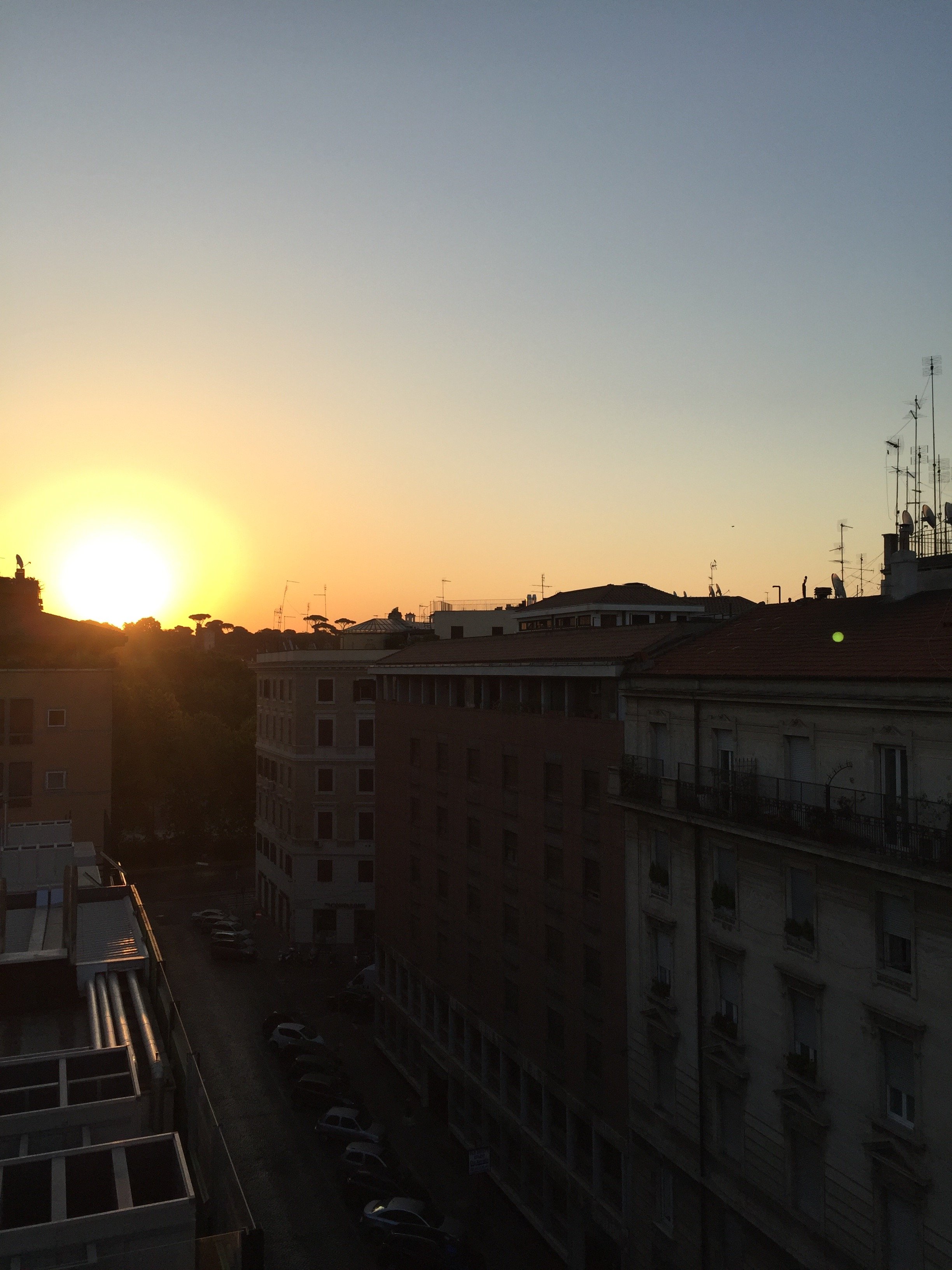
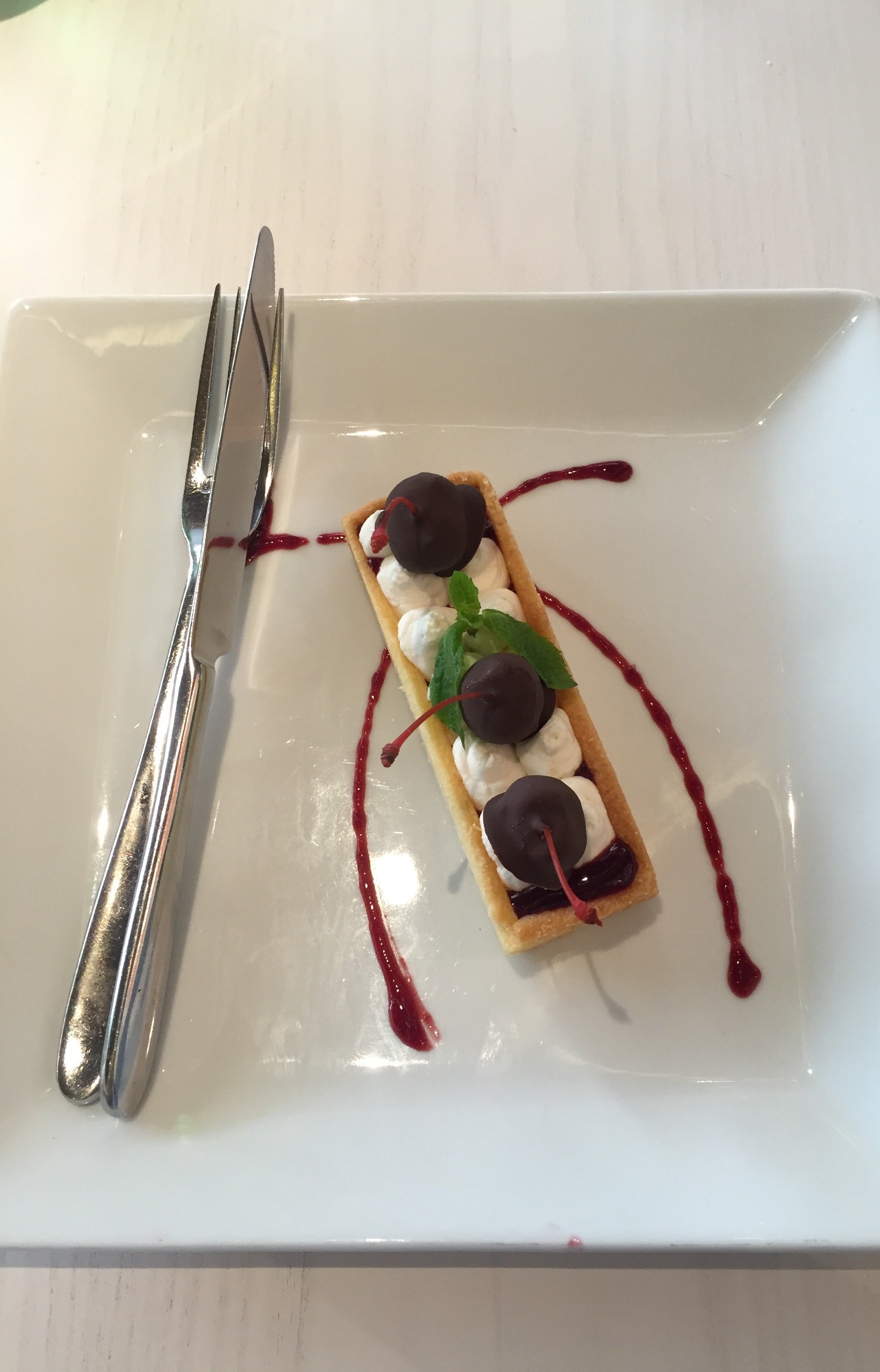 Downstairs, there was a wide selection for breakfast, including American bacon. I repeat, there was American bacon.
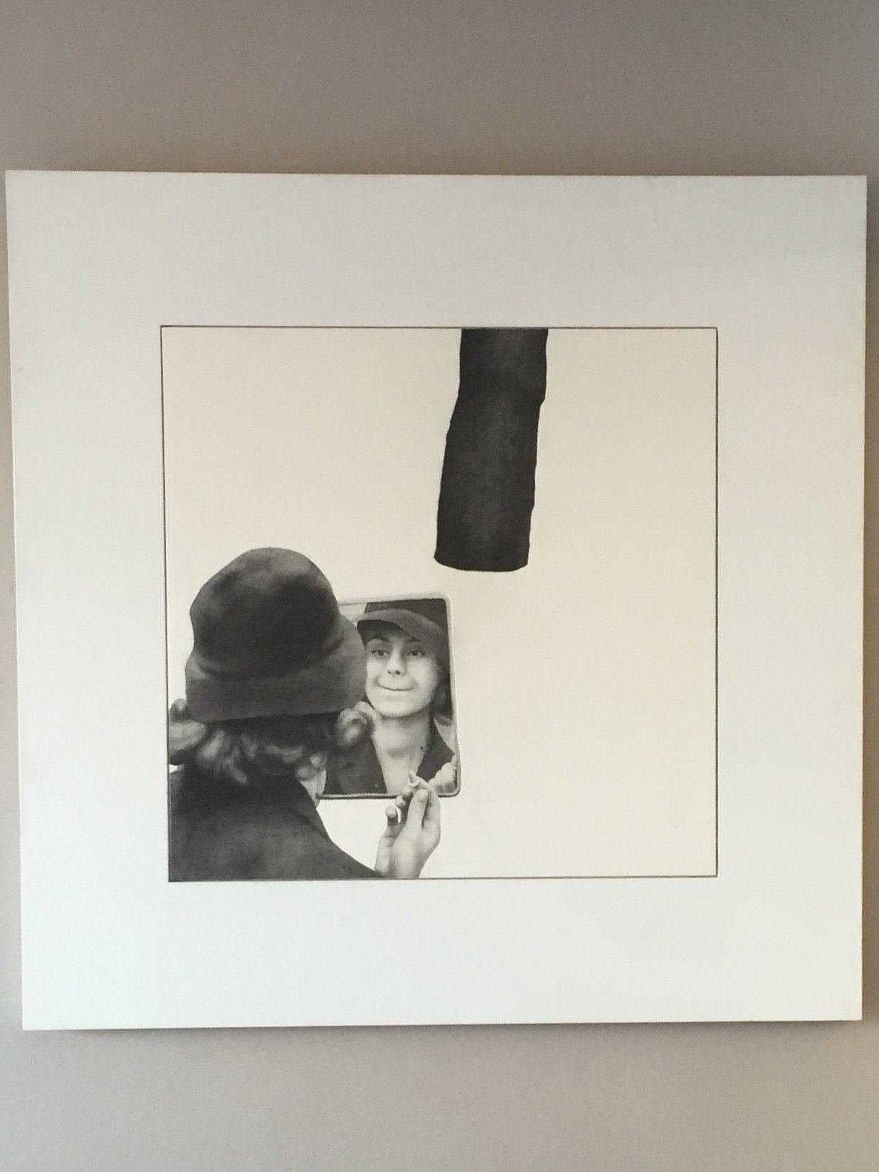
 The hotel has an eclectic art collection, from abstract to figurative pieces, created with different materials. These artworks are from the private collection of the Toti family. Their collection focuses on Italian artists from the 1980s. When people think of Rome they often focus on classical art. It's wonderful to see some contemporaries pieces as well.
 The gym is small but well-equipped with Technogym equipment. Did you know Technogym was an Italian company? I saw this brand in high-end gyms in New York City and Los Angeles and had no idea until I moved to Italy. Mind blown.I stayed at the hotel in early August but have been stopping by since April. This is not official market research but it seems to me that the hotel is very popular with couples, families, business travelers, and friends traveling together. I didn't see too many solo vacation travelers but I've always felt welcomed thanks to the friendly service.Photos: Me and my iPhone. Disclaimer: I was a guest of the hotel. However, opinions and thoughts are my own.
A Weekend in Tuscany's Val d'Orcia Region
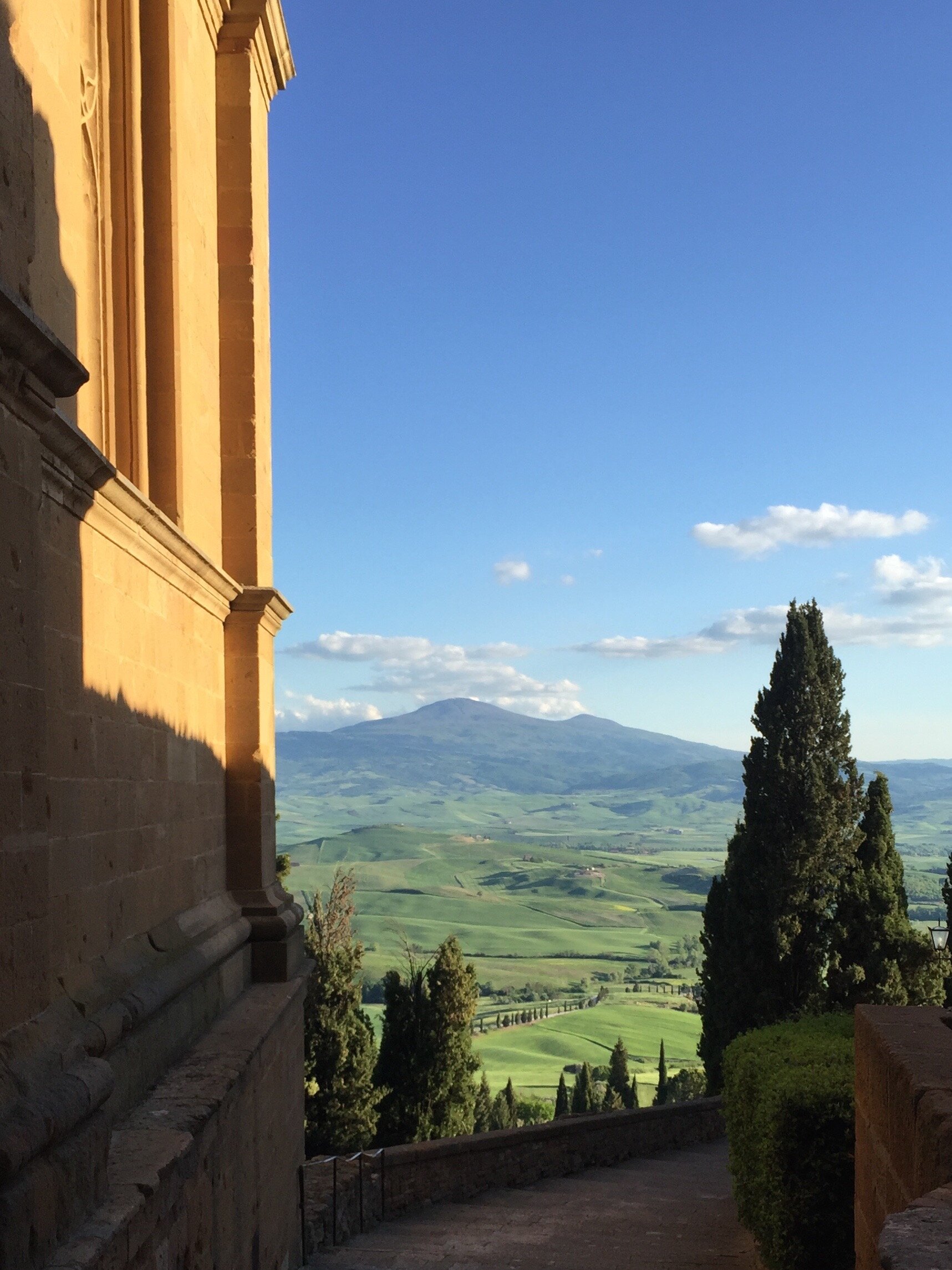
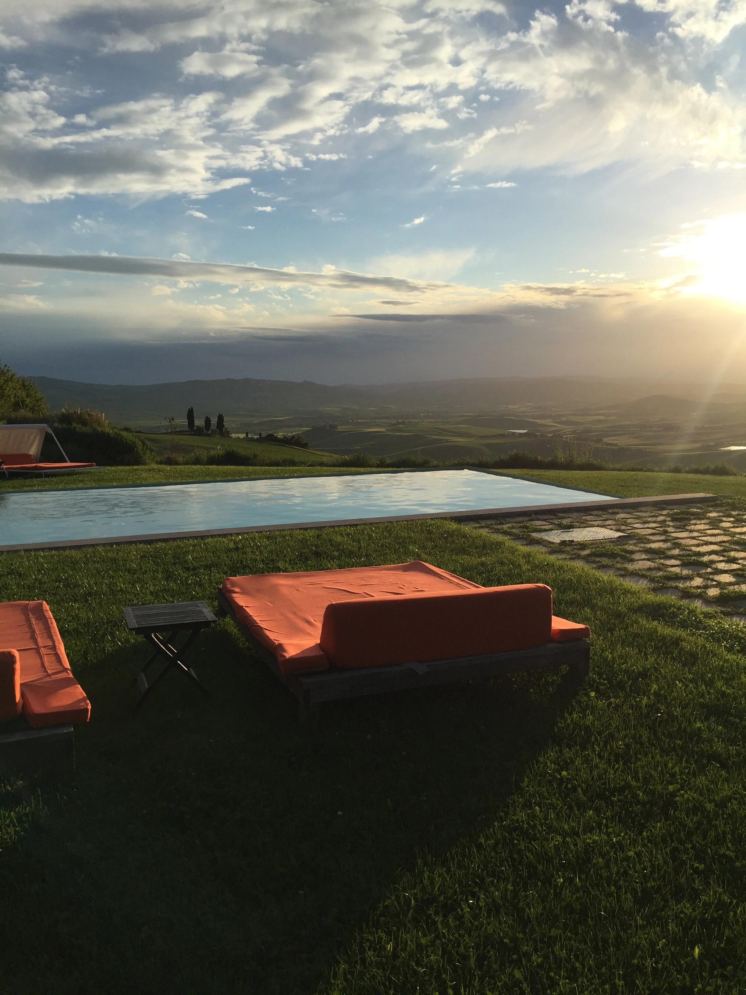
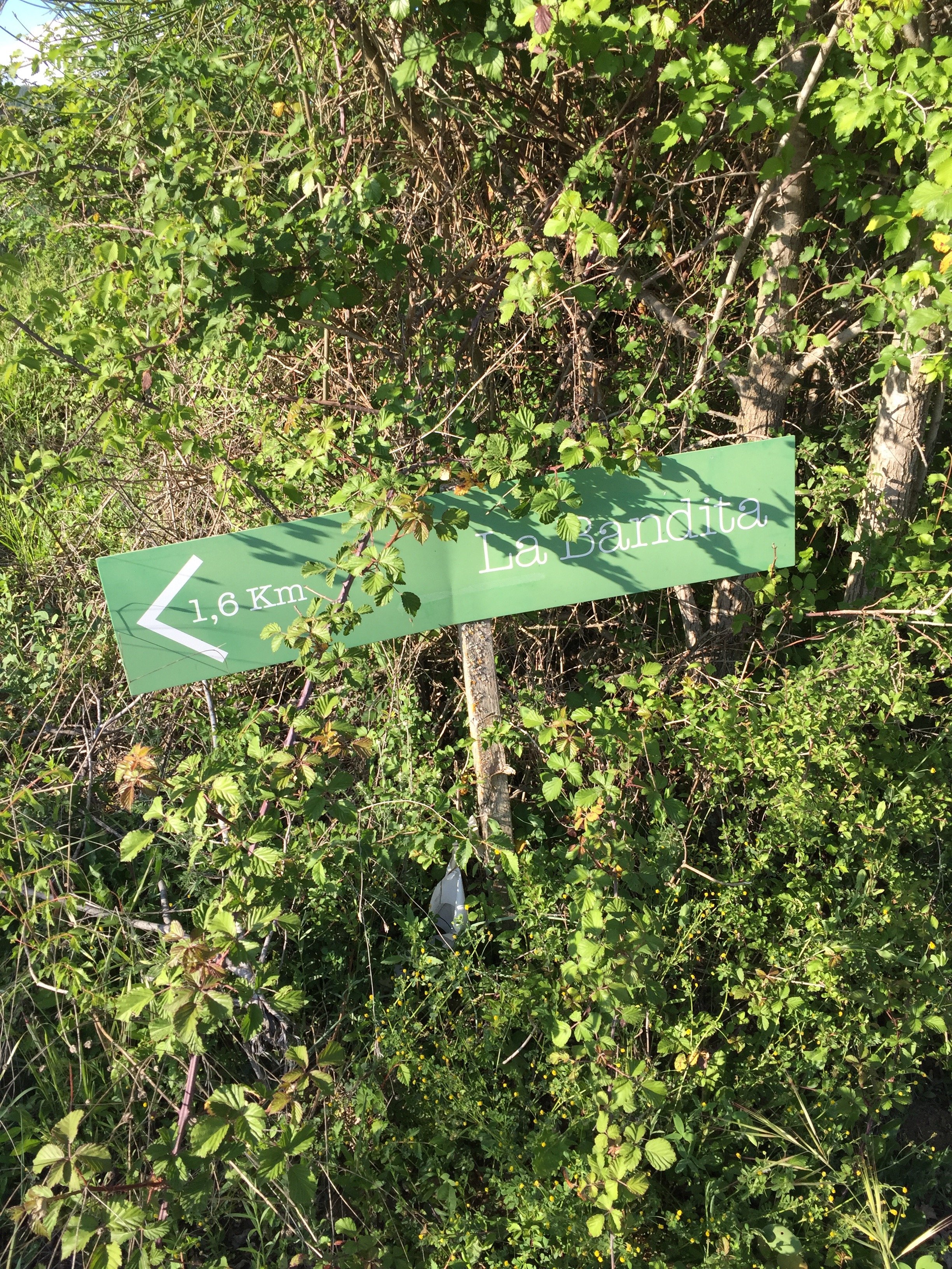
The Val d'Orcia region of Tuscany is a protected UNESCO World Heritage site. Located south of Siena, it's home to some of the most gorgeous vistas in Italy. I cannot wait to return.The first night we stayed at La Bandita.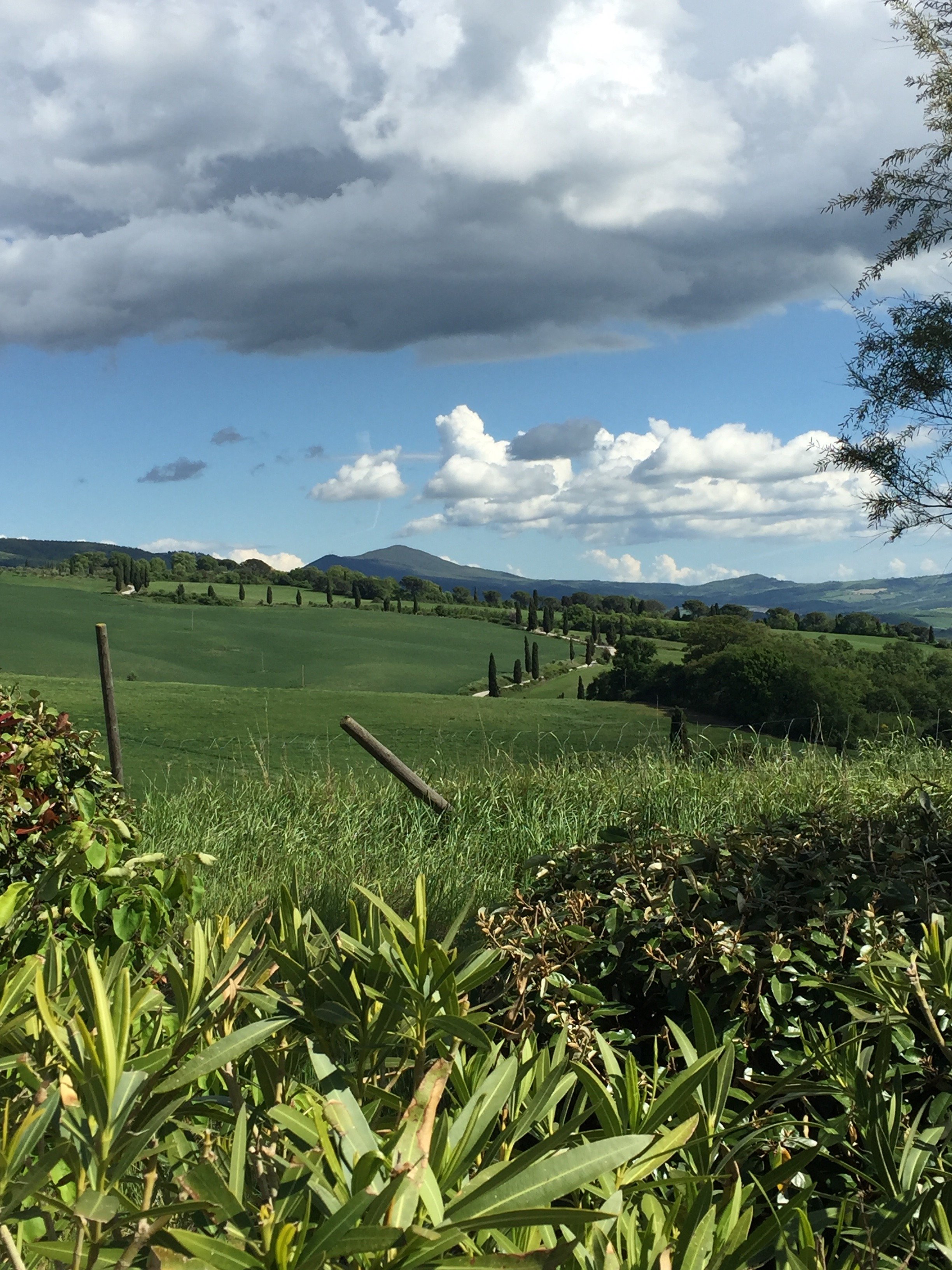
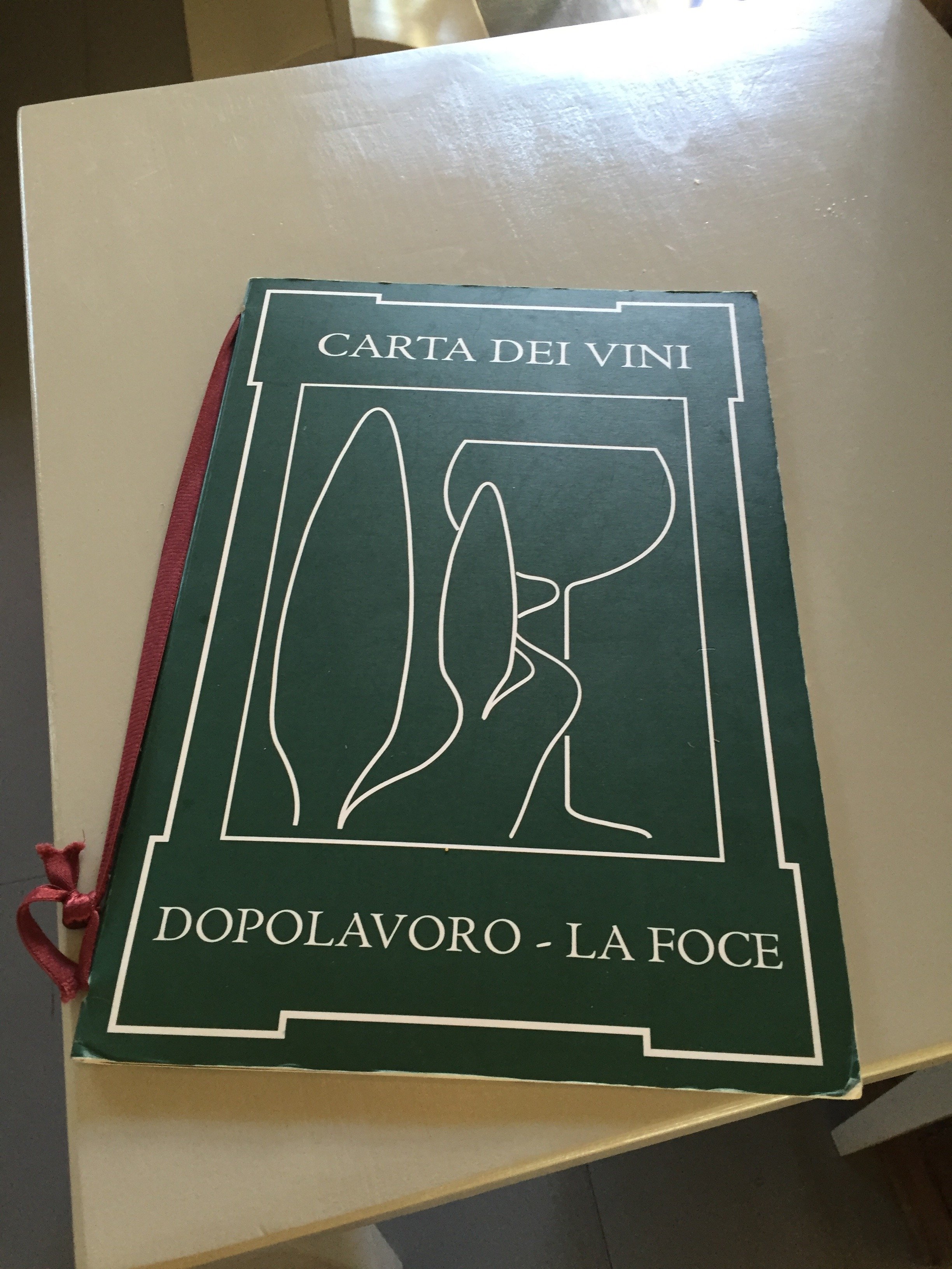
 We arrived just in time to drive back down the steep hill to have lunch at Dopolavoro. Originally built by the Origo family in 1939, it was the meeting place for the workers on the La Foce estate. Dopo lavoro, translated to English, means after work. During the war locals came to watch news reels. The Origo family still owns the La Foce estate and opened the restaurant (after a lengthy restoration) in 2012.
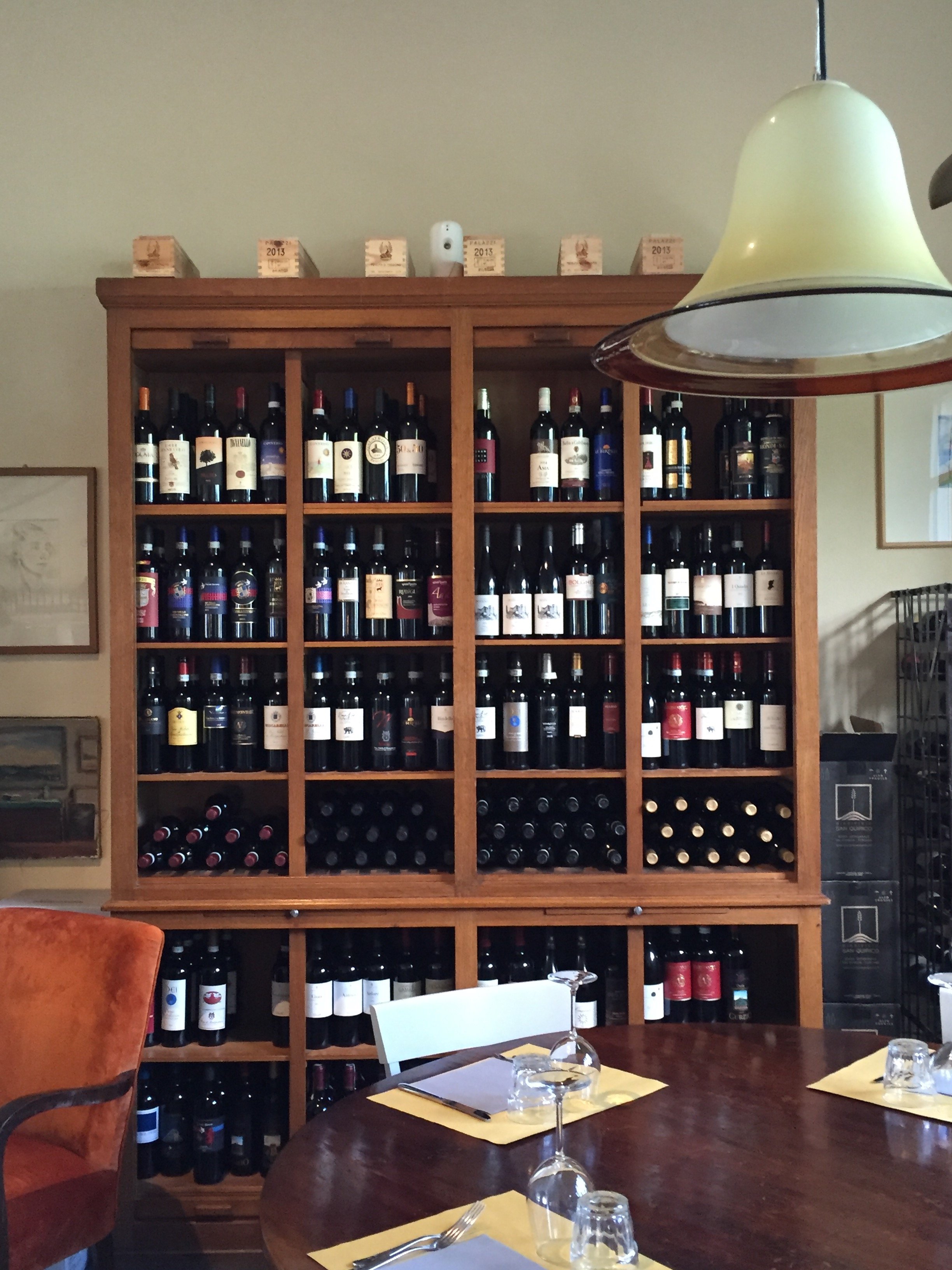
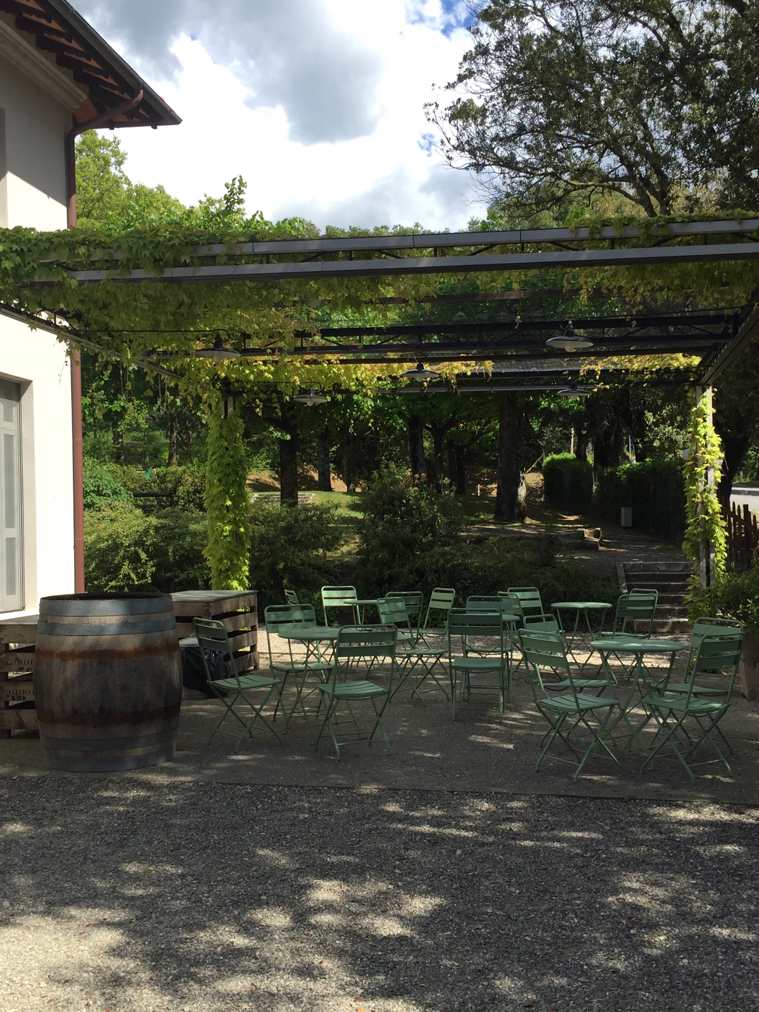 Our lunch was excellent. Annalee doesn't eat meat and found plenty of dishes to choose from (not so easy in Tuscany). The restaurant has a large vegetable garden and uses olive oil from the estate. On a design note, it was perfection. Great service too.
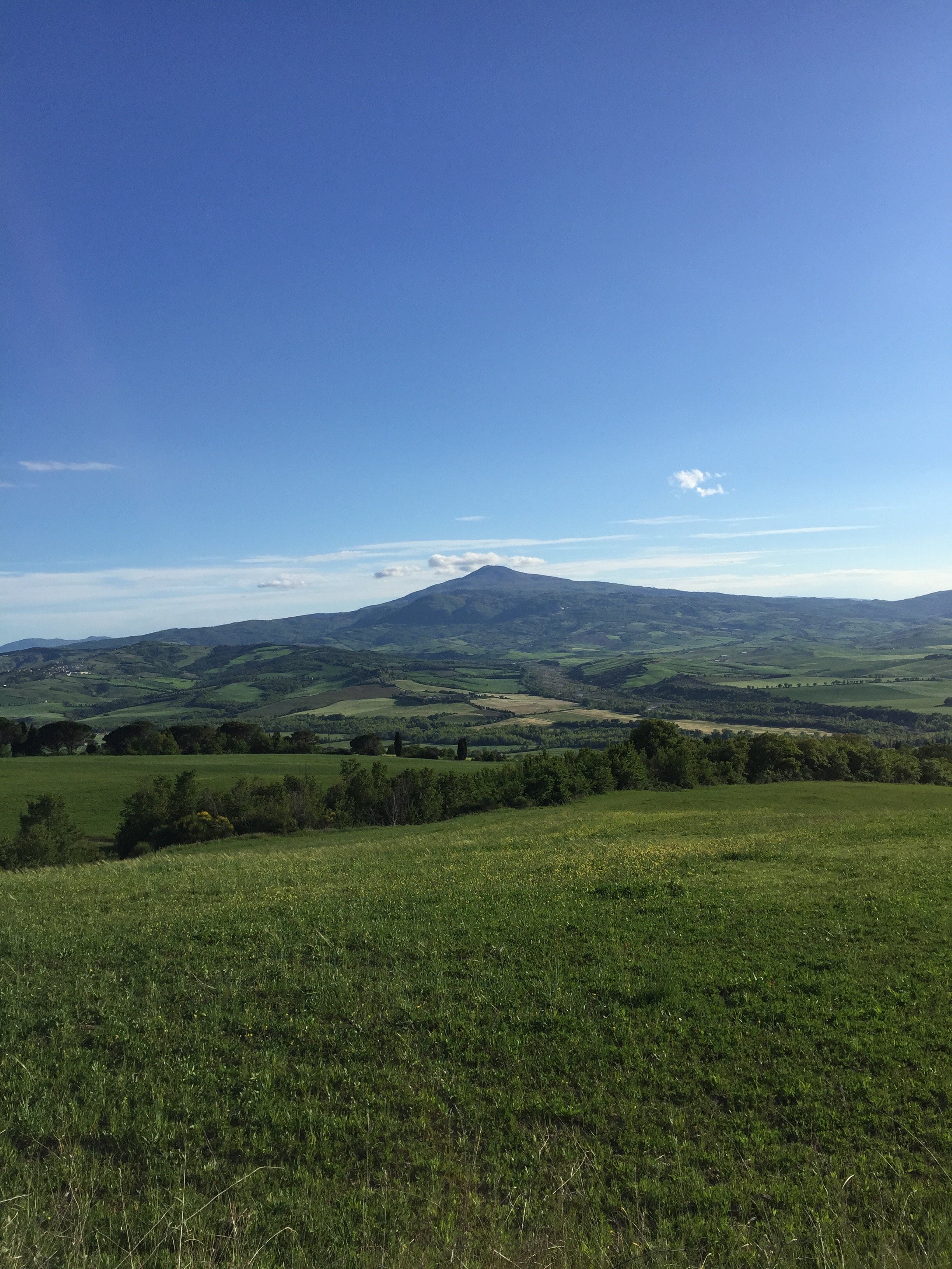
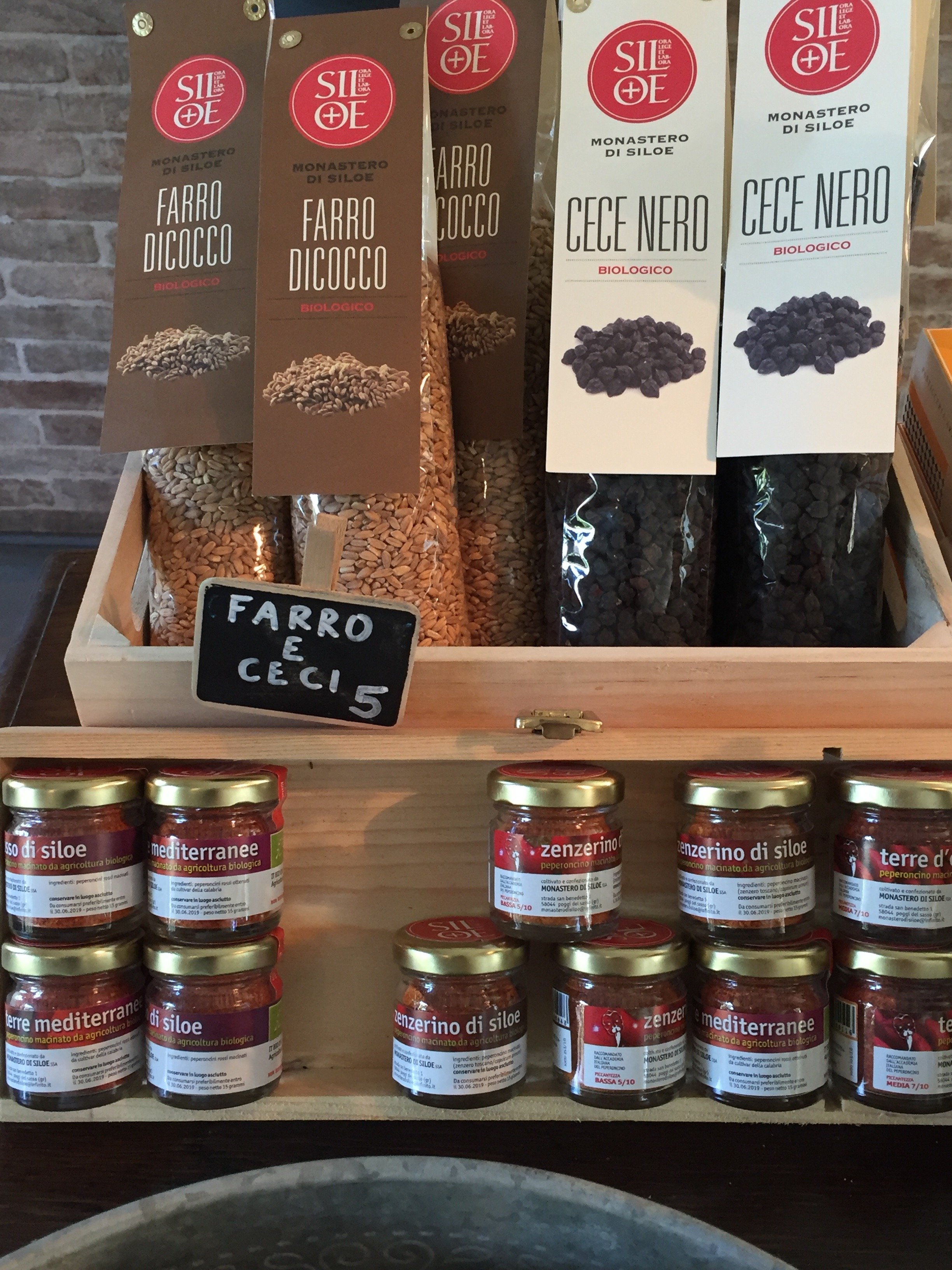 We decide to take a power walk before dinner. I'm relieved we missed the family of boars spotted by the other guests. I don't know why boars freak me out. Maybe because they're wild animals and the adults are massive? I love being out in country but not really a fan of bugs, snakes, and such. I know this is not logical.
 During dinner we met an American couple and a young couple from Poland who had recently become engaged. We had a wonderful time. The conversation flowed and the food prepared by Chef Dario was delicious. You never know with communal dining. I got a little nervous once politics came up but it was fine. Most of our discussion centered around, food/wine, travel, and the places we've visited so far in Italy.It began to rain so we couldn't light the large fire pit. Tears. Instead we went old school and played records. John, the co-owner of La Bandita, is a former music industry executive and has quite the eclectic collection of vinyl. I found an Earth, Wind, and Fire LP and it was a wrap. EW&F is one of my favorite bands. I side-eye people who tell me they dislike them as their catalogue is pretty deep. Perhaps they do not like music, period. Or maybe they don't like R&B or soul/funk? I met a person who told me they couldn't stand EW&F. This person was also a black American Gen-Xer. I was so shook, I didn't even know to say.I cracked up when Annalee started line dancing with Chef Dario and his colleague Paolo. It was the perfect way to end a spectacular day.The next morning, I woke up at my usual time and watched the sun rise. All I could hear were sheep and roosters in the distance. Paradise.
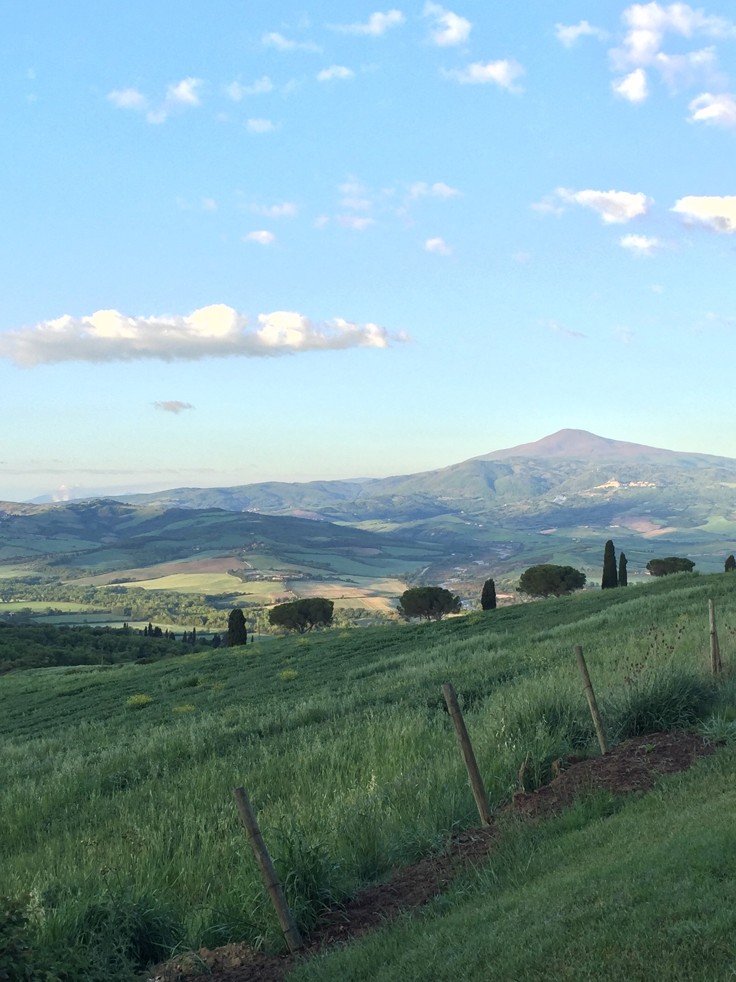
 During my run before breakfast, I was trying to figure out when I could return La Bandita.
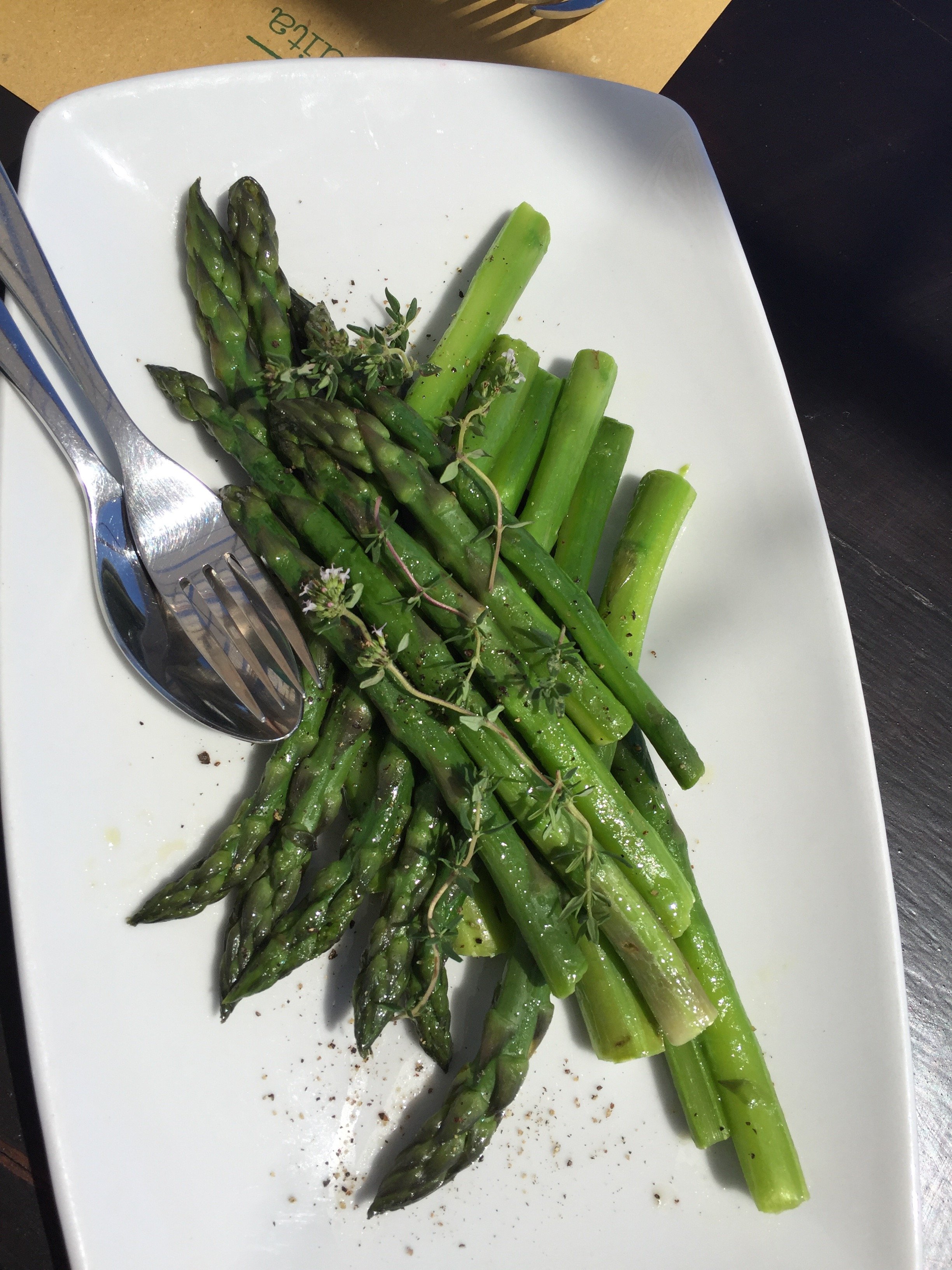
 We decided to have lunch at the Countryhouse before driving to the Townhouse in Pienza as it was the nicest day of the weekend. It was delicious, and very pretty.
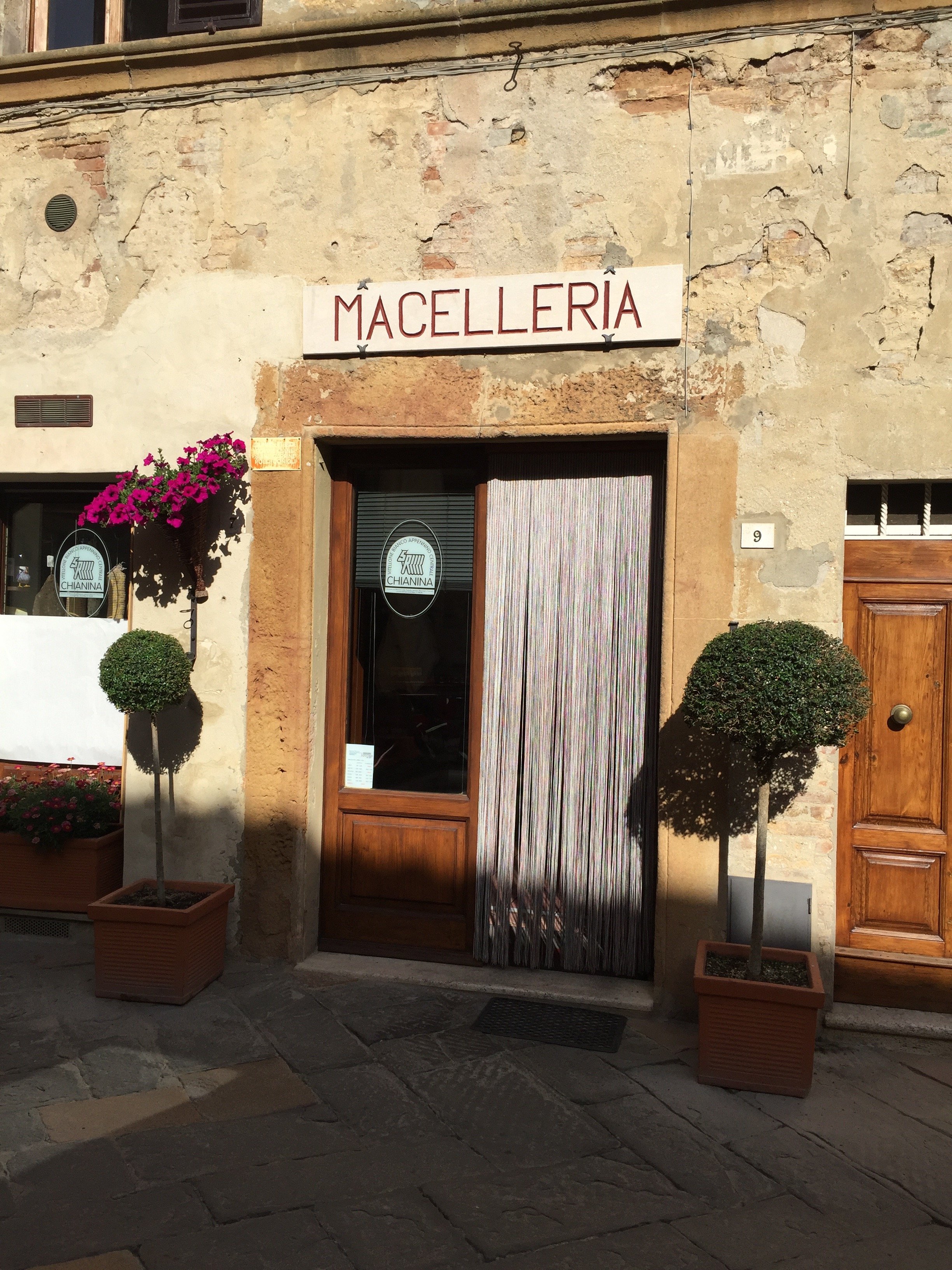
 I've been to Pienza before but it was Annalee's first time. I adore this small hill town.


 The first time I was there was during the dead of winter. This time around Pienza was crowded with large tour buses dropping people off. However, once aperitivi hour arrived, it cleared out a bit. We met Ondine (co-owner with John of La Bandita) for an aperitivo at a new place in town. The views were just ridiculous. Hello, is this real life?
 The next morning I did a quick workout before the rain arrived.

 Annalee and I got completely lost, in the pouring rain, looking for Monteverdi. It was worth it because we ended up driving through a stunning nature reserve.I was excited to finally see Monteverdi. Ilaria Miani was the interior designer and I had interned in her showroom. I couldn't want to see the spaces, that were floor plans during my internship, in person.American Michael L. Cioffi started buying and renovating villas in the village of Castiglioncello del Trinoro in 2003. He and Ilaria have created a special place that respects the history, culture, and beauty of the borgo while restoring it, a difficult feat.


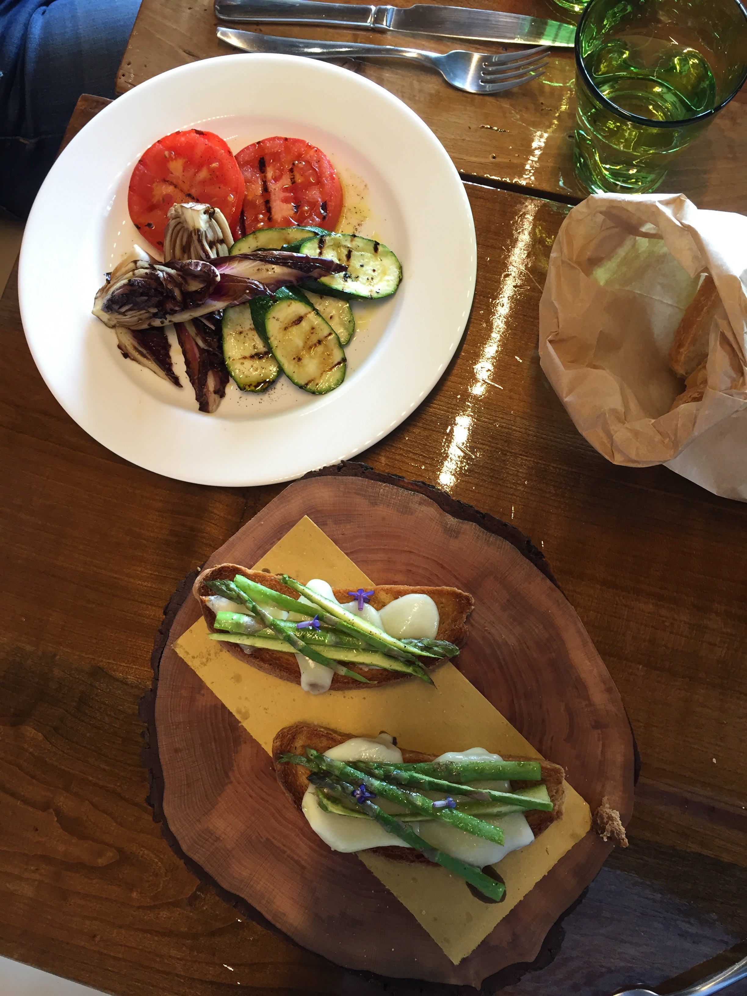
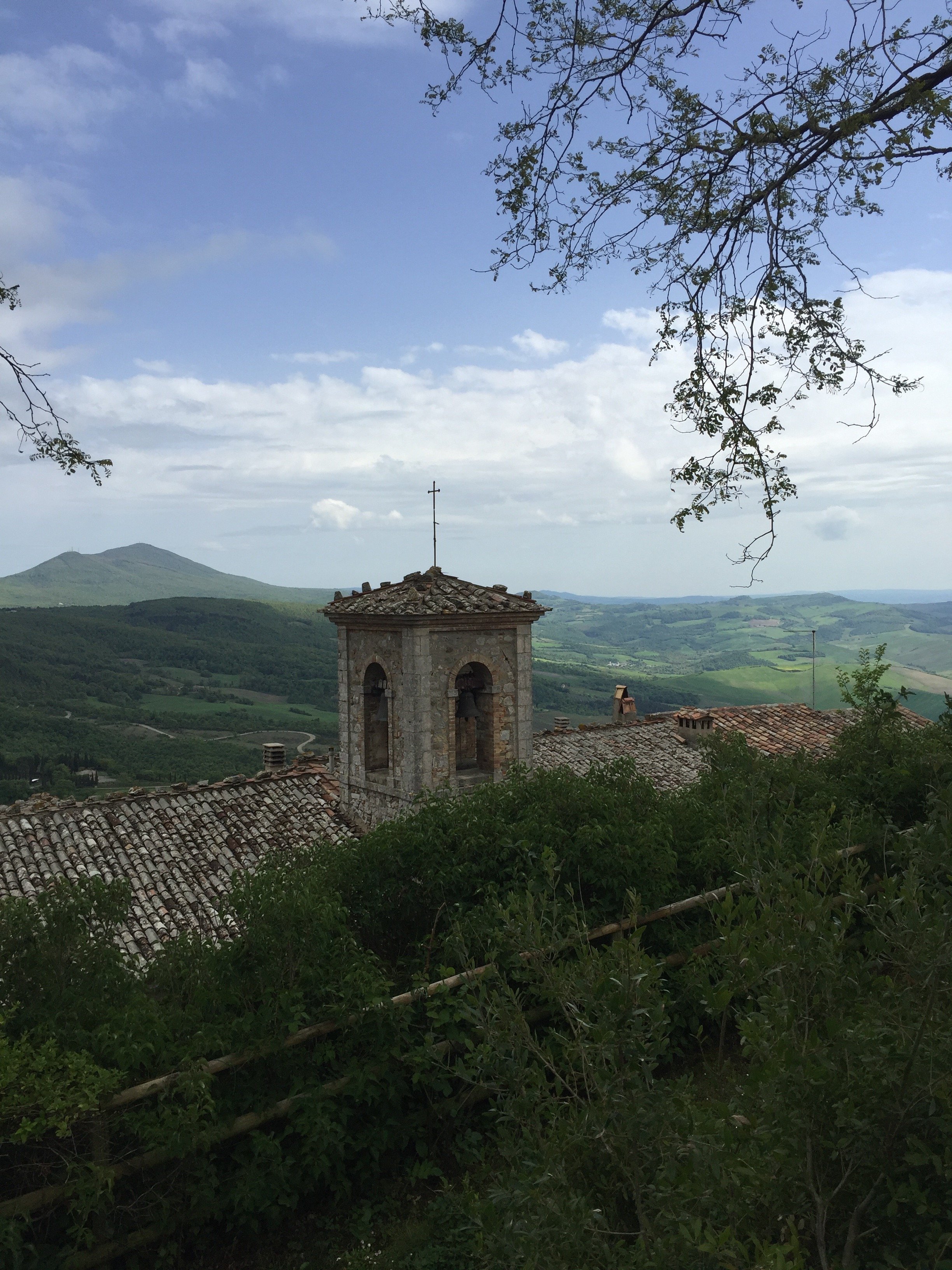 We ate lunch in the entoeca. Outstanding. The service was incredible. As I mentioned earlier Annalee, doesn't eat meat. The chef went to the other restaurant on the property to order some fish for her.
 The sun was trying to make an appearance.
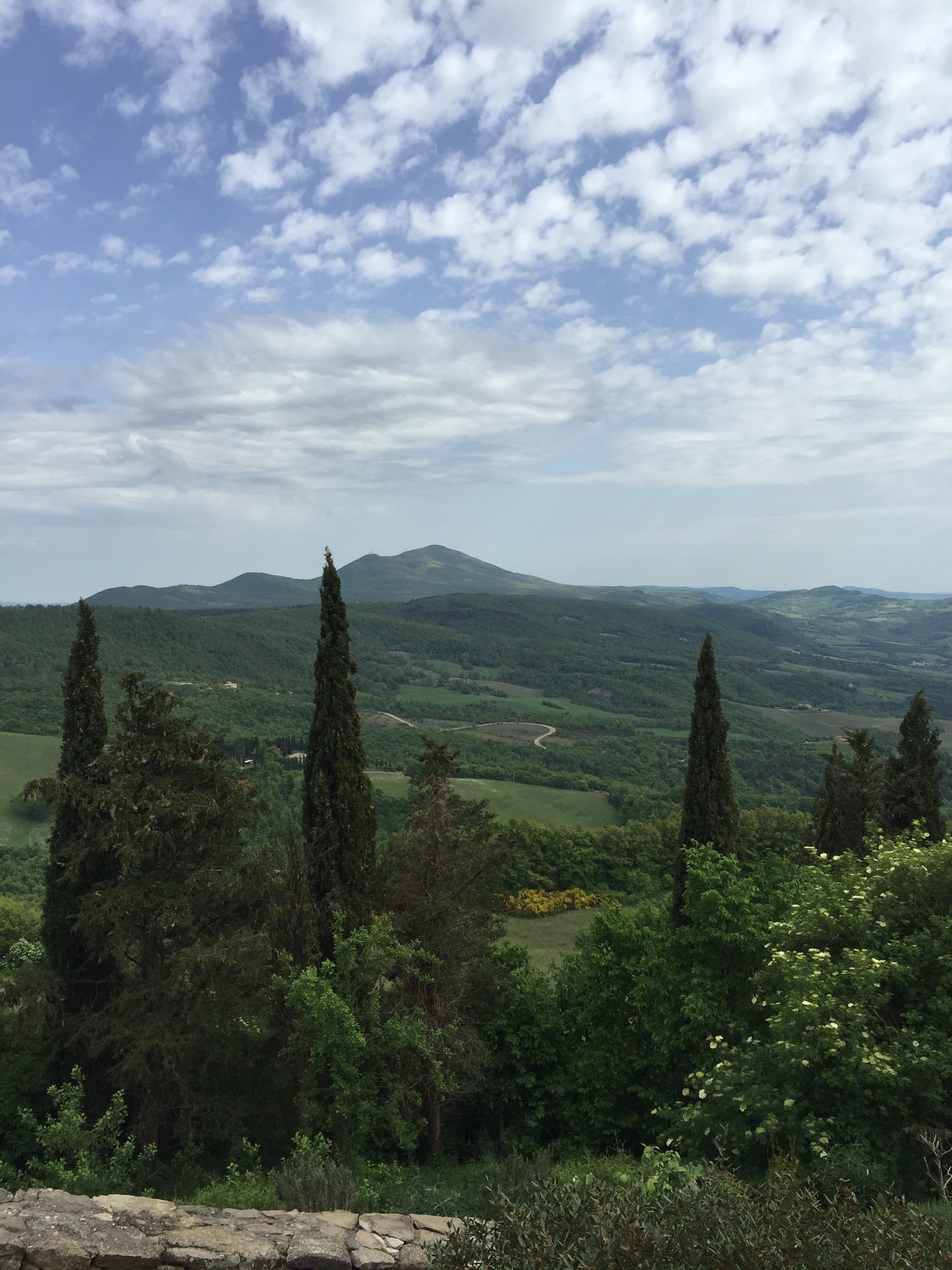 Monteverdi is an unique experience. There are full time residents who have lived in the borgo for decades. However, this isn't a Disney version of a borgo. Locals and visitors attend the concerts, art shows, and other events held in the village's 14th century church, Sant' Andrea.
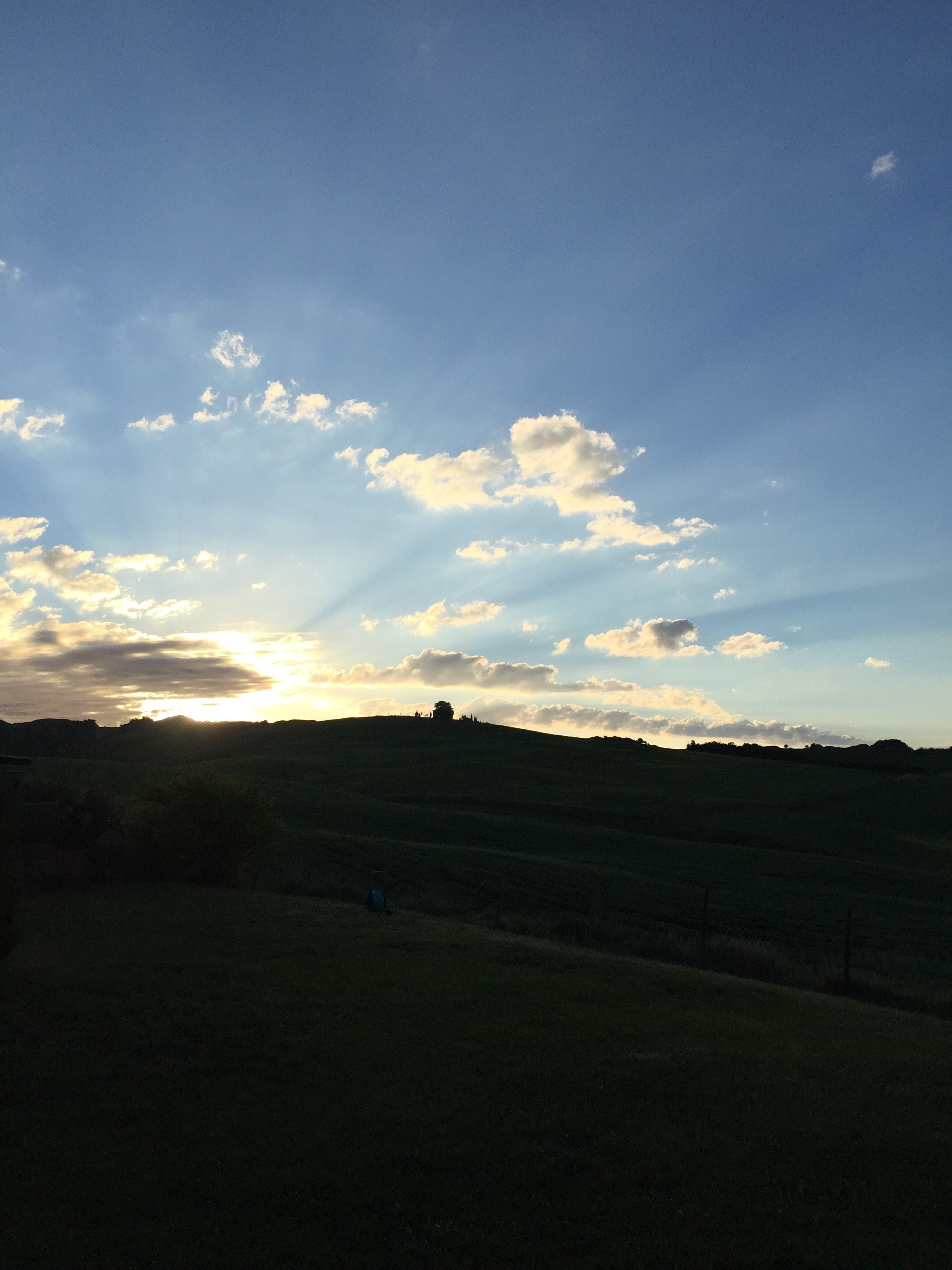
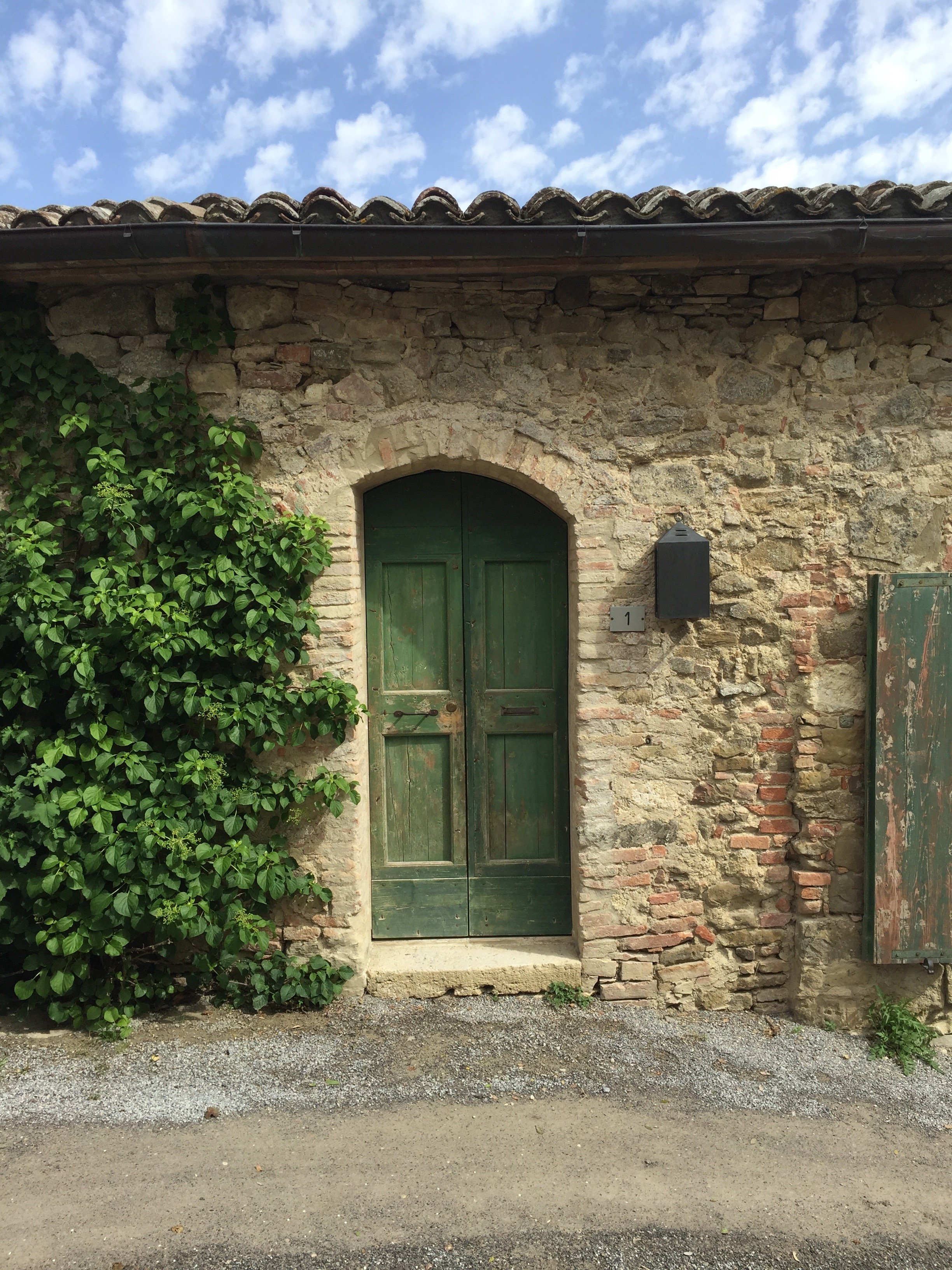 Unfortunately, our weekend was coming to an end and the forecast called for rain all day. When I woke up, I saw that the sun was shinning. I flew out of my room to take advantage of the change in weather.
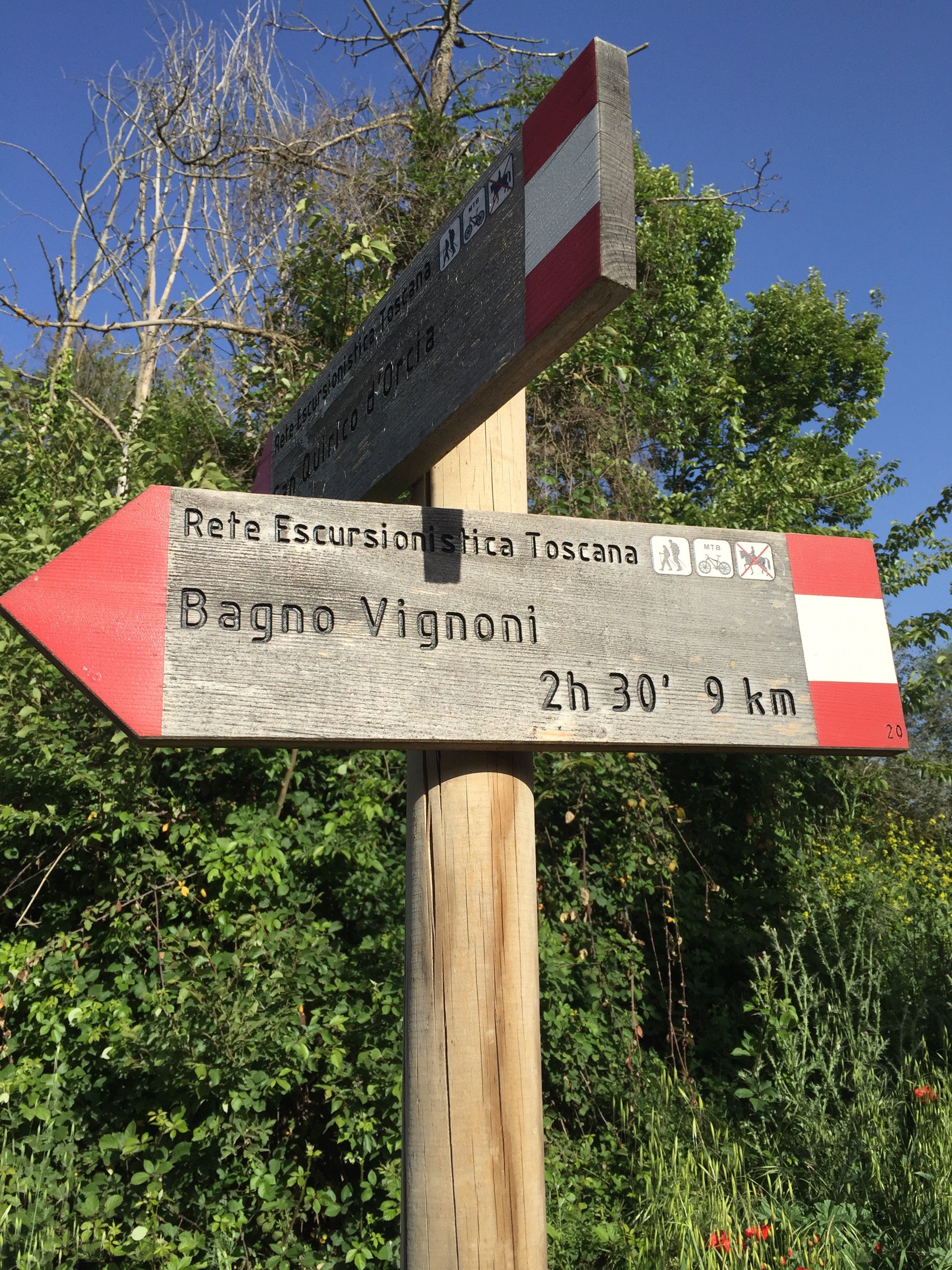

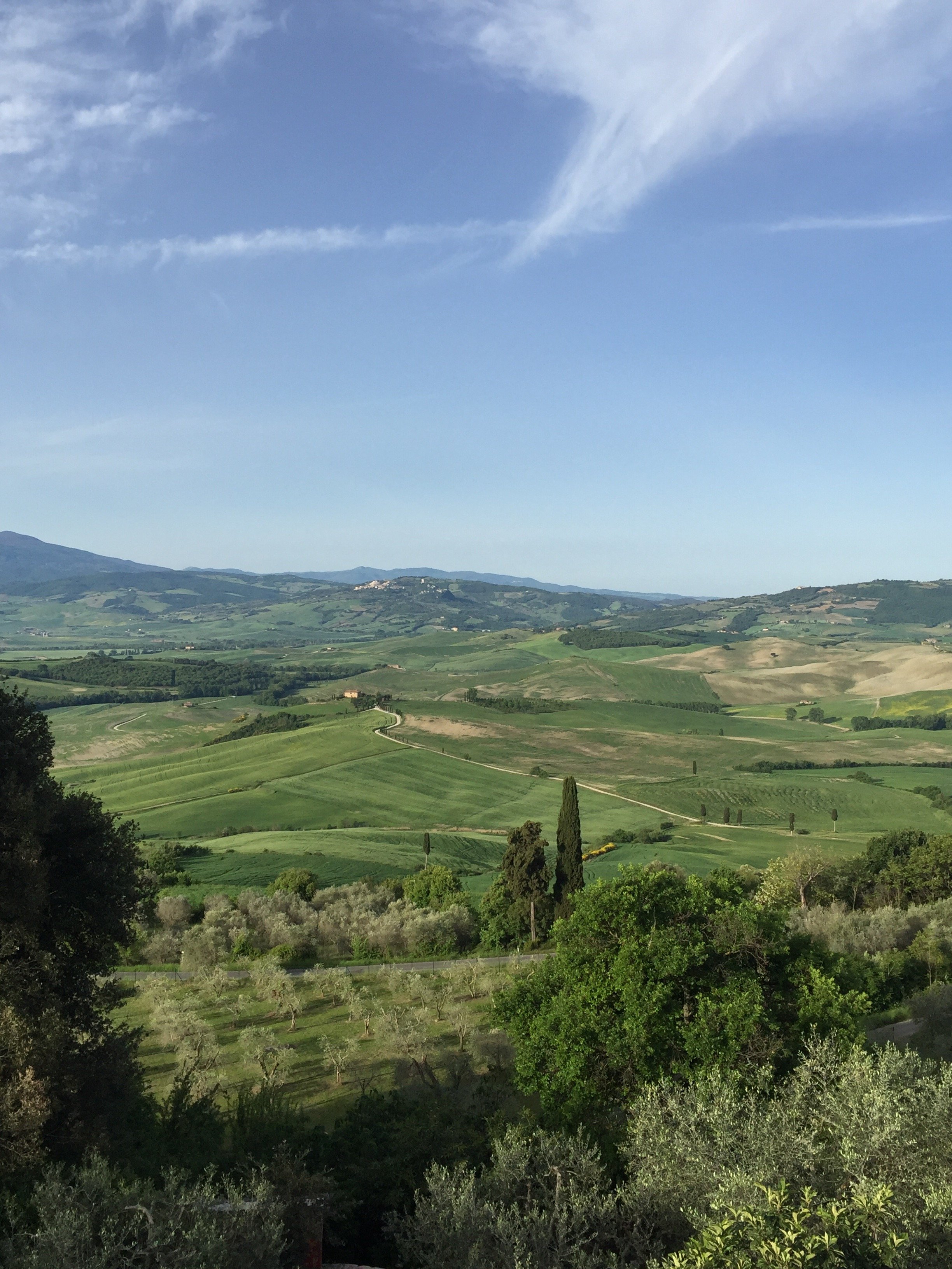 If some of these vistas seem familiar it's because many films were shot on location in this area. The verdant hills of the Val di'Orcia have been inspiring artists for centuries. I highly recommend a visit.Photos: Me and my iPhone
Design Inspiration - La Bandita Countryhouse
My apologies for the radio silence. Work has been bonkers. One of my clients moved back to the States. She was a high-ranking diplomat and her term was up. We needed to organize a major international move for someone who had lived in Rome for quite some time.My trip to La Bandita was the weekend after her move was finished. The timing was perfect. I was completely wiped out.I've been to the Townhouse and was curious about the Countryhouse after reading about it in design magazines. When Annalee invited me to join her, she didn't have to ask twice.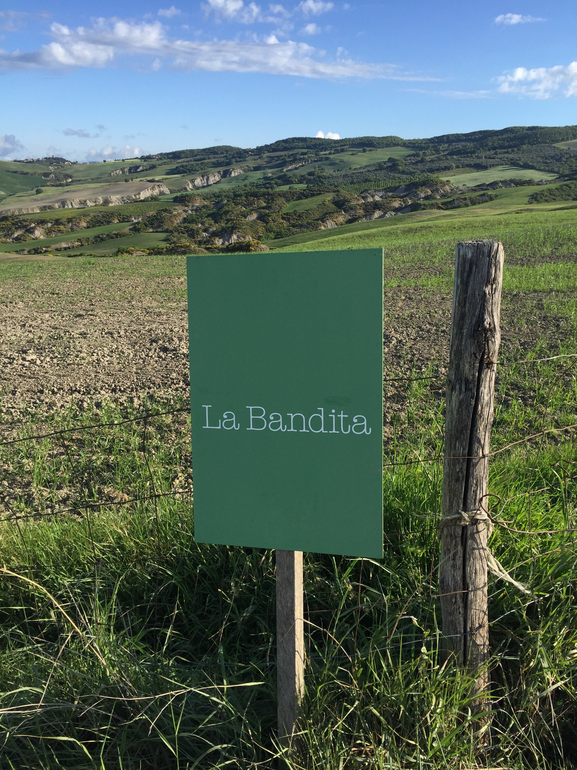 We met at the Chiusi train station and rented a car. Thankfully, Annalee did most of the driving as the two times I've rented a car in Italy I've received a speeding ticket. I lived in Los Angeles for ten years and drove pretty much every single day. I never received a speeding ticket (or any ticket for that matter). NEVER. I really don't understand why I got tickets in Sicily and Tuscany given I was trying to keep up with the flow of traffic. Sorry, I digress.I keep hearing Tuscany is over. Those people are on drugs. Are there some areas that are packed with tourists? Yes, but Tuscany is a large region. There's no reason to write off the entire area.The Val d'Orcia is truly one of the most beautiful places I've been to in Italy. My next post will be about what we did and where we went.Today, I'm focusing on the interior design. I've seen my share of "Tuscan" interiors. Too often there are extremes, either super modern, stripping all the character out of these older homes or too traditional, creating a space that reminds you of the Addams Family's house.Owners Ondine Cohane and John Voightmann, with their architects Ernesto Bartolini and Arianna Pieri of DA Studio in Florence, have a created a contemporary space that is warm, airy, and feels Tuscan. That last quality is so difficult to get right especially in an era of cookie cutter interior design (in part because every city has the same chain stores). Are there elements of the design that would feel at home in say, Miami or the Caribbean? Absolutely. The La Bandita team worked closely with local artisans and used natural materials found in the area. All these pieces came together to create a space that could only be in Tuscany.This article, written by Ondine, is about the how and why John and Ondine opened the Country House.
 Annalee and I stayed in The Pigsty Suite. Yes, this independent apartment (just a few meters from the main house) used to be the pigsty.
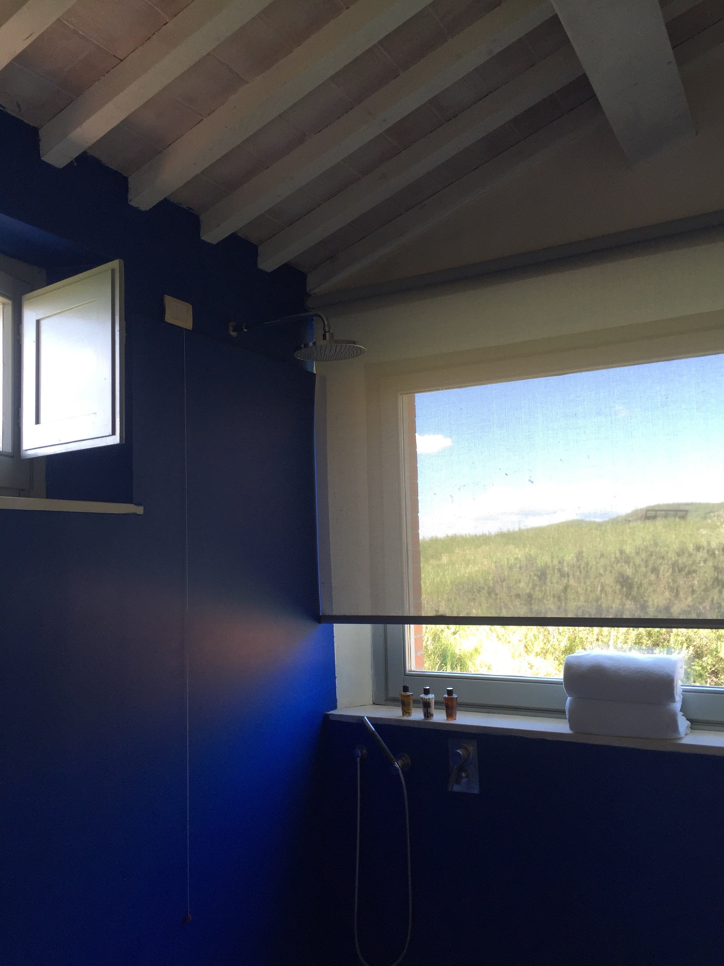
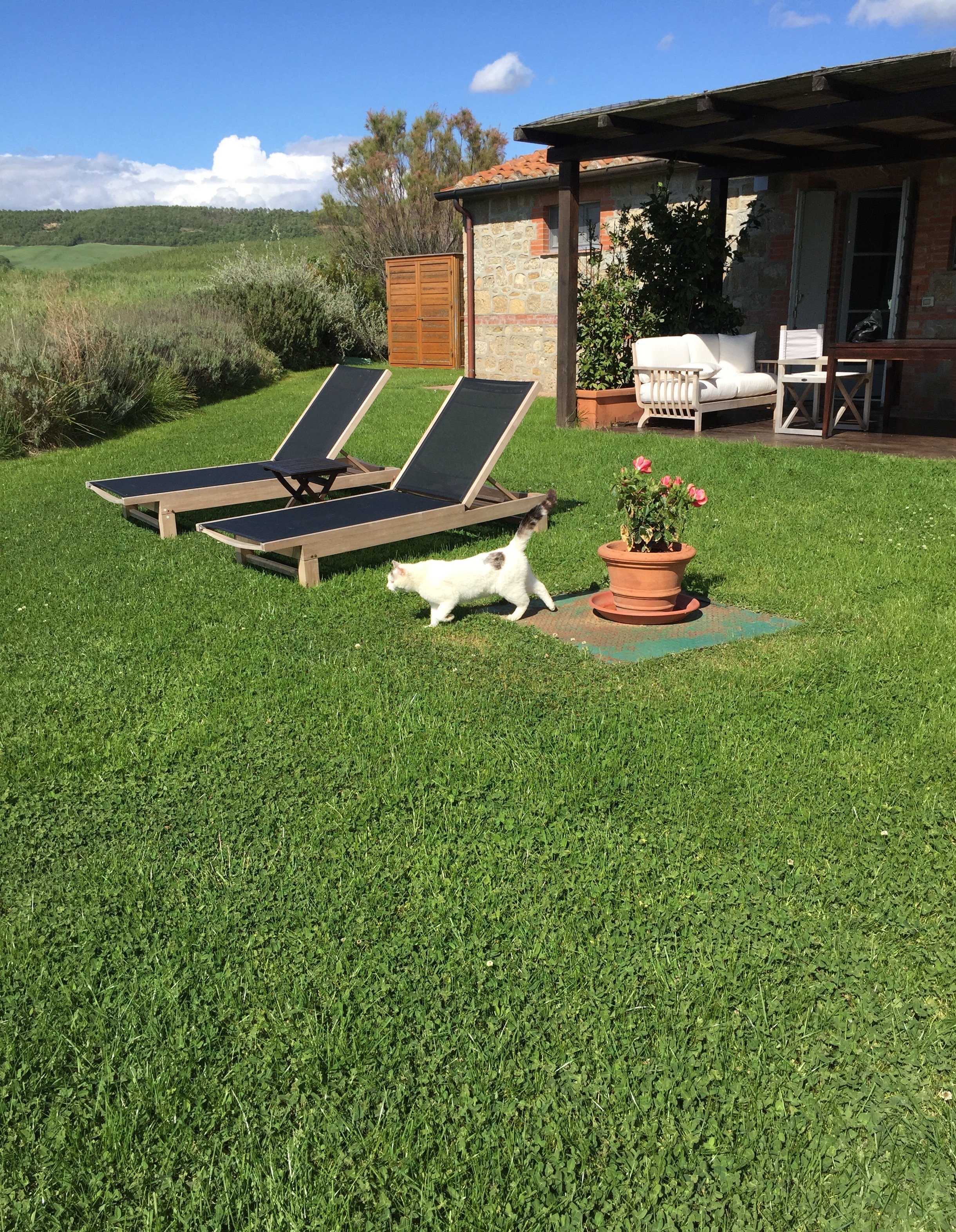
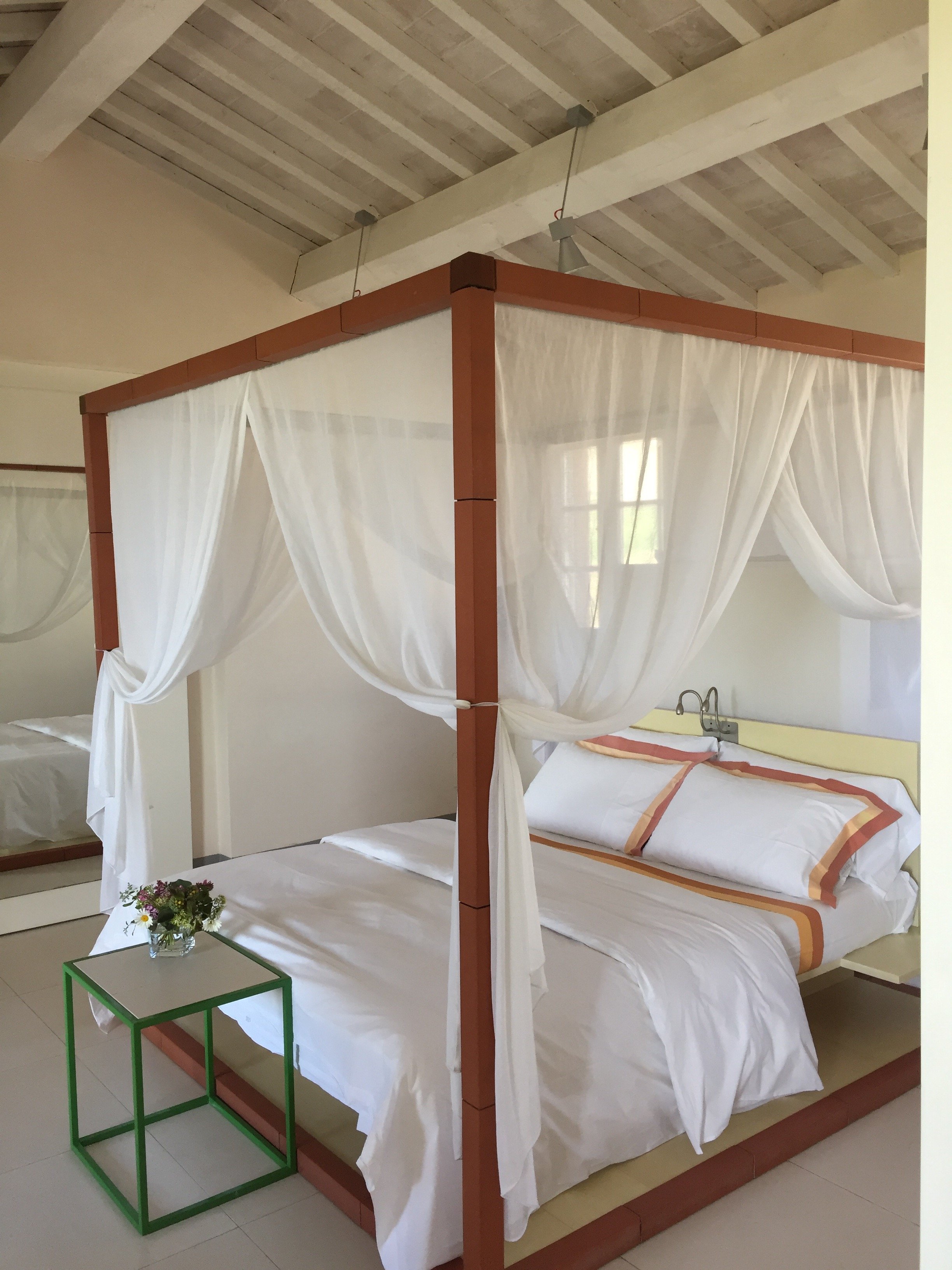 My pictures don't do it justice. It was perfection. We had our own little patio. The views from our "backward" were breathtaking. The bathroom was immaculate. I have a thing about cleanliness in general and it's taken to another level regarding kitchens and bathrooms.The bathroom was huge and I loved having a shower next to the big picture window. I felt like I was taking a shower outdoors but without the risk of being attacked by wild boars. Seriously, these darn boars are no joke. Annalee and I went jogging before dinner and other guests told us they saw a family of boars right after they passed us on the road. No grazie.
 The check in desk/reception is in the main quasi-open planned room with the kitchen and dining areas. There is a lounge/library area with a great selection of books.
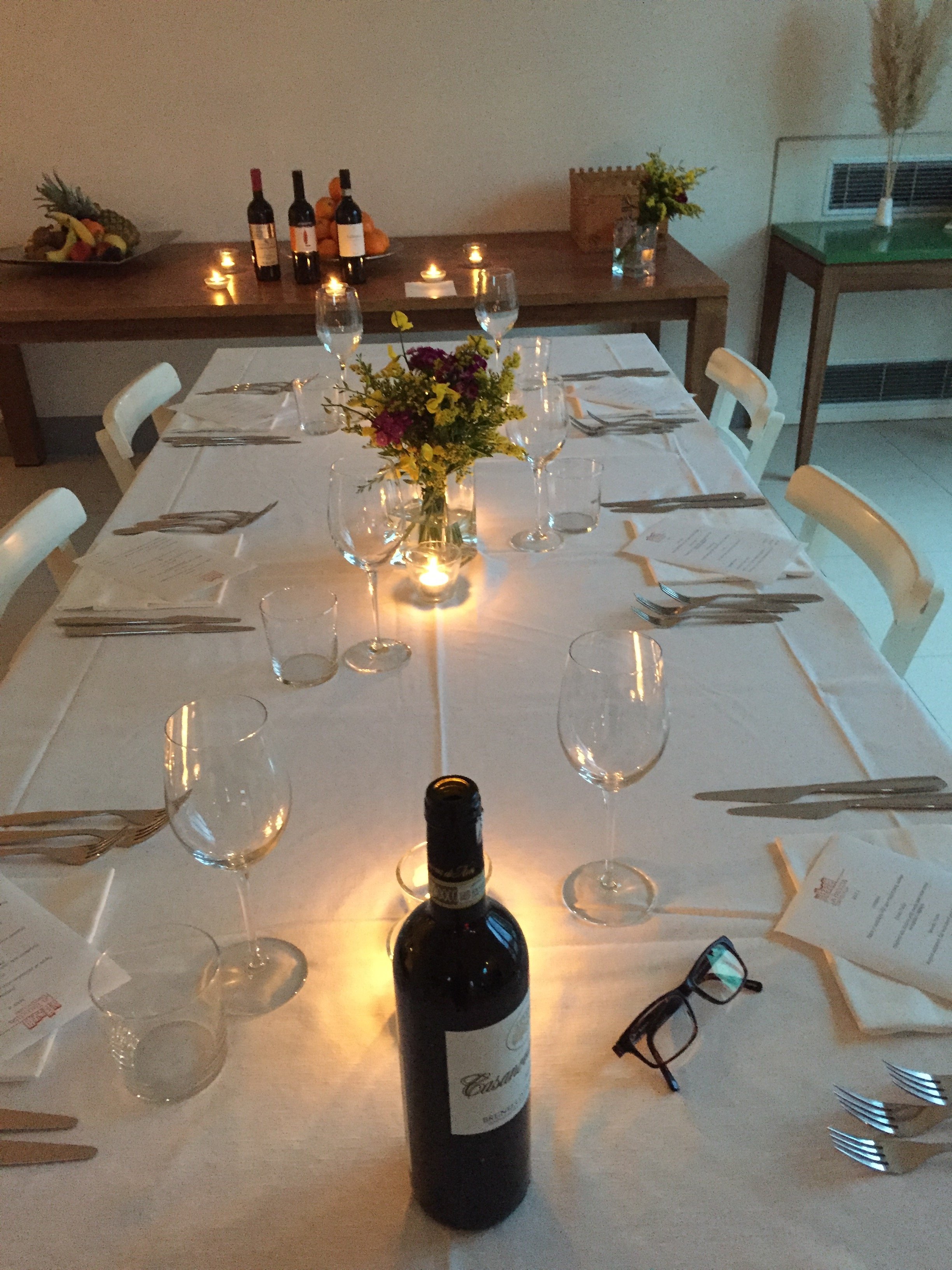
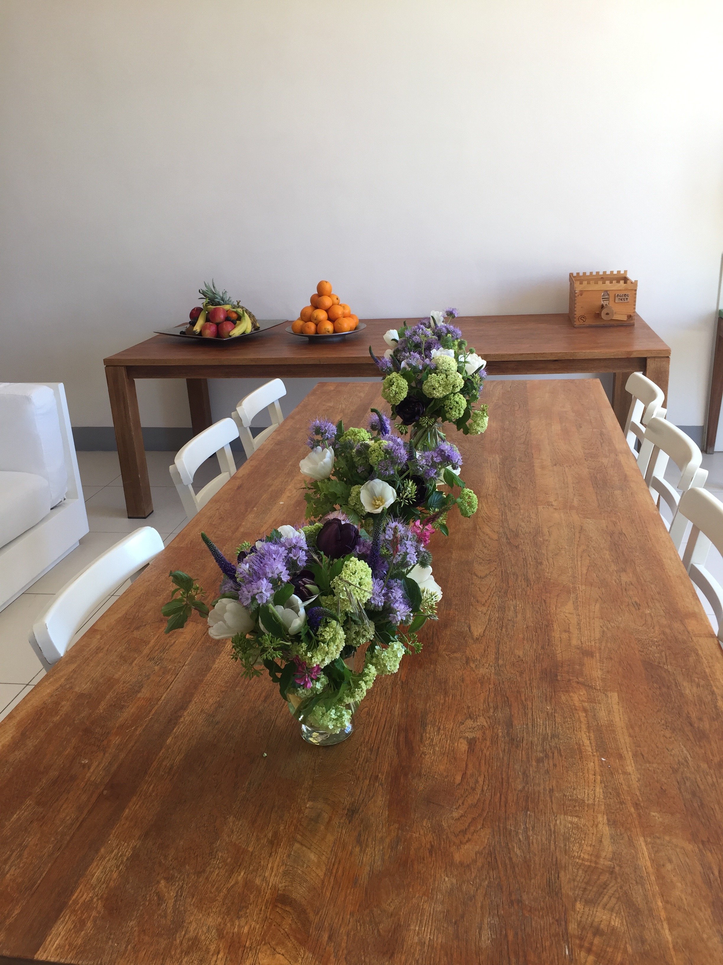
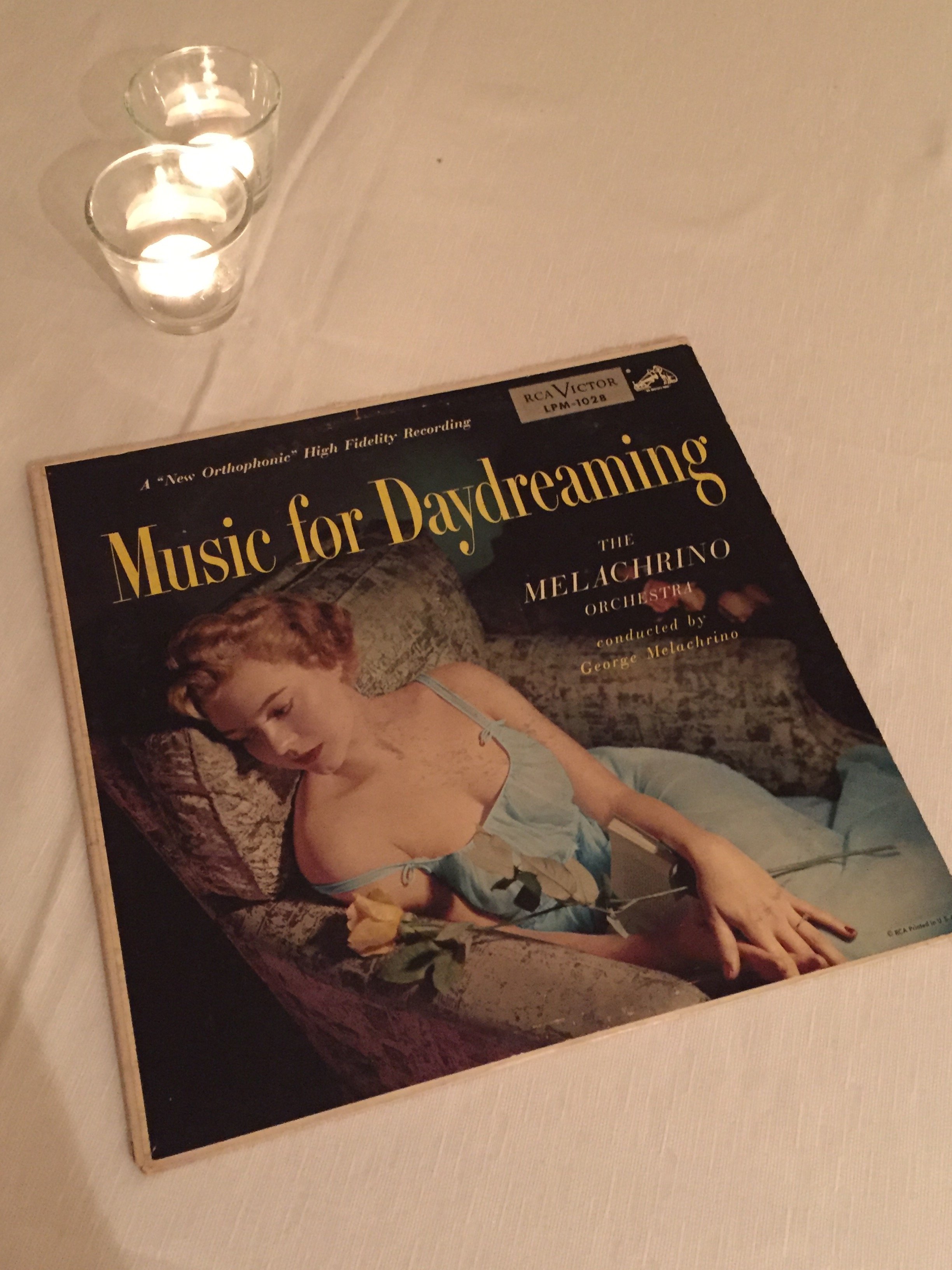 My personal hotel tastes lean toward simple but sophisticated interiors. Some might find the bedrooms too minimalist but for me they let the architecture and views shine. The rooms are relaxing and calm which is what I want in a hotel room.
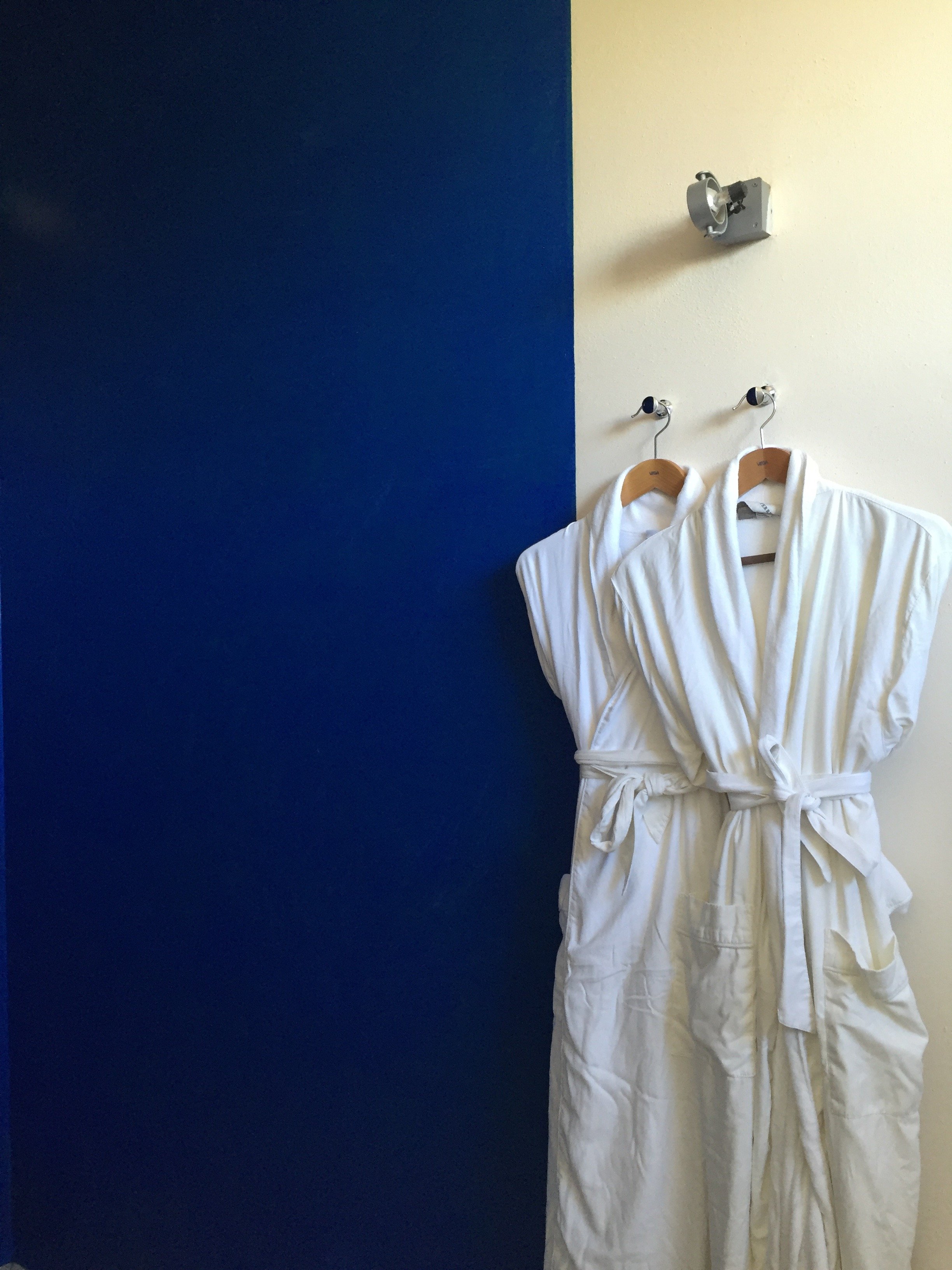 I can see how this hotel may not work for a solo traveler or anti-social couples as the dining space is communal. Bandita Countryhouse would be perfect for a group to rent the entire space.It's truly off the beaten path so I'm glad we arrived during the day. The unpaved road leading to the property is steep but worth it for the 360 views.
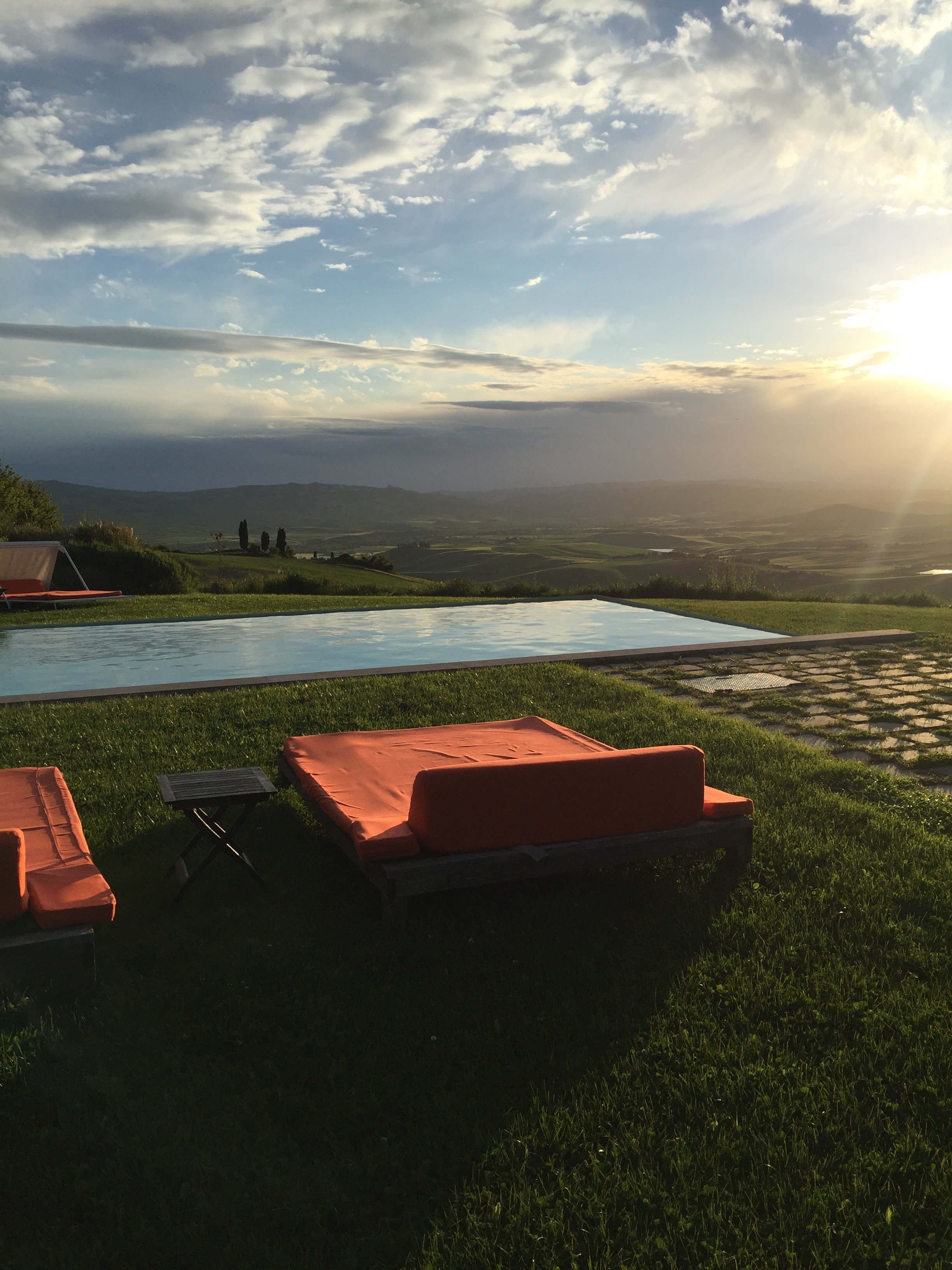
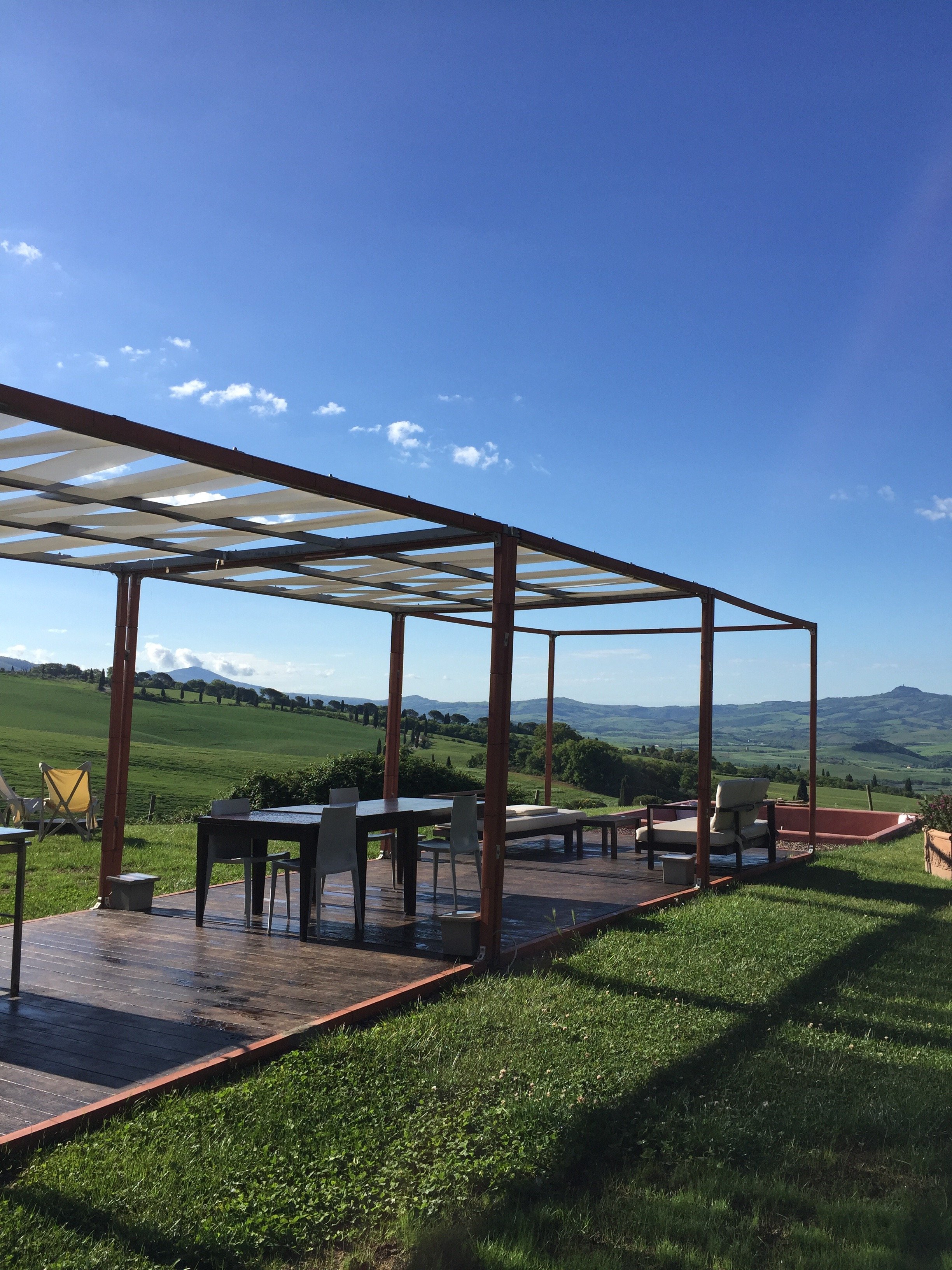 While technically it is a boutique hotel, the vibe at La Bandita Countyhouse is more your friend's very chic country house in Tuscany. I am here for it. The hospitality and food were wonderful. John, Ondine, Dario, Elena, Paola, Marco, and the cat (I didn't catch its name) made us feel at home.I had a great time. So much so that I'm willing to deal with the drama of driving a car in Italy again.
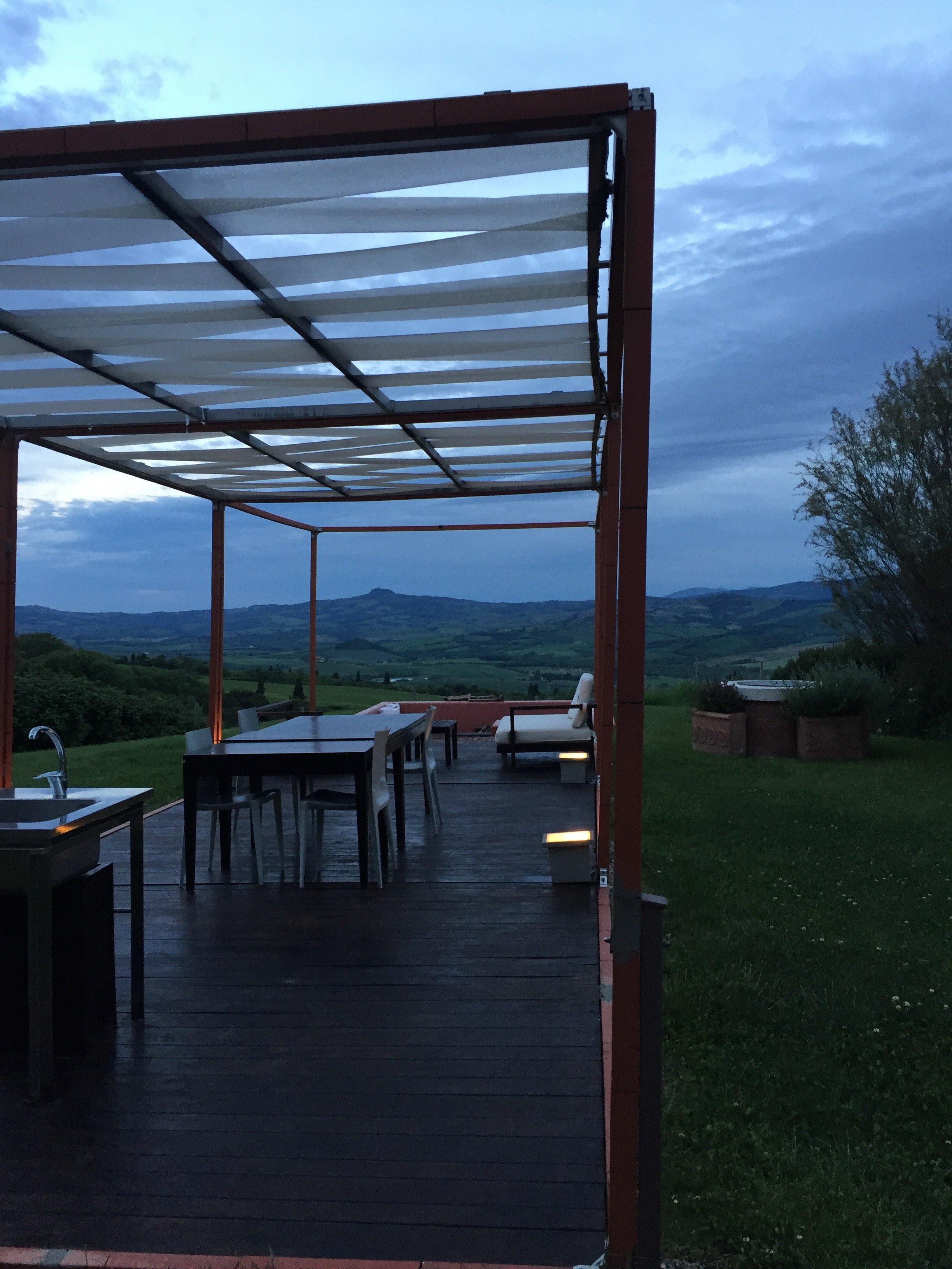 Photos: Me and my iPhone.La Bandita CountryhousePodere La BanditaPienza (SI) 53026Toscana, ItaliaTel +39–333–404–6704Fax +1–212–202–6222website


