Before & After - Via Banchi Vecchi Project
Ciao Bloggisti,Earlier I wrote about the Via Monserrato project. One of the other apartments we worked on was located two blocks away on Via Banchi Vecchi. It was a new apartment for our client.The apartment was empty so we didn't have the same logistical issues but two bathrooms, and the kitchen had to be renovated. Any time you start opening walls you will have some surprises, especially in a building that's over three hundred years old.The brief from the client stated that the unique original flooring and the red tiles in the kitchen could not be replaced. The floors weren't in great shape but I like to think of them as adding character. The client wanted to improve the layout, add a closet in the bedroom, lighten up the very dark kitchen, and make the second bathroom more functional.The bulk of the budget went to the renovation. Some of the furniture came from the other apartments. We bought a mix of high-end hardware/fixtures along with budget friendly pieces.The minute the client stated that they had to change the layout, we called an architect. Fortunately, Domenico Minchilli and his studio took on the project. Square footage wise it was a lot smaller than their usual projects but it was complicated. We had worked together before which made the renovation process, never easy, smoother.BEFORE - The Kitchen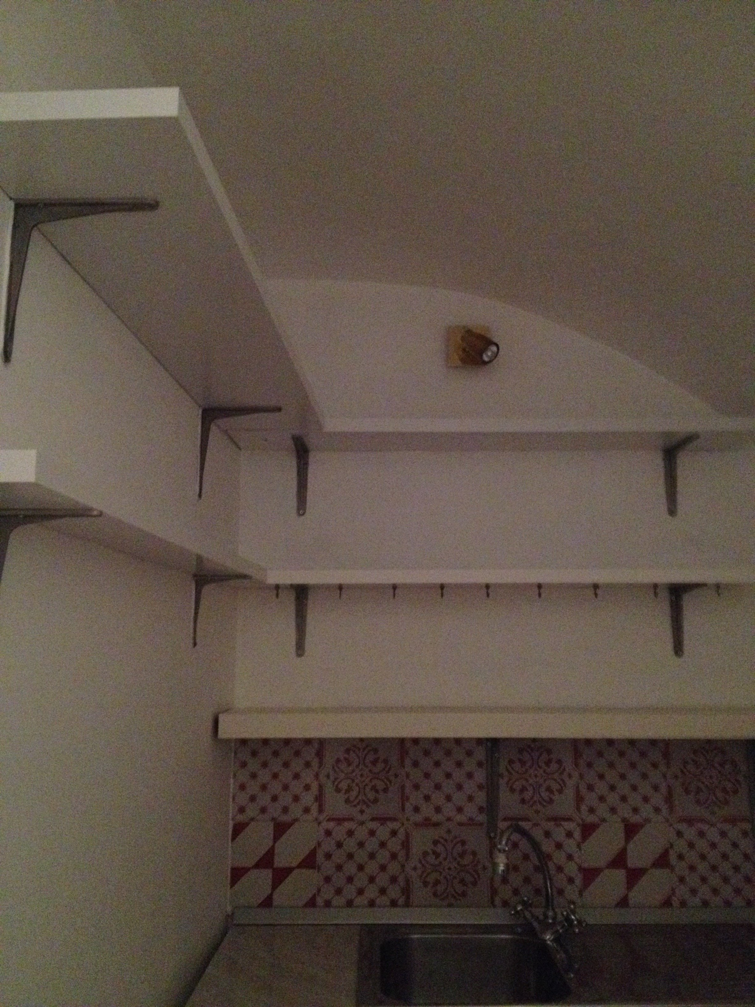 True, this is not a primary residence but I don't think any guest would want to spend a lot of time in here. It was impossible to get a decent shot of this dark, cramped space. The hallway before. The kitchen is behind the wall on the right.
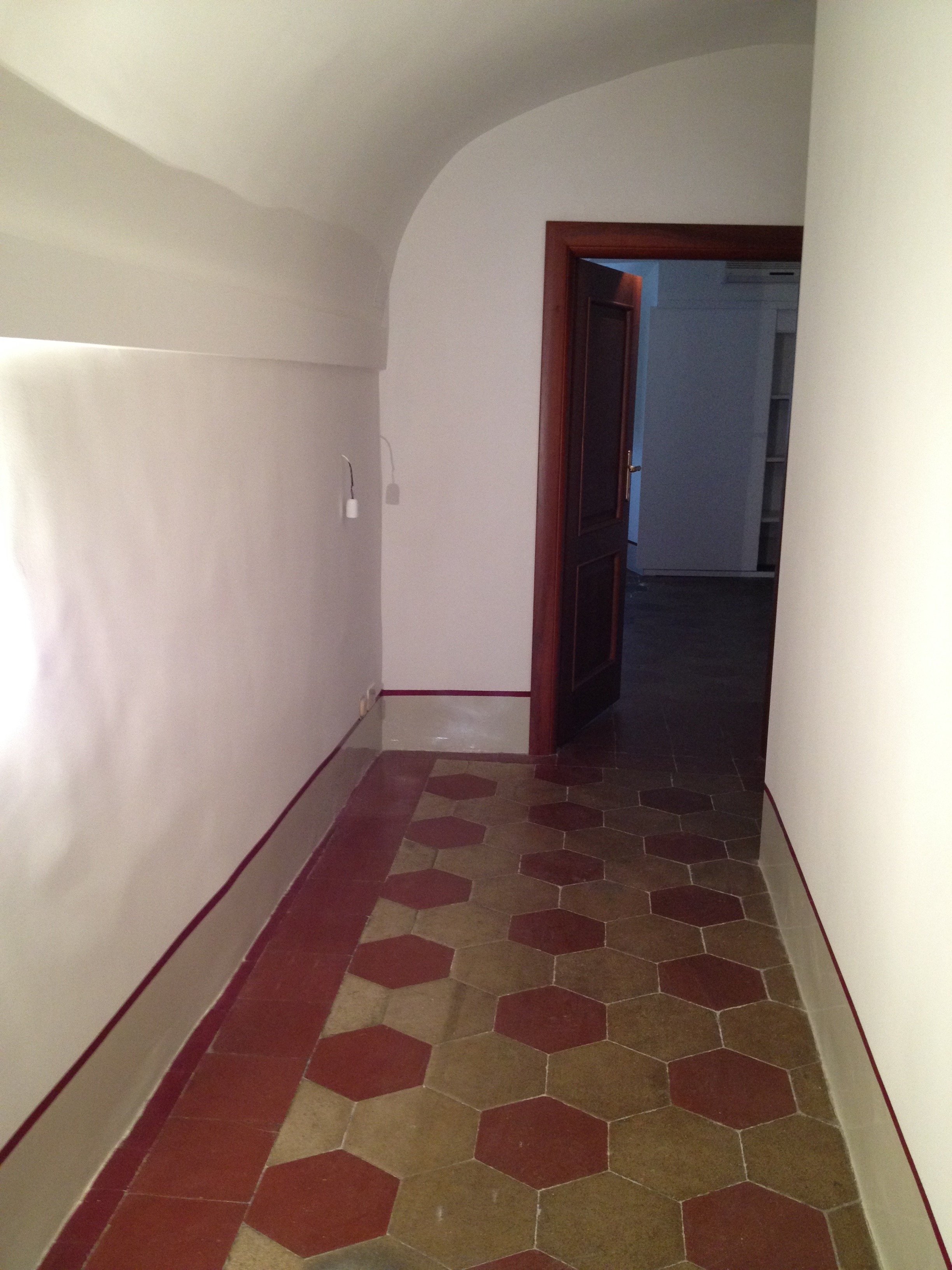 There were structural issues that had to be addressed (electrical, ventilation) so a upgrade/renovation had to happen.
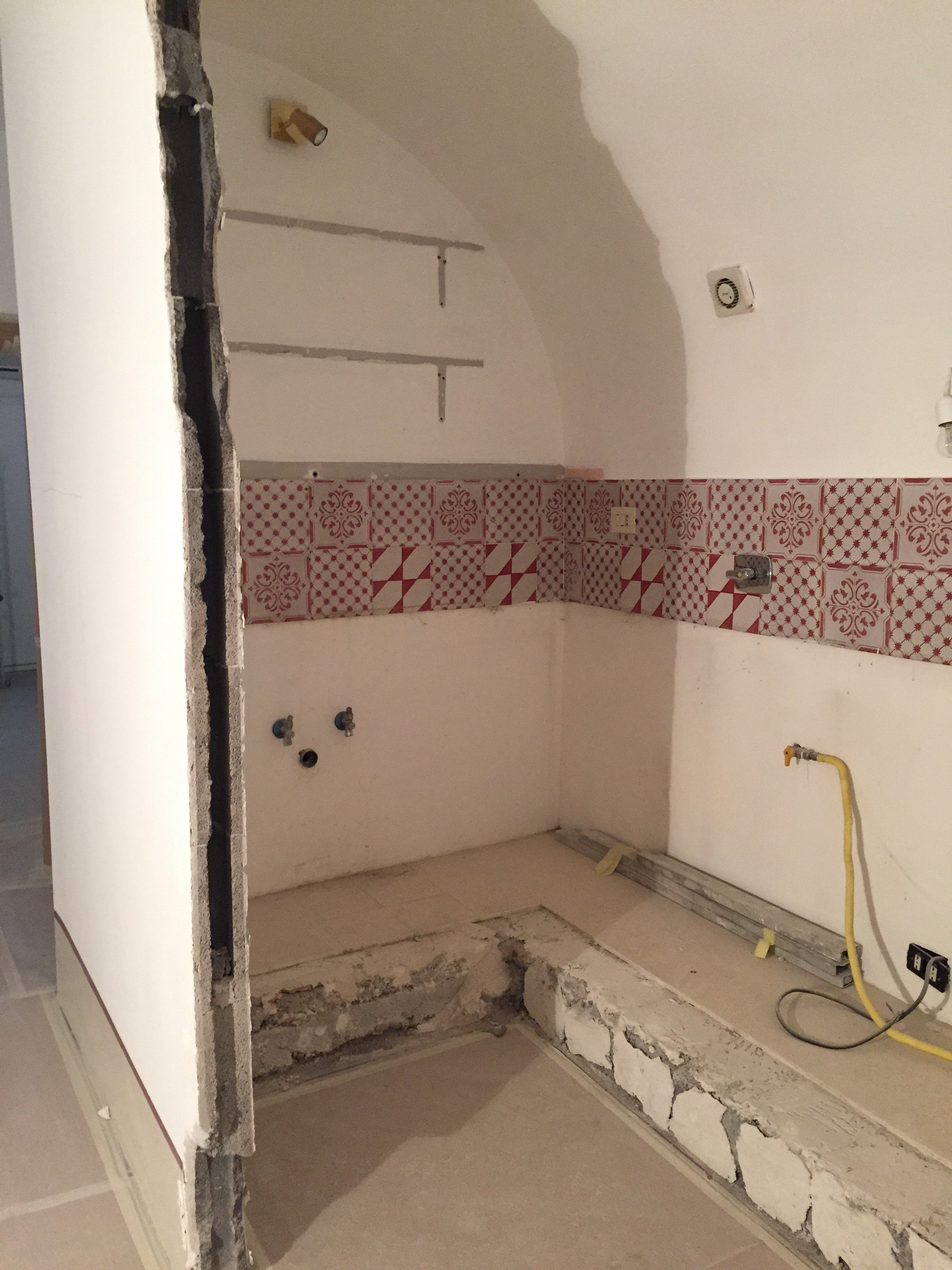 Originally, we discussed opening just one of the walls. Studio Minchilli suggested removing all them so you could see the entire arch as you walked into the apartment.AFTER
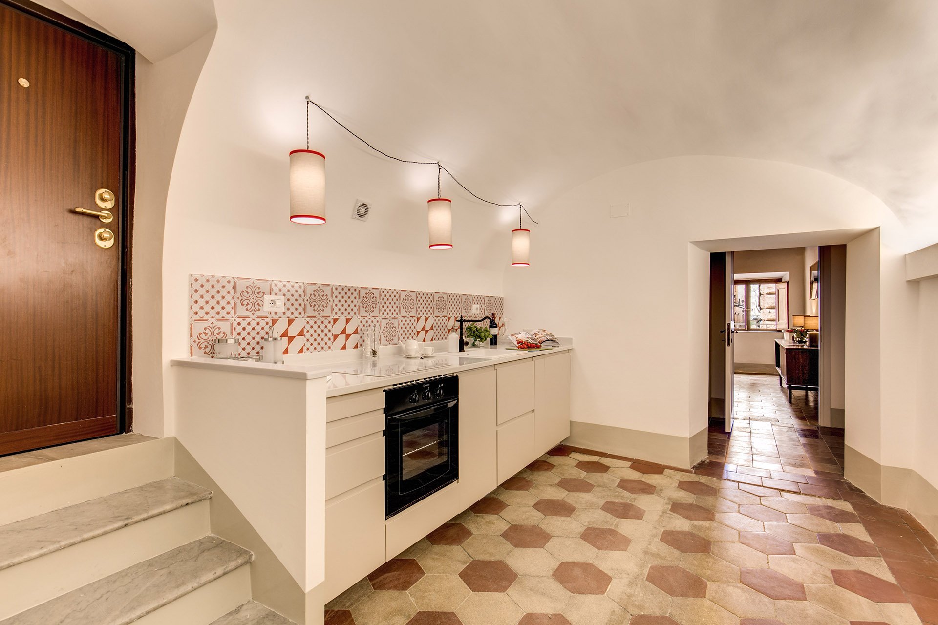
 What a difference. It's light and there's plenty of space to move around. The cabinets are from IKEA but the counter top is quartz from Stone Italiana. We decided to spend more for a higher quality counter top given the open plan design. It elevates the entire space, making the IKEA cabinets look more expensive.My anxiety level was not good the morning of this installation. A heavy slab, cut to order. Three men had to carry it.
  The light fixture is custom. Il Paralume.
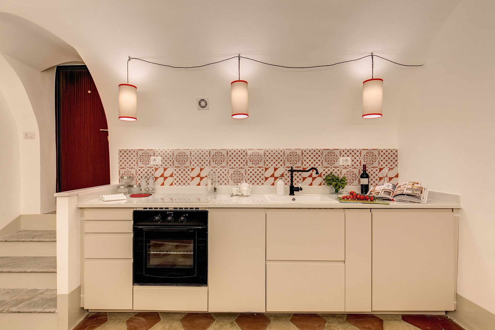 We also installed LED lights on the right.
 BEFORE - Master Bathroom
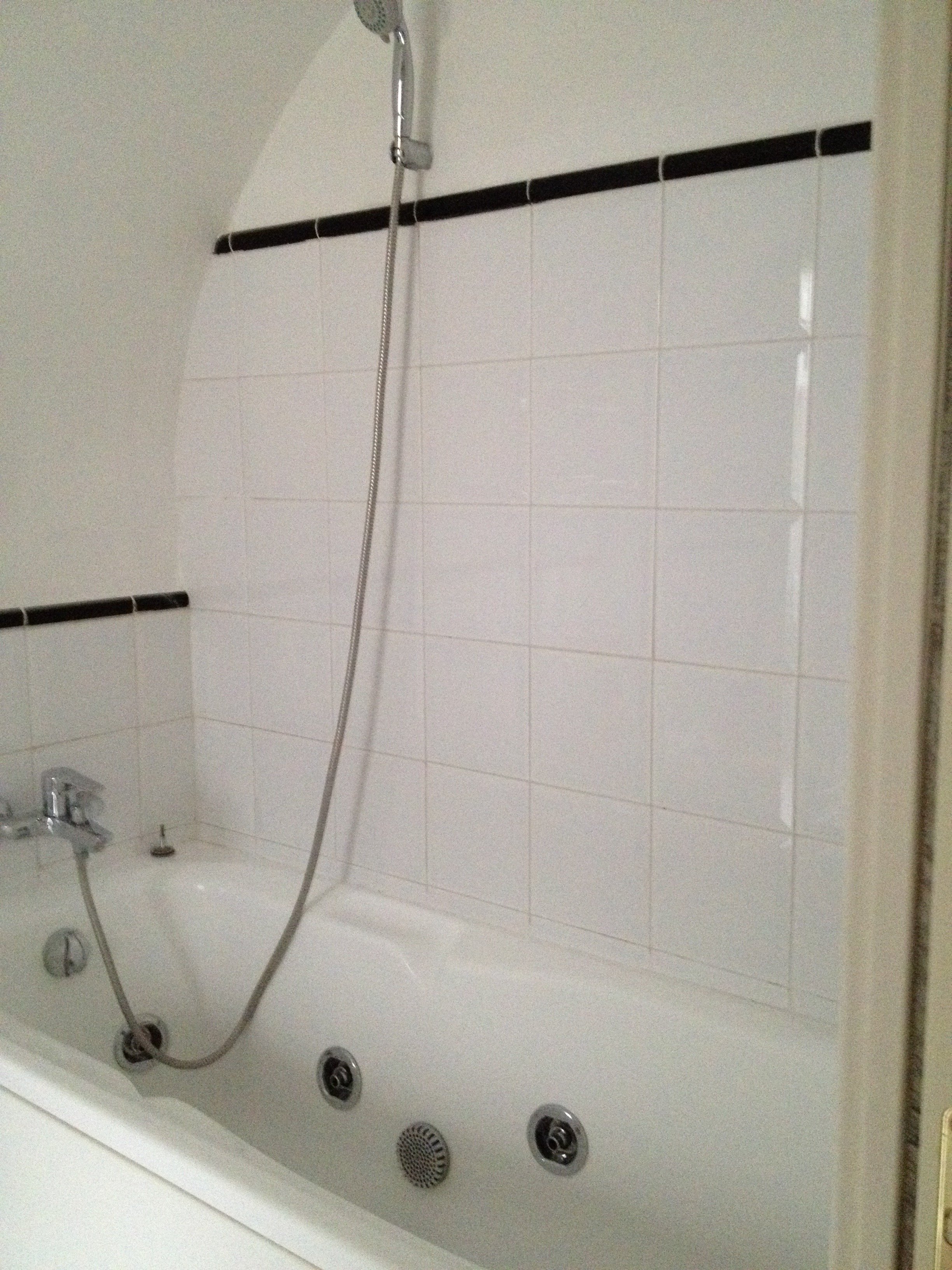 There were dated, inexpensive white tiles on the floor. AFTER
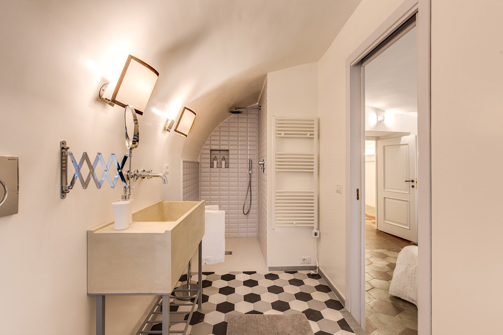 The tub was replaced with a shower.
 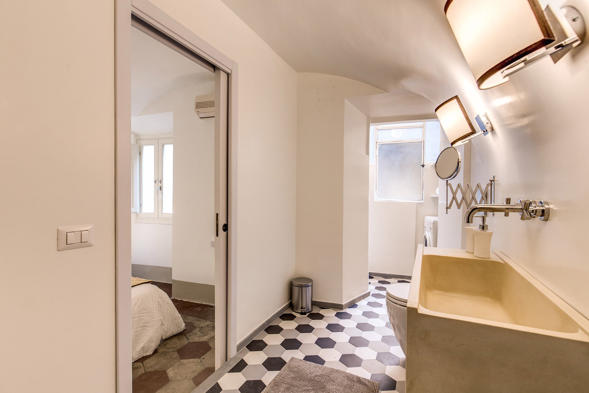 We decided to go with a combination bidet and toilet, which is great for small spaces. The client wanted a unique sink. We ordered these (which were quite heavy, our poor contractor) and asked our blacksmith to build the bases.Notice, we didn't put tiles on the walls. Similar to the Tuscany Project, we wanted the bathrooms to feel more like a room and less clinical. For a busy family bathroom this option could be impractical but I really like how these rooms feel without tiled walls.The design of the new tiles mimics the original tiled floors in the rest of the apartment. While these colors look great together, installing three colors is a different story. Complicated.
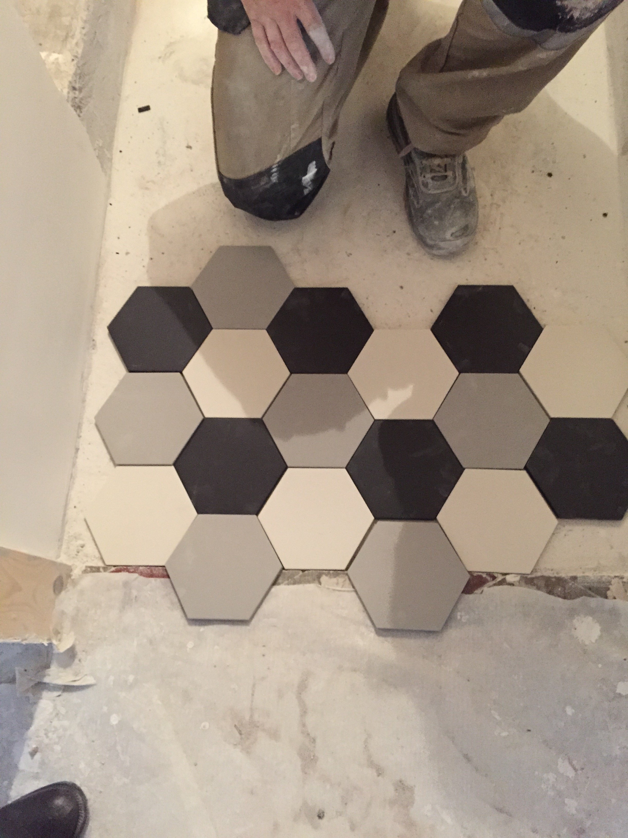 The tiles, sink, and all hardware were purchased at LOZZI.The sconces are custom. Il Paralume.Paint is a custom color from Crown.In the bedroom we added a pocket door, a built-in closet, and the lampshades are custom from Il Paralume.
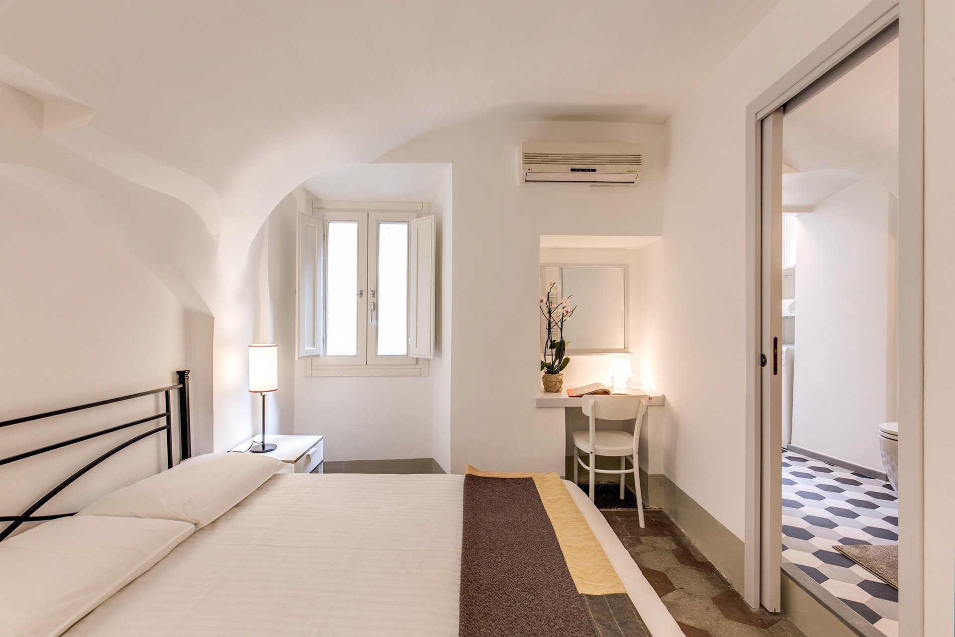 Our carpenter also created a desk in the corner.
 BEFORE - Second bathroom.Extremely tight space, dated tiles. The layout was terrible and the room very dark.
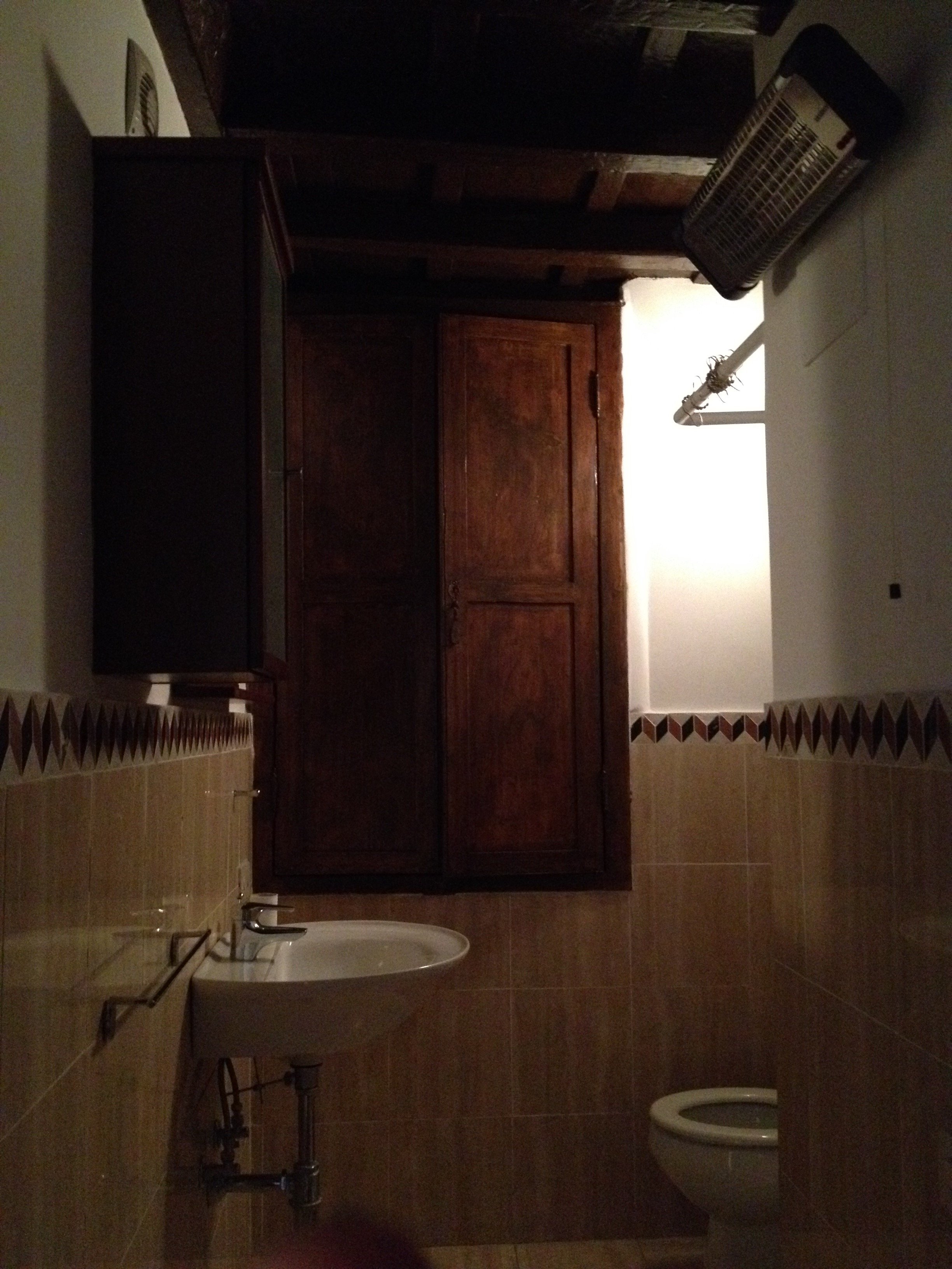 AFTERWe completely changed the layout. We moved the entrance which enabled us to add space for a proper shower.The door is custom made by our carpenter. Door fixtures are from Handles.
 Here's a better shot of the sink with the custom iron base. As with the other bathroom, we bought a combination bidet and toilet.
 BEFORE - Living Room
 AFTER - Living Room
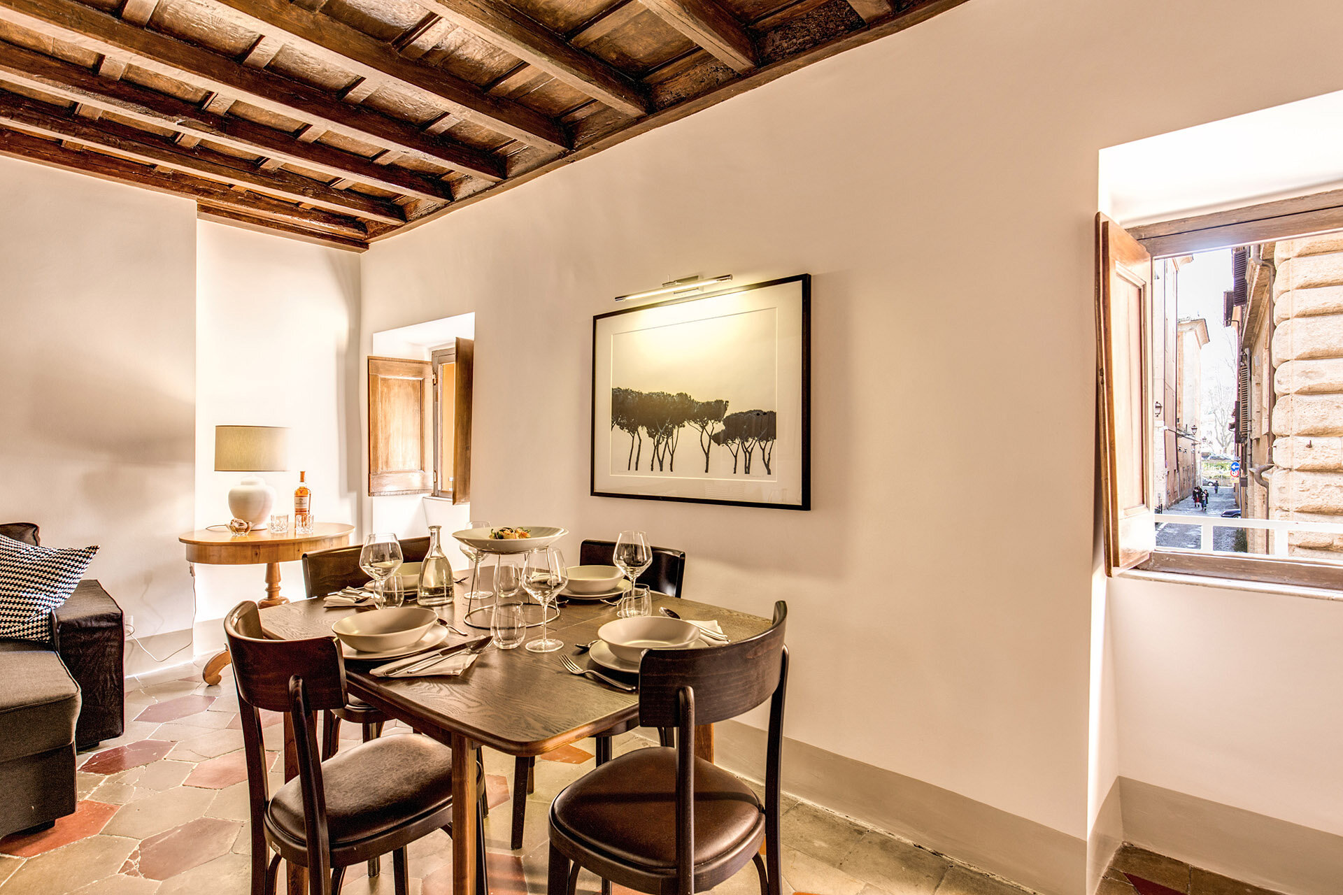
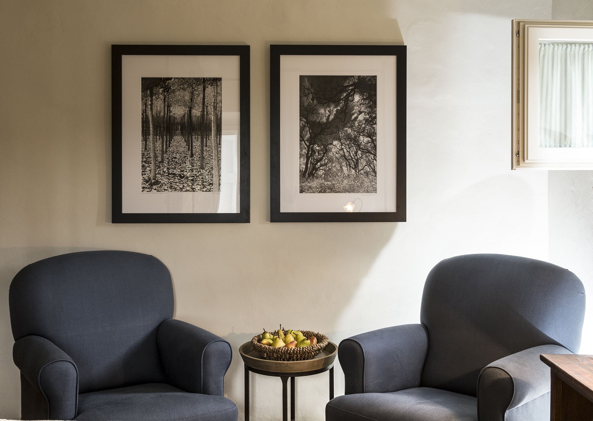
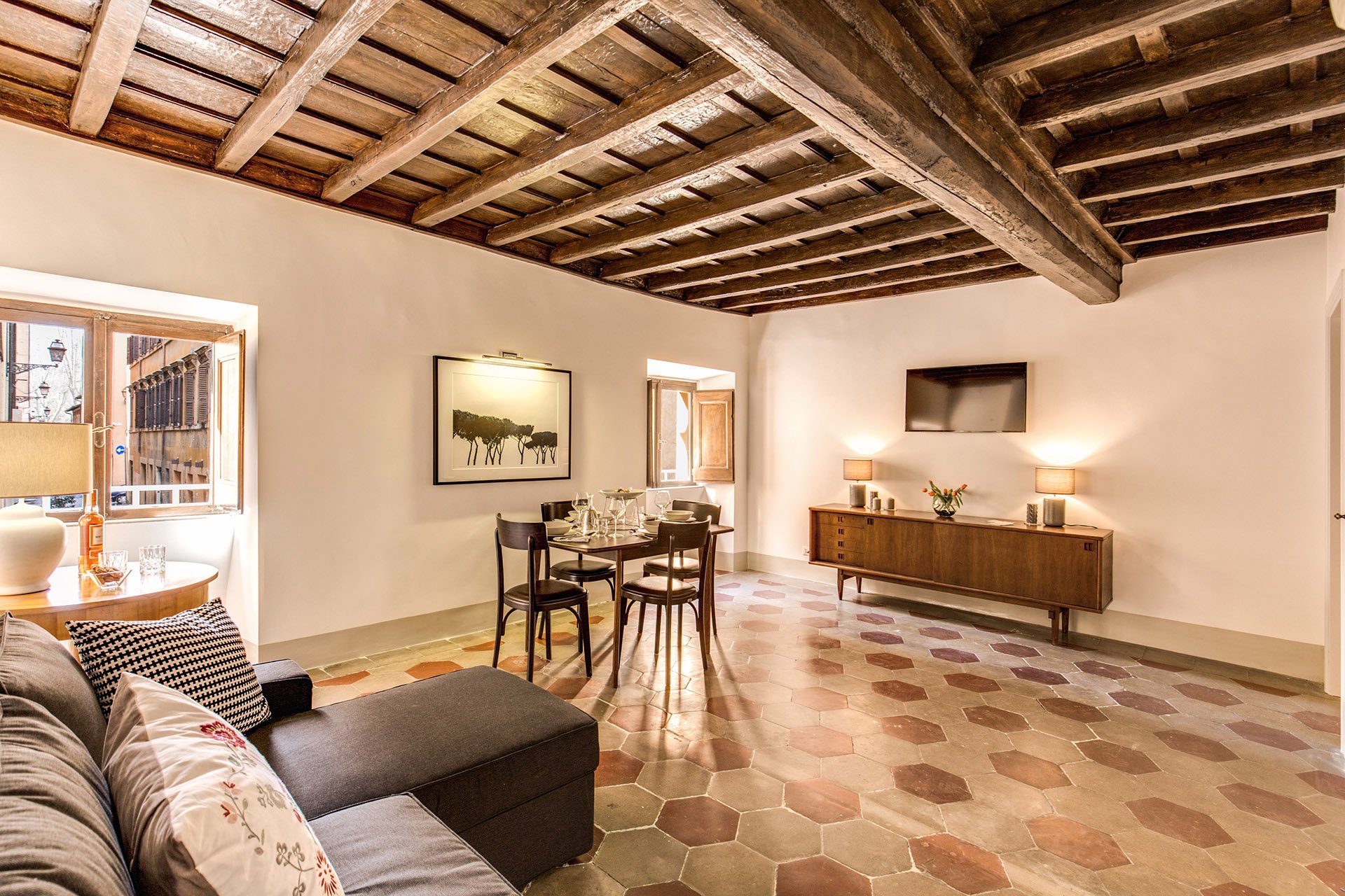 The fantastic artwork is from Due Alberi. They're based in Rome but ship internationally.Our carpenter added new closets.The dining table is from MADE and the chairs belong to the client.
 The side table came from the Via Monserrato apartment. We found the lamp at Leroy Merlin (the French version of Home Depot).
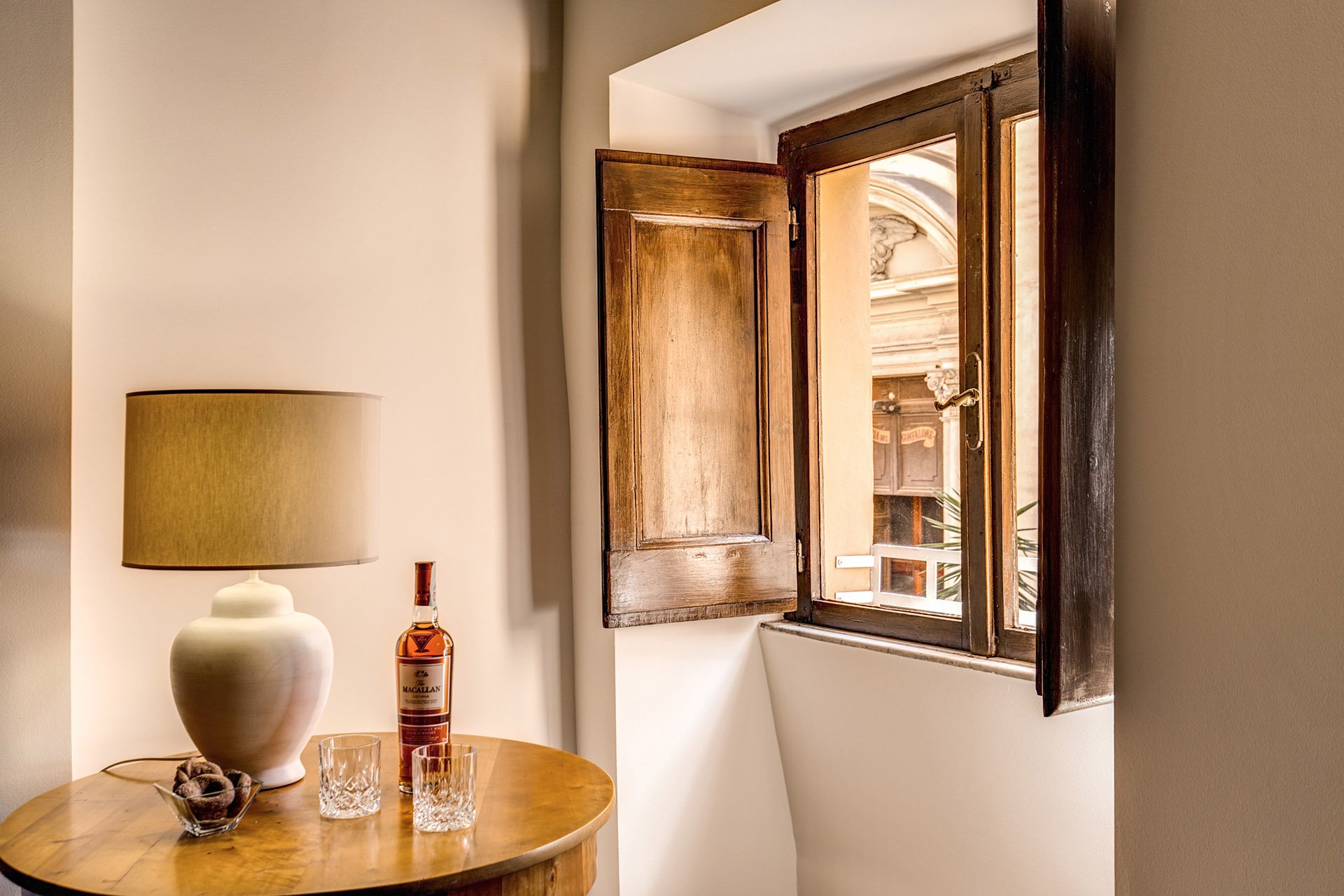 The client found the credenza online. The lamps were a great find at Leroy Merlin. We were so tired and hungry. My client was worried about my mental health as we had just spent hours at the IKEA next door. I perked up when I saw the lamps on a bottom shelf. I was so excited. It was like meeting Idris Elba.
 Overall, the apartment feels lighter despite the lack of light (the windows are tiny). The renovated kitchen and bathrooms compliment the style and architecture of the apartment. We updated them but without losing the charm.We kept the palette very simple, creamy whites, grey, black, with a touch of red. The ceiling seems higher and apartment looks/feels bigger.For more information about this vacation rental, please check out Your Suite Rome on Booking.com.Architect: Domenico MinchilliAfter Photos: Vincenzo Tambasco
I'm Going to Check Myself Before I Wreck Myself - Summer 2016
Ciao Blogglisti,How are you doing?I wrote a post few months ago about being in a major funk after my trip to Milan. While Rome and I never got into fisticuffs, the situation was critical.Late last week, I stopped by a vendor I haven't seen since moving out of the Center. She told me that my Italian had really improved. I thought about her comment. I was constantly beating myself up for not being fluent, instead of remembering that I'm getting better. I seem to be focusing on the negative a lot lately.Yesterday was the first day of summer. I am determined not to spend yet another season salty with city I live in. I'm not the biggest kumbaya person. You will not find me on the top of Gianicolo Hill doing this:[youtube https://www.youtube.com/watch?v=4R462Ro5fqU?rel=0&w=420&h=315]I do know that walking around, as the youngins would say, with a stank attitude is not going to make things better. I will try to see this city with fresh eyes, be more social, and maybe cut back on political news.
Life in Rome - My Post Milan Funk
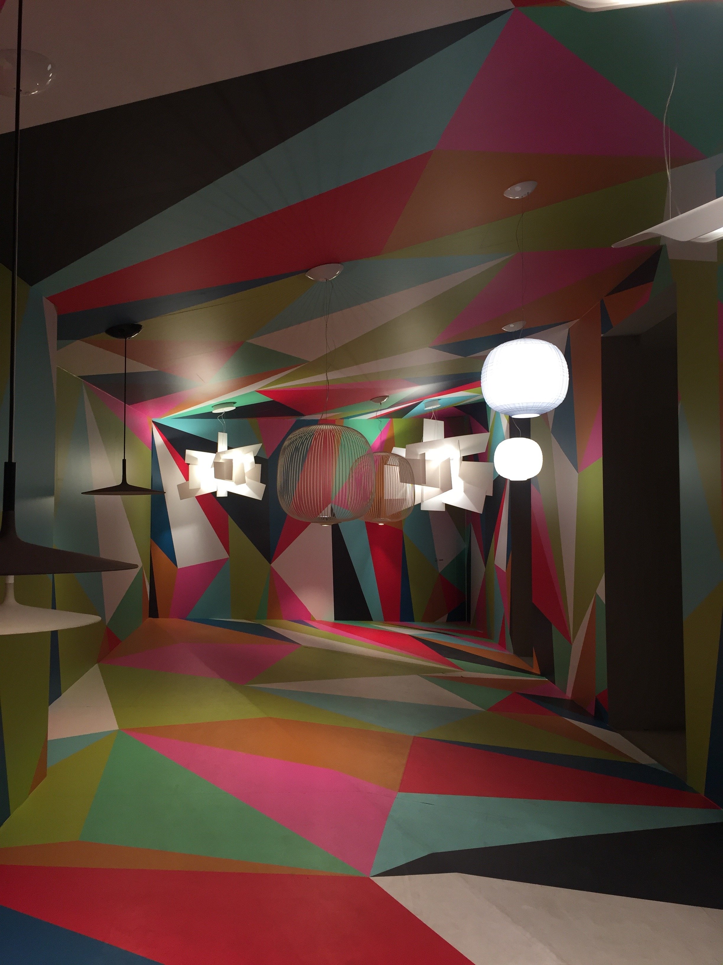
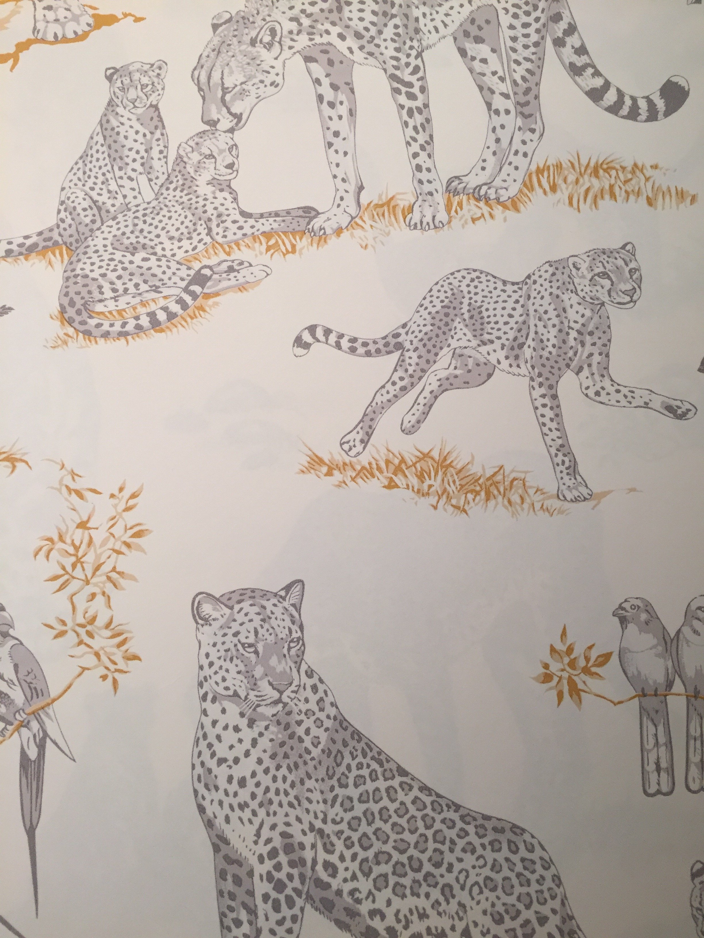
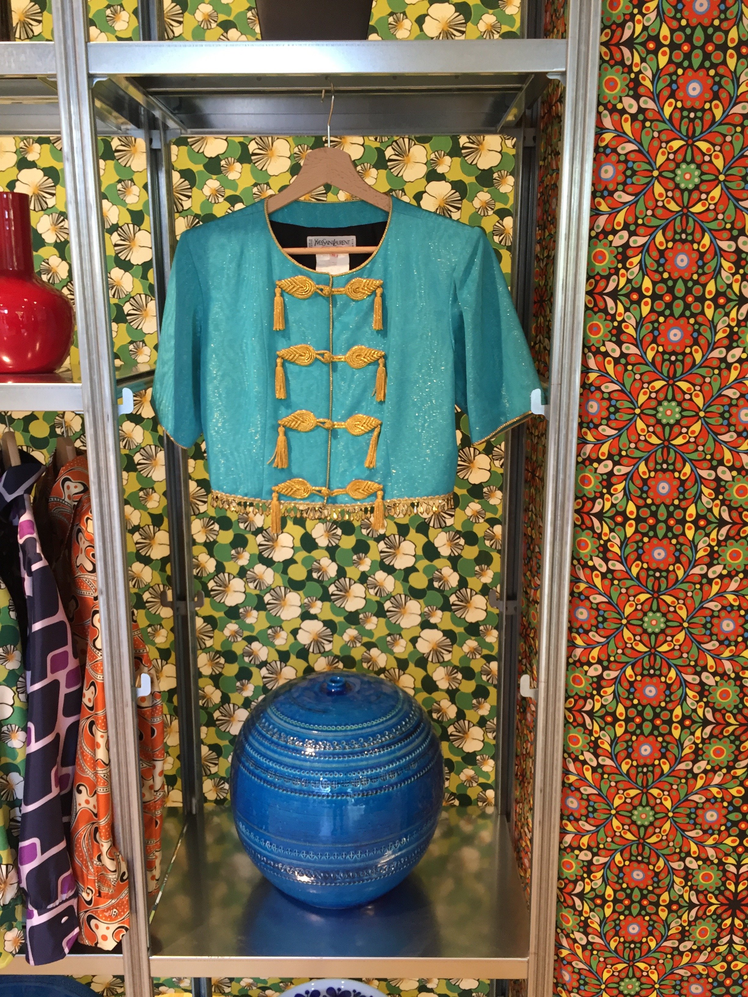
I've been in a weird mood since returning from Milan the other week.I'm crashing from the Salone del Mobile high, Prince is dead, and I have a cold. I rarely get sick but when I do it seems as if my colds have a need to make up for lost time or something.When I went to the Salone two years ago this didn't happen. Something has changed in Rome and it's not for the better. I'm not the only one who feels this way. These articles, yesterday's New York Times and a piece my friend Michelle wrote for US and News Report in February, sum things up pretty well. Maybe I have cabin fever. Hopefully, tomorrow I will feel better and can leave my house!I have been to the Salone three times. The first time I stayed in a hotel near the Convention Center. The second time I rented an apartment in the city near the canals. Third time's a charm.Hotel prices are insane during the Salone (if you can find one). The Salone is larger than Fashion week and seventy percent of the people attending are visiting from other countries. The entire city takes part. If you're planning to attend, make reservations early. Many companies and vendors have blocked out rooms years in advance.I returned to the Principe after my great experience there in September. I still don't understand how the hotel was filled to capacity, yet I rarely saw any other guests on my floor. So quiet. The service at this hotel is impeccable despite its size. Plus, they have American bacon during breakfast.Renting an apartment while traveling on vacation is an excellent option but I've learned my lesson. When I'm working, a hotel is a better choice for me. Much better.I was running around Milan like a chicken with my head cut off and it was wonderful to return to a clean room, to have concierge service, a gym, a convenient place to have meetings, etc. Of course the cost was higher than the apartment I rented two years ago but my trip was more productive.And what a great trip...four intense days of meetings and visiting showrooms. I wish I had more time.I posted a few photos on Instagram and below are additional pictures from some of the highlights. I can't upload all the highlights as I forgot to take photos at the Ethimo party, and quite a few showrooms.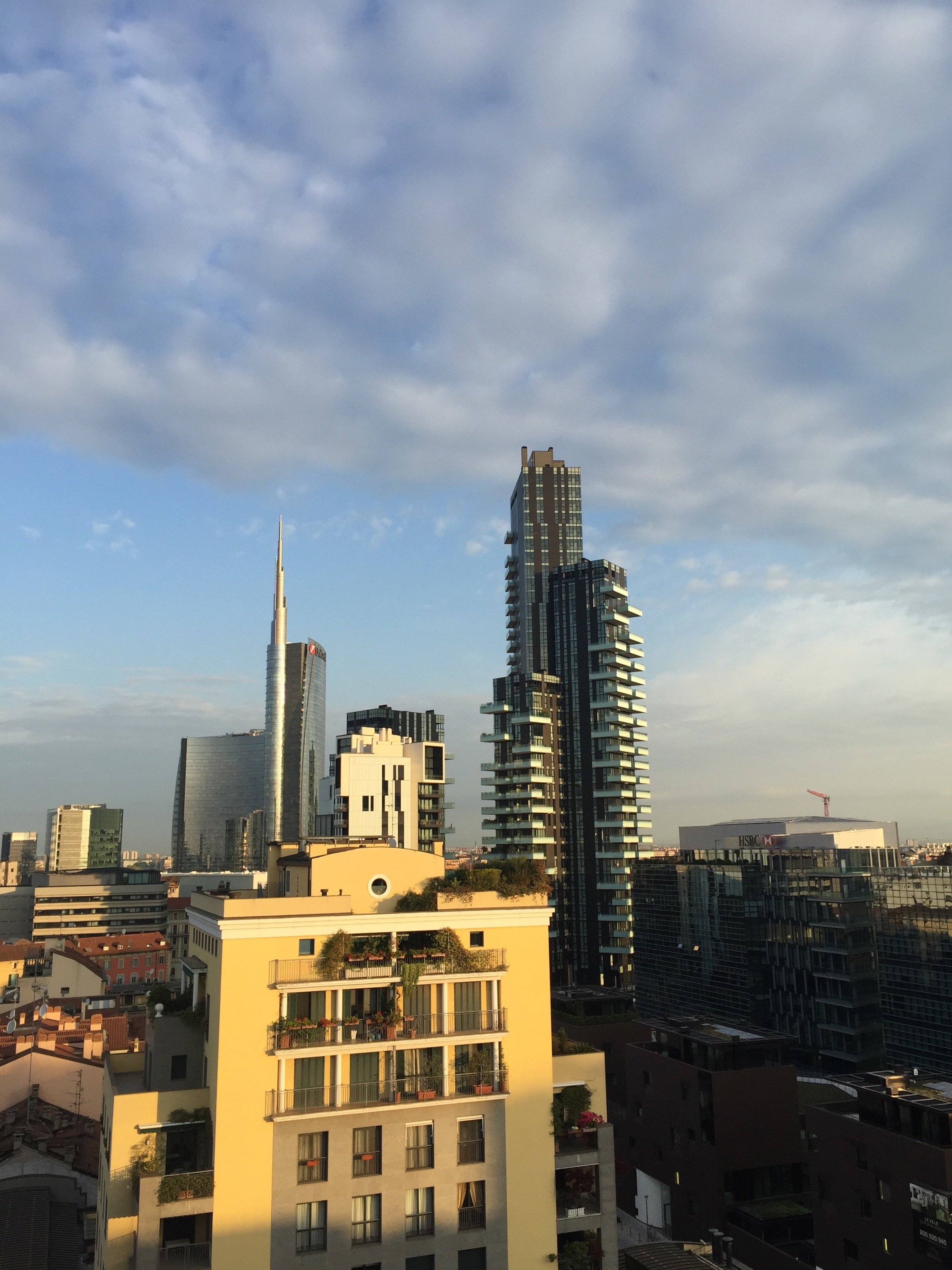


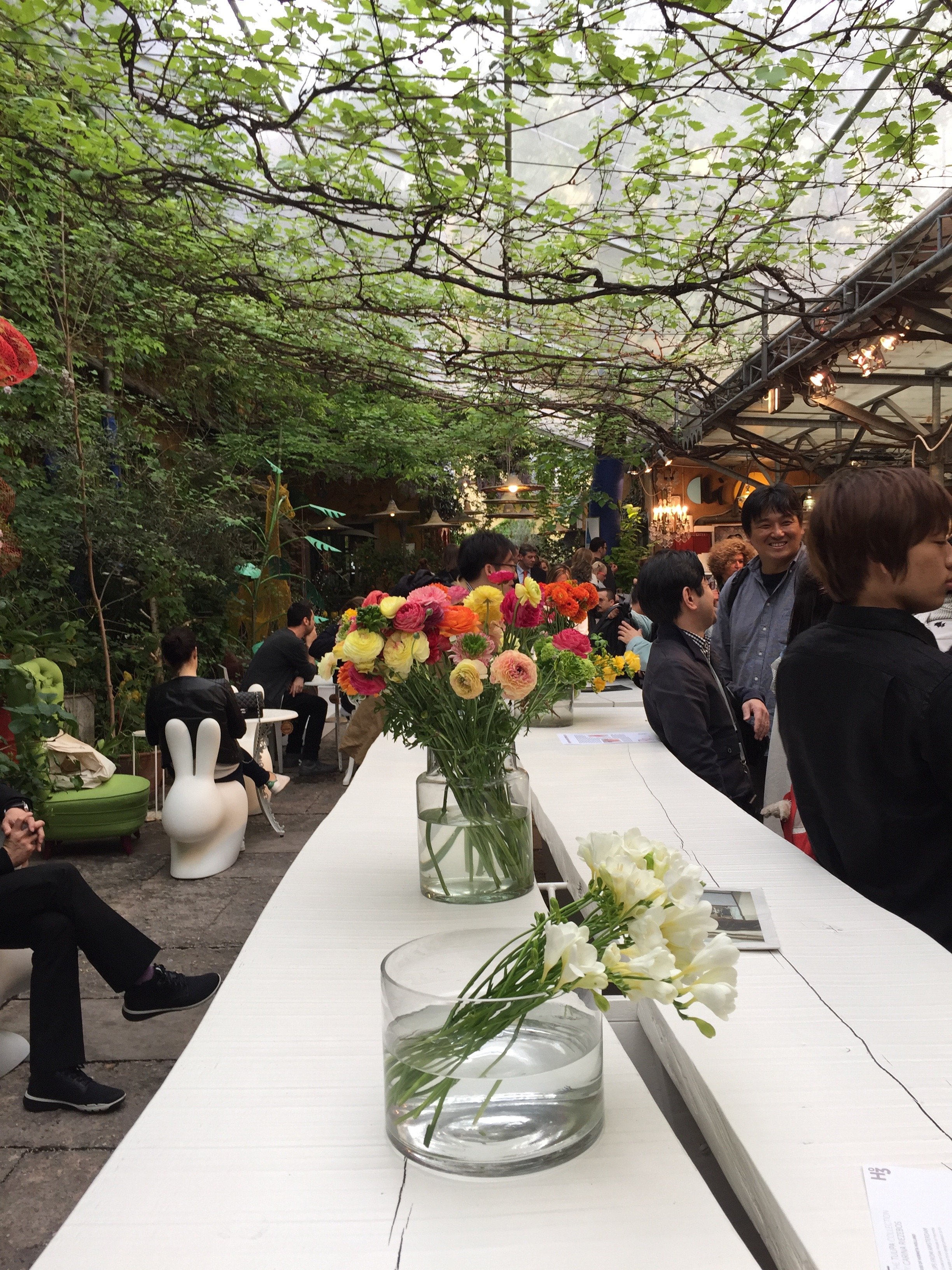
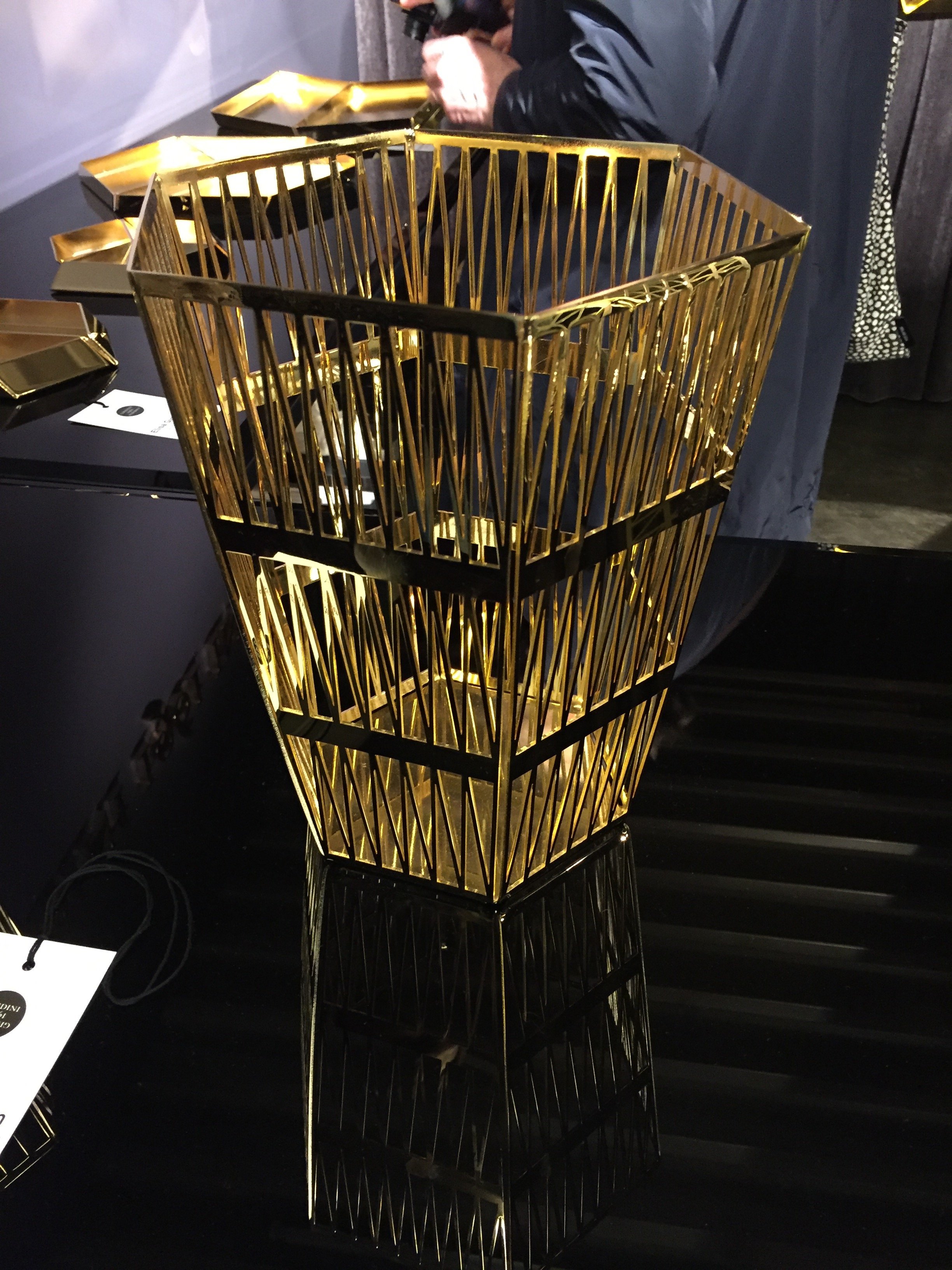
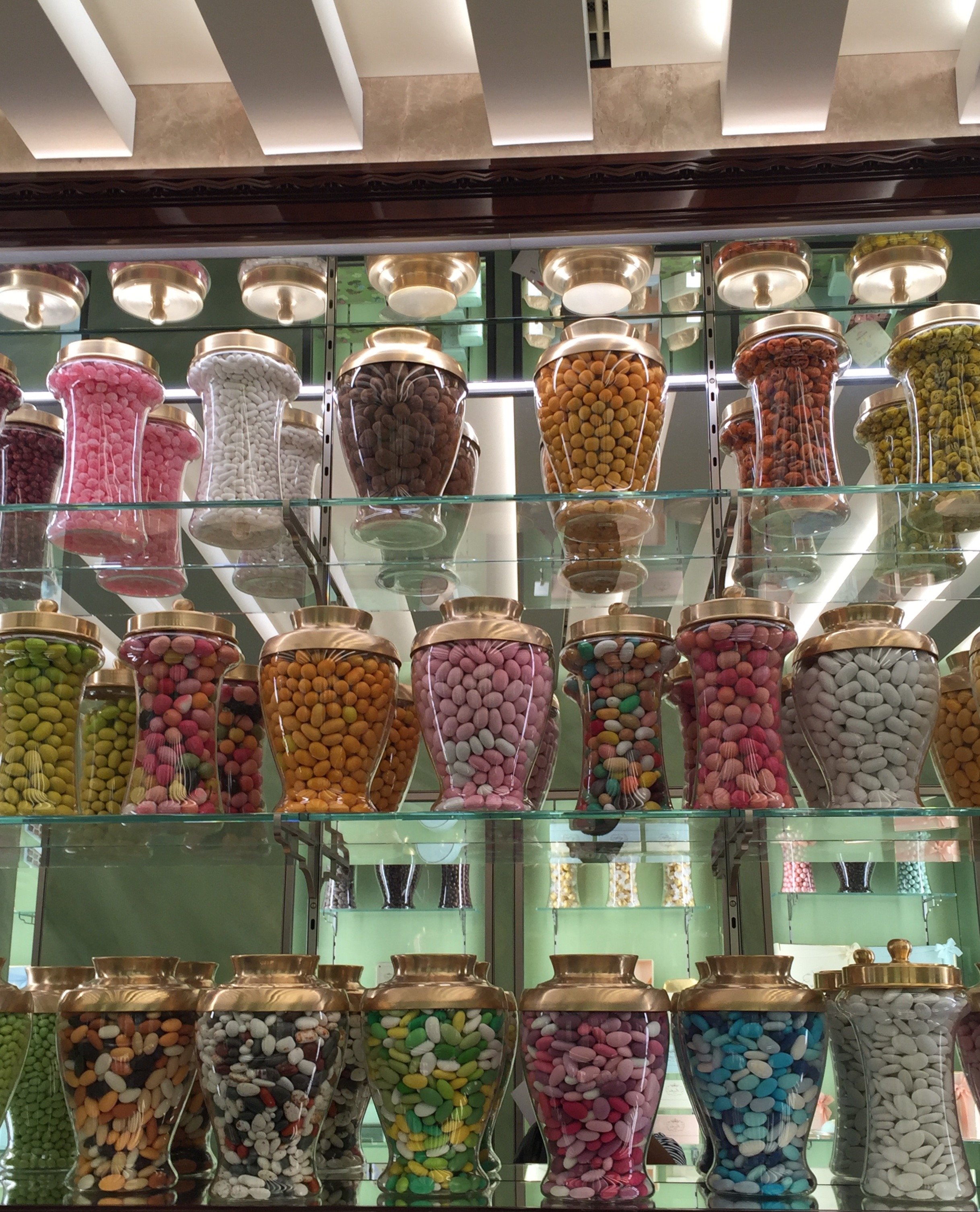
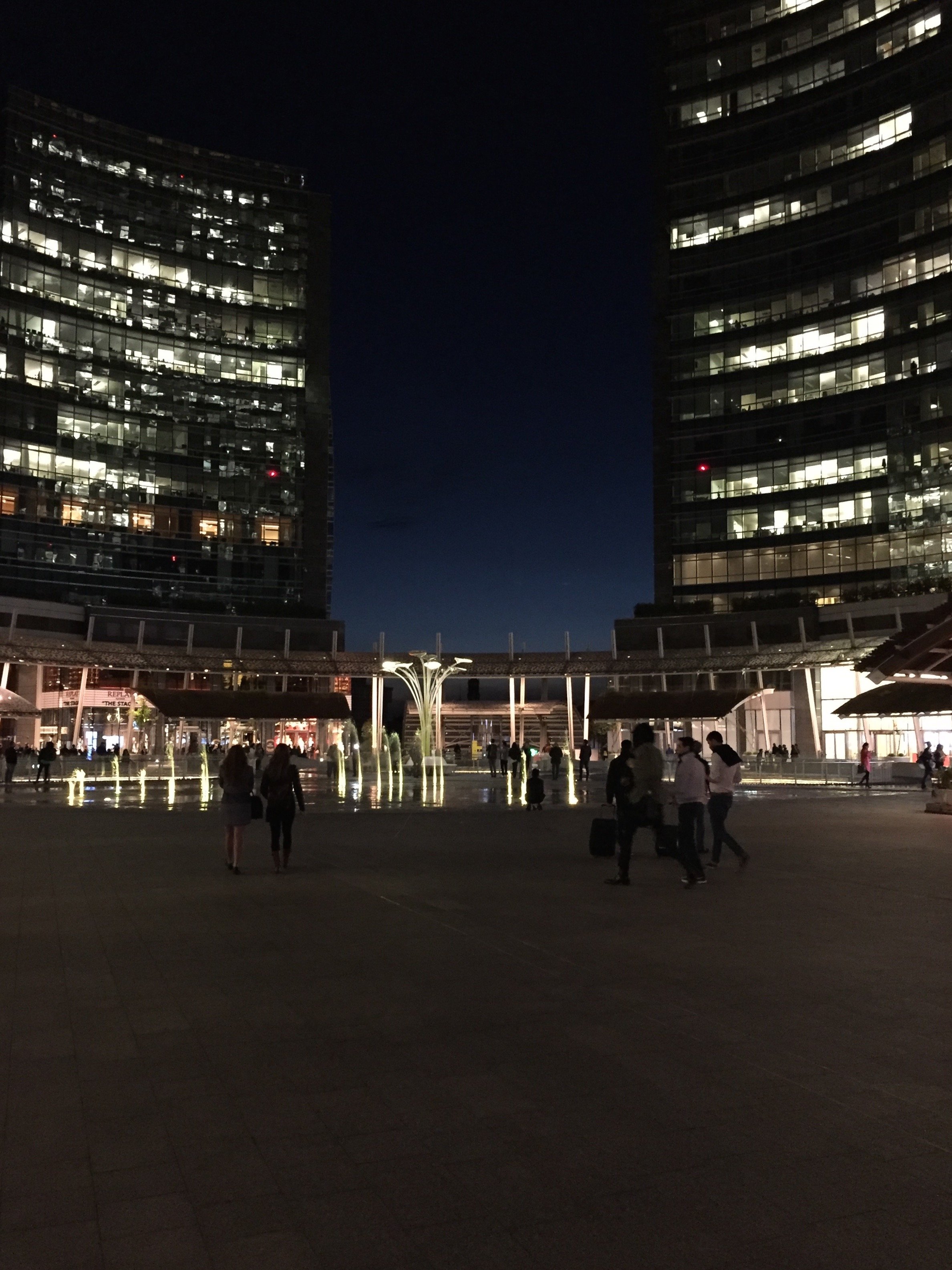
Project Via Monserrato - Reveal
During the past year I've been working on a decorating and renovation project in the Historic Center for a client who wanted to update a few of their B&Bs.It was a great experience. At times it was also challenging, as the apartments were fully booked months in advance. The logistics were difficult.Located inside a palazzo that dates from the 1600s The Via Monserrato apartment (aka Grand Suite), is on one of the prettiest streets in Rome.The brief was to create a contemporary décor, while at the same time retaining (and respecting) the charm and history of the architecture.Vacation rentals are tricky. You don't want a design that is bland or cookie-cutter but it cannot have so much personality that it turns off most customers.Here's a photo from the living room, before.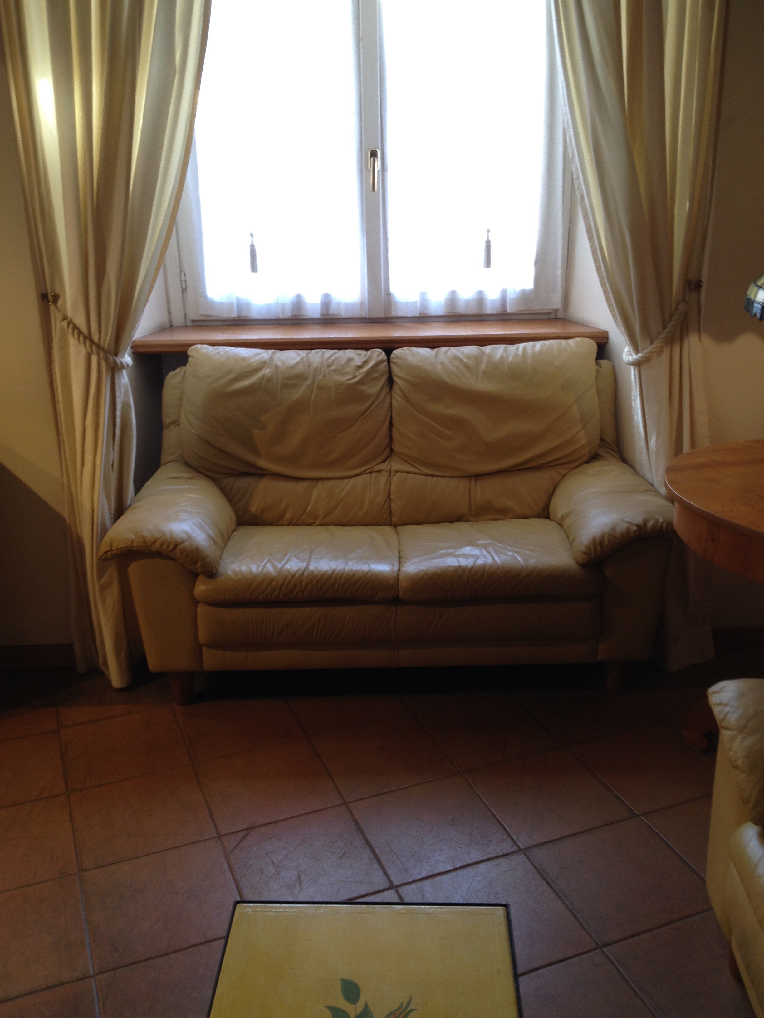 After
After 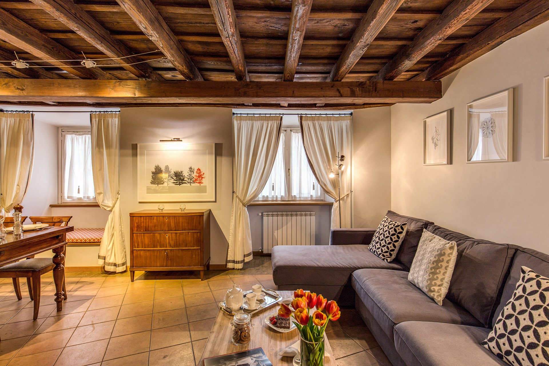 This room is a mix of high and low vendors, antiques (that belong to the client), and custom pieces.The room is light, stylish, yet comfortable. We had to use fabrics and colors that could handle a lot of wear and tear.The walls were changed to Farrow & Ball's "Blackened", a cool white that reads light grey. I know I talk a lot about this brand but there's a reason I have used it in every single project I've worked on. The quality of this paint is no joke and depth of color is incredible. This was the first time the painters had worked with Farrow & Ball and they were very impressed. When people who paint for a living rave about a brand, you know it's good. Stateside, I like Benjamin Moore as well but that brand is not sold here. Le Decorazioni is the authorized Fallow & Ball vendor in Rome.We decided to go with a one L shaped sofa instead two. This model is a sleeper sofa and we bought it from Berto Salotto.The coffee table is from Maisons du Monde, a French brand with stores all over Europe.The curtains were custom made. The trim is Dedar. All the fabric for the apartment was selected and purchased at the store Lelli.The floor lamps are from MADE.The art work over the antique buffet is by Due Alberi. Funny that I read about these two artists in Rome on Elements of Style, which is written by Boston-based American interior designer Erin Gates. We used their work in another apartment (pics soon) as well.We commissioned artist Marta Alexandra Abbott to create pieces that referenced Rome in a subtle way. Marta is American and moved to Rome several years ago. You can see more of this series, inspired by the Ara Pacis, HERE.Dining area.
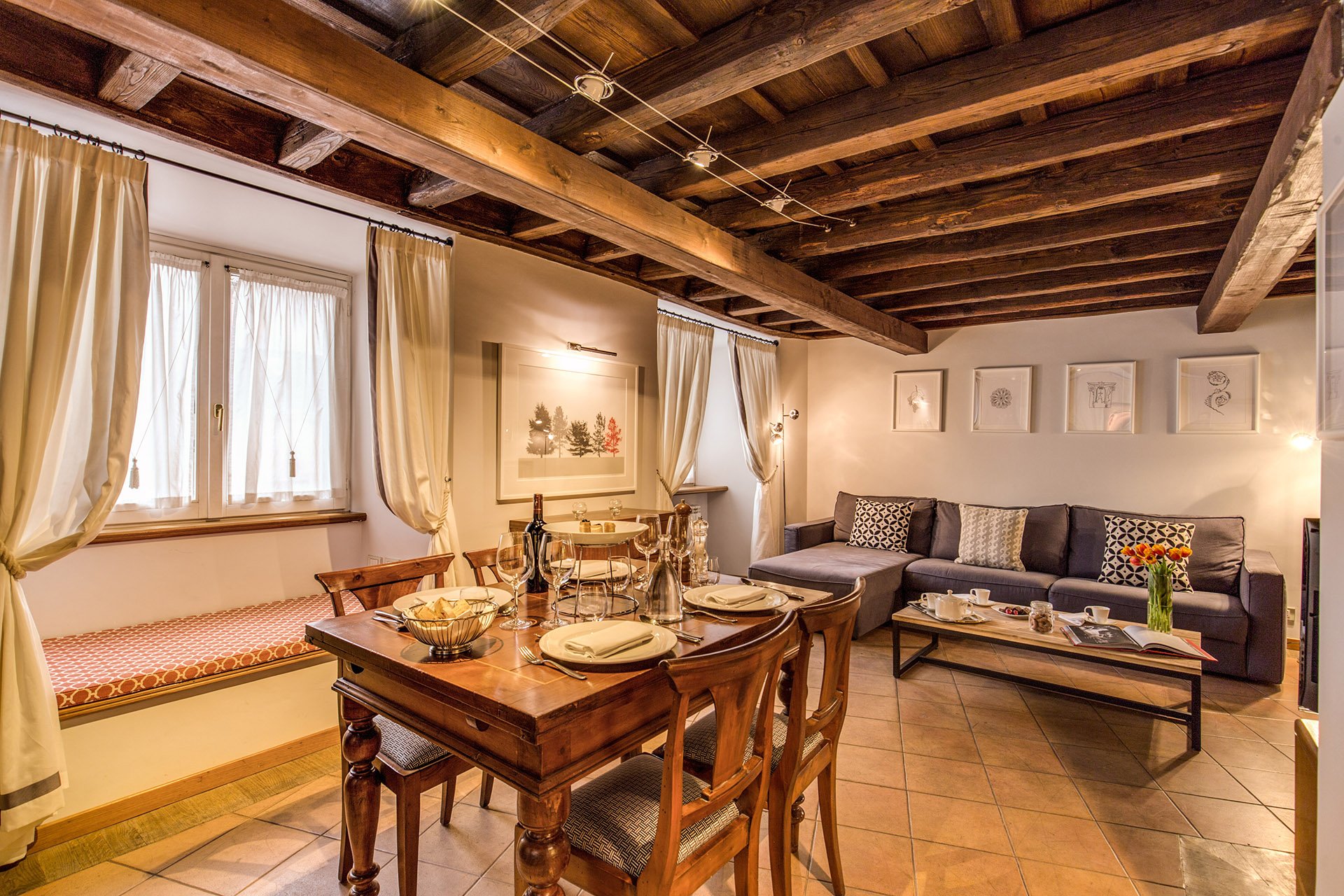 We kept the dining table and reupholstered the dining chairs.Before
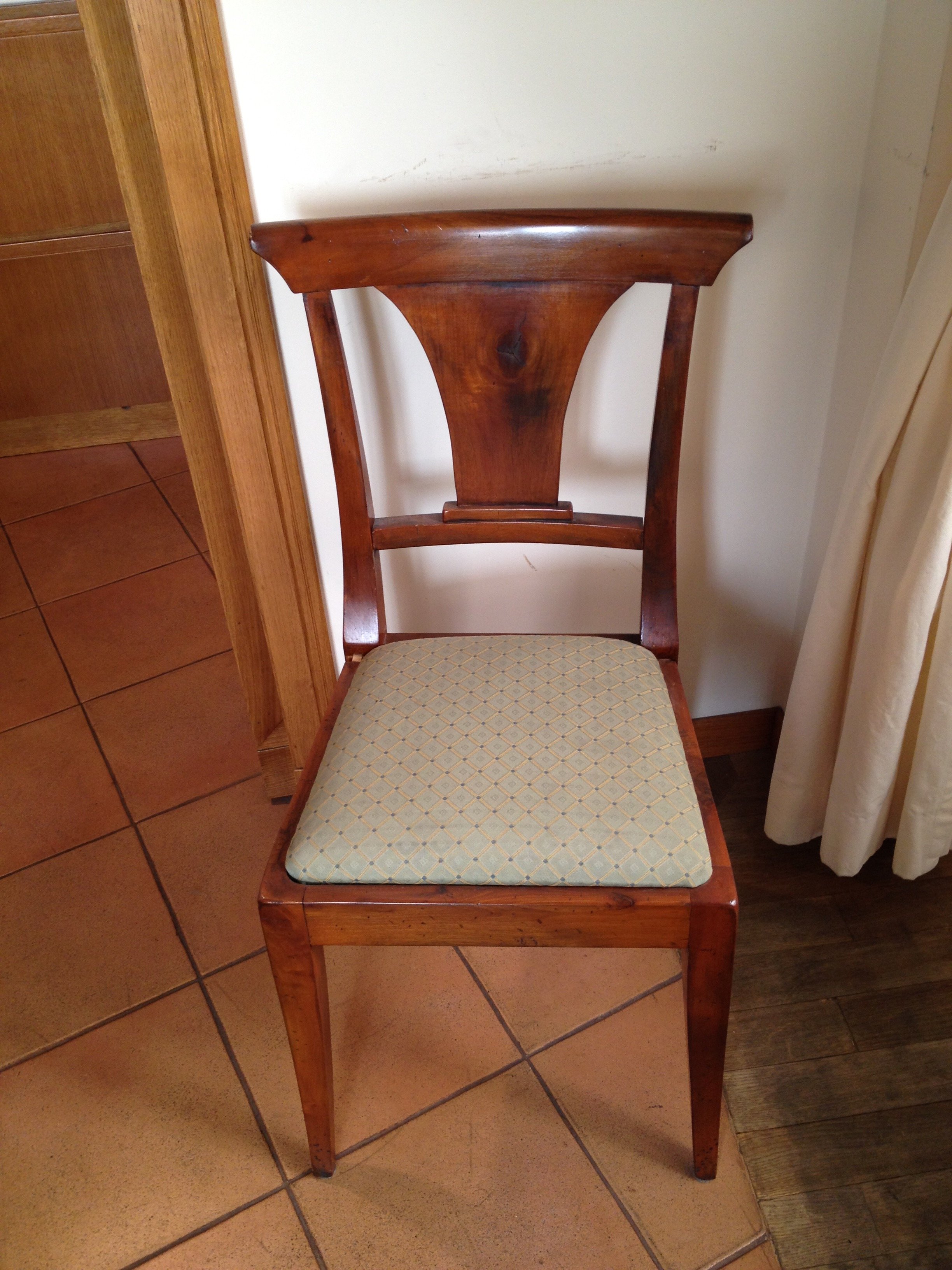 After
After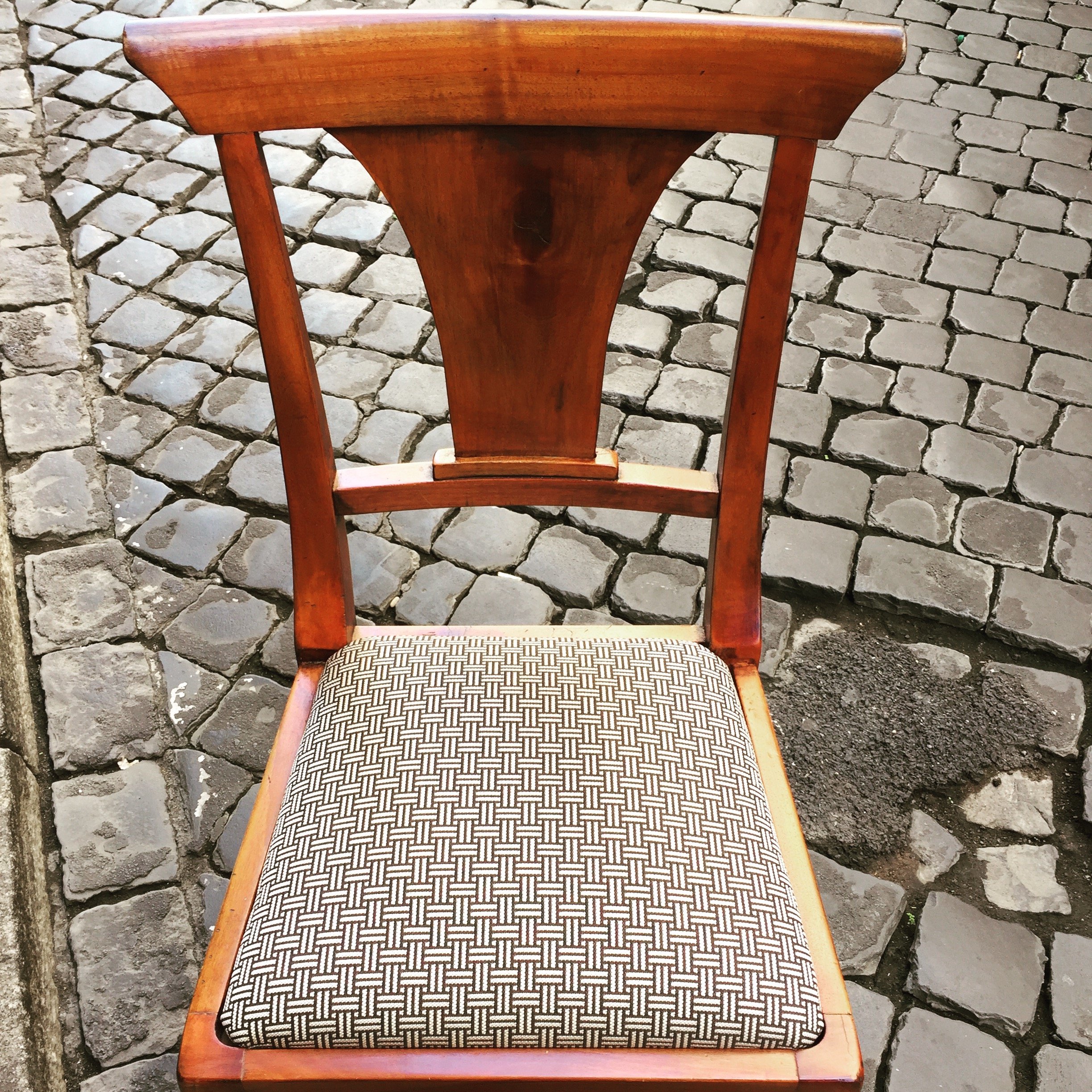 This graphic Dedar fabric is durable and makes the 1930 lines of the chair stand out. The chairs were in great shape. I thought it would be better for the budget and the design to keep them. I'm not a fan of spaces where every single item is brand new. I like to mix things up. You see that a lot in interiors in France and Italy. If you don't have any older pieces of your own, you can find them at flea markets, estates sales, in your family's attics/basements, etc.We created a window seat. I wasn't sure my client would go for the pattern or the color. The fabric is Thibaut. I think it gives this room of neutrals a nice punch of color.The pillow are from a local shop, Fabindia.The former artwork in the living room.
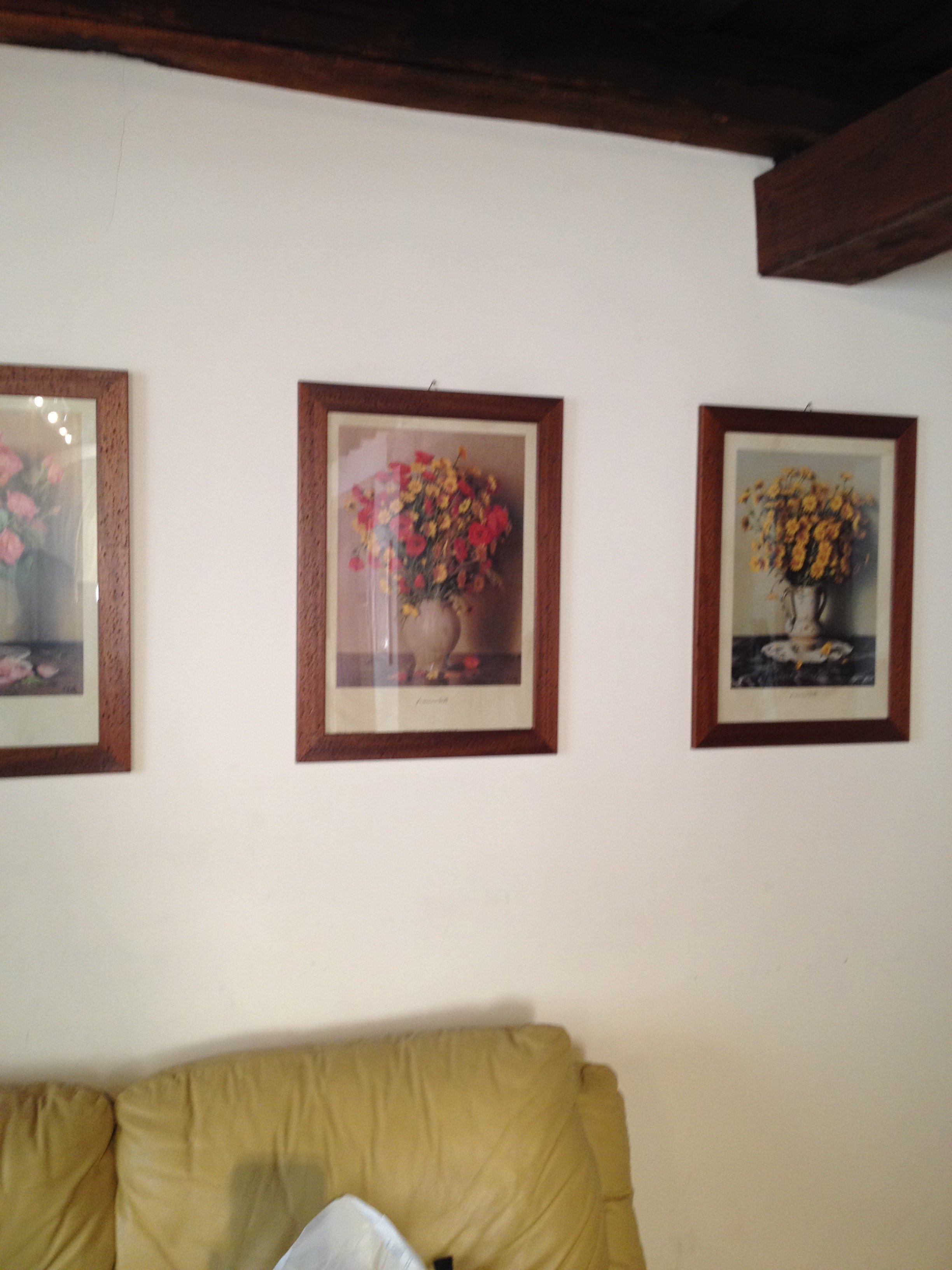 Art work, after.
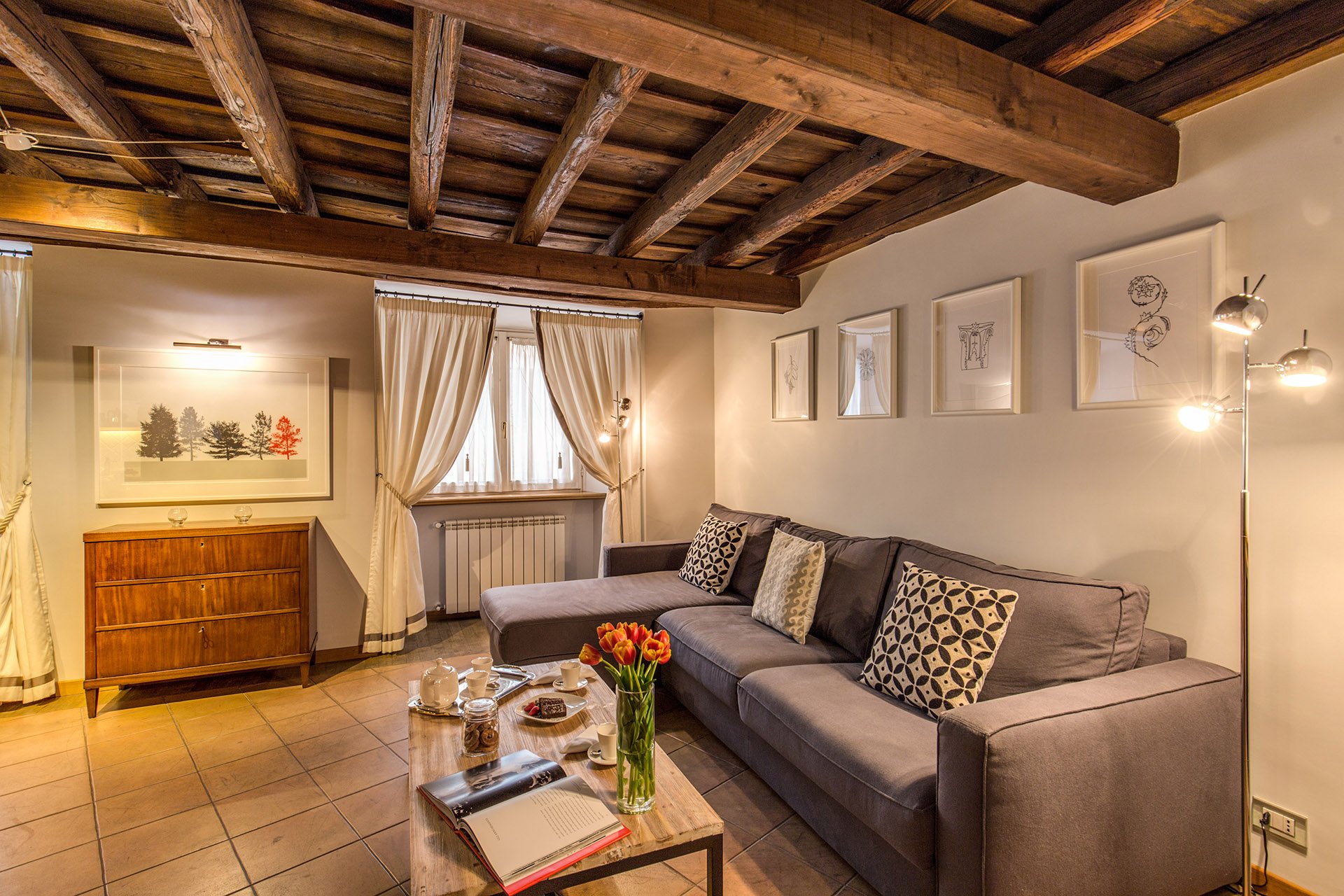 The hallway was painted white and the huge 1980s sconces were replaced with simple, modern ones. This art is by Marta as well.
 Bedroom - before
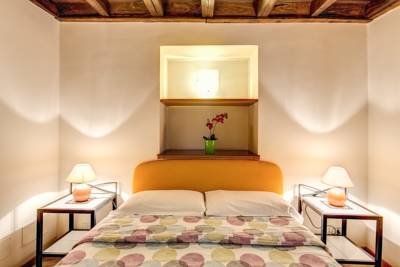 After
After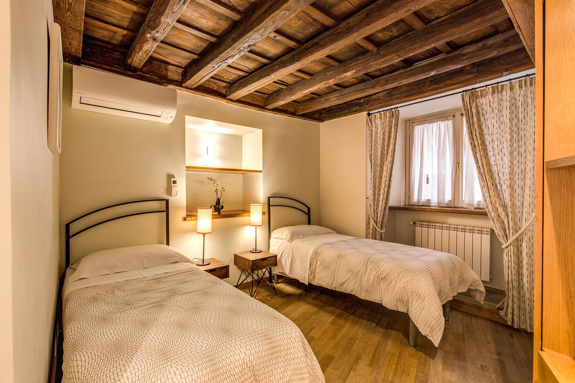 Originally, there was a queen-sized bed in this room but my client's company has had many requests for twin beds.The walls are Farrow & Ball, "James White". The curtains are custom. The fabric is Thom Filicia for Kravet.I asked my blacksmith to make the head boards. I wanted something that would look great when together and when separate. We came up with a few designs and this is the one the client picked.The night stands are from Maisons du Monde. The lamp bases are from IKEA. The shades were custom made at the store Paralume, which is right up the street.I'm not sure how a store that makes/sells lampshades manages to stay in business in this global economy we live in but I hope they stick around for a long time.The beds together.
 The master bedroom - before
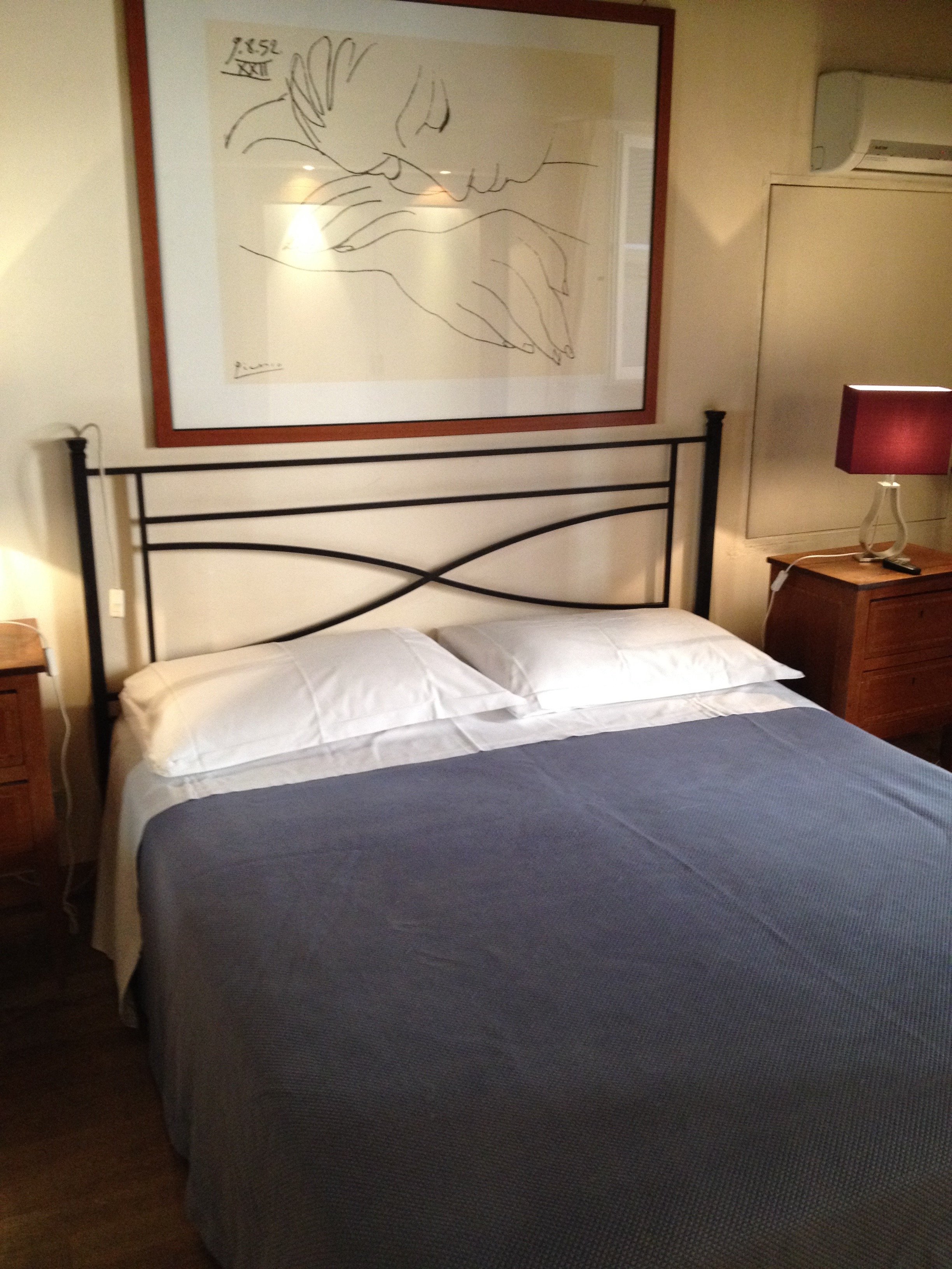 After
After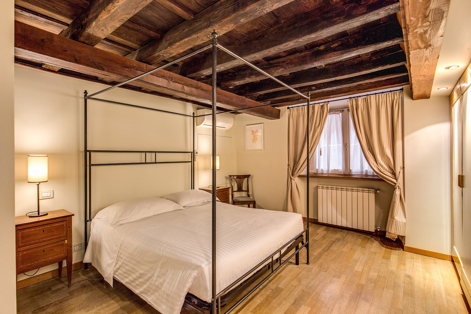 We kept the bedside tables. The walls are F&B James White. The curtain fabric is Malabar.The lamp bases are IKEA, shades custom from Paralume. It's hard to tell from the photo but these shades/trim are a different color from the other bedroom.I have a thing about four poster/canopy beds. Our blacksmith designed this simple yet, elegant frame. With these ceilings, we thought a more decorative frame would be too much. It interesting how the room actually looks bigger even though this bed is the same width as the old one.Two photos from inside the Palazzo.
 Overall, I'm very happy with how the apartment turned out. A huge, "Grazie" to my client and their team. I cannot tell you the amount of WhatsApps, SMS, emails, phone calls, job site visits, that were made. I truly appreciate their patience with my bizarre smash up of Italian and English. My client introduced me to my new Italian teacher. I got the hint. Heh.For more information about renting the Grand Suite, or other apartments from Your Suite Rome, click here.After photos and before of bedroom 1: Vincenzo TambascoOther photos: Me and my iPhone
Work in Progress - My Foyer
As I mentioned in an earlier post, I have lived with white walls for decades. The last time I had any color on the walls was when my parents let me pick the color for my bedroom back in high school.During my apartment search, I knew I wanted a place with a foyer/ingresso. Even my super tiny apartment on Via Pellegrino had one. Both of my apartments in Los Angeles, which were much larger, did not. Drove me nuts. You opened the door and walked right into the living room. Of course this is fine for a loft apartment but I didn't live in a loft.Many people neglect their foyer. It becomes a place to dump keys, magazines, mail, etc., etc. The foyer is the preview for the rest of your home. It sets the atmosphere. What does it say as you enter?Depending on the size of your foyer, it could provide much needed storage space, a place to display artwork, and in a smaller one you could splurge (creatively and/or financially) on your favorite wallpaper.Painting an entrance way a darker color than the next room makes the second room seem much larger. Interior designer Miles Redd loves going from dark to light. I decided to be bold for a change and go for it. I went to the store Le Decorazioni to look at Farrow & Ball samples.I'm so happy with how the foyer turned out. I'm relieved my landlady (who lives in the same building) loved it. I thought she might be offended since she'd just painted the apartment. Instead she asked me to send me a link to the Farrow & Ball website.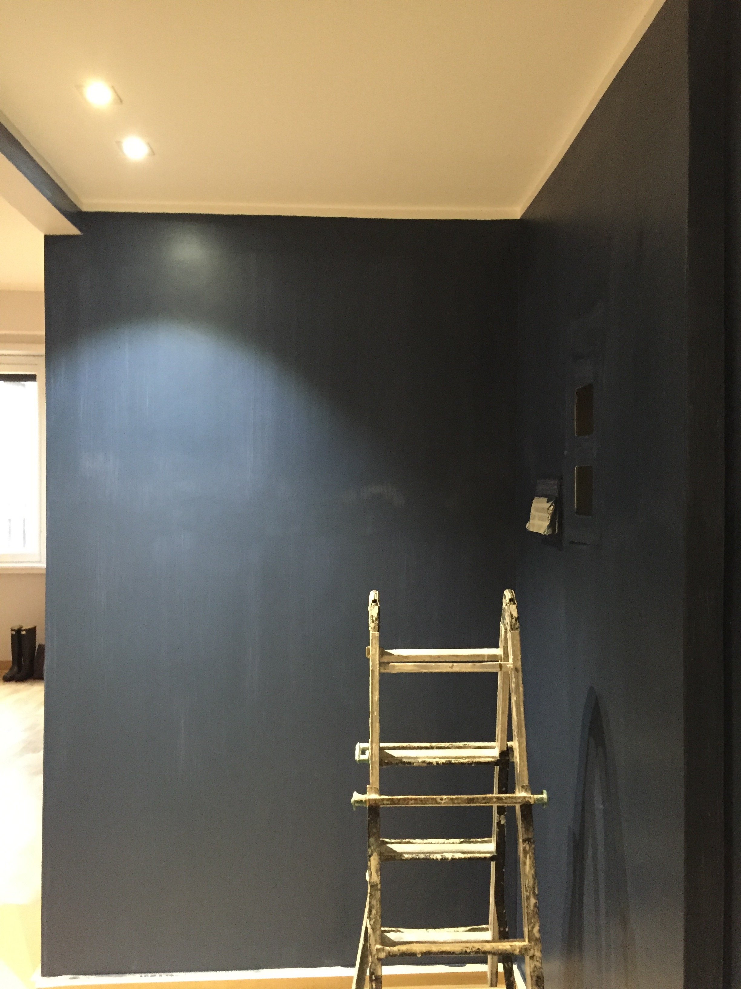 I was thinking of going with Hague Blue but in the end Stiffkey was best with the light grey in the living room. Stiffkey looks great when the lights are on and in natural light it reminds me of late summer nights in Sicily or sitting on my parents' veranda at dusk in St. Martin.When I first saw the apartment the owner told me the bookcase/cabinet in the hallway had to stay. I understood why for practical reasons. The fact that it wasn't flush with the wall bothered me aesthetically.
 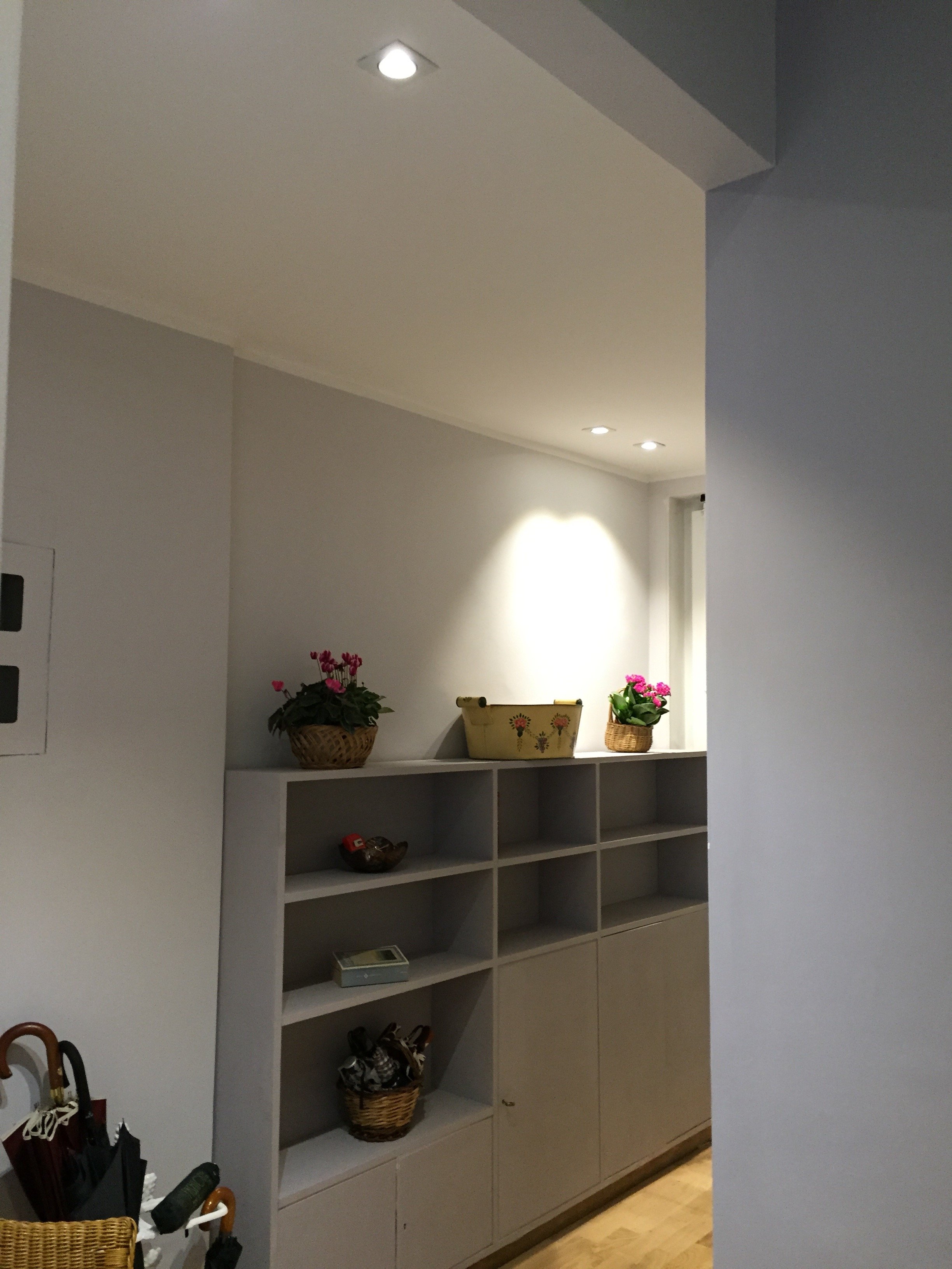 What a difference some high-quality paint makes. The painters and I couldn't believe how this big piece of furniture blends in a little more and looks more expensive than it is.
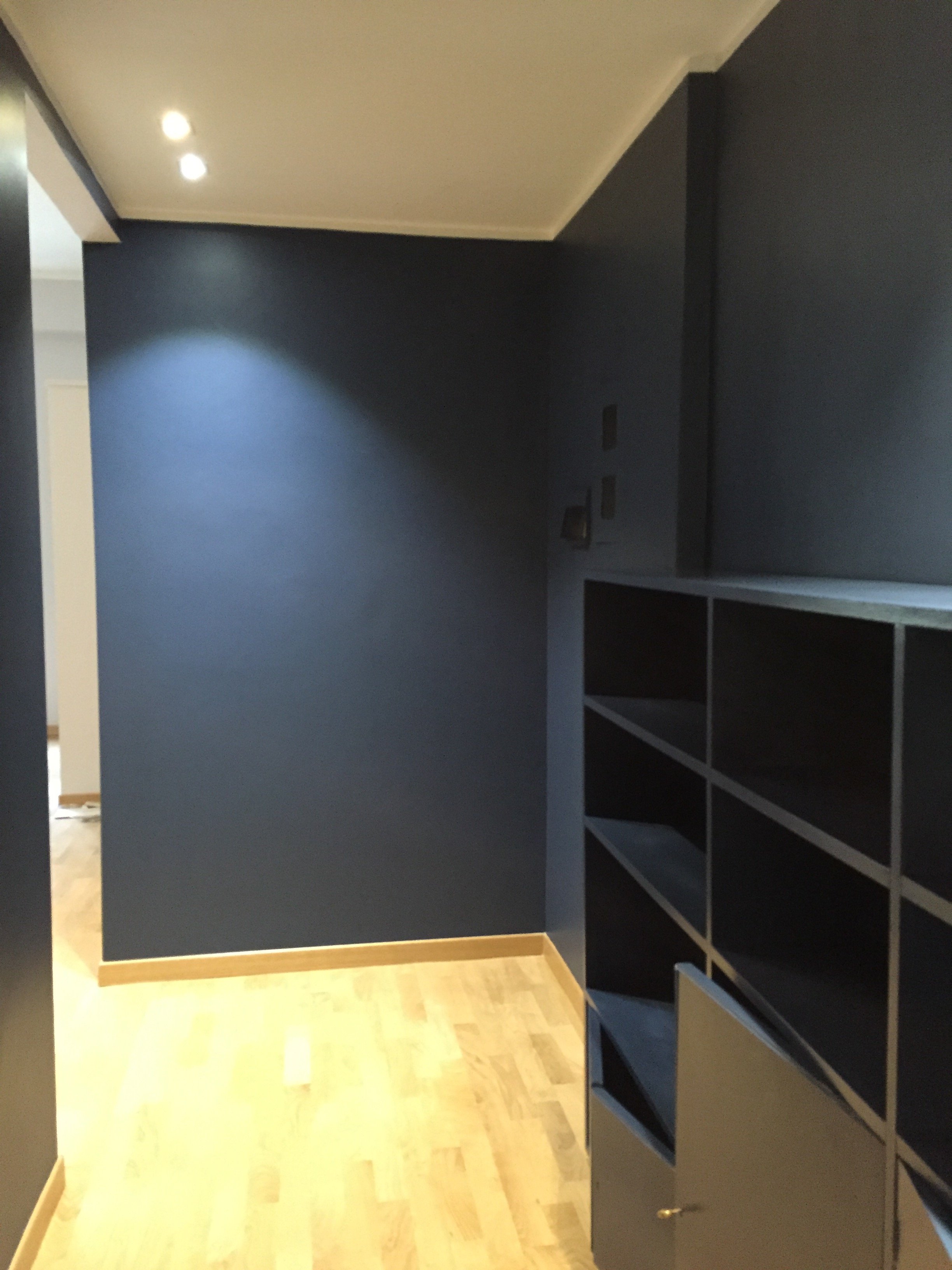 I'm going to meet with my blacksmith to design a simple bench. Above the bench I will hang some black and white photographs.I don't know when that will happen. I tell clients all the time that it's better to take our time while decorating. Perhaps I should listen to my own advice.Photos: Me and my iPhone
Self-Promotion - How do it Without Alienating Everyone?
Yes, the title is a question not a statement. This is a road my entrepreneur/freelancing friends and I are trying to navigate.I was thinking about this while walking home after meeting up with some girlfriends. They are a dynamic group of women.However, one thing I have noticed time and time again (especially when I worked in Hollywood) is that so many of my female friends tend to downplay their success. They say they're lucky or get embarrassed when talking about their accomplishments. Meanwhile, my male friends and colleagues would proudly discuss their success and many would take credit for things they didn't even do.Perhaps there is a fine line between bragging and just stating the facts. What is it?Is being too humble holding us back? I'm not saying we need to go to a Trumpian level of bloviating but the constant self-deprecating, aww shucks thing needs to stop.Even my friends who were born with a sliver platter, hustle. True, their family's influence helped them get in the door but they stay in the room because they're great at what they do. Luck is only a small part of their success.Recently, the very talented Felicia Sullivan asked me to be part of a series she's writing on successful female entrepreneurs. At first, I wondered why would she want to interview me. My friend Erica knocked some sense into me and I did the interview. Then she told me I had to Tweet about it a few times over the next few months. I haven't. Why not?The fact that there's a popular hastag called #humblebrag speaks volumes. Why be passive aggressive? A agent friend in Hollywood told me that there's nothing wrong with with tooting your own horn as long as you also toot the horn of others. Nobody wants to see or read a feed that is me, me, me, 24/7.When I think about the self-promotion that turns me off, it's because the person only talks about themselves. Always.So I say go ahead and tell the world about the great things you're doing. How will people know unless you have a publicist? Maybe some people won't think these things are that great, special, or interesting. That's okay. It's something you're proud of.I'm going to work on my own self-deprecating responses. I now know I won't succeed if I only dwell on negative things or what I haven't accomplished yet in my career. As 2015 draws to a close, I am thinking long and hard regarding how speak about my work and my business.And yes, I'm going to retweet this interview:When I first visited Rome in 2008, Arlene took me to the most incredible Italian restaurant–one I would never have found on a map. We were introduced by a woman who was interested in adapting my memoir for film. Although the project fell through, I’m thankful for having met Arlene and for our long-distance friendship since, punctuated by my occasional visits to Italy.I admire Arlene deeply, embarrassingly so. She left a job, country, and life in pursuit of something other. She wasn’t tethered to age as a means of trapping one in one’s vocation, rather she set out to find her place in the world. Up until a few months ago she was a successful writer/producer and now tell stories in another form: interiors. I love women with verve, women who take risks, break ranks, and live without apology. Arlene is all of these things, but in the end she’s a truth-teller. I only hope to be as successful as I move through my acts. Let her story inspire you. –FSWhen I first met you, you’d recently emigrated to Rome from the U.S. Truth be told, I admired you, how brave you were to leave a successful career behind for something other. This was a time before we’d read articles about expats and second acts. Your career has spanned politics, film and entertainment—but tell us how you returned to your first love: decorating. Why did you leave producing behind?Arlene Gibbs: What timing. Until two months ago, I had two careers going on, screenwriter/producer, and decorator.When we first met, I was writing full-time and developing a few projects as a producer. Everyone told me it would be impossible to be a screenwriter/producer based in Rome (especially without a trust fund). Even after our movie Jumping The Broom was released, and importantly was a hit, I heard the same thing. Nothing changed. Nobody cared. It was a “niche” film. When I pointed out to a producer friend that there were plenty of successful British screenwriters who worked in Hollywood but lived in London, I was told, “Yes, but they are British, white, and male.”To your last question, it took me forever to see the light. Earlier this summer, one of my dear friends, who lives in Rome, said that the universe was screaming at me and I was ignoring the signs. This friend is usually not that crunchy. I needed to heed her advice.Then I read this quote from JJ Martin, an American fashion and design journalist who lives in Milan, and everything clicked.
The best advice I’ve ever received was to look at everything that comes your way as an opportunity. Do not underestimate the power of chance and fate. Do what you love, what opens you up, not what closes you down, and makes you act like an asshole. Be responsible, be loving, be caring. That’s what I advise to anyone starting out. If you truly love fashion, it will come to you.
She’s talking about fashion but it could be applied to any creative endeavor. I wasn’t an asshole when I worked in Hollywood, my former assistants still speak to me, but I was not myself. I became a very bitter person.I was recently hired for a decorating project in Los Angeles. It was my first trip back since making my big decision. It was a great experience. I returned to Rome feeling positive instead of depressed.The rest of the interview is HERE.Thanks again, Felicia!
Life in Rome - This Time I am Ready for Ferragosto
First, I've just returned to Rome from a business trip to the States and the Caribbean. Below are some random observations:Los Angeles traffic continues to get worse. How is this possible.Target is great.J.Crew. What is happening? I've been a fan since the 80s. Something is amiss.Why is Ben and Jennifer's former nanny in the press so much? What is her end game? Reality show?Speaking of reality shows, what the heck is Hollywood Cycle?Ina Garten. Adore.Guy Fieri. Why so many shows, Food Network? Why?!My friend Erica posted this TIME magazine article that said Americans dressing like slobs equals freedom. Perhaps I have lived in Italy too long or I am turning into my Caribbean parents because I think that's absolutely ridiculous. Freedom? From what? The tyranny of Dior?The GOP debate. Fascinating. Trump was peak Trump.The flight attendants on Air France were very friendly and cheerful. It's a long flight from St. Martin to Paris (8.5 hours). Meanwhile, the American Airline attendants on the Miami to St. Martin flight (only 3 hours) not so much. Why?Portions in America are too big. I couldn't finish a single meal.The newish Restoration Hardware showroom in West Hollywood is odd. I don't get it. Is it just for the trade? Who thought it was a good idea to have a 40,000 sq ft store where you have to buy everything online or from the catalog? The scale is huge. How can any shopper, who doesn't live in a castle, envision that massive furniture in their home?It would never occur to me to combine these two things: Second, in the past I have written about my Ferragosto issues. Despite living in Italy for seven years, I was very American when it come to vacations and/or taking a break from work.I said, "was" not "am." Finally, this year I get it. I cannot wait for August 15th. Truly.My trip was intense. I recently signed a Los Angeles based client and flew to Los Angeles direct from Rome. I have NEVER in my life been so happy to sit in a freezing cold plane for a thirteen-hour flight. The six week heatwave in Rome was warping my brain. There were rumblings about Alitalia striking that weekend. Thankfully, they didn't and I got an upgrade to Business Class. Nice.That upgrade made a huge difference. I had horrible jet leg during my trip to Los Angeles back in May. This time it was much better. I think it also helped that I walked to the Century City Mall shortly after arriving and stayed up until 10.30 p.m.While I was running around Los Angeles with my client, I had deliveries and construction happening in Rome for another client. Given the nine hour time difference, things were a little hectic. I was only in Los Angeles for a few days and on my client's schedule so I didn't see many friends or "do meetings".Then I fly to Miami. It was my first trip to the city. I need to return and see more of it. I really liked the vibe. I stayed at the Viceroy which was fantastic.Unfortunately, the design district is shrinking after LVHM bought out several blocks. It was still a productive trip. I sourced some great items for my Anguilla project.From Miami I flew to St. Martin. I said hello to my parents, and the next day took the ferry to Anguilla.After all the flying, unpacking, repacking, shopping, meeting with contractors, painters, carpenters, project managers, receiving texts from clients in Rome about things we need to do ASAP, etc. etc., I hit the wall on Saturday.While packing (again) I watch Flipping Out. Can we talk about this show? I have so many questions. I wish Bravo aired in Italy.I'm not complaining but a very strange thing happened during this trip. I do not feel guilty about looking forward to August 15th. Not one bit.Of course I'm not going completely cold turkey. There are quite a few back office things I need take care of during the break and meetings I must attend.I bought a stack of shelter magazines in the States and the book The Bee Cottage Story. I'm going to cut way back from the Internet and chill. I know September is going to be off the charts busy. Everyone returns to town and I'm looking for a new apartment. The latter will be an interesting process.I may not be able to Dolce Far Niente for two weeks but can try for at least two days. To prepare I need to put together a killer playlist which will include one of my favorite summer jams from August 1990.http://www.youtube.com/watch?v=gzoEK545j64Buon Ferragosto!
I Went Back to Cali - La Cienega Design Quarter - Legends 2015
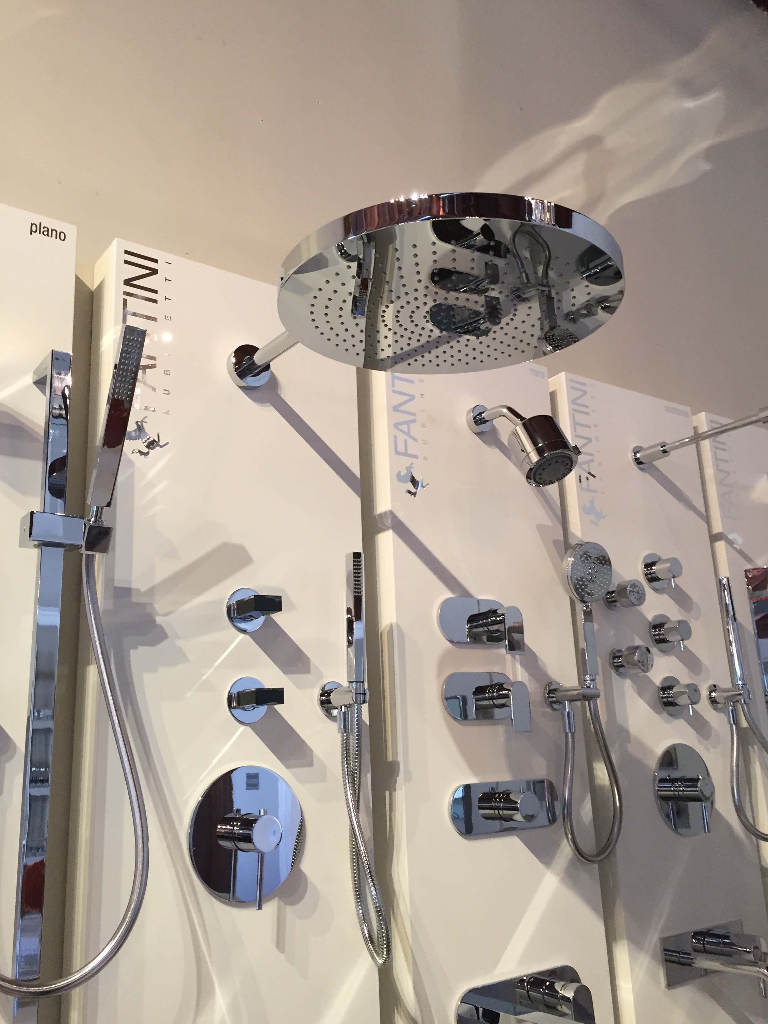
Finally, my jet lag is over. It was much worse in Los Angeles and ended shortly before my return flight to Rome. How wonderful!The LCDQ Legends interior designer conference is one of the most popular events in the industry. I've heard designers call it the Coachaella or the Oscars of interior design. There were more than ten thousand RSVPs for the three-day event, with designers from over twenty-four states, and one hundred and fifty designers traveling to Los Angeles from overseas.This was my first year attending. It was fantastic. There were Interesting and informative panel discussions, fun parties, and over sixty-seven inspiring window displays.Not only did I enjoy visiting some of my favorite (and new) showrooms, I appreciated the style of my fellow decorators. Folks were not playing. It does make sense that many interior designers/decorators have a great sense of style. I forgot how super casual Los Angeles is until I saw someone walk into Urth Cafe in Beverly Hills wearing pajamas bottoms. I'm talking about the sloppy, comfortable ones you sleep in, not the dressy ones you would wear to a party.I also had Hollywood film/TV meetings but since this is not a screenwriting blog, all I will say is that everyone is talking about EMPIRE. We'll see how this hit show changes the landscape.There were many highlights and I left feeling very energized (and determined to move to a new neighborhood).Opening night gala. My friend Corrina (an interior design junkie) came with me. It was packed. The food was delicious. I felt drunk despite not drinking at all. The jet lag struggle was real that night. The official kick off. The Bloggers Breakfast. I met Erinn Valencich from American Dream Builders. So nice. Perhaps my experience is not the norm, but I'm constantly surprised by how friendly and helpful people are in this industry. At the conference I met some serious A-listers and they couldn't be more down to earth. It's shocking!There were many famous design bloggers attending the breakfast but the room was so crowed it was impossible to move around. I found out who was at the event after seeing their Instagram feeds.Yes, I took a photo of this Italian shower head. I love that other people were also taking photos of faucets and shower heads. I could spend hours discussing such things.
 I've written about Peter Dunham before. His showroom, Hollywood at Home, has moved to a new location. Beautiful. I ordered some fabric samples for my Anguilla beach house project.
 You know how I feel about Peonies.
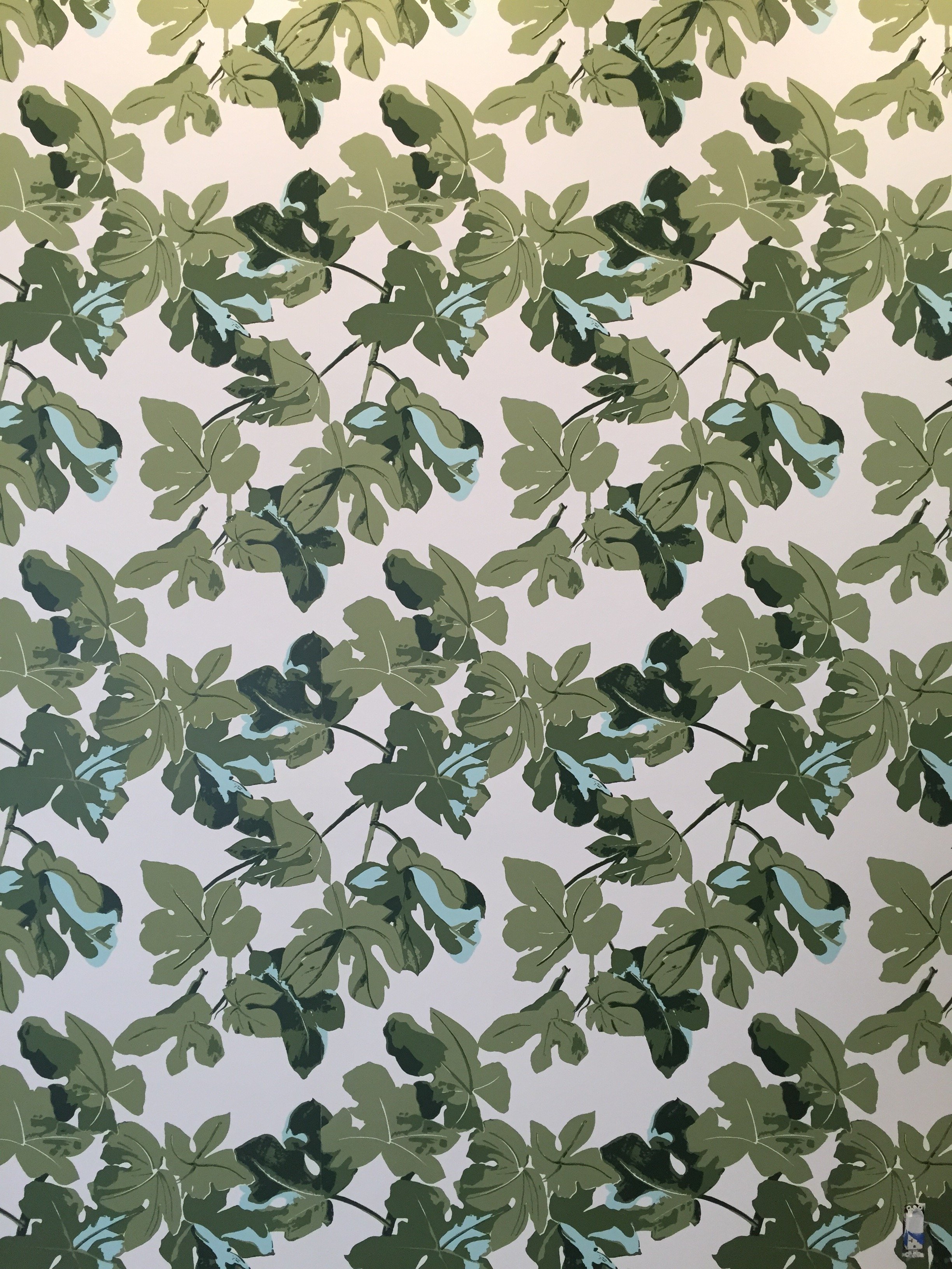
 Peter's famous Fig Leaf print.
 How gorgeous is this dark blue club chair at Mecox?
 This table? Perfect for a bedroom, entryway, or a small office.
 Everyone was so cheerful. It really unnerved me. Ha!This photo was taken at the ELLE DECOR Power Luncheon. Very pretty and again, great food.
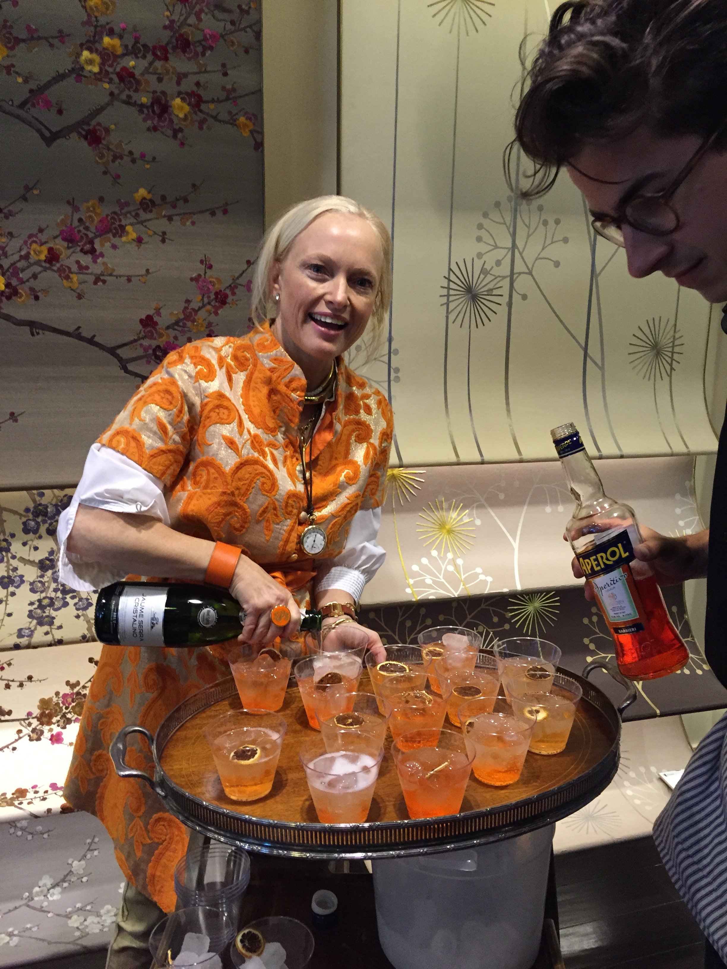
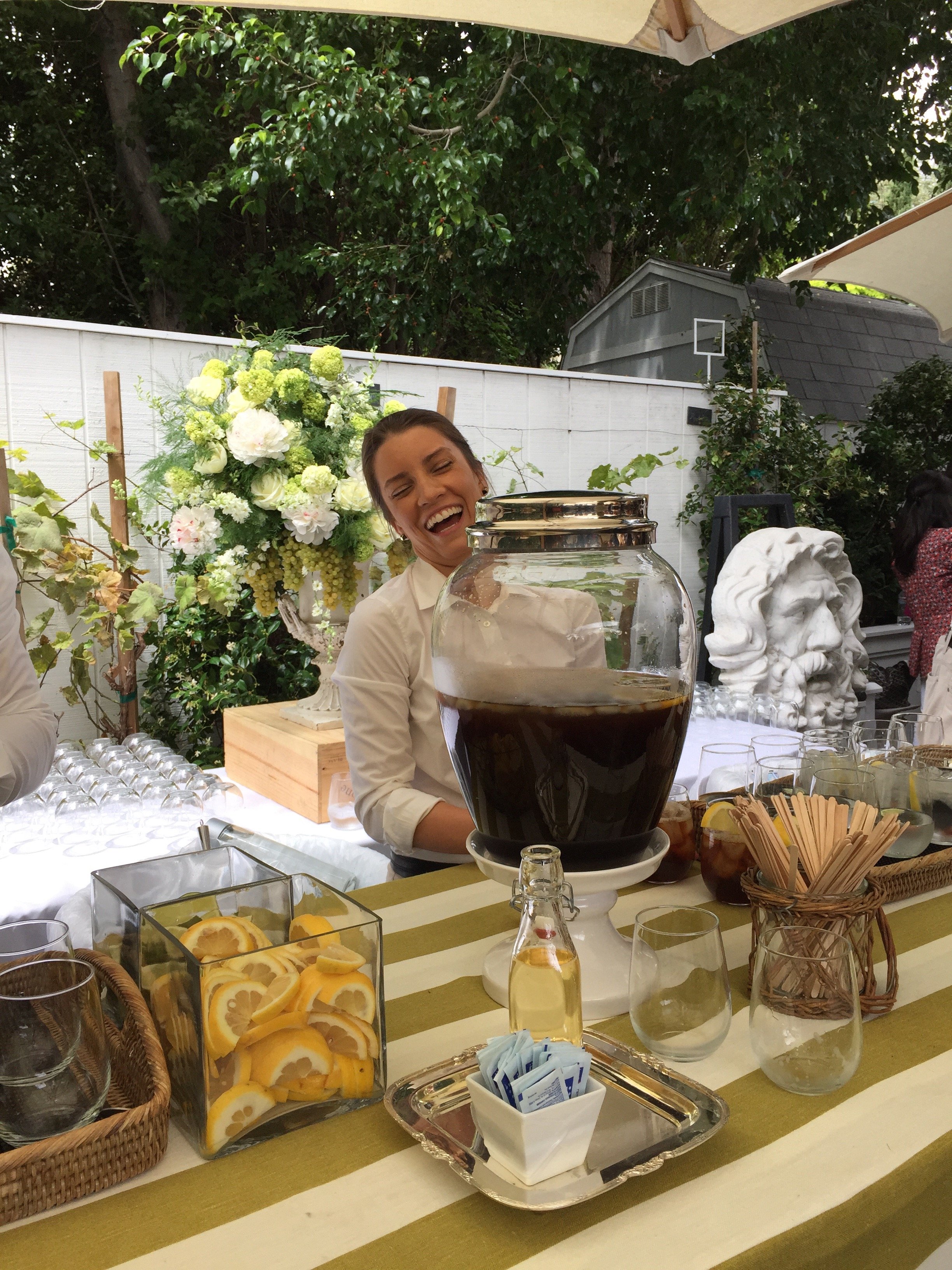 Lulu Powers making Aperol Spritz before the "Entertaining - The Home As A Social Stage" panel, with Susan McFadden, Kathryn M. Ireland, Russ Diamond, and Lulu.The take away? Dining rooms are not obsolete, despite what developers of McMansions say. They're being used differently, less formal. I agree and wish I had one.
 I read Windsor Smith's new book once I returned to Rome. I highly recommend adding it to your library. It was great to meet Windsor and to spend time in the Arteriors' showroom.
 I love that Arteriors was serving cocktails at 2:30 p.m. on a Friday afternoon. Unfortunately, I was driving non-stop in Los Angeles. Still, I enjoyed the festive atmosphere.
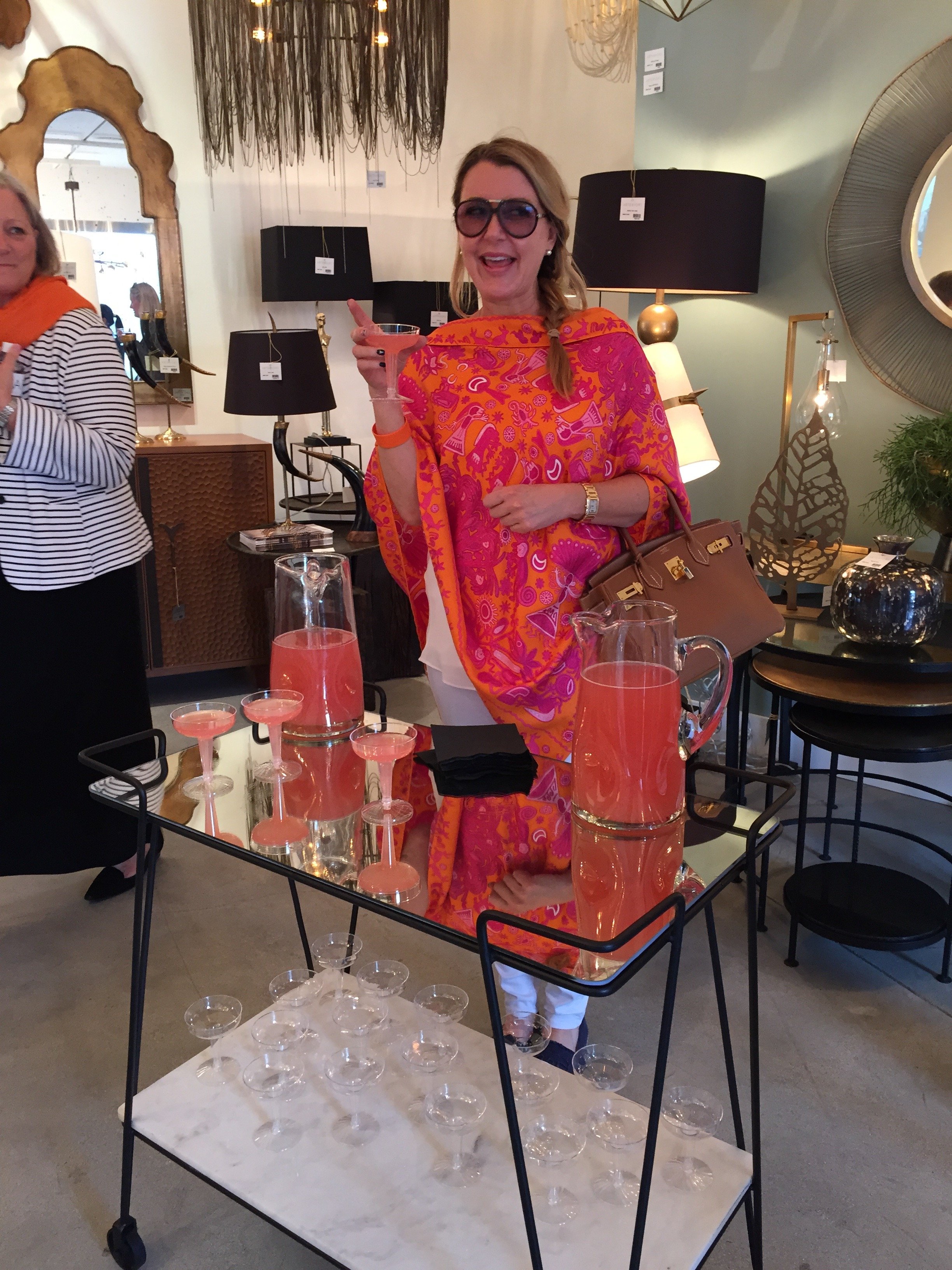 One of the most popular events is the Moore and Giles cocktail party, co-chaired by Harbinger LA and the Hearst shelter magazines (Veranda, Elle Decor, and House Beautiful) in the Harbinger backyard.More Aperol Spritz. The Italian inspired menu was catered by Lulu Powers and was delicious.
 My incredible experience ended with an intimate party at Kathryn M. Ireland's beautiful home. I forgot my phone (the HORROR!).Paloma Contreras of La Dolce Vita blog wrote a post about it.Ireland has moved her West Hollywood showroom next door to her textile printing shop on Washington street. Outside, it looks like any other nondescript industrial space. Inside, is a completely different story.I cannot believe it's been almost three years since I attended her Interior Design Boot Camp. It was one of the best investments I've made in my career. It was also a lot of fun.
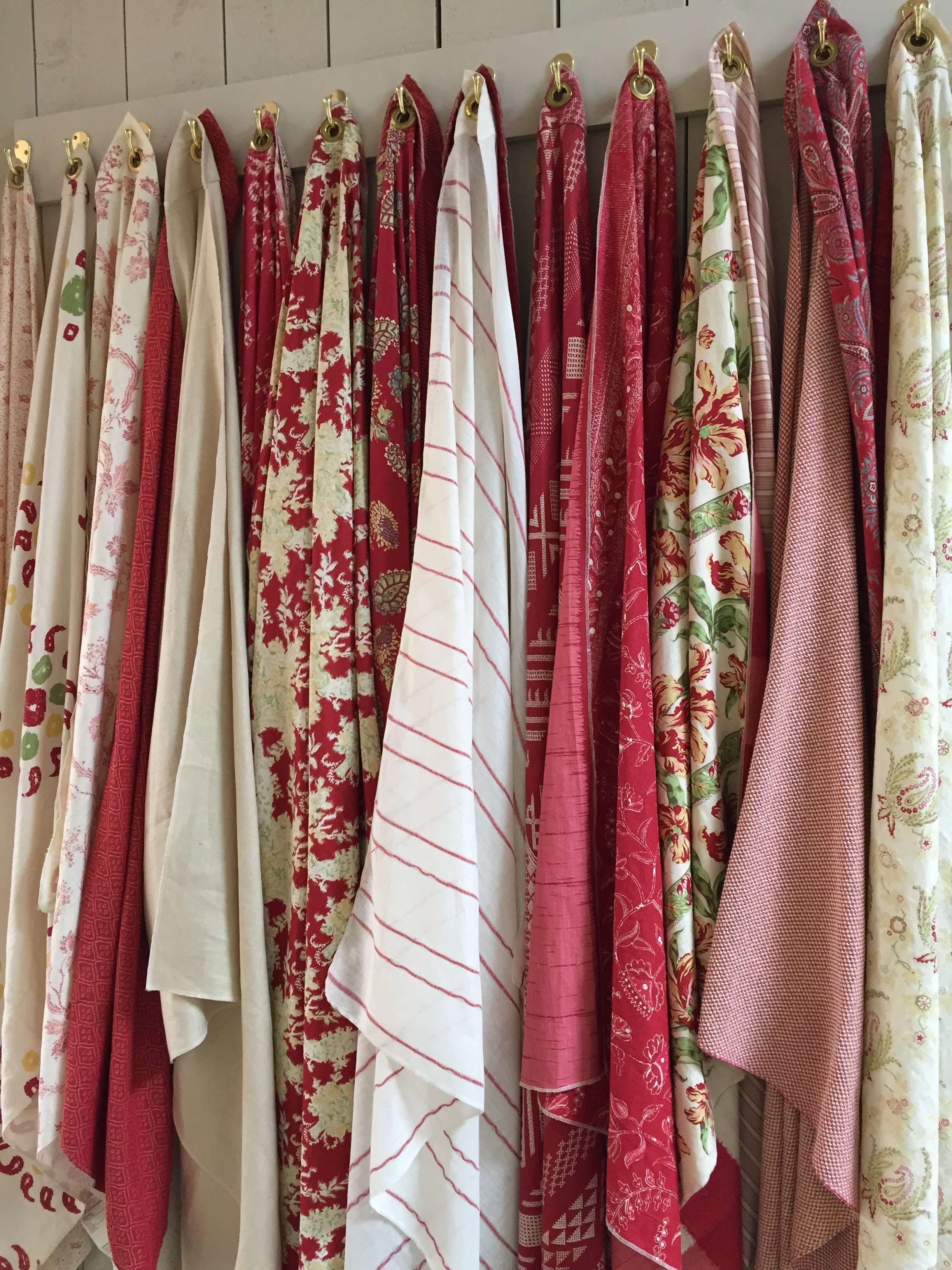 Work in progress. Hand printed textiles.
 Photos: My and my iPhone.
Small Bathrooms That Are Big On Style
The last few weeks have been incredibly busy.I'm working on a new project that will include a bathroom renovation. It has unique design challenges in that It's a vacation rental and the room is TINY.We want the space to function better and to be stylish. Below are three small spaces that caught my eye.Compact yet not claustrophobic. The shelving above the toilet is genius. Great use of space.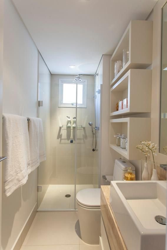 Photo: Banherio PequenoIn a small space you can use higher-end materials and finishes without blowing out your budget. Look at these floors. Stunning.
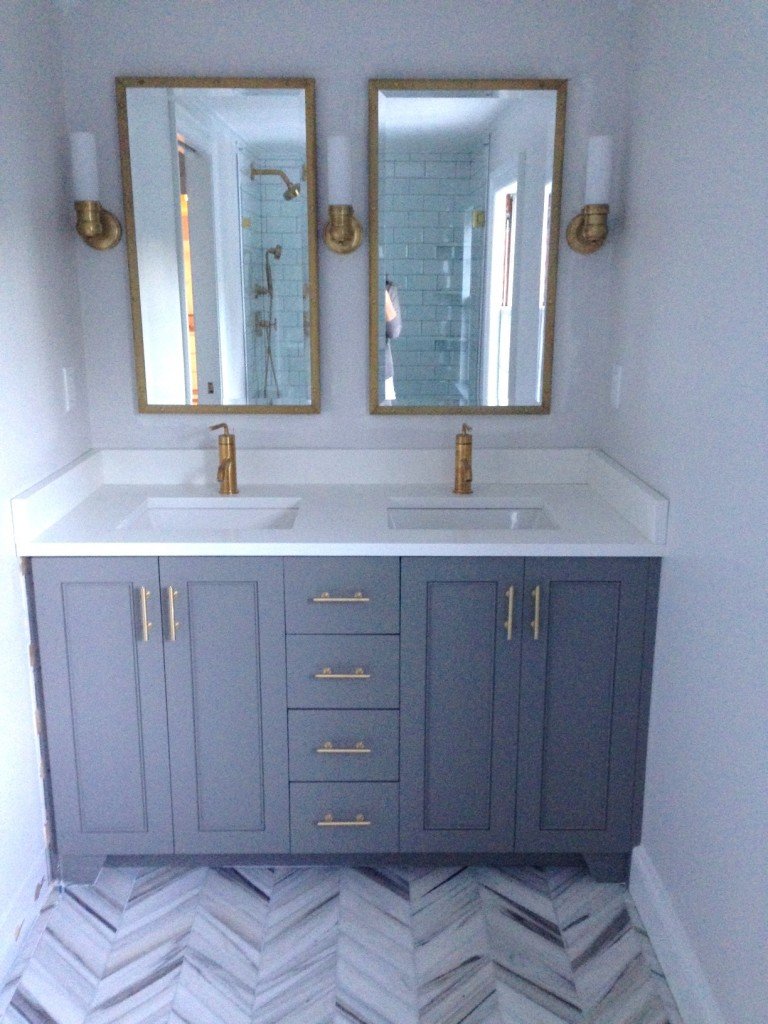
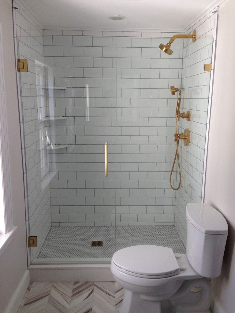 Photo: Elements of StyleLove the drama of Jenna Lyon's bathroom. These floors are spectacular as well.
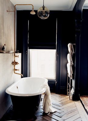 Photo: Domino
Io Adoro - Anguilla, British West Indies
Anguilla is quite the A-list celebrity/VIP destination these days. However, the small island has managed to retain it's relaxed, quiet charm.My most recent piece for FATHOM Magazine went live today. ANGUILLA – I wish I could say I have always appreciated this beautiful island. That would be untrue.When my family moved from New York City to the leafy suburbs of Verona, New Jersey, I knew I had to become a true American teenager. I was hampered by my parents' insistence on raising their children as if we were a family living in the Caribbean.My parents are from St. Martin (totally different from the Dutch side, St. Maarten) and both my grandmothers were Anguillian. Whenever we went to St. Martin to stay with my paternal grandparents, we ferried over to Anguilla to visit family and friends. When I was a child it, was fun to hang out with my cousins, go the beaches, and stuff ourselves on Johnnycakes, rice and peas, and salt fish cakes. But as for the stunning white beaches of the island, they were lost on me when I was older. I mean, I was a teenager. Visiting relative after relative while sitting on their verandas for hours drinking Ting was boring.The final anti-island straw happened one night when I was walking back to my aunt's house and a mongoose ran across my foot. I was done. I thought, "I could be chilling at the Short Hills Mall with my friends instead of being stuck on this tiny island."It wasn't until my parents moved to back to St. Martin after retirement and I moved to Rome that I began to understand why those trips back home were so important.To read the rest and see more pictures, click HERE.
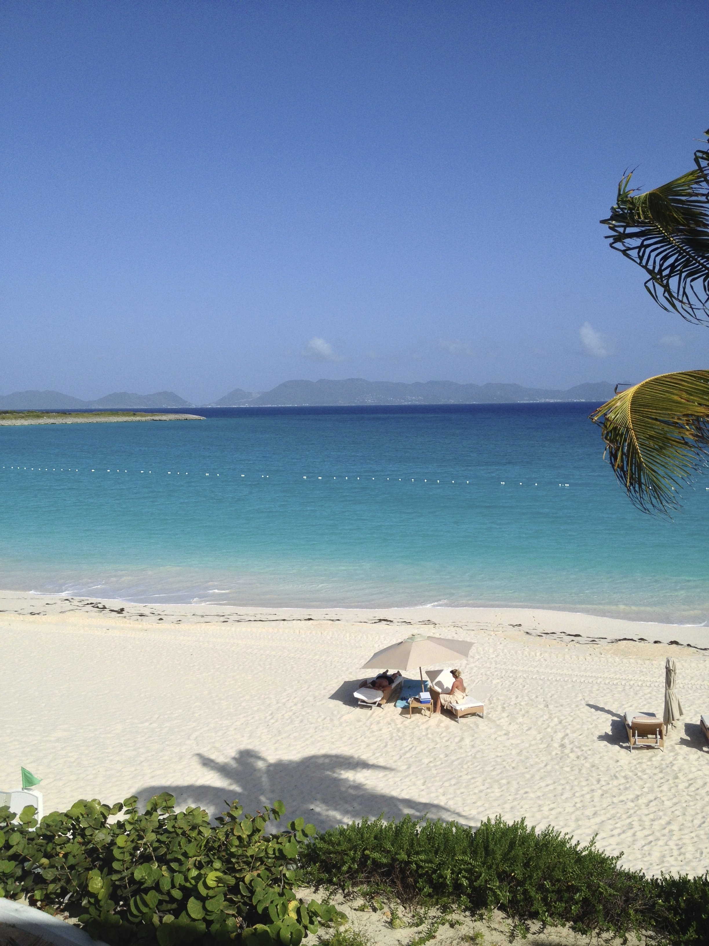
The beach at Cap Juluca with the island of St. Martin/St. Maarten in the background.
Photo: Me and my iPHone
Work In Progress - Caribbean Beach House - Bathroom Inspiration
A few weeks ago I went to Anguilla to check in on one of my projects. The build is going very well.When I think of the mood for a beach house, the first thing that comes to mind is relaxation.I've been looking at books in my library and pulling images from the internet for inspiration. The bathrooms don't have to be from a Caribbean beach house but must have some elements that would work in that environment.There are many decisions that have to be made. What kind of finishes? What color? If we use tile, what size?While this is a house in Anguilla, the style will not be British Colonial. It's too formal for a beach house. There will be touches (like a mahogany four-poster bed) of course but mixed with a contemporary spin on Caribbean design.Below are few spaces that caught my eye:This bathroom is from a home on the tiny Island of Mustique. I love the natural feel of it. We're already using poured cement for the kitchen counter tops. To use it again in the bathrooms might be too much.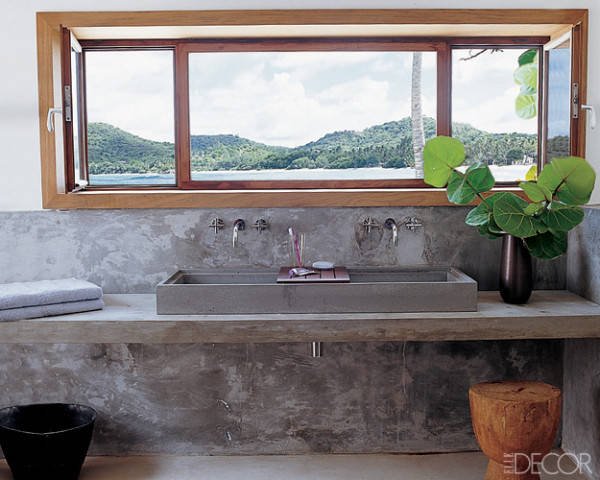
Photo: Elle Decor
This large en-suite bathroom in a Sicilian villa has a stone sink. Love the simplicity of the shower stall and the use of wooden stools. This is a newish boutique hotel. I must see Rocca delle Tra Contrade in person. The photos are stunning.
Photo: Rocca delle Tre Contrade
I'm not a fan of shower caddies.
Our clients for the Tuscany project were very clear that they wanted built-in spaces for shampoo, soap, etc. If it's early enough in the build/renovation, I recommend going in this direction. Just make sure there's a slight slope, so water doesn't pool in the space.
A partial wall works for this project. It never gets cold.
Photo: Elements Of Style
Getting away from the neutrals for a minute, this bathroom from the La Banane hotel on St. Barths is very bright and colorful.
A fun design like this might be a great idea for one of the smaller bathrooms. Or the powder room. In a large space this color and pattern would be not be relaxing to me.
Photo: Villa La Banane
Brass fixtures are having a moment. I like them in this bathroom. I look at all this tile and worry about cleaning the grout.
Photo: Habitually Chic
I LOVE outdoor showers. The ones at Cap Juluca in Anguilla are fantastic.
Photo: Cap Juluca
A more traditional style at Oscar de la Renta's former home in the Dominican Republic.
A shower in Marrakesh. Fantastic built-in bench.
Photos: Mark D Sikes
I don't know where this house is but I like the contrast of the stone-tiled floor with the black contemporary trim on the windows and with the lines of the tub.
Photo: Pinterest
Weekend Insipiration - Have A Seat - Viceroy Hotel - Anguilla, British West Indies
How funky are these chairs?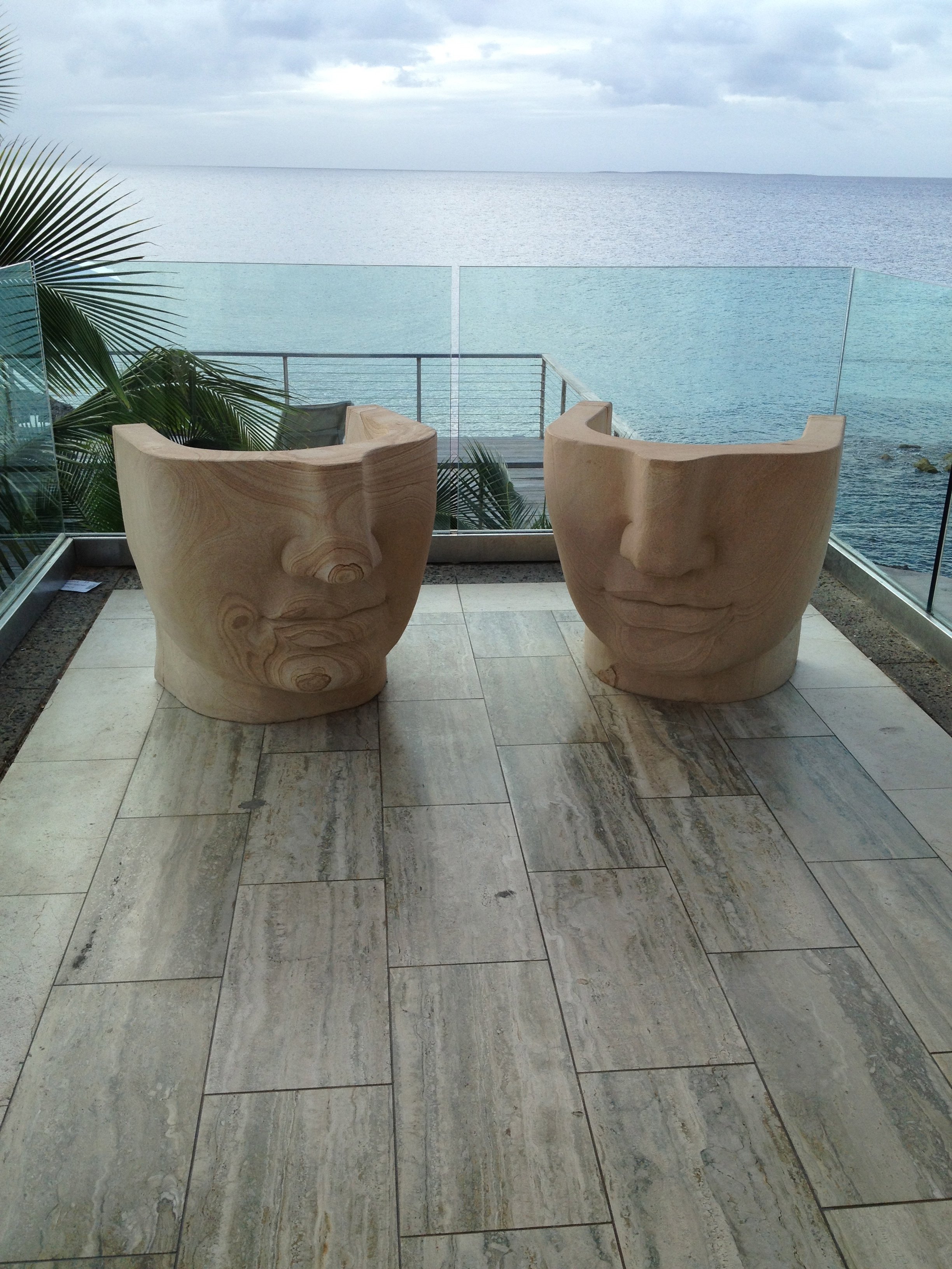 I am a big fan of Kelly Wearstler's commercial work, yet the Viceroy in Anguilla took me by surprise.A few years ago I met clients for a drink at the bar. At first, when I walked in, the décor seemed so "uncaribbean" to me.Then I walked around. It IS very Caribbean. Wearstler's use of natural materials, her color palette, and the subtle nod to more tradition Caribbean design makes the Viceroy one my favorite hotel spaces.This hotel is huge and could easily feel very corporate (thinking of a certain hotel on the Dutch side of St. Maarten that ruined one of the best beaches on the island).Instead it's unique and jaw dropping gorgeous.Not a bad place to meet for drinks, especially with a locals' discount.I have more meetings this weekend about my Caribbean project.Feeling very inspiredBuon weekend!
The Tuscany Project
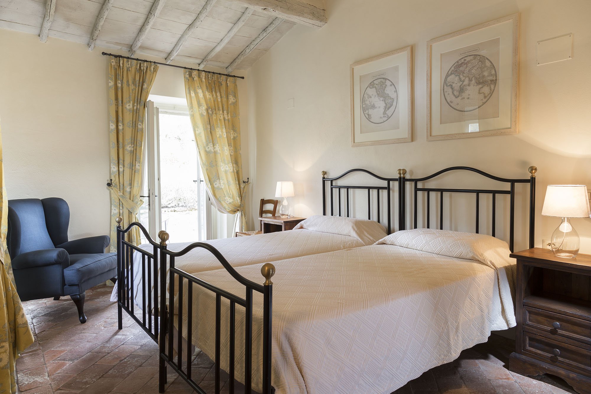
Last year I wrote about the vacation home in Tuscany I'm working on with architect Domenico Minchili.Our clients had some photos taken and below are a few of them.First, a before shot of the living room.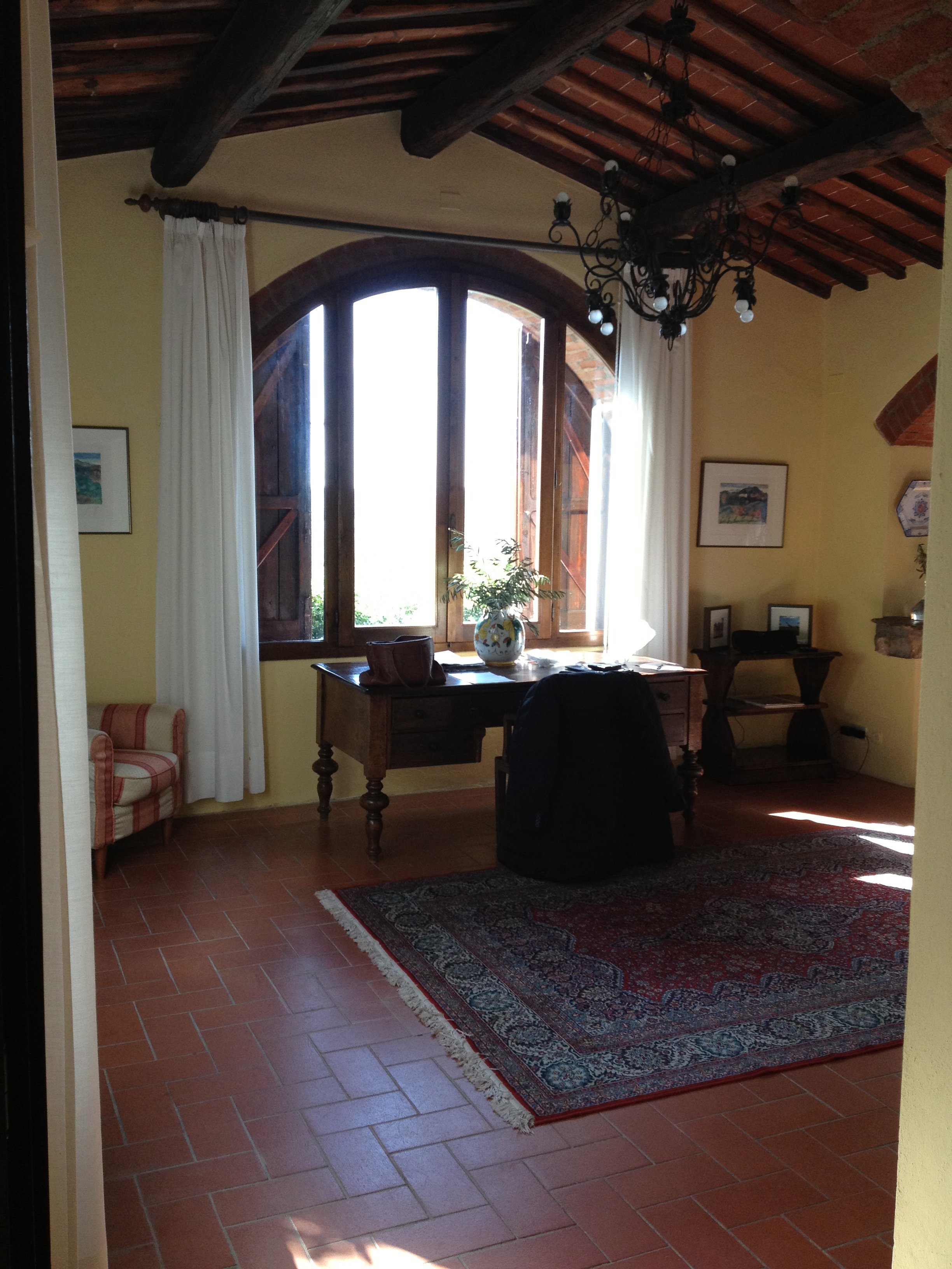 After.The room is so much lighter. The new "old" floors make a huge difference as does the paint color. I was consumed for days regarding which shade of Farrow & Ball white was the best white for the walls. We decided to use Skimming Stone.The chairs were custom made by Tondini & Radicchi. So were all the draperies in the house.
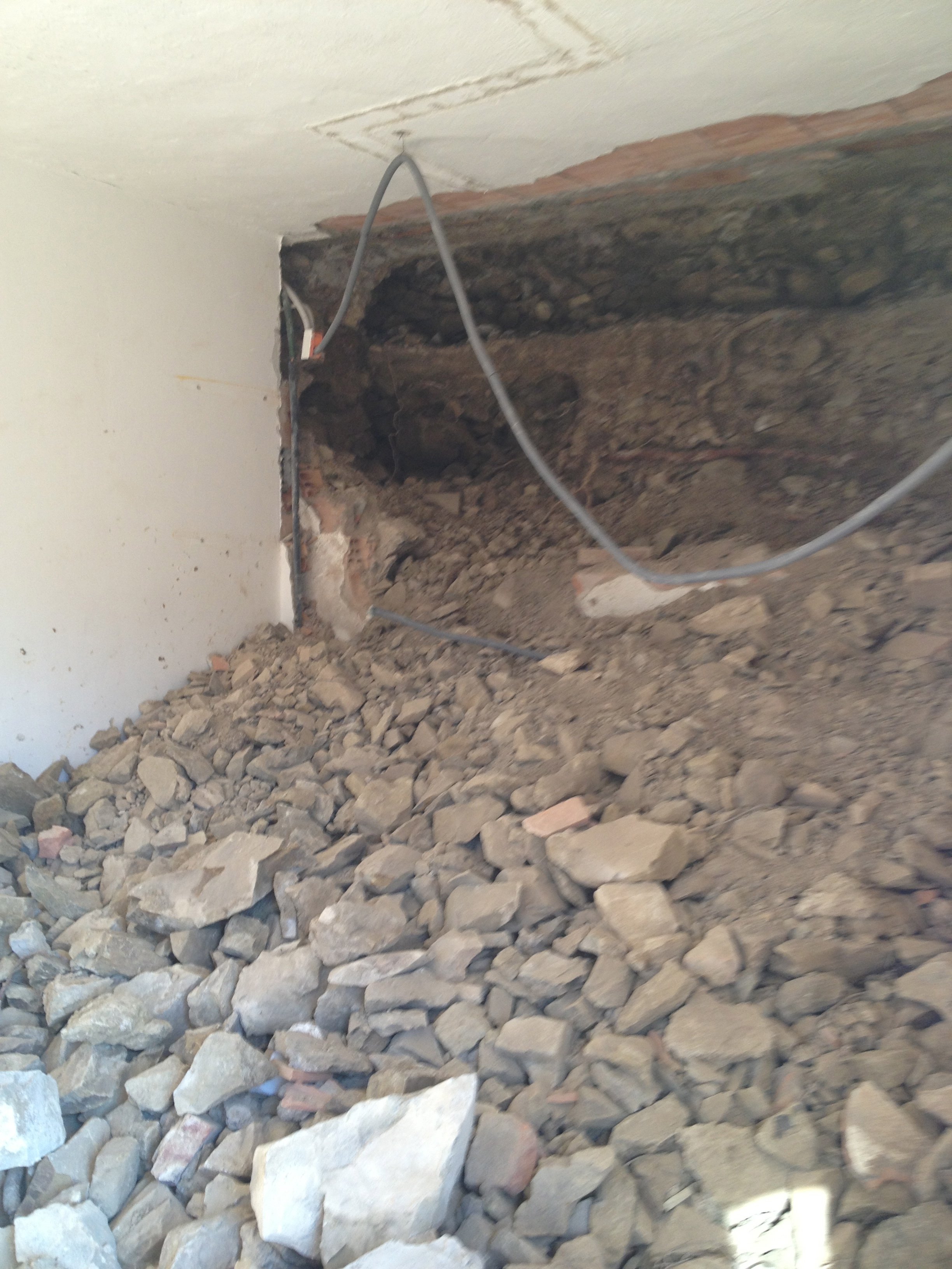
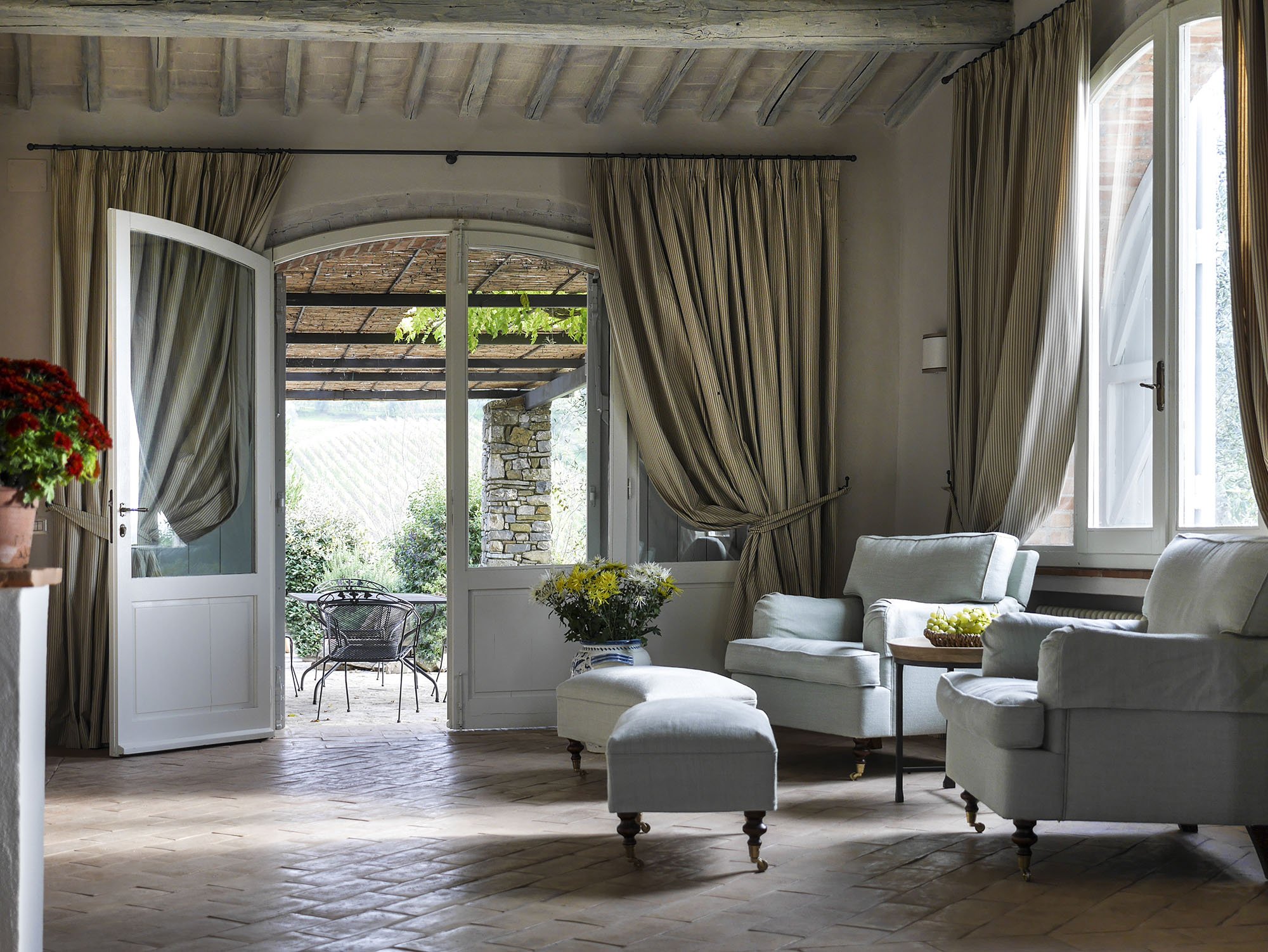 One of the bedrooms mid-renovation.
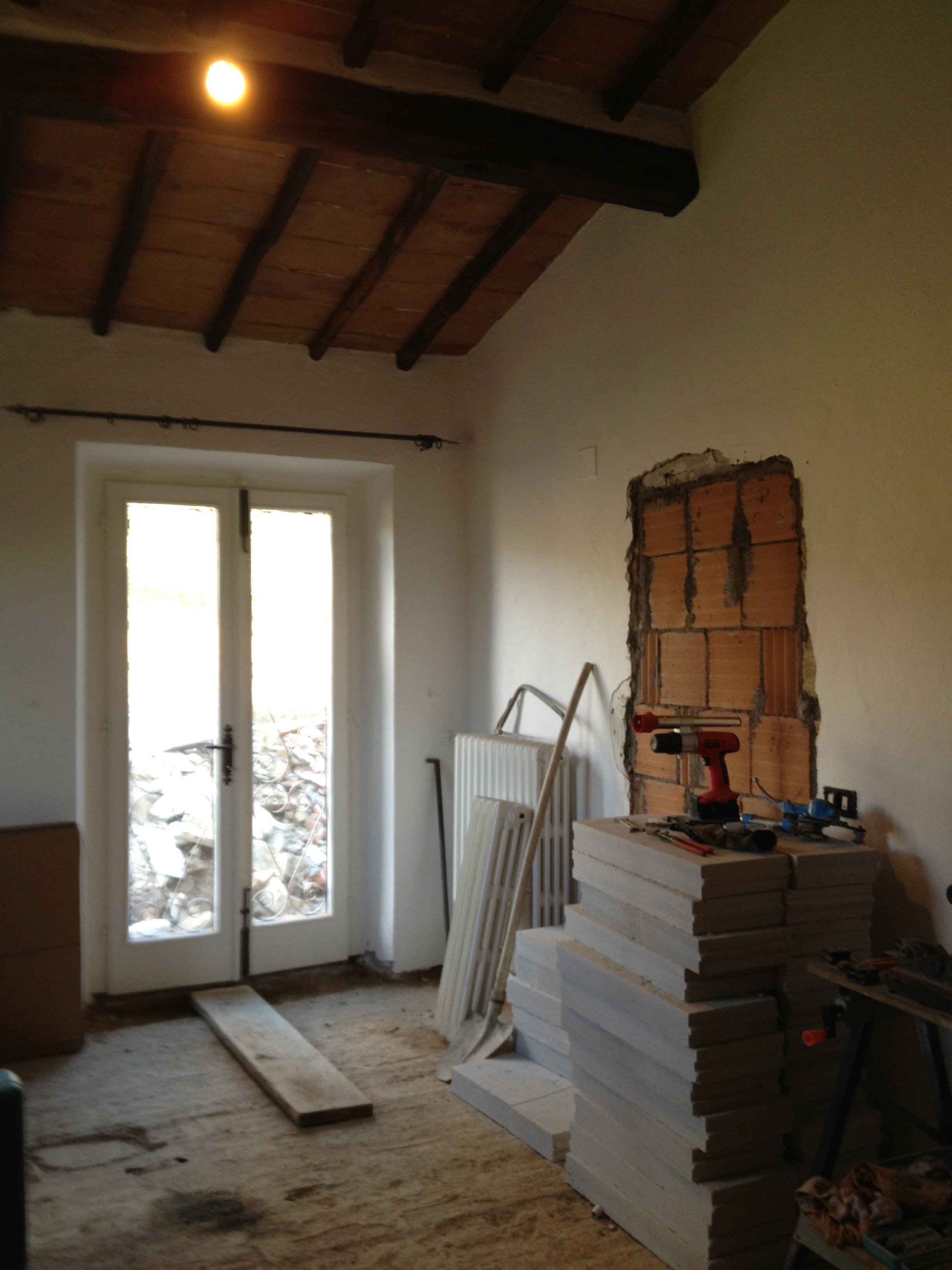 After.
 A bathroom before.
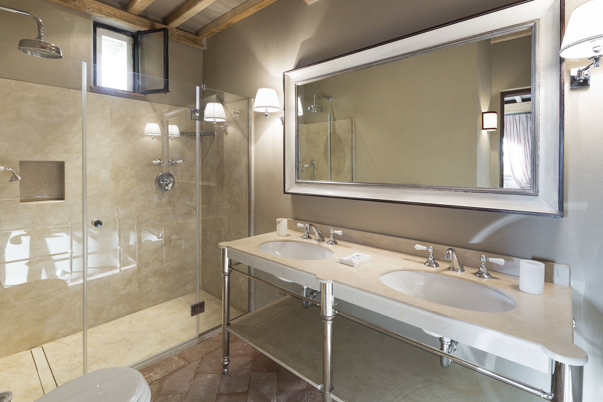
 After.
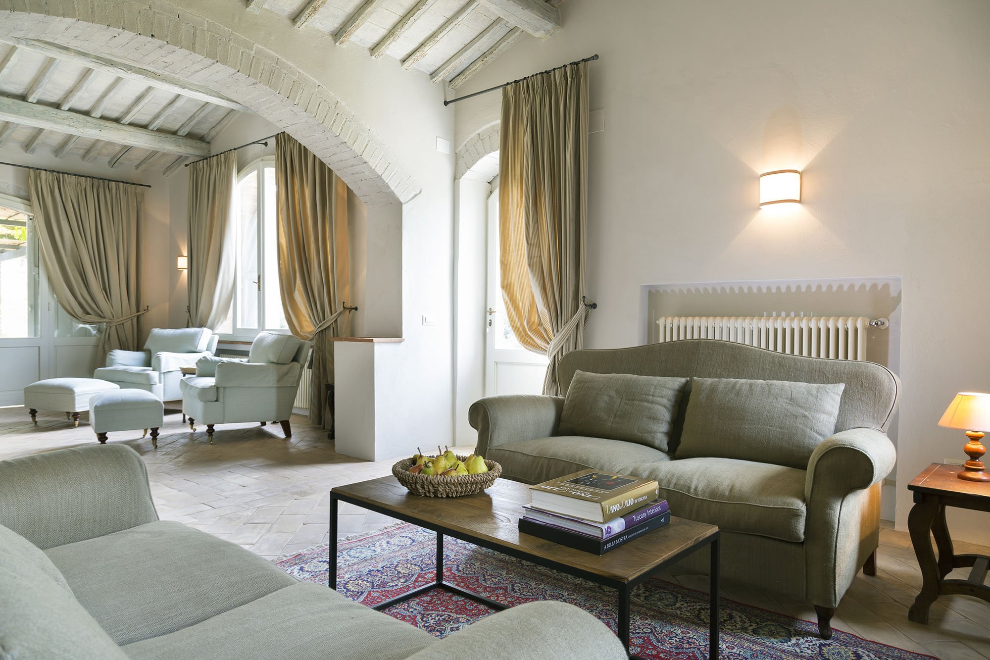
 Wider shot of the living room. The sofas, coffee table, and sconces are custom.
 The studio.This room receives little natural light. Many people assume that a small dark room must be painted a very light color in order to make it look bigger. Not true. It seems counter-intuitive but going darker gives a small room more depth.
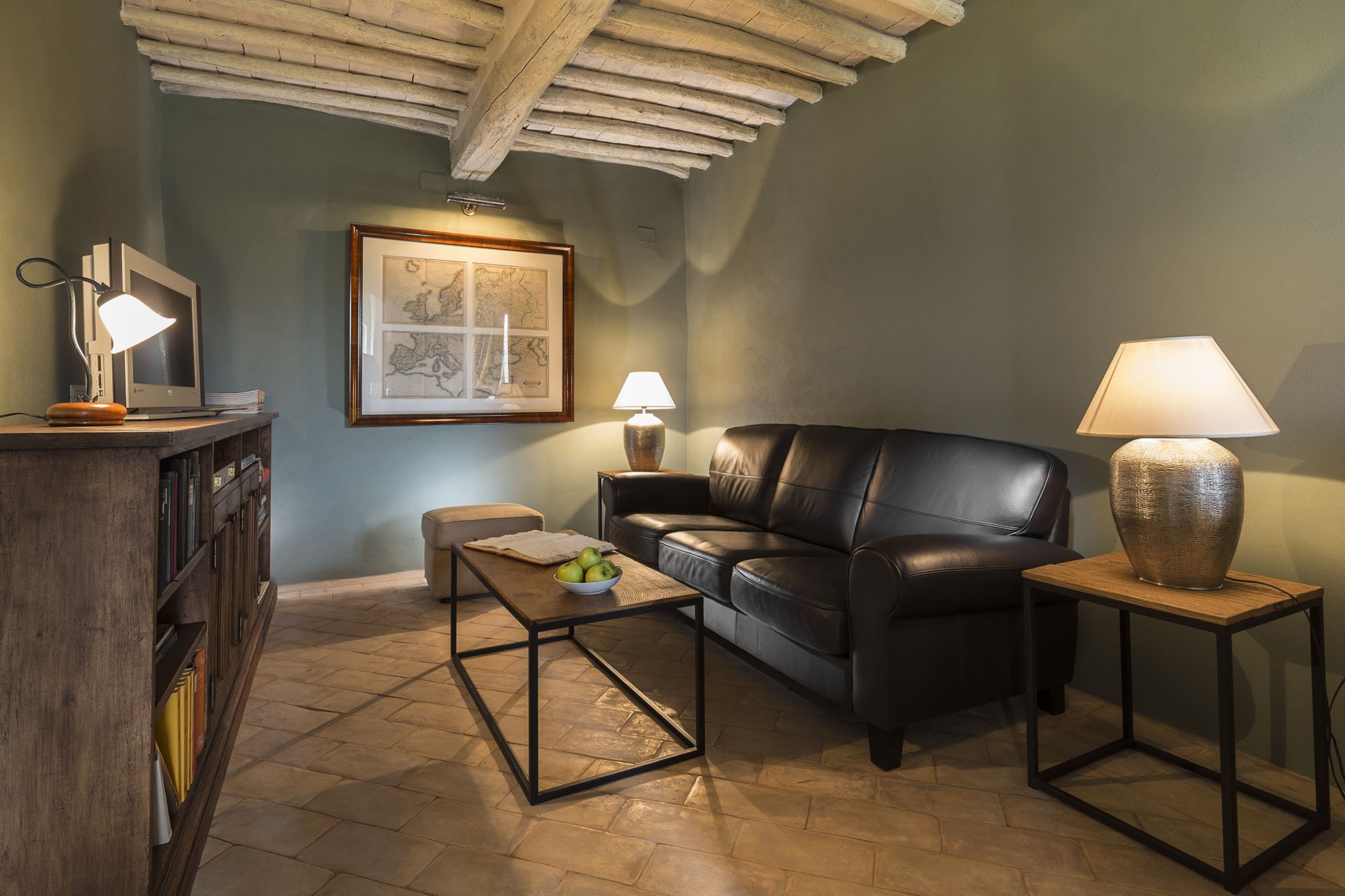
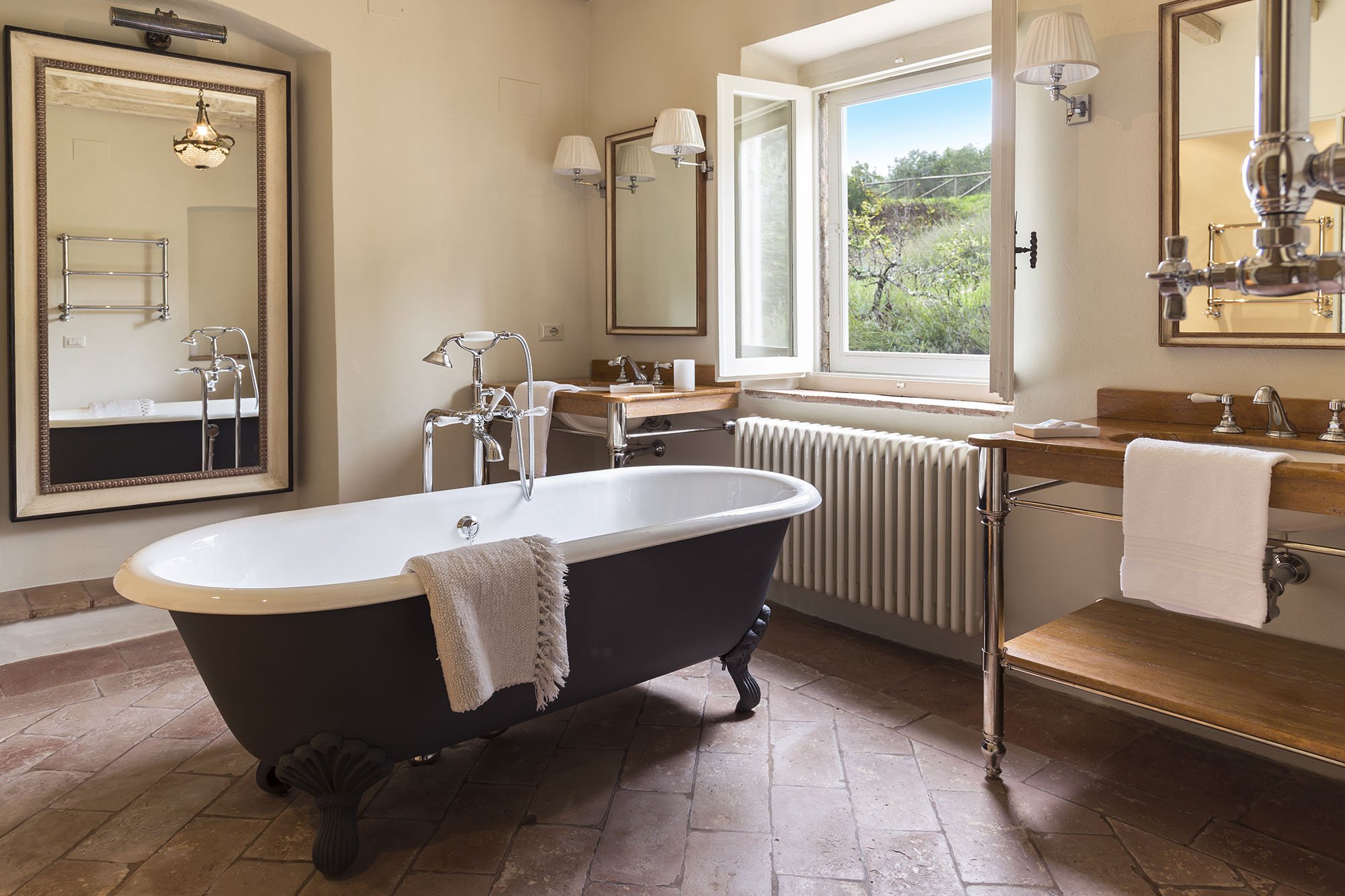
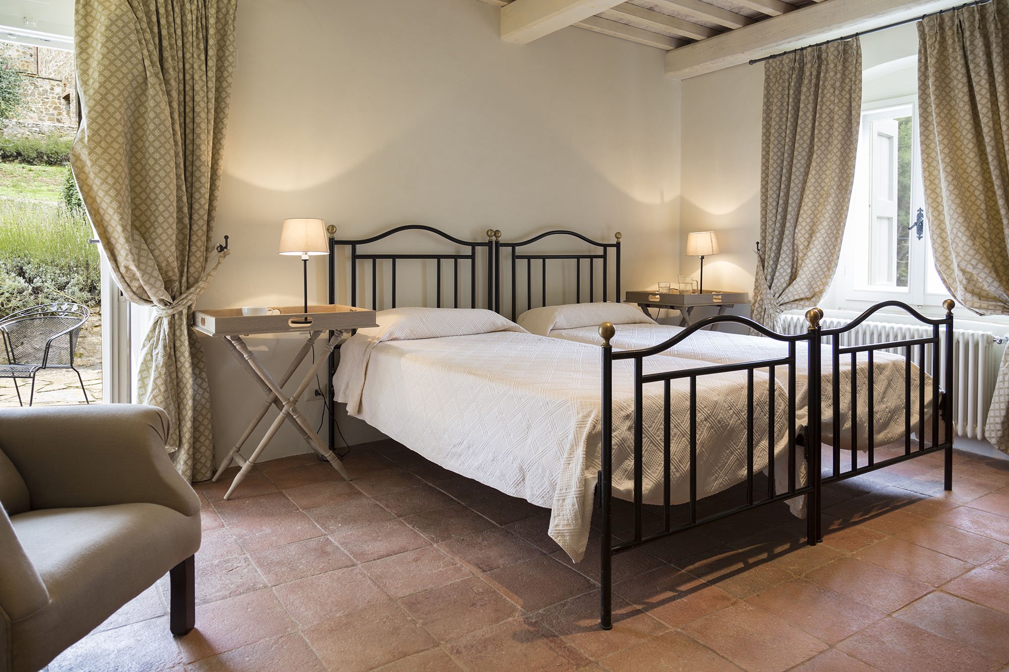
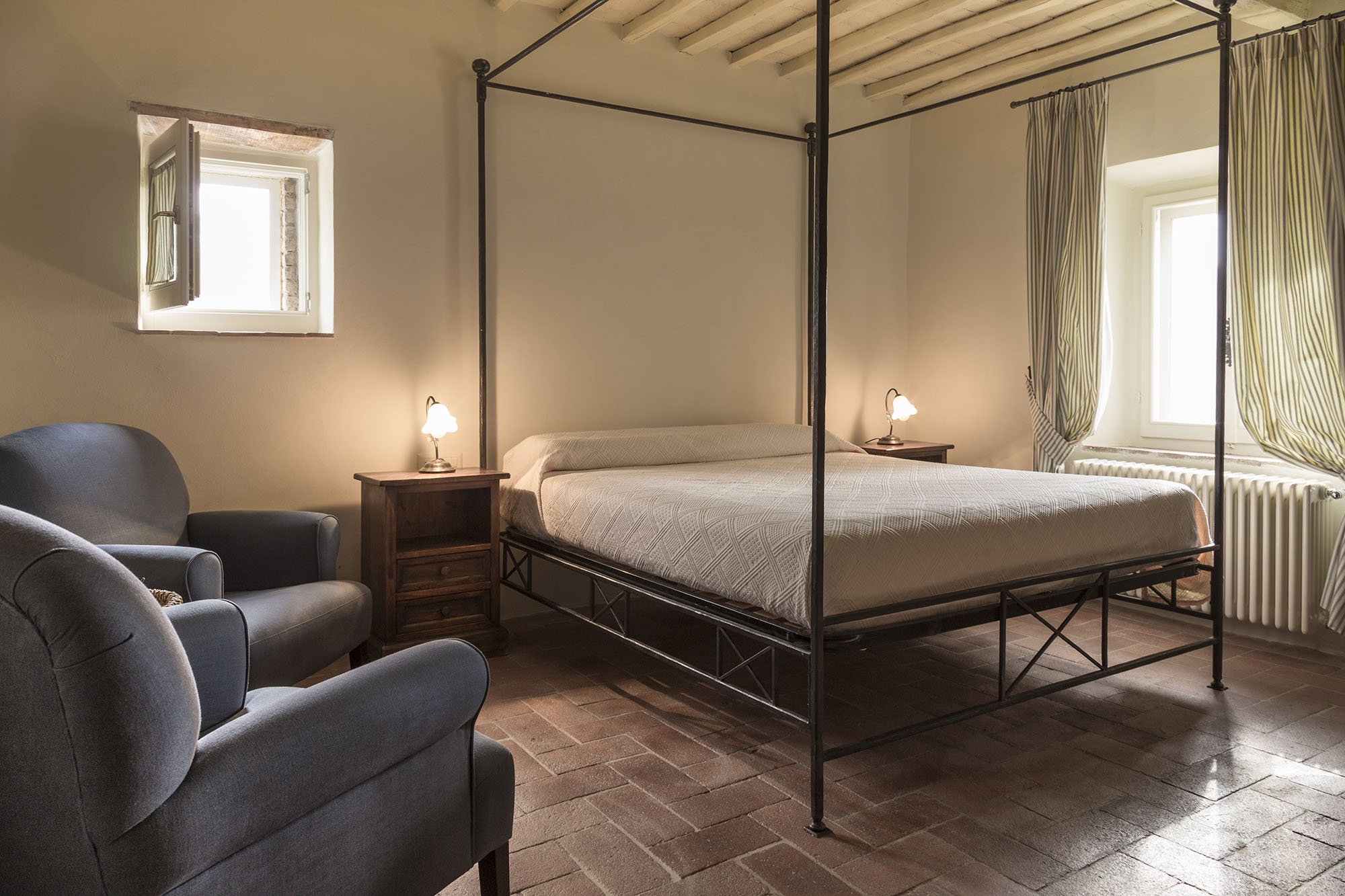
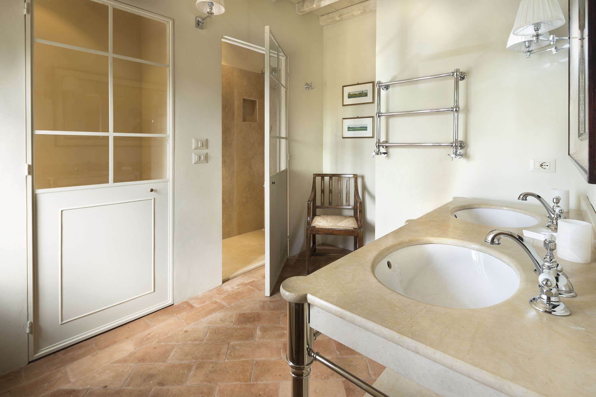

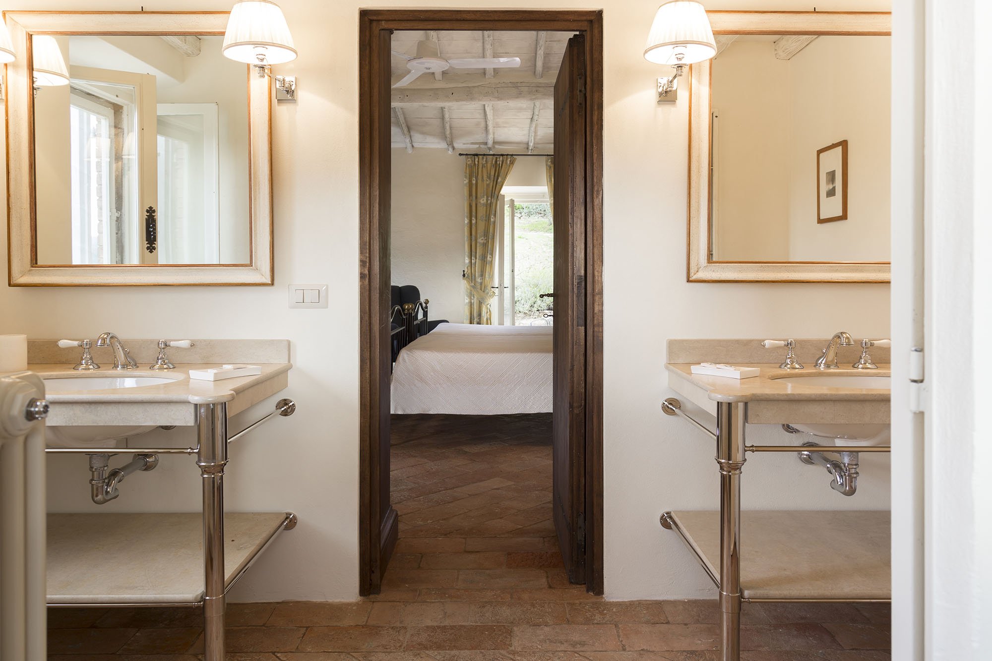
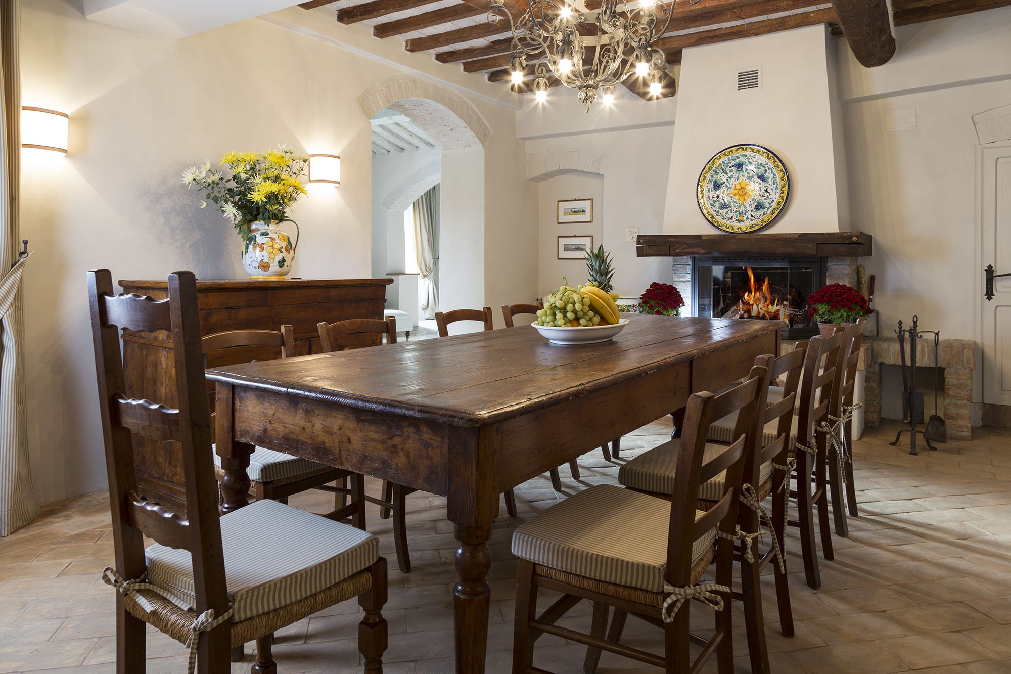
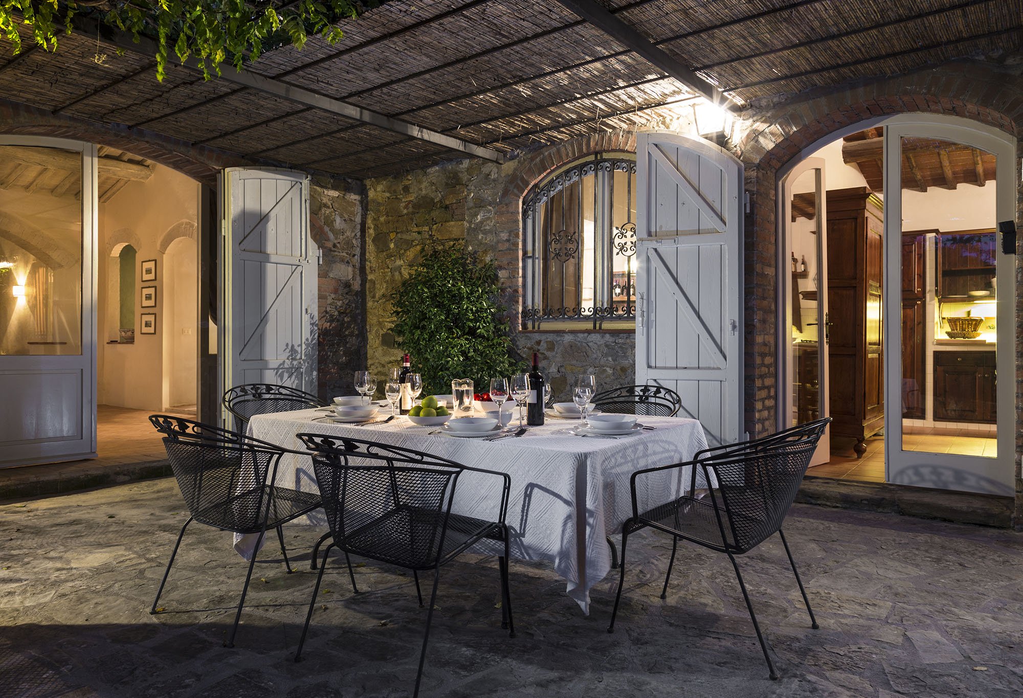
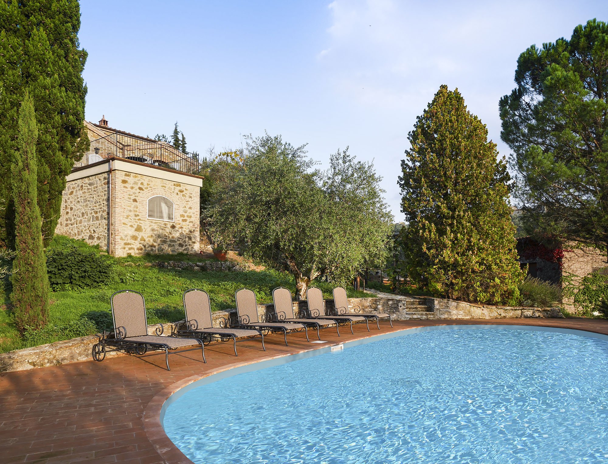 One of my Italian friends called this décor, "Relaxed Chic." Another friend said it was "Casual Luxury." Both work for me.Every bedroom, and its bathroom is unique, yet the entire home is cohesive.The paint is from Farrow & Ball.Most of the new furniture was custom made. We also sourced pieces from Flamant, Barthel, and small shops in Rome and Tuscany.Our fabric sources were, Dedar, Ralph Lauren Home, Kathryn M. Ireland, and Pierre Frey.If you would like to know the specific colors or more information about the fabric or furniture, please feel free to ask me in the comments section.This property is available for vacation rental. It's in the heart of the Chianti region surrounded by vineyards. The views are stupendous.For more information (and some exterior photos), please visit the luxury rental Abercrombie & Kent website.Photos by: Mario Flores
Life In Rome - Interview And Photo Shoot with Gina Gomez
I do not like having my photo taken. Correction, I'm game when I'm in a group shot.It's not just because the camera adds ten to fifteen pounds. It's because I feel like a big dork standing there while the photographer snaps.Thanks to social media, I had to get over my discomfort. That said, I still get salty when unflattering photos are tagged on Facebook. What the what? Does the tagger need new glasses? Good friends don't let folks tag bad photos.Gina wanted to take a few head shots during our terrace photo shoot. I was sweaty and wiped out. So even though Gina is a talented photographer I thought, "no good can come of this."She convinced me to at least try a few. I did and this is what happened: I did a brief interview with Gina and she has posted more photos from the shoot on her blog.To see more of Gina's gorgeous work, please visit her website here.
Photos From My Trastevere Terrace Project
My client travels frequently overseas for work but, like most of the native Romans I know, he enjoys hosting aperitivi and dinner parties when he's in town.He saw the work I did for another client and asked me to take a look at his terrace.We wanted to make the space flow better, redo the landscaping, and buy new furniture to add to some of the pieces he already owned.I think it's important for the outdoor areas and indoor areas to be cohesive. I kept my client's interior spaces in mind as I looked for furniture. My landscaper and I had a long conversation regarding which plants would work best for the terrace.I wrote about photographer Gina Gomez (aka Warm Pears) on my former blog three years ago. Earlier this year, we discussed collaborating on something.The terrace was that perfect something.Below are a few pictures from the shoot.


 Resources:Furniture: UNOPIU'Lantern: FlamantCenterpiece: Bloemen Florist - Via Terenzio, 37 (zona Prati), Rome, +39 06 6892901
Weekend Inspiration - Architectural Digest Showcases A Castle In Umbria
I cannot wait to pick up a copy of the November issue of ARCHITECTURAL DIGEST (USA).One of the stand out articles is about the restoration of a castle in Umbria. The architect was Domenico Minchilli and the interiors were decorated by Martyn Lawrence Bullard. The two were brought together by the client, Evgeny Lebedev.I wrote about Domenico and the project we're working on in Tuscany HERE.Domenico showed me a few before pictures of the castle. As I looked at the photos I thought,"the word ruins doesn't convey what I'm seeing. Perhaps a pile of rocks would be a better description."I was floored by the transformation. It is truly inspiring.The November issue is on newsstands (Stateside) now.Buon weekend!
August In Rome
All over my neighborhood are signs like this: Before I was on Hollywood's schedule, so August was a busy time for me. While all my friends and neighbors fled the August heat and tourists, I stayed behind in Rome writing and pitching TV projects.Now I'm on a local schedule and it's a trip. Last week I was running around town making sure to touch base with my vendors before they closed up shop for the month.There will be NO furniture deliveries in August.September will be out of control. Everything is being pushed to that month.In the meantime, I'm going to use this period to catch up on office paperwork. I also need to find more space in my tiny apartment for all the new books I have. I'm literally running out of room.One friend (who just left town for the rest of the month) suggested I see a few movies. Then we started laughing because most of the movie theaters are closed too.
Weekend Inspiration - La Farmacia
I know people love to talk smack about Gwyneth Paltrow's webiste, GOOP. I don't understand why someone would subscribe to a website they hated. It's not as if anyone is forcing them to read Ms. Paltrow's musings.Yes, some of her suggestions are bananas. However, posts like The French Pharmacy are fantastic.One great about living in Europe are the pharmacies. Finally, some of the skin care products can be found in the States but usually at much higher prices.Klorane is one of my favorite brands. I will be working this weekend, including a very early Saturday meeting with one of my clients. I ran into my local farmacia to pick up one thing and ended up also buying the Energia shower gel and some conditioner.
Photo: Allure.com
I wish I could go to a spa this weekend. Instead, I will do a janky home version. Now, I need to run out to the market to get some cucumbers and limes.Buon weekend!
Work In Progress - Trastevere - Rome, Italy
Great news here at AGD.The house in Tuscany is almost done and I've signed two new clients.For one project, I'm helping my client redo his terrace.The other project also includes working on a terrace and collaborating with my client to furnish her new apartment.Both apartments are in Trastevere.One thing I love about this type of work is that each project is unique. My other Rome project is understated glamour.The apartment I'm working on in Trastevere is contemporary with a very streamlined palette, white, black, gray, and some pops of red. A few pieces came with the apartment and most of the additional furniture will be custom-made.My client would like a home that is minimal, light, and yet cozy. Minimal decors can be cold so I'm all about texture and natural materials.I have an inspiration board for the apartment on PInterest.For the terrace project, we are going to redo the plants, buy new furniture, and make the space flow better. My client entertains often and it's important that his guests feel comfortable.My landscaper is amazing and I cannot wait to see how the terrace will look once the plants grow in a little.I real enjoy working with my clients. I know this something not every decorator can say!
Weekend Inspiration - Shower - Monteverdi, Tuscany
What a week.Just when you think Italian politics couldn't be more confusing or bizarre, they are. I have no idea what is going to happen now. Maybe we'll have new elections.The Pope said good-bye yesterday. The city is packed with tourists who came to see him for the last time. Cardinals are flying in for the conclave and there are journalists in town from all over the world.Work-wise, things were hectic. I'm not sure how it's Friday already.Yesterday, Domenico and I drove up to Tuscany to visit the job site and to meet with our client who flew in from Germany. Normally, we would stay overnight but we decided to make it a day trip and left Rome at 6:30 a.m.It was a very long day. At one point my brain said, "BASTA!" and refused to cooperate. It was around the time I was asking the contractor questions in Italian and then translating his answers into English.On the drive back home, all I could think about was taking a long shower, getting in my PJs, and then watching Law and Order SVU reruns on Fox Crime (I have a thing for Detective Stabler).I wish I had a shower like this: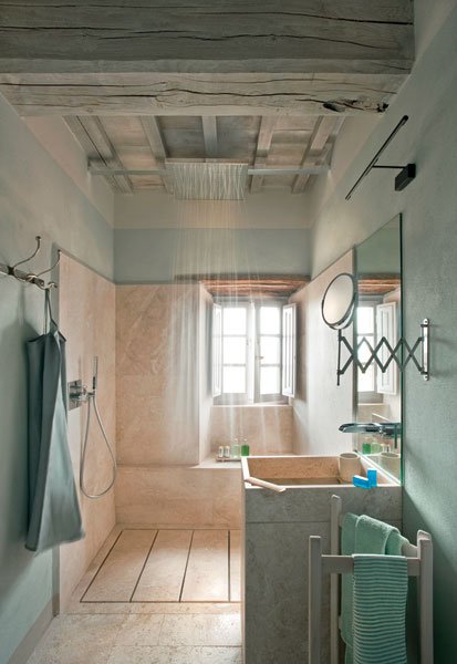 Unfortunately, I do not.The shower in the photo was designed by Ilaria Miani for Monteverdi. Monteverdi is a group of rental villas and a hotel in the small village of Castiglioncello del Trinoro in Tuscany.Stunning. I hope to check it out sometime later this year.In the meantime, Stabler and I will be relaxing this weekend.Buon Weekend!
