Stylish Simplicity - Eres Bikini (and a short rant)
Today's edition of Stylish Simplicity highlights the ERES bikini.
Work it J.Lo
Photo. Vogue June 2012
This French brand has some of the most beautiful bathing suits on the planet... classic and well made.
I never wore a bikini until I moved to Italy. NEVER. I grew up seeing magazine covers constantly saying, "Get A Beach Ready Body!" or tabloid headlines that screamed, "Worst Beach Bodies!" In Los Angeles many of my colleagues gleefully ripped celebrities to shreds, calling them fat and what not. Celebrities who were no larger than a size 4.
What's the point of starving oneself for the season? What happens once the summer is over, back to bad eating habits? I blame the Puritans for this madness.
The first time I went to the beach here I was stunned by the variety of shapes, sizes, and ages wearing bikinis and Speedos. Italians were chilling, just doing their thing. I stood out with my very sensible one-piece for a woman of a "certain age."
How do my friends in Italy get ready for beach season? They put on a bathing suit and go to the beach.
I'm not sure what made me decide to take the plunge and finally buy my first bikini. In the fitting room, I told the saleslady there wasn't enough coverage on top. She looked at me like I had two heads. She said that's the way a bikini was supposed to fit. I was skeptical.
The day came when my Eres bikini and I went out in public. The world didn't stop spinning. The Italians couldn't care less. The only reason I stood out is because I was one of the few people of color on the beach not selling a trinket.
Now my sensible one-pieces (which actually made me look heavier) are sitting at the back of my closet. To me function is just as important as style. A two-piece is more practical than a one-piece.
I wish I could go back and talk to my critical younger self. I'd tell her to get a grip, just go to the darn beach, and enjoy herself.
Weekend Inspiration - Yellow and Blue - CuisinArt, Anguilla BWI
The island of St. Martin is in the background
How pretty is this yellow and blue? I was having lunch at the CuisinArt hotel in Anguilla and had to snap this picture.Yellow can be a difficult color to work with but I hope to use it in my beach house project.Buon Weekend a tutti!
Stylish Simplicity - Hand Pitchers by Frances Palmer
For today's Stylish Simplicity post, I had to write about these pitchers/vases.I've been a fan of potter Frances Palmer for some time. One day my friend Marta, a very talented florist, told me that Frances was on Instagram. How did I not know this important information? That was great a day. Palmer's feed is outstanding.The hand pitchers below caught my eye. Not only are they beautiful, they're also very versatile. I could see them in a variety of décors from a spare, contemporary NYC loft, to a Queen Anne mansion in New Orleans, or in a country house in Puglia.
Photo: francespalmerpottery.com
These pitchers are the very definition of Stylish Simplicity.
A Tale of Two Houses
I'm always curious about abandoned houses. I wonder who lived there and what happened to the house.Renovating an old house, especially one that hasn't been lived in for a while, is not an easy task. Last week, two stories about two very different renovations were in the spotlight.First up, the New York Times wrote about the controversy surrounding the William Mason House in Thompson, CT.
Photo: New York Times
Famous interior designer Mario Buatta bought it twenty-two years ago. The Mason house is a gorgeous example of Gothic Revival architecture and was built in 1845.
At first, people in the small town were excited that a designer like Mr. Buatta bought the home. They believed the home was in good architectural hands. However, no work has been done in years. The house has become a horrible eyesore and is falling apart.
Everyone knows historic renovations are tricky and things take time. However, Buatta's dismissive attitude has alienated the town. He has worked on massive mansions four times the size of the Mason house which has thirteen rooms.
The house is located right on the village green. I understand why the residents are not happy with the snobby and arrogant "Prince of chintz."
Now for a more uplifting tale:
David Lebovitz linked to Messynessychic's post about Australians Karina and Craig Waters on his Facebook page. In 2013 the couple purchased the Chateau de Gudanes, an abandoned 18th century mansion in the Midi-Pyrénées. The chateau had been on the market for over four years.
While many people dream of taking on a project like this, the reality is that the renovation and upkeep for a place with ninety-four rooms is enormously expensive.
Those stairs!! The height of the ceilings!!
Click over to Messynessychic to see additional photos and learn more about the renovation. I cannot wait to see their progress.
Work In Progress - Caribbean Beach House - Bathroom Inspiration
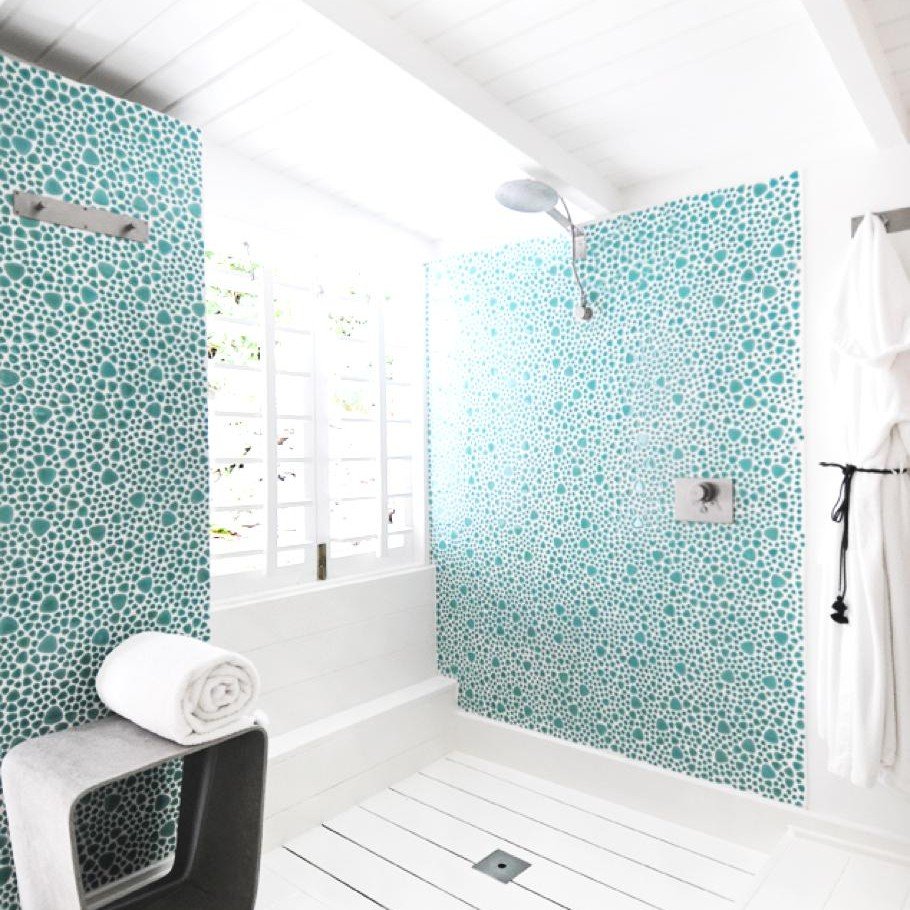
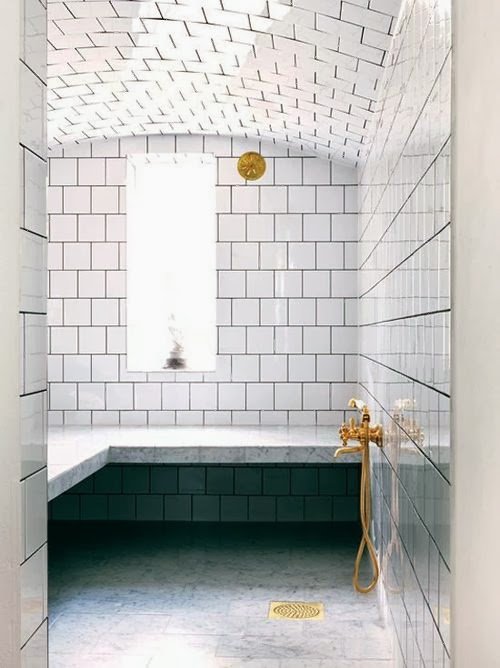
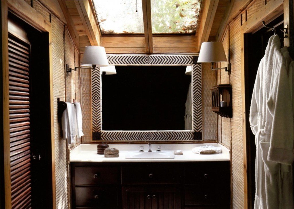
A few weeks ago I went to Anguilla to check in on one of my projects. The build is going very well.When I think of the mood for a beach house, the first thing that comes to mind is relaxation.I've been looking at books in my library and pulling images from the internet for inspiration. The bathrooms don't have to be from a Caribbean beach house but must have some elements that would work in that environment.There are many decisions that have to be made. What kind of finishes? What color? If we use tile, what size?While this is a house in Anguilla, the style will not be British Colonial. It's too formal for a beach house. There will be touches (like a mahogany four-poster bed) of course but mixed with a contemporary spin on Caribbean design.Below are few spaces that caught my eye:This bathroom is from a home on the tiny Island of Mustique. I love the natural feel of it. We're already using poured cement for the kitchen counter tops. To use it again in the bathrooms might be too much.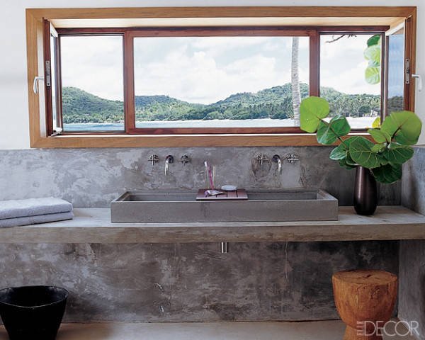
Photo: Elle Decor
This large en-suite bathroom in a Sicilian villa has a stone sink. Love the simplicity of the shower stall and the use of wooden stools. This is a newish boutique hotel. I must see Rocca delle Tra Contrade in person. The photos are stunning.
Photo: Rocca delle Tre Contrade
I'm not a fan of shower caddies.
Our clients for the Tuscany project were very clear that they wanted built-in spaces for shampoo, soap, etc. If it's early enough in the build/renovation, I recommend going in this direction. Just make sure there's a slight slope, so water doesn't pool in the space.
A partial wall works for this project. It never gets cold.
Photo: Elements Of Style
Getting away from the neutrals for a minute, this bathroom from the La Banane hotel on St. Barths is very bright and colorful.
A fun design like this might be a great idea for one of the smaller bathrooms. Or the powder room. In a large space this color and pattern would be not be relaxing to me.
Photo: Villa La Banane
Brass fixtures are having a moment. I like them in this bathroom. I look at all this tile and worry about cleaning the grout.
Photo: Habitually Chic
I LOVE outdoor showers. The ones at Cap Juluca in Anguilla are fantastic.
Photo: Cap Juluca
A more traditional style at Oscar de la Renta's former home in the Dominican Republic.
A shower in Marrakesh. Fantastic built-in bench.
Photos: Mark D Sikes
I don't know where this house is but I like the contrast of the stone-tiled floor with the black contemporary trim on the windows and with the lines of the tub.
Photo: Pinterest
It's All About Sicily In Fathom Magazine
The award-winning Fathom Magazine is celebrating Sicily this week. I'm trilled that I get to join in the festivities.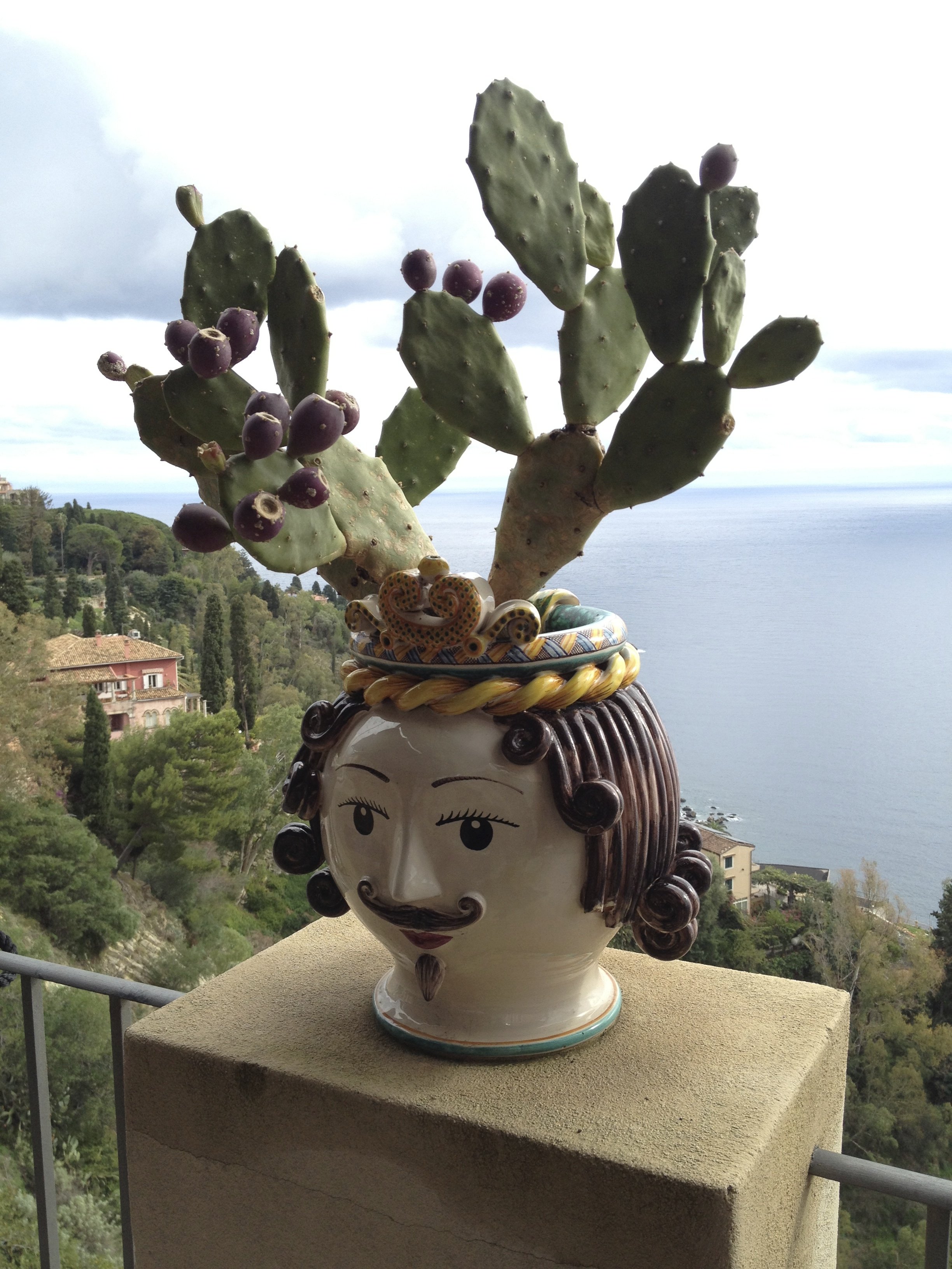 My article is about Sicily and the solo traveler.When I booked my trip, I didn't think it was a big deal that I was traveling alone. Then once everyone and their mother kept saying, "Wow, you're going to Sicily by yourself?!", I started to get nervous.You can read about my Sicilian adventures HERE.The entire series is fantastic. I want to book a trip now.
Weekend Insipiration - Have A Seat - Viceroy Hotel - Anguilla, British West Indies
How funky are these chairs?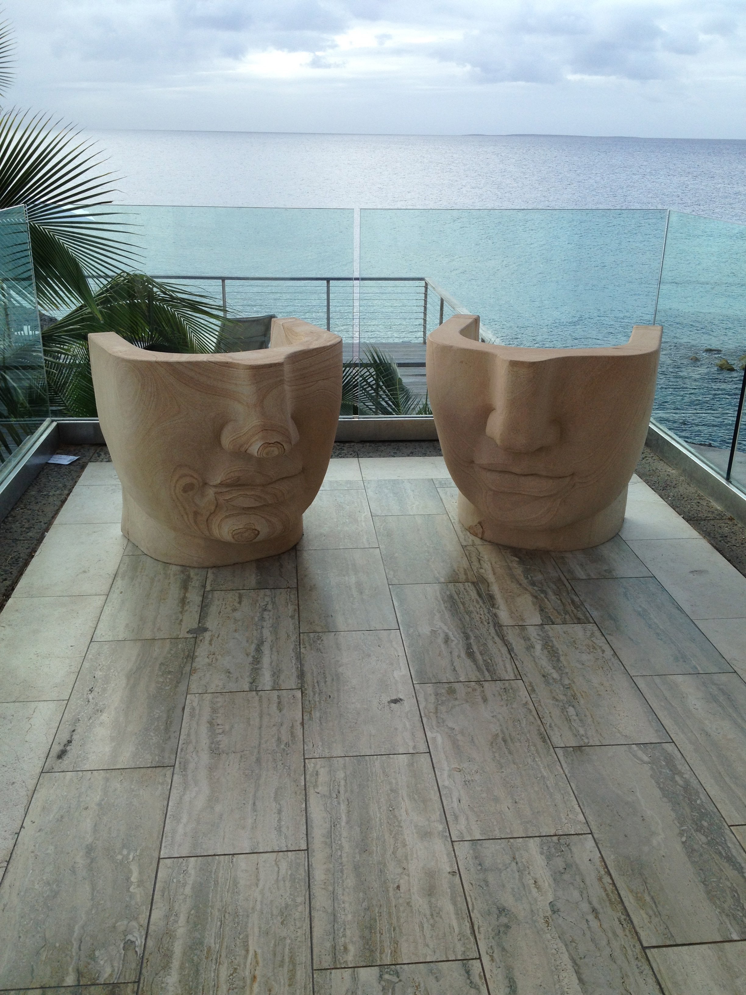 I am a big fan of Kelly Wearstler's commercial work, yet the Viceroy in Anguilla took me by surprise.A few years ago I met clients for a drink at the bar. At first, when I walked in, the décor seemed so "uncaribbean" to me.Then I walked around. It IS very Caribbean. Wearstler's use of natural materials, her color palette, and the subtle nod to more tradition Caribbean design makes the Viceroy one my favorite hotel spaces.This hotel is huge and could easily feel very corporate (thinking of a certain hotel on the Dutch side of St. Maarten that ruined one of the best beaches on the island).Instead it's unique and jaw dropping gorgeous.Not a bad place to meet for drinks, especially with a locals' discount.I have more meetings this weekend about my Caribbean project.Feeling very inspiredBuon weekend!
The Tuscany Project
Last year I wrote about the vacation home in Tuscany I'm working on with architect Domenico Minchili.Our clients had some photos taken and below are a few of them.First, a before shot of the living room.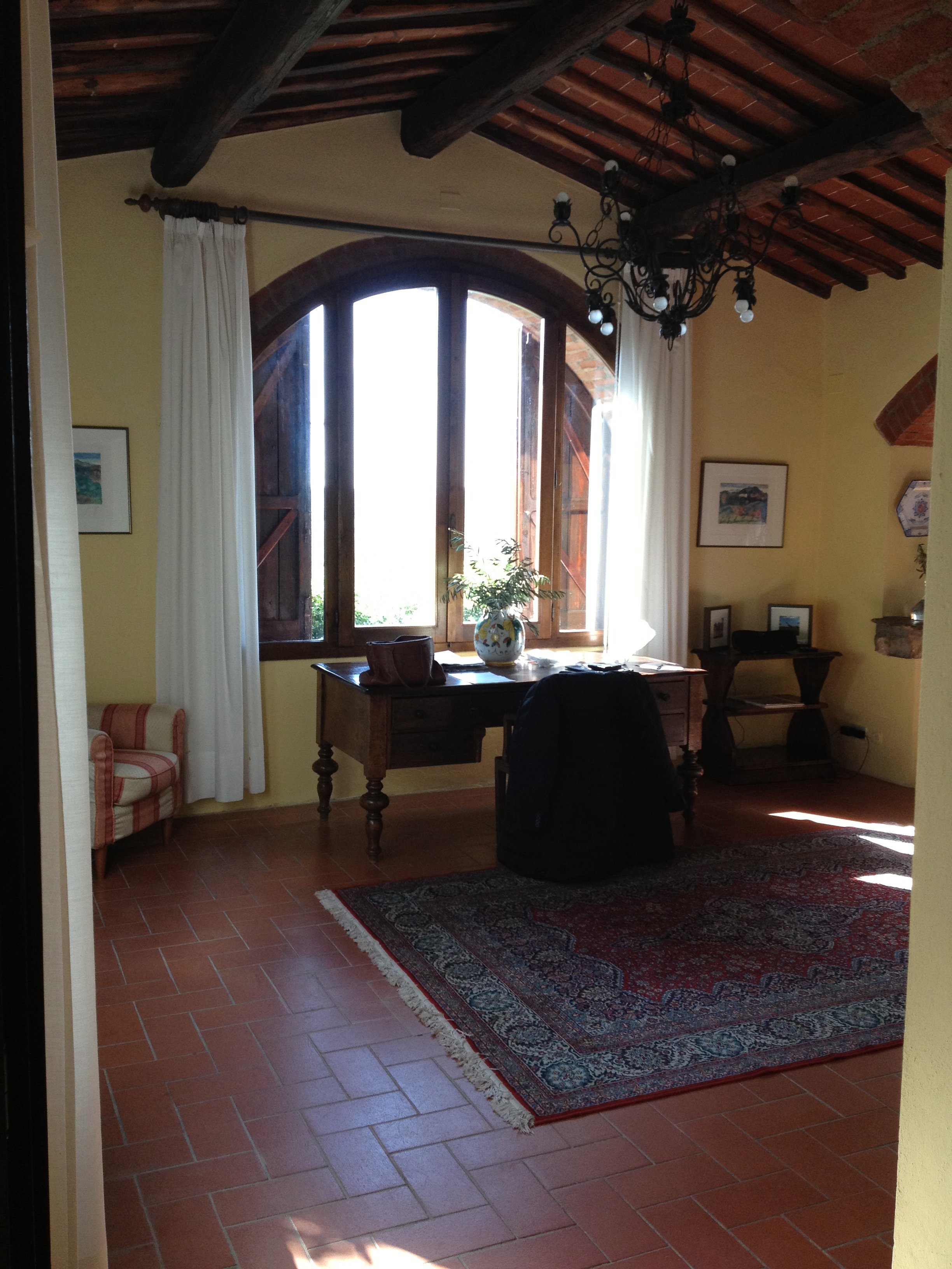 After.The room is so much lighter. The new "old" floors make a huge difference as does the paint color. I was consumed for days regarding which shade of Farrow & Ball white was the best white for the walls. We decided to use Skimming Stone.The chairs were custom made by Tondini & Radicchi. So were all the draperies in the house.
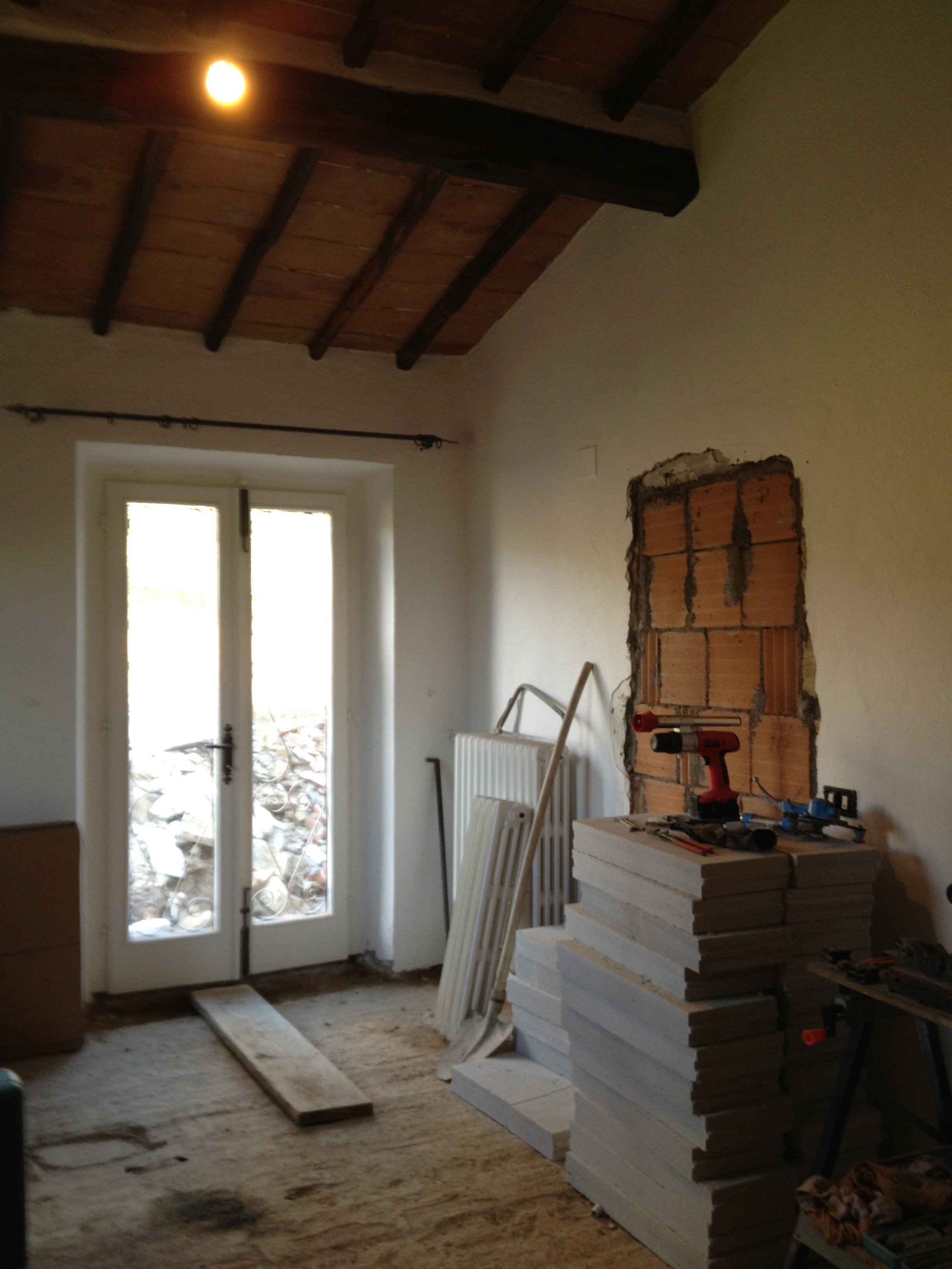
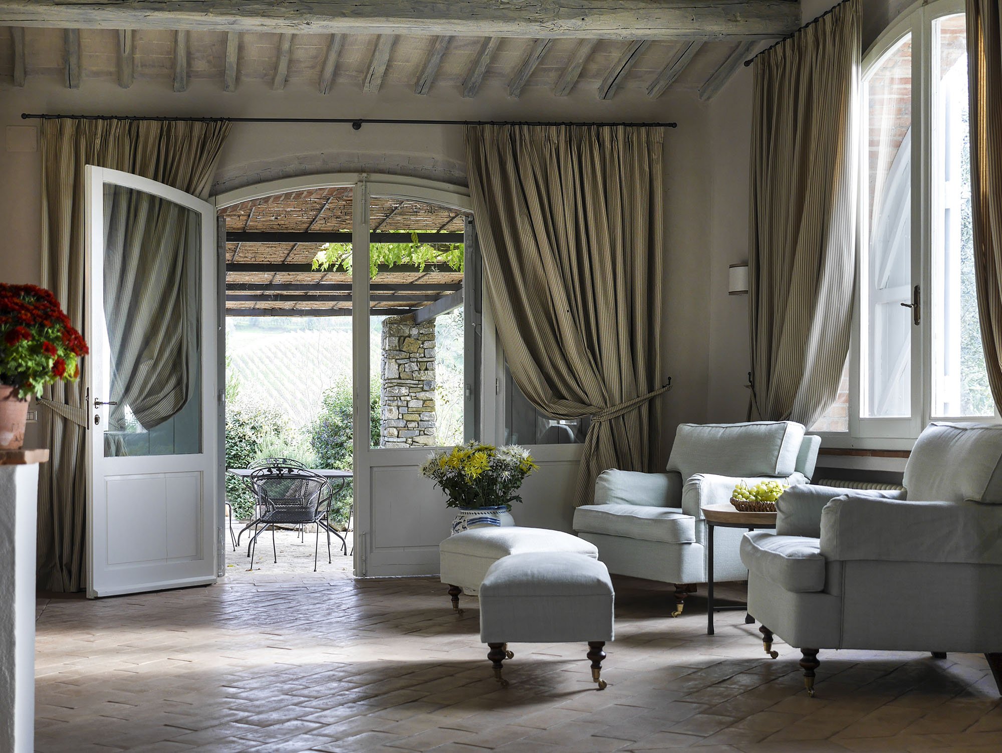 One of the bedrooms mid-renovation.
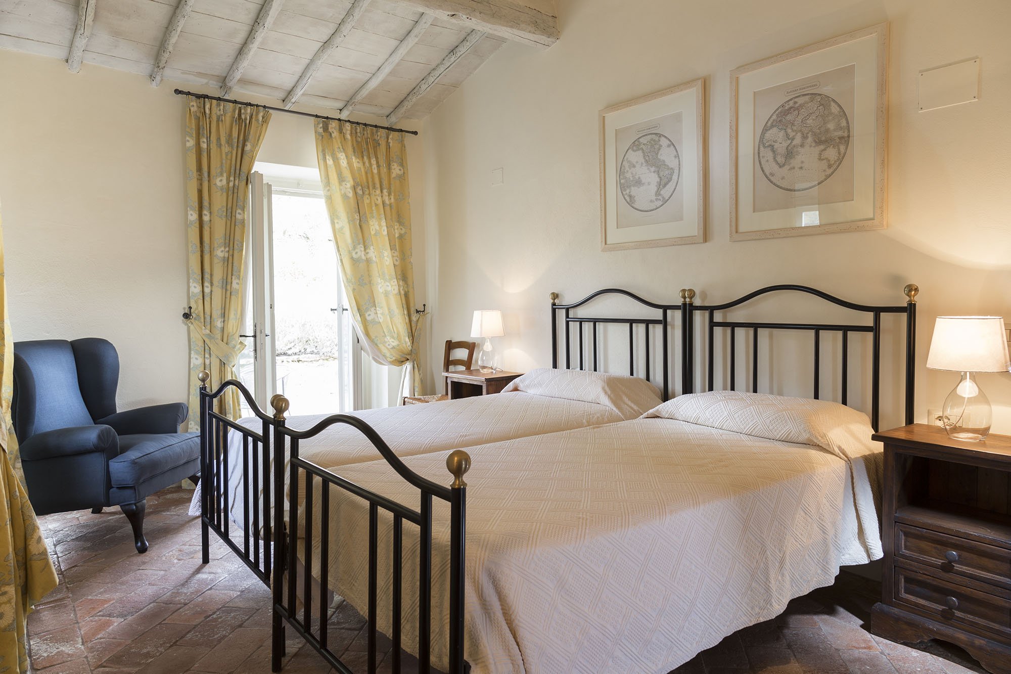
 After.
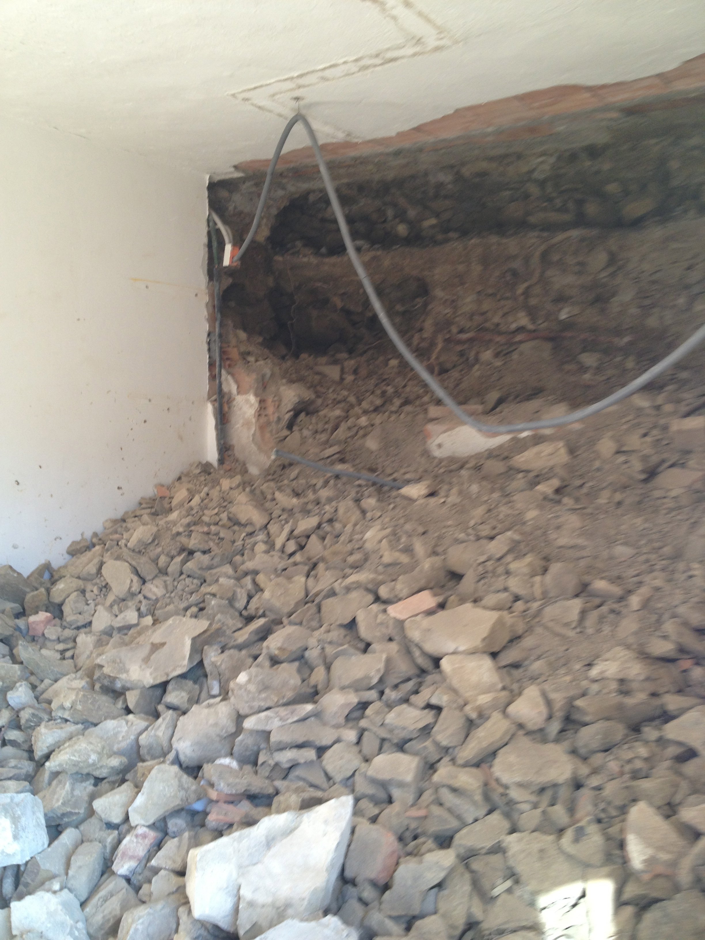
 A bathroom before.
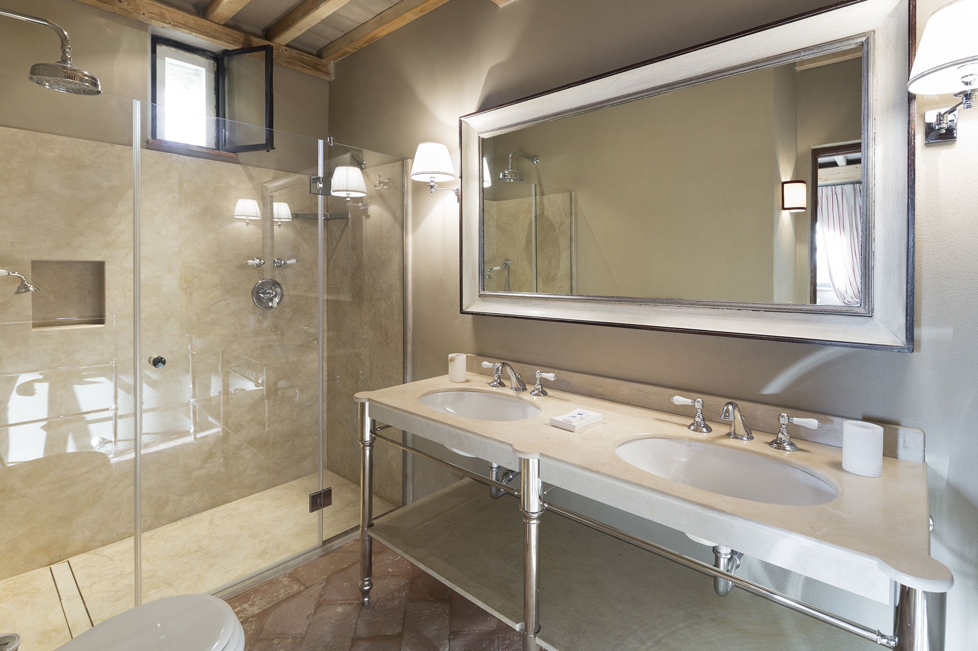
 After.
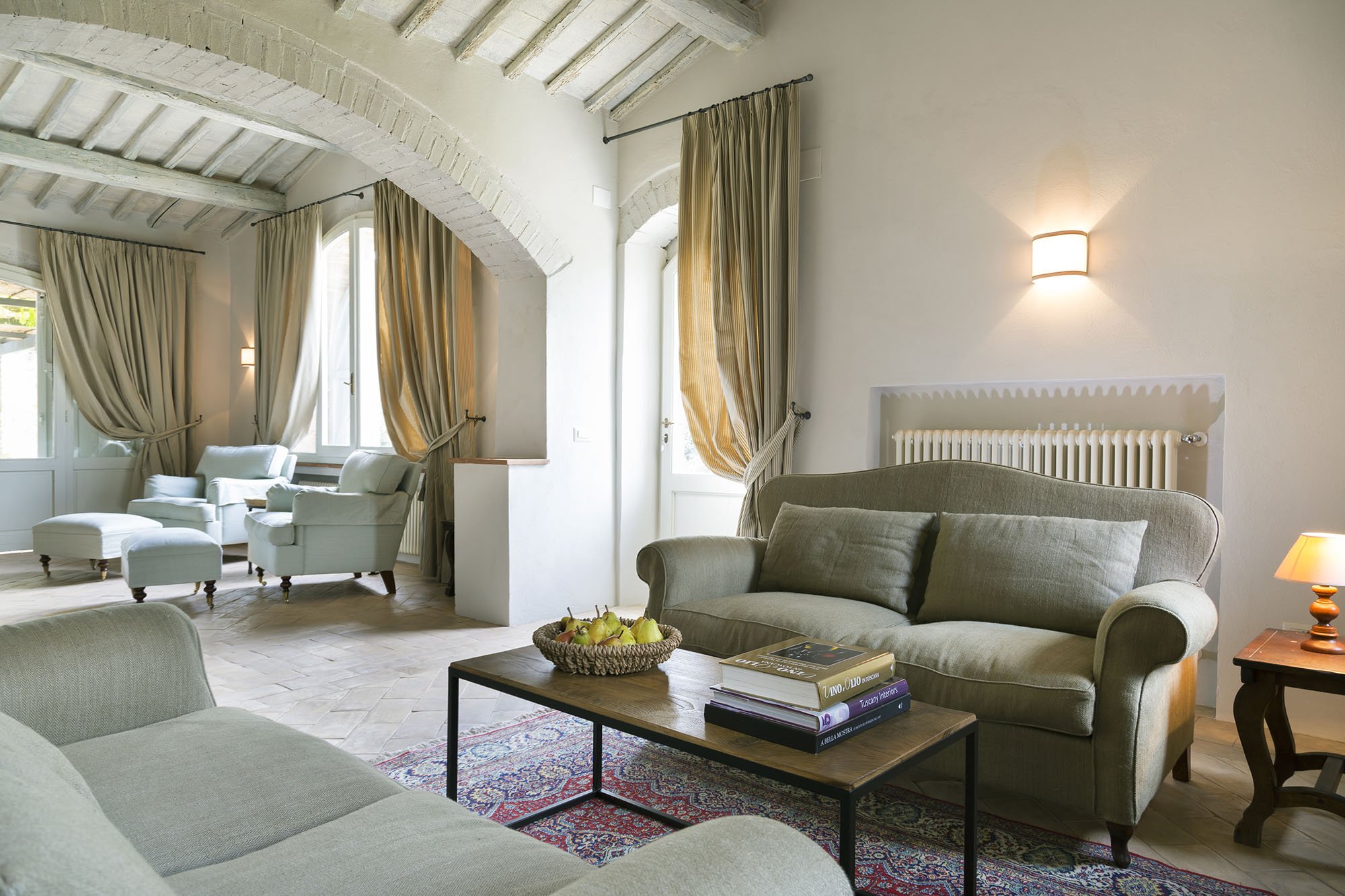
 Wider shot of the living room. The sofas, coffee table, and sconces are custom.
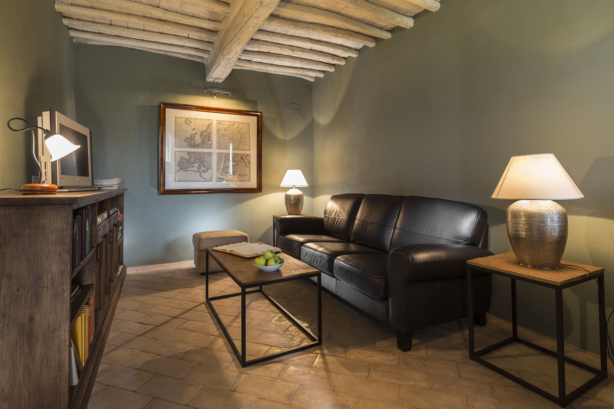
 The studio.This room receives little natural light. Many people assume that a small dark room must be painted a very light color in order to make it look bigger. Not true. It seems counter-intuitive but going darker gives a small room more depth.
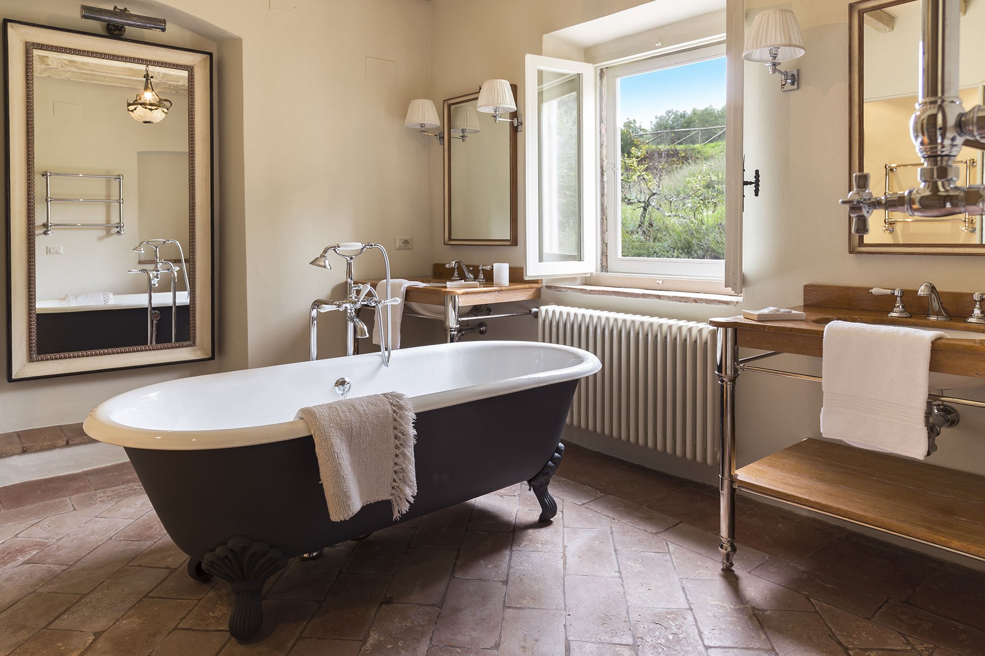
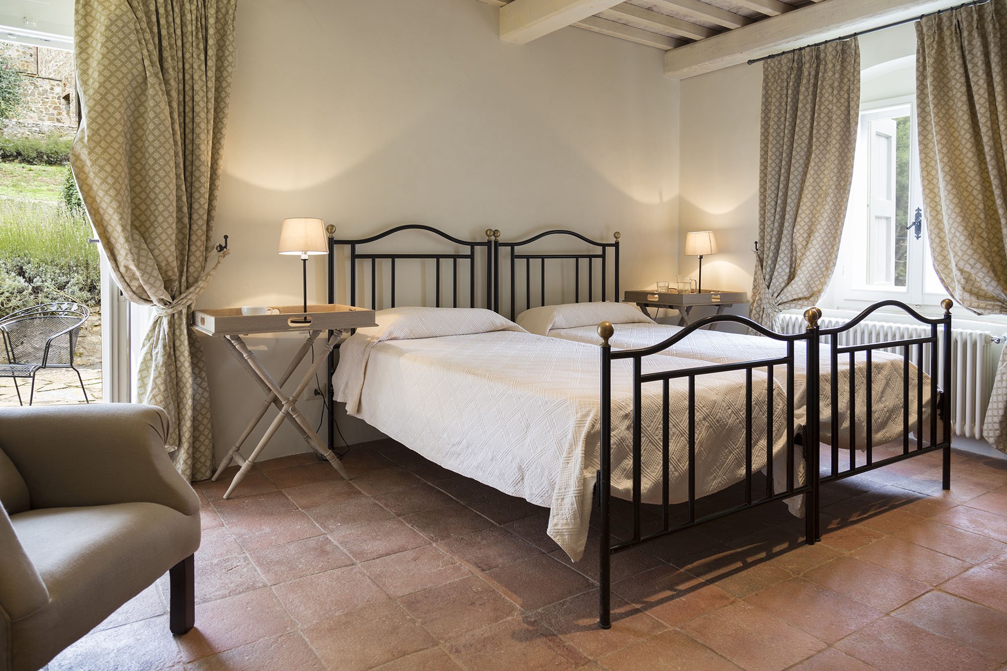
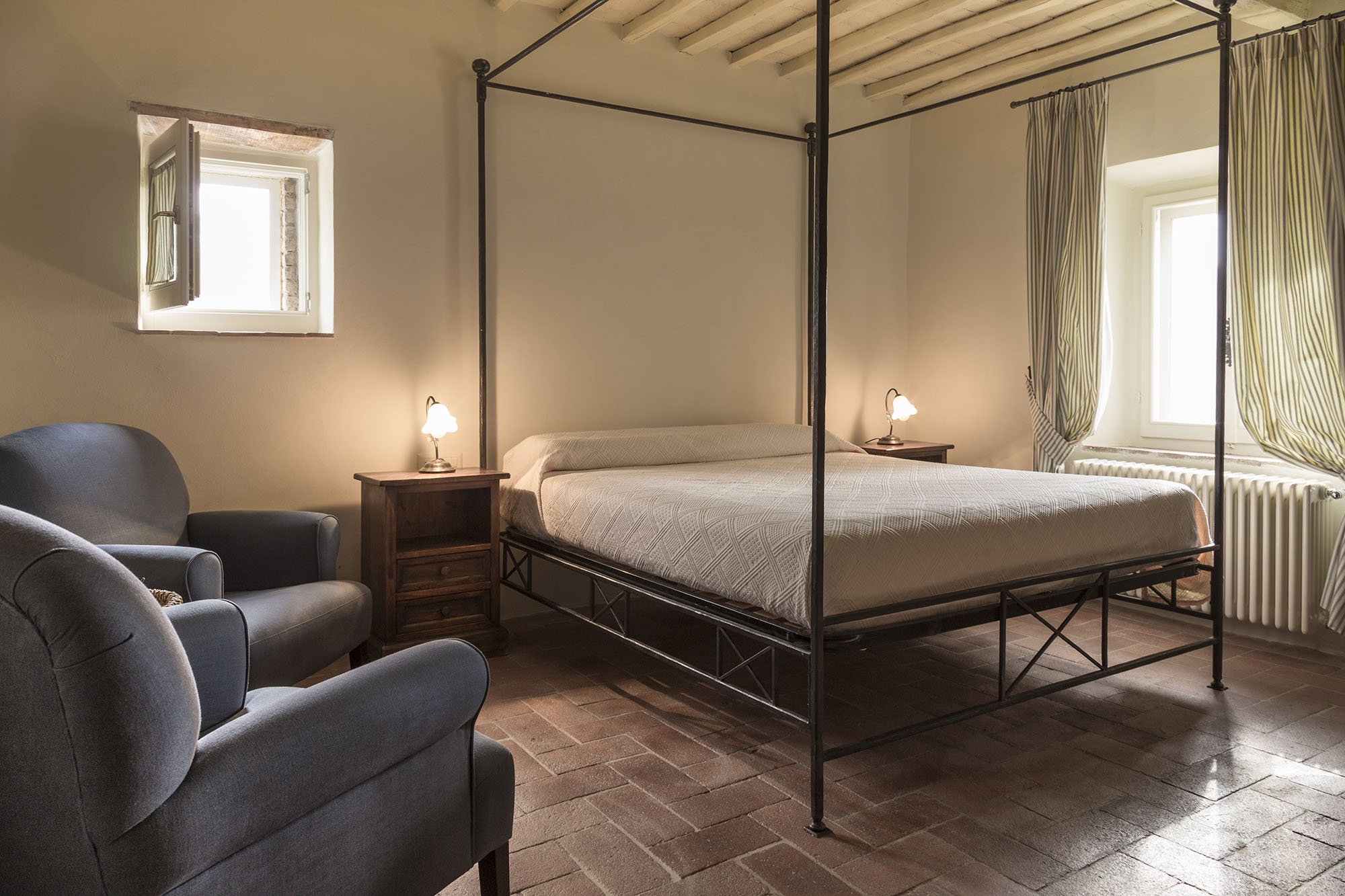
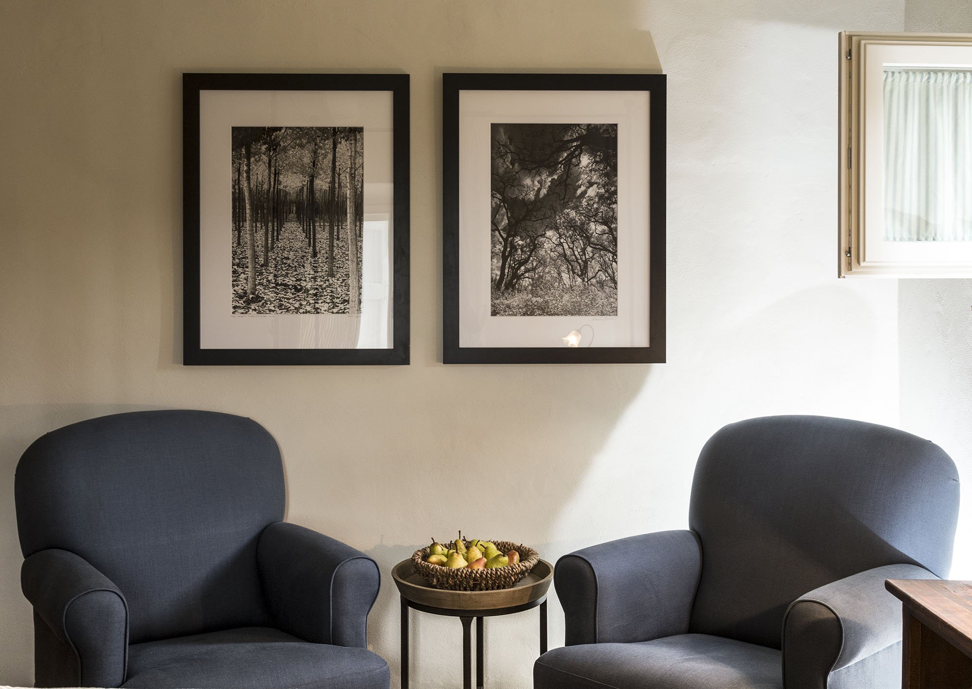
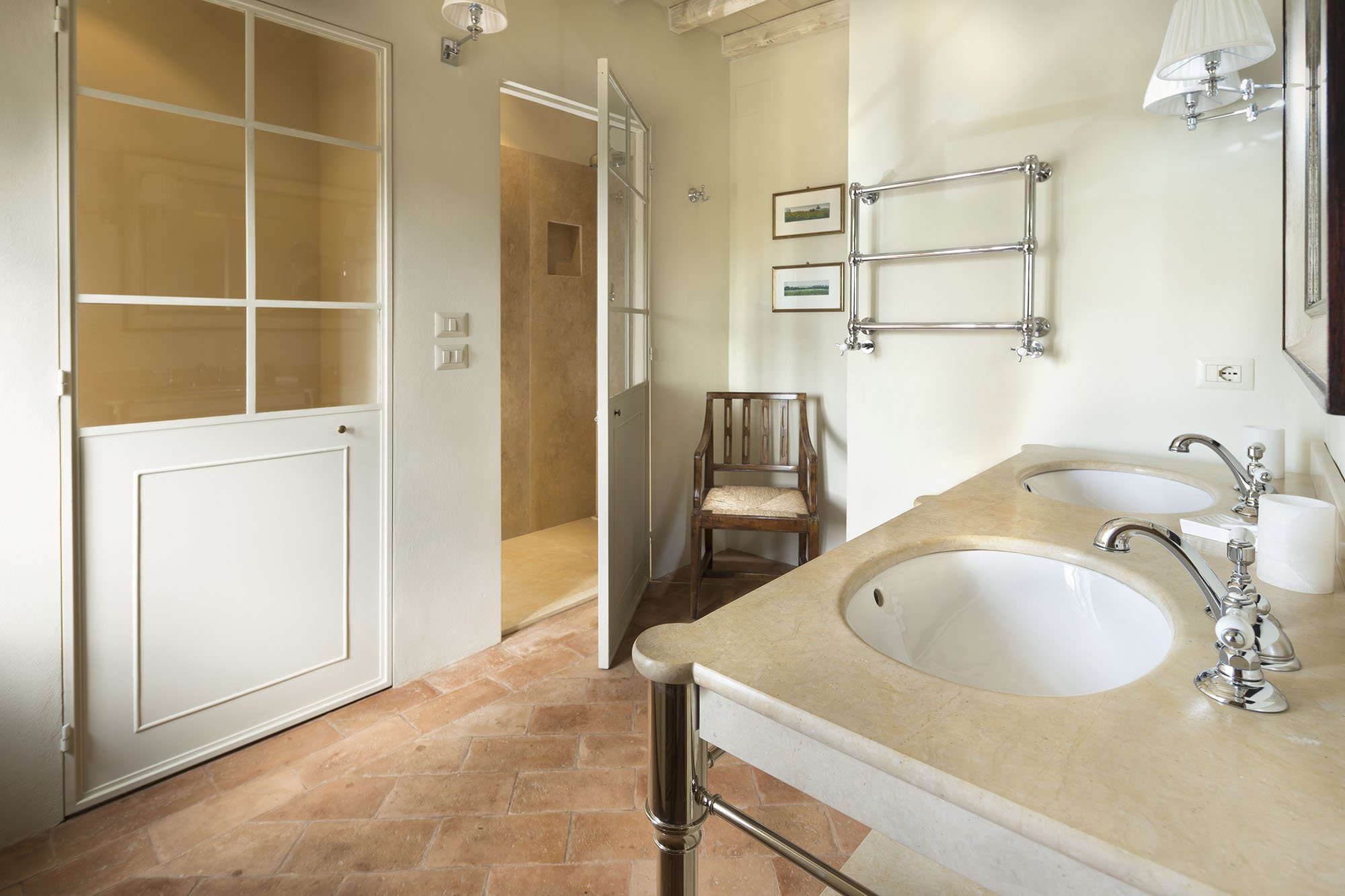

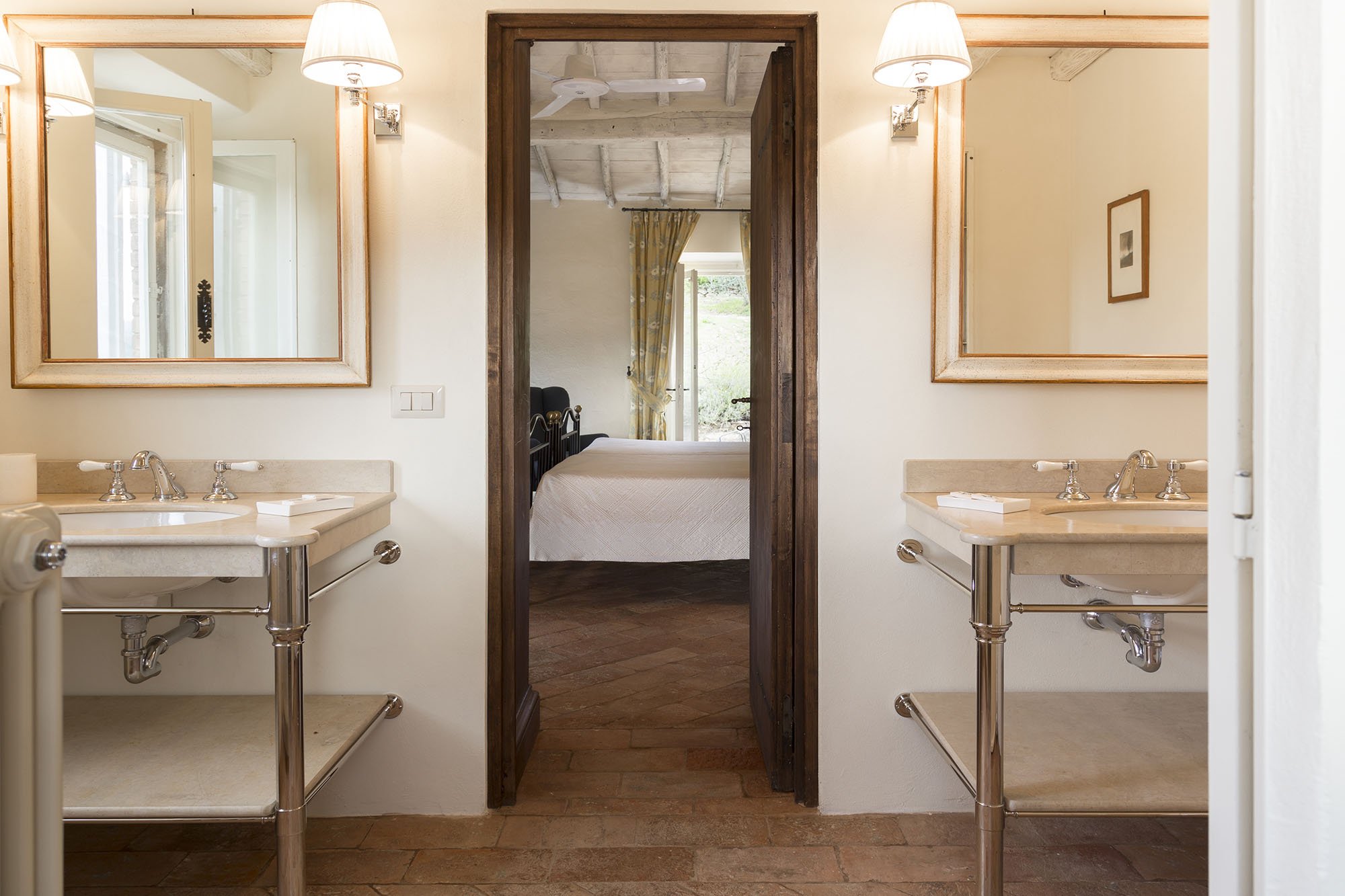
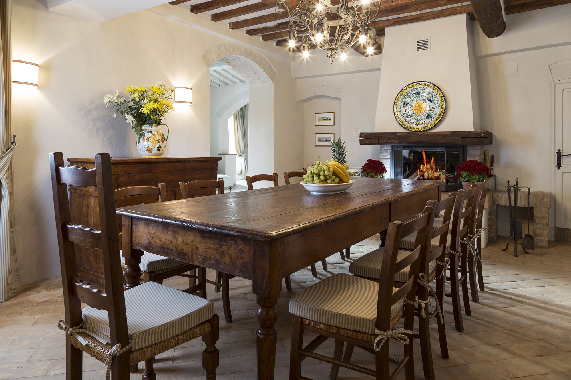
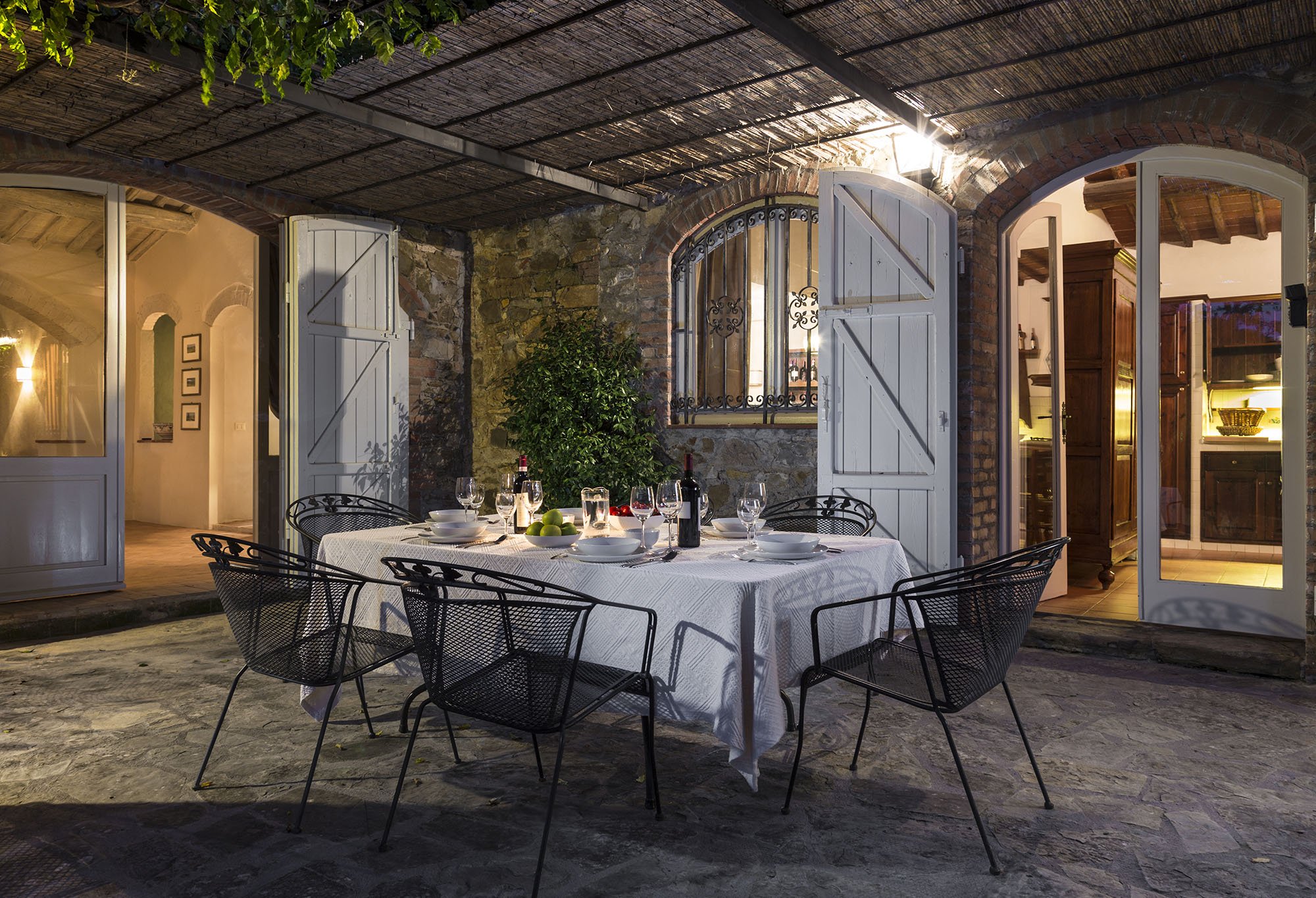
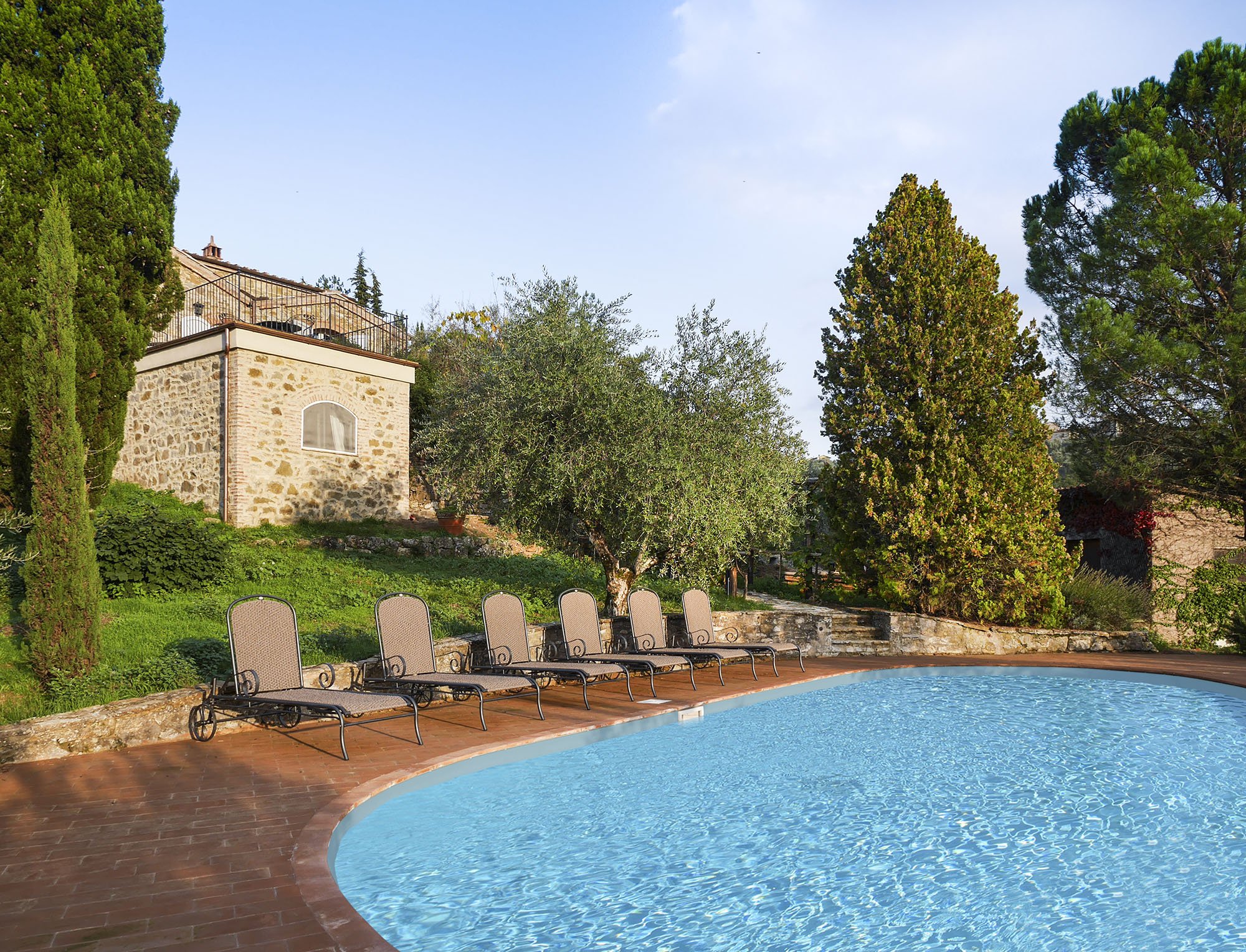 One of my Italian friends called this décor, "Relaxed Chic." Another friend said it was "Casual Luxury." Both work for me.Every bedroom, and its bathroom is unique, yet the entire home is cohesive.The paint is from Farrow & Ball.Most of the new furniture was custom made. We also sourced pieces from Flamant, Barthel, and small shops in Rome and Tuscany.Our fabric sources were, Dedar, Ralph Lauren Home, Kathryn M. Ireland, and Pierre Frey.If you would like to know the specific colors or more information about the fabric or furniture, please feel free to ask me in the comments section.This property is available for vacation rental. It's in the heart of the Chianti region surrounded by vineyards. The views are stupendous.For more information (and some exterior photos), please visit the luxury rental Abercrombie & Kent website.Photos by: Mario Flores
Io Adoro - Portrait Firenze - A New Hotel in Florence, Italy
Before my first trip to Italy, nine years ago, I had to cut my vacation short. The production company I worked for decided to shut down, permanently, two weeks before Christmas. Happy Holidays everyone!I was going to scrap the entire trip but my family was very worried about my mental state and insisted I go.I decided to travel to only one city for just one week. I narrowed down my choices to Rome or Florence. One of my good friends in L.A. is a hardcore Italophile. She proclaimed that I was a Rome person and should save Florence for another trip.I've been to Florence twice. The art is stupendous and the city is beautiful. Yet each time I felt anxious and couldn't wait to return to Rome. It's not as if Rome is a laid back place. However, Florence is a much smaller city and cannot handle the hordes of tourists and study aboard students.Well, I need to get over it because I must see the new Portrait Firenze. The architect/interior designer is Michele Bonan. I've written about how much I LOVE his work, especially, the newish J.K. Place in Rome.The hotel is owned by the Ferragamo family (the Lungarno Collection) and is located in the heart of the Historic Center. It has only thirty-six rooms and killer views of the Ponte Vecchio. It's scheduled to open this spring.Look at that view. Love the soft relaxing colors. Those green lamps? Must track down.
 Sigh. No words.
 I need to be here with my man, enjoying the Franciacorta.
 Pocket doors. Dark wood. Look at that ceiling.
Photos: Lungarno Collection
Porter Magazine - Let's Rejoice
Everyone (who is everyone, really?) says print magazines are so over. Dead. Morte. It's all about the online space.Sorry, but I still adore magazines. I prefer to hold a magazine in my hands rather than read the same content on the computer/iPhone.I'm very curious about the new magazine, PORTER, from the online powerhouse, Net-A-Porter. They didn't have to create a print version of the magazine. I'm glad they decided to. It's interesting that PORTER will shoot clothes by designers that are not available on Net-A-Porter, such as Chanel. To me this (along with feature articles about traveling, design, the arts, tech, etc.), sends a clear signal that PORTER is going to be a proper magazine, not just another venue for online shopping.It will be sold in sixty countries. While the company is based in London, the magazine is written in American English.Given the consistently awful news about the state of print media, I'm excited to see Net-A- Porter take this risk.I cannot wait to get my hands on it.
Stylish Simplicity - Palazzo Mirror by Julian Chichester
I love decorating with mirrors. That said, I'm a little over the sunburst ones. They are everywhere.I was looking for a mirror for a client, when I saw this beauty from one of my favorite furniture designers, Julian Chichester. This London-based designer has so many pieces I would love to have in my home. I don't own a palazzo but I think this mirror would work in a variety of décors.The eglomis frame is stunning and not ornate. This is truly stylish simplicity.
Io Adoro - Michelle Dockery and Lupita Nyong'o
We are smack in the middle of the Hollywood awards season. For fans of film, and/or fashion, these are glorious times.Every season, a few people really stand out. Some, unfortunately, stand out for all the wrong reasons and then there are stars like Michelle Dockery and Lupita Nyong'o.These two actresses have been killing it on the red carpet.I wasn't surprised to find out that they share a stylist, Micaela Erlanger. This has been a break out season for her as well.I love that both woman wear clothes that fit their personalities. Sometimes on the red carpet it looks like the clothes are wearing the star.While it's true most of the clothes are borrowed, there's still no excuse for ill fitting garments. One thing I've noticed with both Michelle and Lupita is the fit of their clothes. Perfection.How beautiful is this Oscar de la Renta dress? On someone else it could've seemed too old fashioned but Michelle's make-up and accessories keep it fresh.
Photo: OscarPRGirl
The detailing at the neckline and the color of this Gucci dress is stunning. It's a great color for Lupita's complexion.
Photo: E! online
I'm very curious to see what they will wear for the Oscars.
Weekend Inspiration - Cate Blanchett in Blue Jasmine
I recently saw Blue Jasmine. Cate Blanchett is so outstanding, you forget the plot holes in the movie.I haven't seen all the other Best Actress nominees' performances yet but if Cate wins the Oscar I wouldn't be surprised.The wardrobe was amazing as well. I read that the costume designer, Suzy Benzinger, had a budget of only $35,000. Most of the clothes were borrowed and every time Cate dropped the Birkin (which belonged to Benzinger and cost more than the entire budget) on the ground, people on set gasped.Beautiful Chanel jacket. Poor Jasmine. She was bananas.
Photo: Collider.com
How stunning is this red Carolina Herrera dress? Love, love, love, it!
Photo: indiewire.com
Stylish simplicity in a linen dress by Façonnable.

Photo: NY Daily News
I have a completely different build from Ms. Blanchett. I'm not sure how any of these clothes would look on my short self, but I can dream about the accessories.
Buon weekend!
My Word For 2014 - Crescere
Happy New Year!Last year my word was, "si."I took some risks (professionally and personally). I learned a lot and I'd like to keep this momentum going. The Italian word for "to grow" is perfect.Other words I considered:Chevron - I don't care what anyone says. This print is a classic and will never be out of style. Idris Elba - Okay, that's two words.[youtube=http://www.youtube.com/watch?v=WLFwuCs8IwY&w=420&h=315] Jon Hamm - Two more words. The interview starts at 3:41[youtube=http://www.youtube.com/watch?v=rOP9OMmAiRU&w=560&h=315] Do you have a word for 2014?
"Ornament, ornament, ornament!"
My sister, Daniella, is ten years younger than me and six years younger than our brother, Gerry. We were old enough to remember the day our parents walked into the house with a new baby. She had a fine pair of lungs.Later that night, my ten year-old self was annoyed. Sure Daniella was an adorable baby and everything but hello, I had school in the morning. I couldn't sleep with all that noise. I may have said something to my mom who gave me the classic Caribbean mother "you better stop with your nonsense" face. I stopped.I was in high school when Daniella started kindergarten. Laning Avenue Elementary School had a Santa's Workshop where kids could buy Christmas gifts for their family and friends.Gerry and I would take our gifts from under the tree, unwrap them and say loudly, "ornament, ornament, ornament!" as every year from kindergarten to fifth grade that is what Daniella gave us. My parents still have those ornaments.I think it started with Gerry, who said, "oh look, it's another ornament. Ornament, ornament, ornament!" I have no idea why we found this hysterically funny.Years later during the first Christmas day we spent with my future sister-in-law and brother-in-law, I busted out with the ornament thing (it really was an ornament) and my siblings and I lost it. My in-laws to be glanced at each other, "what's wrong with these folks?"I don't have room in my apartment for even a Charlie Brown tree, but I could buy an ornament or two.Here are a few that caught my eye:Reindeer! Love the scarves. Very snazzy.
A classic bullicante glass ball ornament from Tiffany & Co for those with more champagne tastes.
I don't like mice at all but how charming are these ballerinas at Dédé Maison, one of my favorite stores in Rome.
 DéDé Maison: Photos by me
Great matte finish on this silver ornament.
Here are more mice with exceptional artistic abilities.
Stylish Simplicity - Williams Sonoma - Rustic Italian Platter
The holiday season is upon us. Lights have just started to go up in my neighborhood and I saw a few festive window displays this morning on Via Condotti and Via Babuino.I haven't seen any panettone movie commercials. Several friends have assured me they are coming. Excellent.One of my goals for 2014 is to entertain more. Yes, I know it's a little early to think about these things. I can't help it.My apartment is small but I had a friend, Susan, in New York City who lived in a studio that was smaller than my place and yet she had dinner parties, Oscar parties, cocktail parties, let me introduce you to my new spinning teacher parties, etc.Her space had a different layout. However, I can still be inspired by many of her fantastic ideas.My mom, like Susan, has a great selection of serving trays and platters. Some she received as wedding gifts fifty years ago.I actually enjoyed setting the dining room table when my parents had dinner parties. My mom was occupied with cooking, my dad was the bartender, and us kids were "in charge" of the table.Okay, so my mom really had the last word about what was going on the table. When I was old enough, it was my job to iron the tablecloth and the napkins. While I STRONGLY dislike ironing my sheets (it takes forever), this party prep was fine with me.The last time I was in St. Martin, one of my friends (and former boss) was on the island and stopped by for a visit. I looked through my parents' collection to find the right tray for aperitivi and thought about all the fun holiday dinners and parties. I also realized that I need to step up my platter game.This one is gorgeous. It's from Williams-Sonoma and made in Umbria.This shade of blue is one of my favorites.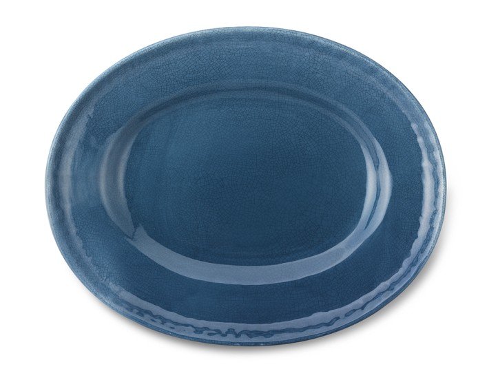 This platter is stylish simplicity.
Three Thanksgiving Floral Arrangement Ideas From Martha Stewart
I cannot believe Thanksgiving is next week! Where has this year gone?I am loving the autumn color explosion at the flower stands in my neighborhood. I want to incorporate some of those colors into interesting Thanksgiving floral arrangements.I thought, "What Would Martha Do?"Lo and behold I found the ones below on her website.Fantastic!What a creative way to use vegetables, flowers, and herbs. While this arrangement is perfect for Thanksgiving, it would also work all fall and winter. You could swap in whatever is in season. This arrangement has less of a bounty from the earth vibe and is a little more dramatic and modern. I wouldn't put it on my dining table (it would block guests' faces) but instead on the bookcase in my foyer.
 Great colors in this rustic arrangement. So warm and inviting.
 I knew Martha wouldn't let me down. To see other beautiful arrangements from Ms. Stewart, click HERE.
Weekend Inspiration - J.K. Place Hotel - Rome
This week, LONNY wrote about the new J.K. Place Hotel. Believe the hype. It's gorgeous.Months ago, one of my vendors told me I had to see the chartreuse DEDAR fabric architect/interior designer Michele Bonan used in the cafe. I finally had a chance to see it when my friend Erica and I went to meet a colleague of hers and his wife who were staying at the hotel.I told Erica we must add J.K. to our list. We are very hard on places when it comes to cocktails. It's not enough to have an excellent bartender, the décor must be on point.Erica's colleague showed us their room. I almost cried when I saw the bathroom. This one is a little larger. Look at that shower. The floors. The marble. Sigh.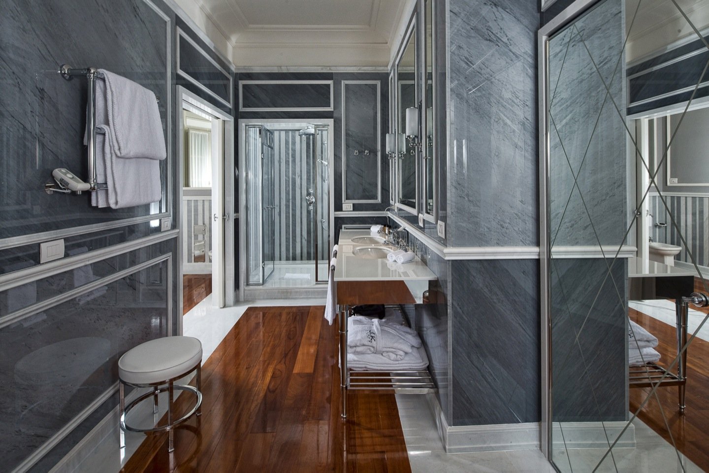 Bonan is one of my favorite designers and what he did with the space is stunning. The building used to be the architecture school for La Sapienza (the largest university in Rome).
 Inspired by Tom Ford's film, A SINGLE MAN, the atmosphere is what folks back in the States call "grown and sexy."It's a very unique space in Rome and I think the bar/lobby will appeal to people who are, well, grown and sexy. I don't see Flip-Flop Girls™ hanging out here. Grazie dio!I could spend hours in the library.
 For more pictures of J.K. Place Roma, you can click on their gallery HERE.Photos: J.K. Place Roma
Castello Di Fumone - Design Inspiration, An Imprisoned Pope, and Drowned Non Virgins.
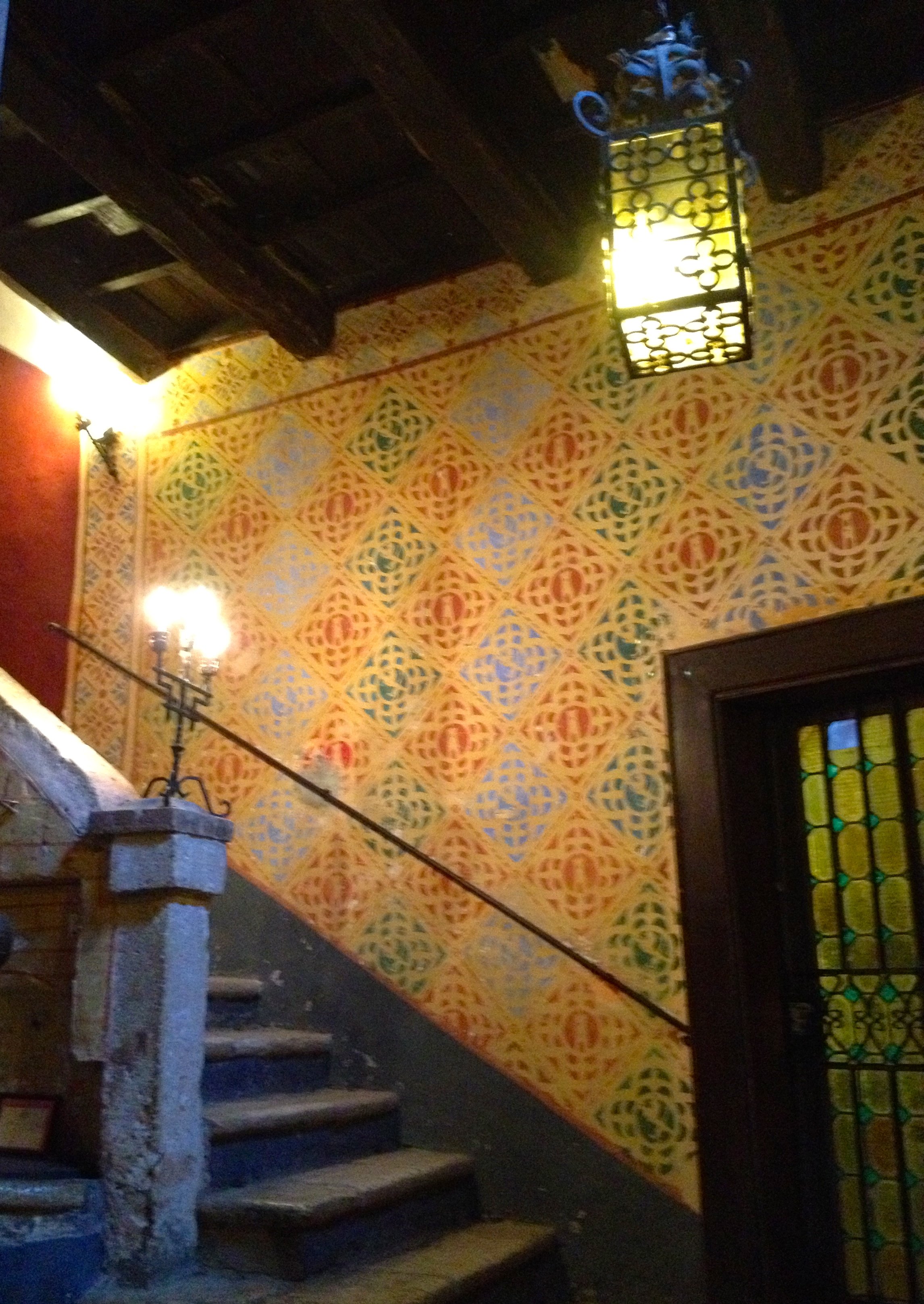
Over the summer my friend Annie invited me to spend the weekend at her in-laws. They live in Fiuggi. It's only an hour south of Rome but at least a good ten degrees cooler.I happened to visit during Fiuggi's sagra. It was outstanding. When a large group of people started to do the Electric Slide, I fell out. Seriously. Here I was in a small hill town in the middle of Italy (I saw only one other black person there) and folks were doing this:[youtube=http://www.youtube.com/watch?v=5w2Anvecs6s&w=560&h=315] Another highlight of my weekend was our trip to Castello di Fumone, (aka Castello di Longhi). The tour (in Italian) was very interesting.The castle was built sometime between 244 - 455. The name means "Big Smoke." The area was very strategic given its high elevation. Large smoke signals were released to warn towns and cities as far away as Rome about invaders.In 1584 Pope Sixtus V asked the noble Longhi family to take over the upkeep of the castle. It had fallen on difficult times. They did and brought it back to life. Members of the family still live in the castle.Castello di Fumone has one of the largest roof gardens in Europe and the views are spectacular.There were many design elements for me to savor. Annie probably got sick of me not keeping up with the group because I was too busy taking photos.How gorgeous is this decorative wall painting? It represents the Longhi family's crest and colors. I could see a very cool wallpaper inspired by it.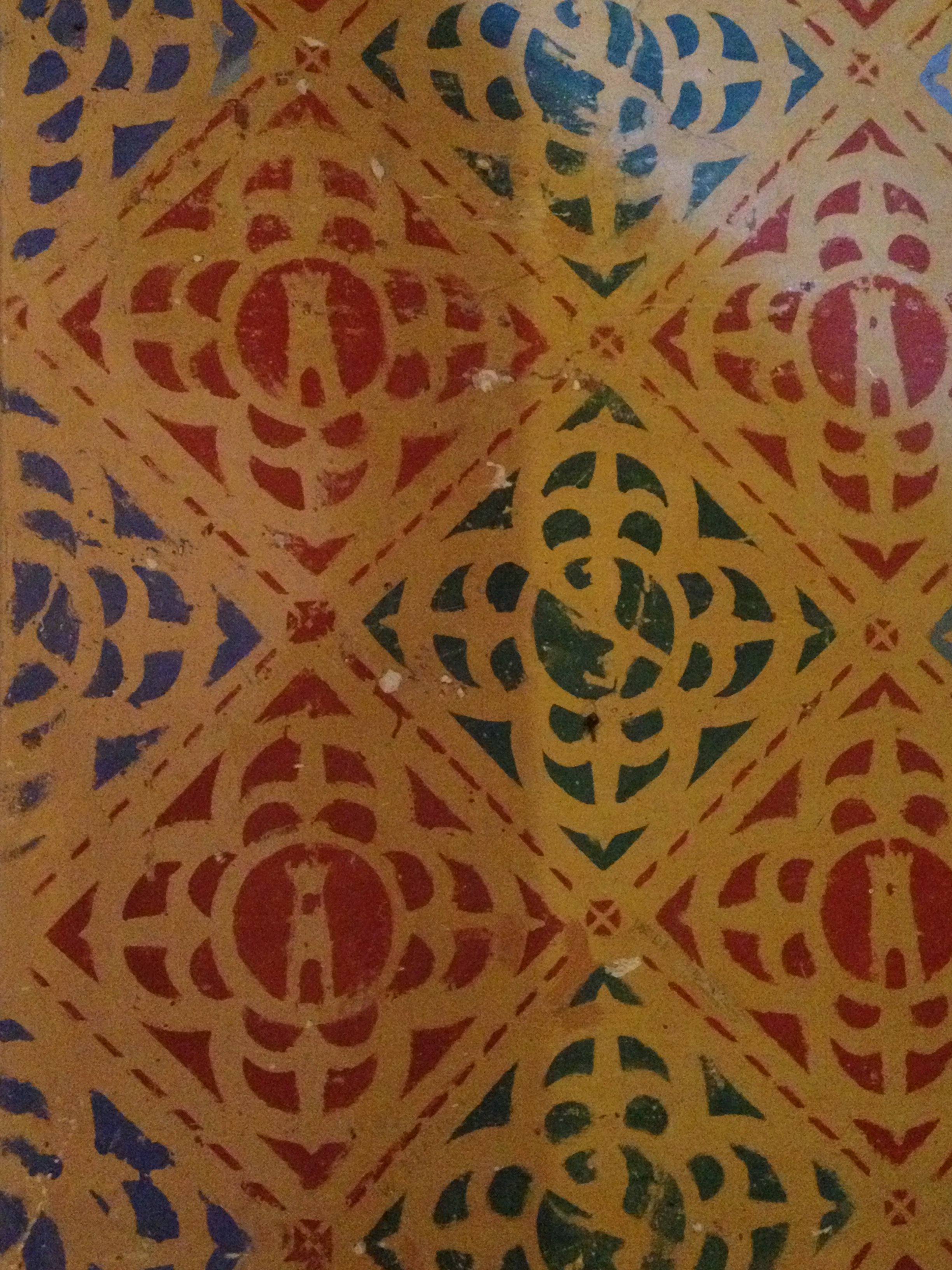
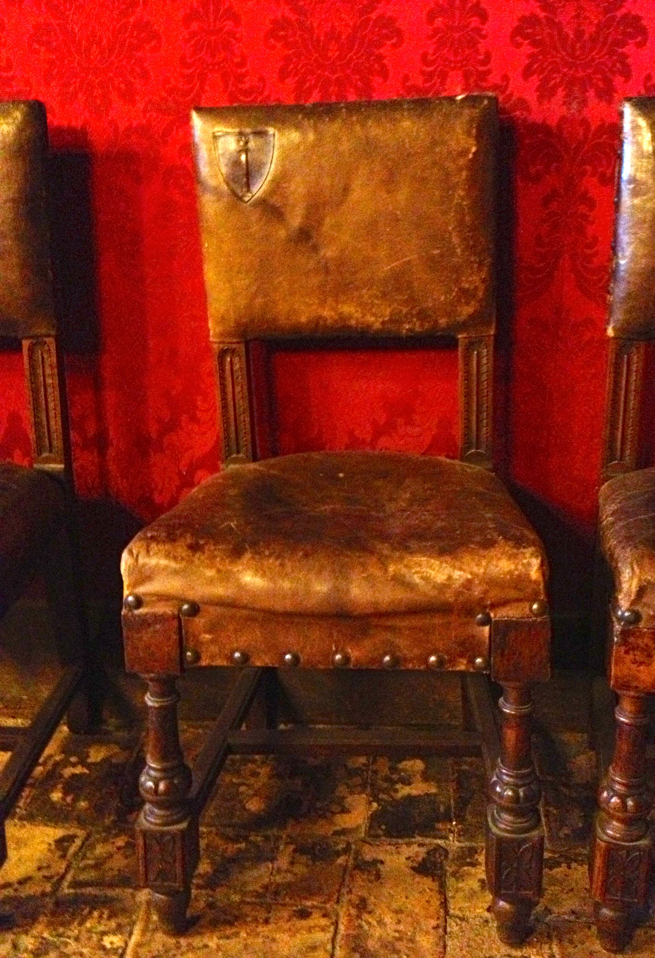
 You know one of the buyers at Restoration Hardware has a photo of this chair on an inspiration board.
 Castello di Fumone was in the news after Pope Benedict abdicated his papacy. He was the first pope to do so in seven hundred years and only the second pope to abdicate.The first pope to resign was Pope Celestine V. He was captured and locked up in a tiny cell in the castle by his predecessor. He died ten months later at age eighty-six.Annie and I could barely fit into the cell. I pictured this old man sleeping on cold stone floors. I guess his fate was better than the man who was buried alive in the castle walls.Thanks to my excessive photo taking, I miss part of the tour in the archives room. It was for the best. Annie filled me in later.In the 1800s Marquise Emilia Caetani Longhi had seven daughters. She and her husband then had a son, Francesco. His sisters, worried that they would be cut out of their inheritance (everything would go to the male heir), slowly poisoned him to death. Nobody knew how he died until years later when one of the sisters confessed upon the death of her parents.It is said that the ghosts of Francesco and his grieving mother can be heard wailing throughout the castle.His body and some of his personal items are kept in a wooden cabinet.Warning: Photo of a mummified toddler below.This freaked me out.
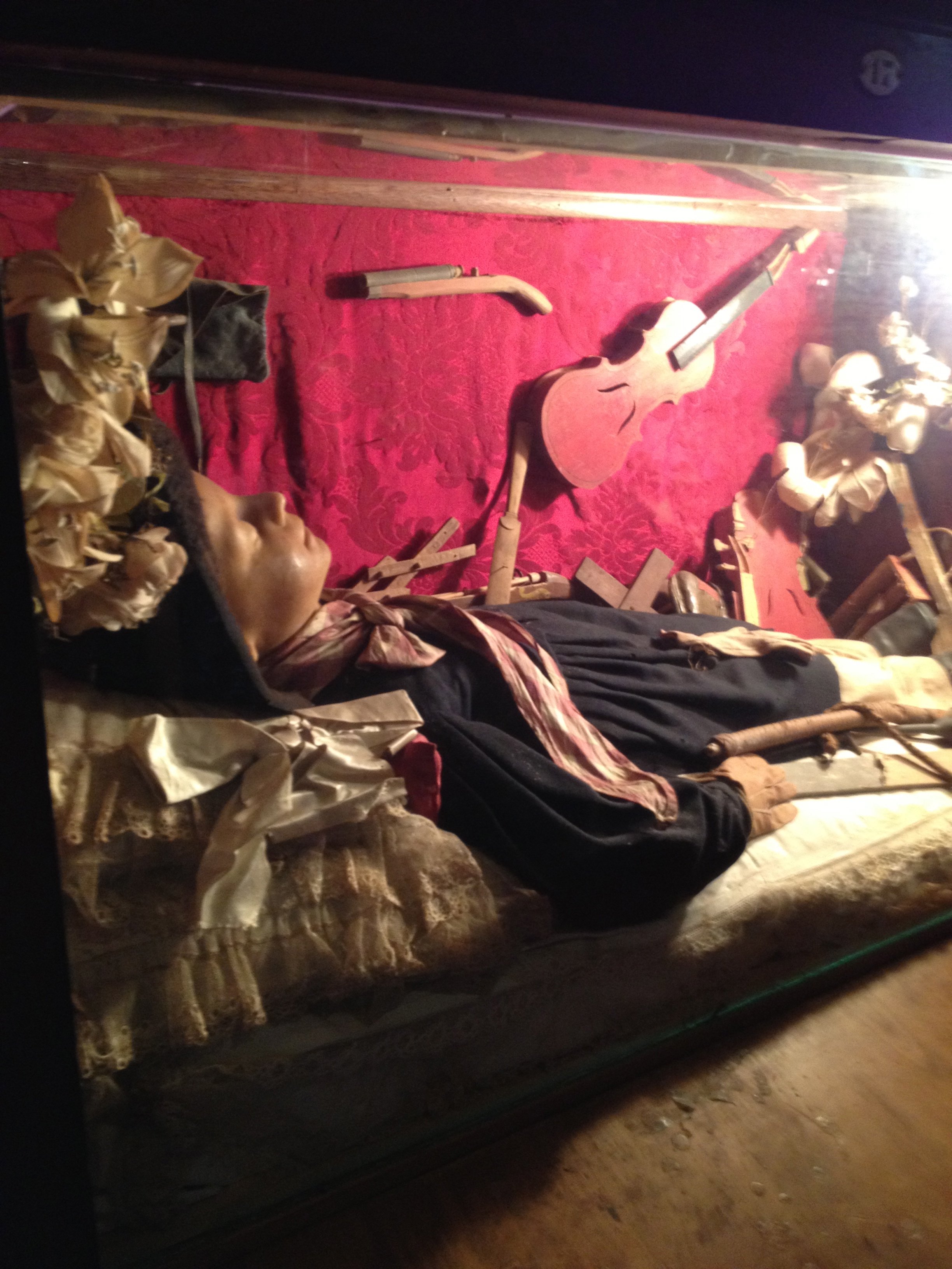
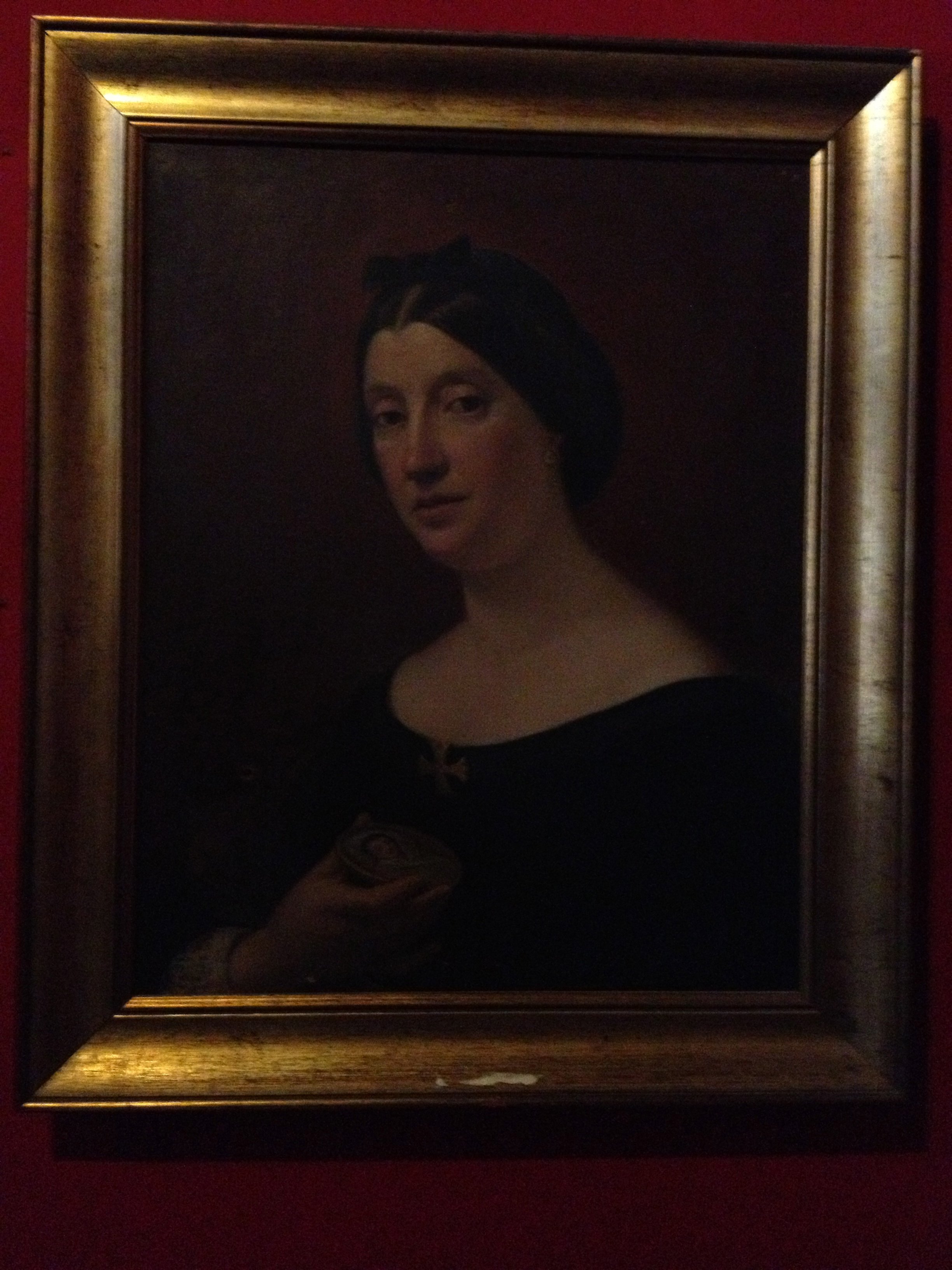
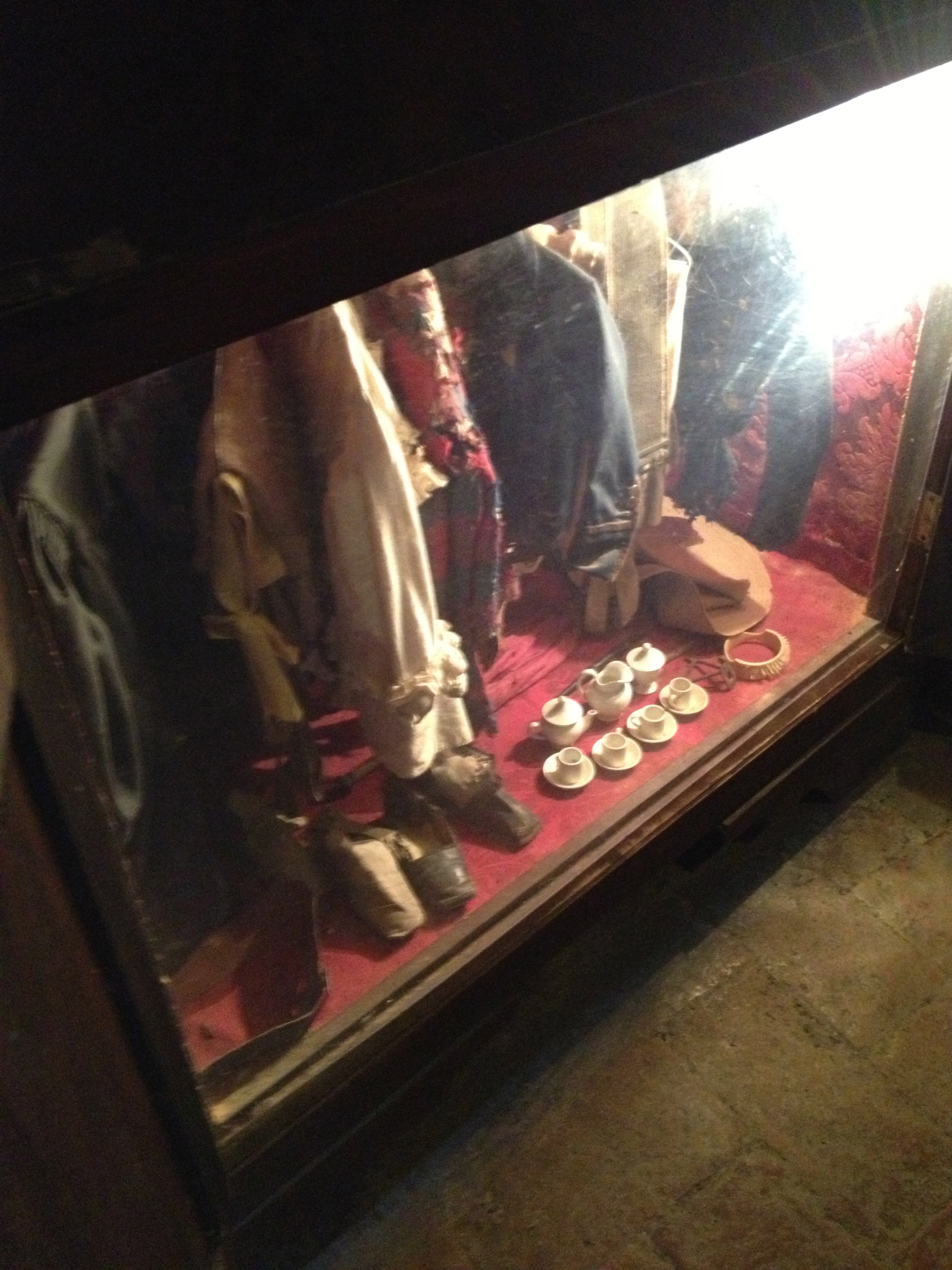 Portrait of Marquise Emilia Caetani Longhi
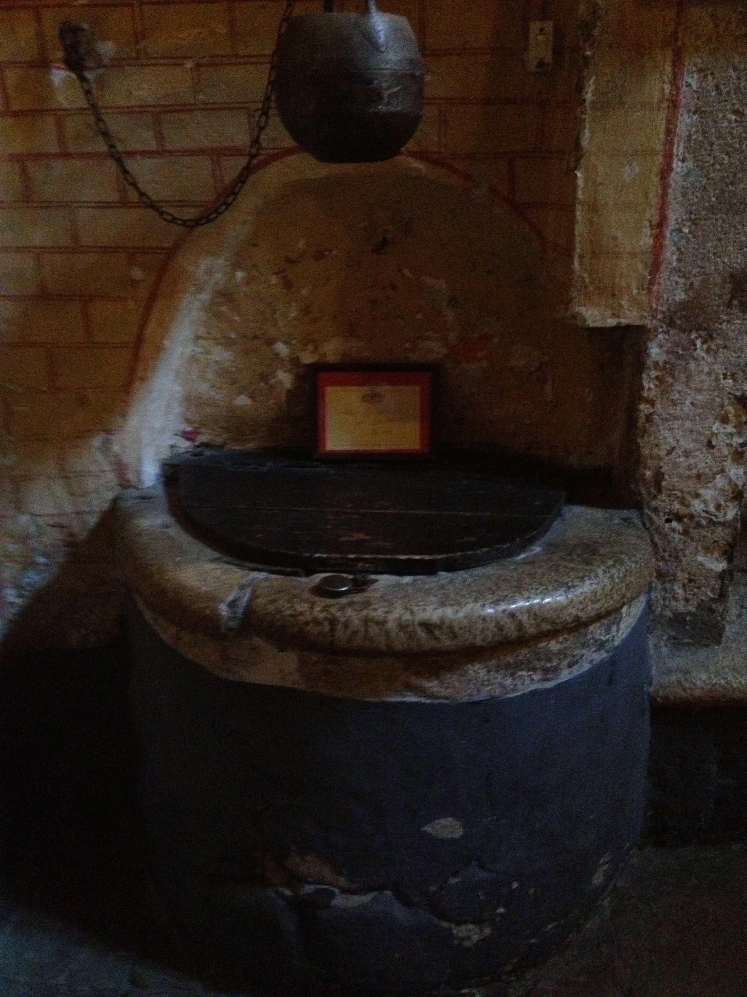
 I thought after hearing about poor Francesco, that would be it for gruesome stories and we could return to a discussion about all the incredible art.That was not the case. I noticed a well when we first walked into the castle. I asked Annie about it and she said all would be explained later.Apparently, back in the day brides had to see the Baron of the castle on their wedding night. If they were not virgins (how the Baron would know/find out this information, I have not a clue), they would be thrown down the well. WHAT IN THE WORLD?!
 There is a lot of history (and shenanigans) inside the walls of this castle. Thanks, Annie for the organizing the trip!
Life In Rome - Interview And Photo Shoot with Gina Gomez
I do not like having my photo taken. Correction, I'm game when I'm in a group shot.It's not just because the camera adds ten to fifteen pounds. It's because I feel like a big dork standing there while the photographer snaps.Thanks to social media, I had to get over my discomfort. That said, I still get salty when unflattering photos are tagged on Facebook. What the what? Does the tagger need new glasses? Good friends don't let folks tag bad photos.Gina wanted to take a few head shots during our terrace photo shoot. I was sweaty and wiped out. So even though Gina is a talented photographer I thought, "no good can come of this."She convinced me to at least try a few. I did and this is what happened: I did a brief interview with Gina and she has posted more photos from the shoot on her blog.To see more of Gina's gorgeous work, please visit her website here.


