My Tamu's Cafe Interview
Last summer I was interviewed by the lovely Tamu McPherson owner/creator of All The Pretty Birds.Those who follow fashion know what a big deal Ms. McPherson is in the industry. She's a smart, dynamic, woman with a strong style POV. Tamu is also kind, down to earth, and hilarious.When she said she wanted to interview me, I'll be honest, I had a minor panic attack. I DO NOT like being in front of the camera. I had to do an interview for the behind the scenes extras for our film JUMPING THE BROOM's DVD. I believe I watched it once after the studio sent me a copy of the film.Also, it was an extremely hot day in Milan and my monthly friend had arrived. Grrrrrr. I felt like a Weeble. I thought we were tapping at her house which had AC. Nope, we were also going to walk around Milan.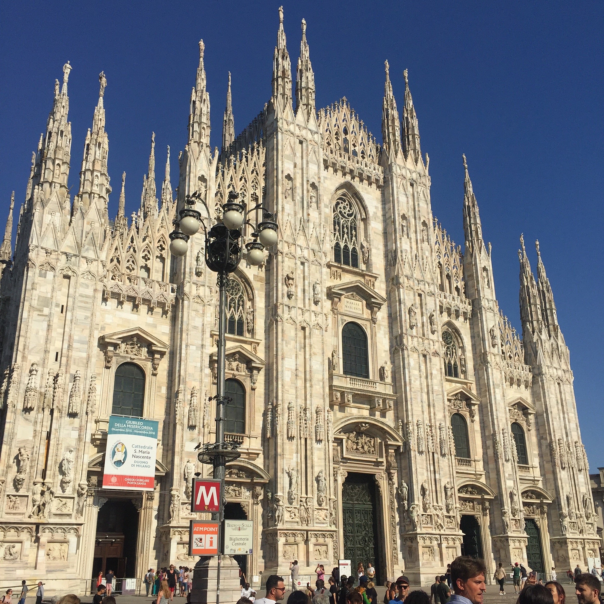 Despite the Caribbean blood that courses through my veins, I'm not a fan of hot weather. I'd say mid/high 70's (F) is my jam. It's in the mid 90s in Rome now and the sun here is on another level. Seriously.My dress had long sleeves but thanks to Tamu's expert sleeve rolling, I was cool as a cucumber. I bought the La Double J dress to celebrate a new project. Little did I know that my biggest client would be leaving Rome (thanks Trump...literally). No regrets though. Last Thursday evening I wore to the dress to events at Chez Dede and the reopening at Le Méridien. People kept asking me where I got it. It's the perfect dress for a dinner date too. Wait, I don't have any of those coming up. Never mind. Back to the subject at hand, the interview.Tamu broke it up into two parts. In Part I, it seems like I did ALL the talking. Tamu, for time, edited out her questions. In Part II we hear more from Tamu. There are Italian subtitles. We talked about working in Italy and what it's like to be a WOC living here, among other things.I move my hands around a lot. I take after my father's side of the family. They're very expressive.PART IPART III have to thank our glam squad. Just kidding. We didn't have one. Tamu and I did our own makeup.Grazie mille, Tamu!
 How pretty are these arrangements from Frida's Flowers?
Design Inspiration - La Bandita Countryhouse
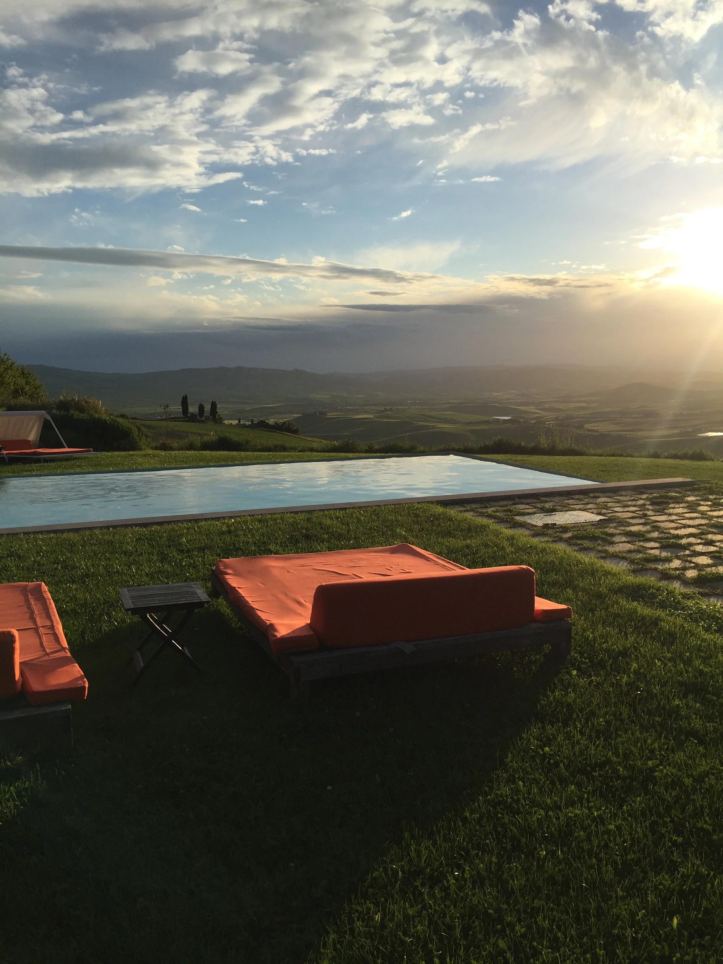
My apologies for the radio silence. Work has been bonkers. One of my clients moved back to the States. She was a high-ranking diplomat and her term was up. We needed to organize a major international move for someone who had lived in Rome for quite some time.My trip to La Bandita was the weekend after her move was finished. The timing was perfect. I was completely wiped out.I've been to the Townhouse and was curious about the Countryhouse after reading about it in design magazines. When Annalee invited me to join her, she didn't have to ask twice.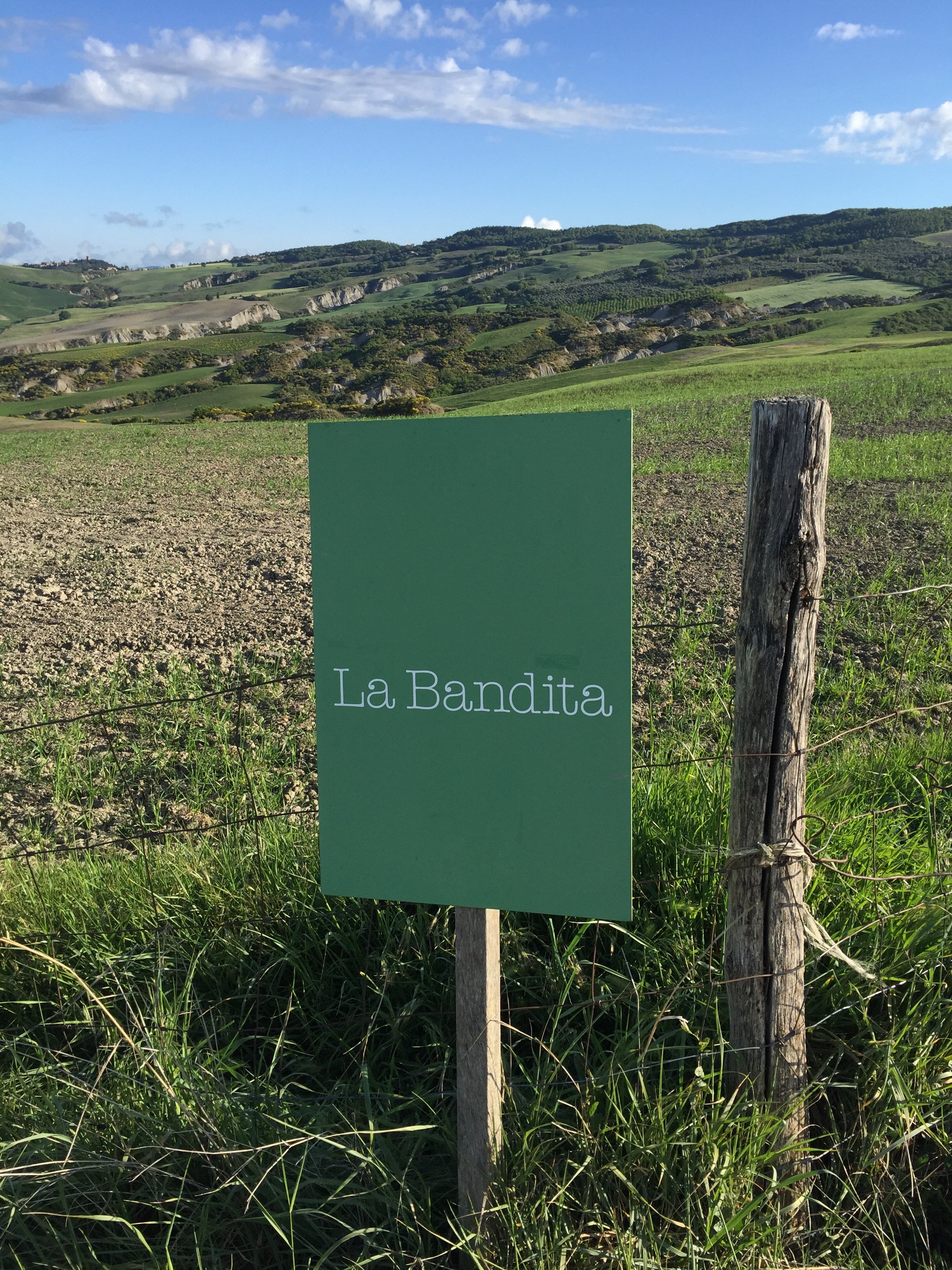 We met at the Chiusi train station and rented a car. Thankfully, Annalee did most of the driving as the two times I've rented a car in Italy I've received a speeding ticket. I lived in Los Angeles for ten years and drove pretty much every single day. I never received a speeding ticket (or any ticket for that matter). NEVER. I really don't understand why I got tickets in Sicily and Tuscany given I was trying to keep up with the flow of traffic. Sorry, I digress.I keep hearing Tuscany is over. Those people are on drugs. Are there some areas that are packed with tourists? Yes, but Tuscany is a large region. There's no reason to write off the entire area.The Val d'Orcia is truly one of the most beautiful places I've been to in Italy. My next post will be about what we did and where we went.Today, I'm focusing on the interior design. I've seen my share of "Tuscan" interiors. Too often there are extremes, either super modern, stripping all the character out of these older homes or too traditional, creating a space that reminds you of the Addams Family's house.Owners Ondine Cohane and John Voightmann, with their architects Ernesto Bartolini and Arianna Pieri of DA Studio in Florence, have a created a contemporary space that is warm, airy, and feels Tuscan. That last quality is so difficult to get right especially in an era of cookie cutter interior design (in part because every city has the same chain stores). Are there elements of the design that would feel at home in say, Miami or the Caribbean? Absolutely. The La Bandita team worked closely with local artisans and used natural materials found in the area. All these pieces came together to create a space that could only be in Tuscany.This article, written by Ondine, is about the how and why John and Ondine opened the Country House.
 Annalee and I stayed in The Pigsty Suite. Yes, this independent apartment (just a few meters from the main house) used to be the pigsty.
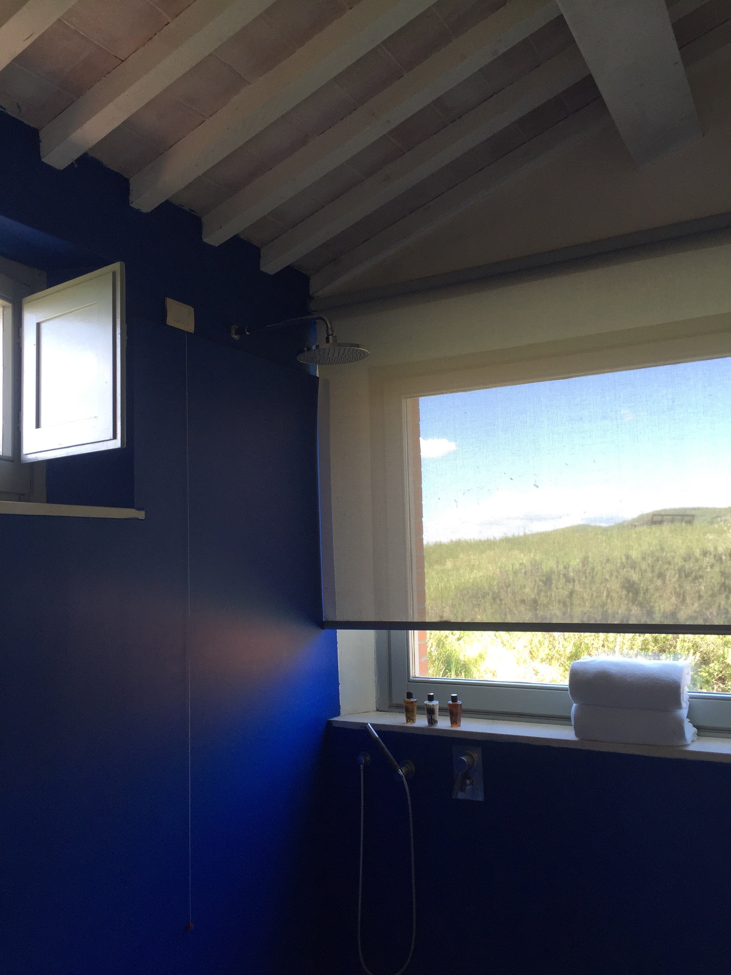
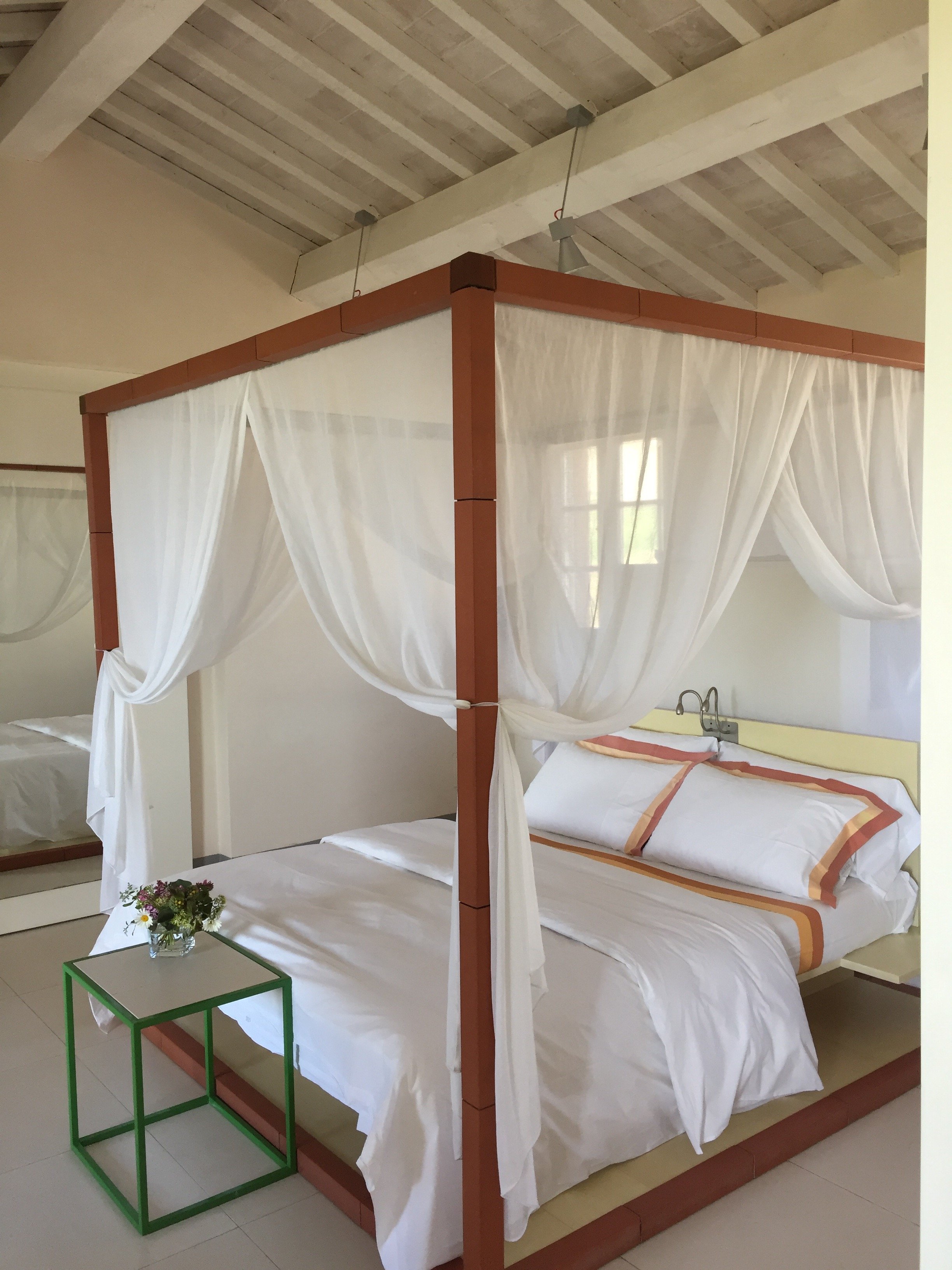 My pictures don't do it justice. It was perfection. We had our own little patio. The views from our "backward" were breathtaking. The bathroom was immaculate. I have a thing about cleanliness in general and it's taken to another level regarding kitchens and bathrooms.The bathroom was huge and I loved having a shower next to the big picture window. I felt like I was taking a shower outdoors but without the risk of being attacked by wild boars. Seriously, these darn boars are no joke. Annalee and I went jogging before dinner and other guests told us they saw a family of boars right after they passed us on the road. No grazie.
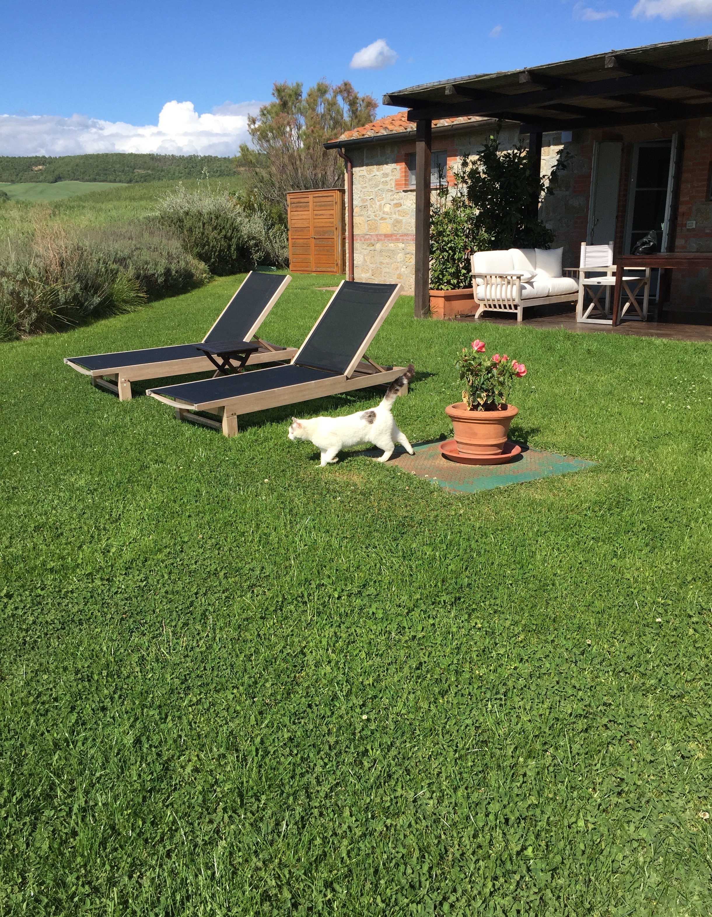 The check in desk/reception is in the main quasi-open planned room with the kitchen and dining areas. There is a lounge/library area with a great selection of books.
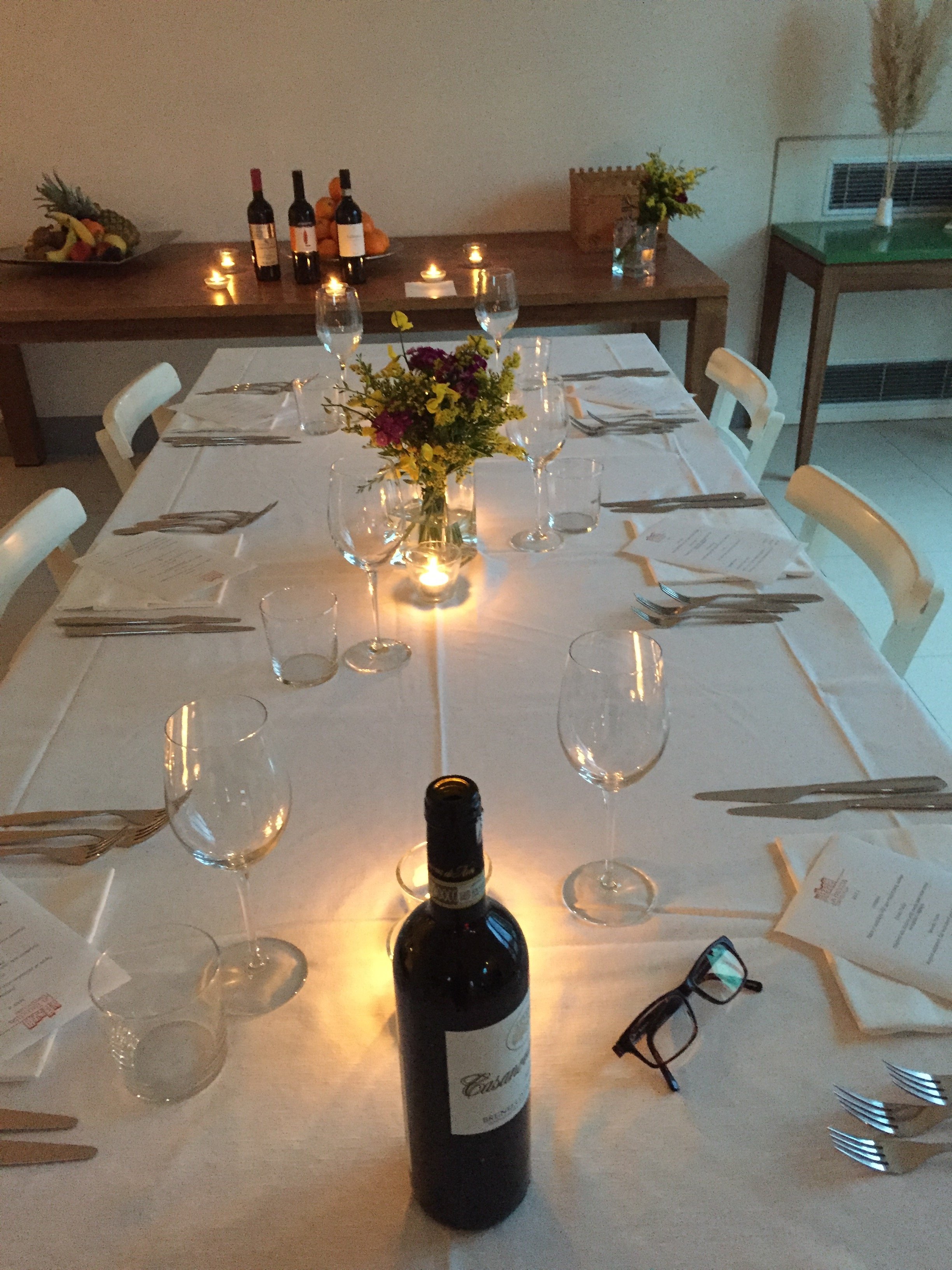
 My personal hotel tastes lean toward simple but sophisticated interiors. Some might find the bedrooms too minimalist but for me they let the architecture and views shine. The rooms are relaxing and calm which is what I want in a hotel room.
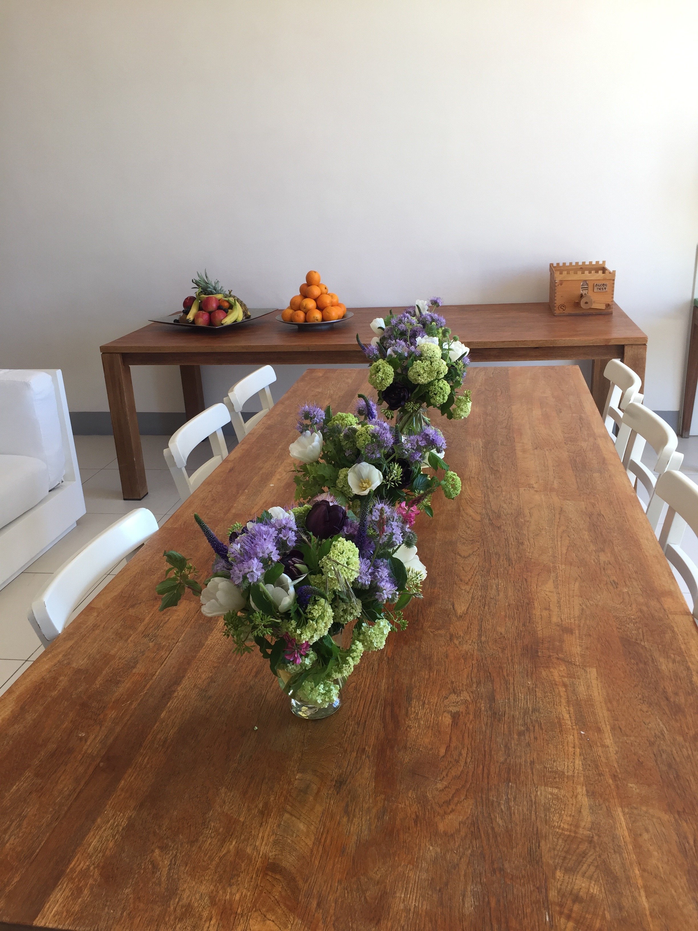
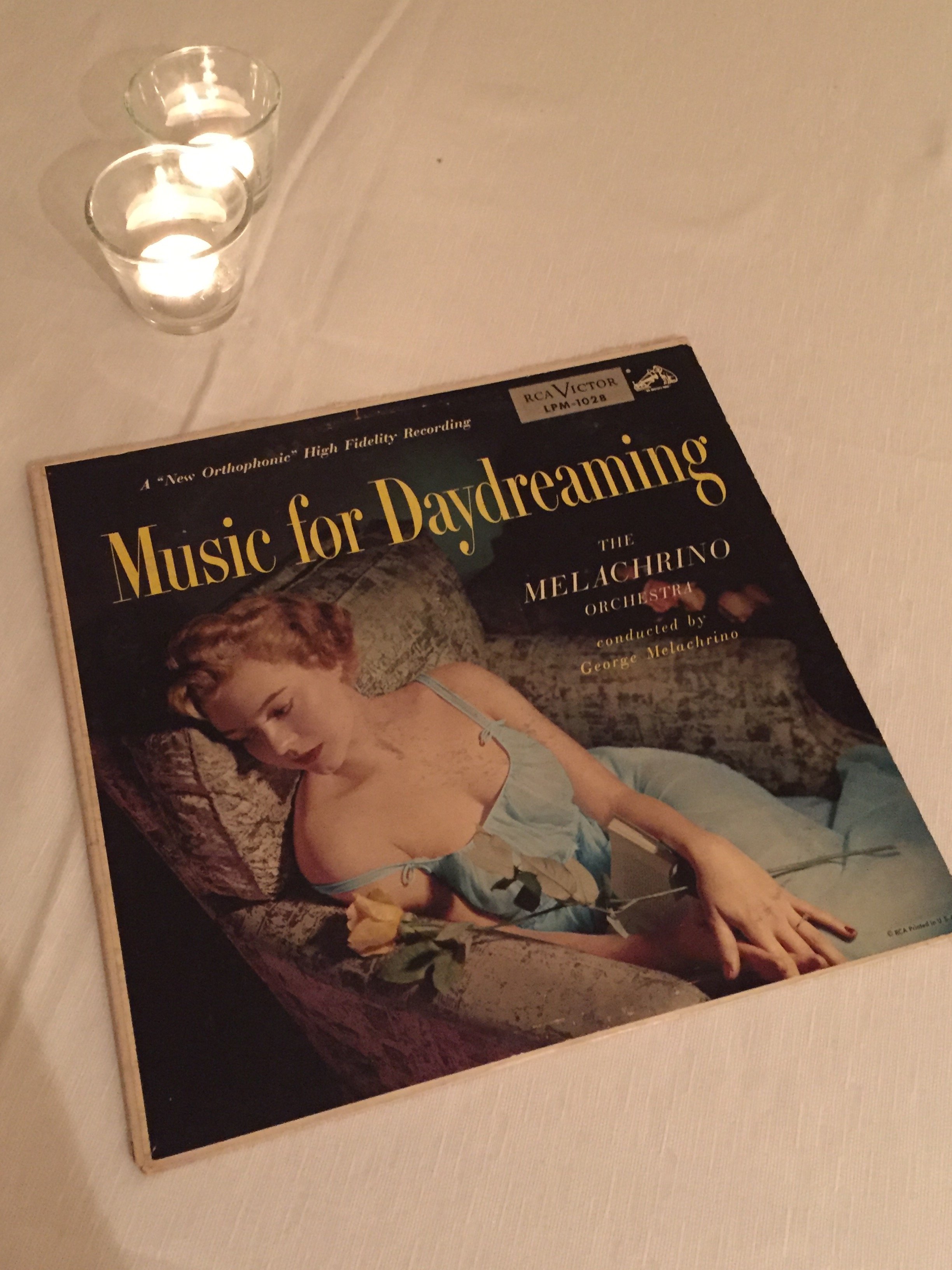
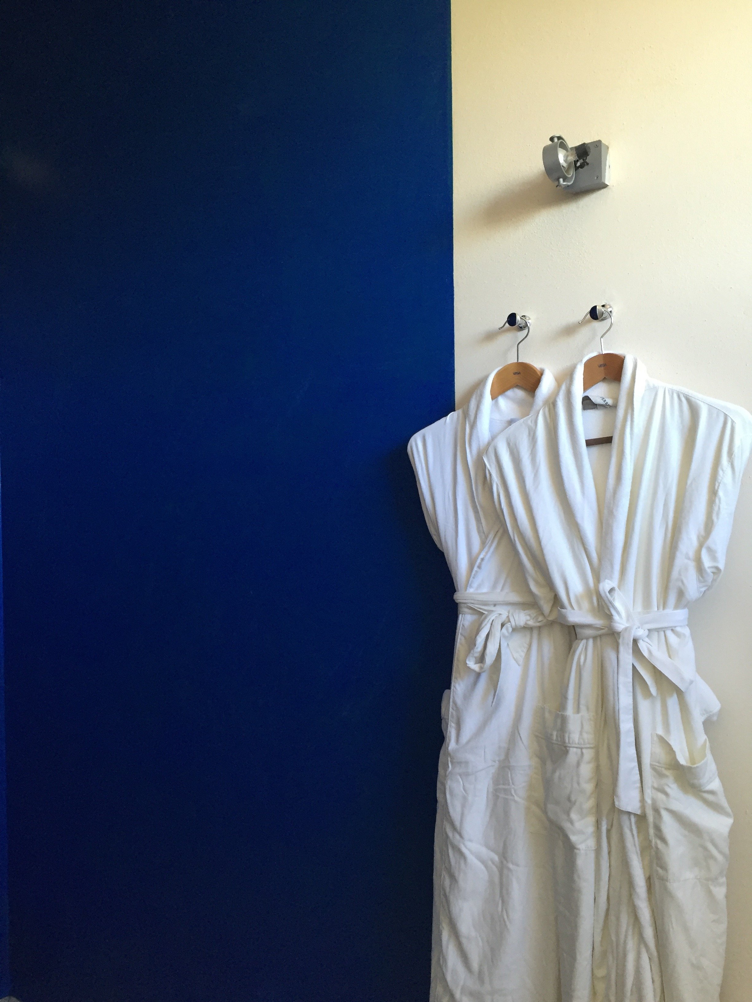 I can see how this hotel may not work for a solo traveler or anti-social couples as the dining space is communal. Bandita Countryhouse would be perfect for a group to rent the entire space.It's truly off the beaten path so I'm glad we arrived during the day. The unpaved road leading to the property is steep but worth it for the 360 views.
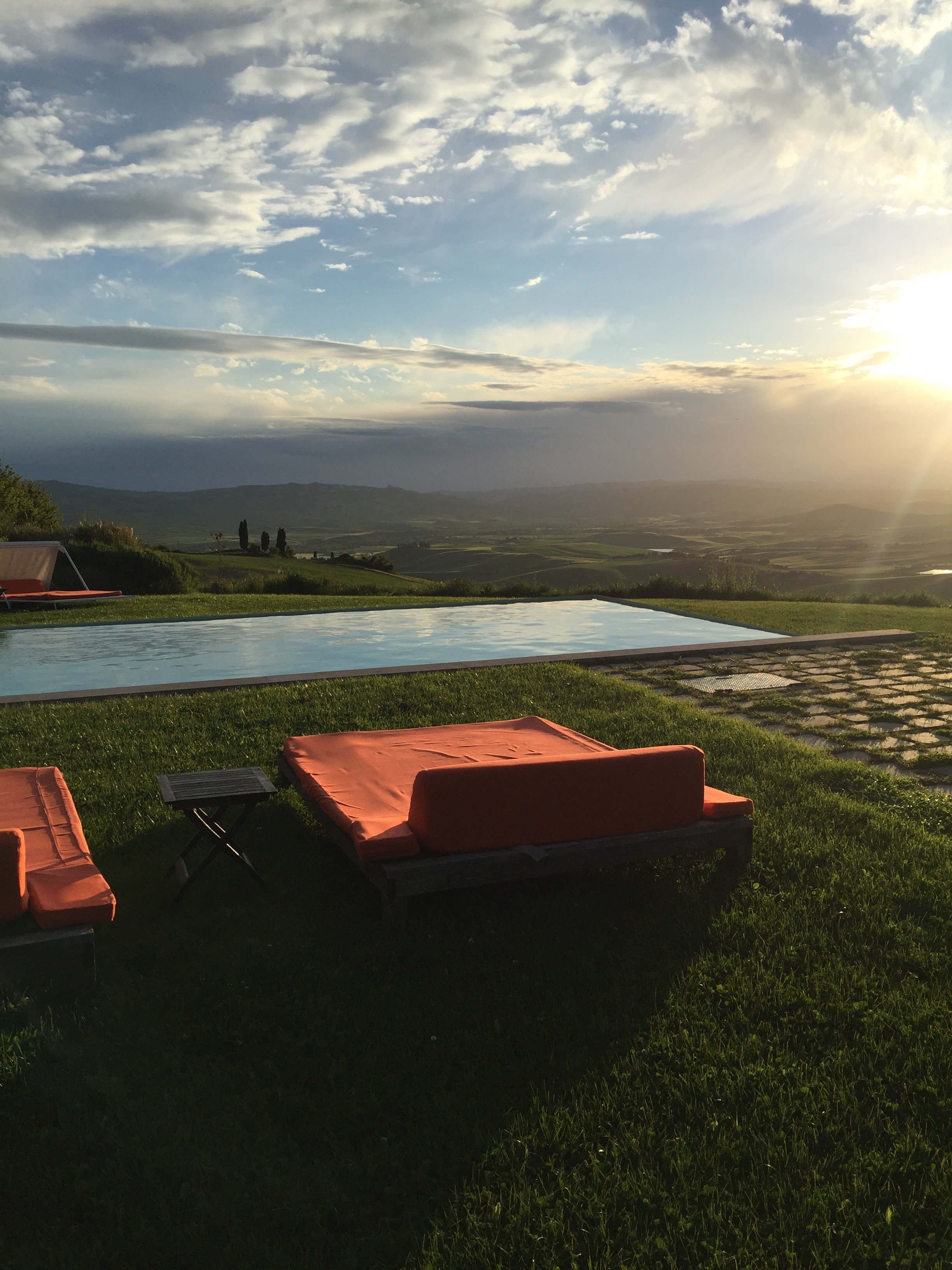
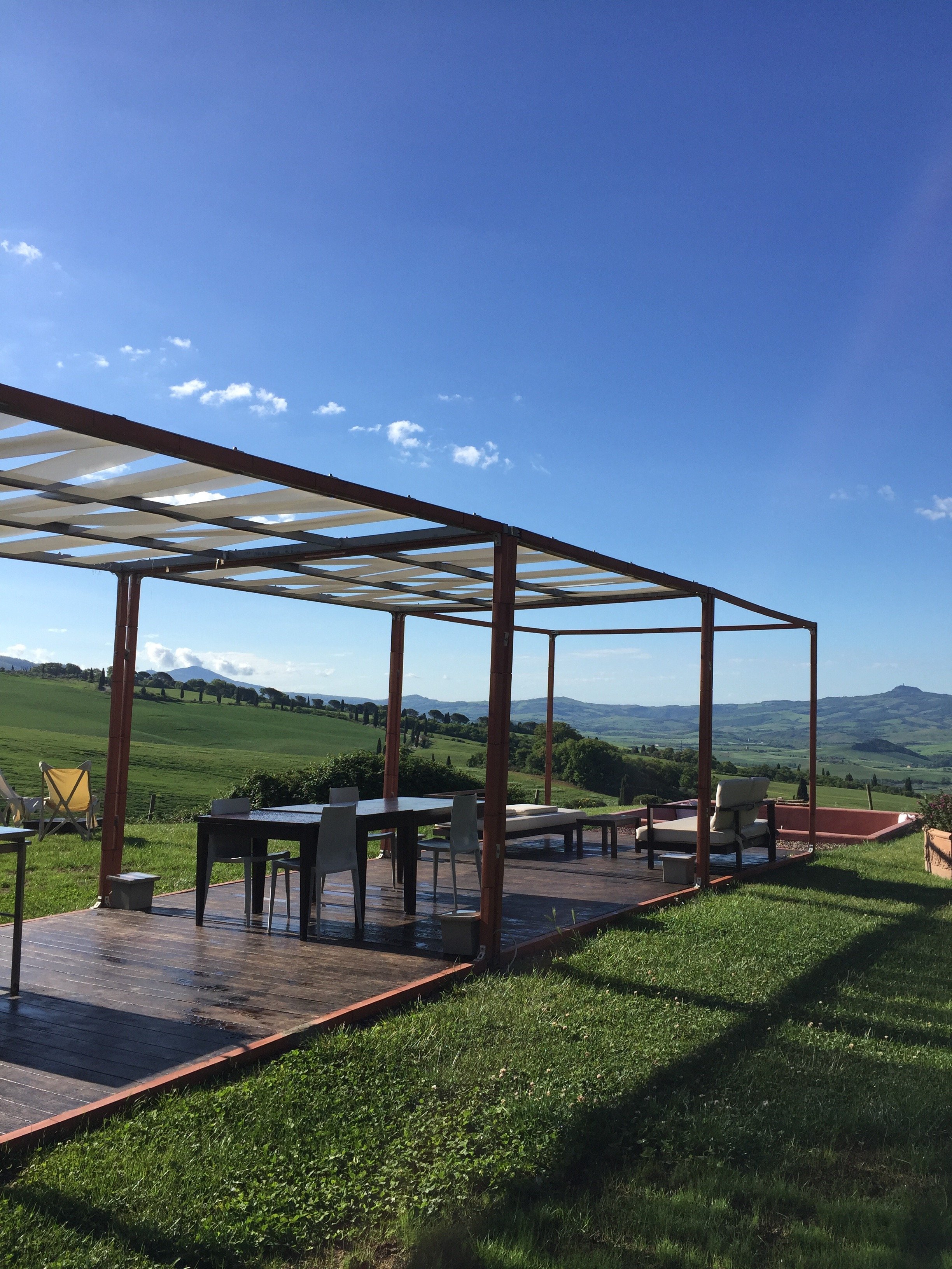 While technically it is a boutique hotel, the vibe at La Bandita Countyhouse is more your friend's very chic country house in Tuscany. I am here for it. The hospitality and food were wonderful. John, Ondine, Dario, Elena, Paola, Marco, and the cat (I didn't catch its name) made us feel at home.I had a great time. So much so that I'm willing to deal with the drama of driving a car in Italy again.
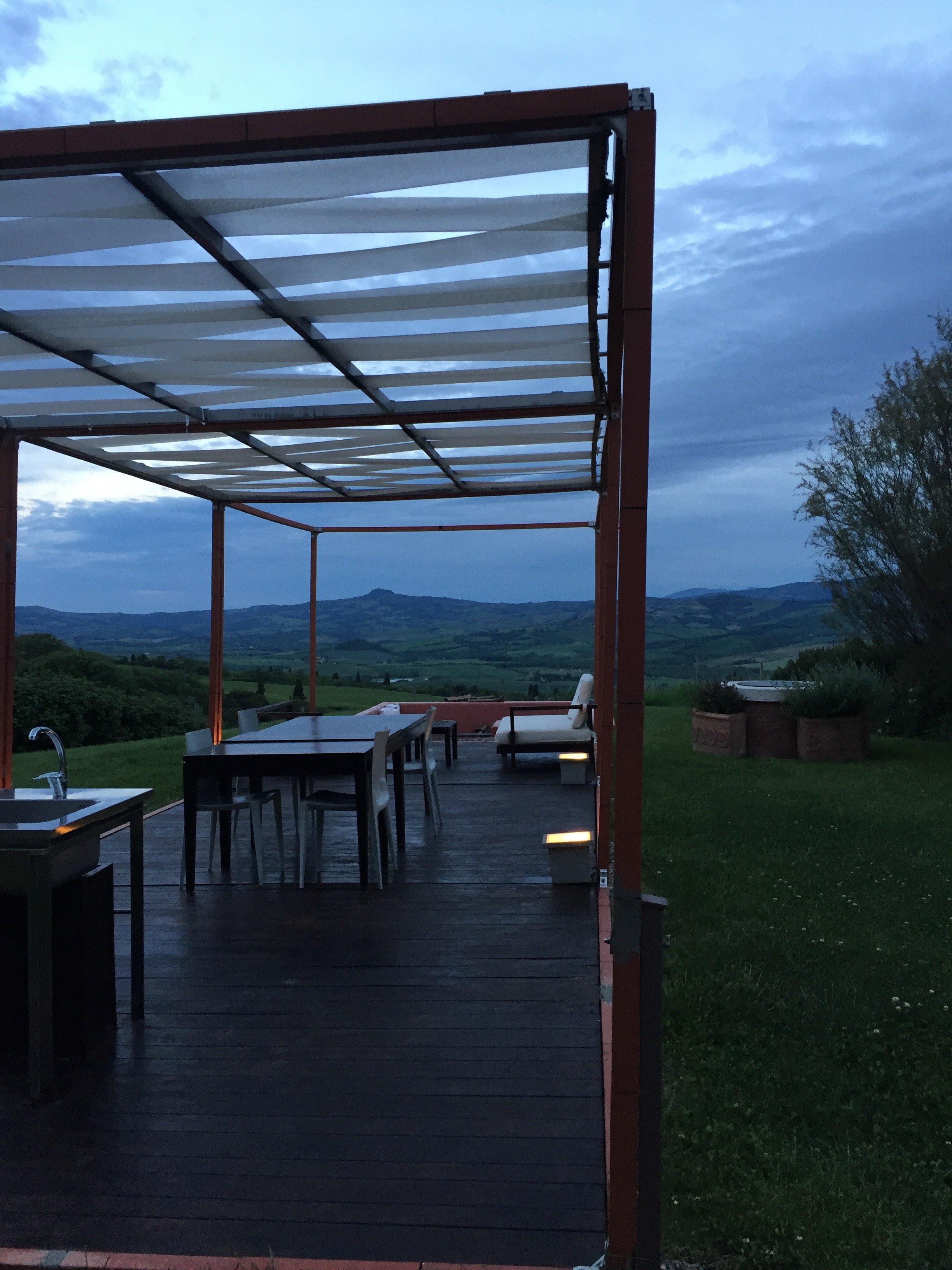 Photos: Me and my iPhone.La Bandita CountryhousePodere La BanditaPienza (SI) 53026Toscana, ItaliaTel +39–333–404–6704Fax +1–212–202–6222website
Design Inspiration - Darryl Carter's Boutique, Washington, DC
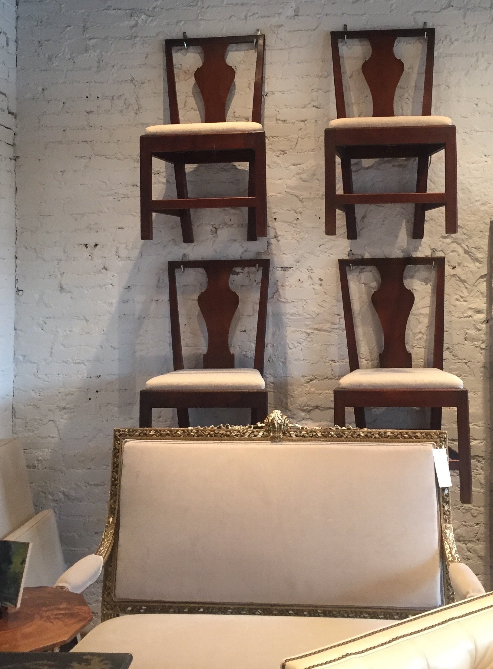
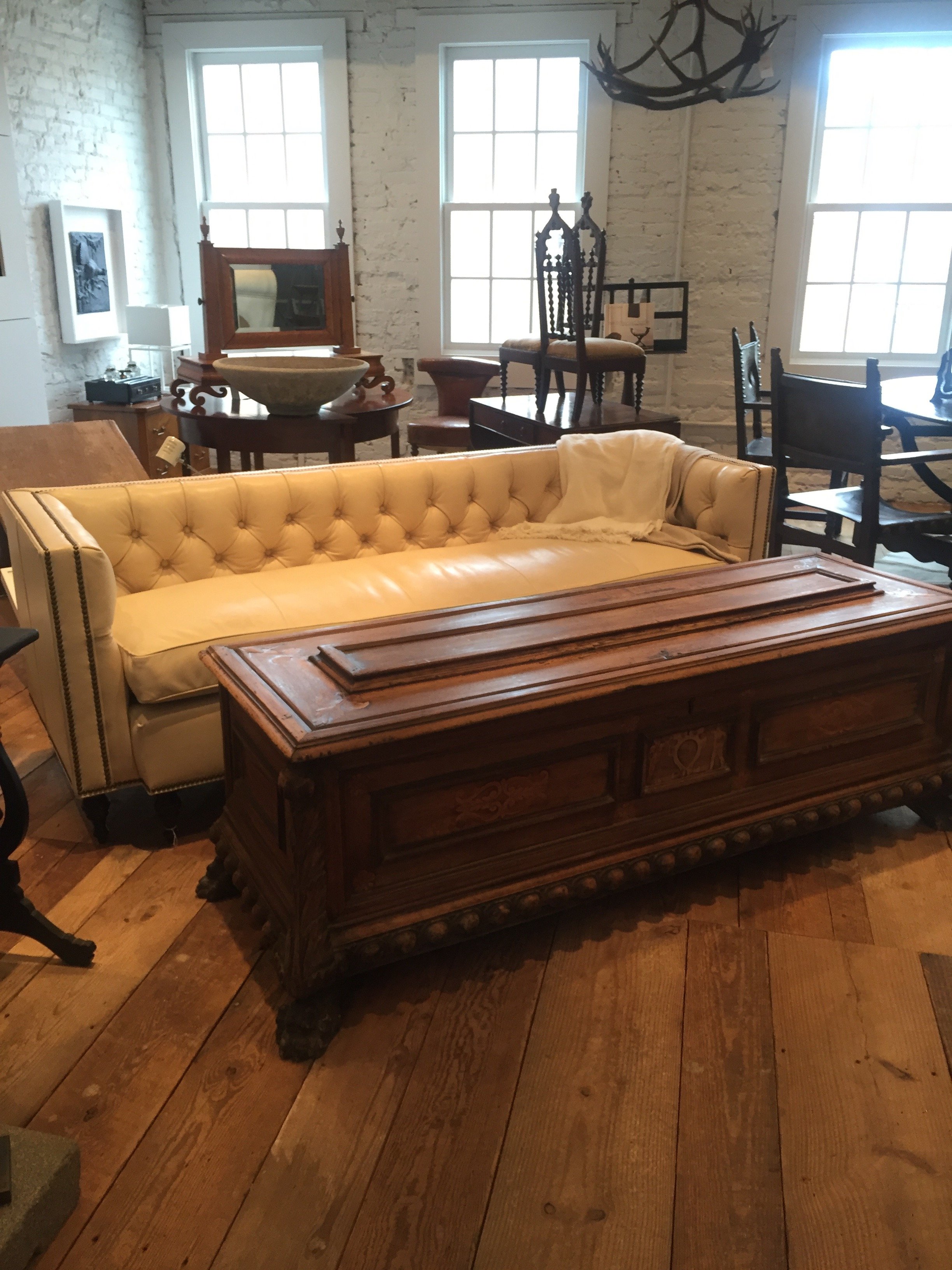
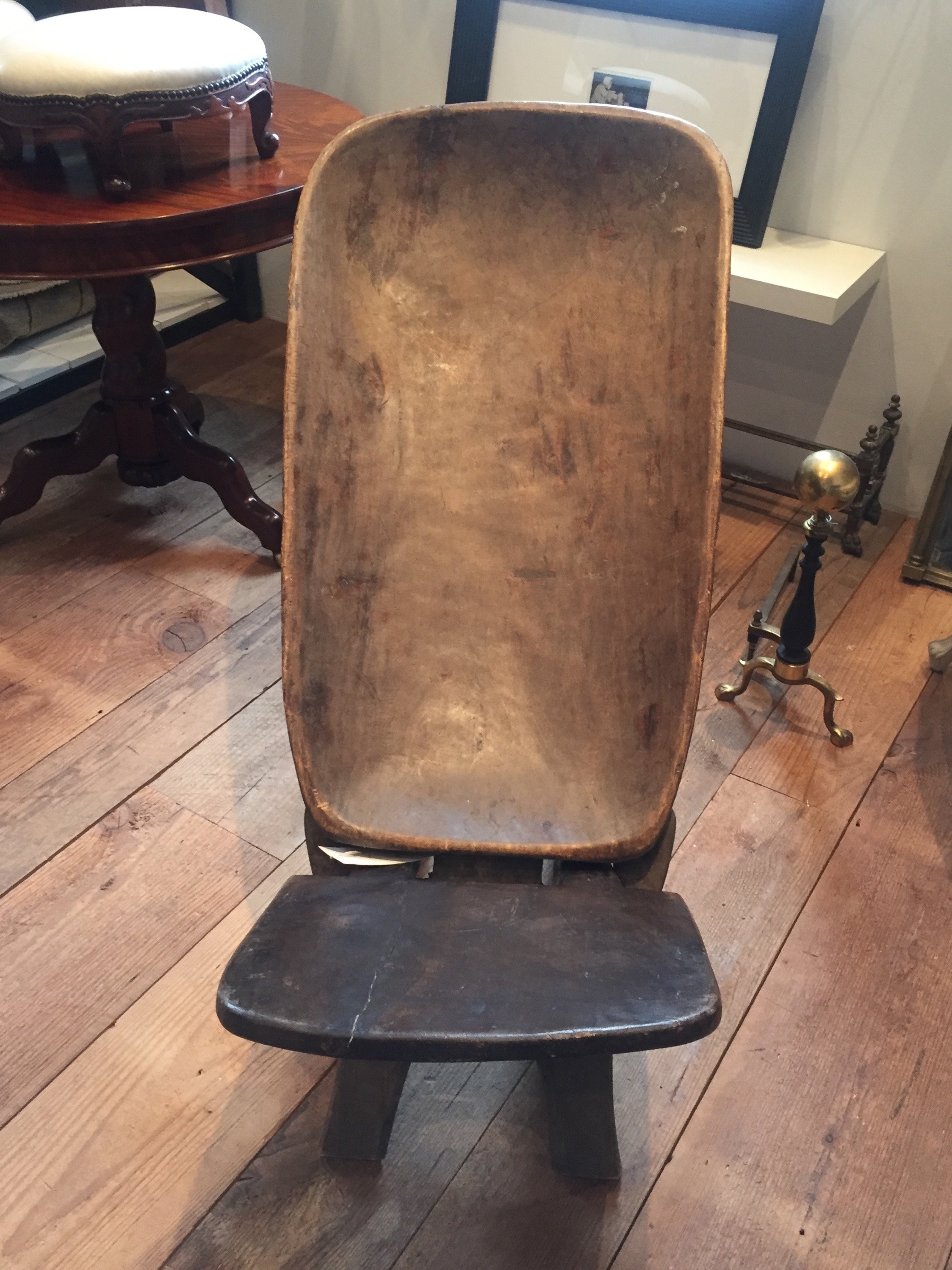
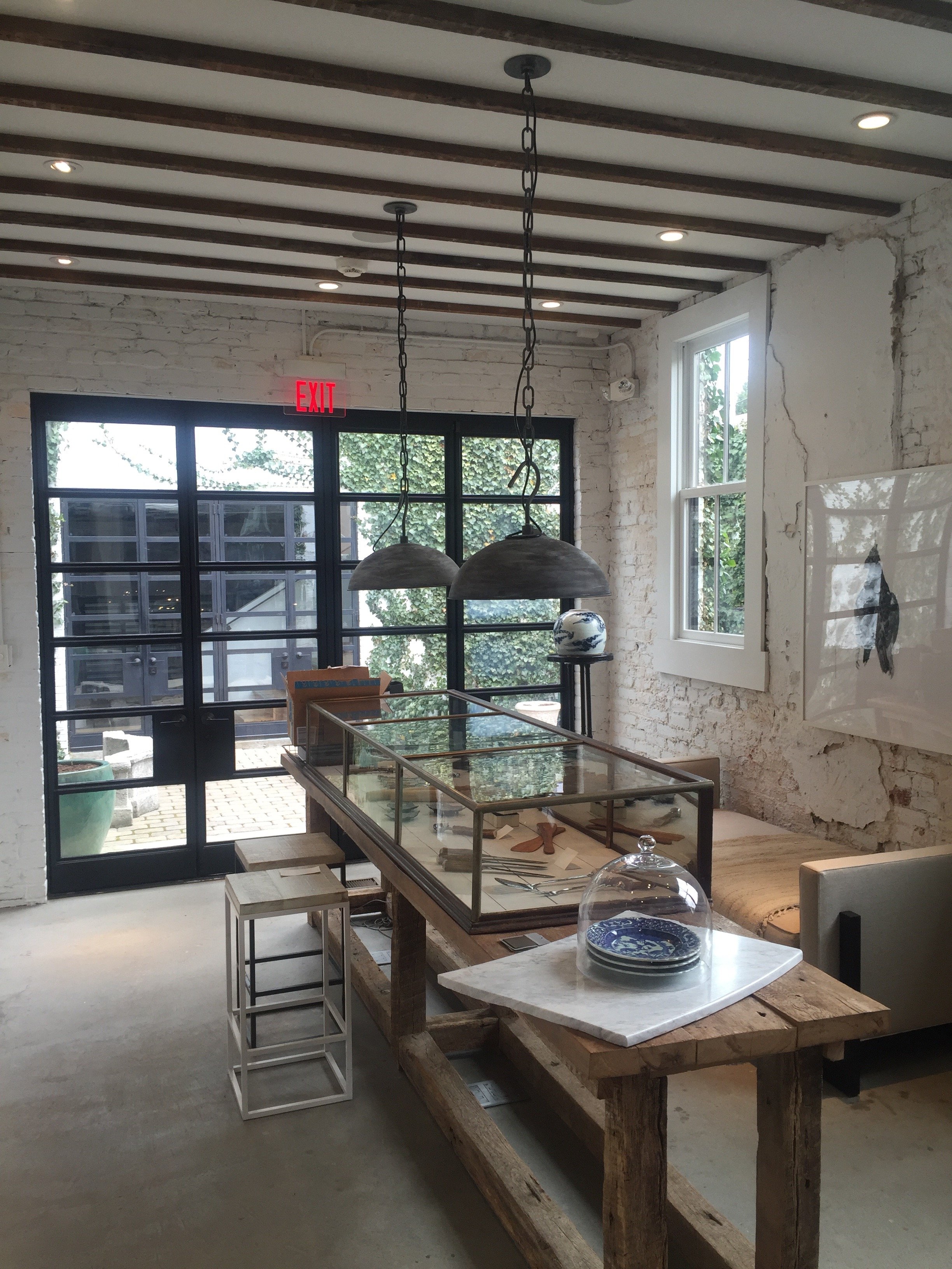
Darryl Carter's boutique was on my list of must sees during my trip to Washington, DC last month.I've read about it and seen many photos of it. Yet, I was not ready!Mr. Carter is one of my favorite interior designers. He usually works with neutral palettes and I love his modern take on traditional, classic style.He didn't study interior design. Carter was expected to attend law school and he did.His transition from a very successful lawyer to one of the most acclaimed designers in America is inspiring.His boutique, a pre-Civil War carriage house, is located in the Shaw neighborhood. The space was in complete disrepair when Carter bought it in 2008. The extensive renovation was thoughtful and bold, retaining many of the building's unique features. The exterior work was approved by the Historic Preservation Review Board.Carter sells antiques and new items that are handmade by artisans. Like his interior design work, the boutique is beautifully edited. It feels more like a home, rather than a store.Megan was kind enough to show me around during my visit.Much of the wood on the first floor was salvaged from the South African Embassy which was built around the same time as the original structure.This incredible limestone arch came from an old Virginia manor. The cupboards were salvaged from the butler's panty of the Dumbarton estate.
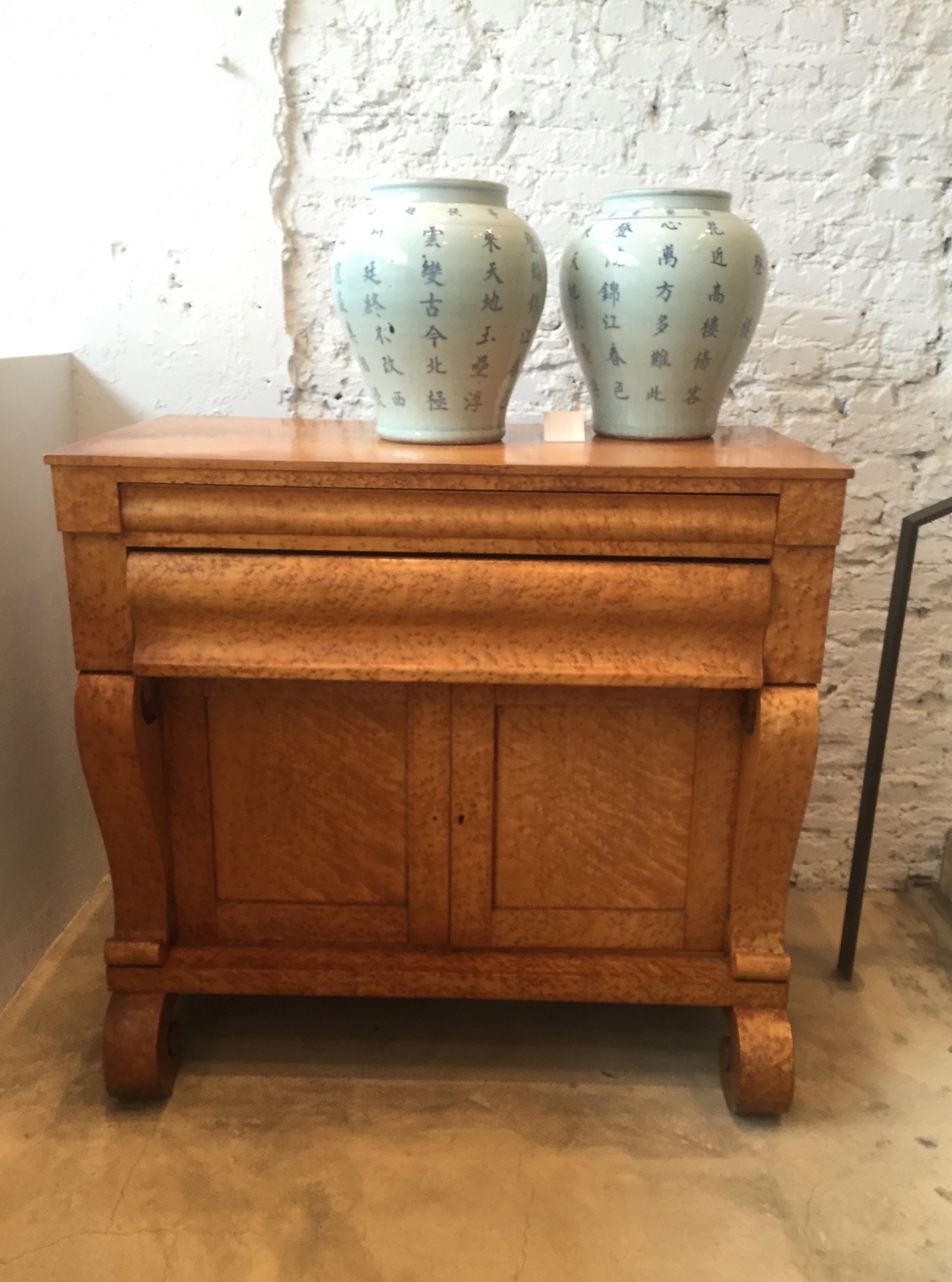
 This Birdseye maple dresser is an American antique from 1835.
 Chairs from the late 1900s found in Philadelphia.
 This sofa? Like butter.
 African birthing chair.
 I wish I took a better photos of the kitchen. My fingers were still defrosting. I cannot handle cold weather anymore.I love every single thing about this space, especially the doors that lead out to the courtyard.
 This bench, designed by Carter, is perfection.

The Design Files - Nursery Tips
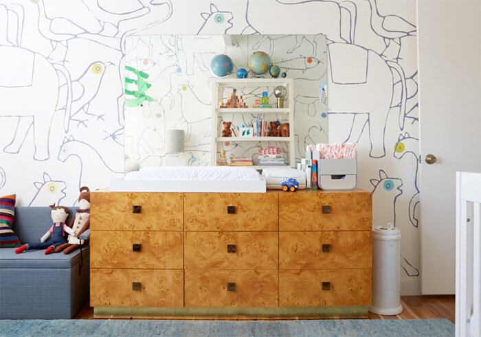
My sister and my brother-in-law had their first child last month. My brother and my sister-in-law have two boys so now I have three nephews.Nurseries are fun rooms to decorate. However, it can be a stressful time for families as they try to get this room together before the baby arrives. Below are some tips:Don't overlook the function of the room. It's easy to do when you see things like this: Make sure the space is practical. For example, is it easy to get to the changing table? Is everything you need for the changing table, wipes, diapers, etc., near the table?Window treatments.I like roman shades. Curtains are fine for babies but once they start crawling, it's better not to have anything on the floor that they can get tangled in. Keep an eye on the cords. Whatever treatment you decide on, can it block out light if needed? If the curtains are too sheer, get black out rolling shades.Babies don't care what the room look like. You will spend hours in this room. Is it comfortable and soothing for you?Not every piece of furniture needs to come from a baby store. A dresser can be turned into a changing table.To save money, re-purpose furniture and pieces that you already own.The room should reflect the rest of the house. If you're someone who loves minimalist mid-century, the nursery doesn't need to look like some cutesy, super traditional space with bright colors, and visa versa. There are ways to incorporate your taste into the room.When it comes to painting the walls, I'm a big fan of grey, and creamy whites for gender neutral colors. They're classic, and depending on the shade, work with all types of décor from traditional to contemporary. A light yellow is great too but a more difficult color to work with.Wallpaper. This is the room to add an accent wall with a bold paper:
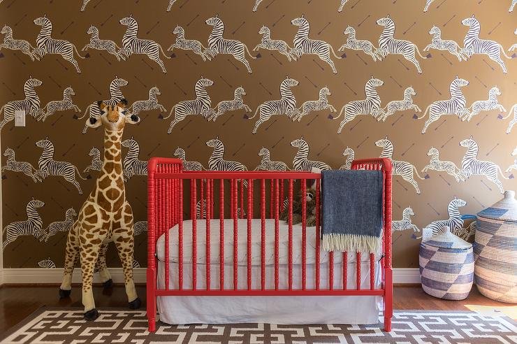 If your taste fall to the more subtle side, something like this gives you a moment without being overwhelming:
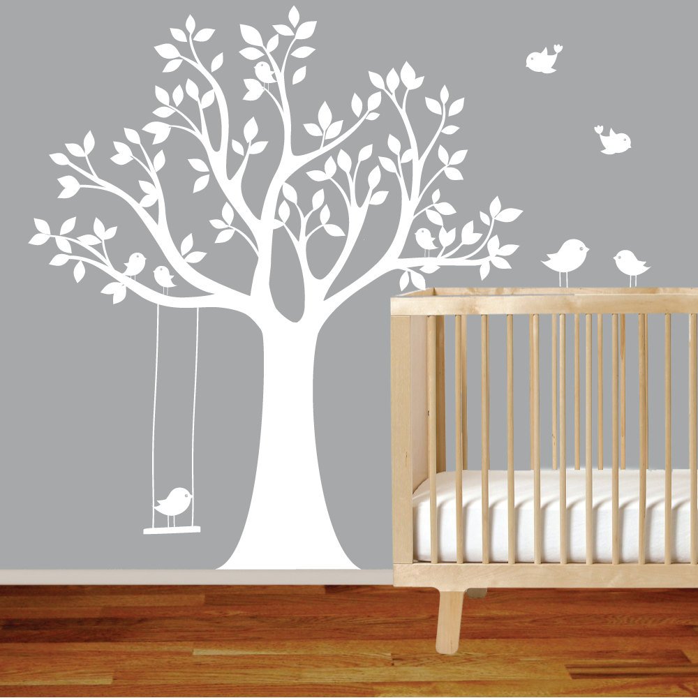
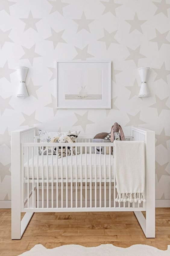 Decals are a great for renters.
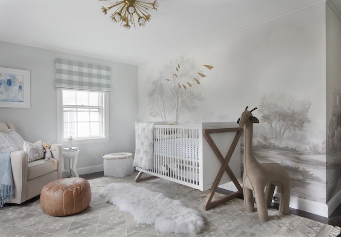
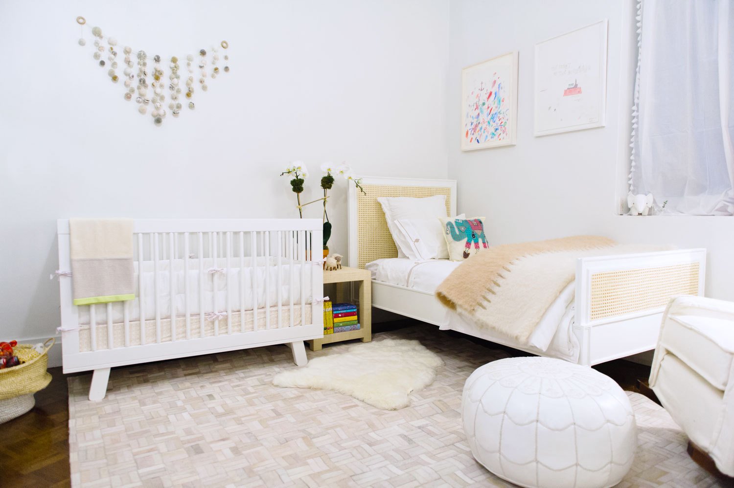
 Unless you have time and money to decorate constantly, select furniture, art, and colors that will grow with your baby. Once they get older, you will redo the space for a big girl/big boy room.It's unlikely that a baby is a Frozen or Hot Wheels fan. Cutesy or trendy themes will feel dated and will become tired very quickly.Do you have enough storage? Clutter is the last thing you need in this room. You don't want trip over things during a midnight feeding when you're exhausted and not the most alert.Don't forget the books, art work, and the accessories. It's the little things that take a room from ho hum to something special.Here are some more fab nurseries:

Life in Rome - Ercoli 1928 Parioli
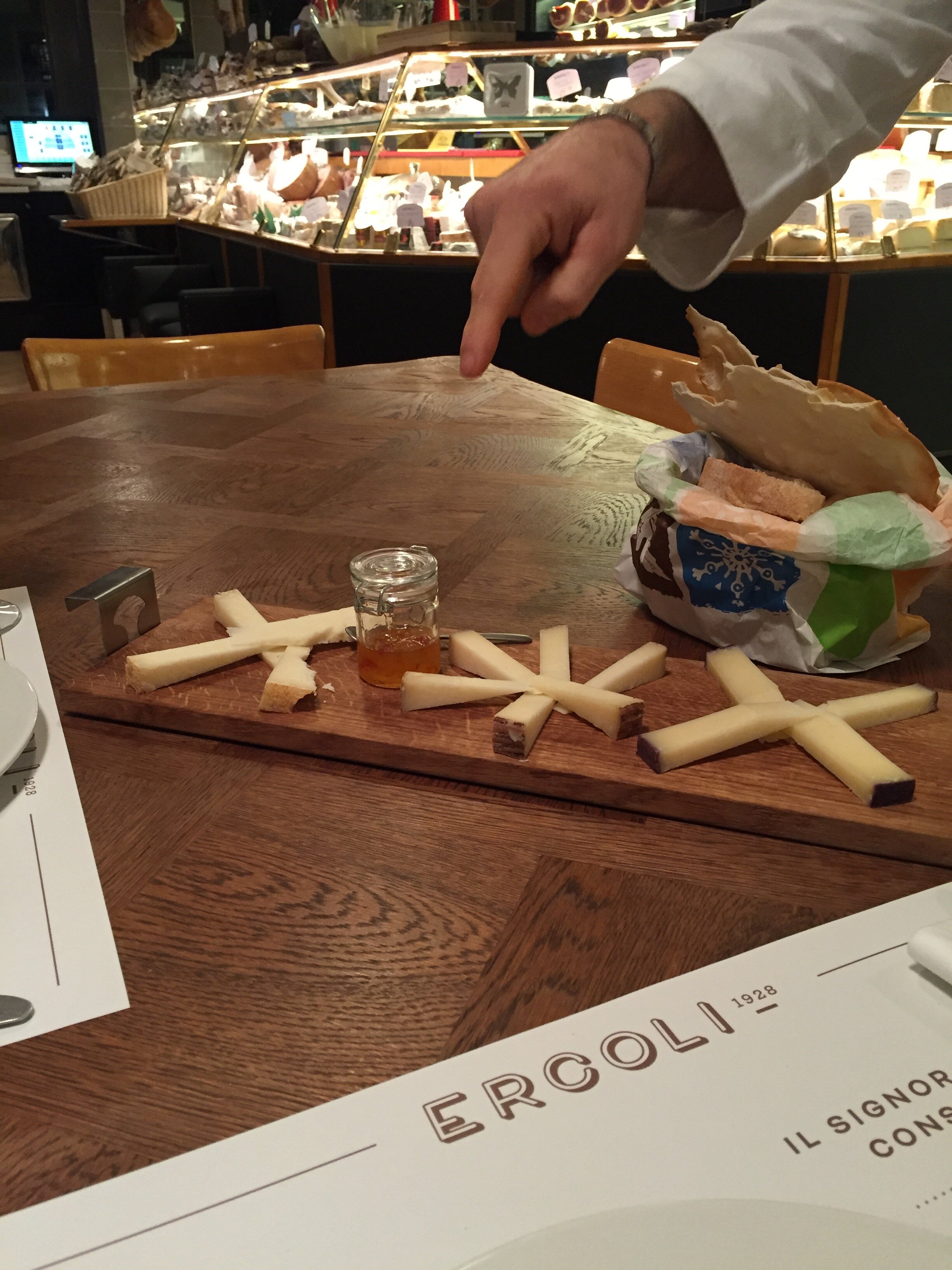
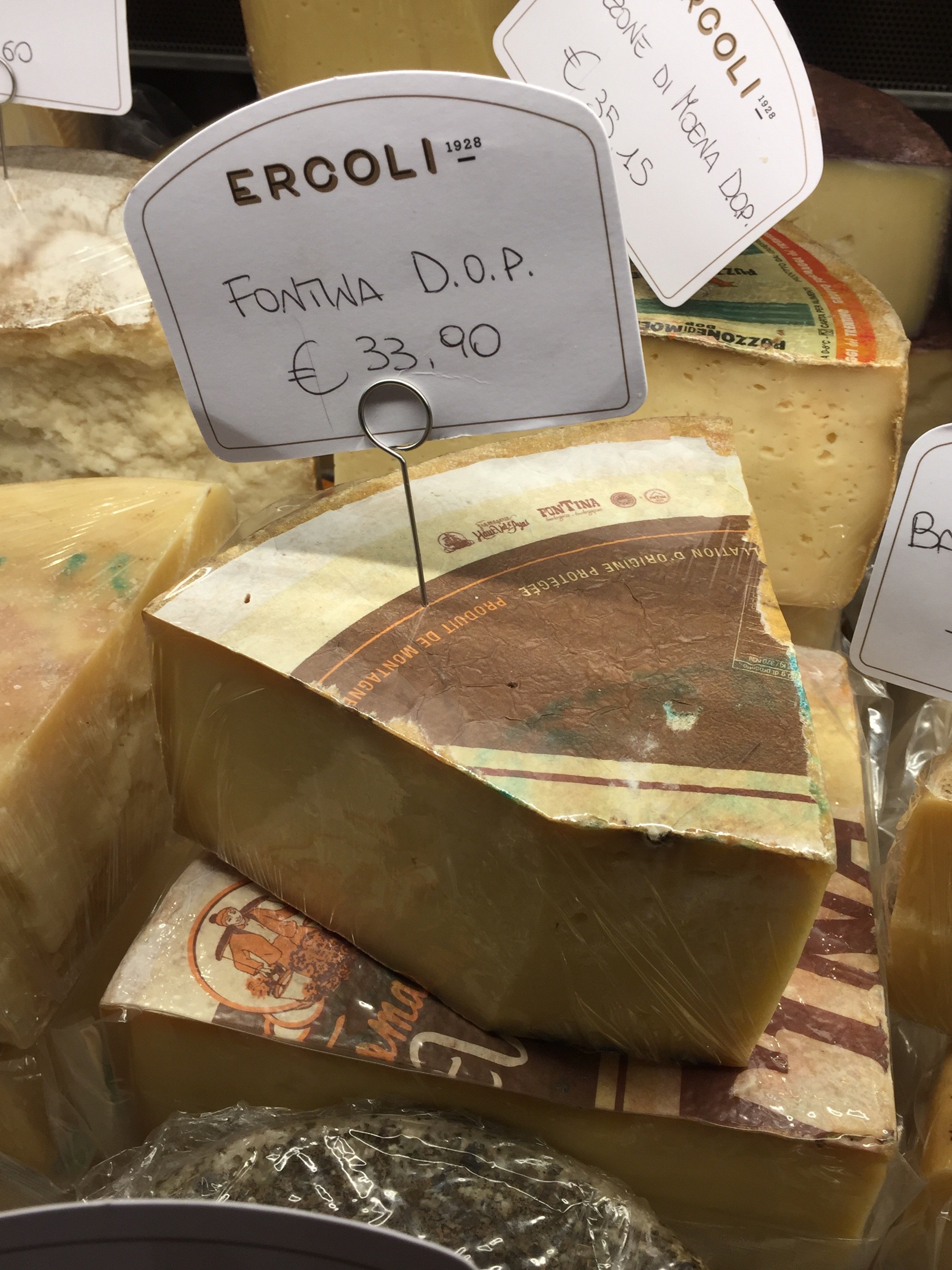
I have lived in Parioli for a year now and love it. When I told people I was moving from the Historic Center to Parioli, everyone had an opinion (mostly negative)."It's so boring," was one of the main criticisms I heard regarding Parioli. Granted, it's not as exciting as living around the corner from the Drunken Ship but that's okay.There are plenty of great places in this neighborhood to get your aperitivi on and the prices are much lower than the Center. That said, it is a more residential area. There are rarely any tourists and while there are quite a few American and British expats living in Parioli, I seem to bump into them only at the DOC or Carrefour supermarkets.The latest addition to the 'hood is Ercoli 1928 Parioli and I am here for it. I met a friend for an aperitivo during the holidays. The first person I saw when we walked in was Federico Tomasselli, the bar manager and one of the best bartenders in Rome. What a very pleasant surprise! He used to be at Barnum on Via del Pellegrino. I lived on Pellegrino and spent a lot of time at Barnum because of Federico and Patrick (Patrick is now at Caffe Propaganda).My friend and I sat at the bar and loved it. The bar's specialty is Vermouth. My friend said their drink was outstanding. If you don't drink Vermouth, no worries. Ercoli's wine list is deep and they have a solid cocktails list too.I returned with another friend the other week and this time we sat in the front because the bar was still setting up.We ordered glasses of wine and the Italian cheese plate. Outstanding.The service was great and everyone was friendly. Trust me, this is not the norm in Rome where service can range from indifference to outright hostility. Ha.My friend picked up some takeout for her husband. I need to ask her how the meatballs were. The cheese selection is fantastic and will be problematic. I haven't eaten lunch or dinner here yet but have heard very positive reviews about chef Andrea di Raimo's dishes.
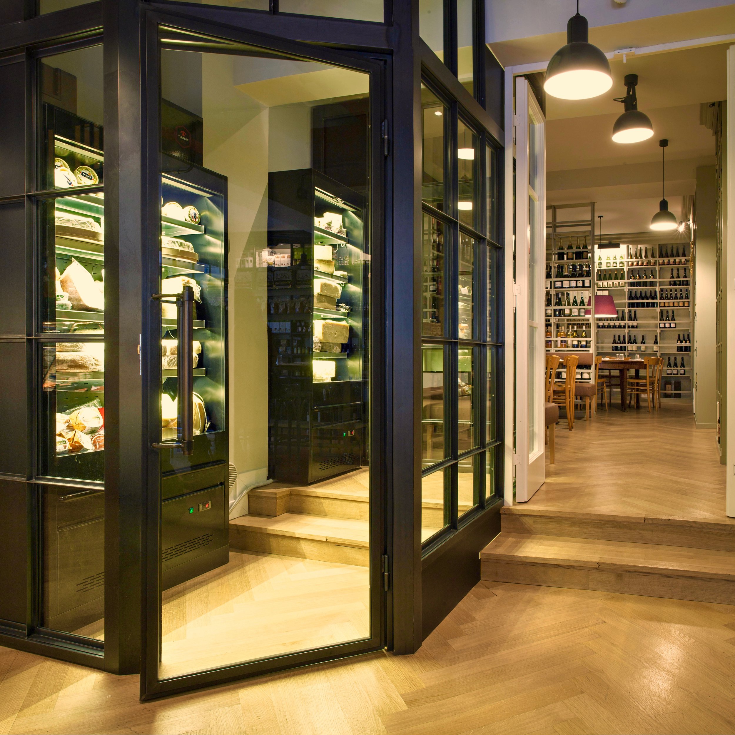
 There are people don't care how a place looks as long as the drinks are great. I'm not one of those people. For food, it's a different story. There are wonderful restaurants that don't have much of a décor but it's okay because the food is on point. However, when it come to aperitivi/cocktails, atmosphere is also very important to me.
 Ercoli Parioli knocks it out of the park. The space is divided into three areas. There's a restaurant, a deli, and the bar/cantina.The architect is Roberto Liorni, who's responsible for several of my favorite restaurant spaces including, Pastificio San Lorenzo a Roma, Rosti, and 'Gusto. The latter opened in 1998 and other restaurants are still "referencing" it. Liorni was also the architect for the film company Cattleya's headquarters. All these places have their own vibe but with his unmistakable DNA, contemporary, chic, yet comfortable.I adore the interior design at Ercoli. It's not trying to be the Roman version of a space in Soho or on Abbot Kinney. It fits the neighborhood and doesn't look like every single restaurant that has opened recently. I love the plaid...an unexpected touch.
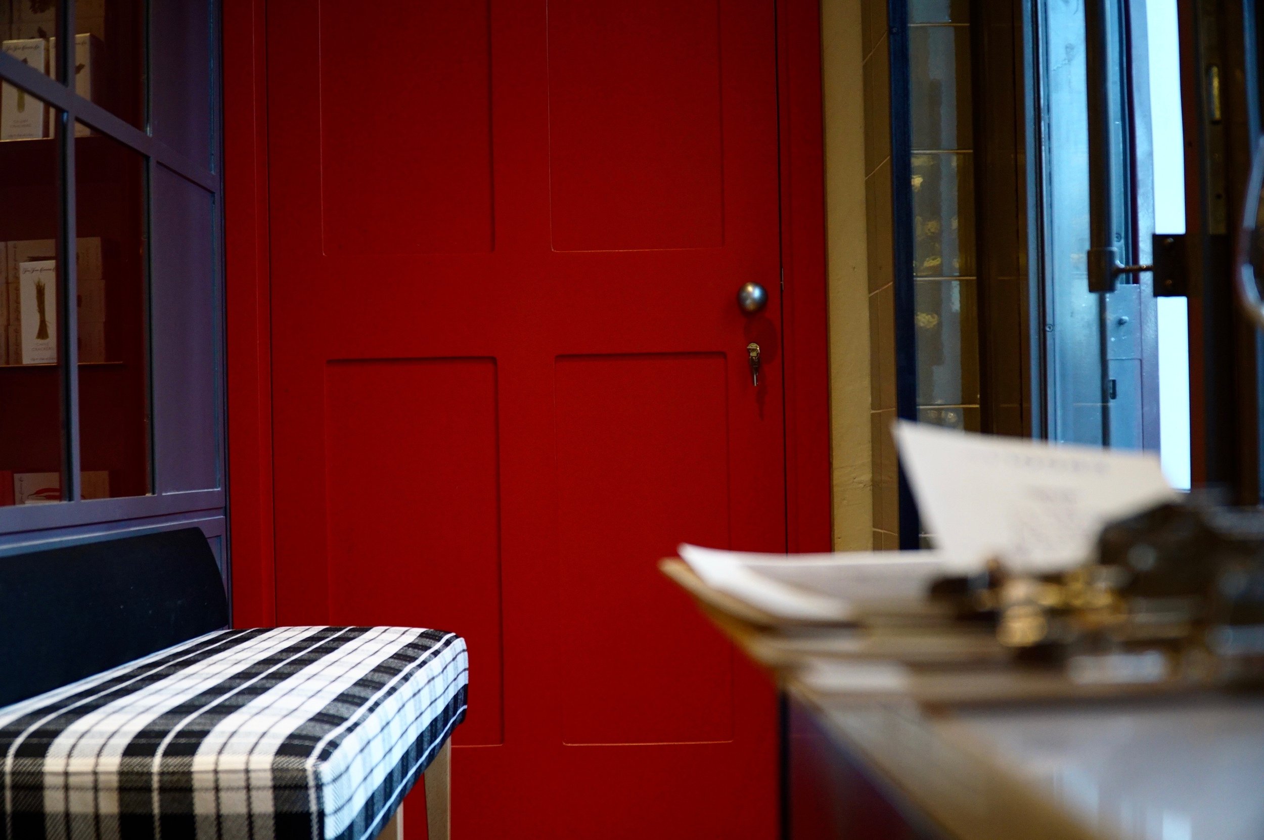
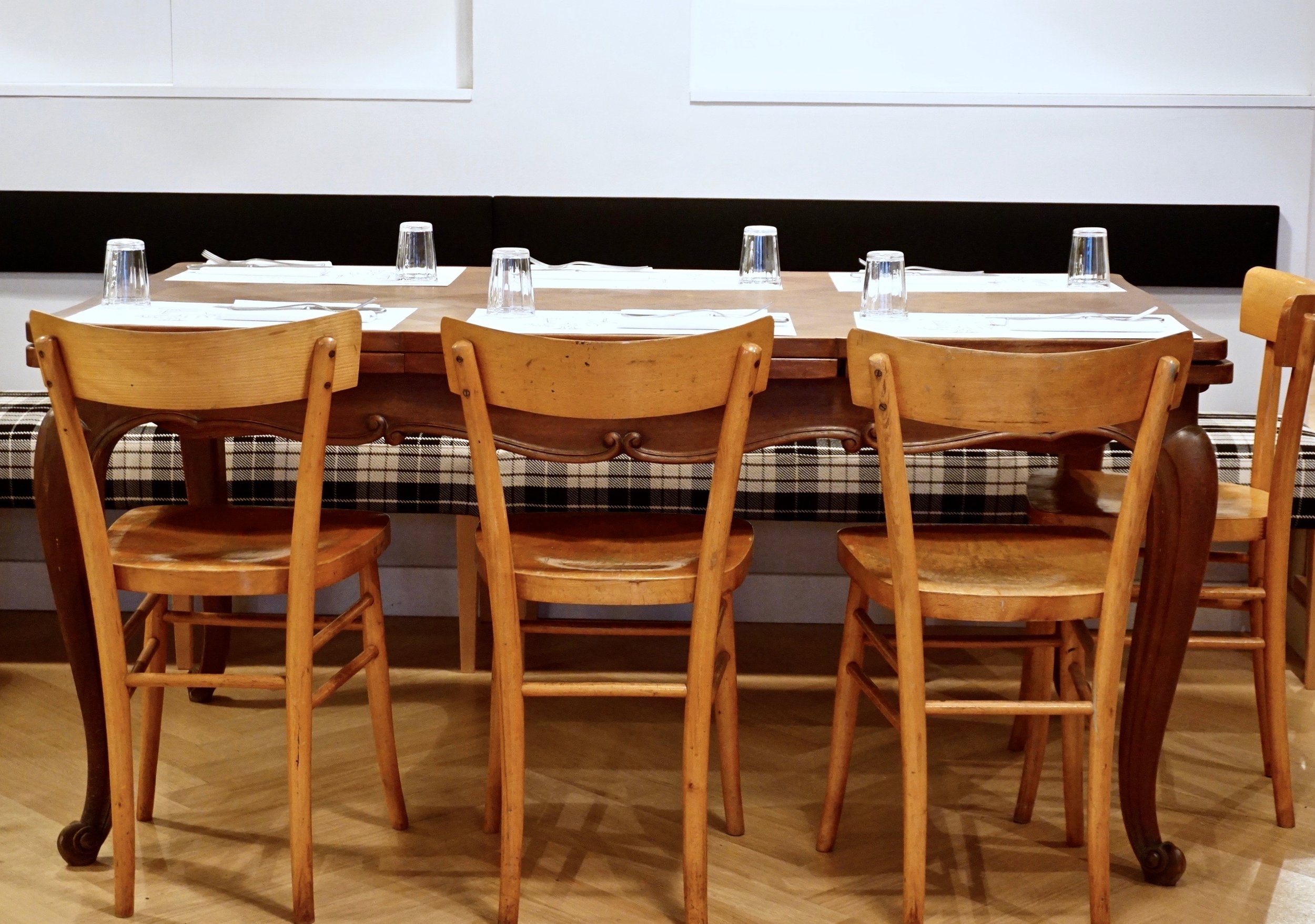
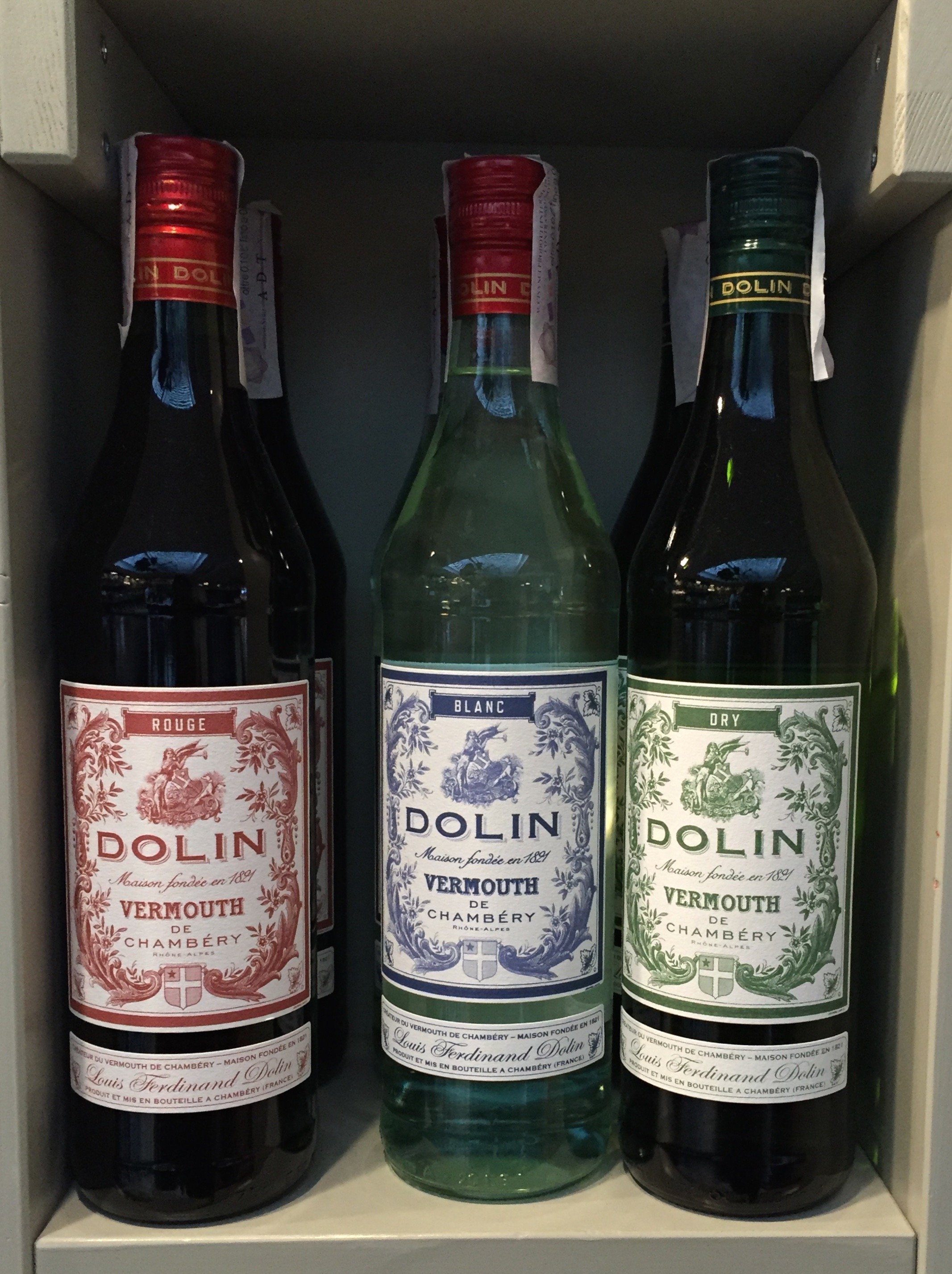
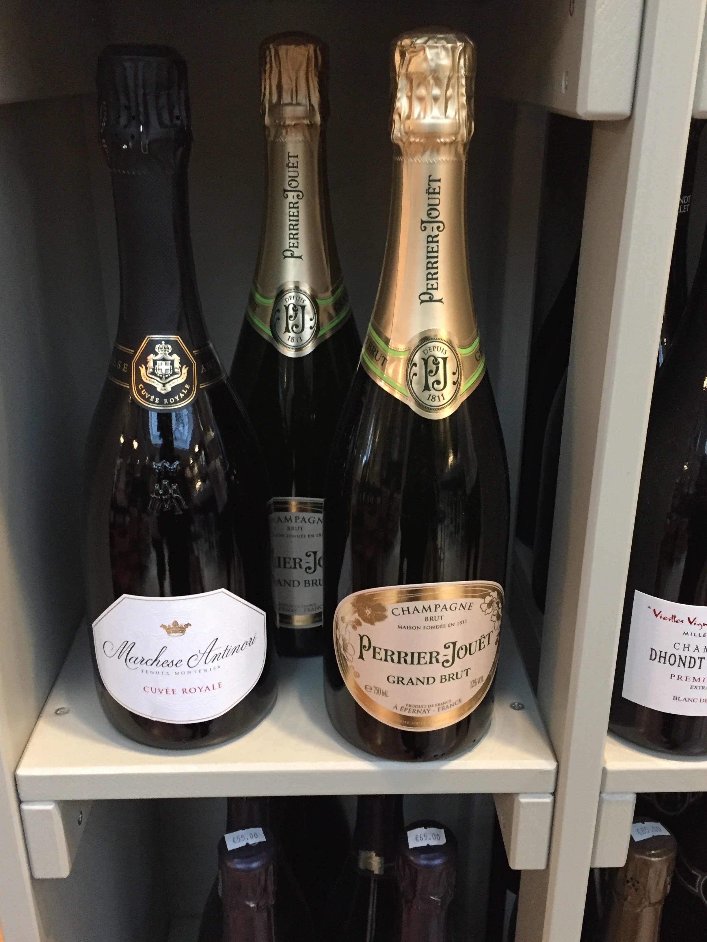
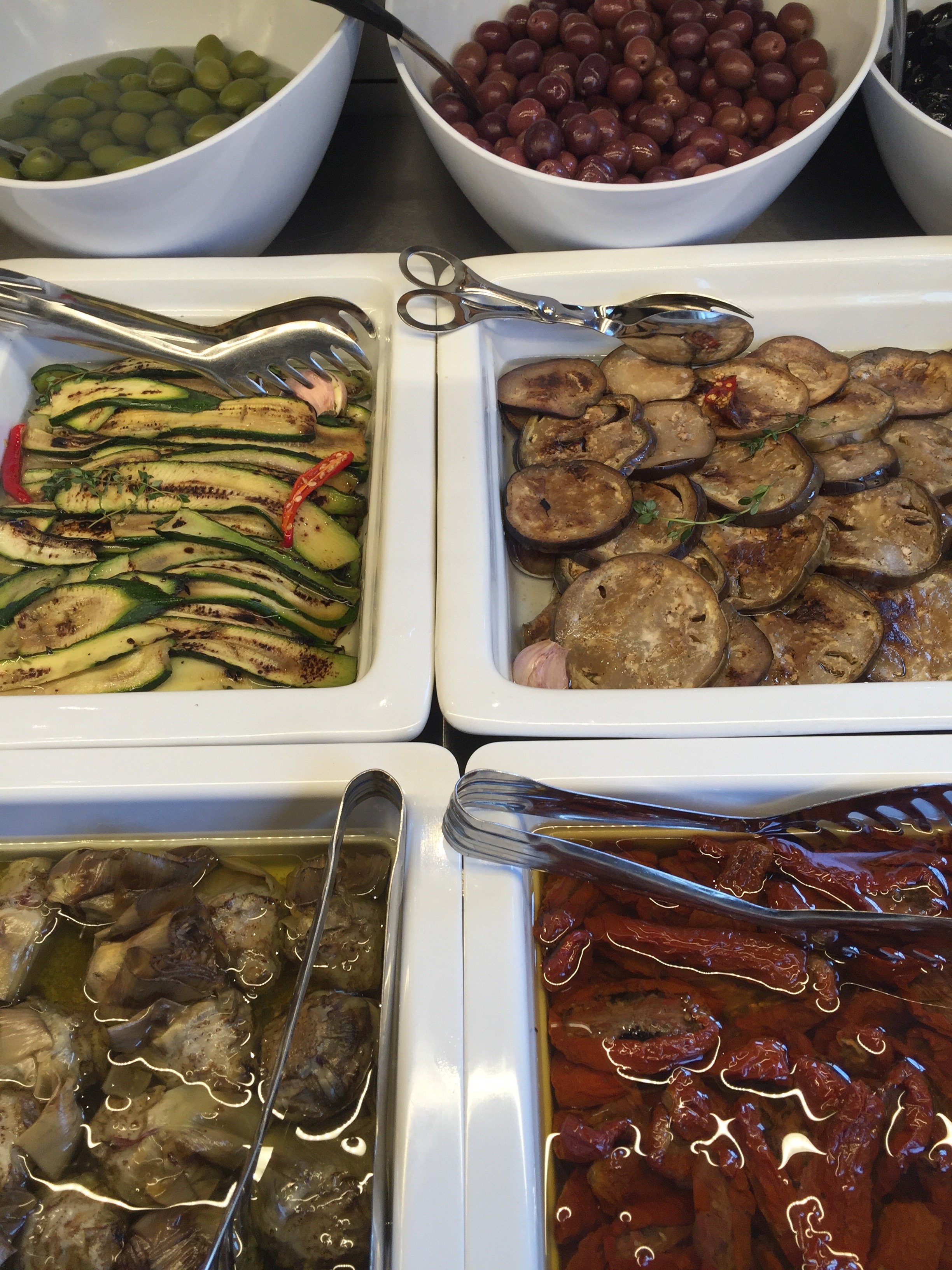
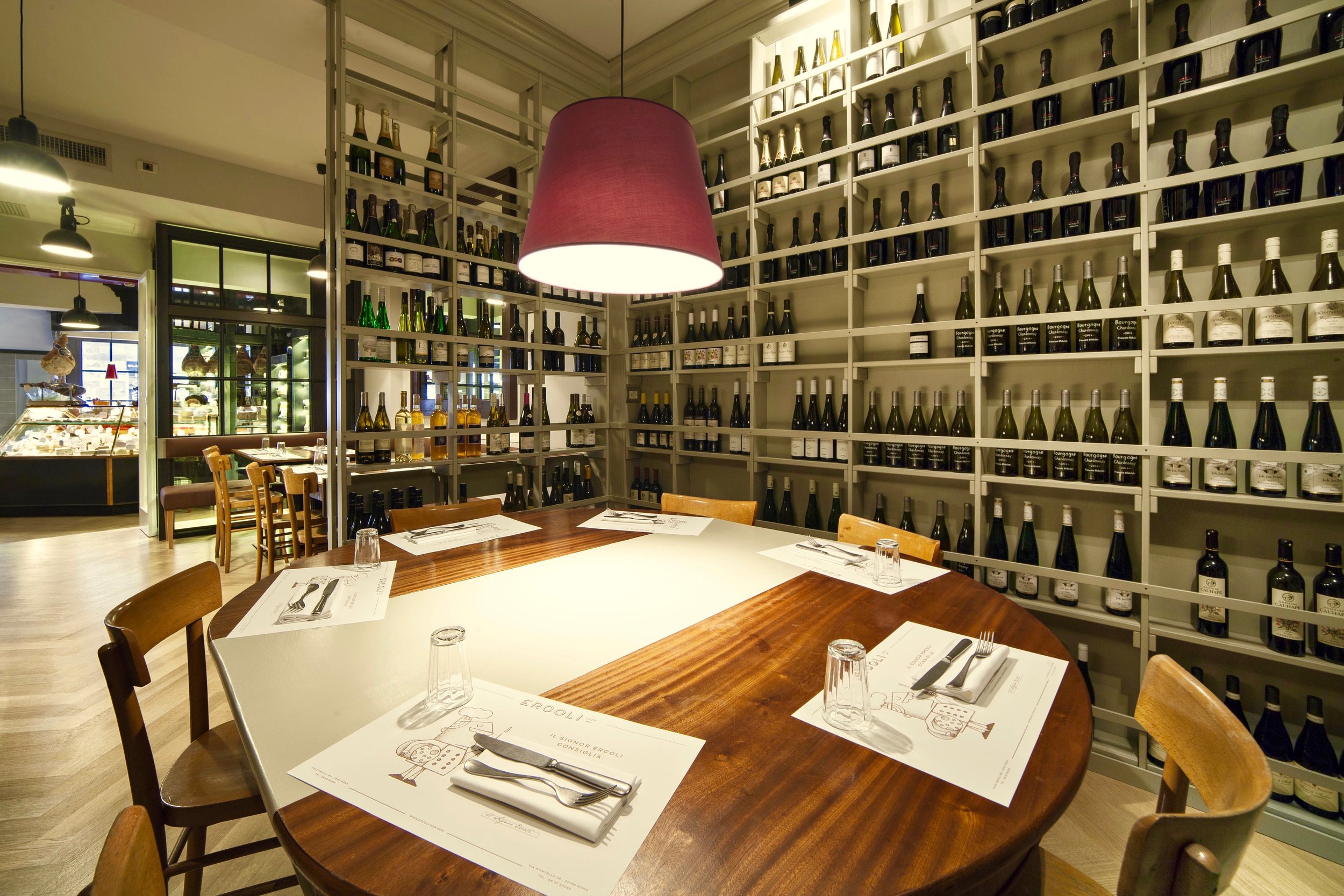


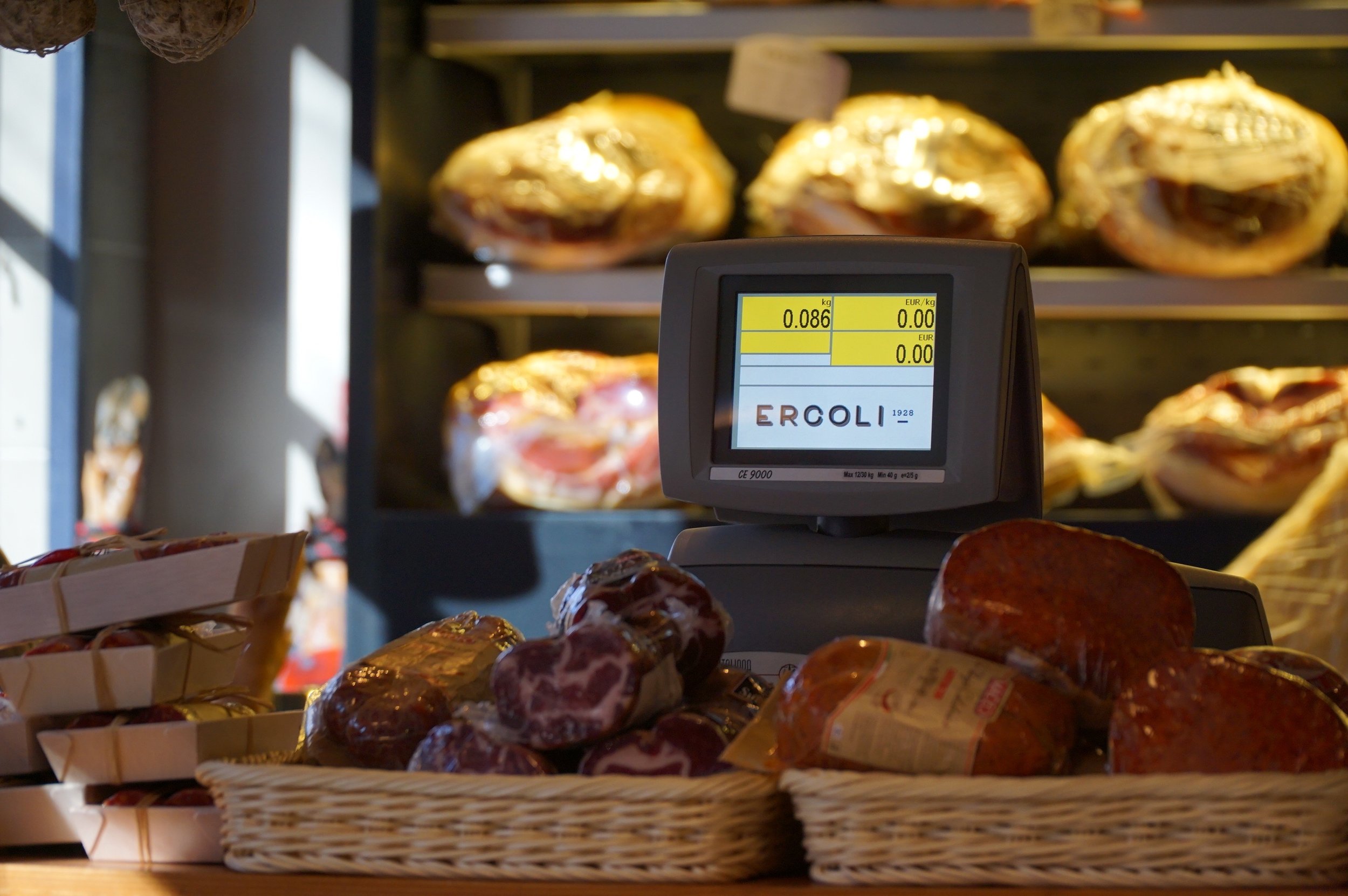 I finished the cheese I bought. I'm trying to avoid Ercoli this week. I don't think I will be successful.
Life in Rome - The Artemisia Gentileschi Exhibit
Buon Anno!Man, am I happy to see 2017. I'm really looking forward to this year, despite all the craziness in the world. I have no control over these many complicated political and social issues but I can control how I react to them.There's a lot of ugliness and hatred in this world. I'm going to focus on the beauty and love. I know that sounds very Pollyanna. However, I strongly believe that those of us who work in creative fields and/or appreciate creative endeavors need to push back. Dostoyevsky wrote, "Beauty will save the world." I agree.If you're in Rome or plan to visit before May 7th, I highly recommend the “Artemisia Gentileschi and Her Time,” exhibit at the Museum of Rome in Palazzo Braschi. It's outstanding.Much has been written about the struggles of Gentileschi (1593-1653). This exhibit doesn't downplay them but focuses on her art and how the times influenced it. There are over one hundred paintings. Most are by Gentileschi with a few from her contemporaries.Gentileschi was the daughter of the painter Orazio and was heavily influenced by Caravaggio. She was the first woman to be admitted to the prestigious Accademia del Arte di Disegno in Florence.The population in Rome was two-thirds male when Gentileschi was growing up. It was very dangerous for a woman to be even be outside. Her mother died when she was twelve and she was raped by the painter her father hired to tutor her when she was seventeen. Her father had to hire a tutor because at the time women were denied access to the art academies. During the humiliating trial, Gentileschi was tortured and her family's reputation questioned. Her accuser (who had raped his wife, his sister-in-law, and tried to steal paintings from Orazio) was sentenced to a year in jail. His verdict was annulled.Gentileschi rejected the stereotypical female roles of the Early Baroque era and painted women who were powerful, mythical.The exhibit is categorized by city. You can see the influence living in Rome, Florence, Venice, London, and Naples (where she died, perhaps from the Plague) had on Gentileschi's work. After her death, Gentileschi's work was often attributed to her father or other artists.The exhibit is well organized (I know. Shocking). There are informative introductions (in Italian and English) to each period of her work.I saw her most famous work, Judith Slaying Holofernes, at the Ufizzi when I visited Florence a few years before I moved to Italy. She painted two versions and the other one is in Naples at Museo Nazionale di Capodimonte. 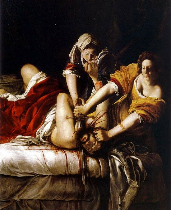 There many paintings of this biblical story (including one by Caravaggio himself). It's fascinating to compare her interpretation to that of her male peers.I don't know if it was the setting (a smaller room, less chaotic that the Ufizzi), post USA election stress, or what, but this time the painting unnerved me. I didn't want to look at it but I couldn't turn away. There was a woman next to me tearing up. It's truly a powerful, visceral, beautiful, work of art. My god the colors. The physicality. Gentileschi painted herself as Judith and her accuser as Holofernes. I didn't know the details of her trial then but even those who have no knowledge of Gentileschi's backstory, can see and feel the unadulterated rage.Moving on from that uplifting note, Palazzo Braschi is a striking venue located in Piazza Navona. During the weekends there was quite a line. It might be less crowded now that the exhibit has been running for a few weeks. Museum of Rome, Palazzo BraschiUntil May 7th, 2017Tuesday to Sunday from 10am to 7pm
Before & After - Via Banchi Vecchi Project
Ciao Bloggisti,Earlier I wrote about the Via Monserrato project. One of the other apartments we worked on was located two blocks away on Via Banchi Vecchi. It was a new apartment for our client.The apartment was empty so we didn't have the same logistical issues but two bathrooms, and the kitchen had to be renovated. Any time you start opening walls you will have some surprises, especially in a building that's over three hundred years old.The brief from the client stated that the unique original flooring and the red tiles in the kitchen could not be replaced. The floors weren't in great shape but I like to think of them as adding character. The client wanted to improve the layout, add a closet in the bedroom, lighten up the very dark kitchen, and make the second bathroom more functional.The bulk of the budget went to the renovation. Some of the furniture came from the other apartments. We bought a mix of high-end hardware/fixtures along with budget friendly pieces.The minute the client stated that they had to change the layout, we called an architect. Fortunately, Domenico Minchilli and his studio took on the project. Square footage wise it was a lot smaller than their usual projects but it was complicated. We had worked together before which made the renovation process, never easy, smoother.BEFORE - The Kitchen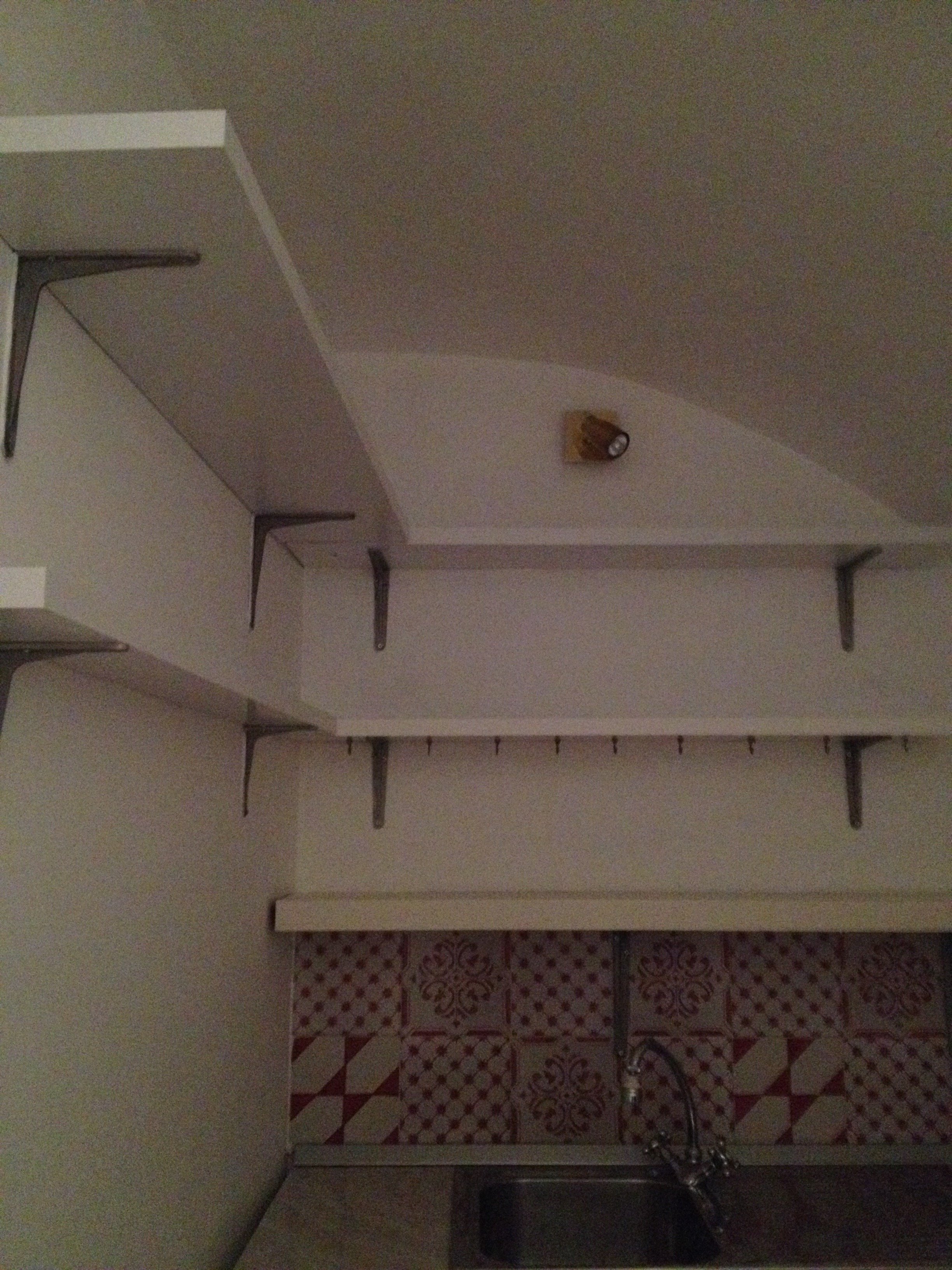 True, this is not a primary residence but I don't think any guest would want to spend a lot of time in here. It was impossible to get a decent shot of this dark, cramped space. The hallway before. The kitchen is behind the wall on the right.
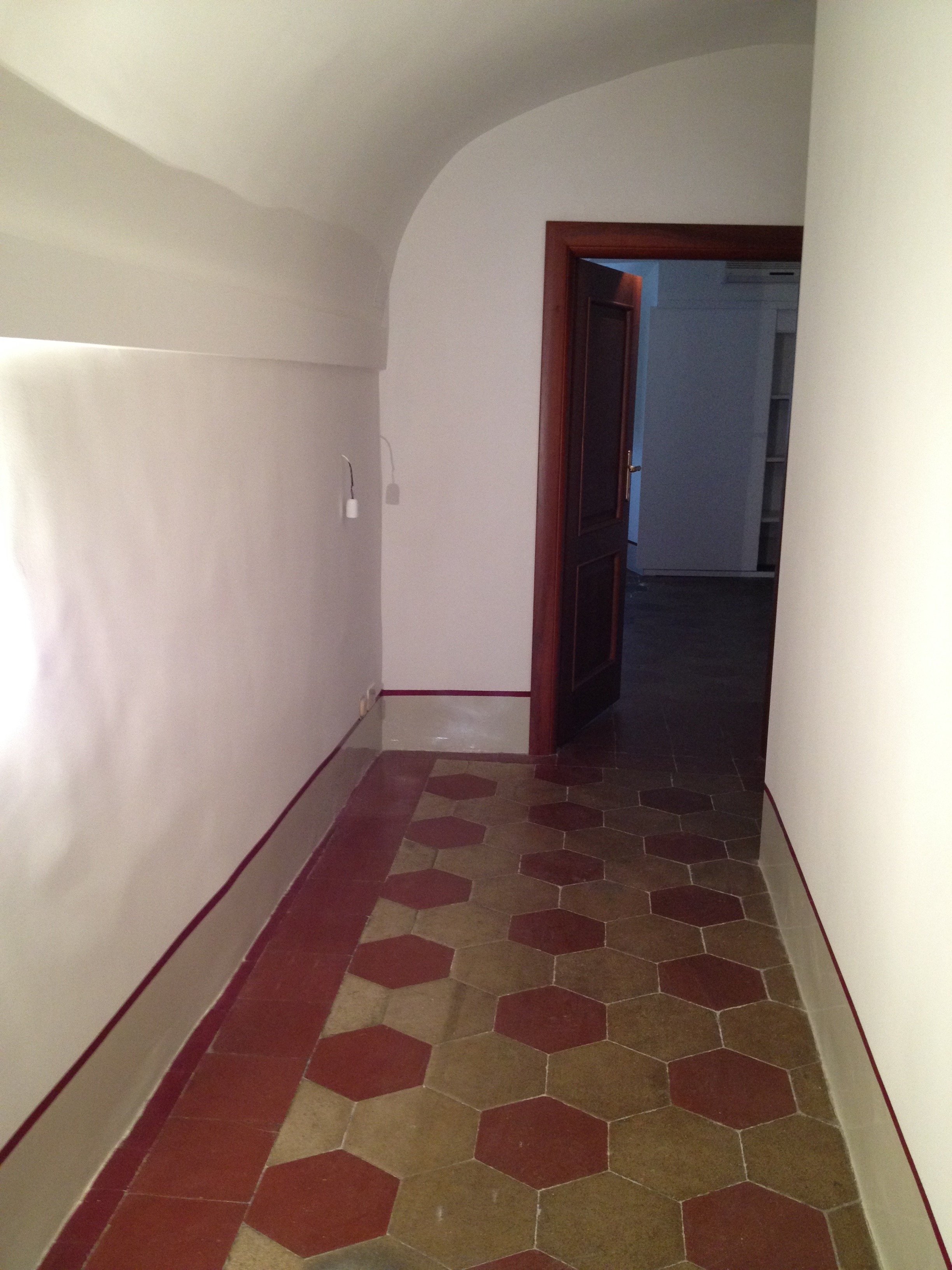 There were structural issues that had to be addressed (electrical, ventilation) so a upgrade/renovation had to happen.
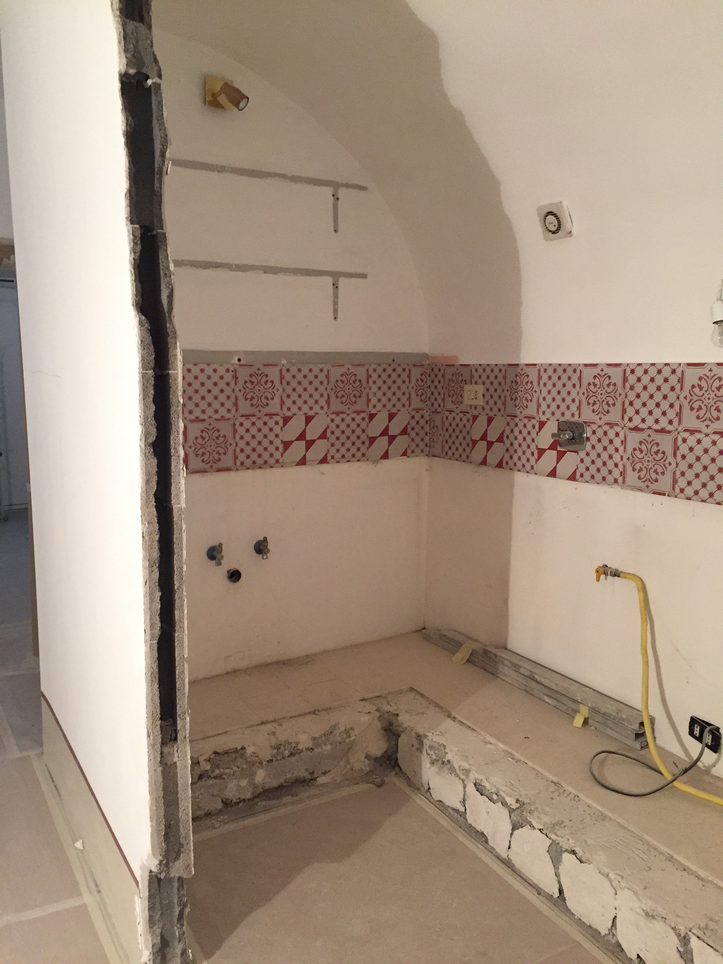 Originally, we discussed opening just one of the walls. Studio Minchilli suggested removing all them so you could see the entire arch as you walked into the apartment.AFTER
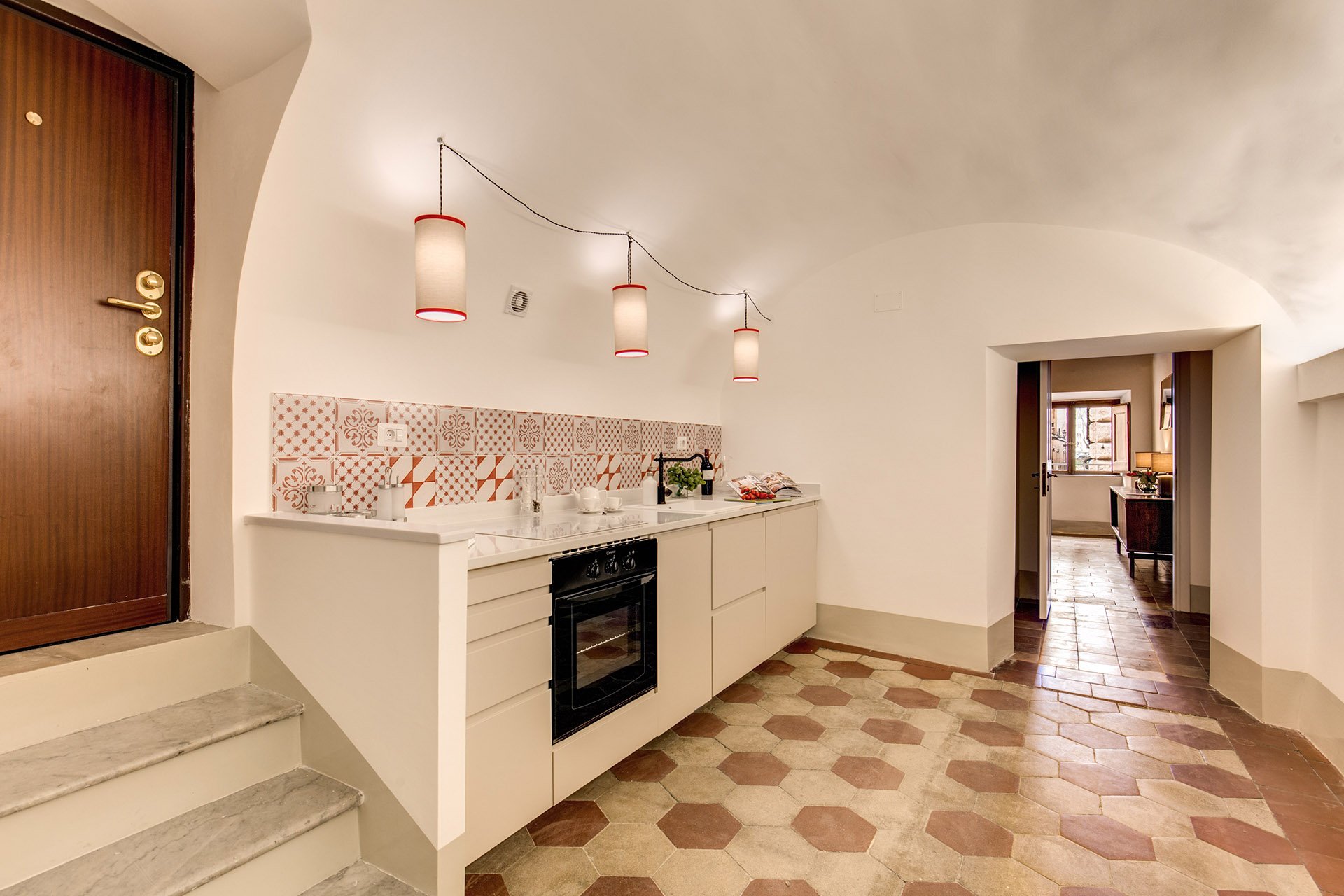
 What a difference. It's light and there's plenty of space to move around. The cabinets are from IKEA but the counter top is quartz from Stone Italiana. We decided to spend more for a higher quality counter top given the open plan design. It elevates the entire space, making the IKEA cabinets look more expensive.My anxiety level was not good the morning of this installation. A heavy slab, cut to order. Three men had to carry it.
  The light fixture is custom. Il Paralume.
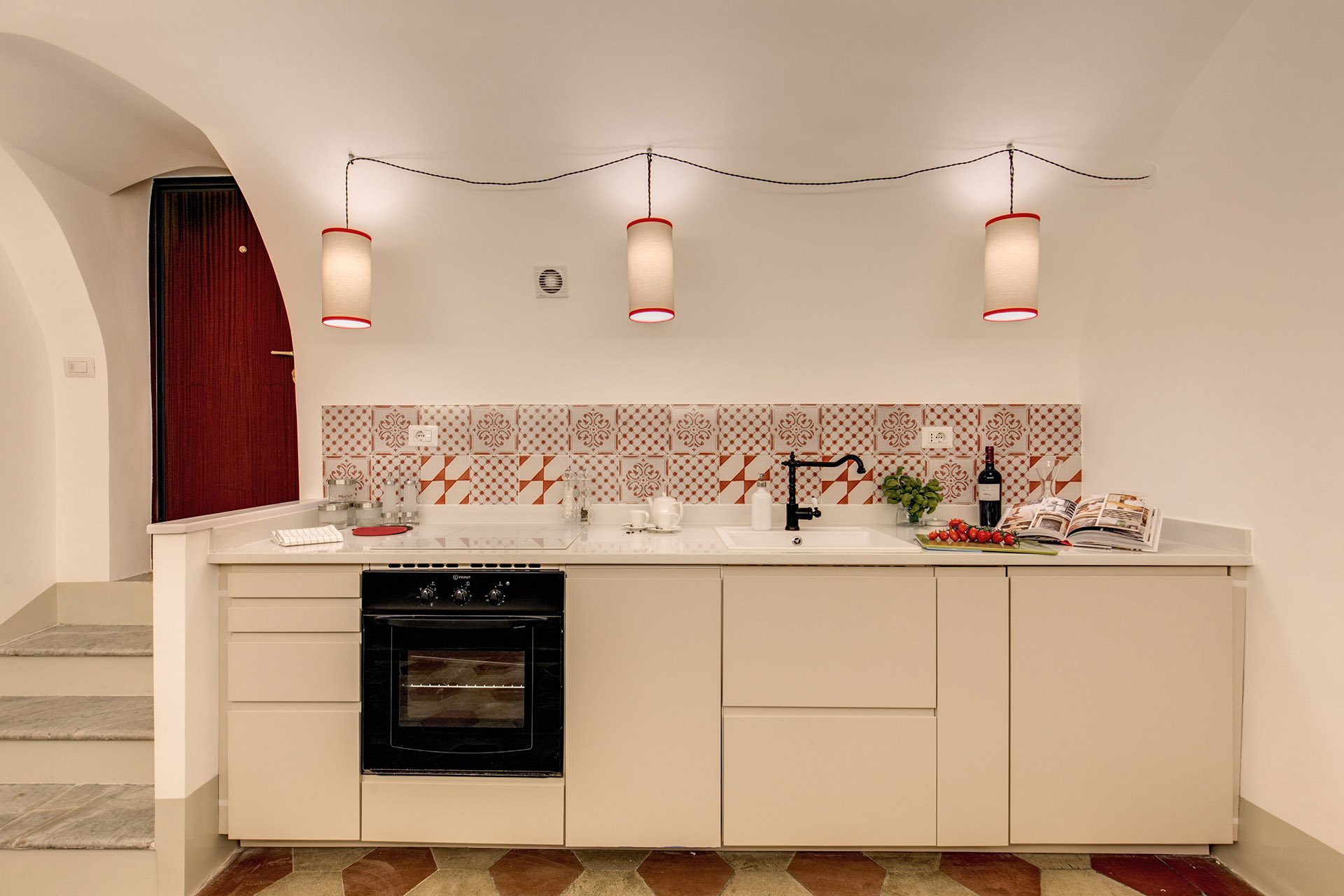 We also installed LED lights on the right.
 BEFORE - Master Bathroom
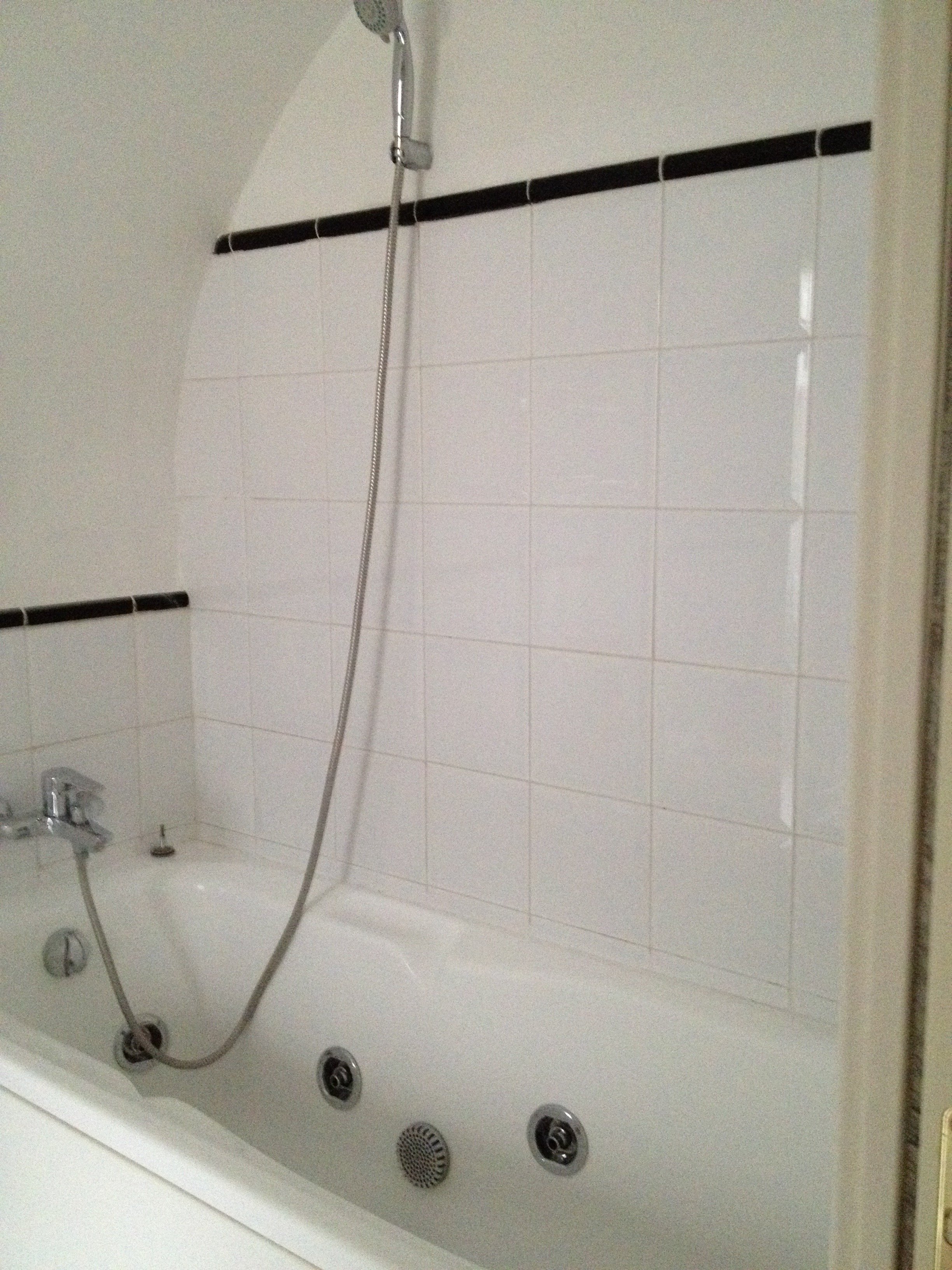 There were dated, inexpensive white tiles on the floor. AFTER
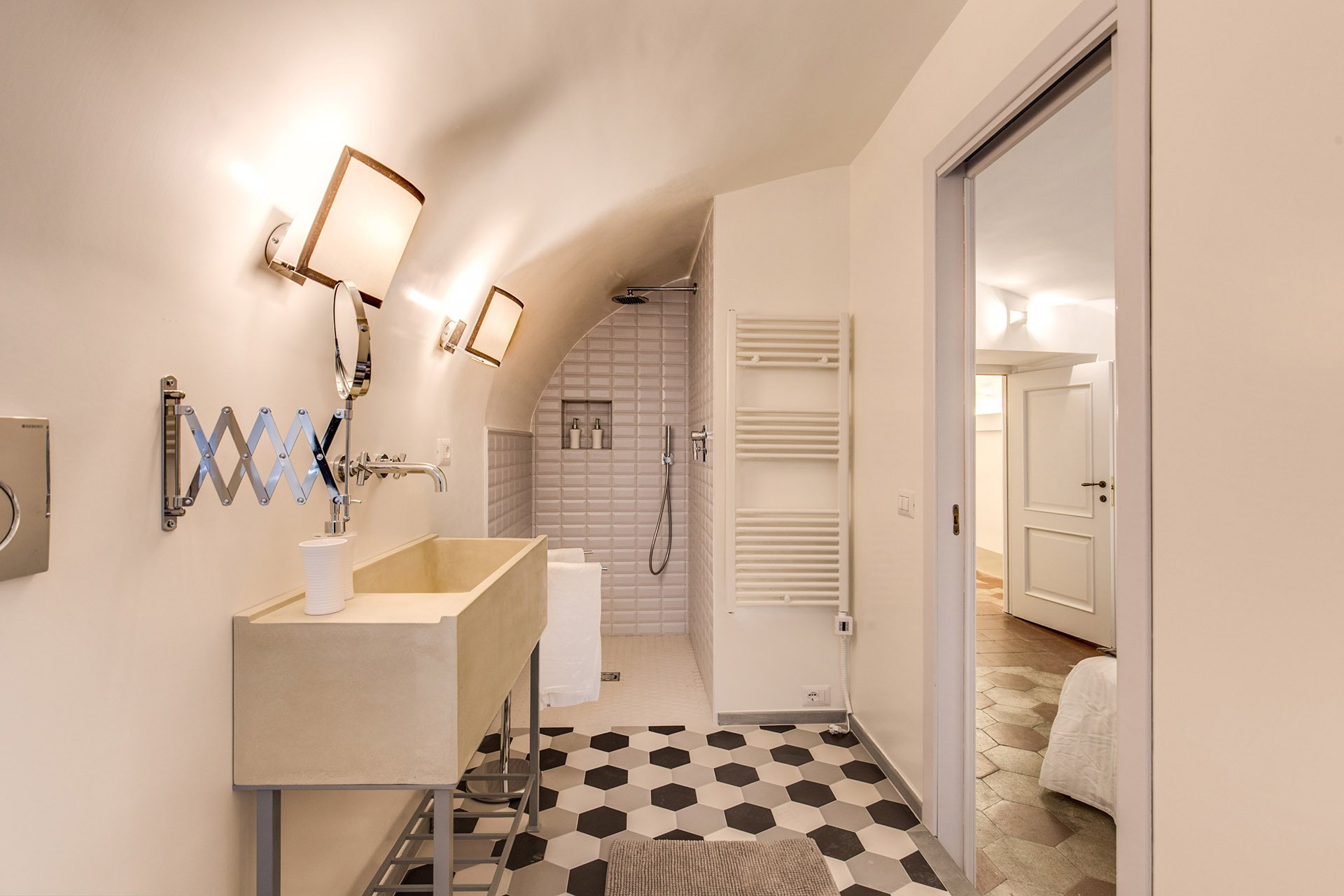 The tub was replaced with a shower.
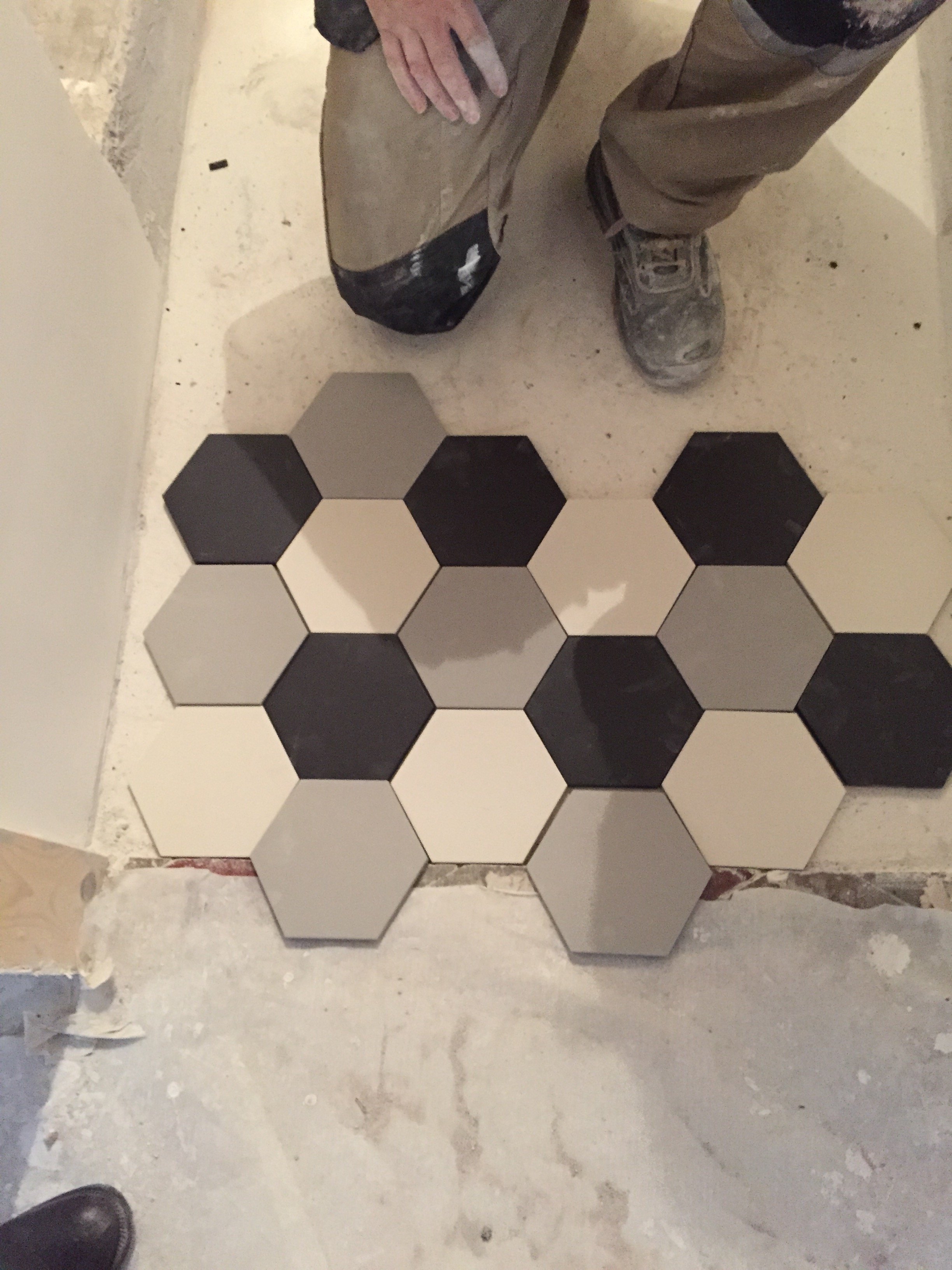
 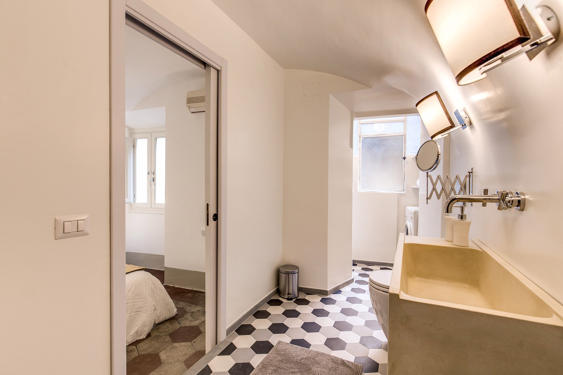 We decided to go with a combination bidet and toilet, which is great for small spaces. The client wanted a unique sink. We ordered these (which were quite heavy, our poor contractor) and asked our blacksmith to build the bases.Notice, we didn't put tiles on the walls. Similar to the Tuscany Project, we wanted the bathrooms to feel more like a room and less clinical. For a busy family bathroom this option could be impractical but I really like how these rooms feel without tiled walls.The design of the new tiles mimics the original tiled floors in the rest of the apartment. While these colors look great together, installing three colors is a different story. Complicated.
 The tiles, sink, and all hardware were purchased at LOZZI.The sconces are custom. Il Paralume.Paint is a custom color from Crown.In the bedroom we added a pocket door, a built-in closet, and the lampshades are custom from Il Paralume.
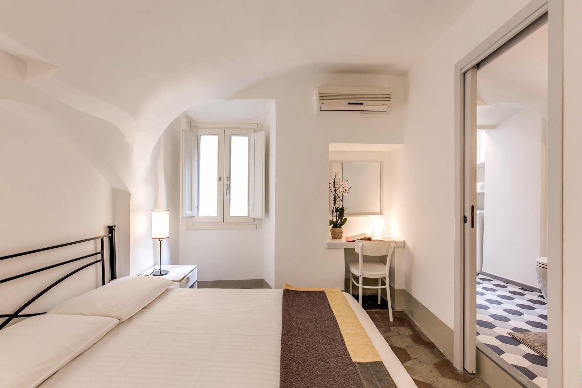 Our carpenter also created a desk in the corner.
 BEFORE - Second bathroom.Extremely tight space, dated tiles. The layout was terrible and the room very dark.
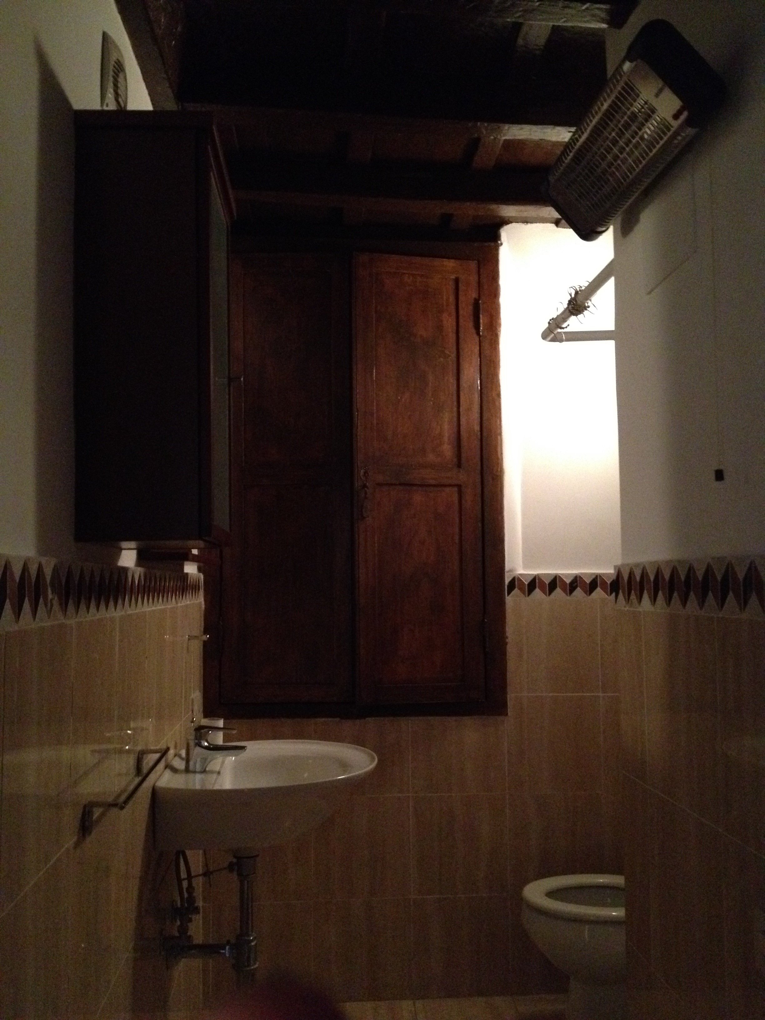 AFTERWe completely changed the layout. We moved the entrance which enabled us to add space for a proper shower.The door is custom made by our carpenter. Door fixtures are from Handles.
 Here's a better shot of the sink with the custom iron base. As with the other bathroom, we bought a combination bidet and toilet.
 BEFORE - Living Room
 AFTER - Living Room
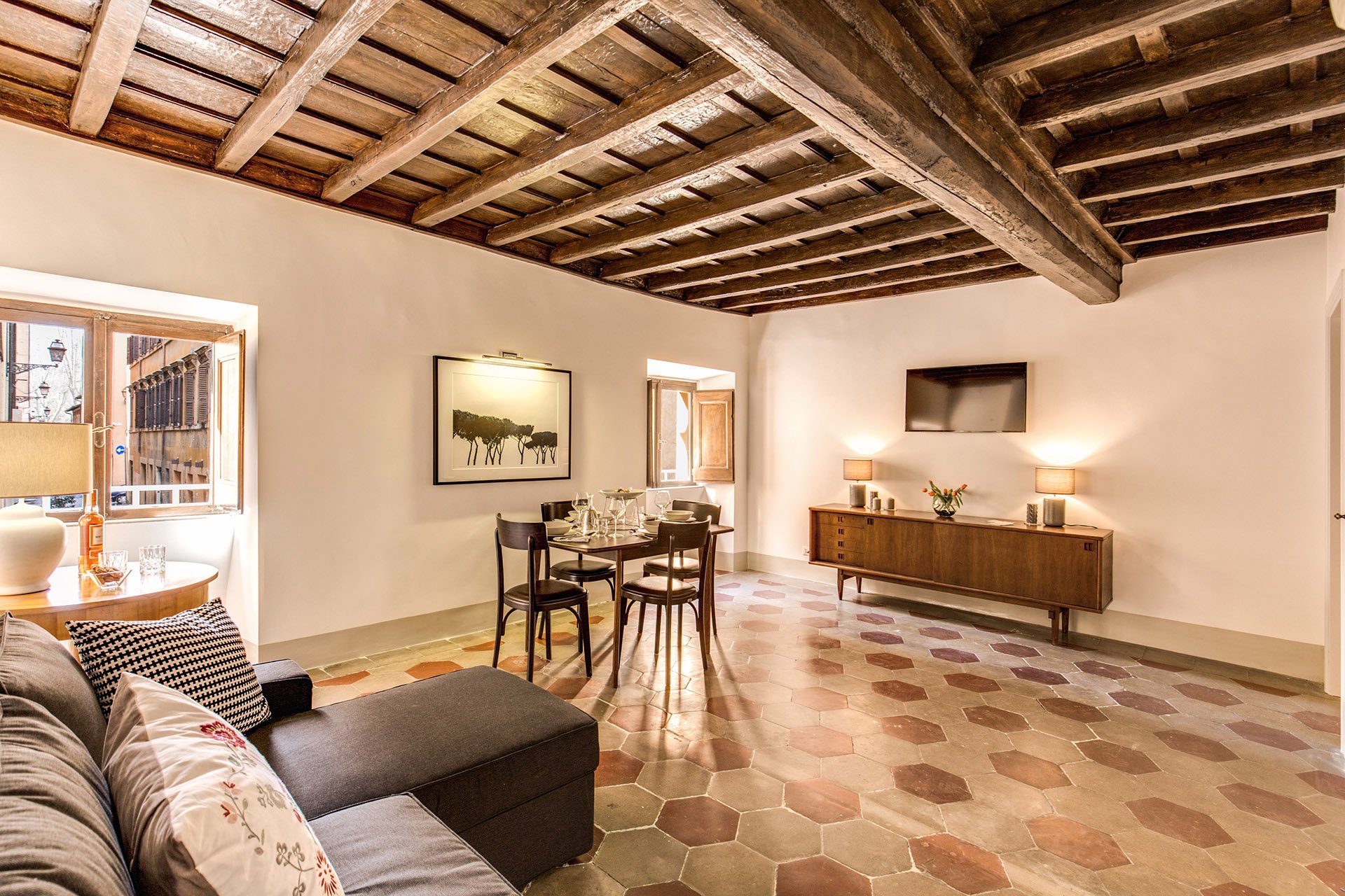 The fantastic artwork is from Due Alberi. They're based in Rome but ship internationally.Our carpenter added new closets.The dining table is from MADE and the chairs belong to the client.
 The side table came from the Via Monserrato apartment. We found the lamp at Leroy Merlin (the French version of Home Depot).
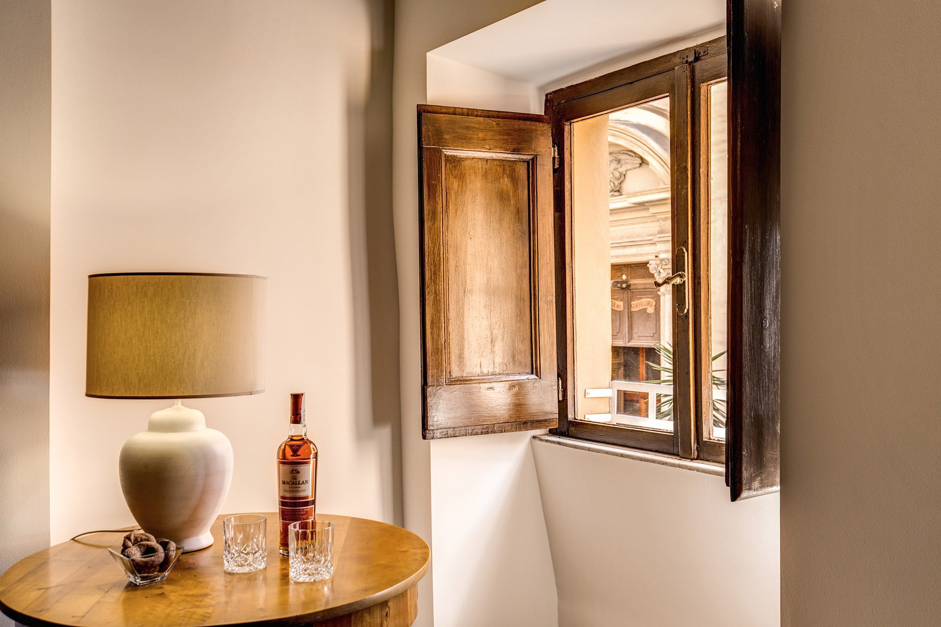 The client found the credenza online. The lamps were a great find at Leroy Merlin. We were so tired and hungry. My client was worried about my mental health as we had just spent hours at the IKEA next door. I perked up when I saw the lamps on a bottom shelf. I was so excited. It was like meeting Idris Elba.
 Overall, the apartment feels lighter despite the lack of light (the windows are tiny). The renovated kitchen and bathrooms compliment the style and architecture of the apartment. We updated them but without losing the charm.We kept the palette very simple, creamy whites, grey, black, with a touch of red. The ceiling seems higher and apartment looks/feels bigger.For more information about this vacation rental, please check out Your Suite Rome on Booking.com.Architect: Domenico MinchilliAfter Photos: Vincenzo Tambasco
Life in Rome - Day Trip to Spoleto
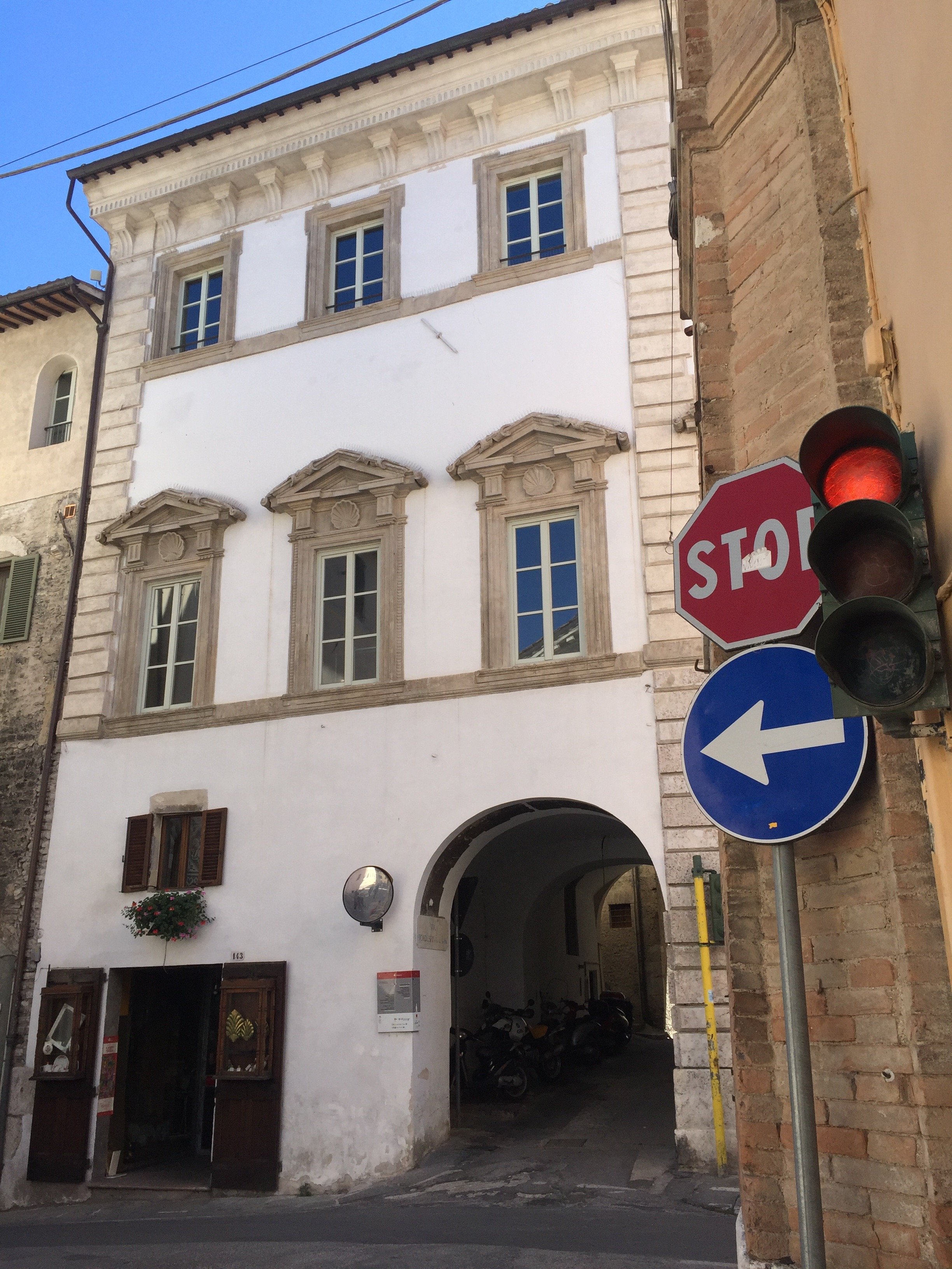
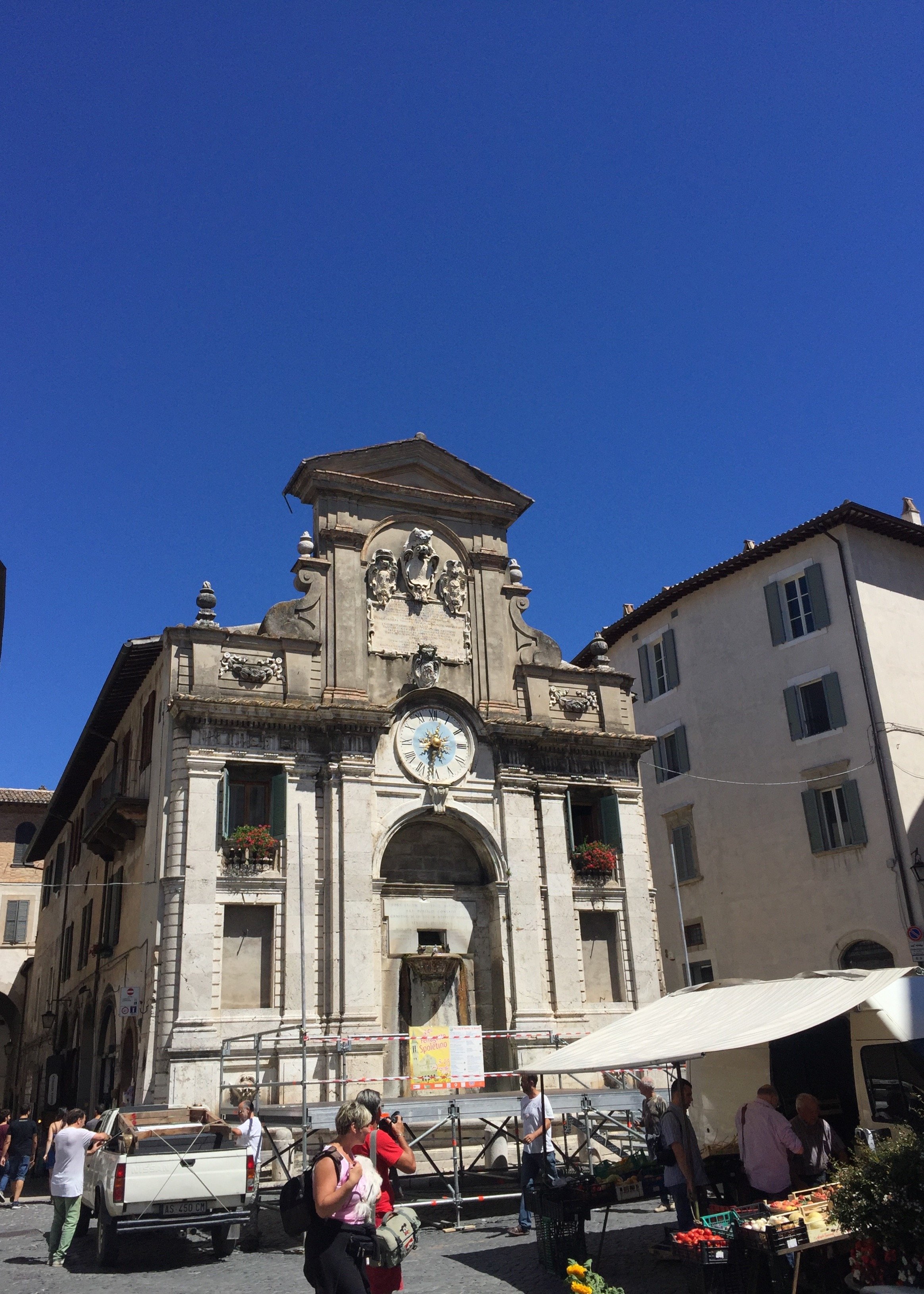
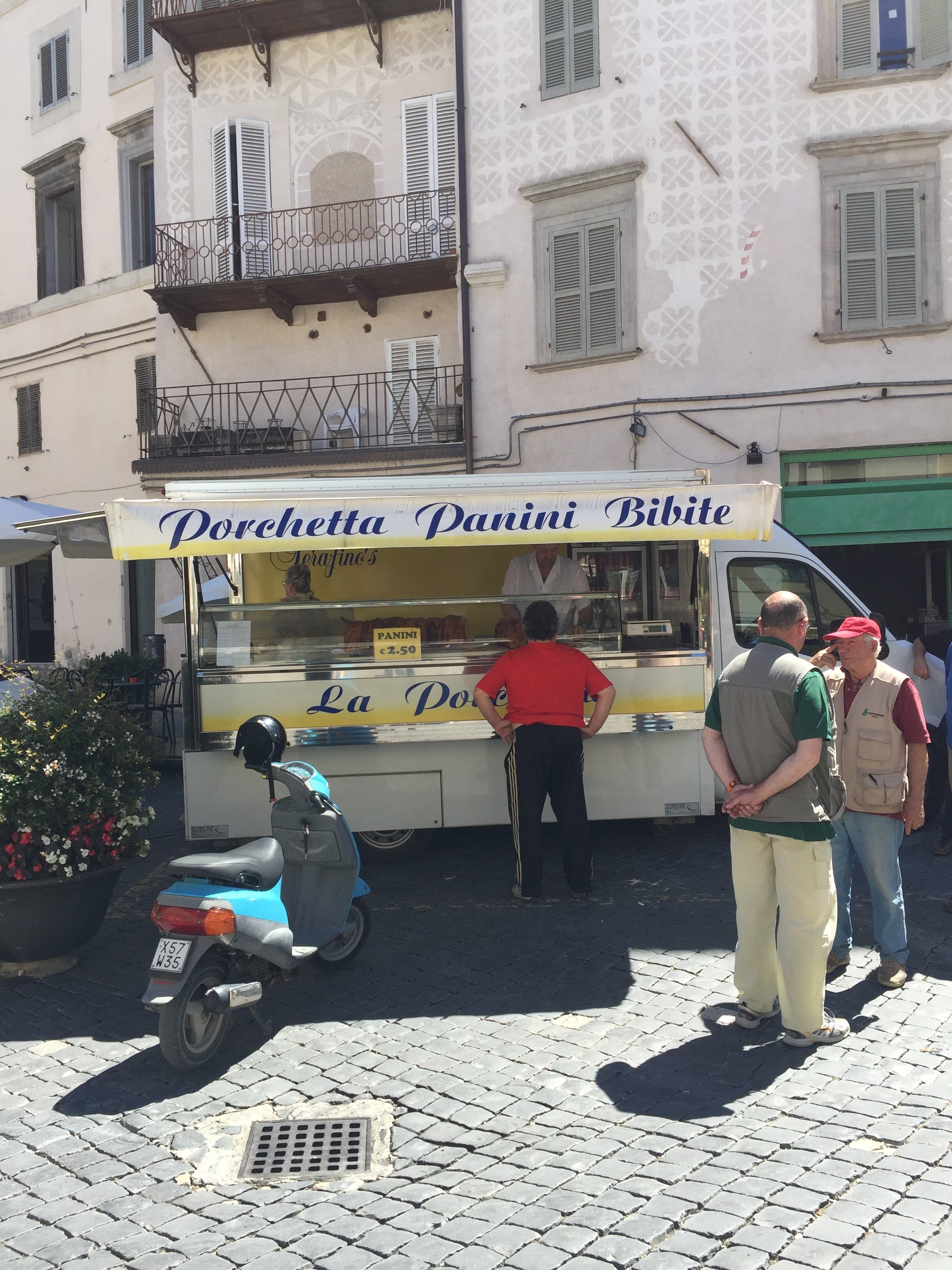
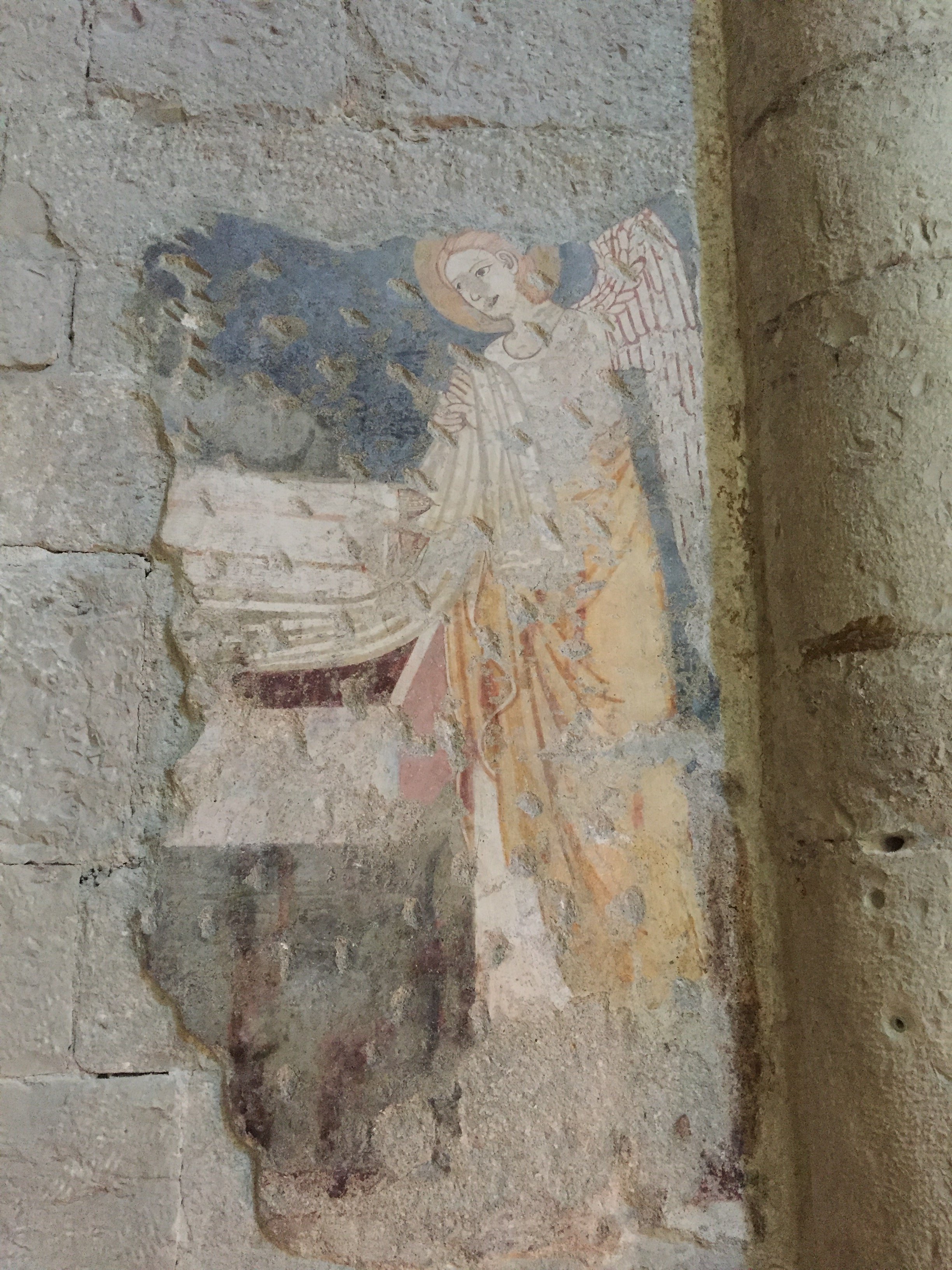
Ciao Bloggisti,Friends of mine recently bought a weekend place in Spoleto and invited me up for a day. It's about forty miles south east of Perugia.It was my first trip to Spoleto and I highly recommend a visit. The Historic Center is very charming with incredible views. I took a lot of photos. Below are a few.Ponte delle Torri - a 13th century aqueduct.One of the highlights for me. Next time I will bring a pair of sneakers or hiking shoes so I could walk further up the trail.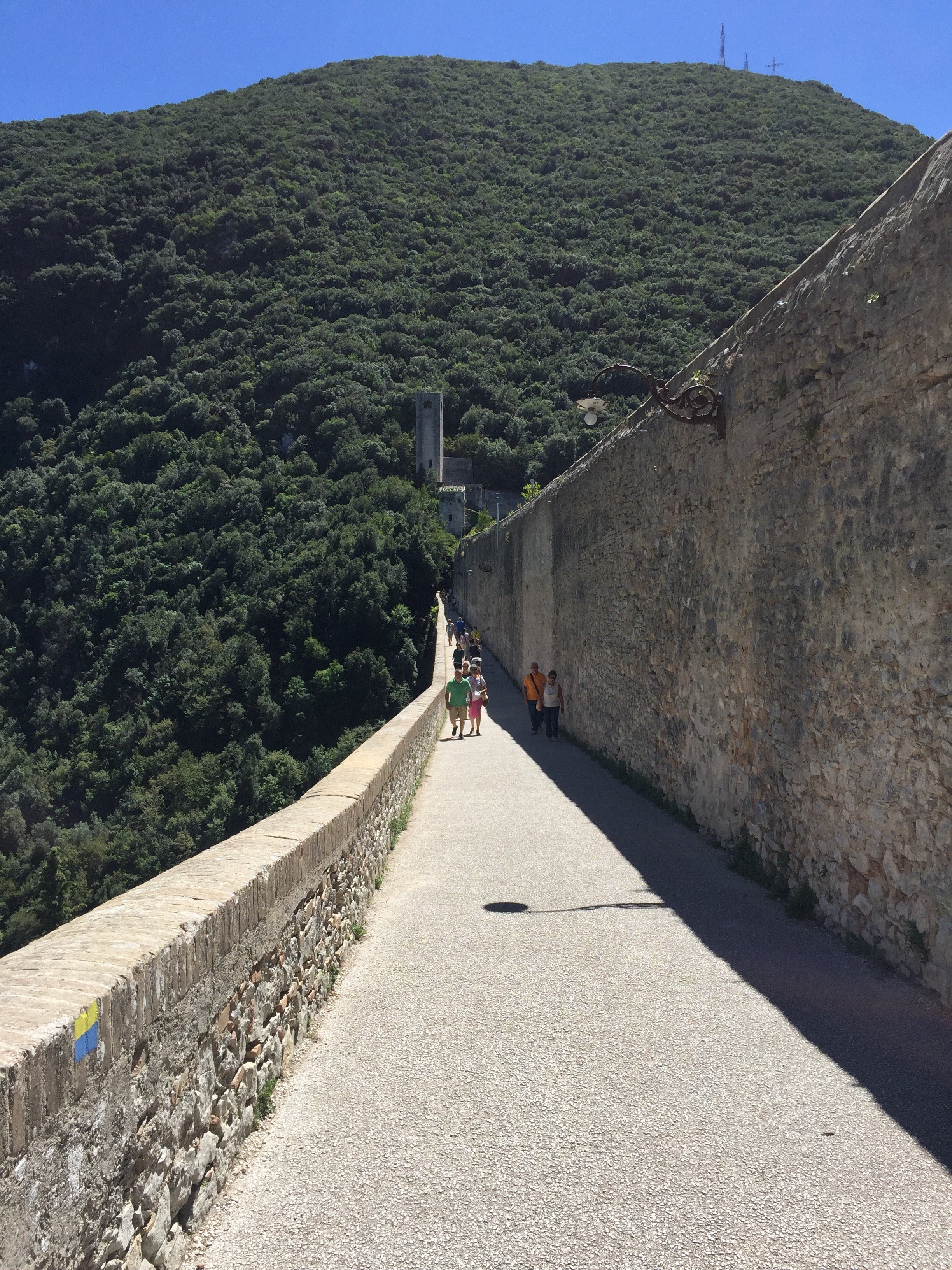
 The Duomo - Santa Maria Assunta
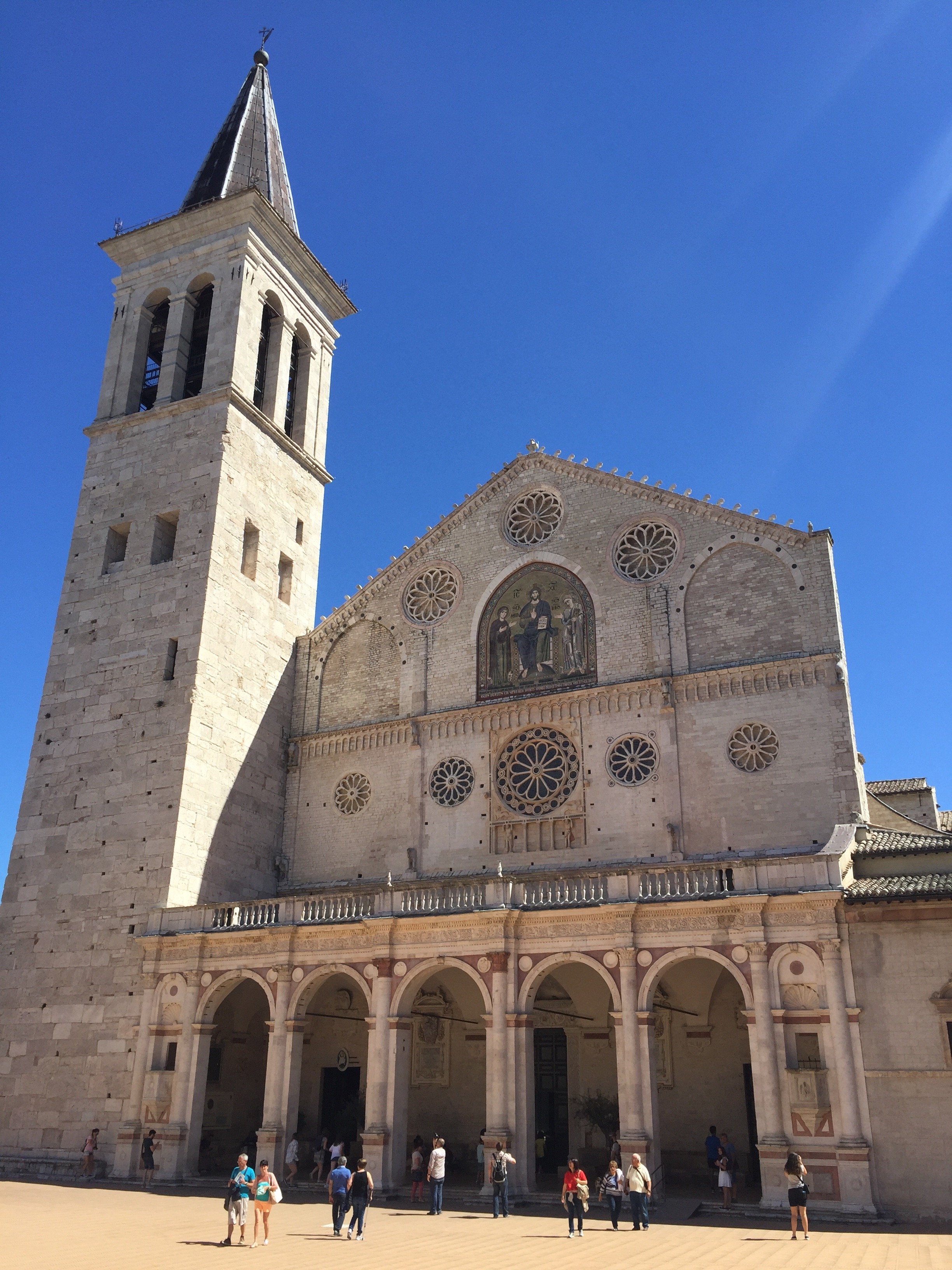

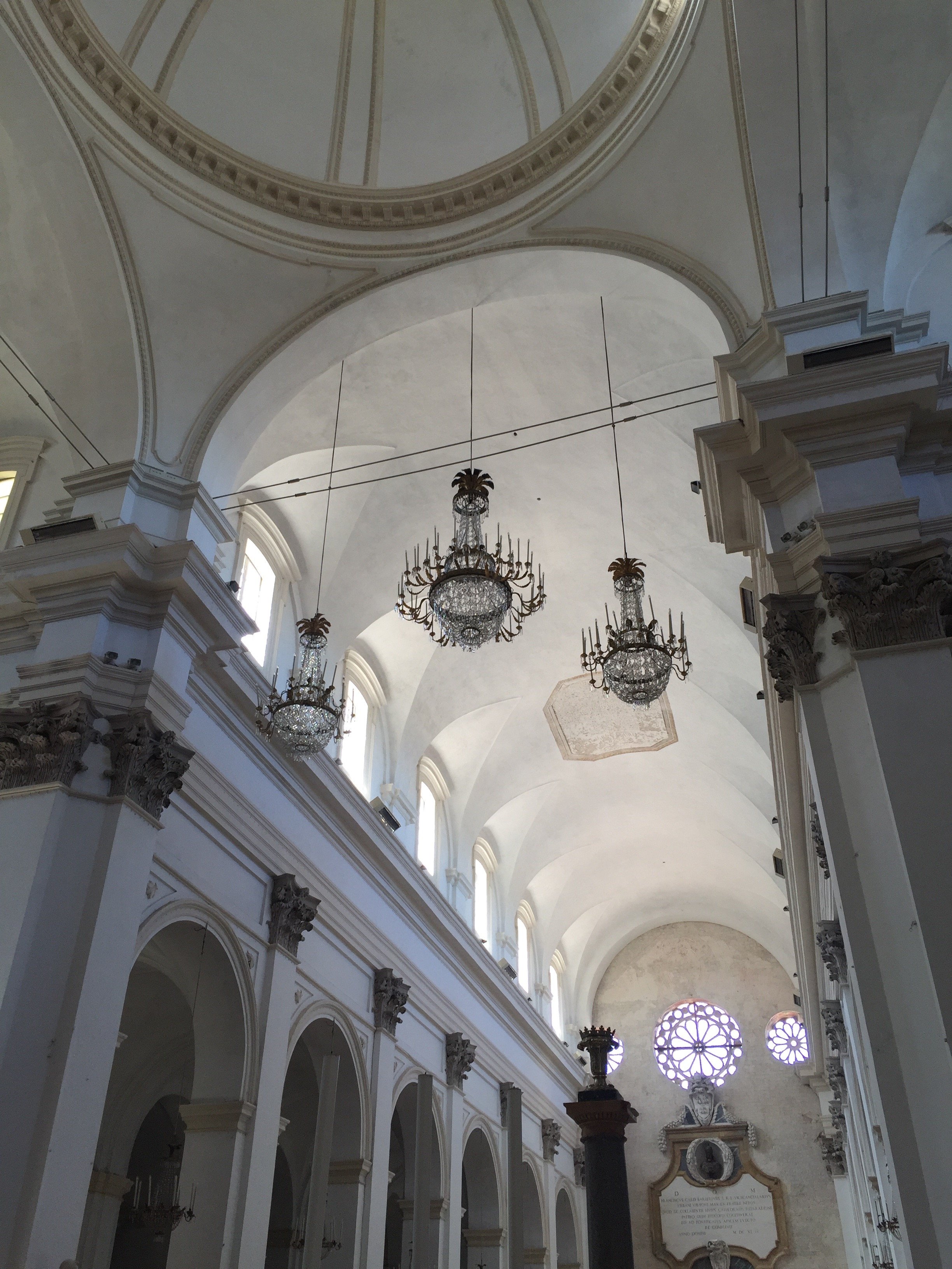
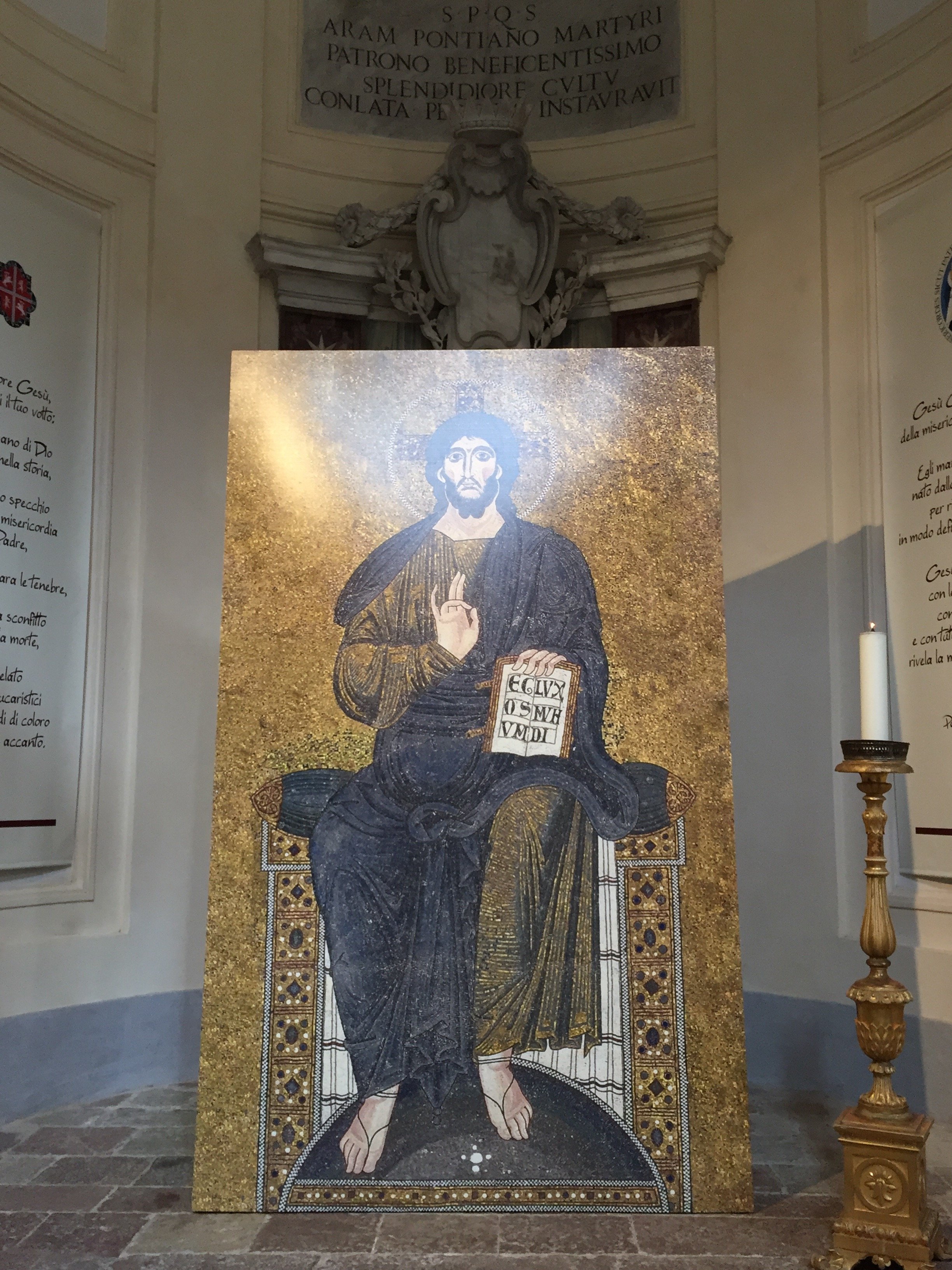
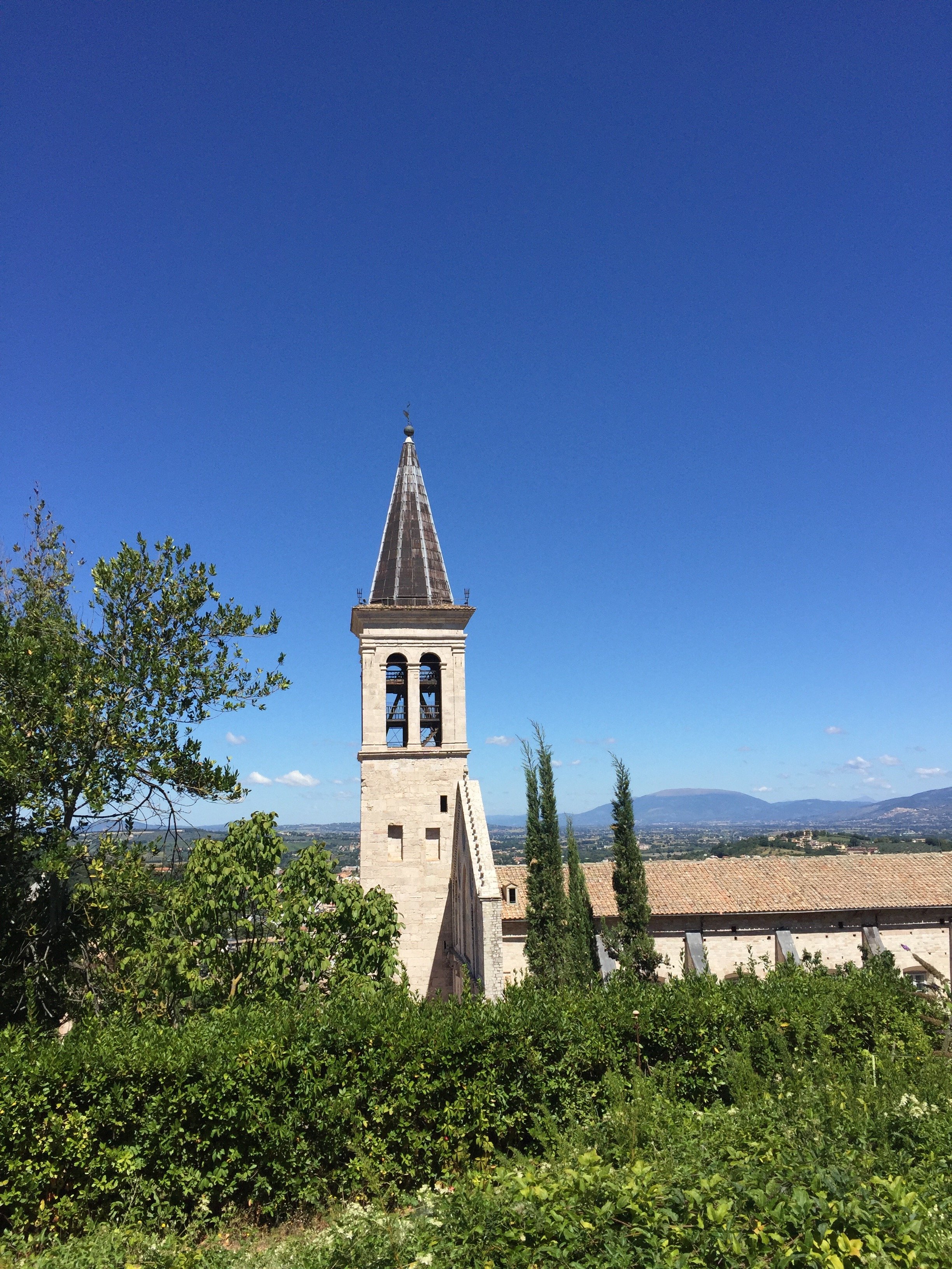 More pictures of the Historic Center.
 Basilica di Santa Gregorio Maggiore - consecrated in 1146.
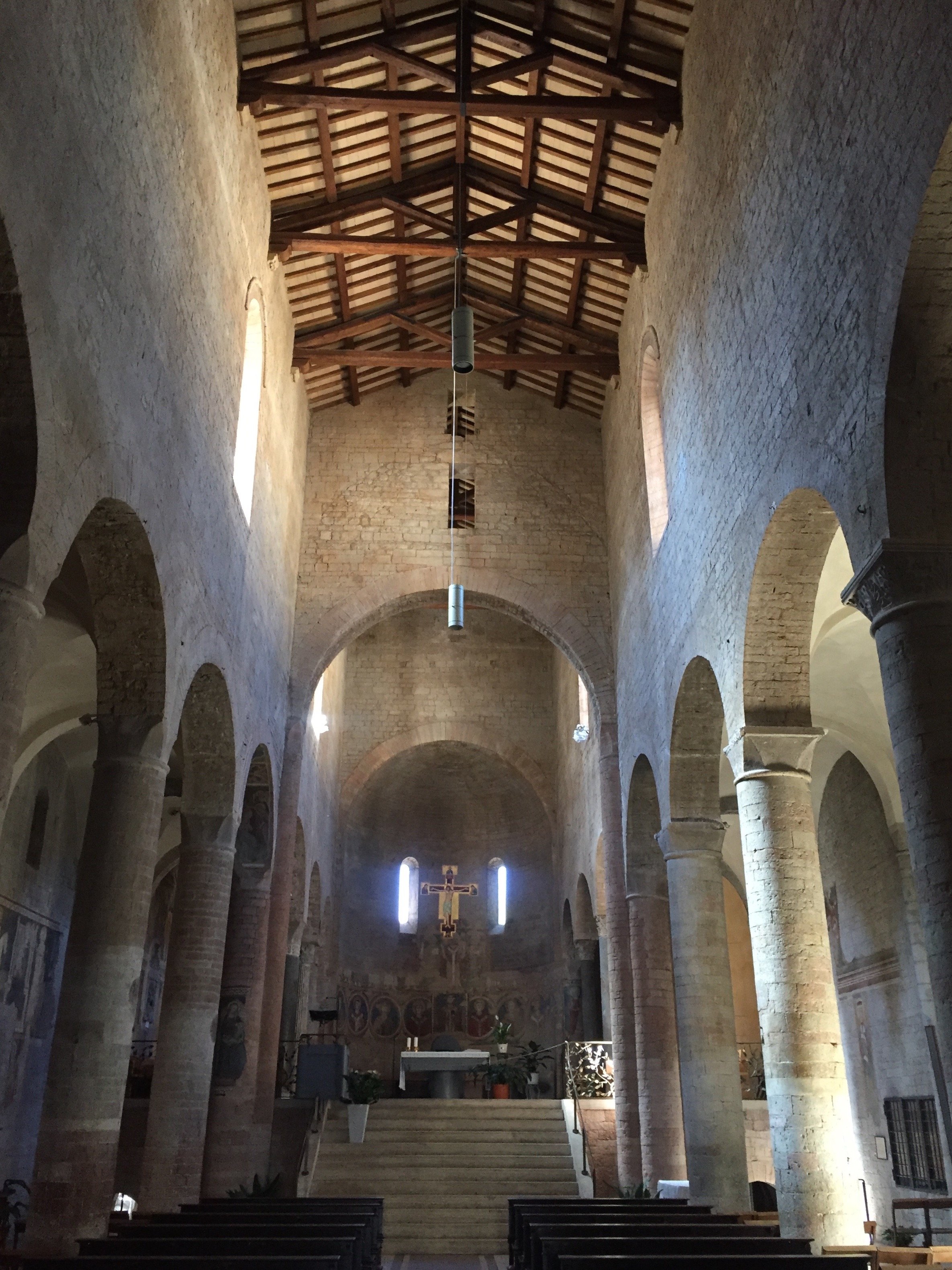
 Note: This is not a politics blog but the US election last week was not normal.The President Elect would like to commute to the White House, staying mostly in Trump Tower. I was not aware that being President of the most powerful country on the planet was a part-time gig. This would create a major logistical nightmare for the Secret Service and the NYPD. It would also be a headache for residents of the building and the surrounding area as blocks of a major street (5th Avenue) would have to be shut down.There's a silver lining. Trump may not have time or the desire to redecorate the White House. I was thinking of writing a separate post about this space:
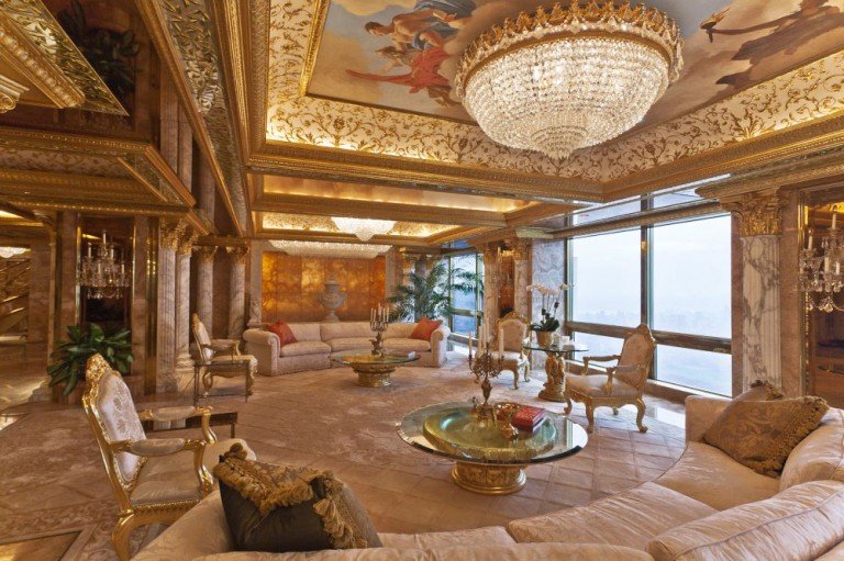 SpoletoPhotos: Me and my iPhone Trump Living Room: iDesignArch
The Design Files - Yes, You Can Mix Stripes and Prints.
Ciao Bloggisti,I know matching curtains, wallpaper, and even bed covers are having a moment. I think this style can look lovely in a Manhattan Classic Six bedroom or a home in the English countryside. In general though, I'm not a fan of what interior designers/decorators refer to, in very technical terms, as matchy-matchy.So far we've used a lot of neutrals and solid colors in our projects. I'm trying to experiment more when it comes to patterns, especially mixing them. It's tricky as there's a fine line between Granny Chic and a room that looks dated.One of my clients has a beautiful striped sofa. The current decorative pillows are a solid blue that she would like to change. Surprising myself, I started to pull prints. Her home has classic lines and a few antiques mixed with modern art. The solid pillows on the couch completely disappeared.Something like this from Designer's Guild would make the pillows stand out more without overwhelming the sofas: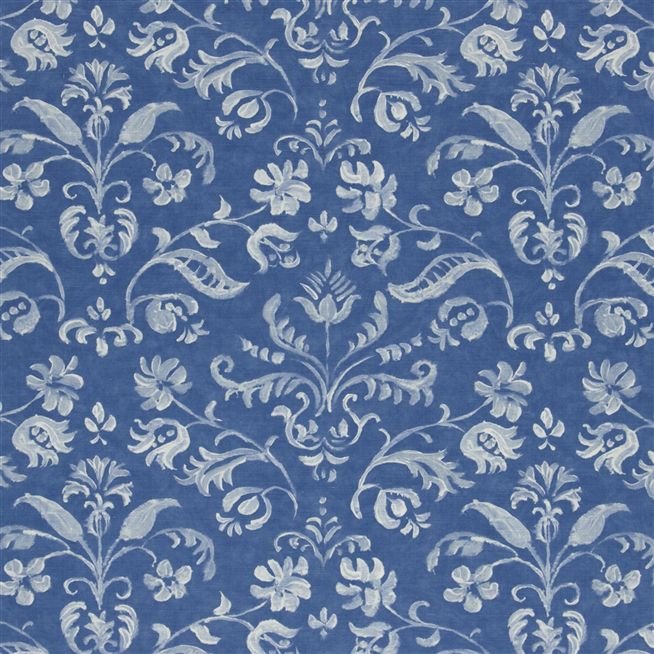 I LOVE stripes. They're a great pattern to mix with as they are simple and graphic. It may seem odd to place a stripe in a room that has floral prints, but try it. The graphic lines of the stripes will help ground the space.How to make sure the room doesn't look like a jumbled mess? Color, color, color. This bedroom by Mark D. Sikes is a perfect example.
 The stripes on the chairs go beautifully with the floral print on the duvet. Imagine a floral pattern on the chairs. I believe it would be way too much.There's a lot going on in this space but the color palette (and the scale of the furniture) makes it relaxing.Below, a bold approach from Steven Gambrel. Gorgeous.
  Chocolate brown and blue from Sheila Bridges. Notice how the print in the curtains is the same color as the stripe. Beautiful. Solid curtains with this type of sofa would've made the space too formal for a young single woman.
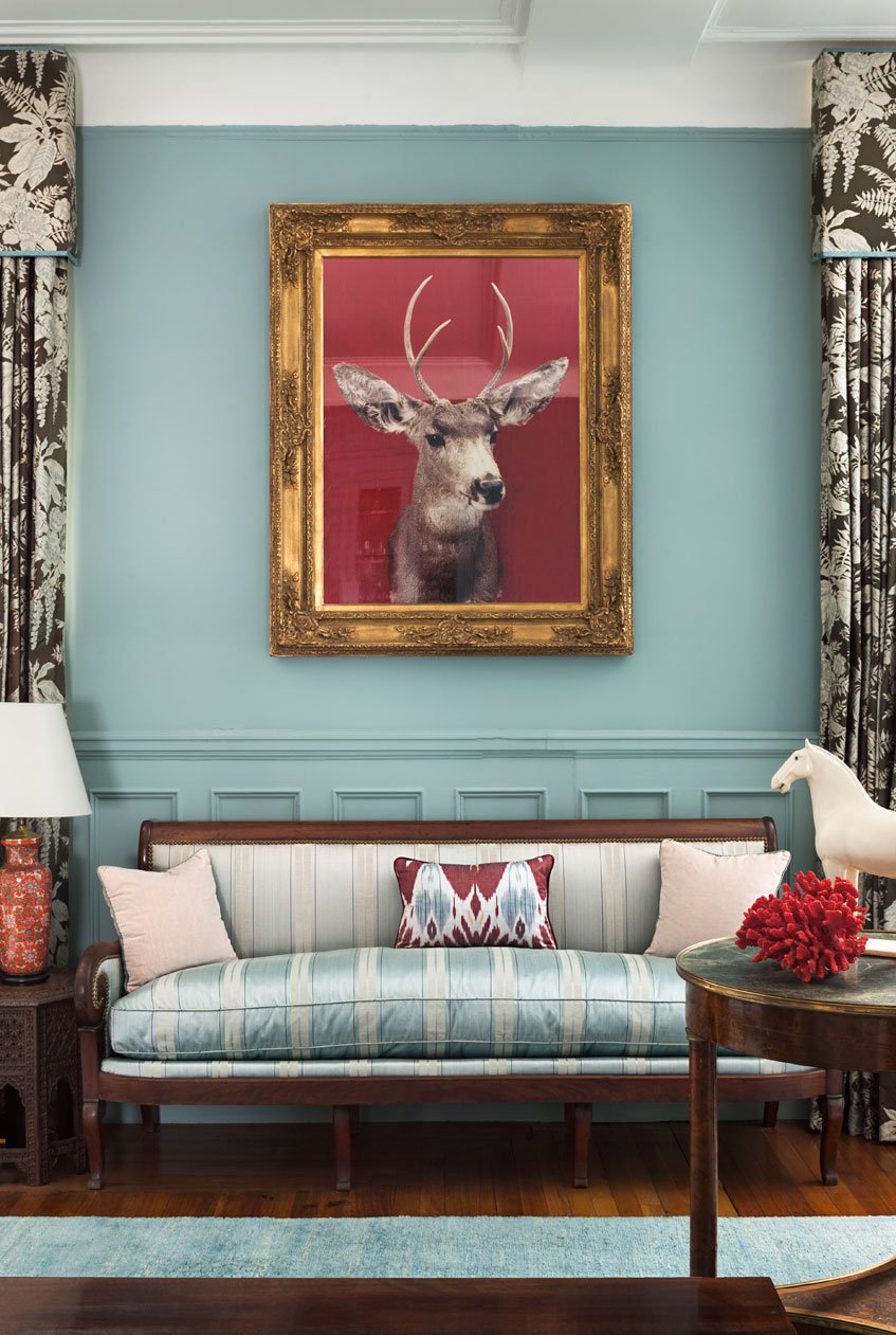 Clearly, I have the color blue on my mind.
Art and Architecture with Ariella - Amsterdam
Ciao Bloggisti,Here is the latest post from our intern, Ariella:Last week my classmates and I went to Amsterdam. My impression of the city upon arriving was very different to my expectations. The architecture reflects its history and age, serving as a unique backdrop for modern, urban life.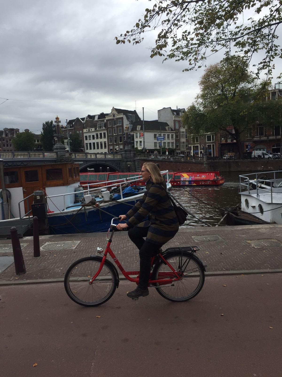 I had preconceived notions of what the relatively “young” culture/community of Amsterdam was like. While Amsterdam really is a young and vibrant city, we soon found out how the existing architectural exteriors are not allowed to change. There’s a strict limit on the height of buildings in order to preserve the density and aesthetic “look” of Amsterdam. This also gives the city the character of feeling small, manageable, and almost village like, easy to get around. We saw many bikers traveling through its beautiful streets, even during peak rush hour time. Amsterdam is very livable and feels “alive” with its diverse multicultural population whose art and ideas you see splashed all about town; on the walls, in the alleyways, in fairs and in performances.
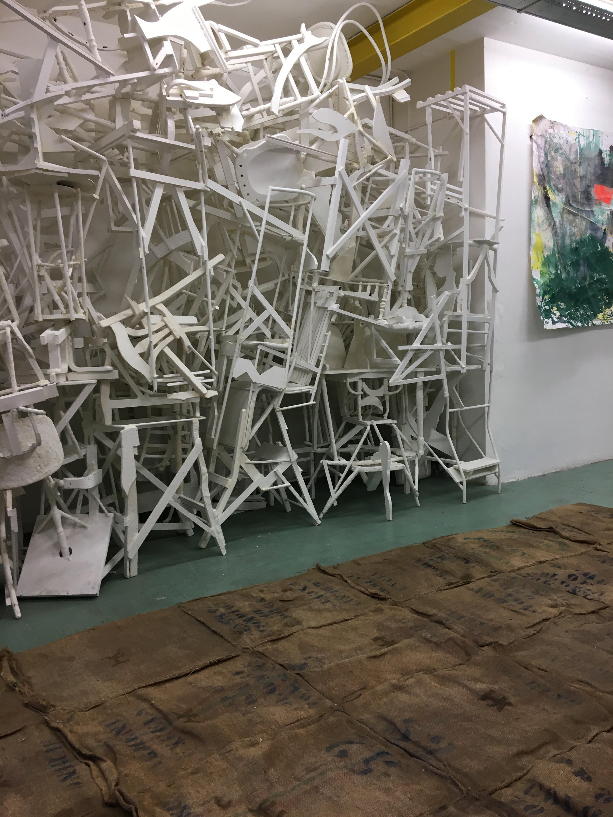
 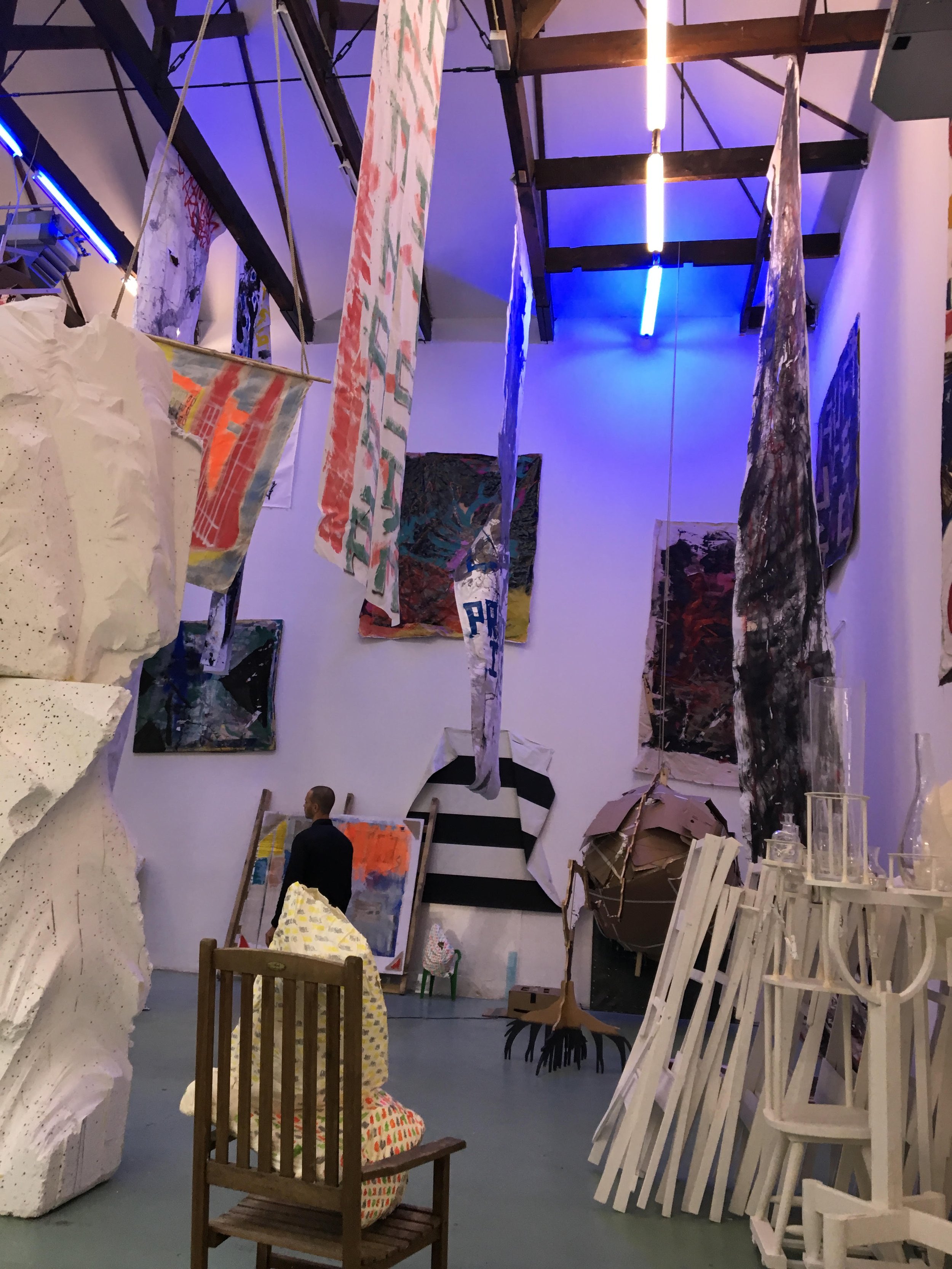 Amsterdam has become a city where all the people and their original works have connected the old character of the city to the new young ideas.
Life in Rome - Villa Farnesina
Ciao Bloggisti,Villa Farnesina has been on my "need to visit" list for quite some time. One rainy afternoon, I decided to schlep across town. It was worth the trip.This villa is one of the finest examples of Renaissance architecture. In 1509, the wealthy banker Sienese Agostino Chigi commissioned architect Baldassarre Peruzzi (who was known mostly for his paintings) to build a villa for him in the country. The villa is located just across the river in Trastevere. Back in the day, Trastevere was considered the country as it was outside the city walls. Chigi was well connected and ran in some very rarefied circles. The location was perfect for him. He was close enough to the city for business and far enough away to build a grand space to entertain his friends, which included the Pope, with lavish banquets. Chigi, while a great host, was also a huge patron of the arts.Rumor has it that Villa Farnesina was built over the ruins of the villa where Cleopatra met her lover Mark Antony for sexy times. When construction began, Chigi was in love with the infamous courtesan Imperia (supposedly she was the first woman to be called as such) but his second mistress, and later wife, Andreosia lived in the home. It's not a surprise that the theme running through the villa is love.Imperia was close to, and perhaps the lover of, the great artist Raphael. She was the model for several of the frescoes in the villa. Other painters along with Raphael and Peruzzi were, Sebastiano del Piombo, Giovanni da Udine, Giovanni Bazzi, Giulio Romano, and Giovan Francesco Penni.In 1577 the Farnese family bought Villa Farnesina. It was given this name to set it apart from the villa they owned across the river in Piazza Farnese.I hope return to Villa Farnesina during a sunny day and soak it all in. It's beautiful.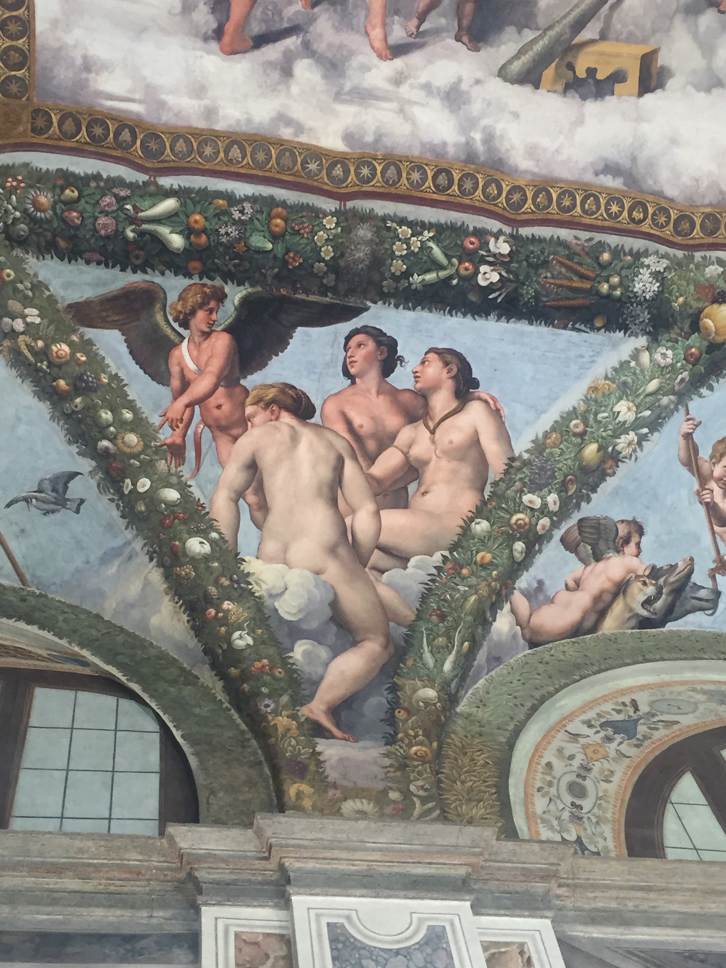
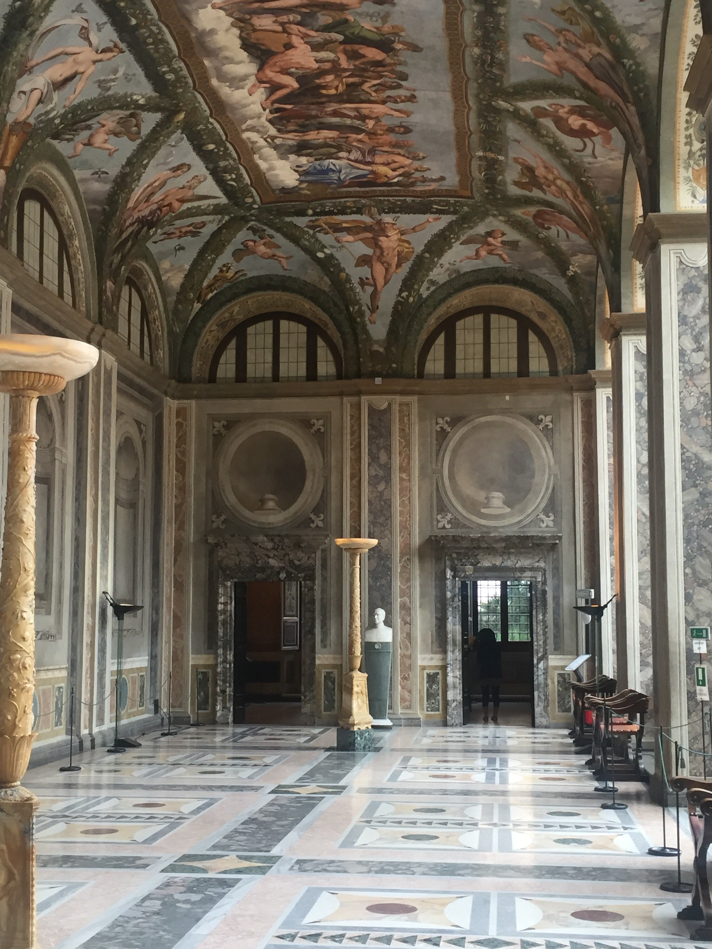
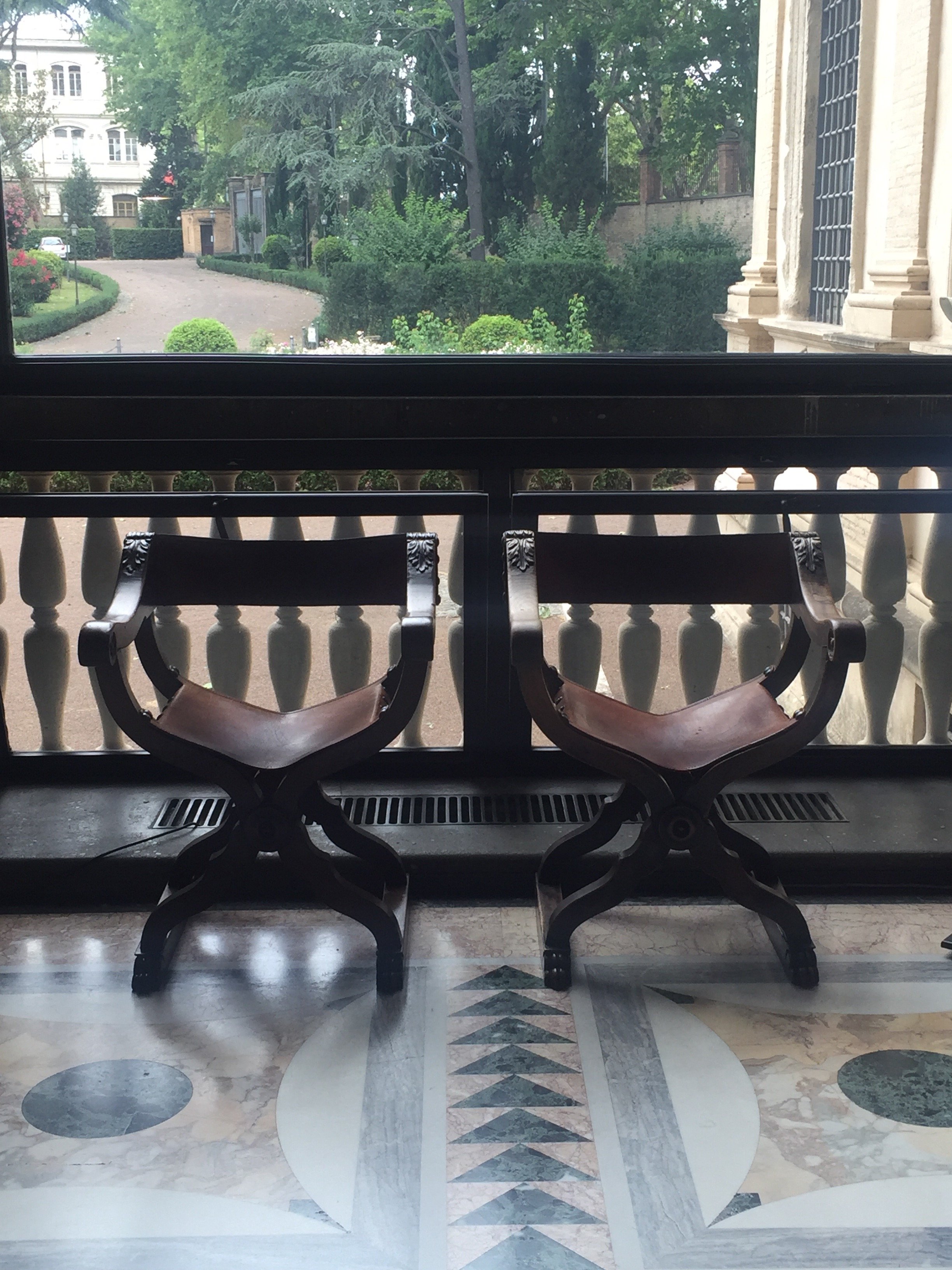
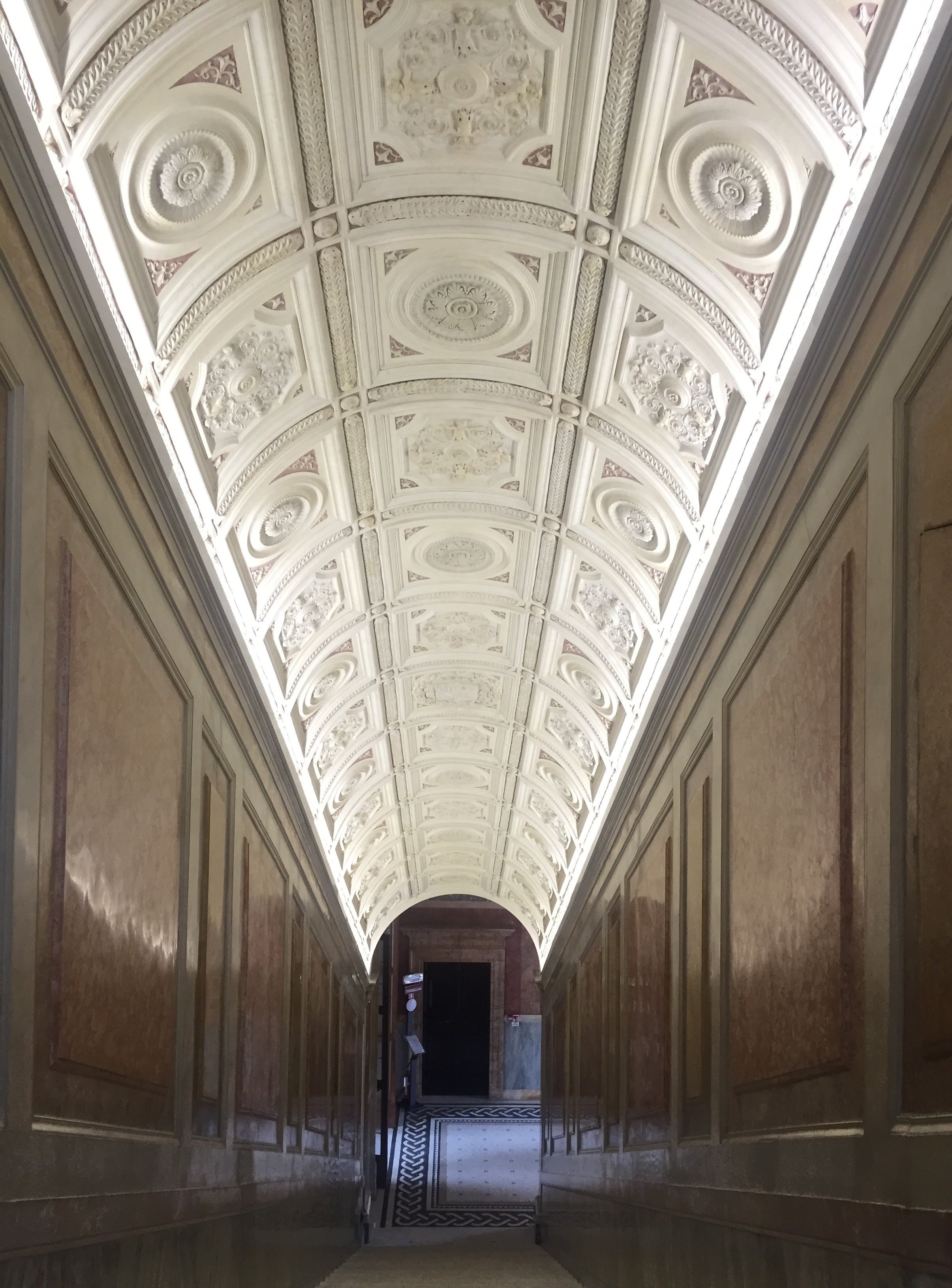
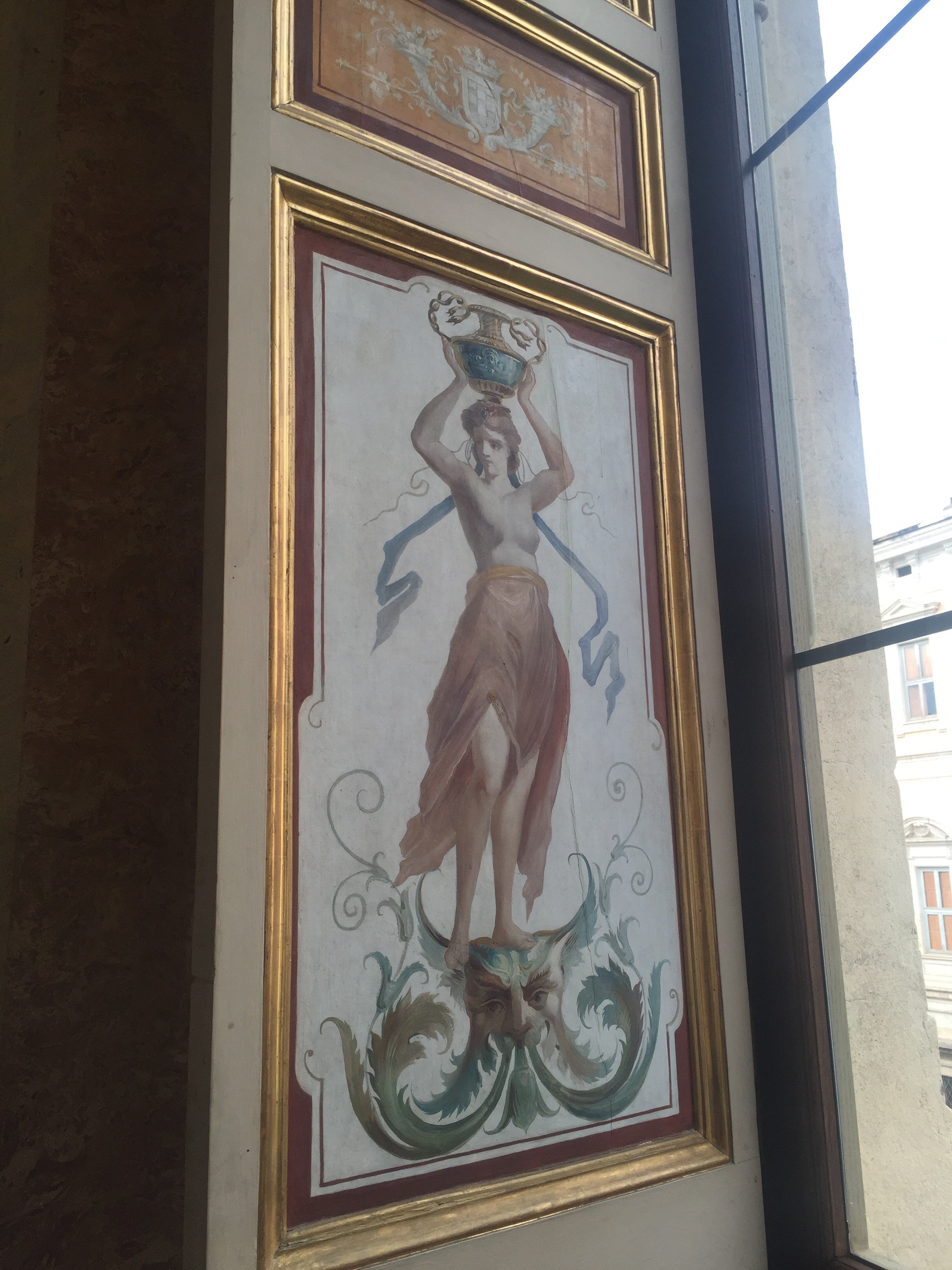
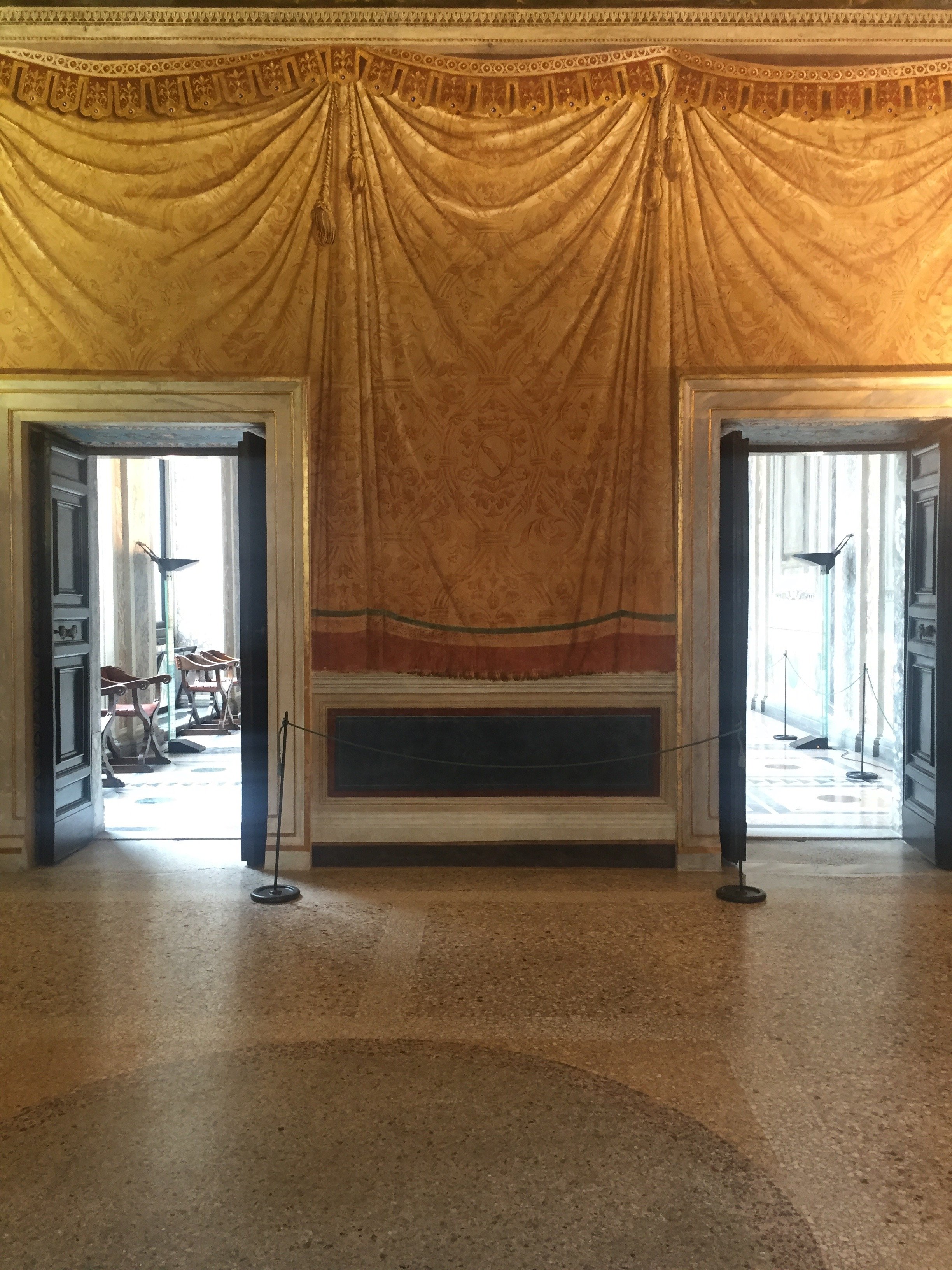
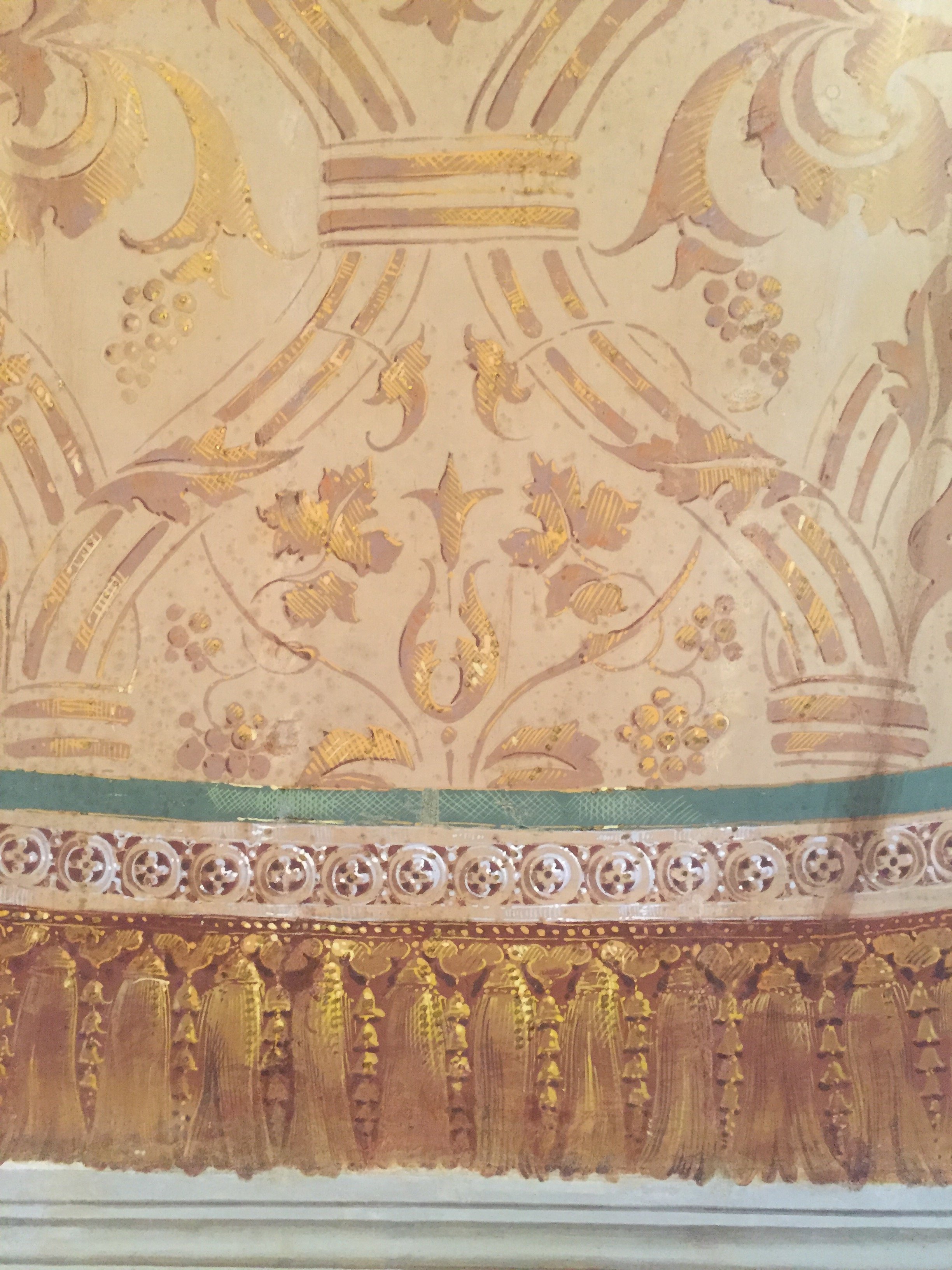
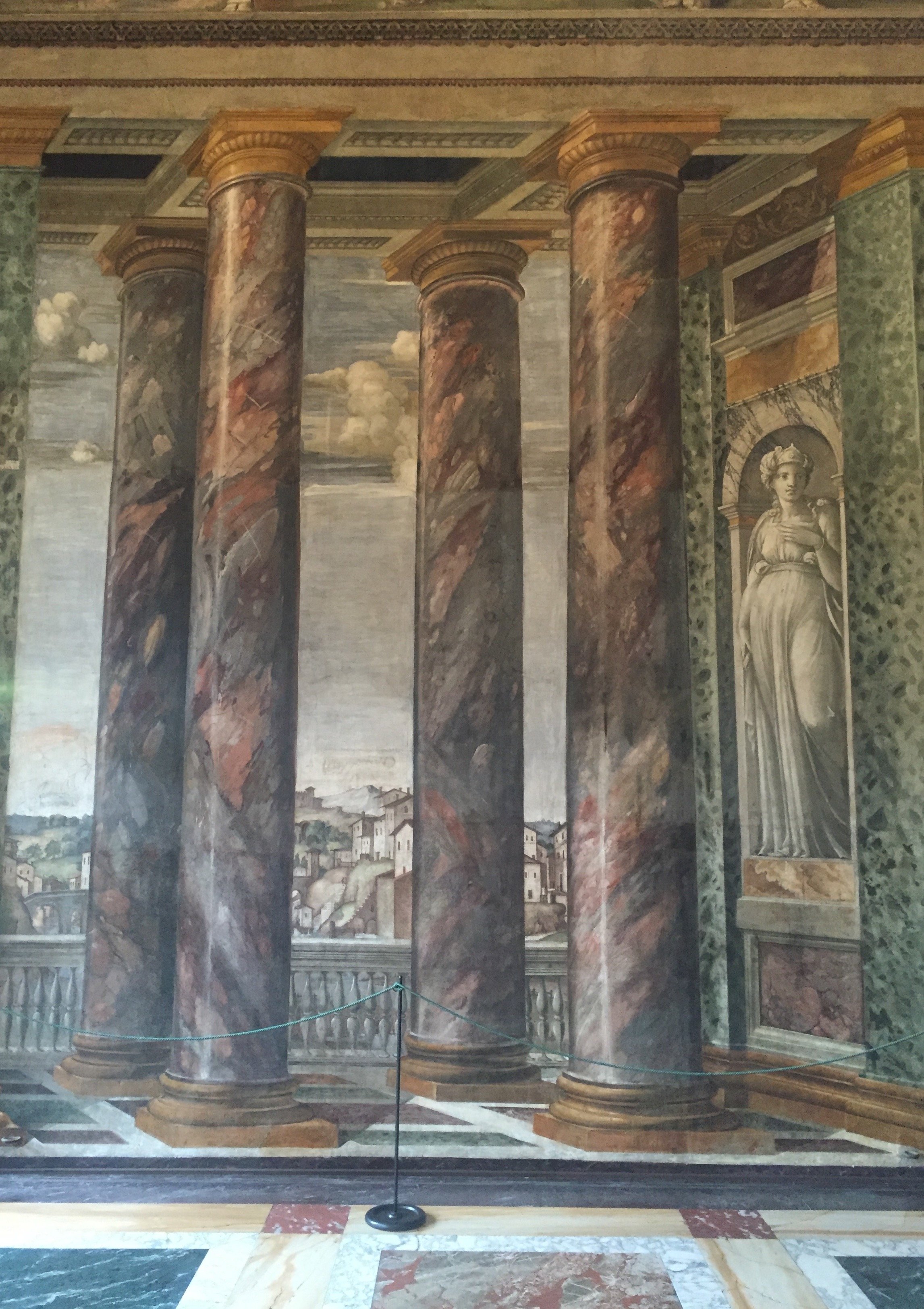
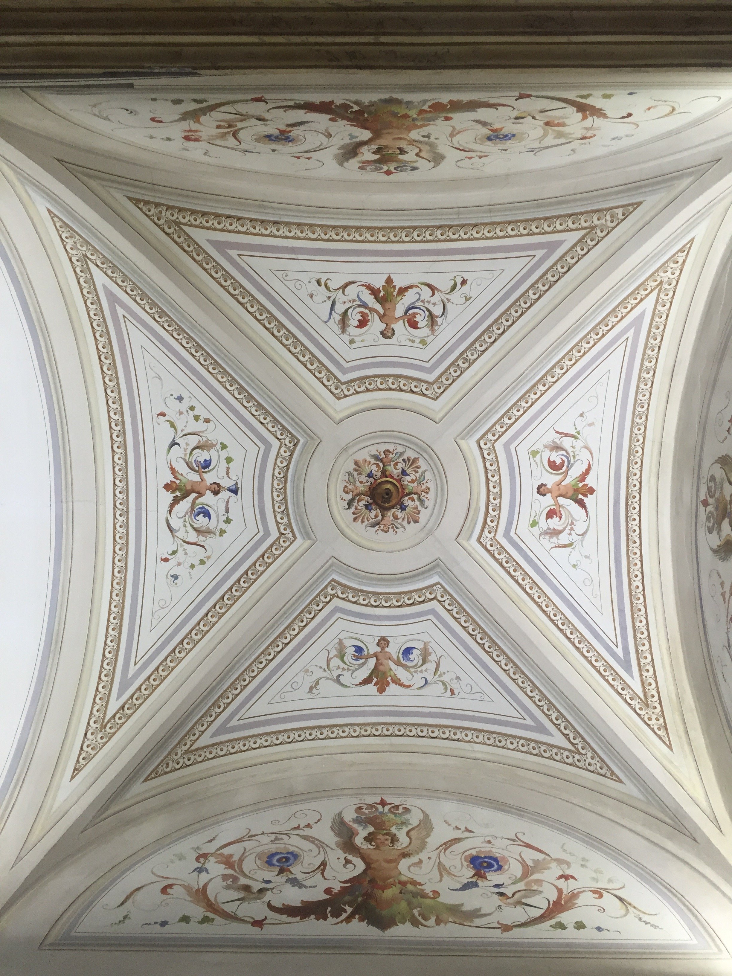
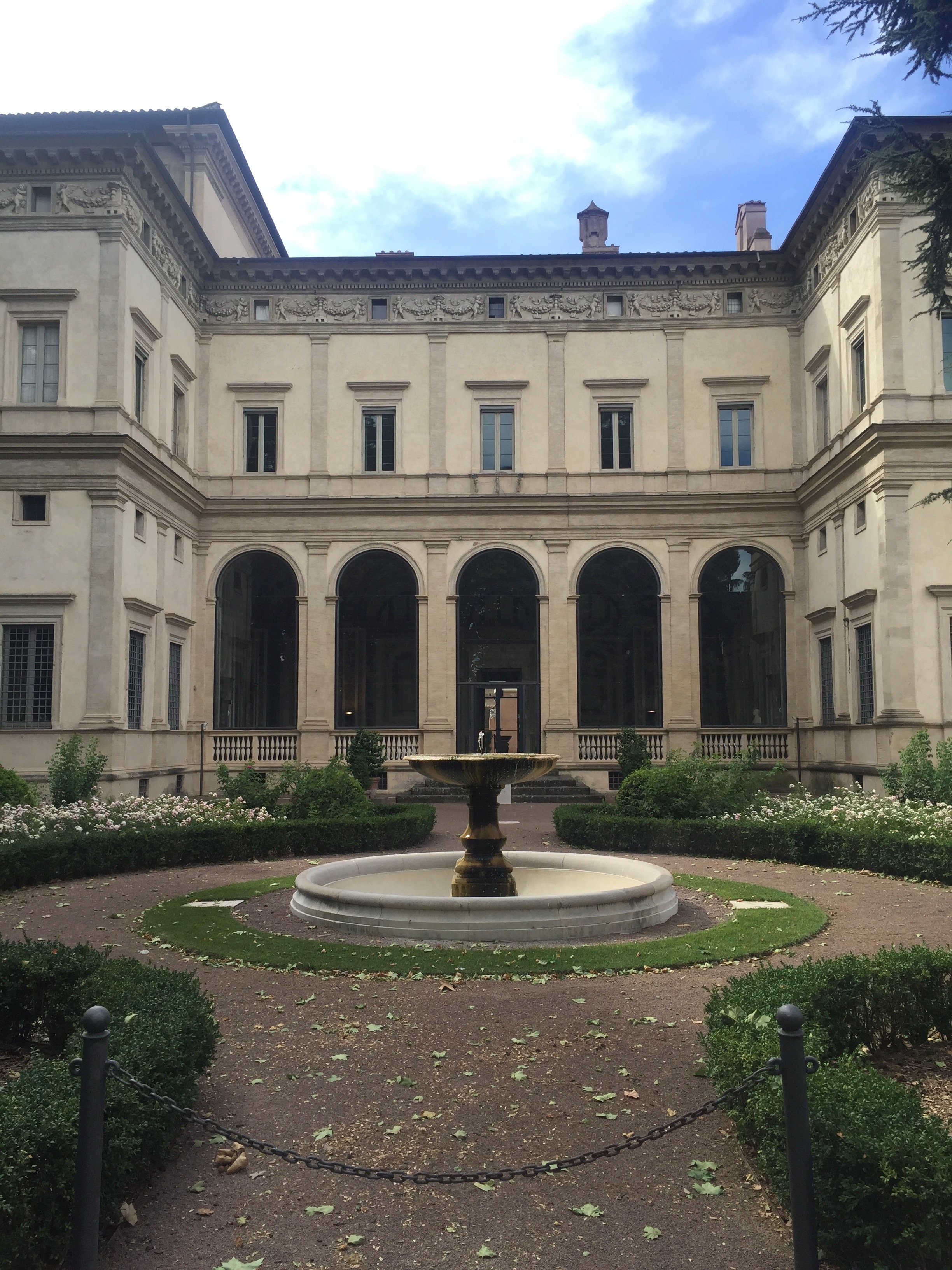 Photos: Me and my iPhone.
Art and Architecture with Ariella - Torino

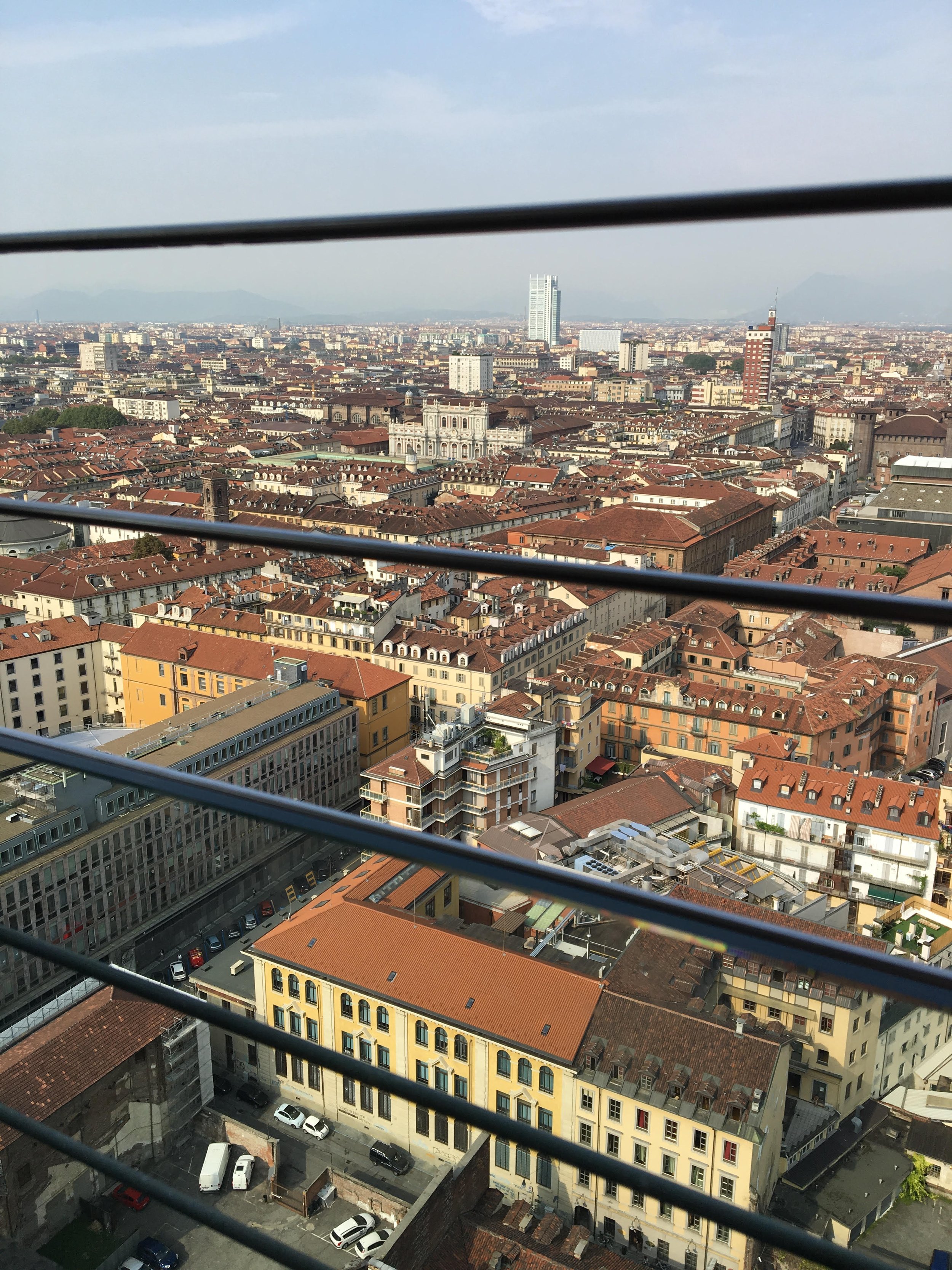 The floor of the elevator was made of glass and had striking views of the entire building. However, the ride up was not the best experience for those of us with a fear of heights.Looking back, I feel I did not spend enough time in the museum as it's something that could possibly take an entire day. The next day we walked around the city admiring the architecture, walking in and out of churches and buildings. At one point we realized there was a kind of 'exhibition' in the city. Contemporary artists had pieces displayed throughout the city and there was a map of all of the pieces. We grabbed a map and started the trail. This trail took us to some beautiful piazzas and courtyards. One of the pieces was a large cube with a triangular pyramid on top which matched the design of the window almost exactly except it was enlarged. The cafes in Torino were also incredibly beautiful. It was obvious that they were built and designed long ago. The way the aesthetics have been maintained make them unique to Torino, similar to much of the architecture we saw.
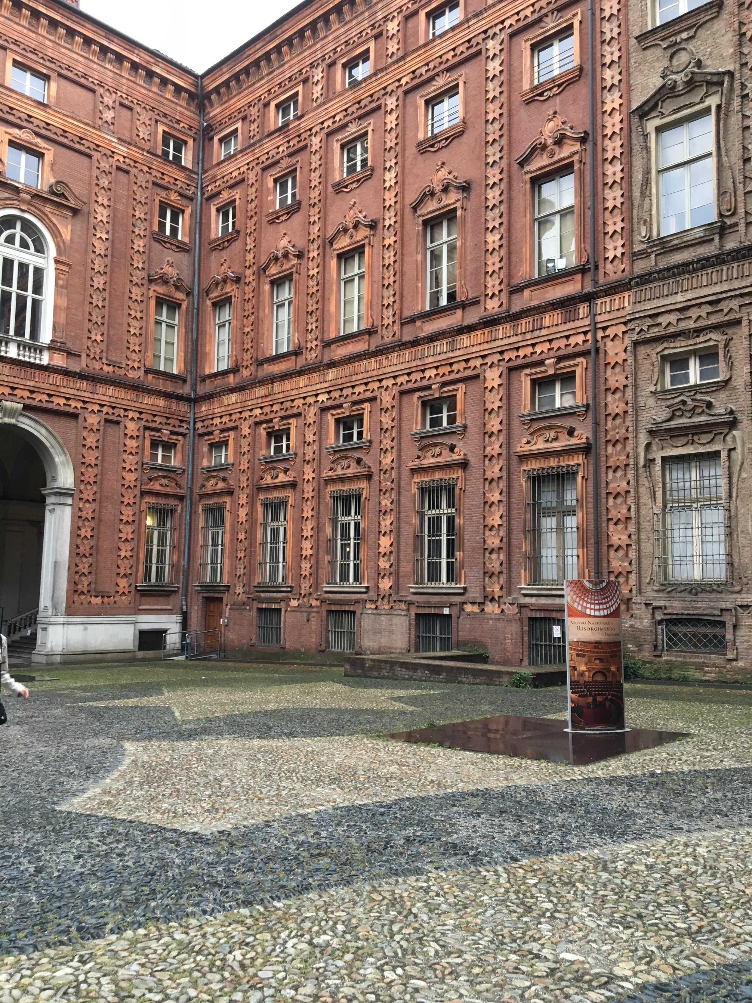
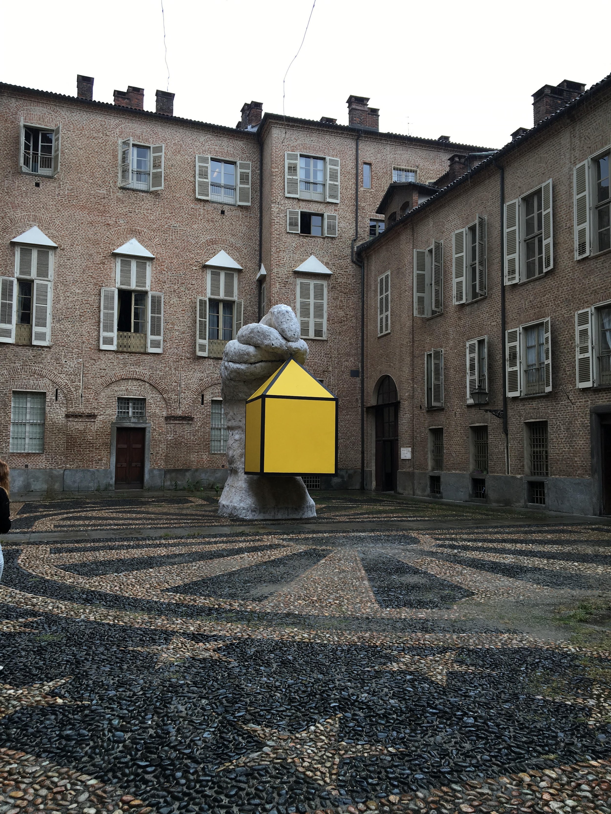
 Photos by Ariella.
A Belated Birthday Trip to Sicily
Ciao Bloggisti,I'm suffering from a bit of Sicily withdrawal. Please bear with me.Thanks to a birthday present from my parents (thank Mom and Dad!), I returned to Sicily for a long weekend. There was an airline strike and my flight departed over two hours late. The weather was horrible. I rented a car and had an accident. I got lost constantly. It didn't matter.The minute I drove up to the reception area and saw the views, smelled the Sicilian jasmine, and had a glass of wine, I forgot all about the hassles to get there. Like my friend Gina, I'm already plotting my next Sicilian trip.One major reason for my withdrawal is Monaci delle Terre Nere. This was my third trip and hopefully there will be a forth. I think I need to go during the Spring as that's the only season I haven't been there. While checking out, I told Sara that the next time I return I want to be there with my man. Hello, I'm single.I stayed in the Fragante room. It has a fireplace, terrace, a Jacuzzi, and sea/vineyards views. It's a short walk, through lime trees, to the main villa. I loved the little details, like this floral arrangement.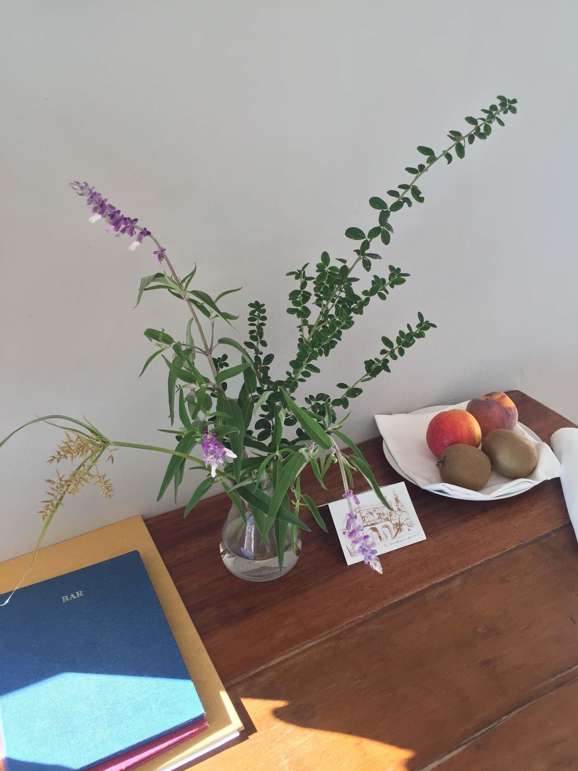 I woke up to sunrises with the sounds of roosters, the sheep next door, and Mt. Etna.
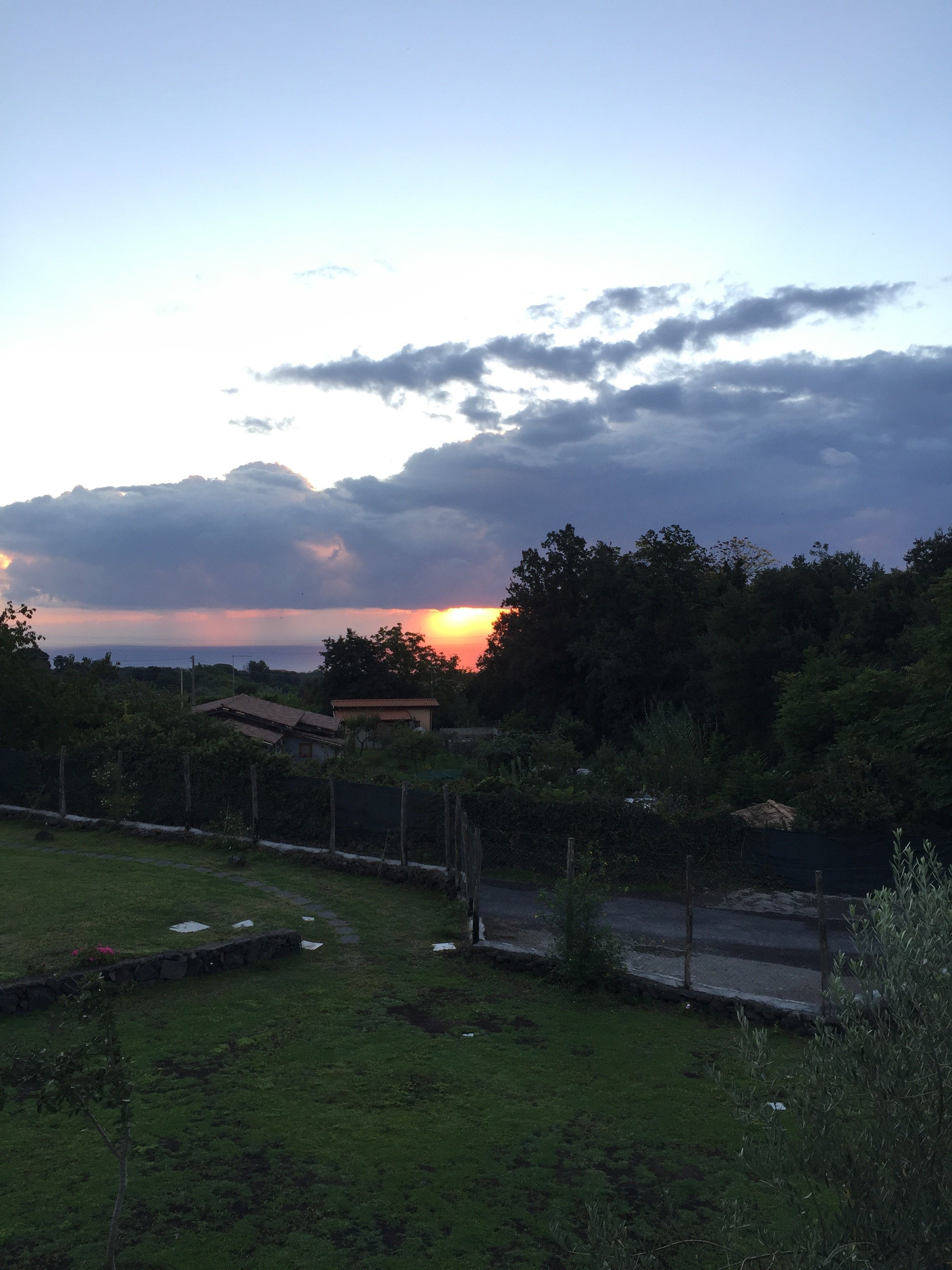
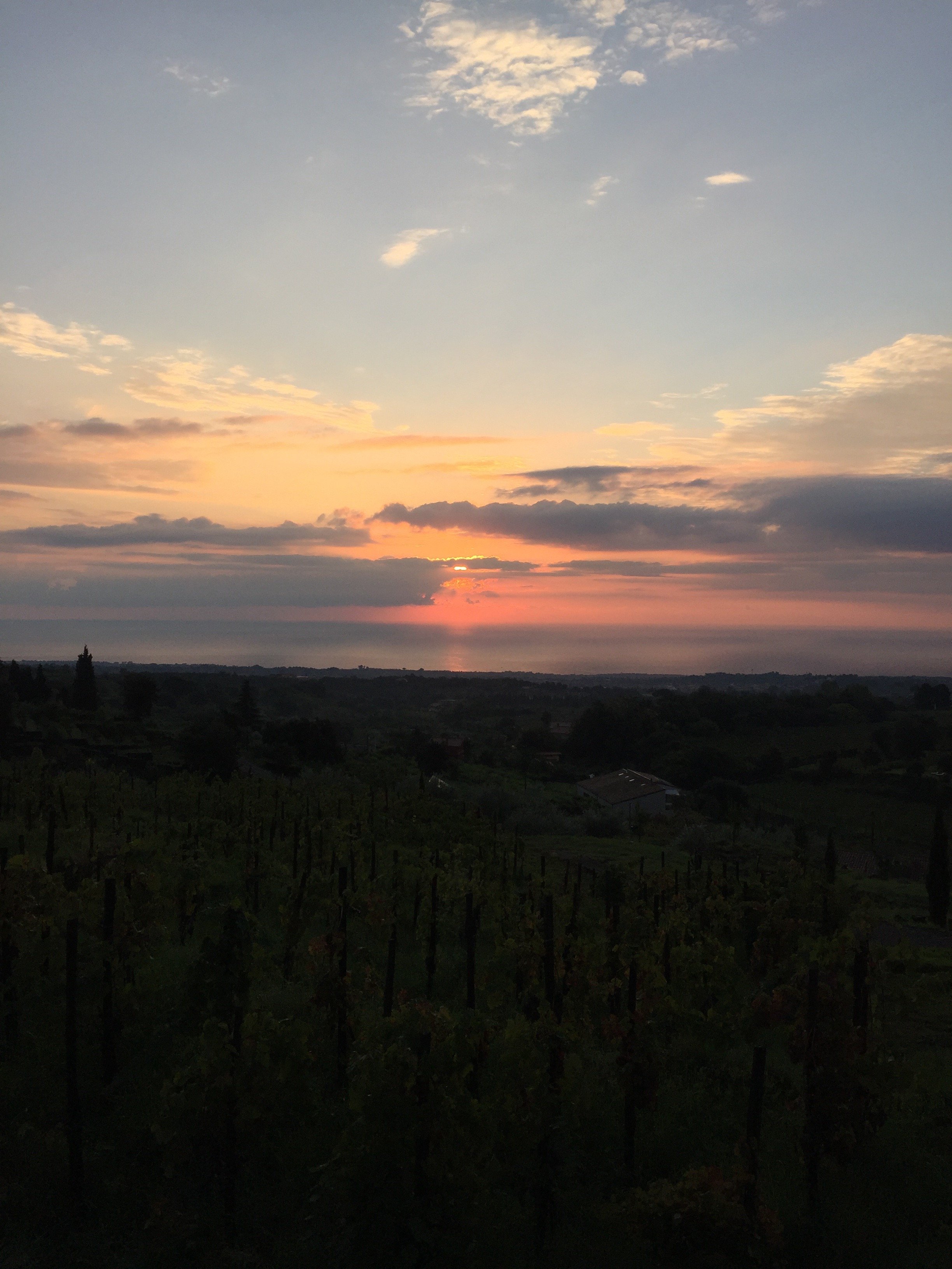 It got a little chilly at night, so I really appreciated the fireplace.They have a newish chef and the food (lunch and dinner) is a little less rustic than before. It is very good but it's a high-end take on Sicilian cuisine. The wine list is extensive and excellent. The breakfast spread was on point.It rained most of the time I was there, so no lounging by the pool (or the pool bar) this time. I'm glad it did clear up a little bit the day I drove down the coast.
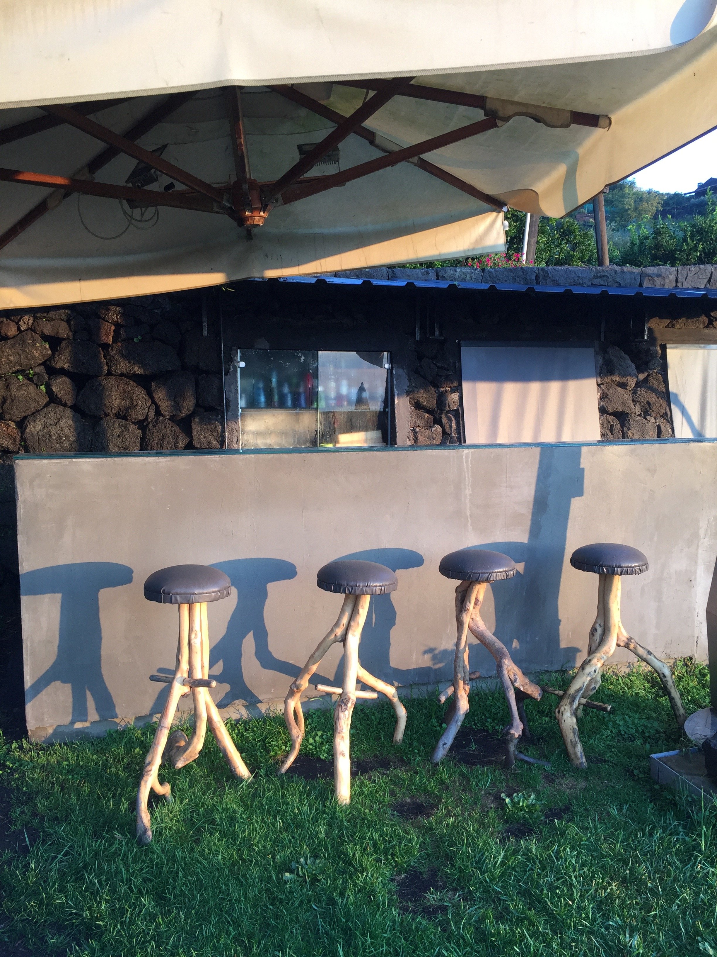
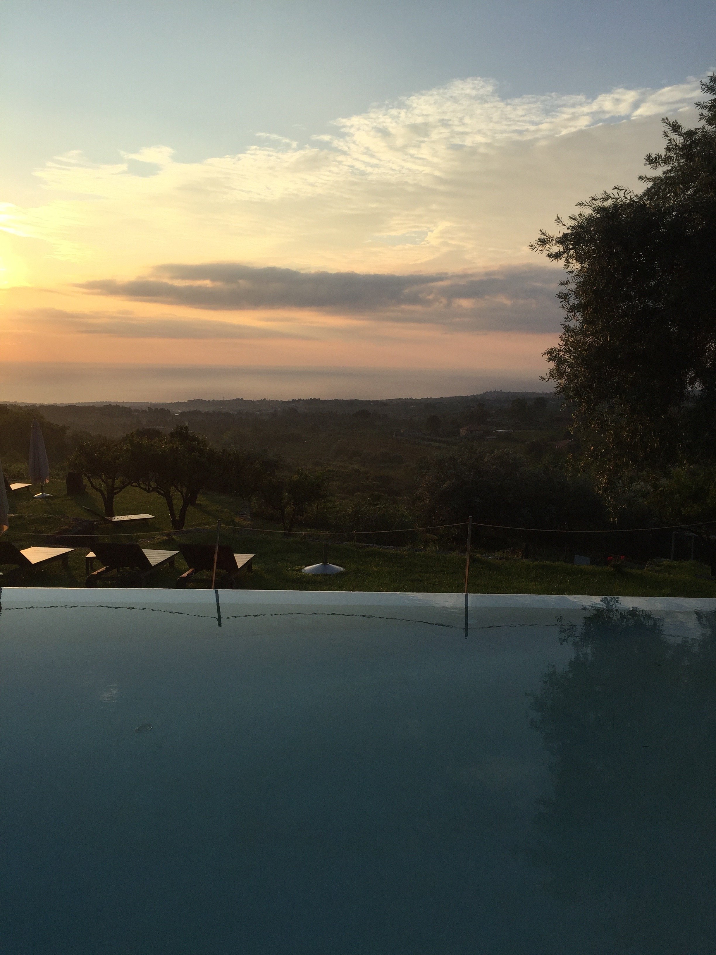 Of course it was a stunning day the morning I checked out.


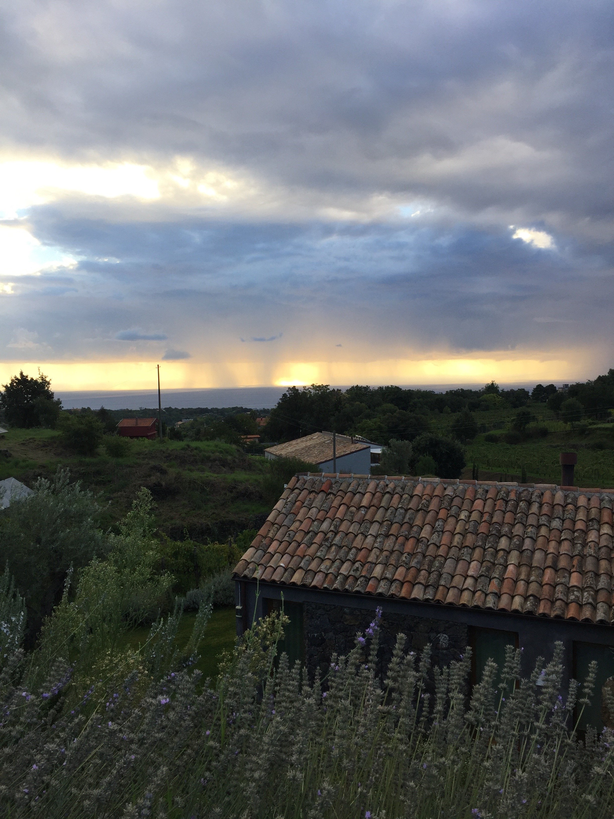
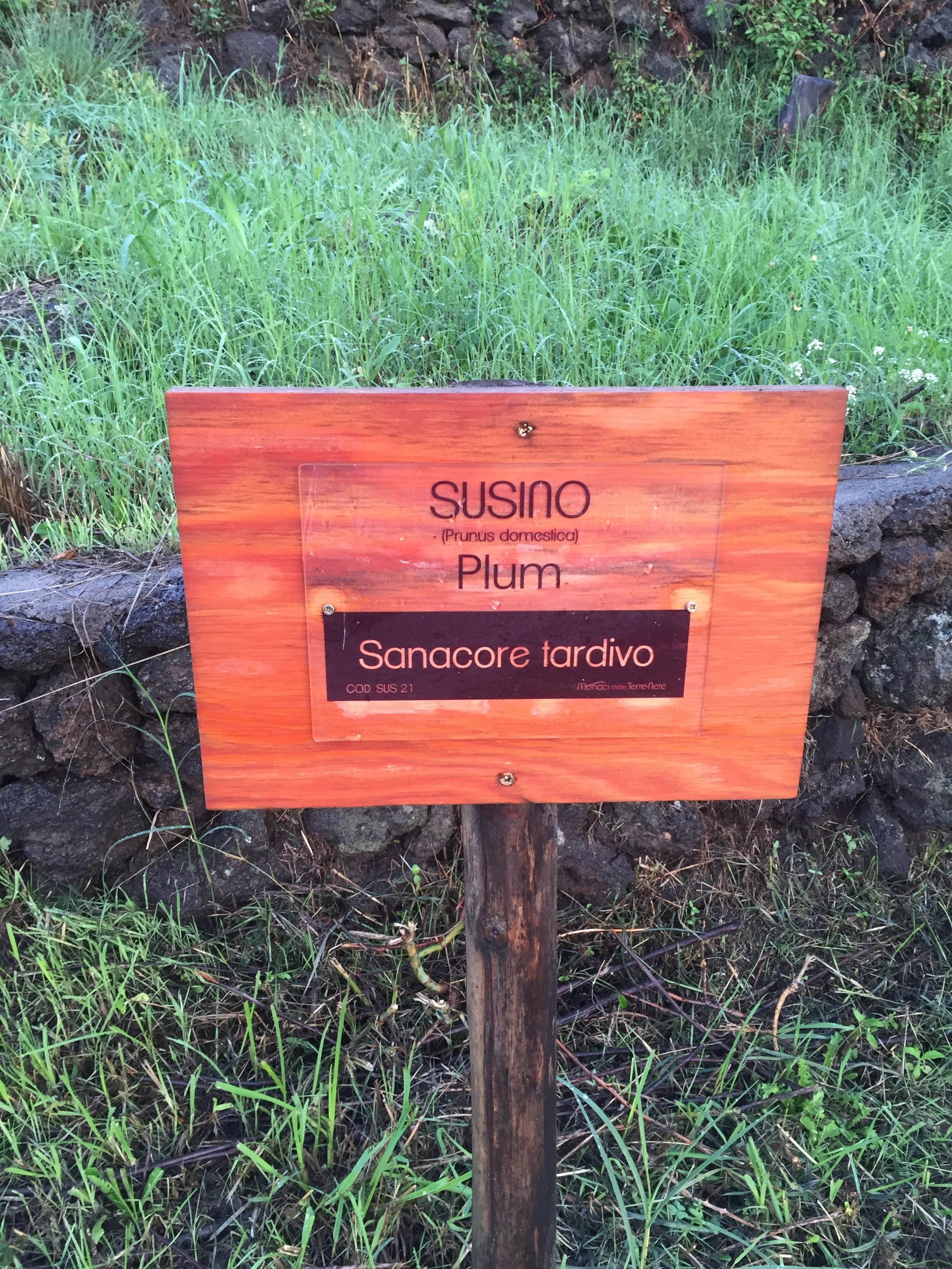
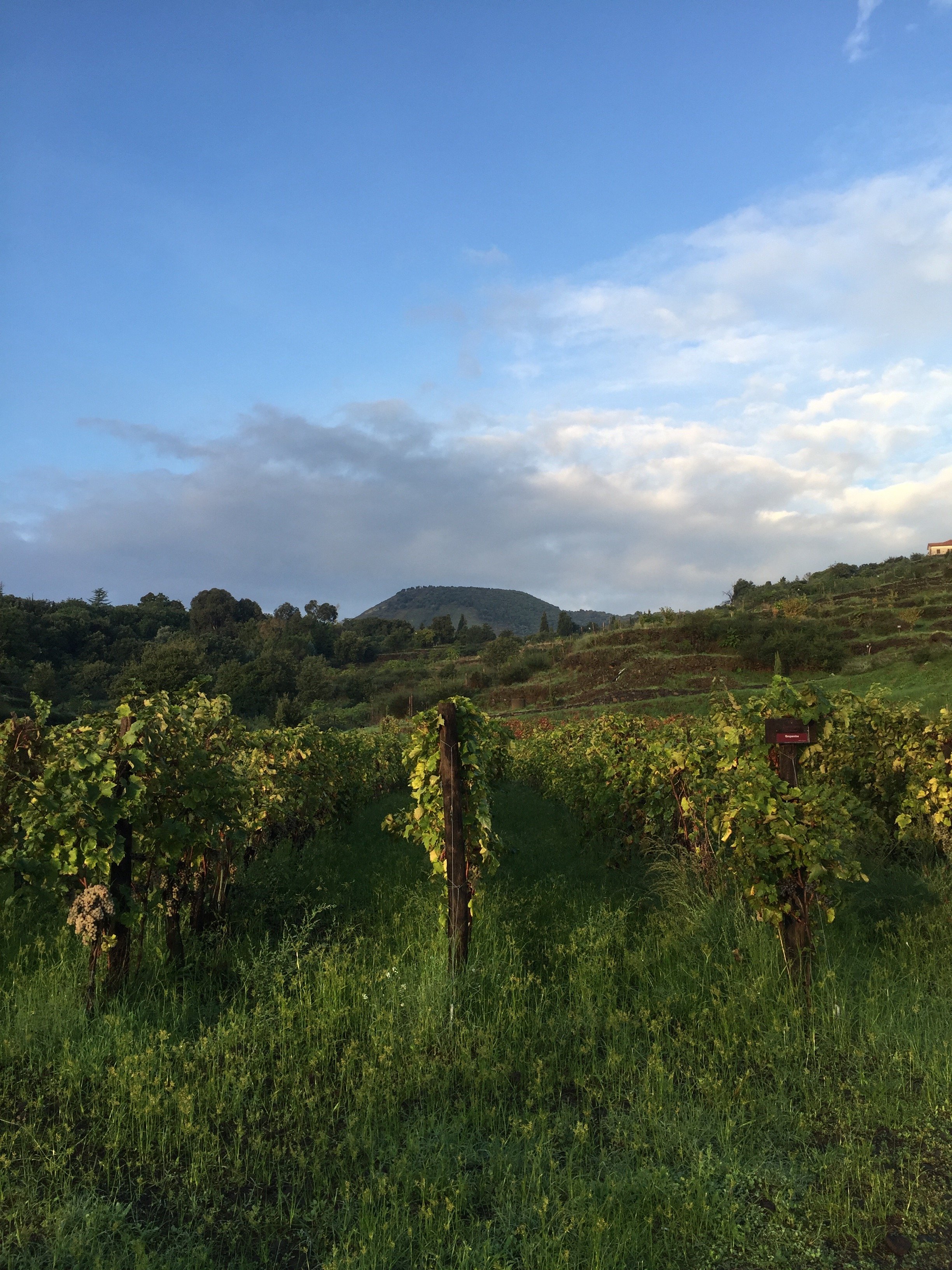

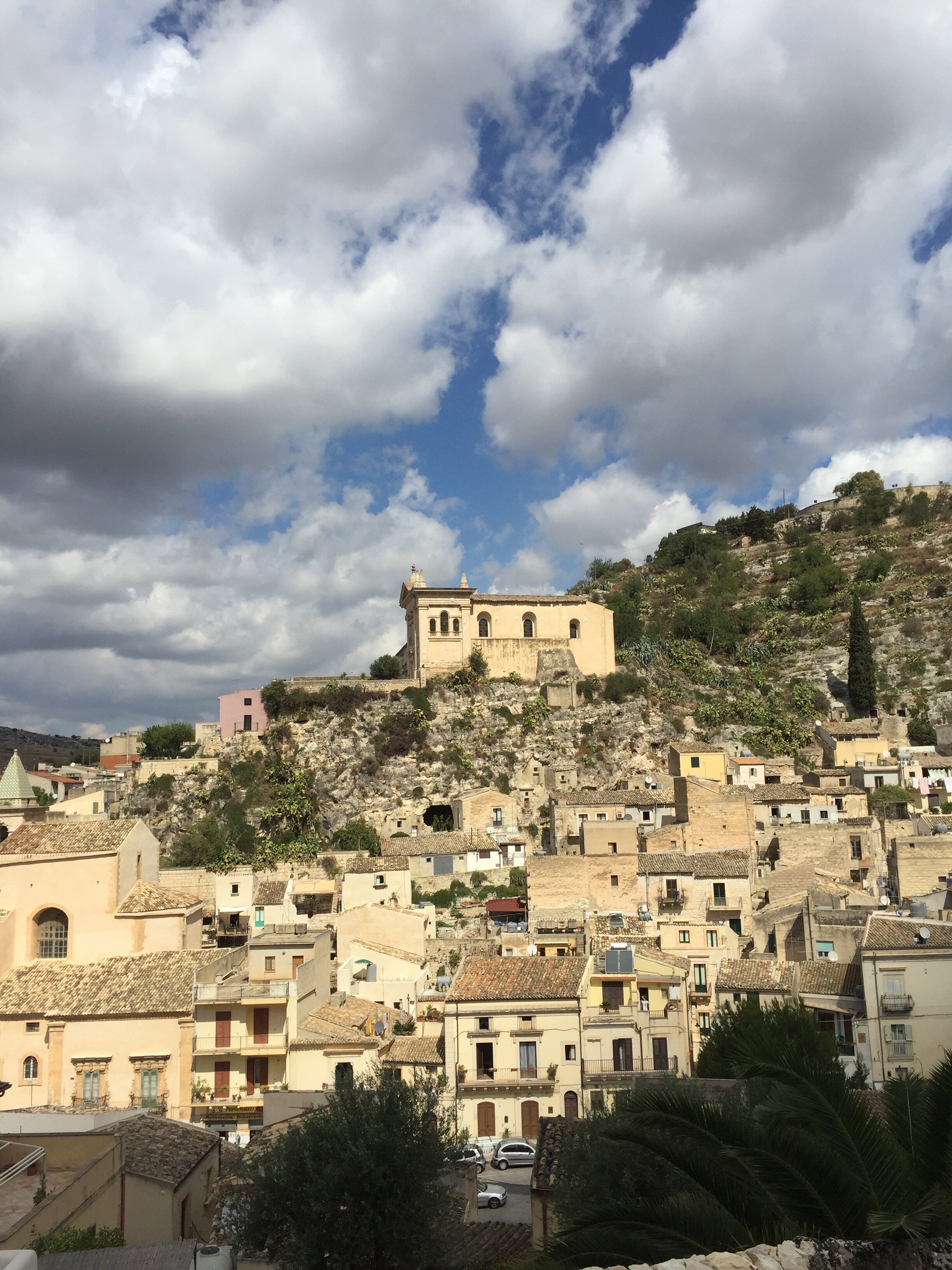
 Grazie mille Guido, Ada, Nujuan, and Sara for everything.I have a solid sense of direction. Therefore, I was perplexed by my Sicilian driving situation. None of the rentals cars came with GPS but I had maps, directions printed out, and Google Maps on my phone and still I got lost. What the heck?My plan was to go to Ragusa, Modica, and then meet Gina in Ortigia for dinner. Some how I took the wrong exit for Ragusa. It was a happy accident because I ended up in Scicli which was incredible.I gasped when I saw this view. Pictures do not do it justice. Stunning.

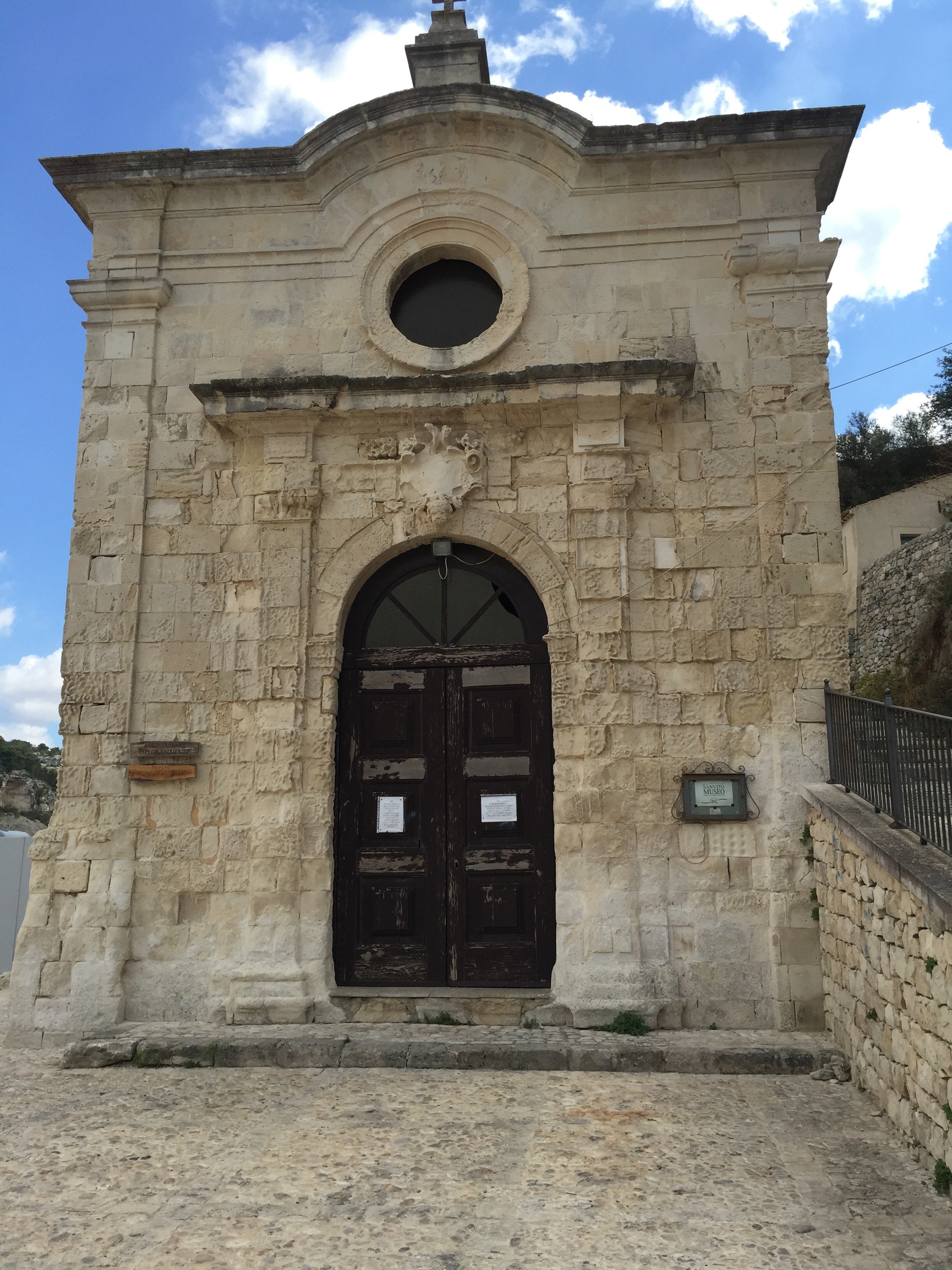 Next, Modica.Had a slight fender bender. It wasn't my fault and after my nerves were frazzled. At least I wasn't driving a stick shift. I thought Modica was beautiful as well.
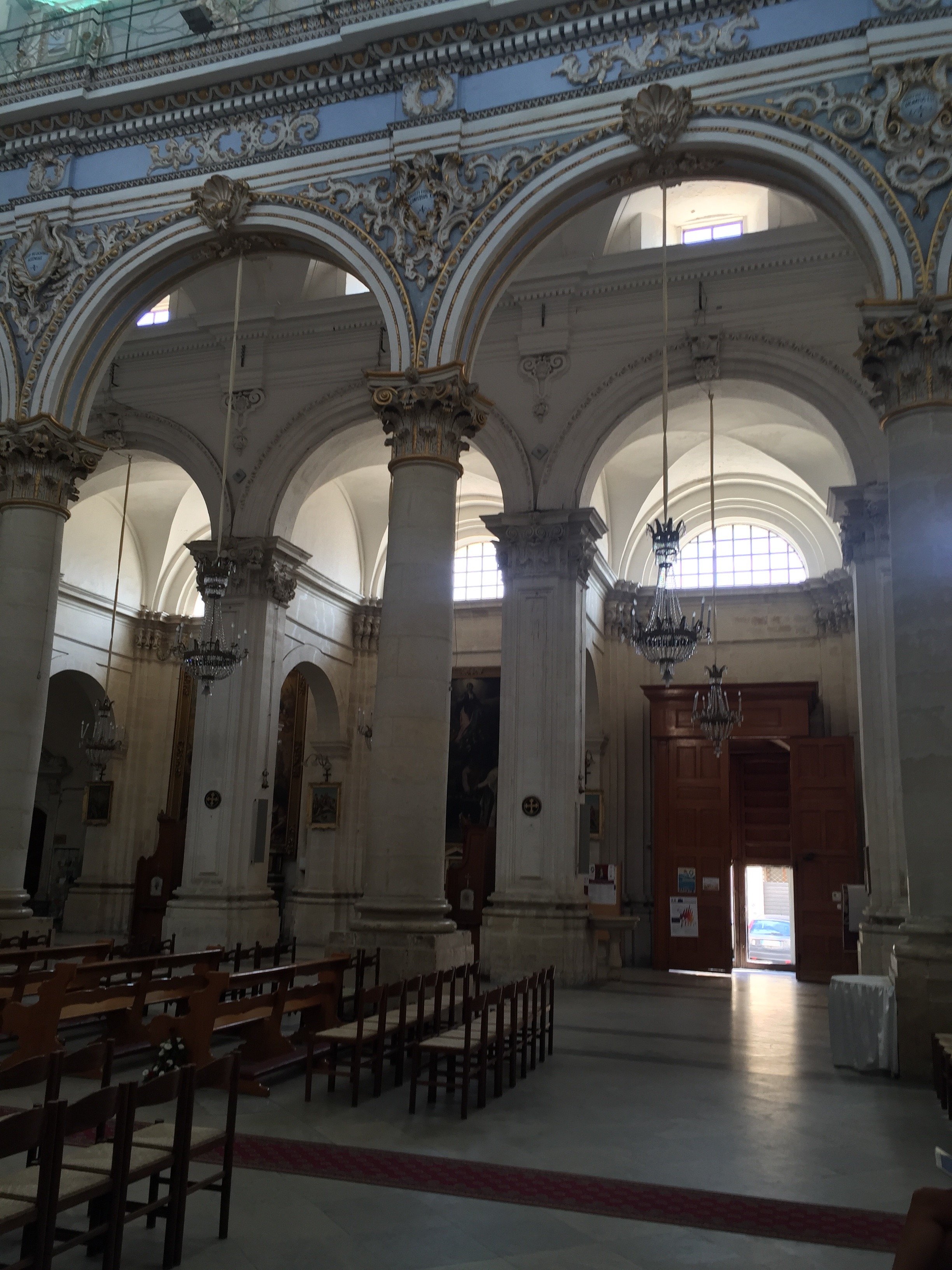
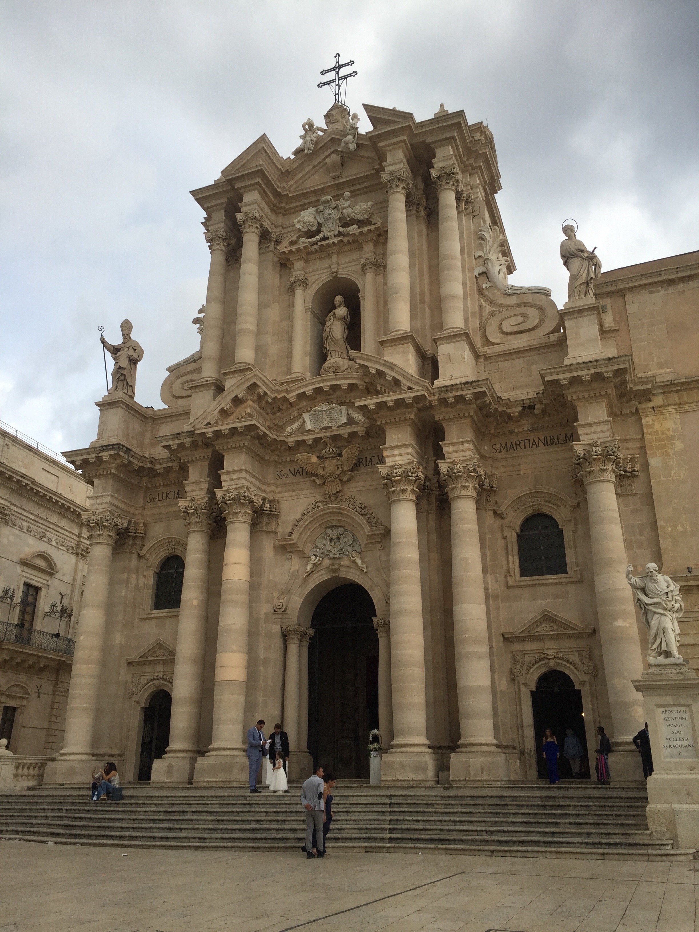
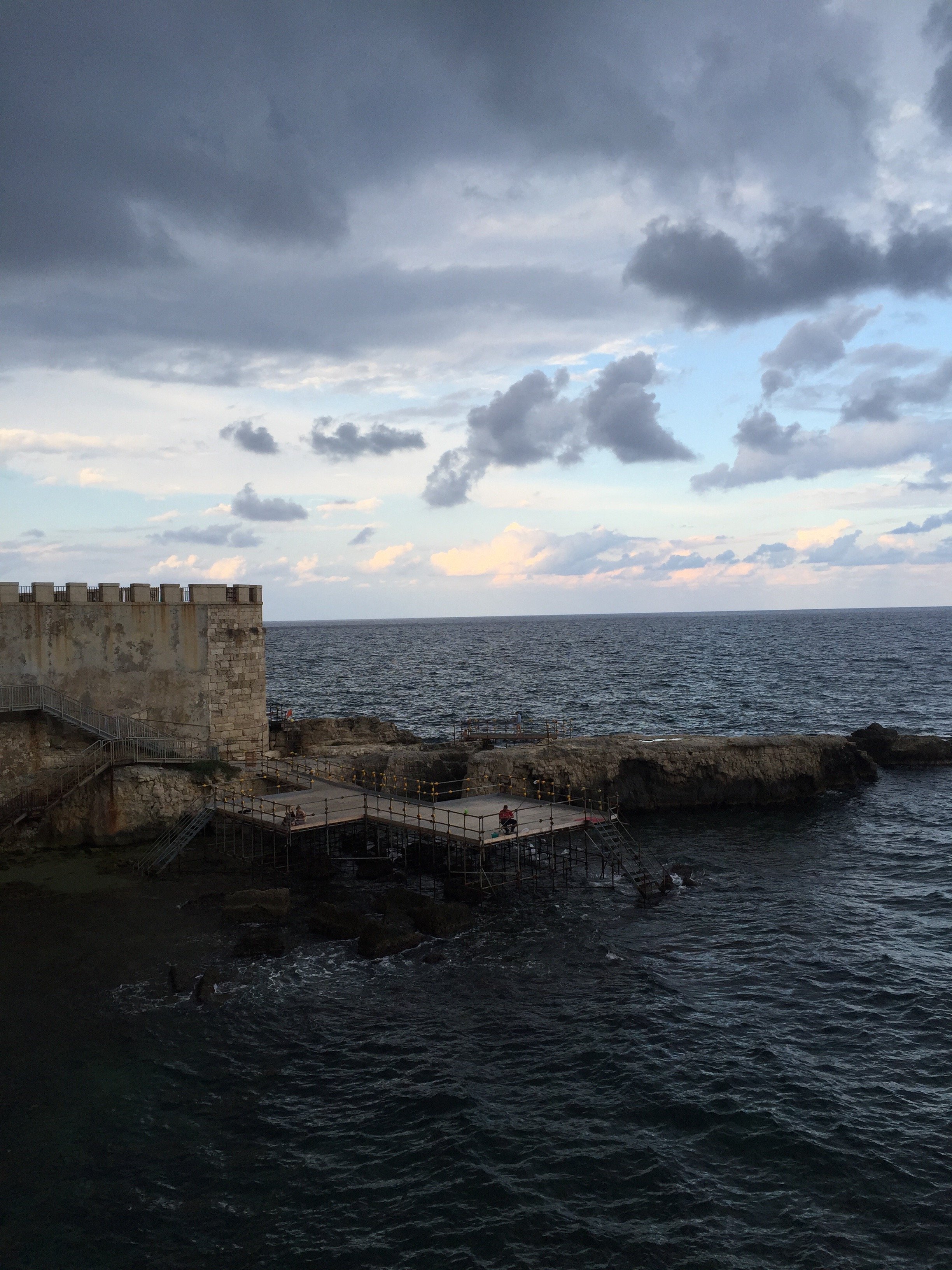
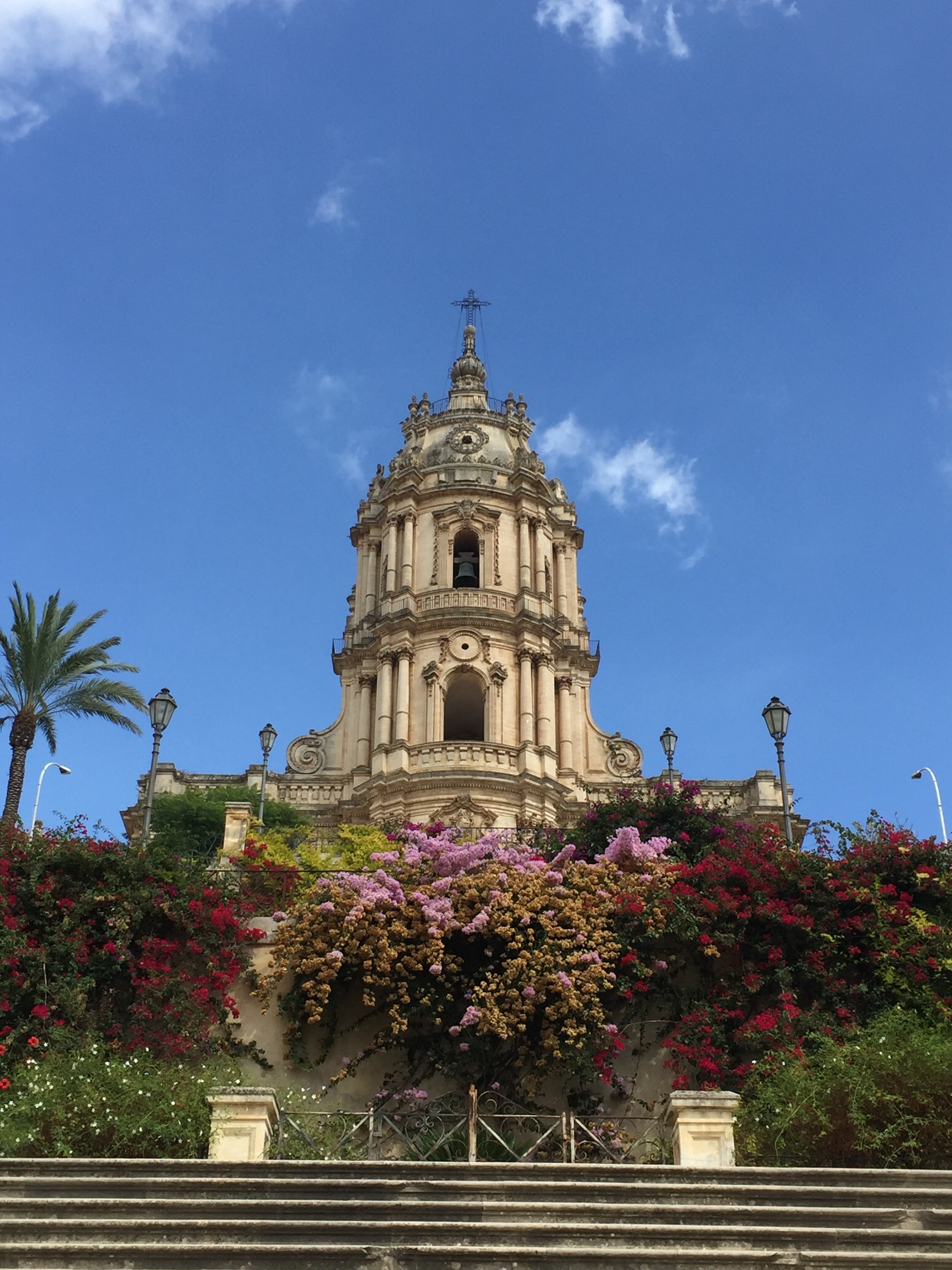 Three years ago when I was trying to decide between staying in Modica or Ortigia, I picked Ortigia. I liked Modica but I would've missed being by the sea and it's a lot more touristy than Scicli. If I had to pick a small hill town to stay in it would be the latter.Ortigia.It started to pour again. Gina and I went to a small caffe for aperitivi to wait it out. The rain never stopped.One thing I noticed right away, is how much Ortigia has changed in one year! The word is out. There were small tour buses. The caffe I always went to in Piazza Archimede was packed with tourists. There are several new shops selling souvenirs (at least most of them are food related). I hope this is great for the local economy.Even in the rain, The Duomo and its piazza moved me.
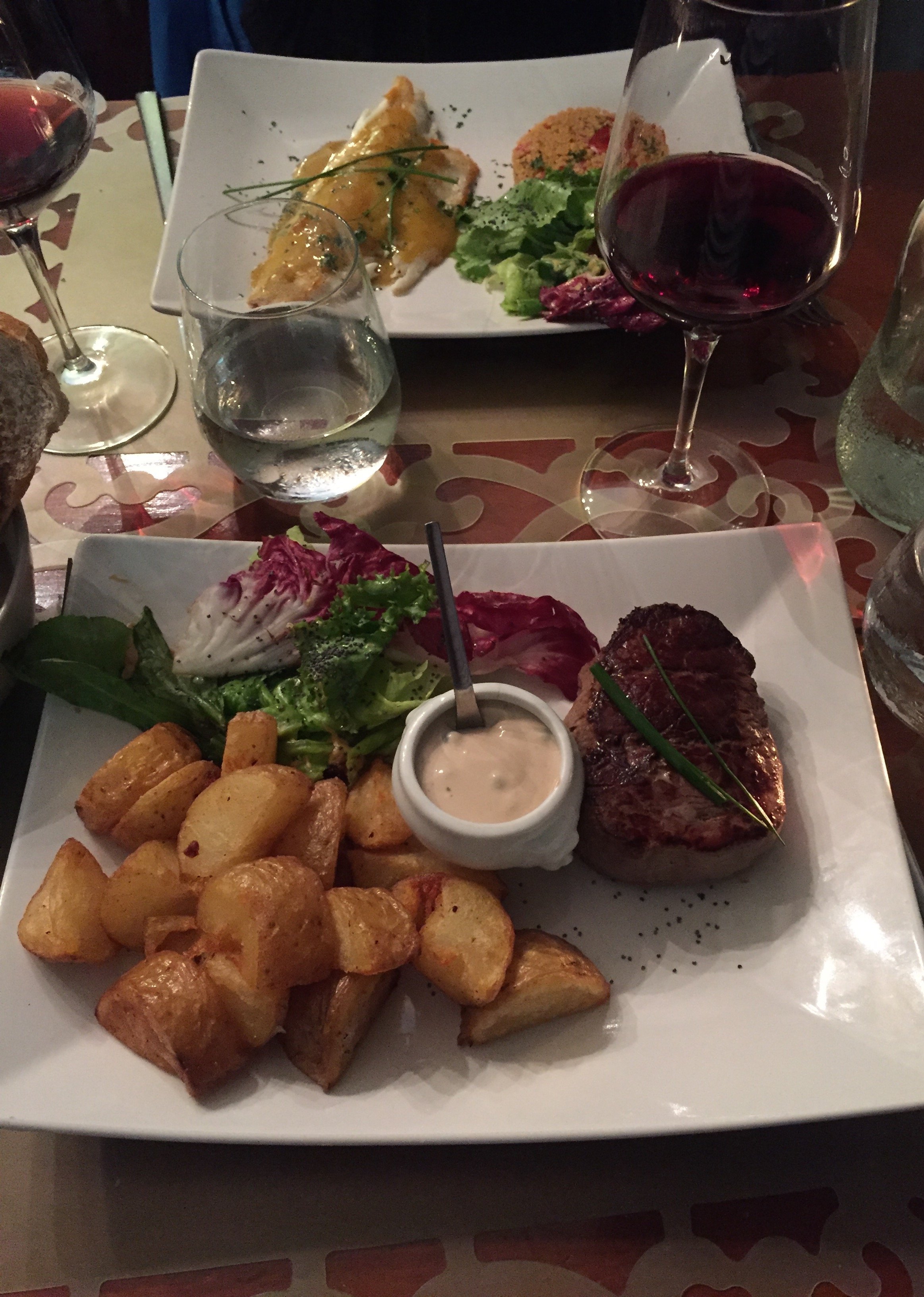
 Dinner at Le Vin de L'assassin was delicious.
 By time we finished dinner, the rain had tampered off. Then I got lost while driving through flooded streets. Fun.I finally made it to the Autostrada. It stopped raining and there wasn't any traffic at midnight. Life was lovely. I was singing along with the radio, loudly, when all of a sudden the skies open up. BUCKETS of rain. I was near Catania and the heavy rain did not stop until I reached the exit for Acireale. More flooding as I drove on hairpin curves up the mountain. Thankfully, this time I found Monaci no problem.I really need to see Palermo and so many other places not just in Sicily but also Italy in general. I haven't been to Puglia or much of the North. However, Sicily keeps calling me. I find the architecture beautiful and inspiring. The food and wine are incredible. The people I've met made me feel at home.
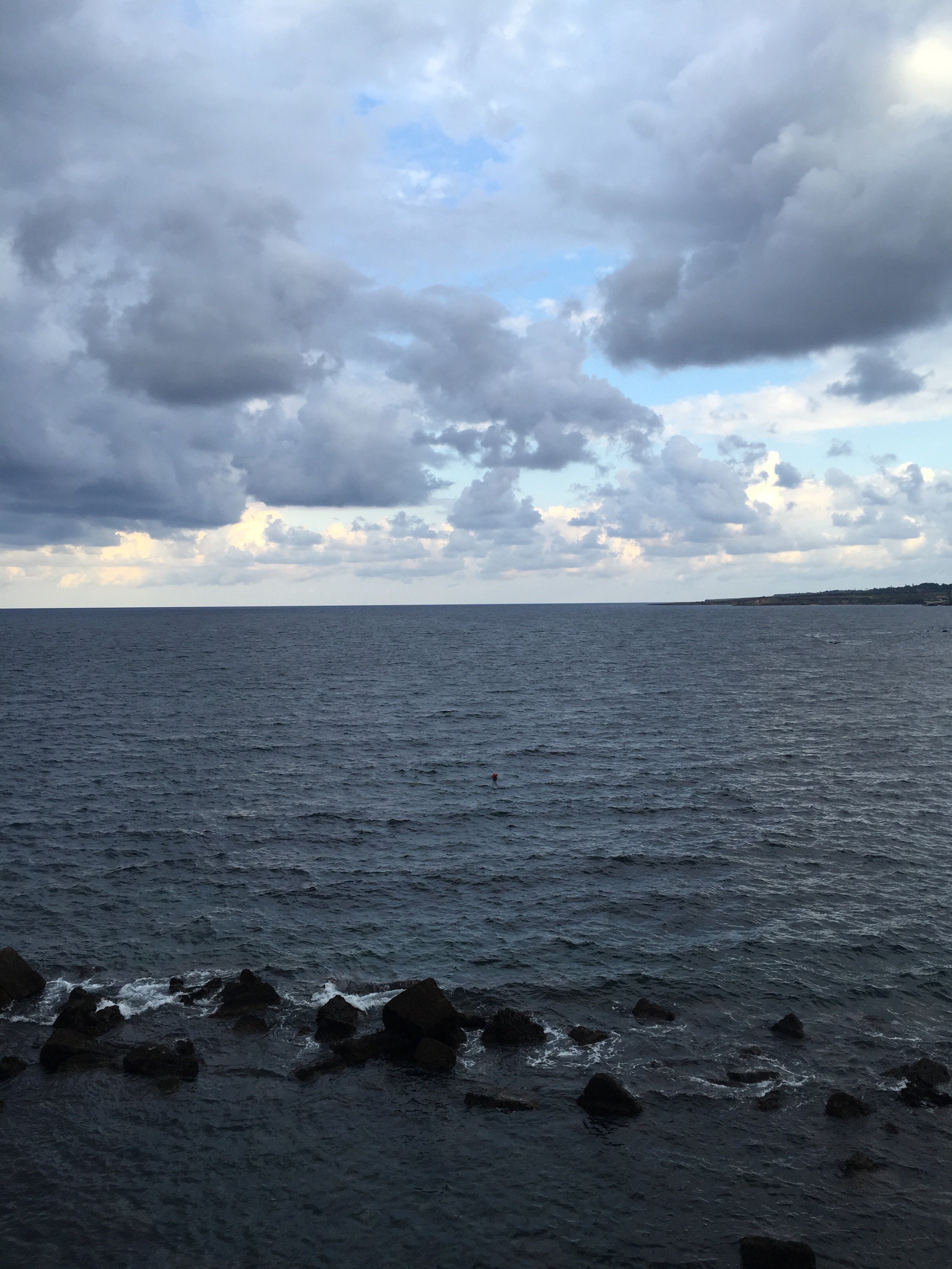 Sicily has my heart and my head.Photos: Me and my iPhone.
Snack Chat - A Summer Treat with Nathan Turner
I saw on Instagram that Nathan Turner was shooting an online series for The Design Network.What a fun idea. Nathan is a very talented interior designer but he's also known for being quite the host.For this series, he has invited several of his design friends to cook a little something, something in the kitchen. Nathan's enthusiasm is infectious.I met him, briefly, at his shop (a must if you're in Los Angeles) during Kathryn M. Ireland's design workshop and he couldn't have been lovelier.There are six episodes (he's currently shooting the second season). I thought this Banana Berry Trifle dish he made with Mary McDonald was the perfect summer dish. I want to make this. I may need to wait until my friends return to Rome though. I can't eat this whole thing by myself.Speaking of Rome, it's Ferragosto time. No trips to Sicily or the Caribbean for me this summer, tears! However, there are some very excited things happening here and I cannot wait to share more in September.Buone Vacanze a tutti!
Rhapsody in Green - Ina Garten's Garden
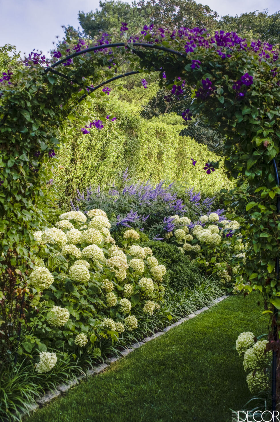
Ciao Bloggisti,I wish more American cooking shows aired in Italy. We have shows from the UK and France but not many (only the Masterchef shows) from the USA. I wonder why?I think the Barefoot Contessa would do well here. What's there not to love? Ina makes fantastic food and the settings/locations are gorgeous (that kitchen!).I was so excited when the latest issue of ELLE DECOR showed up in my mailbox. One, because it's a miracle when my magazines from the United States arrive on time, or at all, and two, because there was a beautiful spread featuring Ina's garden.It took Ina and Jeffrey ten years to convince the owners to sell the overrun pasture next to their property. Ten years. It was well worth the wait. The design of this garden, by landscape designer Edwina von Gal, is spectacular. I love the formality of the boxwoods mixed with the casualness of the roses, Russian sage, and other plants.You can read more about this gorgeous space on ELLE DECOR's website. The July/August issue is on newsstands now.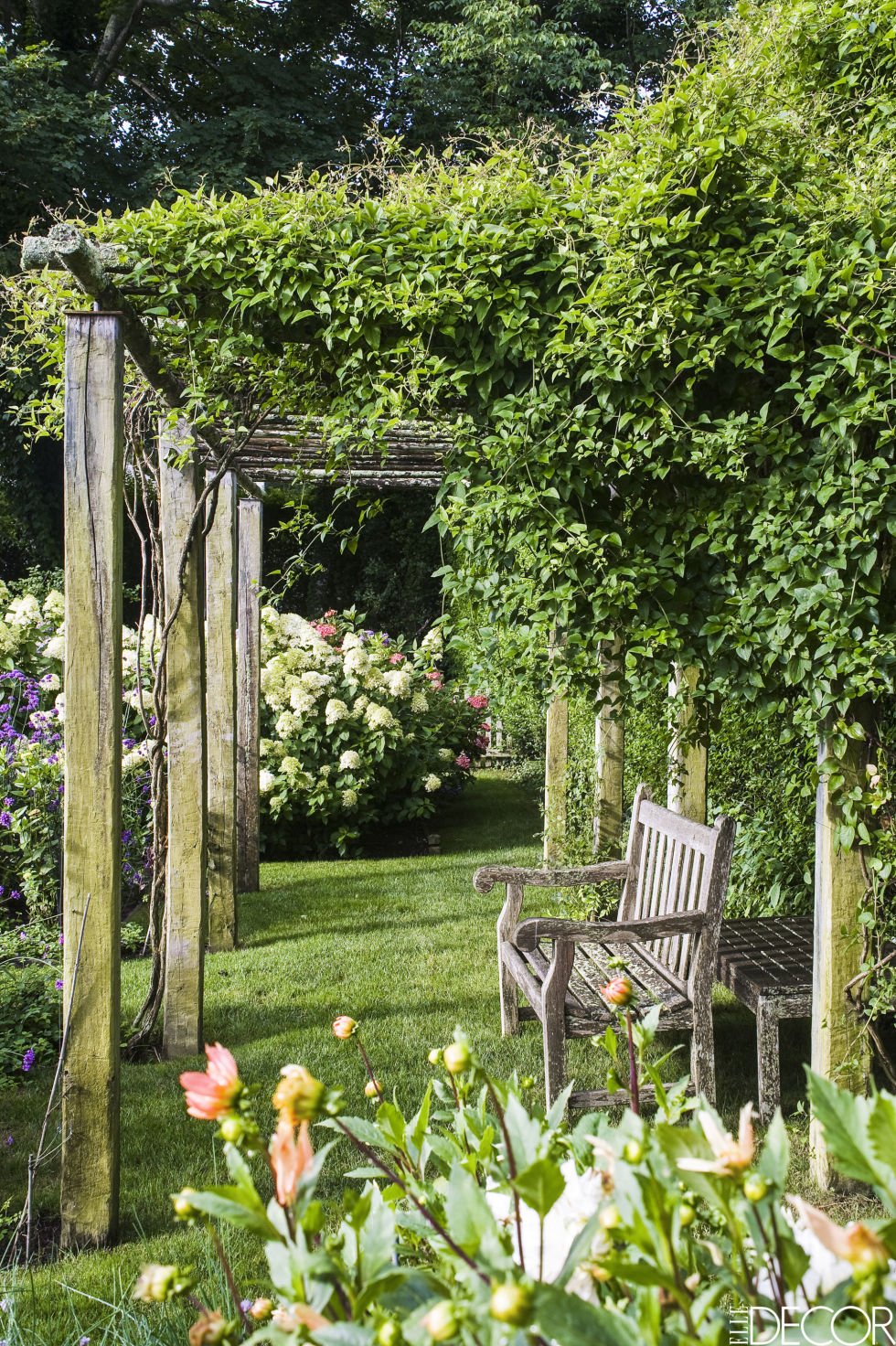
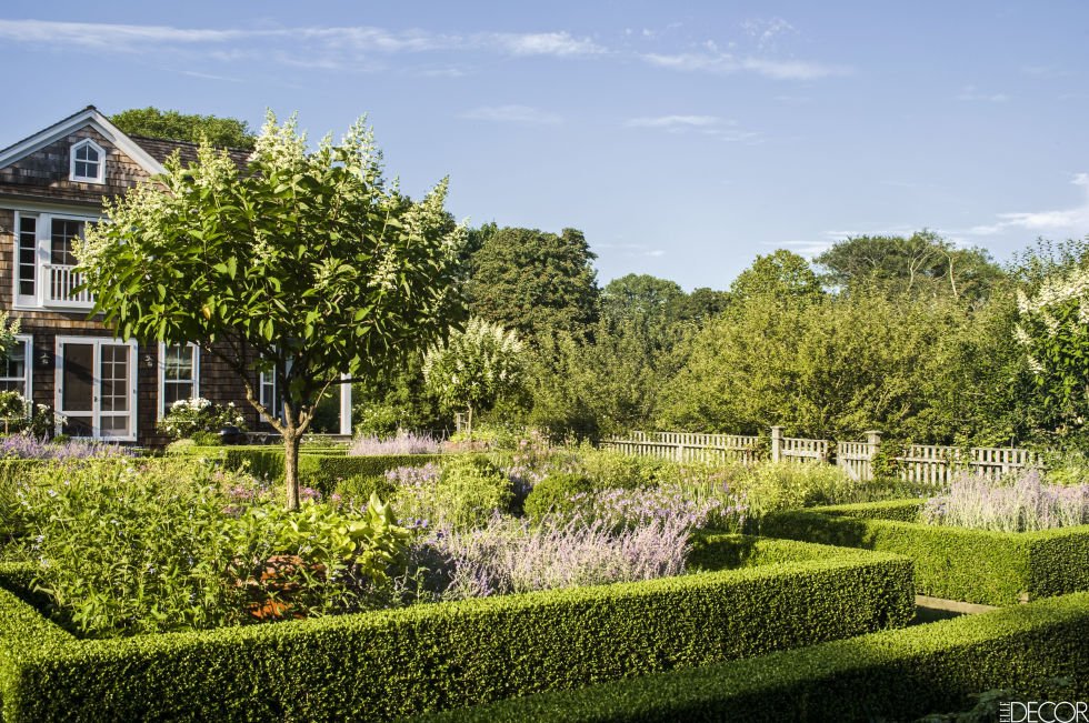
 Photos: Elle Decor
Io Adoro - E' Stile Bookstore
I'm still getting to know my neighborhood. One Sunday morning, I jogged past an interesting store window and made a mental note to check it out.Oh man, this place is going to be an issue. E' Stile is a concept bookstore focusing on art, fashion, and interior design/architecture.They have a GREAT book selection. I do order from Amazon sometimes, especially English language books but nothing beats going to an actual bookstore. Yes, it's more expensive. However, I believe it's important to support small shop owners. I like to browse and speak with the salespeople about the books. You can't duplicate that experience with online shopping.E' Stile also carries Chez Dede bags, products from brands like Kartell and Alessi, and there's a gallery space downstairs.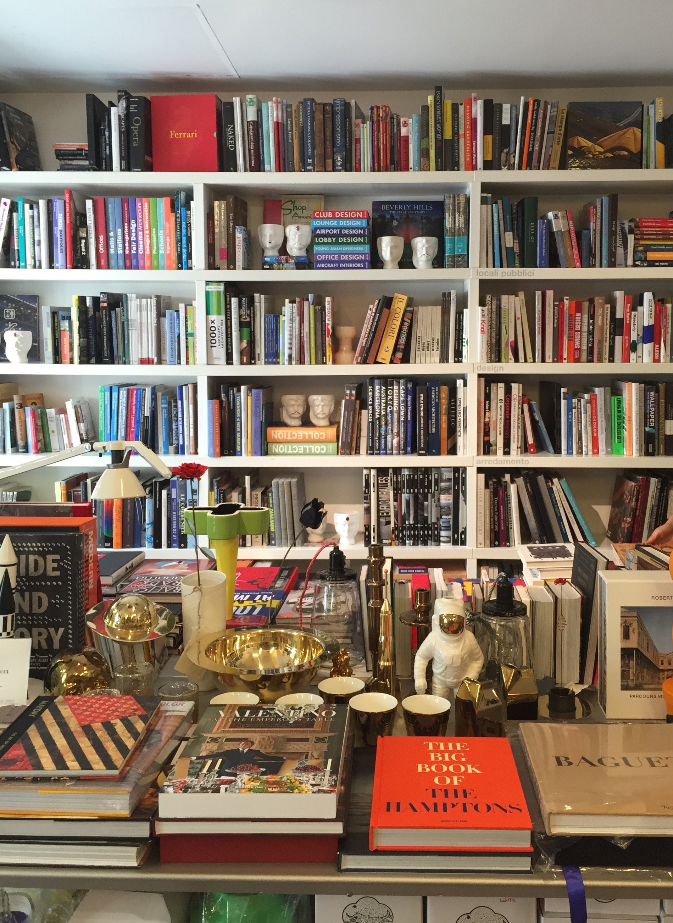
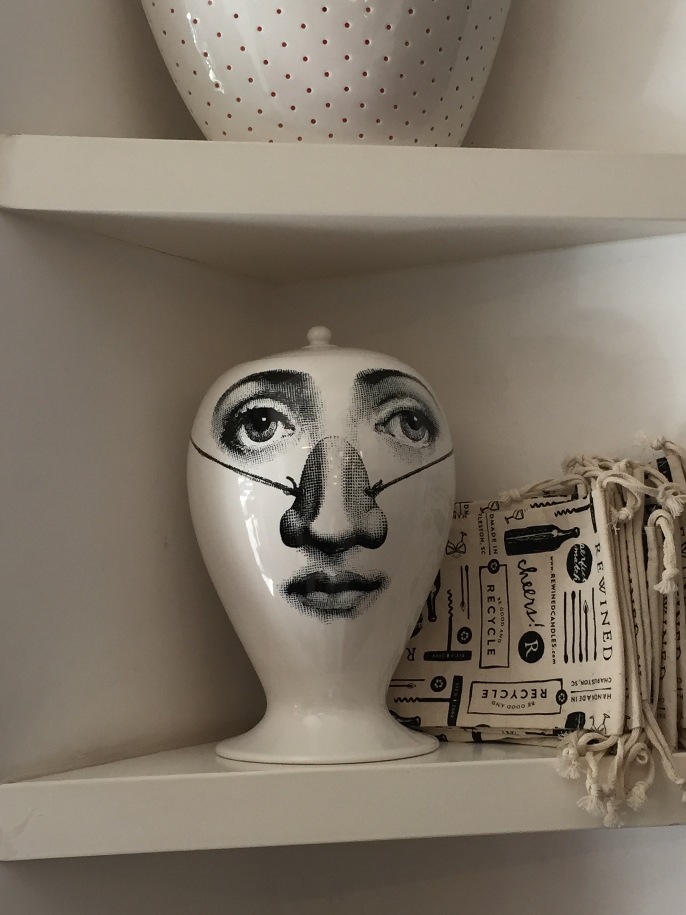
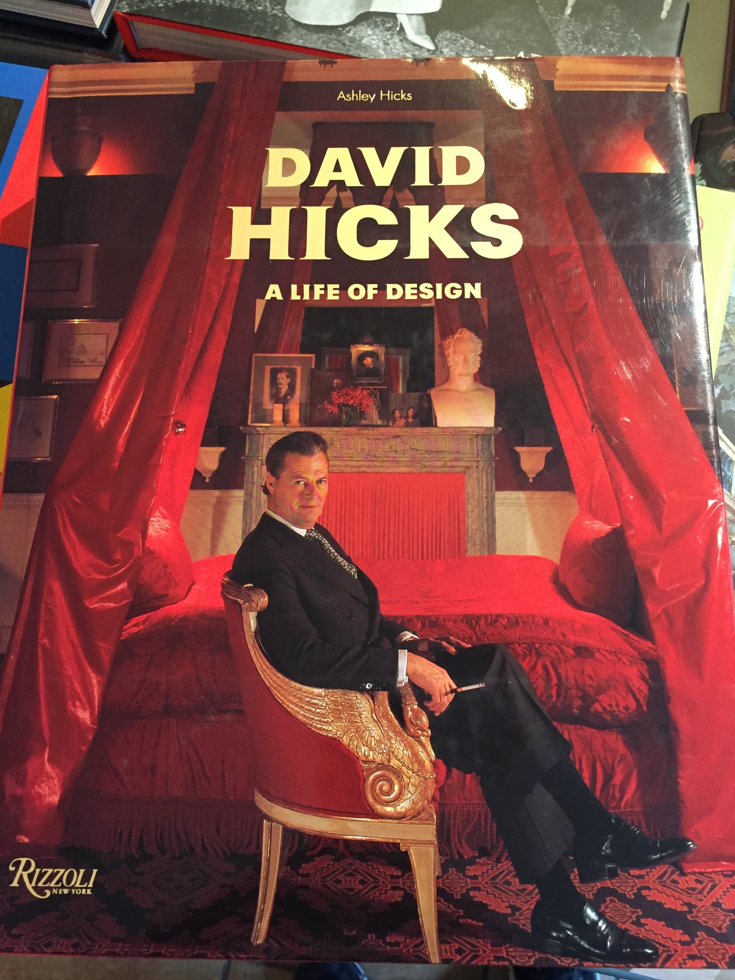


 Photos: Me and my iPhoneE' Stile BookstoreVia Chiana, 15+ 39 06 8555337
Life in Rome - Festival del Verde e Paesaggio
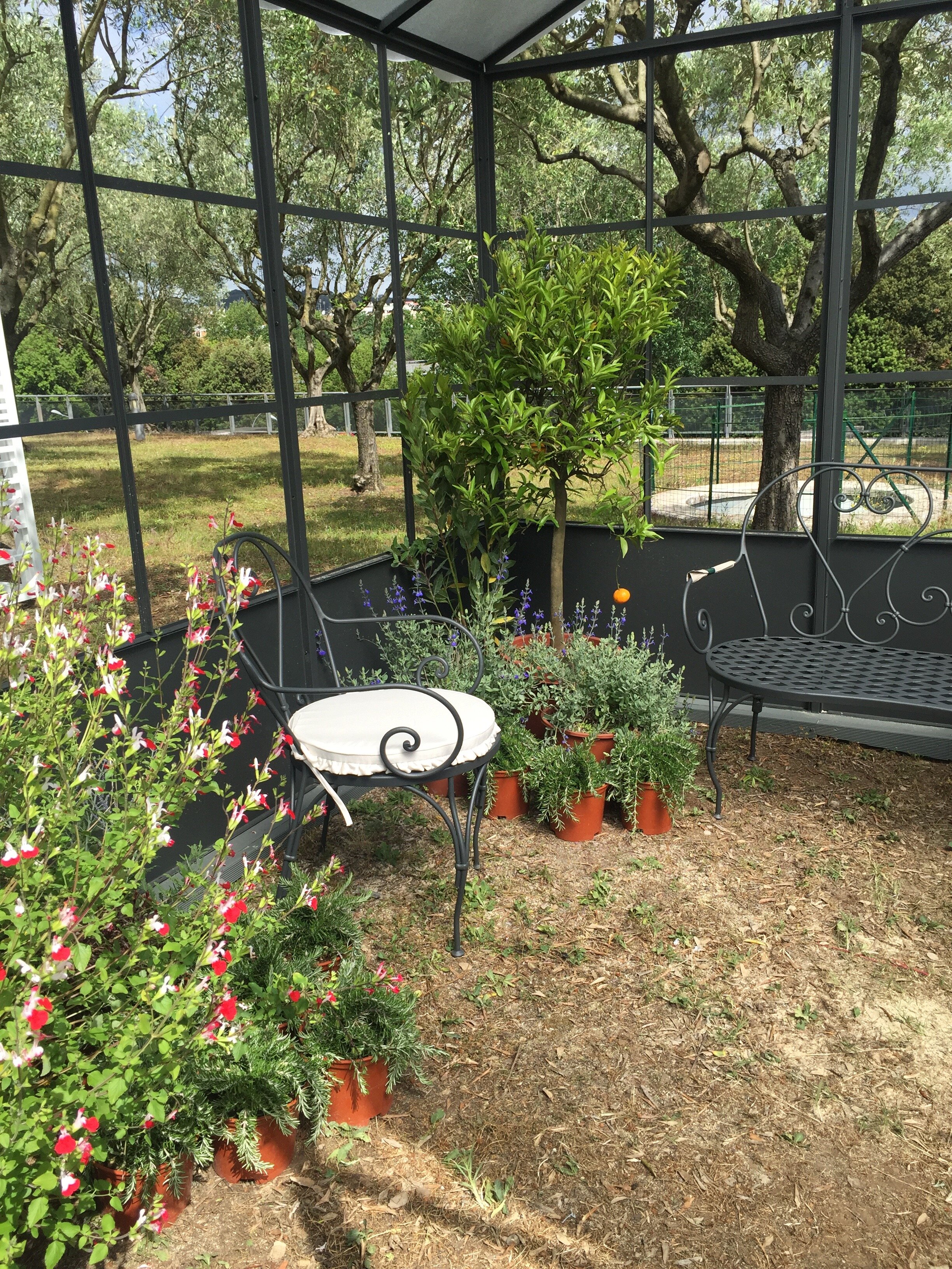
The other week I went to the sixth annual flowers and plants show at Parco della Musica for the first time. These festivals are held throughout Italy during the Spring.The weather was terrible! I'm glad I went on Friday when it was just cloudy. Saturday it poured buckets. I had to work that day on a client's terrace. We couldn't reschedule the gardeners because they were completely booked this month.I had a great time at the show and look forward to checking it out next year. So many beautiful plants to buy, so little space. I wish I had a garden.It's fun for families too. There was a children's section, several food trucks, and a "school" offering classes in floral arrangements, gardening tips, etc.


Metropolian Home is Back*
 *Kind of.I cannot stress how excited I am about this news! METROPOLITAN HOME was one of my favorite shelter magazines. While many of its competitors focused on big suburban houses, MH zeroed in on city living and contemporary design.During the massive financial and housing crisis of 2008, MH and several other magazines shut down (InSTYLE HOME, COTTAGE LIVING, BLUEPRINT, COUNTRY HOME, O at HOME and DOMINO). It was first published in the 1970s as APARTMENT LIFE and was renamed in 1981. It was very popular with city dwelling Baby Boomers and older Gen Xers.Now their children (the Millennials) are starting to buy and/or decorate their own homes. There's a ton of information on the internet of course, but there's something special about print. I think older Boomers who are downsizing and moving back into urban areas might spark to the relaunched MH as well.This is a test issue. It's for sale at newsstands in several cities in the States, was sent to ELLE DECOR (and other Hearst Magazine) subscribers, and is also available via the Apple store. If this issue does well, there will be a second fall/winter issue with the goal of making it a quarterly magazine.I cannot wait to read it. For more information check out their Facebook page, Pinterest page, or Instagram feed.
Life in Rome - My Post Milan Funk
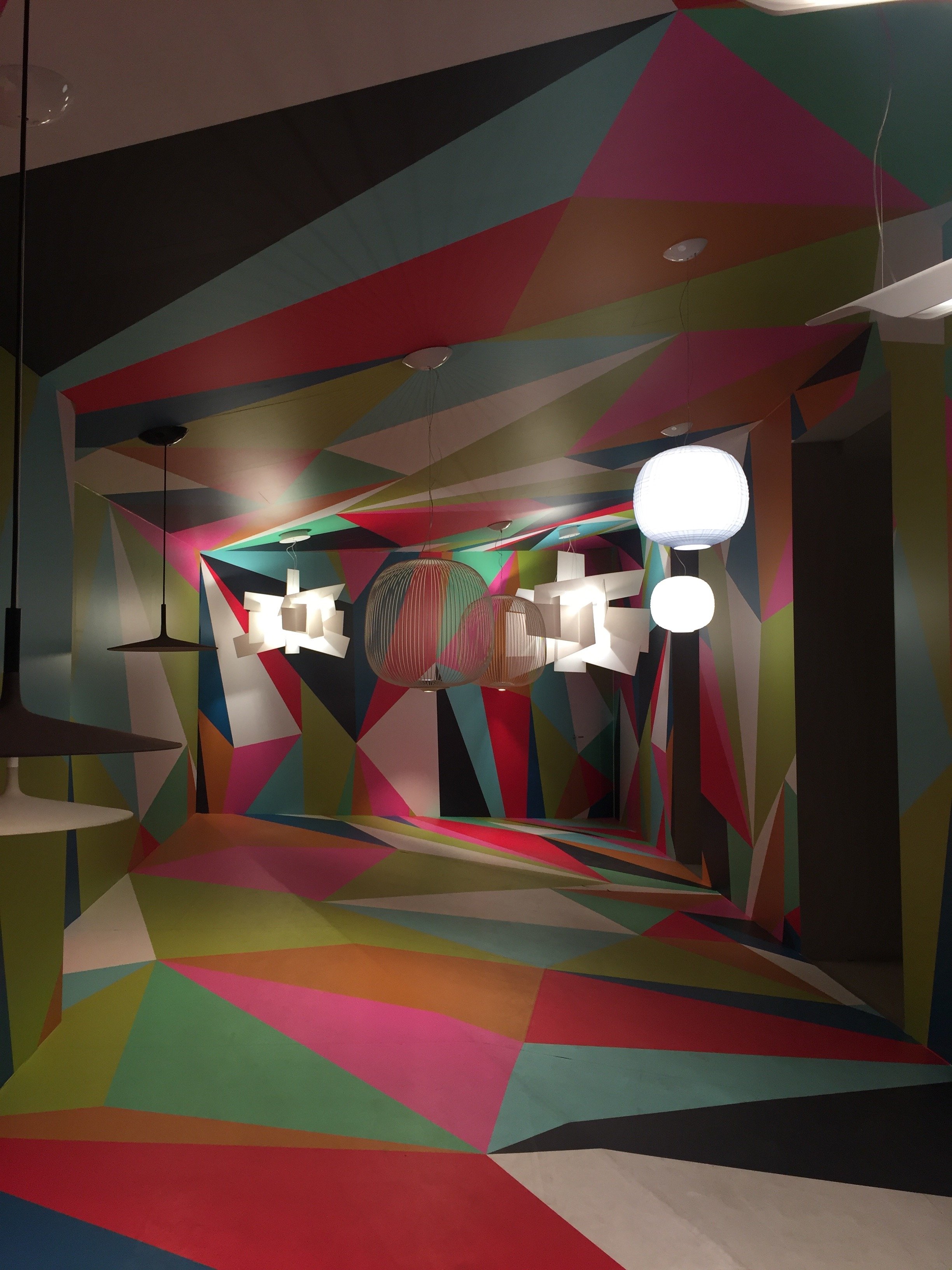
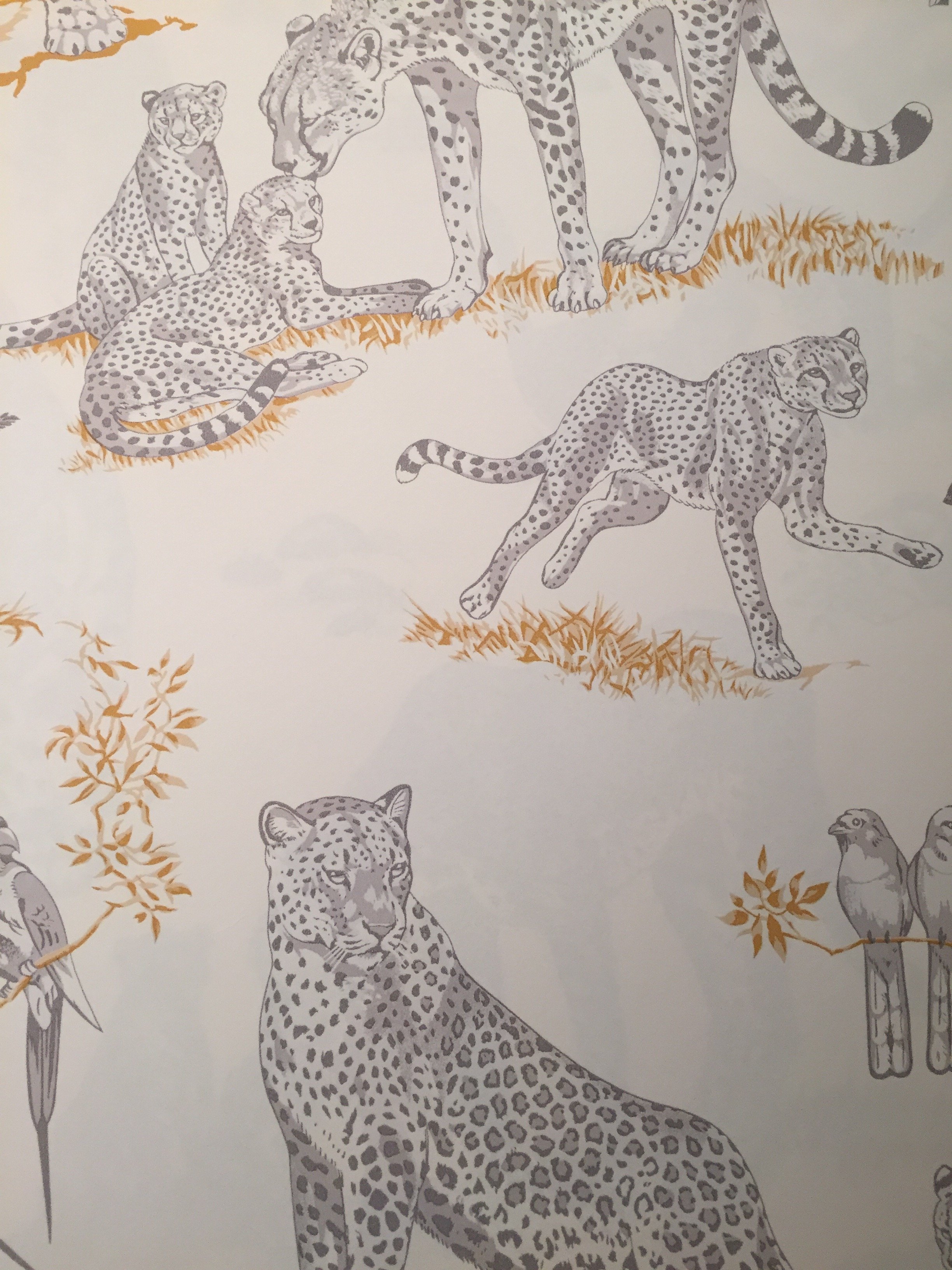
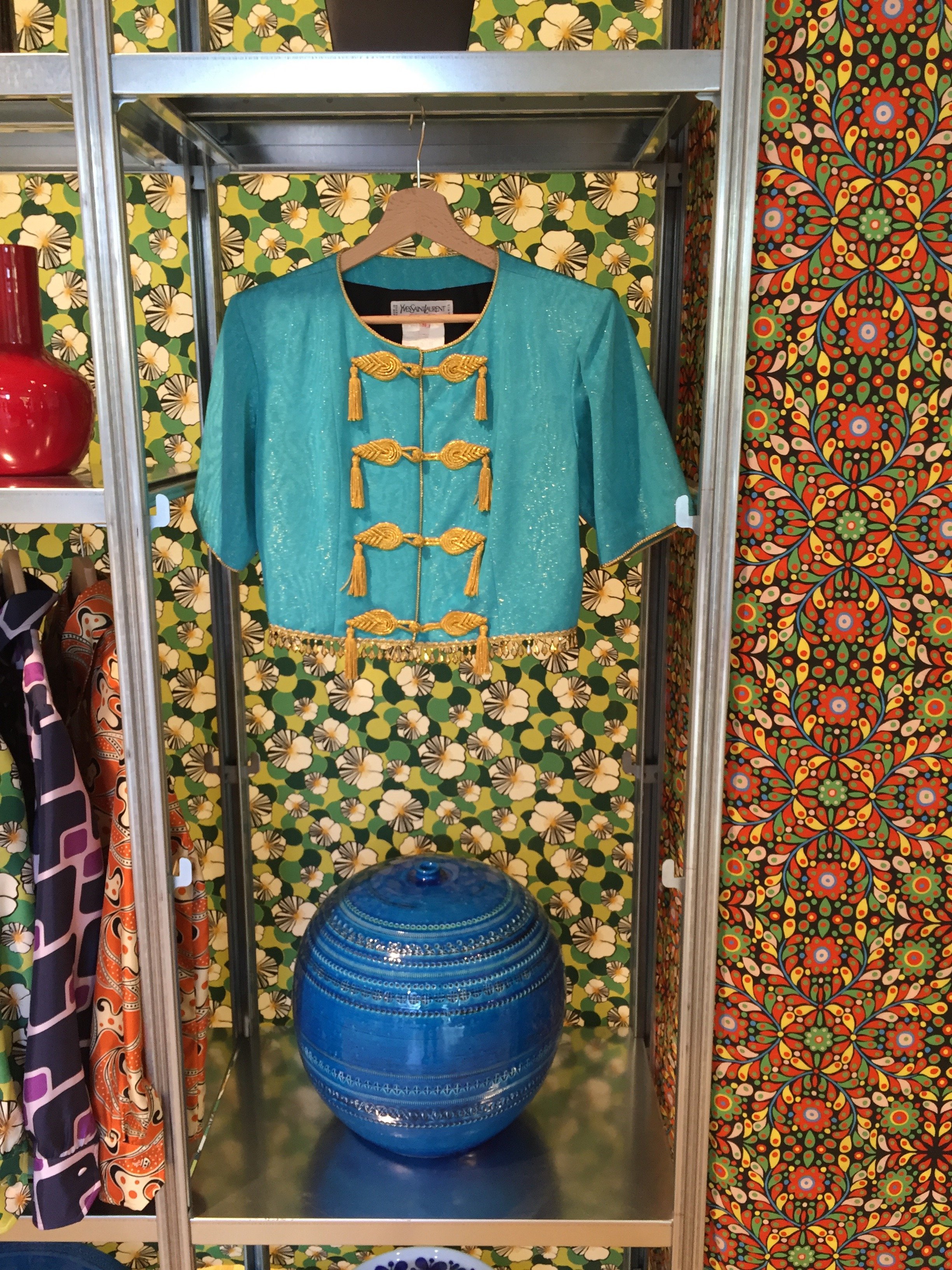
I've been in a weird mood since returning from Milan the other week.I'm crashing from the Salone del Mobile high, Prince is dead, and I have a cold. I rarely get sick but when I do it seems as if my colds have a need to make up for lost time or something.When I went to the Salone two years ago this didn't happen. Something has changed in Rome and it's not for the better. I'm not the only one who feels this way. These articles, yesterday's New York Times and a piece my friend Michelle wrote for US and News Report in February, sum things up pretty well. Maybe I have cabin fever. Hopefully, tomorrow I will feel better and can leave my house!I have been to the Salone three times. The first time I stayed in a hotel near the Convention Center. The second time I rented an apartment in the city near the canals. Third time's a charm.Hotel prices are insane during the Salone (if you can find one). The Salone is larger than Fashion week and seventy percent of the people attending are visiting from other countries. The entire city takes part. If you're planning to attend, make reservations early. Many companies and vendors have blocked out rooms years in advance.I returned to the Principe after my great experience there in September. I still don't understand how the hotel was filled to capacity, yet I rarely saw any other guests on my floor. So quiet. The service at this hotel is impeccable despite its size. Plus, they have American bacon during breakfast.Renting an apartment while traveling on vacation is an excellent option but I've learned my lesson. When I'm working, a hotel is a better choice for me. Much better.I was running around Milan like a chicken with my head cut off and it was wonderful to return to a clean room, to have concierge service, a gym, a convenient place to have meetings, etc. Of course the cost was higher than the apartment I rented two years ago but my trip was more productive.And what a great trip...four intense days of meetings and visiting showrooms. I wish I had more time.I posted a few photos on Instagram and below are additional pictures from some of the highlights. I can't upload all the highlights as I forgot to take photos at the Ethimo party, and quite a few showrooms.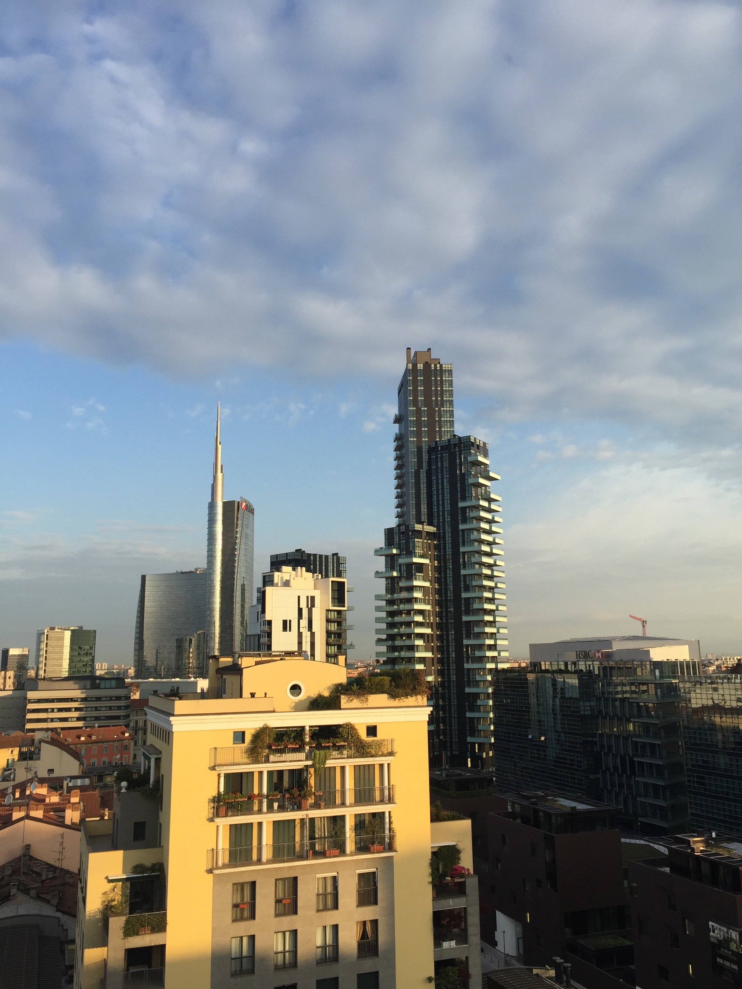


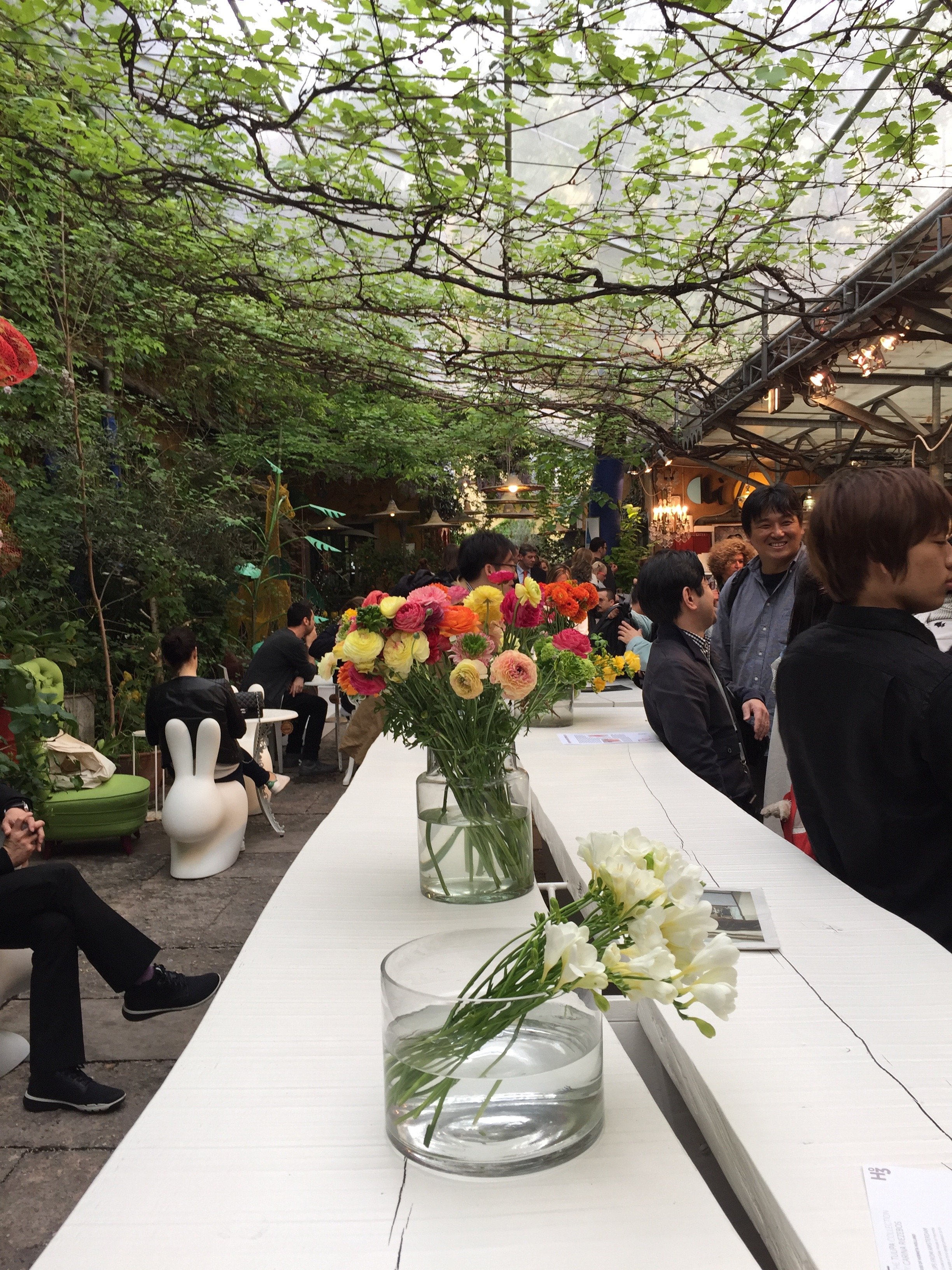
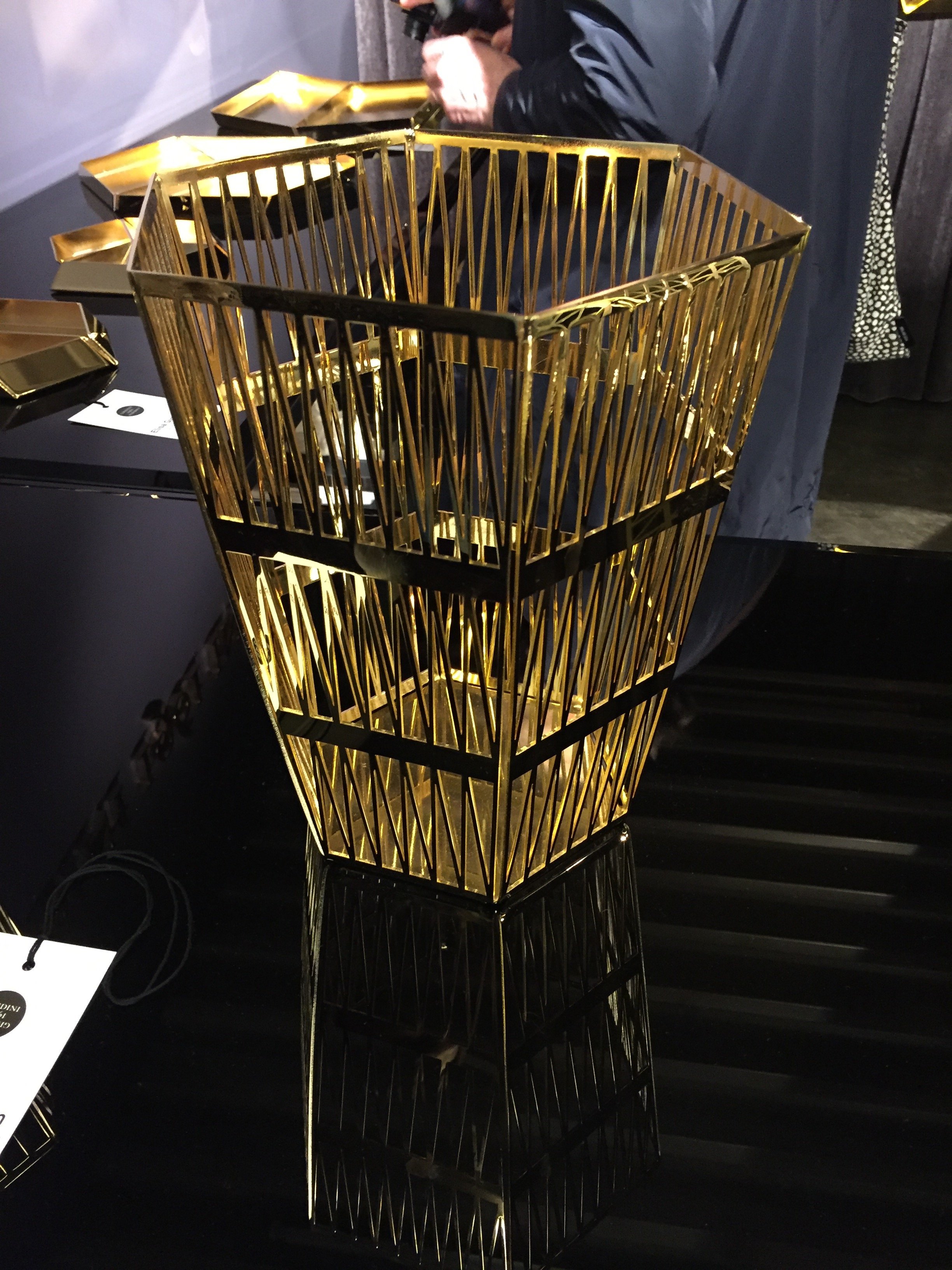
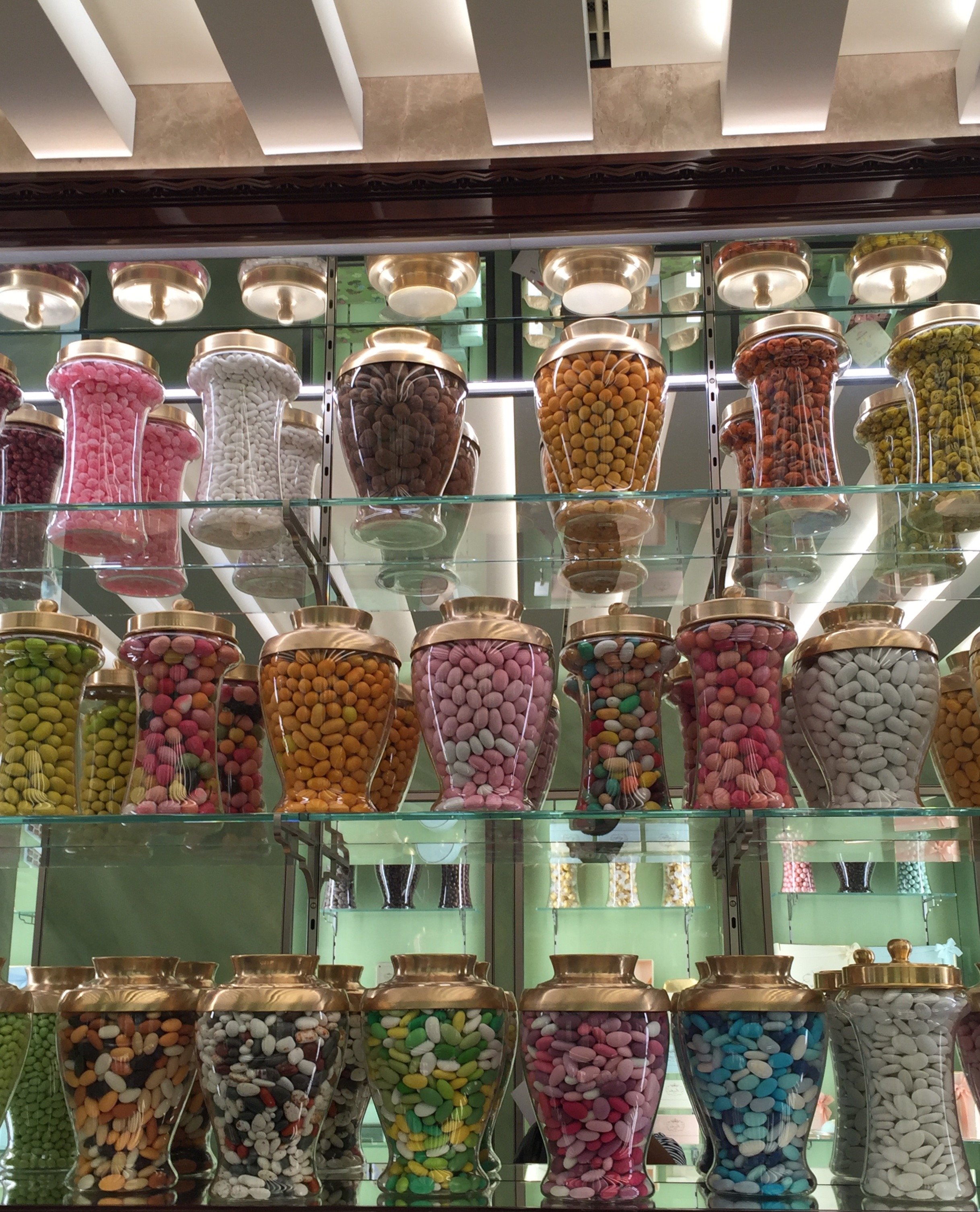
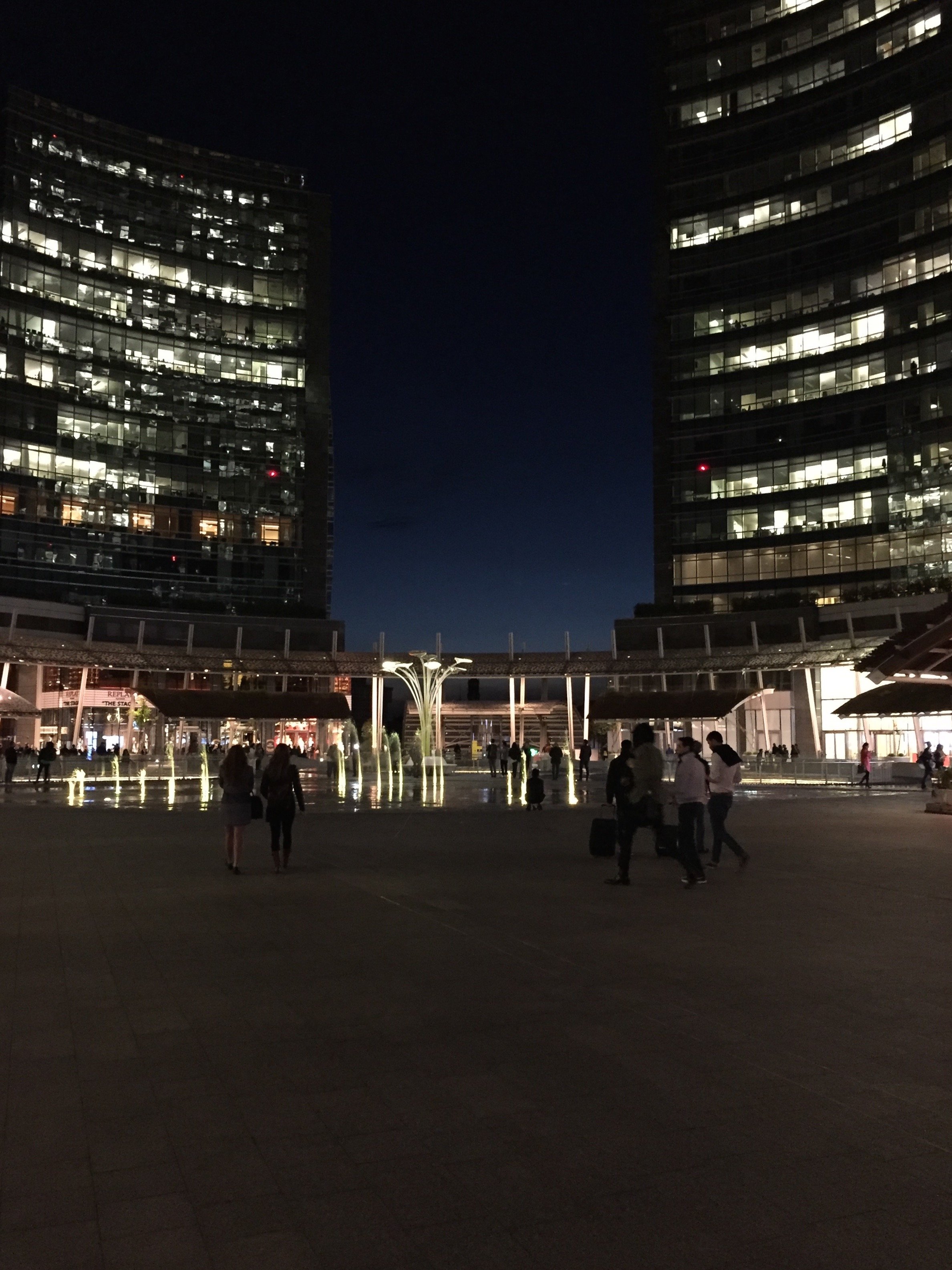
Project Via Monserrato - Reveal
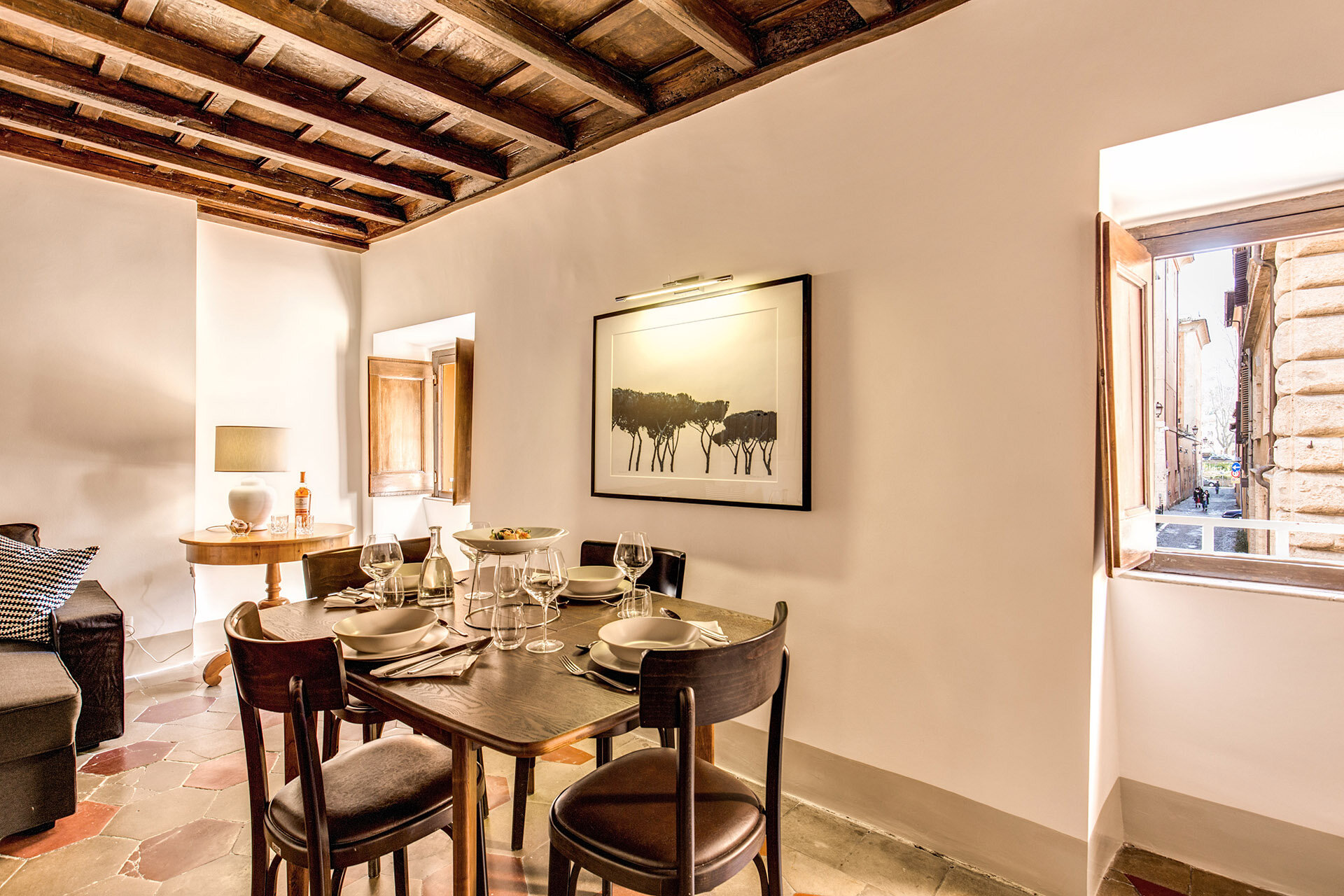
During the past year I've been working on a decorating and renovation project in the Historic Center for a client who wanted to update a few of their B&Bs.It was a great experience. At times it was also challenging, as the apartments were fully booked months in advance. The logistics were difficult.Located inside a palazzo that dates from the 1600s The Via Monserrato apartment (aka Grand Suite), is on one of the prettiest streets in Rome.The brief was to create a contemporary décor, while at the same time retaining (and respecting) the charm and history of the architecture.Vacation rentals are tricky. You don't want a design that is bland or cookie-cutter but it cannot have so much personality that it turns off most customers.Here's a photo from the living room, before.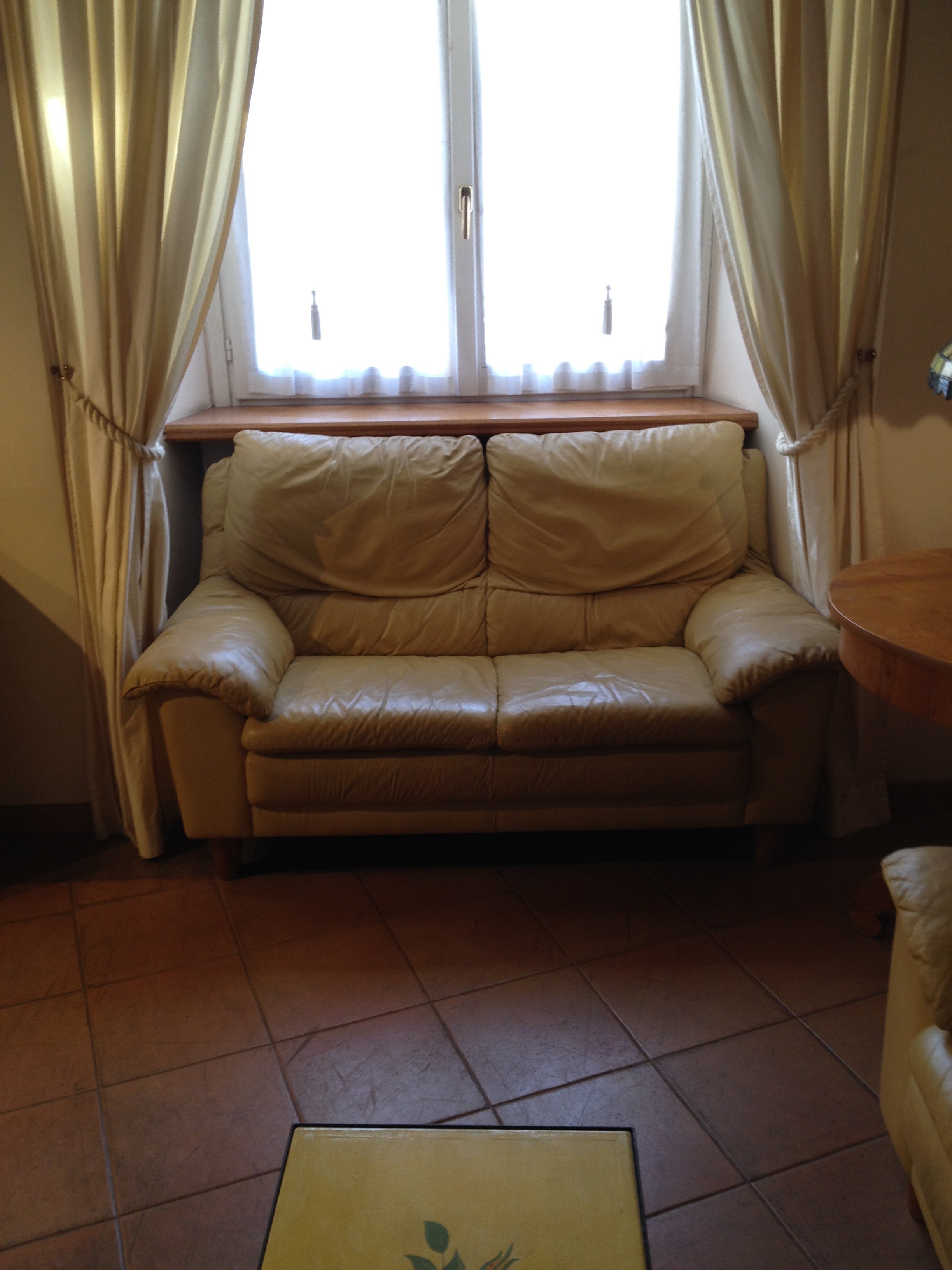 After
After 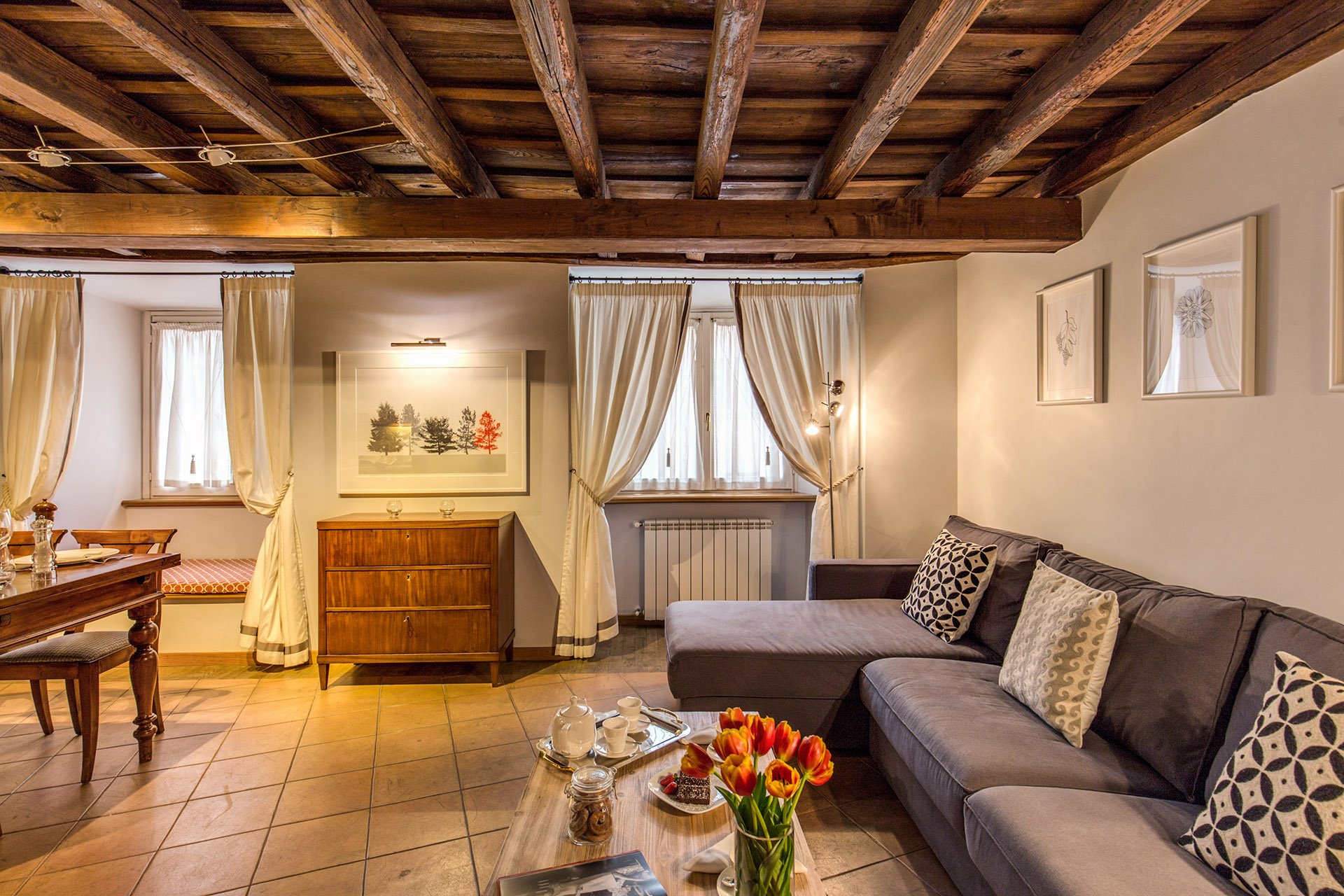 This room is a mix of high and low vendors, antiques (that belong to the client), and custom pieces.The room is light, stylish, yet comfortable. We had to use fabrics and colors that could handle a lot of wear and tear.The walls were changed to Farrow & Ball's "Blackened", a cool white that reads light grey. I know I talk a lot about this brand but there's a reason I have used it in every single project I've worked on. The quality of this paint is no joke and depth of color is incredible. This was the first time the painters had worked with Farrow & Ball and they were very impressed. When people who paint for a living rave about a brand, you know it's good. Stateside, I like Benjamin Moore as well but that brand is not sold here. Le Decorazioni is the authorized Fallow & Ball vendor in Rome.We decided to go with a one L shaped sofa instead two. This model is a sleeper sofa and we bought it from Berto Salotto.The coffee table is from Maisons du Monde, a French brand with stores all over Europe.The curtains were custom made. The trim is Dedar. All the fabric for the apartment was selected and purchased at the store Lelli.The floor lamps are from MADE.The art work over the antique buffet is by Due Alberi. Funny that I read about these two artists in Rome on Elements of Style, which is written by Boston-based American interior designer Erin Gates. We used their work in another apartment (pics soon) as well.We commissioned artist Marta Alexandra Abbott to create pieces that referenced Rome in a subtle way. Marta is American and moved to Rome several years ago. You can see more of this series, inspired by the Ara Pacis, HERE.Dining area.
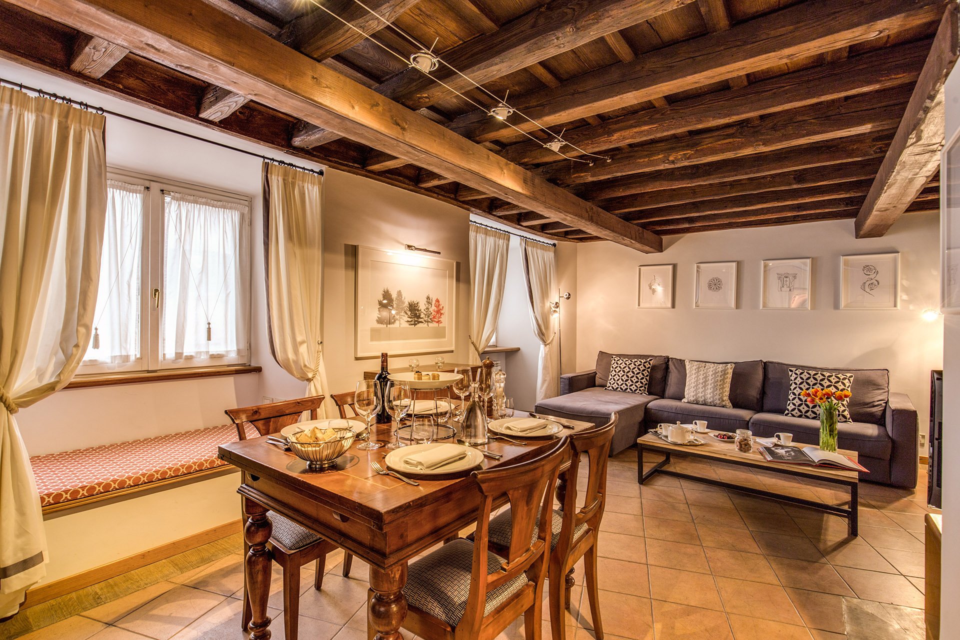 We kept the dining table and reupholstered the dining chairs.Before
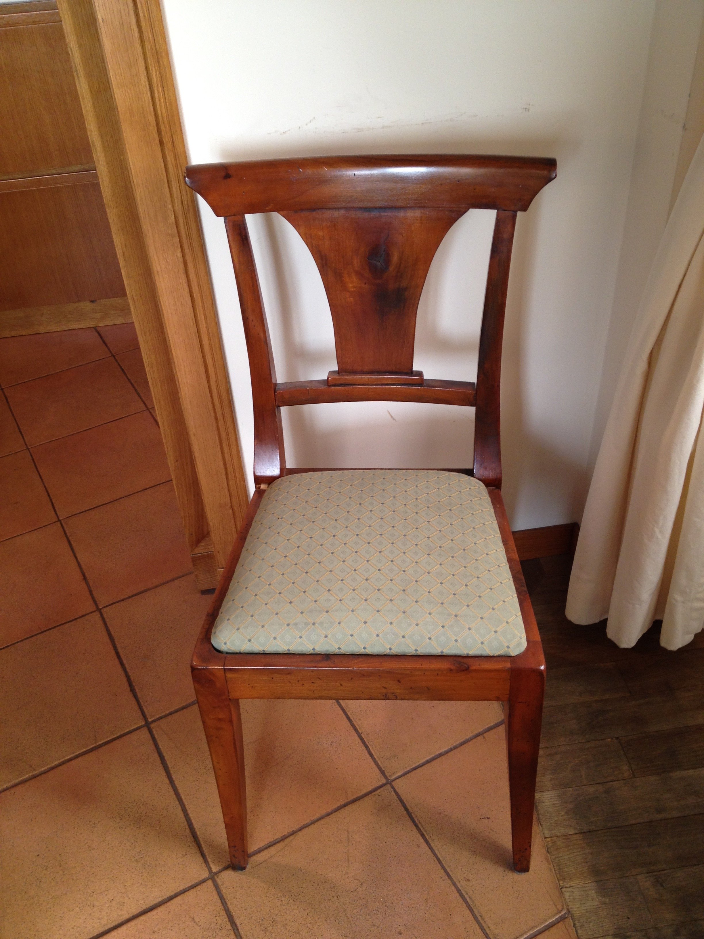 After
After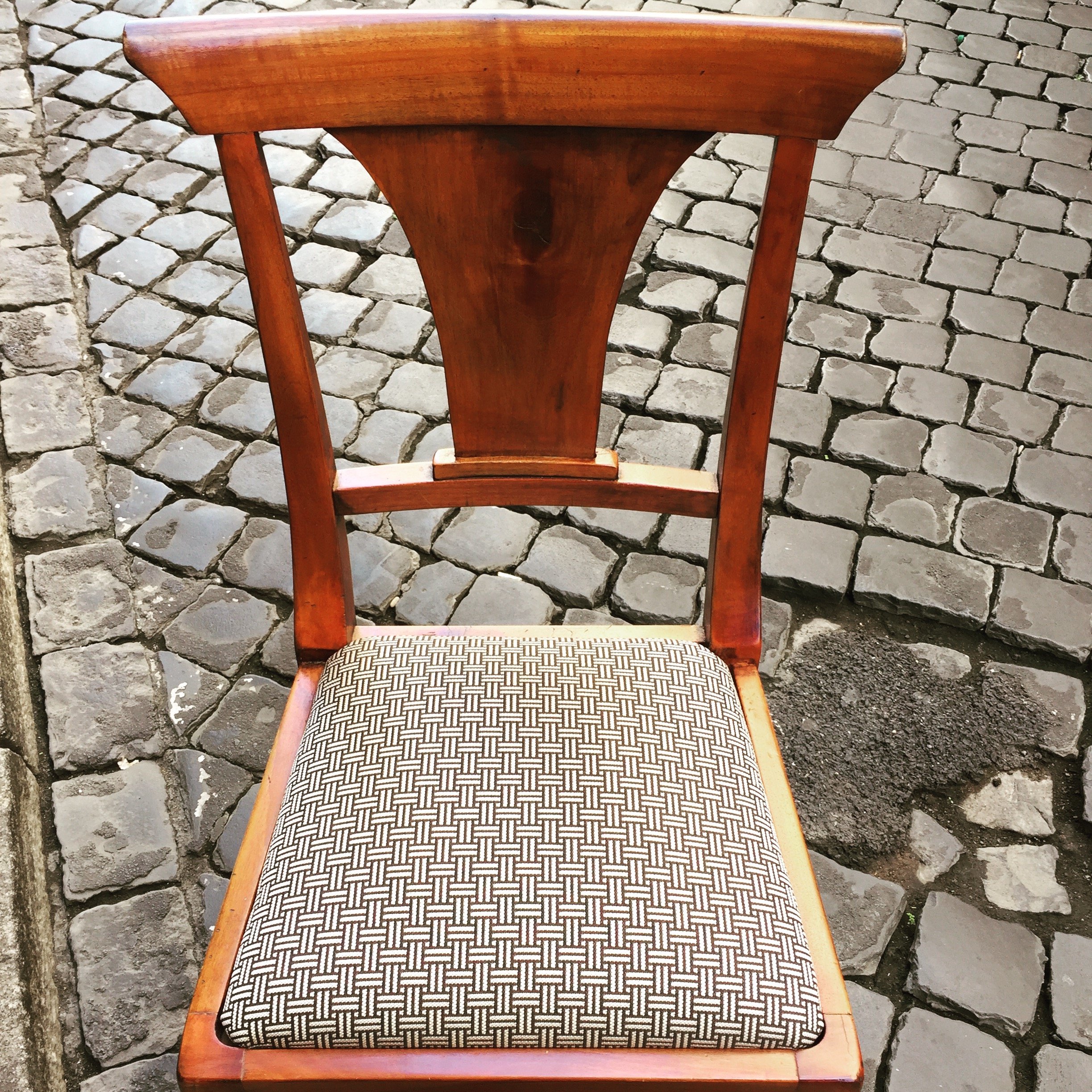 This graphic Dedar fabric is durable and makes the 1930 lines of the chair stand out. The chairs were in great shape. I thought it would be better for the budget and the design to keep them. I'm not a fan of spaces where every single item is brand new. I like to mix things up. You see that a lot in interiors in France and Italy. If you don't have any older pieces of your own, you can find them at flea markets, estates sales, in your family's attics/basements, etc.We created a window seat. I wasn't sure my client would go for the pattern or the color. The fabric is Thibaut. I think it gives this room of neutrals a nice punch of color.The pillow are from a local shop, Fabindia.The former artwork in the living room.
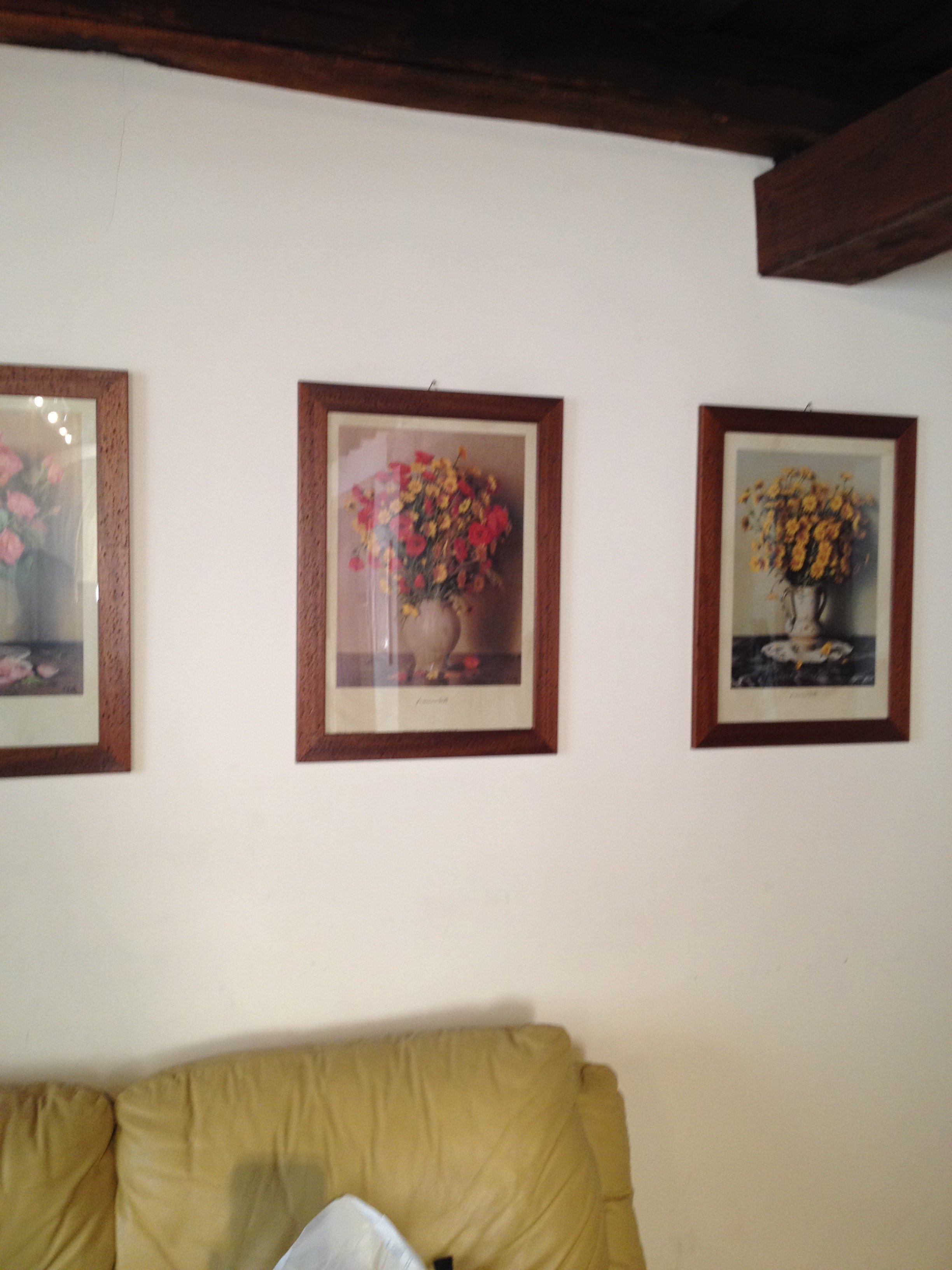 Art work, after.
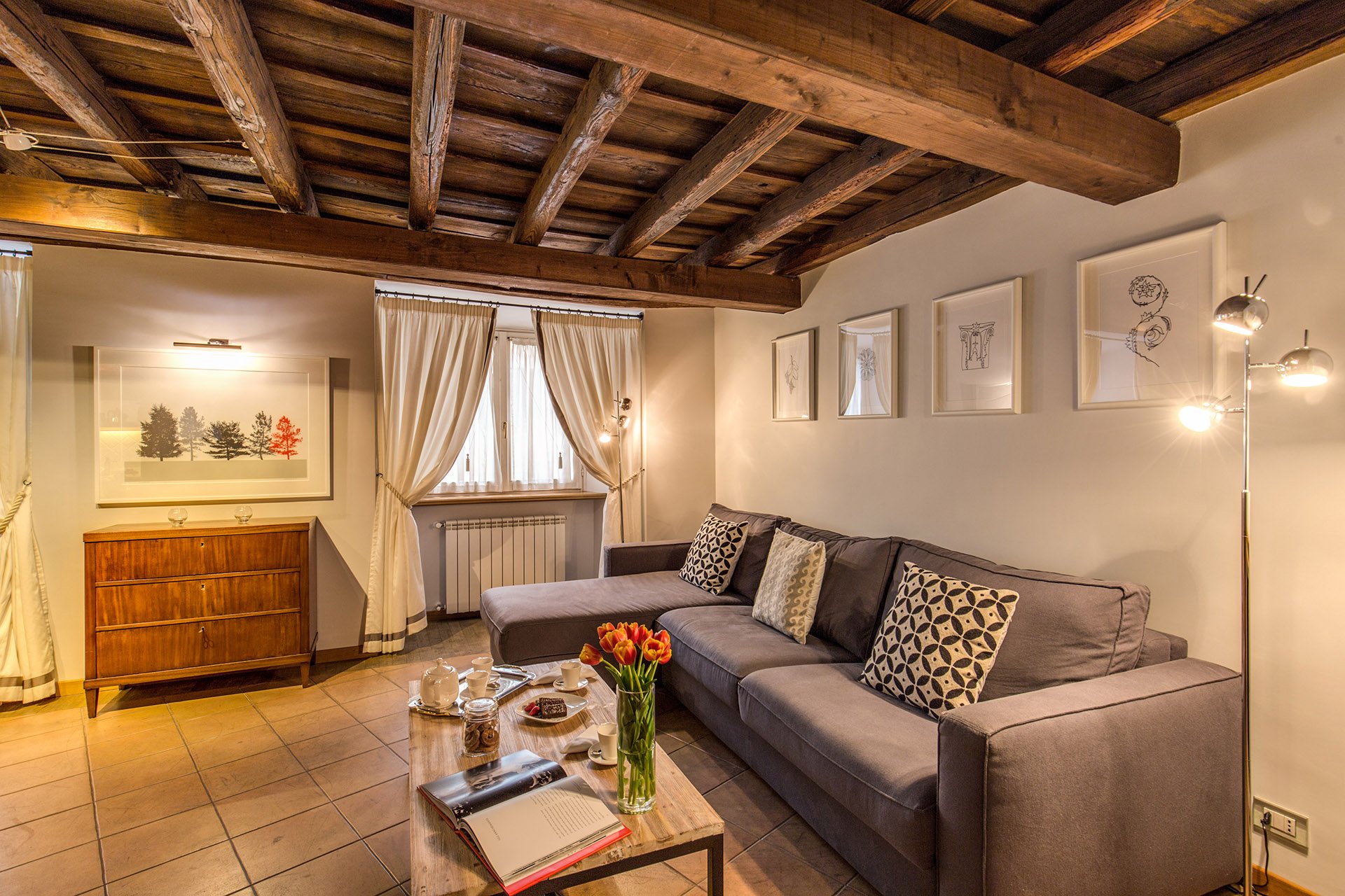 The hallway was painted white and the huge 1980s sconces were replaced with simple, modern ones. This art is by Marta as well.
 Bedroom - before
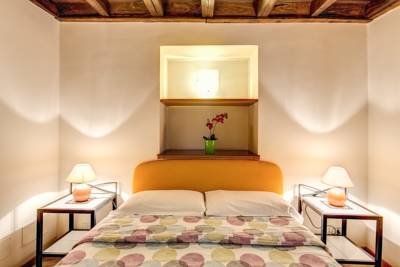 After
After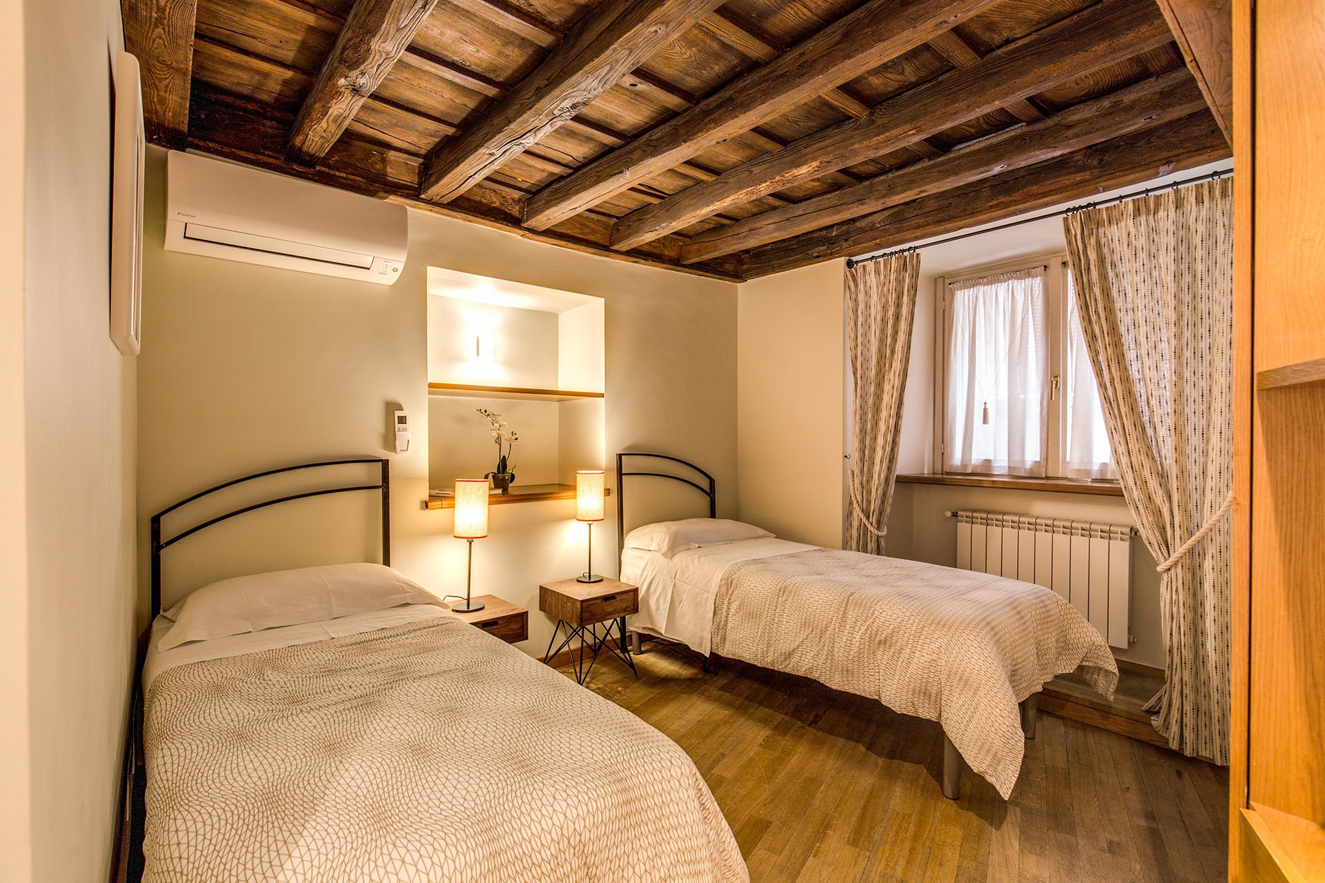 Originally, there was a queen-sized bed in this room but my client's company has had many requests for twin beds.The walls are Farrow & Ball, "James White". The curtains are custom. The fabric is Thom Filicia for Kravet.I asked my blacksmith to make the head boards. I wanted something that would look great when together and when separate. We came up with a few designs and this is the one the client picked.The night stands are from Maisons du Monde. The lamp bases are from IKEA. The shades were custom made at the store Paralume, which is right up the street.I'm not sure how a store that makes/sells lampshades manages to stay in business in this global economy we live in but I hope they stick around for a long time.The beds together.
 The master bedroom - before
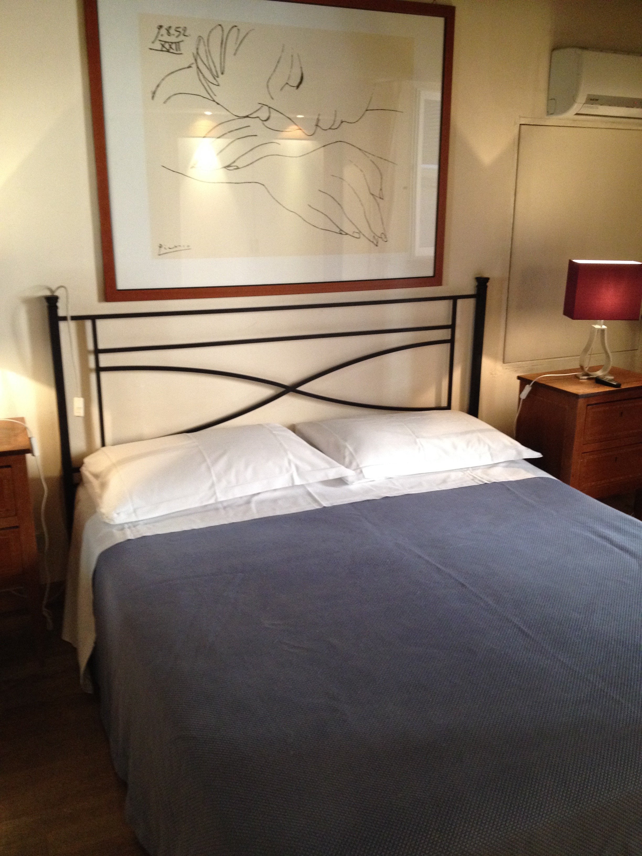 After
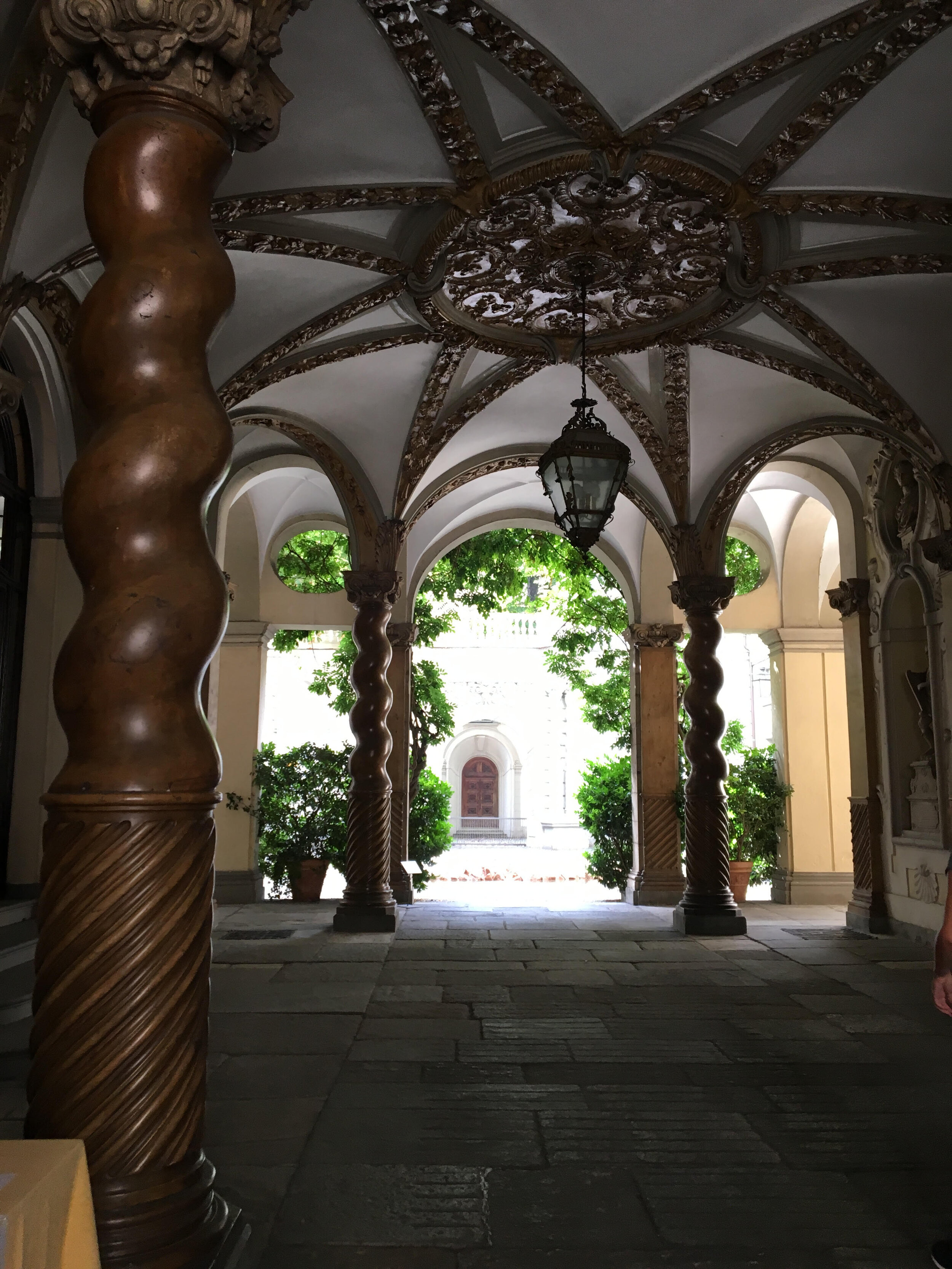
After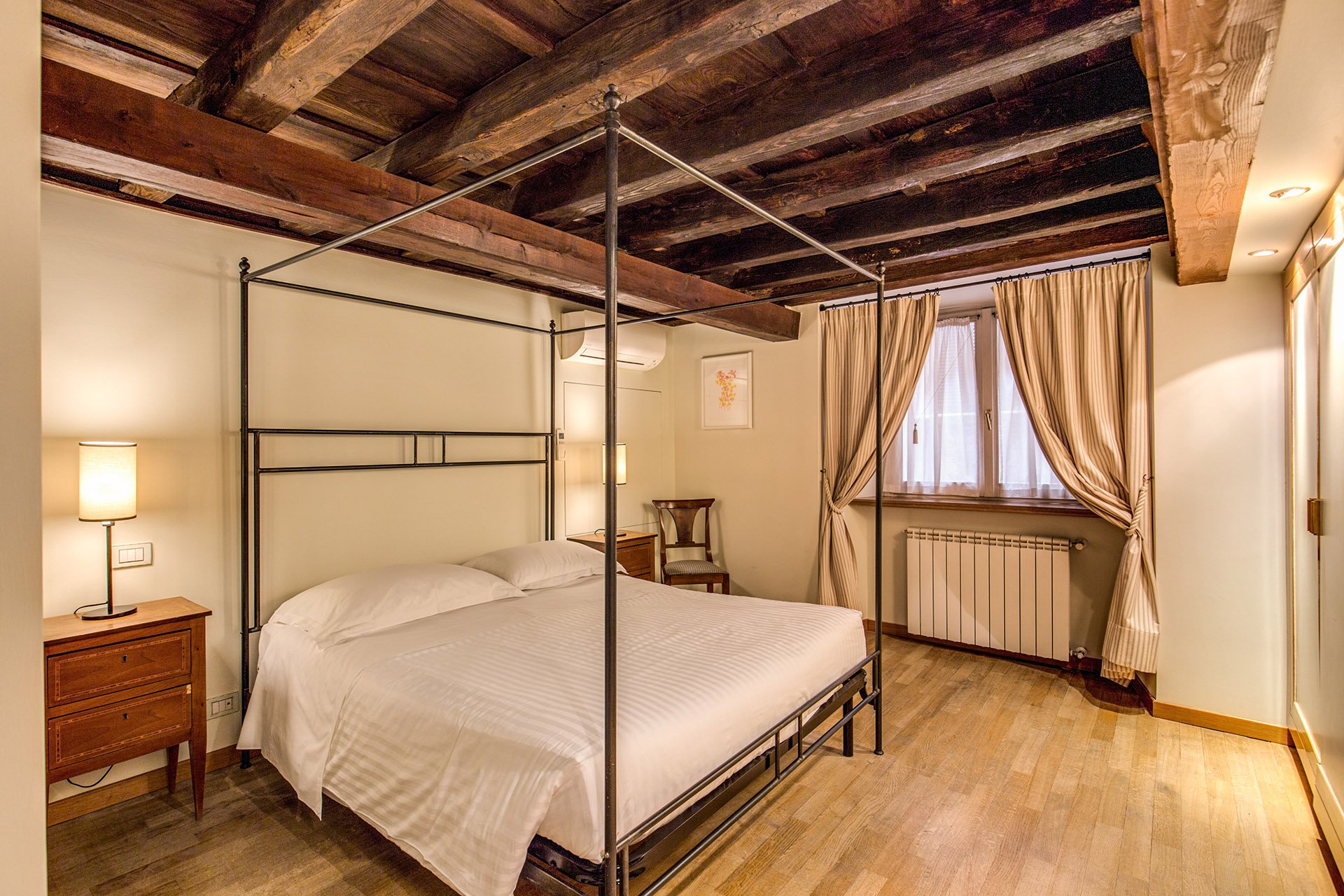 We kept the bedside tables. The walls are F&B James White. The curtain fabric is Malabar.The lamp bases are IKEA, shades custom from Paralume. It's hard to tell from the photo but these shades/trim are a different color from the other bedroom.I have a thing about four poster/canopy beds. Our blacksmith designed this simple yet, elegant frame. With these ceilings, we thought a more decorative frame would be too much. It interesting how the room actually looks bigger even though this bed is the same width as the old one.Two photos from inside the Palazzo.
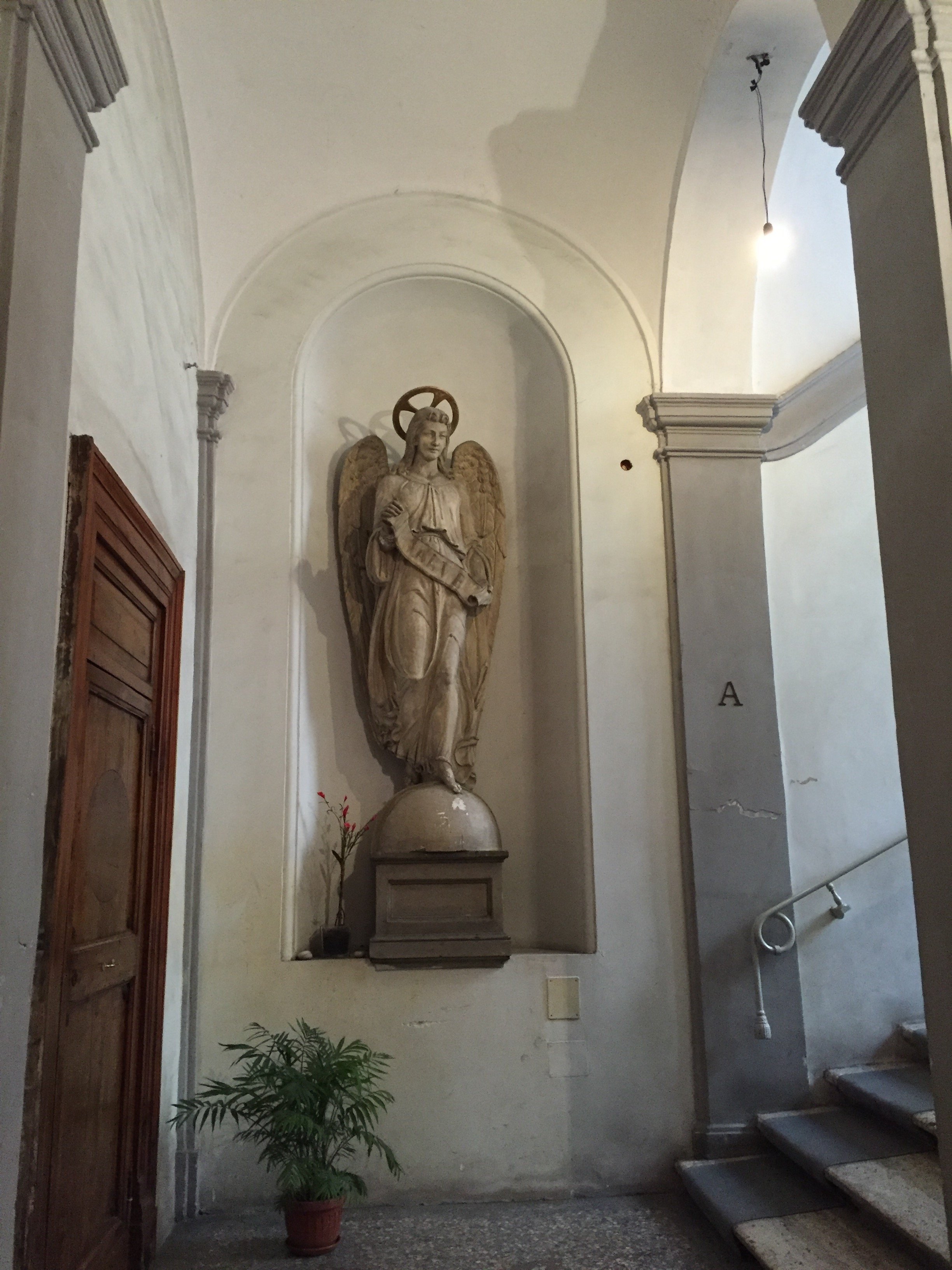
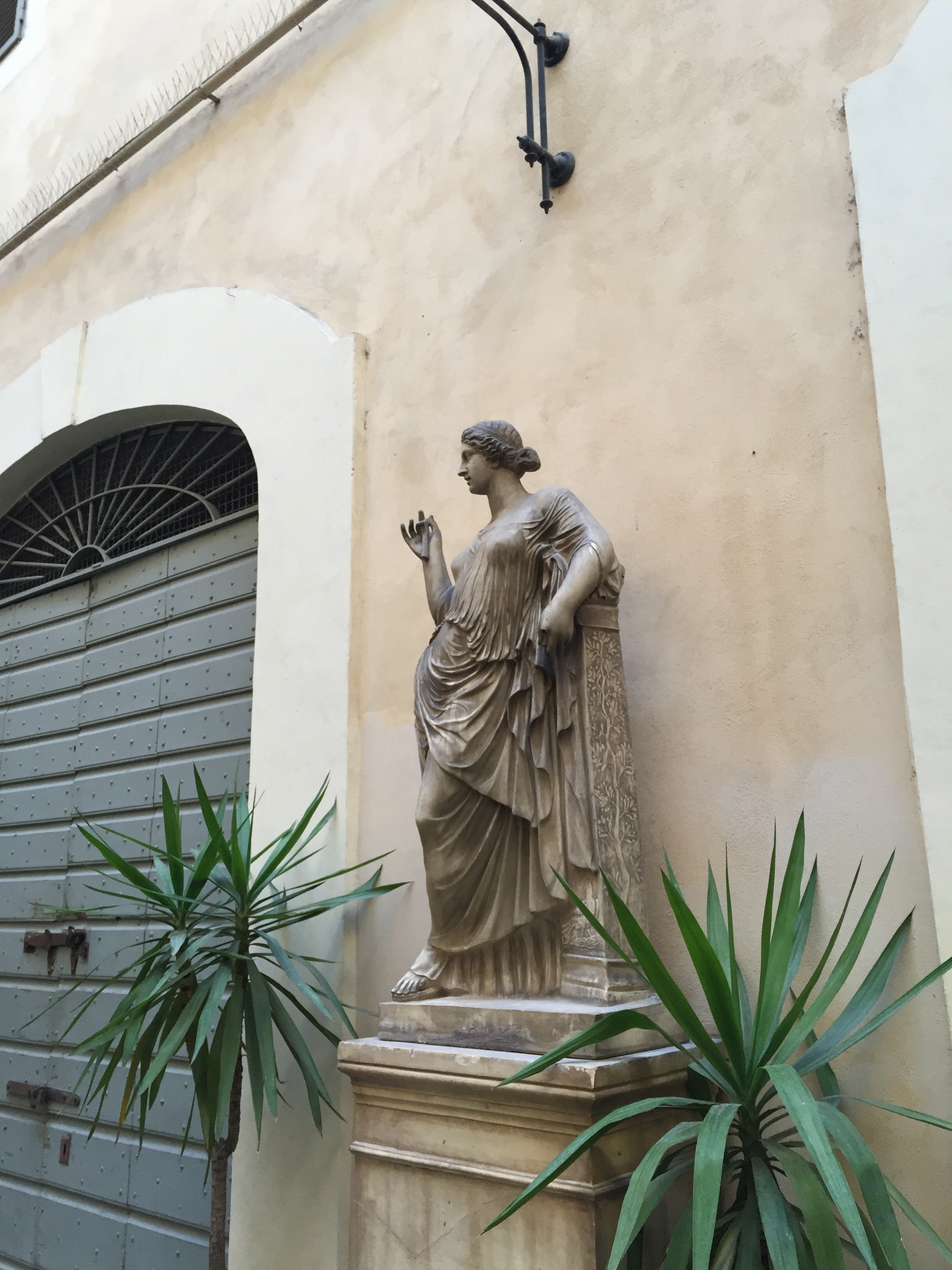 Overall, I'm very happy with how the apartment turned out. A huge, "Grazie" to my client and their team. I cannot tell you the amount of WhatsApps, SMS, emails, phone calls, job site visits, that were made. I truly appreciate their patience with my bizarre smash up of Italian and English. My client introduced me to my new Italian teacher. I got the hint. Heh.For more information about renting the Grand Suite, or other apartments from Your Suite Rome, click here.After photos and before of bedroom 1: Vincenzo TambascoOther photos: Me and my iPhone

